Welcome to week twenty-one of our Art With Heart 2024-25 Colour Creations blog hop!
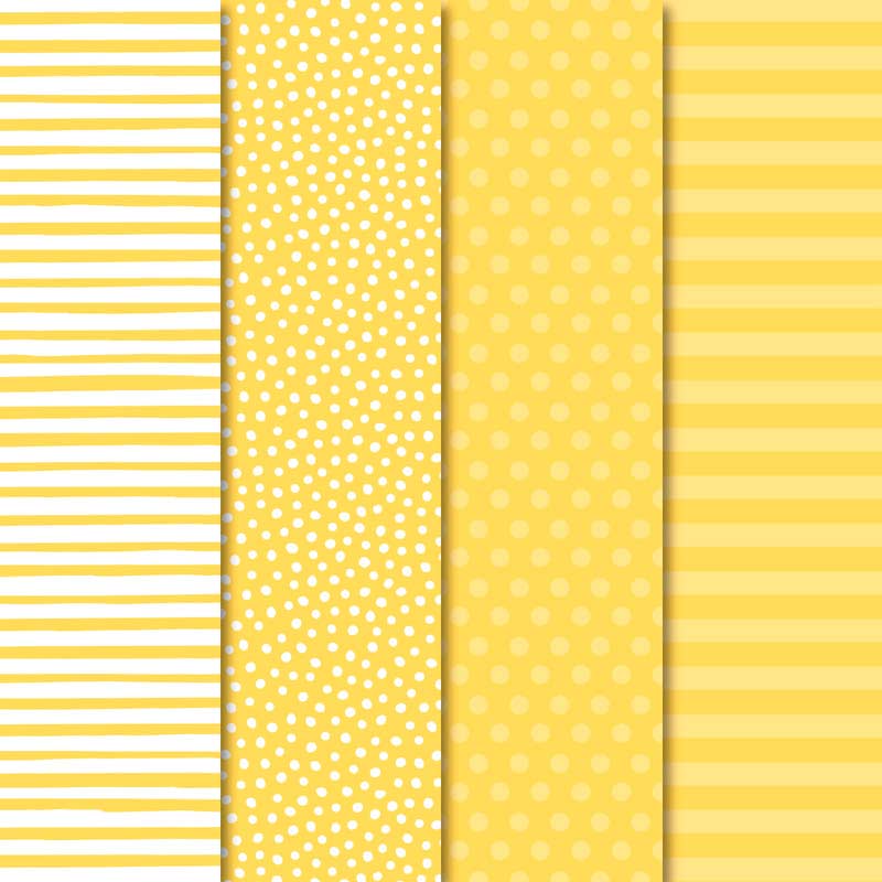
This week we’re featuring Crushed Curry, a deep yellow from the Regals family.
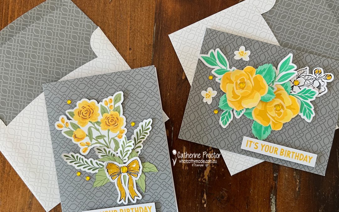
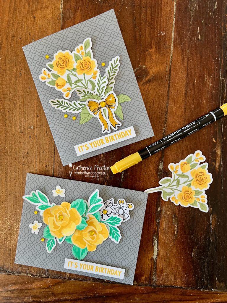
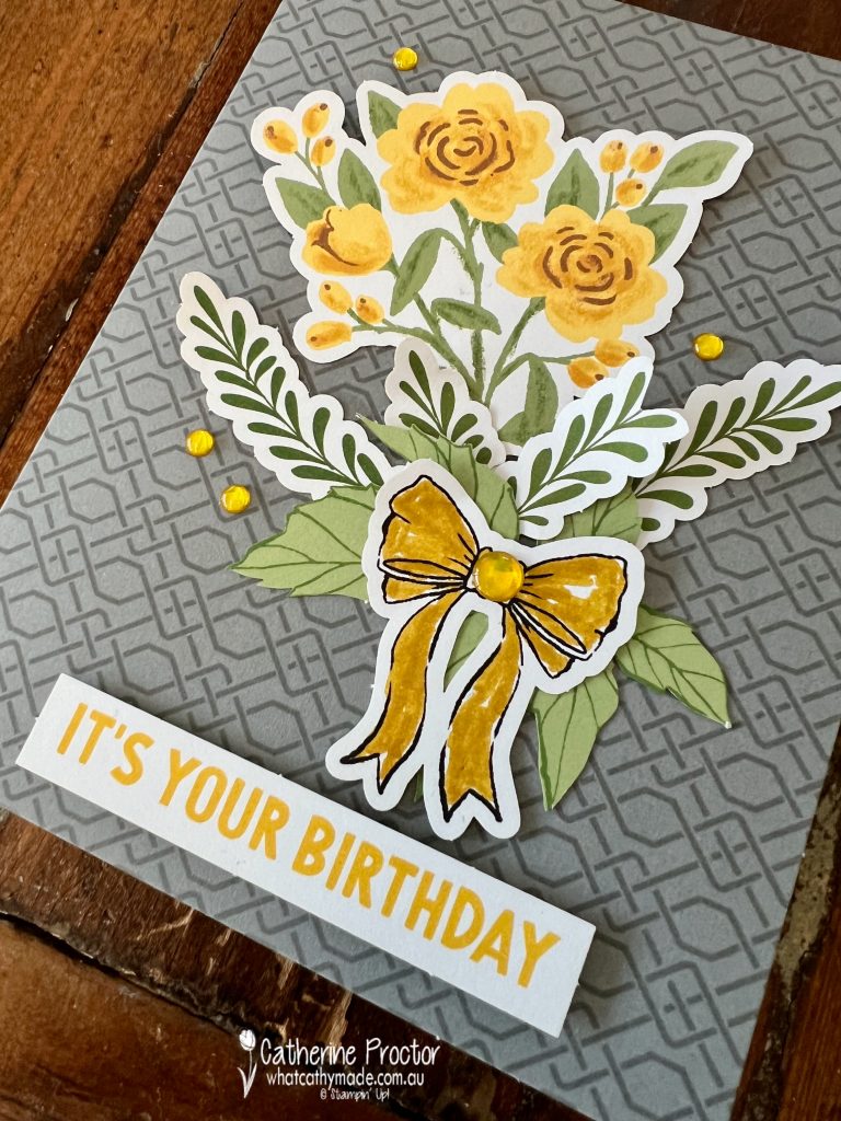
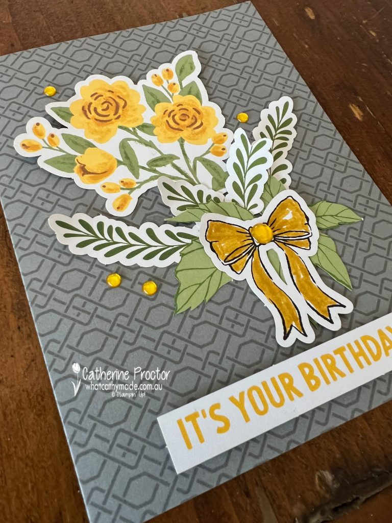
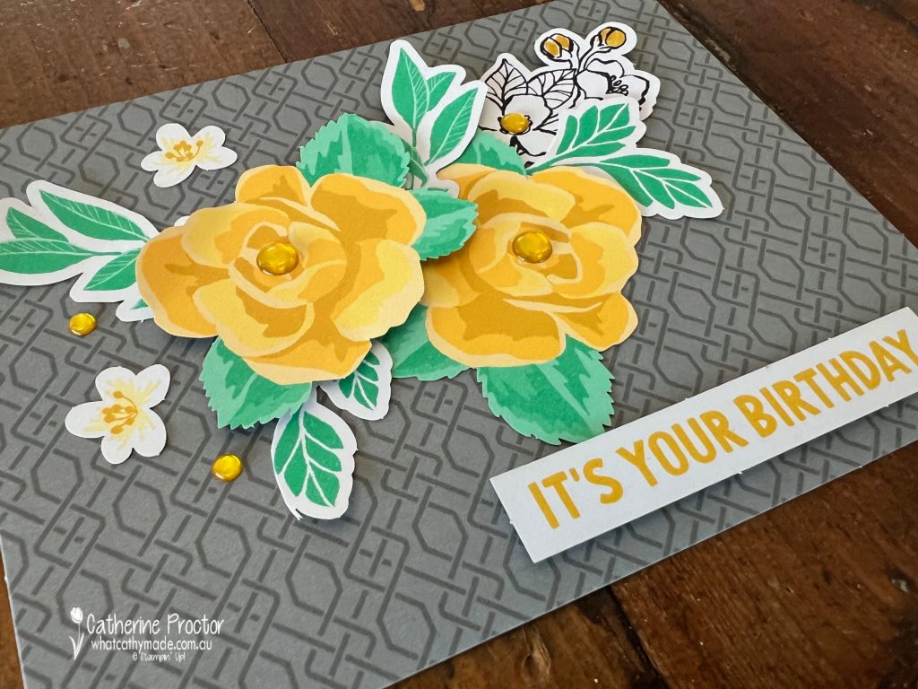
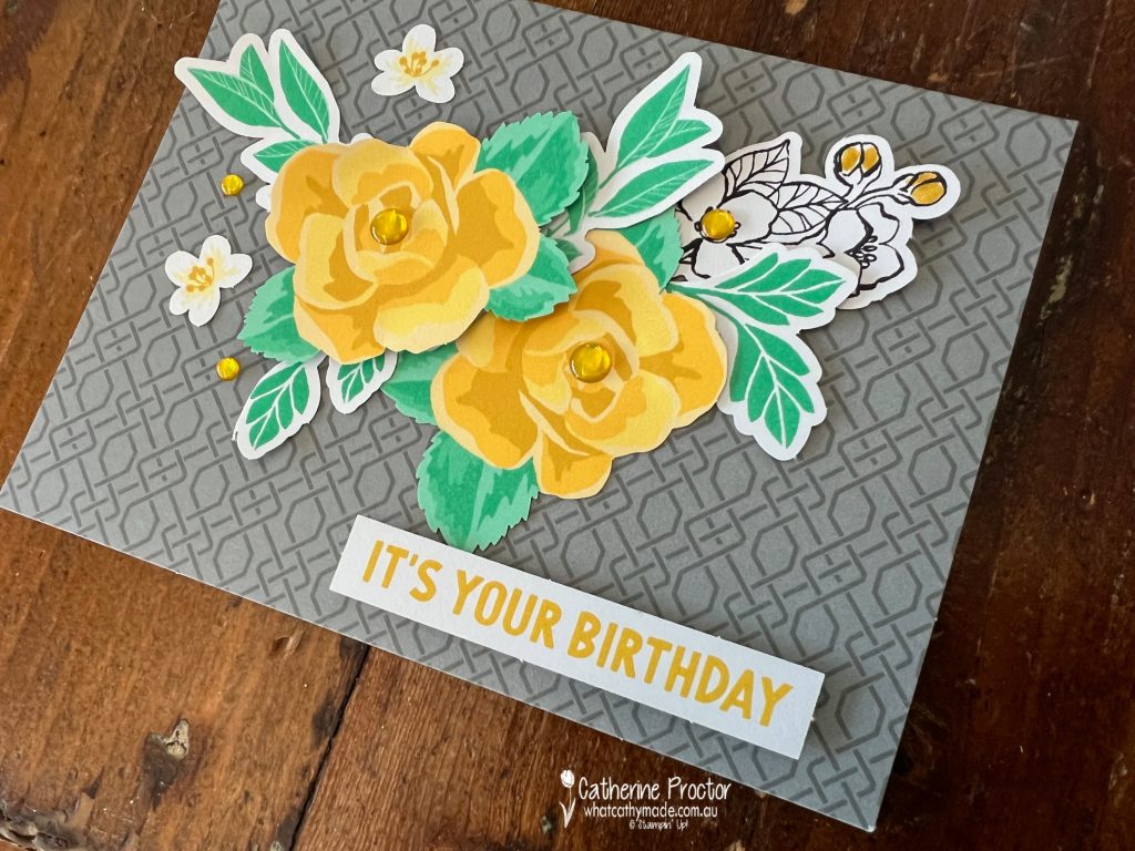
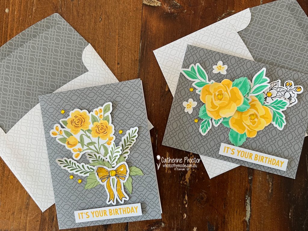
As I was short of time this week I reached for the Fully Flowering Ephemera Pack, the Saying Something Ephemera Pack and the Calming Creek Cards & Envelopes to make two quick cards in under ten minutes!
For both cards my colour combinations were dictated by the colours of the ephemera pieces I selected and the card bases. Card one’s colours are: Basic Black, Crushed Curry, Garden Green, a touch of Pecan Pie and Basic Gray for the card base.
I just love the vintage vibe of these ephemera pieces! I used my Crushed Curry marker to colour in the black and white bow.
A few Daffodil Delight adhesive dots from the Glossy Dots Assortment pack add the add finishing touch to the centre of the bow and around the floral bouquet.
The colour combination for card two is: Basic Black, Crushed Curry, Shy Shamrock and Basic Gray for the card base.
Once again I’ve added Daffodil Delight adhesive dots from the Glossy Dots Assortment pack as the final embellishment.
Both cards use the “It’s your birthday” sentiment from the Saying Something Ephemera Pack to create no stamping cards!
I love that these card bases have matching envelopes too!
Now it’s time to hop in over to our next participant, the lovely Amie McIllroy – I can’t wait to see what Amie has made this week!
If at any time you find a broken link, you can find the complete list of all participants below.
The AWH Colour Creations team will be back next Wednesday 25th September, showcasing Daffodil Delight or you can join us on Monday night for some more Christmas inspiration.
Welcome to week twenty of our Art With Heart 2023-24 Colour Creations blog hop!
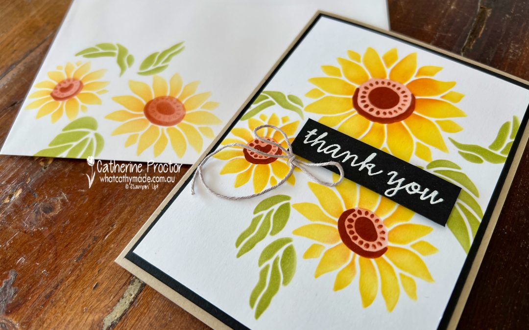
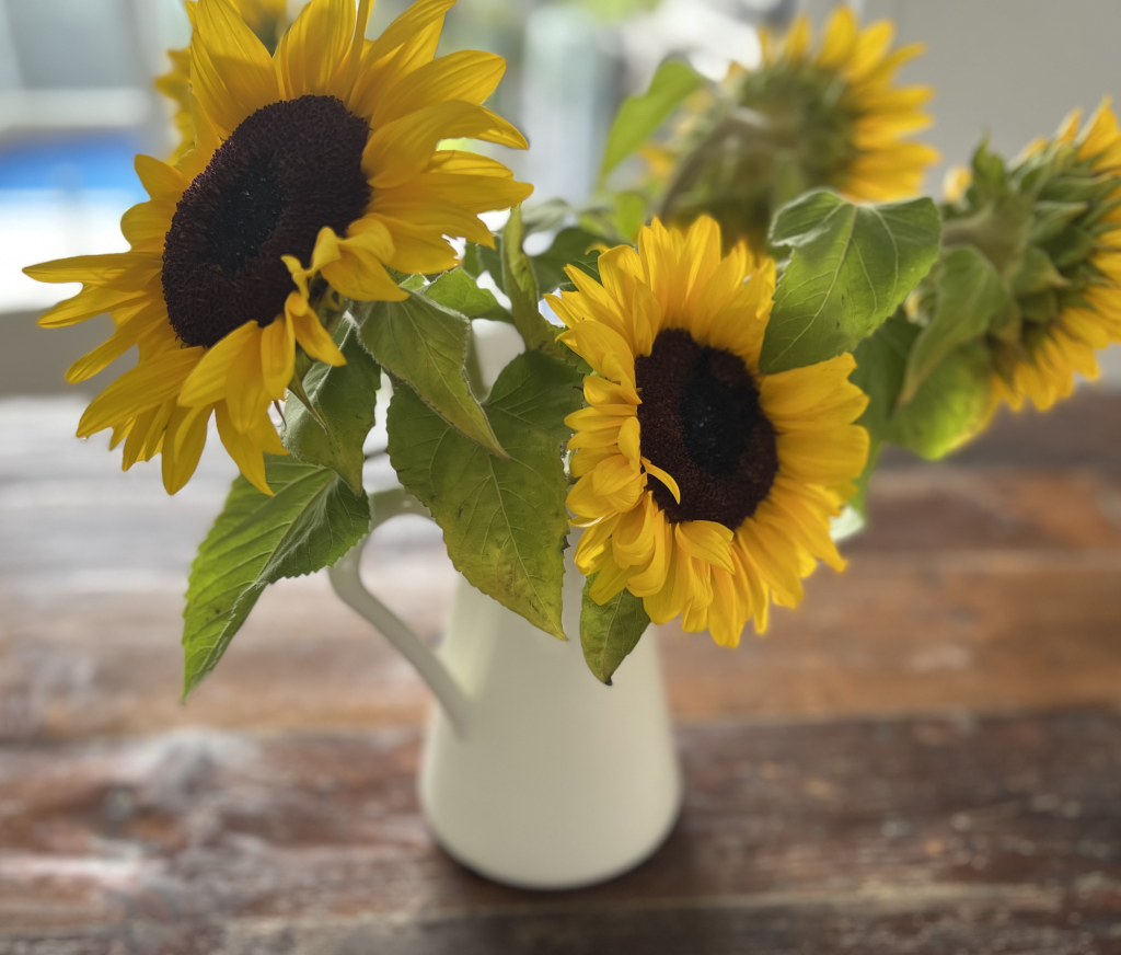
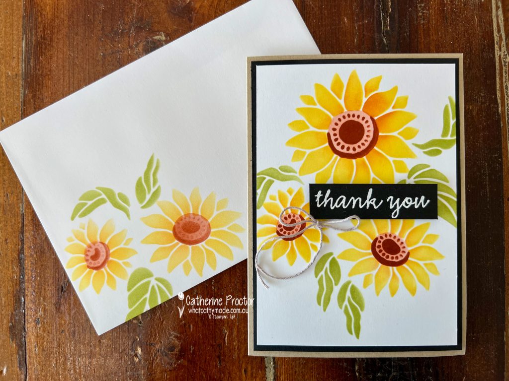
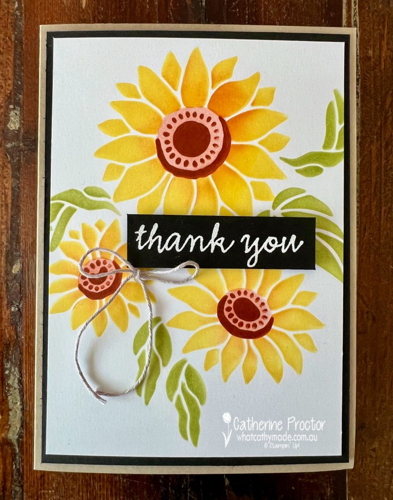
Crushed Curry is such a rich golden yellow, the ideal shade of yellow to use for sunflowers! I bought a bunch of glorious sunflowers this morning to give to my friend Rachel for her birthday.
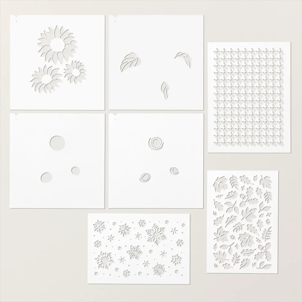
This week was the perfect opportunity to make a sunflower card using the Abundant Beauty Decorative masks. I had overlooked these masks until I started seeing so many gorgeous cards made with them!
You get seven masks in this pack – four masks to create the sunflowers, one snowflake mask, an autumn leaves mask and a “David Jones” argyle patterned mask. At only $18.50, this really has to be the best value product in the entire catalogue!
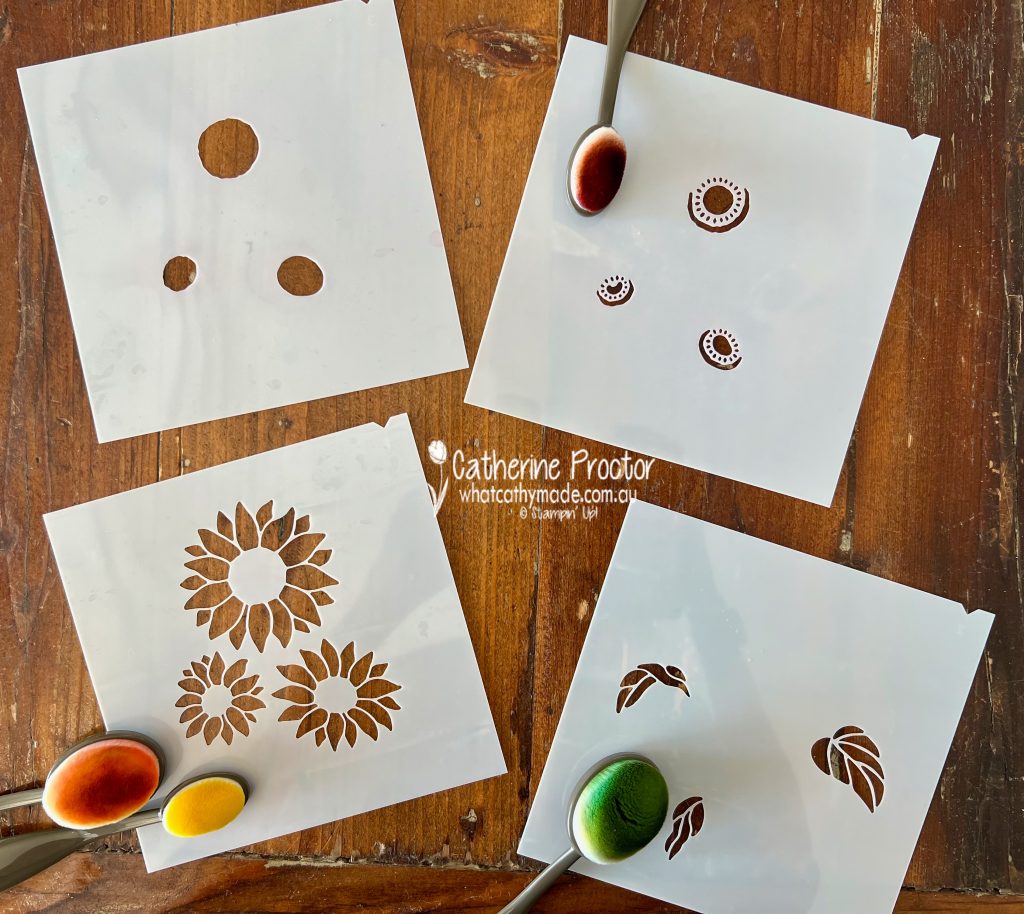
The beauty of masks is that they are so simple and versatile to use.
You can add colour and texture with Embossing Paste and Palette Knives, Classic Stampin’ Ink, Blending Brushes, Sponge Daubers or trace within the mask outlines with Stampin’ Write Markers or even Watercolour Pencils.
I’ve used large and small blending brushes to add colour from my Crushed Curry, Pumpkin Pie, Cajun Craze and Old Olive ink pads. Notches at the top of the masks make for easy alighnment.
Using the ink already on my blending brushes, I also added a couple of sunflowers to the envelope and to the inside of the card.
The “Thank you” sentiment on the front of the card was heat embossed in white onto Basic Black cardstock.
Now it’s time to hop on over to our next participant, the lovely Di Furniss – I can’t wait to see what Di has made this week!
If at any time you find a broken link, you can find the complete list of all participants below.
Welcome to week sixteen of our Art With Heart 2022-23 Colour Creations blog hop! This is a weekly blog hop where we showcase the stunning range of Stampin’ Up! colours in alphabetical order over 12 months and this week we are featuring Crushed Curry, a rich deep yellow in the regal family.
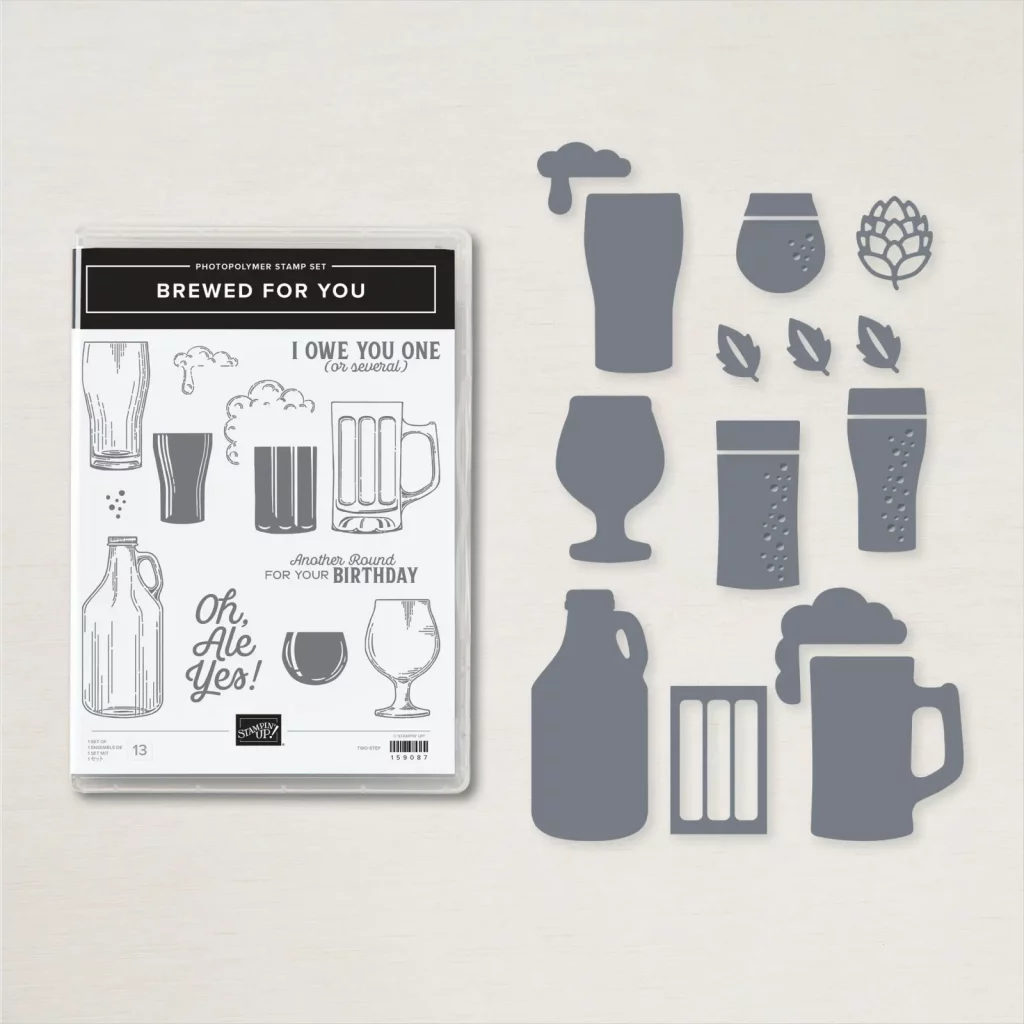
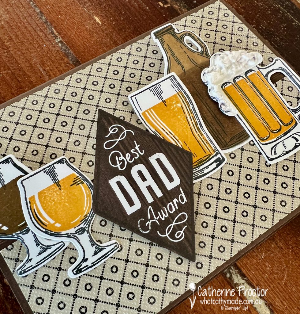
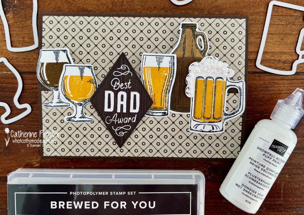
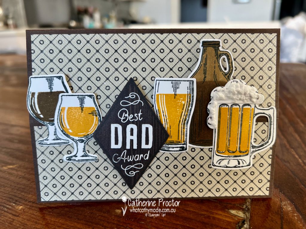
I’ve taken the opportunity this week to make a Father’s Day card for my husband using the Brewed For You bundle and elements from the He’s the Man Suite.
The Brewed For You bundle was a must have purchase for me as my husband and both my sons are quite obsessed with and incredibly knowledgeable about craft beer!
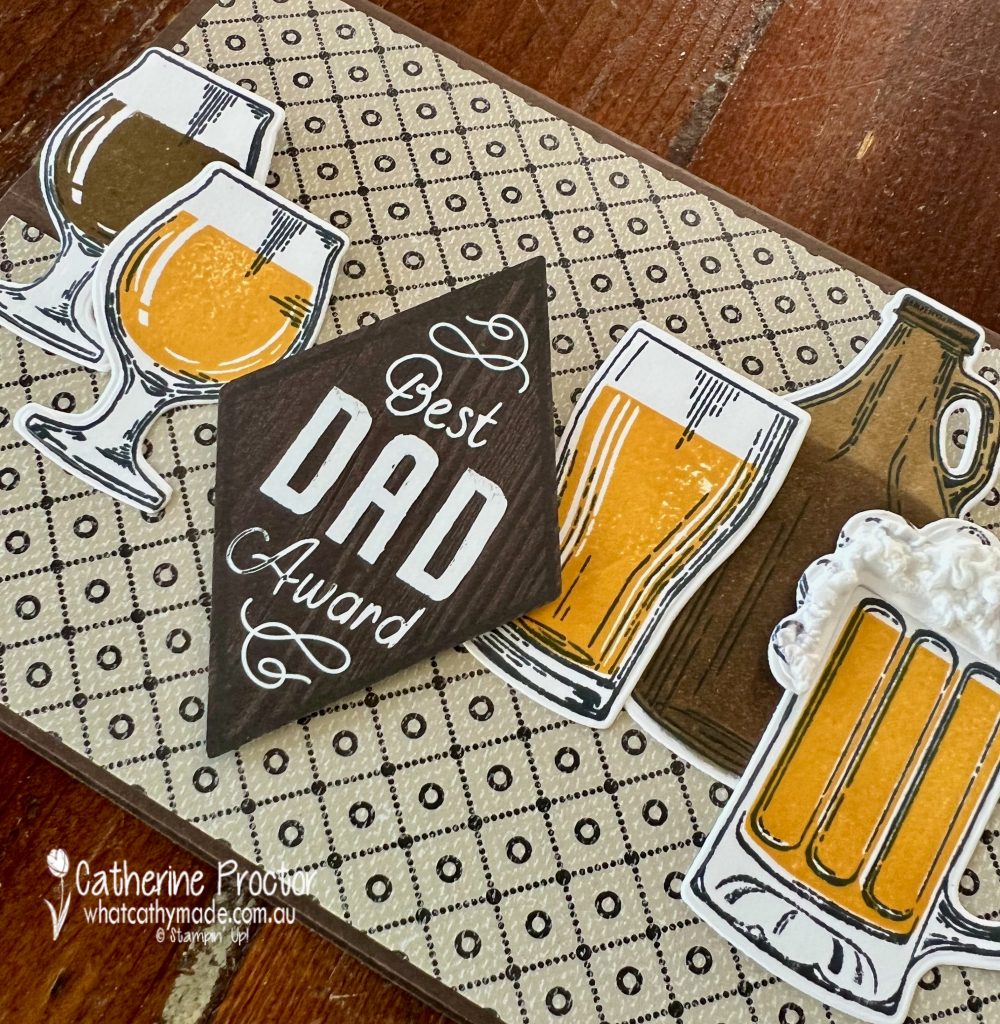
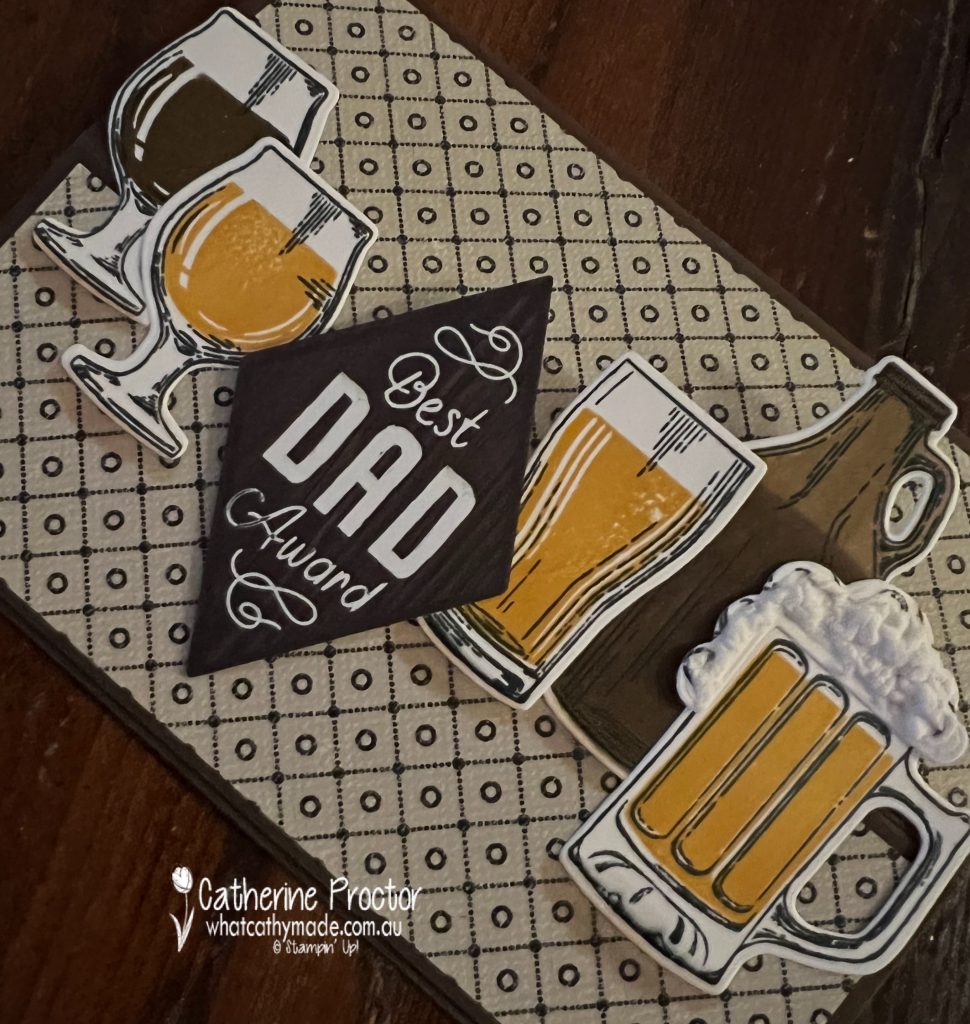
Crushed Curry is such a bold yellow I’ve used it sparingly to colour the IPA beers using the two step stamps included in the Brewed For You stamp set, as well as to layer under the inside sentiment.
The “growler” contains a stout (some of it already poured into the glass on the far left), stamped and coloured with Soft Suede ink and Stampin’ Blends.
A full width easel card allows me to include as many beers as possible – this type of fancy fold is seriously one of the easiest but most effective fancy folds you can make!
Here’s what it looks like when the card is closed. At first glance it appears to be just a normal card.
But when you open it up it looks like this!
And this is what it looks like from the side. This is a great card for display.
Full Width Easel Card Instructions
Make a card base of any size – today I’ve used half an A4 sheet of cardstock, folded in half
Measure the halfway point of the front of the card base and score across this halfway point
Fold this score line and then decorate the card inside and out with DSP and cardstock
To make the “easel” stand, use dimensionals to attach a sentiment to the middle of the inside of the card
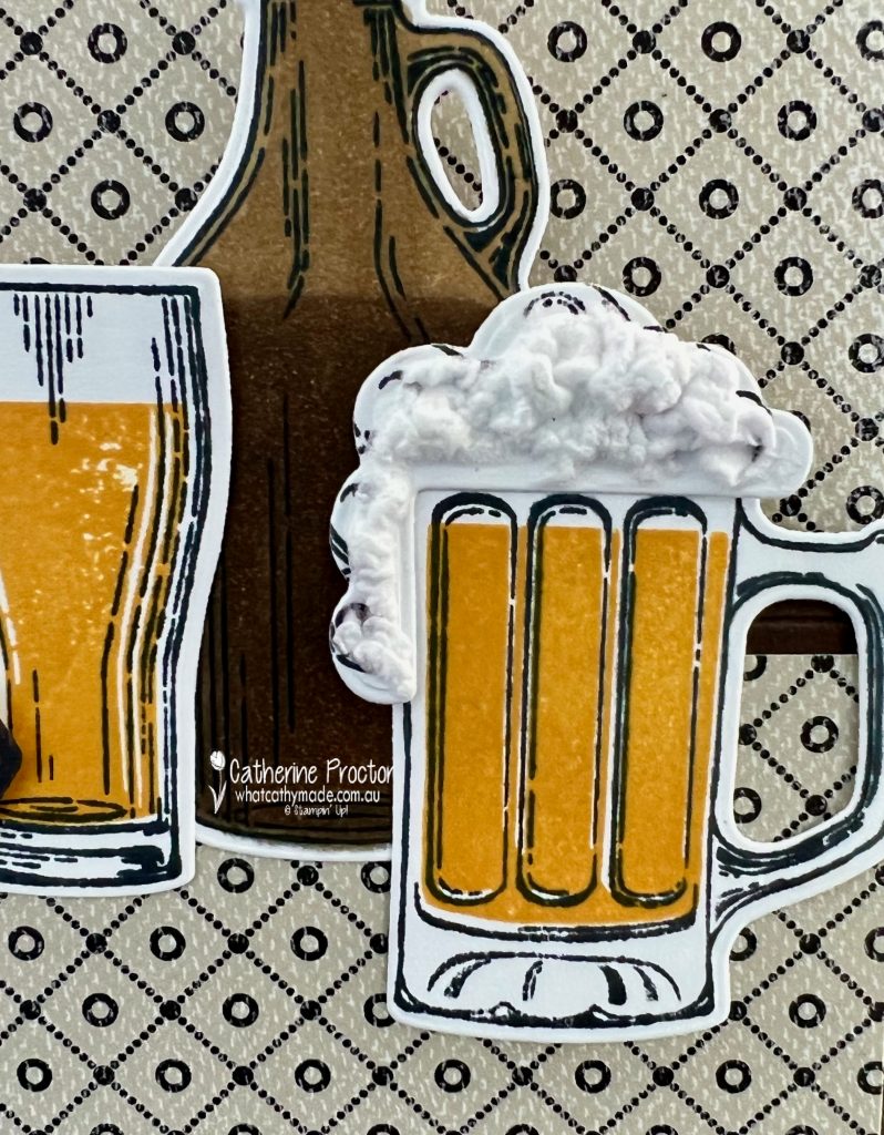
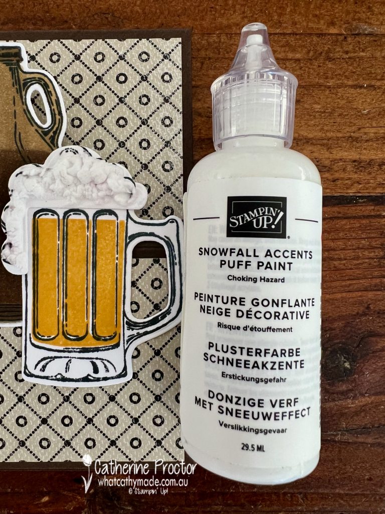
Creating Beer Froth
The froth on the beer is created using the Snowfall Accents puff paint. Make sure you use a heat tool to froth it up as it dries.
I only added froth to one beer glass because most craft beers don’t really have a “head” compared to the more mainstream beers.
I’ve used all of the different glass dies for the beers on this card as we have an entire shelf in the kitchen cupboard dedicated to different kinds of beer glasses! And yes, my wine fridge has also been turned into a beer fridge!
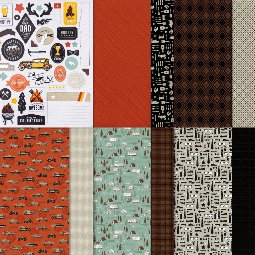
The sentiment on the front of the card is a die cut image from the He’s the Man DSP. I’ve also used a sheet of the He’s the Man DSP to decorate the front of the card – I love the vintage vibe of this DSP.
The sentiment inside that forms the easel mechanism is from the He’s All That Stamp Set, die cut using the Stitched Rectangles dies and mounted onto the card using dimensionals.
I’ve just added a shadow to the bottom of the beer glasses in this last photo, using the Ivory Stampin’ Blend. I think it really grounds the beer glasses onto the card.
Now it’s time to hop on over to our next participant, the lovely Ros Davidson – I can’t wait to see what Ros has made this week!
If at any time you find a broken link, you can find the complete list of all participants below.
Welcome to week 14 of our 2021-22 Colour Creations blog hop! Tonight we are showcasing Crushed Curry, a rich bold yellow from the Regals colour collection.
Do you have any colours that you rarely use, but when you do, you wonder why you don’t use them more often? Crushed Curry is one of those colours for me.
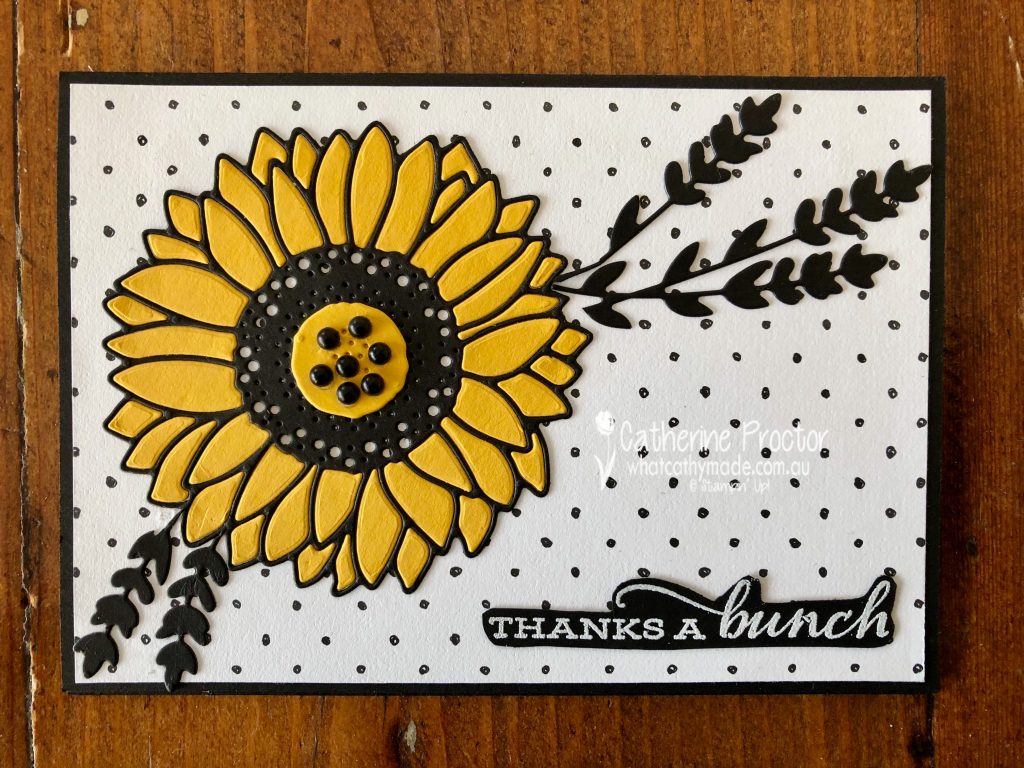
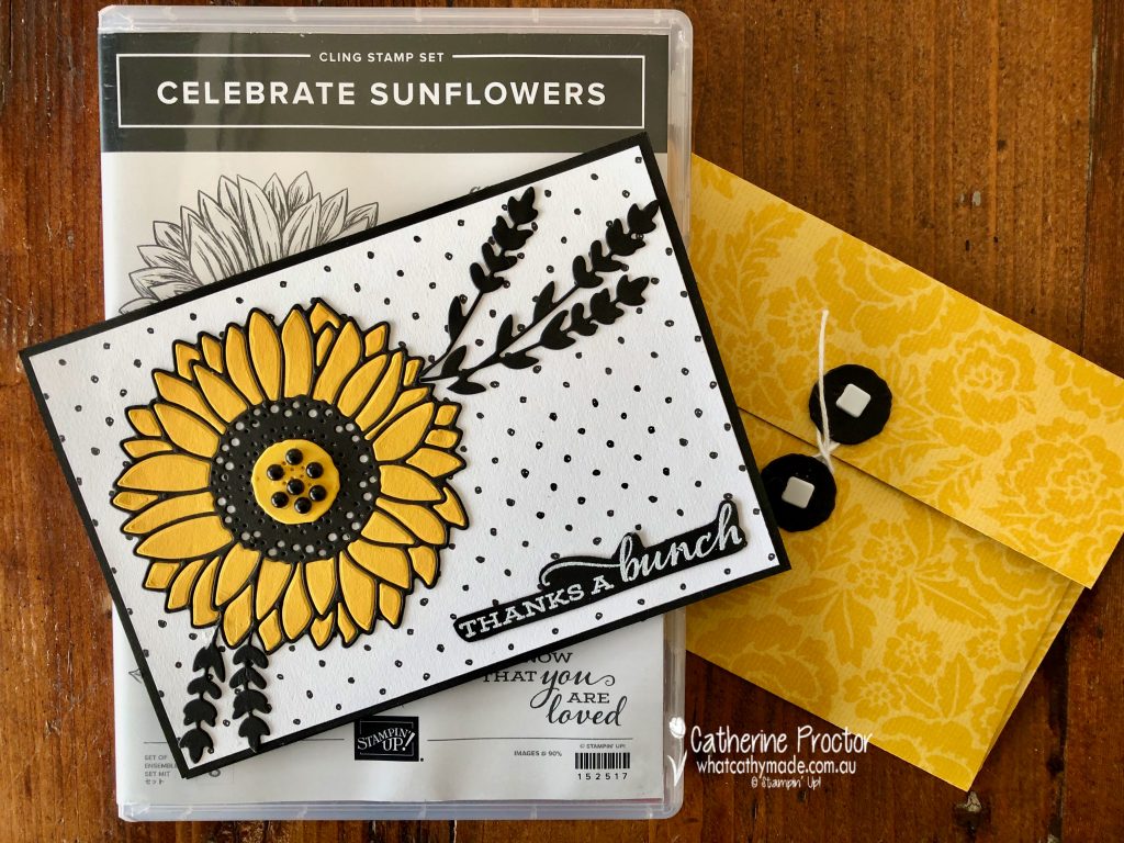
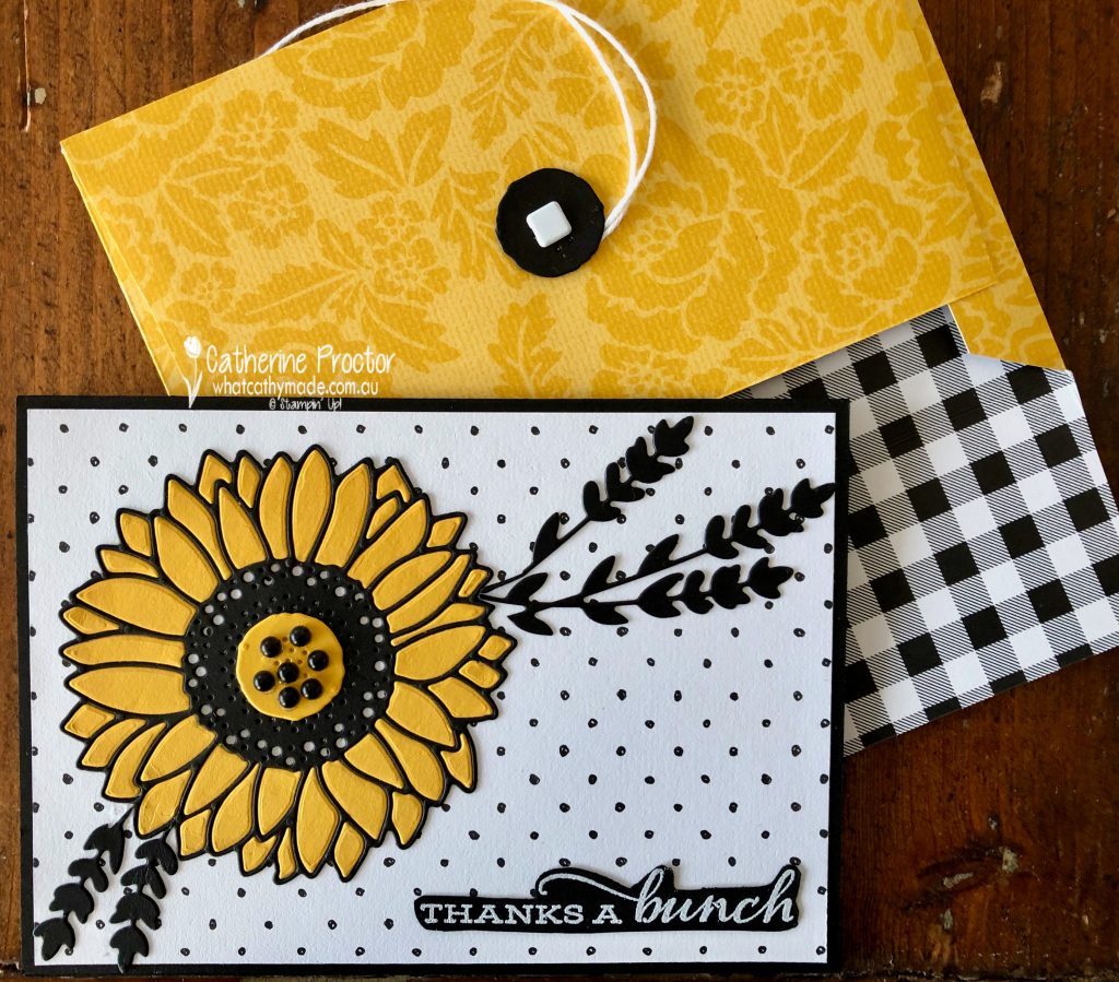
Crushed Curry is so vibrant, it immediately draws your eye and it demands your attention. And as today is the first day of spring here in Australia, I decided to celebrate the arrival of spring with a Crushed Curry sunflower card.
This card uses a favourite technique of mine: the die inlay technique. I highly recommend die inlay to anyone who enjoys doing jigsaws. It’s not a technique for fast mass production but it’s not hard to do either, and the extra time it takes is so worth it for the effect it gives.
Did you notice the background spotted DSP? It’s from the FREE SALE-a-bration Beautifully Penned 12″ x 12″ Designer Series Paper.
Once you’ve layered the spotty DSP onto the Basic Black card base, it’s time to create the die inlay sunflower. The die inlay technique works best if you adhere a piece of adhesive sheet to the back of the Crushed Curry Cardstock and Basic Black Cardstock BEFORE you die cut them.
After you’ve die cut the Crushed Curry Cardstock be careful to keep all of the die pieces together on the cutting platform and use your Take Your Pick Tool to remove the adhesive sheet from the back of the petal pieces and place them into the correct position.
The “Thanks a Bunch” sentiment from Celebrate Sunflowers has been stamped in Versamark and heat embossed in white emboss powder before fussy cutting it out.
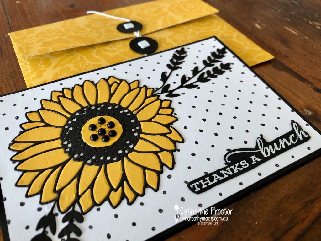
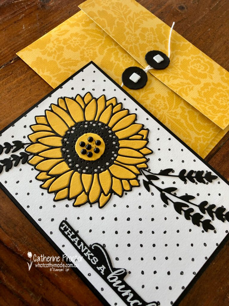
The other great pop of Crushed Curry colour is the handmade matching envelope. Isn’t this DSP pattern just gorgeous? It’s from a host set called Pattern Party Designer Series Paper, which has black and white patterns on one side and vibrant colours on the other side.
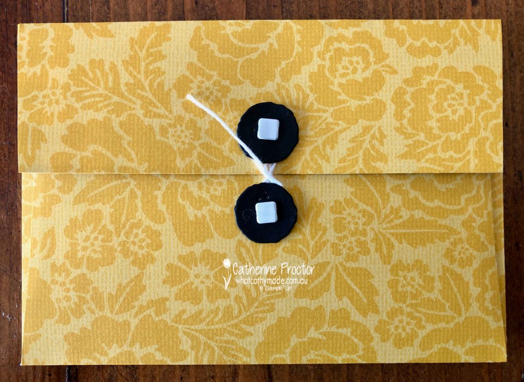
The envelope closure was made using the same die I used for the centre of the sunflower. I cut two of these dies in Basic Black and attached them to the envelope with white square brads. White bakers twine twists around the closures to open and close the envelope.
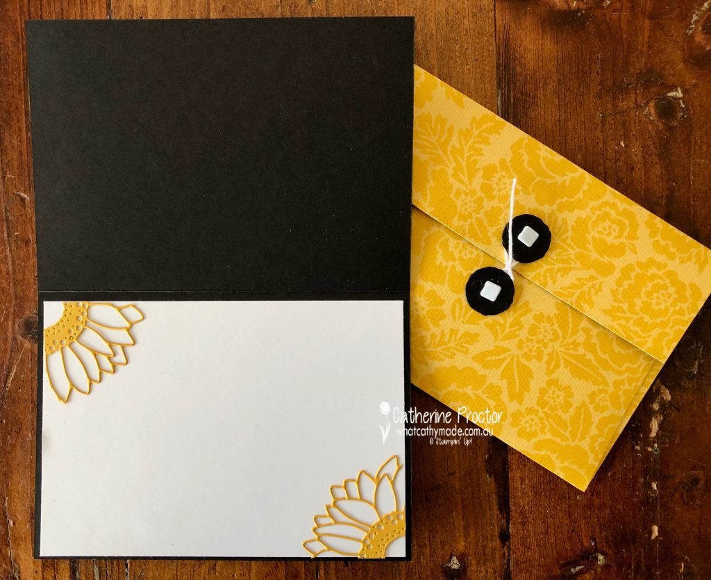
The inside of the card was easy to decorate with leftover Crushed Curry die pieces.
Now it’s time to hop on over to our next participant, the very talented Caroline Manwaring. I can’t wait to see what she’s made this week!
If you find a broken link or have come to this blog hop from a different entry point, you can view the the full list of participants below:
Welcome to week 14 of the Art With Heart Colour Creations Blog Hop!
This week we are showcasing one of the regals colours: Crushed Curry.
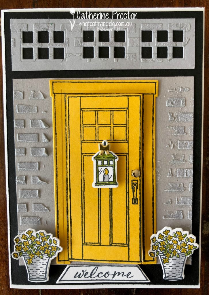
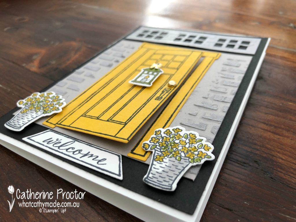
I love this vibrant, rich yellow so much, I painted the front door of my home in a shade of paint very close to Crushed Curry, which is why I think this colour makes me feel happy.
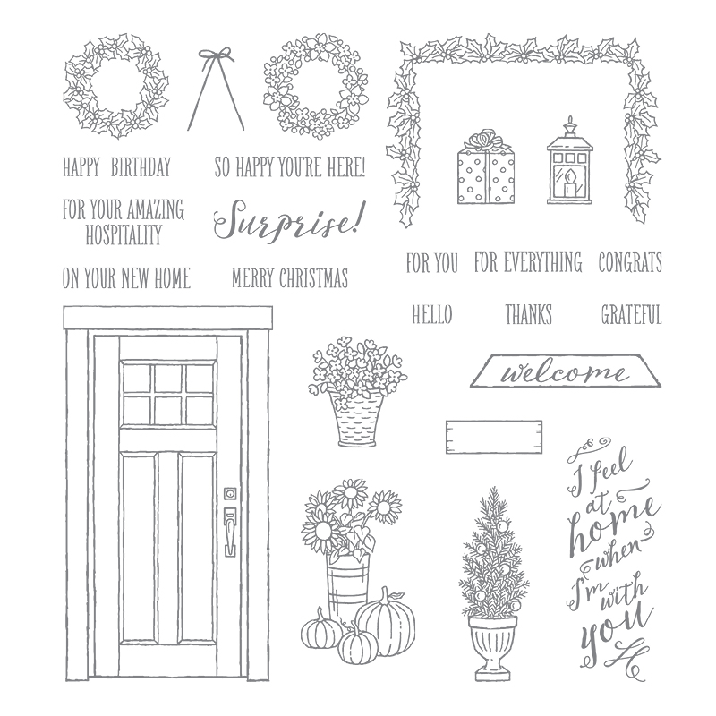
So it really was an absolute no-brainer which stamp set I would use to showcase this gorgeous colour. The “At Home With You” stamp set with its matching At Home Framelits is one of my all-time favourite Stampin’ Up! bundles.
.
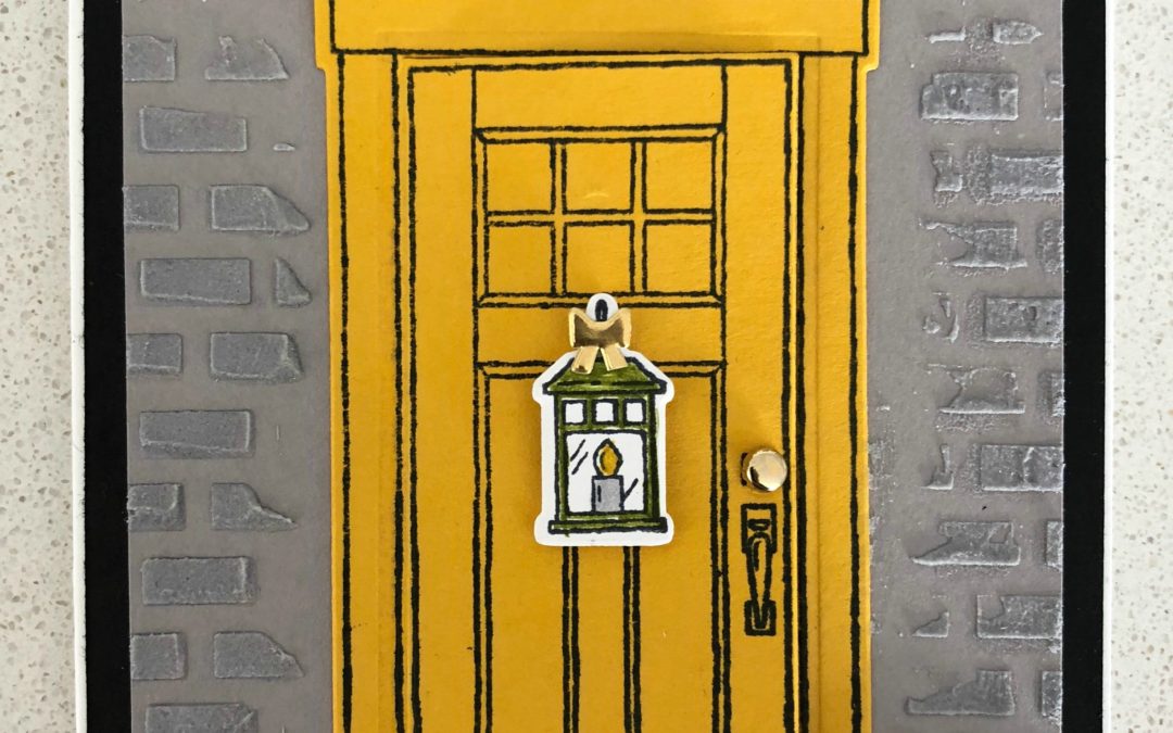
I know from first-hand experience that Crushed Curry looks amazing with black and white (as well as all different shades of grey) because these are the colours of my home! So my design for my card this week was inspired by the colours of the entrance porch to my home.
Wouldn’t it be lovely if the entrance to my house actually looked like this all the time?
Sadly, as I live with 3 surfers (who all play soccer) and a large dog, it is more of a jumble of wetsuits, surfboards, soccer boots, wet towels and yet more wetsuits…my front door only ever looks like this when we are having people over at Christmas time!!!!
And no, I’m not going to spoil my blog with an actual photo of my front door as it looks today (and 364 days of the year!). Instead, let’s take a closer look at the gorgeous little details in this stamp set that really make this card.
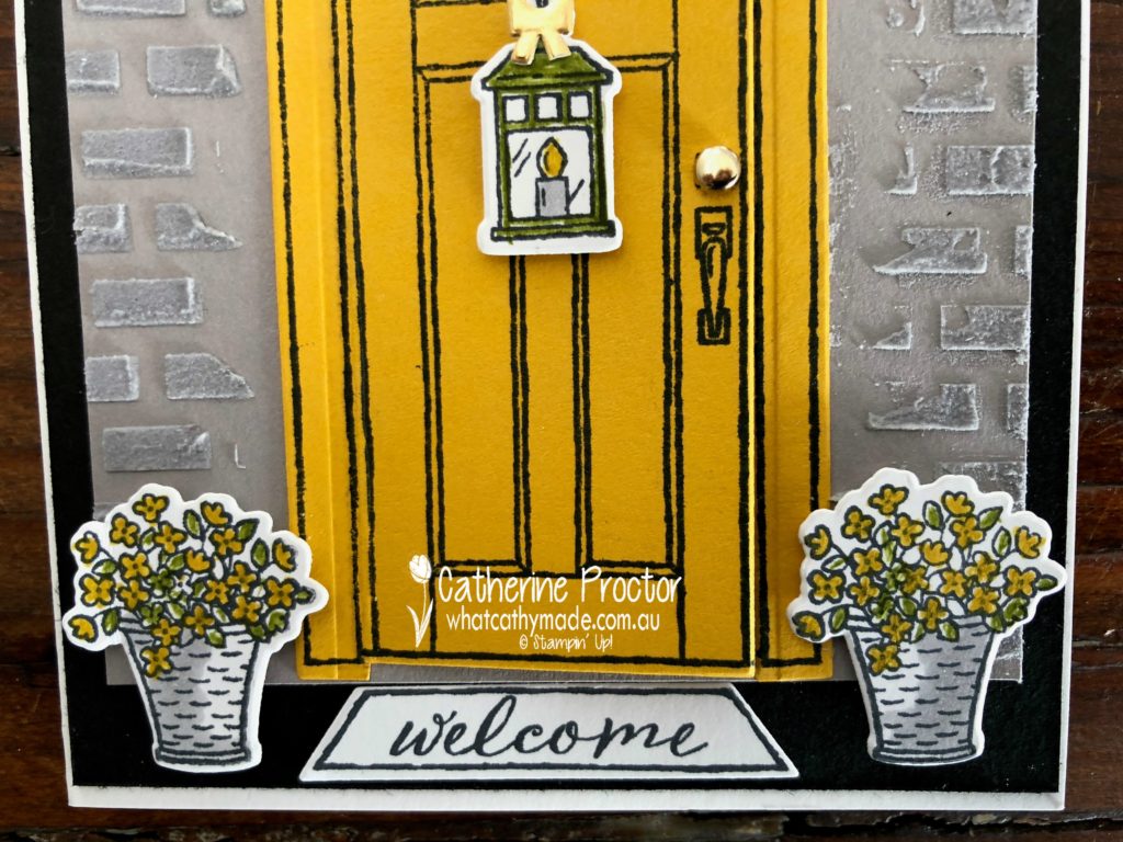
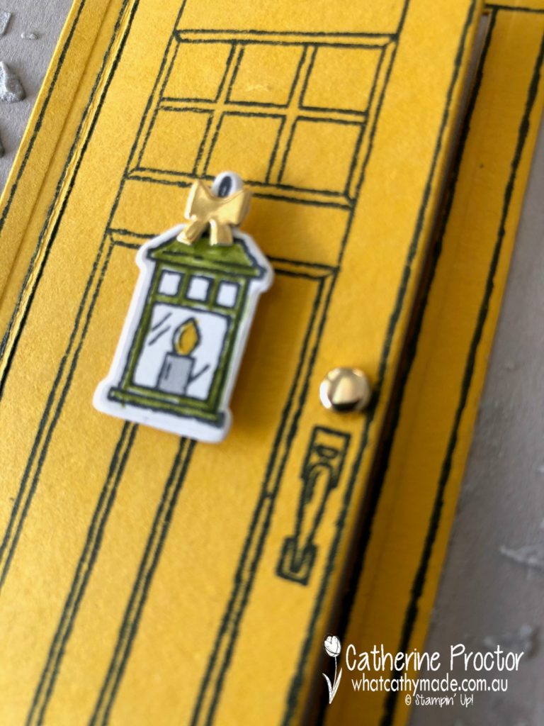
I coloured in the flowers in the flower pots with my Crushed Curry and Old Olive markers, then I used my Light Smoky Slate Blender Pen to shade the flower pot. The Crushed Curry and Old Olive markers and Light Smoky Slate Blender Pen were also used to colour the lantern and I couldn’t resist using a little gold foil bow (from the forthcoming Farmhouse Framelits dies in the Holiday Catalogue) to add that final touch of bling. The doorknob is made by using the smallest gold metallic brad.
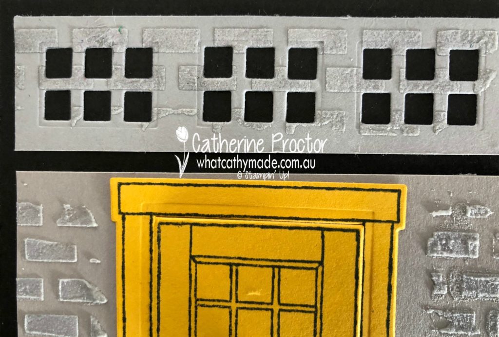
The grates above the door add architectural interest (these grates are on my home but not above the front door) and I created my grates using a die that is actually designed to cut out the glass panels on the front door.
Although we have actually rendered over the bricks in our house I couldn’t resist using my embossing paste and the brick stencil to add a touch of texture to my card. I coloured the paste with some Smoky Slate re-inker, even though I’ve used Gray Granite cardstock for my wall. I really like how these two neutral colours look together.
How cute are the “welcome” mat and the “I feel at home when I’m with you” sentiment? It would make me so very happy to receive a card from someone when these words on it.
And this colour combination certainly makes me feel right at home.
To see what the rest of the team have made click on the links below.


")
")
")

 Specialty Designer Series Paper")


 .
.