Confession time… this week didn’t quite go to plan 😅
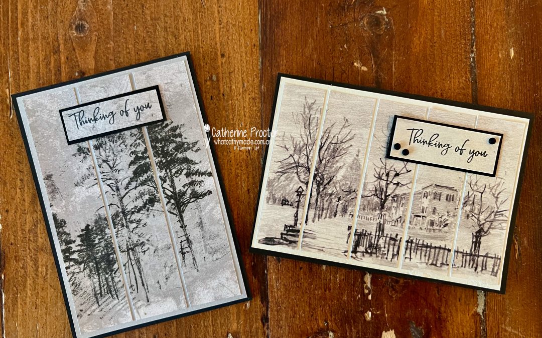
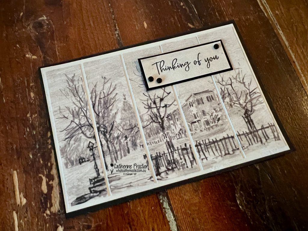
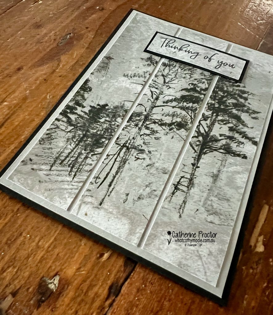
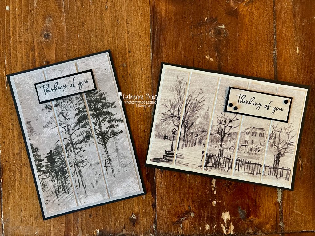
I finished my first card and thought “love it!”… then realised I hadn’t actually used Smoky Slate at all. Oops. That one ended up using a DSP that featured Gray Granite and Basic Beige!
So… take two!
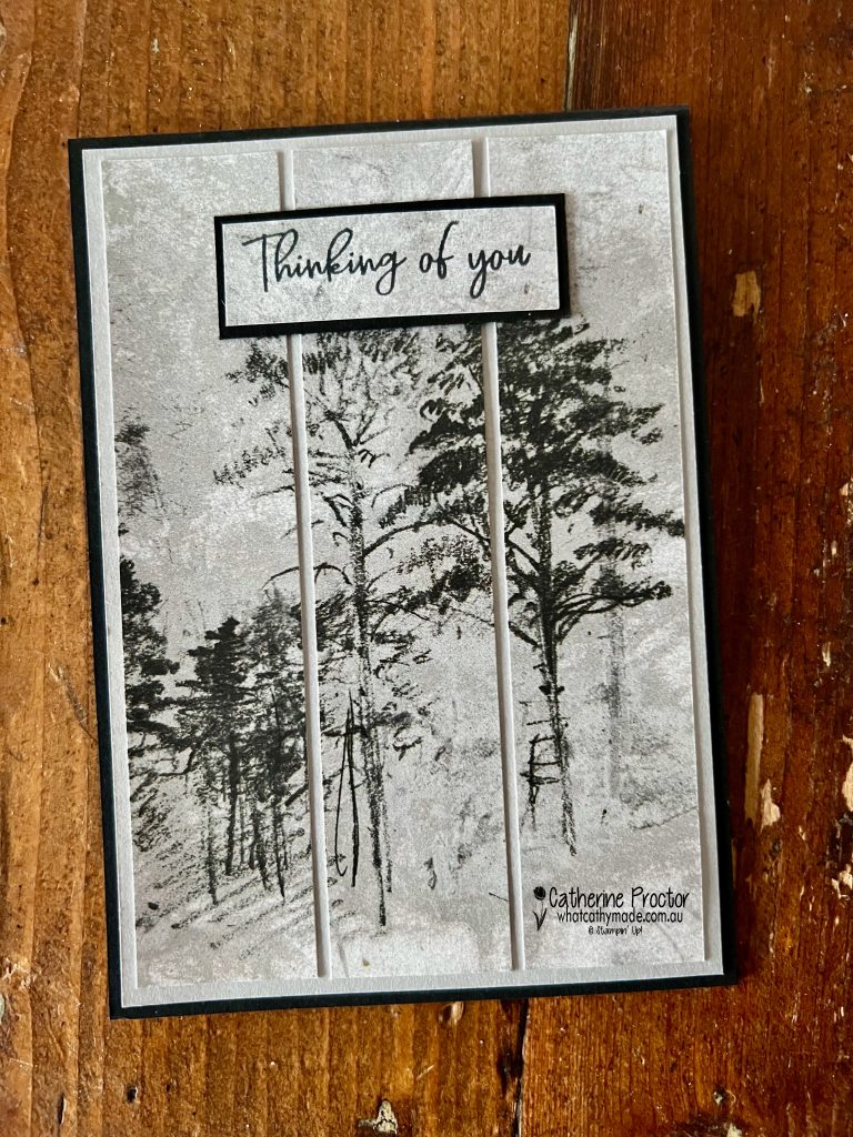
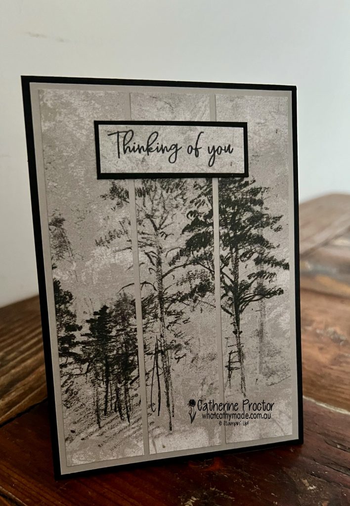
Card two brings it back to the colour we are showcasing this week: Smoky Slate. The DSP design combines Smoky Slate with Basic Gray.
I used the Beautiful Gallery papers on both cards to create simple strip layouts, layered on a simple card stock layer and Basic Black card bases for that rich, moody contrast.
Just trim, space and layer. Sometimes the easiest techniques create the most striking results.
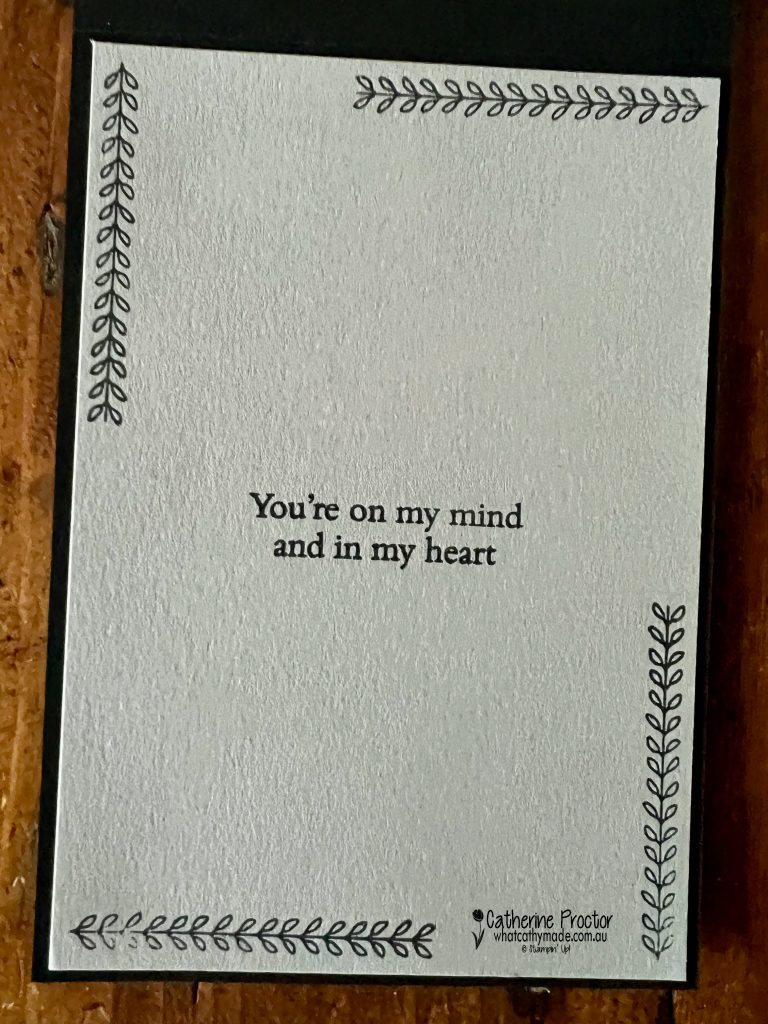
Both cards feature the “Thinking of you” sentiment from the Friendly Foliage Stamp Set on the front of the card, with a matching sentiment and image inside (also from the Friendly Foliage Stamp Set) to tie everything together.
These artistic, slightly moody landscapes felt perfect for sympathy cards. They feel calm, reflective and perfect for sympathy or thinking of you cards.
And sometimes a happy mistake just means you get to make two cards instead of one!
Take a look at some more Smoky Slate inspiration on our Insta Hop!
Our blog hop is now an Instagram hop but the good news is that you don’t need to have an Instagram account to view all of the other projects!
Simply copy any of the Insta handles below into a new search engine window to follow the Instagram hop at any point.
Next in our Hop is Kate @craftwithkate. Be sure to check out her gorgeous project/s.
The full list of this week’s InstaHop is listed below:
Kate @craftwithkate
Helen @apaperparadise
Kirsty @crafty.littlemiss
Cathy @whatcathymade – you are here.
Thank you for joining me for Week 48 of Colour Creations. We’ll be back next Wednesday when we are showcasing Soft Seafoam I hope you can join us then.
Welcome to week 46 of the Art With Heart Colour Creations Blog Hop!
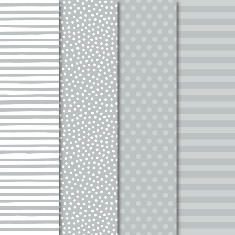
Our colour this week is a very light neutral colour: Smokey Slate.
Because these neutrals go with every colour I thought it would be a perfect colour to showcase our retiring In-Colours in a series of cards that use other retiring products too.
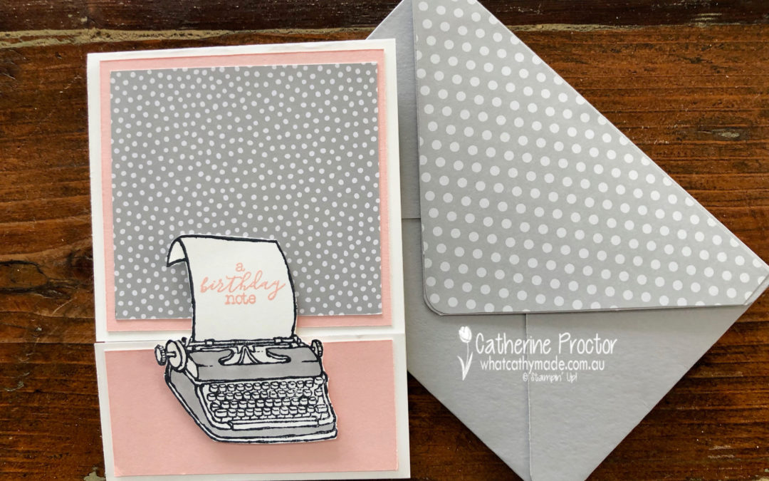
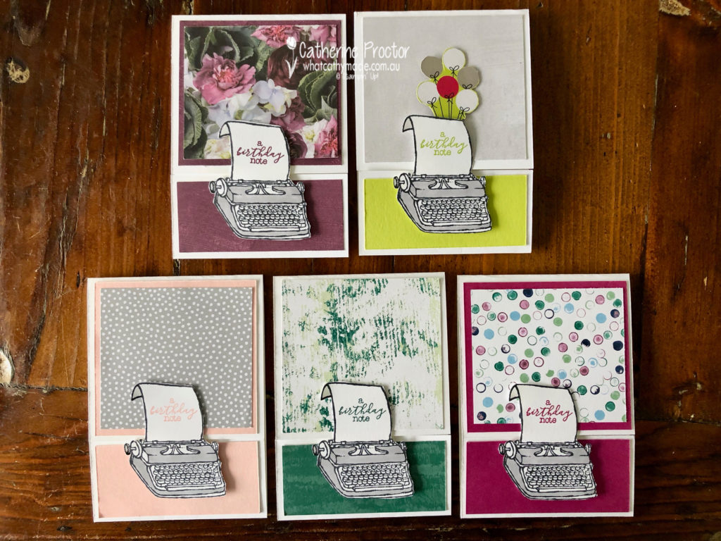
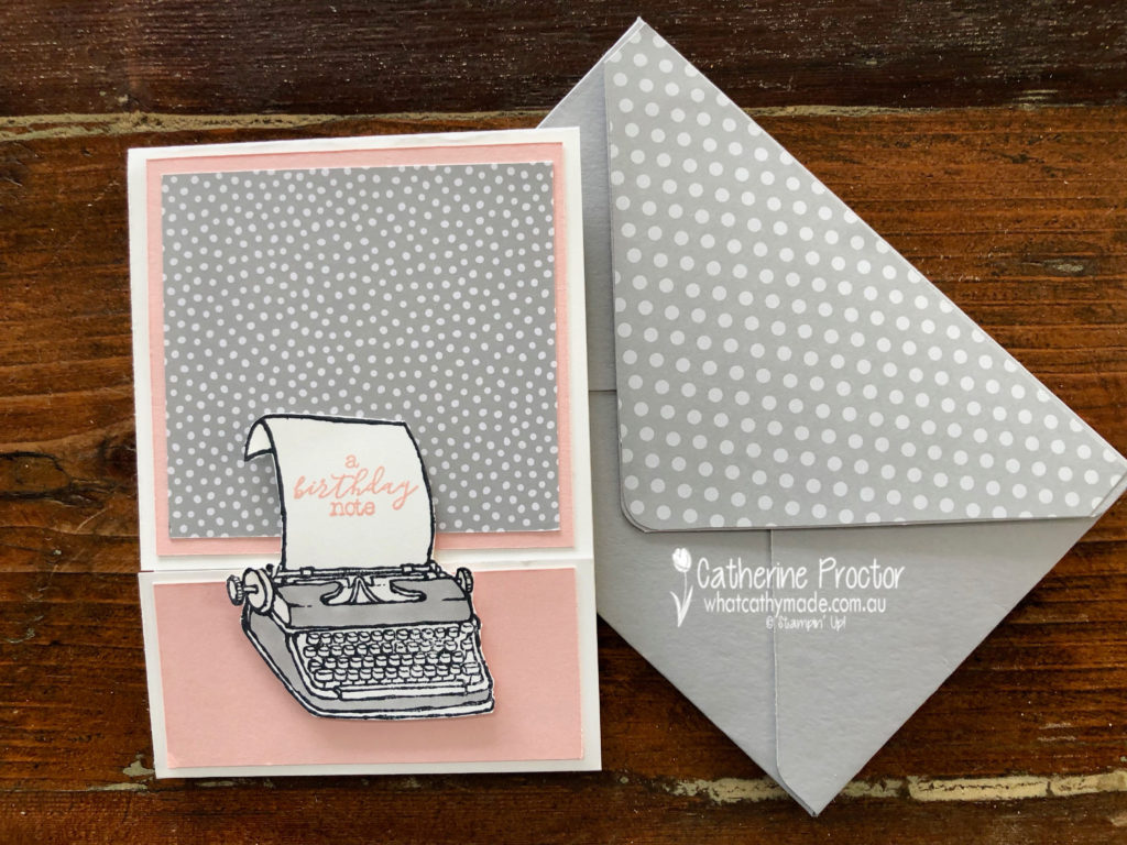
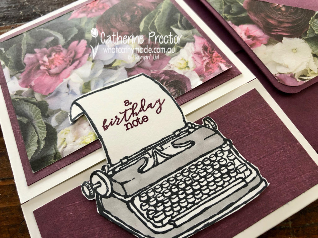
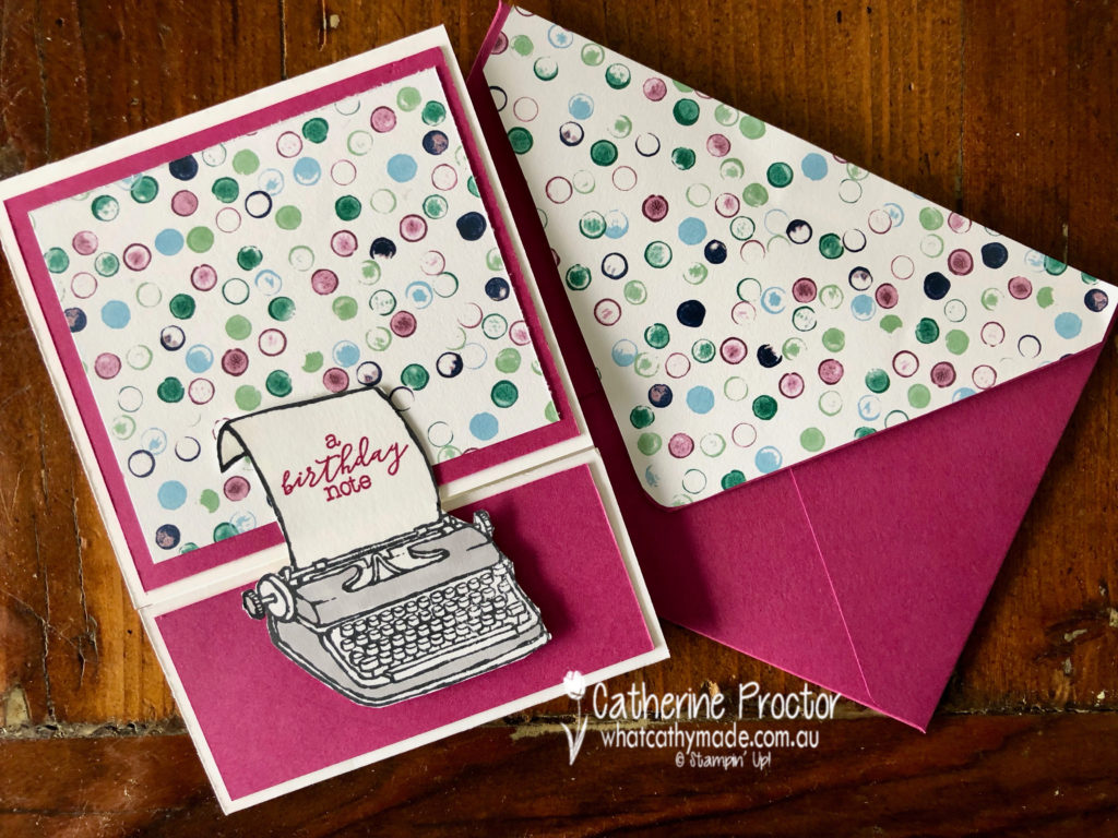
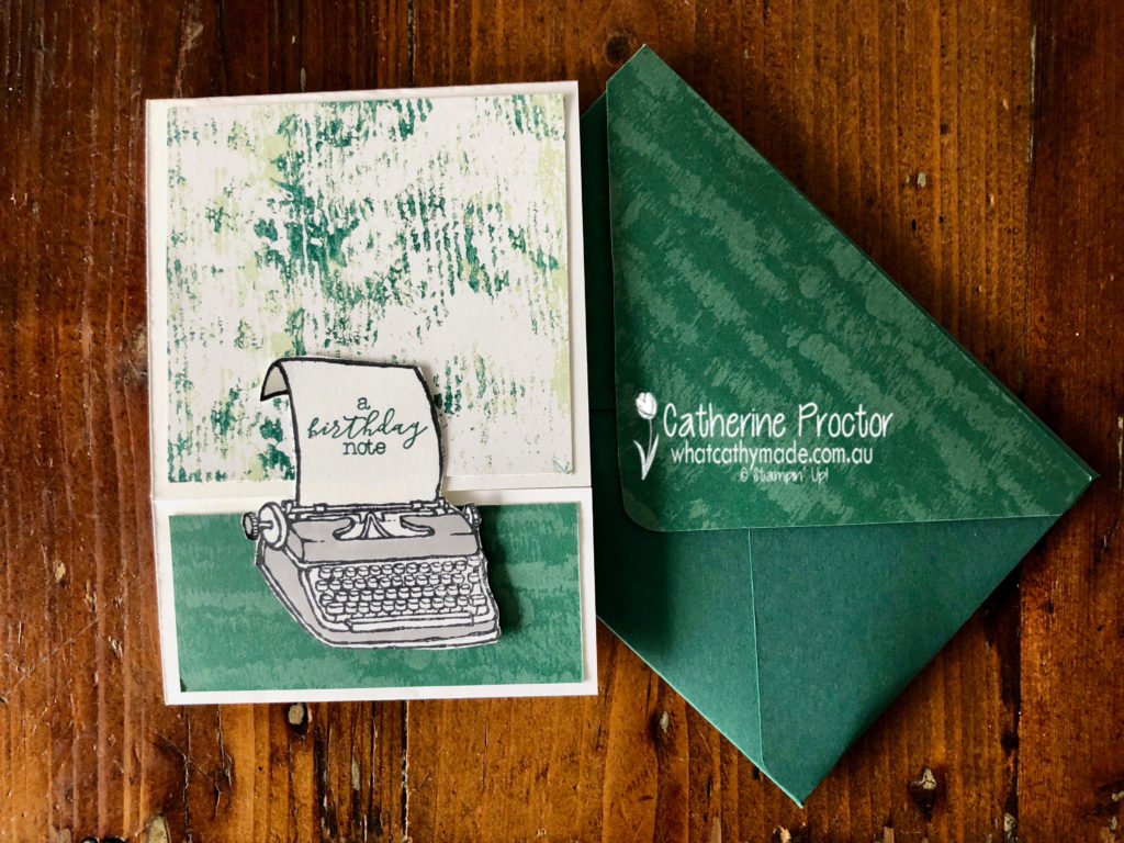
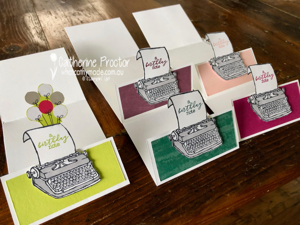
I like to call this set my typing pool!
I decided to use the delightful “P.S. You’re the Best stamp set” as it was just perfect for my friend Bruce. I’m going to his 50th birthday party this weekend and he is an author and currently writing his next book.
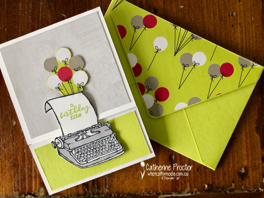
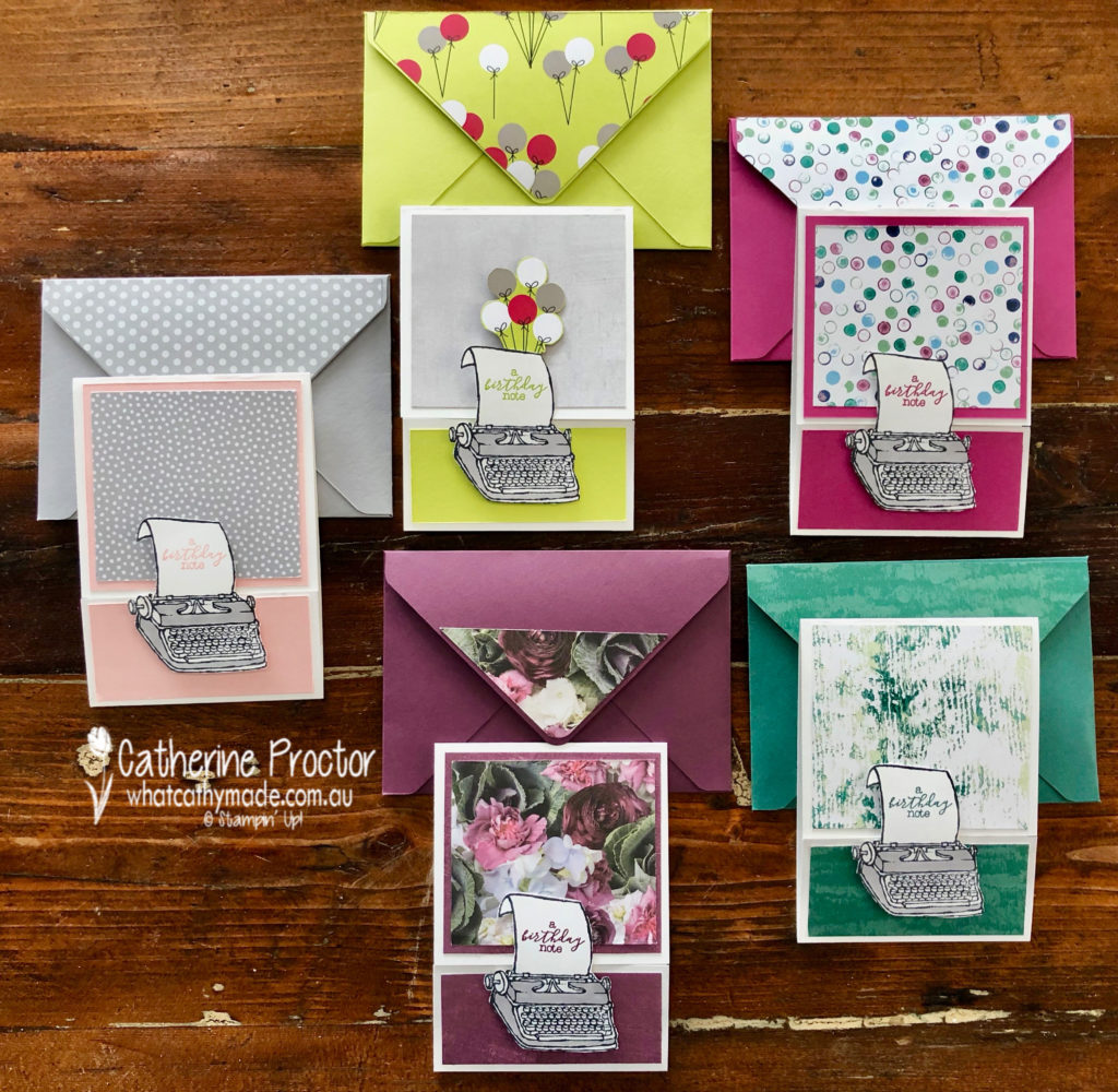
I think I’ll give Bruce the Lemon-lime twist card with the festive balloon paper from the Broadway Bound Designer Series Paper.
What I really like about this stamp set is that you can use it with any colour to make either male or female cards. The Powder Pink card is very feminine.
The Fresh Fig card is also very feminine, using the Petal Promenade DSP
The Berry Burst card and the Tranquil tide card could work for men or women and both use the Tranquil Textures DSP.
My favourite thing about my typing pool cards is the way they open…it is a type of fancy fold but I’m not sure what it’s called!
Another fantastic retiring product I used was the Envelope punch board to make a matching envelope for each card.
To see what the rest of the team have created, click on the links below.
To purchase any of the products I used in this project you can shop with me here. Or if you’d like me to post you your very own copy of any of the Stampin Up! catalogues or find out about more about Stampin’ Up! contact me .
We will be back again next week showcasing a subtle colour: So Saffron. We hope you can along with us then.