Art With Heart Colour Creations Blog Hop: Week 14 Crushed Curry
Welcome to week 14 of the Art With Heart Colour Creations Blog Hop!
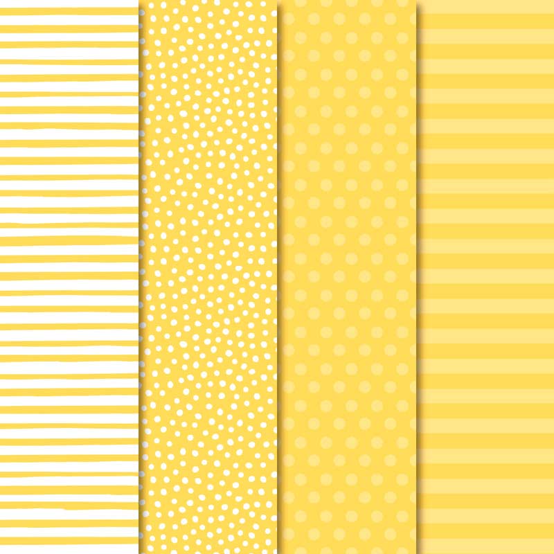
This week we are showcasing one of the regals colours: Crushed Curry.

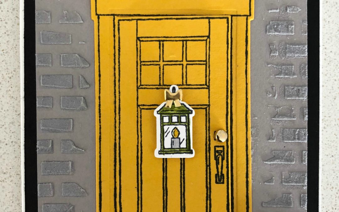
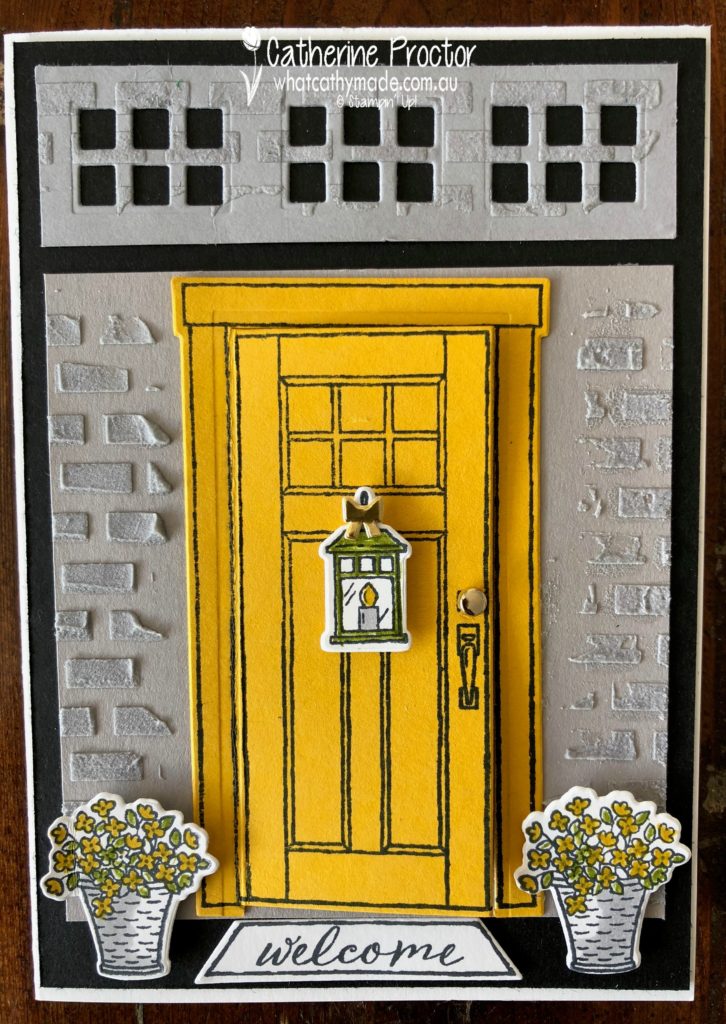
I love this vibrant, rich yellow so much, I painted the front door of my home in a shade of paint very close to Crushed Curry, which is why I think this colour makes me feel happy.
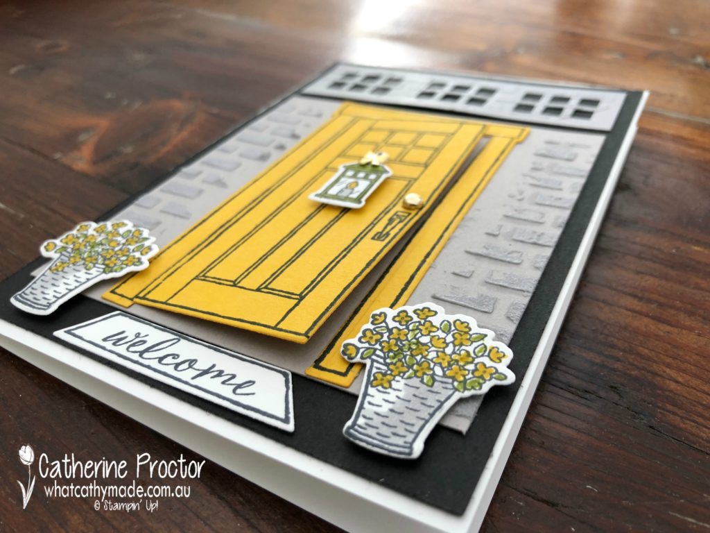
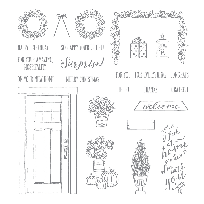
So it really was an absolute no-brainer which stamp set I would use to showcase this gorgeous colour. The “At Home With You” stamp set with its matching At Home Framelits is one of my all-time favourite Stampin’ Up! bundles.
 .
.
I know from first-hand experience that Crushed Curry looks amazing with black and white (as well as all different shades of grey) because these are the colours of my home! So my design for my card this week was inspired by the colours of the entrance porch to my home.
Wouldn’t it be lovely if the entrance to my house actually looked like this all the time?
Sadly, as I live with 3 surfers (who all play soccer) and a large dog, it is more of a jumble of wetsuits, surfboards, soccer boots, wet towels and yet more wetsuits…my front door only ever looks like this when we are having people over at Christmas time!!!!
And no, I’m not going to spoil my blog with an actual photo of my front door as it looks today (and 364 days of the year!). Instead, let’s take a closer look at the gorgeous little details in this stamp set that really make this card.
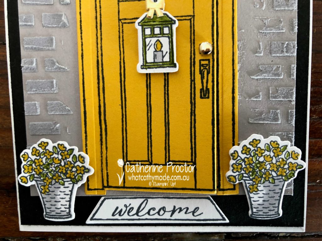
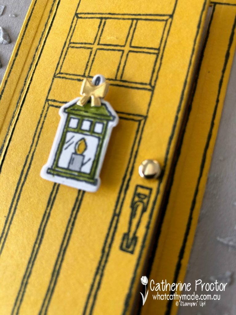
I coloured in the flowers in the flower pots with my Crushed Curry and Old Olive markers, then I used my Light Smoky Slate Blender Pen to shade the flower pot. The Crushed Curry and Old Olive markers and Light Smoky Slate Blender Pen were also used to colour the lantern and I couldn’t resist using a little gold foil bow (from the forthcoming Farmhouse Framelits dies in the Holiday Catalogue) to add that final touch of bling. The doorknob is made by using the smallest gold metallic brad.
The grates above the door add architectural interest (these grates are on my home but not above the front door) and I created my grates using a die that is actually designed to cut out the glass panels on the front door.
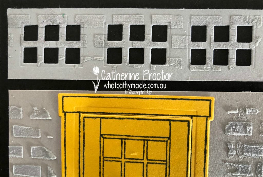
Although we have actually rendered over the bricks in our house I couldn’t resist using my embossing paste and the brick stencil to add a touch of texture to my card. I coloured the paste with some Smoky Slate re-inker, even though I’ve used Gray Granite cardstock for my wall. I really like how these two neutral colours look together.
![]()
How cute are the “welcome” mat and the “I feel at home when I’m with you” sentiment? It would make me so very happy to receive a card from someone when these words on it.
And this colour combination certainly makes me feel right at home.
To see what the rest of the team have made click on the links below.
Catherine Proctor⇐you are here
Thanks for hopping along with us today. To purchase any of the products I used in this project you can shop with me here.
Next Tuesday we’ll be showcasing another lovely yellow, one of the brights: Daffodil Delight. We hope you can hop along with us all then!
Or if you’d like me to post you your very own copy of the 2018-2019 annual catalogue or find out about more about Stampin’ Up! contact me.