Welcome to week twenty six of our Art With Heart 2023-24 Colour Creations blog hop!
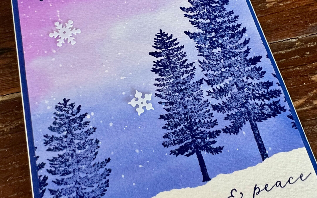
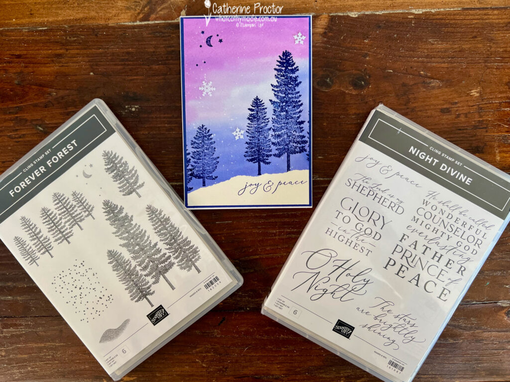
This week we are showcasing Gorgeous Grape, a vibrant purple colour that is now in the regals family, however I still consider it to be a bright! I’ve made a watercolour Christmas card that pairs Gorgeous Grape with Orchid Oasis and Starry Sky.
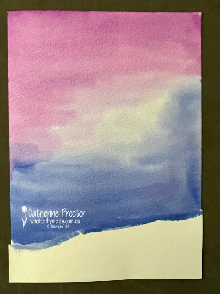
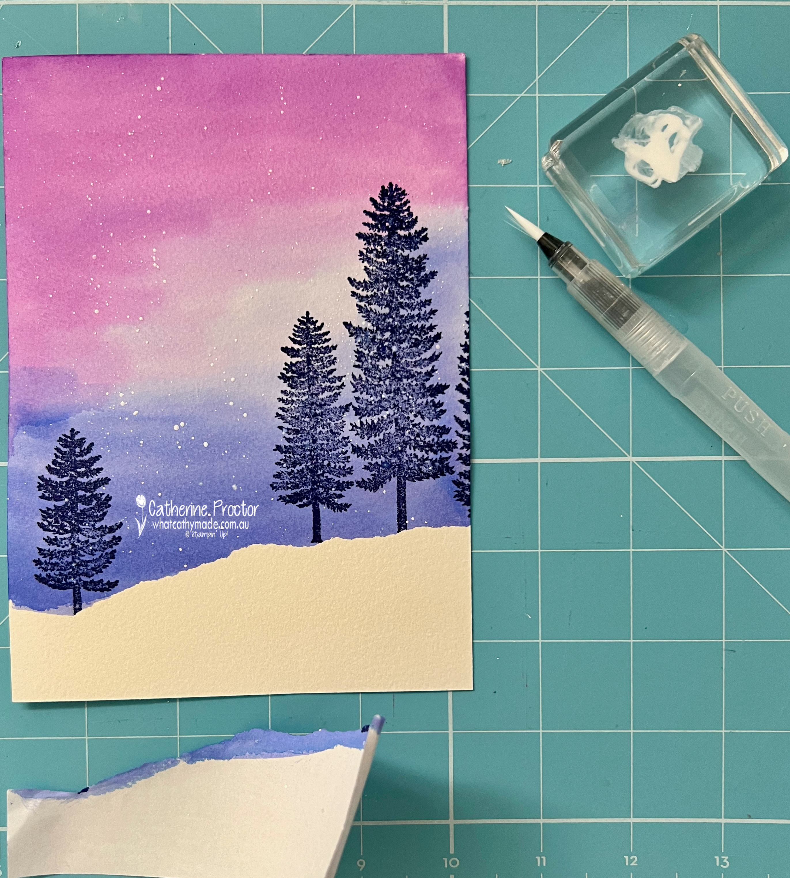
Watercolor backgrounds are so easy to make and even though they come out differently every time you really can’t make a mistake with watercolour. Well, that’s what I like to tell myself, anyway.
Adhere a torn strip of Stampin’ Up masking paper to the bottom section of a sheet of Fluid 100 watercolour paper and then use the widest water painter brush to cover the watercolour paper with water.
Once the paper is all wet, colour it in with Gorgeous Grape, Orchid Oasis and Starry Sky from top to bottom. Use a heat tool to dry the water coloured background.
Stamp trees from the Forever Forest stamp set in Starry Sky and splatter some Whisper White Craft Stampin’ Ink Refill (diluted with water) before carefully removing the masking paper to reveal the snowy landscape.
The ‘joy & peace’ sentiment is from the Night Divine stamp set and the moon and star images are from The Forever Forest stamp set, both stamped in Starry Sky.
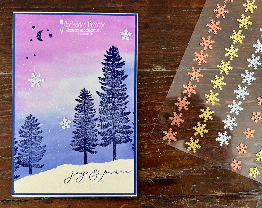
Tiny white snowflakes from the Adhesive-Backed Snowflake Assortment complete the front of the card.
I stamped another tree on the left in Starry Sky once I trimmed the card front to fit on the card base – I forgot the watercolour paper is a lot wider than our metric card bases.
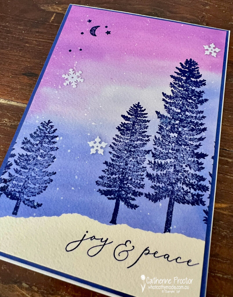
The Starry Sky cardstock layer behind the water coloured card front really makes the Gorgeous Grape water coloured section of the sky stand out.
Now it’s time to hop on over to our next participant, the lovely Rachel Palmieri – I can’t wait to see what Rachel has made this week!
If at any time you find a broken link, you can find the complete list of all participants below.
Welcome to week 20 of our 2021-22 Colour Creations blog hop! Tonight we are showcasing Granny Apple Green, a vivid green from the Brights colour collection.
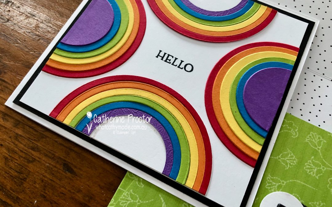
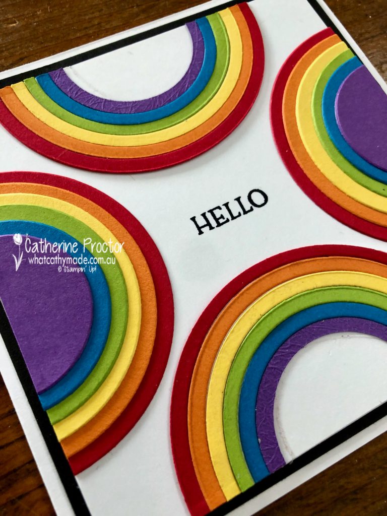
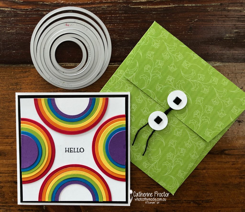
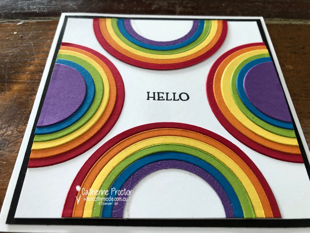
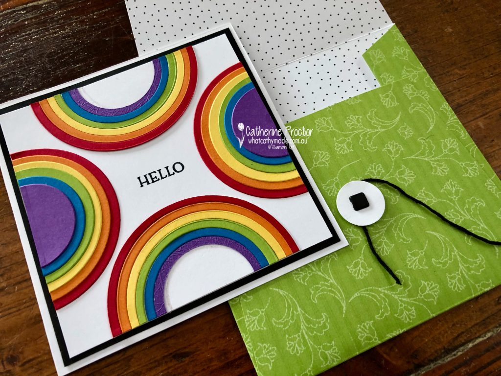
It’s such a cold, wet and windy day here in Sydney – the sort of weather that calls for a bright and happy rainbow card!
The rainbow colours on this card from top to bottom are:
Real Red
Pumpkin Pie
Daffodil Delight
Granny Apple Green
Pacific Point
Gorgeous Grape.
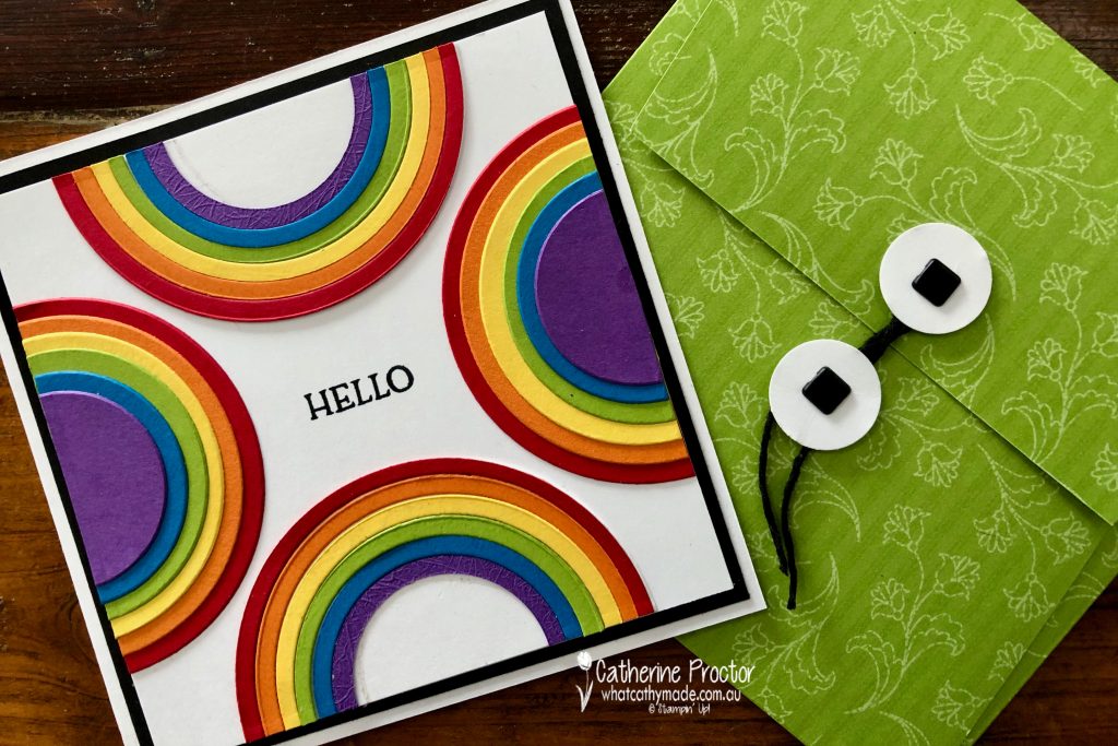
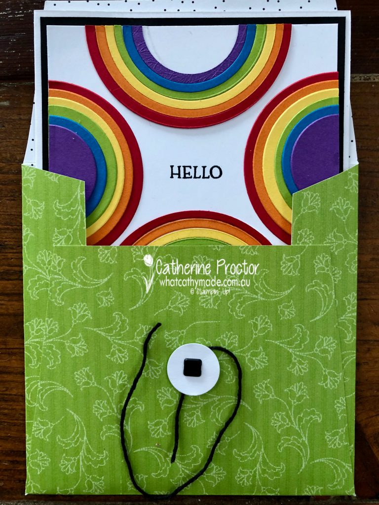
Because I didn’t feel there was enough Granny Apple Green in the card to justify using it for a Colour Creations Granny Apple Green blog hop, I made a matching envelope to showcase this vibrant green, using the Pattern Party DSP.
The layering circle dies make this card quick and easy to make. I created the top and bottom rainbows by die cutting a circle of Real Red with the largest circle die then die cutting it again with the next smallest sized circle and repeating that process with all the colours, using smaller and smaller circle dies. I carefully adhered the colours in rainbow order onto a circle of basic white and cutting it half. The rainbows on the sides of the card use the leftover circles, adhered in the same colour order.
TIP: adhere these circle in 2 sections of 3 layers each and cut them in half BEFORE adhering both sections together. These rainbows are 6 layers thick and too thick to be cut in half with paper trimmer all at once.
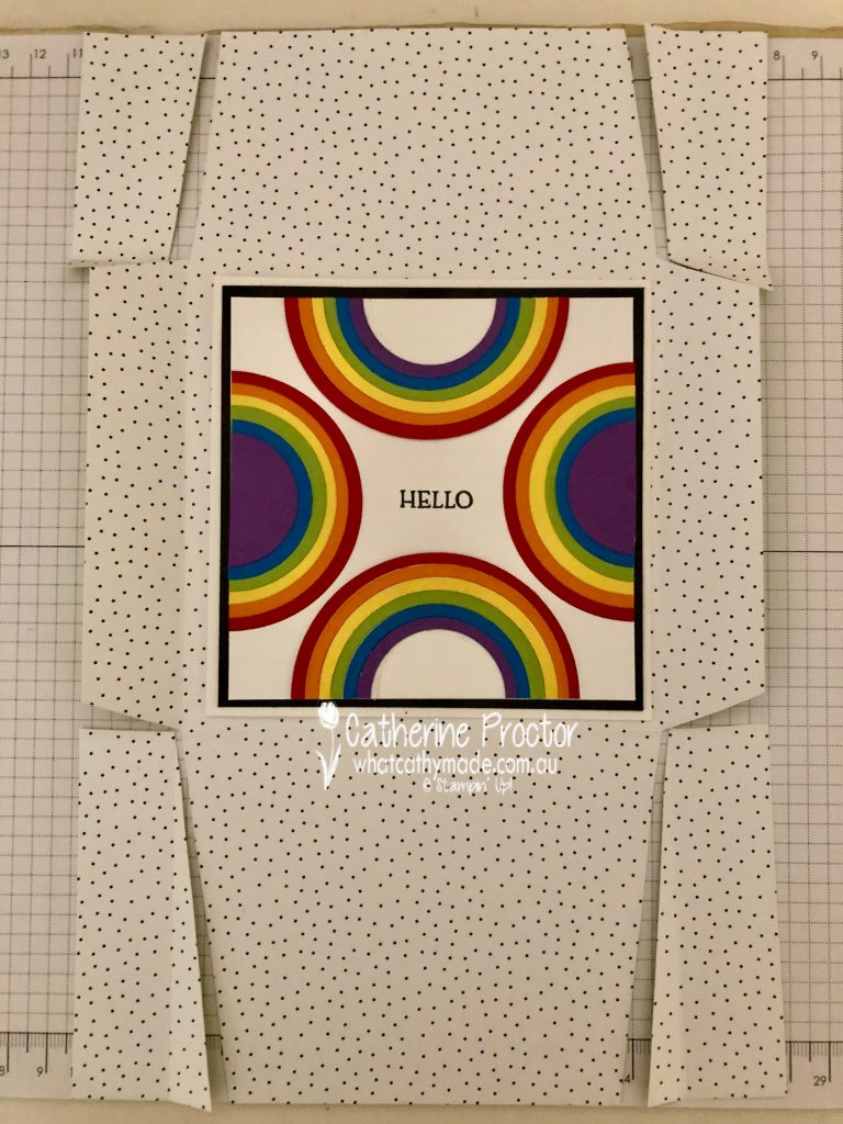
The scoring and cutting pattern for the envelope is shown in the photo below – whatever size your card is, make sure your finished envelope allows enough room for the card to slide in and out.
This card measures 11.5 x 11.5cm (4 1/2 x 4 1/2 inches) so I made my envelope 12.5 x 12.5 cm (5 x 5 inches). The flaps either side are scored at 2.5 cm (1 inch) wide and, the bottom flap is scored at 9.5 cm (3 3/4 inches) and the top flap is scored at 6cm (2 3/8 inches).
The back flap of the envelope closes with die cut Basic White circles secured to the card with square brads and a tie made using a short length of Basic Black Bakers Twine twisted around them. The “Hello” sentiment is from the Blossoms in Bloom stamp set.
Now it’s time to hop on over to our next participant, the lovely Rachel Woollard – I can’t wait to see what she’s made this week!
If you find a broken link or have come to this blog hop from a different entry point, you can view the the full list of participants below:
Welcome to week 19 of our 2021-22 Colour Creations blog hop! Tonight we are showcasing Gorgeous Grape, a bright purple from the Brights colour collection.
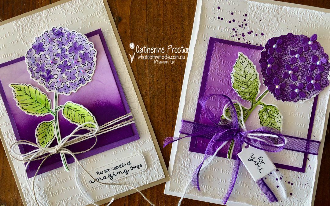
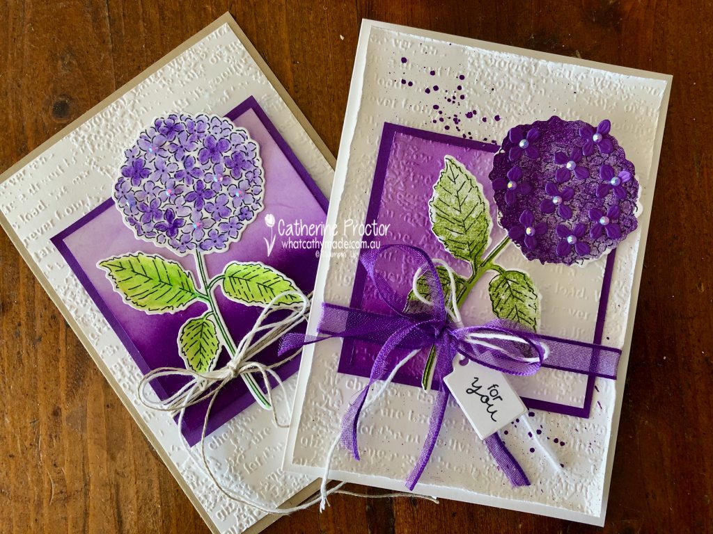
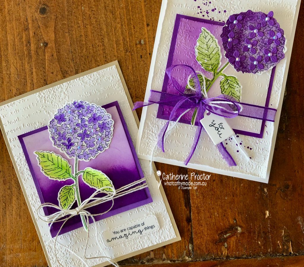
I made a card and I wasn’t sure it worked. So I made another card and I still couldn’t decide which one to post …
So, I present to you my “this or that?” Gorgeous Grape cards!
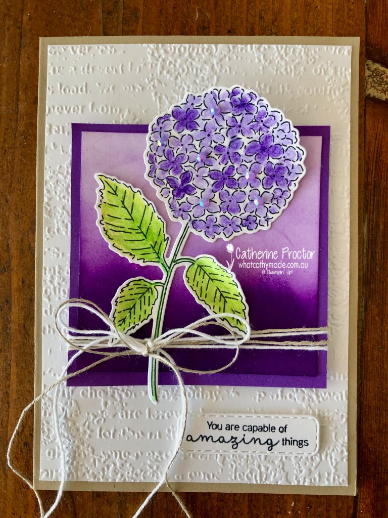
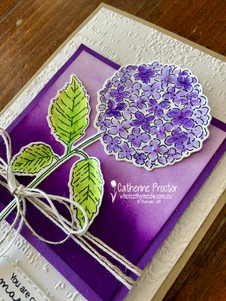
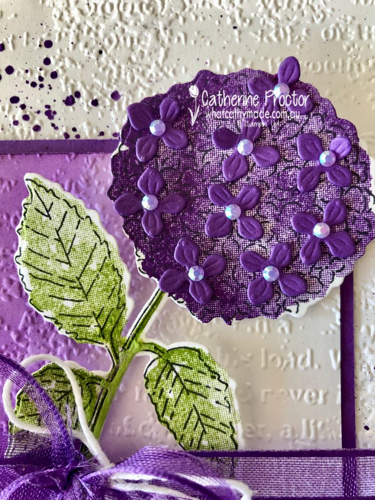
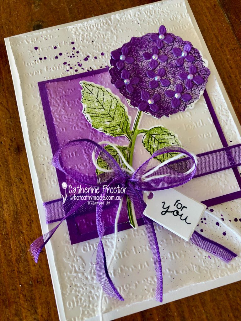
The Hydrangea Haven Bundle includes the Hydrangea Haven Stamp Set and the Hydrangea Dies. There are so many different ways to use this set.
This card has a Crumb Cake cardstock base and the hydrangea is coloured using the Gorgeous Grape and Granny Apple Green Watercolour Pencils, blending them with the Blender pens. Both my cards have a Basic White layer embossed with the Typeworn Type Embossing folder.
The smaller Basic White panel has been coloured in Gorgeous Grape using the blending brushes. Linen Thread and Basic White Bakers Twine are wrapped around the blended panel and Fresh Freesia embellishments from the 2021-2023 In Color Jewels in the hydrangea.
This card has a Basic White card base and the Hydrangea is stamped with Gorgeous Grape and Granny Apple Green. I used the long die from the Hydrangea Dies to cut the individual flowers from Gorgeous Grape cardstock.
I took this card up a notch by splattering and curling up the edges of the background embossed layer, also embossing the smaller front panel and using the Gorgeous Grape ribbon, cut in half for the bow. The stamped hydrangea is a lot darker than the hydrangea coloured in pencils in the other card.
I love the tiny tag that comes in this bundle!
This or that? I’m still not sure which card I prefer!
Now it’s time to hop on over to our next participant, the lovely Kate Morgan – I can’t wait to see what she’s made this week!
If you find a broken link or have come to this blog hop from a different entry point, you can view the the full list of participants below:
Welcome to week twenty-one of our 2020-2021 Art With Heart Colour Creations Showcase.
Each week various members of our Art With Heart Colour Creations team will be bringing you weekly colour inspiration as we showcase our range of over 50 beautiful Stampin’ Up! colours in alphabetical order.
Week 21 – Highland Heather
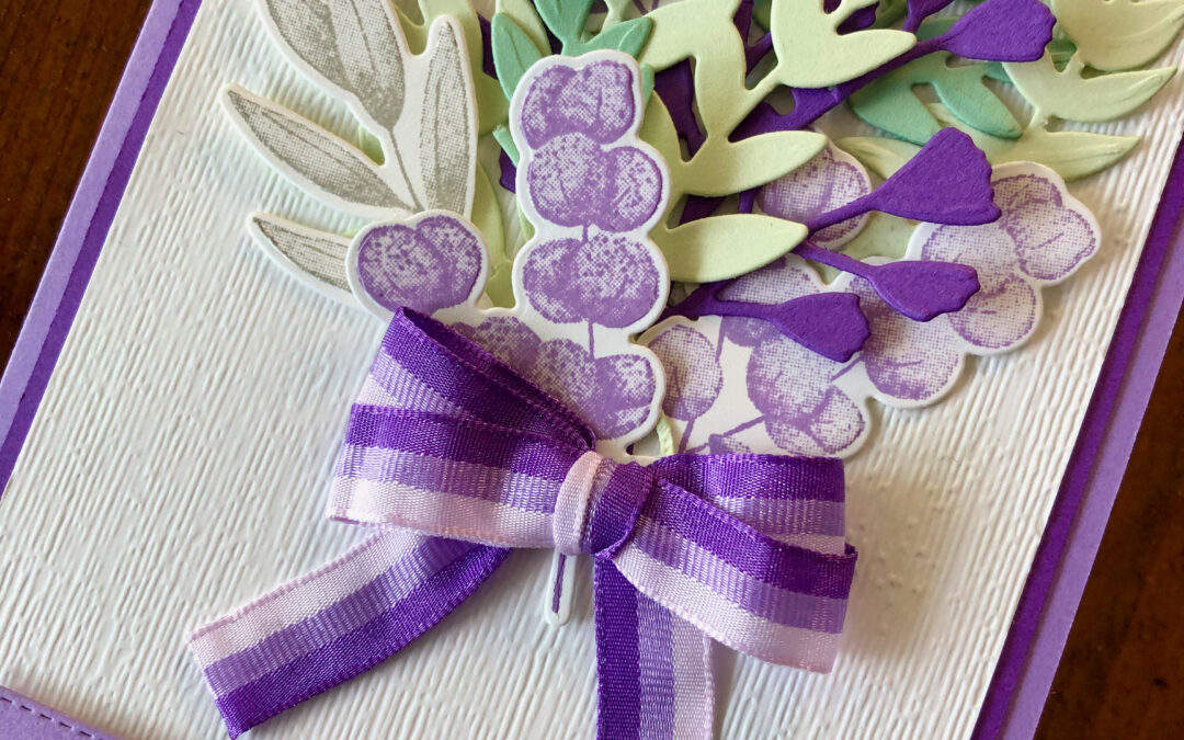
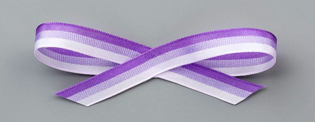
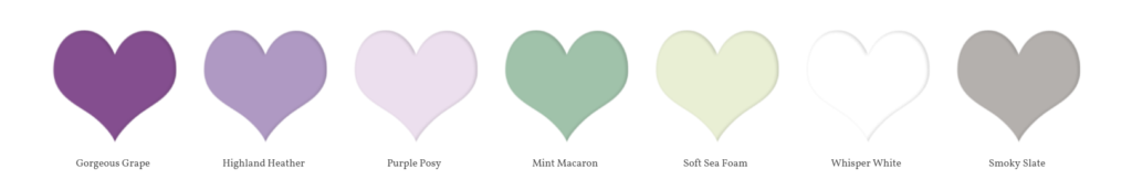
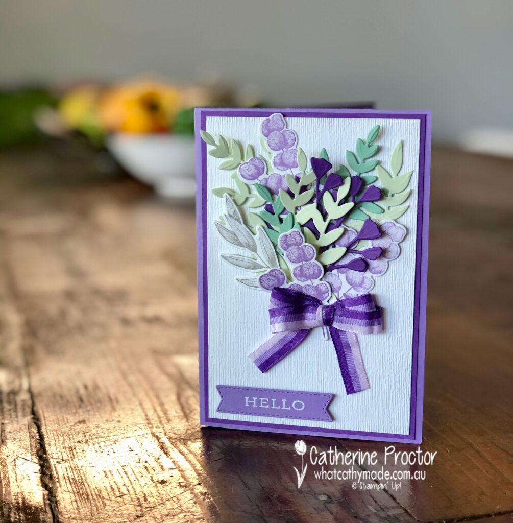
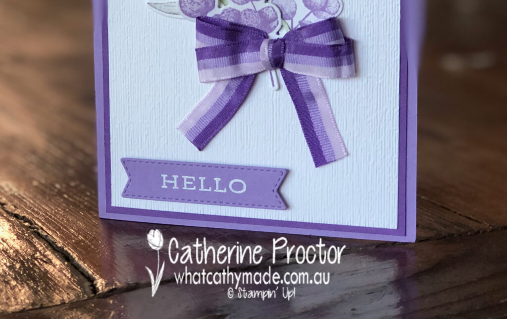
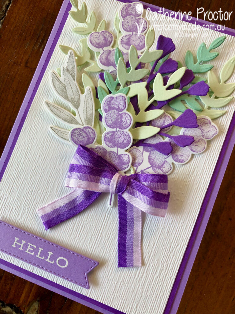
I love Stampin’ Up!’s stunning tricolour purple ribbon so much I designed my card around it this week, creating a bunch of flowers tied with a double bow of this ribbon – its three stripes are Purple Posy, Highland Heather (our colour this week) and Gorgeous Grape.
The other colours included in my bunch of flowers are Soft Sea Foam, Mint Macaron and Smoky Slate. This is such a soft and feminine colour combination.
The Forever Fern bundle was just perfect for this project – its impossible to make a bad card with this stamp set and co-ordinating Forever Flourishing dies, and there are so many way you can use this bundle.
Because I wanted to create a double bow with the stripes in same direction on both sides of my bow I used a bow maker to carefully tie the double bow. If you don’t have a bow maker you can use a fork or even your fingers – there are heaps of free tutorials on Pinterest that will show you how to make a perfect bow of any size.
Stampin’ up!’s subtle embossing folder gives a lovely texture to the Whisper White card stock layer. The “hello” sentiment was stamped in Versamark ink before being heat embossed using white emboss power.
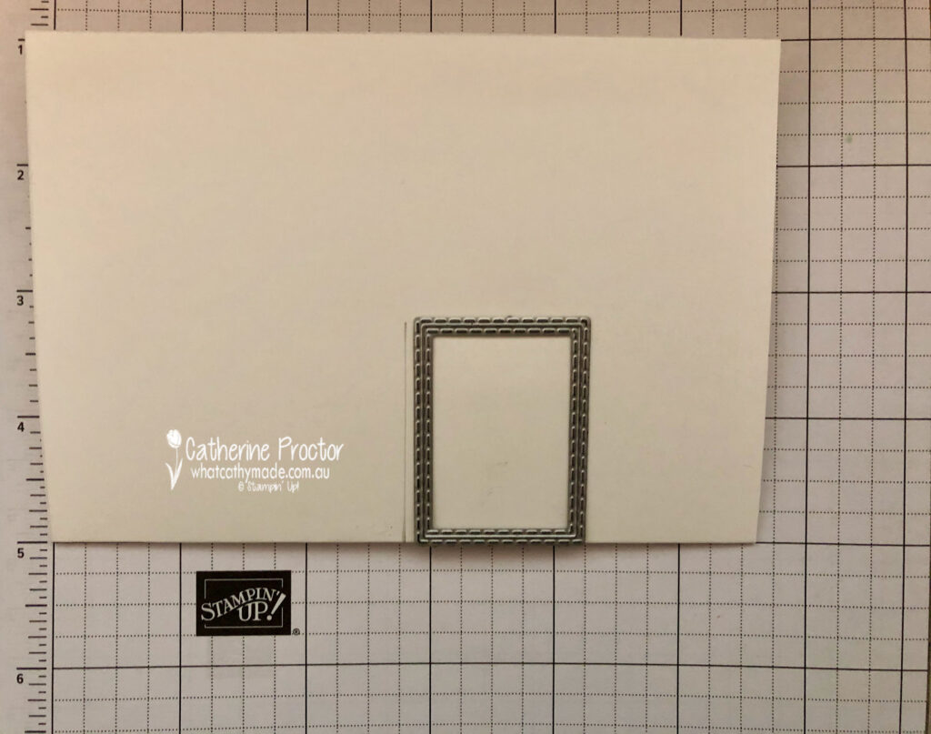
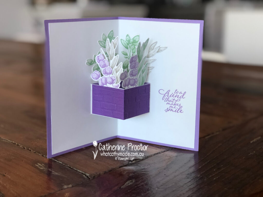
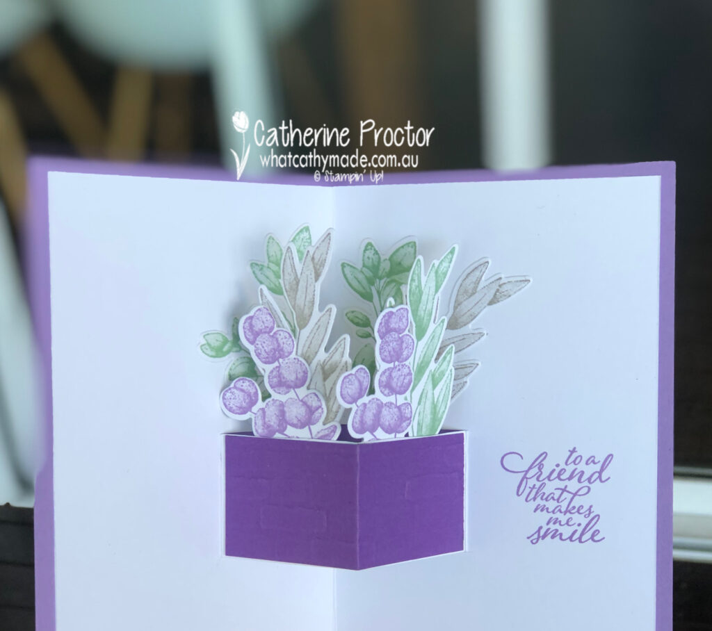
Because I had so many left over die cut pieces I decided to make a quick pop-up planter basket for the middle of my card. I traced around the smallest stitched rectangle to work out where to cut my pop-up mechanism and then simply used my paper snips to cut two side slits into a Whisper White insert.
Once I cut my two side slits I simply flipped out the pop-up mechanism (so it pops in the opposite direction to the card insert) and added a piece of Gorgeous Grape card stock embossed using the Brick & mortar Embossing Folder to create the planter box.
As well as attaching foliage pieces to the inside of the planter box pop-up section I also attached some to the inside of the Whisper White card base. Just a note of warning, when attaching die cut piece to your pop-up section just make sure they are positioned in a way that your card can close smoothly and they don’t stick out the sides when the card is closed.
Here’s a quick 17 second video showing you how my pop-up card moves.
The “to a friend that makes me smile” sentiment is the final touch for the inside of the pop-up card, stamped in Highland Heather.
I can’t wait to see what the rest of the Art With Heart team have created with Highland Heather today. Click on the links below to see what they’ve made.
If you’d like me to post you your very own copy of the August–December 2020 Mini Catalogue, 2020-21 Stampin Up! Annual Catalogue, the 2020-21 Beginners Brochure, or to simply find out about more about Stampin’ Up! contact me.
In the meantime, wherever you are in the world, stay safe, stay calm…and keep on crafting xxx
Welcome to week 20 of the Art With Heart Colour Creations Blog Hop!
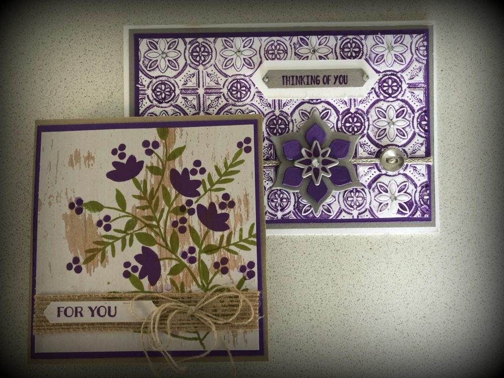
This week we are showcasing one of the Brights: Gorgeous Grape.
I have to confess that although I think this is a stunning colour I’m actually not very confident using the brights and so I had never used this colour before. Ever!
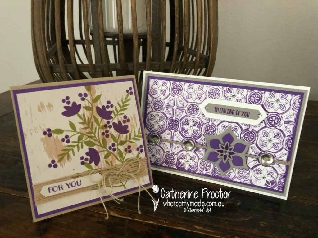
But I ended up making two cards for my blog this week and if I’d had more time I would’ve made some more as I was just getting warmed up playing with Gorgeous Grape.
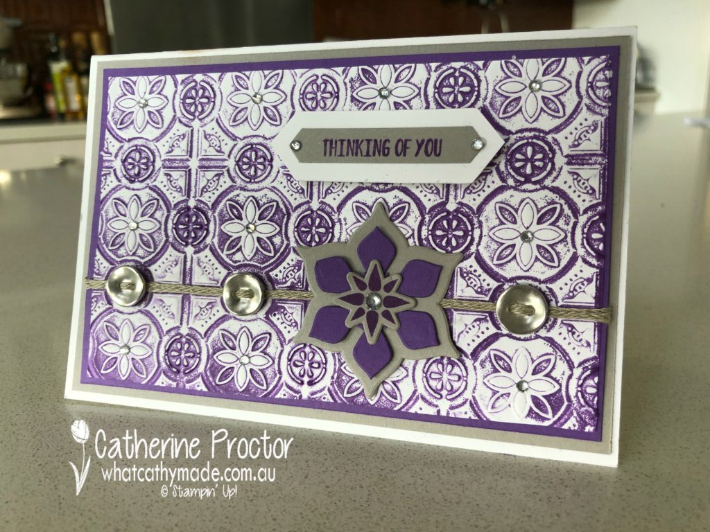
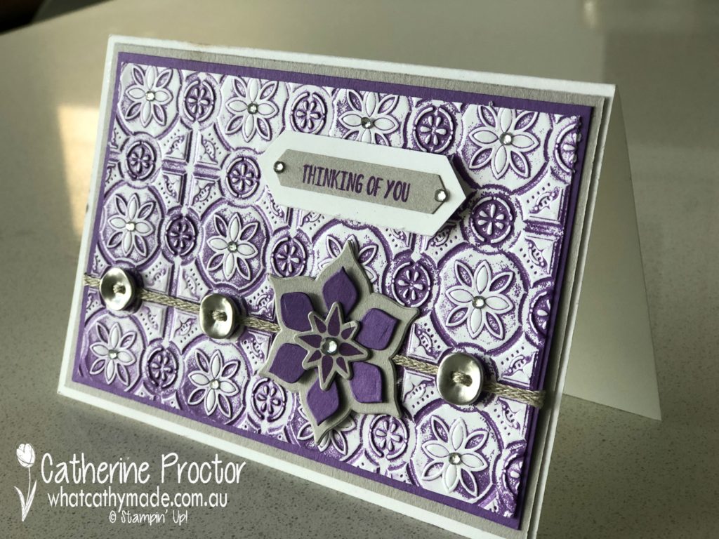
The first card I made used the stunning tin tile embossing folder. I rubbed my Gorgeous Grape inkpad inside one side of the embossing folder before carefully inserting a piece of Whisper White card stock and running it through my bigshot. I love the soft antique effect this gives to the card stock.
The embossed paper was mounted onto Gorgeous Grape and then Gray Granite cardstock and then onto a white card base.
I embellished my card with some braided linen trim threaded through galvanised buttons and a flower embellishment I made using the Eastern Beauty stamp set and matching dies. I think the shapes in this stamp set and matching dies really match the tin tile embossing folder.
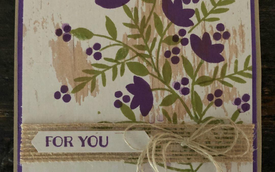
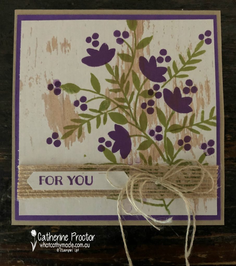
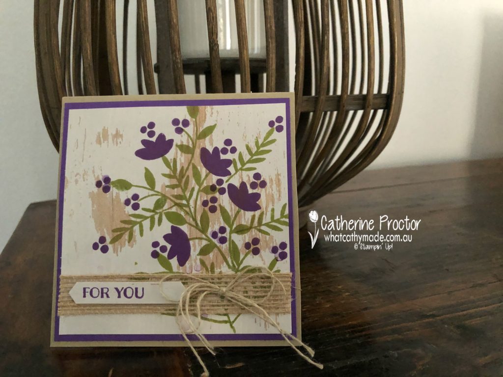
My second card pairs Gorgeous Grape with Pear Pizzaz and Crumb Cake…I had to reassure Crumb Cake that I haven’t abandoned it for the new kid on the block, Gray Granite.
Do you recognise the stamp set I’ve used in the card below?
It’s an oldie but a goldie and it needed some ink. The Banners For You stamp set is wonderful for sentiments but I also love the little details in the smaller stamps on this set, which I have stamped onto one of the sheets of Wood Textures DSP.
So, which colour combo gets your vote? Does Gorgeous Grape work better with the stunning new Gray Granite in the Morrocan inspired embossed tin tile card…
…or does it work better with the old favourite Crumb Cake in the rustic floral card?
To see what the rest of the team have made click on the links below.
Thanks for hopping along with us today. To purchase any of the products I used in this project you can shop with me here. Or if you’d like me to post you your very own copy of the 2018-2019 annual catalogue or find out about more about Stampin’ Up! contact me.
Next Tuesday we’ll be showcasing another new Bright: Granny Apple Green!


")


 Tricolor Ribbon")