Welcome back to our Colour Creations Showcase as we continue our showcase of over 50 beautiful Stampin’ Up! colours in alpha order.
This week we are showcasing Purple Posy, a soon to be retired pale purple from Stampin’ Up’s 2019-21 InColour collection.
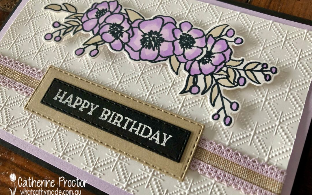
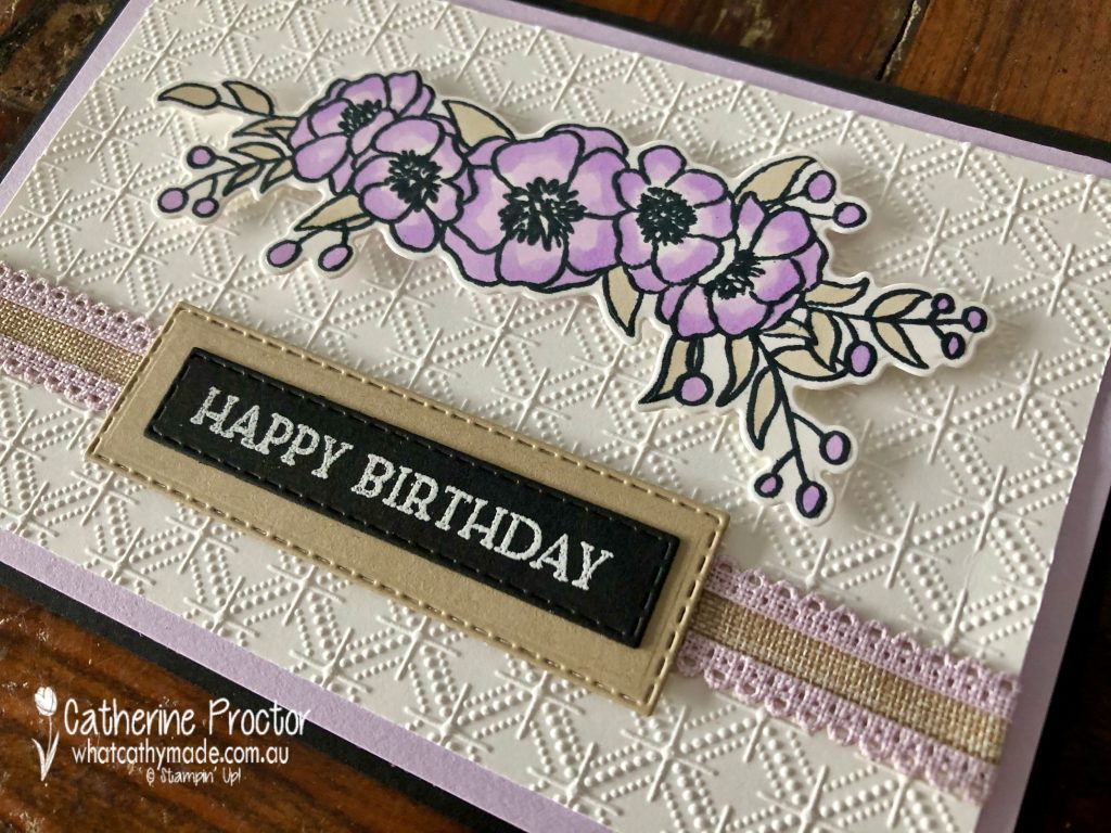
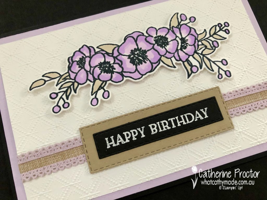
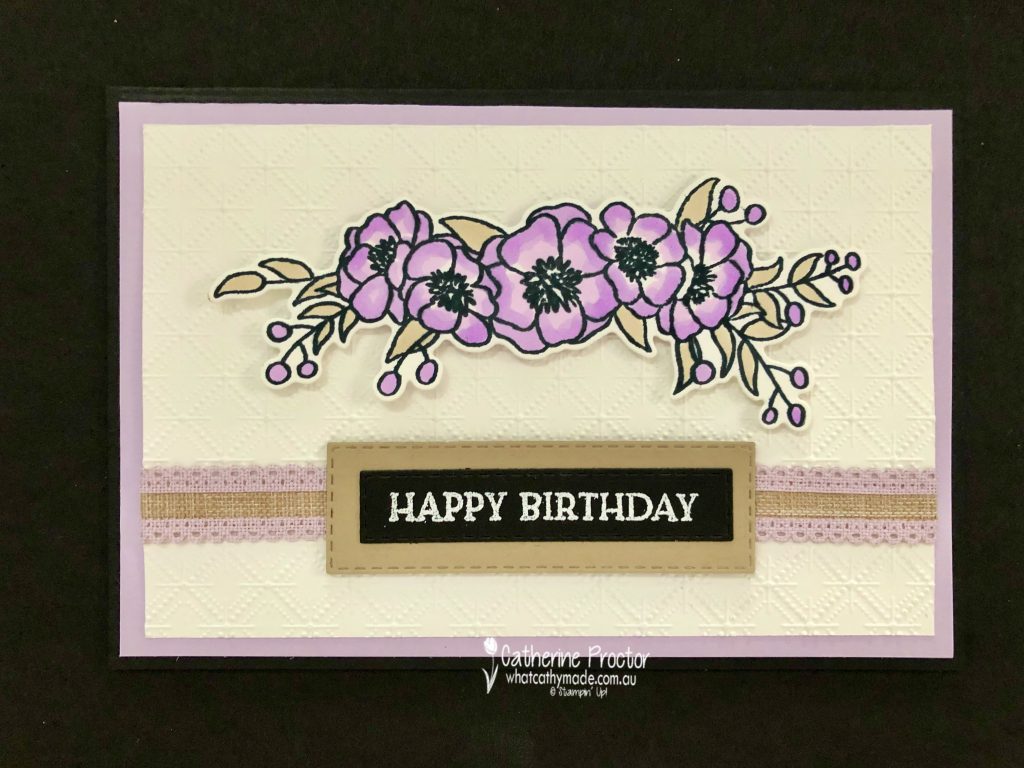
Purple Posy is a feminine and slightly old fashioned (in a good way!) colour that reminds me of my Nana and so I decided to make a card that I think she would have liked to receive. I paired Purple Posy with all neutrals: Crumb Cake, Basic Black and Basic White.
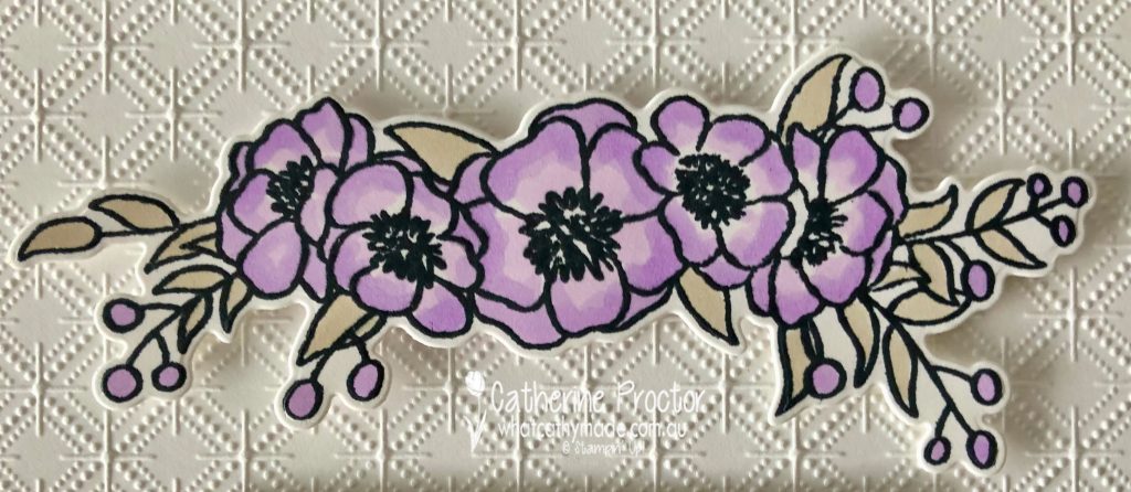
Because there is no Purple Posy stamp pad, I used a floral stamp set that could be coloured using Purple Posy Stampin Blends – Bloom & Grow with its matching Budding Blooms dies.
I could have used virtually any embossing folder on the Basic White card stock layer but decided on the Dainty Diamonds, again with my Nana in mind.
I love this scalloped linen ribbon – it was the Crumb Cake in the centre of this ribbon that inspired me to add Crumb Cake to my colour combination, both in the layer behind the sentiment and the colouring of the leaves.
Because there isn’t a “Happy Birthday” sentiment in the Bloom & Grow stamp set I used the “Happy Birthday” sentiment from Blossoms in Bloom instead.
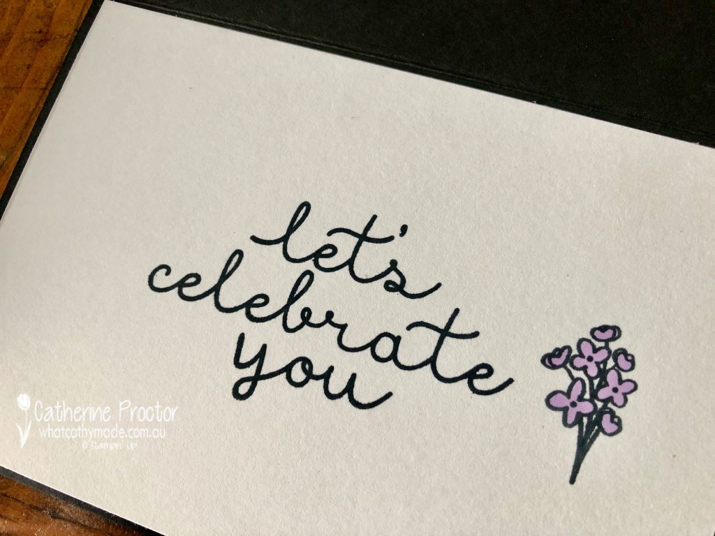
My friend Tina Gillespie ALWAYS stamps the insides of her cards and she has inspired me to try to remember to do the same too …
I can’t wait to see what everyone else has created with Purple Posy today!
If you’d like me to post you your very own copy of the January – June 2020 mini catalogue, the 2020-21 Stampin Up! Annual Catalogue, the 2020-21 Beginners Brochure, or to simply find out about more about Stampin’ Up! contact me.
In the meantime, wherever you are in the world, stay safe, stay calm…and keep on crafting xxx
Welcome to the Monthly Art With Heart Creative Showcase. Tonight we’re sharing some ideas for masculine cards, something I know many of us can find challenging to make.
I recently made two masculine cards I’d like to share with you: the card I made for my dad’s birthday in July and the card I made last week for him for Father’s Day.
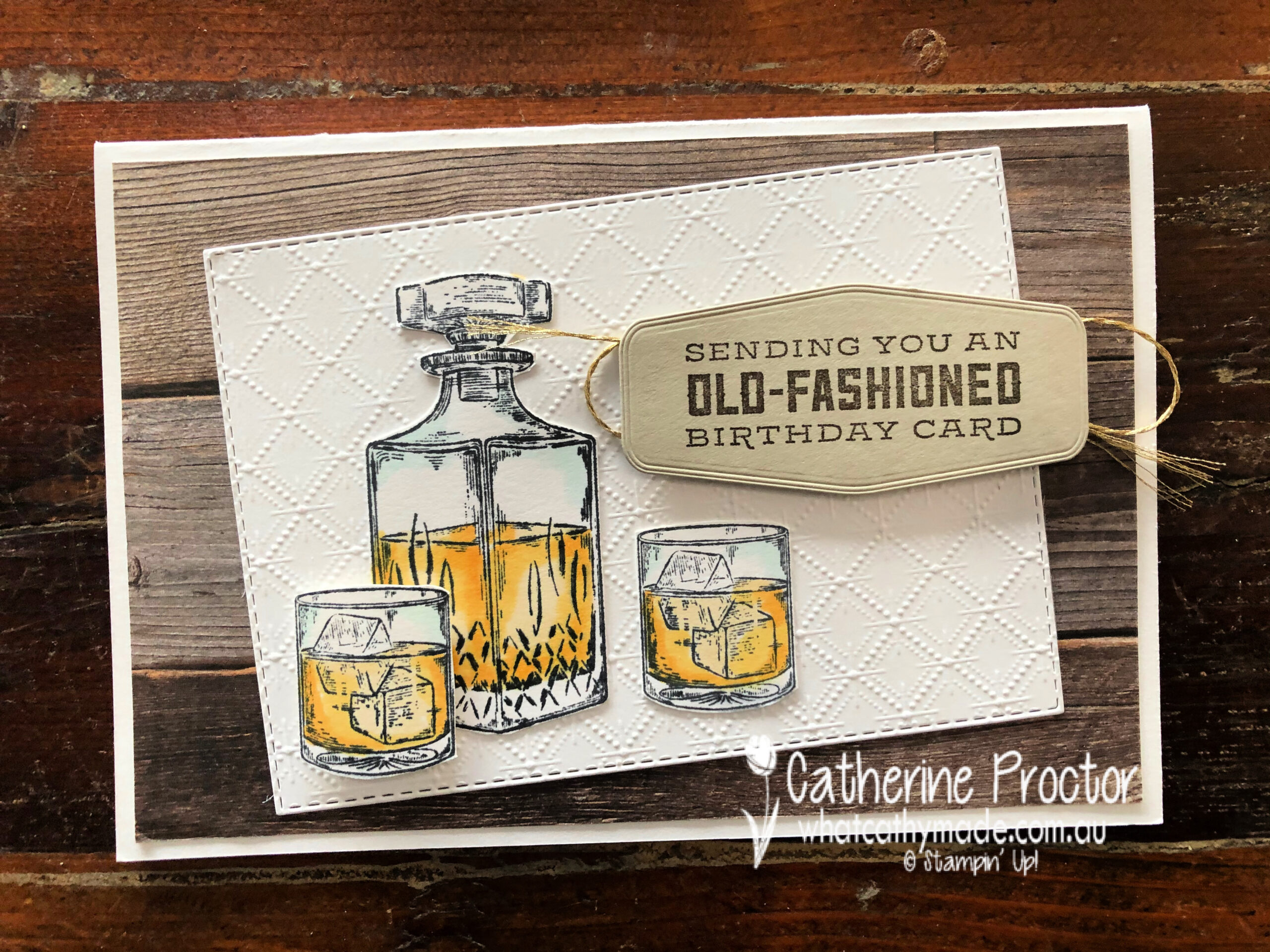
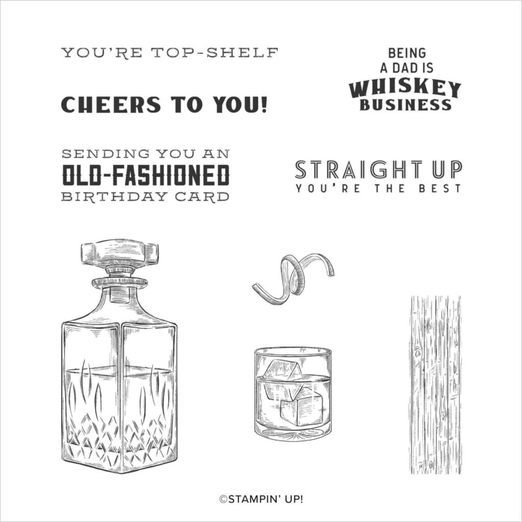
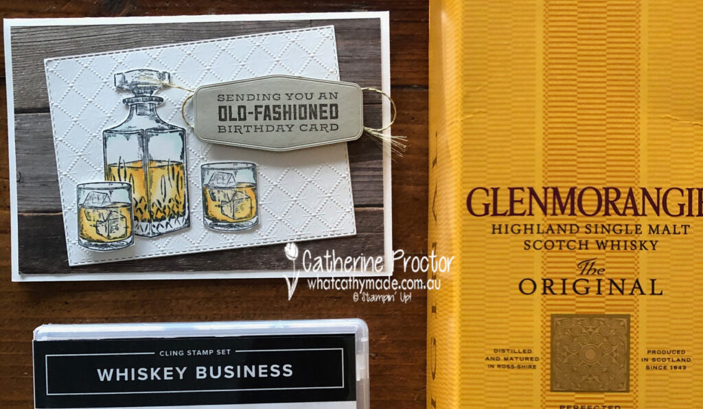
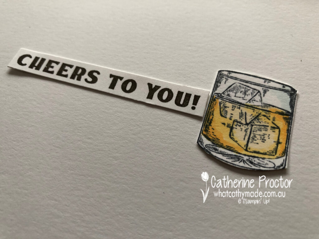
My dad is not a typical card game/car/fishing/treking/BBQ/sport kind of a dad and that can make designing masculine cards for him quite tricky. But there are two Stampin’ Up! stamp sets that perfectly matched the gifts I was giving to my dad: Whiskey Business and Press On.
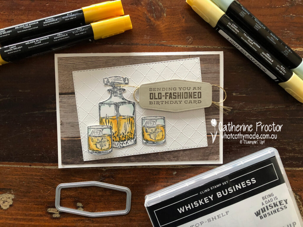
For Dad’s birthday card I used the Whiskey Business set… no prizes for guessing what I gave him for his birthday!
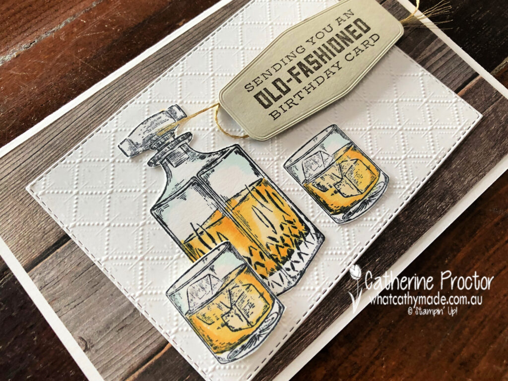
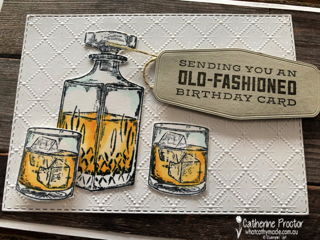
This card was CASED from the design of the card on page 33 of the Annual Catalogue but I made a few changes to make it my own. I just had to use the Dainty Diamonds embossing folder to emboss the Whisper White card stock because it looks just like the pattern in the cut crystal that the Whiskey decanter and whiskey glasses are made of.
The detailed line drawings of the Whiskey Business are so realistic and the Stampin’ Blends make it so easy to bring these stamps to life. I’ve used light Pool Party for the crystal, and light So Saffron, light Mango Melody and dark Mango Melody for the whiskey.
Here’s a close up showing the detail in this stamp set. I simply fussy cut my decanter and glasses using my paper snips before adhering them to the embossed Dainty Diamonds layer.
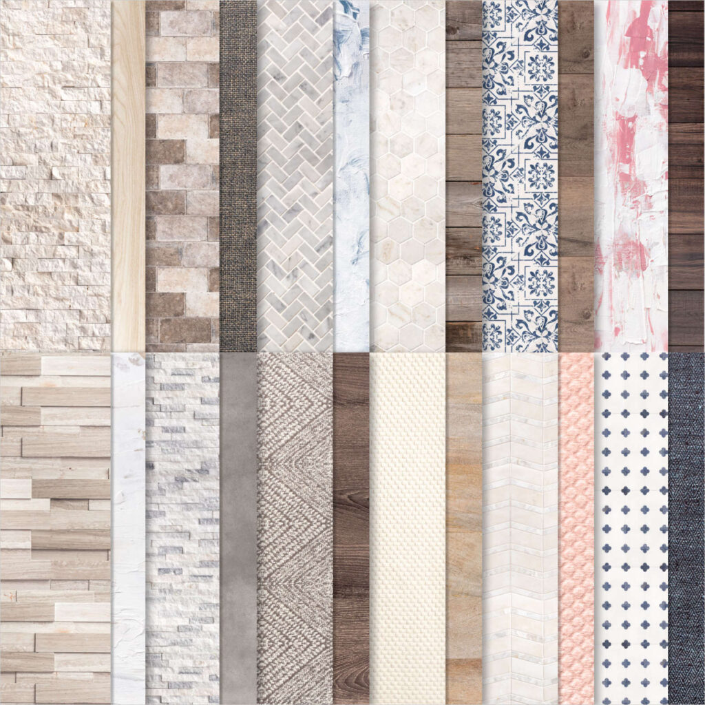
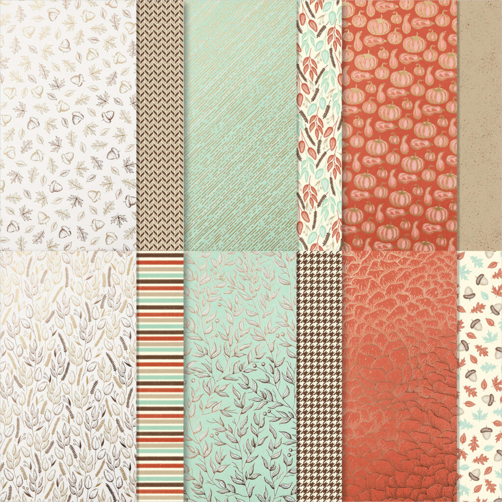
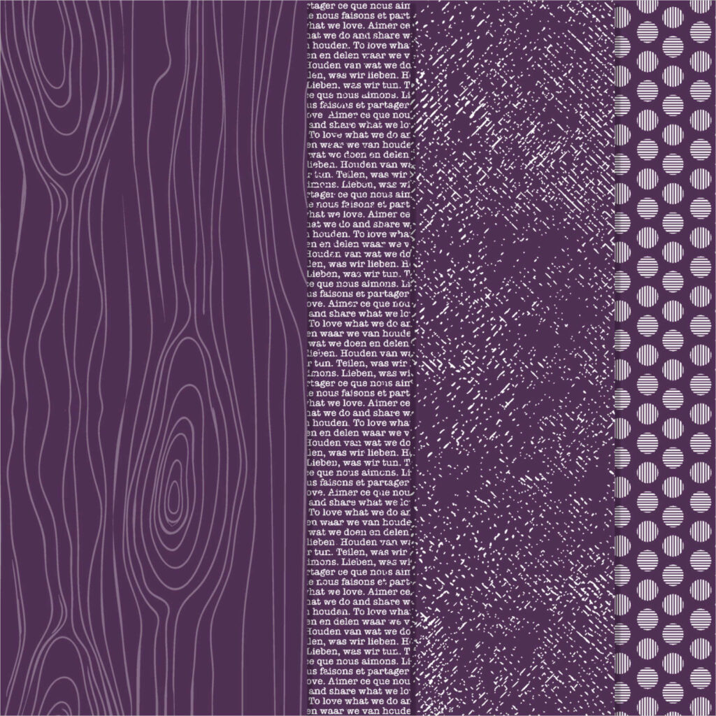
Speaking of realistic – how amazing is this wood patterned DSP from the In Good Taste DSP! All of this patterned paper was created from photographs of actual wood, stone, textiles, etc and it’s just perfect for masculine cards.
And finally, here’s the inside of the card.
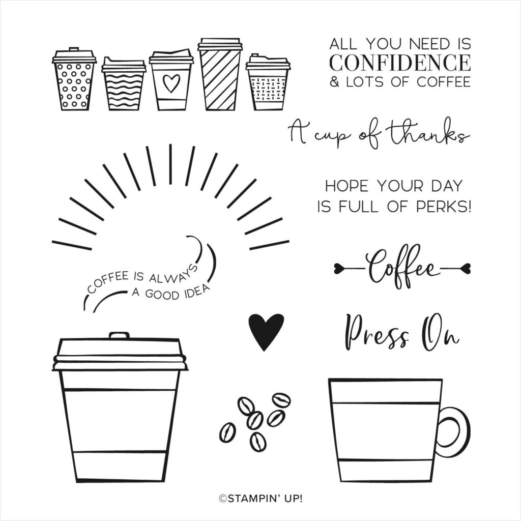
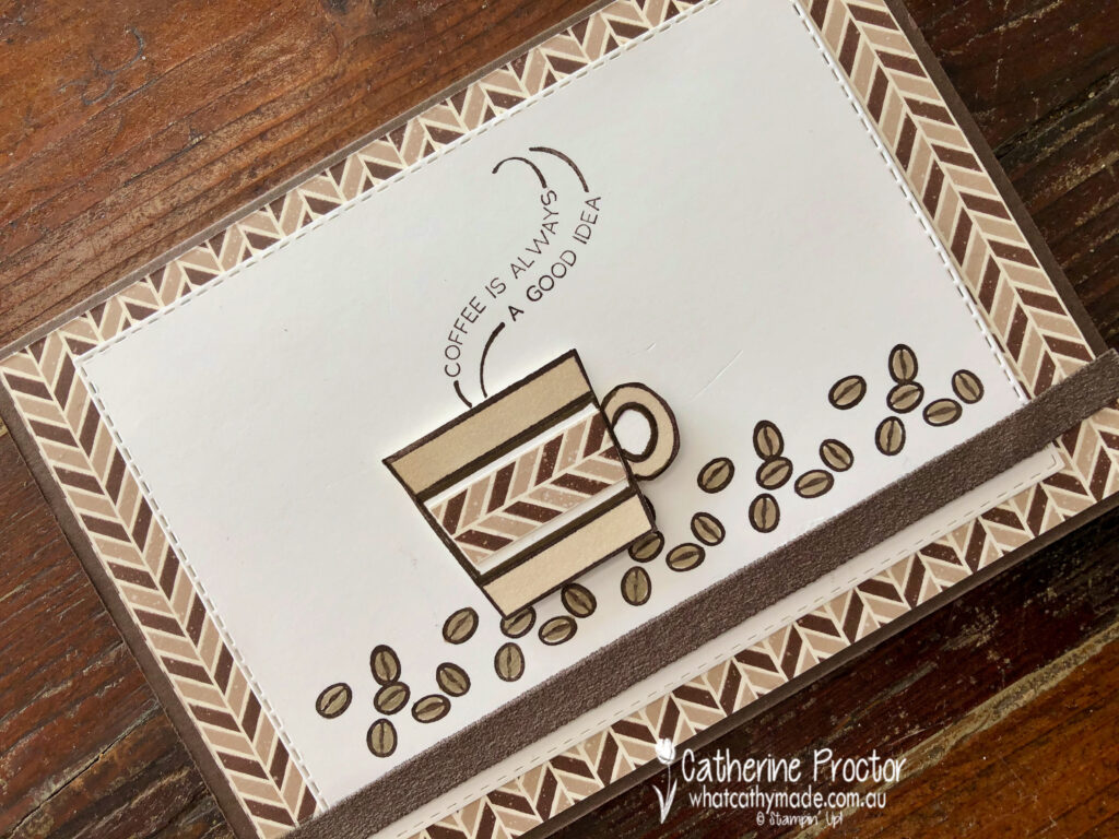
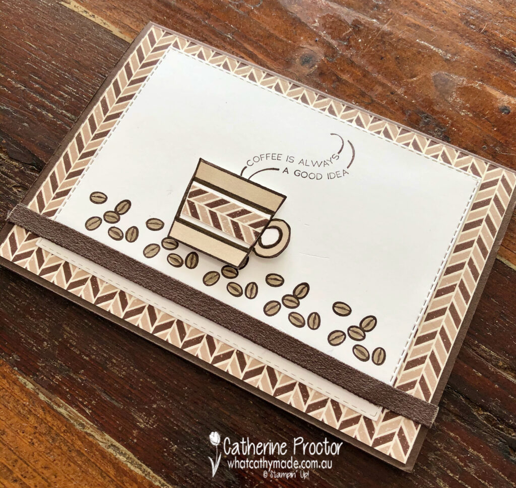
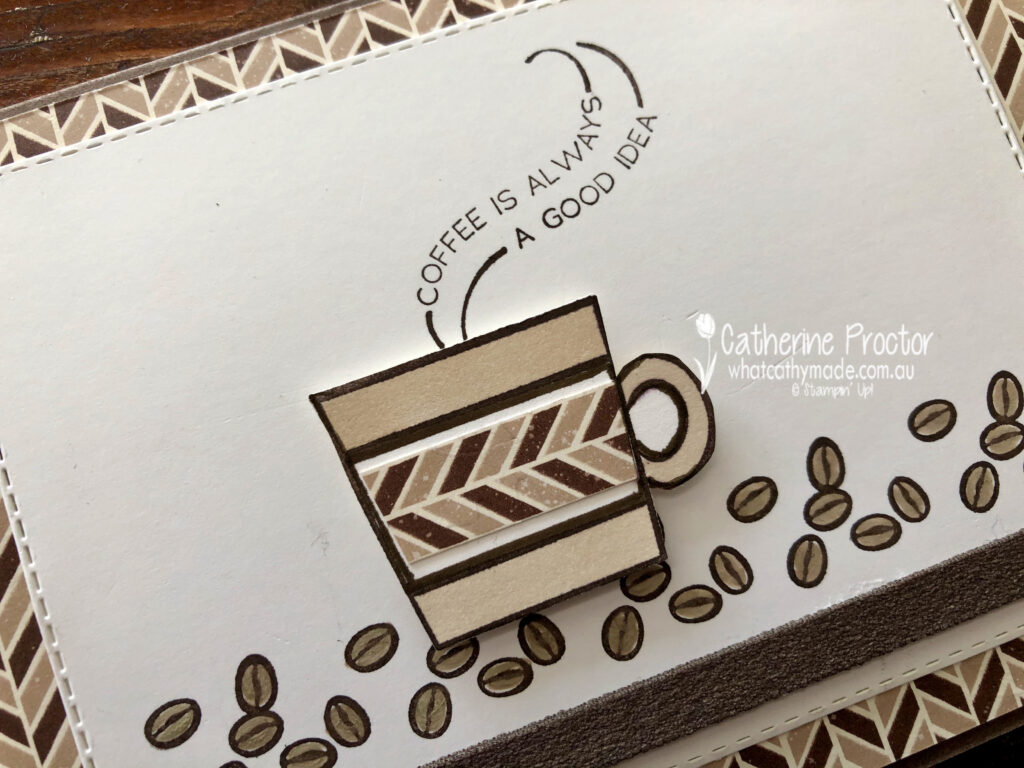
For my second card I’m sharing the one I made for Father’s Day to accompany a coffee machine and coffee, which is why I decided to use the Press On stamp set.
I kept this card very neutral, using coffee shades (Early Espresso and Crumb Cake) with Whisper White.
The lovely masculine chevron DSP is one you might have overlooked – I certainly did! This DSP is part of the Gilded Autumn specialty DSP which is found on page 45 of the August – December 2020 Mini Catalogue.
The coffee cup and beans were stamped in Early Espresso before being coloured in using Crumb Cake Stampin’ Blends and a Crumb Cake Stampin’ Write marker for the coffee beans.
The strip of early espresso faux suede ribbon along the base of the card co-ordinated perfectly and added a luxurious texture to the card.
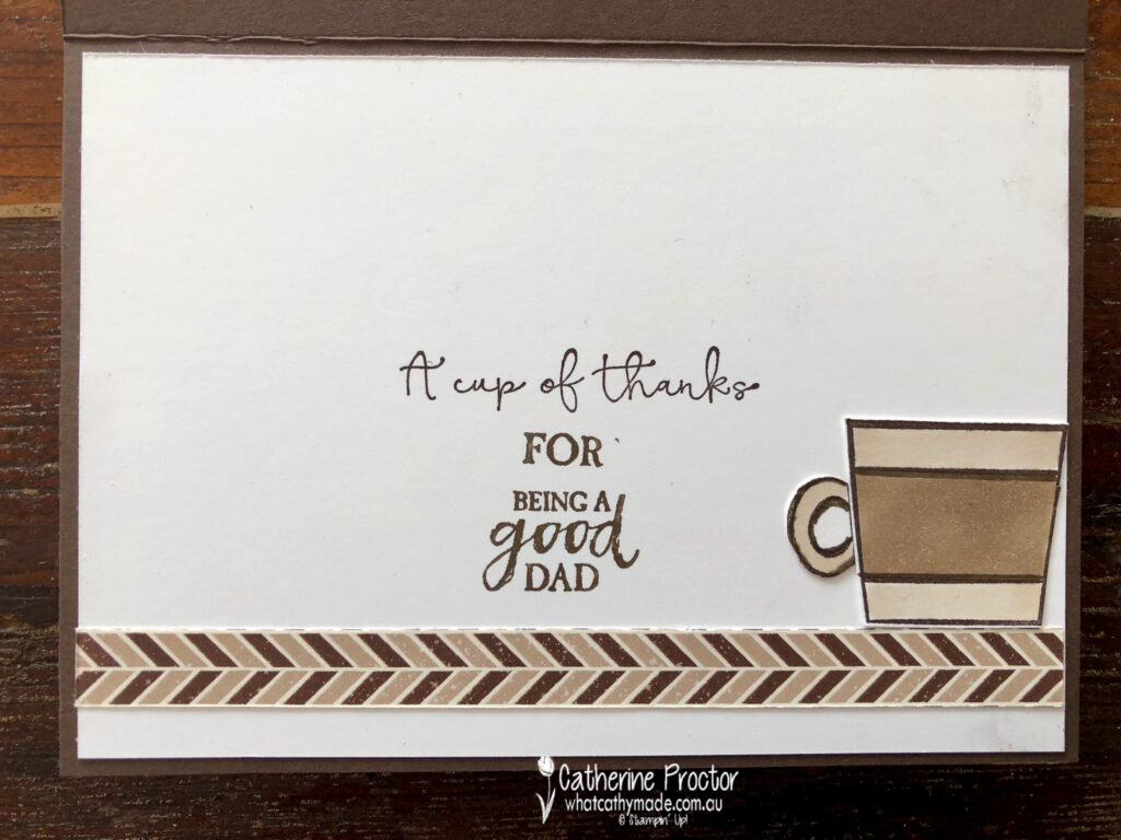
Inside my card I used a variety of sentiments to create a meaningful Father’s Day message – I’m not sure if it really worked, but my dad seemed to appreciate it and that’s what really counts.
To see more masculine card inspiration from the AWH Team head back to Rachel‘s page as she is hosting our monthly blog hops.
To purchase any of the products I’ve used in my cards tonight simply click on the phots of the products below.
If you’d like me to post you your very own copy of the August – December 2020 Mini Catalogue, the 2020-21 Stampin Up! Annual Catalogue, the 2020-21 Beginners Brochure, or to simply find out about more about Stampin’ Up! contact me.
Welcome to week twelve of our 2020-2021 Art With Heart Colour Creations Showcase.
Each week various members of our Art With Heart Colour Creations team will be bringing you weekly colour inspiration as we showcase our range of over 50 beautiful Stampin’ Up! colours in alphabetical order.
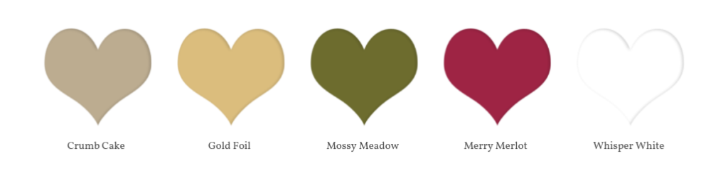
Week 12 – Crumb Cake
I have to confess that Crumb Cake is my favourite and most used Stampin’ Up! colour, although Gray Granite has given it a run for its money since joining the Neutrals family.
I like to think of Crumb Cake as a “bridesmaid” colour – not to dark, not too light. It sits beautifully in the background, complementing any colour it is paired with without vying for attention and yet it also looks amazing on its own. This is why for me, Crumb Cake really is the perfect neutral.
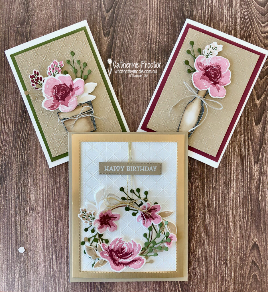
There were so many colour combinations I could have used for my projects today but in the end I decided to stick with a combination of neutrals, using stamping off to add some lighter shades to my colour palette.
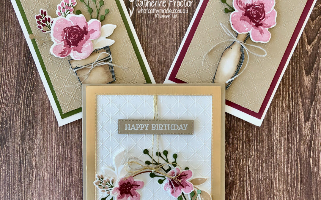
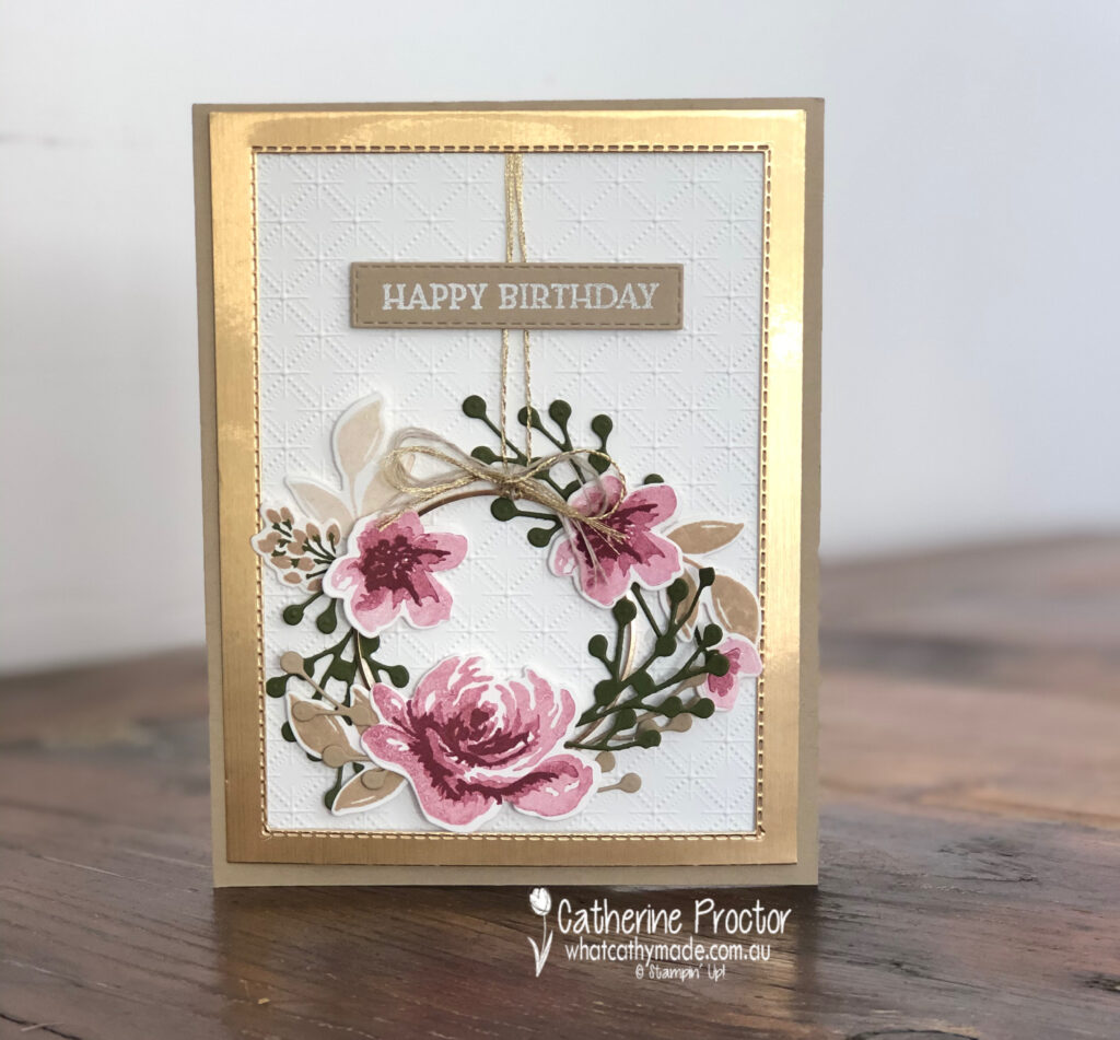
What started out as a clean and simple card has actually become the opposite, but that’s how I craft! And although this is not my usual style I actually love the soft, feminine and “vintagey” vibe of my wreath card.
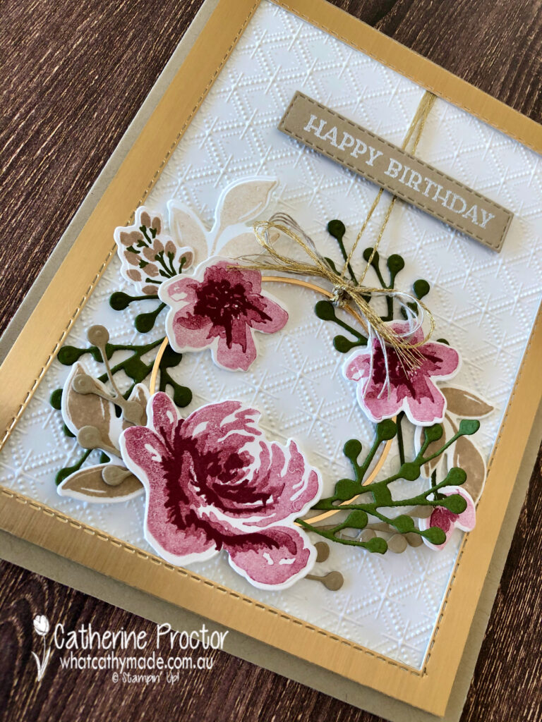
The Dainty Diamonds embossing folder is fast becoming my favourite embossing folder – I can’t seem to stop using it! I’ve laid it onto a Crumb Cake card base and framed it with another new favourite – brushed metallic cardstock.
This photo better shows the burnished sheen the card stock gives – it is hard to photograph but simply luscious in real life!
I know it looks like I’ve used Rococo Rose to stamp my flowers, but it is actually Merry Merlot stamped off once, twice and also used at full strength for the middle of the flowers. I’ve also stamped off Crumb Cake to add variety to the leaves and buds.
Did you notice the beautiful Gold Hoop Embellishment that I used to create my wreath peeking out from beneath the foliage?
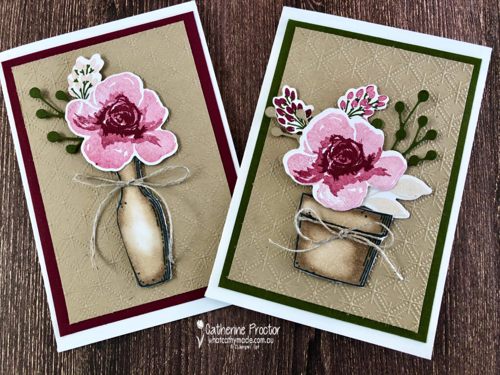
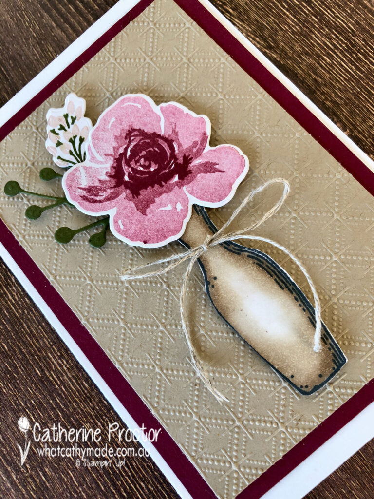
I had originally designed a card for today based on a pot and vase I had stamped in Memento before colouring in with my Crumb Cake blends, but I ended up making the wreath card instead.
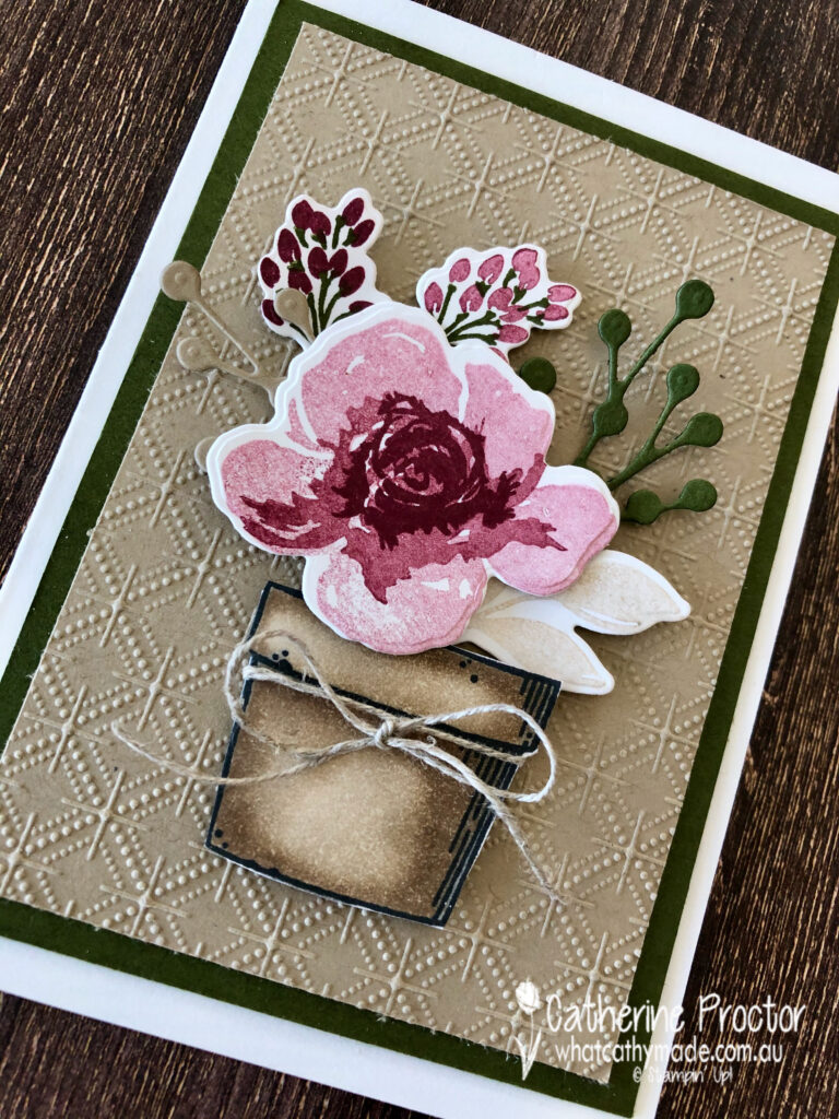
Because I hate wasting leftovers (and I also had leftover flowers and foliage) I quickly made two note cards, this time using Crumb Cake card stock embossed with the Dainty Diamonds embossing folder.
The Crumb Cake blends make it super easy to give dimension to any image. I used the colour lifter bend pen in the middle of my vase card to create the shine that a vase would naturally throw.
The pot card, like the vase card, is finished off with a bow of linen thread – in my opinion linen thread and Crumb Cake really are a match made in heaven!
I have to admit I probably like my last minute leftover note cards as much as the intricate wreath card that took soooo much more time to make! Ain’t that often the way with crafting, LOL!
I deliberately left sentiments of my note cards so they can be used for any occasion. I often do this and leave my card insides blank so I can stamp the appropriate sentiment in the card as I need it.
I can’t wait to see what the rest of the Art With Heart team have created with Crumb Cake today. Click on the links below to see what they’ve made.
Next Tuesday we’ll be showcasing one of the Regals family: Crushed Curry. We hope you can join us all then.
To purchase any of the products featured in today’s post, simply contact your Stampin’ Up! demonstrator, any of the ladies in the AWH Colour Creations Showcase or click on the product links below.
If you’d like me to post you your very own copy of the August–December 2020 Mini Catalogue, 2020-21 Stampin Up! Annual Catalogue, the 2020-21 Beginners Brochure, or to simply find out about more about Stampin’ Up! contact me.
In the meantime, wherever you are in the world, stay safe, stay calm…and keep on crafting xxx
Welcome to week four of our 2020-2021 Art With Heart Colour Creations Showcase.
Each week various members of our Art With Heart Colour Creations team will be bringing you weekly colour inspiration as we showcase our range of over 50 beautiful Stampin’ Up! colours in alphabetical order.
Week 4 -Blackberry Bliss
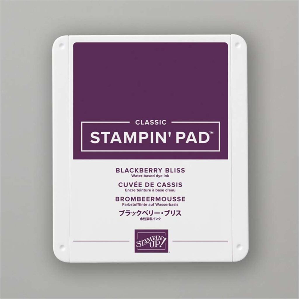
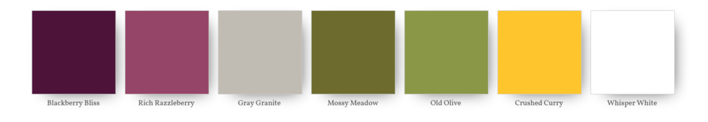
Blackberry Bliss is part of the Regals collection of colours. It is available as A4 Card stock, a Classic Stampin’ Pad and ink refill, Stampin Blends combo pack, Stampin’ Write marker, Regals 6×6 Designer Series Paper, Rainbow Glimmer paper and Gorgeous Posies Card Kit, or you can purchase it within any of the Regals collections.
I have to admit that Blackberry Bliss used to scare me! Don’t get me wrong, I always thought it was a beautiful colour but because it’s so very dark I hardly ever used it. But after water colouring with Blackberry Bliss I’m happy to say I will definitely be using this colour more often!
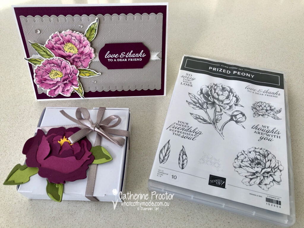
Here’s my colour combination for this week. I don’t usually work with this many colours but with floral images I’ve found that a variety of colours really helps to replicate the subtle mix of colours found in nature.
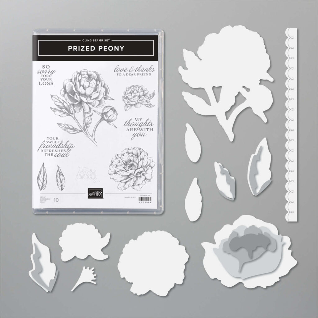
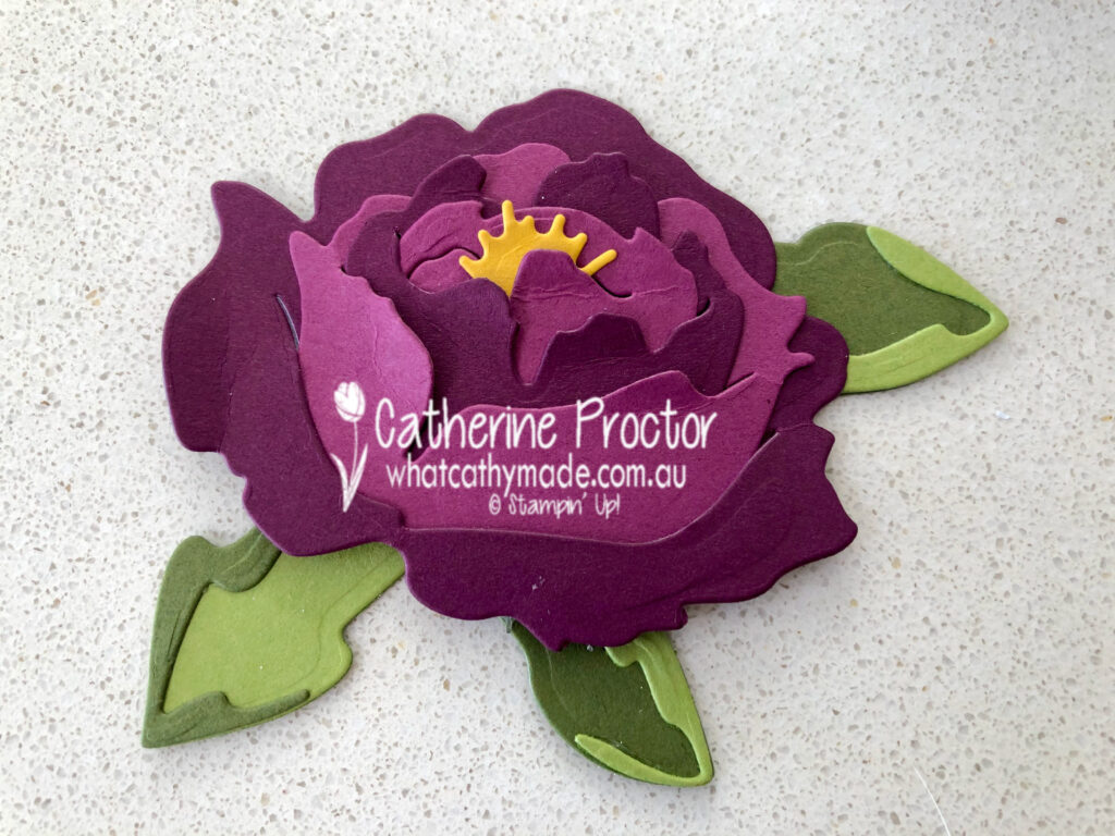
And here’s the gorgeous Prized Peony bundle that I used to create my card with its matching 3D flower.
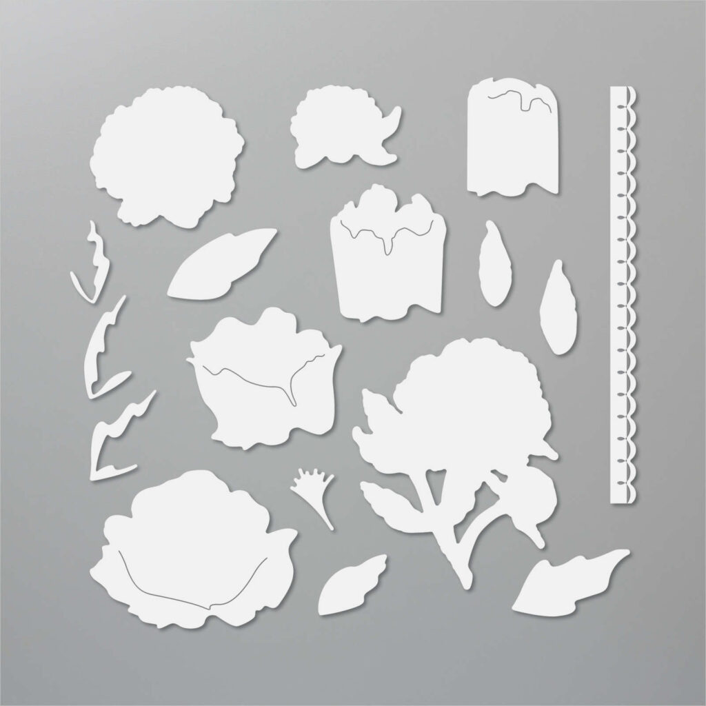
Let’s take a closer look at the peony die set. It includes:
dies that cut out the stamped images from the Prized Peony stamp set,
a stunning scalloped border die,
five dies that layer together to make a 3D peony flower,
and another six dies that layer into three different leaves.
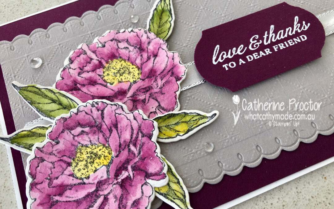
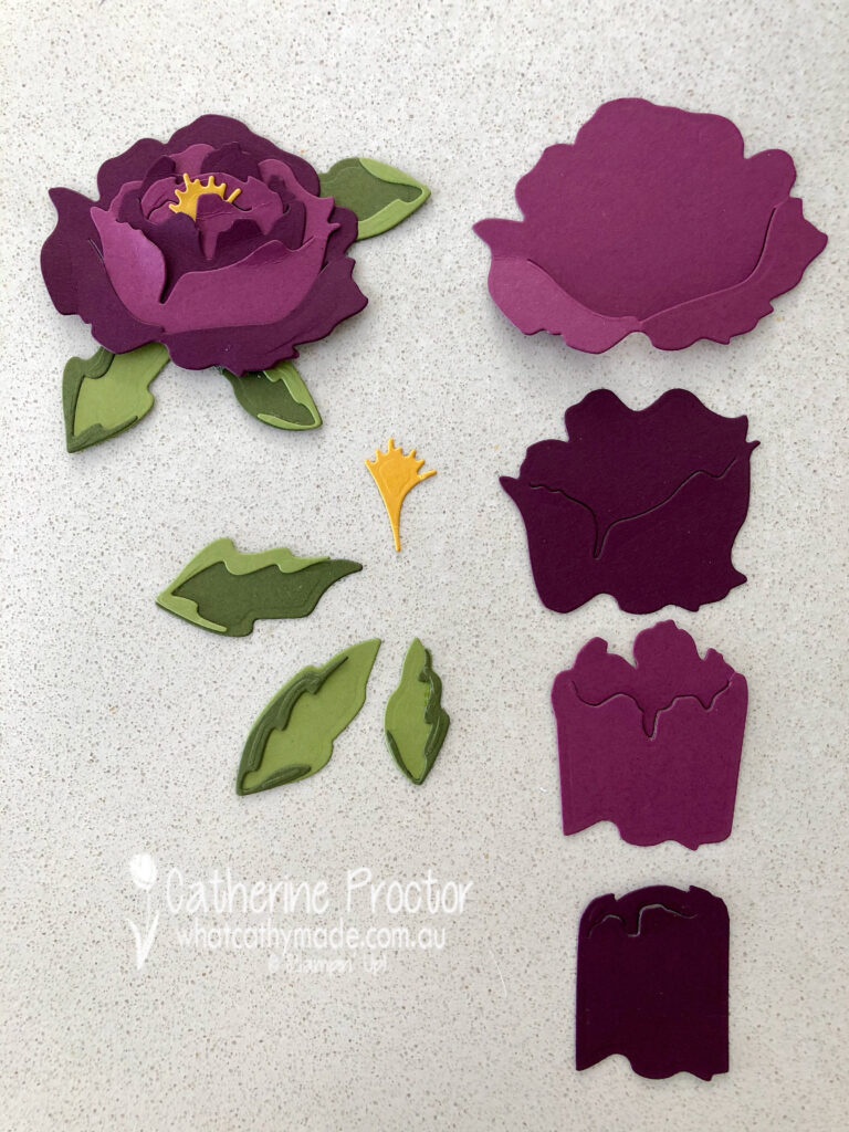
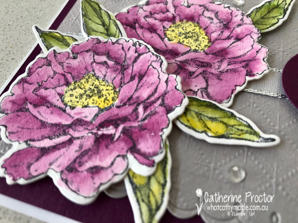
The 3D peony flower and leaf dies don’t come with assembly instructions but as I soon discovered if you simply line up the bottom of the 3D flower dies they layer together perfectly. You slot them together in the order I’ve shown in this photo from top to bottom, adhering at the base of the flower. The stamen is the final part of the flower to be added.
I cut enough pieces out for two flowers: one in Rich Razzleberry and one in Blackberry Bliss. I did this because when I mix these two colours you can more clearly see the definition of layers in the peony flower. The leaves were cut from Mossy Meadow and Old Olive card stock. Here’s a close up of the completed peony flower with leaves.
I used this flower to top a Whisper White Mini Pizza box that I filled with chocolates before wrapping it with some of the new Gray Granite 1/4″ (6.4 mm) Shimmer Ribbon (also from the Peony Garden suite). Can you see its subtle silver shimmer?
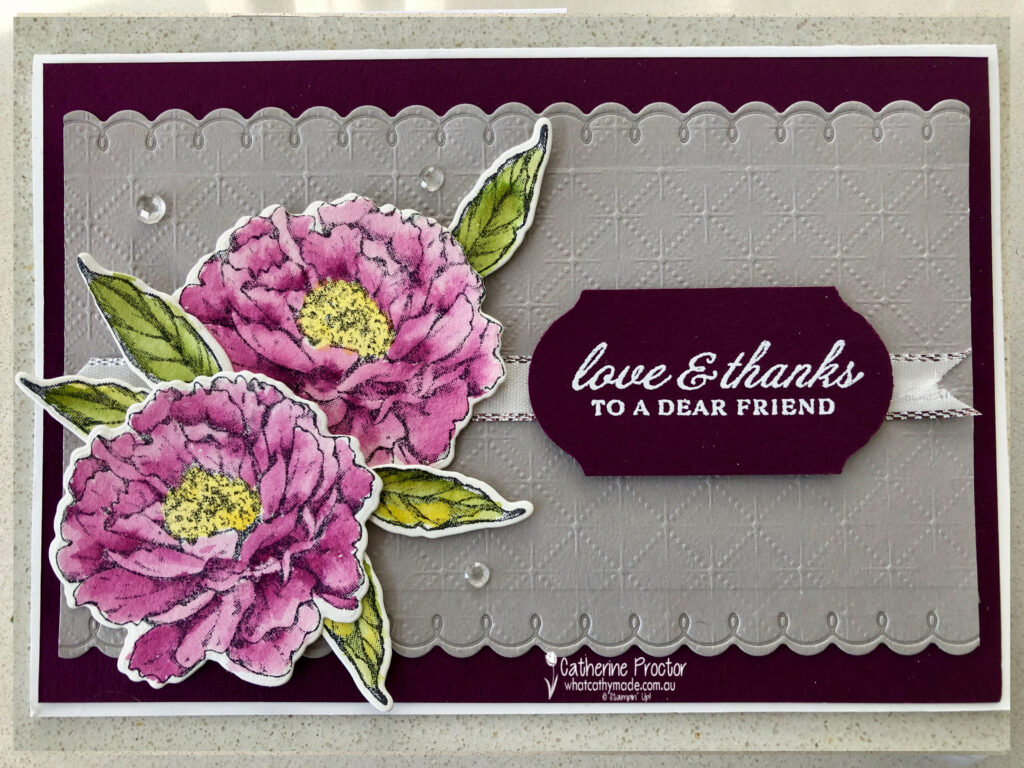
Gray Granite looks so lovely paired with Blackberry Bliss, so I also used it on my matching card. I embossed my Gray Granite card stock with the new Dainty Diamonds embossing folder and used the long scalloped die from the Peony Dies to trim the top and the bottom of my Gray Granite card stock.
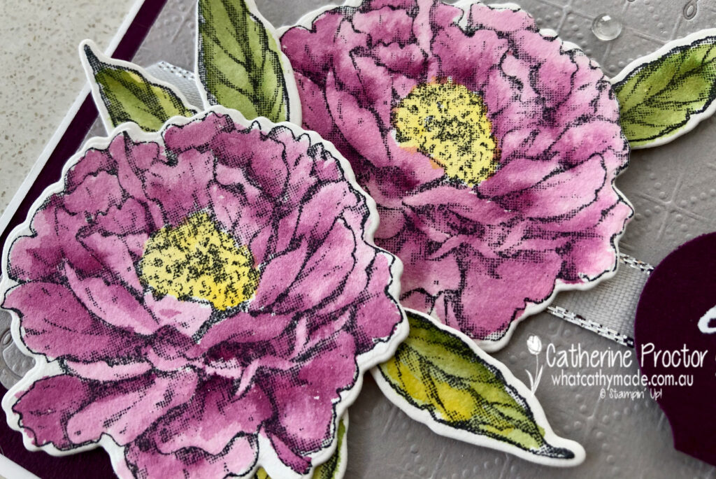
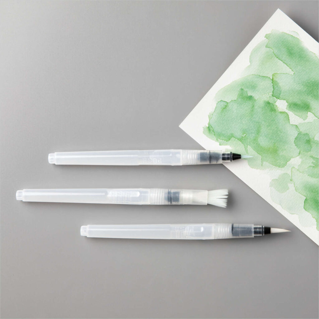
You might think that I coloured my flowers using Rich Razzleberry but it’s actually Blackberry Bliss. After stamping the peony flowers in black Stazon ink onto watercolour paper I used the new water painters and my Blackberry Bliss ink pad to watercolour the flowers.
This “Distinktive” Prized Peony Stamp Set has a special texture that gives added depth and dimension in a single step, creating photo-realistic images that are ideal for water colouring. I water coloured the stamens with Crushed Curry and the leaves with a mixture of Mossy Meadow and Old Olive.
I love water colouring stamped images because it makes me feel like an artist. It also lets me tone down colours I find too intense to work with at full strength. These new Water Painters replace the Aqua Brushes and they really make a wide variety of water colour effects so easy to achieve.
I can’t wait to see what the rest of the Art With Heart team have created with Blackberry Bliss today.
Just click on the links below to see what they’ve all made.
Thanks so much for hopping along with the Art With Heart Team on our weekly Colour Creations Showcase. If you missed any of the previous colours you can see them all here.
Next Tuesday we’ll be showcasing one of the subtles: Blushing Bride. We hope you can join us all then.
To purchase any of the products featured in today’s post, simply contact your Stampin’ Up! demonstrator, any of the ladies in the AWH Colour Creations Showcase or click on the product links below.
If you’d like me to post you your very own copy of the 2020-21 Stampin Up! Annual Catalogue, the 2020-21 Beginners Brochure, or to simply find out about more about Stampin’ Up! contact me.
In the meantime, wherever you are in the world, stay safe, stay calm…and keep on crafting xxx
Welcome to the Monthly Art With Heart Creative Showcase.
This month the team are featuring projects using their favourite products from the new Stampin’ Up! 2020-21 Catalogue. The new catalogue is full of amazing new stamp sets, some bundled with dies or punches. The range of kits, papers and accessories complete the range of products you will see featured in this Showcase.
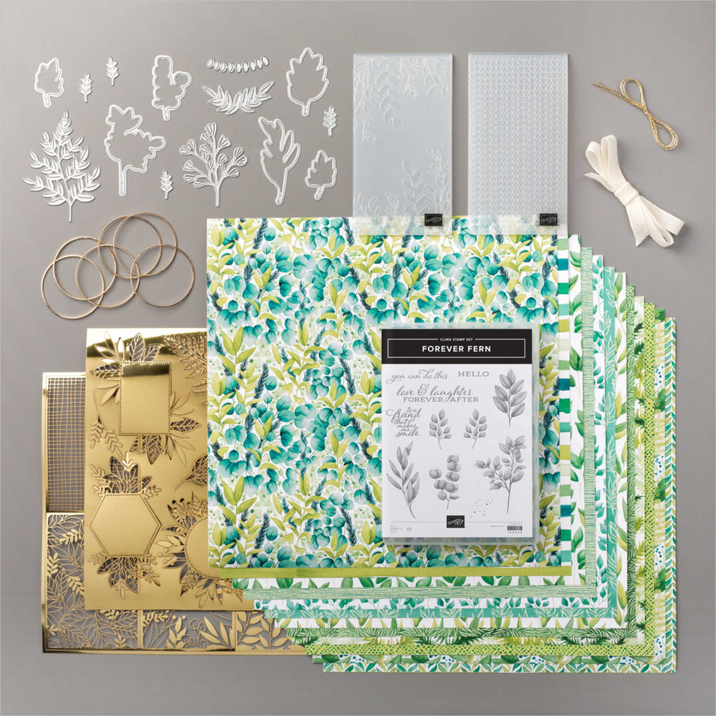
I don’t know about you, but choosing a favourite product is like choosing a favourite child. Impossible to do! However after much consideration I decided to make some cards using products from the stunning Forever Greenery Suite.
I love everything about this suite – the DSP, especially. But I think my absolute favourite part of this suite is the Gold 1/16 ” trim that comes with Vanilla Ribbon in the Forever Greenery Trim combo pack.
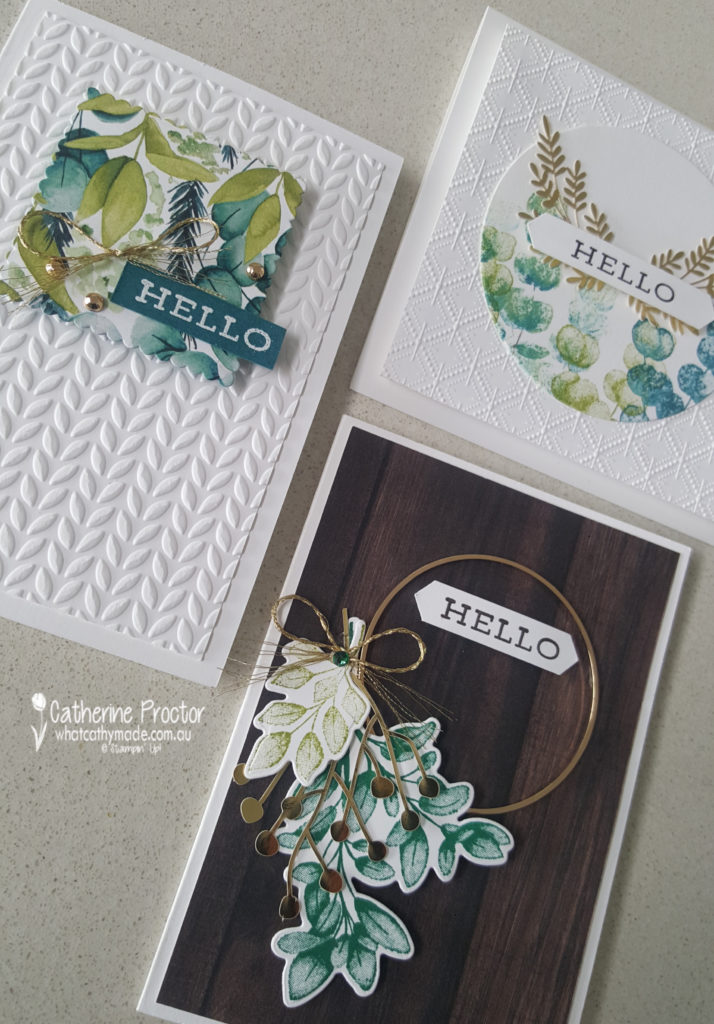
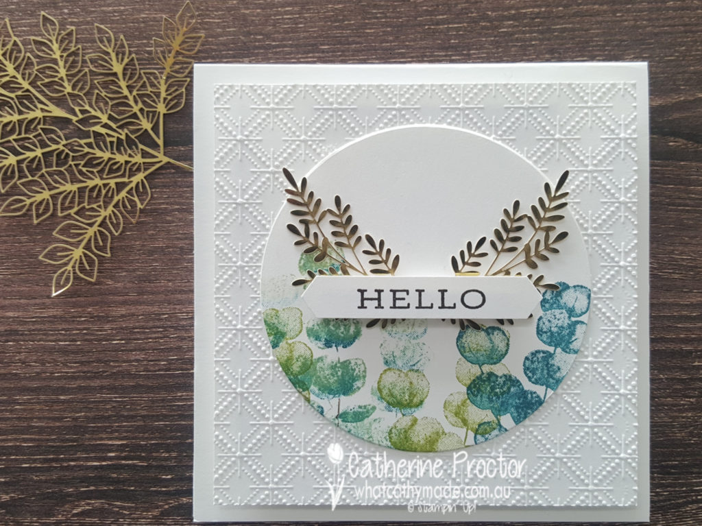
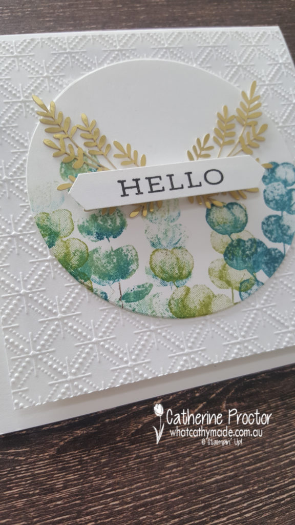
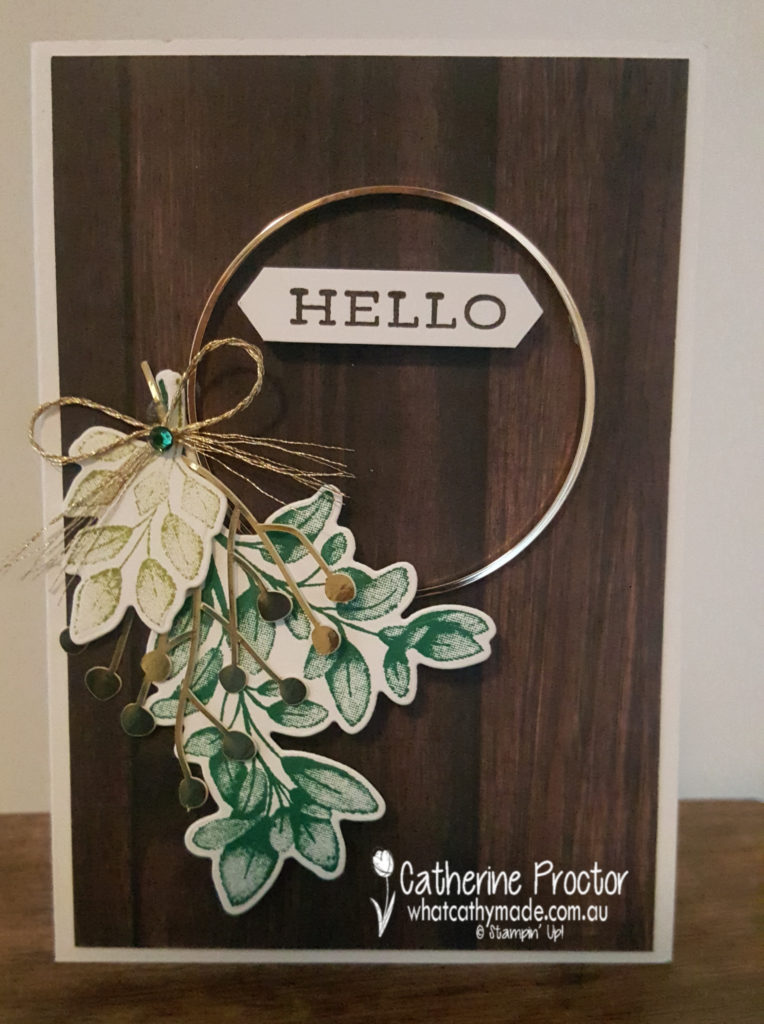
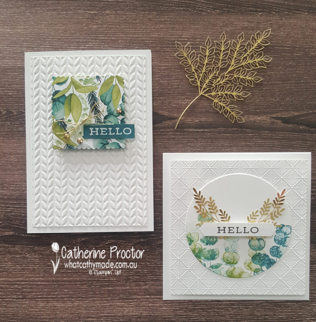
Tonight I made three different cards that all use the Forever Greenery Suite as well as some other new products.
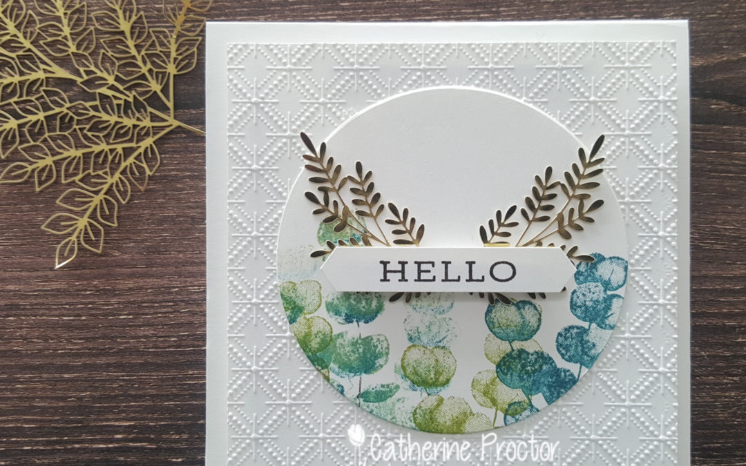
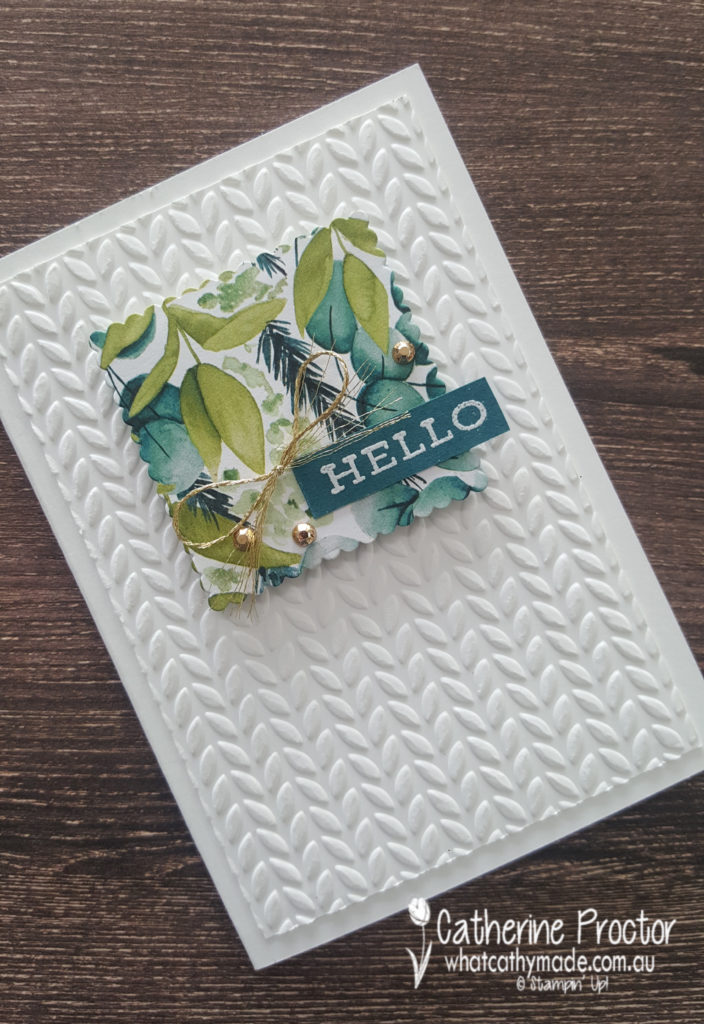
My first card is a square card that actually features a different embossing folder – the Dainty Diamonds embossing folder from the Peony Garden Suite. Isn’t this embossing folder just stunning?
The circle is cut out with the largest of the layering circles and I used one of the stamps from the Forever Fern stamp set, stamped in Pretty Peacock, Pear Pizzaz and some Early Espresso.
The Forever Gold Laser-cut Specialty Paper adds an elegant touch of bling.
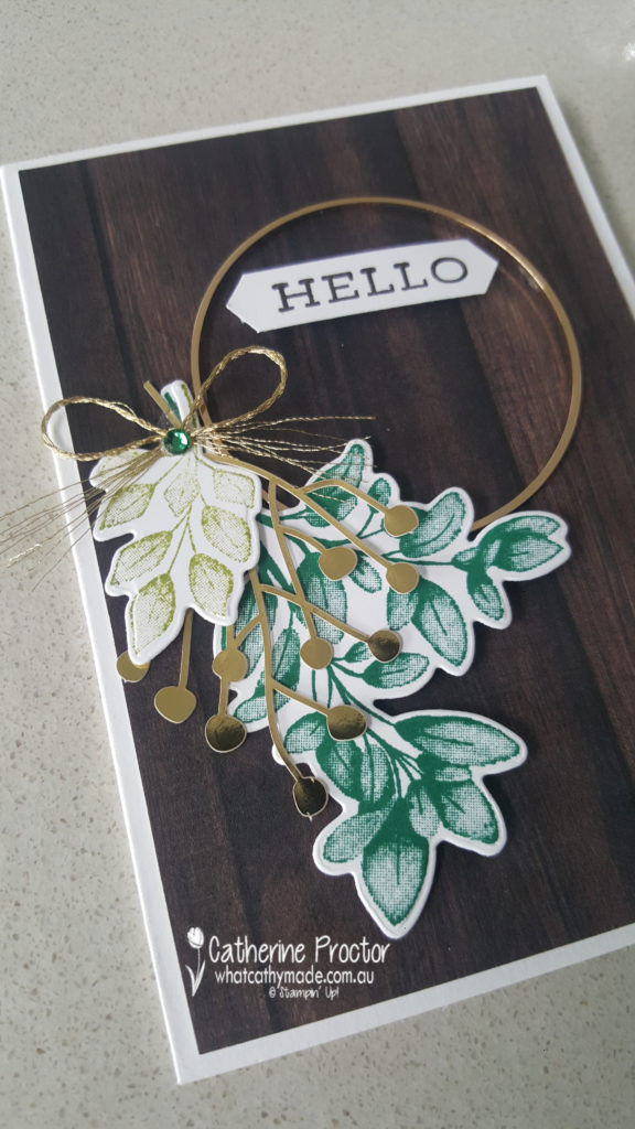
Card two uses a patterned paper from the In Good Taste Designer Series Paper pack. I love how this rich dark wooden paper makes the elements on top of the card really pop.
But of course the main focal point of this card is the gorgeous Gold Hoop Embellishment tied with a bow of Gold 1/16 ” from the Forever Greenery Trim combo pack and another die cut piece from the Forever Gold Laser-cut Specialty Paper. The different green foliage are stamped and die cut using the Forever Fern Bundle.
The layout for my final card is a design I cased from a card made by Dani Dziama, who was an Artisan Design team member a few years ago. I loved the amount of white space on her card, but I changed all the main elements to make it my own.
The embossed white panel has been embossed using one of the Greenery embossing folders and I used one of the scalloped square layering dies to cut out some of the gorgeous Forever Greenery DSP.
For many of my photos today I’ve used one of the sheets of the In Good Taste Designer Series Paper as my background because I love the way the cards look against this DSP. This paper below looks like real wood – it is amazing!
The next Art With Heart Team member to share their new catalogue projects is the super creative Andrea Sargent. I can’t wait to see what she’s made tonight.
If you have a broken link or have come to this blog hop midway, you can view all the participants below:


")


 Scalloped Linen Ribbon")


")


 Faux Suede Trim")


")


")
")


")
")


