We’re a group of stamping friends who are celebrating Bron’s 60th Birthday in 2022 with six blog hops, over six months, with six fun themes! This is our inspiration pic for tonight’s hop. Isn’t it a beauty!
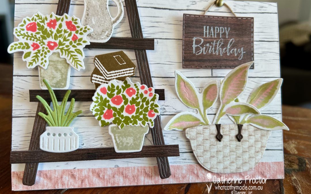
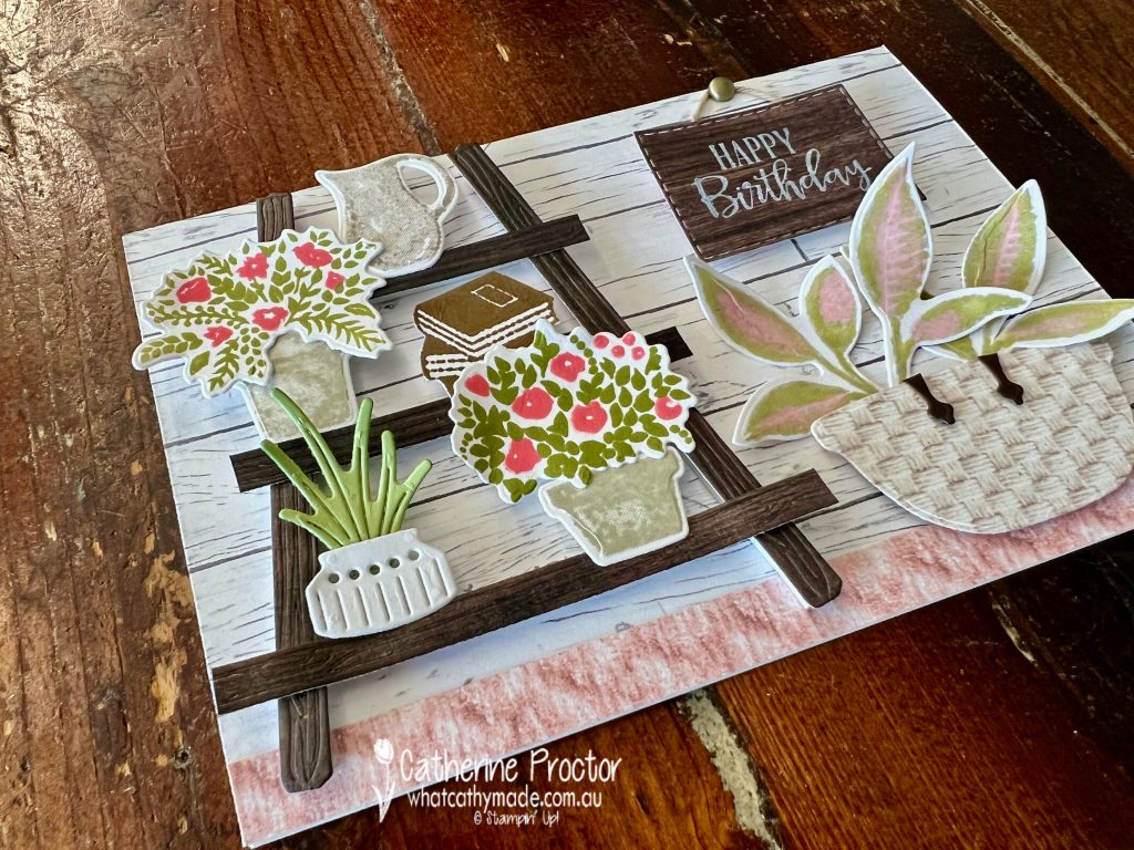
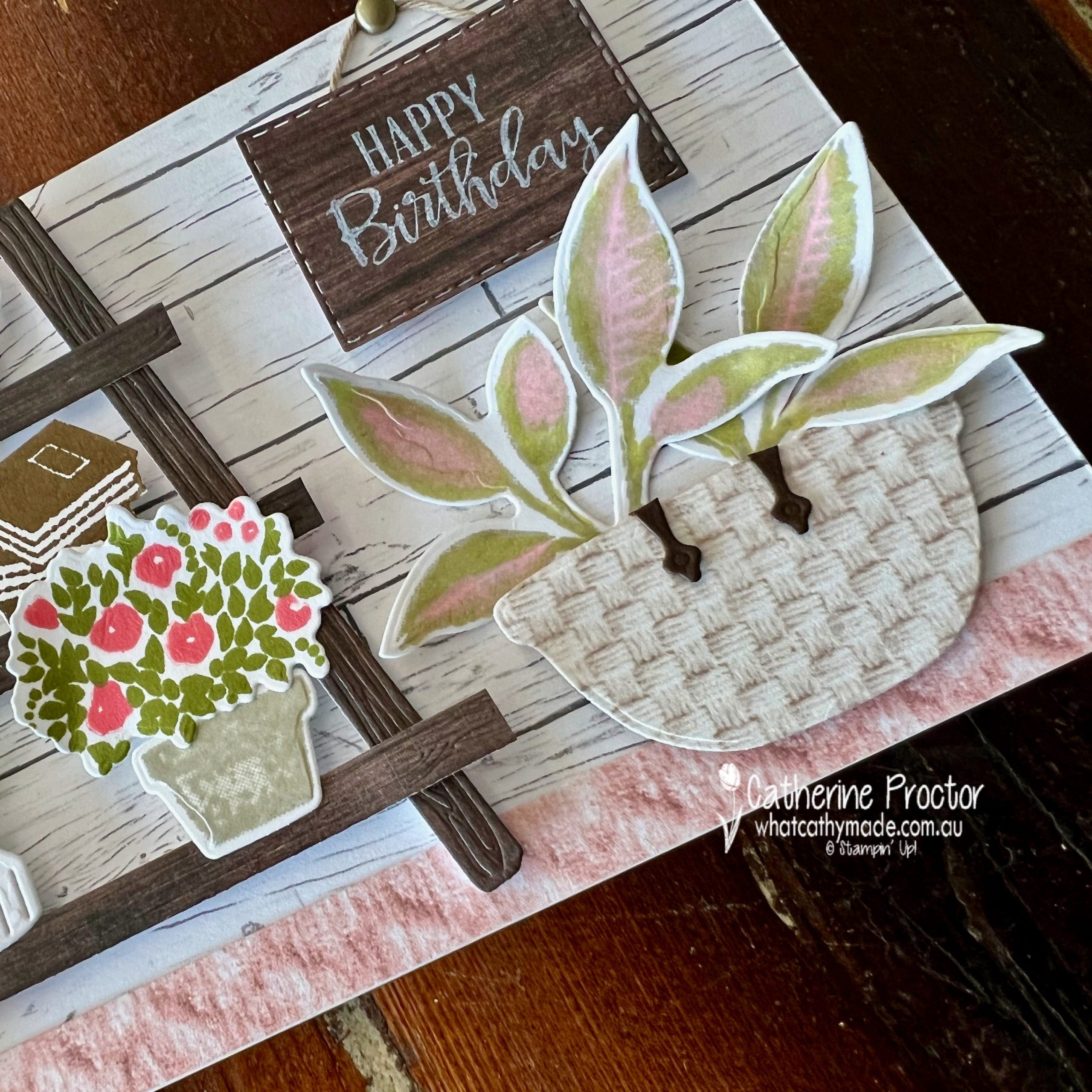
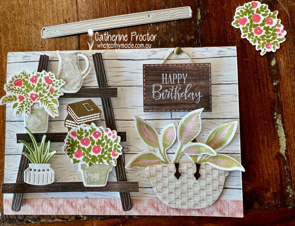
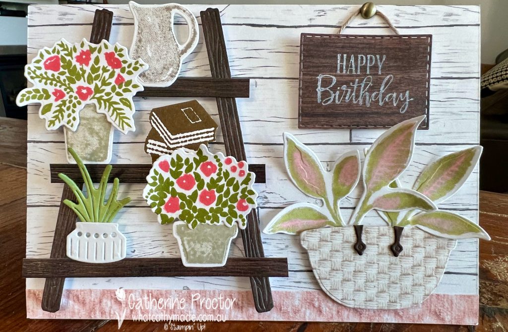
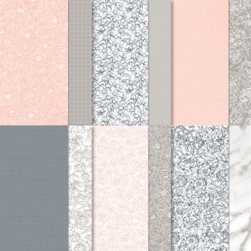
The mix of soft neutrals with a touch of pink and the amazing texture on the basket in this inspiration photo inspired me to use the realistically textured “In Good Taste” DSP to create a home decor scene on my card.
Yes, it’s quite a “busy” card front, but as far as I’m concerned with house plants, more is definitely more! Do you agree?
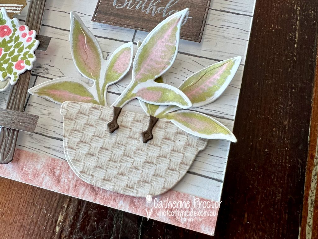
My basket is die cut from In Good Taste DSP, using the bowl die from the Cookin’ dies with the leather handles made from the hinges in the Window flower box dies.
To create the gorgeous two-toned leaves for my Lady Valentine houseplant I stamped the large leaf stamps from the Plentiful Plants bundles in Soft Suede (stamped off) then coloured them in with Old Olive and Flirty Flamingo light Stampin’ Blends before die cutting.
The In Good Taste DSP is retiring soon and 50% off – I’ve just ordered another pack of this incredibly versatile DSP. A strip of the textured pink DSP creates a pink sisal carpet, and the darker wood tone DSP is die cut using long die from the Garden dies to add extra texture to the wood planks in my plant stand.
The background wood plank DSP is from the Heart & Home DSP (I thought this best matched the wood planks in the inspo photo) with the items on the plant stand stamped and die cut using the following products:
Stack of books – Make It Happen stamp set
Jug and floral pots – Welcoming Window stamp set & Window flower box dies
White pot and plant – Perfect Plants dies
The “Happy Birthday” sign is die cut using the stitched rectangle dies and hung on a Brushed Metallic Adhesive-Backed Dot.
Although this is a busy home decor scene, all the plants and the natural textures make me feel calm and happy. I hope my card puts a smile on your face too!
Next up on Bronwyn’s Birthday Blog hop is Sharon Dalton – I can’t wait to see what Sharon has created.
I’ll be back on Wednesday night with the AWH Colour Creations team, where we will be showcasing Smoky Slate.
In the meantime, wherever you are in the world, stay safe, stay calm…and keep on crafting xxx
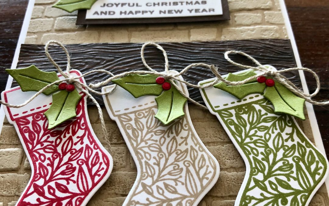
Hello crafters! Welcome to Week 18 of our AWH Heart of Christmas blog hop.
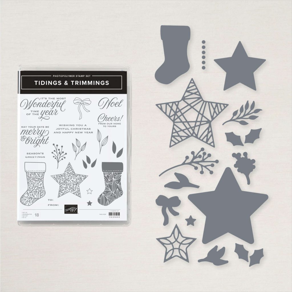
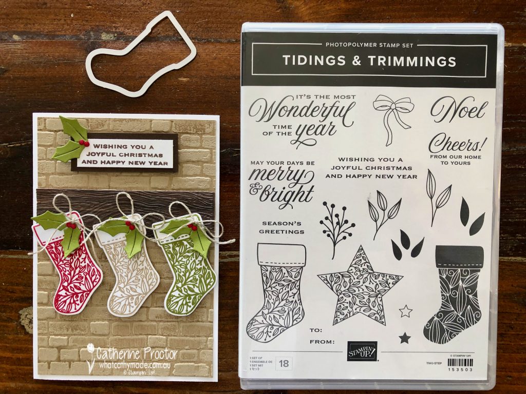
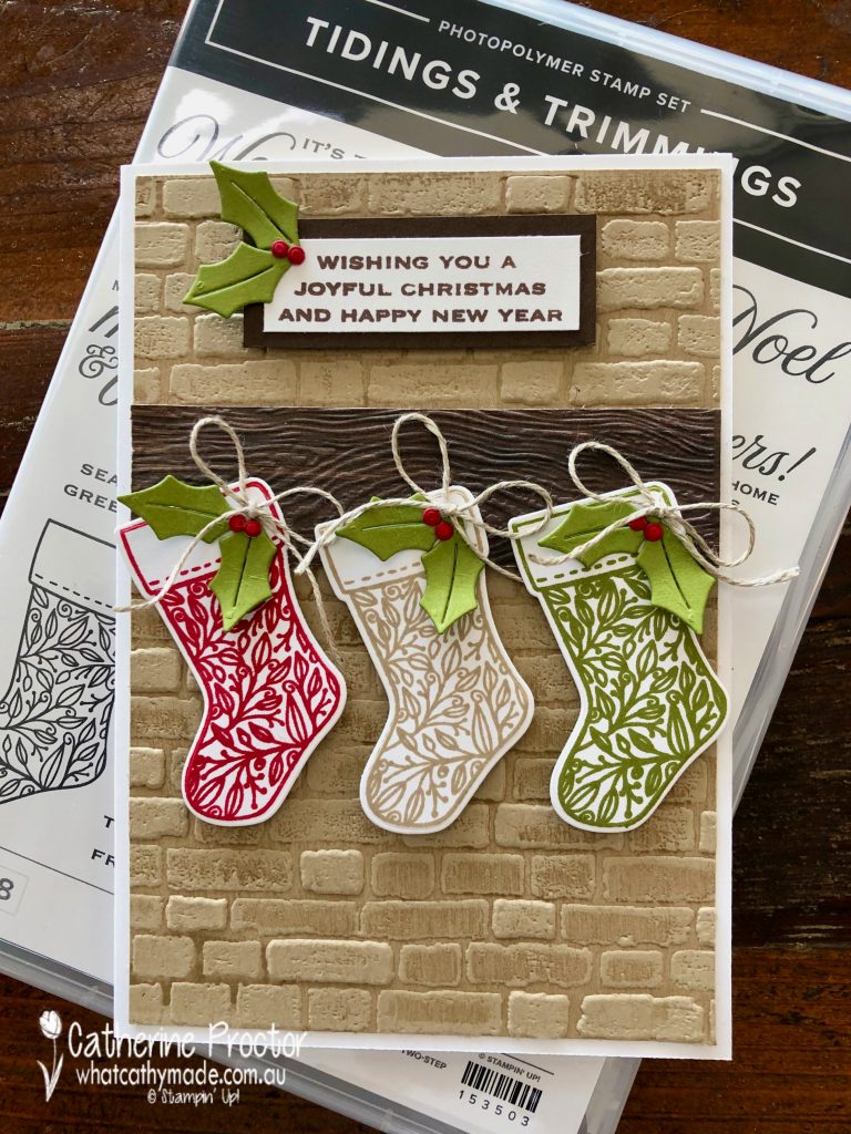
This week I finally used a bundle I’ve had for ages – I don’t know why it took me so long to open it up! The Tidings & Trimmings Bundle includes the Tidings & Trimmings Stamp Set and the Christmas Trimmings Dies. It’s on page 88 of the 2021-22 Annual Catalogue.
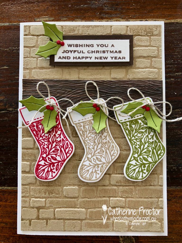
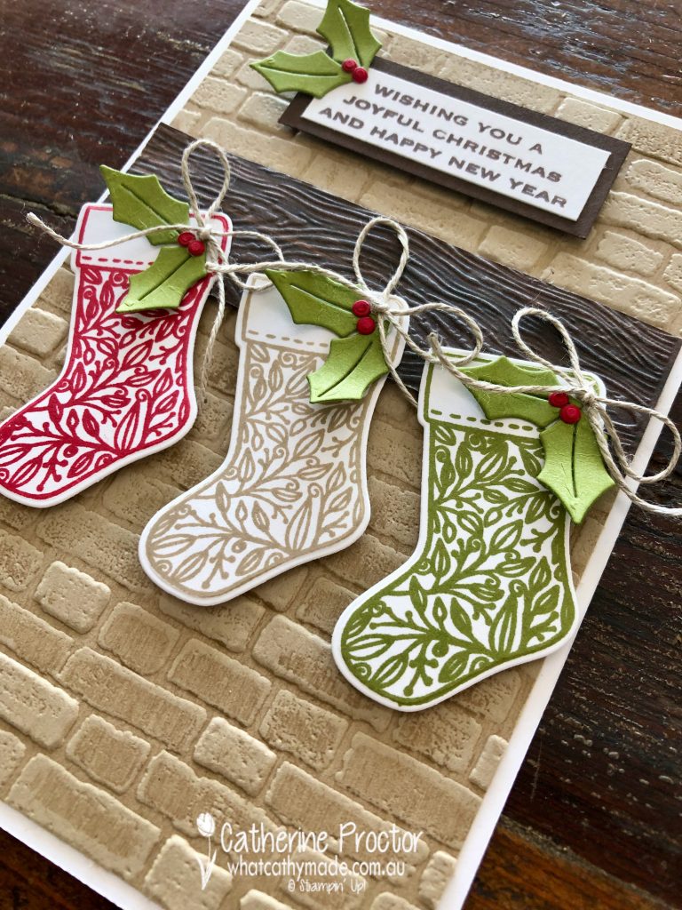
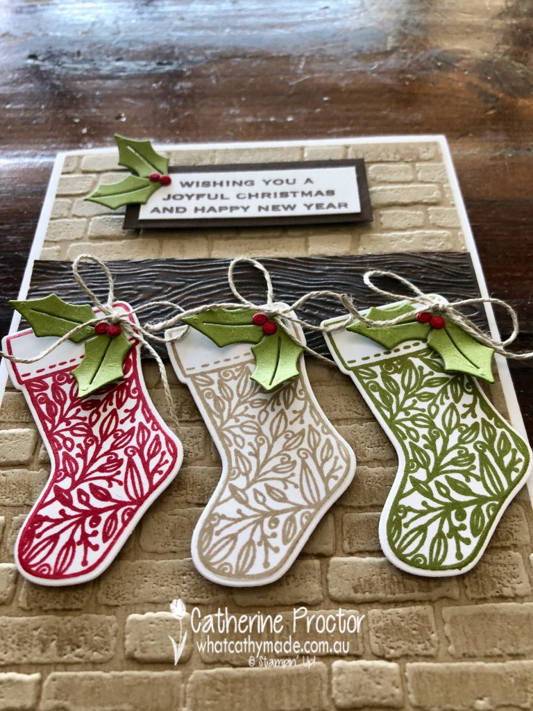
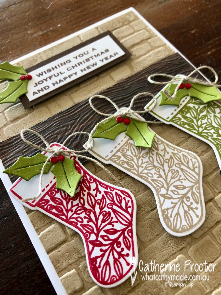
I love creating miniature scenes on cards and the lovely brick background you see on this card is actually a reject from the Christmas card I made for next Monday. I didn’t want to waste this embossed Crumb Cake background so I designed this entire card around it.
TIP: For a more realistic effect I swiped the inside of the Bricks & Mortar EF with my Crumb Cake ink pad BEFORE inserting the Crumb Cake card stock into the EF and running it through the cut’n’emboss machine.
The mantlepiece is simply a strip of In Good Taste DSP that I embossed using the Timber 3D embossing folder. I attached the mantelpiece to the brick chimney using Stampin’ dimensionals so it sits out like a real mantelpiece would.
The three stockings are stamped in Real Red, Crumb Cake and Old Olive (one of my favourite Christmas colour combinations), then die cut out with the stocking die from the Christmas Trimmings Dies.
The little holly leaves and berries decorating the stockings and the sentiment are also cut using the Christmas Trimmings Dies – I used Old Olive for the holly leaves and Real Red for the holly berries.
I couldn’t resist adding a tiny bow of linen thread to each of the stockings – linen thread is hands down my all time favourite Stampin’ Up! product!I love the tiny upper case font on this sentiment. I’ve stamped it in Early Espresso to contrast with the Crumb Cake embossed background and to tie in with the colour of the mantlepiece.
Now it’s time to hop on over to our next participant, the lovely Sharon Davern. I can’t wait to see what she shares with us today!
If at any time you find a broken link please head to the blog of this week’s host of The Heart Of Christmas Blog Hop, Tina Gillespie, and she will have the list of all those participating.
Thanks for visiting my site. I’ll be back with another card on Wednesday.
In the meantime, wherever you are in the world, stay safe, stay calm … and keep on crafting xxx
Welcome back to our 50th week of Colour Creations Showcase for 2020-21!
Today we are showcasing Soft Suede, and it is our final week in this present Colour Creations Showcase format. But don’t worry – we’ll still be sharing weekly colour inspiration with you, going forward!
From next week we will be reverting to a traditional blog hop format, starting with a showcase of ALL FIVE 2021-23 InColours on Wednesday 2nd June, followed by the rest of our beautiful Stampin’ Up! colours in individual alpha order at 8pm every Wednesday.
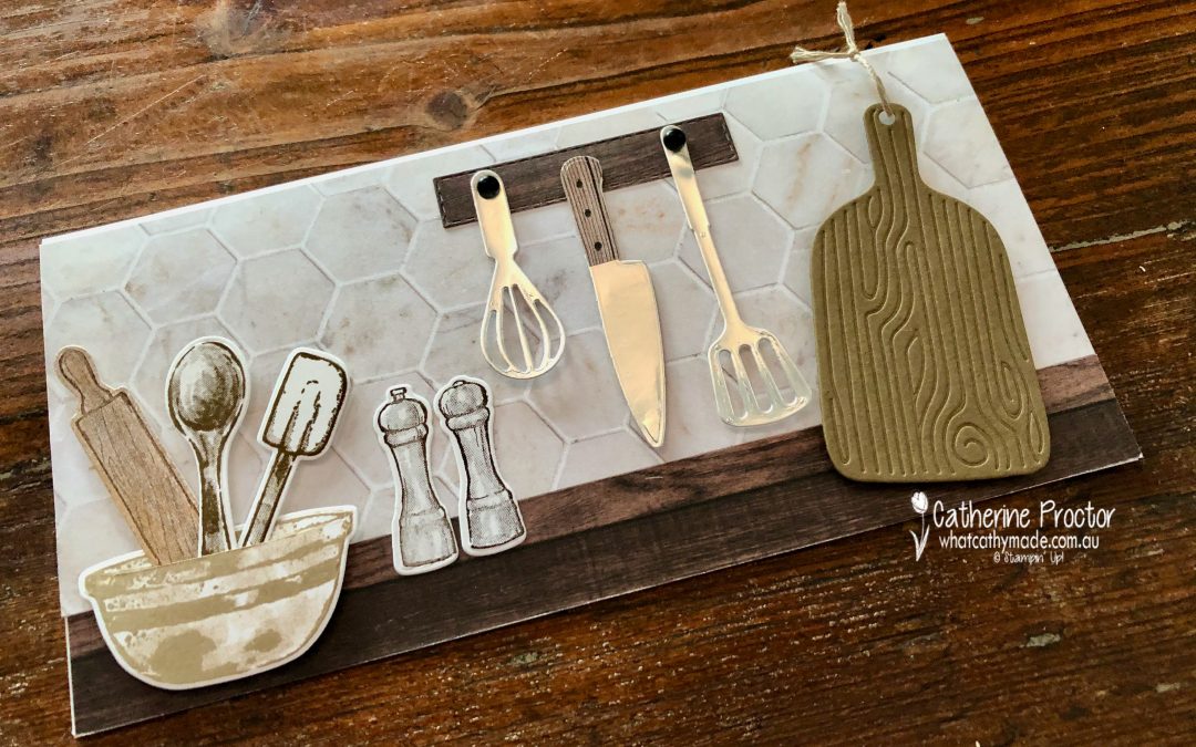
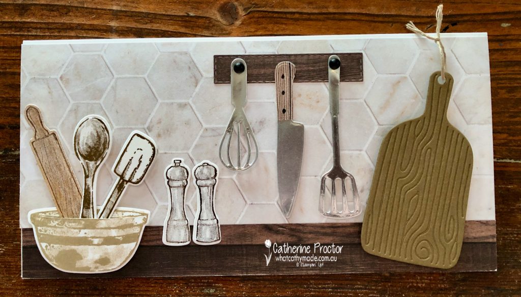
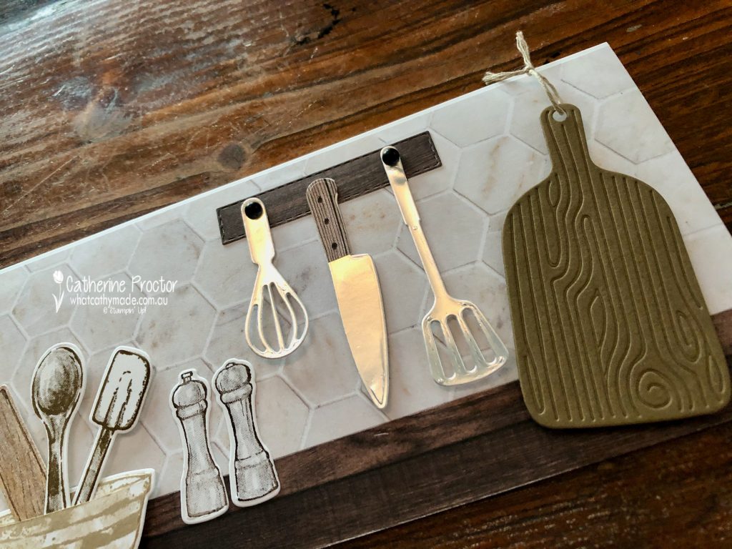
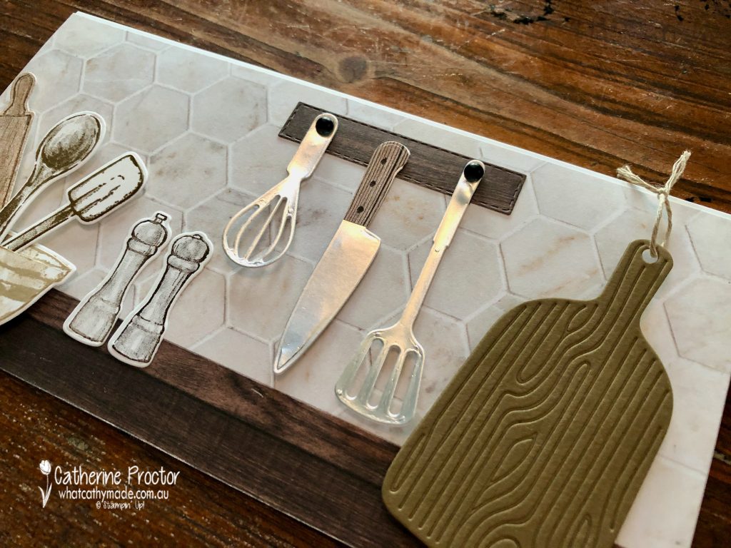
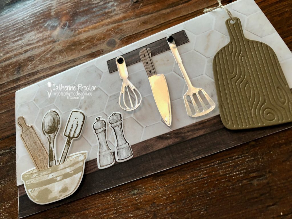
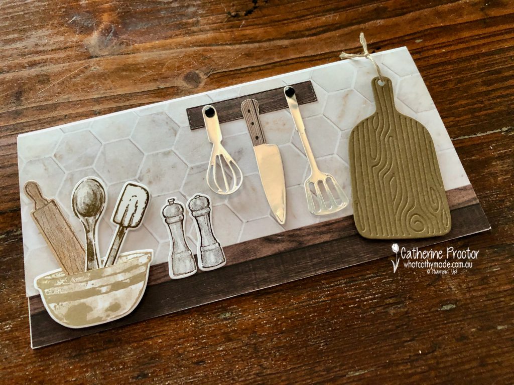
For my final card in our AWH Colour Creations Showcase I’ve used one of my favourite bundles from the new Annual Catalogue, the What’s Cookin’ bundle.
I bought this bundle with the intention to make a kitchen scene bench fold card, however I thought the scale of the elements would work better as a kitchen bench scene in a slimline card.
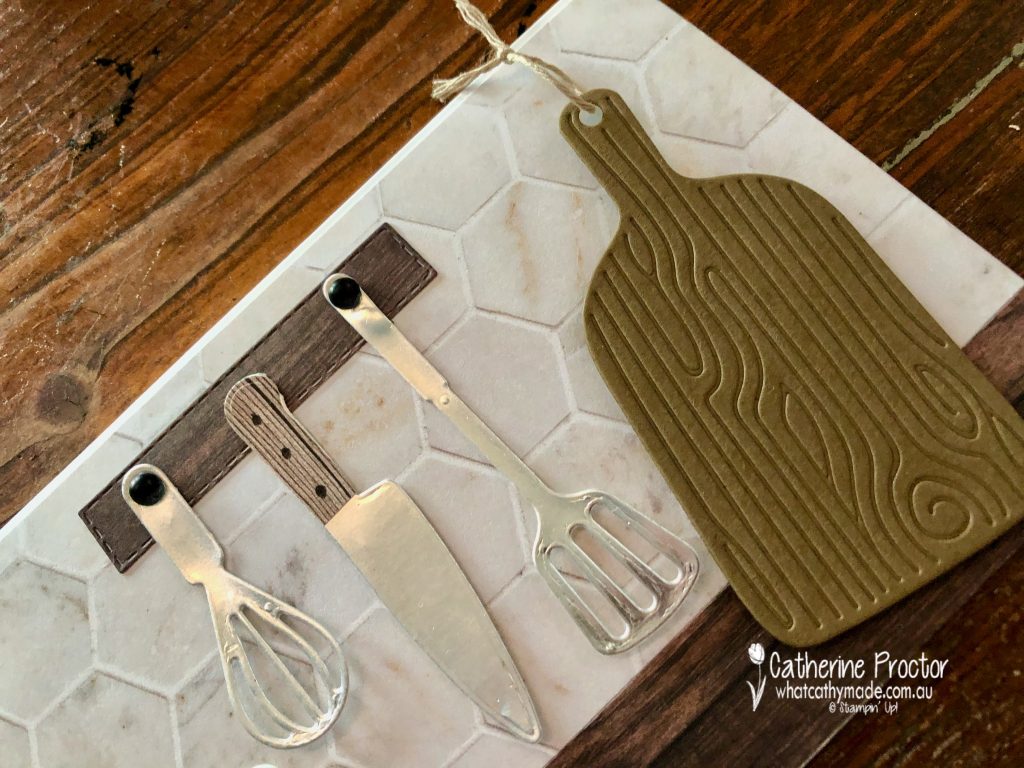
I’m so glad the In Good Taste DSP has carried over to the new catalogue because it is just perfect to create a tiled splash back and wooden kitchen bench.
How adorable is this chopping board in Soft Suede! The die embosses the board at the same time and I’ve tied some of the new Crumb Cake bakers twine through the handle. In fact I’ve kept the colour combination for this card entirely from the neutrals family.
After making and photographing my card I realised the Silver foil I used for the whisk, knife and slotted turner is not in the Annual Catalogue – if you don’t have a scrap of silver foil left over, use Basic Gray card stock for the knife blade and any colour for the whisk and the slotted turner as they could be made of coloured silicon.
I die cut the knife twice to create a wooden handle to which I then added three dots with my Basic Black marker for the screws. The utensil holder is die cut using a stitched rectangle die and 2 matte black dots are the “hooks” for the whisk and the slotted turner.
A single slit in the front curve of the the bowl (use a the sharp blade of a craft knife) allows the rolling pin, spoon and spatula to sit inside the bowl.
I’ve deliberately left the inside of the card blank so it can be used for any purpose or any gender.
I can’t wait to see what everyone else has created with Soft Suede today!
If you’d like me to post you your very own copy of the 2021-22 Stampin Up! Annual Catalogue, or to simply find out about more about Stampin’ Up! contact me.
In the meantime, wherever you are in the world, stay safe, stay calm…and keep on crafting xxx
Welcome to week twenty-four of our 2020-2021 Art With Heart Colour Creations Showcase.
Each week various members of our Art With Heart Colour Creations team will be bringing you weekly colour inspiration as we showcase our range of over 50 beautiful Stampin’ Up! colours in alphabetical order.
Week 24 – Mango Melody
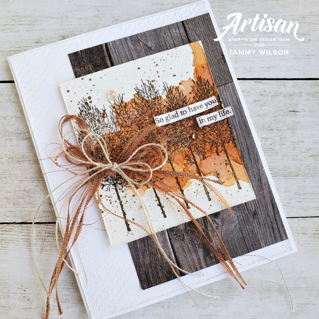
When I saw this beautiful card on Pinterest – created by Tammy Wilson, a USA Stampin’ Up! demonstrator and member of the Artisan Design Team – it instantly evoked a very special memory for me.
In 2018 I visited New York, Indianapolis and Hawaii with my husband and two sons – it was our first big holiday as a family and the first time all four of us went overseas together. We went to celebrate my 50th birthday and more importantly to finally meet and thank my amazing bone marrow donor Ben and his wife Christy.
This incredible trip was one of the happiest times of my life and now with COVID I’m forever grateful we were able to enjoy this special trip together.
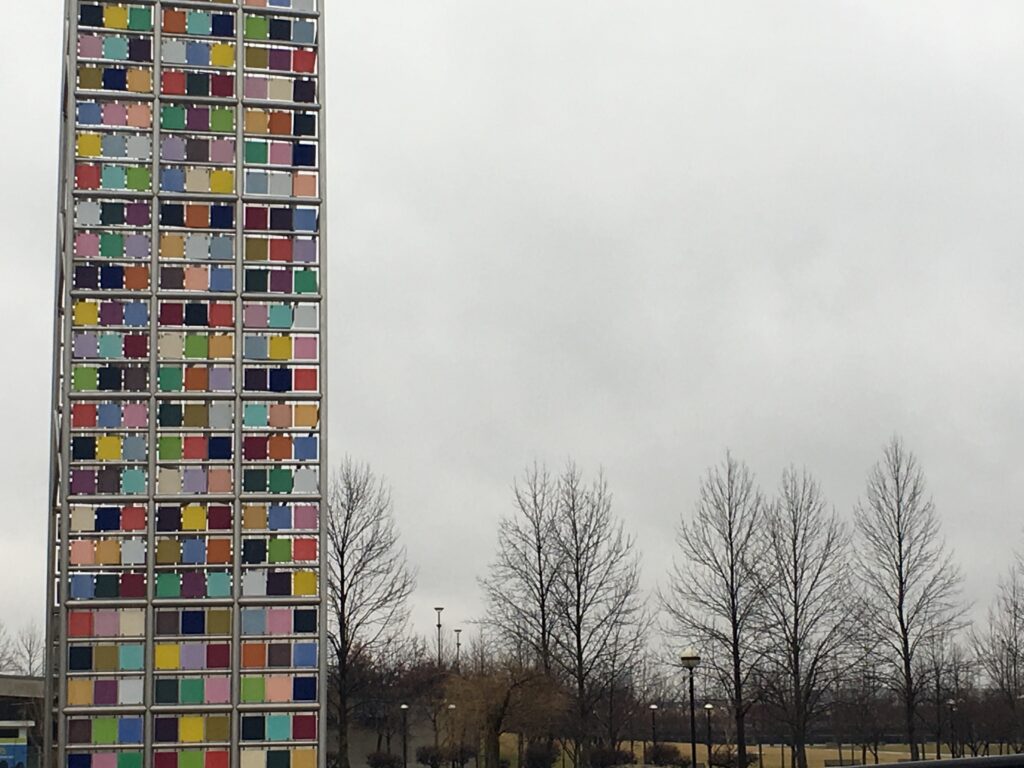
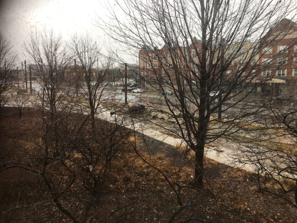
Tammy’s card immediately reminded me of the stunning trees in Central Park, New York and Indianapolis – the soft colour of the sky and the shape of the tree branches is totally different to we have here in Australia. Here’s a few photos I took of this soft winter sky with the silhouettes of the winter trees.
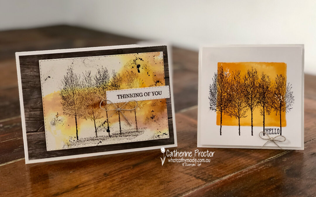
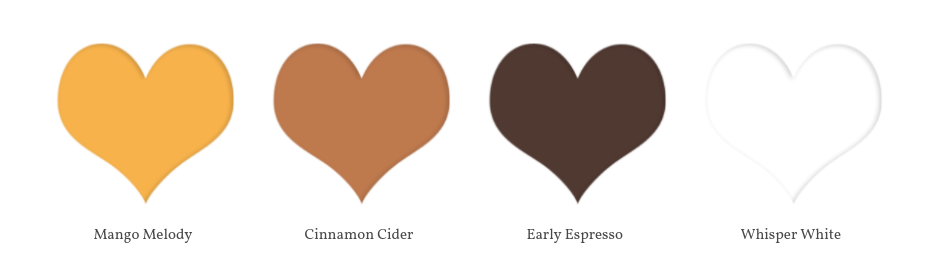
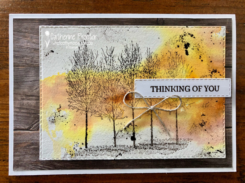
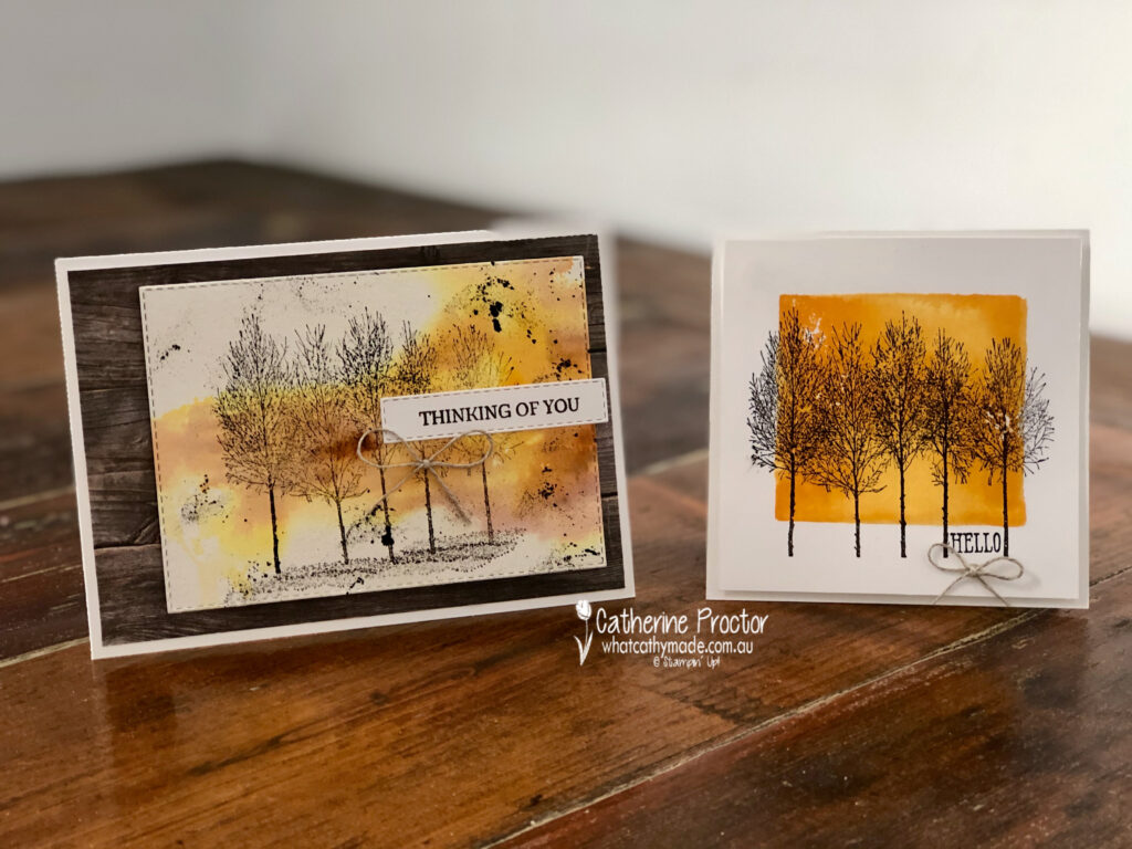
My first card today is a much simpler version of Tammy’s card and it uses slightly different colours. I love these shades of orange and brown together: Mango Melody, Cinnamon Cider, Early Espresso and Whisper White.
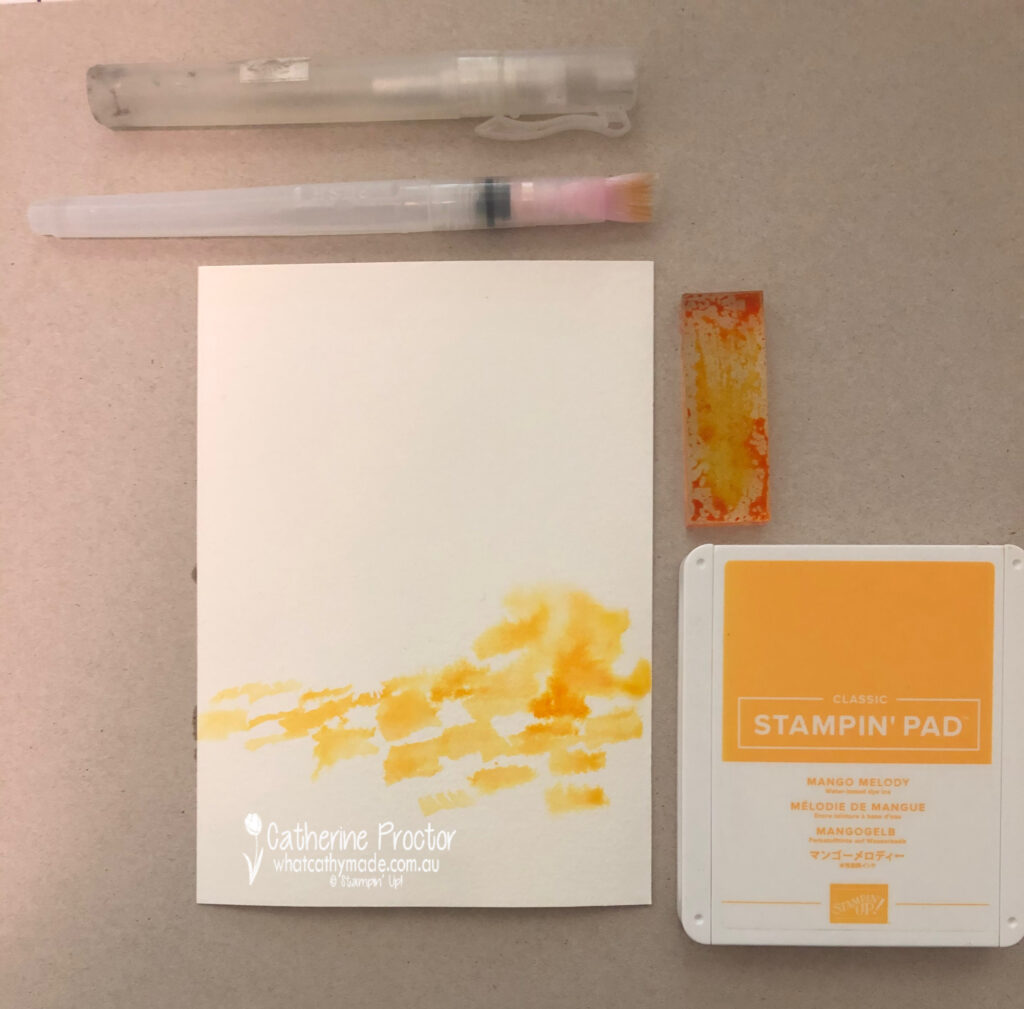
To create my background I’ve used a really fun watercolour technique that creates a different look every time.
Spritz a sheet of Fluid 100 Watercolour paper several times with your Stampin’ Spritzer
Tap an acrylic block onto Mango Melody ink pad to cover the surface of the block with the ink
Use your widest water painter to lift Mango Melody ink off your acrylic block and paint it onto the Fluid 100 Watercolour paper
Tap another acrylic block, this time onto your Cinnamon Cider ink pad and then use your widest water painter to paint some Cinnamon Cider ink onto your Fluid 100 Watercolour paper
Spritz the paper again with your Stampin’ Spritzer (watch the inks merge together at the edges) and then dry the ink using your heat tool
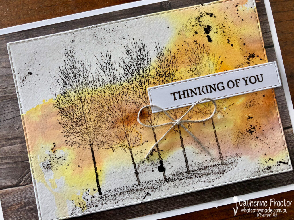
Stamp the largest tree stamp in Early Espresso ink, and then stamp the “shadows” stamp in Early Espresso ink underneath the group of trees
Flick the thick end of your Early Espresso Stampin’ Write marker with your finger to create splatters all over the card
My sentiment is also from the Winter Woods stamp set – I used my Early Espresso marker to colour just the “thinking of you” section of the sentiment before stamping and then die cutting the sentiment out with stitched rectangle die to match the larger stitched rectangle die I used to cut the water coloured layer.
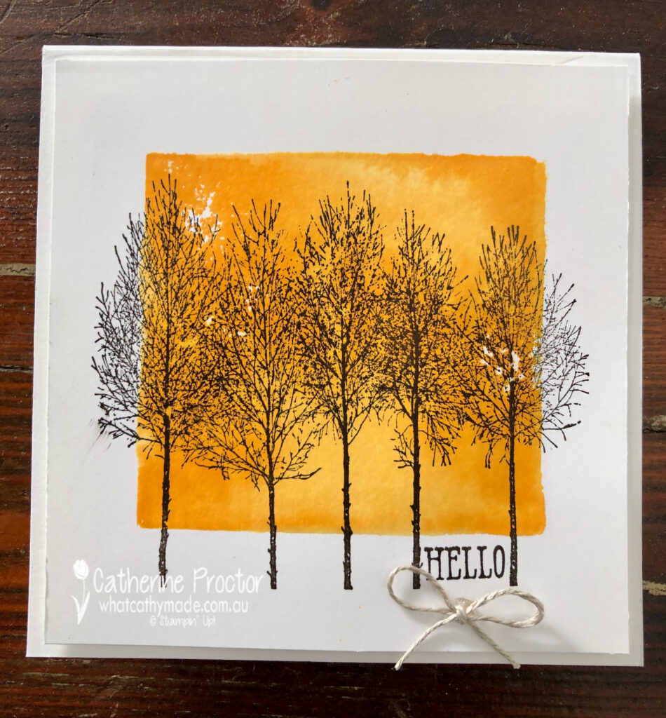
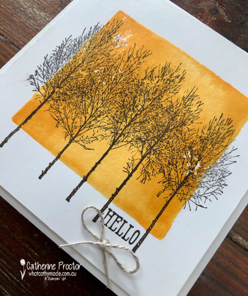
I couldn’t resist making one more card with this stamp set because it also is the perfect stamp set for the acrylic block stamping technique. If you’ve never tried this technique please give it a go – it is so easy and so effective.
You simply ink up an acrylic block (I used size C) by tapping it onto your stamp pad, then spritz it with your Stampin’ Spritzer and stamp the acrylic block directly to your paper. This time I used Whisper White but this technique looks great on watercolour paper too.
Once you’ve dried your ink background, stamp the tree stamp over the top in Early Espresso ink. I wanted a small sentiment to fit in the gap between the two tree branches on the far right and the “Hello” sentiment from the Well Said stamp set was the perfect fit.
Both my cards were finished off with a simple bow of linen thread.
I can’t wait to see what the rest of the Art With Heart team have created with Mango Melody today. Click on the links below to see what they’ve made.
If you’d like me to post you your very own copy of the August–December 2020 Mini Catalogue, 2020-21 Stampin Up! Annual Catalogue, the 2020-21 Beginners Brochure, or to simply find out about more about Stampin’ Up! contact me.
In the meantime, wherever you are in the world, stay safe, stay calm…and keep on crafting xxx
Welcome to week nineteen of our 2020-2021 Art With Heart Colour Creations Showcase.
Each week various members of our Art With Heart Colour Creations team will be bringing you weekly colour inspiration as we showcase our range of over 50 beautiful Stampin’ Up! colours in alphabetical order.
Week 19 – Granny Apple Green
Last weekend was world card making day and I celebrated by holding a free card making class at my place.
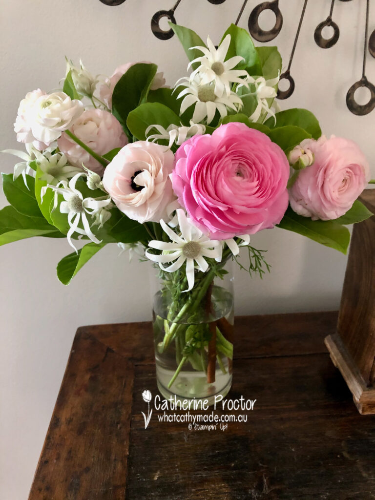
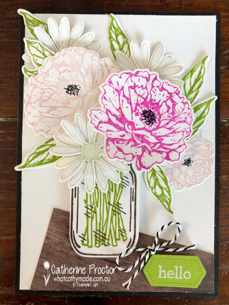
This beautiful bunch of flowers was given to me by my dear friend Nicole who came to my afternoon class. The Granny Apple Green colour of the leaves and stems proved to be the perfect inspiration for my Colour Creations Showcase project this week.
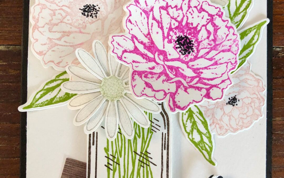
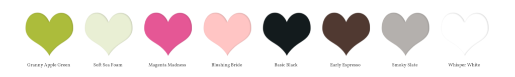
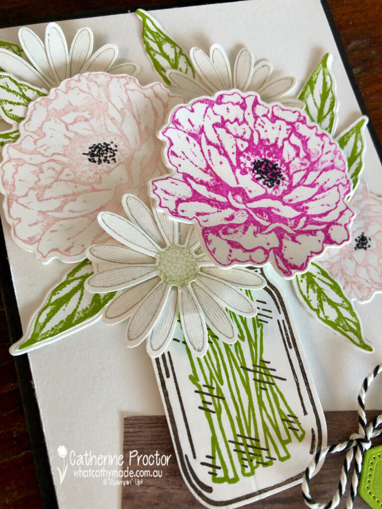
I love using my craft supplies to reproduce gorgeous bunches of flowers. For my card this week I used Granny Apple Green, Magenta Madness, Blushing Bride, Smoky Slate, Soft Sea Foam, Basic Black, Whisper White and Early Espresso.
To make my flannel flowers I used the smaller daisy stamp and Medium Daisy Punch. Smoky Slate was stamped off twice for the petals and Soft Sea Foam stamped off once for the centre of the flannel flowers.
The closest stamp set I found to reproduce the ranunculus was Prized Peony – the darkest pink flower is Magenta Madness stamped off once, with Blushing Bride for the paler pink flowers. The black flower centres are created using the fine tip of a Basic Black Stampin’ Write Marker.
Granny Apple Green reproduced the leaves and the stems, with a piece of In Good Taste DSP set at an angle to reproduce the front hall table where my beautiful vase of flowers greet everyone who walks into the front door.
Isn’t nature always the most amazing source of inspiration?
I can’t wait to see what the rest of the Art With Heart team have created with Granny Apple Green today. Click on the links below to see what they’ve made.
If you’d like me to post you your very own copy of the August–December 2020 Mini Catalogue, 2020-21 Stampin Up! Annual Catalogue, the 2020-21 Beginners Brochure, or to simply find out about more about Stampin’ Up! contact me.
In the meantime, wherever you are in the world, stay safe, stay calm…and keep on crafting xxx
Welcome to the Monthly Art With Heart Creative Showcase. Tonight we’re sharing some ideas for masculine cards, something I know many of us can find challenging to make.
I recently made two masculine cards I’d like to share with you: the card I made for my dad’s birthday in July and the card I made last week for him for Father’s Day.
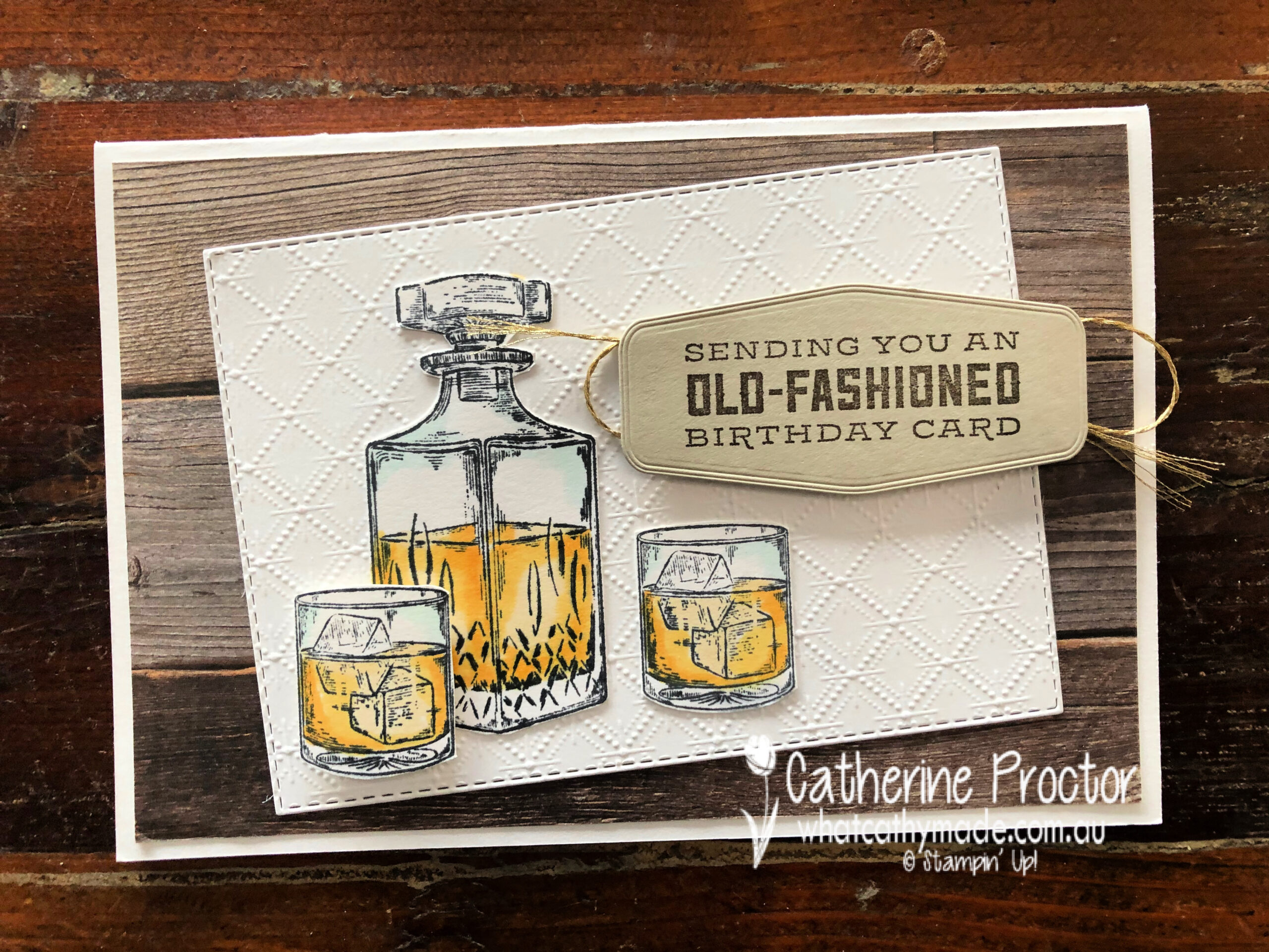
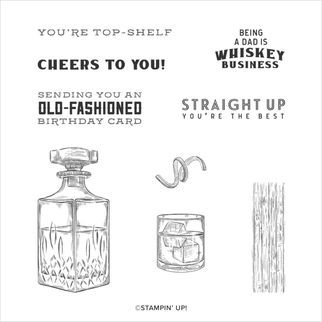
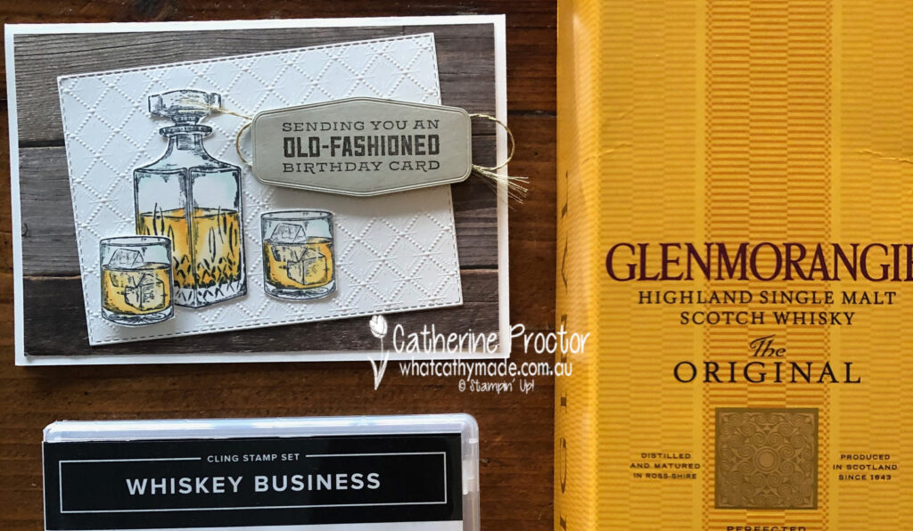
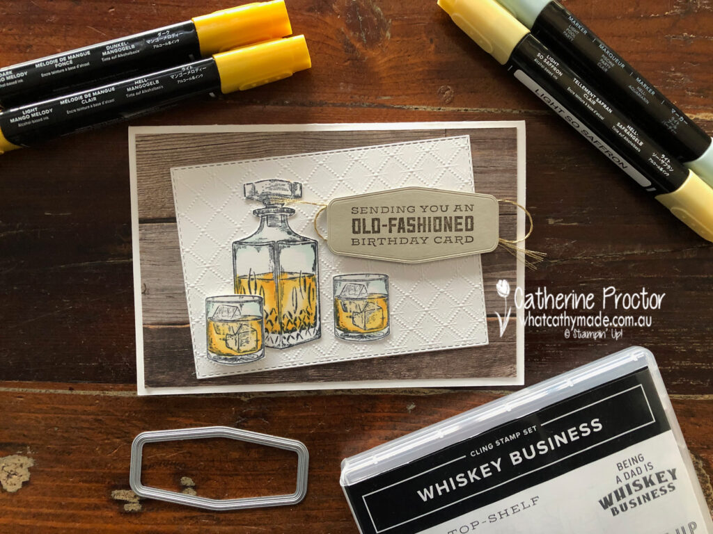
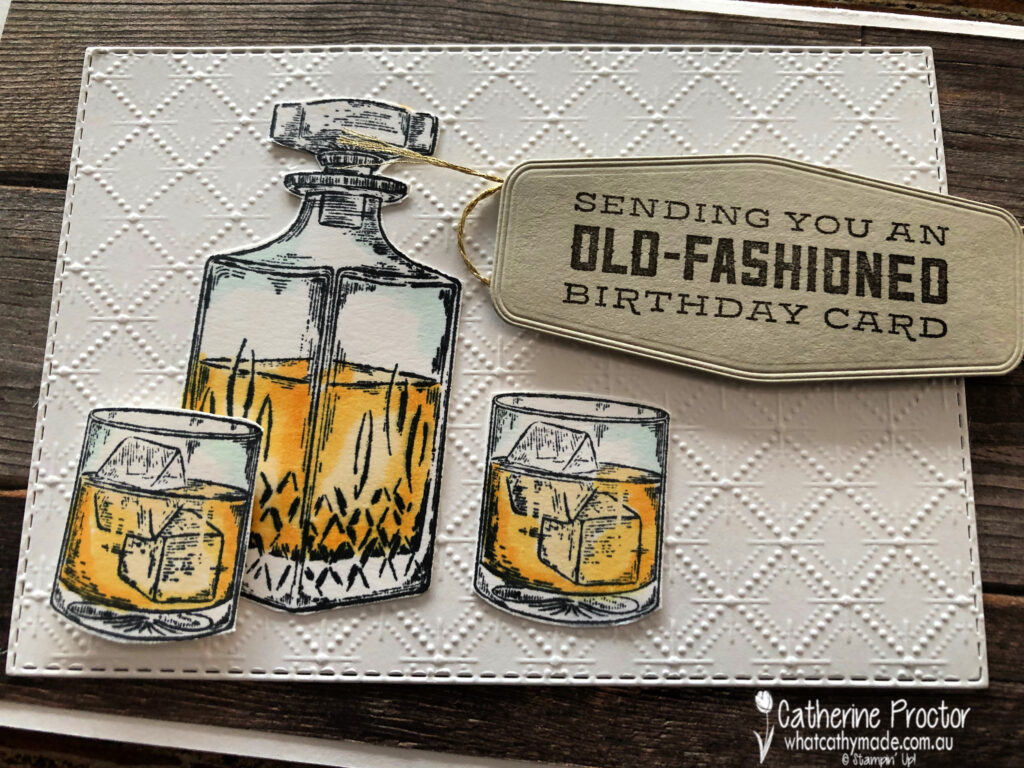
My dad is not a typical card game/car/fishing/treking/BBQ/sport kind of a dad and that can make designing masculine cards for him quite tricky. But there are two Stampin’ Up! stamp sets that perfectly matched the gifts I was giving to my dad: Whiskey Business and Press On.
For Dad’s birthday card I used the Whiskey Business set… no prizes for guessing what I gave him for his birthday!
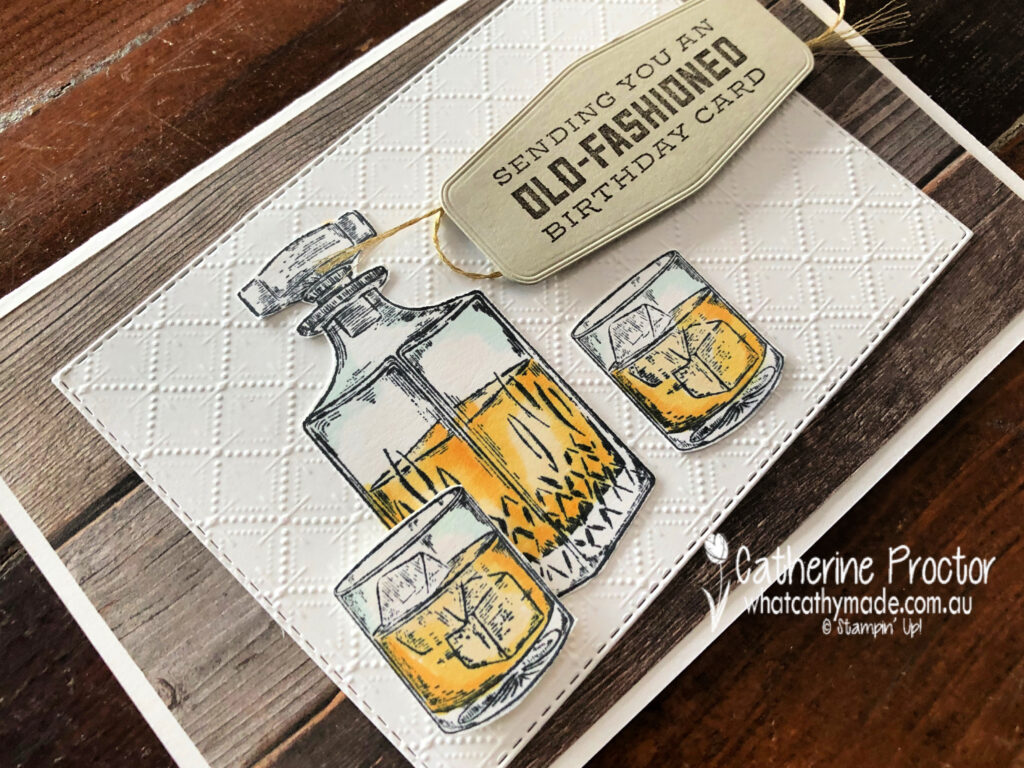
This card was CASED from the design of the card on page 33 of the Annual Catalogue but I made a few changes to make it my own. I just had to use the Dainty Diamonds embossing folder to emboss the Whisper White card stock because it looks just like the pattern in the cut crystal that the Whiskey decanter and whiskey glasses are made of.
The detailed line drawings of the Whiskey Business are so realistic and the Stampin’ Blends make it so easy to bring these stamps to life. I’ve used light Pool Party for the crystal, and light So Saffron, light Mango Melody and dark Mango Melody for the whiskey.
Here’s a close up showing the detail in this stamp set. I simply fussy cut my decanter and glasses using my paper snips before adhering them to the embossed Dainty Diamonds layer.
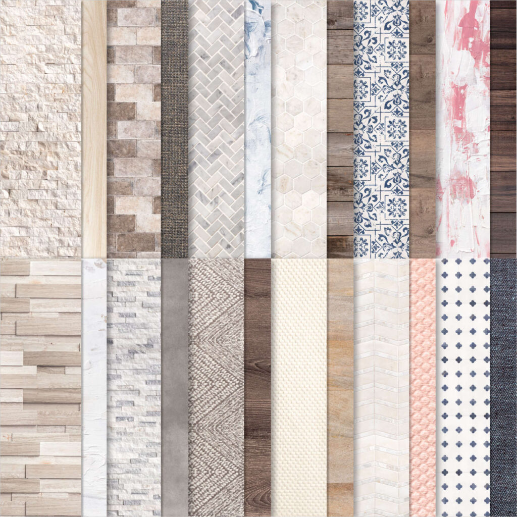
Speaking of realistic – how amazing is this wood patterned DSP from the In Good Taste DSP! All of this patterned paper was created from photographs of actual wood, stone, textiles, etc and it’s just perfect for masculine cards.
And finally, here’s the inside of the card.
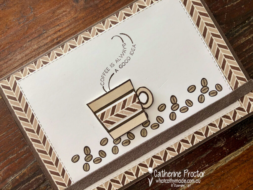
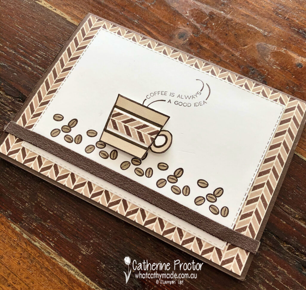
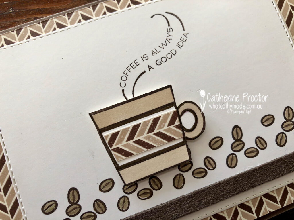
For my second card I’m sharing the one I made for Father’s Day to accompany a coffee machine and coffee, which is why I decided to use the Press On stamp set.
I kept this card very neutral, using coffee shades (Early Espresso and Crumb Cake) with Whisper White.
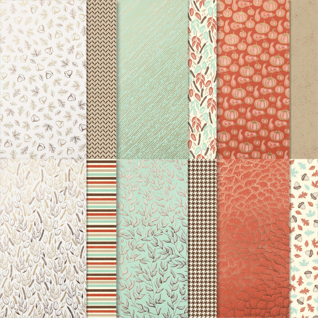
The lovely masculine chevron DSP is one you might have overlooked – I certainly did! This DSP is part of the Gilded Autumn specialty DSP which is found on page 45 of the August – December 2020 Mini Catalogue.
The coffee cup and beans were stamped in Early Espresso before being coloured in using Crumb Cake Stampin’ Blends and a Crumb Cake Stampin’ Write marker for the coffee beans.
The strip of early espresso faux suede ribbon along the base of the card co-ordinated perfectly and added a luxurious texture to the card.
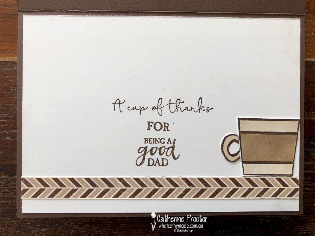
Inside my card I used a variety of sentiments to create a meaningful Father’s Day message – I’m not sure if it really worked, but my dad seemed to appreciate it and that’s what really counts.
To see more masculine card inspiration from the AWH Team head back to Rachel‘s page as she is hosting our monthly blog hops.
To purchase any of the products I’ve used in my cards tonight simply click on the phots of the products below.
If you’d like me to post you your very own copy of the August – December 2020 Mini Catalogue, the 2020-21 Stampin Up! Annual Catalogue, the 2020-21 Beginners Brochure, or to simply find out about more about Stampin’ Up! contact me.
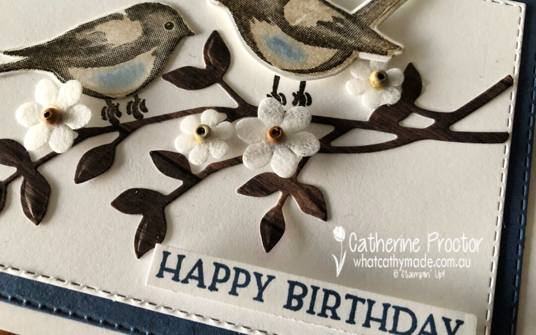
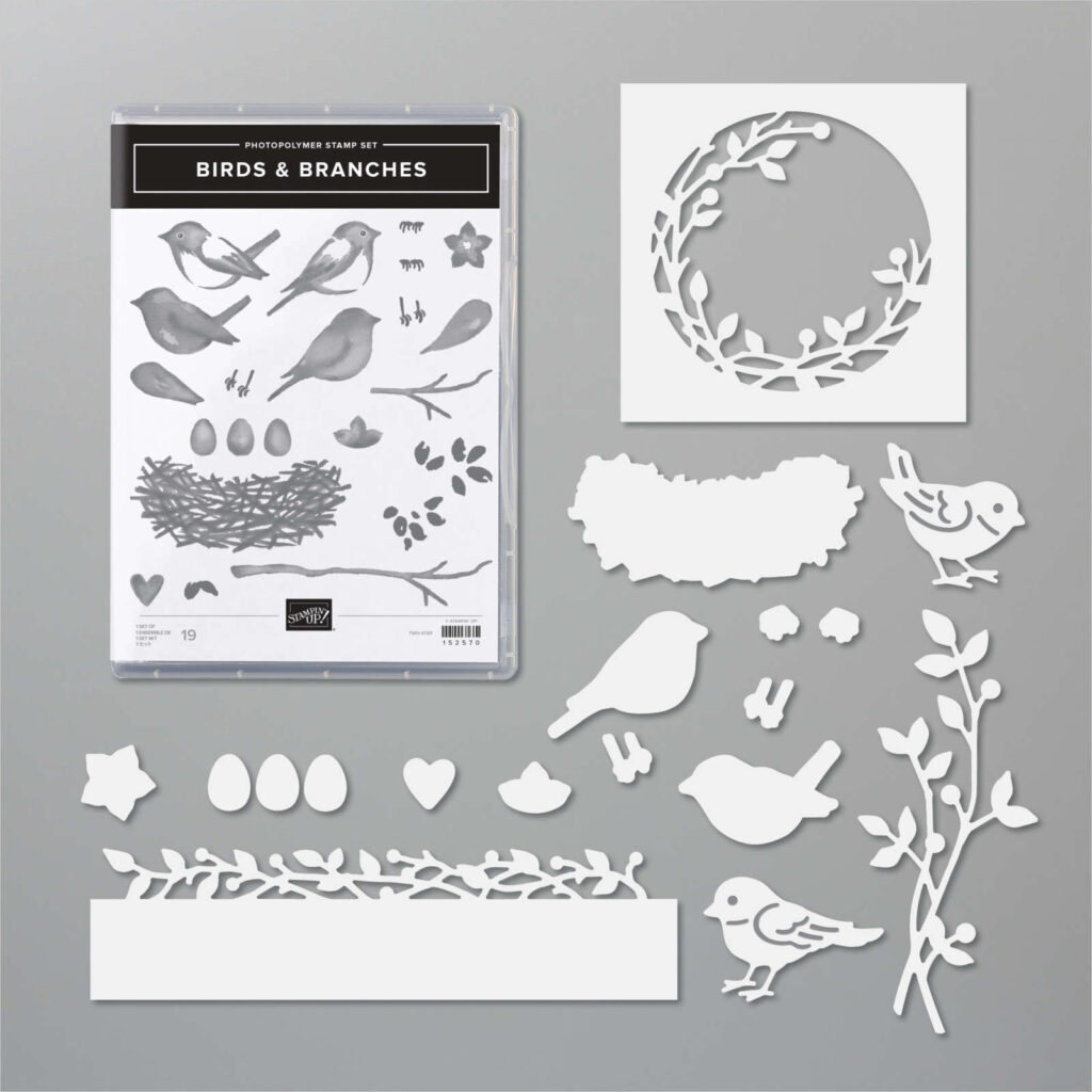
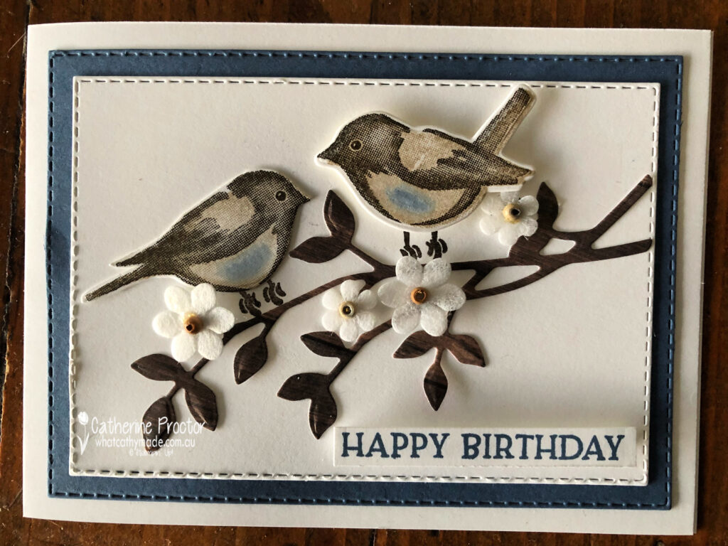
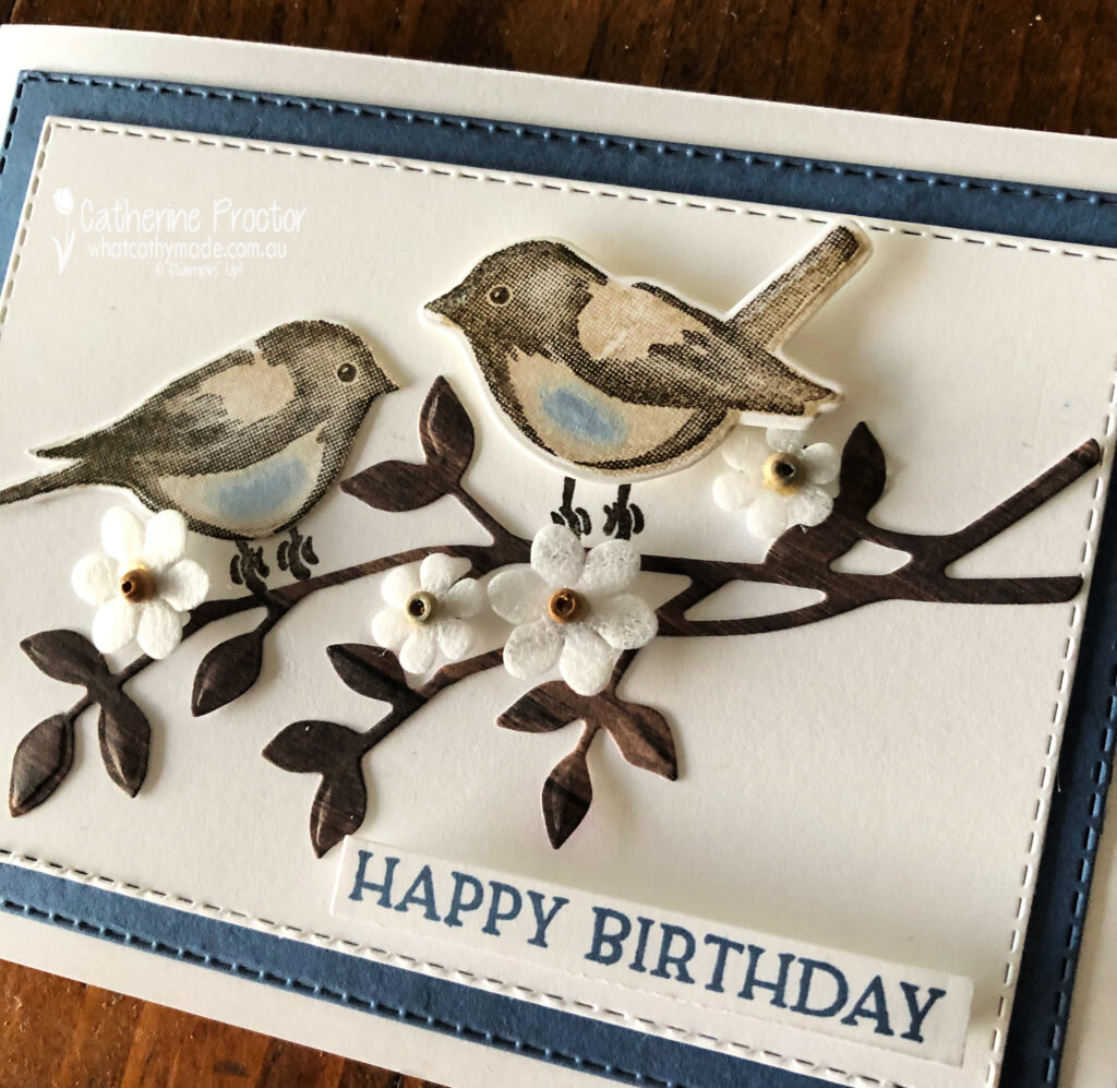
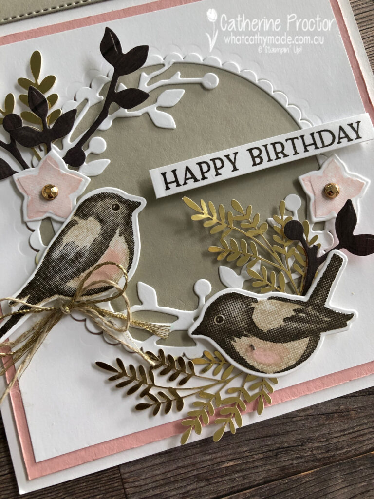
A few weeks ago I shared some cards I made with this gorgeous Stampin’ Up! Birds & Branches Bundle. I have to admit I’m slightly obsessed with these sweet little birds!
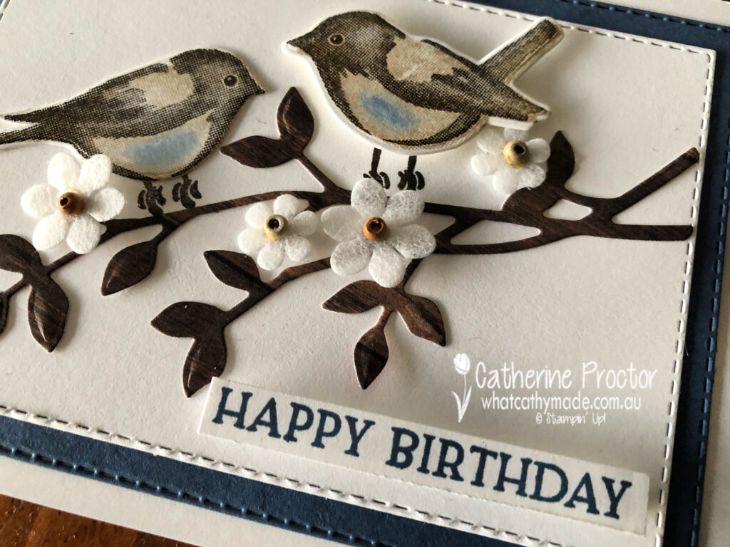
Today I’m sharing a couple more cards made with the Birds & Branches Bundle – this first one has a touch of Misty Moonlight and features some cute little paper flowers from the Boho Indigo product medley.
I love the touch of Misty Moonlight blue on the tummies of the birds, but seriously, how cute are these paper flowers from the Boho Indigo product medley?
They come in two sizes with the little brown wooden button already in the centre of the flower – but you don’t have to buy the entire medley to get the flowers as they also come in the Boho Medley refill.
I cut my branch from one of the In Good Taste Designer Series Paper DSP sheets and the “Happy Birthday” sentiment is from the Blossoms in Bloom bundle.
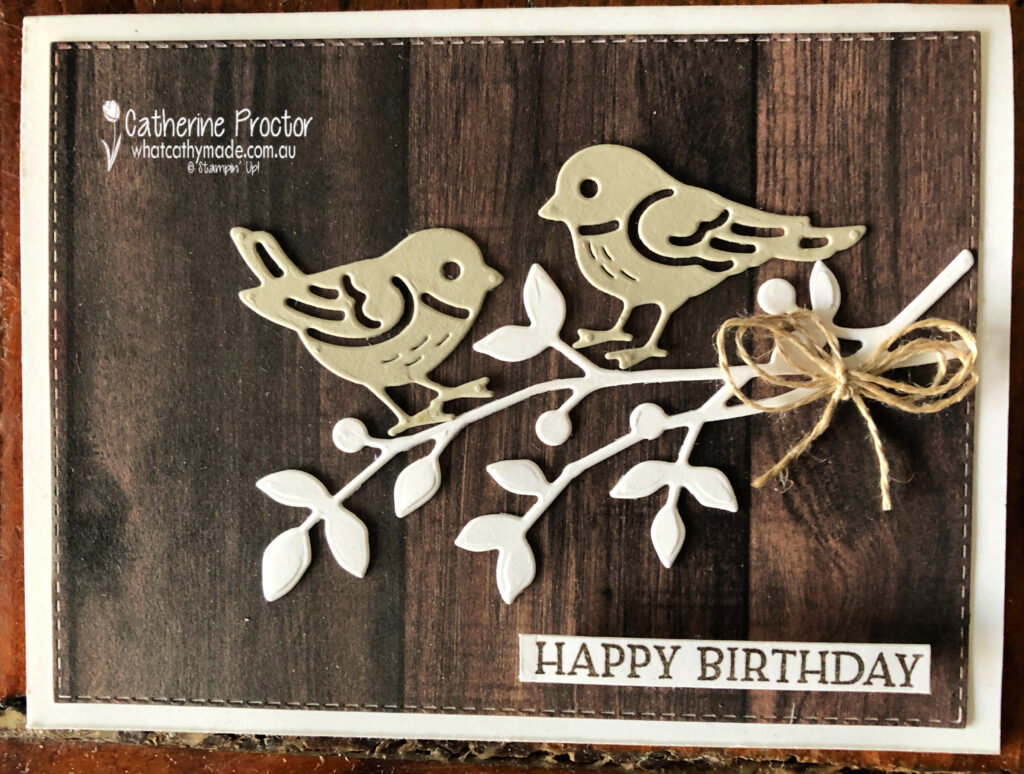
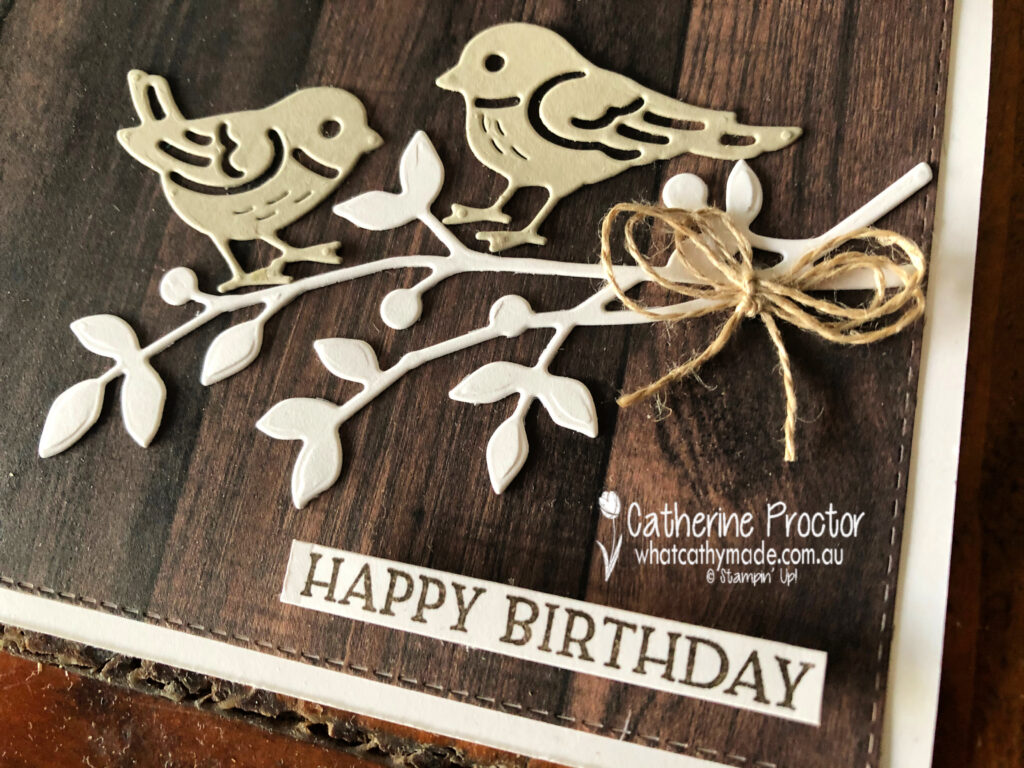
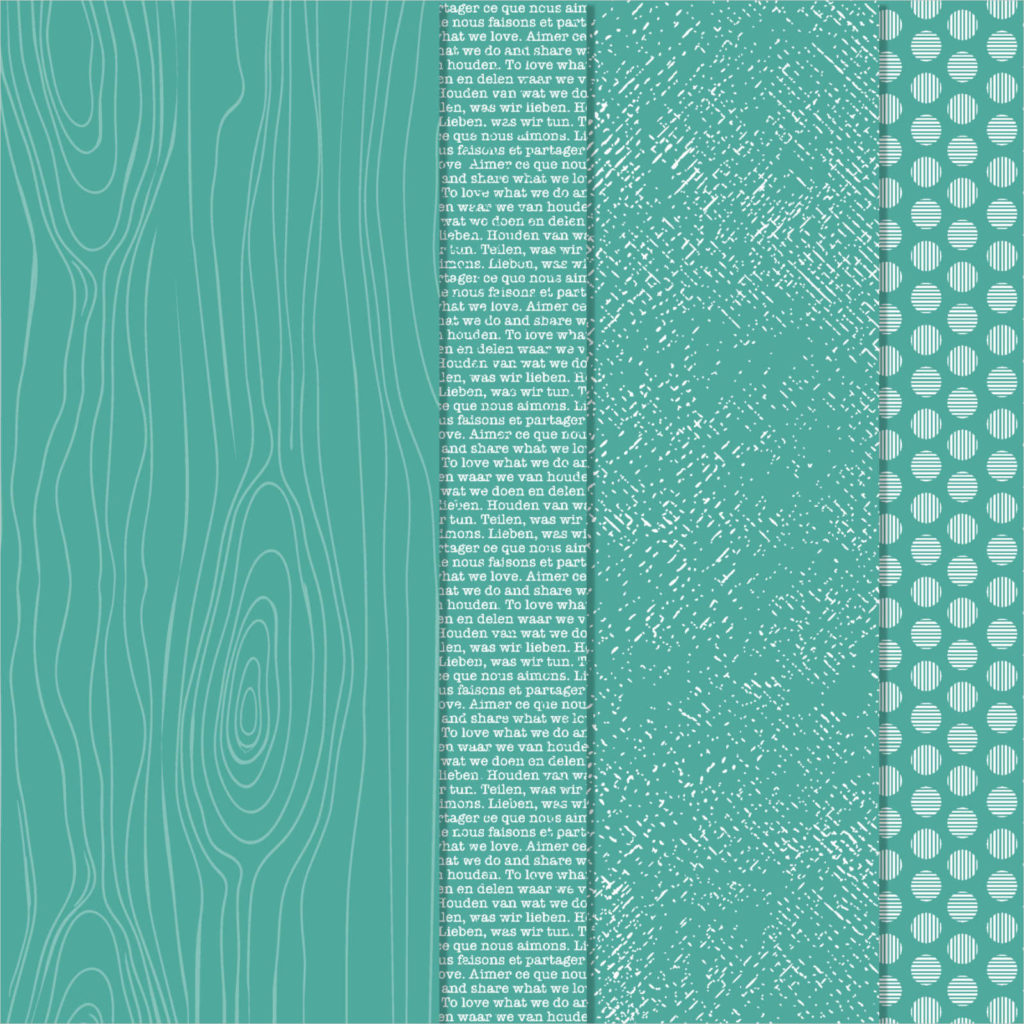
Card two just uses the Birds and More dies, this time with the In Good Taste DSP as the background layer behind the birds. Doesn’t this wood grain paper look so realistic!
I die cut my birds out of Crumb Cake card stock and finished off the card with a double bow of linen thread.
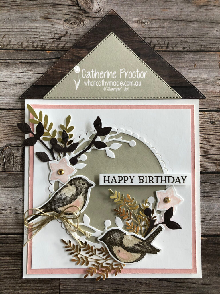
In case you missed my post four weeks ago, this was the birdhouse card I made also using the Birds & Branches Bundle and the stitched triangle dies. You can see more photos of this card and how I made it here.
These are the stitched triangle dies and Birds and More Dies I used to make my birdhouse card.
The soft pink is Blushing Bride and I used my water painter to add a touch of it to their tummies.
To purchase any of the products featured in today’s post, simply click on the product links below.
If you’d like me to post you your very own copy of the 2020-21 Stampin Up! Annual Catalogue, the 2020-21 Beginners Brochure, or to simply find out about more about Stampin’ Up! contact me.
In the meantime, wherever you are in the world, stay safe, stay calm…and keep on crafting xxx
Welcome to the Monthly Art With Heart Creative Showcase.
This month the team are featuring projects using their favourite products from the new Stampin’ Up! 2020-21 Catalogue. The new catalogue is full of amazing new stamp sets, some bundled with dies or punches. The range of kits, papers and accessories complete the range of products you will see featured in this Showcase.
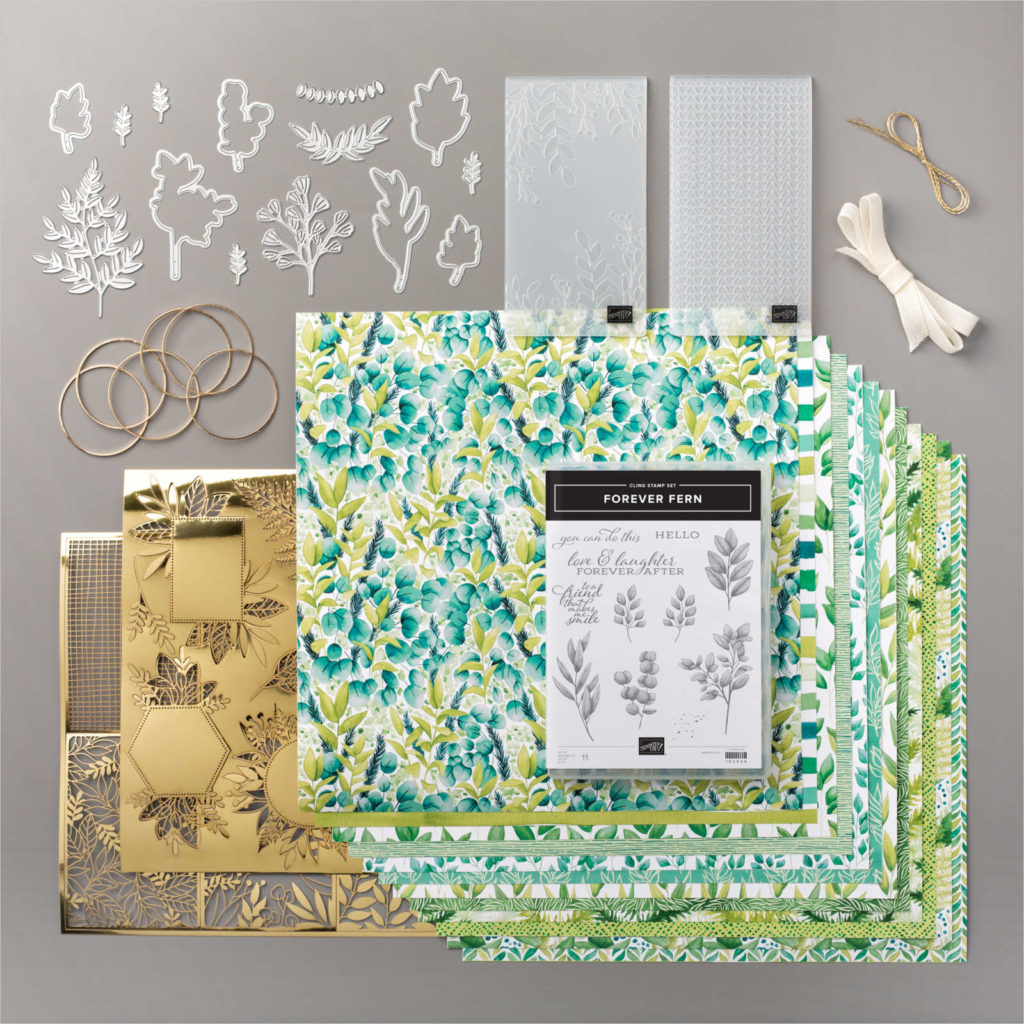
I don’t know about you, but choosing a favourite product is like choosing a favourite child. Impossible to do! However after much consideration I decided to make some cards using products from the stunning Forever Greenery Suite.
I love everything about this suite – the DSP, especially. But I think my absolute favourite part of this suite is the Gold 1/16 ” trim that comes with Vanilla Ribbon in the Forever Greenery Trim combo pack.
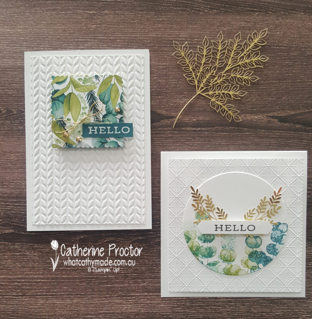
Tonight I made three different cards that all use the Forever Greenery Suite as well as some other new products.
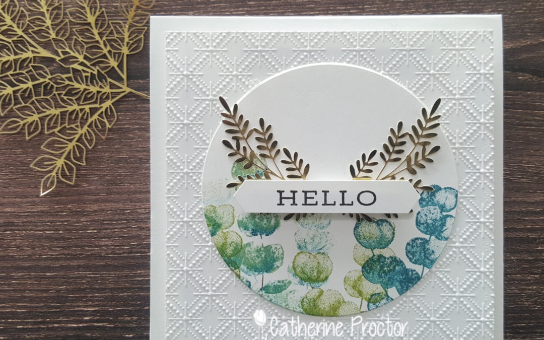
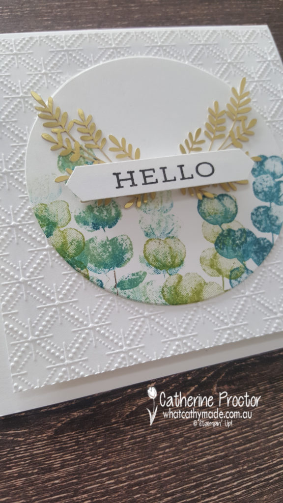
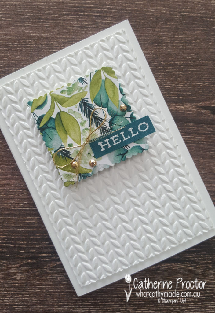
My first card is a square card that actually features a different embossing folder – the Dainty Diamonds embossing folder from the Peony Garden Suite. Isn’t this embossing folder just stunning?
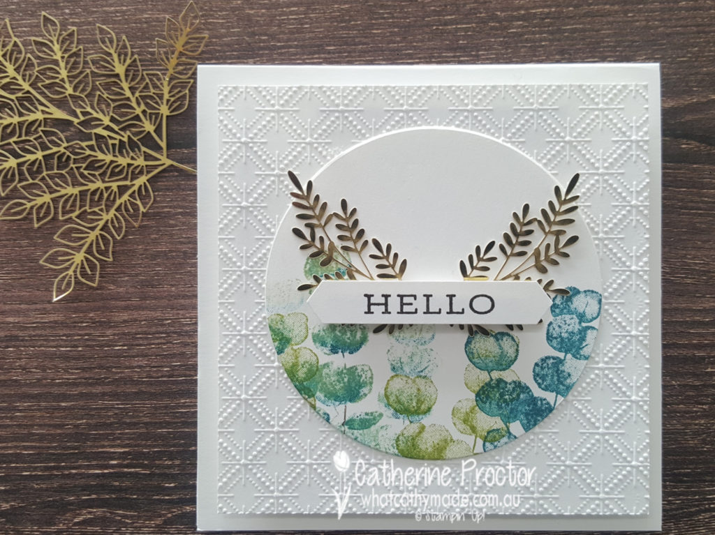
The circle is cut out with the largest of the layering circles and I used one of the stamps from the Forever Fern stamp set, stamped in Pretty Peacock, Pear Pizzaz and some Early Espresso.
The Forever Gold Laser-cut Specialty Paper adds an elegant touch of bling.
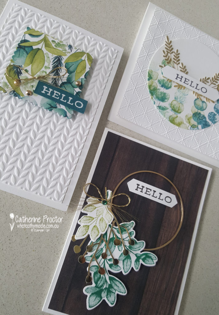
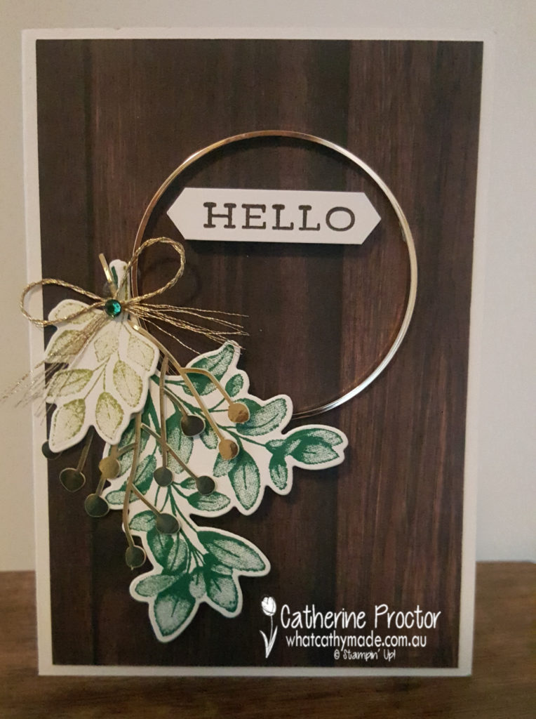
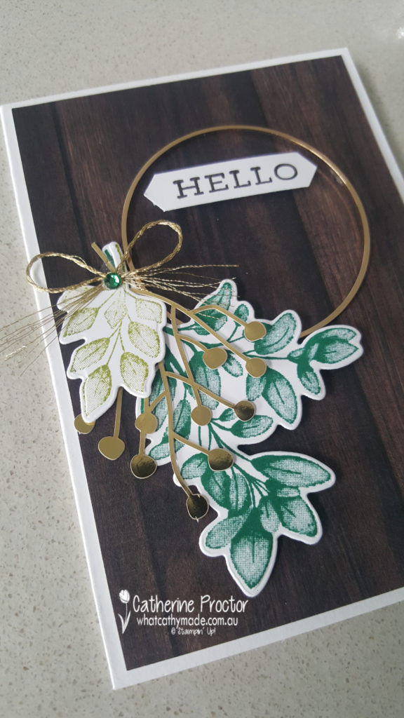
Card two uses a patterned paper from the In Good Taste Designer Series Paper pack. I love how this rich dark wooden paper makes the elements on top of the card really pop.
But of course the main focal point of this card is the gorgeous Gold Hoop Embellishment tied with a bow of Gold 1/16 ” from the Forever Greenery Trim combo pack and another die cut piece from the Forever Gold Laser-cut Specialty Paper. The different green foliage are stamped and die cut using the Forever Fern Bundle.
The layout for my final card is a design I cased from a card made by Dani Dziama, who was an Artisan Design team member a few years ago. I loved the amount of white space on her card, but I changed all the main elements to make it my own.
The embossed white panel has been embossed using one of the Greenery embossing folders and I used one of the scalloped square layering dies to cut out some of the gorgeous Forever Greenery DSP.
For many of my photos today I’ve used one of the sheets of the In Good Taste Designer Series Paper as my background because I love the way the cards look against this DSP. This paper below looks like real wood – it is amazing!
The next Art With Heart Team member to share their new catalogue projects is the super creative Andrea Sargent. I can’t wait to see what she’s made tonight.
If you have a broken link or have come to this blog hop midway, you can view all the participants below:
Welcome to week two of our 2020-2021 Art With Heart Colour Creations Showcase.
Each week various members of our Art With Heart Colour Creations team will be bringing you weekly colour inspiration as we showcase our range of over 50 beautiful Stampin’ Up! colours in alphabetical order.
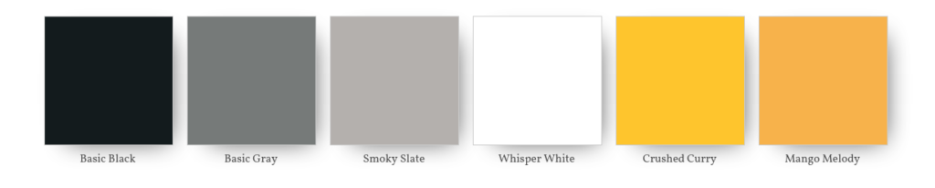
Week 2 – Basic Gray
Basic Gray is what I would call a “gunmetal” gray and part of the Neutrals collection of colours.
It is available in the following products.
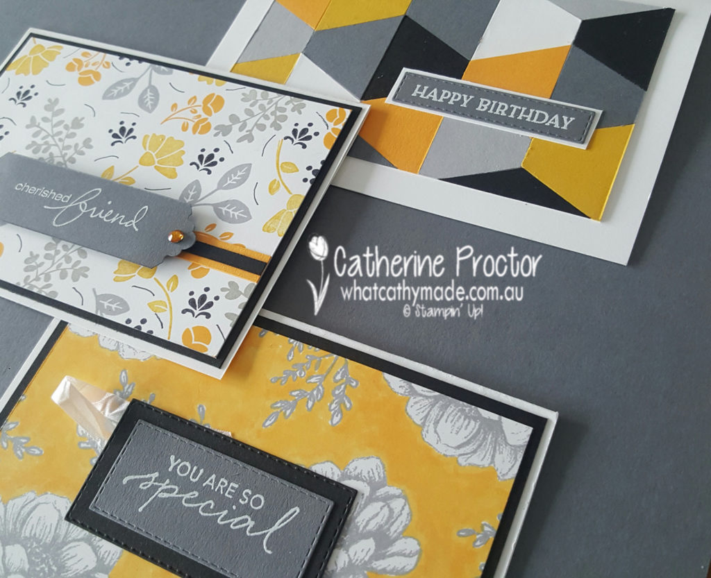
Like all of the versatile neutrals, Basic Gray works with any colour, and today I’ve chosen to pair it with some other neutrals as well as two colours that really pop beside Basic Gray: Mango Melody and Crushed Curry.
Mango Melody and Crushed Curry are two colours I rarely use, but for some reason they are the first colours I seem to reach for when using any shade of grey.
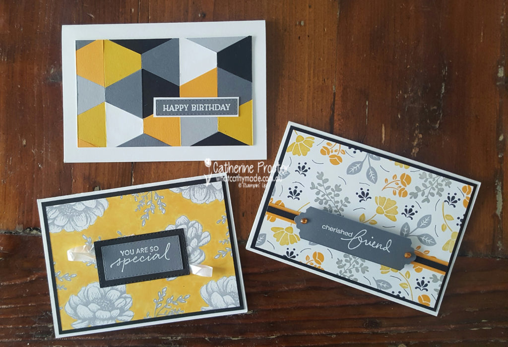
All three of my cards today are CASED from the brand new 2021-22 annual Catalogue as I excitedly wait for my order to arrive!
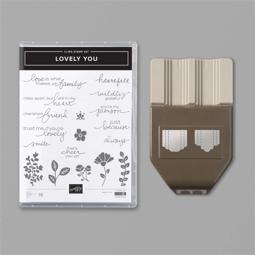
Luckily, as a Stampin’ Up! demonstrator I was able to place a pre-order for the new catalogue so I already have some of the new products, including the Lovely You punch bundle.
I love this card on page 22 of the new catalogue because it uses one of my favourite techniques – stamping your own DSP. There are seven little floral stamps in the Lovely You stamp set and they are just the perfect size for creating homemade DSP.
And here’s my CASE of this card, using the Basic Gray palette of colours that I’ve chosen for my cards today.
Strips of card stock give a ribbon effect and gilded gems add a touch of bling.
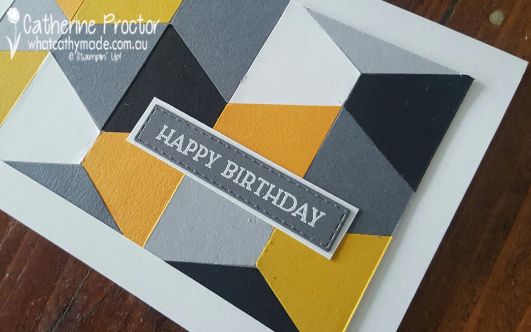
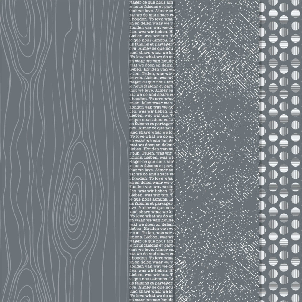
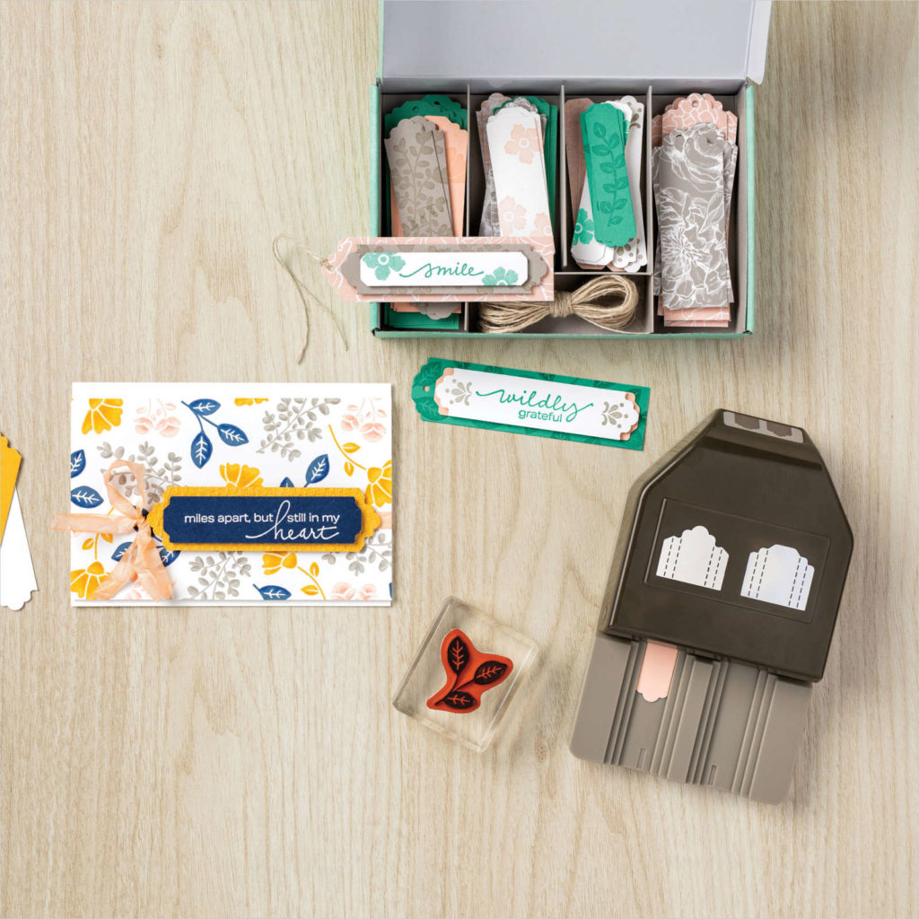
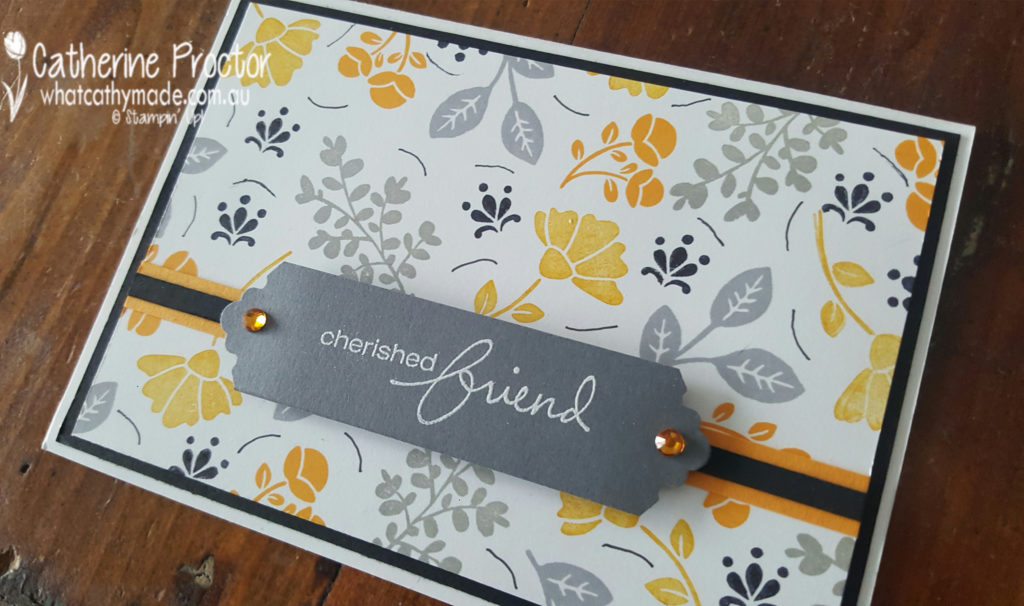
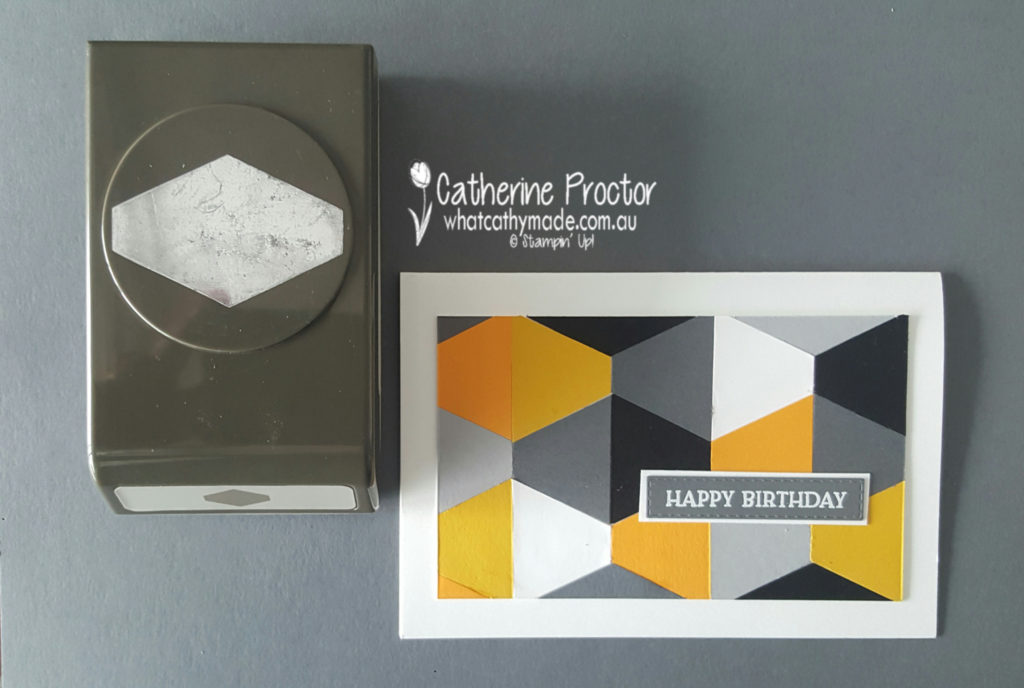
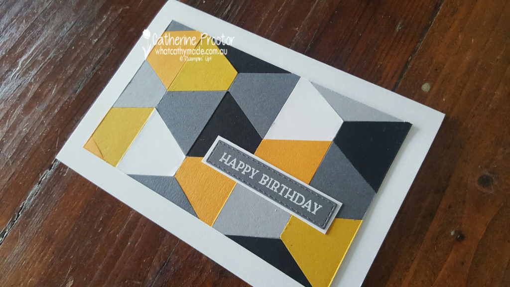
I also wanted to make a strong masculine card using Basic Gray and I was inspired by a very neutral card layout on page 124 of the catalogue. The card on the bottom right of this photo uses one of the dies from Tasteful Touches bundle and the lovely wooden papers in the “In Good Taste” Designer Series Paper .
I love taking a shortcut where ever I can, so for my card I decided to use a punch instead of a die. Using the Tailored Tag punch enabled me to make a card with a very similar layout…only much faster.
I’m very happy with how this card turned out and I’m going to make a couple more cards using this design but with different coloured card stock.
The “Happy Birthday” sentiment is from the new Blossoms in Bloom Stamp set, stamped in Versamark Ink and then heat embossed using White embossing powder.
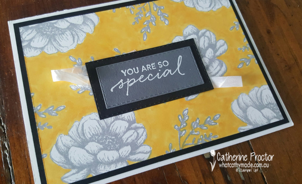
My final card was CASED from a card on page 84 of the catalogue that features the stunning new Peony Garden Designer Series Paper. The blue card in the photo below is the one I decided to CASE.
I cannot wait to get my hands on this paper, but in the meantime I’ve recreated this card using the two of the stamps from the Tasteful Touches Stamp Set and my Mango Melody Stampin’ Blends.
This is such an easy and fun design and also a great way to add a colour to your card if you don’t have any card stock in that colour.
I’ve simply randomly stamped the flower and the branches of the card onto Whisper White card stock using my Basic Gray ink. I then carefully traced around the outline of each images with my Mango Melody Stampin’ Blend before colouring in all of the white area between each image.
The “you are so special” sentiment comes from the Tasteful Touches stamp set.
Basic Gray is such a versatile neutral – I could easily replace the Crushed Curry and the Mango Melody in any of these cards with pinks, red, purples, blues, greens, or even some foil or other neutrals. Any colours would pop really nicely beside Basic Gray.
I can’t wait to see what the rest of the Art With Heart team have come up with today.
Just click on the links below to see what they’ve all made.
Thanks so much joining the Art With Heart Colour Creations Showcase. I hope we’ve inspired you to look at Basic Gray with fresh eyes.
Next Wednesday we’ll be showcasing one of the brights: Bermuda Bay. We hope you can join us all then.
To purchase any of the products featured in today’s post, simply contact your Stampin’ Up! demonstrator, any of the ladies in the AWH Colour Creations Showcase or click on the product links below.
If you’d like me to post you your very own copy of the 2020-21 Stampin Up! Annual Catalogue, the 2020-21 Beginners Brochure, or to simply find out about more about Stampin’ Up! contact me.
In the meantime, wherever you are in the world, stay safe, stay calm…and keep on crafting xxx


")


")


 Faux Suede Trim")


")


")


")
")


")
")


 Crinkled Seam Binding Ribbon")