Welcome to week thirty five of our Art With Heart 2022-23 Colour Creations blog hop. This is a weekly blog hop where we showcase the stunning range of Stampin’ Up! colours in alphabetical order over 12 months and this week we are featuring Pale Papaya from the 2021-23 In Colours.
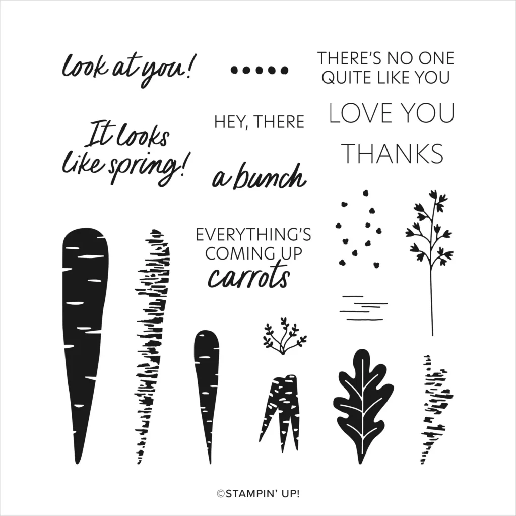
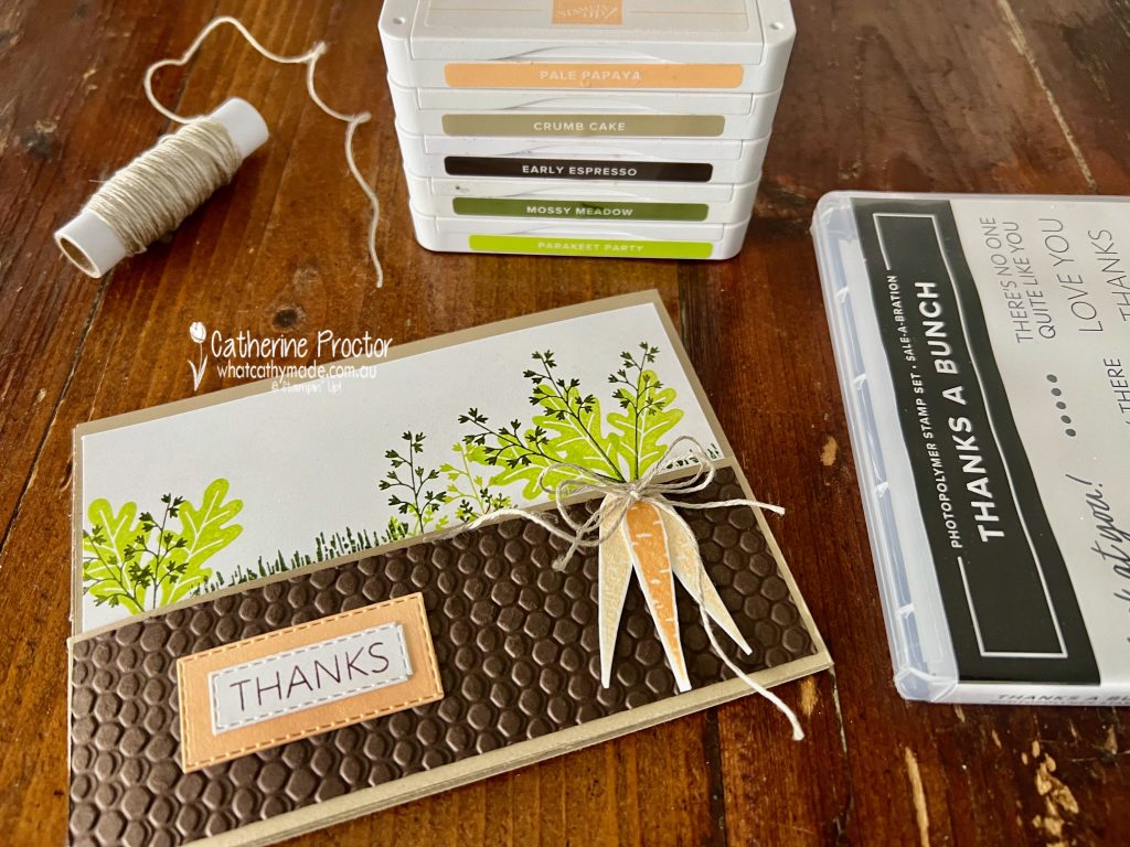
The new January-April Mini Catalogue and SALE-a-bration Catalogue launched last week and one of the free SALE-a-bration items you can redeem for a $90 spend is the Thanks A Bunch stamp set.
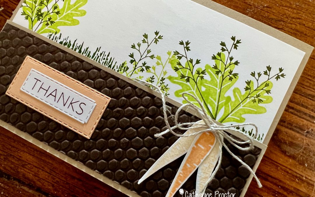
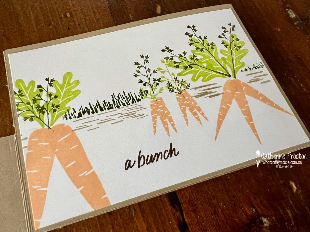
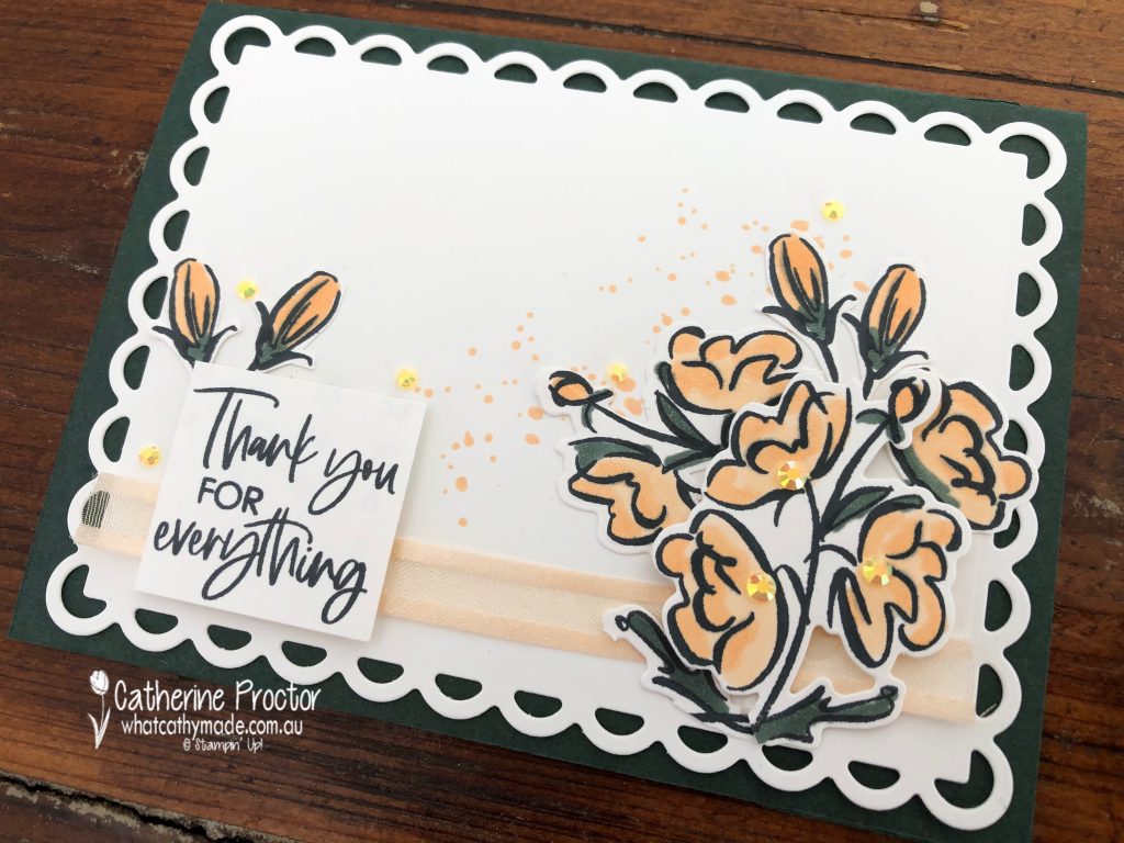
Pale Papaya is a great colour to use for carrots and I’ve used it both at full strength and stamped off once for the front of my split front, tri-fold fold card. Other colours used include Crumb Cake, Early Espresso, Mossy Meadow and Parakeet Party.
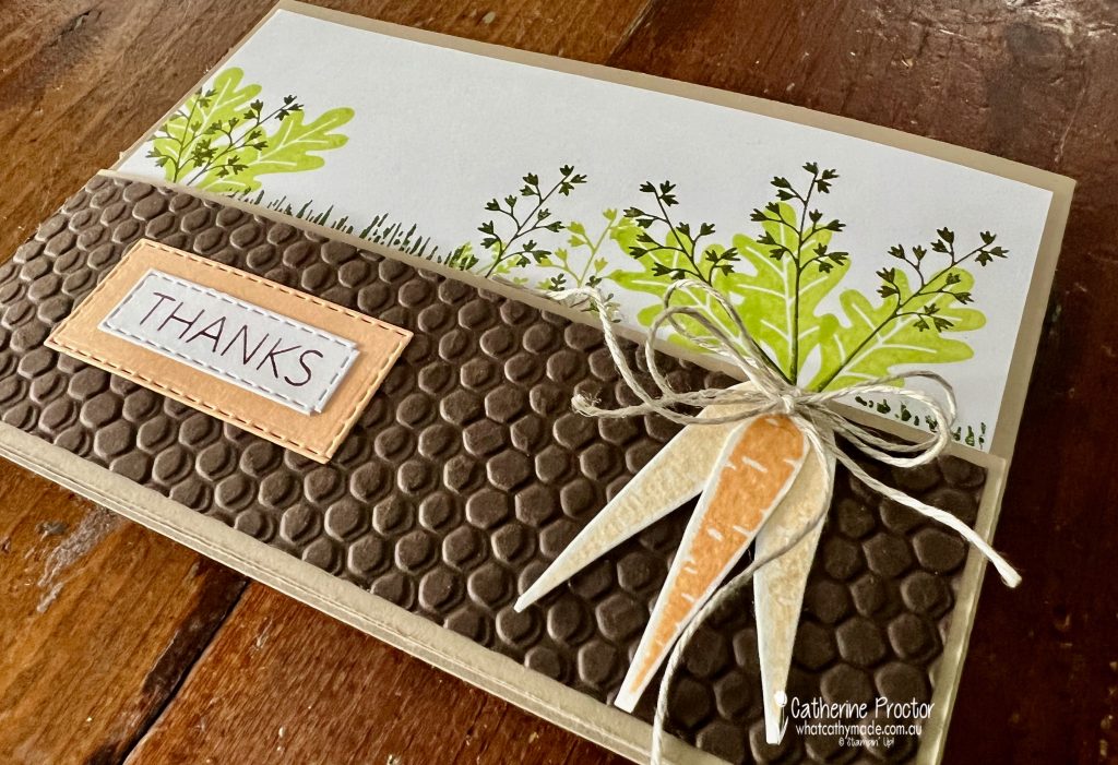
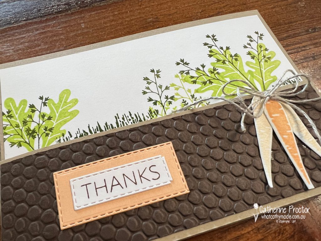
The Hive embossing folder was used to emboss Early Espresso cardstock to create soil for the front flap. As the split front, tri-fold fold card opens the layers of carrots are revealed.
The middle flap shows carrots above and below the ground. One of the carrot shading stamps works really well to create grass once it is turned on its side.
Split front, tri-fold fold card instructions
Cut a sheet of A4 Crumb Cake cardstock at 10.5cm down the middle to divide into two long halves that each measure 21cm wide x 10.5 cm high.
Score both pieces at 14.8cm and fold in half along the score line to make two cards.
One of these cards will become the card base and the left split front panel, while the other card will be used for the right panel.
To create the left split front panel measure and cut off the top 5cm across the top of the left panel of one of the cards.
To create the right panel with the other card, measure 2 cm parallel to the middle score line and cut all the way down the card. You will now have a right panel with a 2cm wide flap which you use to adhere to the back of the right hand side of the card base.
Fold the right flap over the card base and then fold the left split front panel over the right panel – I’ve adhered the embossed Early Espresso cardstock, the “Thanks” greeting and the bunch of tied carrots to the left split front panel.
Stamp and decorate the cardstock layers for your right card flap and card base BEFORE adhering to your split front, tri-fold fold card base.
All of the sentiments in this card are from the Thanks a Bunch stamp set, stamped in Early Espresso.
Now it’s time to hop on over to our next participant, the lovely Tina Gillespie – I can’t wait to see what Tina has made this week!
If at any time you find a broken link, you can find the complete list of all participants below.
If you live in Australia, you can find and purchase these products in my Stampin’ Up! Online Store once they are available to purchase tomorrow morning.
We’ll be back next Wednesday January 18 with projects showcasing one of the Subtles, Pear Pizzazz.
Welcome to the very first week of our new Colour Creations blog hop format for 2020-21!
From today we are reverting to a traditional blog hop format, starting with a showcase of ALL FIVE 2021-23 InColours, followed by the rest of our beautiful Stampin’ Up! colours in individual alpha order at 8pm every Wednesday.
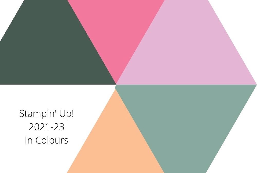
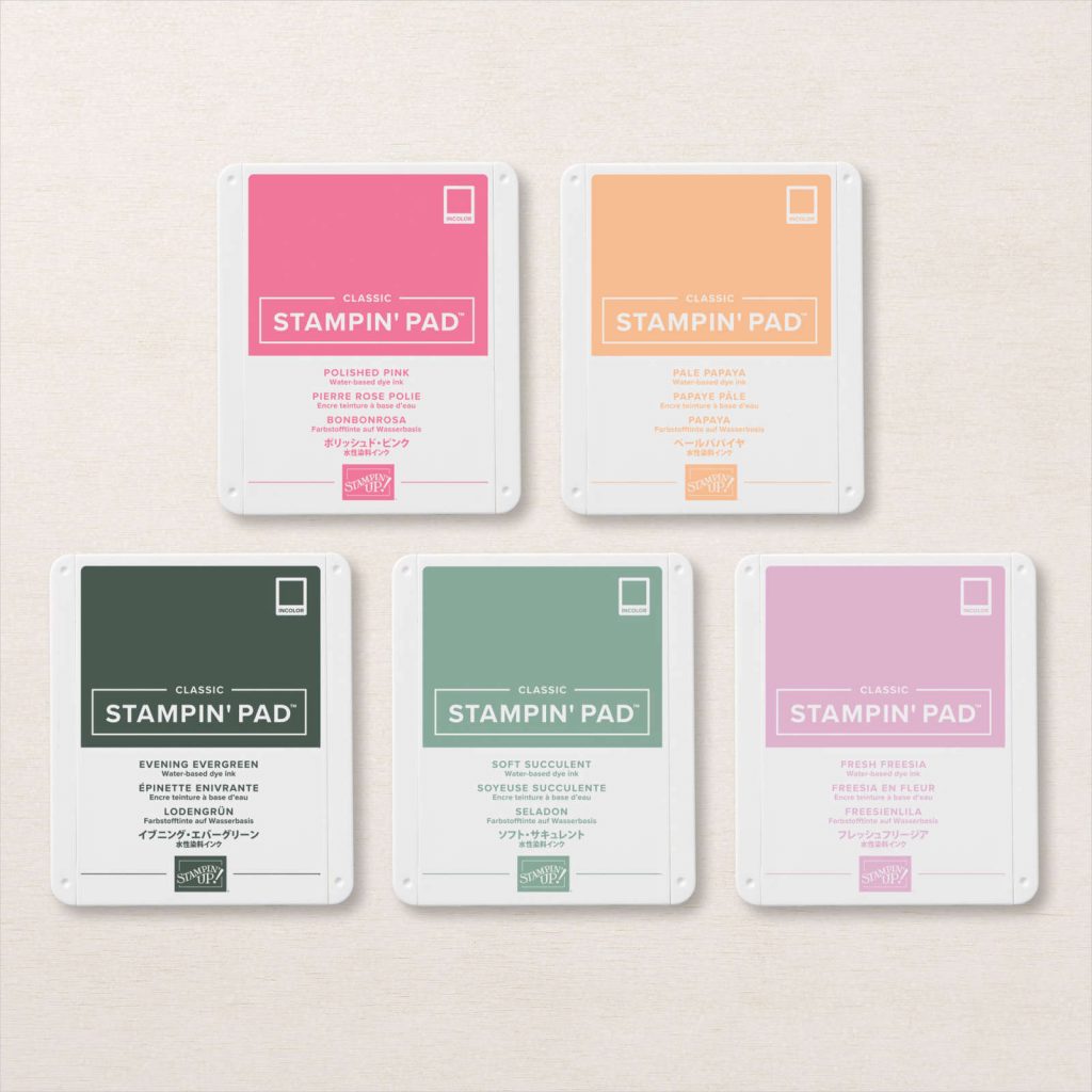
If you haven’t already seen them, here are the five new 2021-23 In Colours.
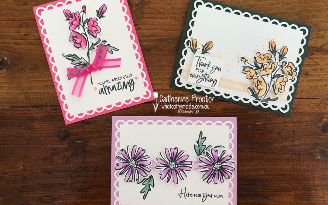
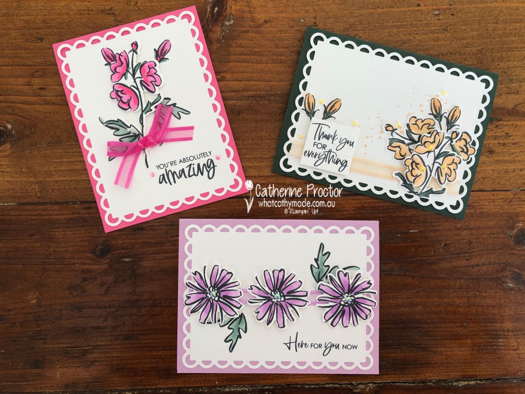
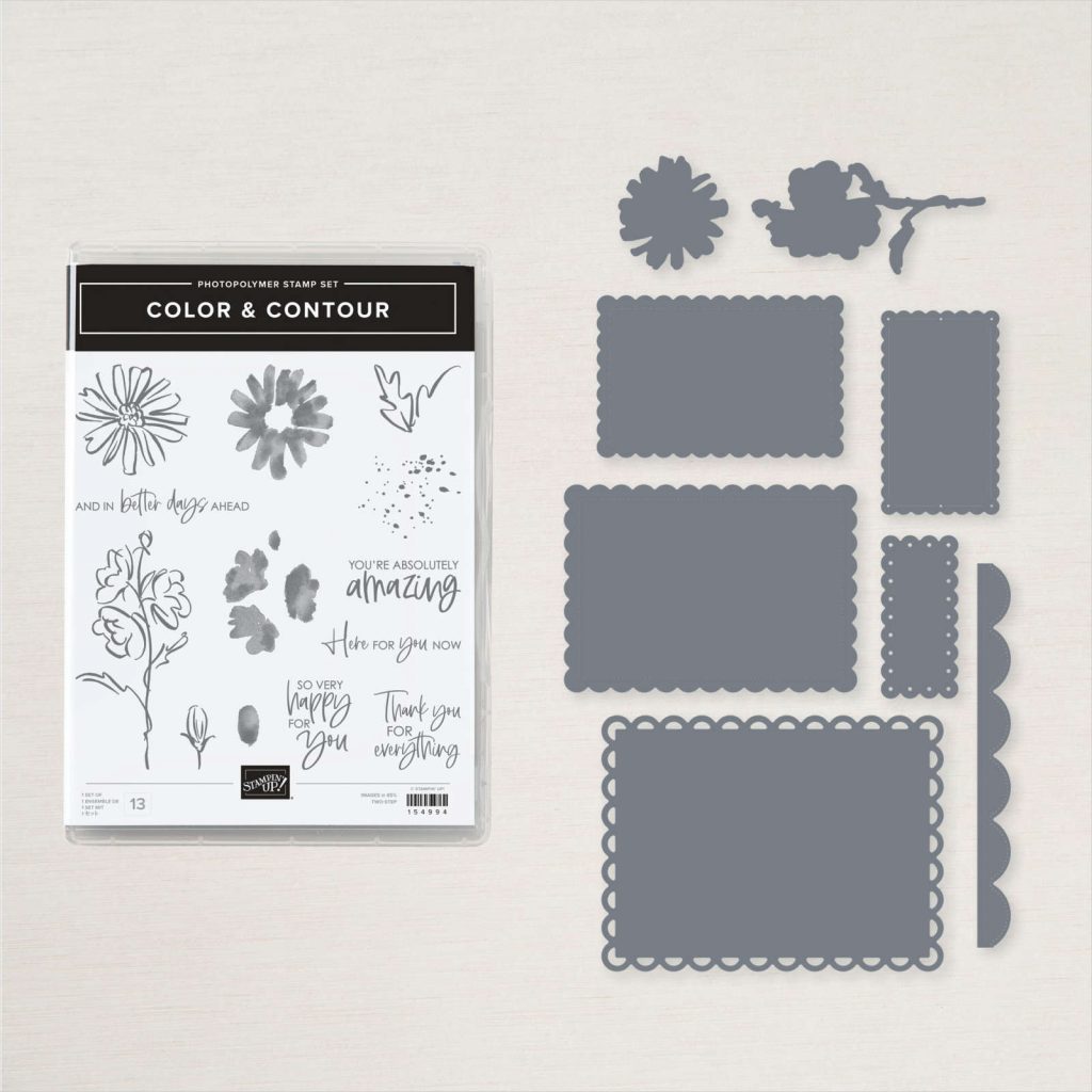
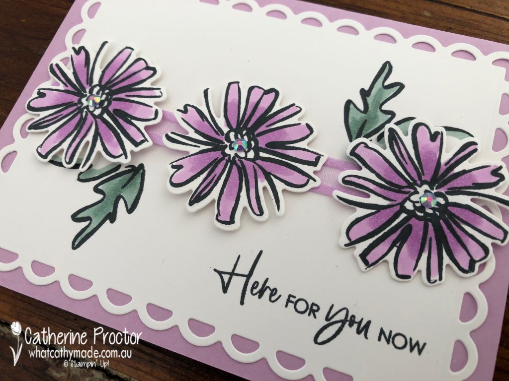
And here are the cards I’ve made to showcase these beautiful 2021-23 InColours using the Colour & Contour bundle. I love how the graphic quality of these floral images really make these colours pop.
When I first saw the Color & Contour bundle I was immediately drawn to the scalloped layering dies but not so sure about the stamp set. After just one use I am totally sold on this stamp set! Although I’ve used the new InColour Stampin’ Blends to colour in the flowers and leaves the stamp set comes with stamps you can use to stamp the colour into the flowers and leaves if you prefer.
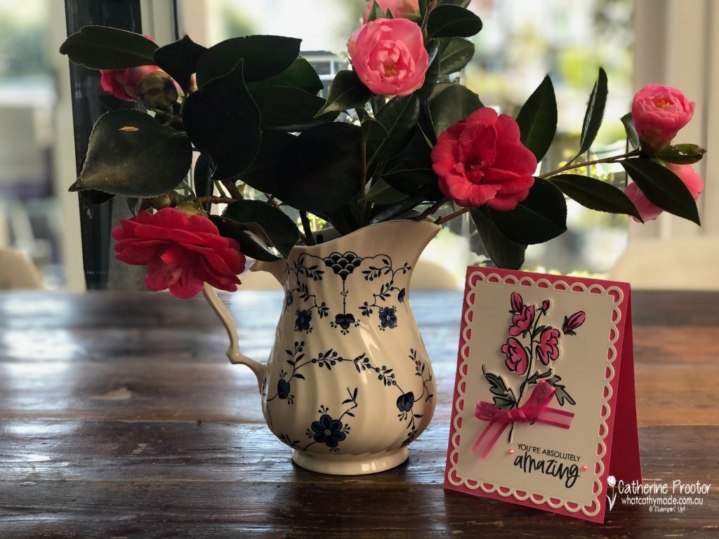
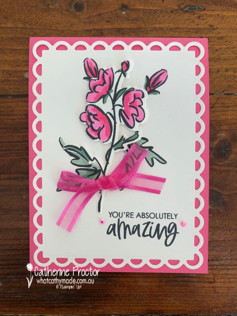
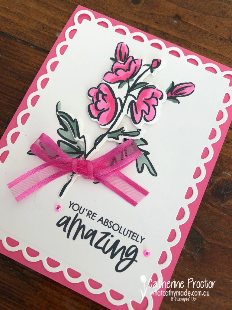
Polished Pink is the brightest of the new 2021-23 InColours – it’s a slightly “redder” pink than Magenta Madness. I couldn’t resist taking a photo of this card beside some camellias I’ve just picked from the trees in my back garden – how good do these pinks and reds look together?
This close-up shows how stunning the largest scalloped contour die is and gives you a better look at the new 2021-23 InColour Jewels and 2021-23 InColour Polished Pink open weave ribbon. The leaves are coloured using another new 2021-23 InColour – Soft Succulent.
I’m so glad I didn’t have to fussy cut this flower – there’s a die for both of the flowers in this bundle. The buds and the smaller leaves are stamped directly onto the Basic White top layer and then the die cut flower is adhered using Stampin’ Dimensionals.
Fresh Freesia is my favourite 2021-23 InColour and this second card uses the other flower stamp, coloured using the Fresh Freesia InColour Stampin’ Blends and die cut with the matching die. The leaves are stamped onto the card front and coloured with the Soft Succulent InColour Stampin’ Blends.
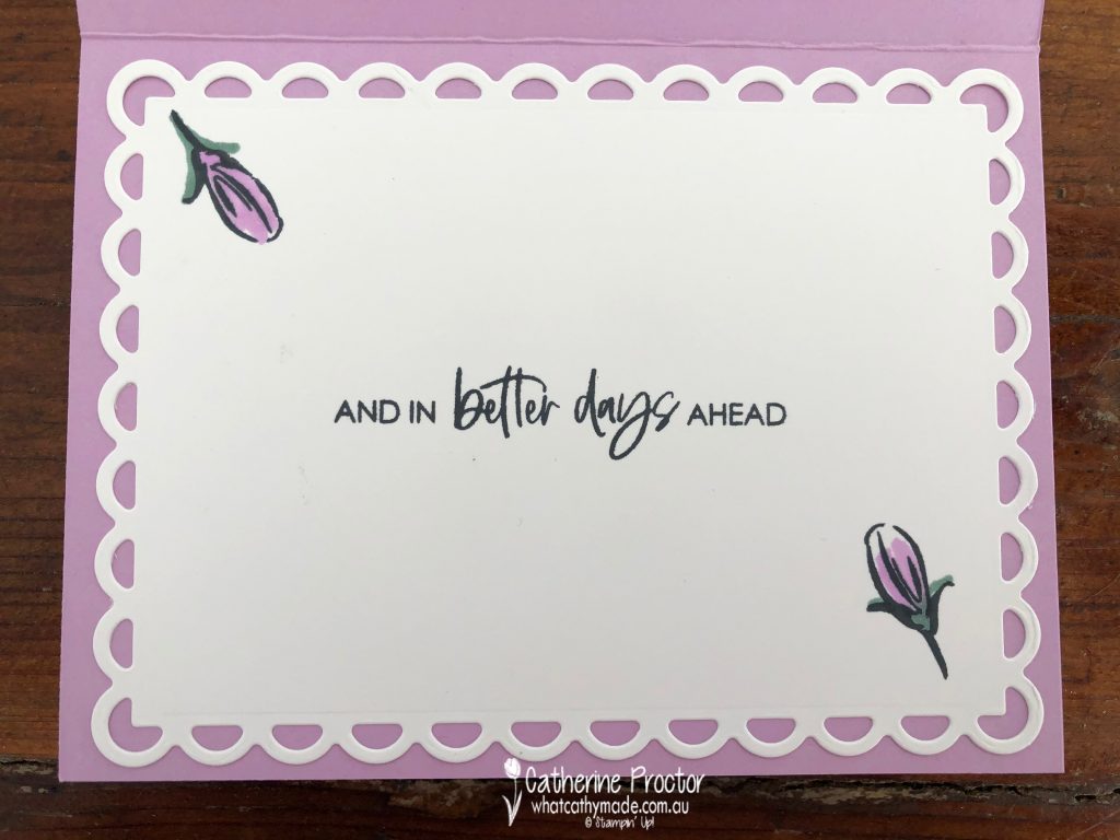
The sentiment stamp on the front of this card is card has a matching stamp that I’ve used on the inside of the card.
For my final card I’ve paired the lightest 2021-23 InColour (Pale Papaya) with the darkest (Evening Evergreen) but I think they really complement each other.
I’ve fussy cut 4 buds as well as the larger flower image (after I die cut it) to create a different floral shape for this card. Did you notice the splattering on the card – it’s another stamp in this really versatile stamp set.
Now it’s time to hop on over to our next participant, the very talented, Kate Morgan.
If you find a broken link or have come to this blog hop from a different entry point, you can view the participants below:
Today I’m sharing a sneak peek of the new Stampin’ Up! InColours for 2021-23. As a Stampin’ Up! demonstrator I get to see the new annual catalogue early and also get to place an order of selected new products.
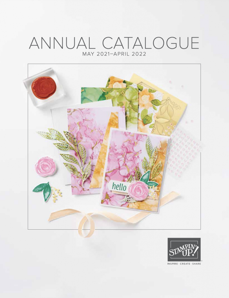
I can’t show you the inside of the new annual catalogue until it goes live, but I can share the cover with you.
I’ve ordered a copy of the new catalogue to be delivered to my customers so if you buy your Stampin’ Up! products through my online store you’ll be receiving your own copy of the catalogue very soon.
What do you think? Do you have a favourite colour?
Let’s see how each of these new InColors compare to our existing colours.
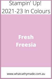
Fresh Freesia
Fresh Freesia is a pinky lilac colour that I think will work really well with bluey pinks and lavenders or purples. It is more of a purple than a pink so I’ve compared it here to the purples, including the retiring Purple Posy, so you can see how it is a pinker purple but still looks amazing with Gorgeous Grape.
Fresh Freesia colour comparison Stampin’ Up 2021-23 In Colours
Yes, Soft Succulent is another “blue green” very similar to Mint Macaron but because it is a muddier green I think I will get a lot of use of this colour when stamping leaves and flowers. Soft Succulent will look amazing with any pink or purple as well as all the browns and greys in the neutrals – here’s how it compares to the other soft blue/greens.
Soft Succulent Colour Comparison Stampin’ Up 2021-23 In Colours
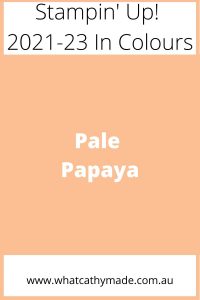
Pale Papaya is a lovely shade of apricot that is at once a pink and an orange. It sits neatly on the apricot/rust colour spectrum between Petal Pink and Calypso Coral and could prove useful as an additional skin tone colour.
Pale Papaya Colour Comparison Stampin’ Up 2021-23 In Colours
Evening Evergreen is a very dark green and like Soft Succulent it will be great for Australian foliage, but I can also see it being used a lot for Christmas or masculine cards – it’s almost another neutral colour so used sparingly it can be incredibly versatile.
Here’s how Evening Evergreen looks compared to the other dark greens.
Evening Evergreen Colour Comparison Stampin’ Up 2021-23 In Colours
Evening Evergreen will look amazing with the other darker neutrals – what do you think of this “tartan inspired” colour combination for masculine cards or Christmas cards?
Can a pink be bright and soft at the some time? Polished Pink certainly is and my favourite thing about this colour is that it is a pure, bluish pink with none of the orange undertones of Petal Pink – I think I’ll be “stamping off” or watercolouring this loverly pink a lot to get a light pure shade of pink.
Not as orange as Flirty flamingo, as bright as Magenta Madness or as red as Melon Mambo, Polished Pink is a welcome addition to the Stampin’ Up! range of pinks.
Polished Pink Colour Comparison Stampin' Up 2021-23 In Colours
I love using red and pink together and think Polished Pink will work equally well with softer light tones or a lovely bright colour combination like this one.
I’ll be receiving my pre-order very soon and will be posting some projects using these 2021-23 InColours later this week.
If you’d like me to post you your very own copy of the forthcoming 2021-22 Stampin Up! Annual Catalogue, the January – June 2020 mini catalogue, or to simply find out about more about Stampin’ Up! contact me.
When you shop online in my Stampin’ Up! Online Store don’t forget to use my monthly Host Code (if your order is between $50 – $250) and I will send you a thank you gift the following month. If your order is over $250 don’t use the host code because you will qualify for your own stamping rewards.
My April Host Code is ESWKFC2Y and it is valid until midnight April 31.
Would you like to get a 20% discount on everything you order? Click here to join my team:
Thanks for visiting my blog today. I’ll be back this Wednesday with the AWH Colour Creations Showcase – we are creating projects with Terracotta Tile this week.
In the meantime, wherever you are in the world, stay safe, stay calm…and keep on crafting xxx


")


 Open Weave Ribbon")
 Open Weave Ribbon")
 Open Weave Ribbon")