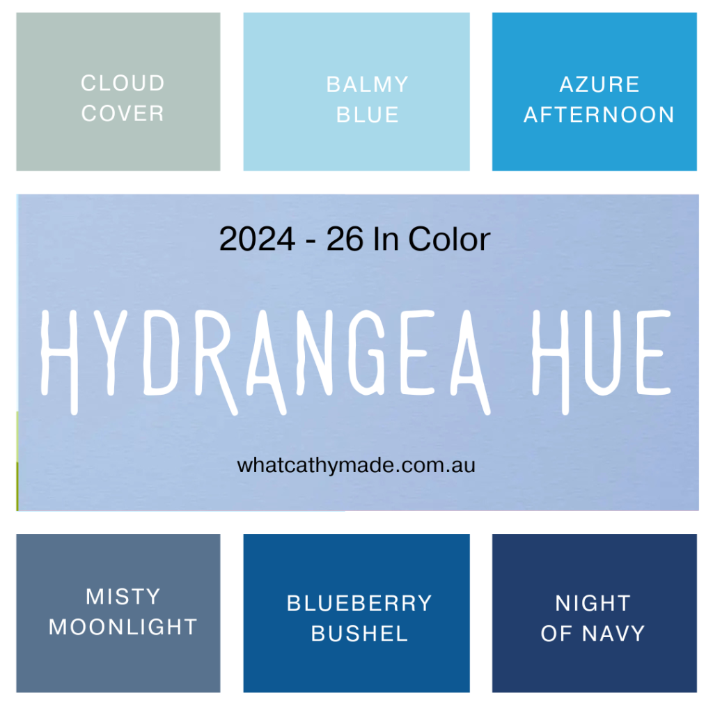
This week for the Art With Heart Team Colour Creations Blog Hop we are featuring one of the beautiful new 2026–2028 In Colours, Hydrangea Hue. This is such a soft and stunning shade of lavender blue, similar to another retired InColour, Seaside Spray. Here’s how it compares to the current blues in the Stampin’ Up! range.
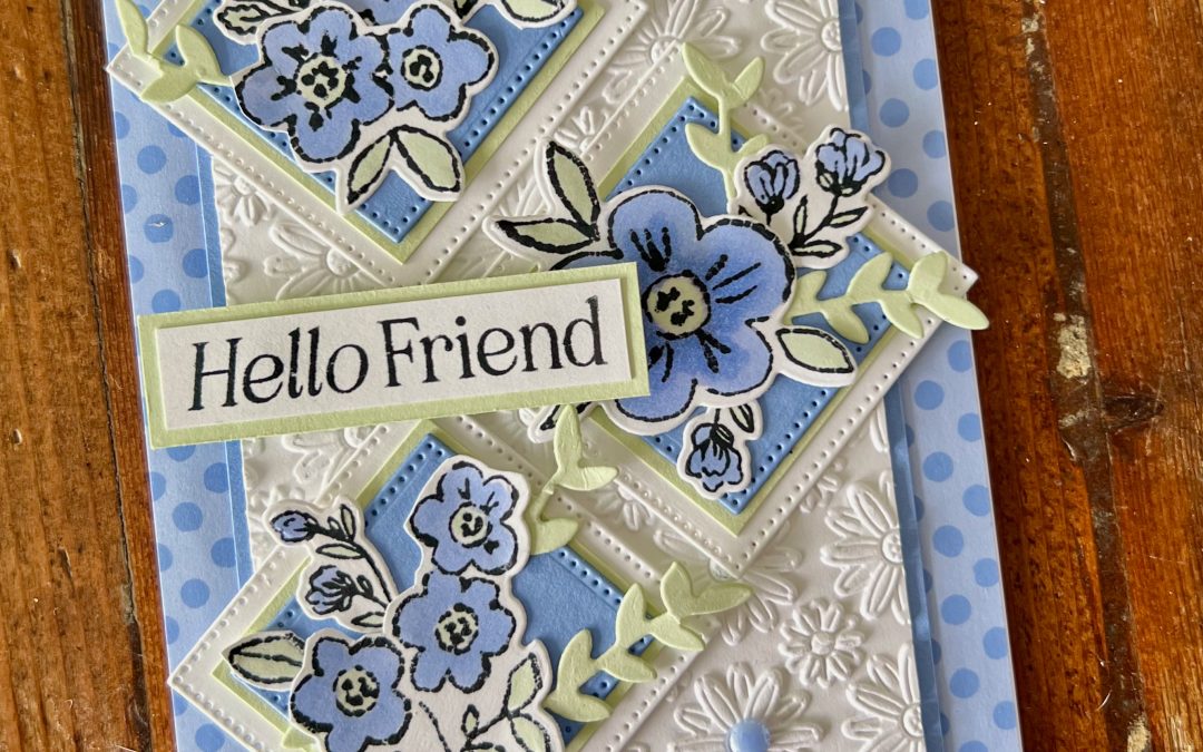
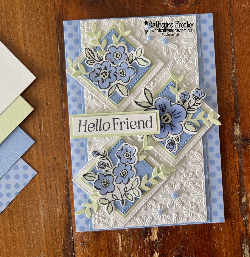
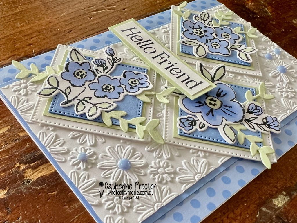
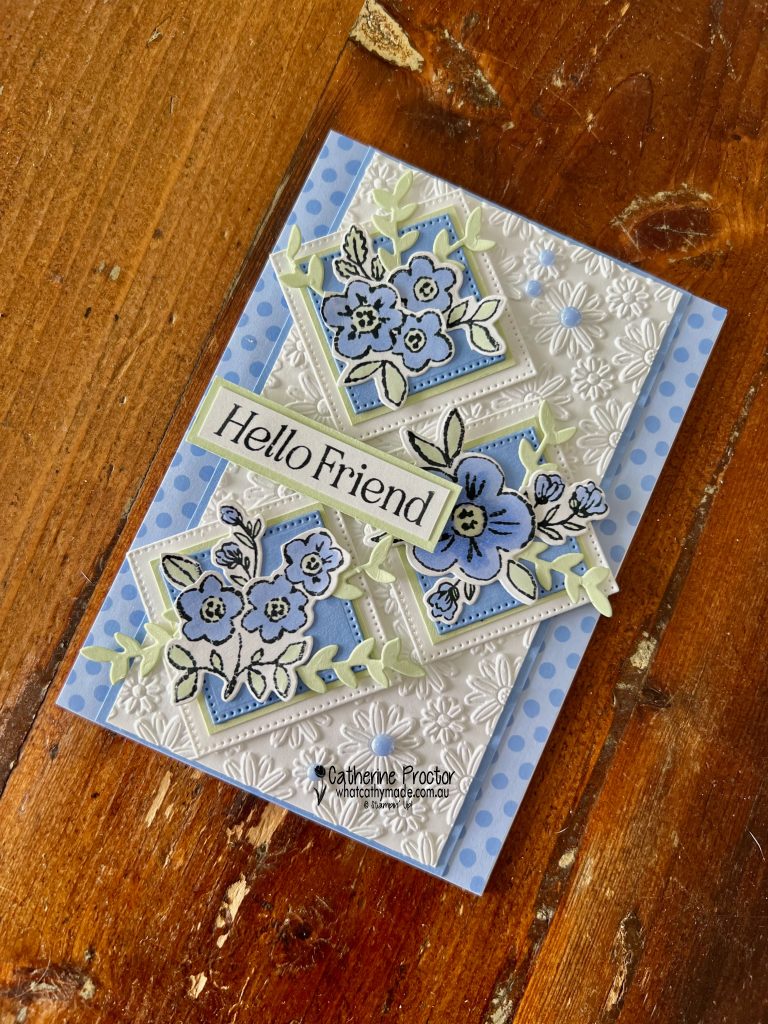
For my “Hello Friend”card I paired Hydrangea Hue with Soft Sea Foam, Basic White and touches of Basic Black for contrast. I absolutely love how fresh and soft Hydrangea Hue and Soft Sea Foam look together, with the black and white adding definition and contrast.
The background is a layer of 2026–2028 In Colour Painted Patterns 12″ x 12″ Designer Series Paper, over which I’ve added a strip of Hydrangea Hue card stock and an embossed layer of Basic White cardstock.
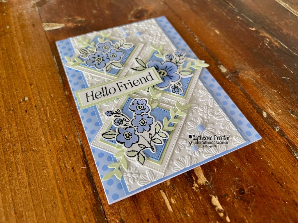
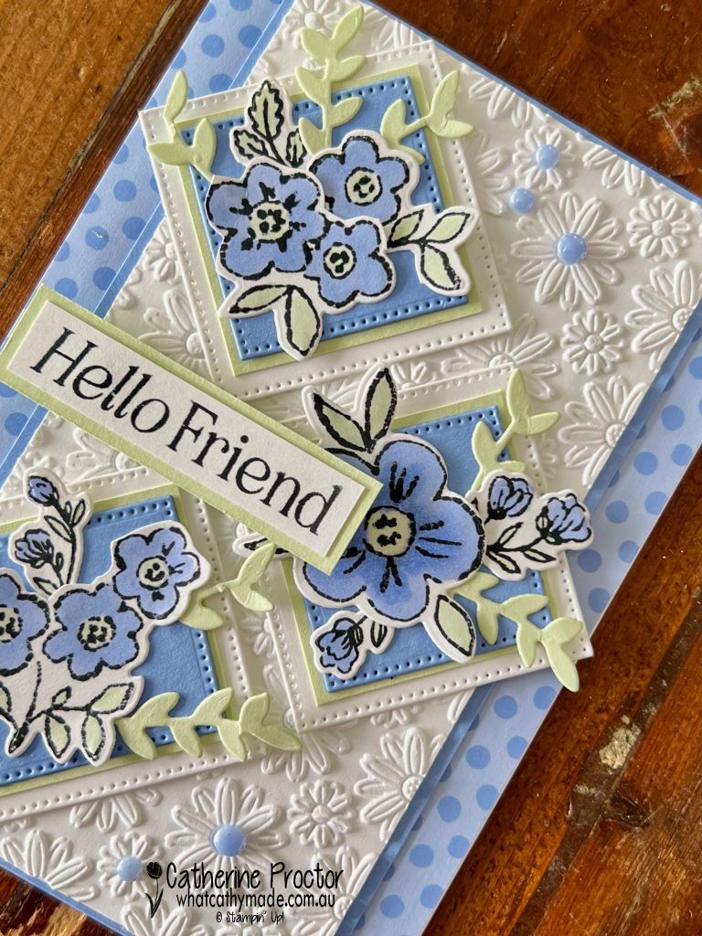
I love this Lazy Daisy Embossing Folder so much I accidentally ordered it not once, but three times! Luckily I was able to exchange two of these embossing folders. Take a closer look in the photo below at just how gorgeous this pattern is.
The layered diamond panels were created using two of the square Stylish Shapes Dies. I arranged them diagonally across the card front to create movement and draw the eye across the floral elements.
The flowers and die cut foliage are all from the Heirloom Boutique Bundle and were coloured using Hydrangea Hue Stampin’ Blends and Soft Sea Foam Stampin’ Blends. I carefully cut up the stamped and die cut images to layer them. I also added extra layers of die-cut Soft Sea Foam foliage behind each floral cluster.
To finish the card I added a sentiment from the Lovely Arrangements Stamp Set and some of the new 2026–2028 In Colour Dots which coordinate beautifully with Hydrangea Hue and add just the right amount of shine.
Take a look at some more Hydrangea Hue inspiration on our Insta Hop!
Our blog hop is now an Instagram hop but the good news is that you don’t need to have an Instagram account to view all of the other projects!
Simply go to my Insta handle in a new search engine window to follow the Instagram hop: @whatcathymade.
Next week we are showcasing the final one of the brand new 2026–27 In Colours, Peaceful Pine.
It’s hard to believe we’ve reached Week 50 of our 2025–26 AWH Colour Creations hop, finishing with one of the retiring 2024–2026 In Colours Summer Splash.
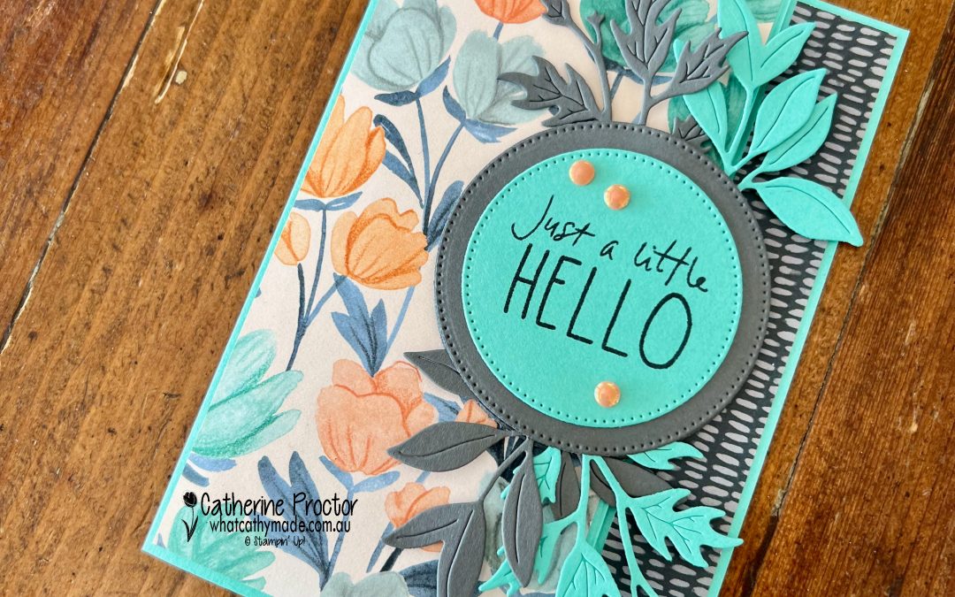
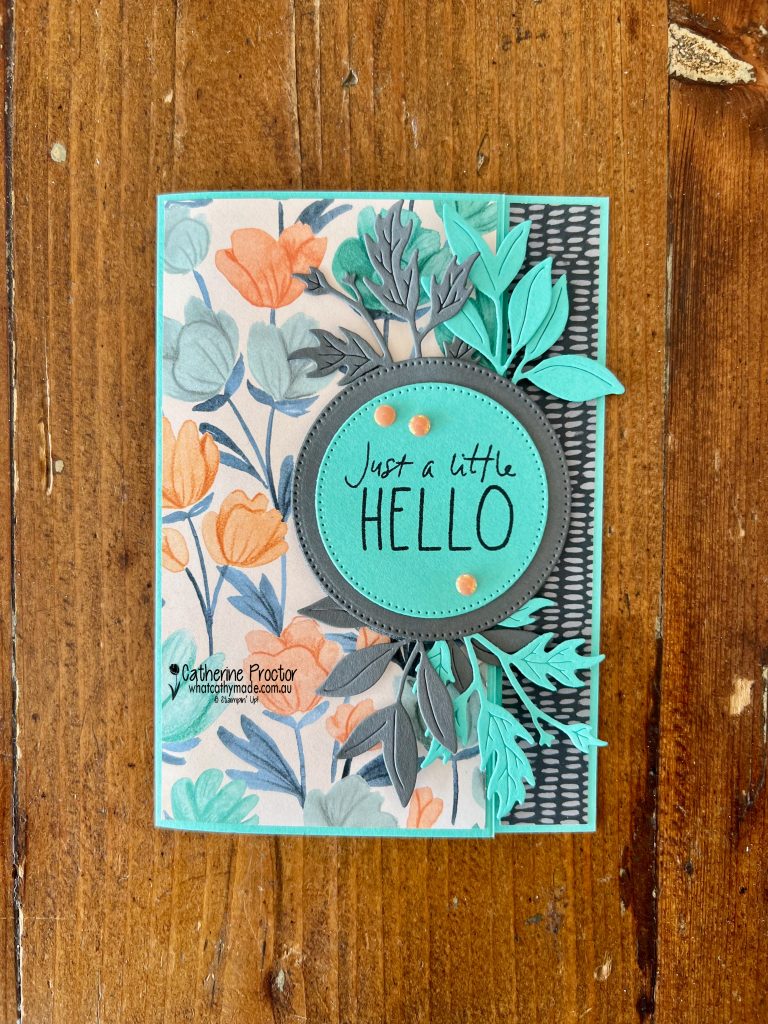
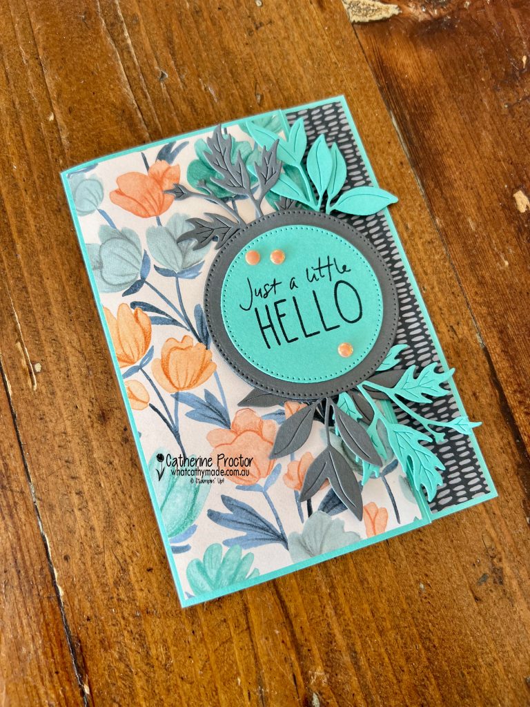
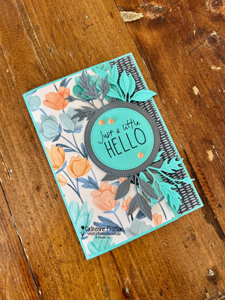
I wanted to create something a little interactive, so I made a side latch card featuring the beautiful Florals in Bloom 12″ x 12″ Designer Series Paper.
Inspired directly by the DSP, my colour combination pairs Summer Splash with Timid Tiger, Cloud Cover and Secret Sea.
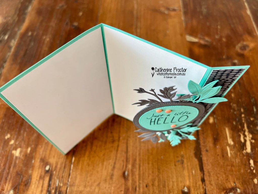
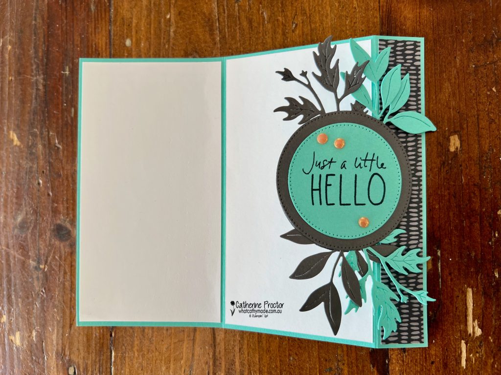
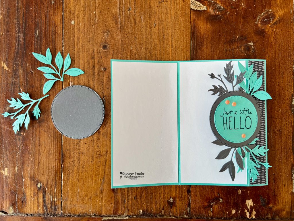
The side latch mechanism keeps the card closed and adds a lovely dimensional focal point. I’ve simply layered die cut circles using the Stylish Shapes dies, however any die cut or punched shape will work.
The circular latch is layered with Summer Splash centre panel with the sentiment from the Cutest Crew stamp set. The slightly larger die-cut circles in Secret Sea hold the foliage and “lock” the card.
To add texture and movement, I used the Help Me Grow Dies to create layered foliage in Summer Splash and Secret Sea. These were tucked behind the circle latch to frame the sentiment and add interest.
Finally, I added a few Timid Tiger 2025–2027 In Colour Flat Pearls for a subtle pop of shine. They bring everything together without overwhelming the design.
Take a look at some more Summer Splash inspiration on our Insta Hop!
Our blog hop is now an Instagram hop but the good news is that you don’t need to have an Instagram account to view all of the other projects!
Simply go to my Insta handles in a new search engine window to follow the Instagram hop: @whatcathymade.
We kick off our 2026-27 Colour Creations hop next week, starting with the brand new 2026–27 In Colours:
Barely Blush
Crisp Cantaloupe
Golden Glow
Hydrangea Hue
Peaceful Pine
I can’t wait to start creating with these fresh new shades.
Thanks so much for following along this year. See you next week for a brand new colour journey.
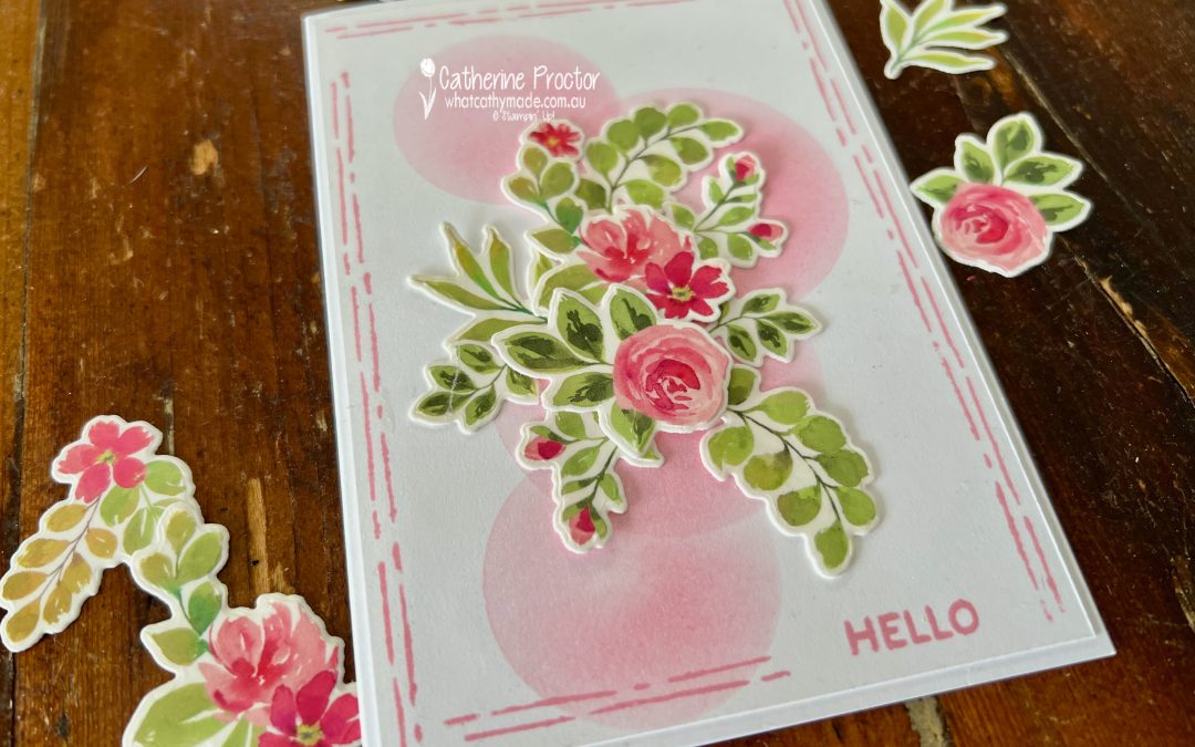
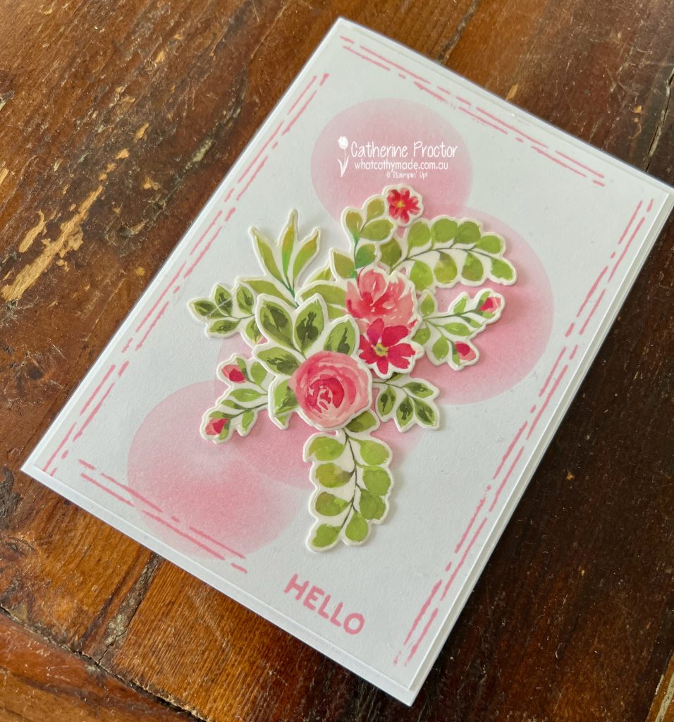
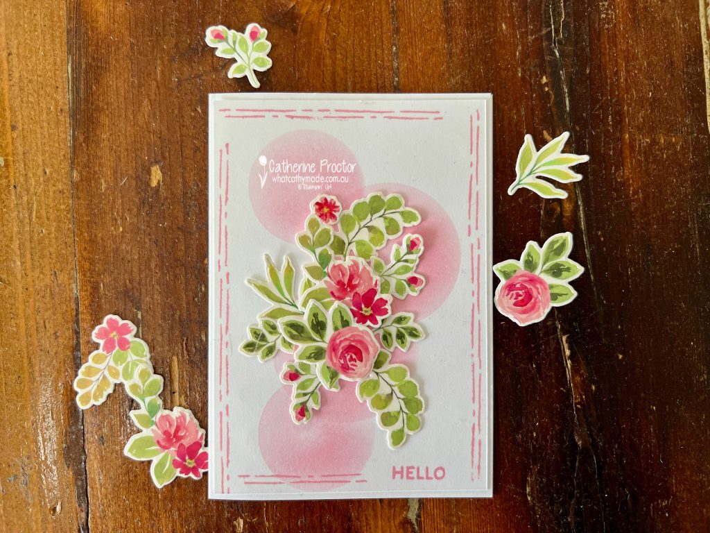
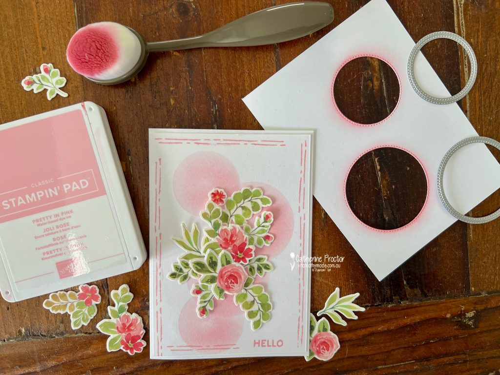
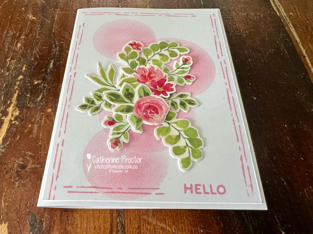
This week for Colour Creations we’re celebrating Pretty in Pink and I’ve created a soft floral hello card using hand made masks to create shading for the background layer.
This gorgeous pink 2024-26 InColour is retiring at the end of April so stock up now if you love Pretty In Pink.
The Extraordinary Flora Bundle and the coordinating Extraordinary Flora Washi Tape makes it incredibly easy to create beautifully detailed floral clusters without lots of individual stamping and colouring.
All you need to do is adhere the tape to cardstock, die cut the images using the coordinating dies, and you suddenly have a whole pile of ready-to-use flowers and foliage.
To create the soft background detail, I die cut a few circles from scrap paper using the Stylish Shapes Dies and used them as masks. With a blending brush and Pretty in Pink ink, I gently blended ink through the circular openings to create those soft, dreamy pink circles behind the floral arrangement.
The only stamping on my card is the simple “Hello” sentiment from the Help Me Grow stamp set, sitting in a hand stamped border that I created using the parallel lines stamp in the Extraordinary Flora stamp set.
Take a look at some more Pretty In Pink inspiration on our Insta Hop!
Our blog hop is now an Instagram hop but the good news is that you don’t need to have an Instagram account to view all of the other projects!
Simply copy any of the Insta handles below into a new search engine window to follow the Instagram hop at any point.
Next in our Hop is Helen @apaperparadise. Be sure to check out her gorgeous project/s.
The full list of this week’s InstaHop is listed below:
Helen @apaperparadise
Kirsty @crafty.littlemiss
Kate @craftwithkate
Cathy @whatcathymade – you are here!
Thank you for joining me for Week 42 of Colour Creations. We’ll be back next Wednesday when we are showcasing Pretty Peacock. I hope you can join us then.
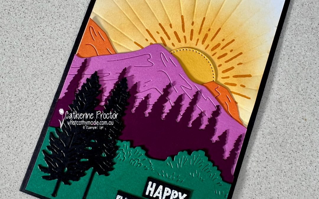
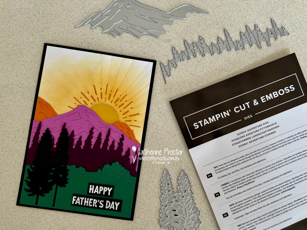
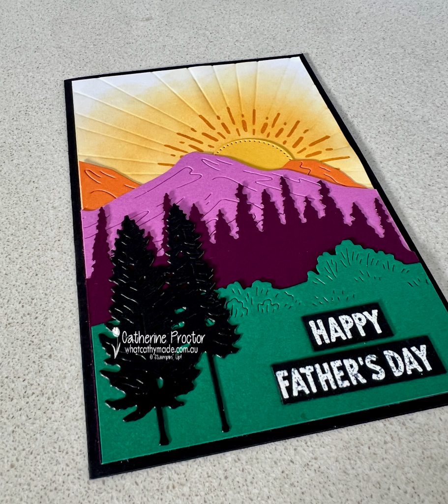
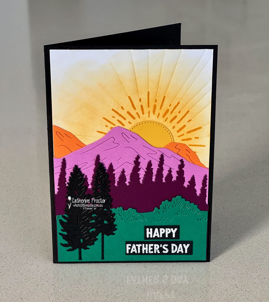
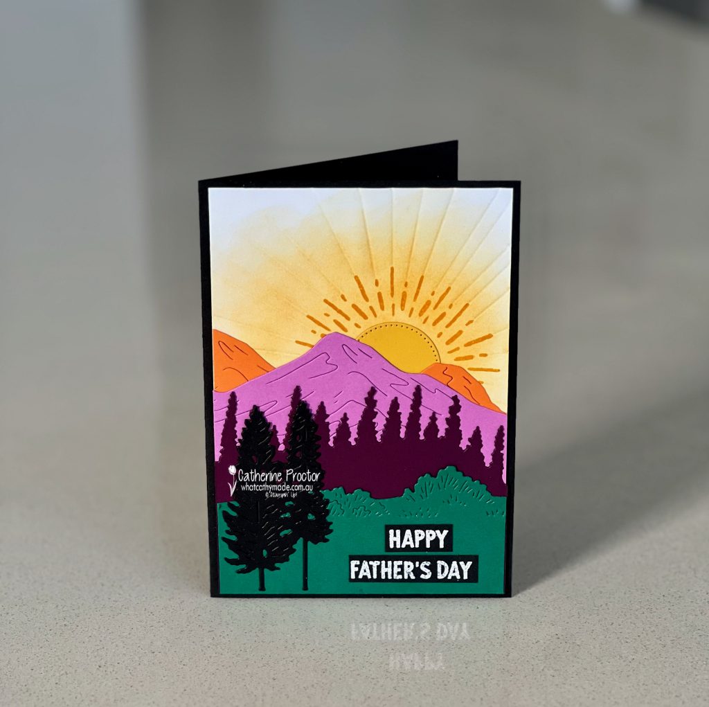
This week we’re showcasing Crushed Curry, a rich golden yellow from the Regals family, and I’ve used it with the amazing Scenic Adventure dies to create a sunrise Father’s Day card for my husband.
Although I usually gravitate towards more monochromatic colour palettes, for this card I took my inspiration from nature and used colours I would not normally pair together: Crushed Curry, Pumpkin Pie, Petunia Pop, Blackberry Bliss, Basic Black and Shaded Spruce.
The Scenic Adventure dies are part of a bundle with the Scenic Adventure stamp set, however on this card I’ve only used the Scenic Adventure dies, as well as a circle die from the Stylish Shapes dies to make the Crushed Curry sun. The only stamping is the sentiment.
Adding extra detail with hand embossing
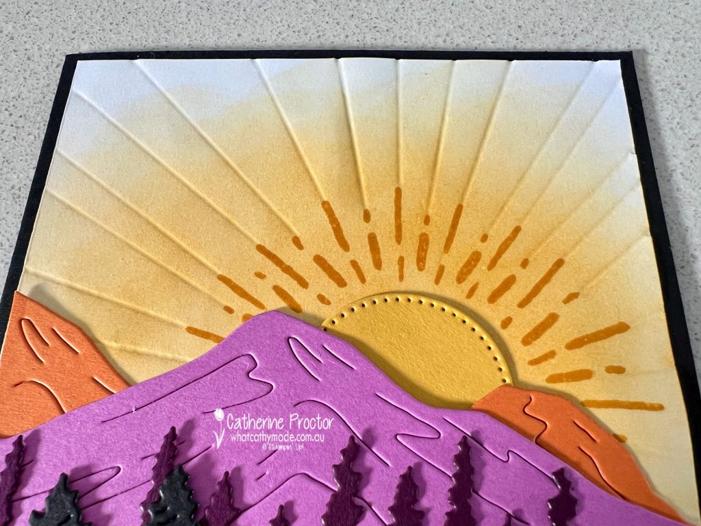
To emphasise the Crushed Curry sun and add extra texture to this card I decided to add some hand embossing.
On a Basic White cardstock layer I stamped a sun in Crushed Curry using the semicircle stamp in the Sunshine Vibes stamp set and then I stamped the Sun rays in Crushed Curry all round the sun.
To add texture, I used the stylus from my Simply Scored Scoring Tool and a ruler to emboss lines that extend the sun rays. I then used a small blending brush and Crushed Curry Ink to add the glow of the sun in the sky as it rises above my mountain scene.
The white heat embossed “Father Day” sentiment is from the Trusty Tools stamp set, heat embossed onto Basic Black card stock.
I really love the vibrant, graphic quality this unusual colour combination gives to my sunrise scene and i hoipw my husband likes it too!
Take a look at some more Crushed Curry inspiration on our Insta Hop!
Our blog hop is now an Instagram hop but the good news is that you don’t need to have an Instagram account to view all of the other projects!
Simply copy any of the Insta handles below into a new search engine window to follow the Instagram hop at any point.
Next in our Hop is Kirsty @crafty.littlemiss . Be sure to check out her gorgeous project/s.
The full list of this week’s InstaHop is listed below:
Kirsty @crafty.littlemiss
Kate @craftwithkate
Helen @apaperparadise
Leanne @createwithleanne2
Sharon @sharondaverncreates
Andrea @andreaksargent
Vicki @vickiboucher
Cathy @whatcathymade
Cathy @whatcathymade – you are here!
We’ll be back next Wednesday when we are showcasing another yellow: Daffodil Delight!
Looking for some Christmas card inspiration?
Our Heart of Christmas blog hop is back for 2025 and we will go live at 8pm (EAST) every Monday night with Christmas card inspiration. This hop is a traditional blog hop (not an Instahop) so you can follow along by reading my blog.
Welcome to week seven of our Art With Heart 2023-24 Colour Creations blog hop!
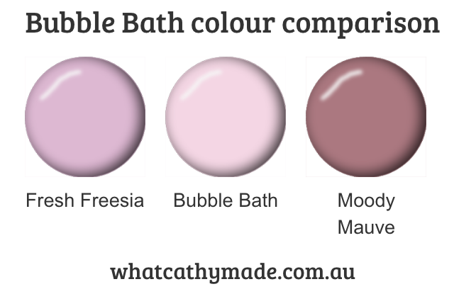
Bubble Bath is a gorgeous light pink that’s in the Subtles family, sitting somewhere in between Fresh Freesia and Moody Mauve.
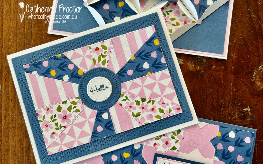
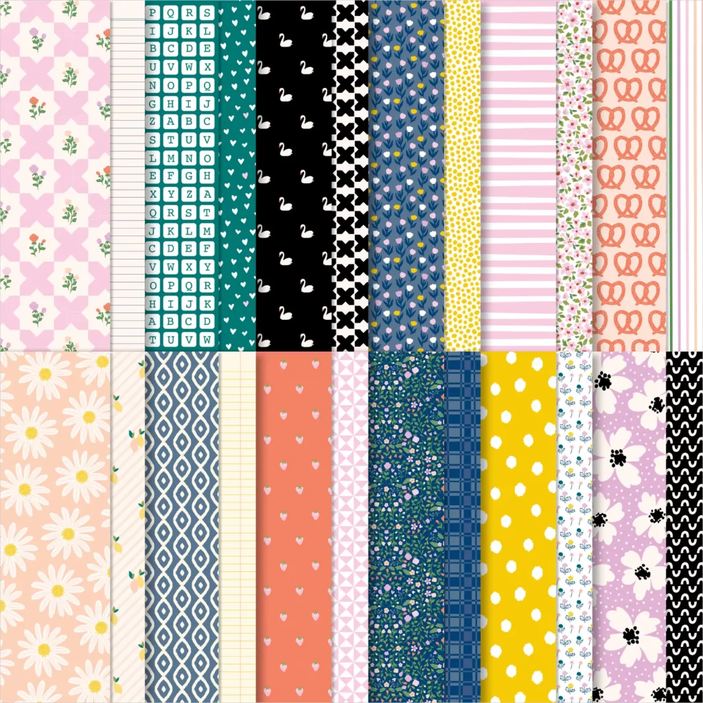
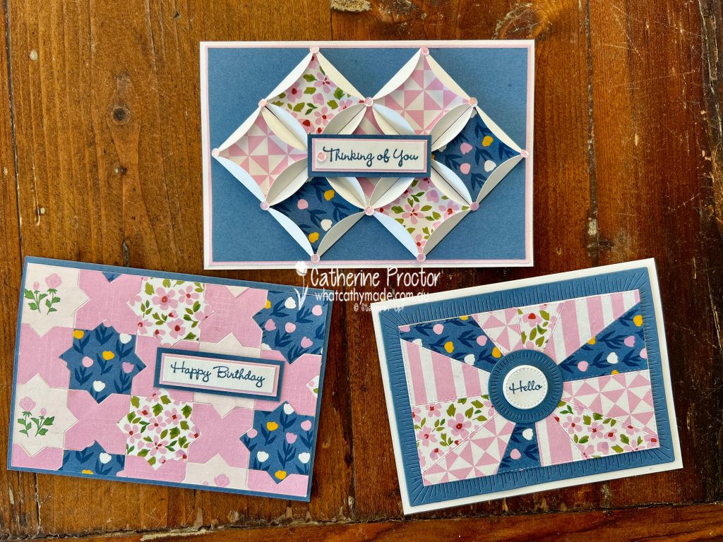
My three Bubble Bath cards are all paper quilt cards that feature the Delightfully Eclectic DSP, one of the Designer Series Papers on sale at 15% off for the entire month of June (the entire list of papers on sale is listed here).
By only using four of these DSP designs, I’ve narrowed my colour pallette to Bubble Bath, Misty Moonlight, Garden Green and Basic White – with just a tiny touch of Night of Navy, Crushed Curry and Cajun Craze in the selected DSP patterns.
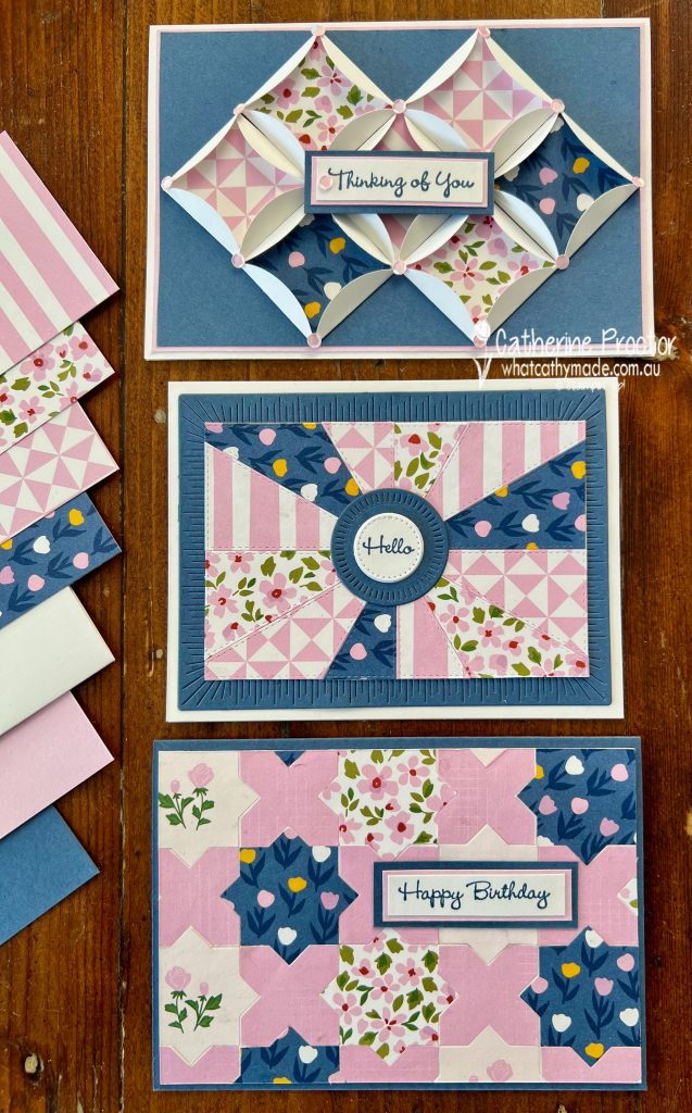
If you’ve never you ever made a paper quilt card before it’s such a fun technique for using DSP. I’ve created three different paper quilt cards this week, however there are as many ways to make this style of card as there are ways to make quilts!
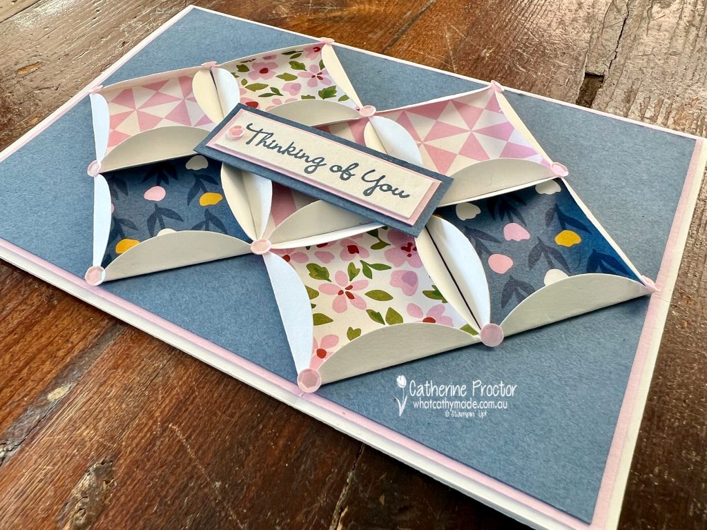
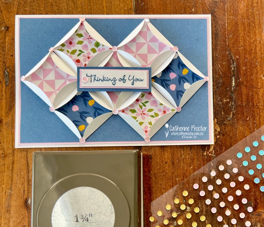
This “Thinking of you” card is a cathedral windows card, named after the cathedral windows style of quilts it looks like. It has a lot of dimension as you can see more clearly in this side-on photo.
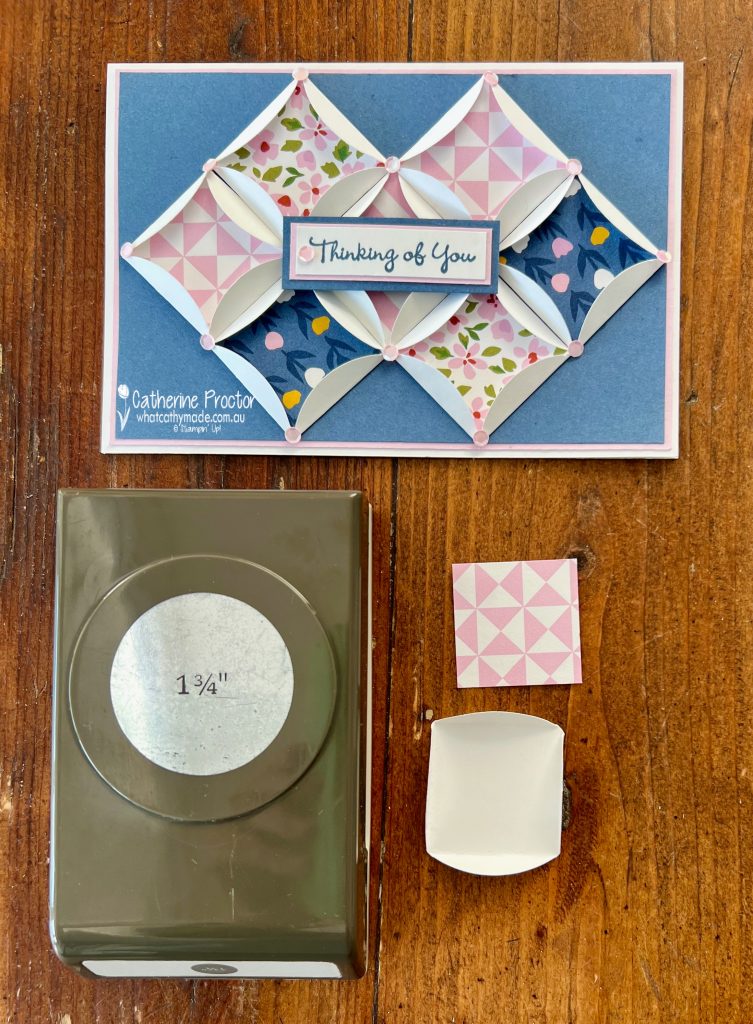
I’ve used the 1 3/4″ circle punch (you can also use dies) to cut Basic White cardstock circles as I wanted the effect of the white edges against the Misty Moonlight layer.
Insert squares of DSP inside the circles and use your fingers and your bone folder to fold the edges of the circle around the squares of DSP, creating the square cathedral window shape.
The colour of these pink Pastel Adhesive-Backed Sequins are actually listed on the packet as Petal Pink, but I think they match Bubble Bath perfectly.
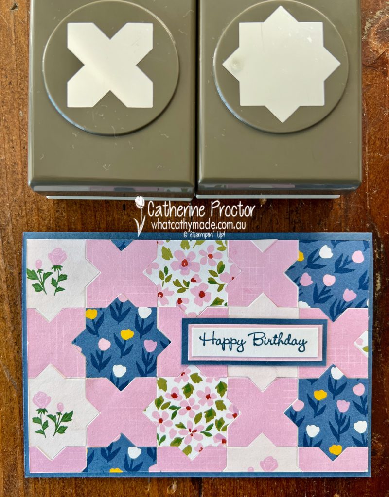
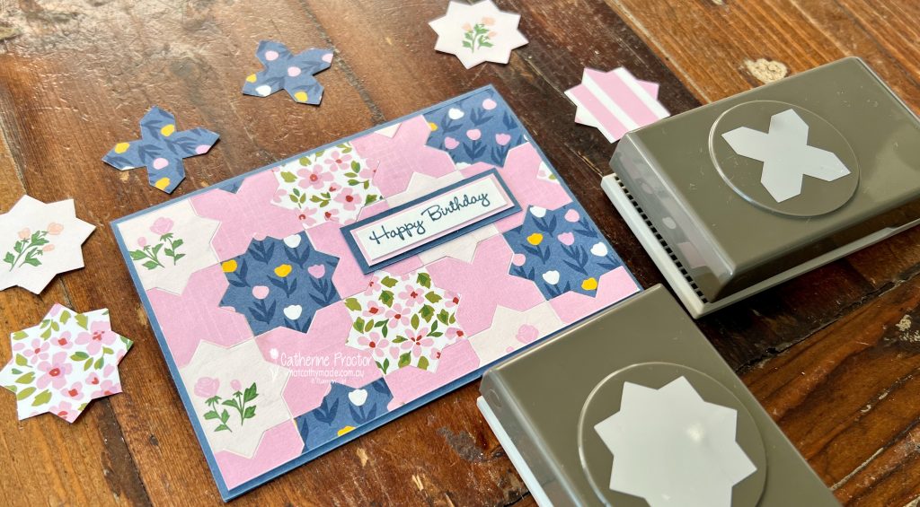
My “Happy Birthday” card uses the the Inked & Tiled Punch Pack. These punches are designed to slot into each other so they are ideal for making a paper quilt.
No folding or measuring required for this paper quilt! Simply arrange the punched out pieces into your preferred quilt design, glue them onto a layer of Basic White cardstock and adhere your quilt to your card base.
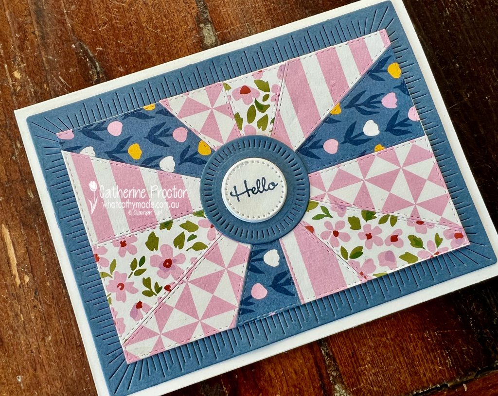
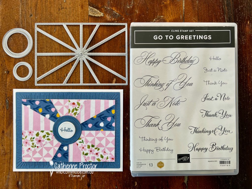
The “Hello” card uses dies from the Patchwork Pieces dies, the Stylish Shapes dies and the Radiating Stitches dies. Seriously, how many different dies can I use on the one card, LOL!
Die cut four different DSP patterns using the Patchwork Pieces die and then arrange them in a symmetrical design, gluing alternating DSP pieces onto a cardstock layer.
The Misty Moonlight base layer and the Misty Moonlight circle layer under the sentiment are die cut with the Radiating Stitched dies – an online only product. The Hello sentiment is die cut using the smallest circle from the Stylish Shapes dies.
All three cards use sentiments from the “Go To Greetings” stamp set, stamped in Misty Moonlight. I thought the soft feminine script of these sentiments really suited the colour pallette and DSP patterns on my quilt cards.
Now it’s time to hop on over to our next participant, the lovely Kathryn Ruddick – I can’t wait to see what Kathryn has made this week!
If at any time you find a broken link, you can find the complete list of all participants below.
Welcome to week one of our Art With Heart 2023-24 Colour Creations blog hop!
We have a brand new blog hop header and next blog button – thank you to my friend Sharon Davern for creating these for our AWH Colour Creations 2023-24 blog hop!
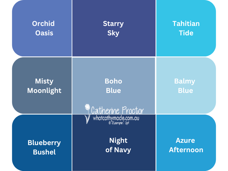
This week we are showcasing a brand new 2023-25 In Colour: Boho Blue. Boho Blue is such a beautiful soft blue – I know I will use this one a lot. Here’s a chart I created to show you how Boho Blue compares to the other current Stampin’ Up! blues.
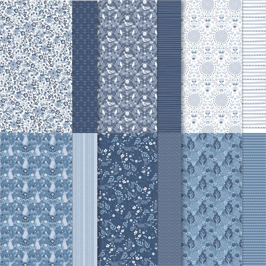
One of the products Stampin’ Up! demonstrators were able to order early from the 2023-24 catalogue was this stunning Countryside Inn DSP. It pairs Boho Blue with Balmy Blue, Misty Moonlight and Night of Navy.
When you place Boho Blue beside Balmy Blue, it really makes Balmy Blue look a lot like Pool Party!
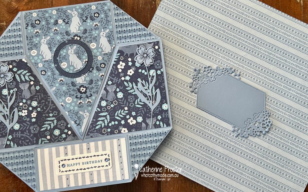
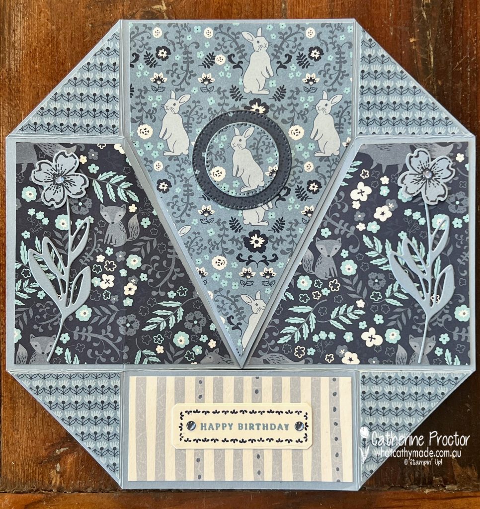
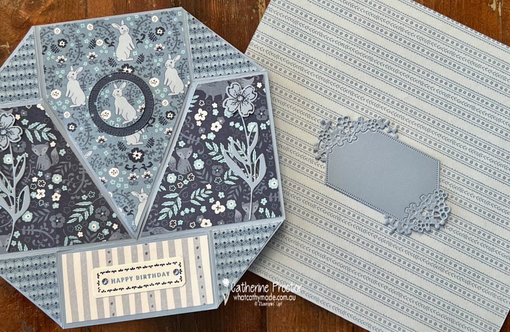
I decided an octagonal never ending card would be a wonderful way to showcase Boho Blue and as much of this DSP as possible.
This short video shows how this magical card works – never ending cards really have the ultimate wow factor!
A video I found on Pinterest from a cardmaker called Els Ham showed me the mechanics of making this style of never ending card, however I’ve changed the size of my card to make it a lot bigger than Els’ original card.
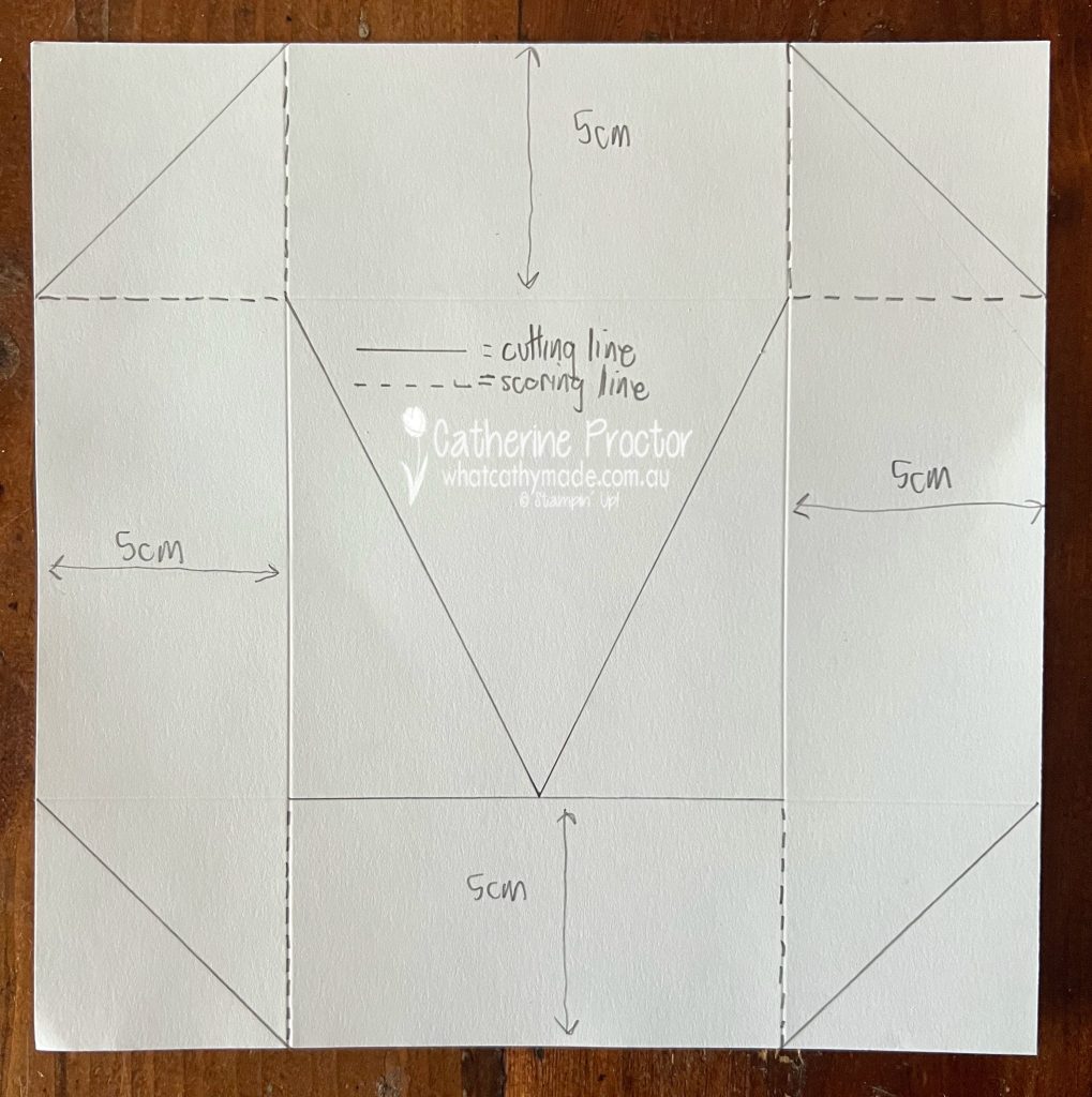
This template shows you how to cut and fold your 20 x 20 cm cardstock base. Start by scoring 5 cm in from all four sides. Once you’ve followed the template below to cut, score and fold your card, you can then decorate all the panels.
Always decorate the front of the card first before you decorate the reverse sides. Fold the card as you decorate the reverse sides to make sure you get any sentiments the right way up.
Here’s the card photographed from all the different angles. Front view…
Left and right middle flaps reversed…
Bottom and top flaps reversed…
Middle flaps reversed again…
Top and bottom flaps reversed to return to the front view of the card…
I’ve used various stamps and dies from the Petal Park stamp set, Sentimental Park stamp set, Sentimental Park dies, Petal Park Builder punch and the Stylish Shapes dies to embellish this Boho Blue never ending card.
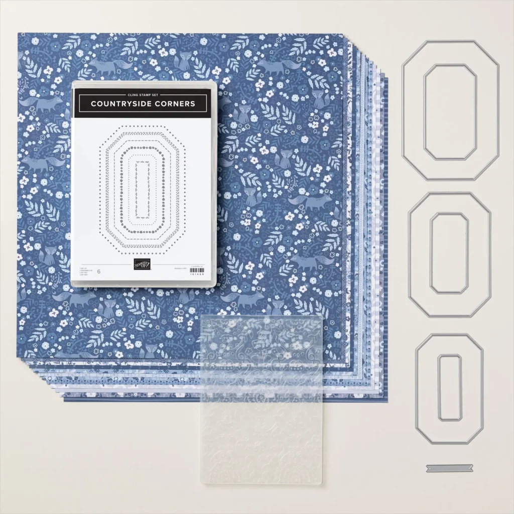
Every product from the Countryside Inn Suite collection was also used: the Countryside Corners bundle (Countryside Corners stamp set and Countryside Corners dies), the Countryside Blossoms Embossing folder and the Countryside Inn DSP
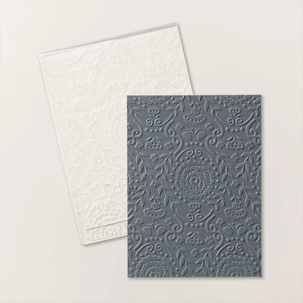
One really cool feature of this suite is the Countryside Blossoms Embossing folder – it actually embosses the Countryside Inn DSP!
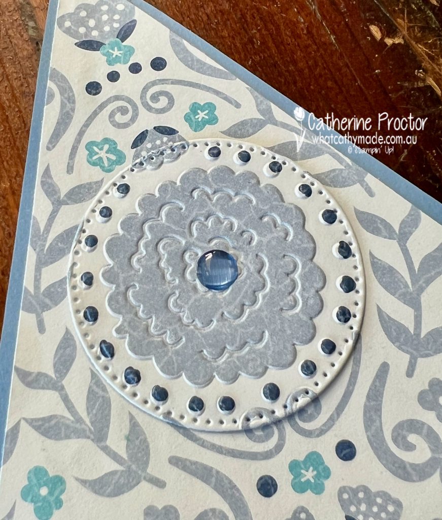
Here’s a close up of the embossing of the DSP. The gorgeous Boho Blue embellishments you can also see in this image are from the 2023-2025 In Colour Dots.
This is a very large card, measuring 20x20cm, so to make an envelope for it I used a C4 business envelope, trimming 10 cm off the base of the envelope before folding and gluing the base up to reseal the bottom of the envelope.
I then decorated the front and back of the envelope with the Countryside Inn DSP and a Boho Blue address label, die cut using the Sentimental Park dies.
I love Boho Blue so much I’ve already ordered another pack of the cardstock!
Now it’s time to hop on over to our next participant, the lovely Kate Morgan – I can’t wait to see what Kate has made this week!
If at any time you find a broken link, you can find the complete list of all participants below.
This year we’re starting the Stampin’ Up! Colour creations with our five new In colours, so we’ll be back next Wednesday, May 10, with another new 2023-24 In Colour, Copper Clay!
Welcome to week twenty-one of the Heart Of Christmas Blog Hop!
Oh my goodness, I love it when different products are designed to coordinate together!
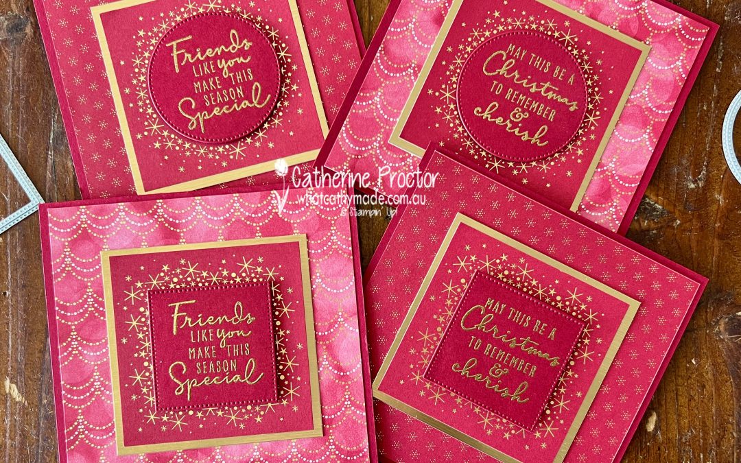
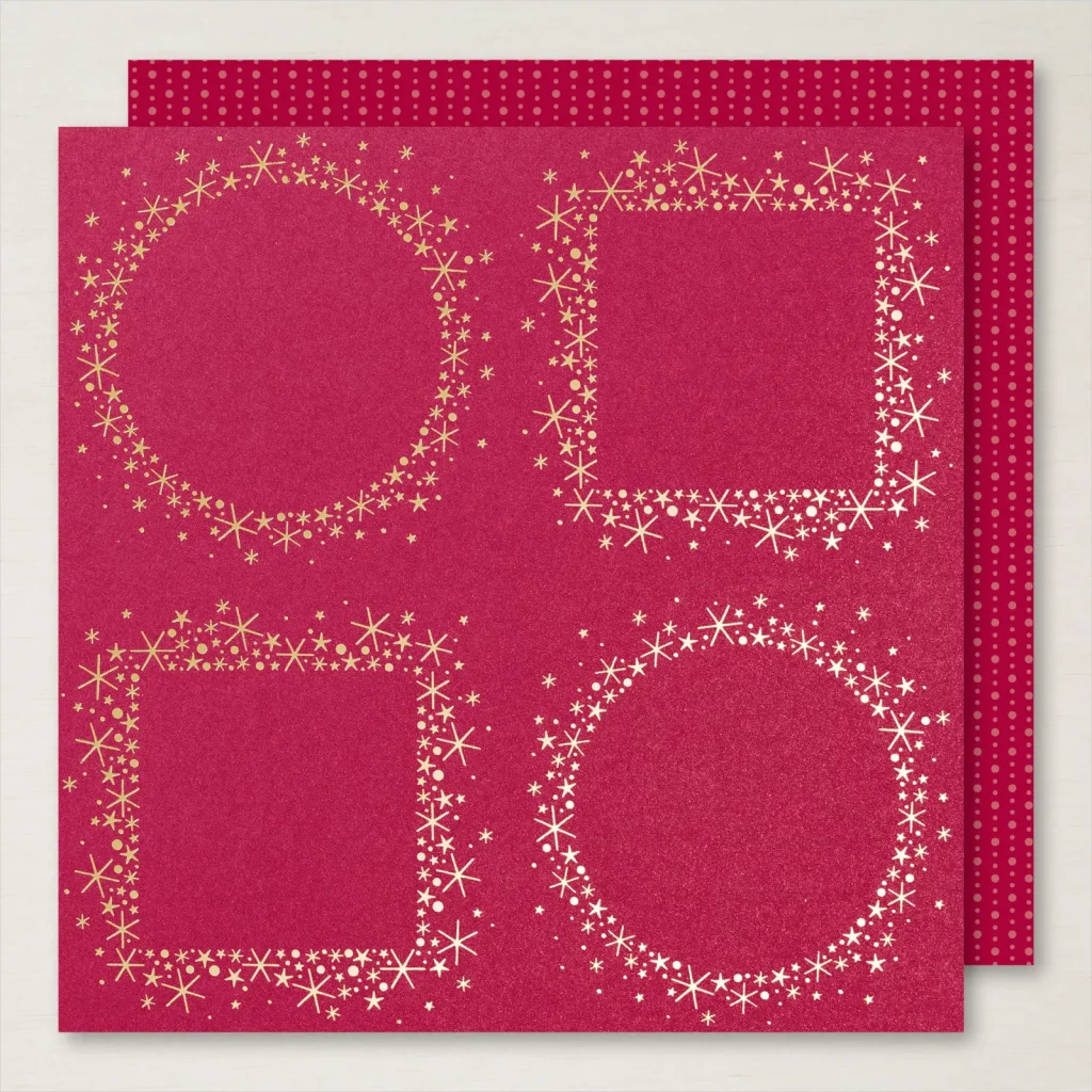
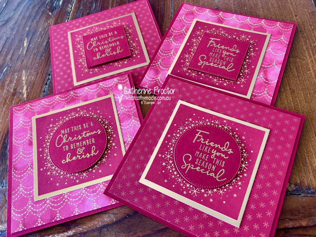
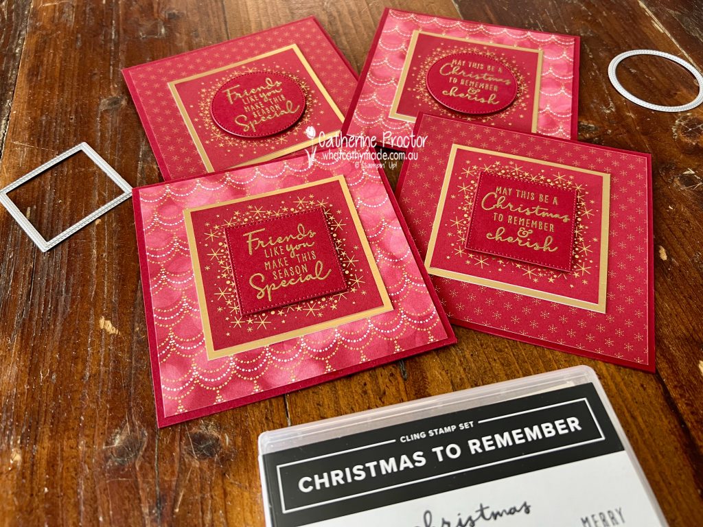
Did you know that two of the stamps in the Christmas To Remember Stamp Set fit perfectly into the Stylish Shapes Dies, which in turn, fit into the centre of the circles and squares on this design in the Lights Aglow DSP?
I made four cards from this one sheet of DSP, deliberately keeping my colour scheme very monochromatic by only using Cherry Cobbler and gold.
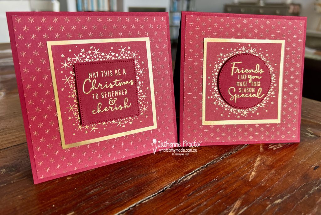
In the photo above, Cherry Cobbler looks very pink, but in the photo below, it looks more like a rich red. Either way, this is a stunning colour.
Can you see the gorgeous shimmer of the Lights Aglow DSP? These two cards use another pattern from the Lights Aglow DSP – the small gold foiled star pattern for the background layer.
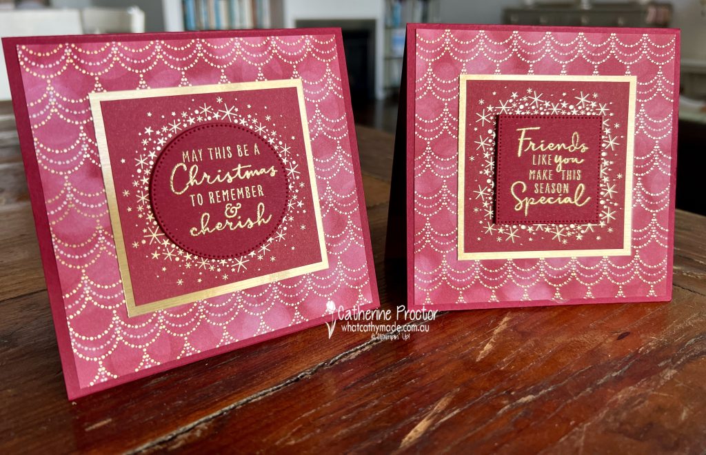
These next two cards use the foiled festive garland design from the Lights Aglow DSP as their background. I love the classic colours and elegance of this DSP!
Now it’s time to hop on over to our next participant, the lovely Sharon Davern. I can’t wait to see what Sharon has made this week.
If at any time you find a broken link, you can find the complete list of all participants on Sharon‘s blog.
Welcome to week eighteen of the Heart Of Christmas Blog Hop!
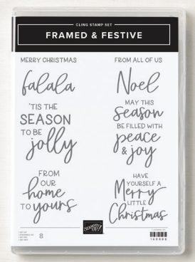
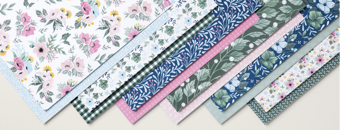
From tomorrow, November 1, the Fitting Florets Collection from the upcoming January – June Mini Catalogue will be available to order and it includes two products only available for limited time: the Framed & Festive Stamp Set and the Fitting Florets DSP.
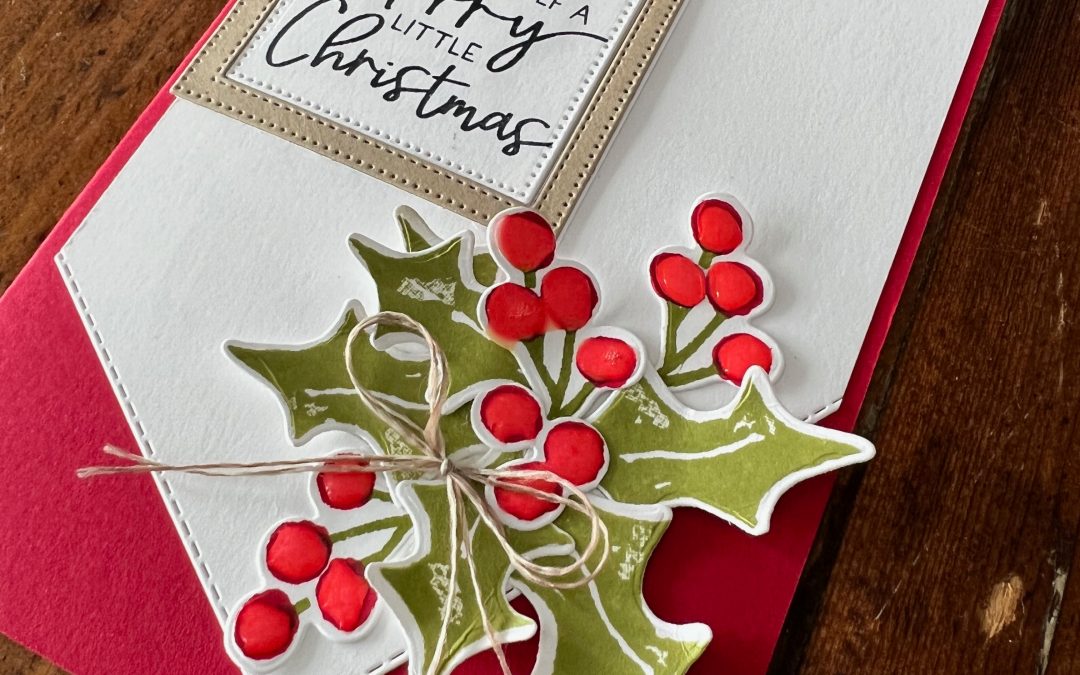
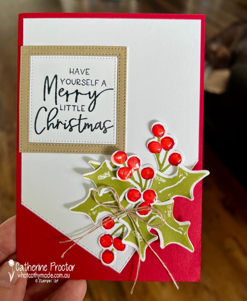
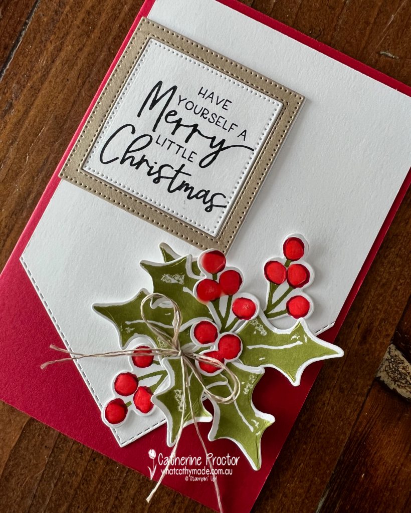
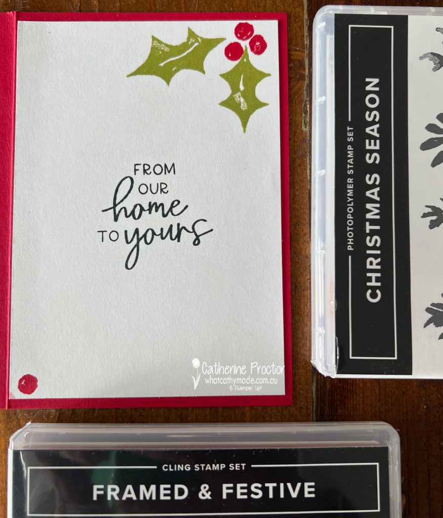
The Framed & Festive stamp set is a really versatile Christmas sentiment stamp set that works with any Christmas products. I’ve paired it with the Christmas Season stamp set and the coordinating Seasonal Labels dies for this week’s Heart of Christmas card.
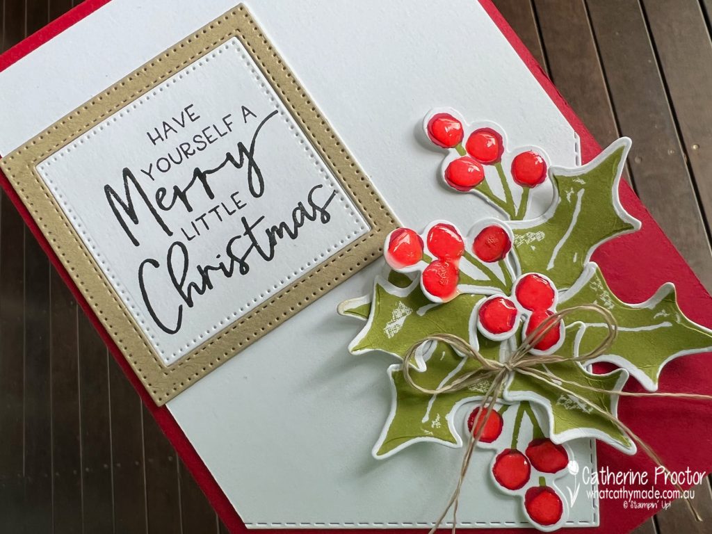
The Basic White layer has been die cut an angle using the largest of the stitched rectangle dies. This adds visual interest and draws your attention to the bunch of holly berries and leaves.
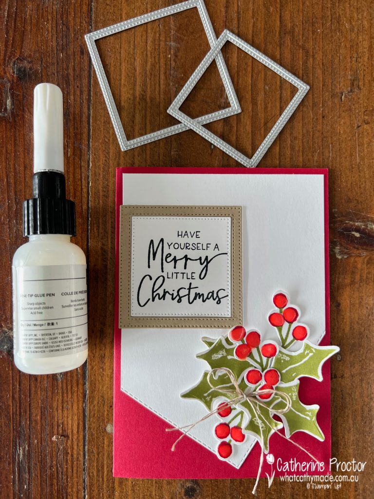
My traditional red and green colour combination uses Real Red, Pear Pizzazz, Crumb Cake and Basic White. Fine tipped glue has been added to the holly berries to make them shine.
The sentiment has been die cut and framed using the middle two square Stylish Shapes dies. I really like the mix of fonts in the Christmas sentiments in the Framed & Festive stamp set.
Another sentiment from the Framed & Festive stamp set has been used for the inside of the card – I think I will be using this sentiment a lot for my Christmas cards this year.
Now it’s time to hop on over to our next participant, the lovely Rachel Woollard – I can’t wait to see what Rachel has created today!
If at any time you find a broken link, you can find the complete list of all participants on Sharon‘s blog.
Welcome to week twenty six of our Art With Heart 2022-23 Colour Creations blog hop!
This is a weekly blog hop where we showcase the stunning range of Stampin’ Up! colours in alphabetical order over 12 months and this week we are featuring Highland Heather from the subtles family.
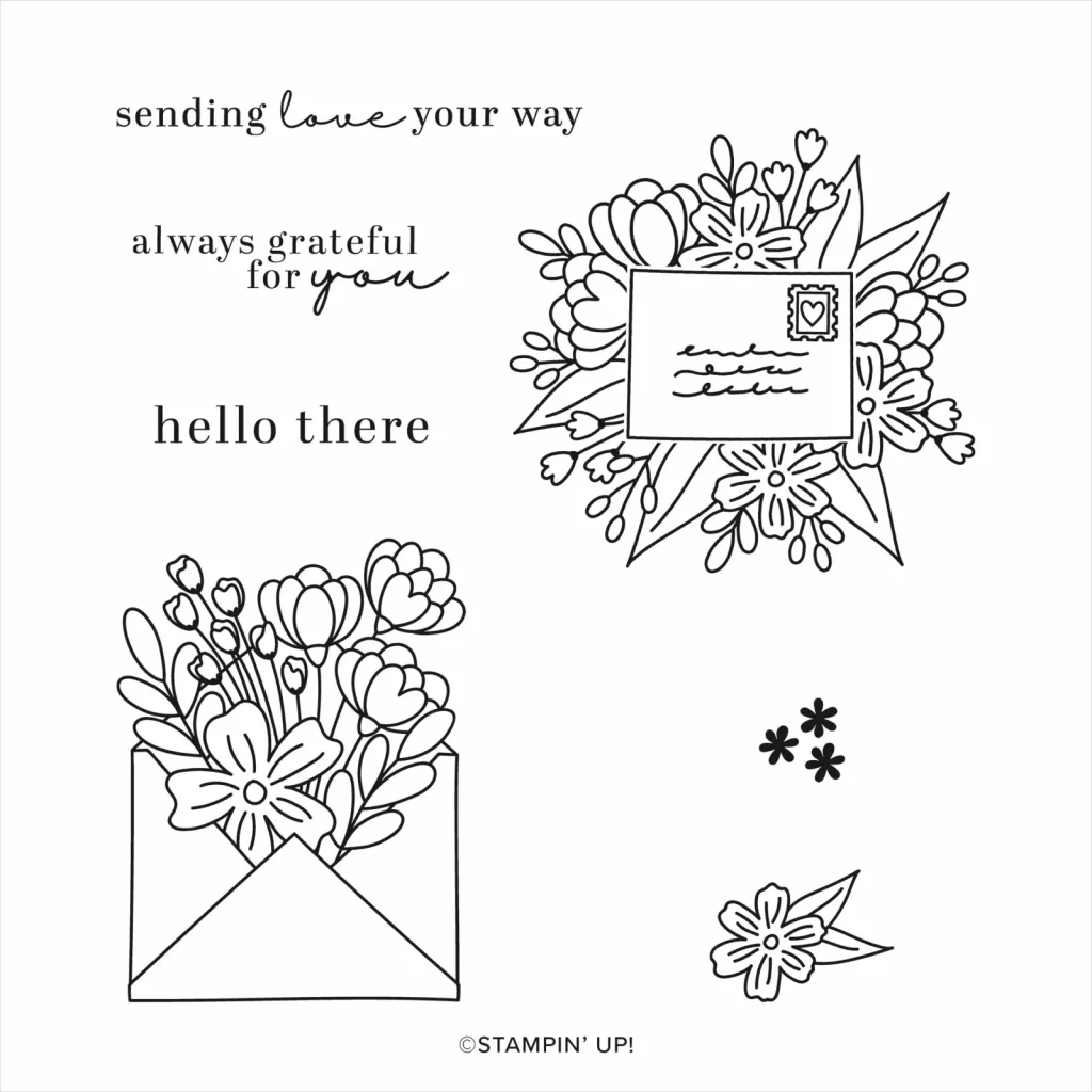
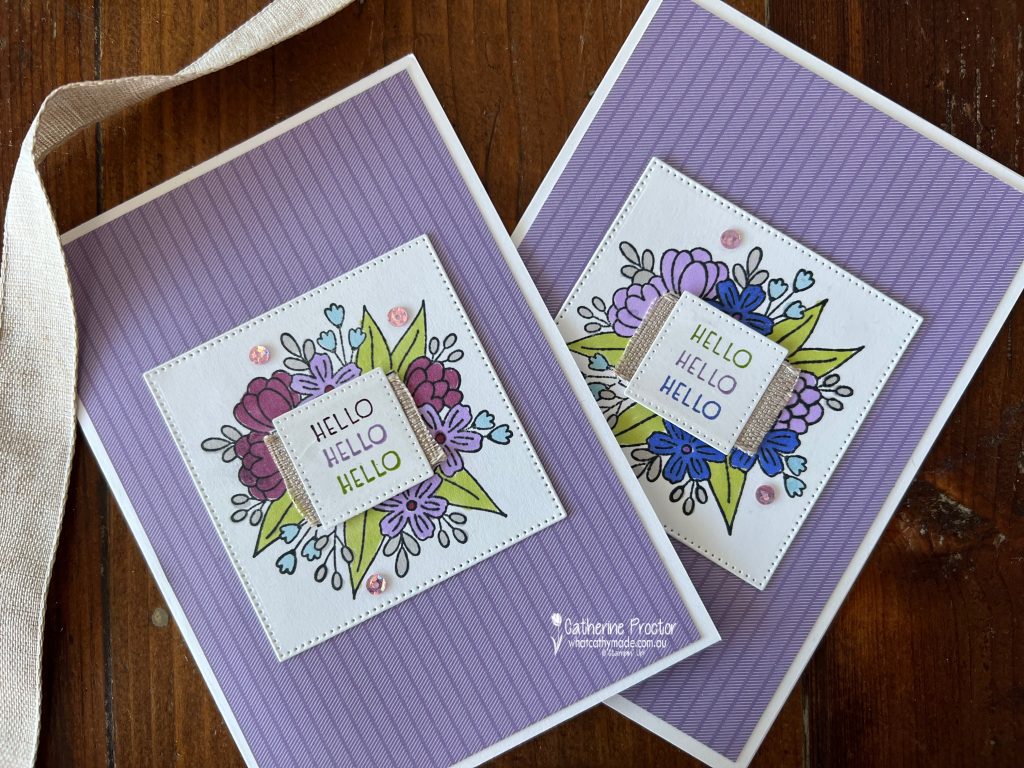
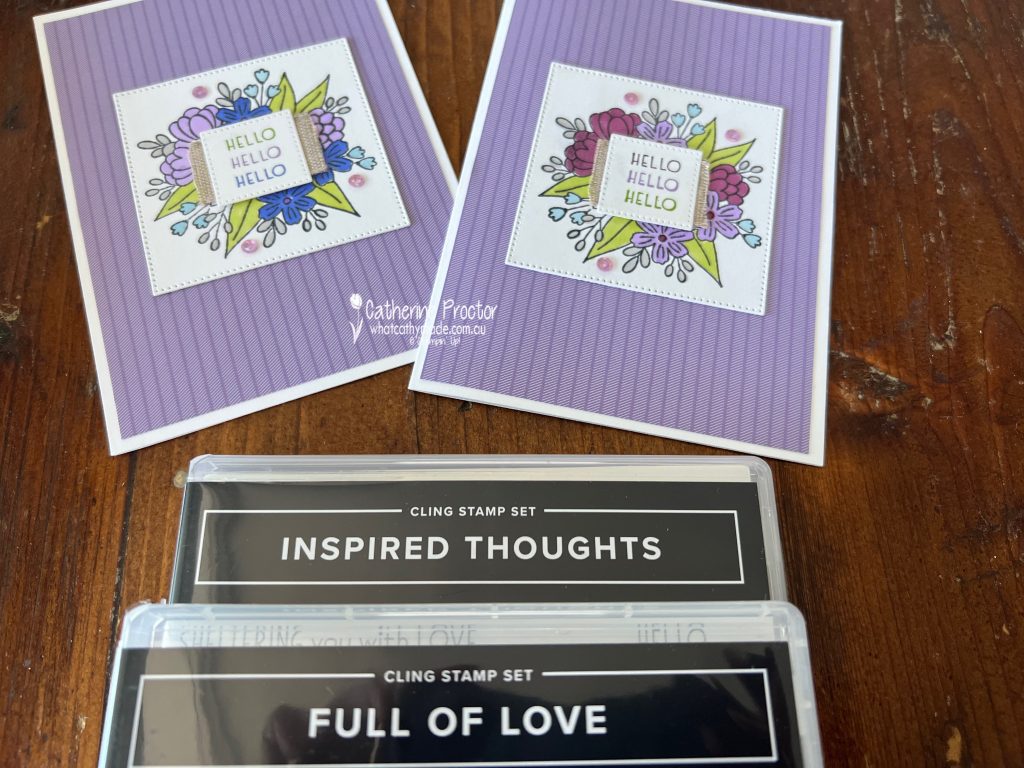
This week I’m using a stamp set that is great for any kind of colouring: the Full of Love Stamp Set.
This is also great stamp set for stampers who are starting their stamp collection as it contains a variety of sentiments and images.
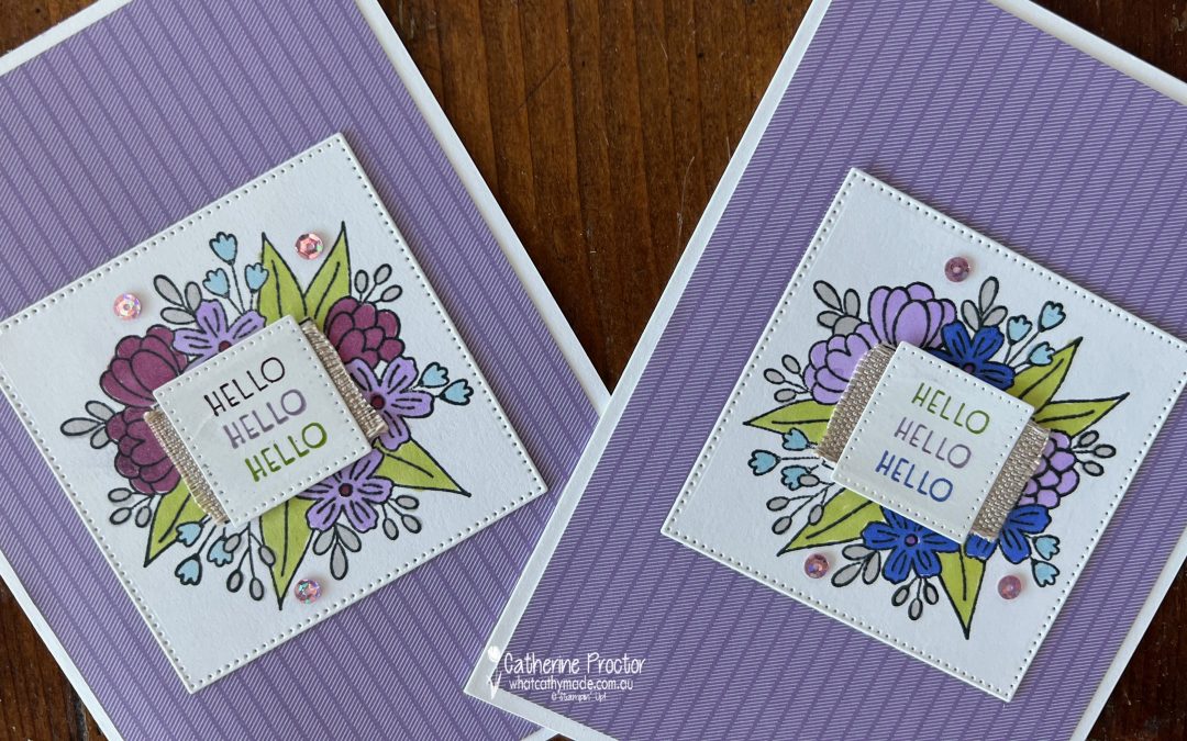
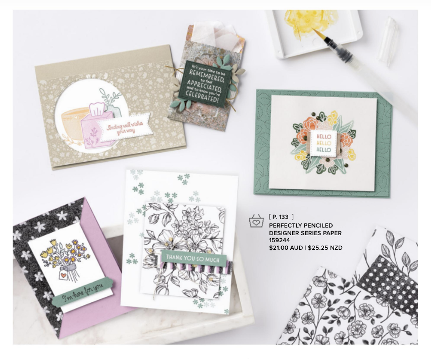
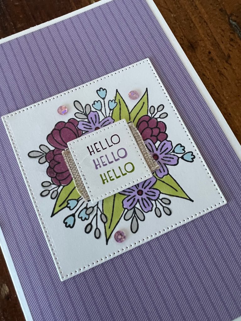
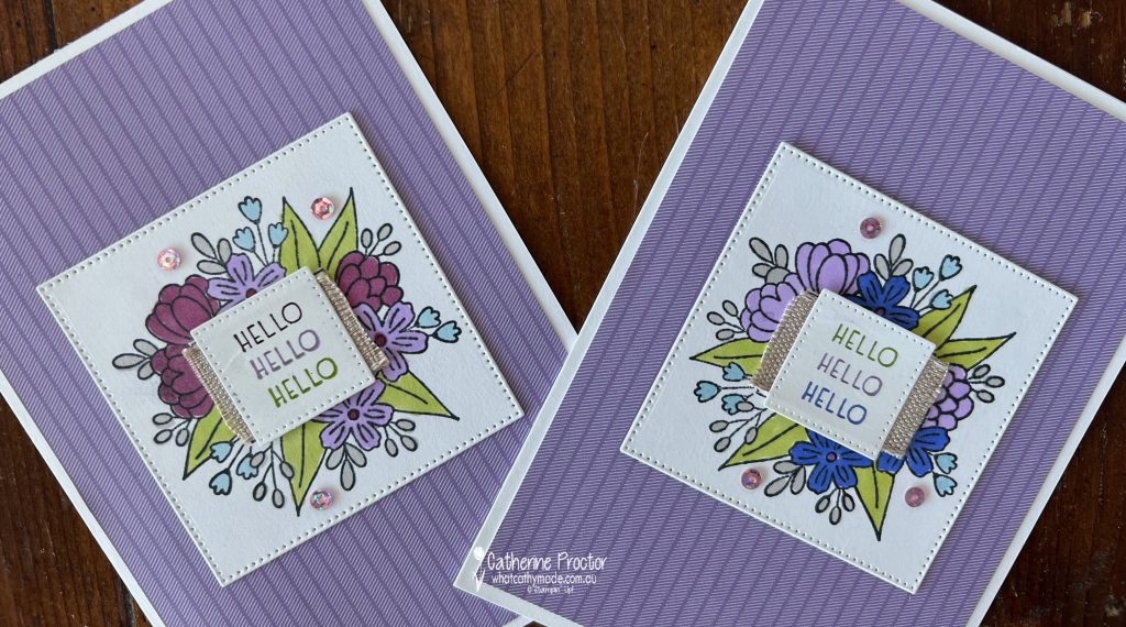
I’ve actually used a sentiment from another stamp set – Inspired Thoughts – but that is only because I am CASEing the “Hello, hello, hello” card from page 76 of the Annual Catalogue.
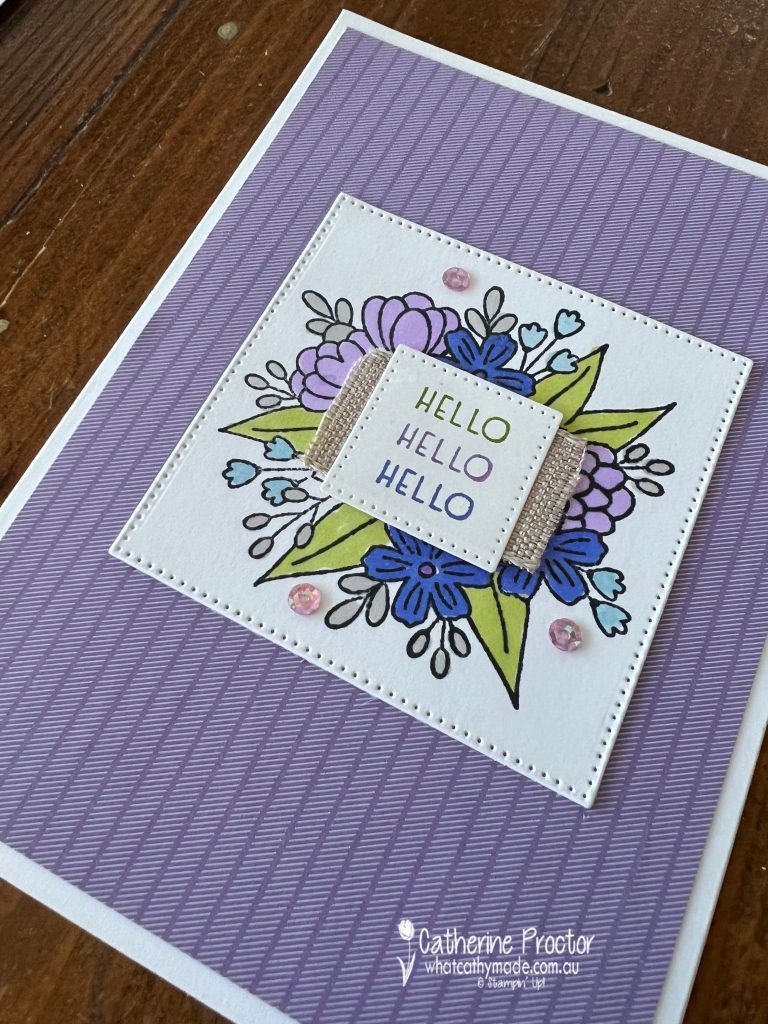
The Stampin’ Up! designers layered the die cut sentiment over a strip of the Natural Finish Ribbon to cover the stamped envelope, revealing just the flowers that surround the envelope. I’ve also done this for my two cards below.
I’ve taken a risk with my colour choice for both cards, combining Highland Heather, which is a soft subtle colour, with two very intense colours: Blackberry Bliss and Orchid Oasis.
Card one combines Highland Heather with Blackberry Bliss, Balmy Blue, Gray Granite and Granny Apple Green.
Card one combines Highland Heather with Orchid Oasis, Balmy Blue, Gray Granite and Granny Apple Green.
Both cards use the smallest square in the Stylish Shapes Dies to die cut the coloured image, Highland Heather Subtles 6″ x 6″ Designer Series Paper and Stampin’ Blends to colour the images.
The finishing touch is three Fresh Freesia Adhesive-Backed Sequins.
Now it’s time to hop on over to our next participant, the lovely Kate Morgan – I can’t wait to see what Kate has made this week!
If at any time you find a broken link, you can find the complete list of all participants below.
Welcome to week twenty five of our Art With Heart 2022-23 Colour Creations blog hop!
This is a weekly blog hop where we showcase the stunning range of Stampin’ Up! colours in alphabetical order over 12 months and this week we are featuring Gray Granite from the neutrals family.
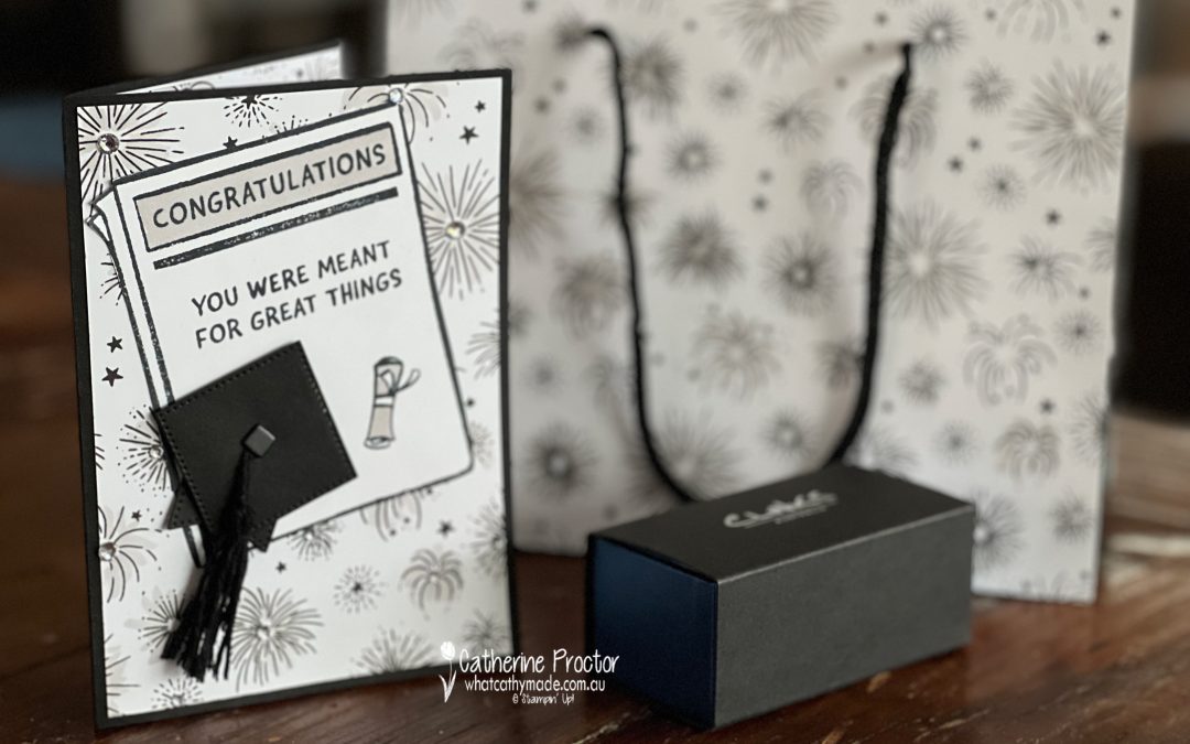
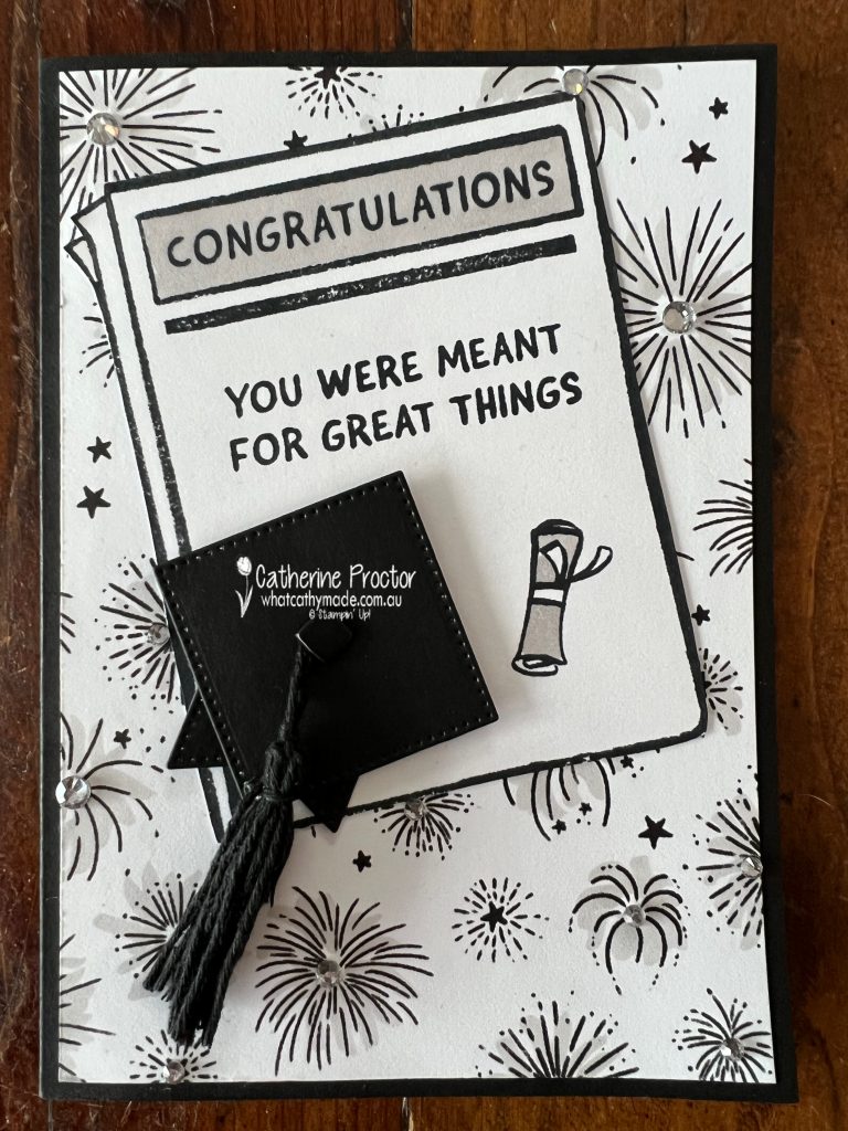
I made this card for a very special ocassion – my eldest son’s university graduation last week! He actually finished uni not last year, but the year before, but thanks to Covid they are running a bit behind with the graduation ceremonies.
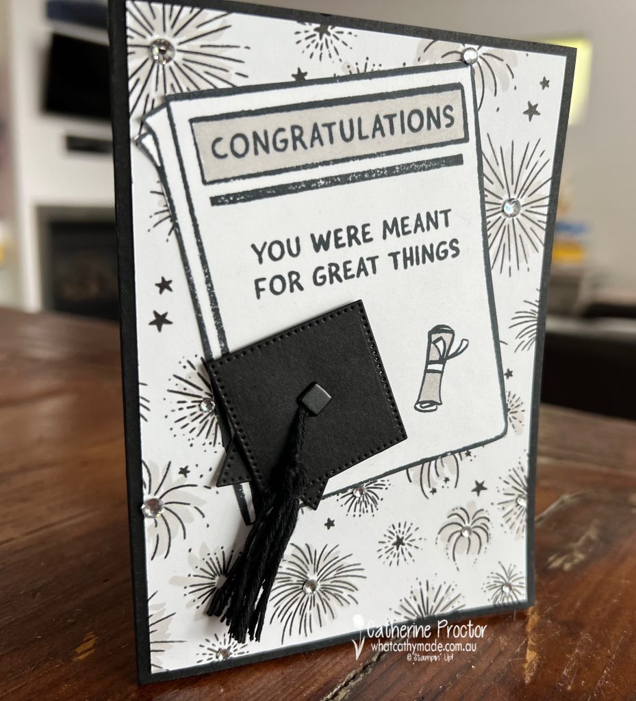
I specifically bought the Breaking News Stamp Set to make Samuel’s graduation card, however I think it’s going to be great for all kinds of cards. Working in publishing all my life, I love having a newspaper stamp set in my collection!
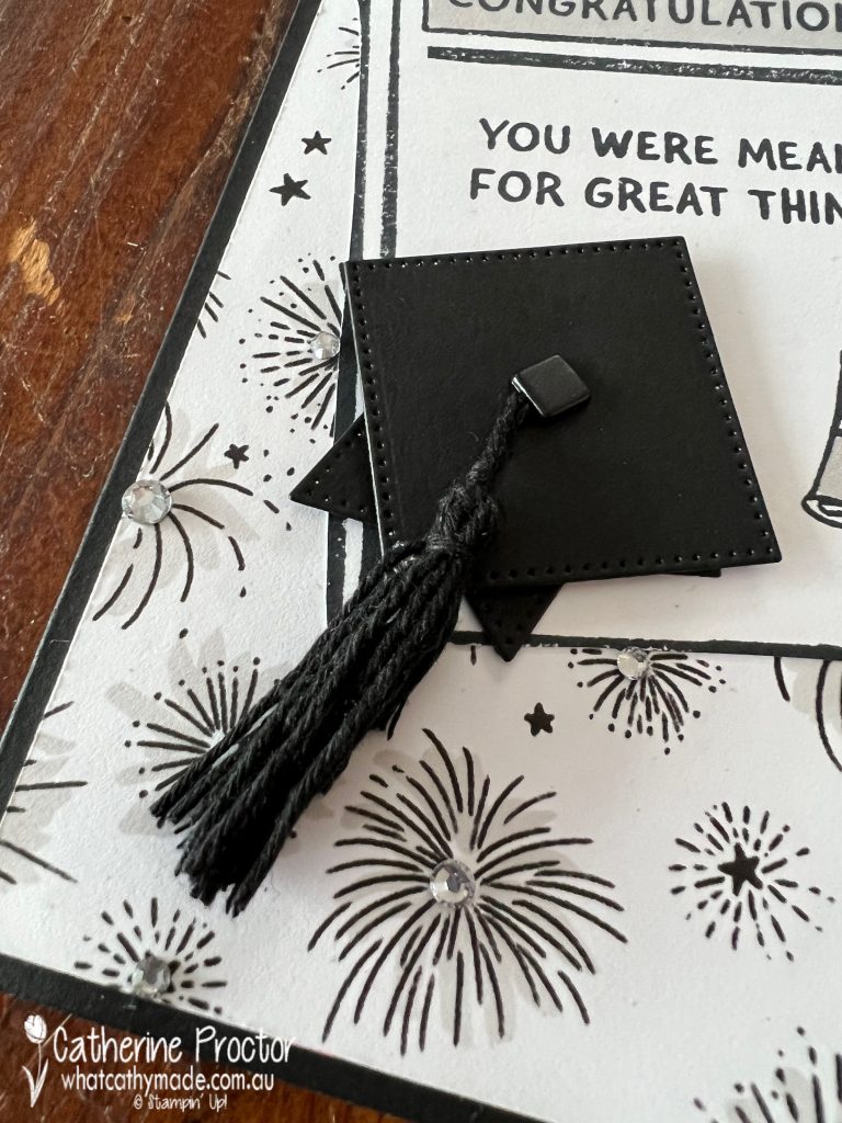
I also wanted to also incorporate a Mortar Board on my card and so I used a couple of the Stylish Shapes Dies to make a mini Mortar Board with a Black Brad from the Round & Square Brads and some Black Baker’s Twine from the Baker’s Twine Essentials Pack to make the tassel.
I jazzed up the Celebrate Everything 12″ x 12″ Designer Series Paper using my Gray Granite Stampin’ Blends and some Rhinestone Basic Jewels.
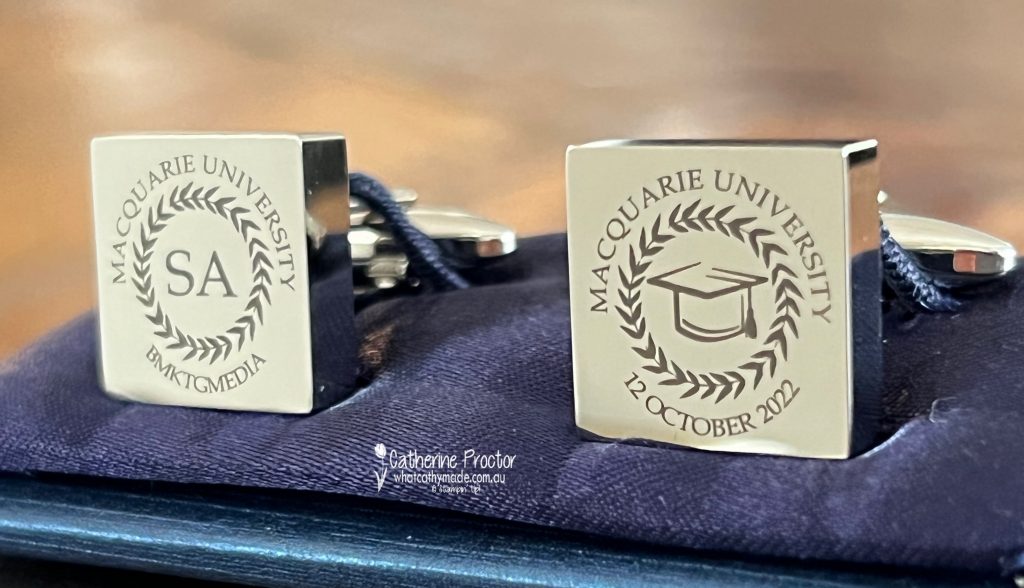
We gave Samuel some cufflinks engraved with his initials, the abbreviation of his degree, the date of his graduation and the name of the university he graduated from – Macquarie University.
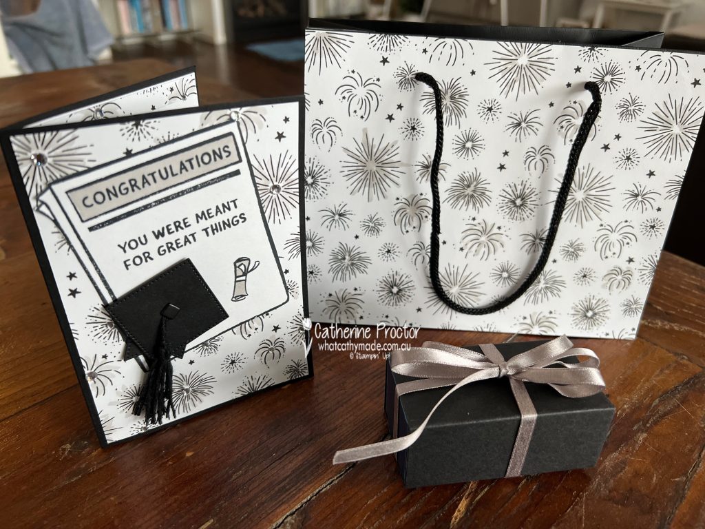
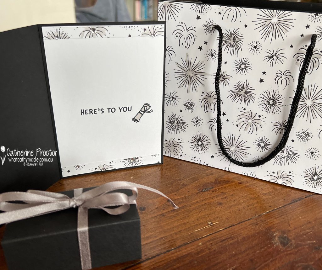
The cufflinks arrived in a lovely box and gift bag so there was no need for me to “reinvent the wheel” with the packaging. I simply adhered the Celebrate Everything 12″ x 12″ Designer Series Paper to the black gift bag and tied some Gray Granite Shimmer Ribbon around the cufflinks box.
This fireworks DSP pattern just screams celebration to me and it could be easily customised with any colour.
Here’s the inside of the card – how cute is that little diploma/degree scroll stamp! Once again, it was coloured with Gray Granite Stampin’ Blends.
Now it’s time to hop on over to our next participant, the lovely Andrea Sargent – I can’t wait to see what Andrea has made this week!
If at any time you find a broken link, you can find the complete list of all participants below.