Welcome to week thirty nine of our Art With Heart 2022-23 Colour Creations blog hop.
This is a weekly blog hop where we showcase the stunning range of Stampin’ Up! colours in alphabetical order over 12 months and this week we are featuring Pool Party from the Subtles family.
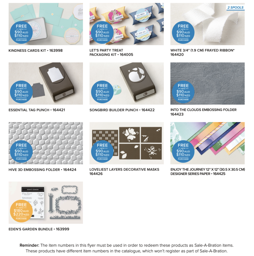
Did you know that Stampin’ Up! has now added 10 more products to their SALE-a-bration offerings? Until 28 February you can earn these products or the original SALE-a-bration items for FREE on any order over $90.
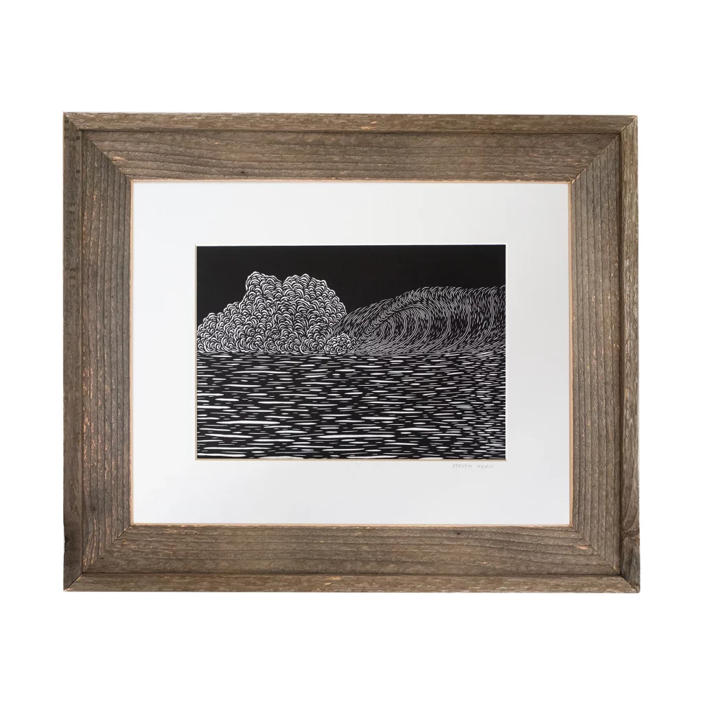
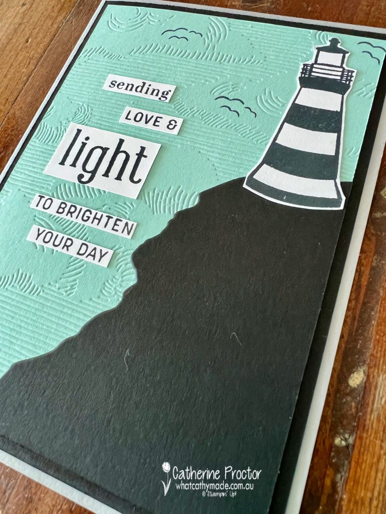
One of these new SALE-a-bration offerings is the Into The Clouds embossing folder which to me looks like a linocut or woodcut. I’ve always loved this graphic style of printmaking, especially in illustrations for children’s books.
Steven Kean, from the North shore of Hawaii is one artist, in particular, who our entire family loves because he specialises in this style of surf prints. This is the print we bought from him in on our holiday to Hawaii several years ago.
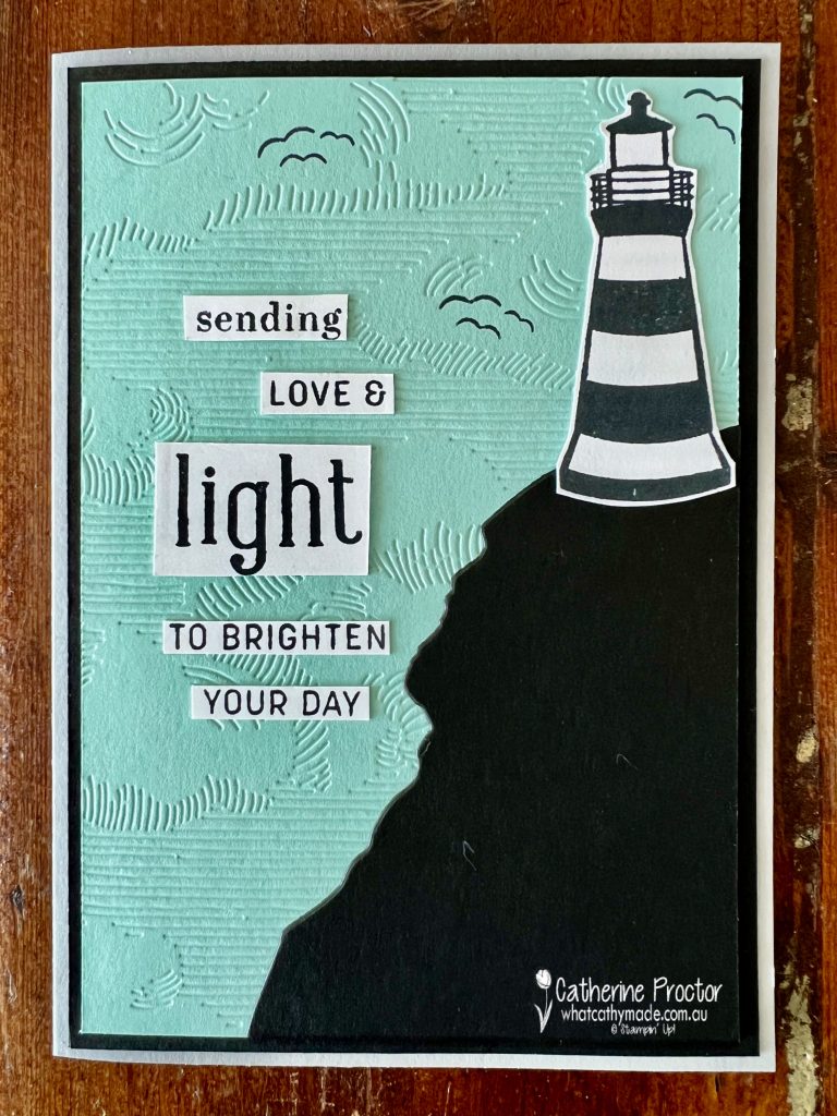
As I wanted to make Pool Party and the Into The Clouds embossing folder the main focus of my card, I’ve kept my color scheme very monochromatic, using just three colours as well as Basic White.
The Into The Clouds embossing folder is quite a thin embossing folder so the Stampin’ Up! Stampin’ Cut & Emboss Machine sandwich that worked for me was:
Base Plate – bottom layer
Into The Clouds embossing folder with Pool Party cardstock inside – middle layer
Embossing Plate – top layer
Always remember to run your embossing folders through Stampin’ Cut & Emboss Machine with the folded spine going through the machine first and the Stampin’ Up! logo facing upwards.
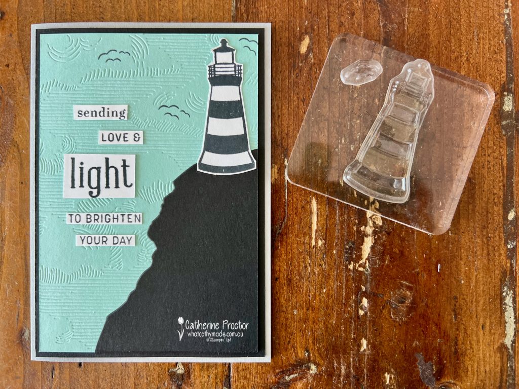
To create my lighthouse scene I used a landscape die from the new Greatest Journey dies, however you could easily freehand cut a cliff if you don’t own these dies.
Don’t forget to use the stamp sets that come in kits on your other cards. This lighthouse stamp is from the You Are My Anchor Photopolymer Stamp Set, part of a kit collection called the You Are My Anchor All-Inclusive Card Kit.
This kit really is fantastic value for money!
For $33 you receive everything you need to make make 10 mini cards, 10 mini printed envelopes and 4 boxes with bands, including: * You Are My Anchor Photopolymer Stamp Set * Pre-cut card bases and die cut pieces * Pacific Point Classic Stampin’™ Spot * Rope Twine * Adhesive to complete projects * Acrylic stamp block
The lighthouse was the perfect size and very easy to fussy cut out with Paper Snips. I also stamped seagulls using the tiny seagull stamp from the same stamp set to create this lighthouse scene.
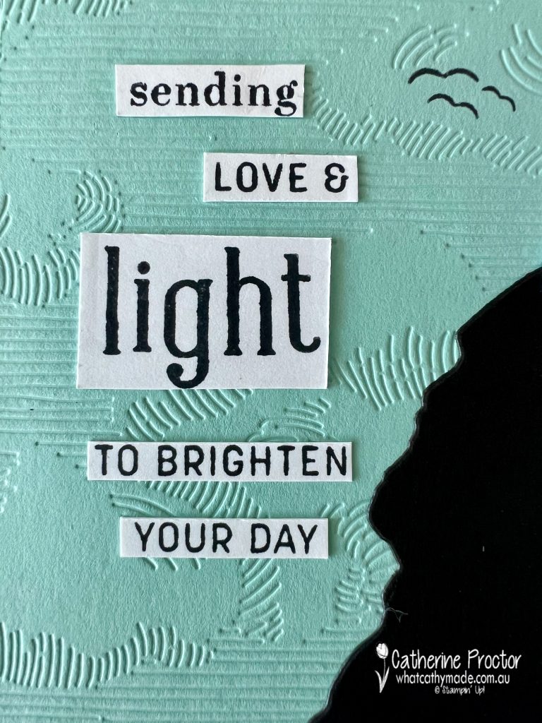
There are plenty of sentiments that would work really well with this card, however, I don’t own any of these stamp sets so I created my own using stamps I already have.
The word “sending” is from the Full of Love Stamp Set, “light” is stamped using the Alphabest stamp set and the rest of words are from the Sending Smiles stamp set.
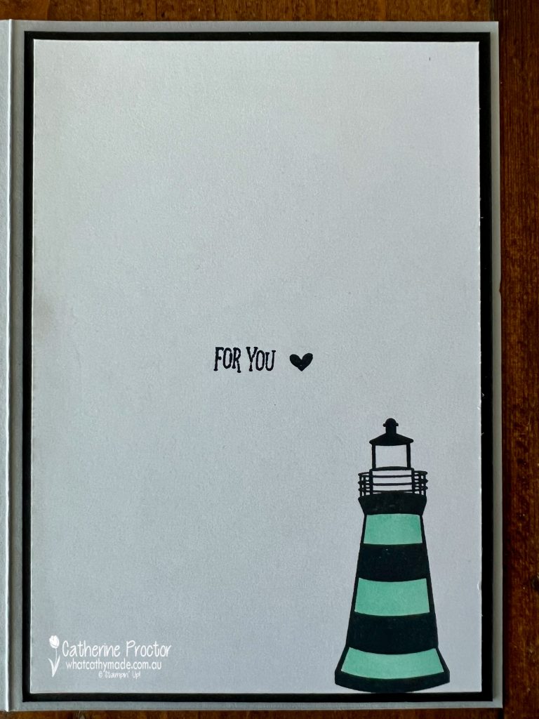
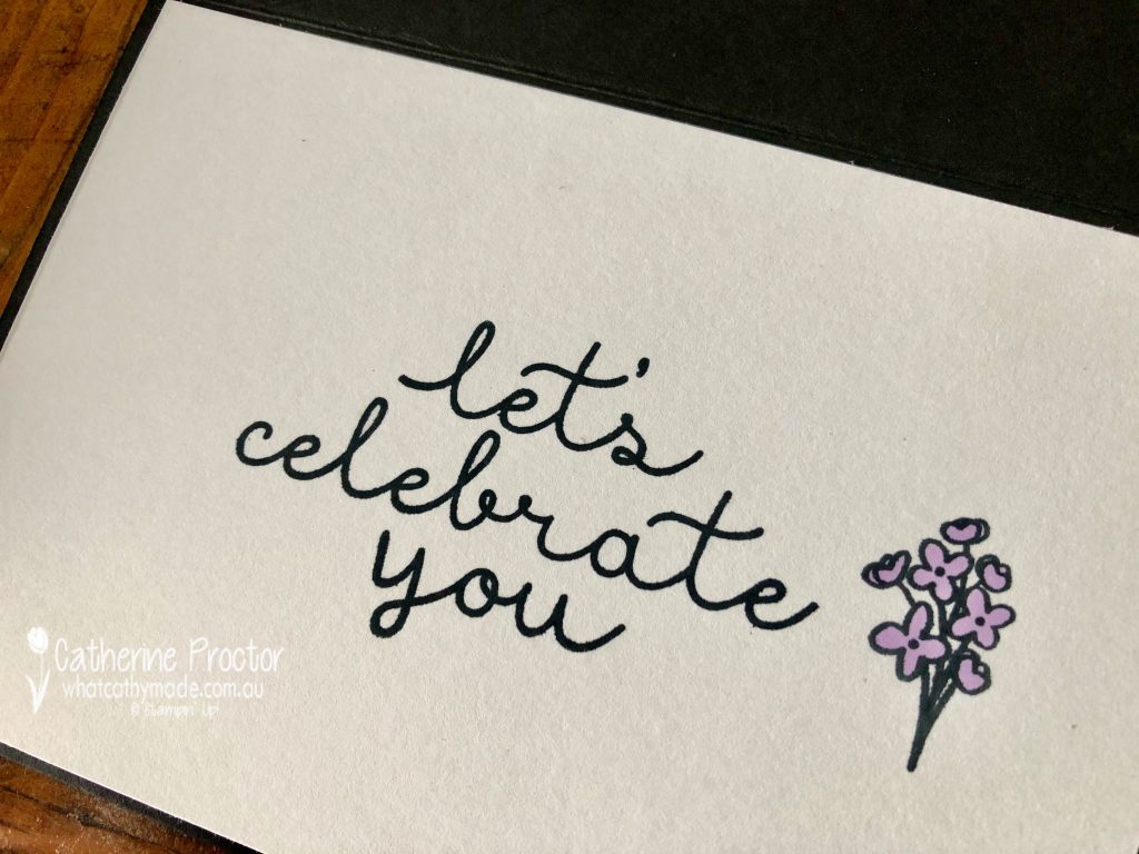
I’ve stamped another lighthouse on the inside of my card, along with a sentiment and a heart, all stamps included in the You Are My Anchor Photopolymer Stamp Set.
Now it’s time to hop on over to our next participant, the lovely Tina Gillespie – I can’t wait to see what Tina has made this week!
If at any time you find a broken link, you can find the complete list of all participants below.
If you live in Australia, you can find and purchase these products in my Stampin’ Up! Online Store once they are available to purchase tomorrow morning.
We’ll be back next Wednesday, February 15, with projects showcasing Poppy Parade.
Welcome to week thirty eight of our Art With Heart 2022-23 Colour Creations blog hop.
This is a weekly blog hop where we showcase the stunning range of Stampin’ Up! colours in alphabetical order over 12 months and this week we are featuring Polished Pink from the 2021-23 family.
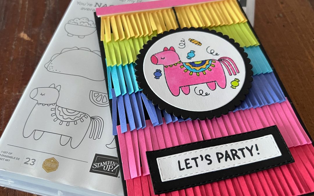
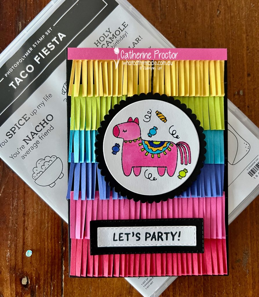
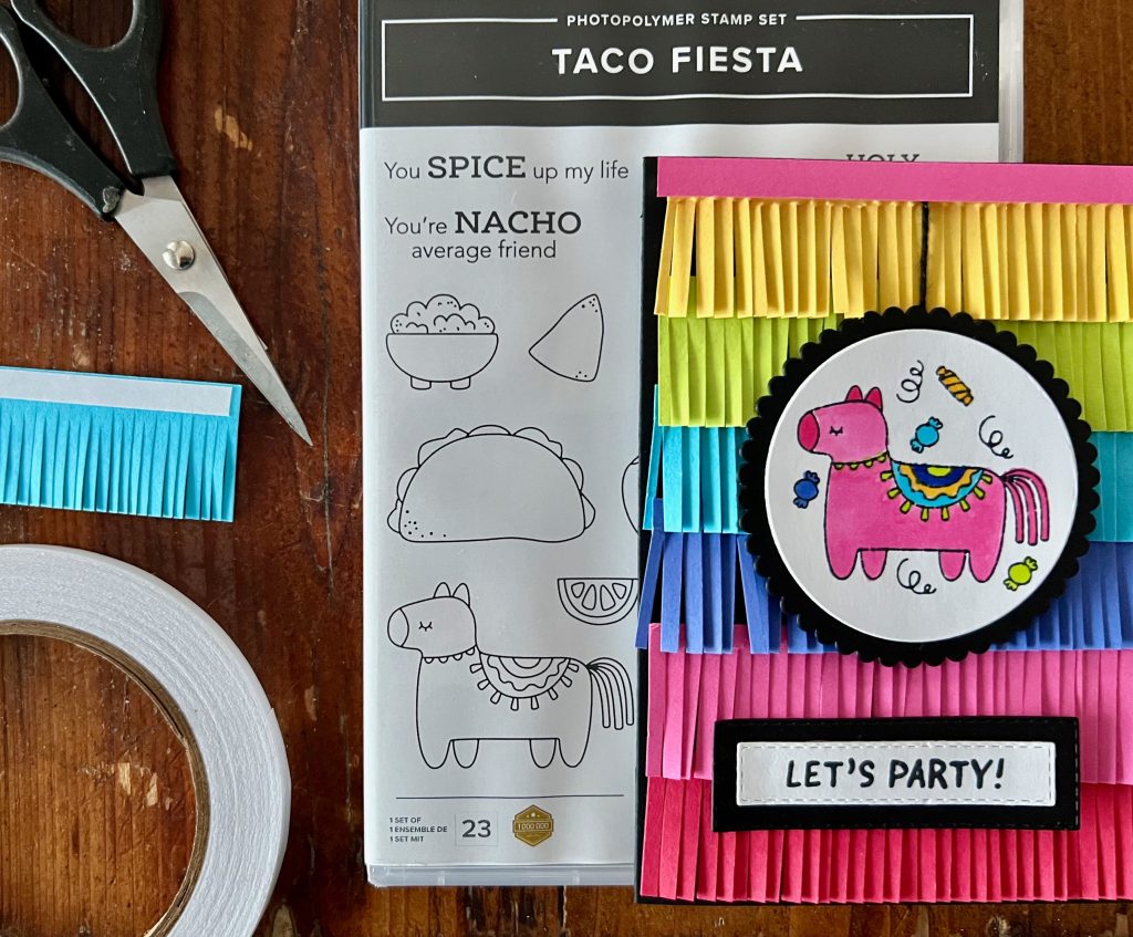
A fabulously fun colour like Polished Pink deserves to be paired with fabulously fun stamp set like Taco Fiesta!
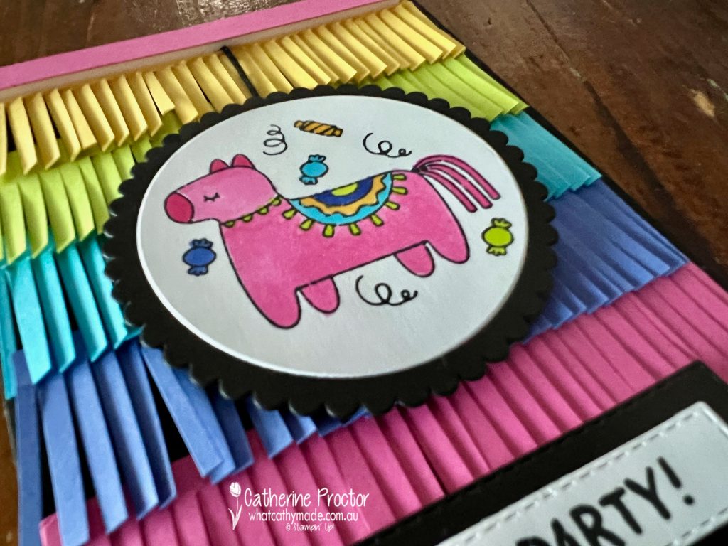
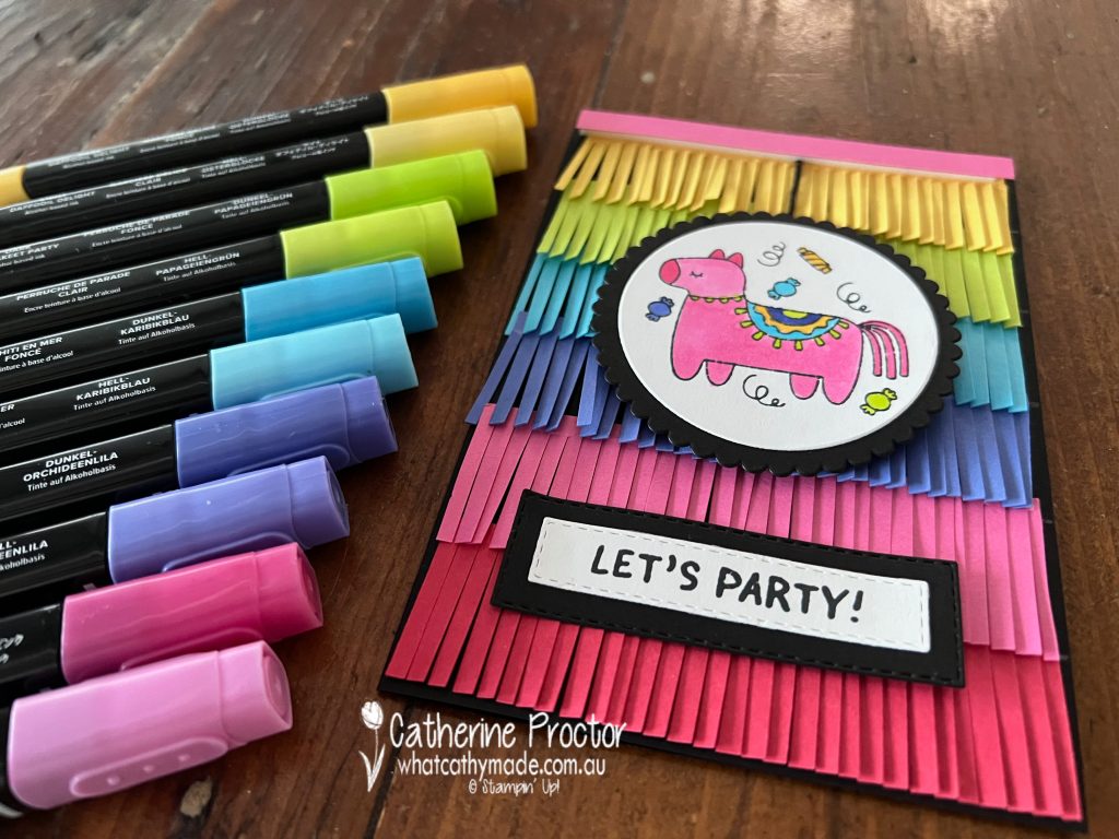
There are plenty of taco/guacamole/chilli related food images and sayings in this stamp set, however I just couldn’t resist using this adorable pinata image, coloured in with Stampin Blends in the colours of the cardstock used for the pinata fringing.
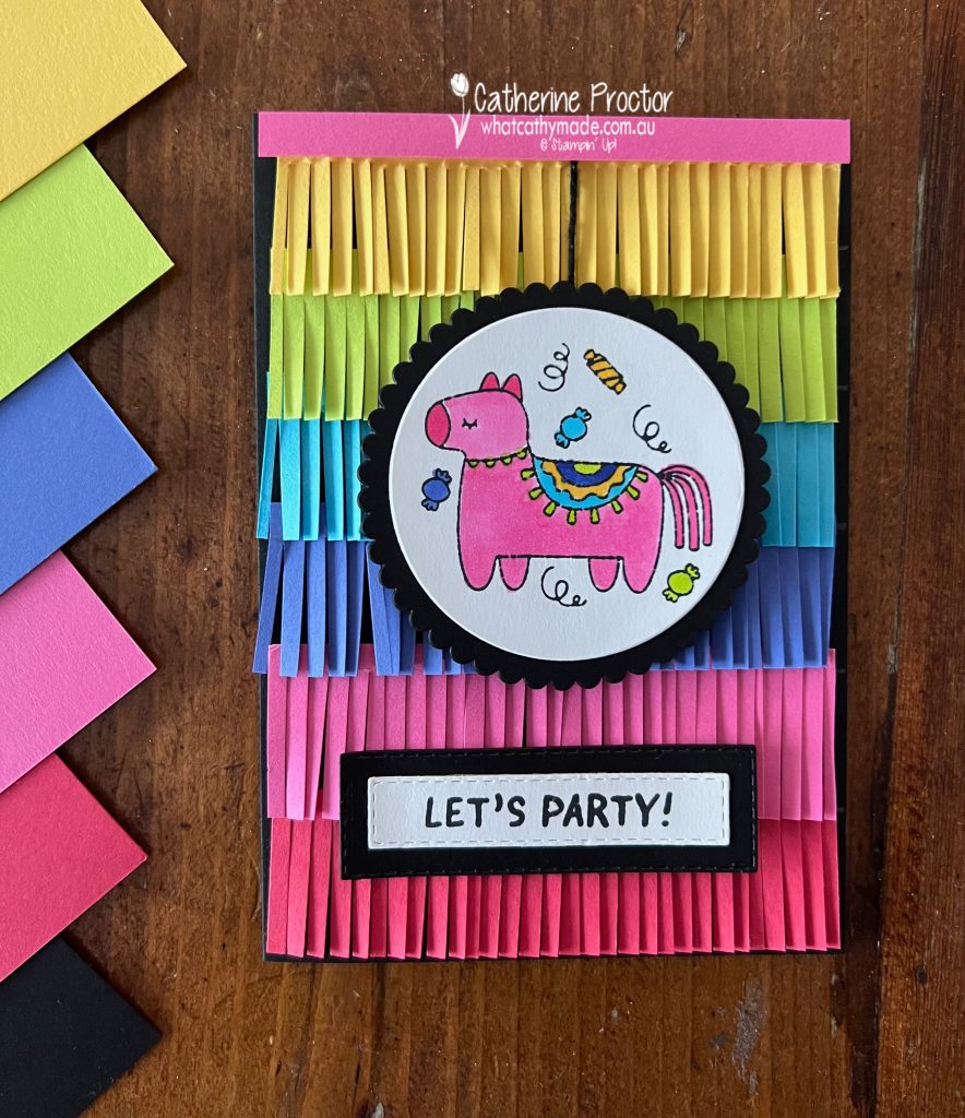
Polished Pink is gorgeous vibrant pink, so I paired it with other vibrant In Colours as well colours from the Brights family. From top to bottom in my card I’ve used Daffodil Delight, Parakeet Party, Orchid Oasis, Polished Pink and Sweet Sorbet, with a card base of Basic Black to make these colours pop even more.
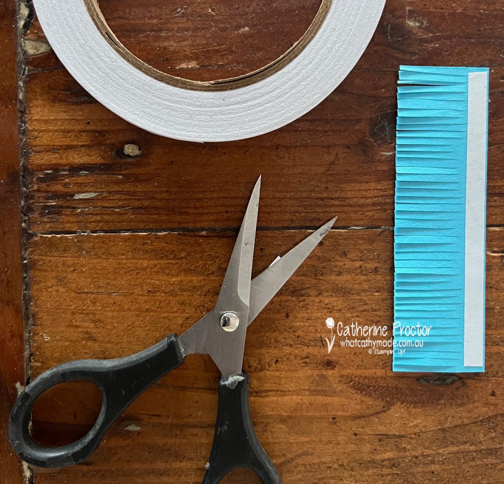
The pinata fringing on the card front is super easy to make, either with fringing scissors or using your paper snips.
Pinata Fringing Technique
My card base measures 14.8 x 10.5cm (half an A4 sheet of cardstock that has been scored and fold in half) and I wanted to use 6 colours, so I used my trimmer to cut 6 different cardstock colours, each at 3 x 10 cm – this allows the layers of fringing to overlap each other.
Use a pencil to mark 5 lines, each spaced 2.5 cm apart (this gives room for overlap of fringing) measuring up from the bottom of the card and going all the way up to the top.
Attach one strip of tear & tape along the longer 10 cm edge on one side of each colour of cardstock.
With the side that has the tear & tape facing up, use Paper Snips or fringing scissors to cut fringes at all the way along the length of the cardstock, cutting up to the bottom of the tear & tape.
Once all of your colours have all been fringed, remove the backing off the tear & tape and attach the fringing to the card front along your pencil lines, working from the bottom of the card up so you can overlap the fringing as you go.
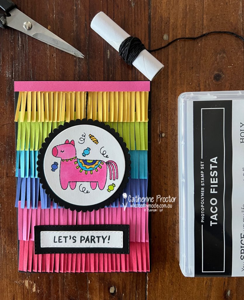
I’ve die cut the pinata image using a layering circle die and added a scalloped Basic Black layering circle behind it. The pinata is “hanging” from the strip of Polished Pink cardstock by a string of Basic Black Bakers twine.
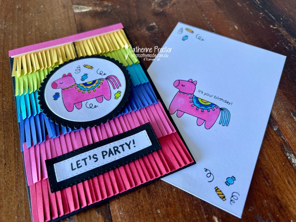
The “Let’s Party” sentiment is part of a longer sentiment from the Breaking News stamp set. I bought this stamp set for my son’s university graduation, however I’ve used it on so many cards since.
Inside the card I’ve used part of a sentiment from the Taco Fiesta stamp set. To use just one a part of a sentiment simply place the sticky part of a post it note over the words you want covered. Ink up the stamp and then remove the post it note BEFORE stamping the sentiment onto the cardstock.
Now it’s time to hop on over to our next participant, the lovely Andrea Sargent – I can’t wait to see what Andrea has made this week!
If at any time you find a broken link, you can find the complete list of all participants below.
If you live in Australia, you can find and purchase these products in my Stampin’ Up! Online Store once they are available to purchase tomorrow morning.
We’ll be back next Wednesday, February 8, with projects showcasing a favourite colour for many people, Pool Party.
Welcome back to our Colour Creations Showcase as we continue our showcase of over 50 beautiful Stampin’ Up! colours in alpha order.
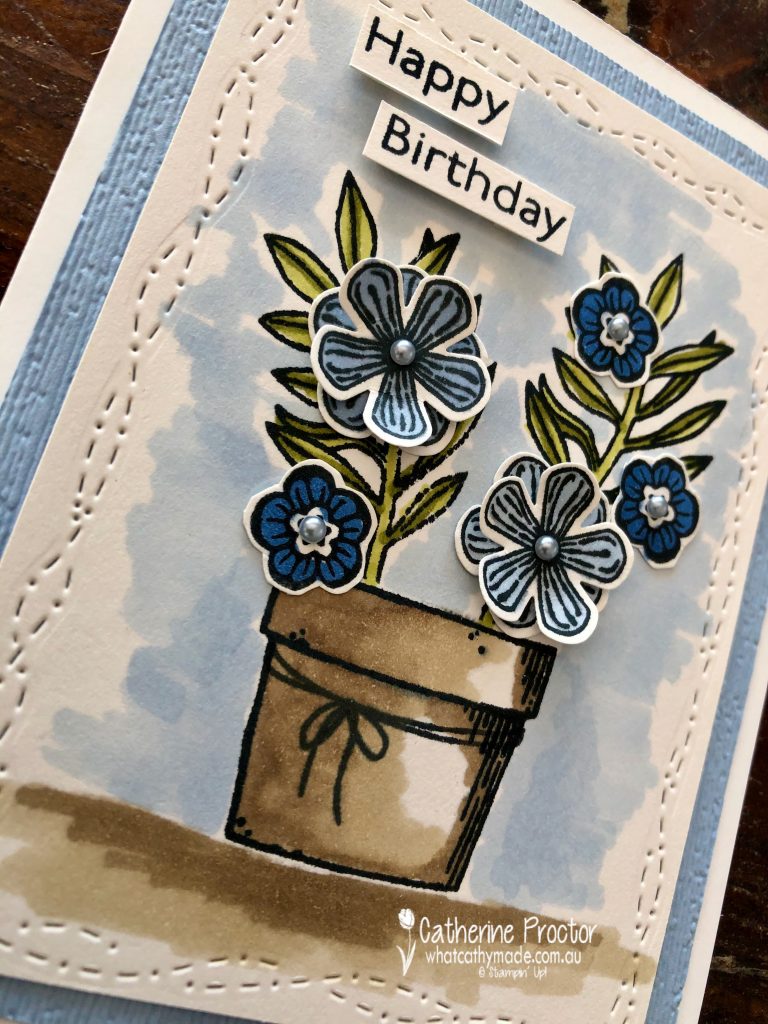
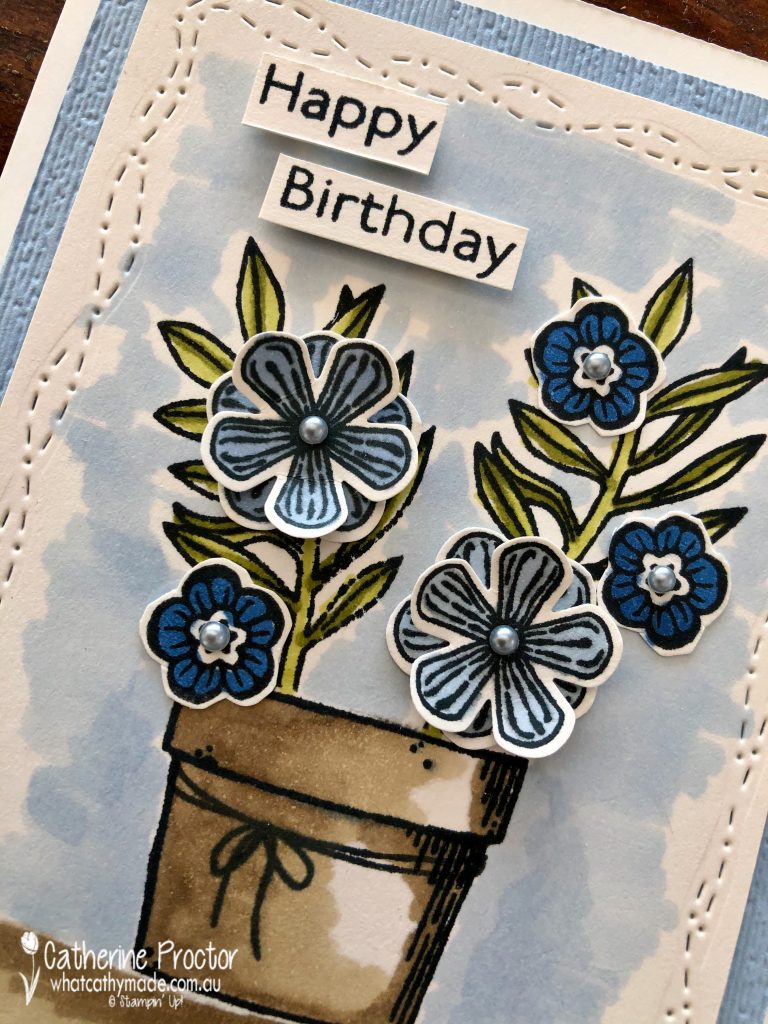
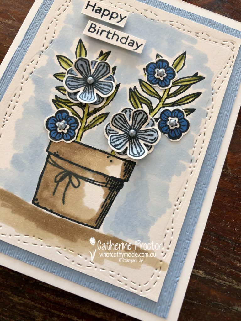
This week we are showcasing Seaside Spray, a soon to be retired 2019-21 In colour that I’m really going to miss!
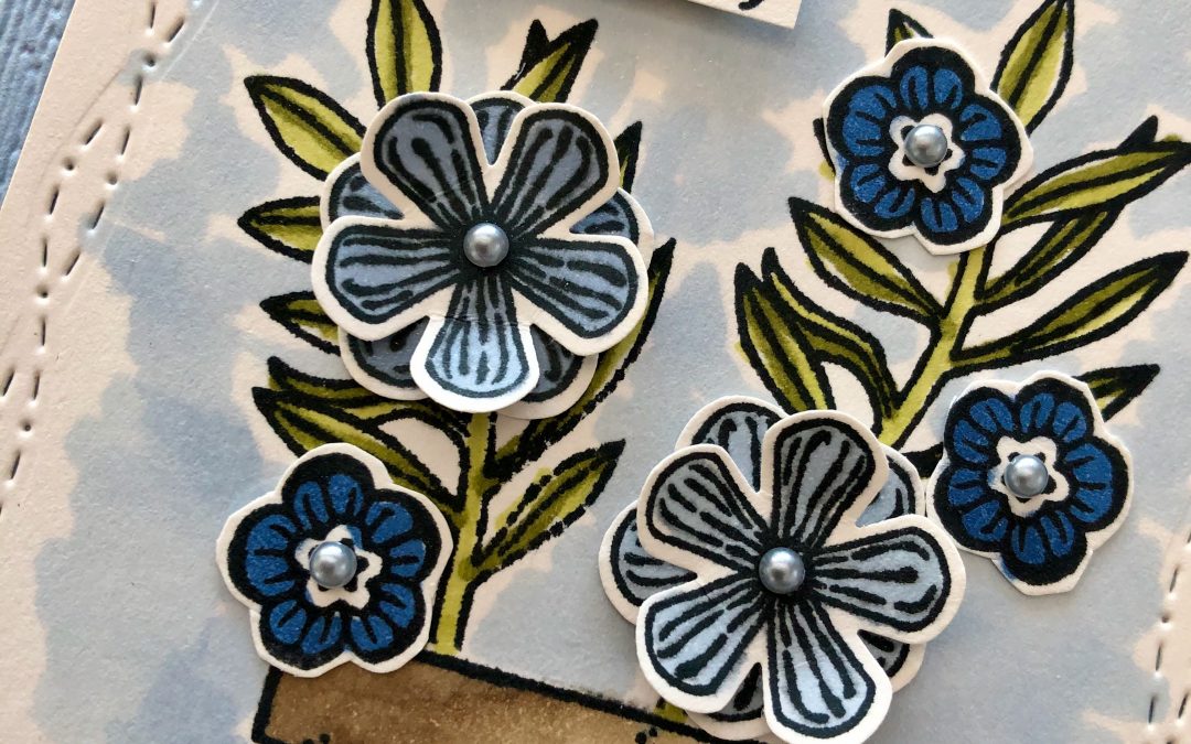
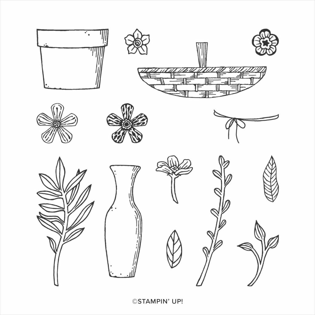
This week I’m also using a stamp set and co-ordinating punch that are retiring soon – the Basket of Blooms stamp set and the small bloom punch.
For quick and easy colouring I simply stamped my pot and leaves in Memento Ink onto Shimmery White card stock and coloured the pot in using Crumb Cake Stampin’ Blends and the leaves using Old Olive Stampin’ Blends.
The ground below the post and the area around the pot were also coloured using Seaside Spray Stampin’ Blends and Crumb Cake Stampin’ Blends . I love the stamp in this set that is a piece of twine wrapped around the pot.
The flowers were stamped onto a separate piece of paper and coloured in with Night of Navy and Seaside Spray Stampin’ Blends before being punched out with the small bloom punch or fussy cut. I’ve layered the largest flower and used silver metallic pearls for the centre of the flowers.
Don’t you just love the border created by the touch of whimsy dies? I’m so glad these are not retiring – the metallic pearls and the stitched with whimsy dies are both carrying over to the new catalogue, hooray!
The subtle embossing folder will also be sorely missed – I love the dimension this gives to card stock.
I can’t wait to see what everyone else has created with Seaside Spray today!
We will return next week on Wednesday April 28th when we’ll be showcasing Shaded Spruce.
If you’d like me to post you your very own copy of the forthcoming 2021-22 Stampin Up! Annual Catalogue, the January – June 2020 mini catalogue, or to simply find out about more about Stampin’ Up! contact me.
In the meantime, wherever you are in the world, stay safe, stay calm…and keep on crafting xxx
Welcome back to our Colour Creations Showcase as we continue our showcase of over 50 beautiful Stampin’ Up! colours in alpha order.
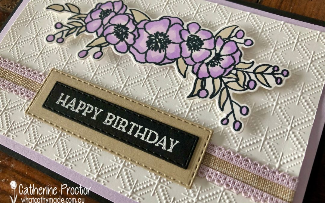
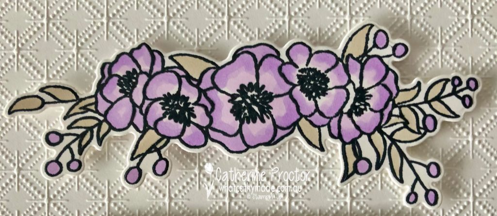
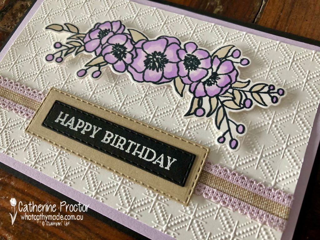
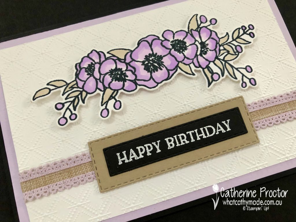
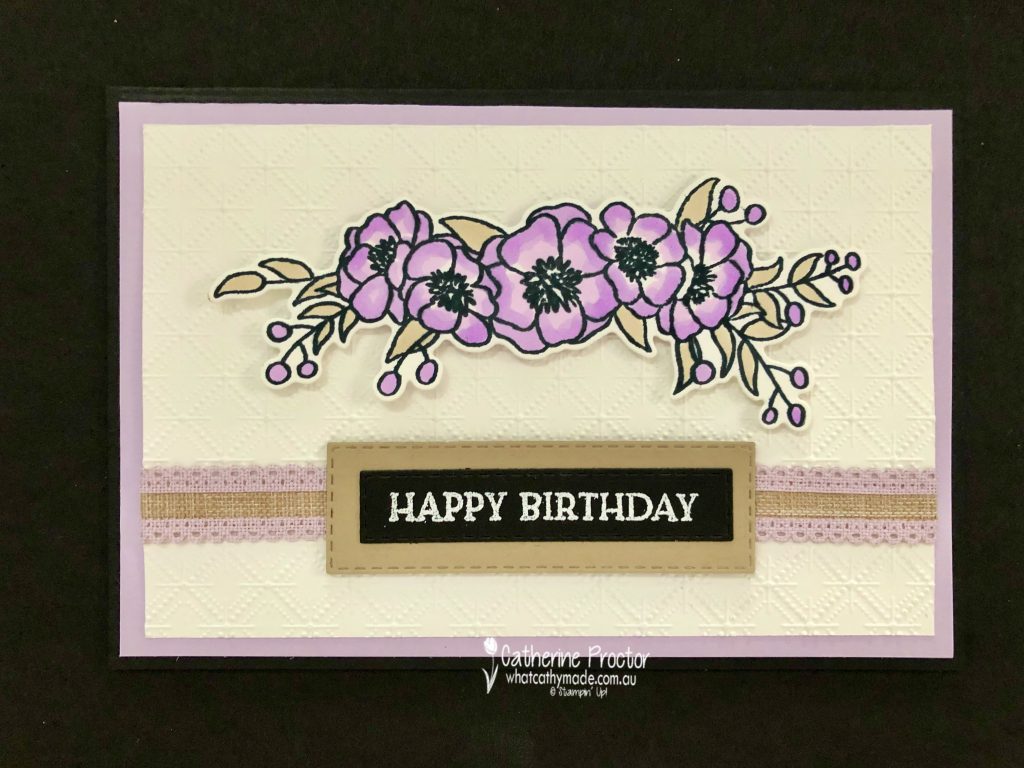
This week we are showcasing Purple Posy, a soon to be retired pale purple from Stampin’ Up’s 2019-21 InColour collection.
Purple Posy is a feminine and slightly old fashioned (in a good way!) colour that reminds me of my Nana and so I decided to make a card that I think she would have liked to receive. I paired Purple Posy with all neutrals: Crumb Cake, Basic Black and Basic White.
Because there is no Purple Posy stamp pad, I used a floral stamp set that could be coloured using Purple Posy Stampin Blends – Bloom & Grow with its matching Budding Blooms dies.
I could have used virtually any embossing folder on the Basic White card stock layer but decided on the Dainty Diamonds, again with my Nana in mind.
I love this scalloped linen ribbon – it was the Crumb Cake in the centre of this ribbon that inspired me to add Crumb Cake to my colour combination, both in the layer behind the sentiment and the colouring of the leaves.
Because there isn’t a “Happy Birthday” sentiment in the Bloom & Grow stamp set I used the “Happy Birthday” sentiment from Blossoms in Bloom instead.
My friend Tina Gillespie ALWAYS stamps the insides of her cards and she has inspired me to try to remember to do the same too …
I can’t wait to see what everyone else has created with Purple Posy today!
If you’d like me to post you your very own copy of the January – June 2020 mini catalogue, the 2020-21 Stampin Up! Annual Catalogue, the 2020-21 Beginners Brochure, or to simply find out about more about Stampin’ Up! contact me.
In the meantime, wherever you are in the world, stay safe, stay calm…and keep on crafting xxx
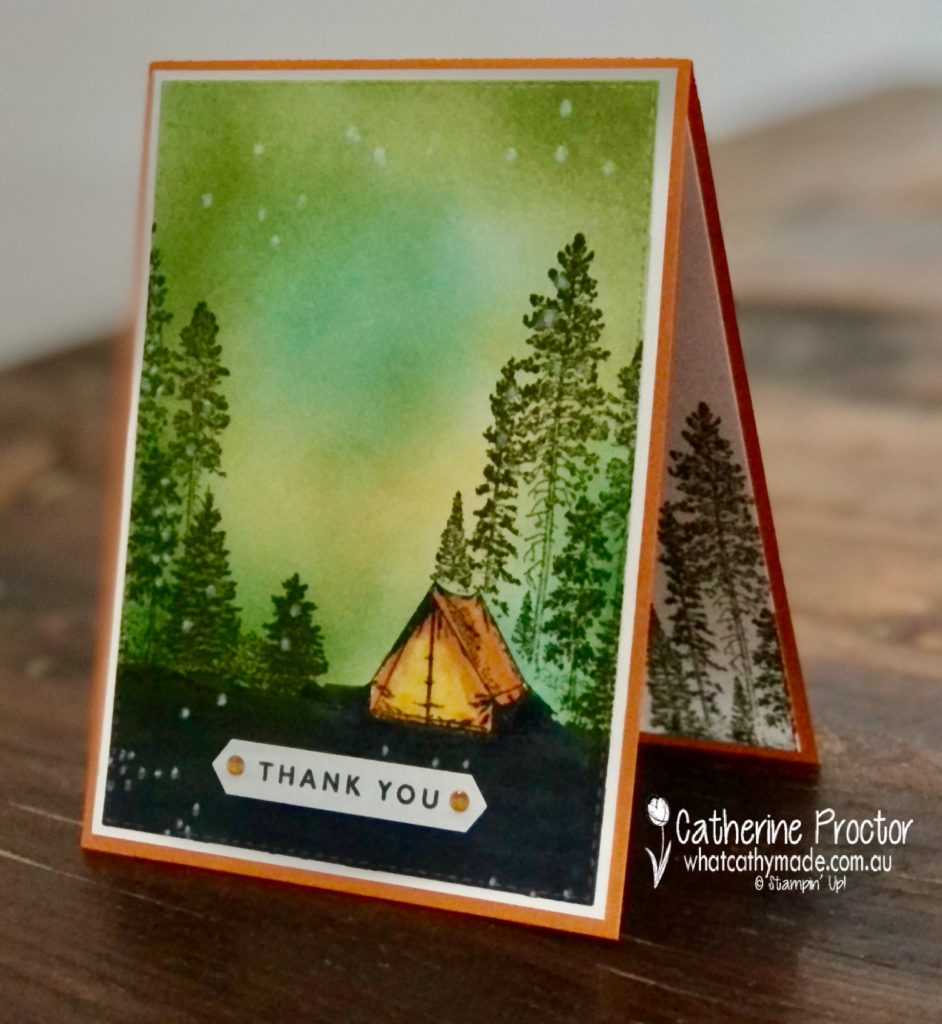
Welcome back to our Colour Creations Showcase as we continue our showcase of over 50 beautiful Stampin’ Up! colours in alpha order.
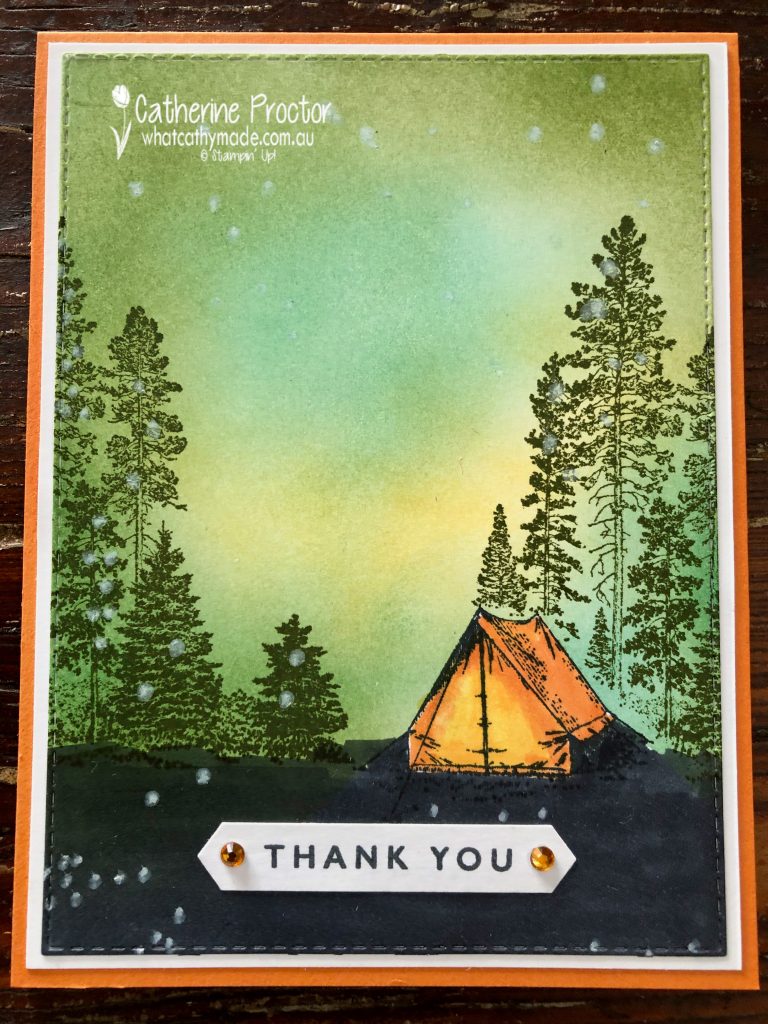
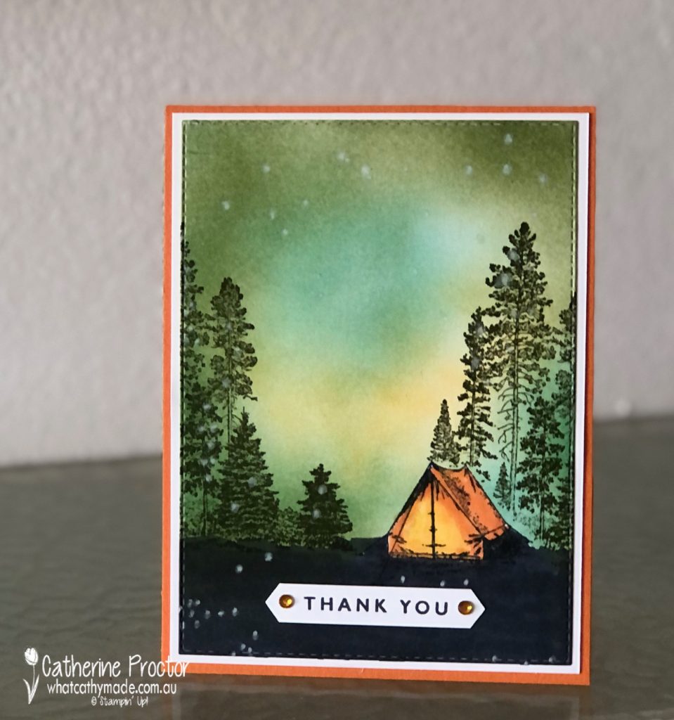
This week we are showcasing Pumpkin Pie, a rich orange from our regals family.
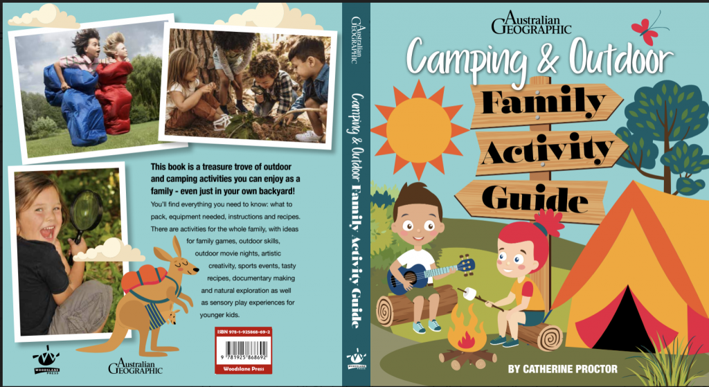
I wanted to make a thank you card for my amazing designer Christine who has just designed and typeset my latest book. We’ve worked together on many books together over the years but I really think this is her best design ever.
The book is being printed overseas now but I’m so excited about Christine’s design I wanted to share a sneak peek at the cover…
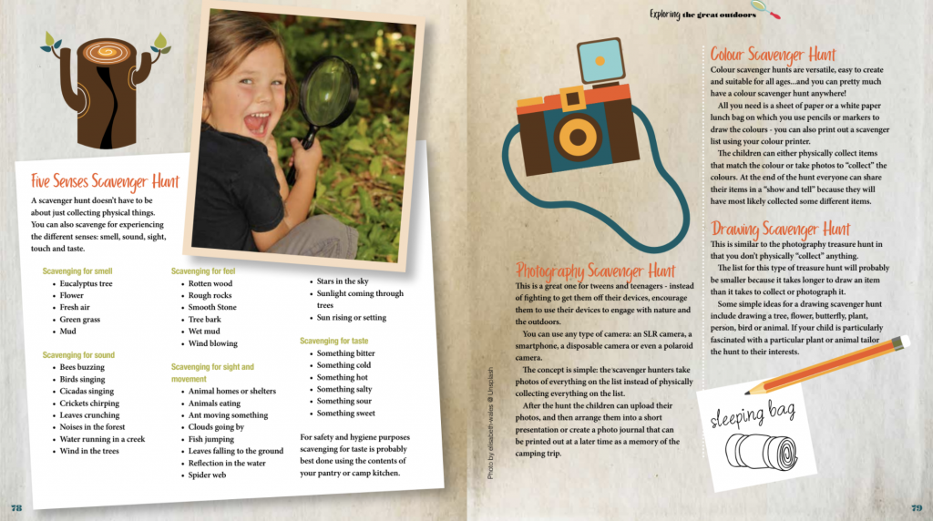
And a sample of the internal pages..
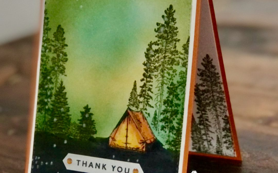
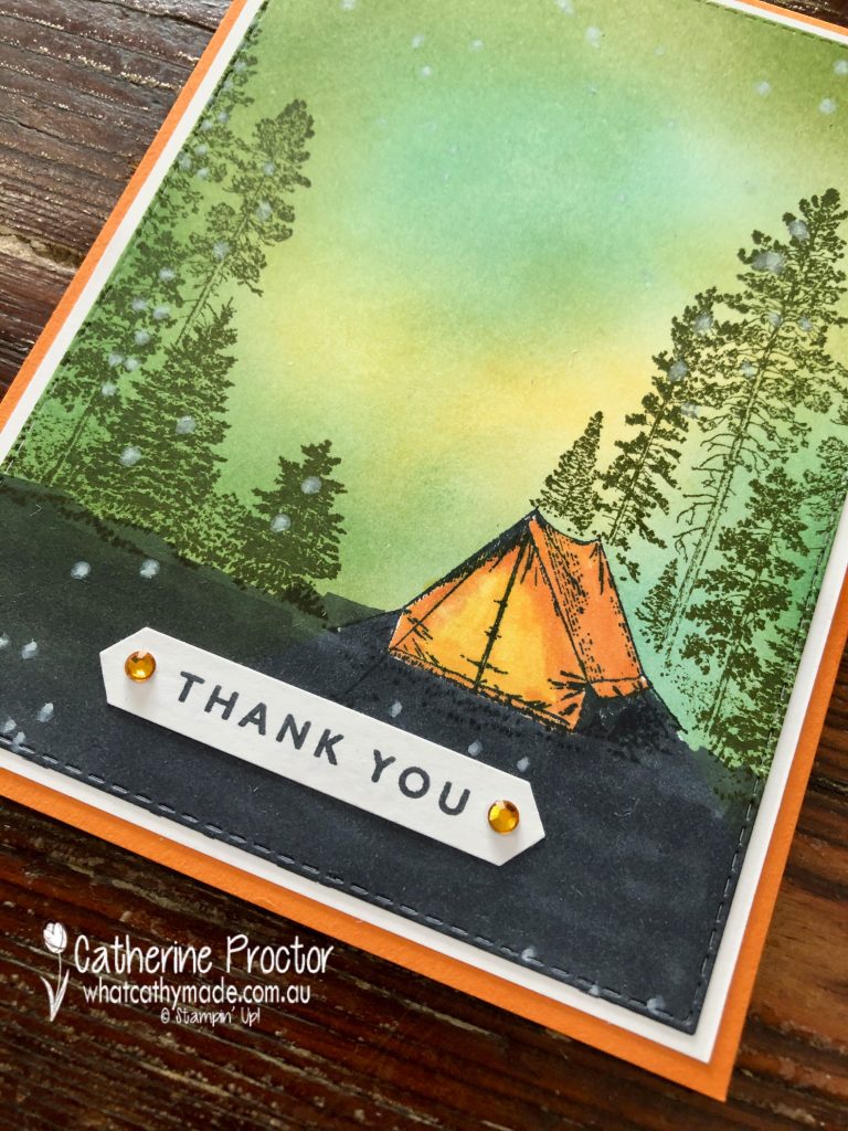
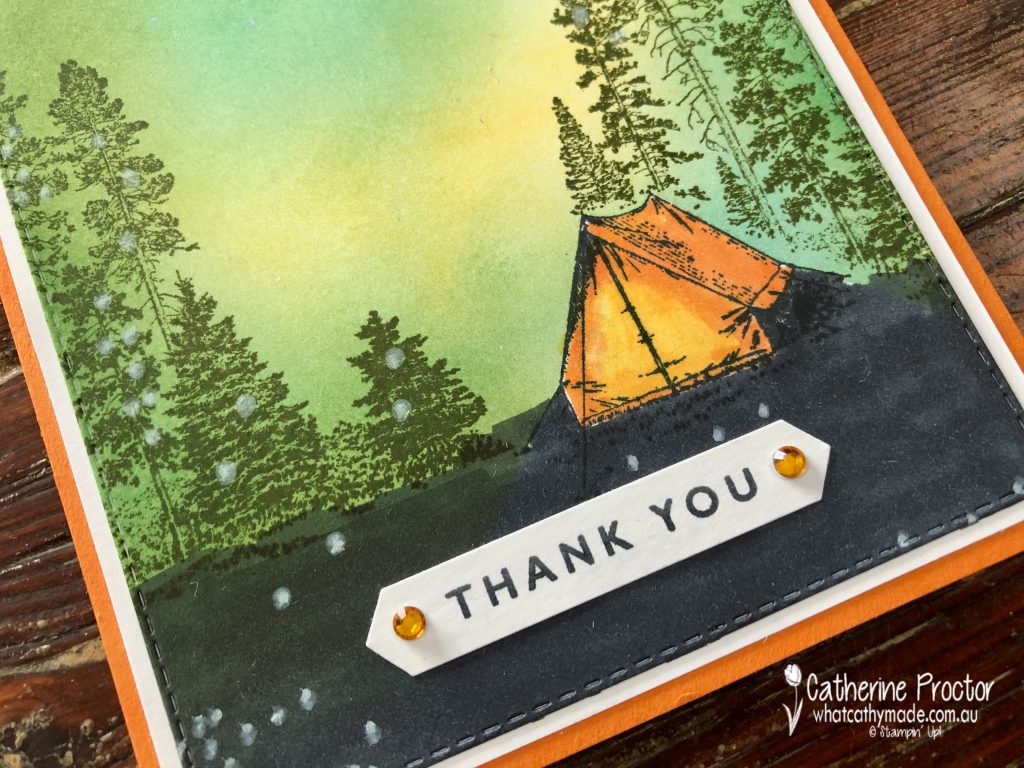
Campology is the stamp set I just had to use for this card but I’ve never feel very confident making “scene” cards. I searched Pinterest for inspiration on how to use the “Campology” stamp set and I found a wonderful card by one of the top American Stampin’ Up! demonstrators called Michelle Zindorf – she is amazing at creating blended backgrounds. I have CASED elements of Michelle’s card, including the Pumpkin Pie tent, but changed the rest of the card design and layout to include more Pumpkin Pie.
Thanks to the new Stampin’ Up! blending brushes I’m no longer scared of making “scene cards”! I used blending brushes to make a night sky background with my So Saffron, Just Jade and Mossy Meadow ink pads. The secret to getting a smooth coverage is to start blending off the page and keep moving the brushes in a circular motion.
I then stamped the tent in Memento Ink onto the front layer of the card and also onto a Post-It note to mask the tent – you fussy cut around the top of the tent to create a mask that protects the tent while you stamp the trees in Mossy Meadow over the tent and on either side of the card. Once you’ve stamped the trees remove the Post It note and your tent pops into into the foreground of the scene, with the trees in the background.
The tent is coloured in with Pumpkin Pie and Mango Melody blends – I love how these colours make it look like there is a light on in the tent!
The base of the top layer was coloured in with the Basic Black Stampin’ Blends and the “Thank you” sentiment is from “Blossoms in Bloom” with the ink applied with a sponge dauber for a crisp finish – my go-to tip when inking up sentiments. My trusty Holiday Rhinestone Basic Jewels just add a tiny bit of bling and dimension.
The card opens at the top and the inside has been stamped in Mossy Meadow using the tall tree stamp from “Campology”. I hope this card brings a smile to Christine’s face and expresses how grateful I am to her incredible design skills that bring my writing to life!
I can’t wait to see what everyone else has created with Pumpkin Pie today!
We will return next week on Wednesday March 10th when we’ll be showcasing one of the soon to be retired 2019-21 In Colours: Purple Posy. We hope you can join us all then.
To purchase any of the products used in my card tonight, click on the links below.
If you’d like me to post you your very own copy of the January – June 2020 mini catalogue, the 2020-21 Stampin Up! Annual Catalogue, the 2020-21 Beginners Brochure, or to simply find out about more about Stampin’ Up! contact me.
In the meantime, wherever you are in the world, stay safe, stay calm…and keep on crafting xxx
Welcome to the Monthly Art With Heart Creative Showcase. Tonight we’re sharing some ideas for using designer series paper because Stampin’ Up! have 15% off a select range of their stunning DSPs for the month of October. You can see the full list of papers on sale here.
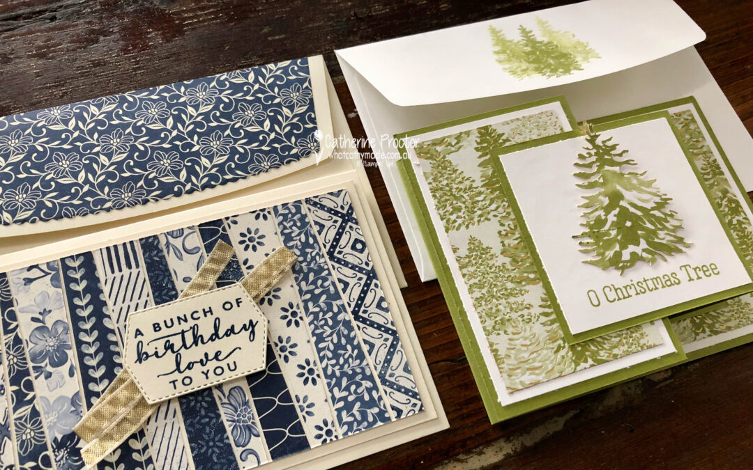
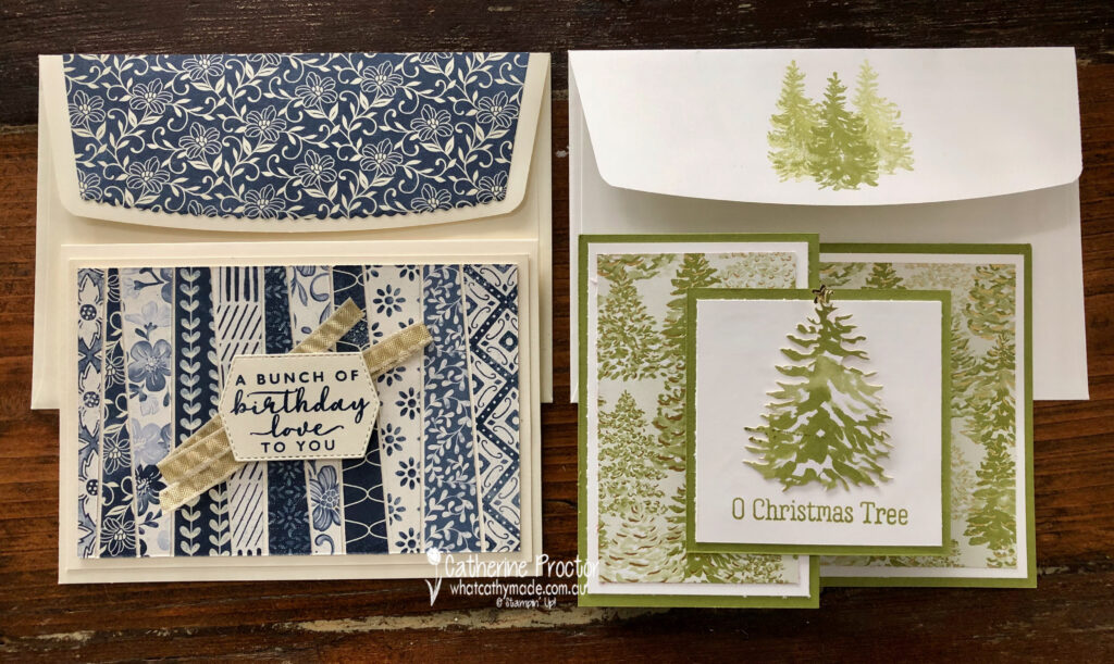
To celebrate World Card Making day last Saturday I held a class where I shared two card techniques that really showcase designer series papers: a double z-fold Christmas card and a “Scrappy Strip technique” birthday card.
Both of these cards feature stunning designer series papers that can sometimes be overlooked because they are from Product Medleys, so they are not listed in the paper section of the Stampin’ up! website or the catalogues.
These designer series papers also come in refill packs, so you don’t have to purchase the entire product medley to get your hands on the DSP.
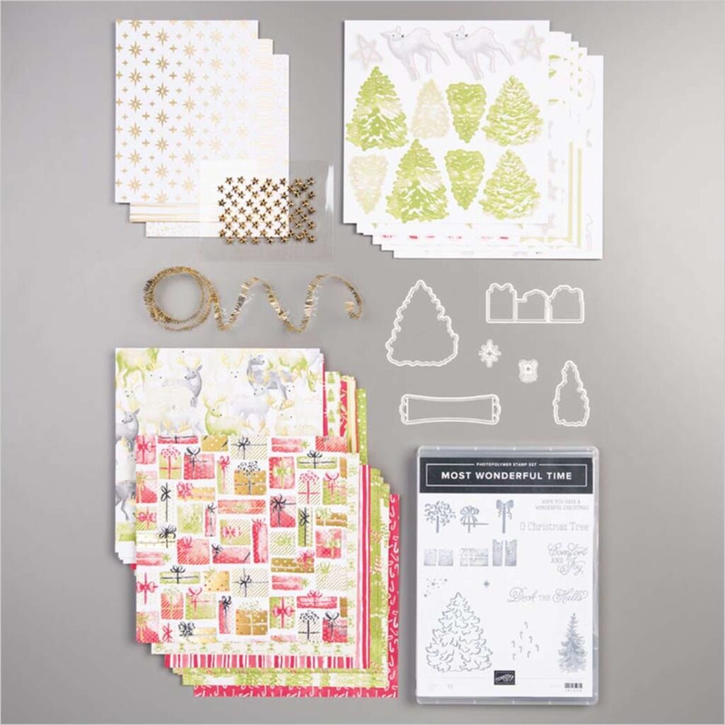
Most Wonderful Time
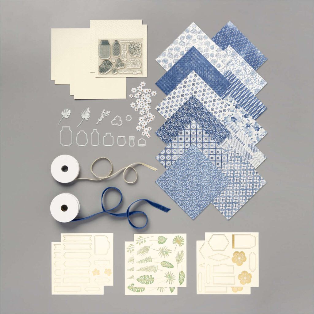
Boho Indigo
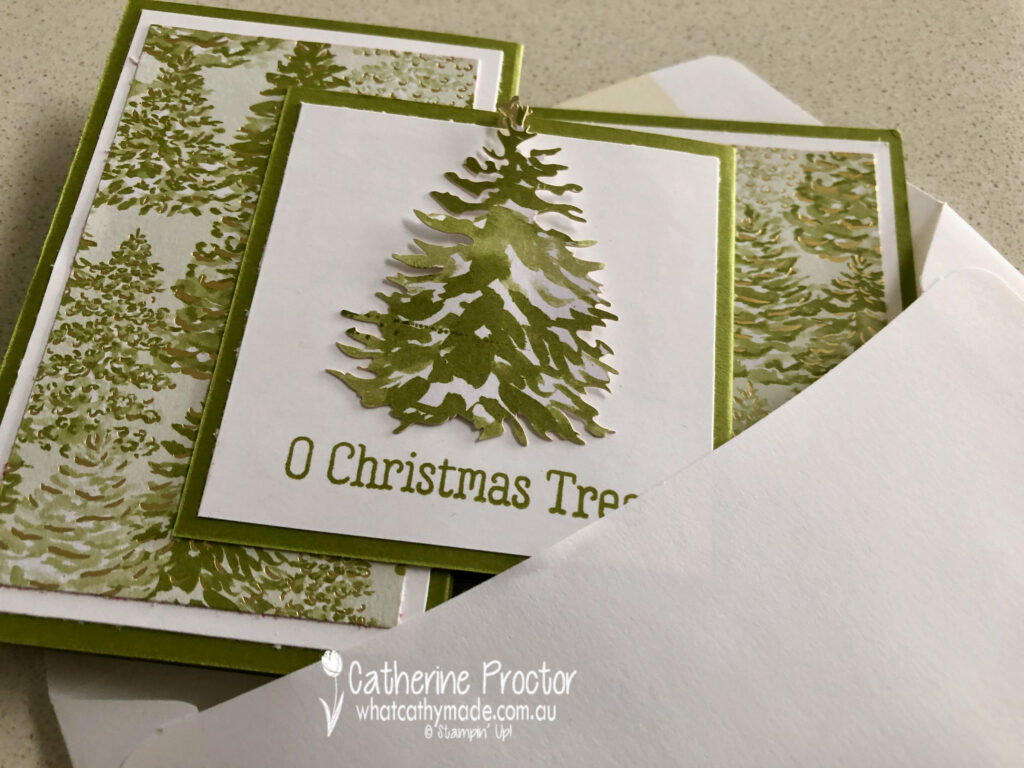
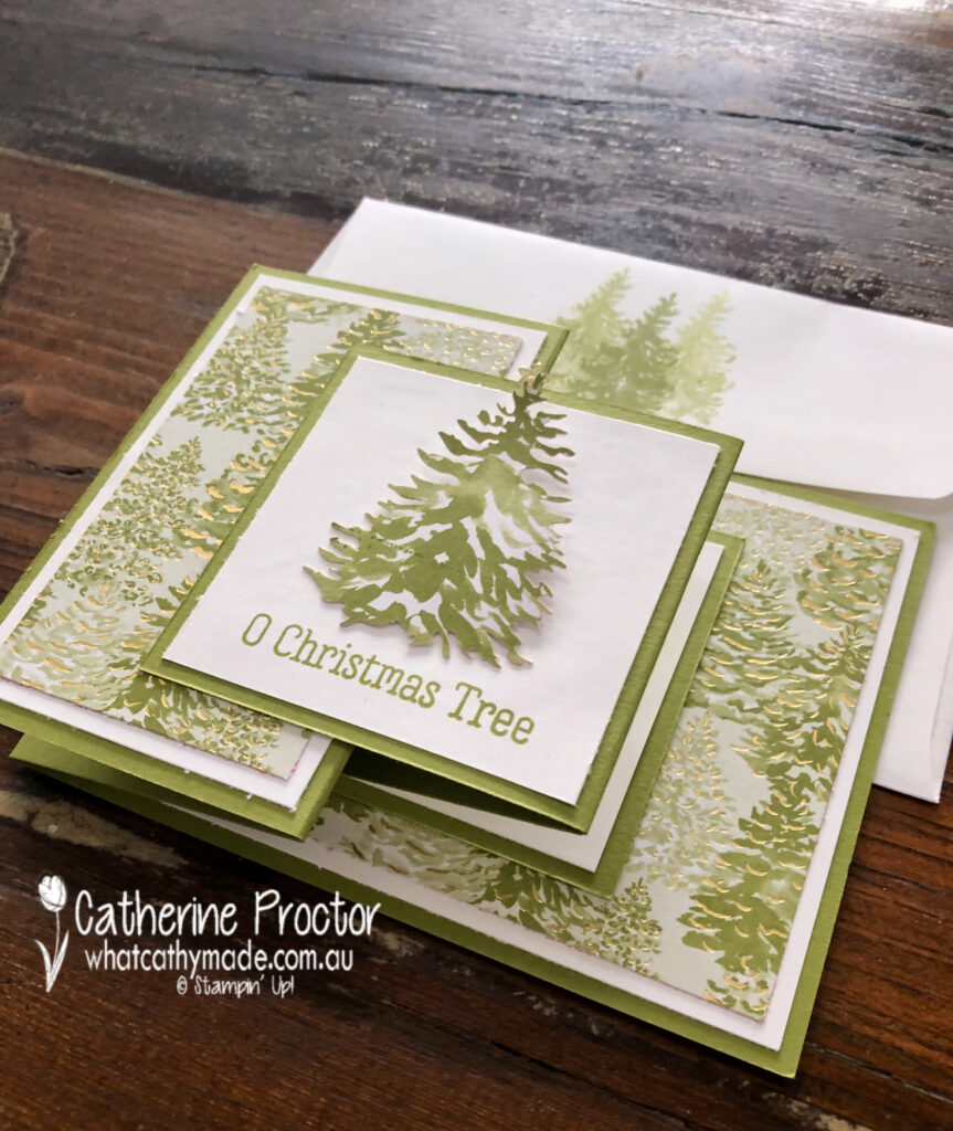
The double Z-fold card is a Christmas card and you could use any of the Christmas DSPs on sale to make this design too. For the front panel of the card you can use a sticker from the product medley or stamp a greeting or a different image – the possibilites are endless.
Here’s how it looks from the side.
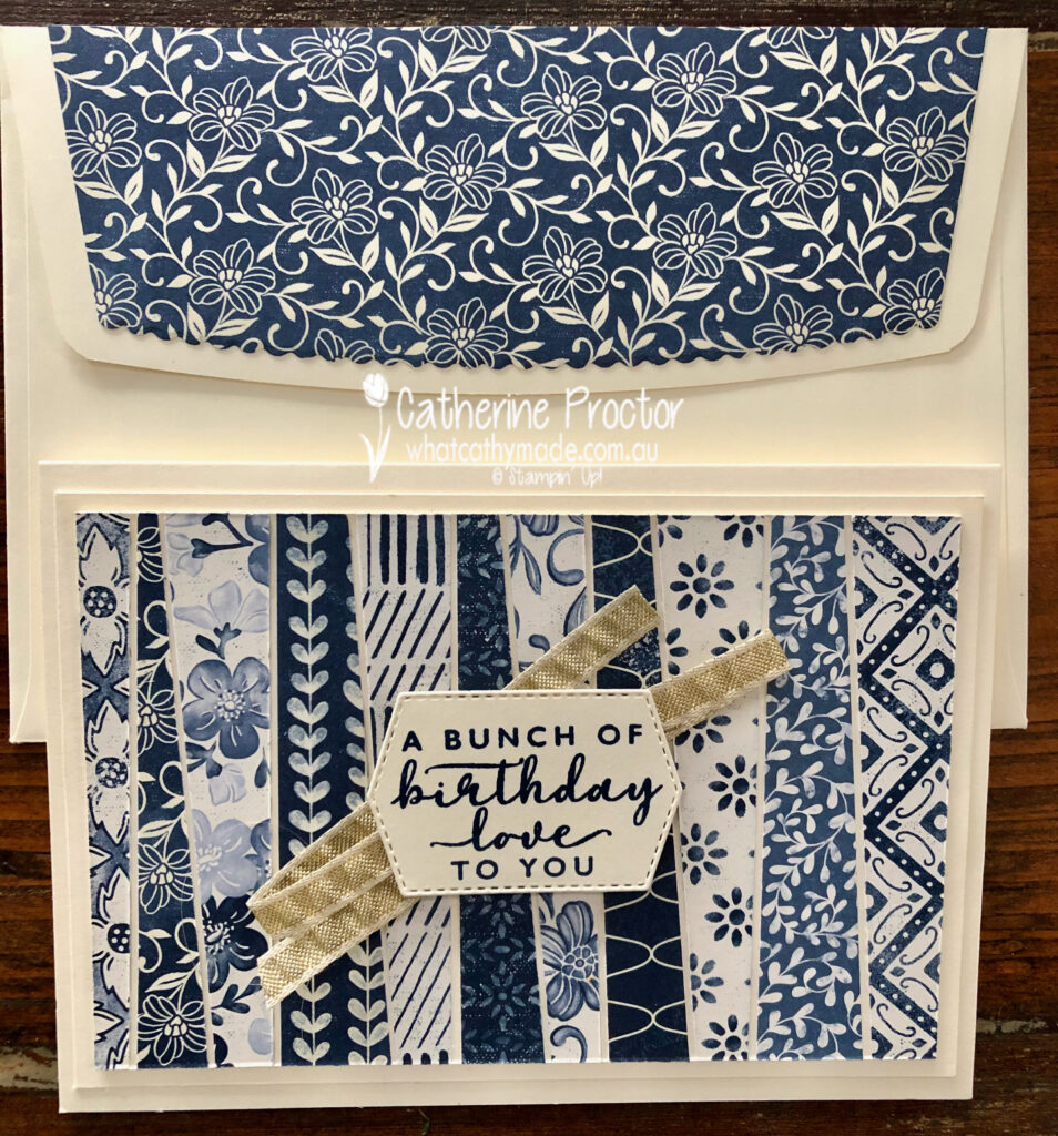
And here’s my matching envelope – I simply stamped off the Christmas Tree stamp on the back flap of a C6 envelope.
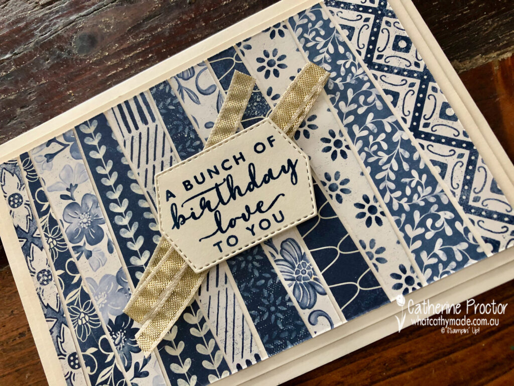
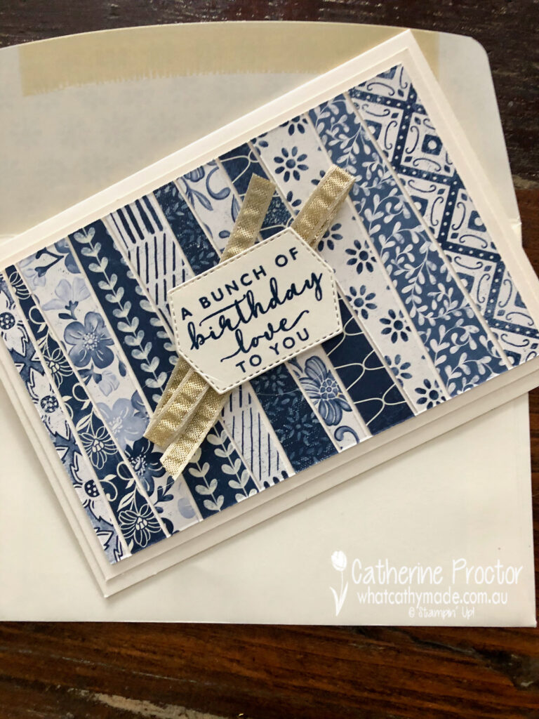
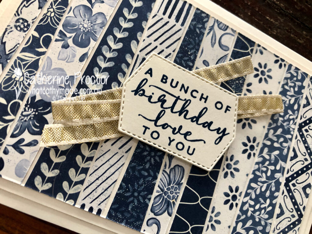
My scrappy strip technique birthday card uses the stunning blues and whites and creams of the Boho Indigo Product Medley.
To make a scrappy strip technique card you simply cut a piece of Very Vanilla A4 card stock in half and score and fold to make the card base. Cut the other piece of card stock in half and trim 1/4 inch (5cm) off the top and side – this is your middle layer. For the top layer, trim 1/2 inch (10cm) off the top and side.
Trim strips of DSP at an angle before lining them up (alternating dark and light) and lining them up with approximately the same gap between strips. Adhere the strips, turn over so the strips are under the top Very Vanilla layer and trim the strips back to the edges of the top layer.
Once you’ve adhered all your layers, add some ribbon behind your sentiment.
I used the Envelope dies to add DSP to the outer flap of a C6 envelope. The Envelope dies come in four different sizes (to match the four different envelope sizes Stampin’ Up! sells) and you can either use them inside as an envelope liner or outside as a feature flap as I’ve done below.
This scrappy strip technique is the perfect way to use up your scraps of DSP.
I’m going to make both these cards again, this time using some of the lovely DSP on sale this month.
To see more Designer Series Paper inspiration from the AWH Team head back to Rachel‘s page as she is hosting our monthly blog hops.
To purchase any of the products I’ve used in my cards tonight simply click on the phots of the products below.
If you’d like me to post you your very own copy of the August – December 2020 Mini Catalogue, the 2020-21 Stampin Up! Annual Catalogue, the 2020-21 Beginners Brochure, or to simply find out about more about Stampin’ Up! contact me.
Welcome to the Monthly Art With Heart Creative Showcase. Tonight we’re sharing some ideas for masculine cards, something I know many of us can find challenging to make.
I recently made two masculine cards I’d like to share with you: the card I made for my dad’s birthday in July and the card I made last week for him for Father’s Day.
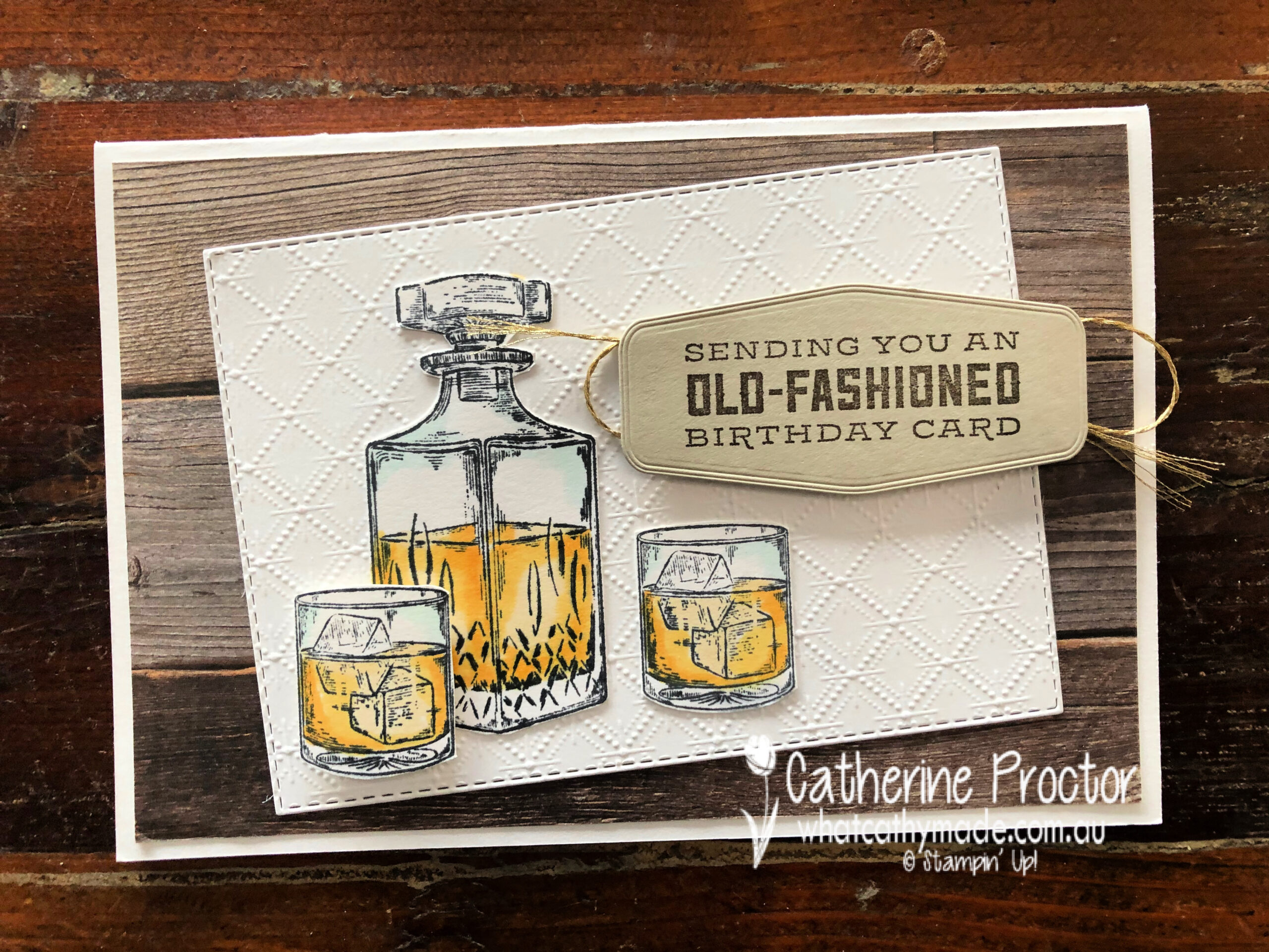
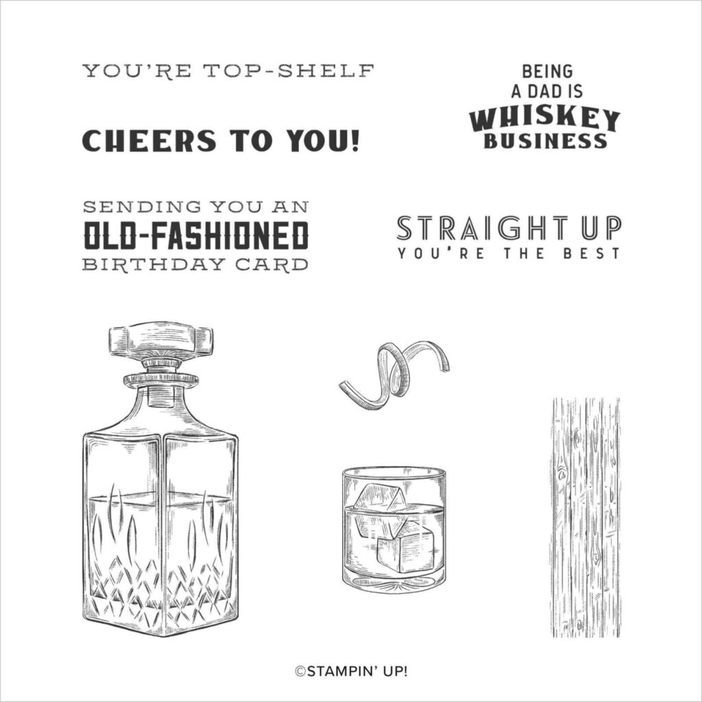
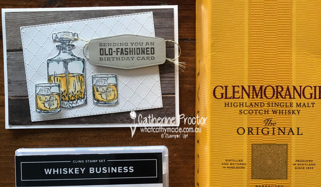
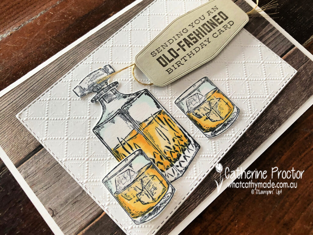
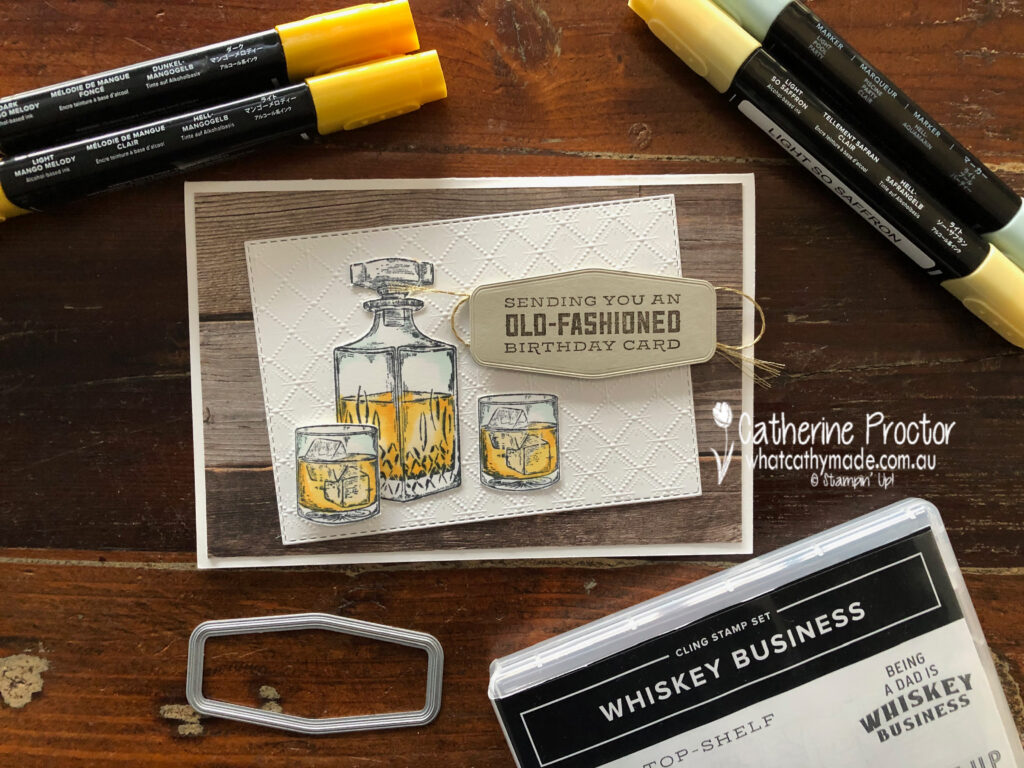
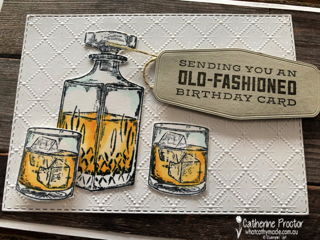
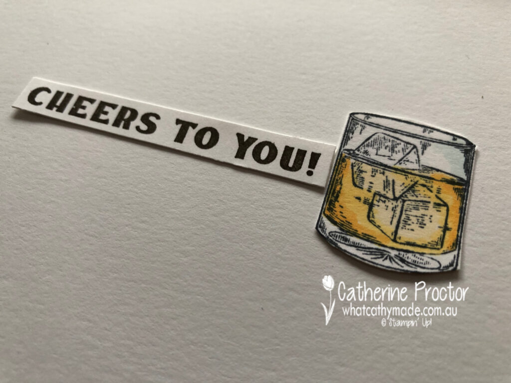
My dad is not a typical card game/car/fishing/treking/BBQ/sport kind of a dad and that can make designing masculine cards for him quite tricky. But there are two Stampin’ Up! stamp sets that perfectly matched the gifts I was giving to my dad: Whiskey Business and Press On.
For Dad’s birthday card I used the Whiskey Business set… no prizes for guessing what I gave him for his birthday!
This card was CASED from the design of the card on page 33 of the Annual Catalogue but I made a few changes to make it my own. I just had to use the Dainty Diamonds embossing folder to emboss the Whisper White card stock because it looks just like the pattern in the cut crystal that the Whiskey decanter and whiskey glasses are made of.
The detailed line drawings of the Whiskey Business are so realistic and the Stampin’ Blends make it so easy to bring these stamps to life. I’ve used light Pool Party for the crystal, and light So Saffron, light Mango Melody and dark Mango Melody for the whiskey.
Here’s a close up showing the detail in this stamp set. I simply fussy cut my decanter and glasses using my paper snips before adhering them to the embossed Dainty Diamonds layer.
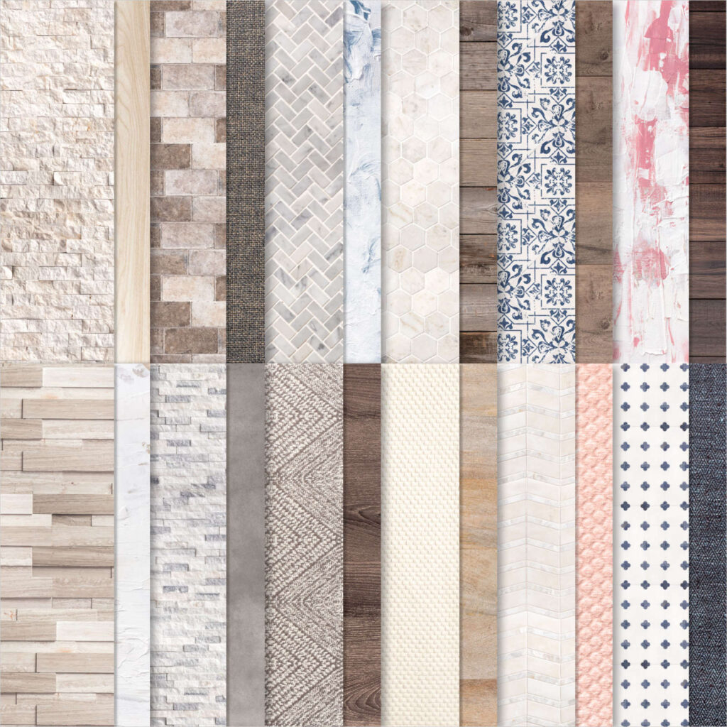
Speaking of realistic – how amazing is this wood patterned DSP from the In Good Taste DSP! All of this patterned paper was created from photographs of actual wood, stone, textiles, etc and it’s just perfect for masculine cards.
And finally, here’s the inside of the card.
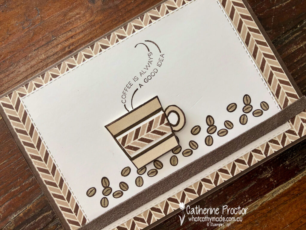
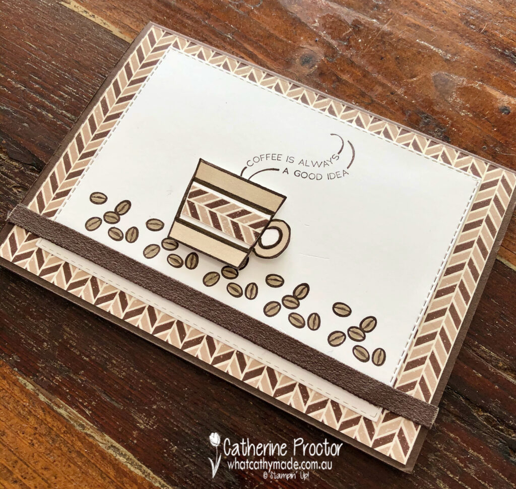
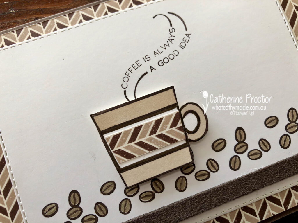
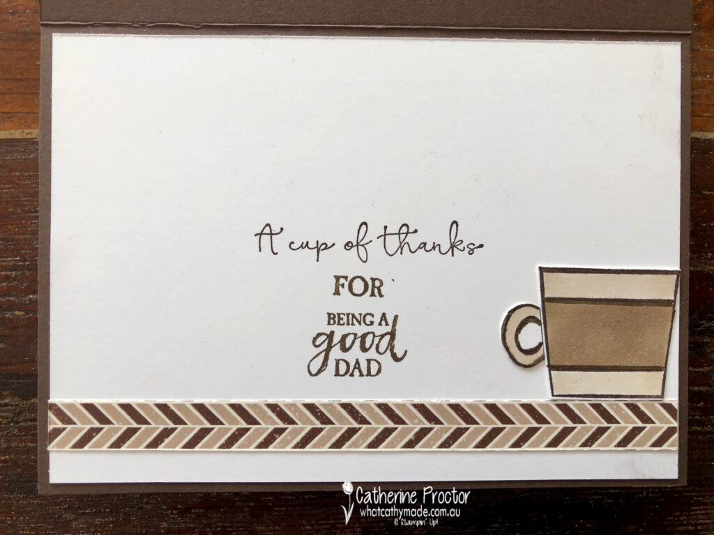
For my second card I’m sharing the one I made for Father’s Day to accompany a coffee machine and coffee, which is why I decided to use the Press On stamp set.
I kept this card very neutral, using coffee shades (Early Espresso and Crumb Cake) with Whisper White.
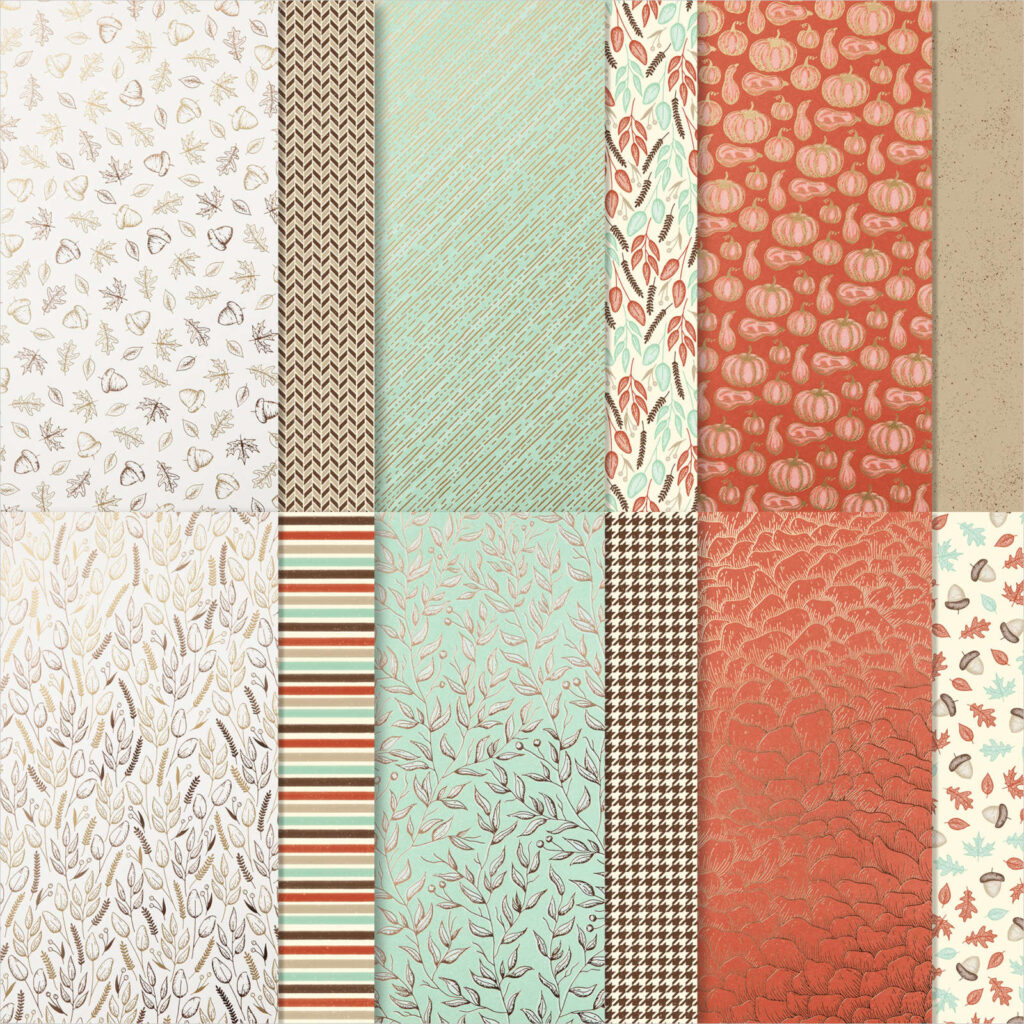
The lovely masculine chevron DSP is one you might have overlooked – I certainly did! This DSP is part of the Gilded Autumn specialty DSP which is found on page 45 of the August – December 2020 Mini Catalogue.
The coffee cup and beans were stamped in Early Espresso before being coloured in using Crumb Cake Stampin’ Blends and a Crumb Cake Stampin’ Write marker for the coffee beans.
The strip of early espresso faux suede ribbon along the base of the card co-ordinated perfectly and added a luxurious texture to the card.
Inside my card I used a variety of sentiments to create a meaningful Father’s Day message – I’m not sure if it really worked, but my dad seemed to appreciate it and that’s what really counts.
To see more masculine card inspiration from the AWH Team head back to Rachel‘s page as she is hosting our monthly blog hops.
To purchase any of the products I’ve used in my cards tonight simply click on the phots of the products below.
If you’d like me to post you your very own copy of the August – December 2020 Mini Catalogue, the 2020-21 Stampin Up! Annual Catalogue, the 2020-21 Beginners Brochure, or to simply find out about more about Stampin’ Up! contact me.
Welcome to another week of Christmas inspiration with the Art with Heart team.
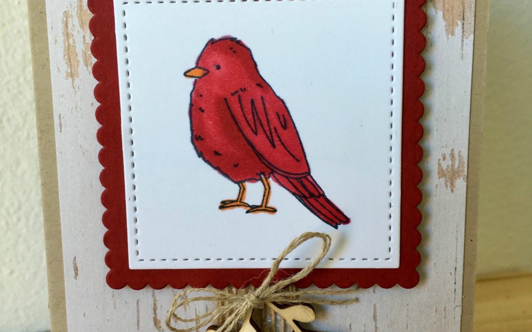
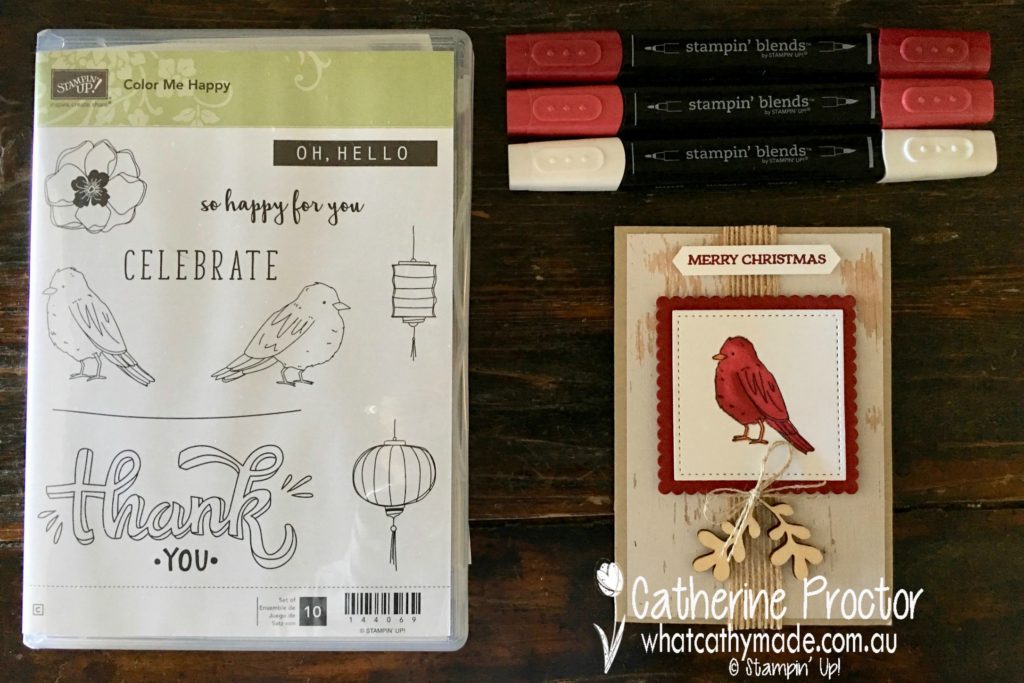
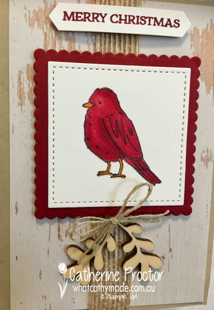
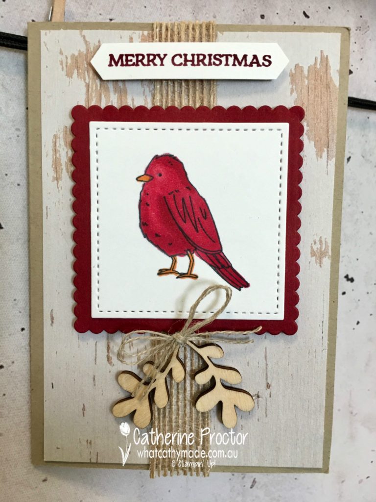
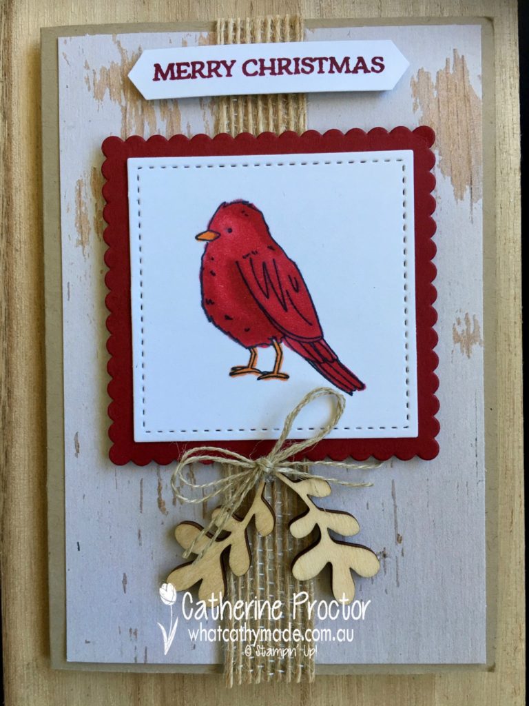
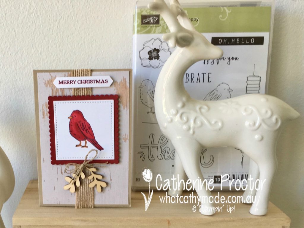
This week I’m playing with the new Stampin Blends and matching stamp set, Color Me Happy, which are available for sale from today. Instead of making one of the designs in the Colour Me Happy Kit (which by the way are all so beautiful) I decided to make a Christmas card using one of the bird stamps from the Colour Me Happy Stamp set.
I used four of the Stampin Blends pens: dark cherry cobbler, light cherry cobbler, dark pumpkin pie, and the colour lifter pen to shade my little Christmas bird. The colour lifter pen allows you to remove colour, giving your shading extra depth. Here’s a close-up of my little bird so you can see the shading.
I then cut out my stamped image with a square stitched shapes die and mounted it onto a scalloped square of cherry cobbler, die cut using the layering squares dies. The background DSP is from the wood textures DSP stack, mounted onto a card base made from crumb cake card stock.
Texture was added with some burlap ribbon, touches of nature elements and a sweet little bow made with linen thread. The sentiment is from the Santa’s Sleigh stamp set, punched out with the classic label punch.
To see what the rest of the team have made hop back to Claire’s blog and I’ll be back with some more Christmas inspiration next week.


")


 Scalloped Linen Ribbon")


")
")


")


 Faux Suede Trim")