Welcome back to our Colour Creations Showcase as we continue our showcase of over 50 beautiful Stampin’ Up! colours in alpha order.
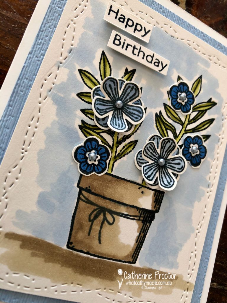
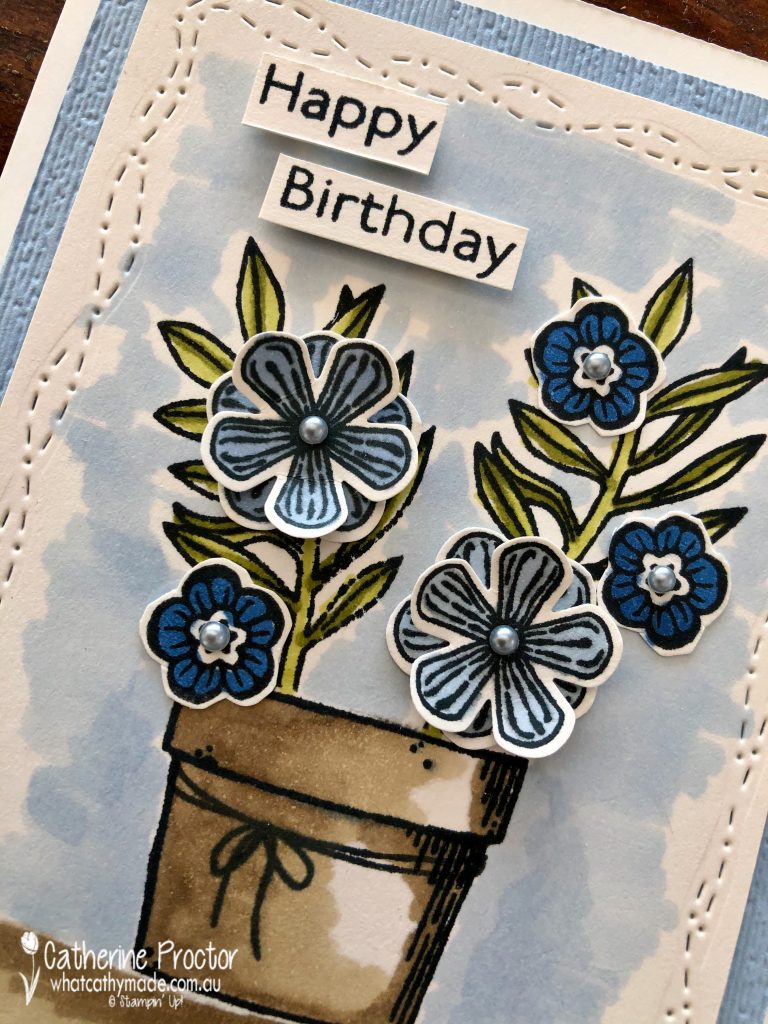
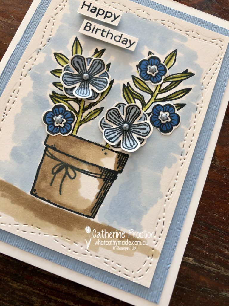
This week we are showcasing Seaside Spray, a soon to be retired 2019-21 In colour that I’m really going to miss!
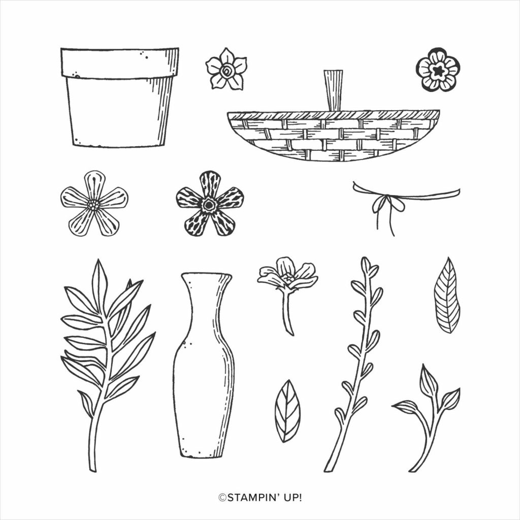
This week I’m also using a stamp set and co-ordinating punch that are retiring soon – the Basket of Blooms stamp set and the small bloom punch.
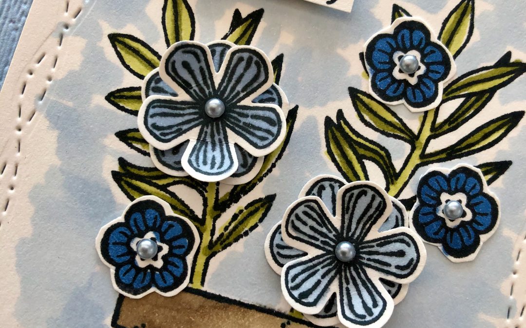
For quick and easy colouring I simply stamped my pot and leaves in Memento Ink onto Shimmery White card stock and coloured the pot in using Crumb Cake Stampin’ Blends and the leaves using Old Olive Stampin’ Blends.
The ground below the post and the area around the pot were also coloured using Seaside Spray Stampin’ Blends and Crumb Cake Stampin’ Blends . I love the stamp in this set that is a piece of twine wrapped around the pot.
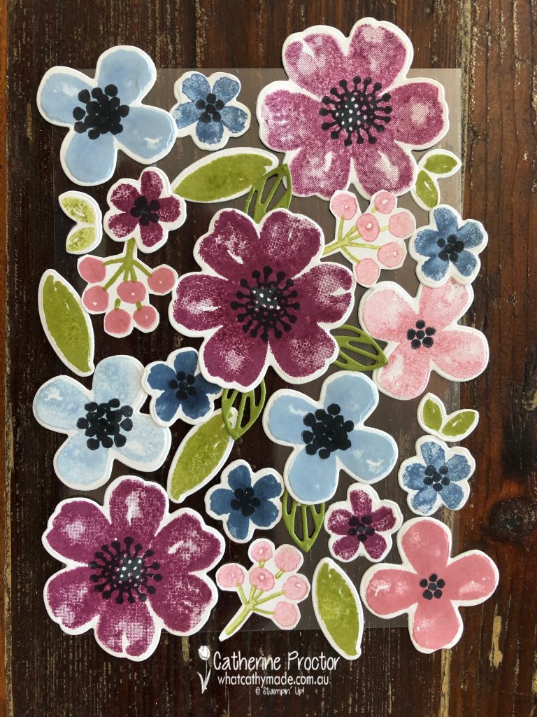
The flowers were stamped onto a separate piece of paper and coloured in with Night of Navy and Seaside Spray Stampin’ Blends before being punched out with the small bloom punch or fussy cut. I’ve layered the largest flower and used silver metallic pearls for the centre of the flowers.
Don’t you just love the border created by the touch of whimsy dies? I’m so glad these are not retiring – the metallic pearls and the stitched with whimsy dies are both carrying over to the new catalogue, hooray!
The subtle embossing folder will also be sorely missed – I love the dimension this gives to card stock.
I can’t wait to see what everyone else has created with Seaside Spray today!
We will return next week on Wednesday April 28th when we’ll be showcasing Shaded Spruce.
If you’d like me to post you your very own copy of the forthcoming 2021-22 Stampin Up! Annual Catalogue, the January – June 2020 mini catalogue, or to simply find out about more about Stampin’ Up! contact me.
In the meantime, wherever you are in the world, stay safe, stay calm…and keep on crafting xxx
Welcome back to our Colour Creations Showcase as we continue our showcase of over 50 beautiful Stampin’ Up! colours in alpha order.
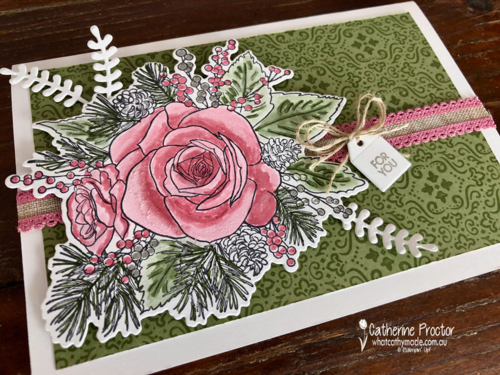
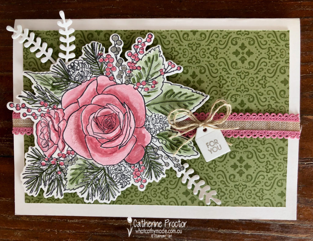
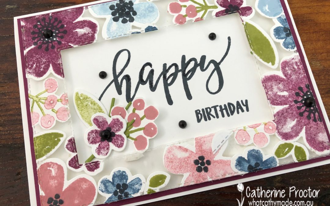
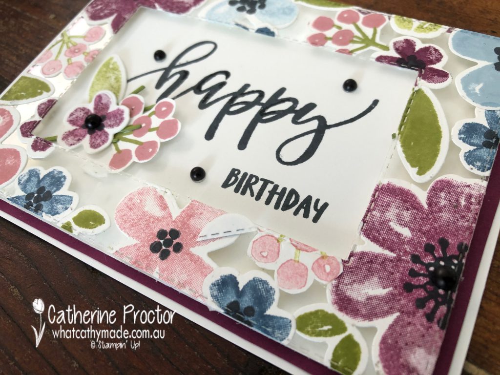
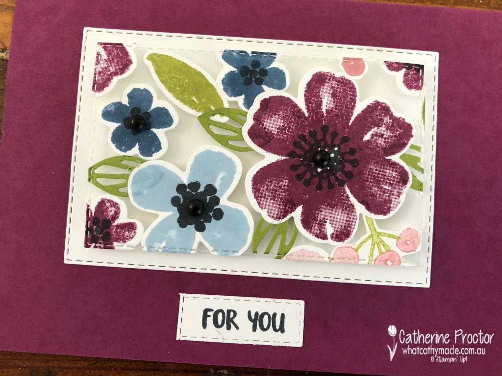
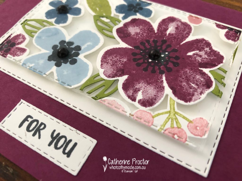
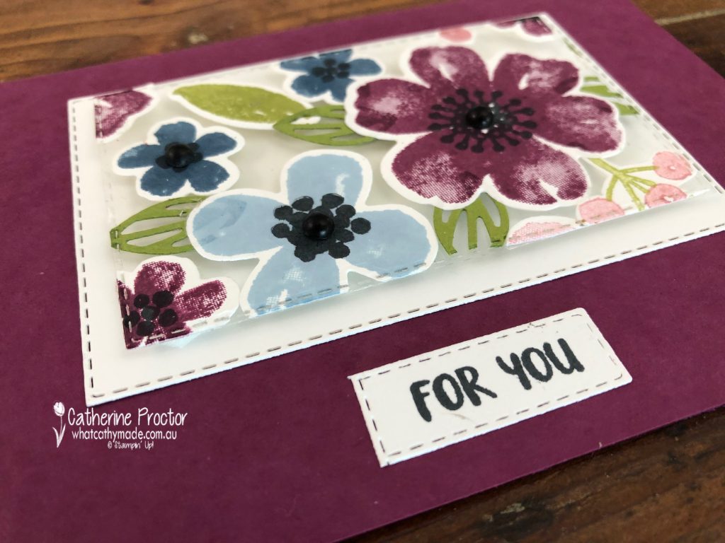
This week we are showcasing Rich Razzleberry, a lovely mauve/plum shade from our regals family.
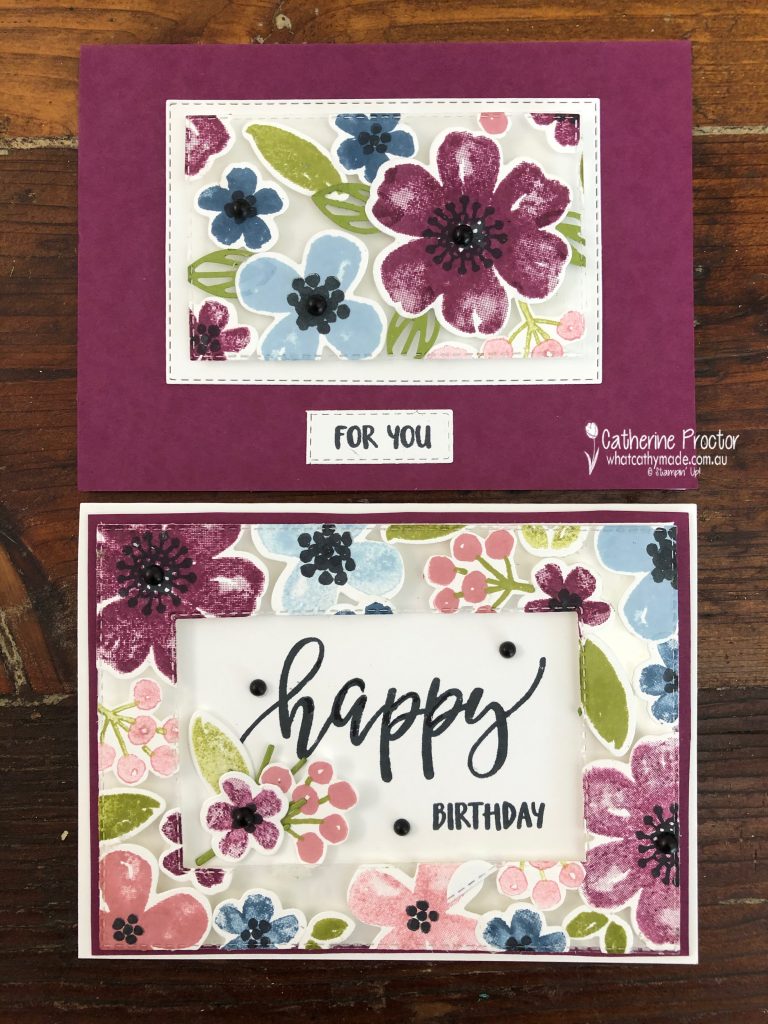
Tonight I’ve made two floating element cards using the Pretty Perennials bundle and this colour combination.
Have you ever tried the floating frame technique or the floating element technique? Both these techniques make two cards, which is a great time saver.
The floating element technique uses a window sheet to make the elements on the card look like they are floating – hence the name. After stamping and die cutting your elements you layer them onto a window sheet and adhere with glue.
You then trim around the edges of the window sheet and die cut out a centre piece so you are left with a frame or border piece and a centre piece.
I used the stitched rectangle dies for this – you may need to run the die through the cut-n-emboss machine several times and on an angle.
Use dimensionals (strategically placed behind the elements) to attach your top layer to your card base – the dimensionals make your elements look like they are floating.
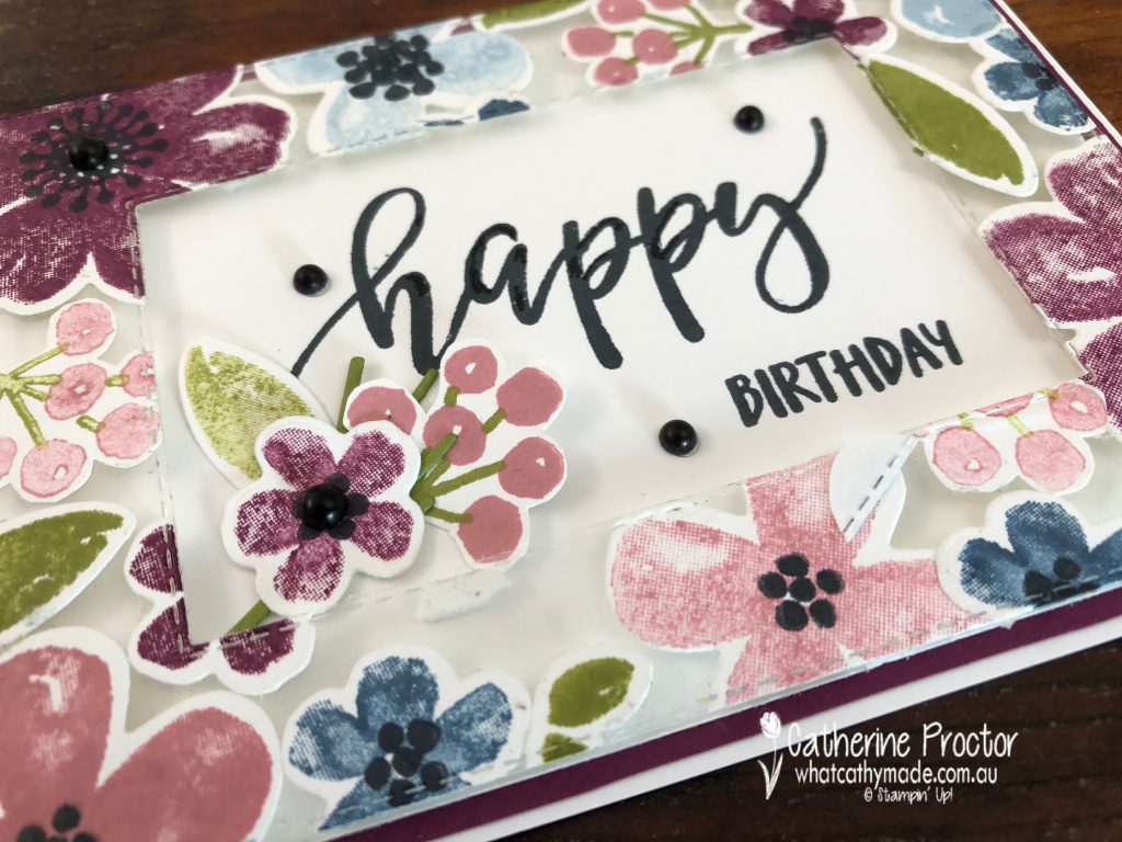
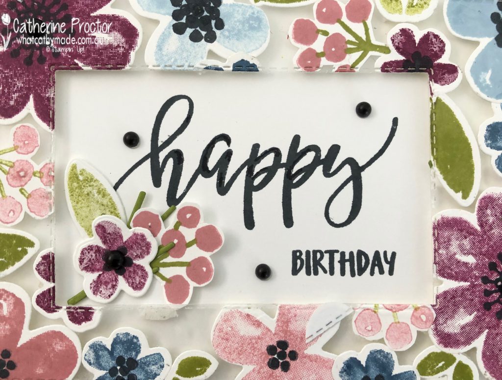
I stamped a large sentiment in the middle of my frame and added some matte black dots and extra die cuts.
I love this big “happy” stamp from the Pretty Perennials bundle!
I used my centre “floating element” piece to make a second card.
This time I used Rich Razzleberry card stock for the card base and layered the floating layer onto a die cut Basic White layer.
Once again I added some matte black dots for dimension and texture. The “for you” sentiment is also from the pretty Perennials bundle.
I can’t wait to see what everyone else has created with Rich Razzleberry today!
We will return next week on Wednesday 31 March when we’ll be showcasing one of the soon to be retired 2019-21 In Colours: Rococo Rose. We hope you can join us all then.
To purchase any of the products used in my card tonight, click on the links below.
If you’d like me to post you your very own copy of the January – June 2020 mini catalogue, the 2020-21 Stampin Up! Annual Catalogue, the 2020-21 Beginners Brochure, or to simply find out about more about Stampin’ Up! contact me.
In the meantime, wherever you are in the world, stay safe, stay calm…and keep on crafting xxx
Welcome back to our Colour Creations Showcase as we continue our showcase of over 50 beautiful Stampin’ Up! colours in alpha order.
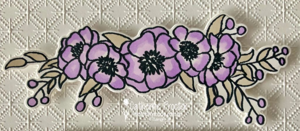
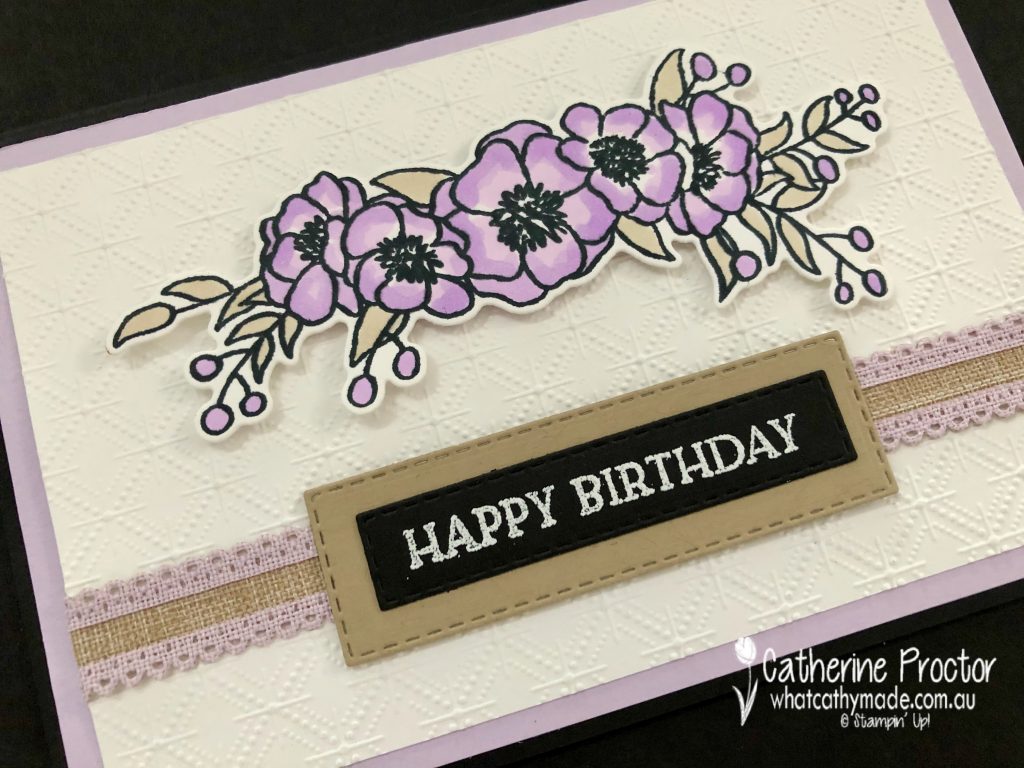
This week we are showcasing Purple Posy, a soon to be retired pale purple from Stampin’ Up’s 2019-21 InColour collection.
Purple Posy is a feminine and slightly old fashioned (in a good way!) colour that reminds me of my Nana and so I decided to make a card that I think she would have liked to receive. I paired Purple Posy with all neutrals: Crumb Cake, Basic Black and Basic White.
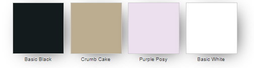
Because there is no Purple Posy stamp pad, I used a floral stamp set that could be coloured using Purple Posy Stampin Blends – Bloom & Grow with its matching Budding Blooms dies.
I could have used virtually any embossing folder on the Basic White card stock layer but decided on the Dainty Diamonds, again with my Nana in mind.
I love this scalloped linen ribbon – it was the Crumb Cake in the centre of this ribbon that inspired me to add Crumb Cake to my colour combination, both in the layer behind the sentiment and the colouring of the leaves.
Because there isn’t a “Happy Birthday” sentiment in the Bloom & Grow stamp set I used the “Happy Birthday” sentiment from Blossoms in Bloom instead.
My friend Tina Gillespie ALWAYS stamps the insides of her cards and she has inspired me to try to remember to do the same too …
I can’t wait to see what everyone else has created with Purple Posy today!
If you’d like me to post you your very own copy of the January – June 2020 mini catalogue, the 2020-21 Stampin Up! Annual Catalogue, the 2020-21 Beginners Brochure, or to simply find out about more about Stampin’ Up! contact me.
In the meantime, wherever you are in the world, stay safe, stay calm…and keep on crafting xxx
Welcome back to our Colour Creations Showcase as we continue our showcase of over 50 beautiful Stampin’ Up! colours in alpha order.
This week we are showcasing Pumpkin Pie, a rich orange from our regals family.
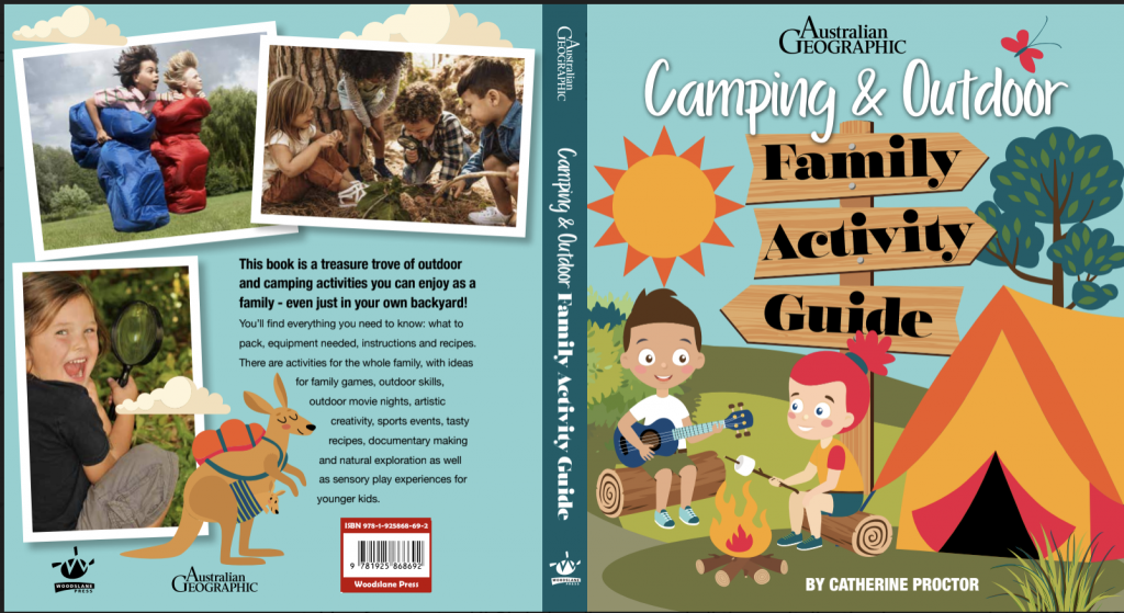
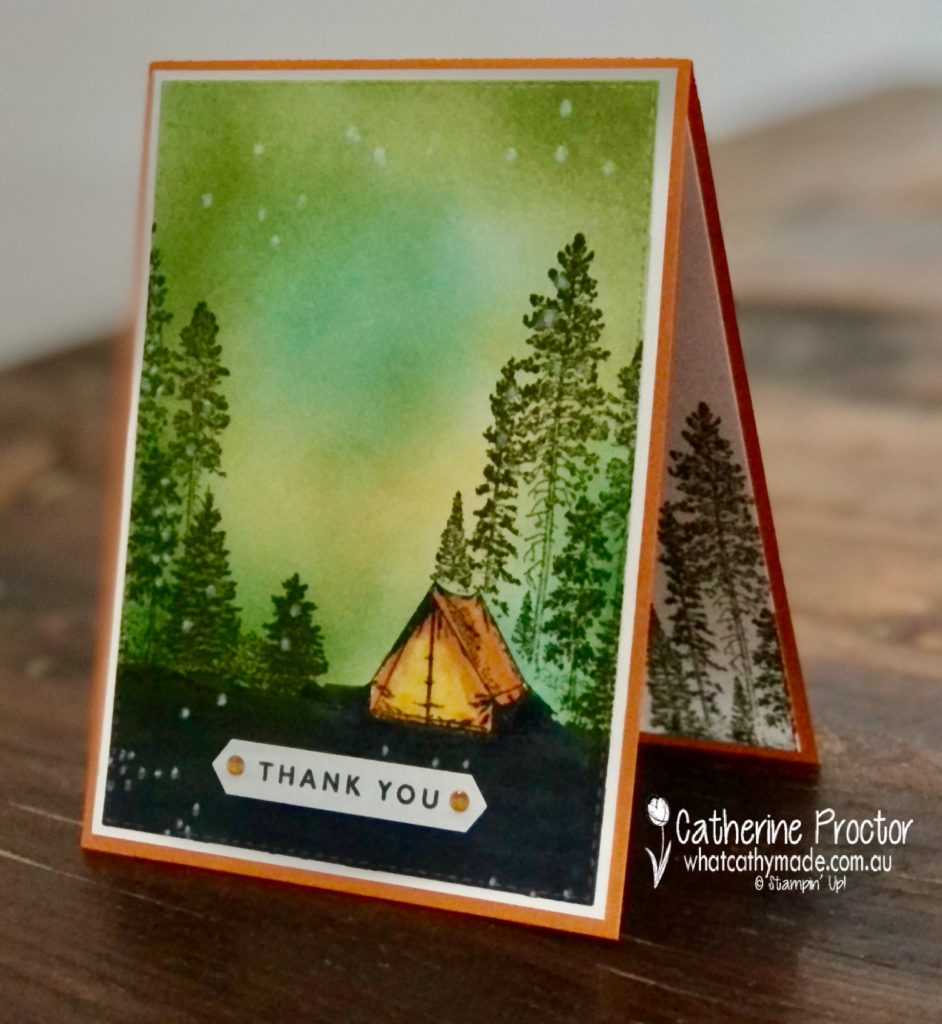
I wanted to make a thank you card for my amazing designer Christine who has just designed and typeset my latest book. We’ve worked together on many books together over the years but I really think this is her best design ever.
The book is being printed overseas now but I’m so excited about Christine’s design I wanted to share a sneak peek at the cover…
And a sample of the internal pages..
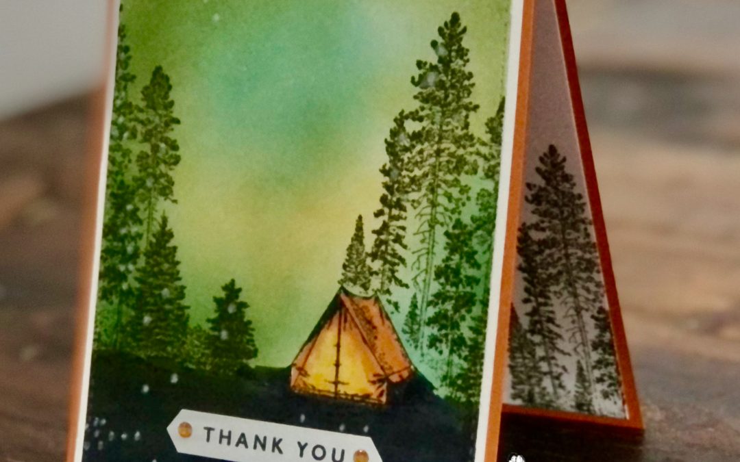
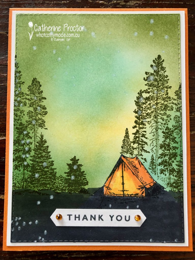
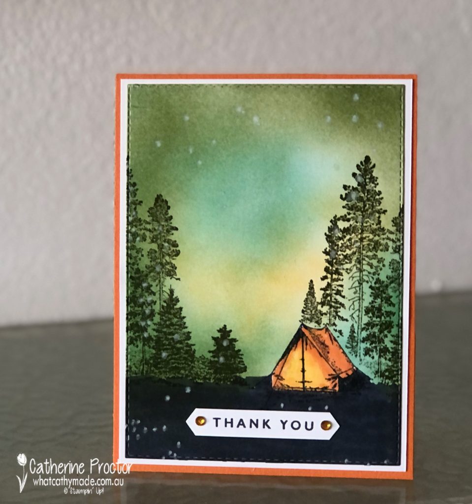
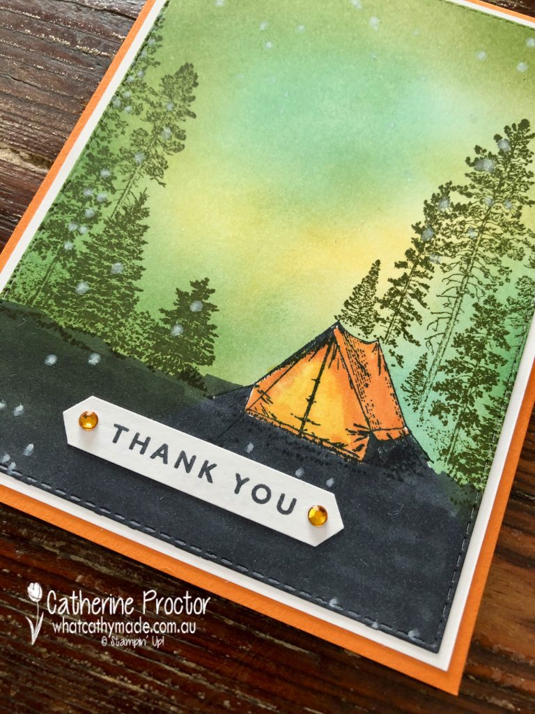
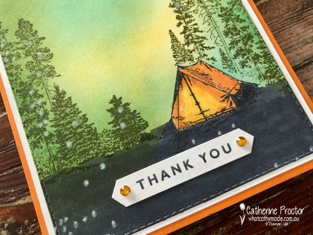
Campology is the stamp set I just had to use for this card but I’ve never feel very confident making “scene” cards. I searched Pinterest for inspiration on how to use the “Campology” stamp set and I found a wonderful card by one of the top American Stampin’ Up! demonstrators called Michelle Zindorf – she is amazing at creating blended backgrounds. I have CASED elements of Michelle’s card, including the Pumpkin Pie tent, but changed the rest of the card design and layout to include more Pumpkin Pie.
Thanks to the new Stampin’ Up! blending brushes I’m no longer scared of making “scene cards”! I used blending brushes to make a night sky background with my So Saffron, Just Jade and Mossy Meadow ink pads. The secret to getting a smooth coverage is to start blending off the page and keep moving the brushes in a circular motion.
I then stamped the tent in Memento Ink onto the front layer of the card and also onto a Post-It note to mask the tent – you fussy cut around the top of the tent to create a mask that protects the tent while you stamp the trees in Mossy Meadow over the tent and on either side of the card. Once you’ve stamped the trees remove the Post It note and your tent pops into into the foreground of the scene, with the trees in the background.
The tent is coloured in with Pumpkin Pie and Mango Melody blends – I love how these colours make it look like there is a light on in the tent!
The base of the top layer was coloured in with the Basic Black Stampin’ Blends and the “Thank you” sentiment is from “Blossoms in Bloom” with the ink applied with a sponge dauber for a crisp finish – my go-to tip when inking up sentiments. My trusty Holiday Rhinestone Basic Jewels just add a tiny bit of bling and dimension.
The card opens at the top and the inside has been stamped in Mossy Meadow using the tall tree stamp from “Campology”. I hope this card brings a smile to Christine’s face and expresses how grateful I am to her incredible design skills that bring my writing to life!
I can’t wait to see what everyone else has created with Pumpkin Pie today!
We will return next week on Wednesday March 10th when we’ll be showcasing one of the soon to be retired 2019-21 In Colours: Purple Posy. We hope you can join us all then.
To purchase any of the products used in my card tonight, click on the links below.
If you’d like me to post you your very own copy of the January – June 2020 mini catalogue, the 2020-21 Stampin Up! Annual Catalogue, the 2020-21 Beginners Brochure, or to simply find out about more about Stampin’ Up! contact me.
In the meantime, wherever you are in the world, stay safe, stay calm…and keep on crafting xxx
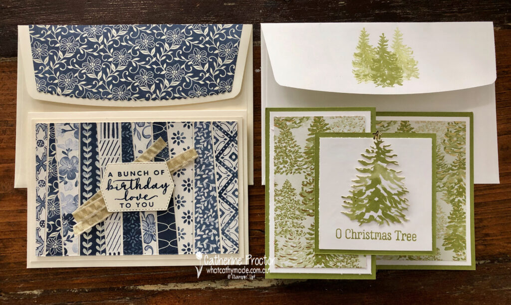
Welcome to the Monthly Art With Heart Creative Showcase. Tonight we’re sharing some ideas for using designer series paper because Stampin’ Up! have 15% off a select range of their stunning DSPs for the month of October. You can see the full list of papers on sale here.
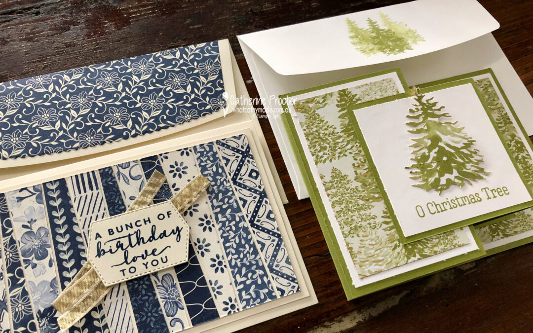
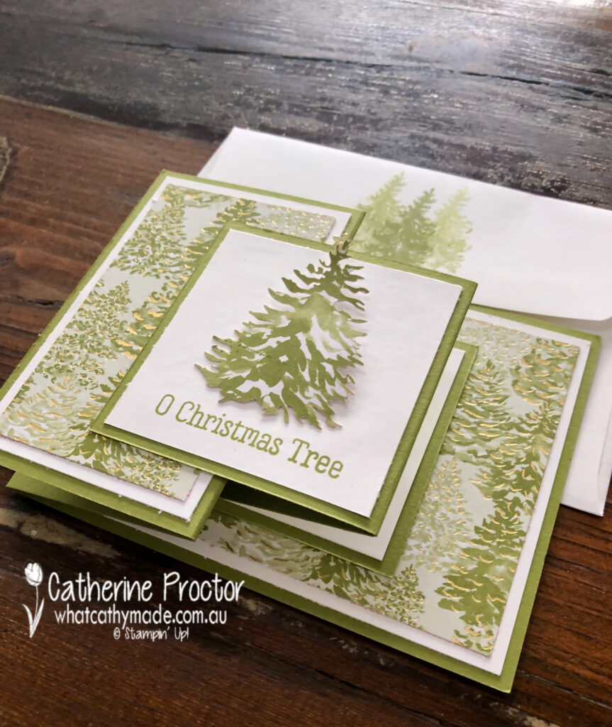
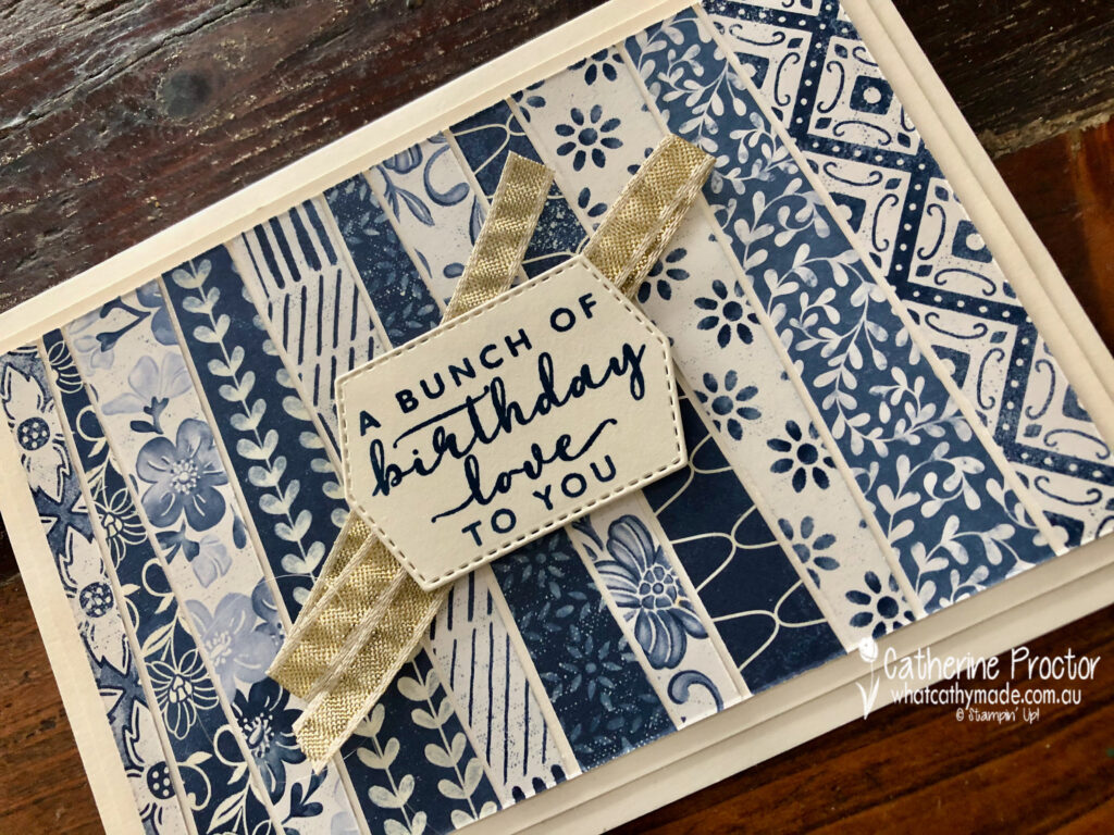
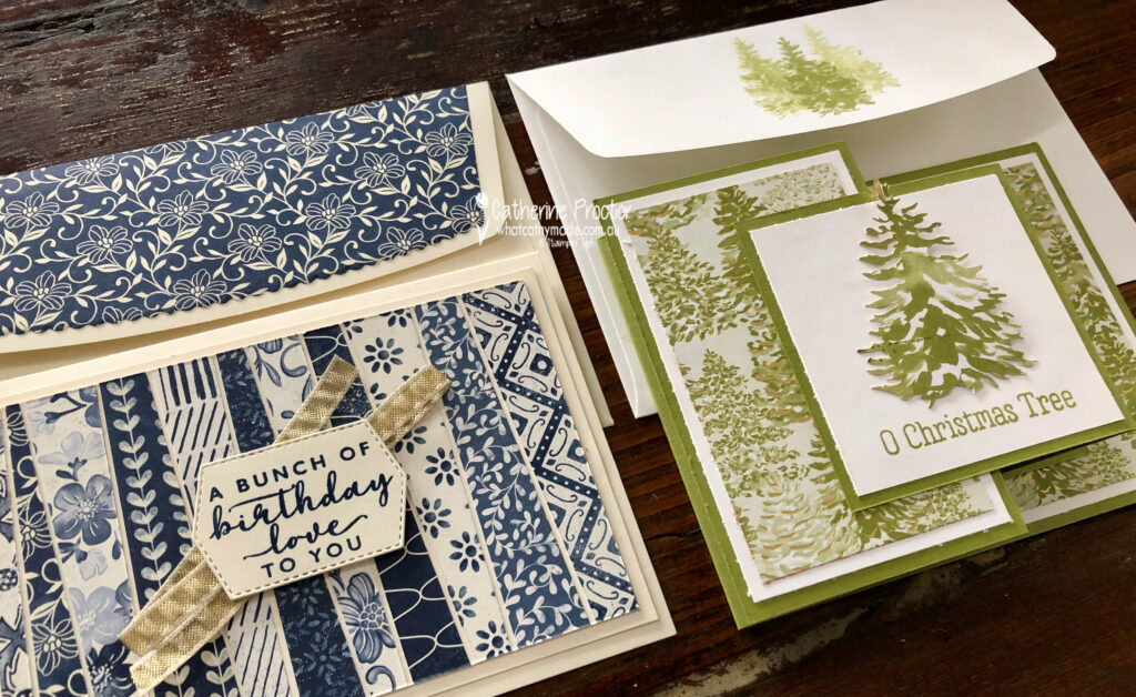
To celebrate World Card Making day last Saturday I held a class where I shared two card techniques that really showcase designer series papers: a double z-fold Christmas card and a “Scrappy Strip technique” birthday card.
Both of these cards feature stunning designer series papers that can sometimes be overlooked because they are from Product Medleys, so they are not listed in the paper section of the Stampin’ up! website or the catalogues.
These designer series papers also come in refill packs, so you don’t have to purchase the entire product medley to get your hands on the DSP.
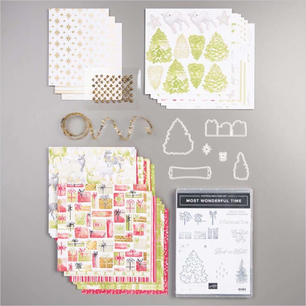
Most Wonderful Time
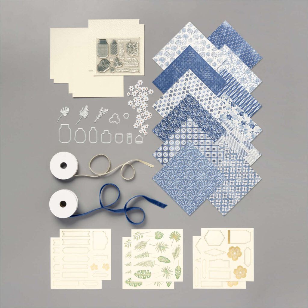
Boho Indigo
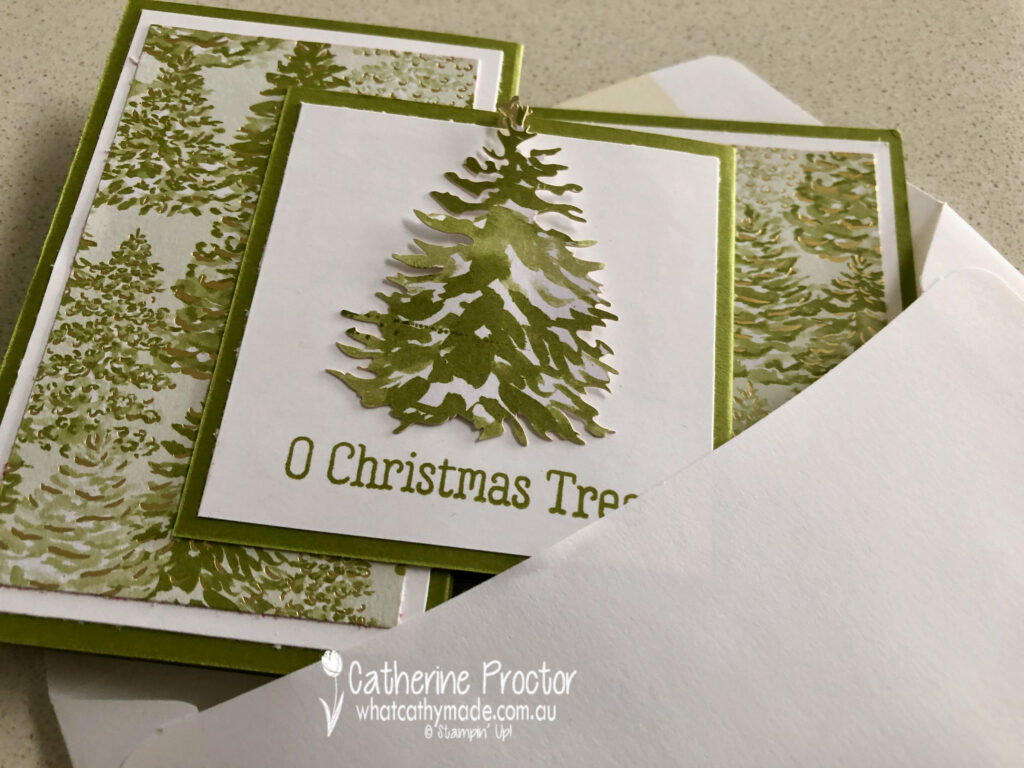
The double Z-fold card is a Christmas card and you could use any of the Christmas DSPs on sale to make this design too. For the front panel of the card you can use a sticker from the product medley or stamp a greeting or a different image – the possibilites are endless.
Here’s how it looks from the side.
And here’s my matching envelope – I simply stamped off the Christmas Tree stamp on the back flap of a C6 envelope.
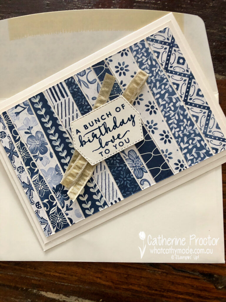
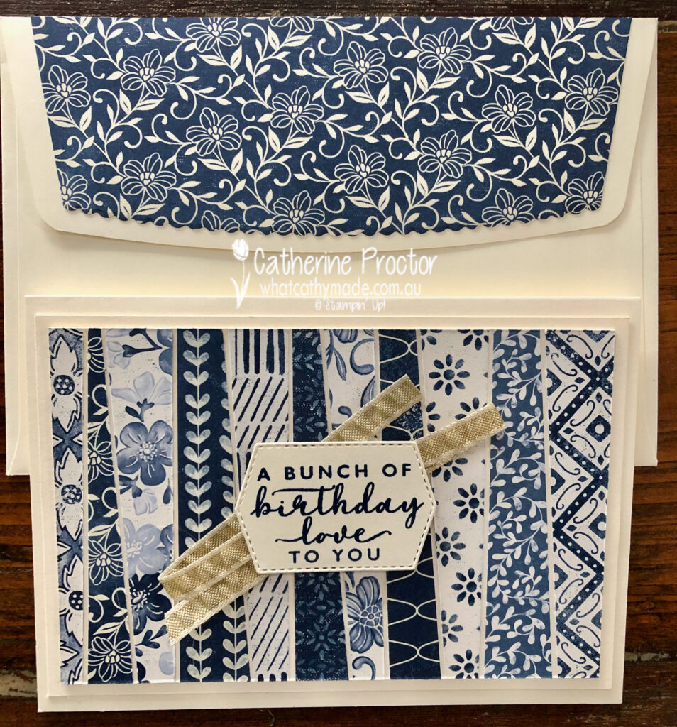
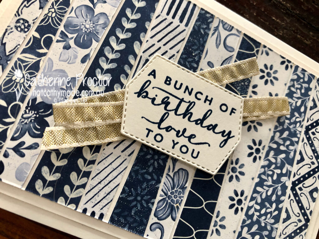
My scrappy strip technique birthday card uses the stunning blues and whites and creams of the Boho Indigo Product Medley.
To make a scrappy strip technique card you simply cut a piece of Very Vanilla A4 card stock in half and score and fold to make the card base. Cut the other piece of card stock in half and trim 1/4 inch (5cm) off the top and side – this is your middle layer. For the top layer, trim 1/2 inch (10cm) off the top and side.
Trim strips of DSP at an angle before lining them up (alternating dark and light) and lining them up with approximately the same gap between strips. Adhere the strips, turn over so the strips are under the top Very Vanilla layer and trim the strips back to the edges of the top layer.
Once you’ve adhered all your layers, add some ribbon behind your sentiment.
I used the Envelope dies to add DSP to the outer flap of a C6 envelope. The Envelope dies come in four different sizes (to match the four different envelope sizes Stampin’ Up! sells) and you can either use them inside as an envelope liner or outside as a feature flap as I’ve done below.
This scrappy strip technique is the perfect way to use up your scraps of DSP.
I’m going to make both these cards again, this time using some of the lovely DSP on sale this month.
To see more Designer Series Paper inspiration from the AWH Team head back to Rachel‘s page as she is hosting our monthly blog hops.
To purchase any of the products I’ve used in my cards tonight simply click on the phots of the products below.
If you’d like me to post you your very own copy of the August – December 2020 Mini Catalogue, the 2020-21 Stampin Up! Annual Catalogue, the 2020-21 Beginners Brochure, or to simply find out about more about Stampin’ Up! contact me.
Welcome to the Monthly Art With Heart Creative Showcase. Tonight we’re sharing some ideas for masculine cards, something I know many of us can find challenging to make.
I recently made two masculine cards I’d like to share with you: the card I made for my dad’s birthday in July and the card I made last week for him for Father’s Day.
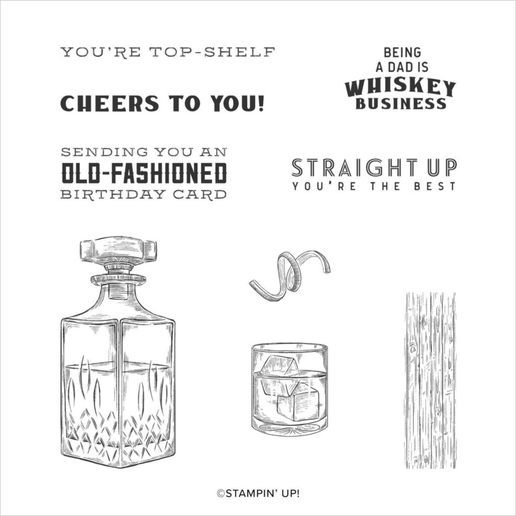
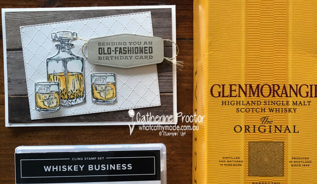
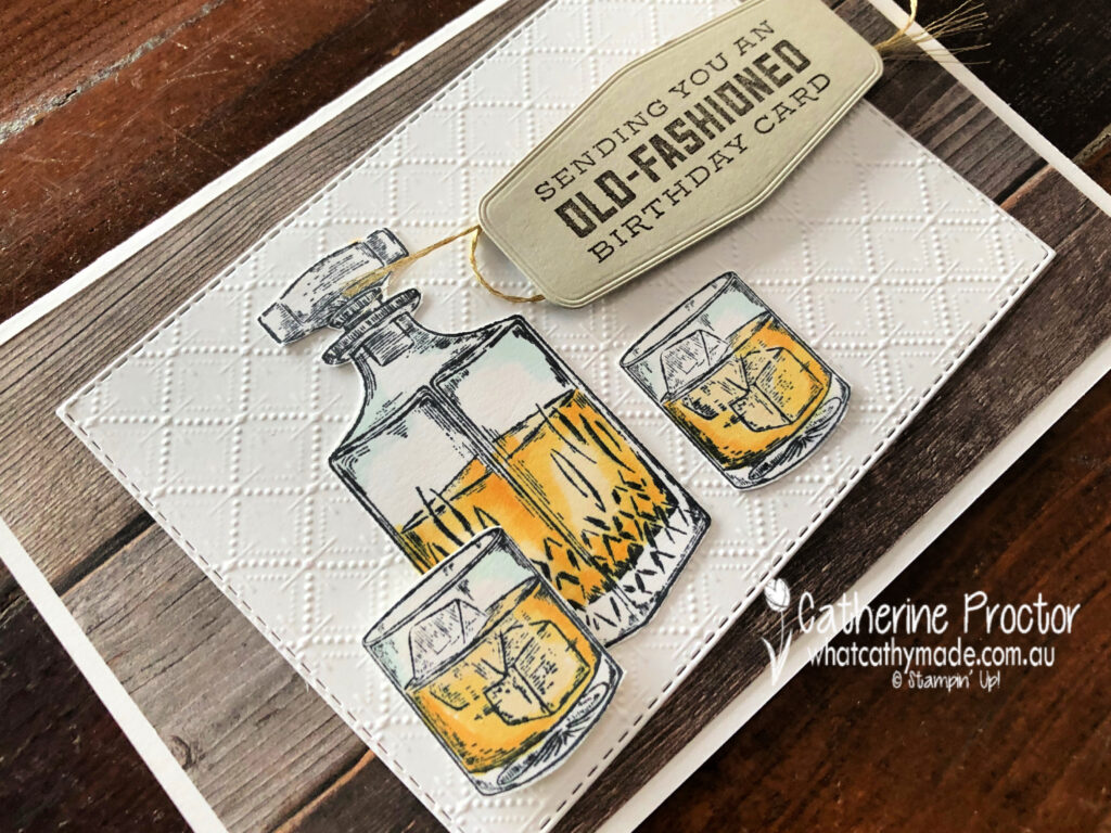
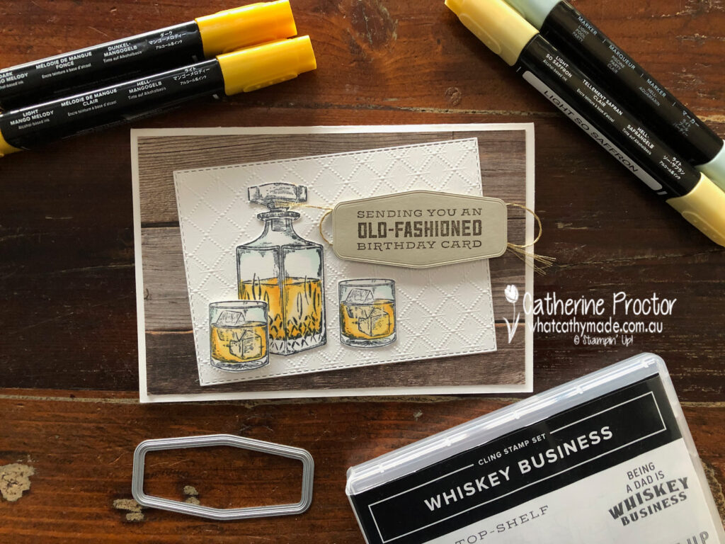
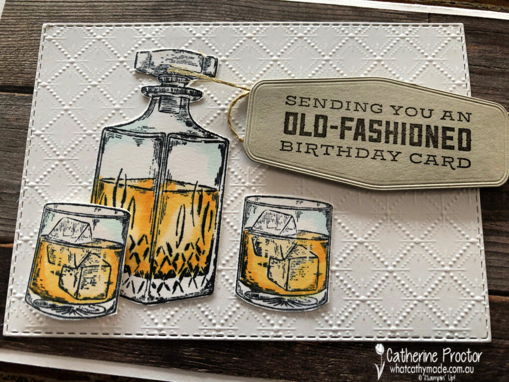
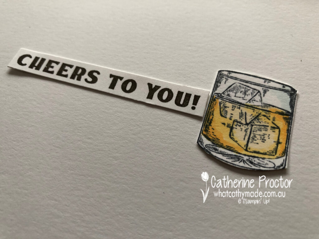
My dad is not a typical card game/car/fishing/treking/BBQ/sport kind of a dad and that can make designing masculine cards for him quite tricky. But there are two Stampin’ Up! stamp sets that perfectly matched the gifts I was giving to my dad: Whiskey Business and Press On.
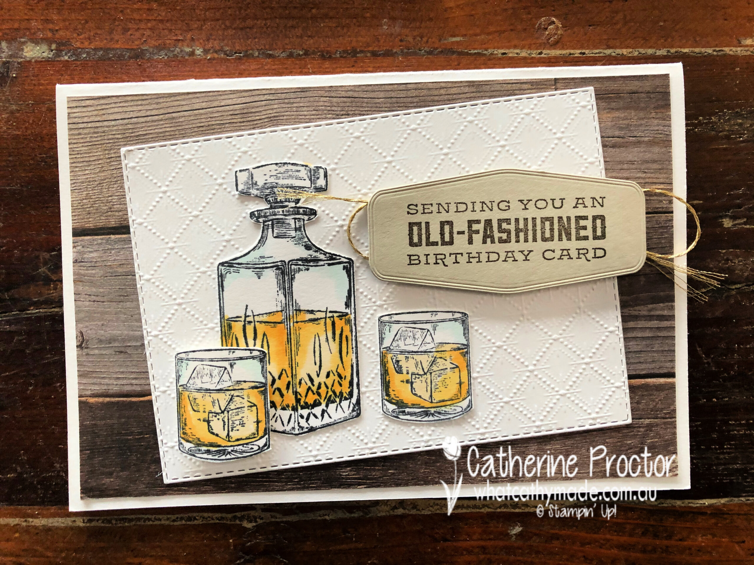
For Dad’s birthday card I used the Whiskey Business set… no prizes for guessing what I gave him for his birthday!
This card was CASED from the design of the card on page 33 of the Annual Catalogue but I made a few changes to make it my own. I just had to use the Dainty Diamonds embossing folder to emboss the Whisper White card stock because it looks just like the pattern in the cut crystal that the Whiskey decanter and whiskey glasses are made of.
The detailed line drawings of the Whiskey Business are so realistic and the Stampin’ Blends make it so easy to bring these stamps to life. I’ve used light Pool Party for the crystal, and light So Saffron, light Mango Melody and dark Mango Melody for the whiskey.
Here’s a close up showing the detail in this stamp set. I simply fussy cut my decanter and glasses using my paper snips before adhering them to the embossed Dainty Diamonds layer.
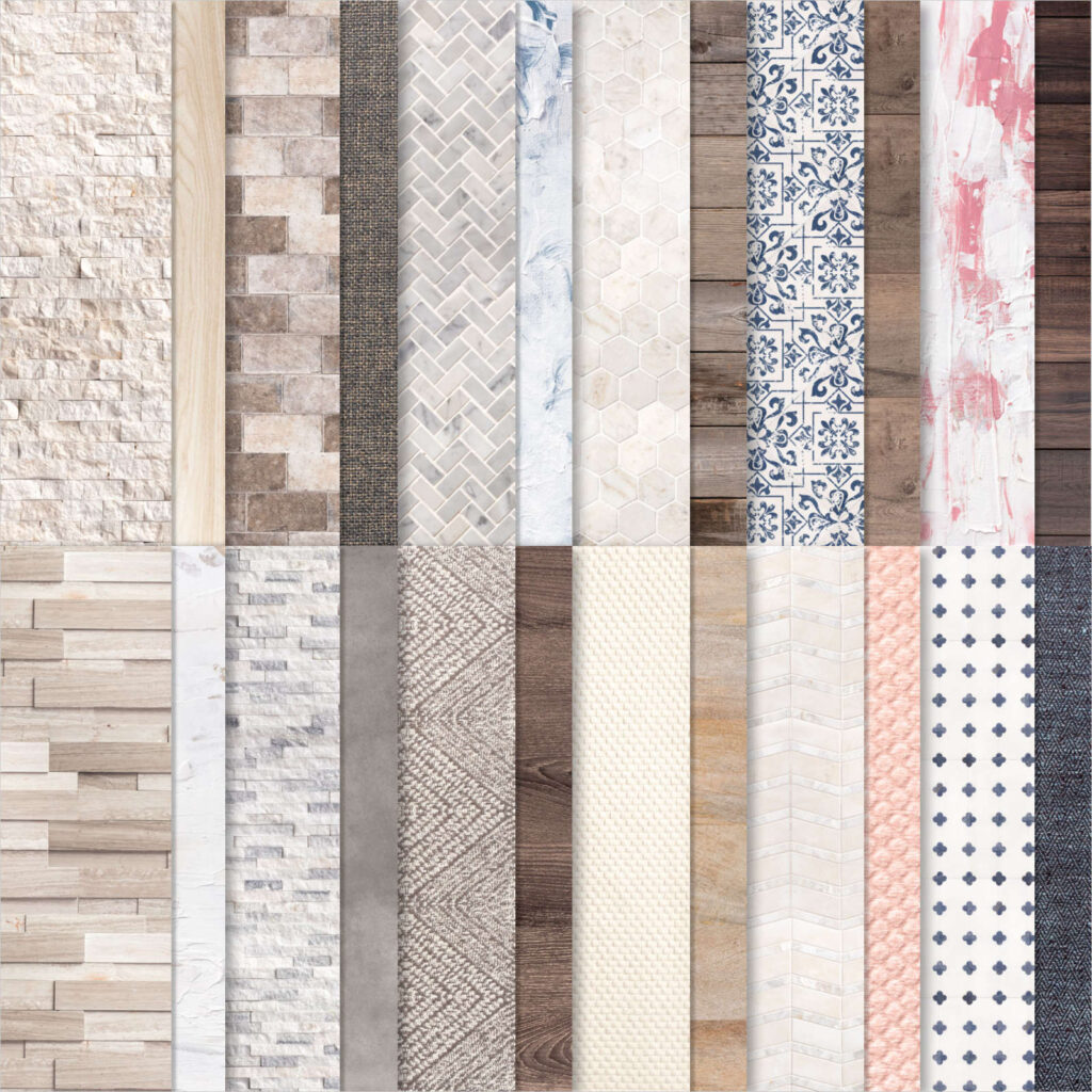
Speaking of realistic – how amazing is this wood patterned DSP from the In Good Taste DSP! All of this patterned paper was created from photographs of actual wood, stone, textiles, etc and it’s just perfect for masculine cards.
And finally, here’s the inside of the card.
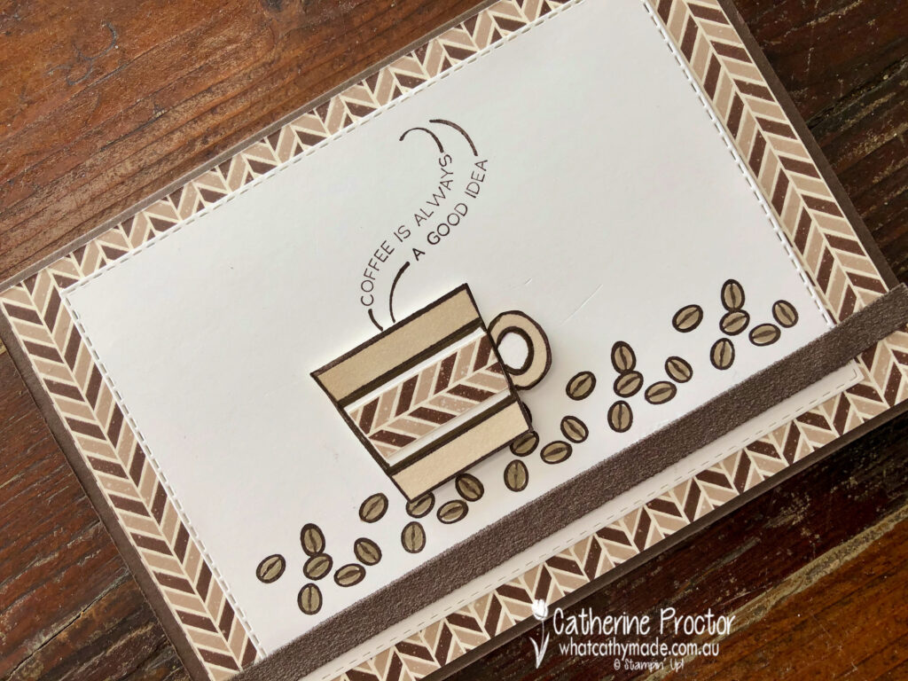
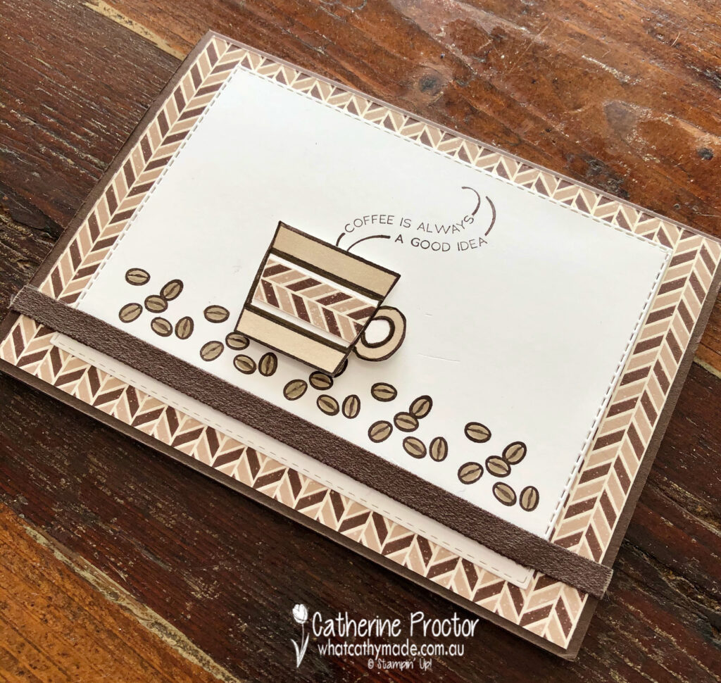
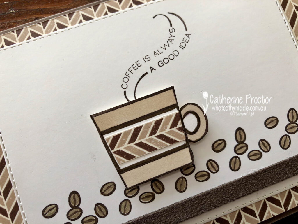
For my second card I’m sharing the one I made for Father’s Day to accompany a coffee machine and coffee, which is why I decided to use the Press On stamp set.
I kept this card very neutral, using coffee shades (Early Espresso and Crumb Cake) with Whisper White.
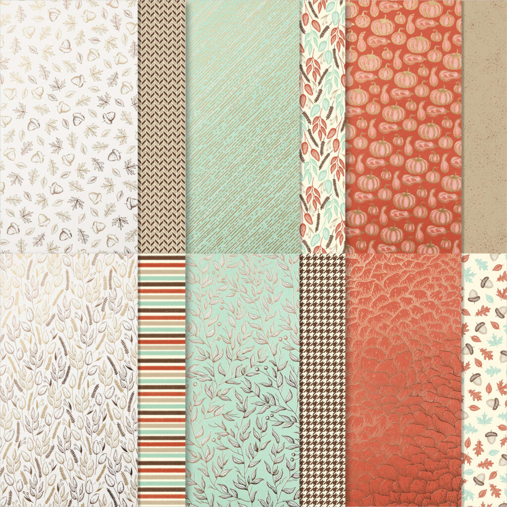
The lovely masculine chevron DSP is one you might have overlooked – I certainly did! This DSP is part of the Gilded Autumn specialty DSP which is found on page 45 of the August – December 2020 Mini Catalogue.
The coffee cup and beans were stamped in Early Espresso before being coloured in using Crumb Cake Stampin’ Blends and a Crumb Cake Stampin’ Write marker for the coffee beans.
The strip of early espresso faux suede ribbon along the base of the card co-ordinated perfectly and added a luxurious texture to the card.
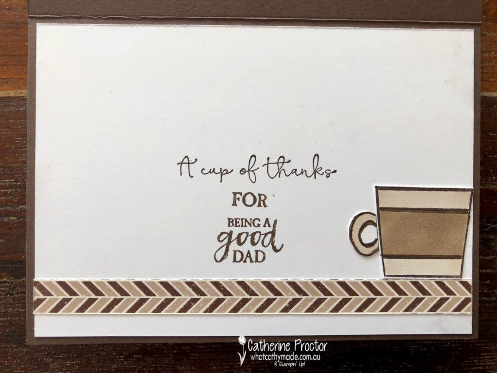
Inside my card I used a variety of sentiments to create a meaningful Father’s Day message – I’m not sure if it really worked, but my dad seemed to appreciate it and that’s what really counts.
To see more masculine card inspiration from the AWH Team head back to Rachel‘s page as she is hosting our monthly blog hops.
To purchase any of the products I’ve used in my cards tonight simply click on the phots of the products below.
If you’d like me to post you your very own copy of the August – December 2020 Mini Catalogue, the 2020-21 Stampin Up! Annual Catalogue, the 2020-21 Beginners Brochure, or to simply find out about more about Stampin’ Up! contact me.
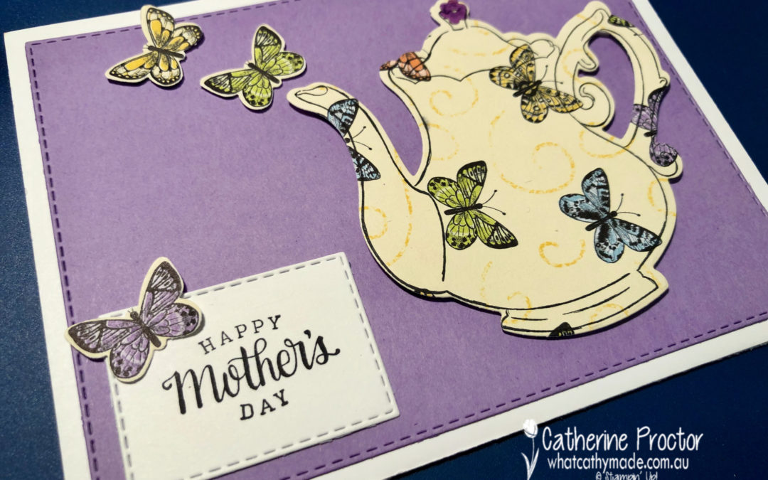
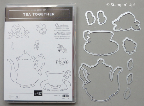
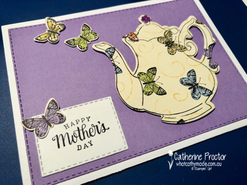
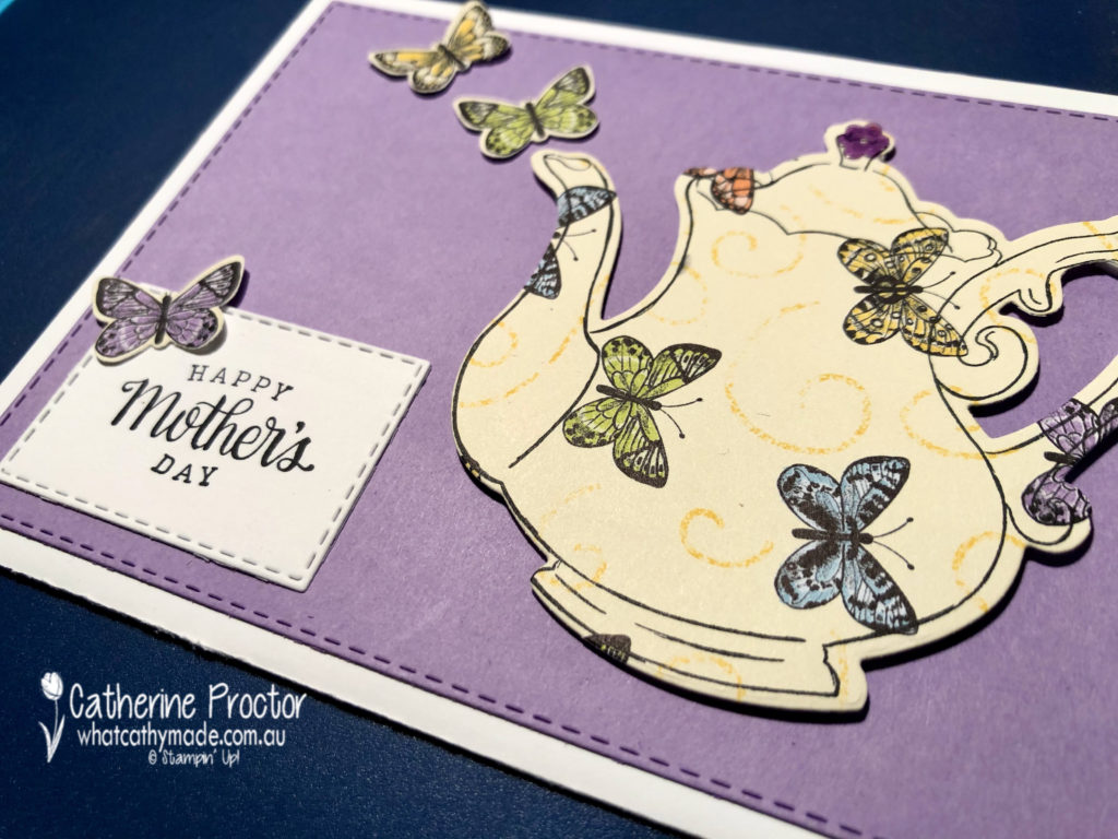
We’re up to day four of my “Marie Condo” farewell to retiring products and since it’s only a week until mother’s day I thought it would be the perfect time to farewell a stamp set with a mother’s day sentiment.
The Tea Together stamp set has matching tea time dies, which makes card making super fast and easy.
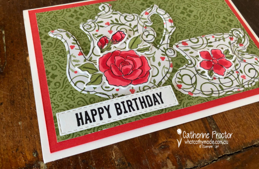
I’ve used this card to make both birthday cards and mother’s day cards – I love this mother’s day sentiment. I’ve made my teapot for this card using Gorgeous Grape card stock and some retired butterfly DSP but it looks lovely cut out of any patterned paper, especially floral designs.
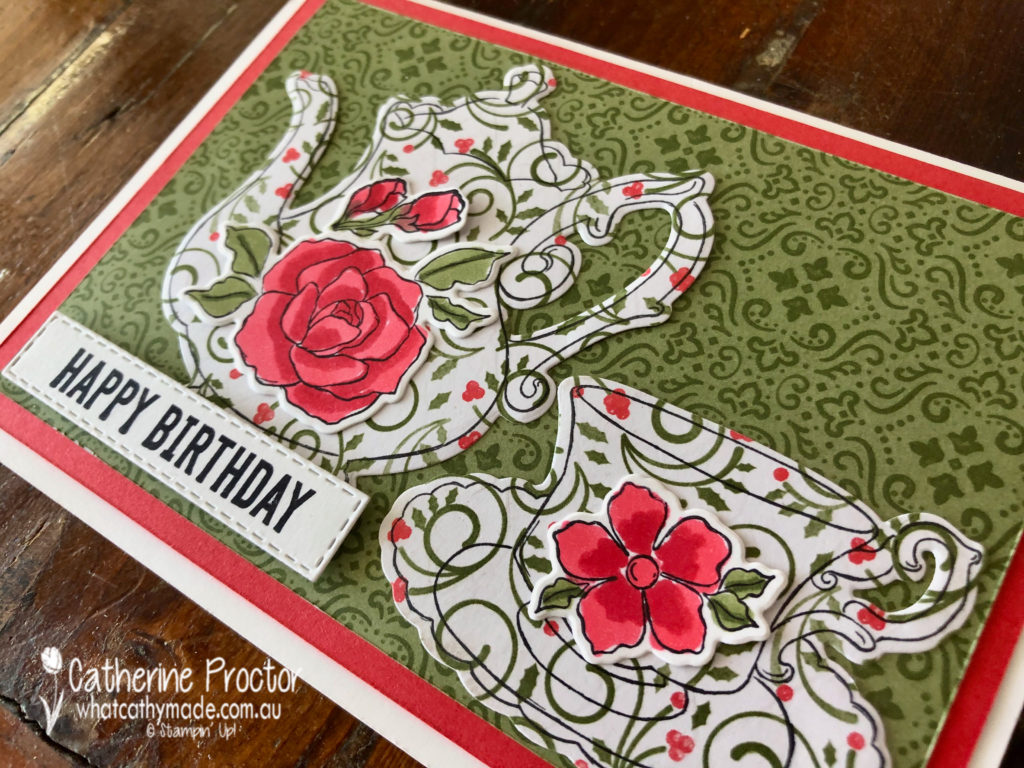
Here is another card i made with this set …this time using a Christmas paper to make a birthday card.
I picked up on the Poppy Parade and the Mossy Meadow colours in the DSP and used my blender pens in these colours to colour in stamped flowers from the Tea Together stamp set. The teapot, cup and saucer were also stamped from this set and then all cut out using the matching dies.
The happy birthday sentiment is from the Itty bitty Birthdays stamp set die cut out with my stitched rectangle dies.
I also used the stitched rectangle dies on my Mother’s Day card.
I hope you’re enjoying my farewell to retiring products?
Every day I will be featuring a stamp set that is retiring from the 2019 Annual Catalogue and the 2020 January to June Mini Catalogue and thank it for its service by showcasing a card (or two) that I’ve made with the stamp set.
You can view all the retiring products in my online shop.
Would you like me to send you your very own Stampin’ Up! 2020-21 Annual Catalogue?
If you’d like me to post you your very own copy of the 2020-21 Stampin Up! Mini Catalogue, the 2019-20 Stampin Up! annual catalogue, or to simply find out about more about Stampin’ Up! contact me.
I’ll be back tomorrow with another card or two to farewell another retiring stamp set.
In the meantime, wherever you are in the world, stay safe, stay calm…and keep on crafting xxx
Welcome to Week 13 of the Heart of Christmas blog hop.
This week I’m sharing with you a variety of cards I’ve made using Stampin’ Up!’s brand new “Christmastime Is Here Suite”.
This suite is not in the Holiday Catalogue, but you can order it online here.
All of the products in the suite can either be ordered together or individually. This video gives you closer look.
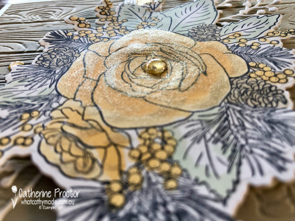
Yes this is a Christmas suite, but the DSP patterns and the rose themed stamps and dies are also ideal for a variety of cards, including Christmas, birthday, Mother’s Day, thank you and sympathy cards.
Card one is a “for you” card that I shared in a blog last week. Here it is again in case you missed it.
After stamping the rose image in Memento ink onto Whisper White card stock I used my marker pens in Rococo Rose, Mossy Meadow and Gray Granite to colour directly onto the stamped image and then I blended using the clear blender pen, NOT the stampin blends.
Card two uses exactly the same stamped image but colouring in with soft saffron and soft sea foam it gives it a totally different effect.
This time I made a square card and mounted the image onto a piece of Sahara Sand, embossed with the pinewood embossing folder.
I’ve also used the Gold 1/4″ (6.4 mm) Shimmer Ribbon and Gold Glitter Enamel Dots from the suite as well as branches die cut in Whisper White using the Frosted Bouquet dies.
I finished of with some Wink of Stella but did go a teeny weeny bit overboard, making my card very glittery!
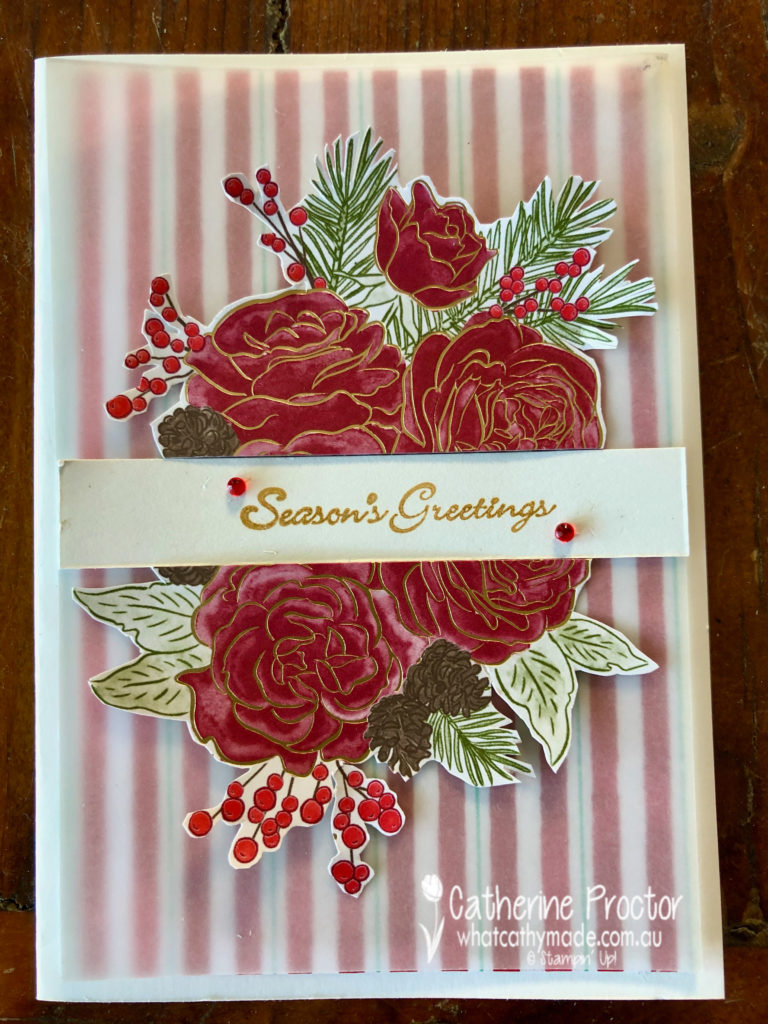
Card three is a Christmas card that uses a piece of Let it Snow DSP, overlaid with vellum. I fussy cut the image from the Christmastime is Here DSP, before cutting it in half to sit either side of the “Seasons Greetings” sentiment from Itty Bitty Christmas stamped in gold.
Red Rhinestones add a touch of bling and cover a smudge of ink!!!!
Card four uses two different patterns from the Christmastime Is Here DSP to make a birthday card that could very easily be used as a Mother’s Day card if I changed the sentiment.
I picked up on the Poppy Parade and the Mossy Meadow colours in the DSP and used my blender pens in these colours to colour in stamped flowers from the Tea Together stamp set. The teapot, cup and saucer were also stamped from this set and then all cut out using the matching dies.
The happy birthday sentiment is from the Itty bitty Birthdays stamp set die cut out with my stitched rectangle dies.
My final card is another one I shared with you last week and perhaps the most traditional of the lot – a Merry Christmas card.
I simply die cut out the image from the DSP , using the same die that I used to cut out my stamped rose in the other cards. Very quick and super easy.
The lovely Judy May is hosting our Heart of Christmas blog hop this week – to see what the rest of the team have made this week you can visit Claire’s page here.
To purchase any of the products I used in this project you can shop with me here.
If you’d like me to post you your very own copy of the brand new 2019 Stampin Up! Holiday Catalogue, the 2019-20 Stampin Up! annual catalogue or to simply find out about more about Stampin’ Up! contact me.
Welcome to week 11 of our Art With Heart, Heart of Christmas blog hop.
I have a confession to make.
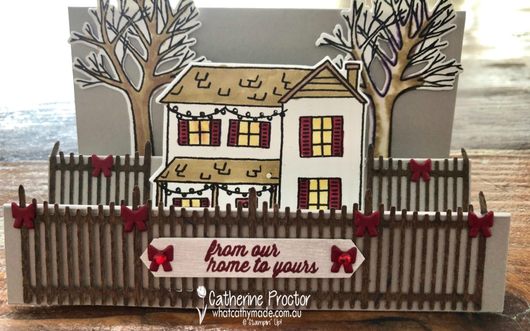
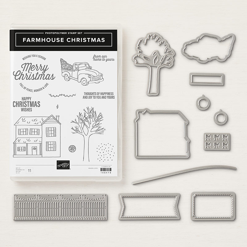
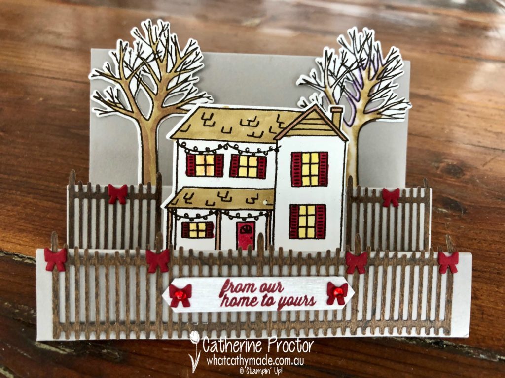
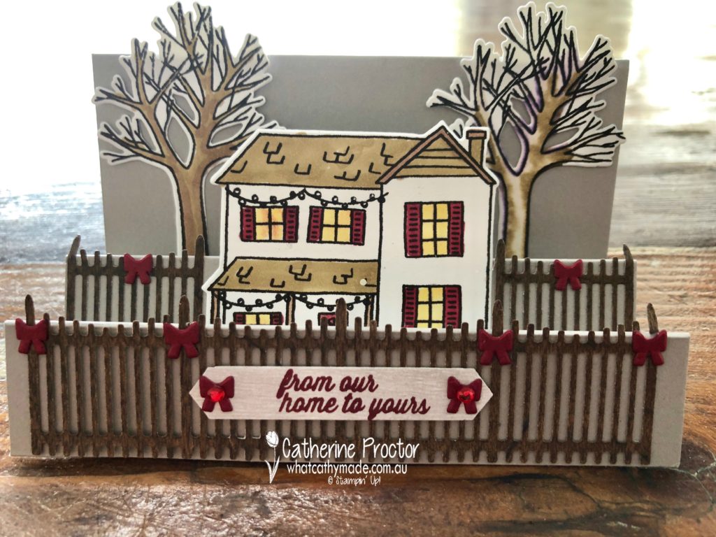
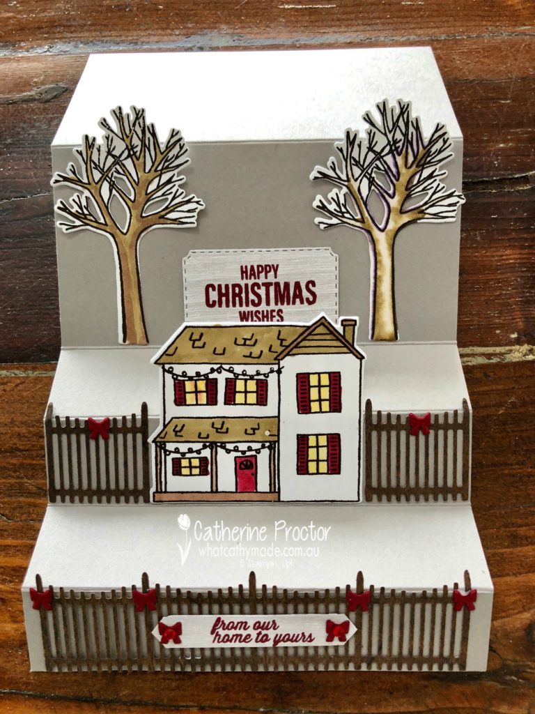
I bought the Farmhouse Christmas bundle simply to get the picket fence, the teeny tiny string of lights and the teeny tiny bow dies. But now that I’ve had a play with this set, I’ve fallen in love with every stamp and die in this bundle. It’s just so cute!
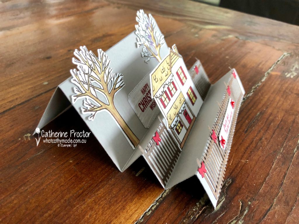
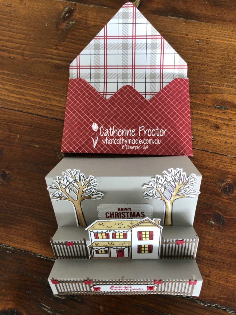
I’ve seen a few Z fold cards made with this set but I haven’t seen any step cards so I decided to make one for my project this week. If you haven’t seen a step card before, here’s a side on view to show you what I’m talking about.
Step cards come in so many different variations (just Google it and you’ll see what I mean) but the type I’ve made with the Farmhouse Christmas bundle is very simple and so easy to make. The measurements for my card are as follows. Begin with a piece of cardstock (I used Gray Granite) measuring 8 1/2 x 4 3/4 inches. Score and fold at 1″, 2″, 3″, 4″ and 6 3/8″.
At this point, I need to insert a little disclaimer. I stamped my house and trees using Early Espresso ink and then used my Stampin’ Up! blends to colour them in, but on the tree where I used my colour lifter blender pen it comes up with a purple hue in my photos!
In real life, you don’t even notice this but if this worries you and you don’t want that purple hue on your card don’t use the colour lifter pen when colouring in.
Here’s a photo of the card stretched out so you can see how I’ve laid out the stamps and the dies on my card.
Step cards are really suited to stamp sets that you can use to create a layered scene. And they are wonderful for the recipient because they stand up beautifully by themselves for display purposes.
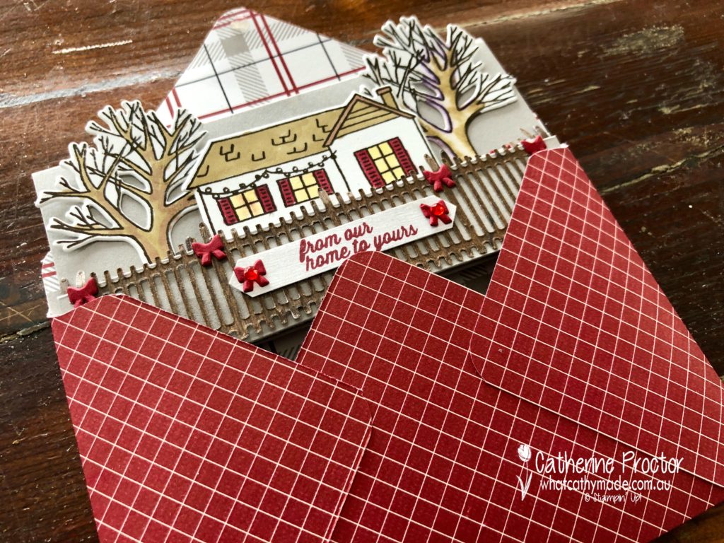
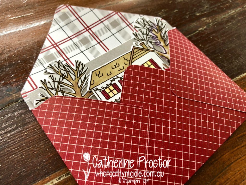
As you can see in the photo above I’ve made an envelope to match my card, using the envelope punch board and the matching Festive Farmhouse DSP. To keep my envelope closed when posting or gifting the card I use a glue dot underneath the back flap.
To see what the rest of the team have made this week hop over to the lovely Claire Daly’s blog.
To purchase any of the products I used in this project you can shop with me here. Or if you’d like me to post you your very own copy of the 2018-2019 annual catalogue or find out about more about Stampin’ Up! contact me.


")

 Scalloped Linen Ribbon")


")
")


")


 Faux Suede Trim")