Welcome to week forty nine of our Art With Heart 2022-23 Colour Creations blog hop. Next week is our last week for the 2022-23 Annual Catalogue before we start again on Wednesday, 3rd May, with five new In colours, four new core colours and seven returning colours!
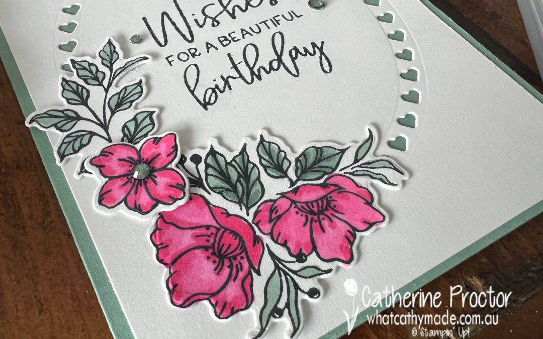
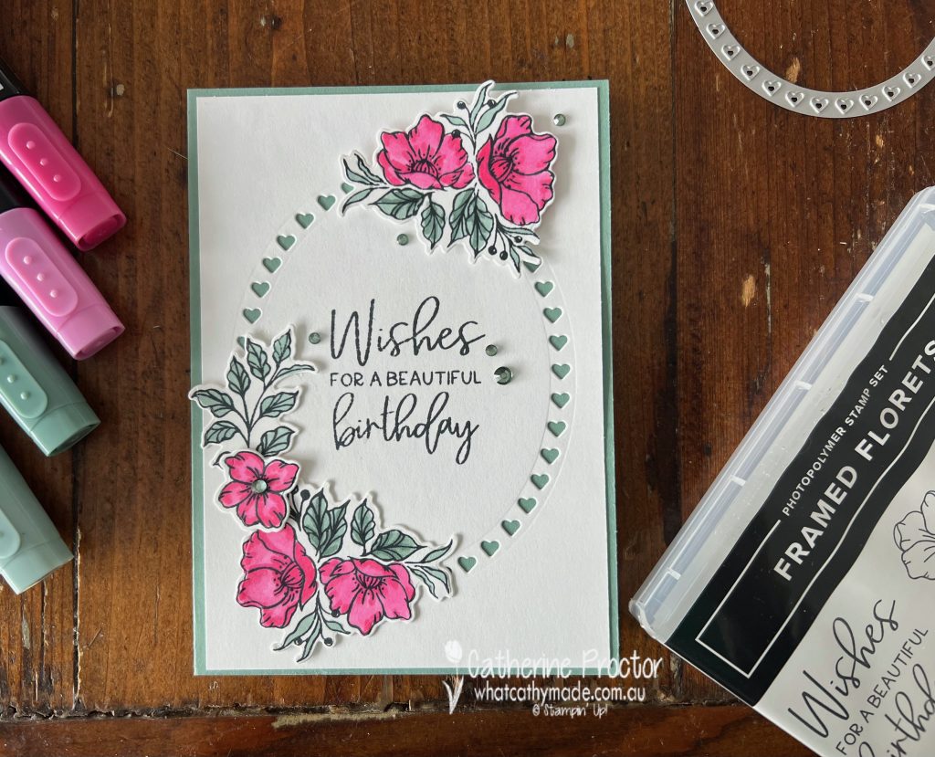
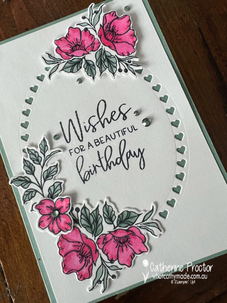
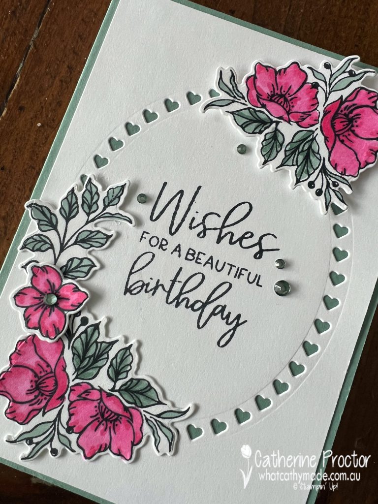
This week we are featuring Soft Succulent, one of the retiring 2021-23 In Colours. I’ve also featured Polished Pink, another retiring 2021-23 In Colour on my card, as well as the retiring Framed Florets stamp set and Framed Florets dies (reduced from $65 to $26).
Unfortunately the beautiful Soft Succulent and Polished Pink Stampin’ Blends! that I used to colour in my stamped images have already sold out!
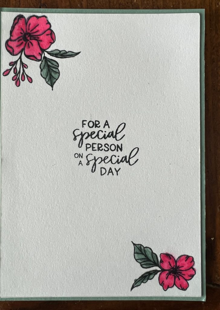
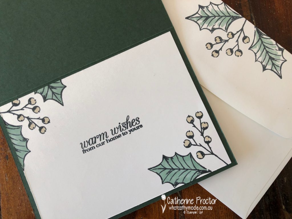
The ‘Wishes for a beautiful birthday’ sentiment is from the Framed Florets stamp set, stamped in Tuxedo Memento Black Ink.
Inside the card I stamped and coloured more floral images and added another sentiment, all from the Framed Florets stamp set.
The sparkly embellishments on the front of the card are Rhinestone Jewels, coloured using my Soft Succulent Stampin;’ Blends.
Now it’s time to hop on over to our next participant, the lovely Rachel Palmieri – I can’t wait to see what Rachel has made this week!
If at any time you find a broken link, you can find the complete list of all participants below.
We’ll be back next Wednesday, April 26, with our last Colour Creations blog hop for the 202-23 Annual catalogue, showcasing a retiring core colour from the neutrals family, Soft Suede.
Today I’m sharing another card I made for the “G’day Fri’yay’ Card Making Challenges” Facebook group, a fortnightly Card Making Challenge with Aussie Themes.
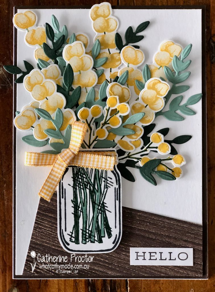
The theme for this challenge is “Spring” and for me nothing announces the start of spring in Australia like wattle does. September 1 is the start of spring as well as Wattle Day, a celebration of our national flower.
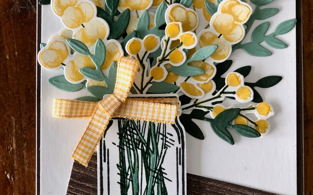
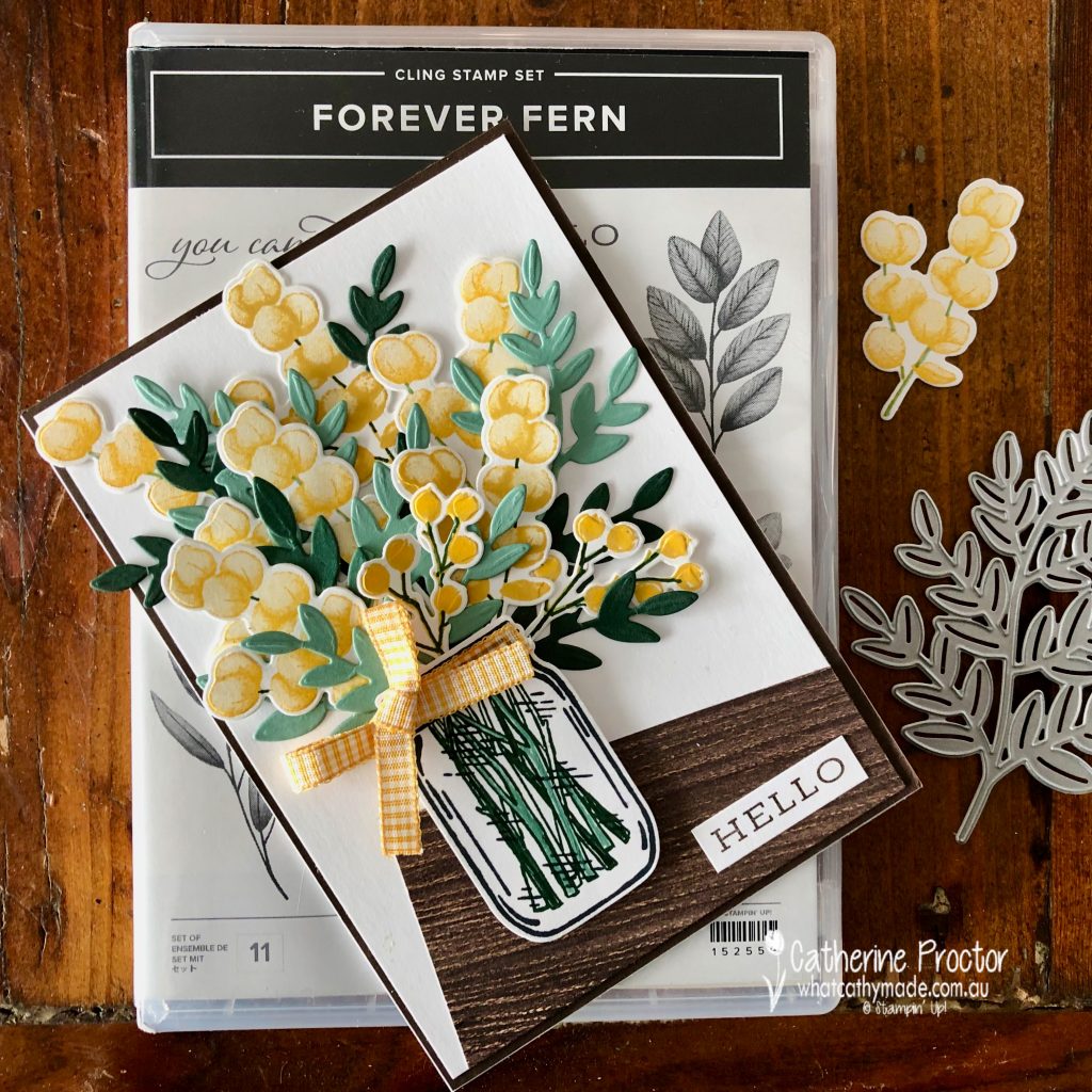
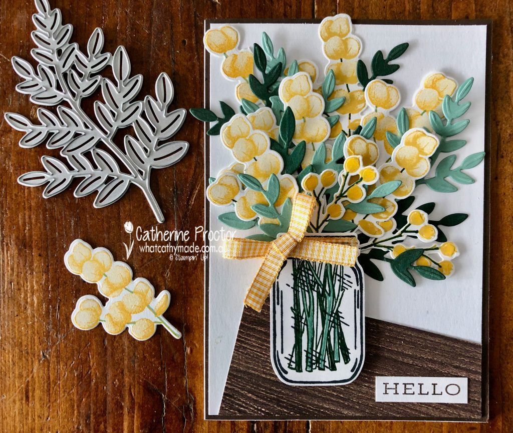
To celebrate the arrival of spring I’ve created a jar of wattle sitting on the edge of a wooden table, using the Forever Fern stamp set, the coordinating Forever Flourishing dies and the Jar of Flowers stamp set with coordinating Jar punch.
Three of the new In Colours (Bumblebee, Soft Succulent and Evening Evergreen) were paired with Daffodil Delight to stamp and die cut my wattle. I love how “Australian” Soft Succulent and Evening Evergreen look when used for foliage.
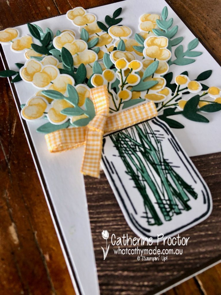
The wattle was all stamped in either Daffodil Delight or Bumblebee and then I used my Soft Succulent and Evening Evergreen markers to draw on the stems of the wattle and turn them from yellow to green. The smaller wattle springs at the front are stamped using the poinsettia petals stamp set.
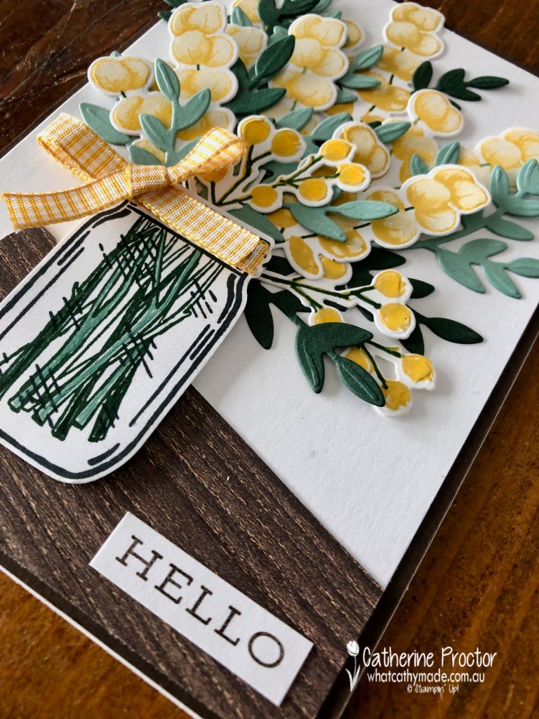
The large fern die was used to die cut all my foliage and then it was simply a case of chopping up the foliage and arranging it with my flowers. I used my Soft Succulent and Evening Evergreen markers to also colour in the stamped stems in the jar – the jar and the stems are from the Jar of Flowers stamp set, punched out with the coordinating jar punch.
The Hello sentiment is also from the Forever Fern stamp set and a bow of Bumblebee gingham ribbon is the finishing touch.
I’ve used a piece of In Good Taste DSP set at an angle to creates the impression of the edge of a wooden table.
Thanks for visiting my blog today. I’ll be back tomorrow on our weekly AWH Colour Creations Showcase – we are showcasing Daffodil Delight this week.
If you live in Australia, you can find and purchase all these products in my Stampin’ Up! Online Store. Don’t forget to use my monthly Host Code (if your order is between $50 – $250) and I will send you a thank you gift the following month. If your order is over $250 don’t use the host code because you will qualify for your own stamping rewards.
My September Host Code is WVX3UYCR and it is valid until midnight September 30.
In the meantime, wherever you are in the world, stay safe, stay calm … and keep on crafting xxx
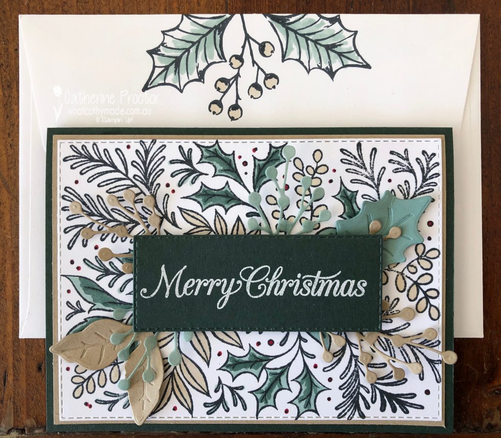
I know it’s only July, but in this house it’s beginning to feel a lot like Christmas!!!
Why, you may ask? Well firstly, it’s Week One of our Heart of Christmas blog hop for 2021, yeah!
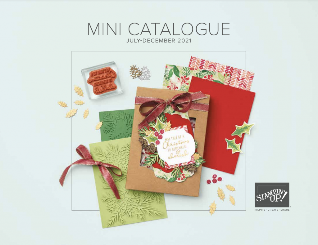
And secondly, as a Stampin’ Up! demonstrator I’ve already got my hands on the brand new July-December mini catalogue, jam packed with lots of beautiful Christmas products! My pre-order will be arriving in the next few days, so watch this space for upcoming sneak peeks. Here’s the cover…
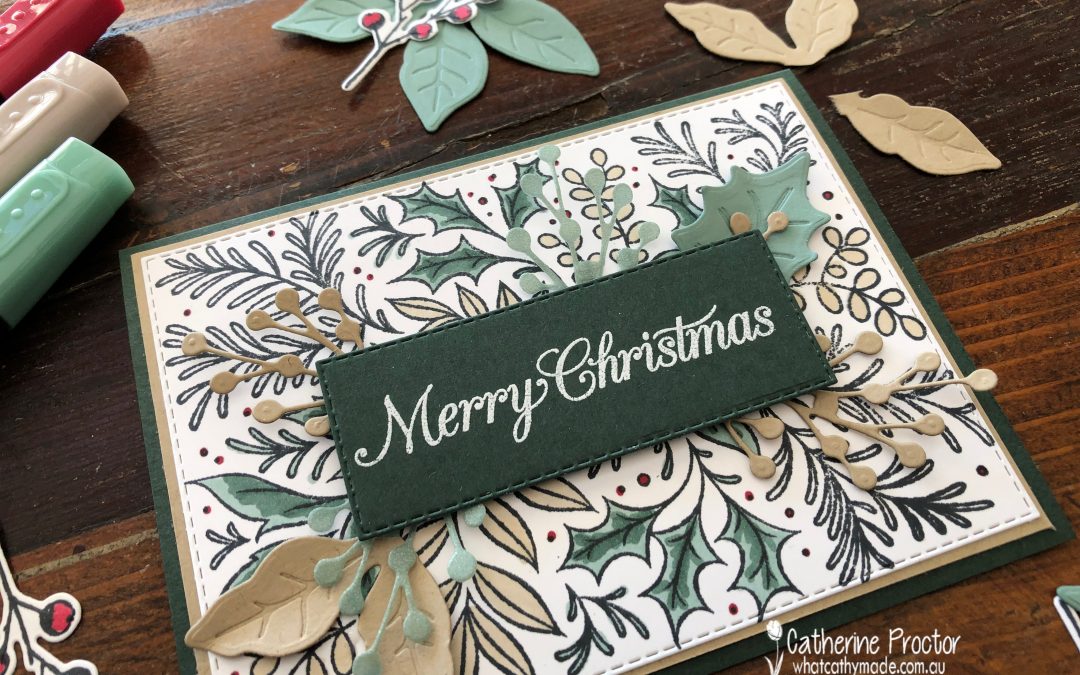
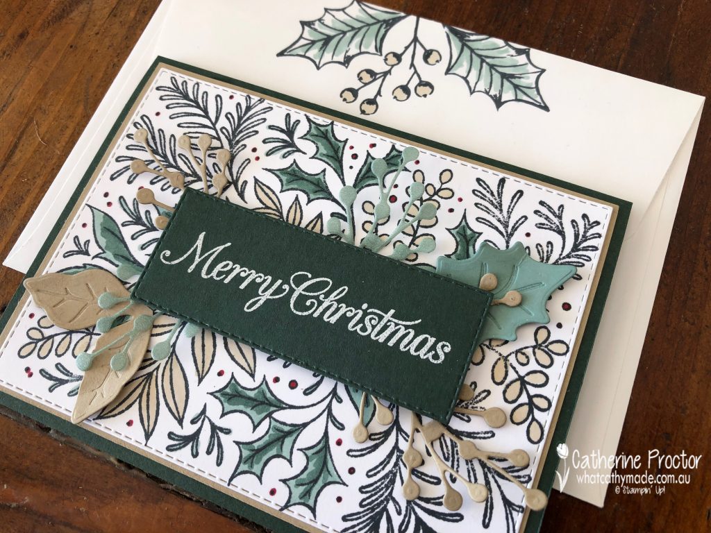
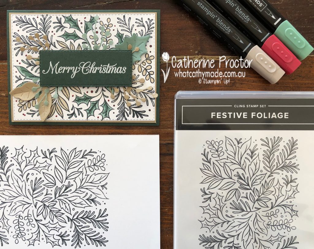
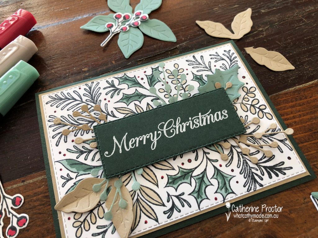
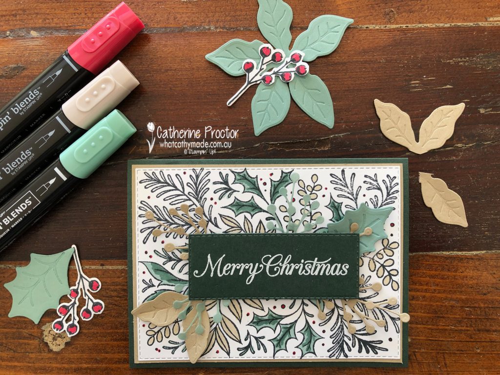
For tonight, I’ve made a card that uses two products you can already get your hands on. Festive Foliage is a brand new background stamp set from the 2021-22 Annual Catalogue (p90) and the Poinsettia Petals Photopolymer Stamp Set (p92) and coordinating Poinsettia dies (p165) which have carried over from last year’s Holiday catalogue.
This Festive Foliage background stamp is a great alternative to using DSP because with a single stamp (I always use my Stamparatus for stamping background stamps) you get a large image that covers an entire layer. You can either stamp this image in any coloured ink and leave it uncoloured OR colour it in with blends, markers, pencils, pastels or even watercolour it using water painters and inks. TIP – don’t forget to use Stayzon ink instead of Memento ink if you are water colouring.
I’ve stamped in Memento and then coloured the image in with Evening Evergreen, Real Red, Crumb Cake and Soft Succulent dark and light Stampin’ Blends.
To add layers, textures and a sentiment to my card, I chose the Poinsettia Petals Photopolymer Stamp Set and coordinating Poinsettia dies as the images and die shapes work so well with the Festive Foliage stamp set.
I’ve die cut flowers and leaves and strategically placed them under the sentiment to add a bit of dimension to the card WITHOUT covering all of the lovely hand coloured background image. Some of the flower petals I used as leaves by tearing them off the main flower.
It’s hard to see in my photos, but I’ve used the new Soft Succulent 2021–2023 In Color Shimmer Vellum for the green sprigs – it adds such a lovely subtle shimmer to my card. This photo from a Annual catalogue gives you a better idea of the shimmer.
Finally, the Poinsettia Petals Photopolymer Stamp Set was perfect for decorating the inside of my card and the back flap of my envelope too.
Now it’s time to hop on over to our next participant, the very talented, Claire Daly.
If you find a broken link or have come to this blog hop from a different entry point, you can view the full list of participants on Sharon Davern’s blog.
To purchase any of the products used in my cards today you can add them to your cart here.
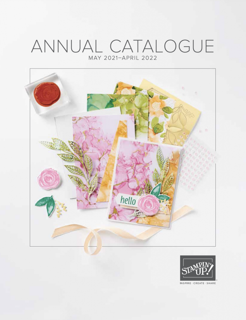
Today I’m sharing a sneak peek of the new Stampin’ Up! InColours for 2021-23. As a Stampin’ Up! demonstrator I get to see the new annual catalogue early and also get to place an order of selected new products.
I can’t show you the inside of the new annual catalogue until it goes live, but I can share the cover with you.
I’ve ordered a copy of the new catalogue to be delivered to my customers so if you buy your Stampin’ Up! products through my online store you’ll be receiving your own copy of the catalogue very soon.
What do you think? Do you have a favourite colour?
Let’s see how each of these new InColors compare to our existing colours.
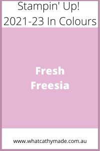
Fresh Freesia
Fresh Freesia is a pinky lilac colour that I think will work really well with bluey pinks and lavenders or purples. It is more of a purple than a pink so I’ve compared it here to the purples, including the retiring Purple Posy, so you can see how it is a pinker purple but still looks amazing with Gorgeous Grape.
Fresh Freesia colour comparison Stampin’ Up 2021-23 In Colours
Yes, Soft Succulent is another “blue green” very similar to Mint Macaron but because it is a muddier green I think I will get a lot of use of this colour when stamping leaves and flowers. Soft Succulent will look amazing with any pink or purple as well as all the browns and greys in the neutrals – here’s how it compares to the other soft blue/greens.
Soft Succulent Colour Comparison Stampin’ Up 2021-23 In Colours
Pale Papaya is a lovely shade of apricot that is at once a pink and an orange. It sits neatly on the apricot/rust colour spectrum between Petal Pink and Calypso Coral and could prove useful as an additional skin tone colour.
Pale Papaya Colour Comparison Stampin’ Up 2021-23 In Colours
Evening Evergreen is a very dark green and like Soft Succulent it will be great for Australian foliage, but I can also see it being used a lot for Christmas or masculine cards – it’s almost another neutral colour so used sparingly it can be incredibly versatile.
Here’s how Evening Evergreen looks compared to the other dark greens.
Evening Evergreen Colour Comparison Stampin’ Up 2021-23 In Colours
Evening Evergreen will look amazing with the other darker neutrals – what do you think of this “tartan inspired” colour combination for masculine cards or Christmas cards?
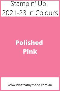
Can a pink be bright and soft at the some time? Polished Pink certainly is and my favourite thing about this colour is that it is a pure, bluish pink with none of the orange undertones of Petal Pink – I think I’ll be “stamping off” or watercolouring this loverly pink a lot to get a light pure shade of pink.
Not as orange as Flirty flamingo, as bright as Magenta Madness or as red as Melon Mambo, Polished Pink is a welcome addition to the Stampin’ Up! range of pinks.
Polished Pink Colour Comparison Stampin' Up 2021-23 In Colours
I love using red and pink together and think Polished Pink will work equally well with softer light tones or a lovely bright colour combination like this one.
I’ll be receiving my pre-order very soon and will be posting some projects using these 2021-23 InColours later this week.
If you’d like me to post you your very own copy of the forthcoming 2021-22 Stampin Up! Annual Catalogue, the January – June 2020 mini catalogue, or to simply find out about more about Stampin’ Up! contact me.
When you shop online in my Stampin’ Up! Online Store don’t forget to use my monthly Host Code (if your order is between $50 – $250) and I will send you a thank you gift the following month. If your order is over $250 don’t use the host code because you will qualify for your own stamping rewards.
My April Host Code is ESWKFC2Y and it is valid until midnight April 31.
Would you like to get a 20% discount on everything you order? Click here to join my team:
Thanks for visiting my blog today. I’ll be back this Wednesday with the AWH Colour Creations Showcase – we are creating projects with Terracotta Tile this week.
In the meantime, wherever you are in the world, stay safe, stay calm…and keep on crafting xxx