Welcome to week thirteen of our 2020-2021 Art With Heart Colour Creations Showcase.
Each week various members of our Art With Heart Colour Creations team will be bringing you weekly colour inspiration as we showcase our range of over 50 beautiful Stampin’ Up! colours in alphabetical order.
Week 13 – Crushed Curry
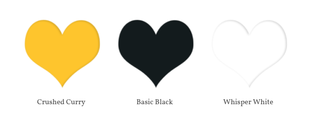
Crushed Curry is part of the regals family and it’s a rich, deep, warm yellow colour…which is why I thought it would be perfect to use with the Celebrate Sunflowers Bundle.
This bundle includes the Celebrate Sunflowers Stamp Set and the Sunflowers Dies but you can buy both the stamp set and the dies separately too.
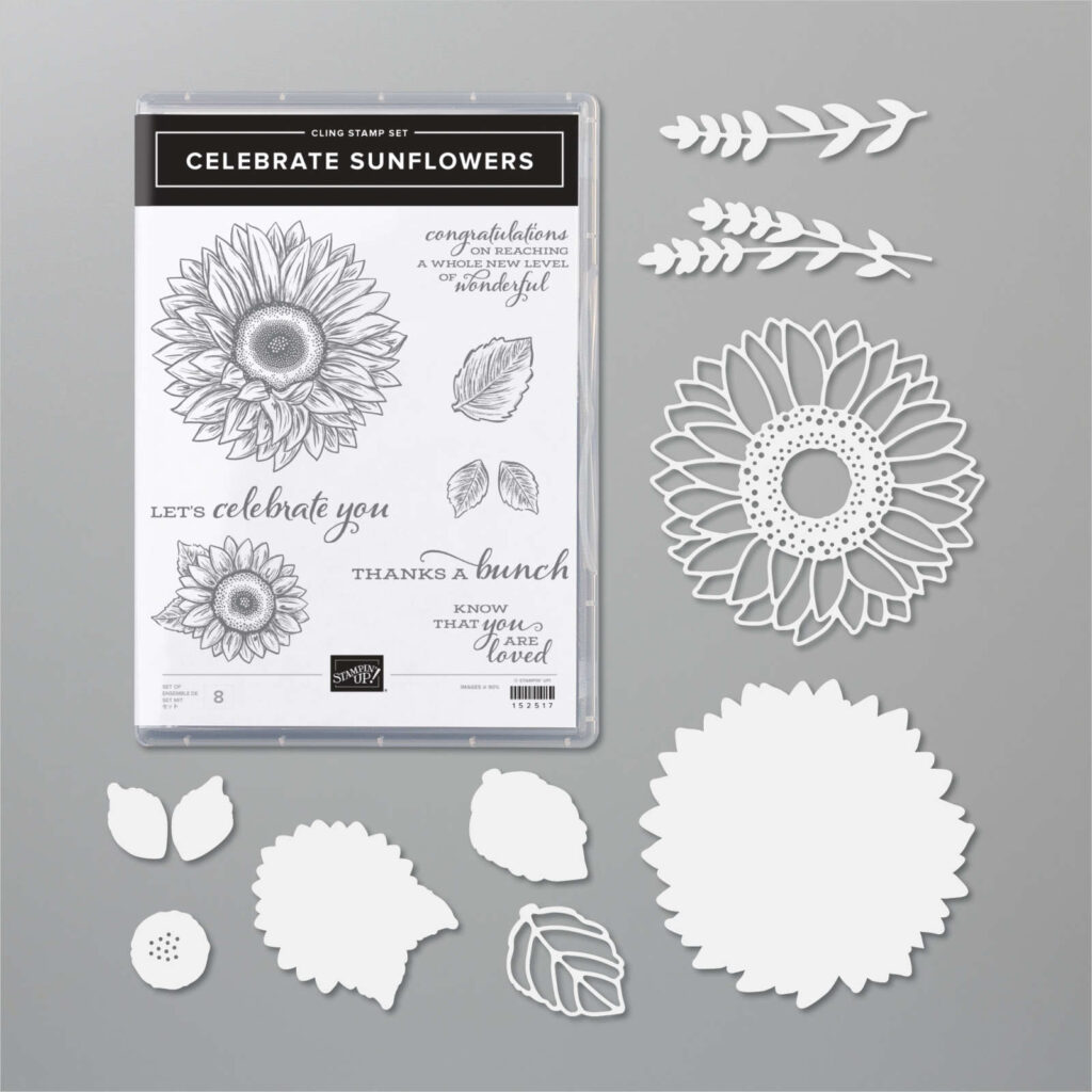
I’ve seen so many different and eye-catching cards made with the sunflower bundle but for my cards tonight I’ve decided to keep to a very simple colour palette. I personally like Crushed Curry best when it’s paired with either black and white. or grey and white.
First things first – colouring in the sunflowers. You can do this in a variety of ways but love water colouring so I stamped in Stazon onto shimmery white card stock and then water coloured using the new Water Painters to lift Crushed Curry ink off the lid of my stamp pad.
Once the sunflowers were water coloured and dried they were die cut with the matching dies.
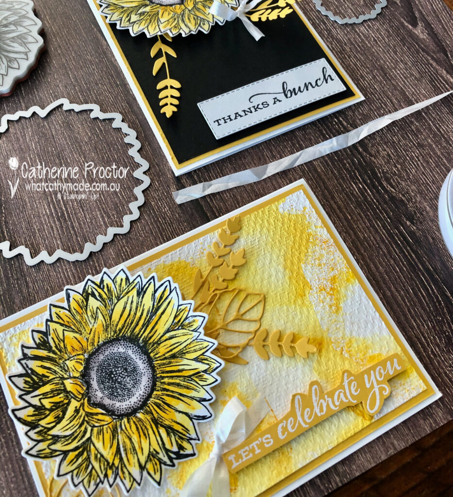
The custom background for my “Let’s Celebrate You” card was created using the side of my Crushed Curry ink pad randomly stamped onto a large acrylic block and then sprayed with water from a Stampin’ Spritzer.
This created a marbled ink effect on the block – I carefully placed the card stock onto the marbled block to transfer the ink to the paper before letting it dry and embossing it with the tasteful textile embossing folder.
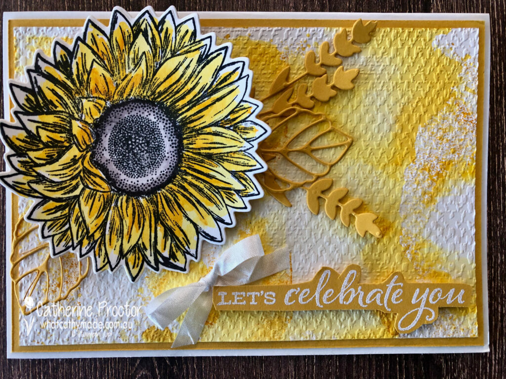
The “Let’s Celebrate You” sentiment was stamped onto Crushed Curry card stock in Versamark Ink before heat embossing with White Emboss powder.
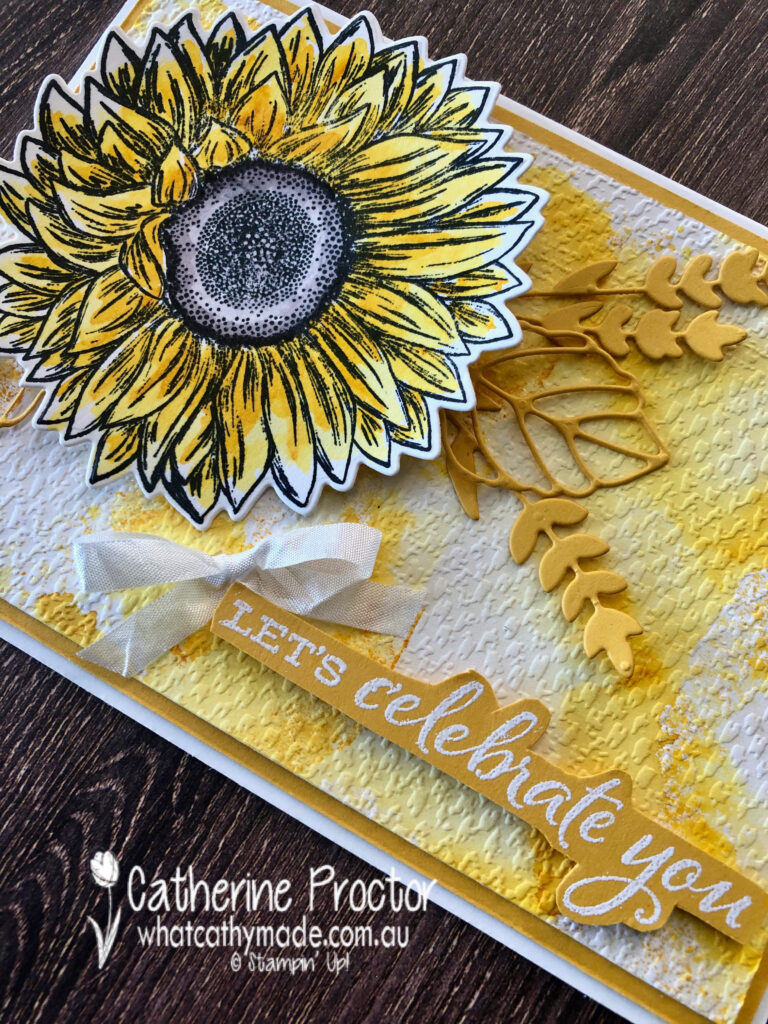
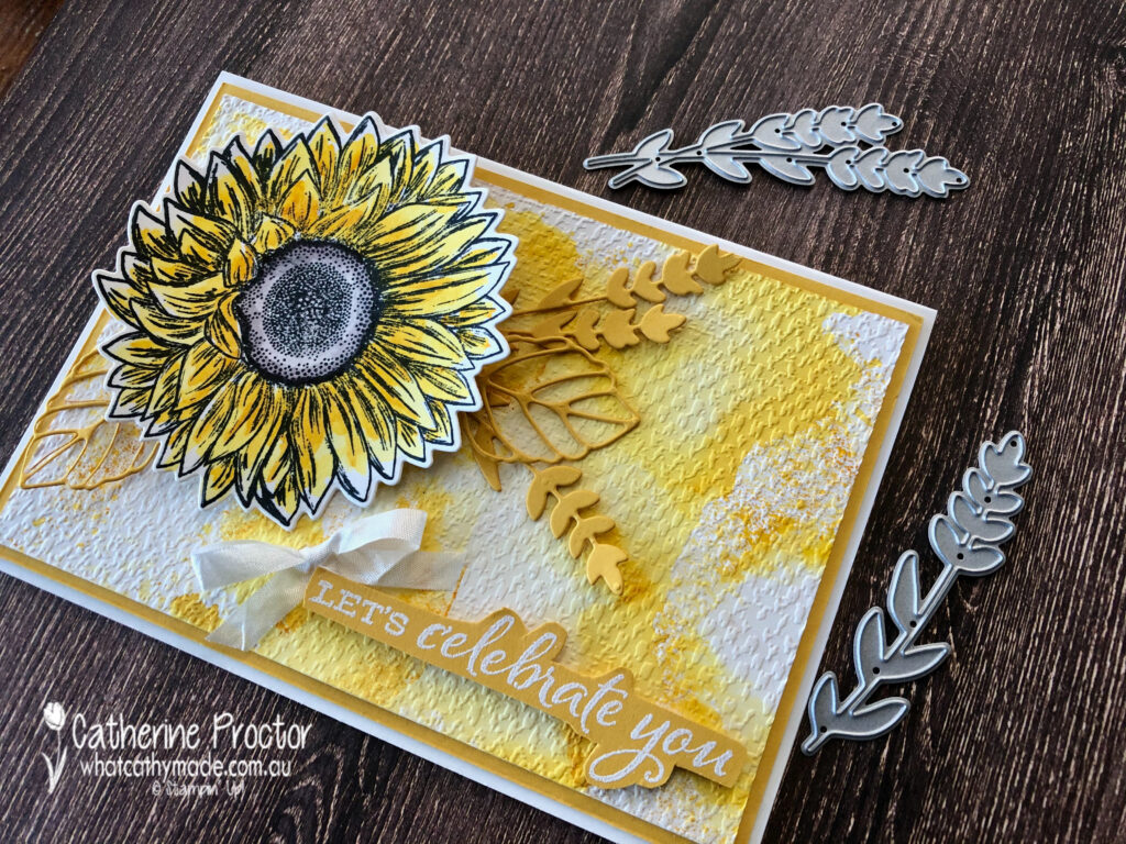
These adorable dies were used to die cut leaves and foliage out of Crushed Curry card stock.
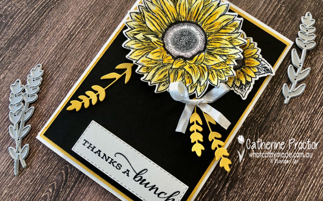
My second card was quickly created to use up my leftover water coloured sunflowers.
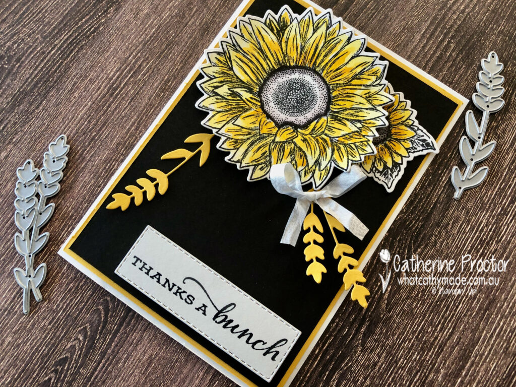
I really love the sentiments in this set, especially the mixed font on this “Thanks a bunch” sentiment.
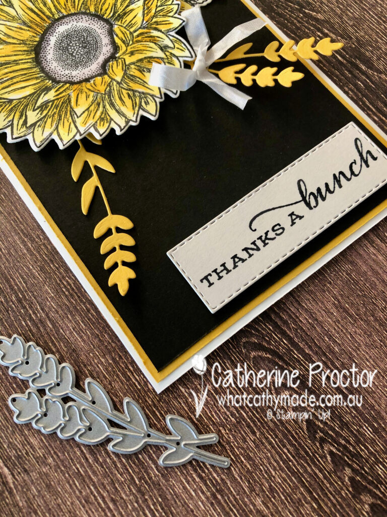
I have to confess I think I actually prefer this card to the first because the Basic Black background layer really makes the sunflowers pop!
Liking my card made from leftovers more than the original card is starting to become a habit with me!
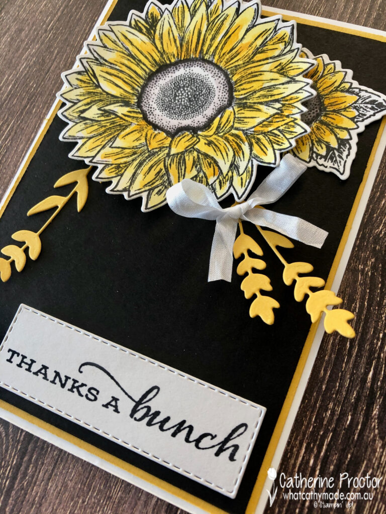
Thanks to the deep vibrant yellow of Crushed Curry, both cards are so bright and happy in real life, but I’m curious to find out which card you prefer?

I can’t wait to see what the rest of the Art With Heart team have created with Crushed curry today. Click on the links below to see what they’ve made.
- Andrea Sargent
- Kate Morgan
- Rachel Woollard
- Fiona Ryan
- Kathryn Ruddick
- Tina Gillespie
- Sharon Davern
- Michele Taylor
- Christine Blain
- Theresa Gerrard
- Caroline Manwaring
- Ros Davidson
- Diane Furniss
- Rachel Palmieri
To purchase the products used in these cards simply click on the links below.
Product ListIf you’d like me to post you your very own copy of the August–December 2020 Mini Catalogue, 2020-21 Stampin Up! Annual Catalogue, the 2020-21 Beginners Brochure, or to simply find out about more about Stampin’ Up! contact me.
In the meantime, wherever you are in the world, stay safe, stay calm…and keep on crafting xxx


Beautiful cards Catherine, I think for me the black background one is my favourite.
Stunning cards but the marbled ink background card, catches my eye the most.
Such bright happy cards but I would have to say my favourite is the one with the water coloured background
I love your watercoloured background, however I do agree with you, that the black does make that stunning sunflower pop right off the card! Both fantastic cards though.
Catherine, I love the watercolour background of the lighter card but the black and crushed curry of the other is just so striking. Hard to choose so I will just sit on the fence and say that I think both of your cards are stunning.
I think I first need to say “SNAP” and “great minds think alike”. I love both your cards Cathy. I love your watercolour background and the water-coloured sunflowers. The sunflower on your second card really does stand out on the black background. Stunning. xxx
Your ink smooshed background looks amazing – the added texture really makes it sing! I have to agree with you, though, the black background makes the other sunflower pop right off the card. They are both so beautiful.
Both your cards are stunning and I love how you made the marbled effect on your first card but I must say the black card is very strikingly beautiful! GORGEOUS!
I love your watercolour wash effect background on your first card. One of my favourite colour combo’s is Black, White & Yellow, and I am tending to agree with you that the black background really makes the sunflowers pop. I like your 2nd card better.
I love the watercoloured background best, but sunflowers are always winners!
Both cards are beautiful Cathy, but the black background is my favourite
Both of your cards are gorgeous Catherine, but I have to say your second card with the black card stock layer is simply stunning!
Beautiful cards, Cathy, using a classic, elegant, colour combination. I especially love the “marbled” effect on the white background of your first card – gorgeous!