Welcome to week eighteen of our 2020-2021 Art With Heart Colour Creations Showcase.
Each week various members of our Art With Heart Colour Creations team will be bringing you weekly colour inspiration as we showcase our range of over 50 beautiful Stampin’ Up! colours in alphabetical order.
Week 18 – Gorgeous Grape
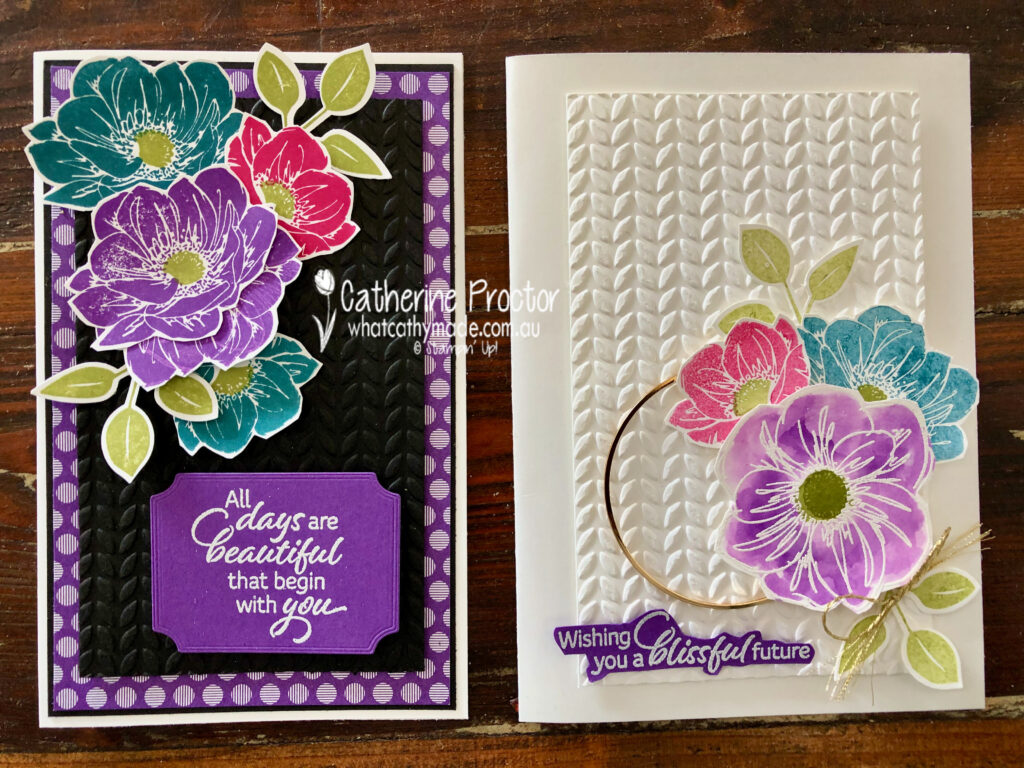
Gorgeous Grape is indeed a gorgeous colour, but I have to admit I do sometimes feel intimidated by the bright colours. This is why I decided to create my first card card using water colouring and stamping off to reduce the intensity of the colours.
My colour palette for this week combines Gorgeous Grape with other bright and vibrant colours: Pretty Peacock, Melon Mambo, Old Olive and Whisper White.

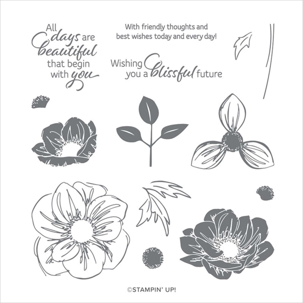
I’ve used the Floral Essence stamp set for my card, along with the greenery embossing folder. But because the largest floral stamp in this set is an outline stamp and the two smaller flowers are solid colour stamps, I stamped the largest flower outline stamp in versamark ink before adding white emboss powder and heat embossing it. This technique allowed all the flowers on this card to be a single colour without any black outline.
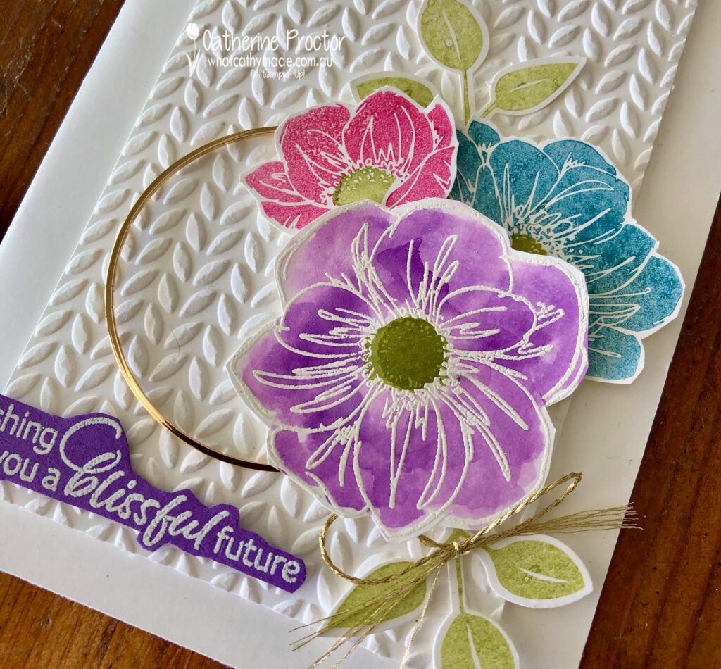
I used my water painter to watercolour the largest flower with ink from my Gorgeous Grape inkpad, using Old Olive for the centre of the flower.
The other flowers were stamped off once in Pretty Peacock and Melon Mambo, the leaves in Old Olive, before fussy cutting them all out.
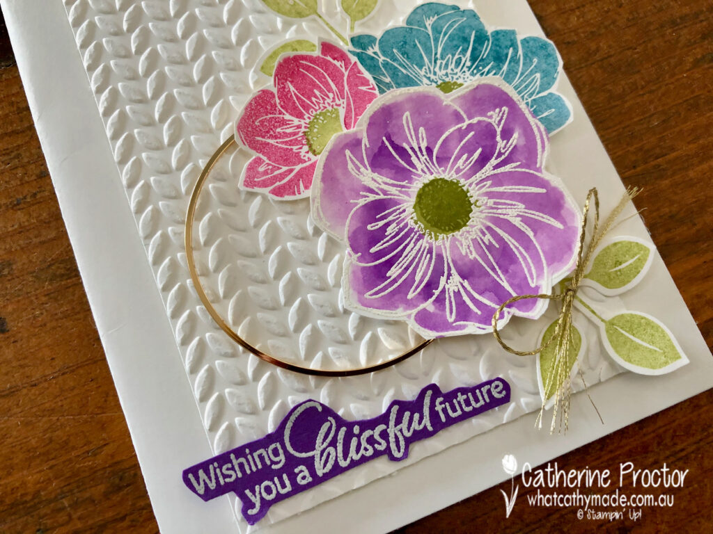
The sentiment is also from the Floral Essence stamp set, stamped onto Gorgeous Grape card stock in versamark ink before adding white emboss powder and heat embossing it.
The Gold Hoop embellishment and gold twine bow are the final touch to add some sparkle and bling to my card.
After making my first card I decided to be brave and bold and use these colours at full strength — I know, shock, horror, right???!!!
But how gorgeous indeed do these vibrant colours look against Basic Black!
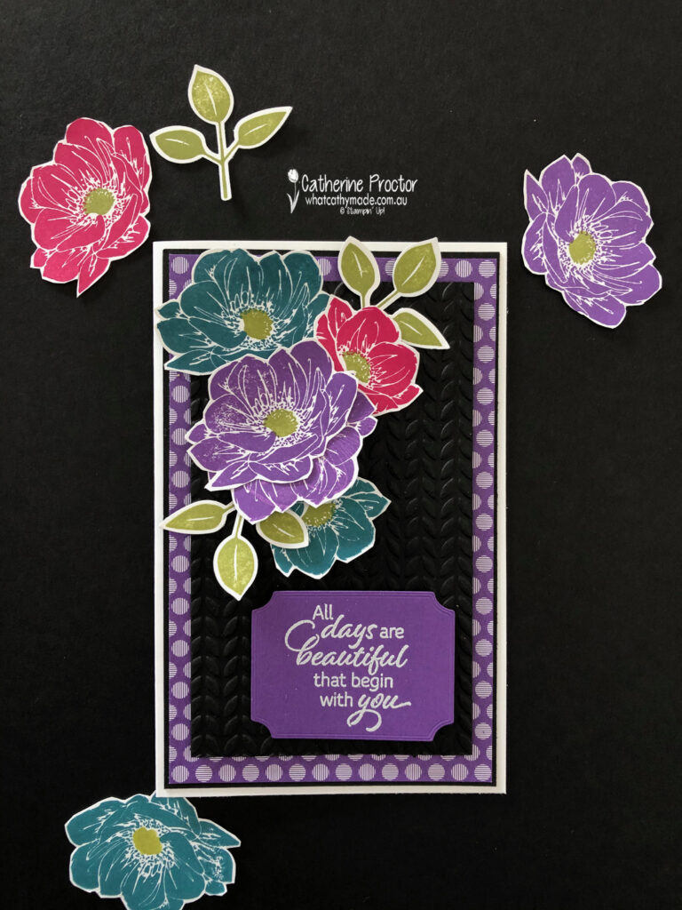
I used Basic Black instead of Whisper White for my embossed layer – I love the contrast of Basic Black against strong colours. It really makes them pop!
The Gorgeous Grape flower is created using two of the same flowers, layered on top of each other, curled up with a bone folder and adhered using glue dots. The spotted patterned paper layer is from the Brights 6×6 Designer Series Paper.
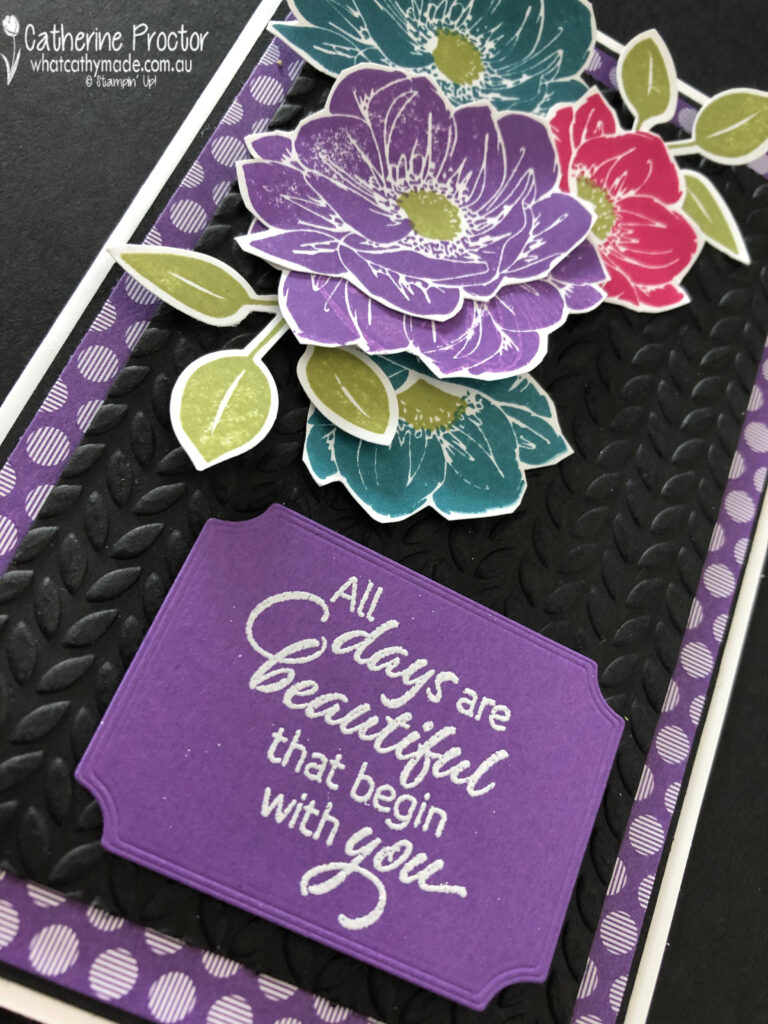
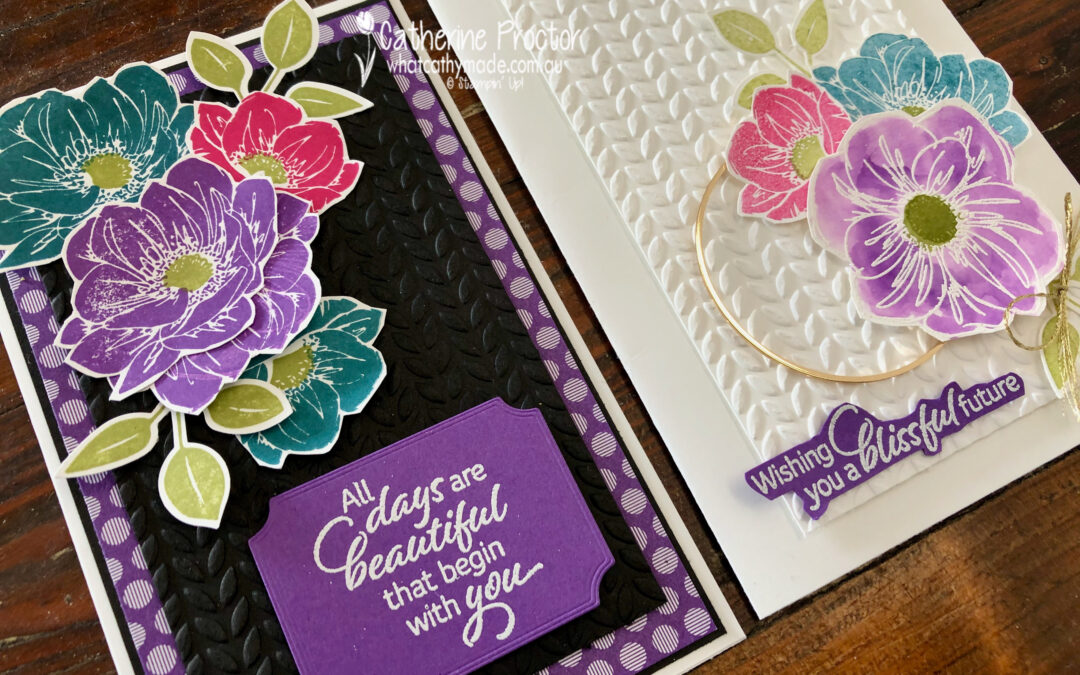
I’m so glad I used these colours at full strength because I think I actually prefer my second card!
I can’t wait to see what the rest of the Art With Heart team have created with Gorgeous Grape.
Click on the links below to see what they’ve made.
- Michele Taylor
- Kathryn Ruddick
- Kate Morgan
- Andrea Sargent
- Vicki Boucher
- Theresa Gerrard
- Rachel Woollard
- Tina Gillespie
- Fiona Ryan
- Rachel Palmieri
- Christine Blain
- Diane Furniss
- Sue Madex
- Ros Davidson
- Caroline Manwaring
- Sharon Davern
Next Tuesday we’ll be showcasing one of the Brights: Granny Apple Green. We hope you can join us all then.
To purchase any of the products featured in today’s post, simply click on the product links below.
Product ListIf you’d like me to post you your very own copy of the August–December 2020 Mini Catalogue, 2020-21 Stampin Up! Annual Catalogue, the 2020-21 Beginners Brochure, or to simply find out about more about Stampin’ Up! contact me.
In the meantime, wherever you are in the world, stay safe, stay calm…and keep on crafting xxx


I’m with you – I love the bold colours on the black background. They pop so much! You were very clever to heat emboss the first flower though, that’s the kind of matchy-matchy that I like!
It’s a bold colour combo but one that works beautifully especially on the white and the addition of the gold hoop finishes it off beautifully. Your water colouring is lovely as well
Love the colour combo you’ve used there. Both great cards.
Catherine, your cards are gorgeous! I love the soft and pretty colours on card 1. Gorgeous Grape looks amazing, water coloured. And that black on card 2 is just WOW! I can’t pick a favourite – I love them both! xx
Both of your cards are gorgeous Catherine. Like you, I do think that I like the brighter version slightly better than the watercolored one. The embossed black background really does make the flowers pop.
Oh what gorgeous watercolouring and the addition of the gold hoop sure does look stunning against that white background, but both lovely cards.
I favour the white also, but it’s just my opinion. Great stamp set to use for this colour.
Such gorgeous cards Cathy. Great colour combo. It’s really good seeing them against both the white and the black. Both lovely. Like you I went to watercolouring in an attempt to soften the bright colour – your results look beautiful and are my favourite. xxx
Stunning cards Catherine, I loooove the colour combination.
Those colours really do pop against black, Cathy … but my favourite of your two cards is the one with the white background. Lovely use of a stamp set that I just don’t know what to do with! You’ve showcased Gorgeous Grape beautifully.
Ditto what Christine said 🙂
I DO like how much the bright colours pop against the black, it is a real statement. But I will always favour white on white layers – it’s just so elegant and understated.
Very clever of you to think to white emboss the larger image so your outlines all matched!