Welcome to week forty-five of our Art With Heart 2023-24 Colour Creations blog hop!
Our colour this week is Shaded Spruce, a rich deep blue green from the Regals family. As the Last Chance Products lists for both the The January–April 2024 Mini Catalogue and the 2023–2024 Annual Catalogue have now been released I thought I’d use a stamp set that is soon to be retired but I haven’t inked it up yet!
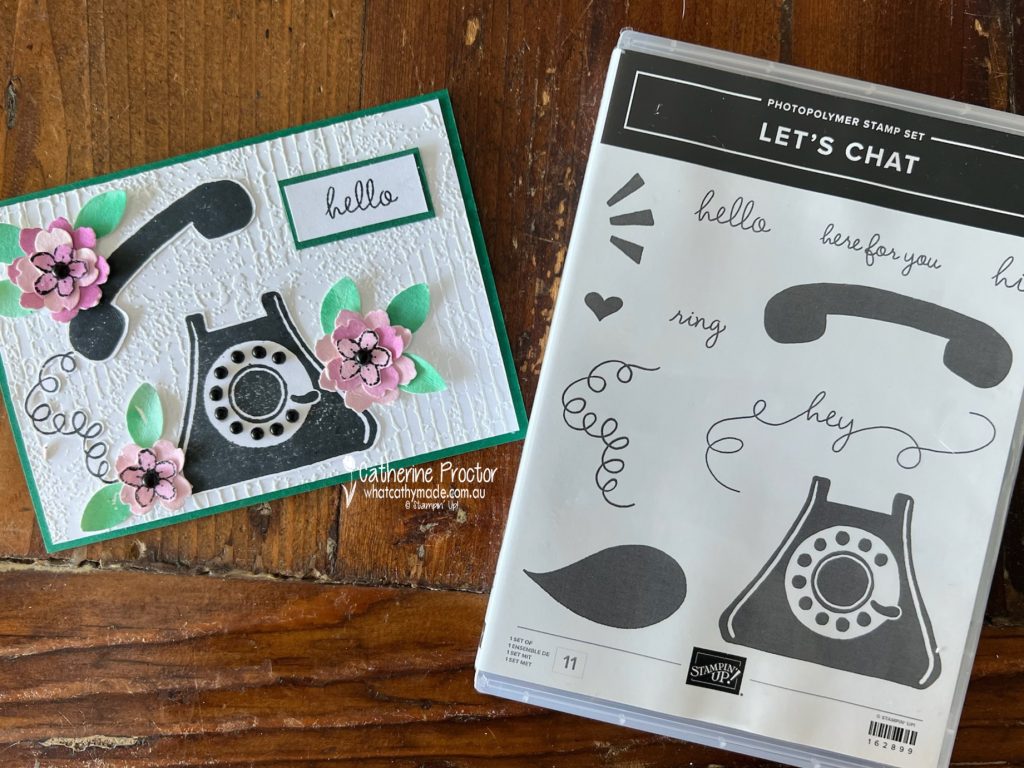
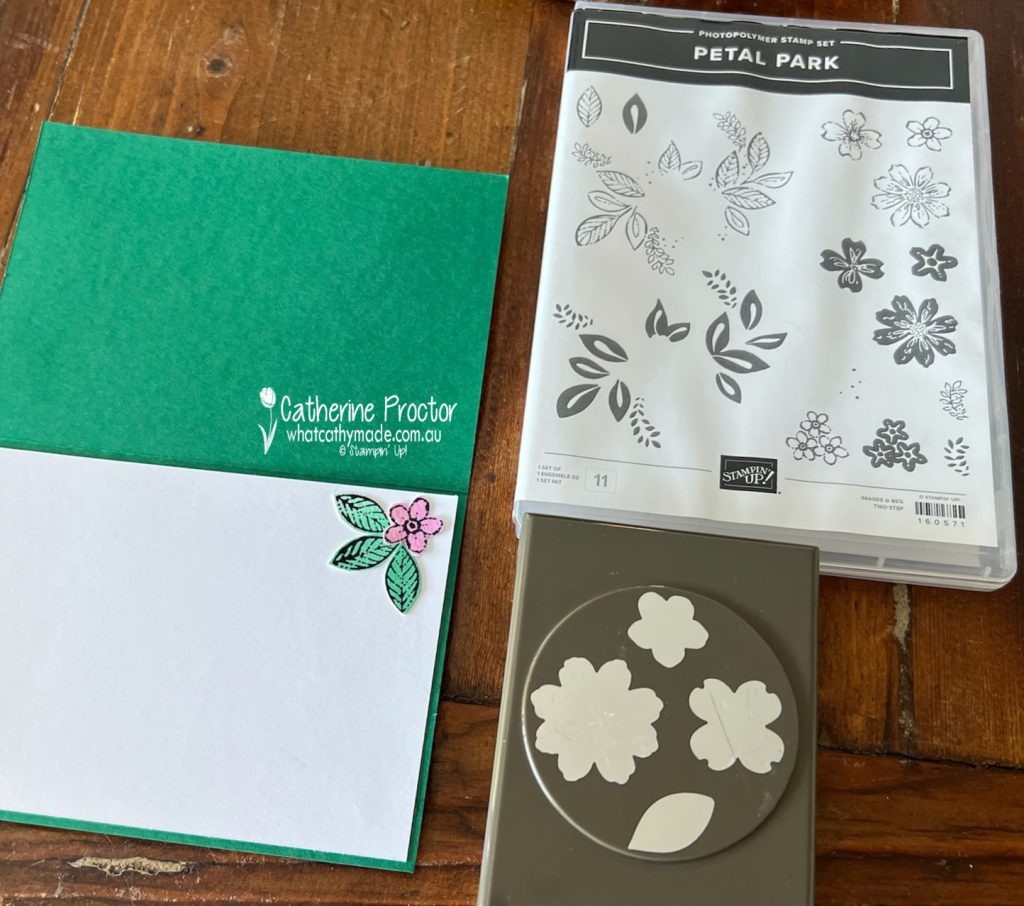
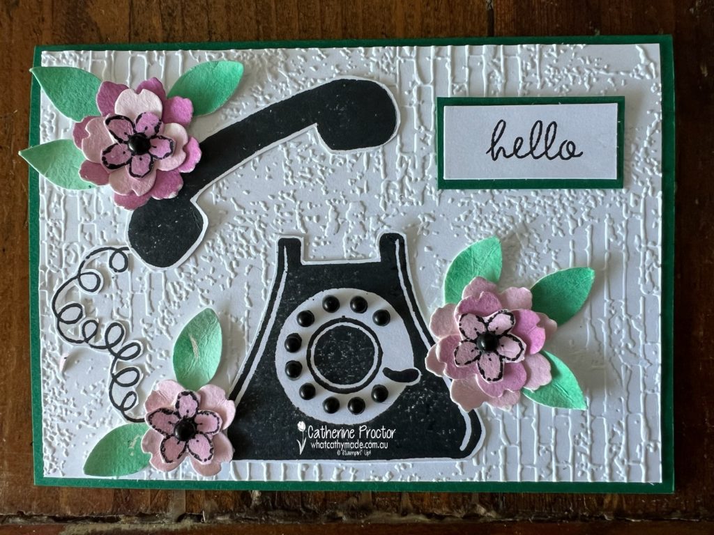
I’ve watercoloured Shaded Spruce and Blackberry Bliss onto Fluid 100 watercolour paper using my water painter to achieve a much softer shade. Once the watercolour paper was dry I punched out flowers and petals using the Petal Park Builder Punch. This punch will be carrying over to the new catalogue, but the stamp set will be retiring.
I love the texture all these layers in the punch give to the flowers!
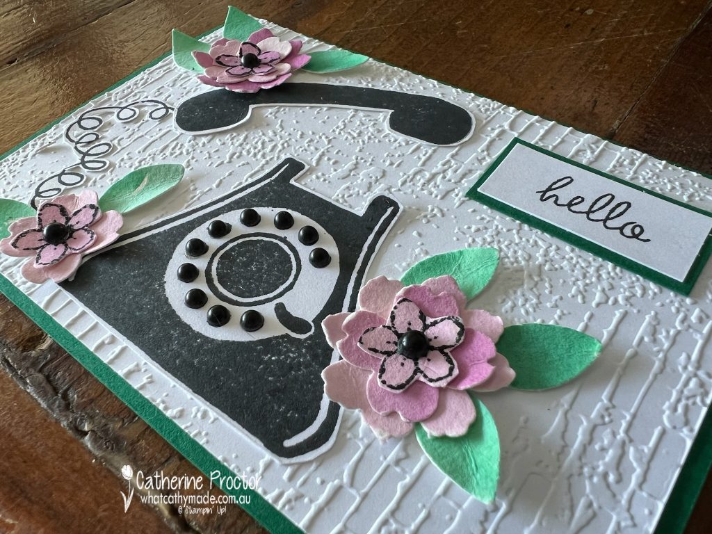
I added Black Classic Matte Dots to centre of the flowers and to the rotary dial on the phone to add even more dimension!
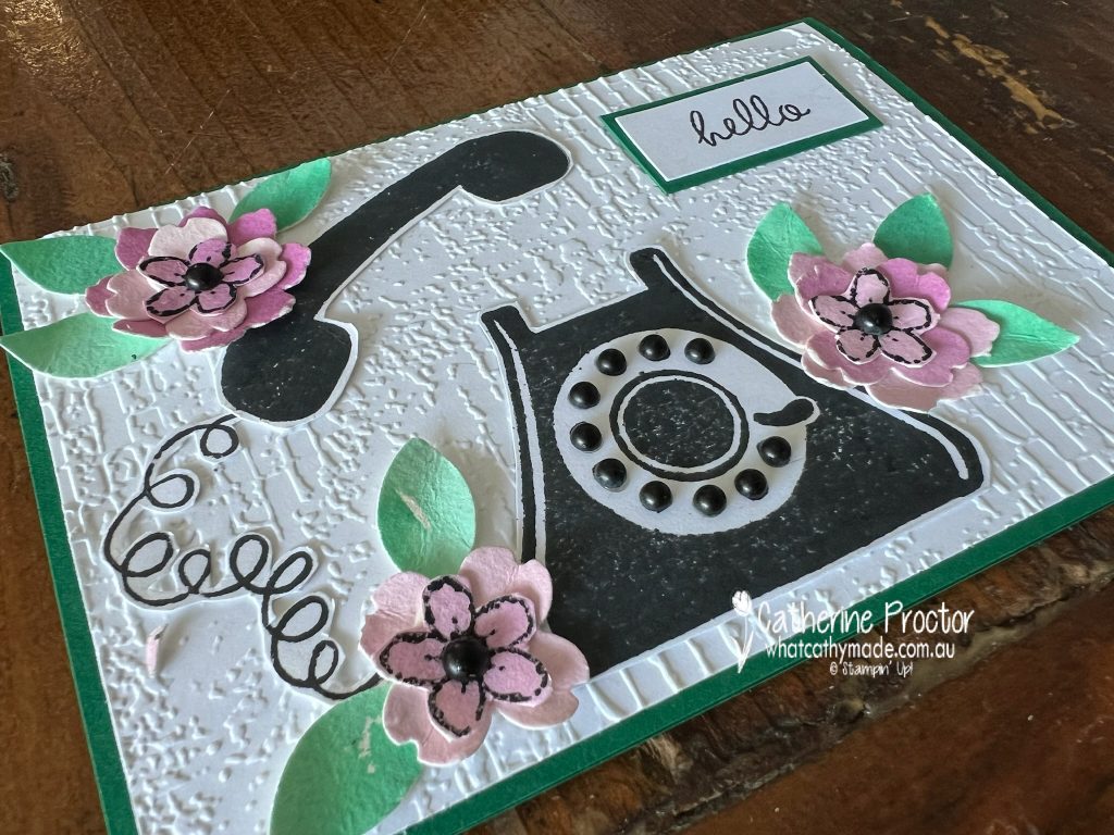
Originally, I was planning on making a vertical card, however I changed my mind after I had adhered my layer of embossed Basic White card stock so the Exposed Brick 3D Embossing Folder is actually the wrong way around, but hopefully no-one will notice, LOL!
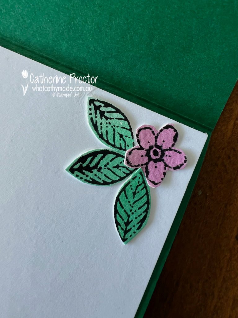
Leftover flowers and leaves decorated the inside of the card.
Now it’s time to hop on over to our next participant, the lovely Rachel Palmieri. I can’t wait to see what Rachel has made this week!

If at any time you find a broken link, you can find the complete list of all participants below.
Catherine Proctor – you are here!
We’ll be back showcasing Smoky Slate next Wednesday, 27th March. I hope you can join us then.
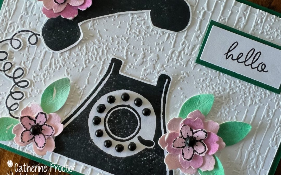
Don’t you hate it when the retiring list comes out and some of the stamps haven’t seen ink? The combination of the retro phone and flowers is a very pretty one though and I’m glad you shared it Cathy.
Cathy I love how you have softened the Shaded Spruce using watercolouring. So much softer. Personally I don’t think the orientation of the Embossing folder matters at all. I love the black dots on the phone too!
The soft watercolouring is beautiful, Cathy, I would never have picked it to be Blackberry Bliss. I just love that phone, maybe it brings back wonderful memories. The black dots add great dimension too!
A gorgeous Hello card Cathy. I adore your black phone surrounded with the beautiful water-coloured flowers. I love the subtle colours you achieved with watercolouring. The black embellished flower centres and the phone dial add special touches too. So beautiful xxx
Cute card Cathy, your water coloured flowers and leaves look great with the black telephone.
I love how you’ve adorned the phone with flowers. They look so pretty in the softer tones of Shaded Spruce and Blackberry Bliss.
The white panel can just be a roughcast wall background, Cath – doesn’t have to be the “wrong” way around! I love the softness of Shaded Spruce watercoloured. So pretty. This is a delightful card, and I really like your generous use of black matte dots!
How cute is that phone against the exposed brick embossed background. The reverse embossed layer just adds more texture! Your watercoloured flowers are lovely and soft. Brilliant use of the black Classic Matte dots for the telephone dial.