I hope you had a good weekend and you’re staying safe and well?
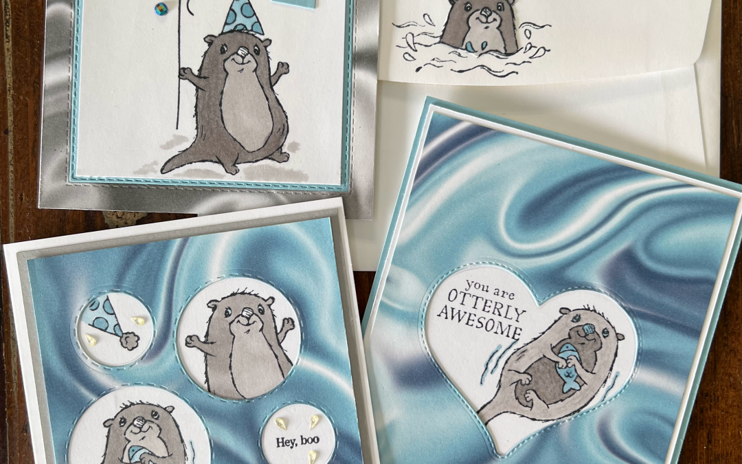
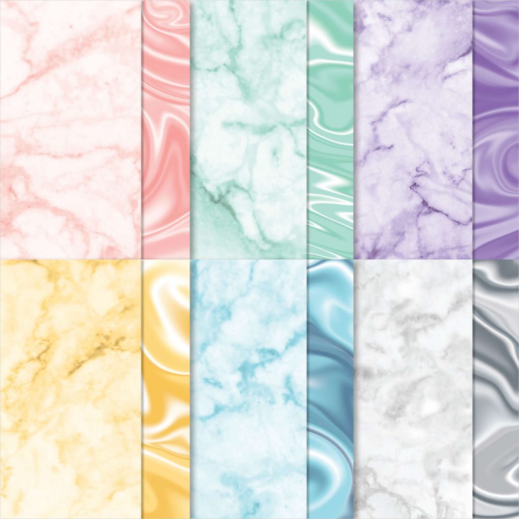
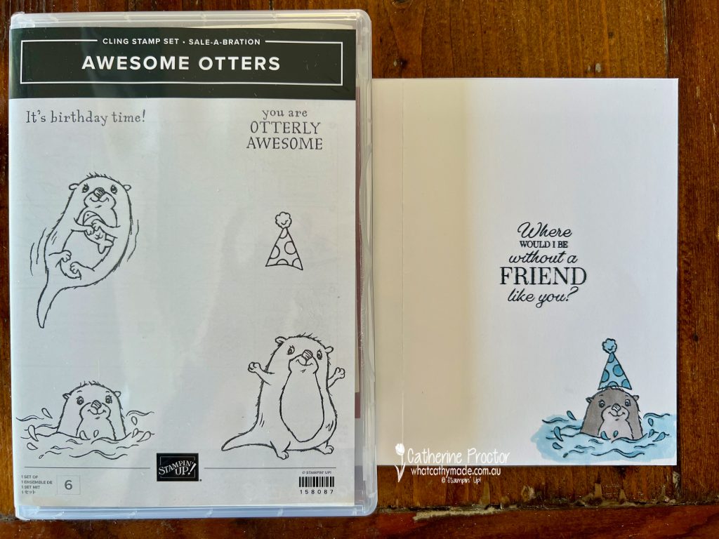
Isolation has given me more time to craft (yay!!) and so I have three more otter cards to share with you using three of the SALE-a-bration products: the Awesome Otters stamp set, the Simply Marbleous Designer Series Paper and the Special Moments stamp set.
Awesome Otters Stampset
Simply Marbelous DSP
Special Moments Stampset
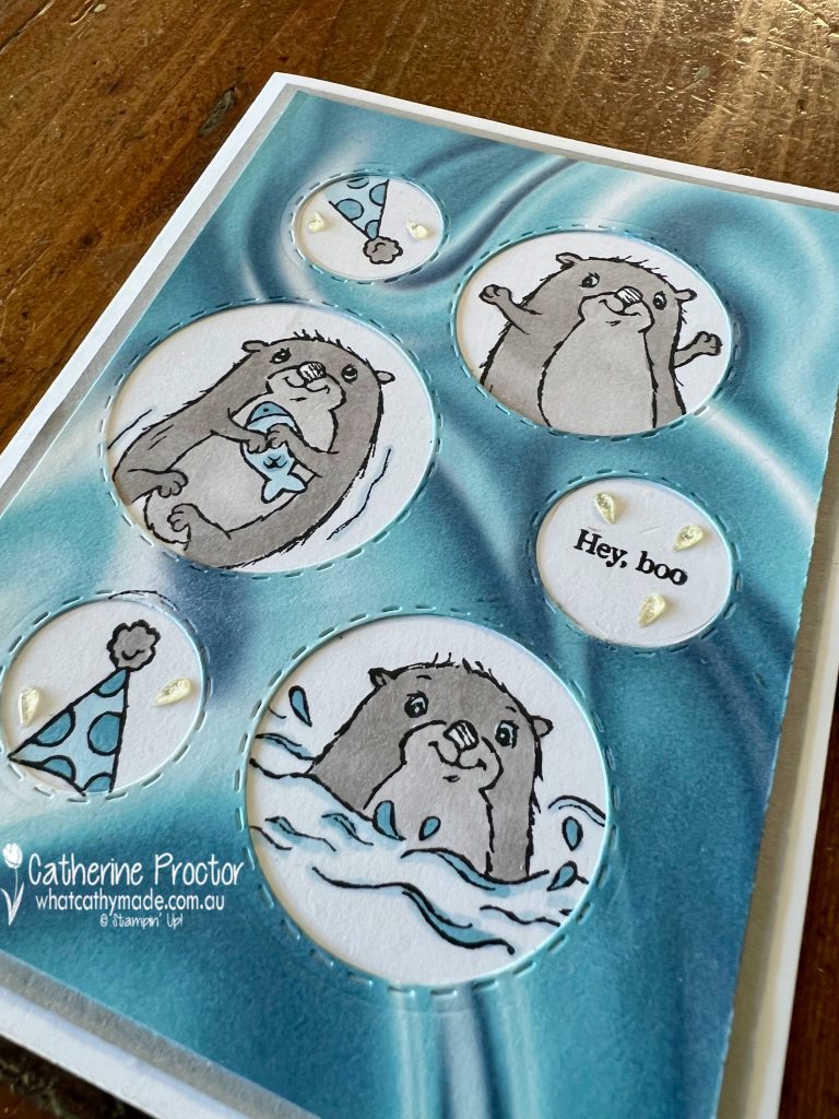
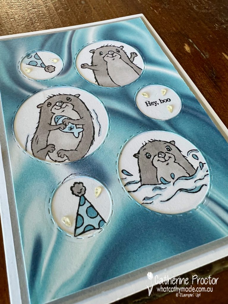
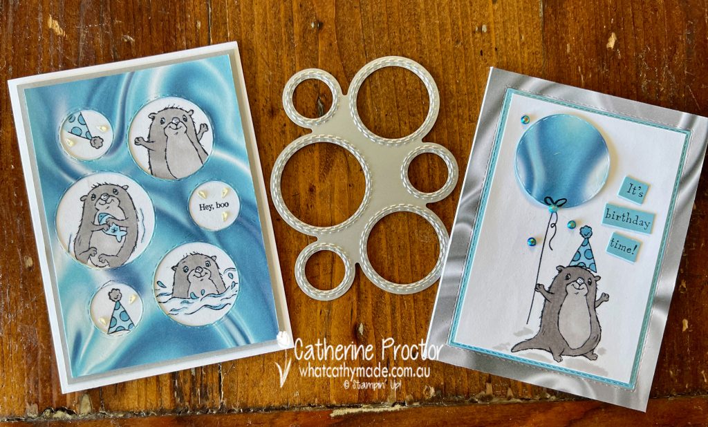
Card one – “Picture This” dies
The round “Picture This” die works so well with the Awesome Otters stamp set – each window frames the otters perfectly! The “Hey Boo” sentiment comes from the Special Moments stamp set.
To ensure my stamping lined up with the die cut circles, I used the die cut as a template, drawing inside each circle with my pencil before stamping. Once everything was stamped, I simply rubbed out the pencil circles, coloured the images using my Stampin’ Blends and adhered the top layer of DSP.
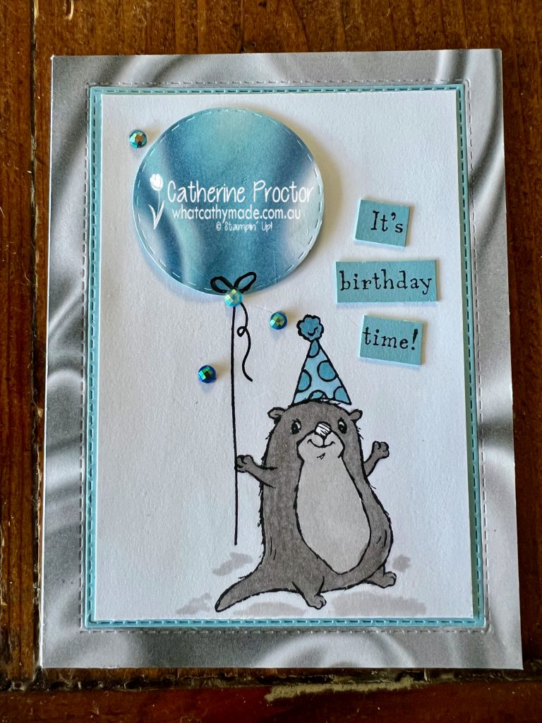
Card two – birthday balloon
Card two uses the largest circle die cut from card one to make a fun birthday balloon.
The Stitched Rectangle dies create an inlay effect that frames the birthday boy perfectly!
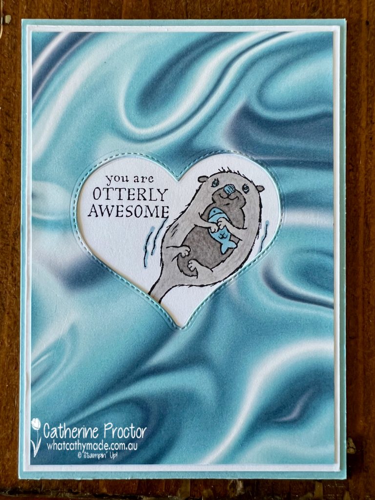
Card three – “Bouquet of Love” hybrid embossing folder.
Card three uses another great die: the largest heart die from the Bouquet of Love Hybrid Embossing Folder.
And of course, I had to stamp the inside of each card as well as the back of the envelopes!
I’ll be back with the Art with Heart Colour Creations team at 8pm (AEST) Wednesday night to showcase Night of Navy.
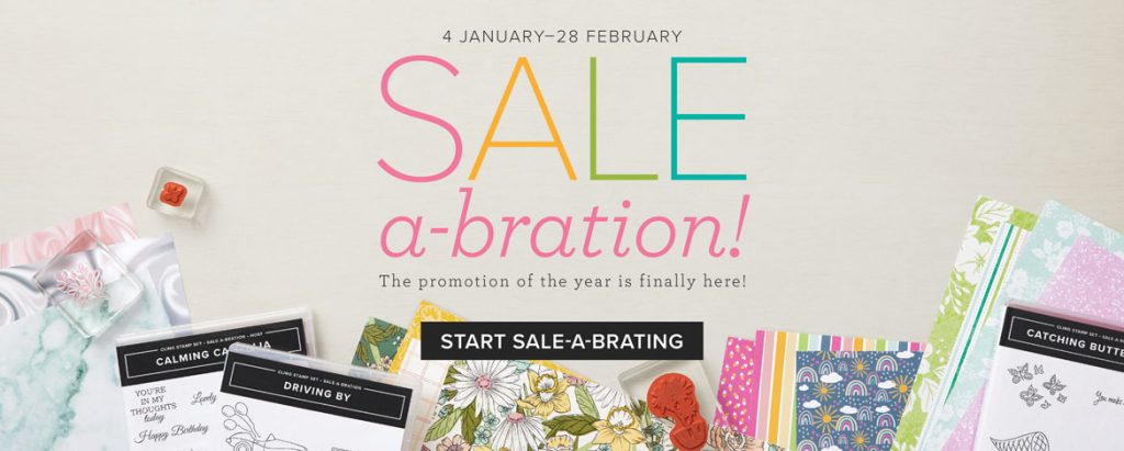
Saleabration goes through until the end of February. During this time, you can earn free products with shopping and there is a great joining deal where you get an extra 2 free stamp sets of YOUR choice, in addition to the already great value starter kit.
All the products I’ve used in this card are available in my online store 24/7 and don’t forget to use my January Host code when placing an order over $50 (January 2022 Host Code is 4EMV7CCW) to receive your FREE embellishments.
Wherever you are in the world, stay safe, stay calm … and keep on crafting xxx
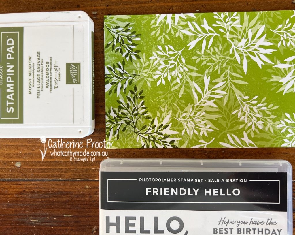
Welcome to week 30 of our 2021-22 Colour Creations blog hop! Tonight we are showcasing Mossy Meadow, a very dark green from the Neutrals family.
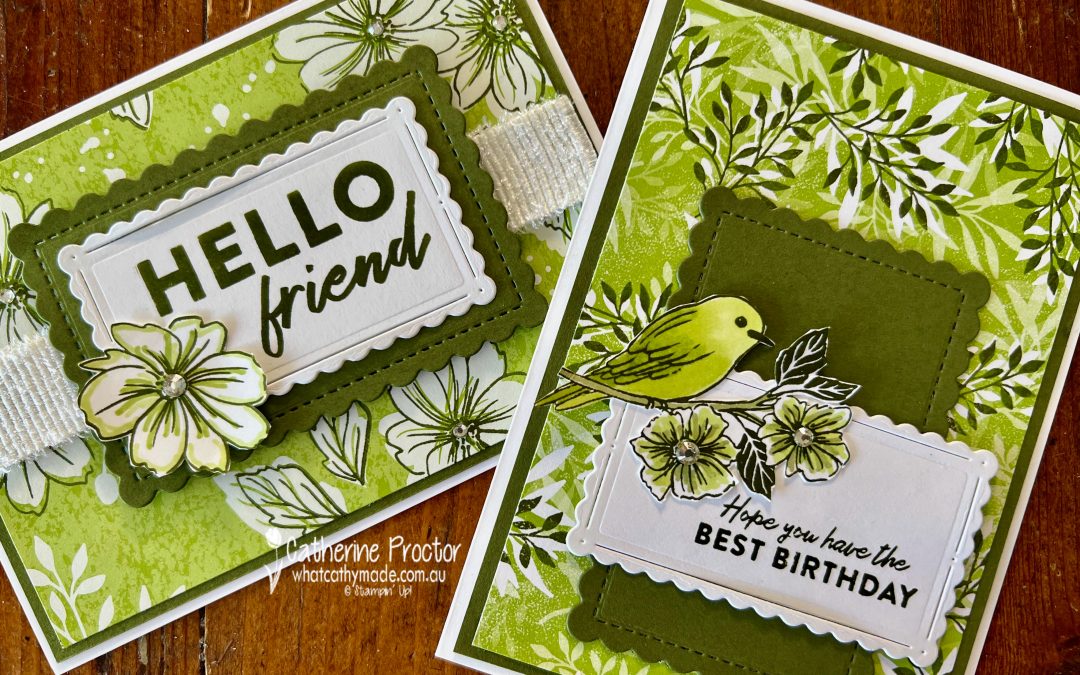
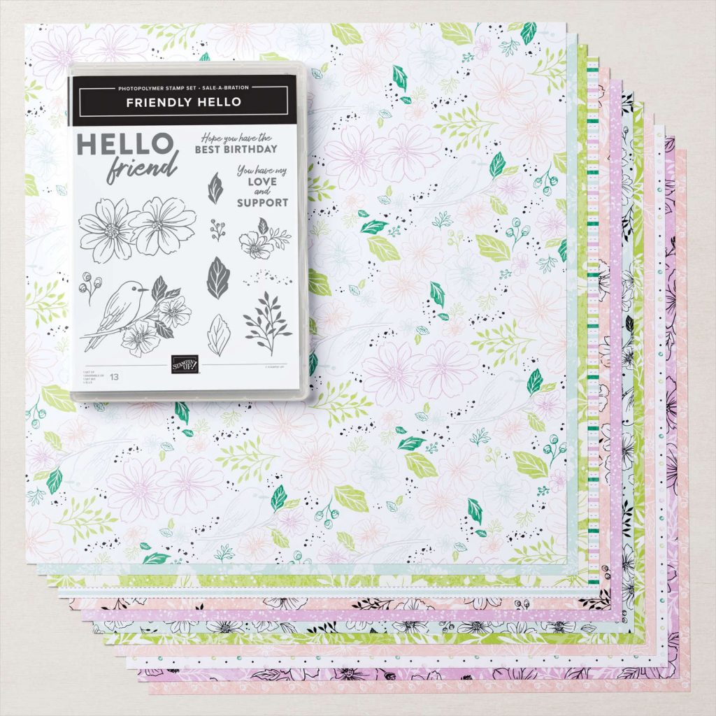
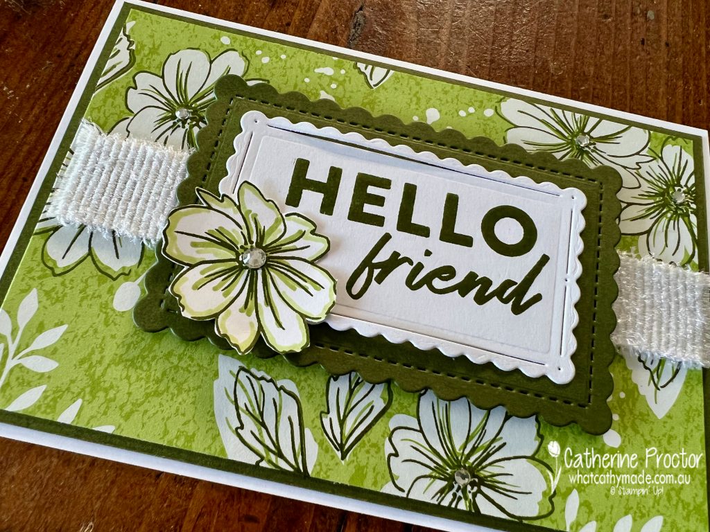
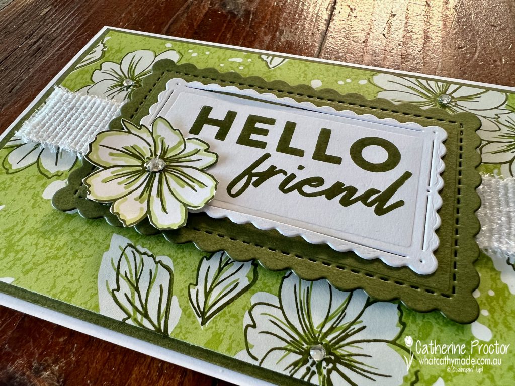
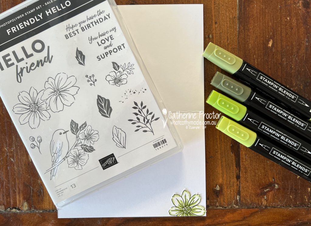
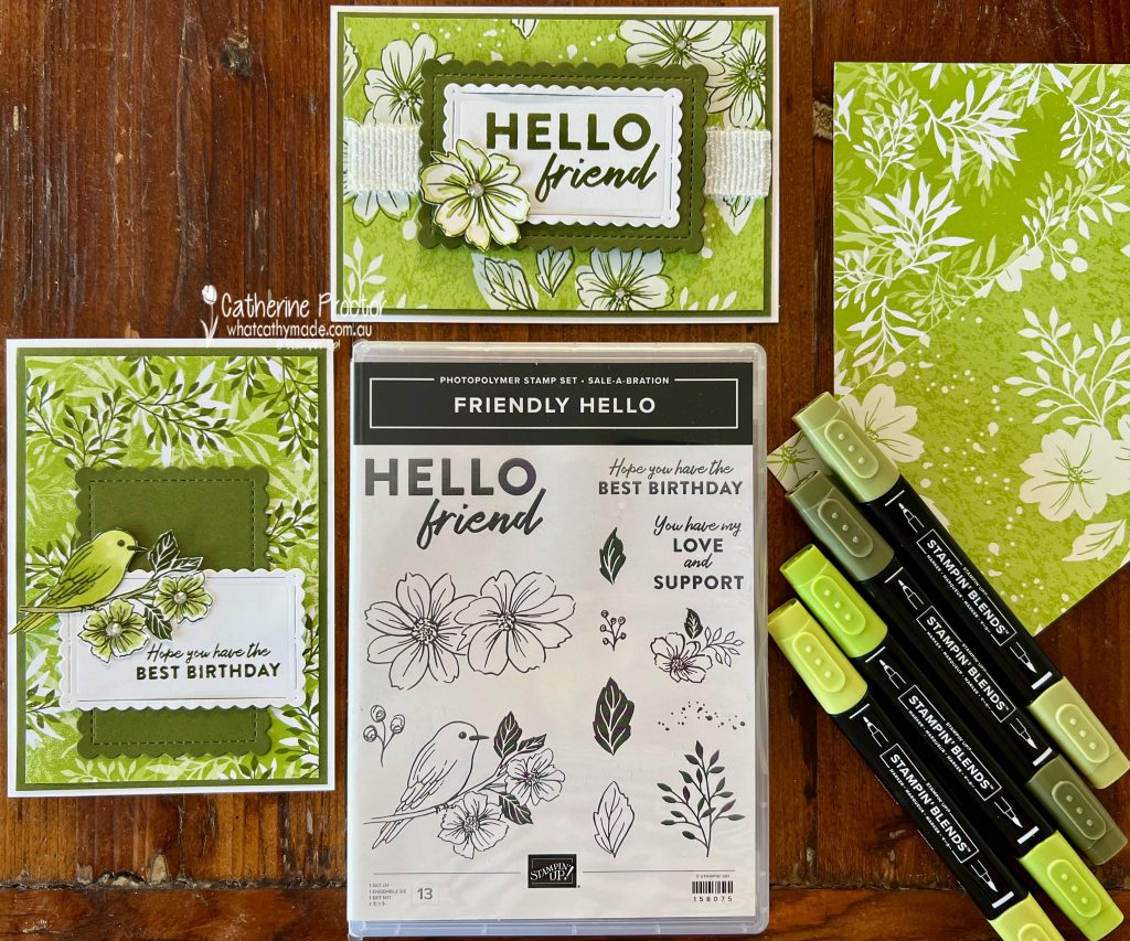
Yesterday the new 2022 January to June Mini Catalogue and the Sale-a-bration catalogue launched and so I decided to share with you two cards made using a gorgeous bundle in the SALE-a-bration catalogue – the Friendly Hello bundle. This bundle is FREE with any Stampin’ Up purchase of $180 or more.
Some images from the stamp set are designed to be stamped directly onto the paper for a unique look you’ll love. I would normally do this in Basic Black but as we are showcasing Mossy Meadow tonight I decided to try it instead and I’m thrilled at how it looks against the Granny Apple Green. You can see in this photo below how the paper looks both before and after it is stamped.
My first card uses the floral Granny Apple Green DSP, stamped in Mossy Meadow with the large double flower stamp and the open leaf stamp.
Behind the layered sentiment I’ve added a strip of the the new White 3/4″ Frayed Ribbon from the January-June Mini Catalogue – this ribbon has a soft, slightly fuzzy feel and it is a great way to add instant texture.
I also stamped the large double flower in Mossy Meadow onto a scrap of Whisper White, colouring it with Granny Apple Green Stampin’ Blends and fussy cutting it into two – one for the front of the card and one for the inside.
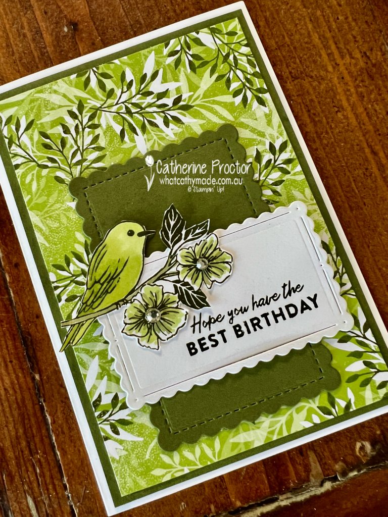
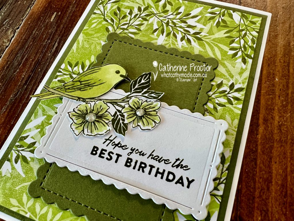
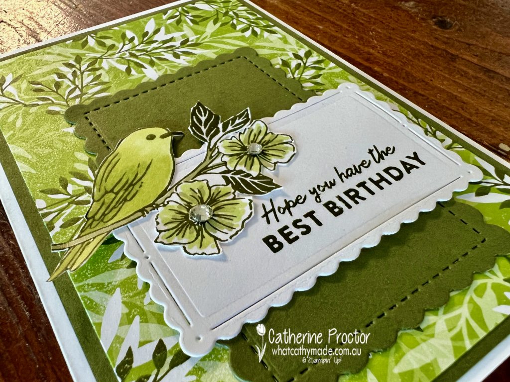
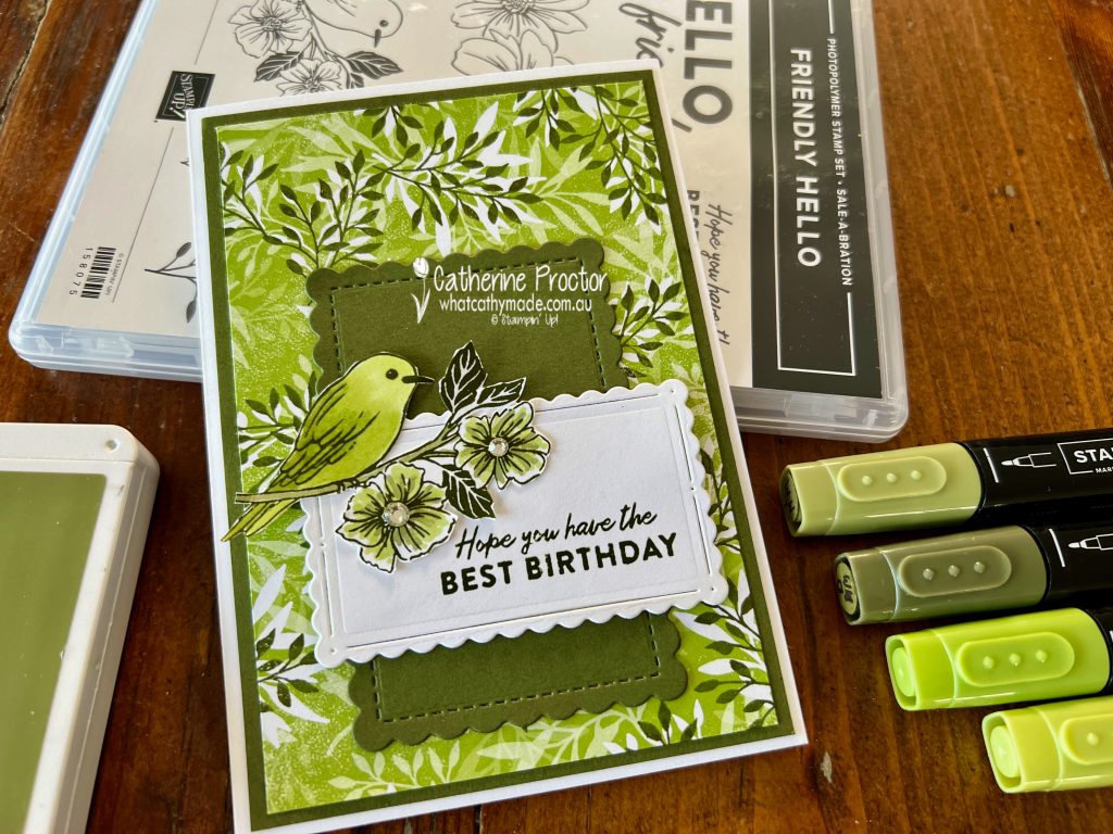
My second card uses the “leaf frond branch” stamp and DSP and the “bird on a branch” stamp.
The same Scalloped Contours Dies were used for the sentiment, just positioned in a different way.
The bird and flower stamp was stamped in Mossy Meadow and coloured in with Mossy Meadow and Granny Apple Green Stampin’ Blends before fussy cutting. There are just so many possibilities with this stamp set and DSP bundle for both crafters who love to colour as well as those who avoid colouring as this DSP does all the hard work for you. You don’t have to be precise with your stamping as it is designed for an offset effect or you can use it as it is, unstamped.
Do you have a favourite card? As I’m always a sucker for a bird on a card, there’s not prizes for guessing which one is my favourite!
Now it’s time to hop on over to our next participant, the lovely Kate Morgan – I can’t wait to see what Kate has made this week!
If at any time you find a broken link, you can find the complete list of all participants below.
Happy New Year to you all! Were you able to catch up with family and friends over Christmas and New Year?
Unfortunately, like so many others, Covid put our Christmas, New Year and the birthdays of several family members on hold, but fingers crossed, we will hopefully be able to celebrate them all soon.
On the bright side, there has been a HUGE advantage of having to isolate at home … more time in my craft room to get organised and to play with some of the exciting new products from two new catalogues that launch today!
2022 January-June Mini & SALE-a-bration catalogues
The 2022 January to June Mini Catalogue and the Sale-a-bration catalogue both launch today. If you are one of my customers you should have received a paper copy of each of these catalogues sent by me. If you haven’t received one, please get in touch and I will pop one in the post to you.
Covid has had a huge impact on worldwide shipping and like so many retailers everywhere, Stampin’ Up! is being impacted with delays. This means there are a still a few items from both catalogues that we are still waiting on – they are showing as unavailable in the store. I’ll keep you updated as they come into stock.
Saleabration also starts today and goes through until the end of February. During this time, you can earn free products with shopping and there is a great joining deal where you get an extra 2 free stamp sets of YOUR choice, in addition to the already great value starter kit.
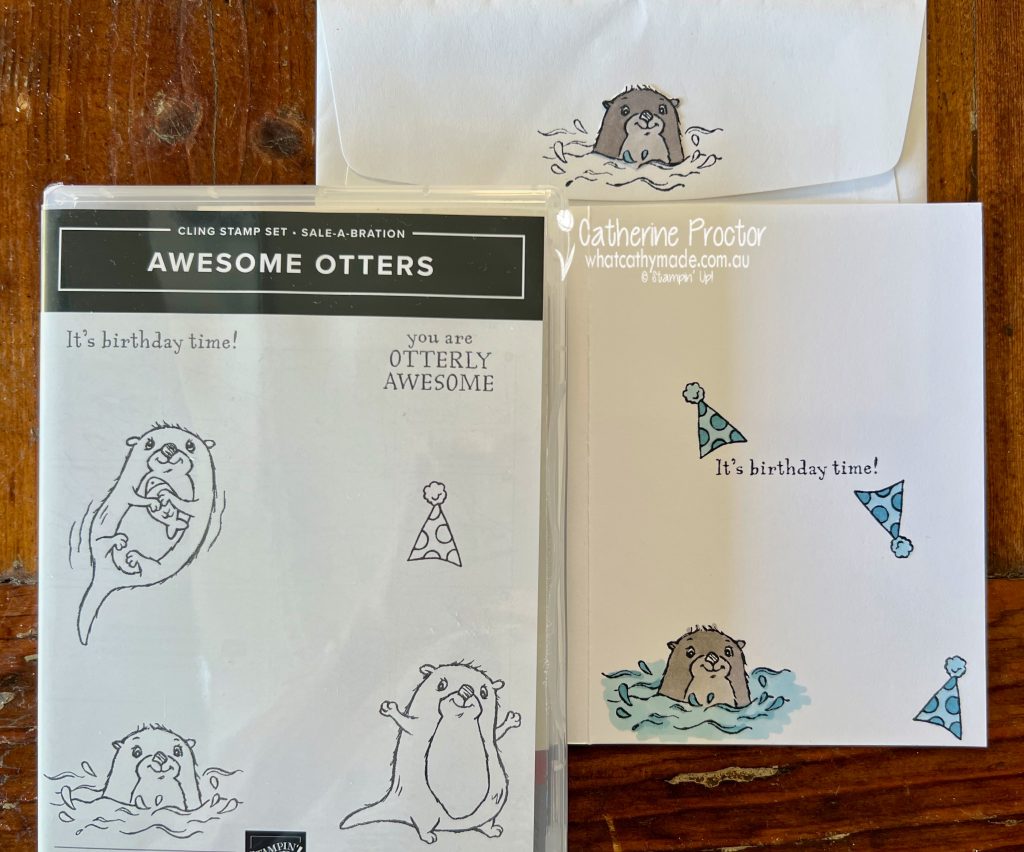
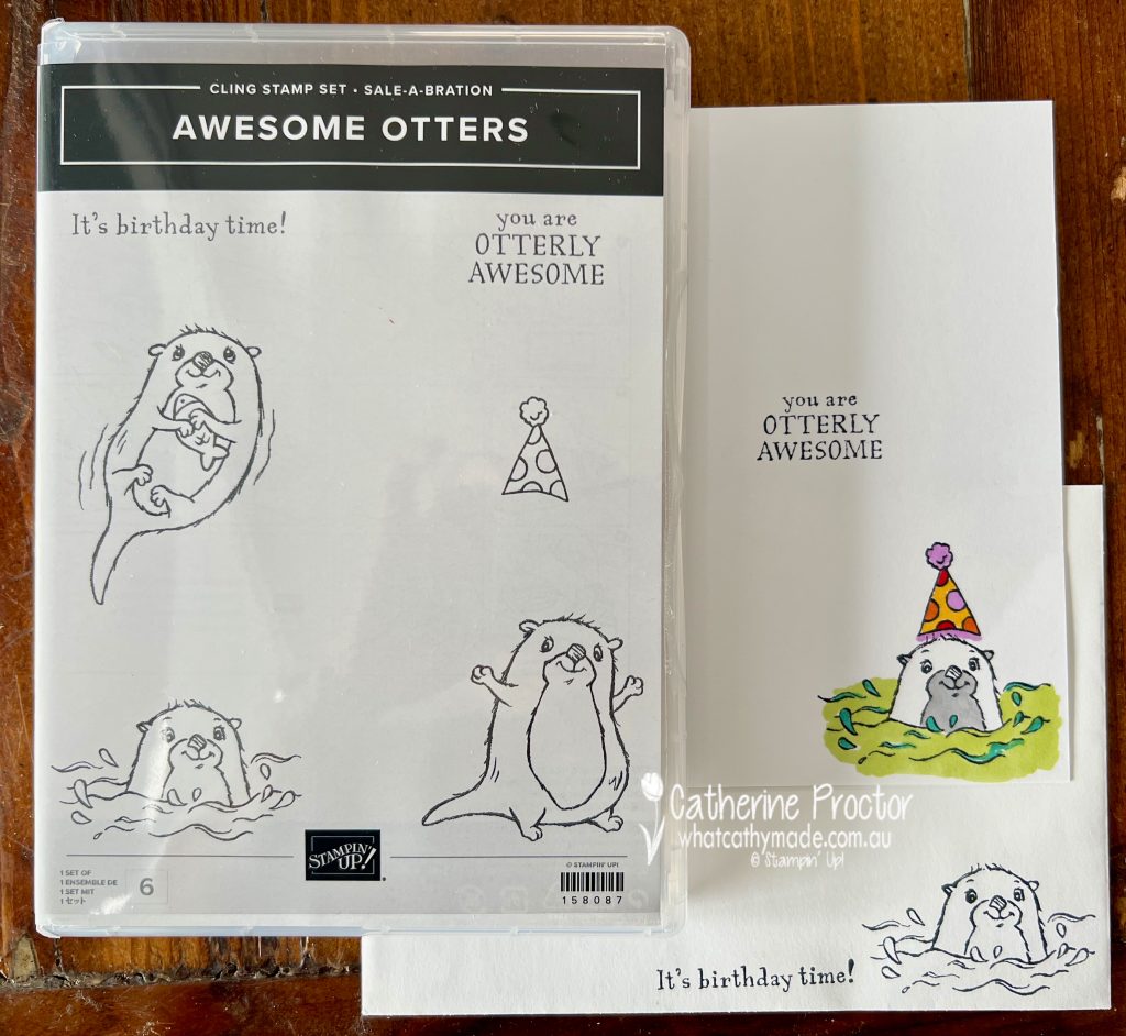
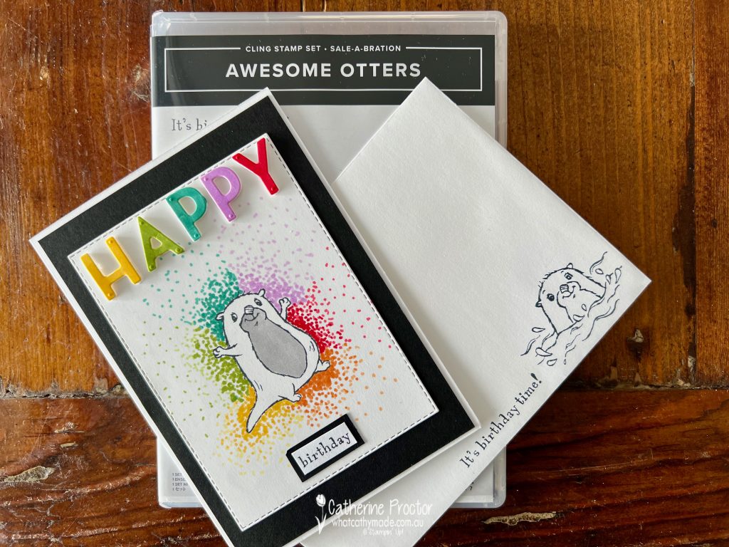
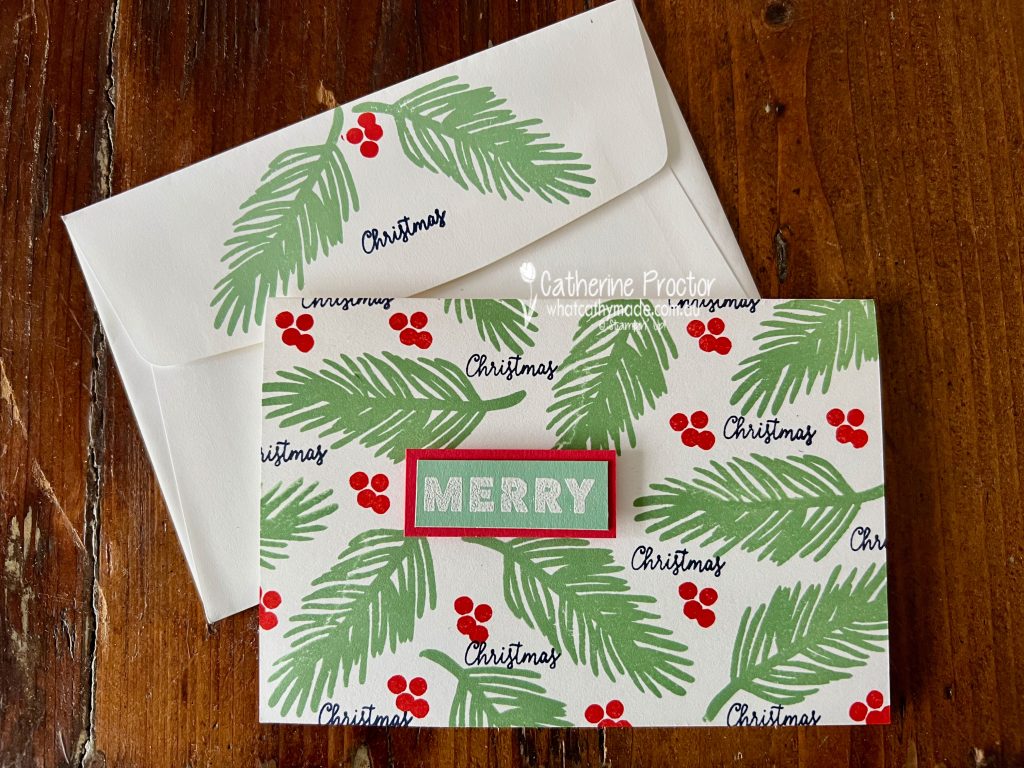
One of the SALE-a-bration items that is available now is the Awesome Otters stamp set. If you spend $90 or more you can chose this exclusive Sale-A-Bration item for FREE!
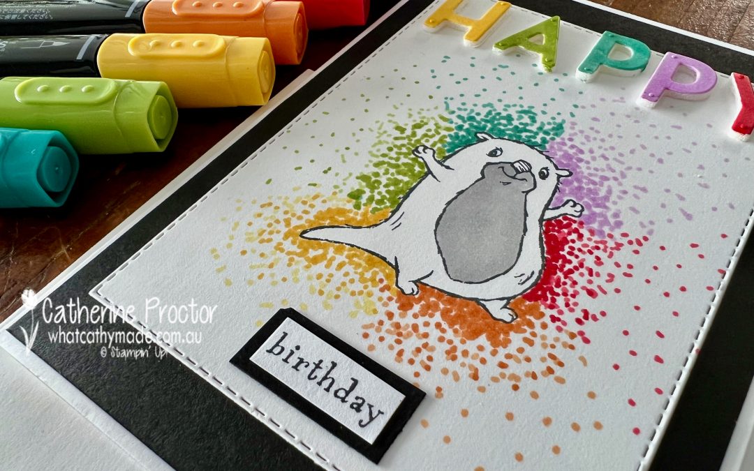
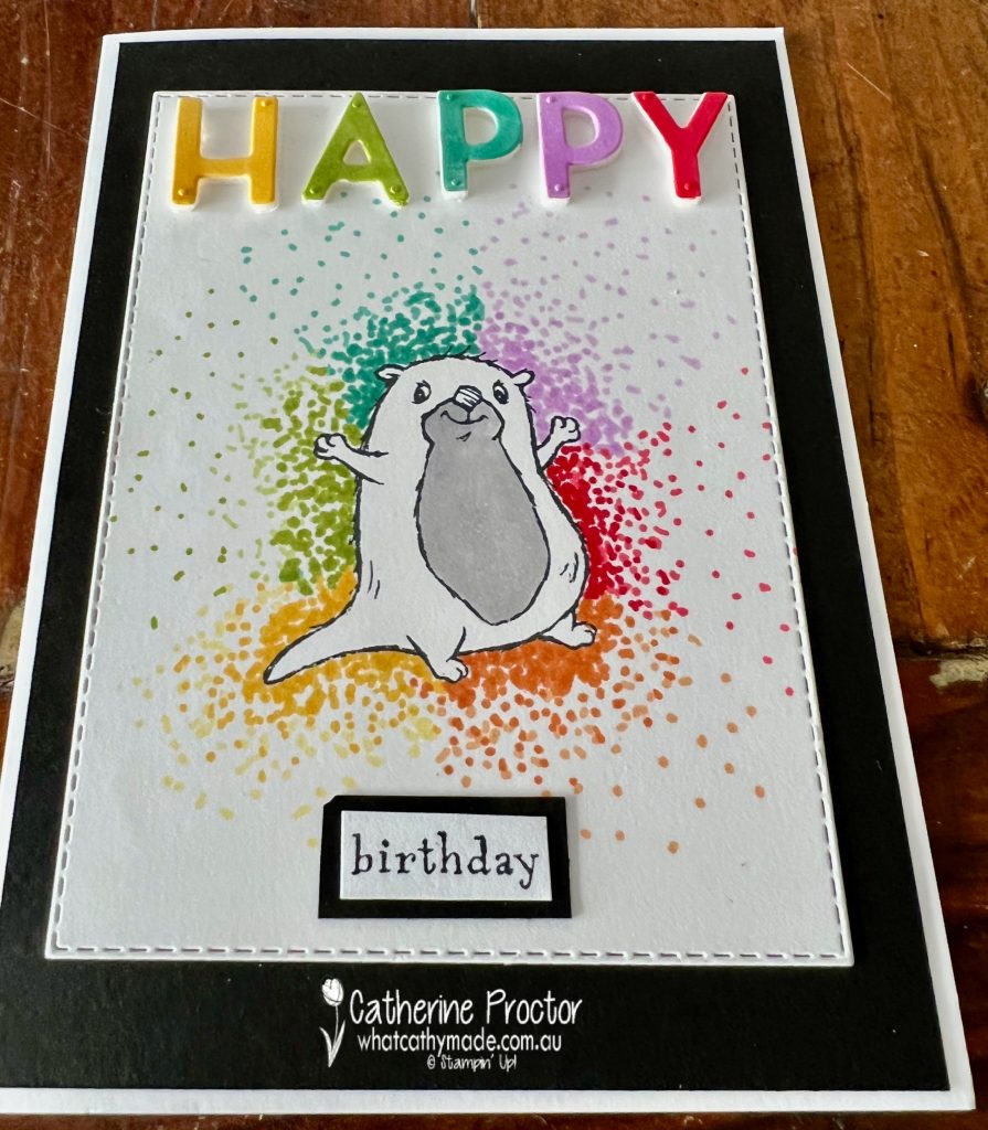
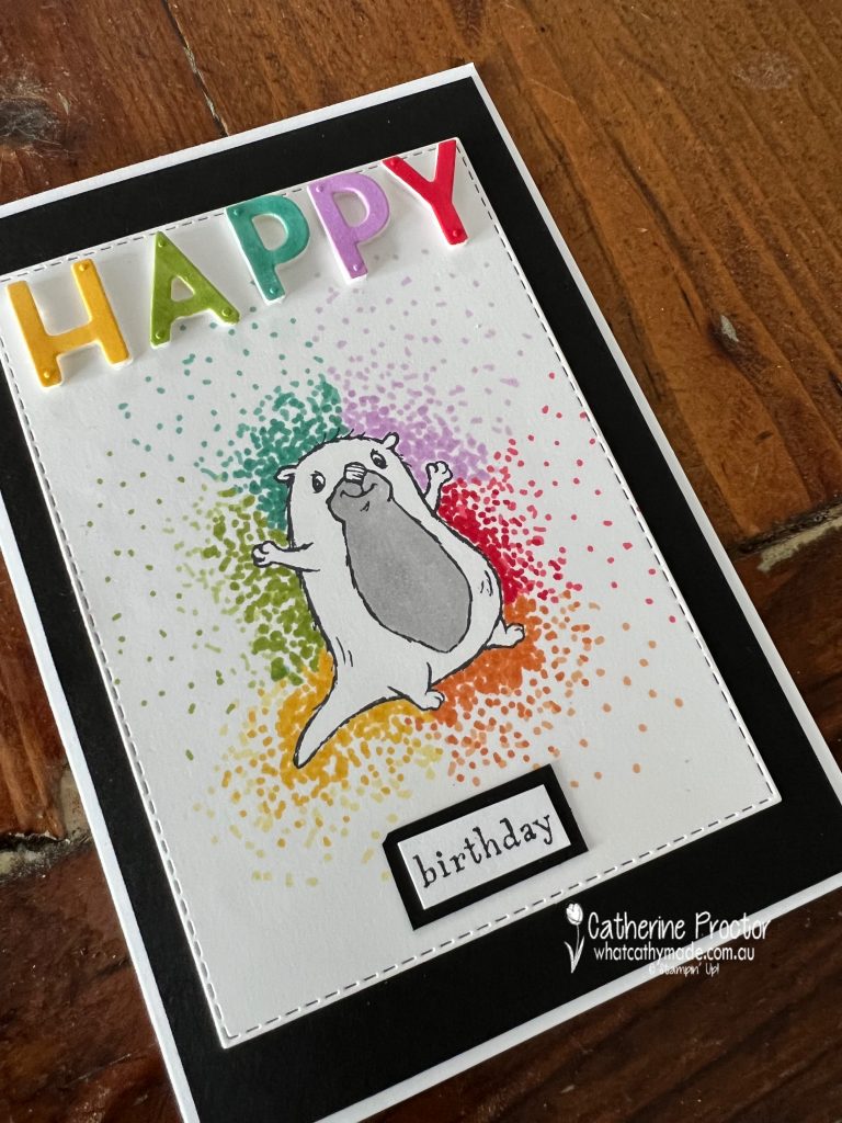
I’ve made a super simple card with these otters by using an easy but so effective colouring technique known as “dot colouring” or the “pointillism technique”.
Pointillism was a revolutionary painting technique pioneered by Georges Seurat and Paul Signac in Paris in the mid-1880s and it is such a fun effect to use on cards as well.
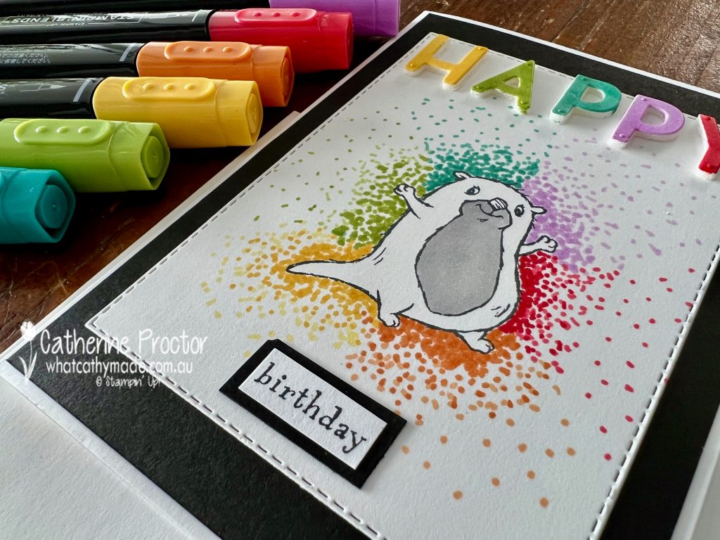
The Stampin’ Up! colours I used are: Granny Apple Green, Daffodil Delight, Pumpkin Pie, Poppy Parade, Fresh Freesia, Bermuda Bay and a touch of Gray Granite for his tummy! You simply use the narrow end of your Stampin’ Blend! to add dots to around the otter, making the dots closer and darker nearer the stamped image.
The “HAPPY” was made using the Playful Alphabet dies. I adhered some Basic White card stock to foam adhesive sheets, die cut the word “HAPPY” and then coloured each letter using bright Stamping Blends colours.
One of the other otters was used to decorate the inside of the card and the envelope too.
The “birthday” sentiment on the card front is part of the longer “It’s birthday time” sentiment that I’ve stamped onto the envelope – I simply cut away the other words and mounted it onto a scrap of Basic Black cardstock.
I’ll be back with the Art with Heart Colour Creations team at 8pm (AEST) tomorrow night to showcase Mossy Meadow. I’ll be using two more FREE SALE-a-bration products for my cards and. I can’t wait to share these cards with you!
You can purchase all the products I’ve used in this card in my online store 24/7 and don’t forget to use my January Host code when placing an order over $50 (January 2022 Host Code is 4EMV7CCW) to receive your FREE embellishments.
Wherever you are in the world, stay safe, stay calm … and keep on crafting xxx
Welcome to week 29 of our 2021-22 Colour Creations blog hop! Tonight we are showcasing Misty Moonlight, a soft blue from the 2020-22 In Colour family.
Misty Moonlight is such a beautiful blue and one of my all time favourite Stampin’ Up! colours – I will be so sad to see this colour retire when the Annual Catalogue ends in May 2022.
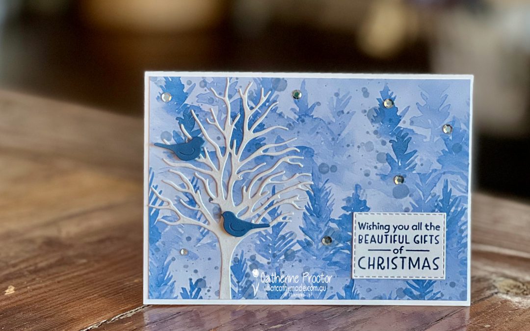
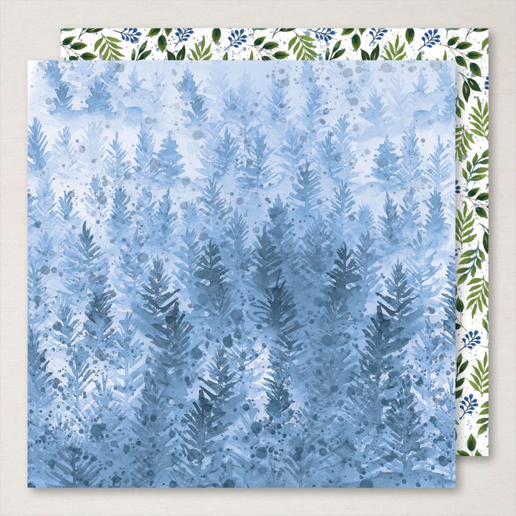
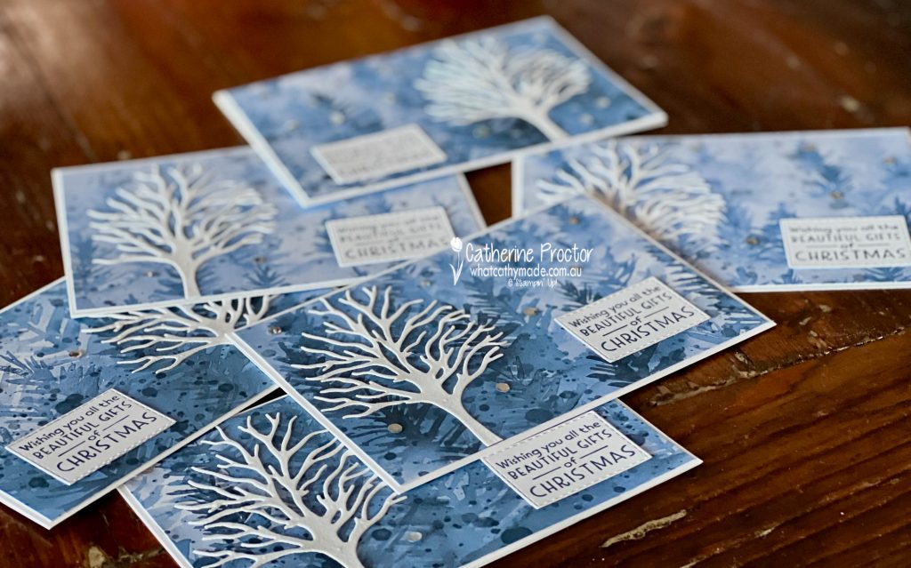
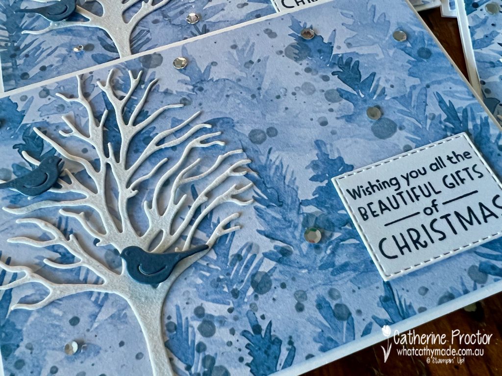
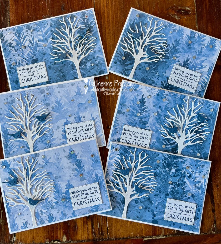
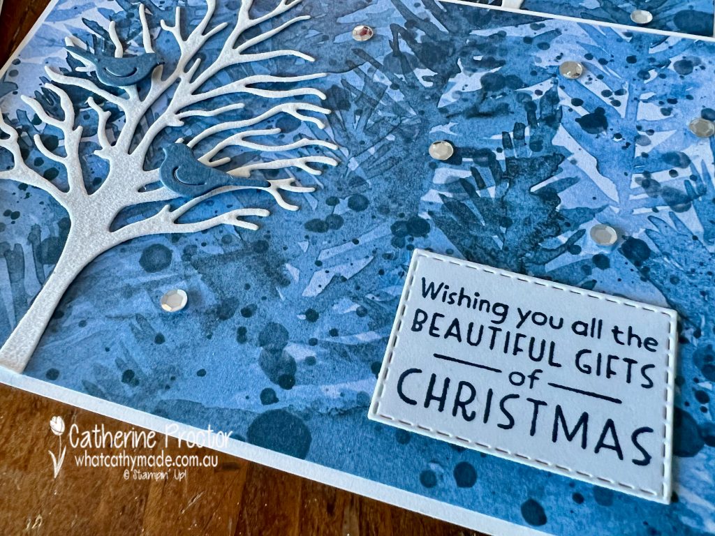
Because I am still making Christmas cards (why am I so disorganised with Christmas every year!!!) I thought I’d step up my production and make not one, but six cards from one sheet of this stunning Misty Moonlight 12×12 DSP from the Beauty of the Earth Designer Series Paper. My fellow Art With Heart team member, Tina, has been really inspiring me with how many cards she has made with her Sheetload of cards designs each week!
After cutting the DSP into 6 pieces and trimming to layer on top of Basic White card bases, I die cut 6 trees from Snowy White Velvet Sheets using the Beautiful Trees Dies. TIP – I added an adhesive sheet to the Velvet Sheets BEFORE die cutting to turn my trees into stickers!After taking this photo I realised something was missing – the little bluebirds I had die cut to pop in the trees. I just love these little birds and I had to add them to my cards!
Each of the 6 cards is slightly different due to the variations in the DSP, which is why for some cards I stuck the tree on the left and for others, on the right. The white tree pops out more if you lay it on the darker DSP.
The gorgeous sentiment comes from the Inspired Wishes stamp set and some Subtle Shimmer Sequins complete this simple card.
Now it’s time to hop on over to our next participant, the lovely Kate Morgan – I can’t wait to see what Kate has made this week!
If at any time you find a broken link, you can find the complete list of all participants below.
We’re taking a Christmas break but will be back to showcase Mossy Meadow on January 5. Have a wonderful Christmas and a Happy New Year – wherever you are in the world, stay safe, stay calm … and keep on crafting xxx
Welcome to week 28 of our 2021-22 Colour Creations blog hop! Tonight we are showcasing Mint Macaron, a light green from the subtles family.
Although I start making my Christmas cards in July, I always have a last minute panic this time of the year. Have I made enough? Will I get them posted in time? Why do I always feel so disorganised this time of the year!!!
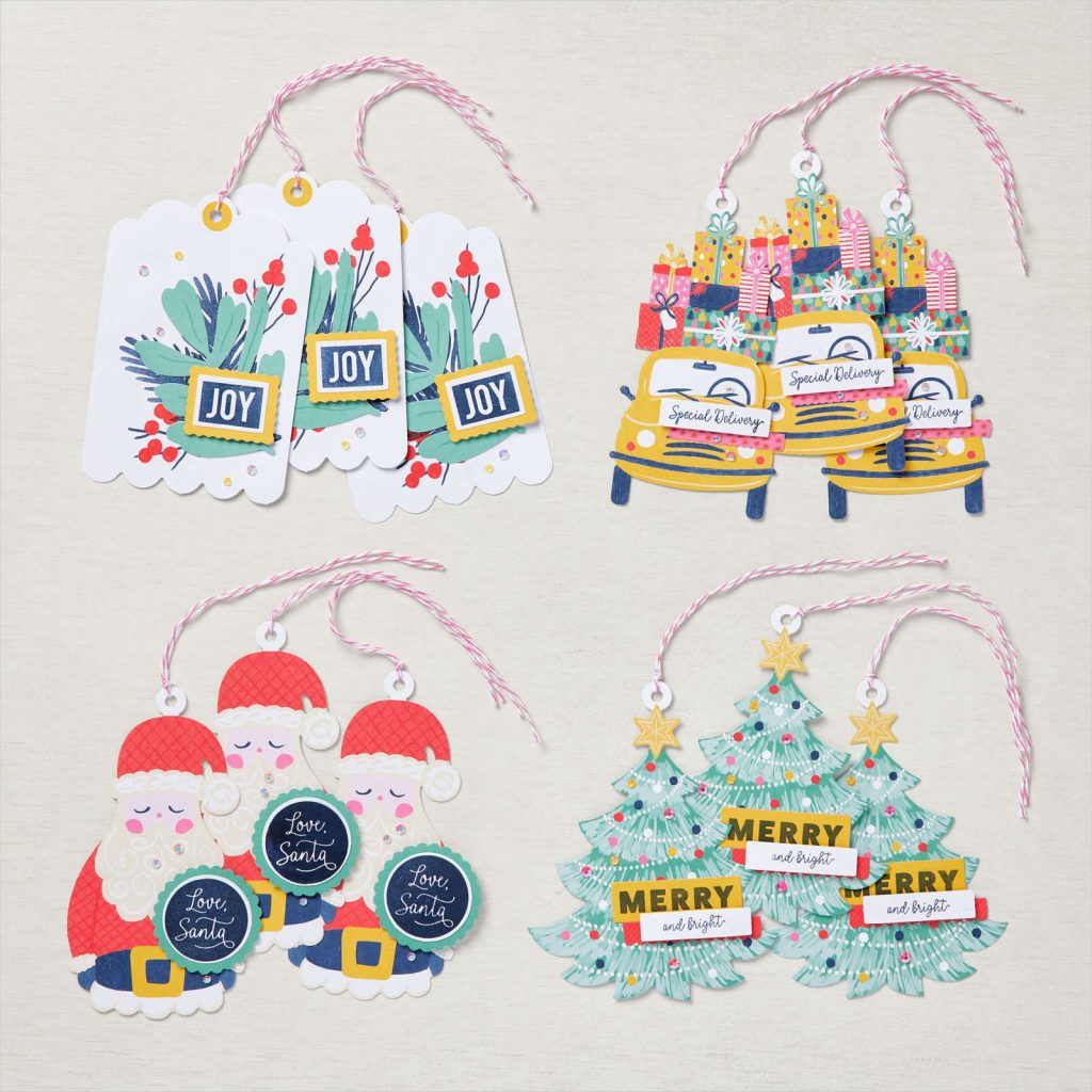
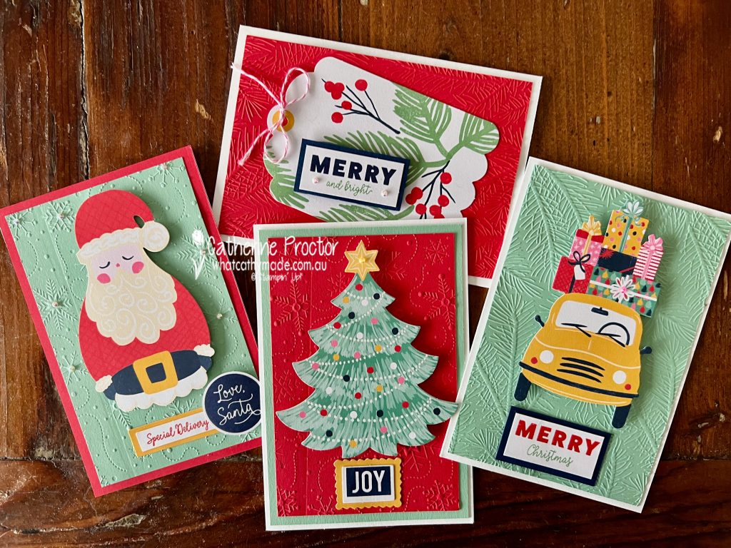
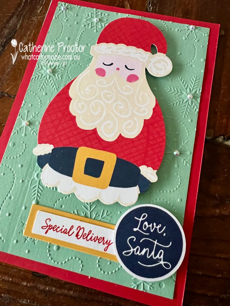
Luckily, card kits are fantastic when you need cards made quickly and Stampin’ Up!’s Love Santa Tag Kit can be used to make either tags or cards. Here’s what the tags look like when made up as per the instructions.
And here’s my version of the tags, using the large Memories & More card bases to turn the tags into cards.
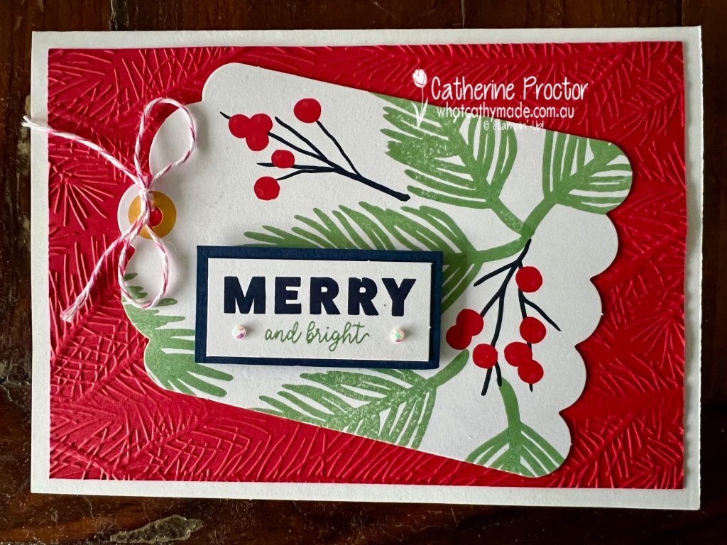
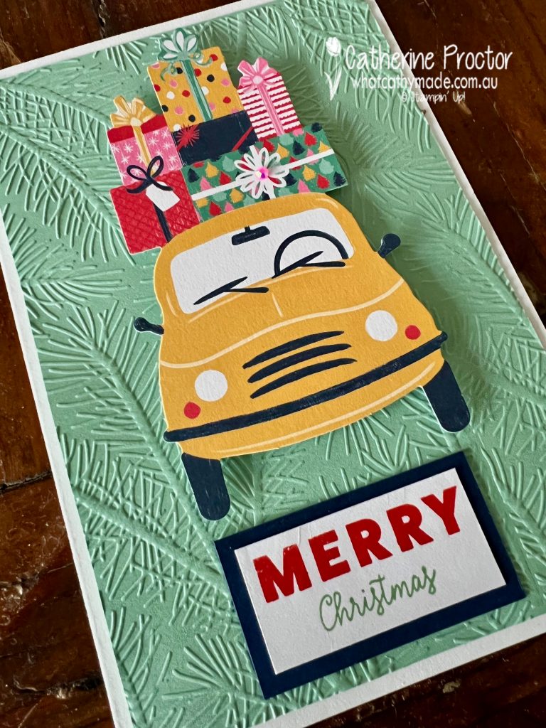
I love the bright retro colours in this kit – although Mint Macaron is not actually a colour in this kit it works really well with this colour combination: Bumblebee, Just Jade, Night of Navy, Polished Pink and Poppy Parade.
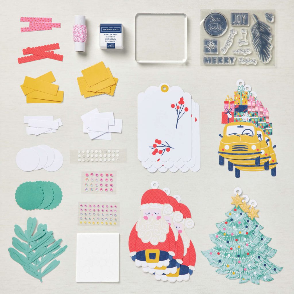
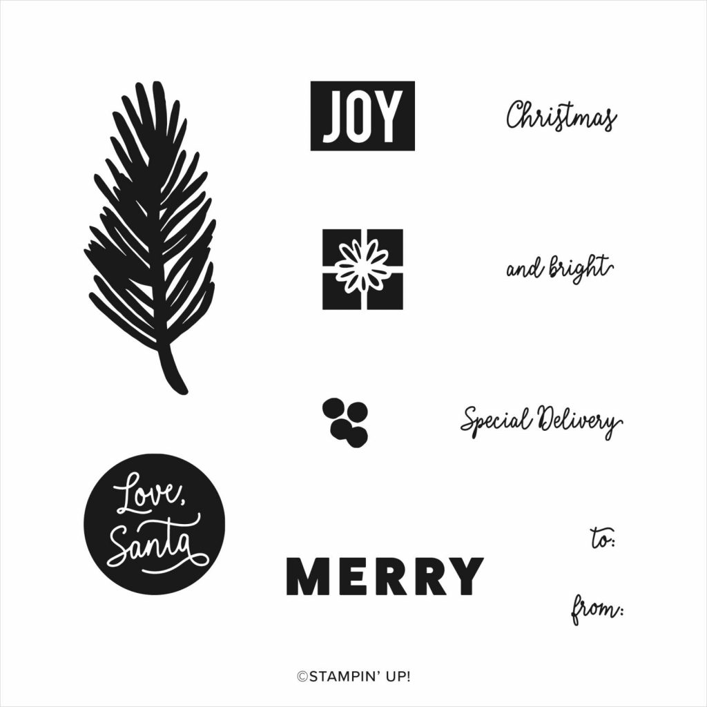
Here’s what’s included in the kit.
To turn these tags into cards I used Mint Macaron and Real Red cardstock, Mint Macaron and Real Red ink pads, as well as the two Wintry embossing folders.
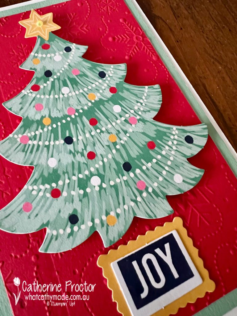
After turning each of the tags into cards I decided to have a play with the stamp set included in the kit – it is so cute!
It was super quick and easy to create a very tropical looking christmas card, perfect for a down-under Christmas!
Now it’s time to hop on over to our next participant, the lovely Kate Morgan – I can’t wait to see what Kate has made this week!
If at any time you find a broken link, please head to the blog of this week’s host of the AWH Colour Creations Blog Hop, Christine Blain, and she will have the list of all participants.
If you live in Australia, you can find and purchase all these products in my Stampin’ Up! Online Store or by clicking on the images below.
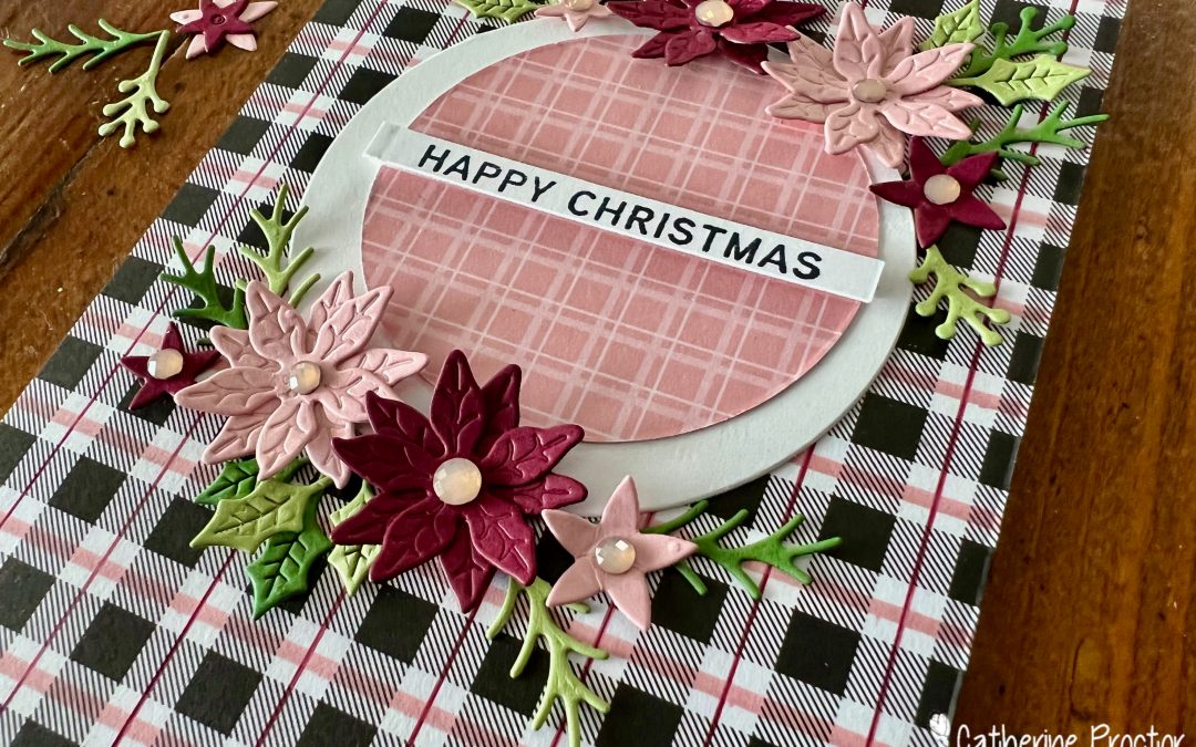
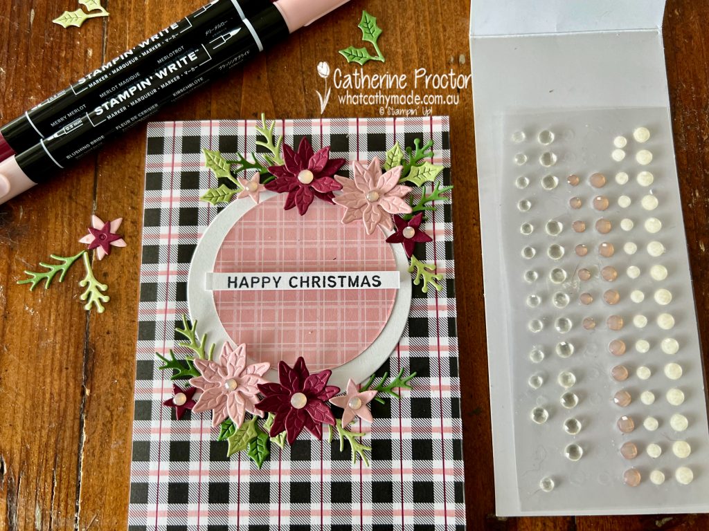
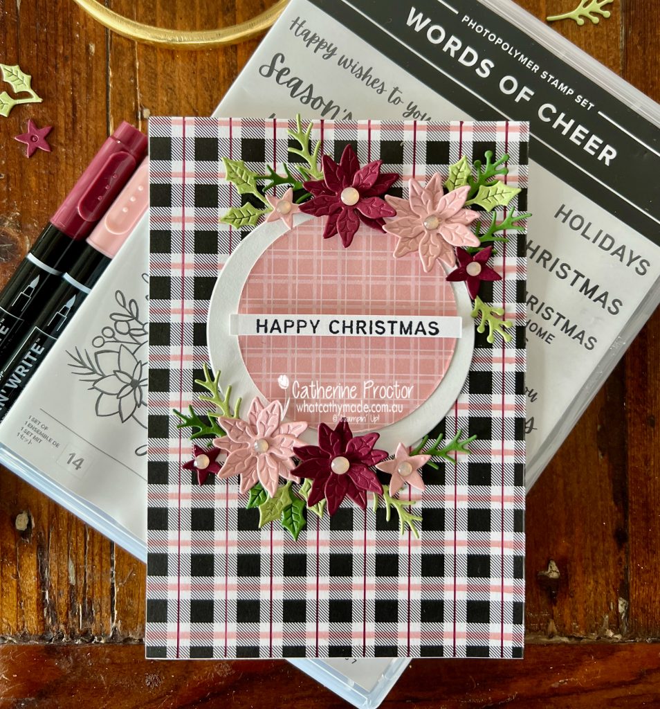
Welcome to week 27 of our 2021-22 Colour Creations blog hop! Tonight we are showcasing Merry Merlot, a rich deep red wine colour that rather surprisingly sits within the neutrals family.
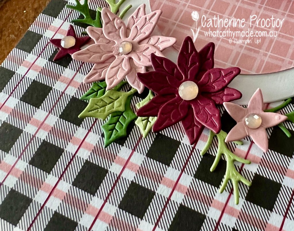
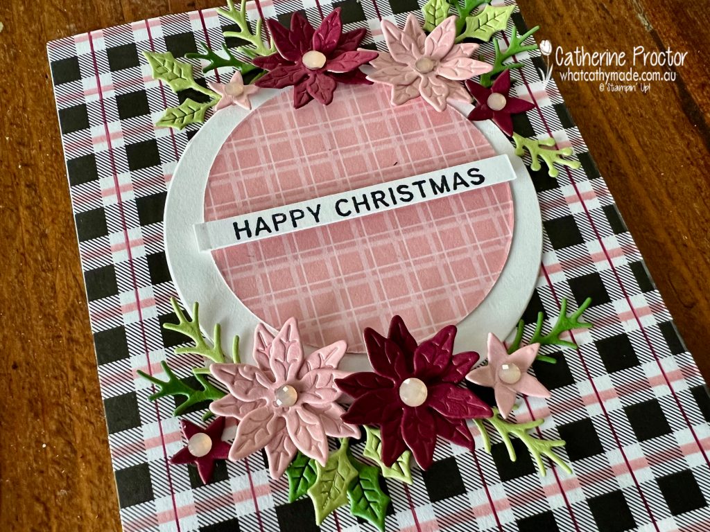
I love pairing Blushing Bride with Merry Merlot – for this card I’ve added in Pear Pizzazz and Garden Green for foliage and Basic Black and Basic White for contrast.
Recognise this Merry Merlot tartan plaid DSP? It’s actually the black and white check pattern from the Party Pattern DSP pack that I have customised to match the colour combination on my card.
I used my Stampin’ Write markers and ruler to add thin vertical lines of Merry Merlot and thick horizontal lines of Blushing Bride. This is such a quick and easy way to make your own DSP.
The flowers and leaves are die cut using the Christmas cheers dies and the poinsettia dies, with Petal Pink Elegant Faceted Gems adding some sparkle to the centre of the flowers.
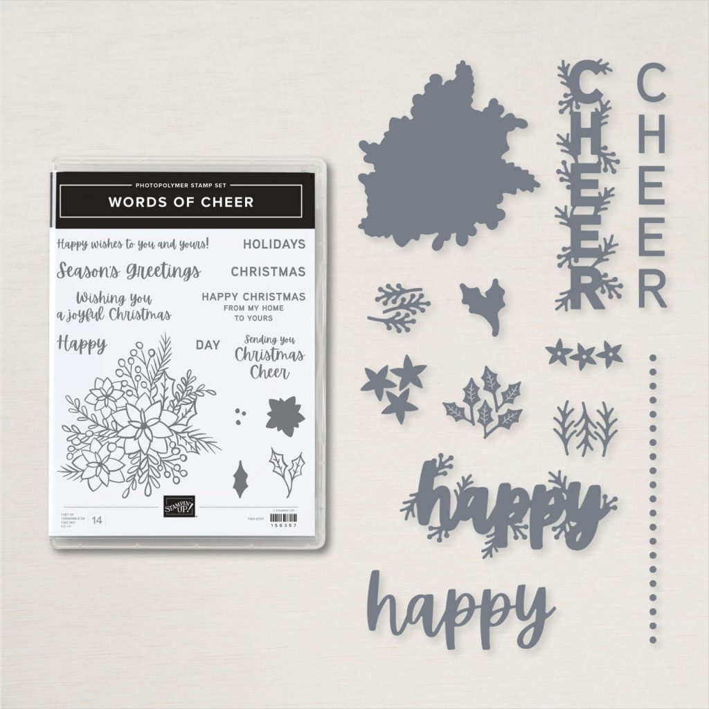
The Blushing Bride checked DSP is from the Subtles assortment, die cut with the layering circle dies, and the “Happy Christmas” sentiment is from the Words of Cheer stamp set.
Now it’s time to hop on over to our next participant, the lovely Kate Morgan – I can’t wait to see what Kate has made this week!
If you find a broken link or have come to this blog hop from a different entry point, you can view the the full list of participants below:
Hello crafters – welcome to our last AWH Heart of Christmas blog hop for 2021! I’ve loved being inspired by the incredible creations in our Art with Heart Team.
With less than four weeks to Christmas have you got all your Christmas cards made yet? Have you even started yet?
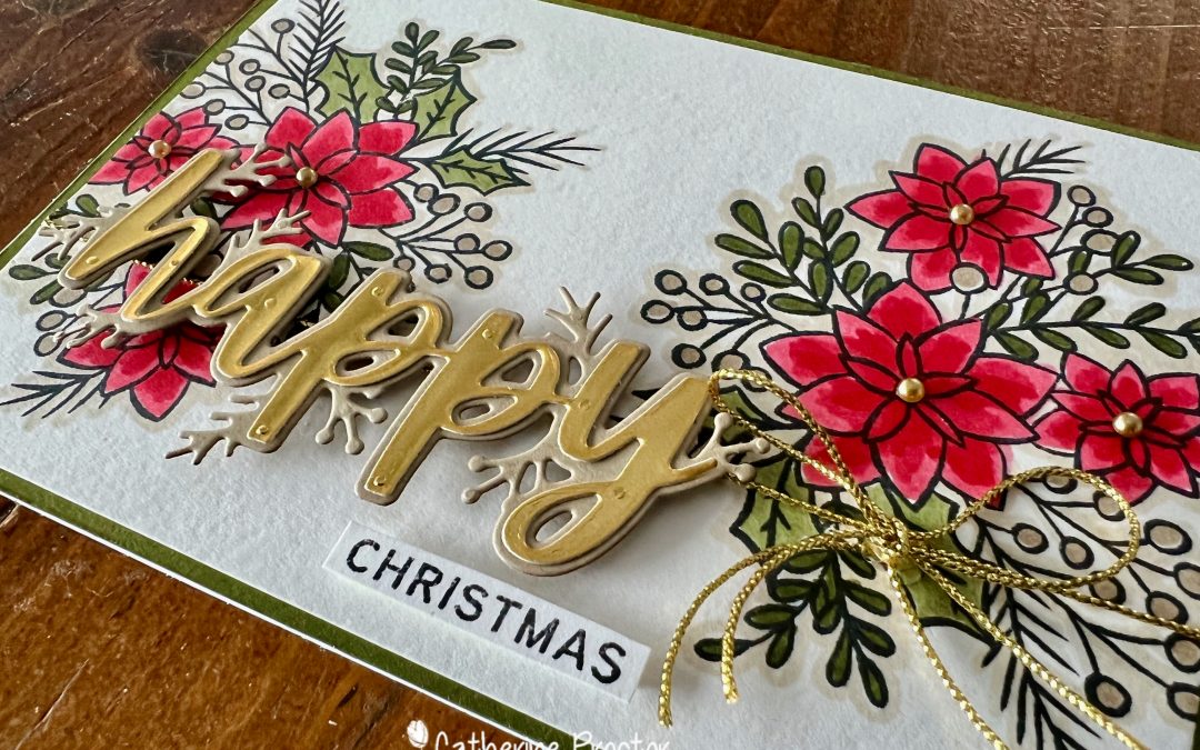
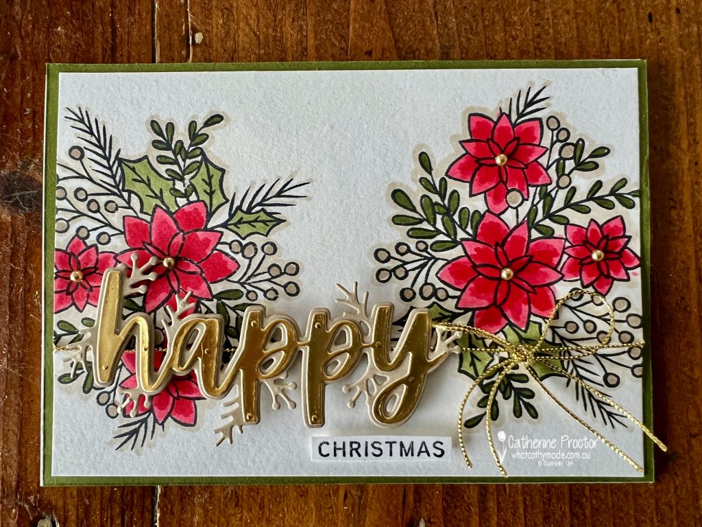
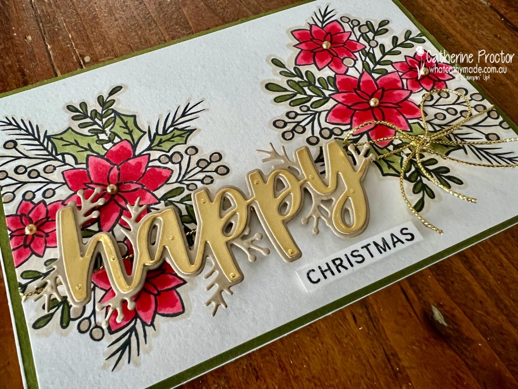
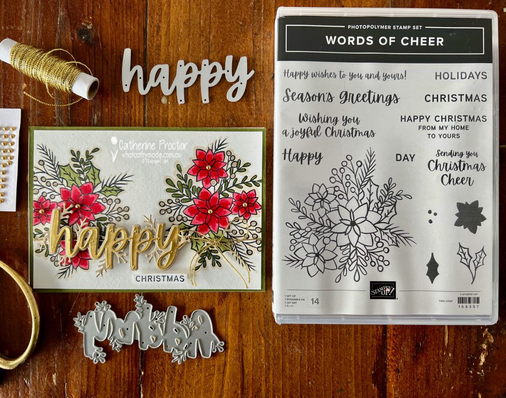
I finally caved in and purchased the Words of Cheer bundle after seeing so many amazing cards made with this bundle. I’ve enjoyed using this bundle so much I’ve also used it for my Merry Merlot card for our AWH Colour creations blog hop this week – come back and visit my blog on Wednesday night to see the other card I’ve made with the Words of Cheer bundle.
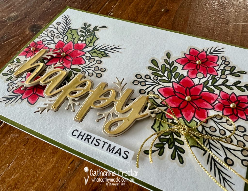
The large floral image gives you a lot of different options for adding colour to your card. I’ve used Poppy Parade, Mossy Meadow and Crumb Cake Stampin Blends, a Basic Black stamped sentiment and image outline, with gold accents in the die cut letters and the twine. I love how all these neutrals work together to make the Poppy Parade really pop!
The card design is super simple. Stamp the large floral image on each side of the Basic White card stock layer, colour it in and wrap with some twine or ribbon before adhering to your card base – I used Mossy Meadow.
When die cutting with foil I use use adhesive sheets to eliminate the risk of glue on the foil. The top layer of “happy” is gold foil on an adhesive sheet and the bottom layer is die cut in Crumb Cake card stock and then popped onto the card using Stampin Dimensionals.Not only do these large double layer dies look amazing, they are so easy to use!
To match the gold metallic Simply Elegant Trim tied around the base of the card I added Gold adhesive backed Metallic Pearls to the centre of the flowers. TIP – to get the Simply Elegant Trim to stay tied in a bow and sitting on the card I used a double knot and also adhered it to the card using glue dots.
Now it’s time to hop on over to our next participant, the lovely Christine Blain. I can’t wait to see what Christine shares with us today!
If at any time you find a broken link please head to the blog of this week’s host of The Heart Of Christmas Blog Hop, Tina Gillespie, and she will have the list of all those participating.
If you live in Australia, you can find and purchase all these products in my Stampin’ Up! Online Store or by clicking on the images below.
Welcome to week 26 of our 2021-22 Colour Creations blog hop! Tonight we are showcasing Melon Mambo, a vibrant pink from the Brights colour collection.
Inspired by the colour combination I loved on some now retired Designer Series Paper, this week I’ve paired Melon Mambo with Blushing Bride, Night of Navy and Basic White.
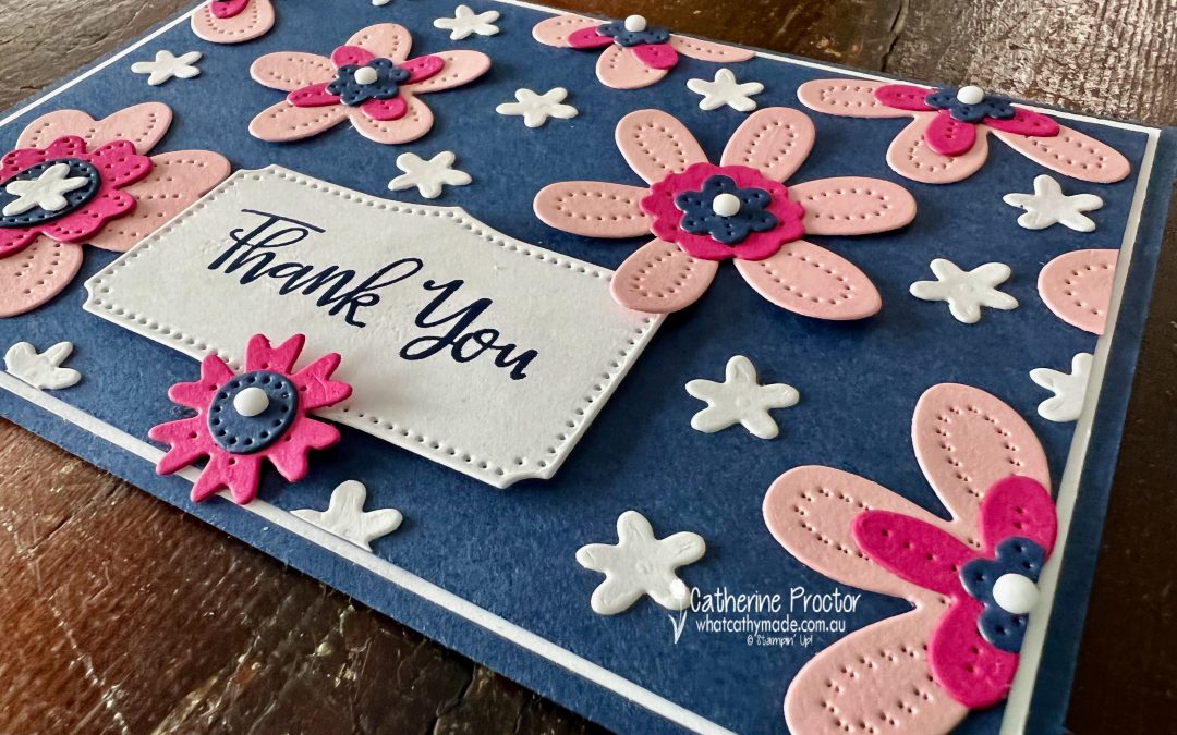
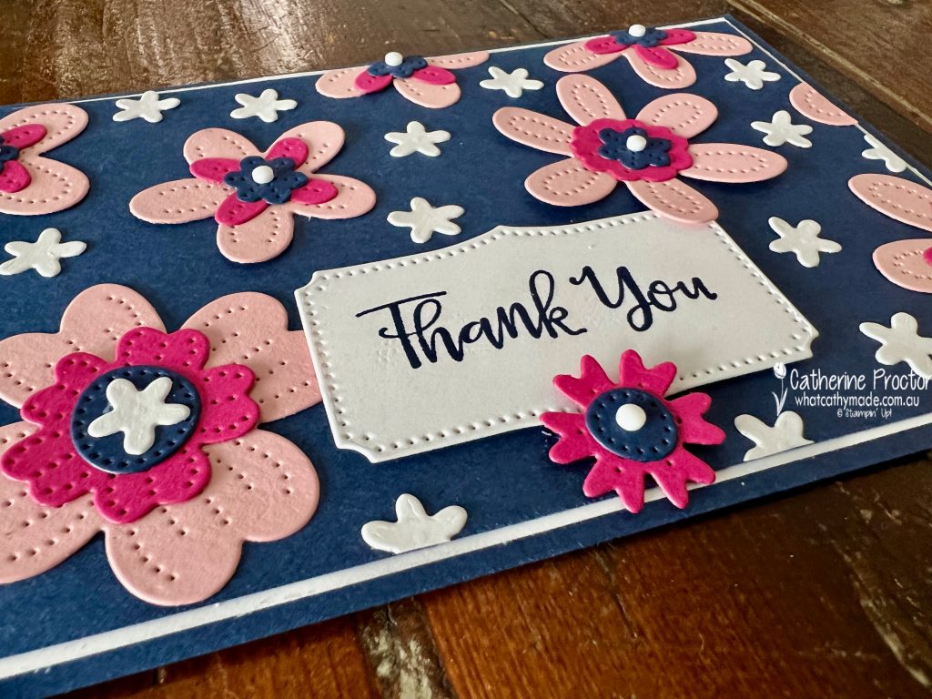
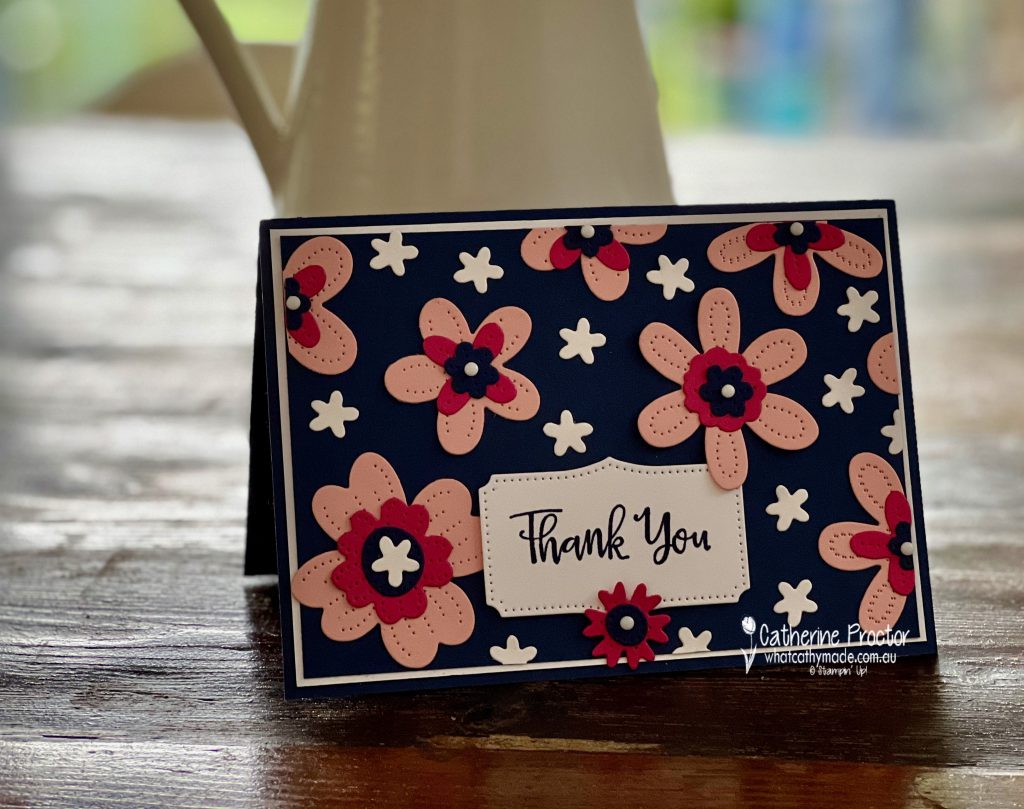
The Night of Navy Cardstock layer really makes the white and both the pinks pop, and using the Pierced Blooms dies makes for a very quick and easy card. I love making this type of card – it’s sort of like creating a 3D DSP!
The only stamping on my card is the sentiment from the Peaceful Moments Stamp Set – I chose this sentiment because it fitted perfectly into the the sentiment die cut from the Pierced Blooms dies.
Did you notice the white dot embellishments in the centre of the flowers? These are a new product coming in the January–June 2022 Mini Catalogue.
Classic Matte Dots are Adhesive-backed enamel dots with a matte finish that come in four colours: Basic Black, Basic Gray, Very Vanilla and Basic White, which is the colour I’ve used on my card today.
The beauty of this design is that it can be made in any colour combination and for any occasion, depending on the sentiment you use.
Now it’s time to hop on over to our next participant, the lovely Kate Morgan – I can’t wait to see what Kate has made this week!
If you find a broken link or have come to this blog hop from a different entry point, you can view the the full list of participants below:
Hello crafters! Welcome to Week 21 of our AWH Heart of Christmas blog hop. It’s hard to believe that it’s less than five weeks until Christmas and after tonight’s blog hop we only have one more Heart of Christmas blog hop left this year!
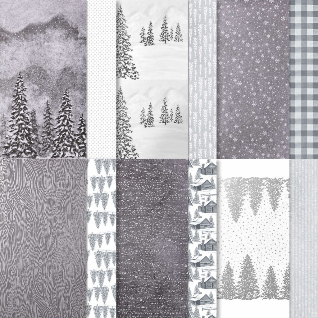
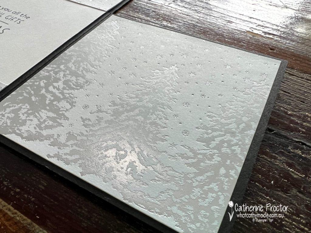
I don’t know about you, but sometimes I don’t use a particular Designer Series Paper because it’s just so beautiful and I don’t want to cut it or cover it. It’s really had to see all the foiling in this photo, but the Peaceful Place is simply stunning and I wasn’t sure exactly how to use it.
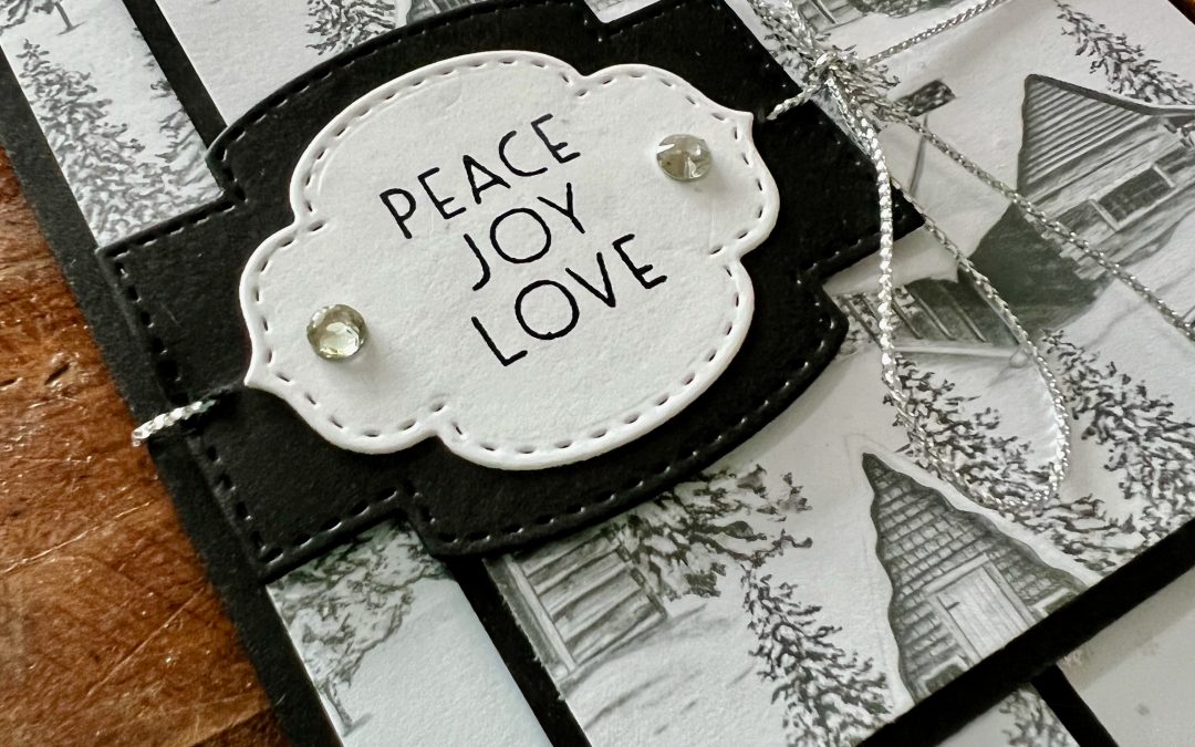
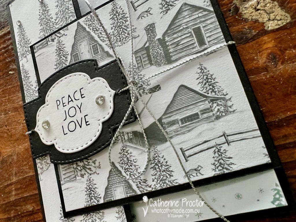
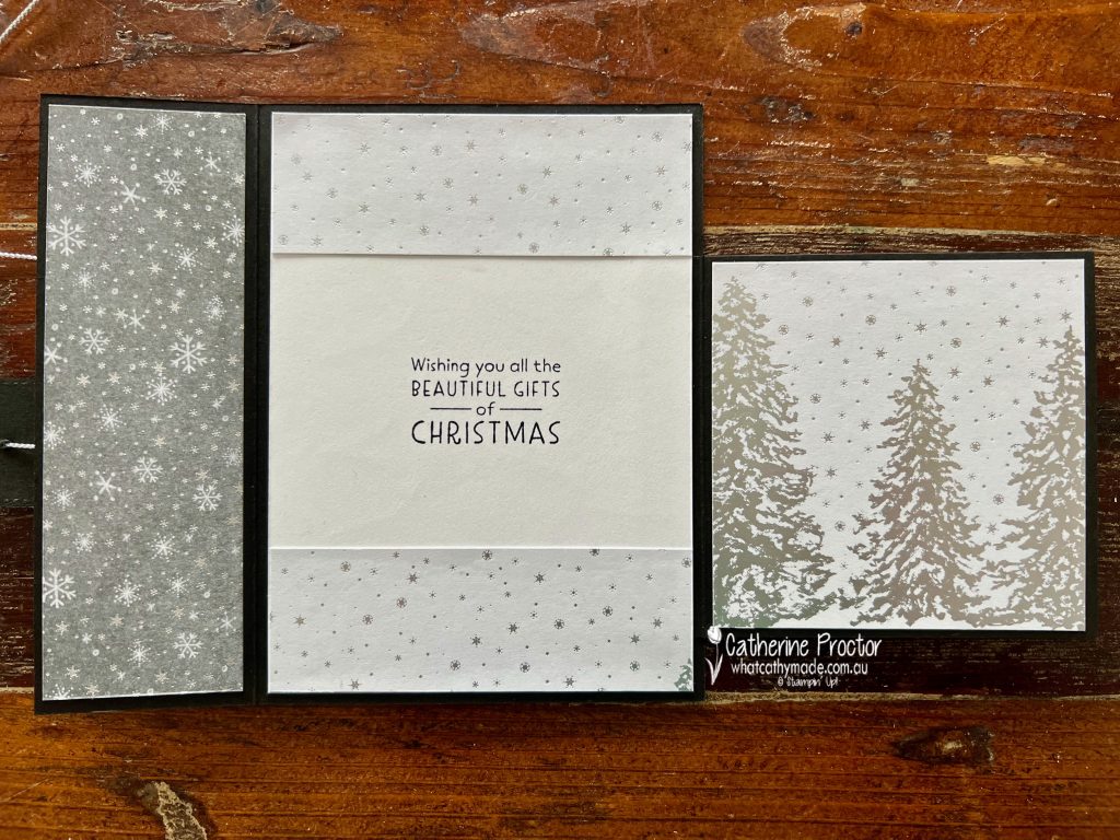
With Designer Series Paper as elegant as this, I think it’s best to keep the card quite simple and let the paper be the star of the show, which is why I decided to create a Christmas latch card.
This fancy fold looks pretty fancy, but it is easy peasy to make. The card base is created from two pieces of Basic Black cardstock. The first piece measures 16 x 14.8 cm, scored at 5 cm along the 16 cm side – this is the back of the card and the left flap. The second piece measures 10.5 x 9.5 cm, scored at 1 cm along the 10.5 cm side – this is the right flap and hinge.
Once you adhere the right hinge to the right hand side of the card, you can then decorate the inside and the outside of the cardstock base and flaps with the DSP. I used this lovely foiled DSP for the inside right flap.
Here’s what all of the card looks like on the inside. Both this sentiment and the sentiment on the front of the card are from the Inspired Thoughts stamp set. Isn’t this a beautiful font?
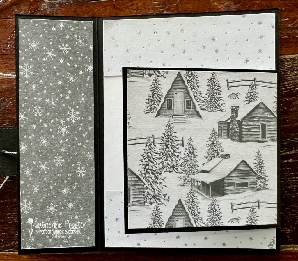
The photo below shows how the outside of the right flap uses the DSP with the cabin print. There is a coordinating Peaceful Cabin Bundle (it includes the Peaceful Cabin Stamp Set and the Cabin Dies), but I don’t own it. This type of fancy fold is ideal for when you want to showcase DSP but you don’t own the matching bundle – all you need is a sentiment from any stamp set that works with the DSP.
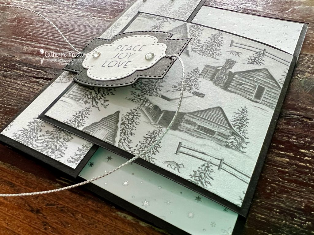
The “Peace, Joy, Love” sentiment has been die cut using the Stitched So Sweetly dies and it forms the latch mechanism. After threading a length of silver simply elegant trim through the sentiment, I used a couple of Stampin’ Dimensionals to attach the LEFT SIDE ONLY of the sentiment to the card – the right flap of the card slips over the left flap and under the right side of the sentiment to create a latch.
The final touch to my card was the addition of some rhinestone jewels and then tying the metallic silver thread into a bow to the right of the sentiment. This thread wrapped around the card is not only decorative … it also helps the card to sit flat.
Now it’s time to hop on over to our next participant, the lovely Ros Davidson. I can’t wait to see what she shares with us today!
If at any time you find a broken link please head to the blog of this week’s host of The Heart Of Christmas Blog Hop, Sharon Davern, and she will have the list of all those participating.
If you live in Australia, you can find and purchase all these products in my Stampin’ Up! Online Store or by clicking on the images below.
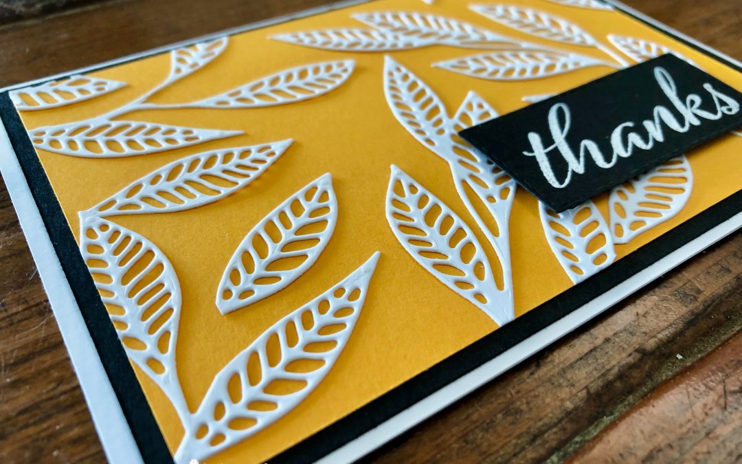
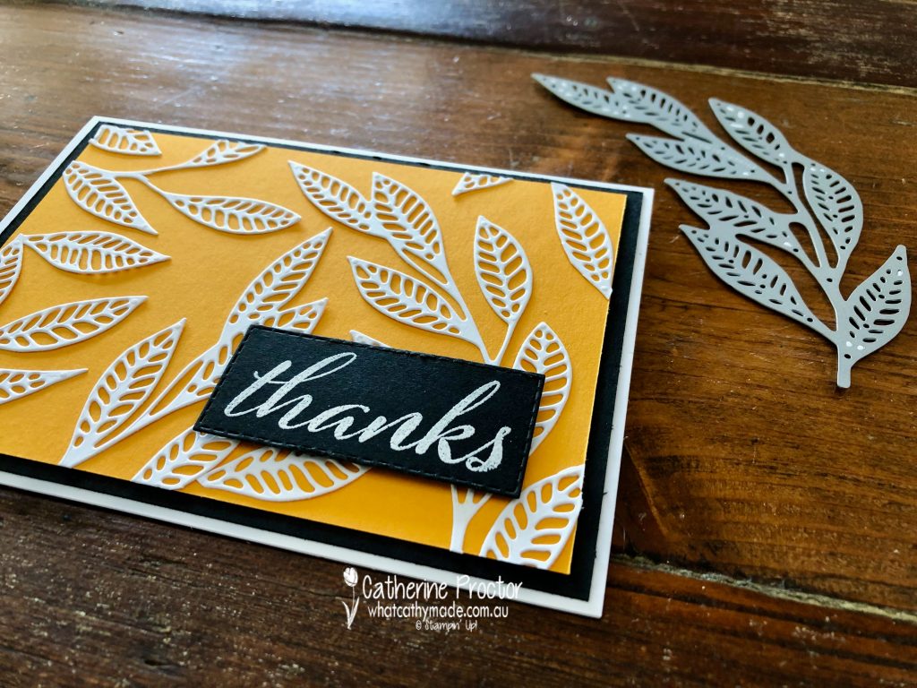
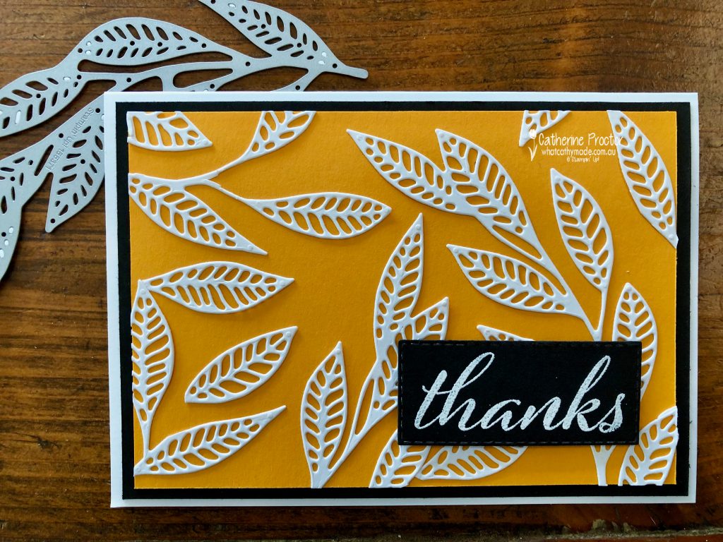
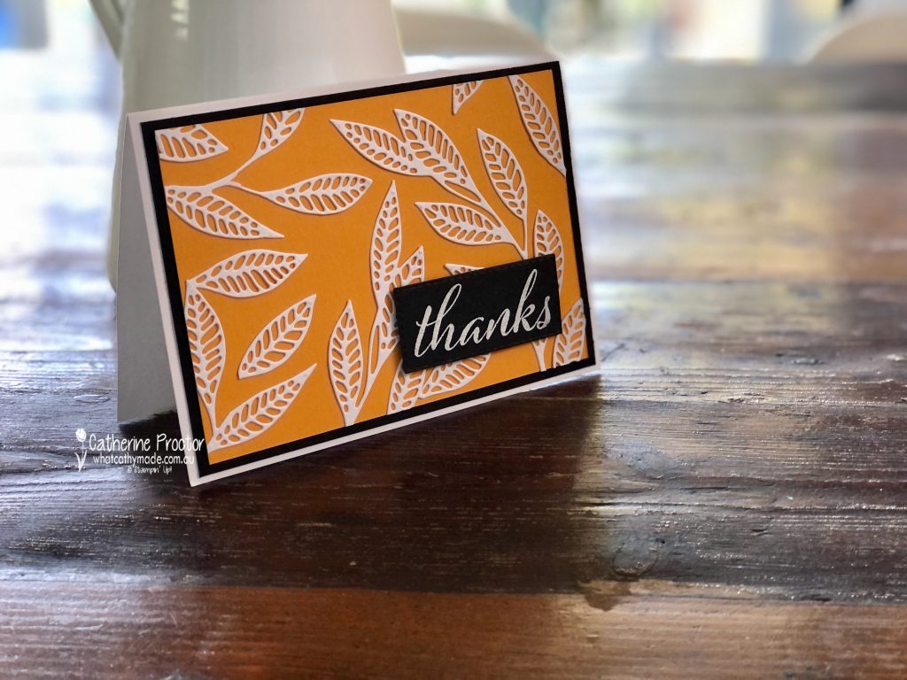
Welcome to week 25 of our 2021-22 Colour Creations blog hop! Tonight we are showcasing Mango Melody, a vibrant orange from the Brights colour collection.
Although the dominant colour on my card is Mango Melody, as they say on Sesame Street, “This card is brought to you by the Adhesive Sheets and the Artistic Dies”!
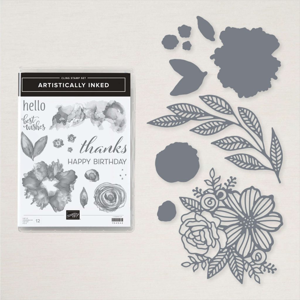
The adhesive sheets and the large leaf die from the Artistic Dies do all the hard work on this thank you card that I have deliberately left unembellished so it can be used for both masculine and feminine occasions. The “Thanks” sentiment is from the Artistically Inked stamp set that you can buy in a bundle with the Artistic dies.
By adding an adhesive sheet to my Basic White card stock BEFORE die cutting the large leaf die several times, I’ve turned this die cut into a sticker. This makes it super easy to chop these branches up and adhere and easily reposition the leaves to the Mango Melody cardstock layer. There’s no fiddly glueing or worrying about glue showing on the cardstock.
Here’s another photo of my Mango Melody card, showing how this colour can either yellowy orange or a darker orange from different angles or in different lights.
Now it’s time to hop on over to our next participant, the lovely Andrea Sargent – I can’t wait to see what Andrea has made this week!
If you find a broken link or have come to this blog hop from a different entry point, you can view the the full list of participants below:


 Designer Series Paper")


")


 Host Designer Series Paper")


")

 Specialty Designer Series Paper")


")


