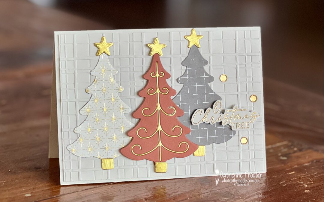
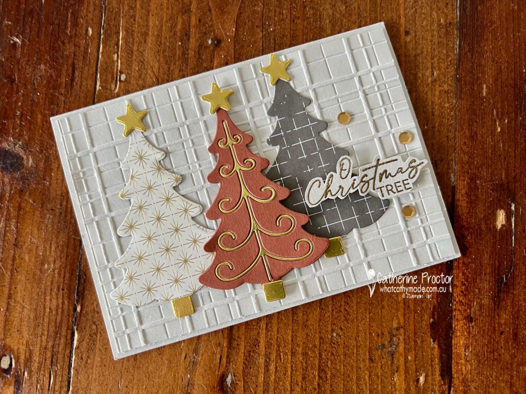
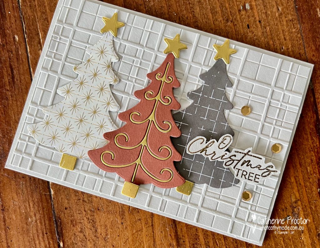
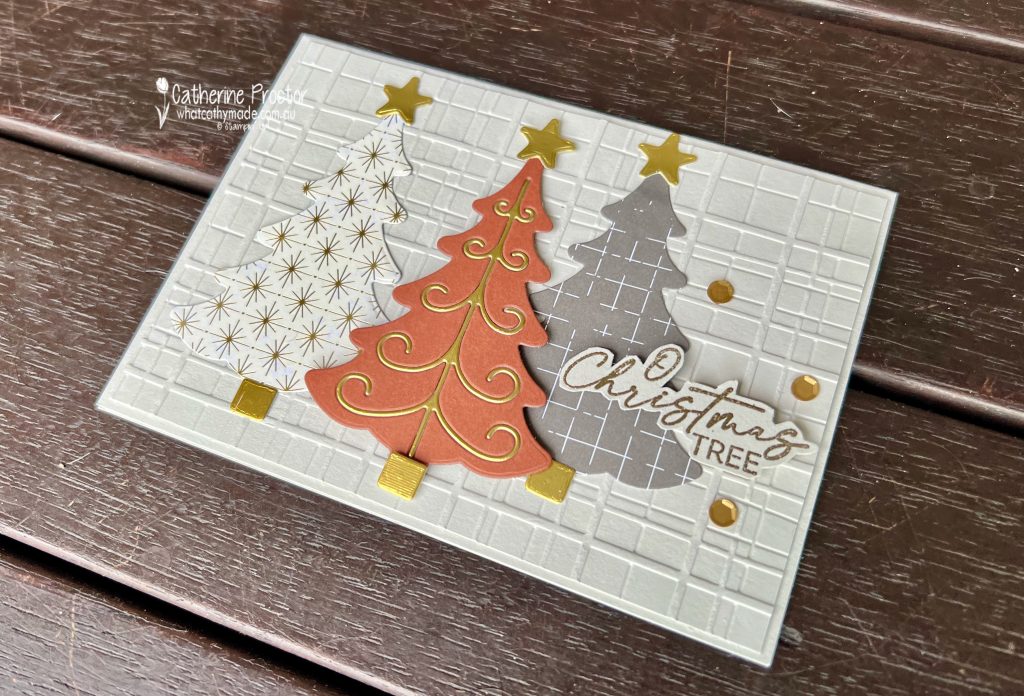
Day 9 of the 30 Day Christmas Card Making Challenge is a colour challenge where we make a card featuring the following colours: cinnamon, charcoal grey and birch white.
My colour combination uses the following Stampin’ Up colours: Copper Clay, Pebbled Path, Basic Beige, Very Vanilla and gold foil.
I’ve used DSP patterns from the Nature’s Sweetness Specialty Designer Series Paper, die cut using dies the Decorative Trees Dies.
The middle tree uses the die inlay technique, with a Copper Clay cardstock tree inlayed with a gold foil spine.
I’ve admired the new Forever Plaid 3D Embossing Folder on so many cards so I popped it into my latest order and I’m so glad I did.
I’ll be back tomorrow with another “30 Days of Christmas” Christmas card.
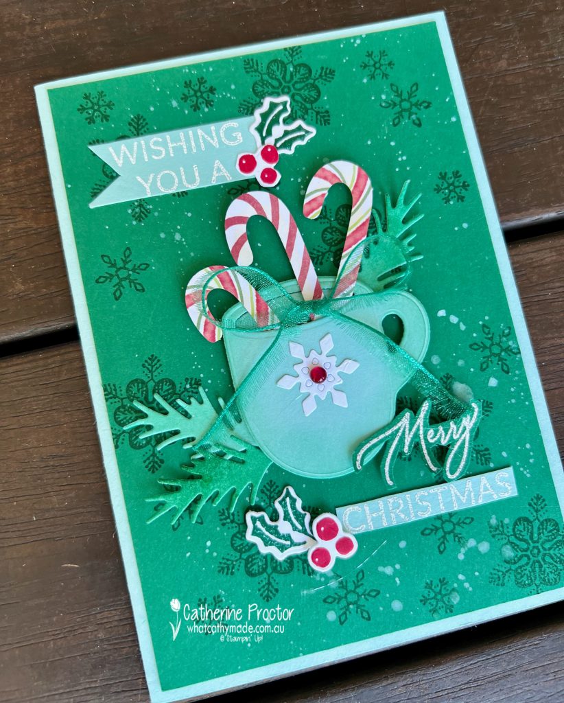
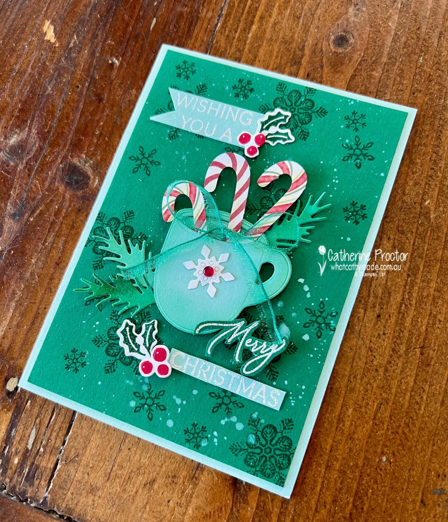
Day 8 of the 30 Day Christmas Card Making Challenge is all about the sweet holiday spirit with candy canes and peppermint-inspired touches!
My colour combination is Shaded Spruce, Pool Party, Real Red and Basic White. I love Shaded Spruce and Pool Party together!
The candy canes are from the Joyful Images Mix & Match Ephemera Pack and I’ve popped them in a mug made using the Latte Love dies to die cut Pool Party Card stock.
I’ve stamped snowflakes from the Snowy Wonder stamp set in Shaded Spruce onto Shaded Spruce cardstock and added white splatters too. The snowflake die on the mug was die cut using the Snowy Wonder dies.
The white heat embossed sentiment is from the Greetings of the Season Stamp Set.
The holly leaves and berries are from the Reindeer Fun bundle.
I’ll be back tomorrow with another “30 Days of Christmas” Christmas card.
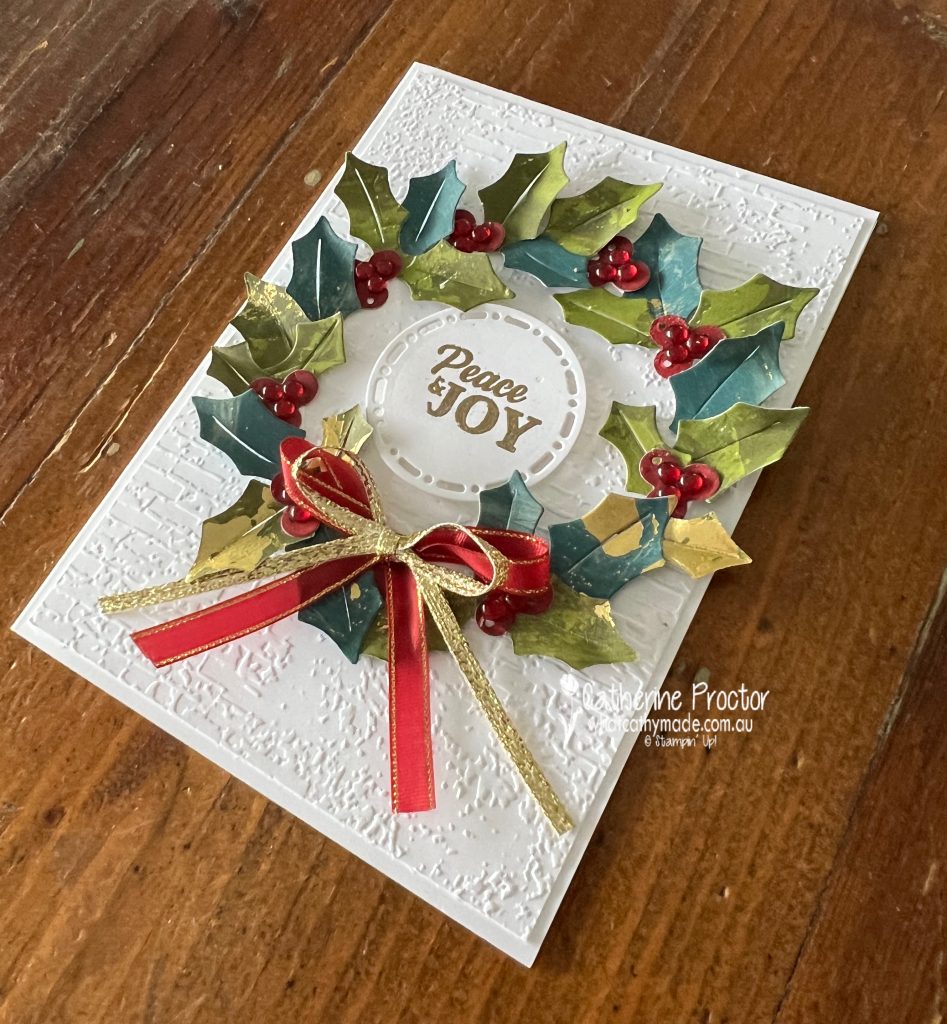
Today’s day 7 of the 30 Day Christmas Card Making Challenge and today’s challenge is all about wreaths.
There were so many gorgeous wreath products I could have used, however I just couldn’t resist pairing the unexpected combination of the holly dies from the Reindeer Fun dies and the Season of Elegance 12″ x 12″ (30.5 x 30.5 cm) Specialty Designer Series Paper.
This close up image shows the beautiful gold leafing on the DSP.
Other material used are the “Peace & JOY” sentiment from the Peaceful Season stamp set (heat embossed in gold and die cut using the Spotlight on Nature dies), the Distressed Brick embossing folder, the Cherry Cobbler & Gold 1/4″ (6.4 mm) Satin Ribbon, gold ribbon from the Gold & Silver 3/16″ (4.8 mm) Trim Combo Pack and Cherry Cobbler & Pearl Adhesive-Backed Berries.
I’ll be back tomorrow with another “30 Days of Christmas” Christmas card.
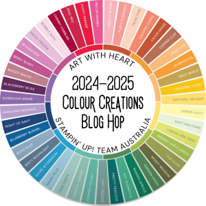
Welcome to week twenty-eight of our Art With Heart 2024-25 Colour Creations blog hop!
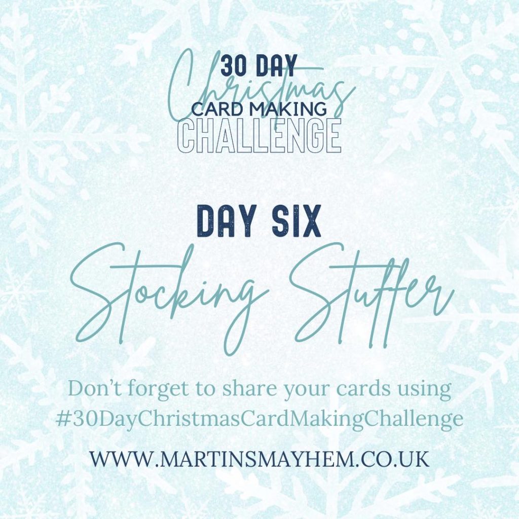
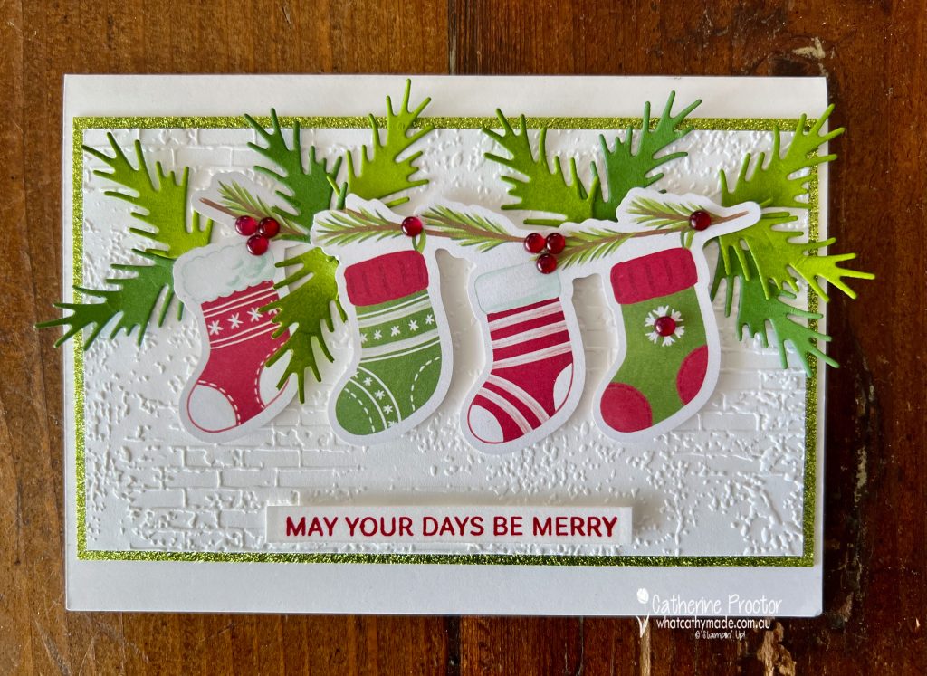
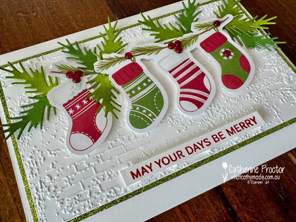
This week we’re featuring Granny Apple Green, a vibrant, fresh green from the Brights family. My card tonight has also been created for the 30 Day Christmas Card making challenge and today’s challenge is Day Six, “Stocking Stuffer”.
As I don’t own a current Christmas stocking stamp, once again, the die cuts from the A Little Bit Festive DSP come to the rescue!
Luckily, the four stockings die cut piece are coloured with Granny Apple Green, Real Red, Cherry Cobbler, Garden Green and a touch of Pecan Pie.
To make these four stockings look like they are hanging on a mantlepiece I’ve added a layer of Basic White cardstock embossed using the Exposed Brick 3D Embossing Folder, bordered with the Granny Apple Green glimmer paper. from the Festive 12″ x 12″ (30.5 x 30.5 cm) Glimmer Paper.
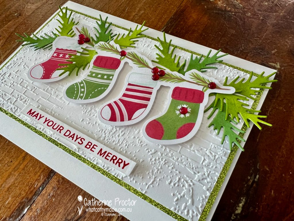
This outdoor photo shows how shimmery the Granny Apple Green glimmer paper is!
To add texture and interest to the four stockings I’ve added Granny Apple Green and Garden Green die cut fronds using dies from the Winterly Tree Top dies. I’ve used a sponge dauber to add more Granny Apple Green to the edges of the foliage.
The red embellishments are from the Cherry Cobbler & Pearl Adhesive-Backed Berries and the Real Red stamped sentiment is from the Decorative Trees stamp set.
Now it’s time to hop in over to our next participant, the lovely Andrea Sargent. I can’t wait to see what Andrea has made this week!
If at any time you find a broken link, you can find the complete list of all participants below.
The AWH Colour Creations team will be back next Wednesday 13th November, showcasing Gray Granite or you can join us on Monday night for some more Christmas inspiration.
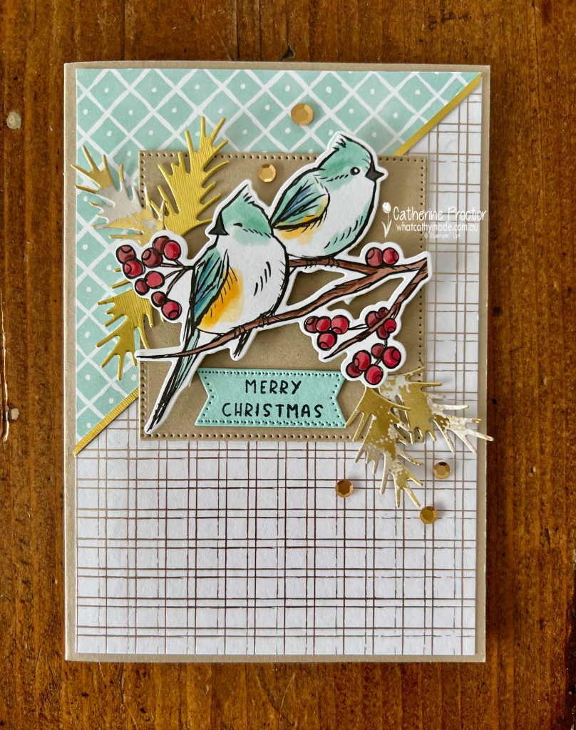
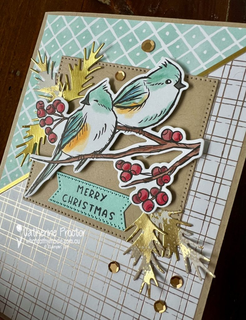
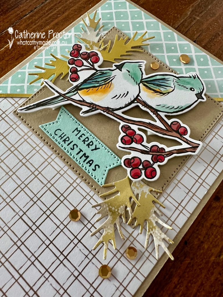
We’re up to day 5 of the 30 Day Christmas Card Making Challenge and today’s challenge is a sketch challenge.
The wonderful thing about a sketch design is that you can use whatever products you have at hand as long as you follow the general sketch layout.
I’ve used the Regal Distressed Patterns Specialty DSP, Season of Elegance DSP and products from the Nests of Winter Suite, including the Nests of Winter DSP and the Winterly Tree Top dies.
The focal image was super easy to make as the birds are from the Nests of Winter DSP, die cut using the Winterly Tree Top dies, so there’s no stamping involved!
The gold fronds are die cut from the Season of Elegance DSP and the brand new online exclusive, the Brushed Silver & Gold Foil Specialty Paper. I also added a thin strip of the new Gold Foil Specialty Paper to highlight the angled line between the DSP on the back of the card.
This photo below shows the gorgeous shine.
The “Merry Christmas” sentiment is from the Humble home stamp set, die cut out with a Stylish Shapes die.
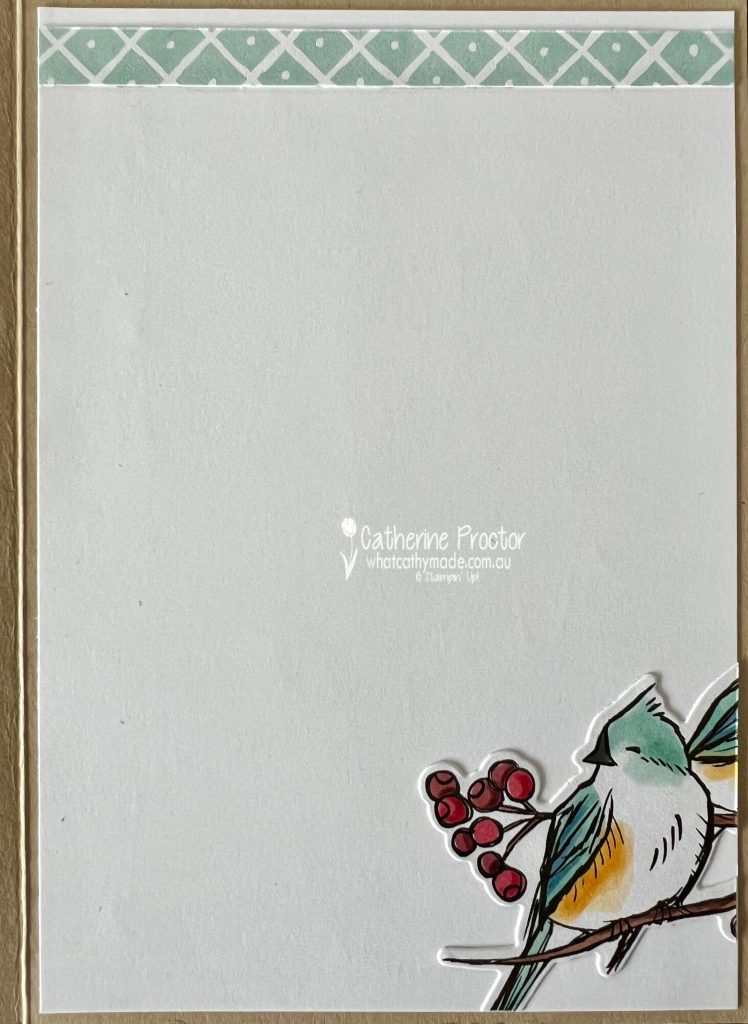
The inside of the card has also been decorated using another image die cut from the Nests of Winter DSP and a left over scrap of DSP.
I’ll be back tomorrow with the AWH Coklour creations blog hop showcasing Granny Apple Green and it will also be another “30 Days of Christmas” Christmas card.