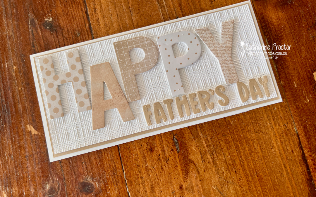
Welcome to Week 18 of the Art With Heart Colour Creations Blog Hop. This week we’re showcasing Crumb Cake, one of my favourite Stampin’ Up! colours and the perfect colour for a Father’s Day card.
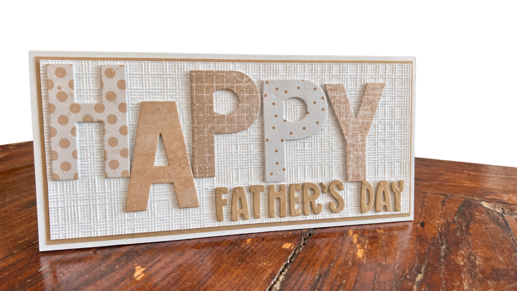
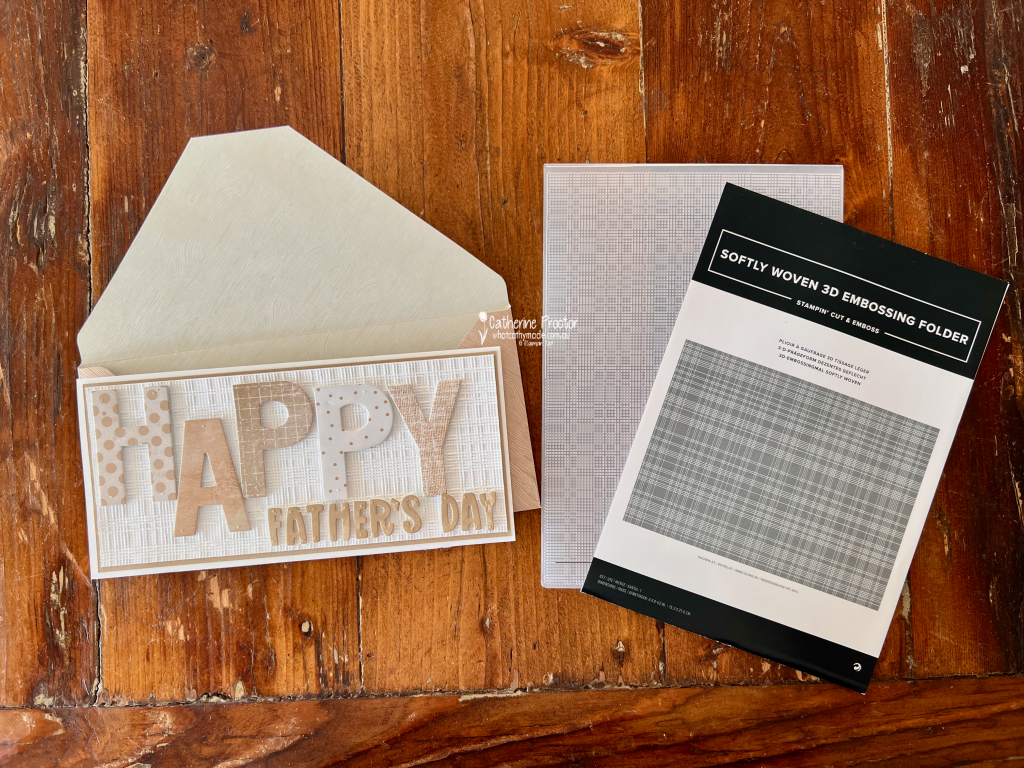
With Father’s Day this Sunday, I’ve created a Crumb Cake and white slimline card, combining lots of pattern, texture and dimension while keeping the colour palette elegantly simple and monochrome.
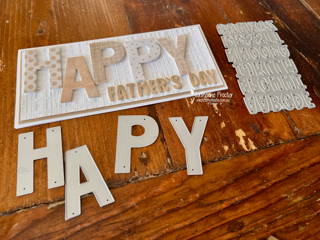
The starting point for my card was the oversized HAPPY sentiment. Rather than cutting all five letters from the same Designer Series Paper, I went through my DSP collection to find five different patterns featuring Crumb Cake. I love how different each one looks, yet they all work together because of the limited colour palette. From left to right, I used: H – Everyday Essentials Mix & Match 12″ x 12″ (30.5 x 30.5 cm) Designer Series Paper A – Beautiful Gallery 6″ x 6″ (15.2 x 15.2 cm) Designer Series Paper P – Nature Walk 12″ x 12″ (30.5 x 30.5 cm) Designer Series Paper P – Everyday Essentials Mix & Match 12″ x 12″ (30.5 x 30.5 cm) Designer Series Paper Y – Delicate Dreams 12″ x 12″ (30.5 x 30.5 cm) Specialty Designer Series Paper
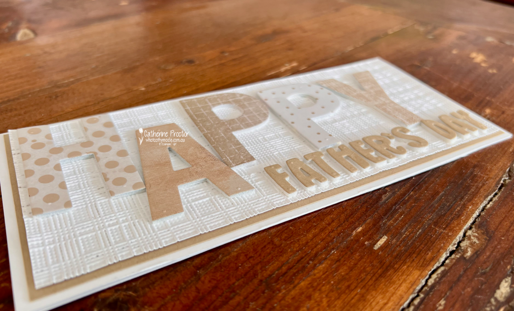
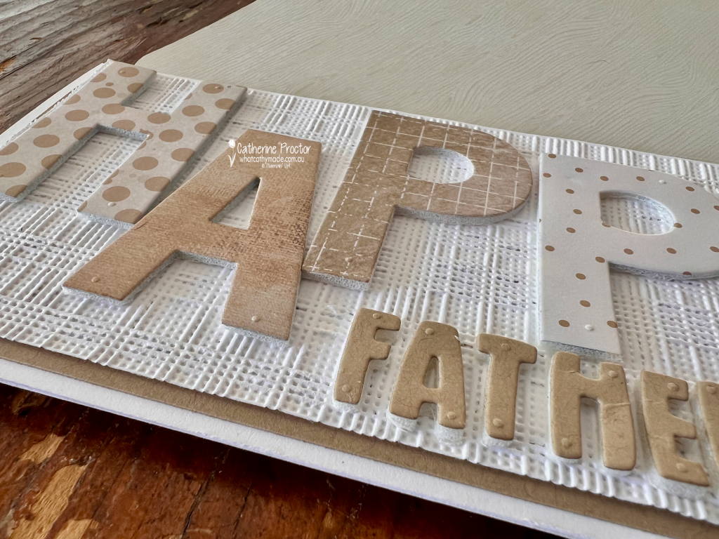
Before die cutting the letters, I adhered the DSP to Adhesive Foam Sheets. This was an easy way to give the large letters plenty of dimension and really lift them away from the embossed background. This photo shows the lovely dimension. the foam gives to the words.
And that background adds even more texture! The Basic White layer has been embossed with the Softly Woven Embossing Folder. I especially love the contrast between its woven texture and all the different prints in the HAPPY letters.
The smaller FATHER’S DAY sentiment was die cut from Crumb Cake card stock using the Mini Alphabet Dies. I kept this part of the sentiment quite simple so it didn’t compete with those fabulous oversized letters from the Party Alphabet Dies.
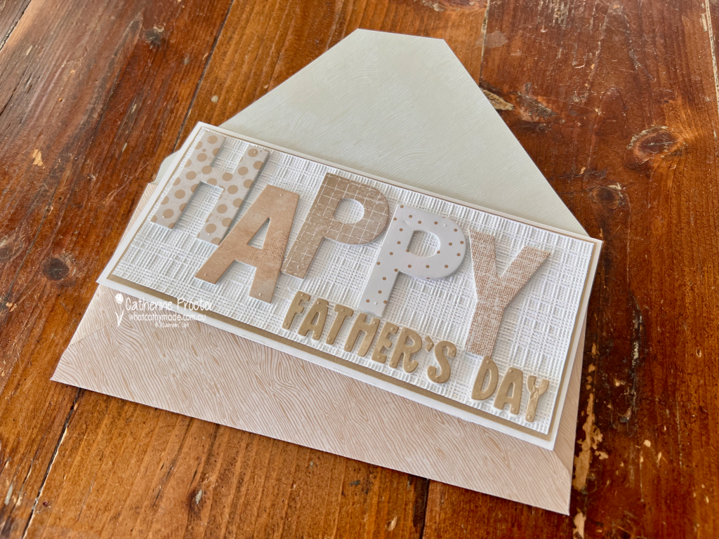
I do love slimline cards. The extra length was perfect for the large letters in this design, however it also meant I needed to make an envelope to fit.
I used a sheet of Wood Grain Wonders 12″ x 12″ (30.5 x 30.5 cm) Designer Series Paper to create a coordinating envelope. The subtle Crumb Cake woodgrain couldn’t have been more perfect for this Father’s Day card.
I think this project is a great example of how a limited colour palette doesn’t have to mean a simple design. Mixing patterns, embossed texture and different levels of dimension gives a monochromatic project so much interest.
Take a look at some more Crumb Cake inspiration on our Insta Hop!
Our blog hop is now an Instagram hop but the good news is that you don’t need to have an Instagram account to view all of the other projects!
Simply go to my Insta handle in a new search engine window to follow the Instagram hop: @whatcathymade.
Welcome to Week 17 of the Art With Heart Colour Creations Blog Hop. This week we are creating with the gorgeous Coastal Cabana.
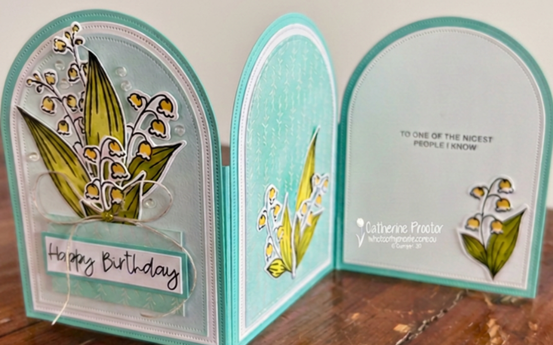
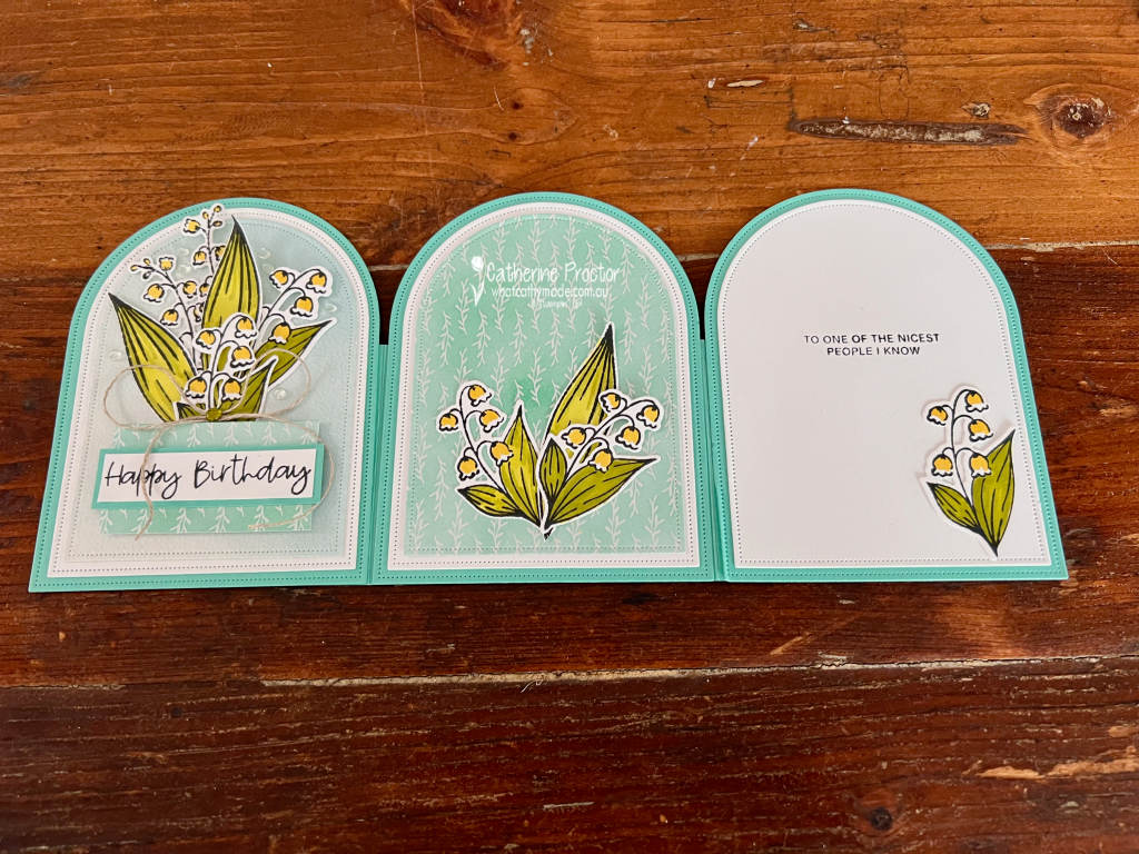
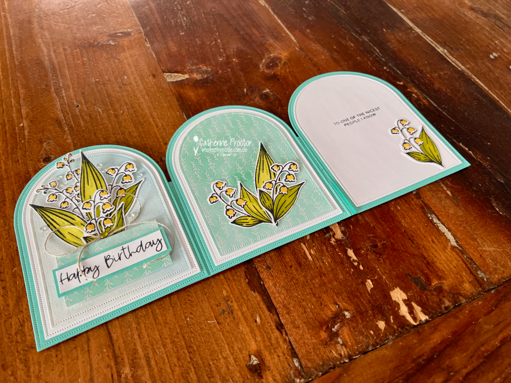
For my project this week, I’ve made a tri-fold arch card using the stunning Valley in Bloom Suite Collection. I love the way this card opens out to reveal three arched panels, and because it stands up so beautifully, it makes a wonderful display card too.
I used the three largest dies from the Everyday Arches Dies to create the layers and shape of my card.
The Coastal Cabana card base consists of three arch-shaped panels joined together, with each panel decorated slightly differently. When completely opened, the three arches create a lovely continuous display, while the folds allow the card to stand on its own.
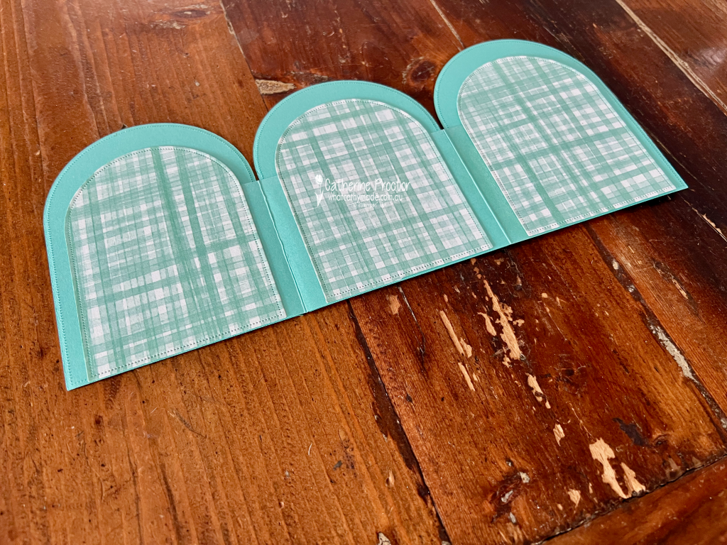
I also decorated the reverse of each panel with coordinating Designer Series Paper, so the card looks just as pretty from the back when it is standing on display.
My colour combination was taken directly from the Valley in Bloom 12″ x 12″ (30.5 x 30.5 cm) Designer Series Paper:
Coastal Cabana
Darling Duckling
Garden Green
Lemon Lime Twist
Basic White
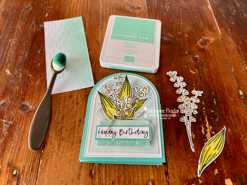
I stamped the lily of the valley images before colouring them with Stampin’ Blends in Darling Duckling, Garden Green and Lemon Lime Twist. I love how those fresh greens and little pops of yellow look against Coastal Cabana.
One of my favourite details on this card is actually quite subtle.
I used one of the beautiful patterns from the Luxe White 12″ x 12″ (30.5 x 30.5 cm) Specialty Designer Series Paper and added Coastal Cabana ink with a Blending Brush.
The soft ink blending allows the delicate white pattern of the paper to remain visible while completely changing its appearance. It was such an easy way to create a coordinating background without covering up the gorgeous detail in this specialty paper.
I used this piece on the front panel behind my largest arrangement of lily of the valley.
For the front panel, I created a fuller floral arrangement, layering several stamped, coloured and die-cut lily of the valley images over the softly blended Luxe White Specialty DSP.
I added a strip of the Valley in Bloom DSP behind the Happy Birthday sentiment, along with a simple linen thread bow and a few clear embellishments.
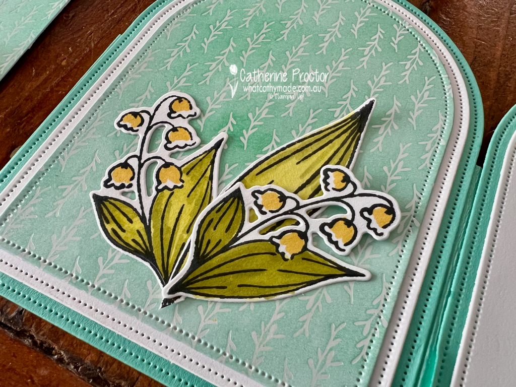
The centre panel features another pattern from the Valley in Bloom DSP, with a smaller arrangement of flowers positioned towards the bottom of the arch. I love how this panel lets that pretty Coastal Cabana pattern become part of the design rather than simply acting as a background.
The final panel is kept predominantly Basic White to leave plenty of room for a handwritten message. I stamped the sentiment “To one of the nicest people I know” and added one smaller lily of the valley image in the bottom corner to tie it back to the other two panels.
The combination of the repeating arch shapes, fresh colours and delicate flowers makes this card feel so light and spring-like.
And if you love the Valley in Bloom Designer Series Paper as much as I do, it’s an especially good time to stock up because it is on sale now.
I really enjoyed making this tri-fold design and I think the Everyday Arches Dies are perfect for this style of card. It looks quite impressive opened out, but I especially love that the recipient can stand it up and enjoy it long after their birthday.
Take a look at some more Coastal Cabana inspiration on our Insta Hop!
Our blog hop is now an Instagram hop but the good news is that you don’t need to have an Instagram account to view all of the other projects!
Simply go to my Insta handle in a new search engine window to follow the Instagram hop: @whatcathymade.
Welcome to Week 15 of the Art With Heart Colour Creations Blog Hop. This week we’re creating with Cloud Cover, a beautiful soft blue-grey that works wonderfully with Secret Sea.
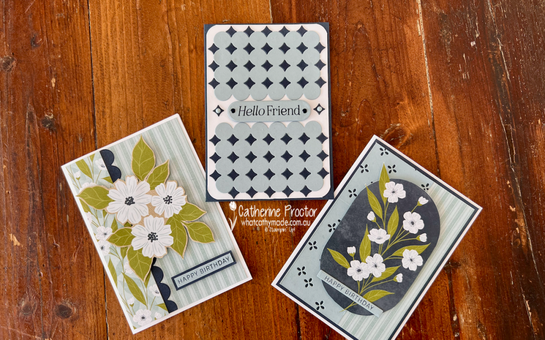
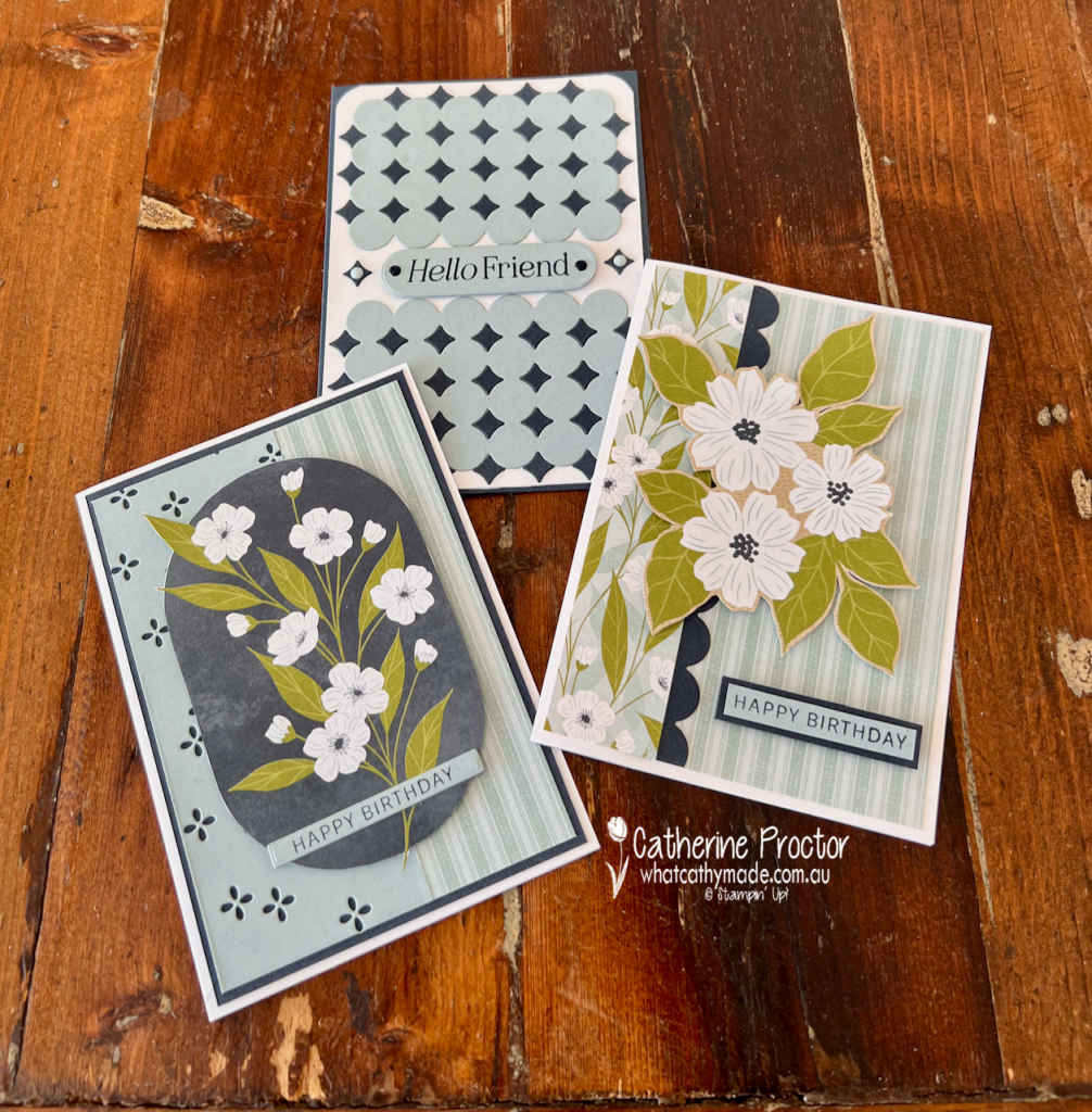
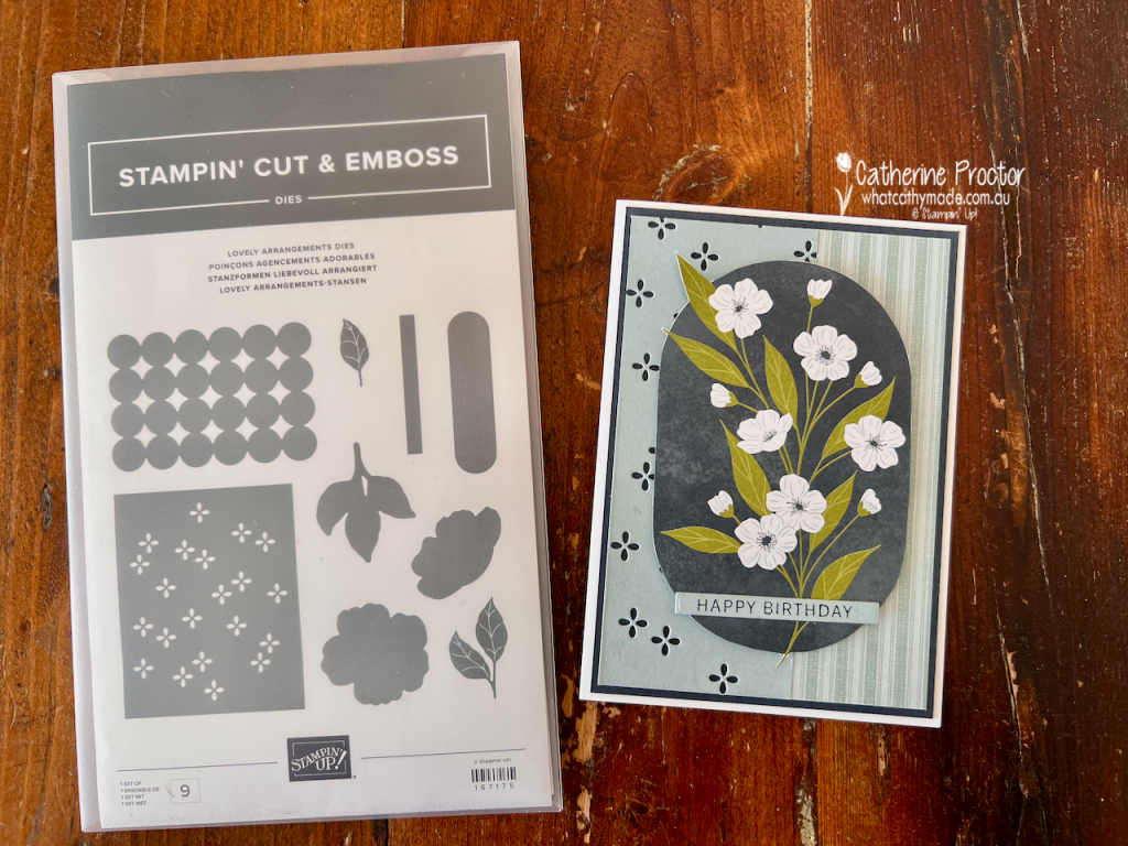
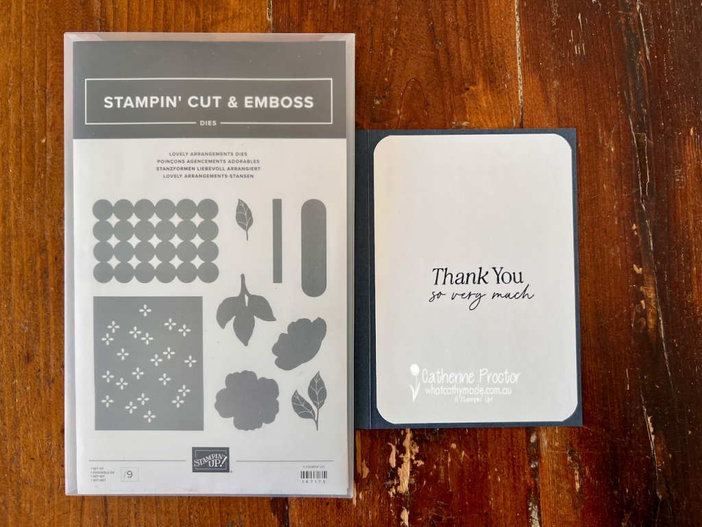
For my projects this week, I’ve paired Cloud Cover with Secret Sea, Old Olive and Basic White to create three very different cards using the Lovely Blossoms Designer Series Paper and the Lovely Arrangements Bundle.
And yes, this is another one of those DSP packs I’ve been hoarding because it’s just too lovely to cut into!
The good news is that Lovely Blossoms Designer Series Paper is currently included in the Stampin’ Up! paper sale, so it seemed like the perfect excuse to finally put some of mine to use.
The Lovely Arrangements Dies are also now in the Last Chance section of the Stampin’ Up! website, so if these versatile dies have been on your wish list, you might want to grab them before they disappear.
Card One – Fussy-cut florals
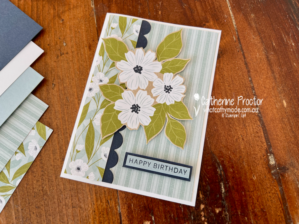
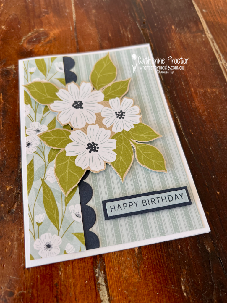
For my first birthday card, I let the gorgeous Lovely Blossoms DSP do most of the work.
I covered the card front with the subtle Cloud Cover striped pattern, then added a contrasting strip of the floral DSP down the left-hand side.
A narrow Secret Sea scalloped border was die cut using the Circle Lattice Die from the Lovely Arrangements Dies, creating definition between the two patterns.
The large floral arrangement was fussy cut directly from the DSP. I love doing this with papers that have beautiful large-scale imagery because you get all the detail of a stamped and coloured image without having to do any stamping at all.
I popped the arrangement up to give the card some dimension, then finished it with a simple Happy Birthday sentiment from the Lovely Arrangements stamp set, layered onto Secret Sea card stock.
Card 2 – Flower Frame
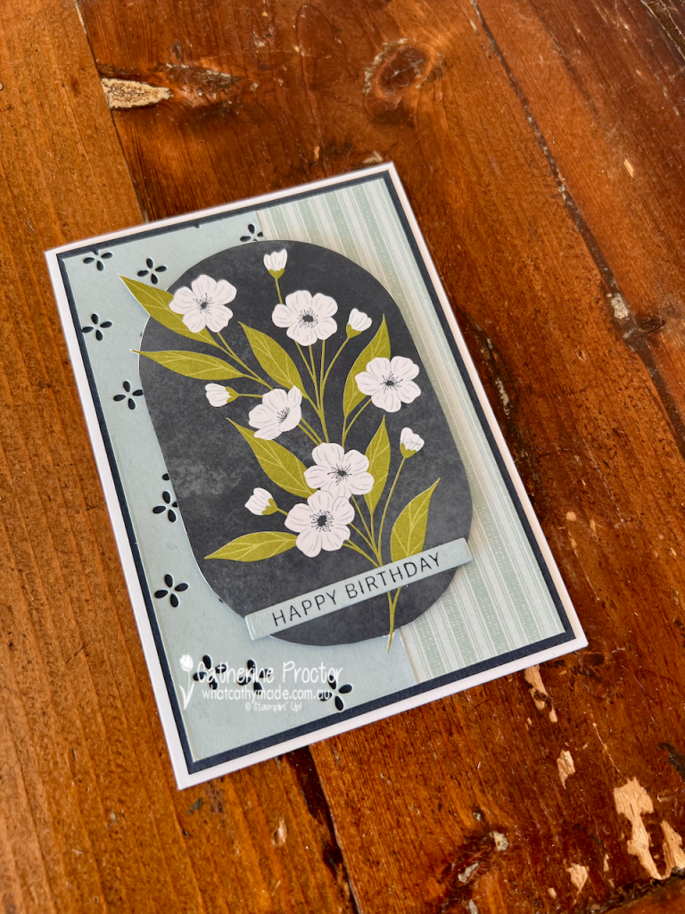
My second card uses another section of the Lovely Blossoms DSP, this time featuring the delicate white flowers and Old Olive foliage.
I once again fussy cut the floral arrangement from the DSP and layered over the Cloud Cover layer on the card front. I combined Cloud Cover card stock with another strip of the striped DSP.
I used the small floral detail die from the Lovely Arrangements Dies to cut tiny flowers into the Cloud Cover panel, allowing the Secret Sea layer underneath to show through.
A simple Happy Birthday sentiment across the bottom of the floral panel completes the card.
Card 3 – Lovely Arrangements Dies
For my third card I wanted to show just how versatile the Lovely Arrangements Dies can be, even without using the floral DSP.
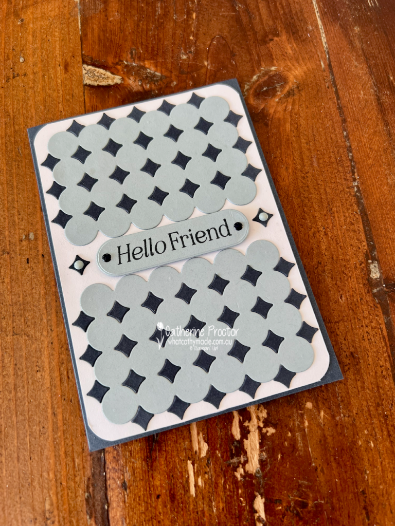
I used the Circle Lattice Die to cut two panels from Cloud Cover card stock. I also cut the die twice from Secret Sea card stock, this time keeping the small negative diamond-shaped pieces. I carefully adhered these into the openings in the Cloud Cover panels to create a striking geometric pattern.
I love the contrast between the soft Cloud Cover and deep Secret Sea, and how this simple technique gives the die a completely different look.
The panels are mounted onto a Basic White card stock layer and I rounded the corners to reflect the overall circular design.
Between the two panels I added a Hello Friend sentiment on a Cloud Cover label, with more Secret Sea card stock diamonds on either side and a few Secret Sea and Cloud Cover embellishments from the Moody Palette Glossy Dots to finish it off.
It has a completely different look from the first two cards, but uses exactly the same die set! Here’s the inside of the card.
Take a look at some more Cloud Cover inspiration on our Insta Hop!
Our blog hop is now an Instagram hop but the good news is that you don’t need to have an Instagram account to view all of the other projects!
Simply go to my Insta handle in a new search engine window to follow the Instagram hop: @whatcathymade.
Welcome to Week 15 of the Art With Heart Team Colour Creations Blog Hop! This week we’re creating with Cherry Cobbler, a rich, classic red that is absolutely perfect for Christmas.
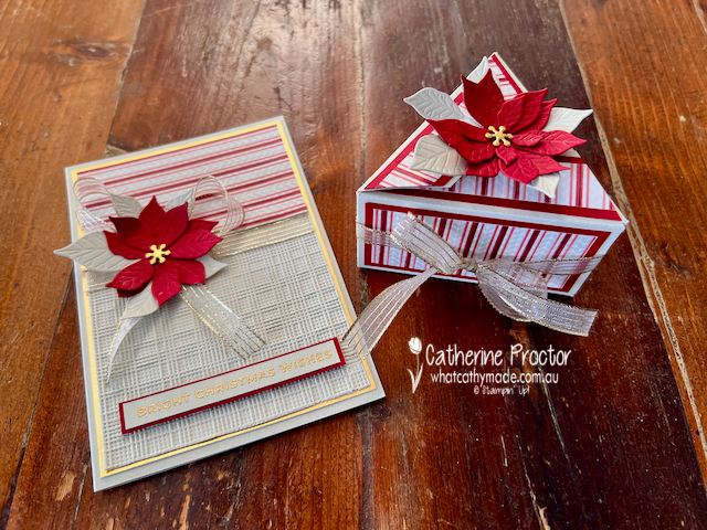
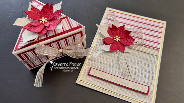
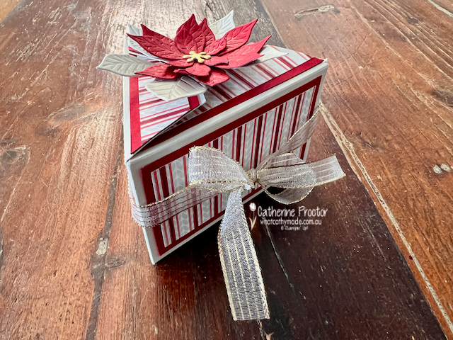
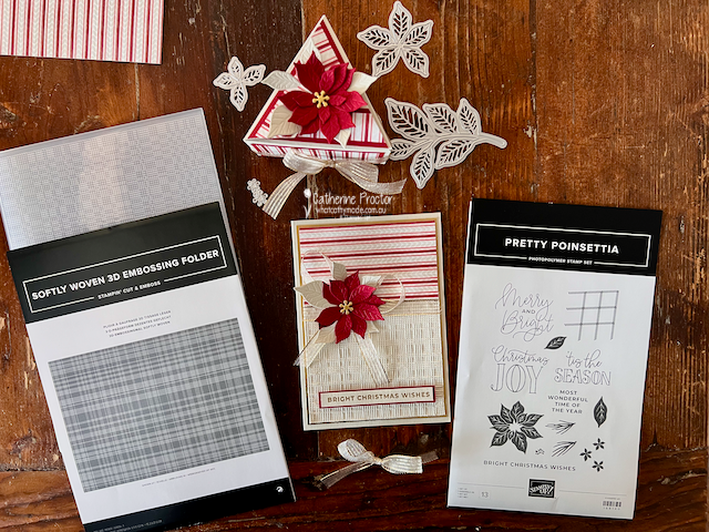
For my project this week, I’ve made a coordinating Interlocking Triangle Gift Box and Christmas card, using the gorgeous Pretty Poinsettia Bundle.
Interlocking Triangle Gift Box
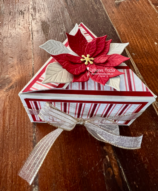
How fabulous is this box? I love the unusual triangular shape and the clever way the sections interlock to close.
The instructions came from “Lauren’s Scrap Lot”, who has a fantastic video on YouTube showing exactly how to make this box. It looks quite intricate when it’s finished, but her video makes the construction very easy to follow.
I decorated my box with the beautiful Basic Beige and Cherry Cobbler striped Designer Series Paper from the A Little Christmas 12″ x 12″ (30.5 x 30.5 cm) Designer Series Paper.
This DSP is a little sneak peek from the new September–December 2026 Mini Catalogue, available from 1 September.
The top of the box is decorated with layered poinsettias and leaves from the Pretty Poinsettia Bundle. I love all the texture in these flowers, especially when the different shades of Cherry Cobbler are layered together.
I finished the box with the Gold Striped 3/8″ (1 cm) Mesh Ribbon, which adds a lovely soft shimmer and ties in beautifully with the gold accents.
This video shows how the box opens up.
A Coordinating Christmas Card
Of course, I couldn’t make such a special gift box without making a card to match!
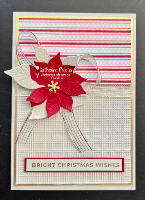
I carried the same striped DSP, poinsettia and ribbon across to the card so the two pieces work together as a coordinated Christmas gift set.
For the bottom section of the card, I used another new product coming in the September–December 2026 Mini Catalogue, the Softly Woven 3D Embossing Folder. The woven texture is gorgeous and adds so much interest to the Basic Beige cardstock without competing with the poinsettia.
The sentiment, “Bright Christmas Wishes”, has been given a touch of gold to complement the ribbon and the thin gold layer around the card front.
I really love this combination of Basic Beige and Cherry Cobbler with touches of gold. It feels warm and traditional, but the neutral Basic Beige gives it a softer, more contemporary Christmas look.
And I think this little Interlocking Triangle Gift Box would be perfect for filling with chocolates, jewellery or another small Christmas surprise.
Take a look at some more Cherry Cobler inspiration on our Insta Hop!
Our blog hop is now an Instagram hop but the good news is that you don’t need to have an Instagram account to view all of the other projects!
Simply go to my Insta handle in a new search engine window to follow the Instagram hop: @whatcathymade.
Welcome to Week 14 of the Art With Heart Team Colour Creations Blog Hop! This week we’re celebrating the vibrant and cheerful Calypso Coral.
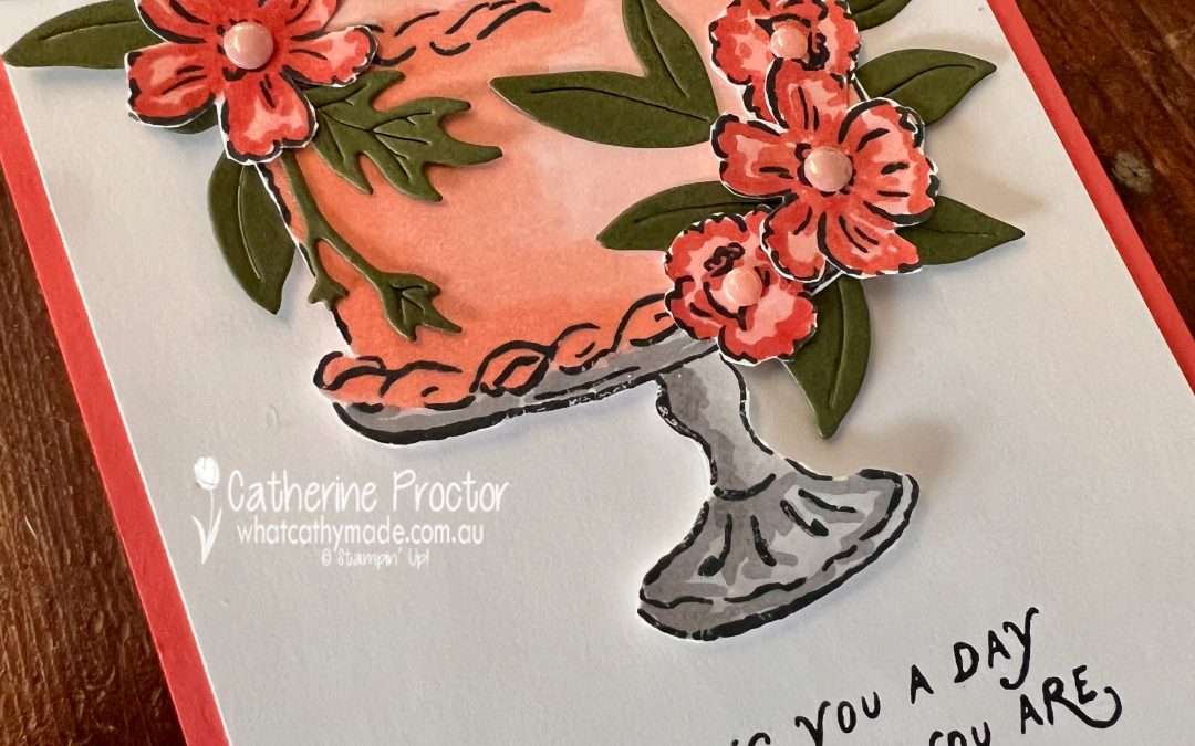
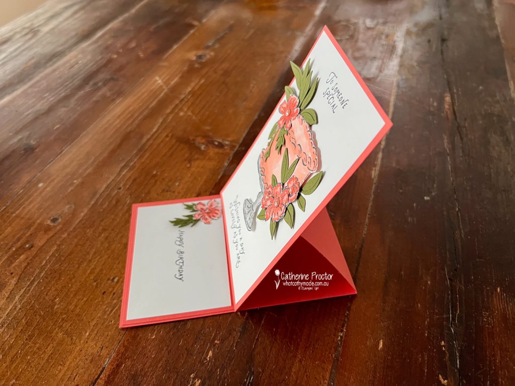
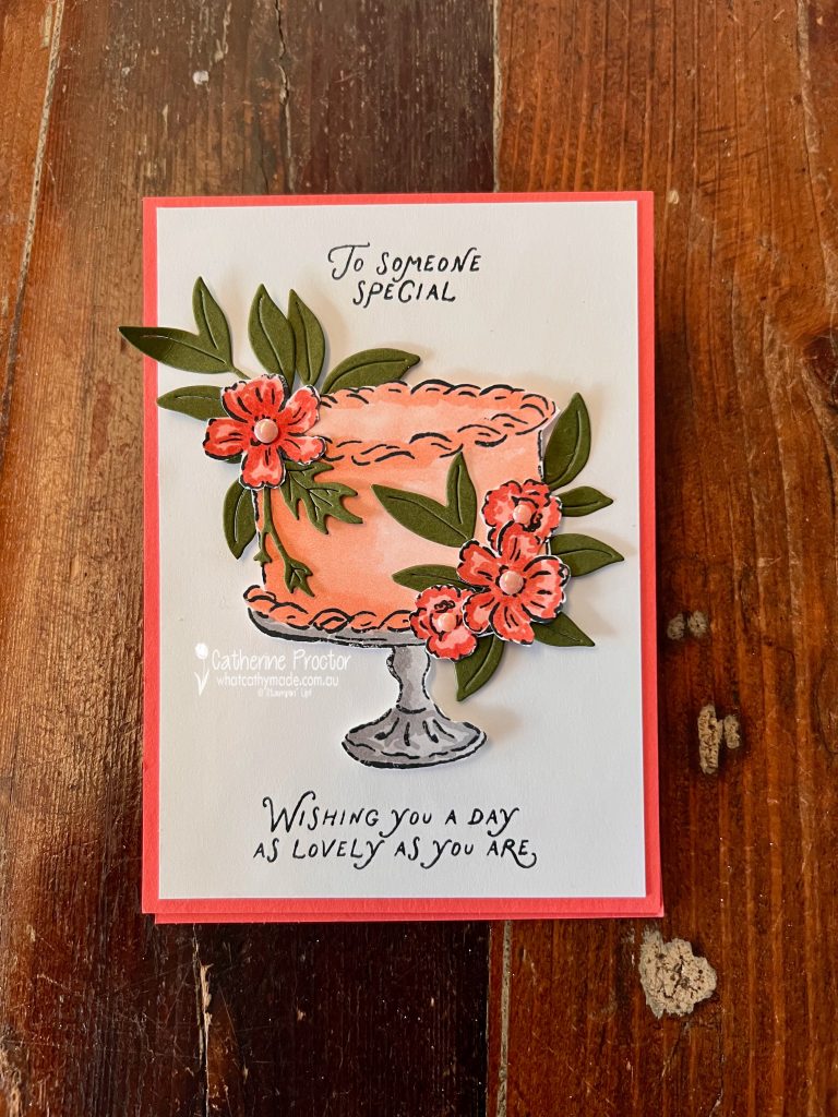
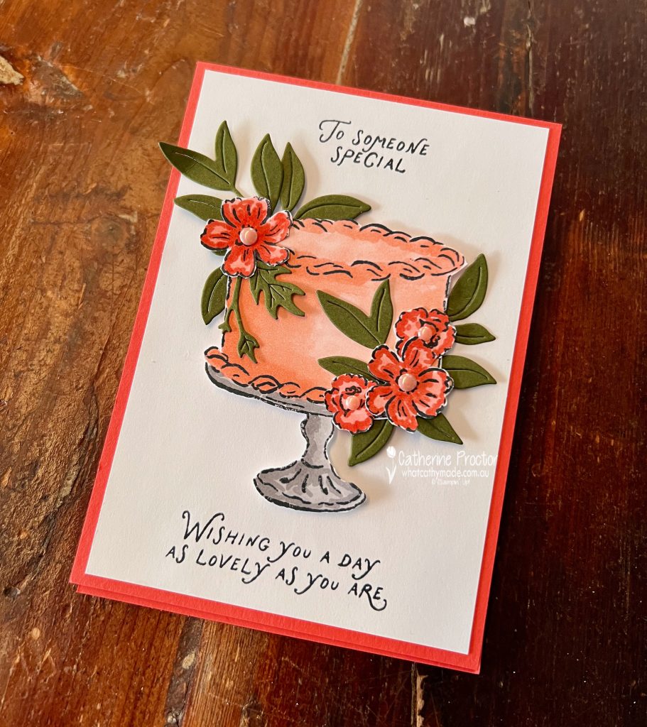
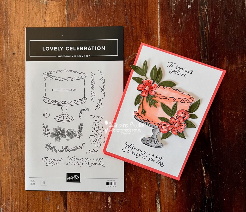
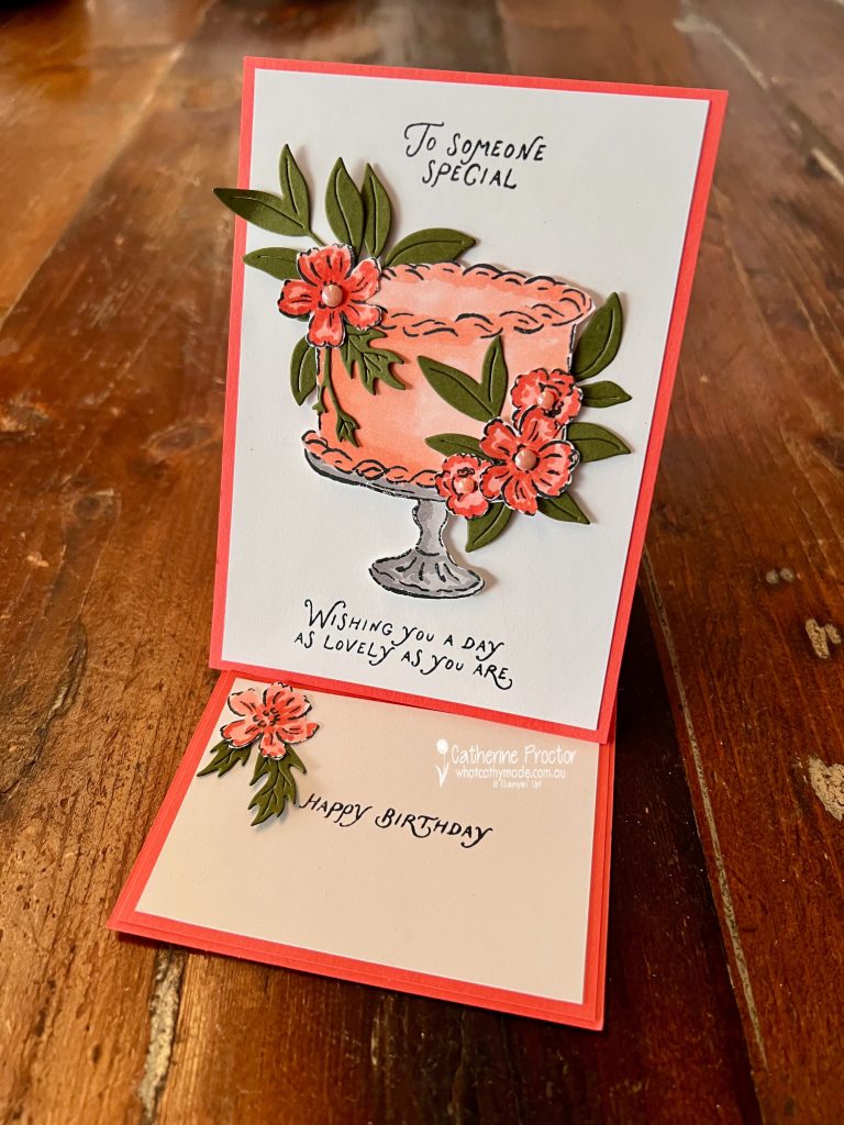
For my project, I created a simple easel card featuring one of the gorgeous new stamp sets from the forthcoming Stampin’ Up! September–December Catalogue – Lovely Celebration. I couldn’t wait to ink it up!
The beautiful cake image is coloured with Crisp Cantaloupe Stampin’ Blends, giving it a soft peachy look that pairs beautifully with the Calypso Coral card base. The elegant cake stand is coloured with Smoky Slate Stampin’ Blends to create a classic silver finish.
To frame the cake, I stamped and fussy cut the floral images, colouring them with Calypso Coral Stampin’ Blends. The flower centres are embellished with the gorgeous 2026–2028 In Color™ Dots in Crisp Cantaloupe, adding just the right amount of shine and dimension.
The foliage was die cut from Old Olive Cardstock using the Help Me Grow Dies and tucked behind the flowers to create a lush floral arrangement. All of the sentiments are from the Lovely Celebration stamp set.
Although this card looks like a standard greeting card when closed, it opens into an easel card that stands beautifully for display.
A double layered cardstock insert with small floral embellishment inside provides a place for the sentiment and message and acts as the stopper to hold the easel upright.
Take a look at some more Calypso Coral inspiration on our Insta Hop!
Our blog hop is now an Instagram hop but the good news is that you don’t need to have an Instagram account to view all of the other projects!
Simply go to my Insta handle in a new search engine window to follow the Instagram hop: @whatcathymade.
Welcome to Week 13 of the Art With Heart Team Colour Creations Blog Hop! This week we’re celebrating Cajun Craze, one of Stampin’ Up!’s rich, earthy colours that works beautifully for masculine cards, autumn projects and vintage-inspired designs.
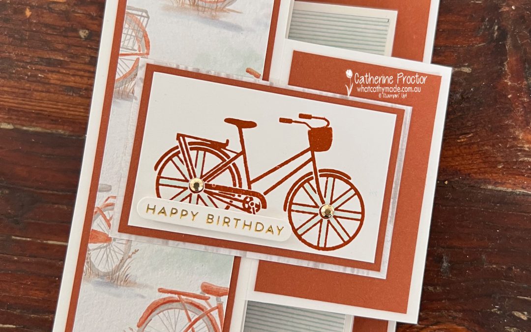
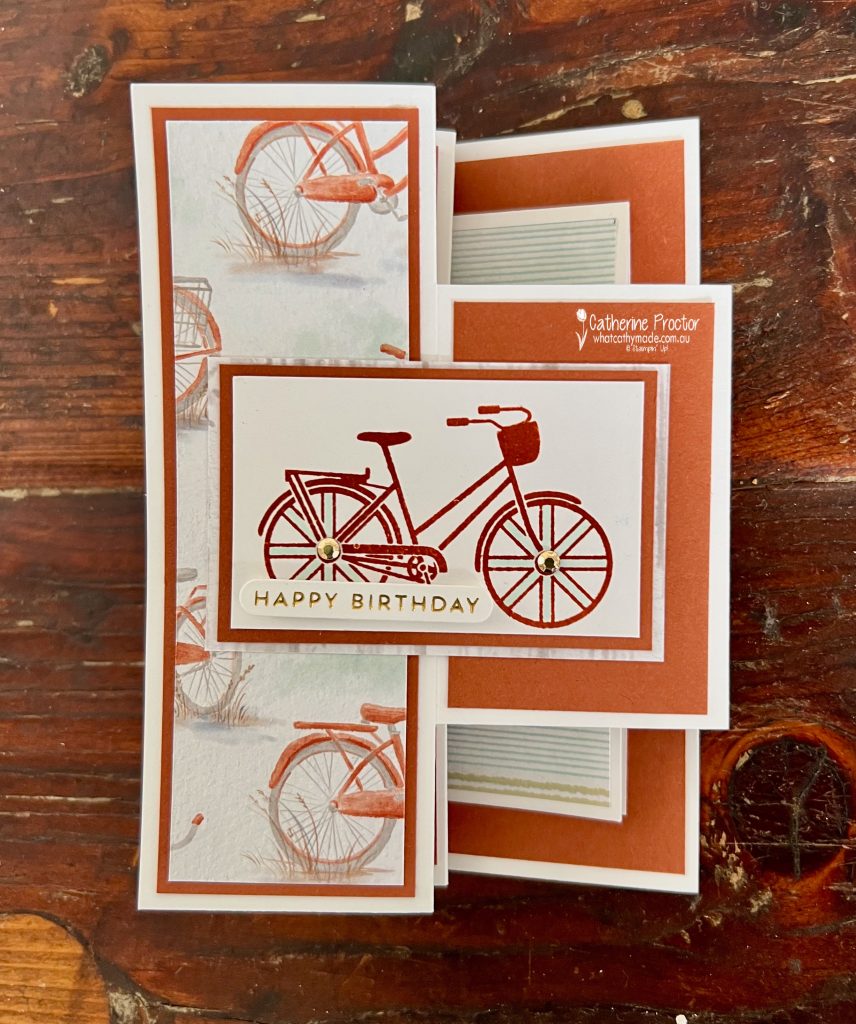
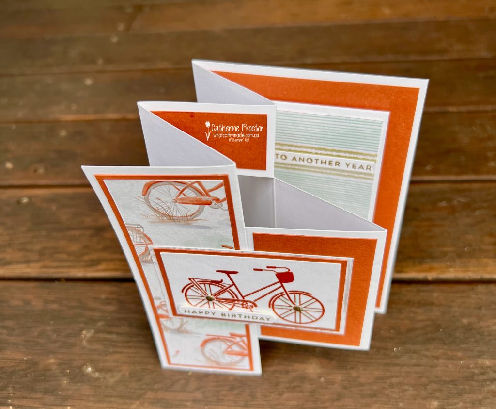
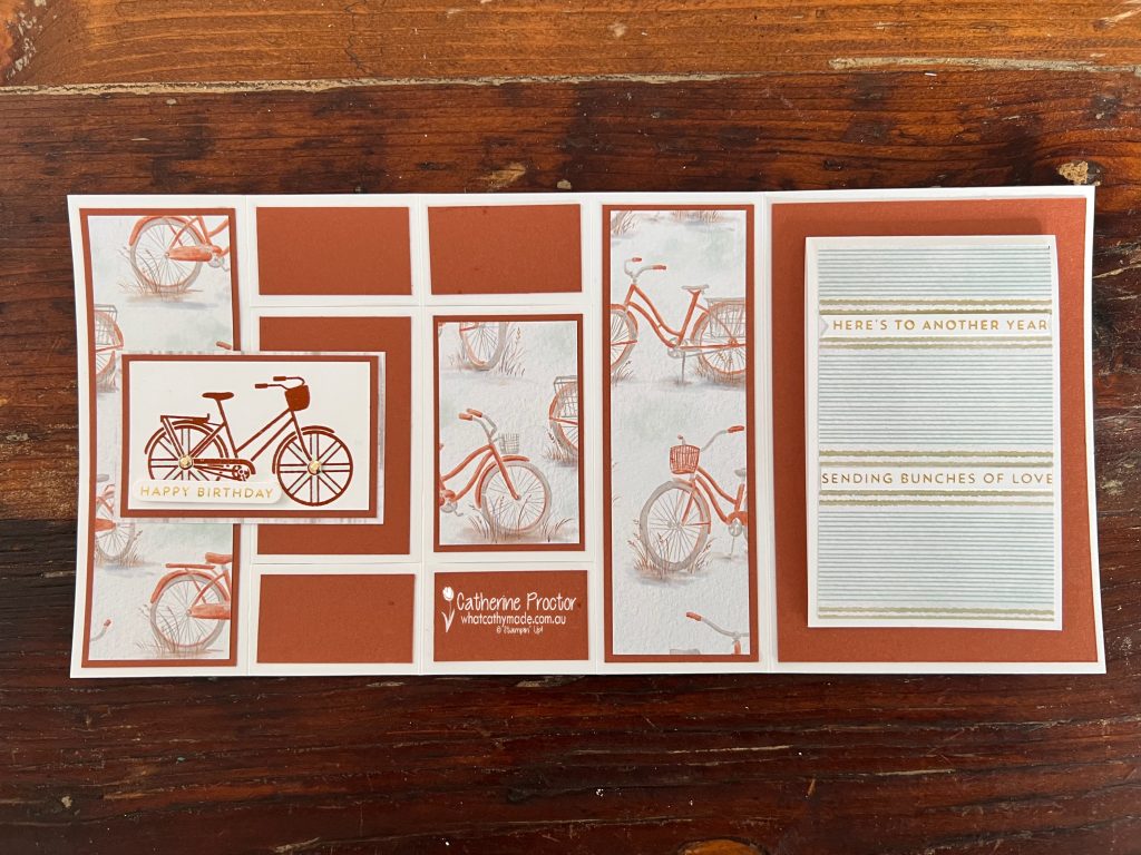
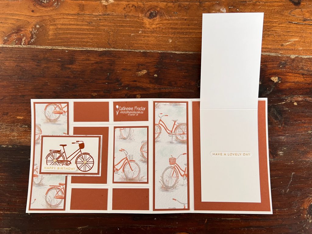
For my project, I created an Accordion Z Fold Card with a Card Within a Card. Yes… that’s quite a mouthful! But it’s also a really fun interactive fold that has plenty of wow factor.
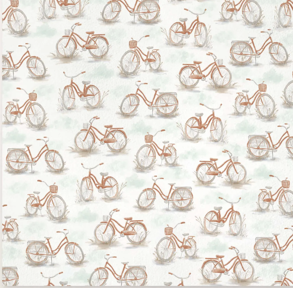
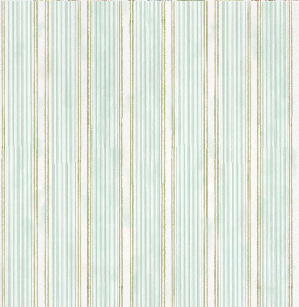
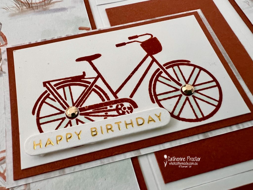
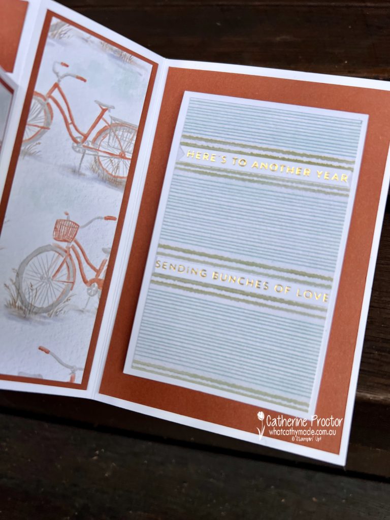
I made this card for my brother’s birthday and chose the gorgeous bicycle pattern and striped pattern from the Waterside Retreat 12″ x 12″ (30.5 x 30.5 cm) Designer Series Paper as my starting point.
I loved pairing it with the adorable bicycle stamp from the June “Bikes & Blooms” Paper Pumpkin Kit—it was the perfect match.
Here’s what the fancy fold looks like from above…
Here’s what it looks like laid out flat…
And here’s the “Card Within a Card” inside the accordion fold!
One of my favourite details on this card is the shiny foil on all of the sentiments. If you noticed those little glints of metallic shine, that’s thanks to my new Stampin’ Up! Hot Foil System!
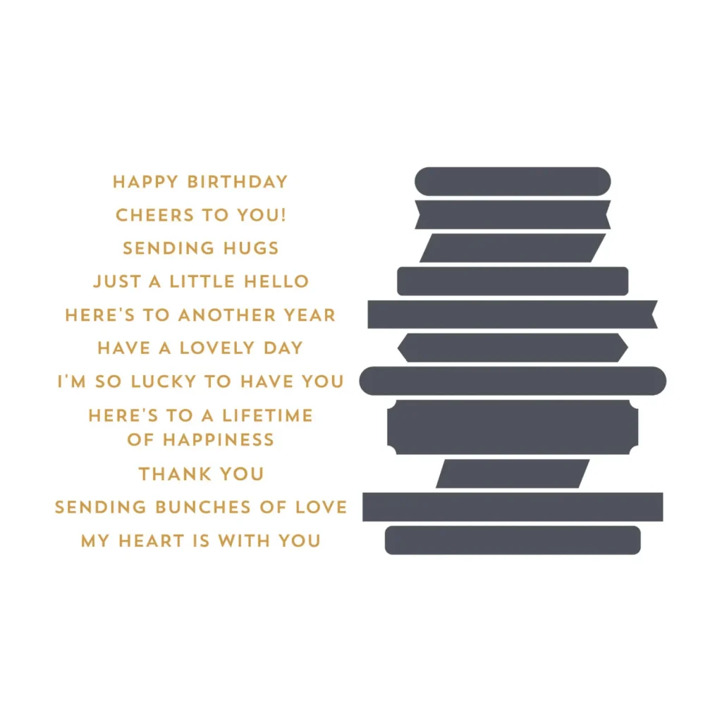
I used the Sweetly Sentimental Hot Foil Dies, and I’m absolutely loving the elegant finish they add to a project.
This fold is surprisingly easy to make and gives you plenty of space to decorate both inside and out, making it ideal for special birthdays and other milestone occasions.
Take a look at some more Cajun Craze inspiration on our Insta Hop!
Our blog hop is now an Instagram hop but the good news is that you don’t need to have an Instagram account to view all of the other projects!
Simply go to my Insta handle in a new search engine window to follow the Instagram hop: @whatcathymade.
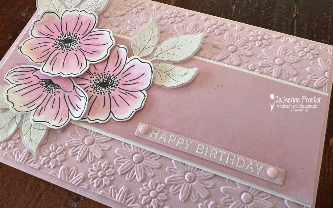
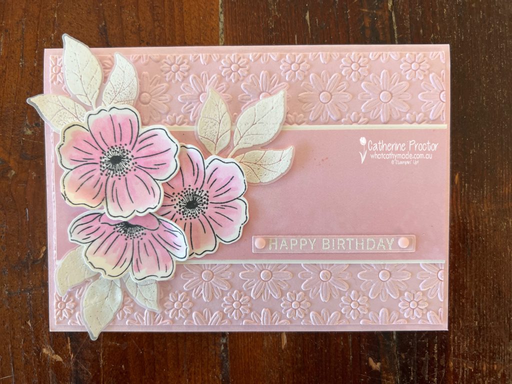
Week 12 of our Art With Heart Colour Creations Insta hop is all aboutBubble Bath, one of those beautifully soft pinks that works for almost any occasion. Delicate without being overpowering, it’s perfect for creating elegant floral cards with a subtle, feminine feel.
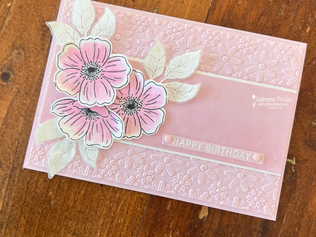
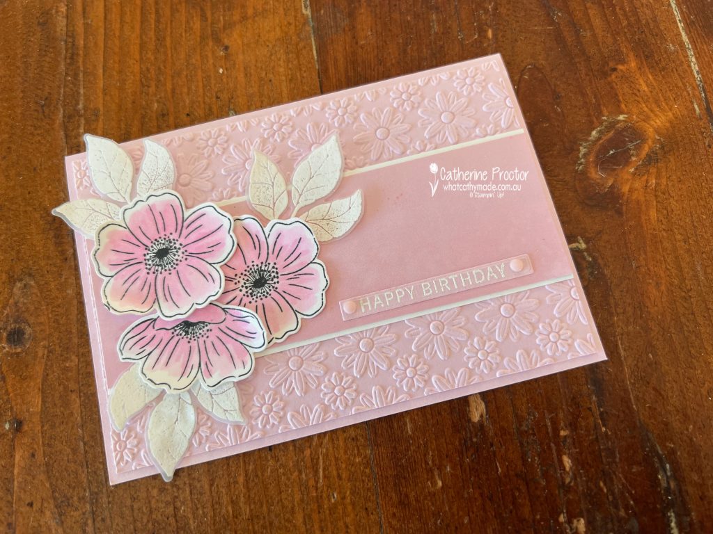
For my project I’ve created a monochromatic birthday card, using different shades, textures and layers to add interest while keeping the colour palette beautifully simple.
The floral arrangement was created with the Lovely Arrangements Bundle, with the flowers stamped in Memento Tuxedo Black Ink and coloured using both the Light and Dark Bubble Bath Stampin’ Blends. Using the two Blends adds subtle shading and depth while keeping the card beautifully monochromatic.
The leaves were stamped onto Vellum Cardstock using VersaMark Ink and white heat embossed. The translucent vellum softens the foliage, allowing it to sit behind the flowers without competing for attention, while the crisp white embossing adds an elegant finish.
The Happy Birthday greeting on the front was white heat embossed on Bubble Bath card stock before being die cut using the thin sentiment die from the Lovely Arrangement Dies.
I embossed the background using the Lazy Daisy 3D Embossing Folder, adding plenty of texture while allowing the soft Bubble Bath colour to remain the star of the show.
To break up the background, I added a strip of Beach Boardwalk 12″ x 12″ (30.5 x 30.5 cm) Designer Series Paper, layered over a slightly wider strip of Basic White cardstock. This simple layering technique helps frame the floral arrangement, introduces a subtle pattern and adds another layer of interest while keeping the overall design soft and elegant.
Take a look at some more Bubble Bath inspiration on our Insta Hop!
Our blog hop is now an Instagram hop but the good news is that you don’t need to have an Instagram account to view all of the other projects!
Simply go to my Insta handle in a new search engine window to follow the Instagram hop: @whatcathymade.
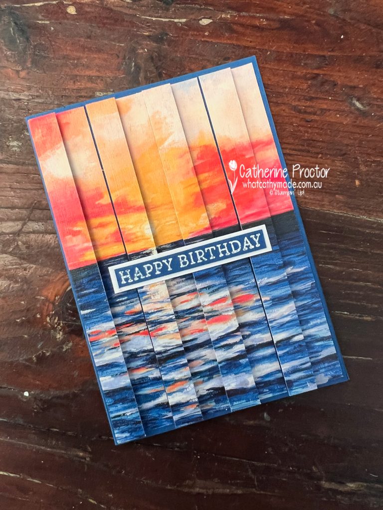
This week the Art With Heart Team is celebrating Blueberry Bushel and my original plan was to use the Scenic Coast 6″ x 6″ (15.2 x 15.2 cm) Designer Series Paper, but as it’s currently out of stock I thought I’d showcase another option.
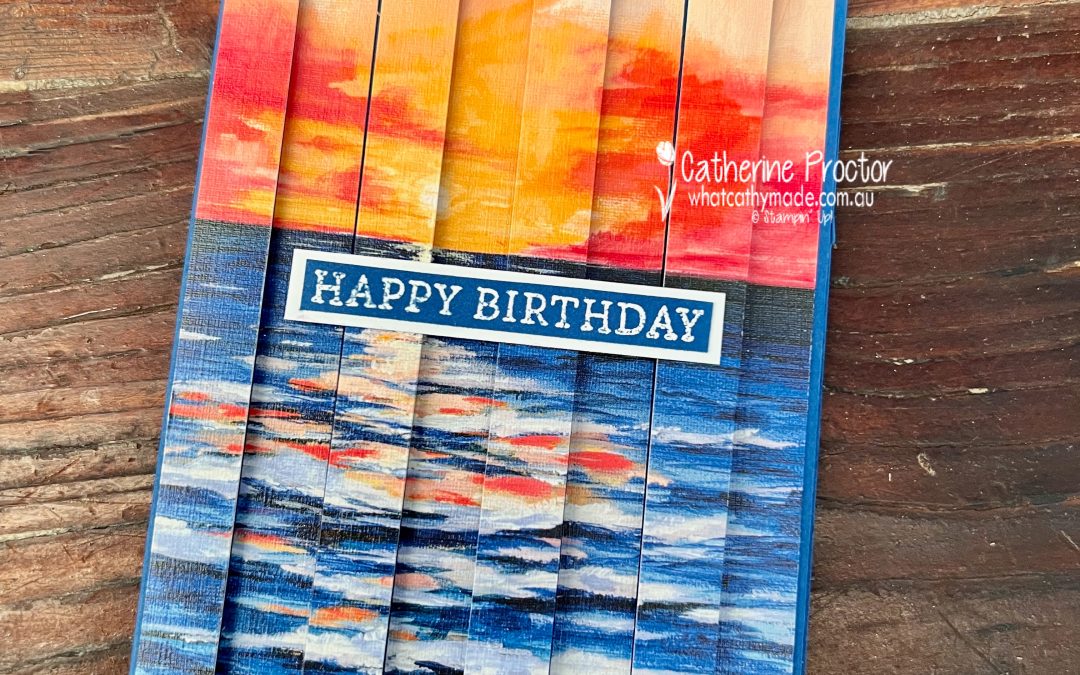
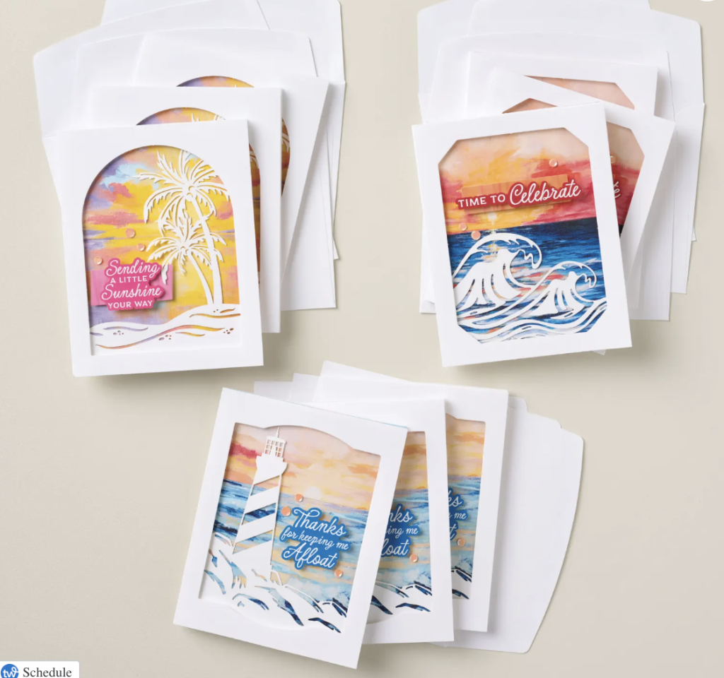
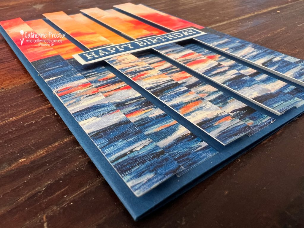
Instead, I’ve chopped up one of beautiful card fronts from the Painted Skies Kit to make a double vision card. My dad’s birthday is next week and he has always loved nature scenes, so this dramatic sunset over the water was ideal.
The artwork in the Painted Skies Kit has such a similar painterly style that I’m convinced it was created by the same artist. If you love scenic landscapes, the kit is a wonderful substitute for the Scenic Coast 6″ x 6″ (15.2 x 15.2 cm) Designer Series Paper.
The Double Vision effect looks complicated, but it’s actually very simple.
To create the illusion:
Cut your image into equal-width strips, keeping them in order.
Attach every second strip directly to the card base with liquid glue.
Add the remaining strips using foam strips.
Alternate the glued and raised strips across the card.
The alternating heights create a wonderful dimensional effect that changes depending on the viewing angle.
The Happy Birthday greeting on the front was white heat embossed on Blueberry Bushel card stock before being layered onto a strip of Basic White card stock for extra contrast.
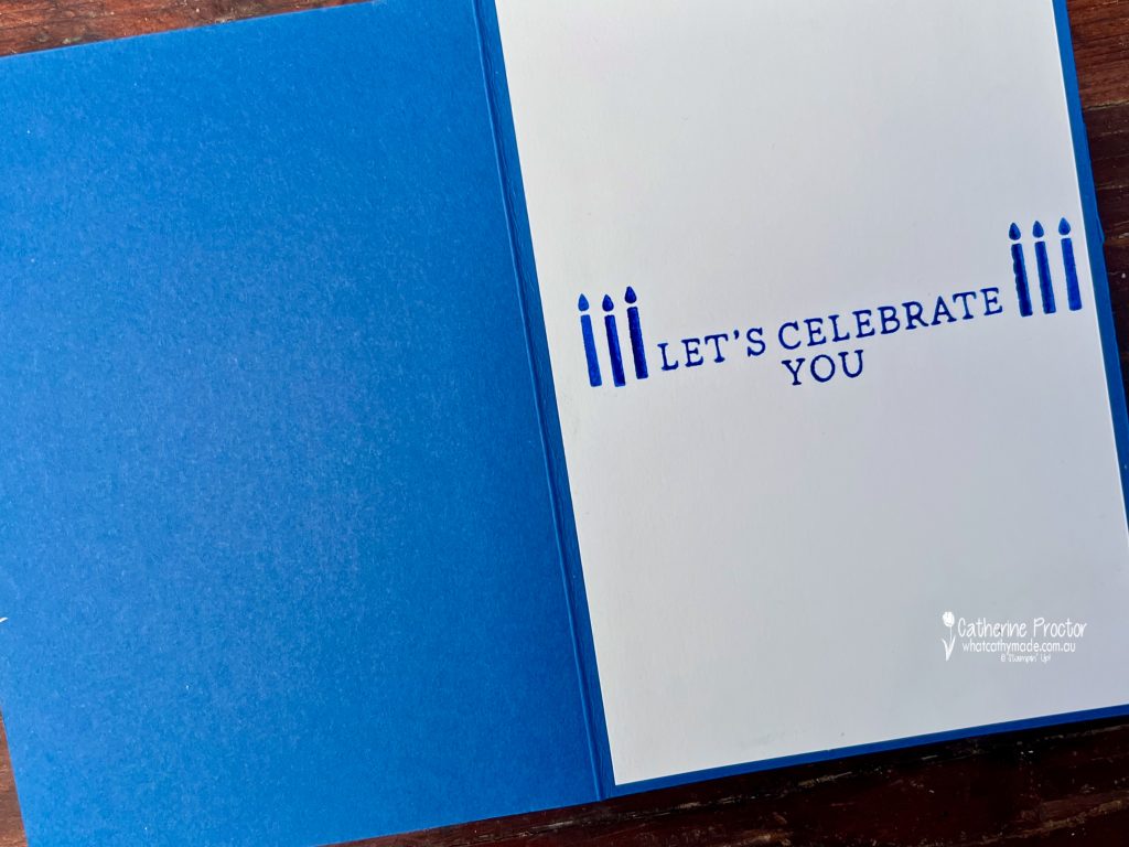
Inside the card, I stamped Let’s Celebrate You in Blueberry Bushel and added candles from the Words & Wishes stamp set to frame the sentiment.
Both the front greeting and the inside sentiment are from the Simply Said stamp set, which has now retired, but I still love reaching for it whenever I need a clean, classic sentiment.
A Blueberry Bushel card stock base provides the perfect bold frame for this colourful sunset and really makes the artwork pop.
Take a look at some more Blueberry Bushel inspiration on our Insta Hop!
Our blog hop is now an Instagram hop but the good news is that you don’t need to have an Instagram account to view all of the other projects!
Simply go to my Insta handle in a new search engine window to follow the Instagram hop: @whatcathymade.
Welcome to Week 10 of the Art With Heart Team Colour Creations Blog Hop, where we’re working our way alphabetically through the Stampin’ Up! colour collection. This week we’re celebrating the rich, elegant shade of Blackberry Bliss.
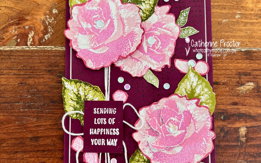
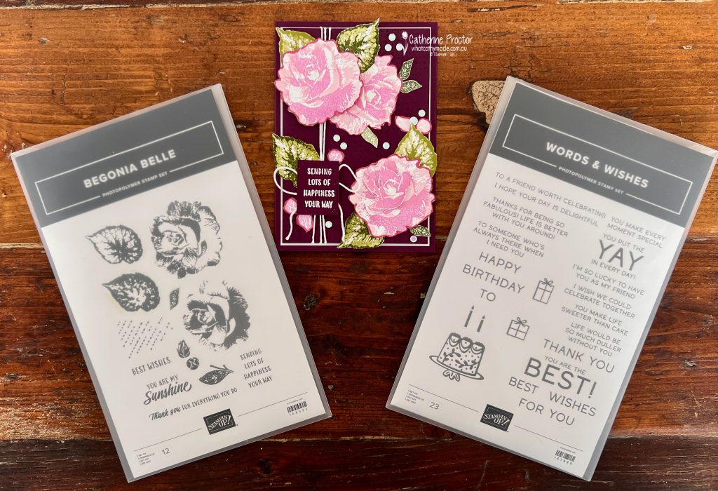
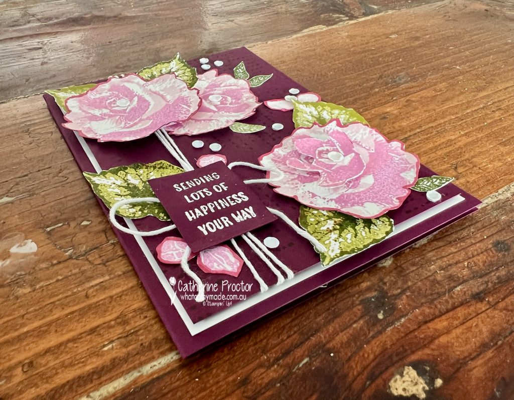
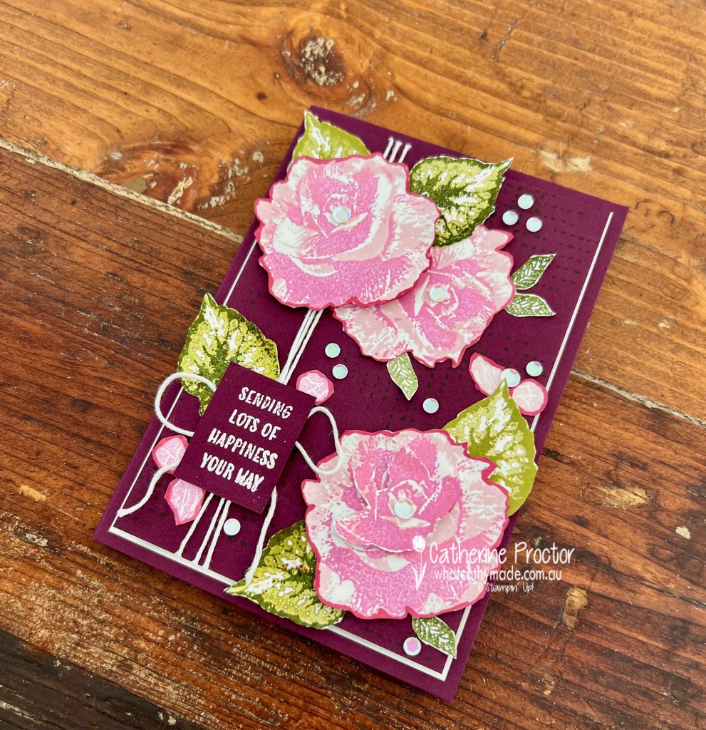
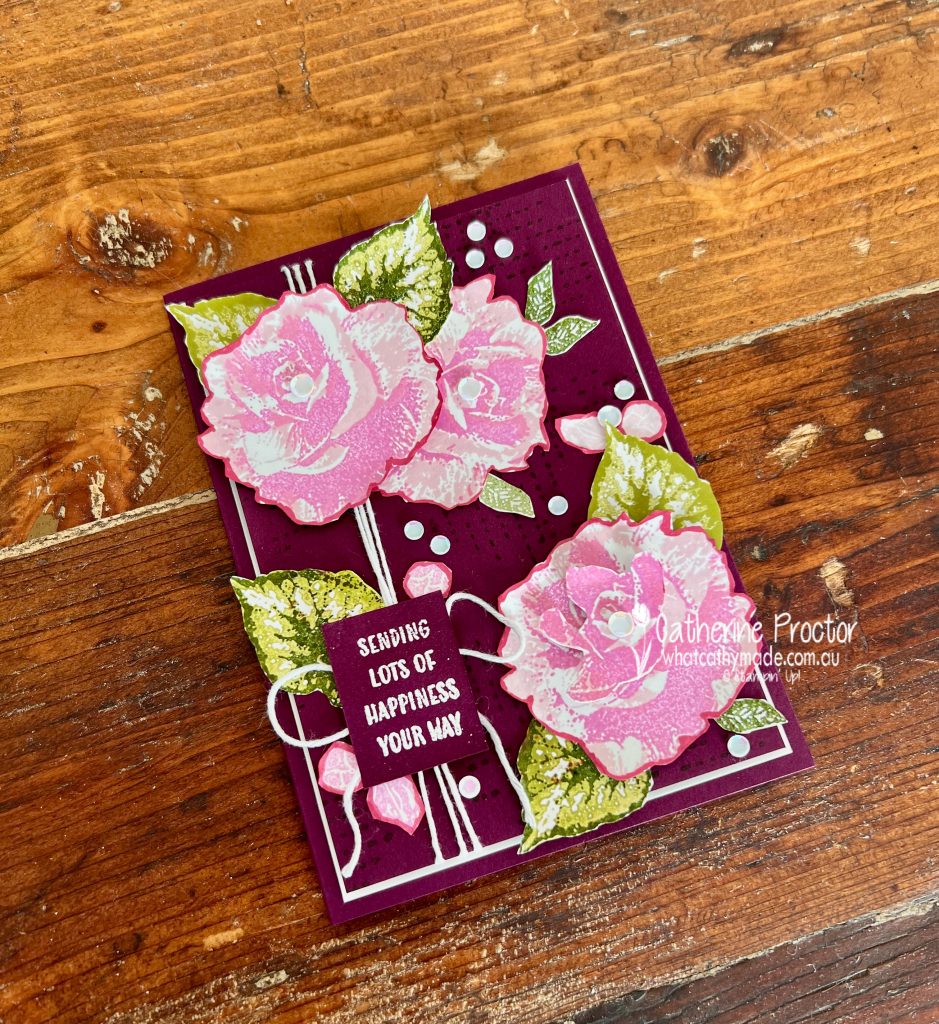
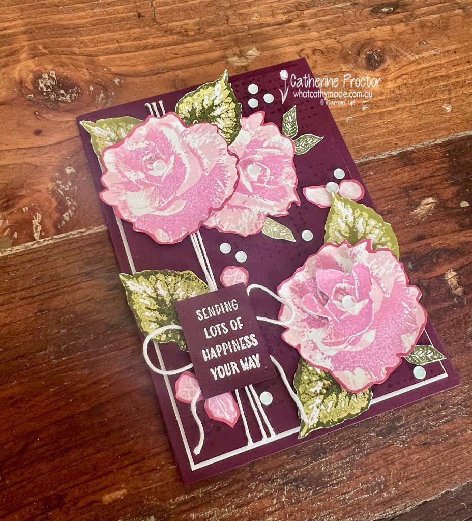
This week’s card is especially meaningful because I made it for my lovely Aunty Robin, who celebrates her 90th birthday this month. Reaching such a wonderful milestone deserves a special handmade card, and the beautiful new Begonia Belle stamp set was the perfect choice.
After creating a card base with the Blackberry Bliss card stock, I added a layer of Basic White card stock and then another layer of Blackberry Bliss card stock stamped with the pattern stamp from the Begonia Belle stamp set using Blackberry Bliss ink.
The tone-on-tone effect is hard to capture in a photo, however in real life it adds texture and interest without competing with the focal flowers.
I wanted the flowers and leaves to really pop against the rich, dark, Blackberry Bliss card stock, so I used the following colour combination:
Blackberry Bliss
Fresh Freesia
Bubble Bath
Old Olive
Mossy Meadow
Basic White
Basic Black
Gold Foil
The large flowers and leaves were stamped using the two-step stamping technique. I love how layering the images creates extra depth and detail while still keeping the design soft and elegant.
After stamping, I carefully fussy cut each flower before outlining them with the Dark Blackberry Bliss Stampin’ Blend. This simple trick helps define the edges and makes the flowers stand out beautifully against the background.
The front sentiment is from the Begonia Belle stamp set, stamped in Versamark ink and white heat embossed.
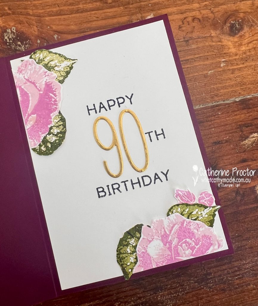
Because this card was for a 90th birthday, I wanted the sentiment to be a little more personalised. I used the Words & Wishes stamp set to stamp “happy” and “Birthday” and a simple masking technique to isolate the small “th” in the “birthday” stamp, allowing me to create the 90th sentiment.
I love how the soft pinks balance the richness of Blackberry Bliss, while the touches of Gold Foil add just the right amount of elegance for such a special birthday.
Thank you for visiting my blog today. I hope this project inspires you to pull out your Blackberry Bliss cardstock and inks and create something beautiful.
Take a look at some more Blackberry Bliss inspiration on our Insta Hop!
Our blog hop is now an Instagram hop but the good news is that you don’t need to have an Instagram account to view all of the other projects!
Simply go to my Insta handle in a new search engine window to follow the Instagram hop: @whatcathymade.
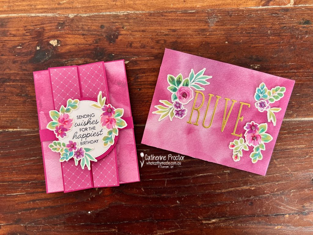
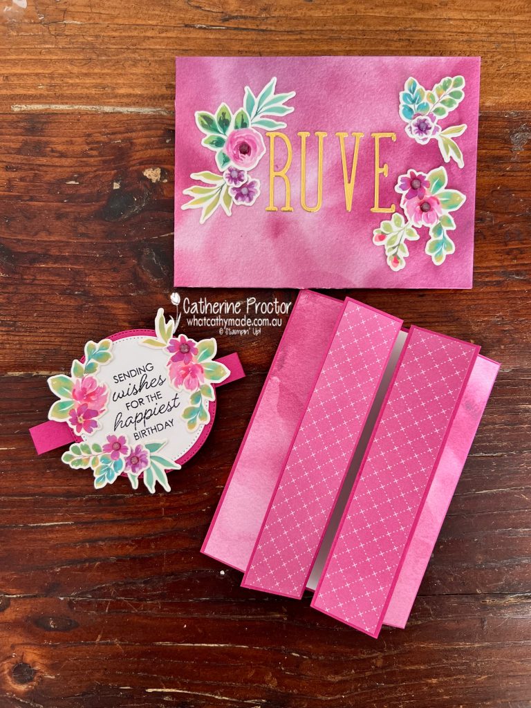
Welcome to Week 9 of our Art With Heart Team Colour Creations Blog Hop, where we’re working our way through the Stampin’ Up! colour collection in alphabetical order. This week we’re celebrating the rich, vibrant Berry Burst.
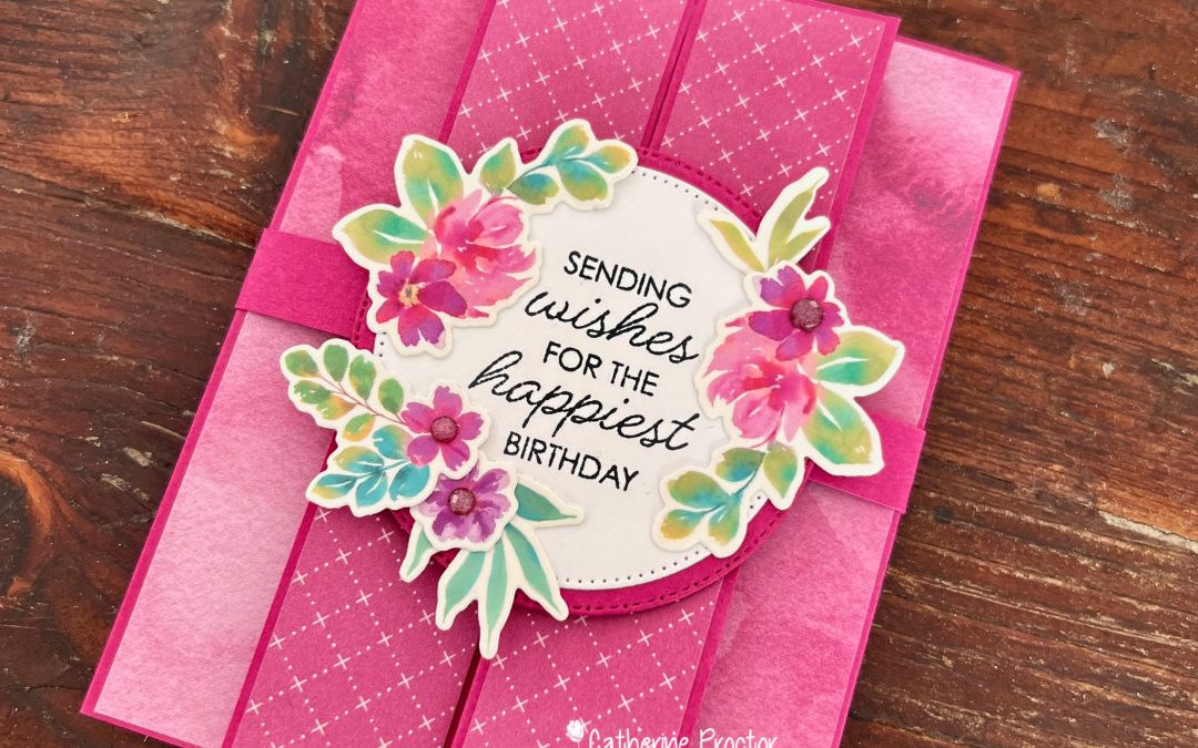
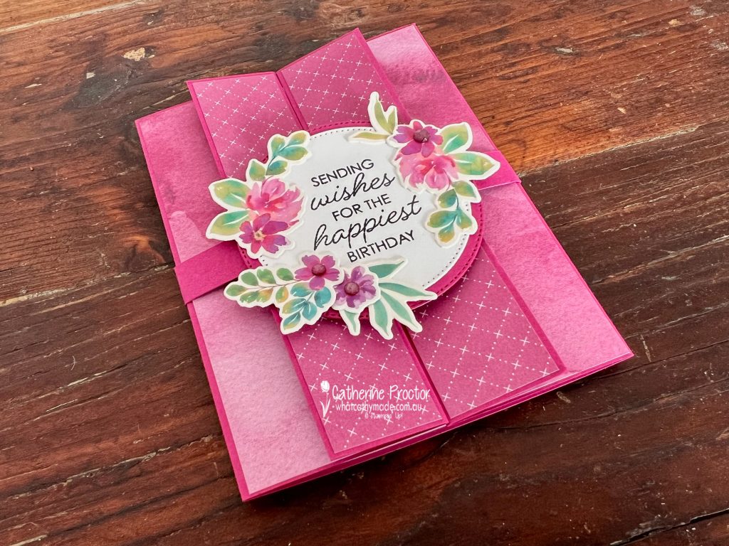
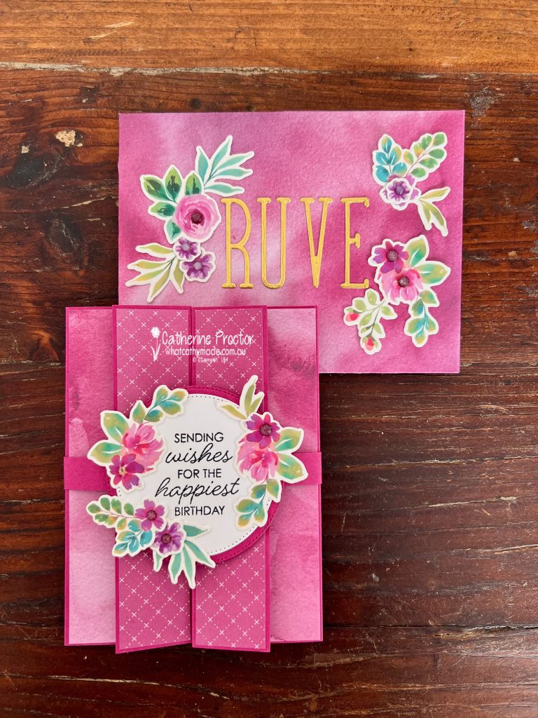
Berry Burst is one of those colours that always makes a statement. Bright, cheerful and full of personality, it pairs beautifully with florals, making it the perfect choice for this feminine birthday card and matching custom envelope.
For this project, I created a Double Gatefold Card featuring the gorgeous Extraordinary Flora Washi Tape. If you haven’t tried this washi tape yet, it’s such a fun product to work with. Simply adhere it to Basic White card stock before die cutting with the coordinating Extraordinary Flora Dies, giving you beautifully detailed floral embellishments in minutes.
My card features:
Berry Burst card stock base
Moonlit Flora Designer Series Paper on the front gatefold panels
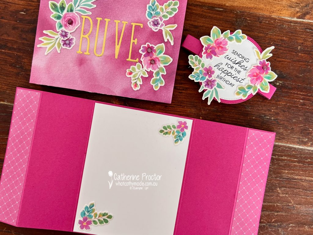
Garden Poetry Designer Series Paper for the inside panels and matching custom envelope
Extraordinary Flora Washi Tape adhered to Basic White card stock and die cut with the coordinating dies
Framed All Around Stamp Set sentiment
Layered Stylish Shapes Dies circles with a Berry Burst mat
Berry Burst embellishments to finish the floral clusters
Normally I make cards in metric measurements to make the most of our Australian A4 card stock bases, but because this design uses more than half a sheet of A4 card stock and because I wanted to make a perfectly fitting custom envelope, I followed a US tutorial using imperial measurements for this project.
Start with an 11″ x 5-1/2″ piece of Berry Burst card stock and score at:
1-1/4″
3-3/8″
7-5/8″
9-3/4″
Cut Designer Series Paper for the four front panels and adhere to the card stock base.
Front panels: 1-1/8″ x 5-3/8″ (Moonlit Flora DSP)
Inside flaps: 2″ x 5-3/8″ (Garden Poetry DSP)
For the inside panel cut a piece of Basic White card stock and adhere to the card base: 4″ x 5-1/4″.
I created a 1″ belly band to hold the card flat, covering the front join with layered stitched circles with a Berry Burst mat. The front sentiment is from the Framed All Around Stamp Set.
This video shows how the card opens up.
Take a look at some more Berry Burst inspiration on our Insta Hop!
Our blog hop is now an Instagram hop but the good news is that you don’t need to have an Instagram account to view all of the other projects!
Simply go to my Insta handle in a new search engine window to follow the Instagram hop: @whatcathymade.