Welcome back to our 50th week of Colour Creations Showcase for 2020-21!
Today we are showcasing Soft Suede, and it is our final week in this present Colour Creations Showcase format. But don’t worry – we’ll still be sharing weekly colour inspiration with you, going forward!
From next week we will be reverting to a traditional blog hop format, starting with a showcase of ALL FIVE 2021-23 InColours on Wednesday 2nd June, followed by the rest of our beautiful Stampin’ Up! colours in individual alpha order at 8pm every Wednesday.
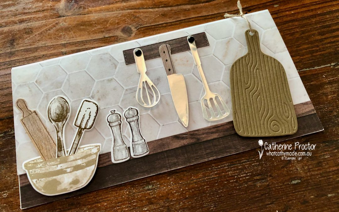
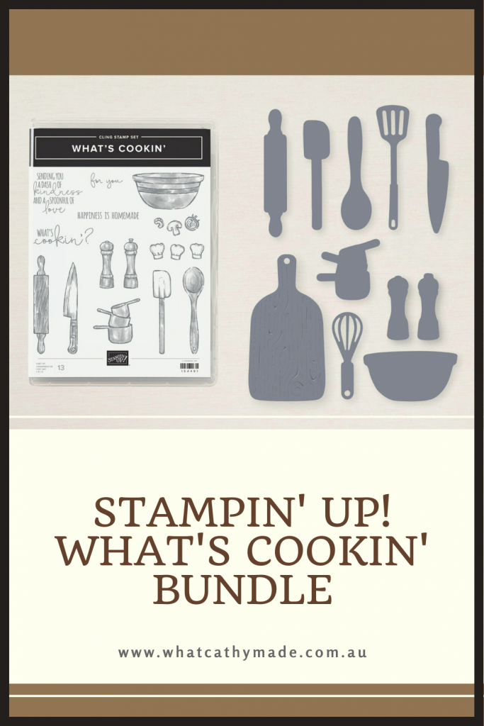
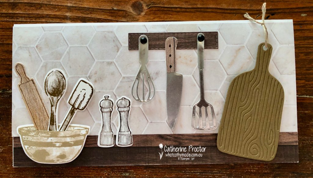
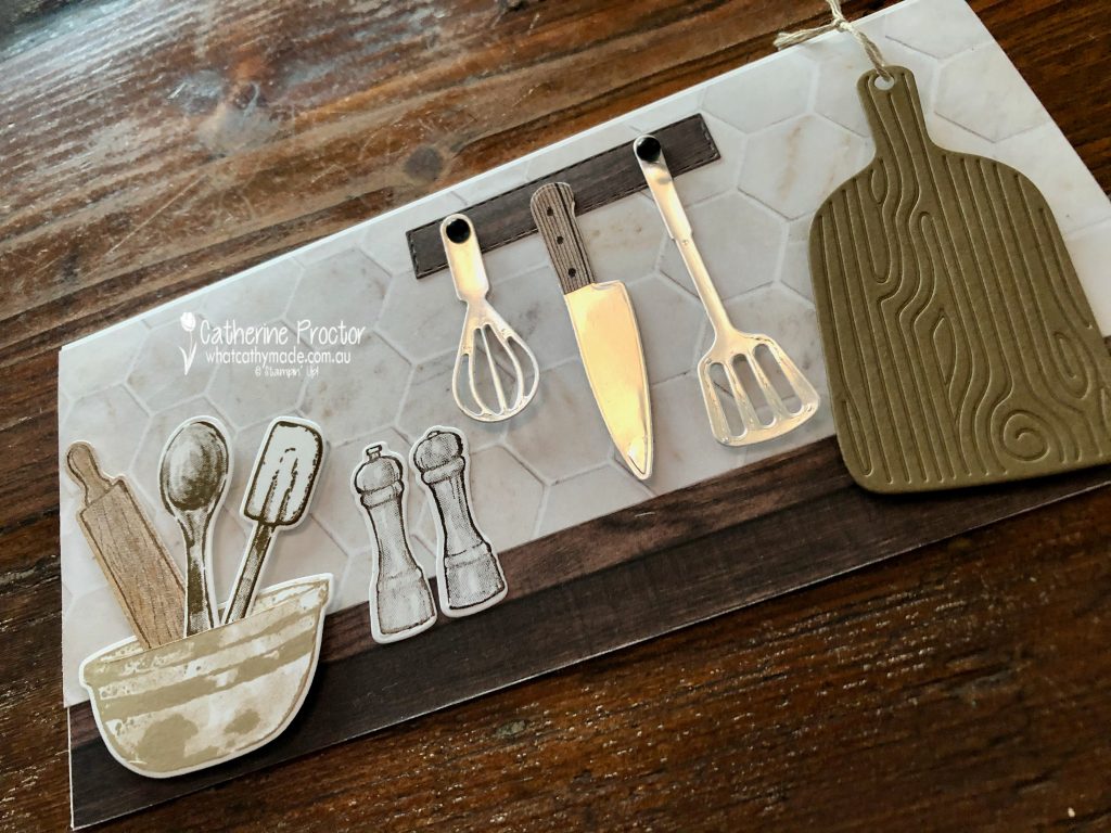
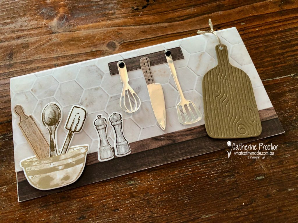
For my final card in our AWH Colour Creations Showcase I’ve used one of my favourite bundles from the new Annual Catalogue, the What’s Cookin’ bundle.
I bought this bundle with the intention to make a kitchen scene bench fold card, however I thought the scale of the elements would work better as a kitchen bench scene in a slimline card.
I’m so glad the In Good Taste DSP has carried over to the new catalogue because it is just perfect to create a tiled splash back and wooden kitchen bench.
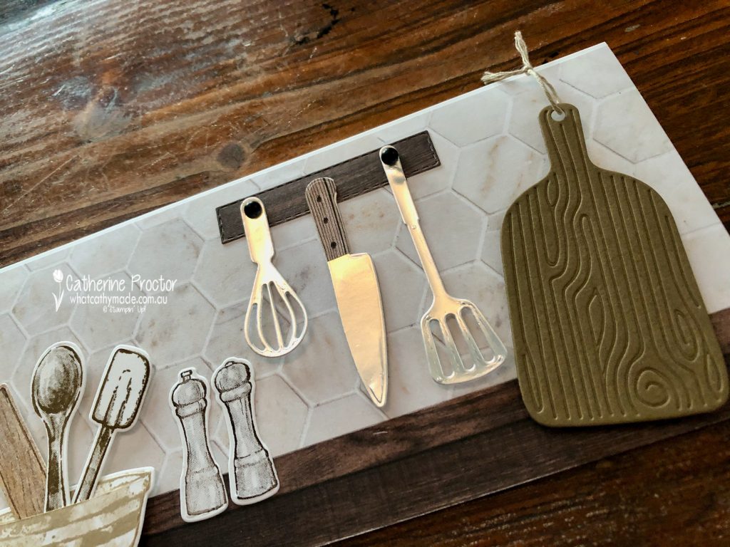
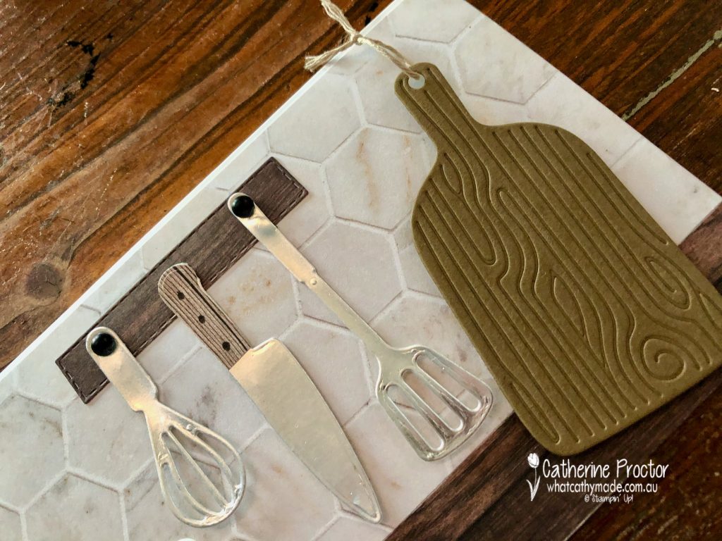
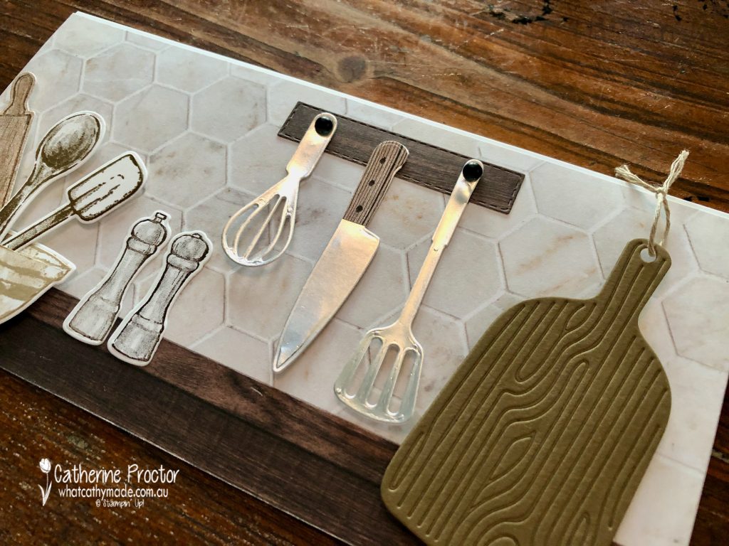
How adorable is this chopping board in Soft Suede! The die embosses the board at the same time and I’ve tied some of the new Crumb Cake bakers twine through the handle. In fact I’ve kept the colour combination for this card entirely from the neutrals family.
After making and photographing my card I realised the Silver foil I used for the whisk, knife and slotted turner is not in the Annual Catalogue – if you don’t have a scrap of silver foil left over, use Basic Gray card stock for the knife blade and any colour for the whisk and the slotted turner as they could be made of coloured silicon.
I die cut the knife twice to create a wooden handle to which I then added three dots with my Basic Black marker for the screws. The utensil holder is die cut using a stitched rectangle die and 2 matte black dots are the “hooks” for the whisk and the slotted turner.
A single slit in the front curve of the the bowl (use a the sharp blade of a craft knife) allows the rolling pin, spoon and spatula to sit inside the bowl.
I’ve deliberately left the inside of the card blank so it can be used for any purpose or any gender.
I can’t wait to see what everyone else has created with Soft Suede today!
If you’d like me to post you your very own copy of the 2021-22 Stampin Up! Annual Catalogue, or to simply find out about more about Stampin’ Up! contact me.
In the meantime, wherever you are in the world, stay safe, stay calm…and keep on crafting xxx
Welcome back to our Colour Creations Showcase as we continue our showcase of over 50 beautiful Stampin’ Up! colours in alpha order.
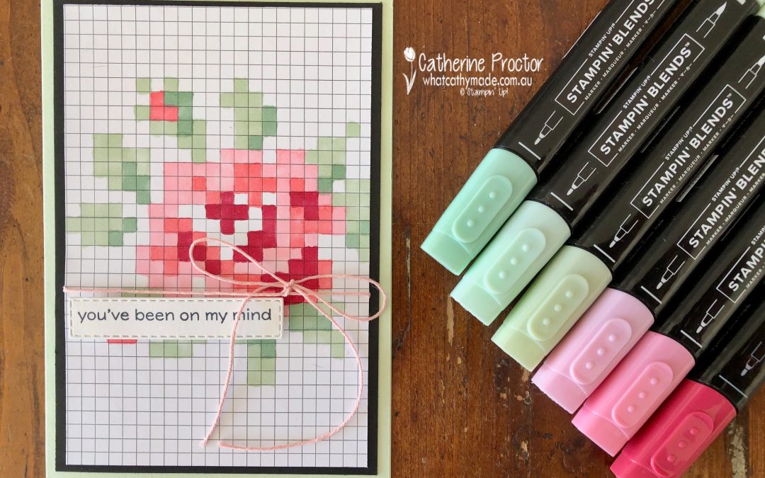
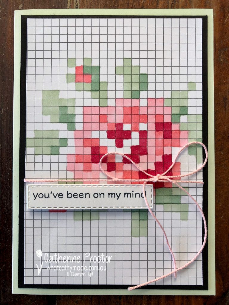
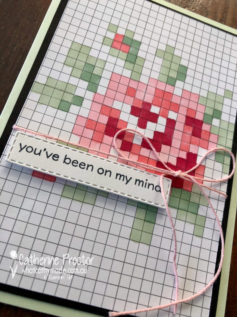
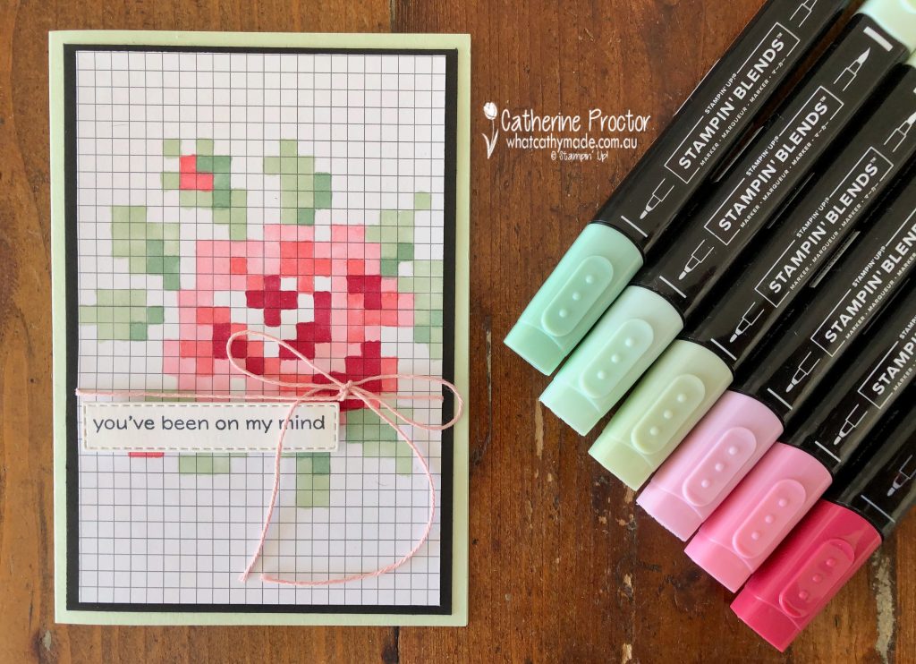
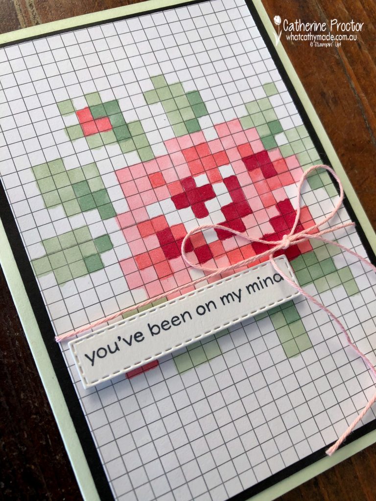
This week we are showcasing Soft Sea Foam, the palest green in the Stampin’ Up! colour range.
I’d love to claim credit for the idea for my card today, but sadly I’m not that clever! One of the incredible Artisan Design team members, Martin Stone, originally came up with this super creative use of the grid pattern paper from Handsomely Suited DSP. As soon as I saw his card I knew I just had to make one too.
The design is inspired by needlepoint charts and I based my design on a Cath Kidston needpoint chart.
My colour scheme pairs Soft Sea Foam with Mint Macaron (I love these two greens together), Flirty Flamingo and Real Red.
I used blends to colour my grid paper but markers or watercolour pencils would also work well. The advantage of using blends is that you get a light and dark blend for each colour.
The “you’ve been on my mind sentiment” is from the Simply Succulents Stamp Set, die cut using a stitched rectangle die.
A soft bow using the Blushing Bride bakers twine from the Snail Mail Twine Combo Pack completes the card.
I can’t wait to see what everyone else has created with Soft Sea Foam today!
We will return next week on Wednesday 26th May when we’ll be showcasing our last colour in alphabetical order: Soft Suede. We will then return on 2nd June to showcase our new 2021-22 In Colours.
To purchase any of the products used in my card tonight, click on the links below.
If you’d like me to post you your very own copy of the 2021-22 Stampin Up! Annual Catalogue, the January – June 2020 mini catalogue, or to simply find out about more about Stampin’ Up! contact me.
In the meantime, wherever you are in the world, stay safe, stay calm…and keep on crafting xxx
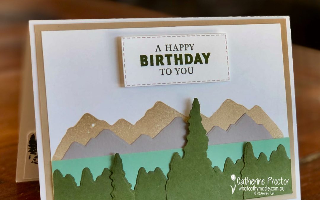
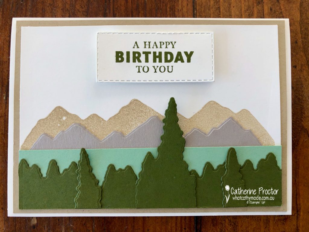
Today I’m sharing my entry for the CASEing the Catty Challenge #CTC317 – Say Hello to the New Catalogue. Just in case you haven’t heard the term before, to CASE is to Copy And Share Everything or to Copy And Selectively Edit.
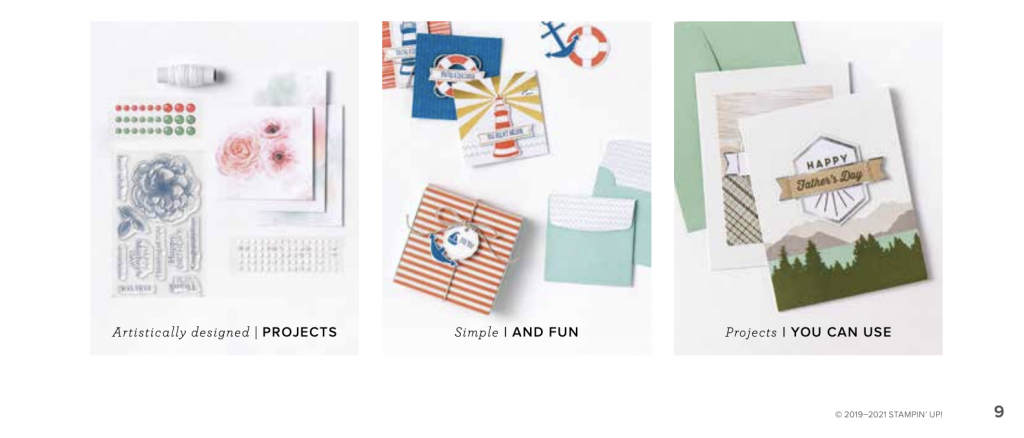
This week our challenge is to case a project from the 2021-2022 Annual Catalogue. The project I chose to CASE is the Fathers Day card (bottom right in photo below) from page 9 of the 2021-2022 Annual Catalogue – this is one of the new “kits collection” that will be available to purchase from June 1.
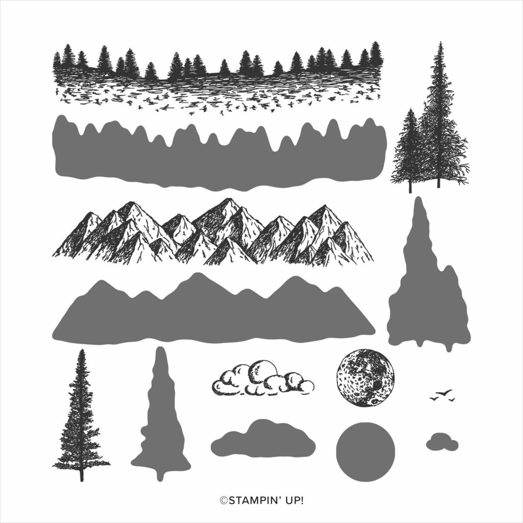
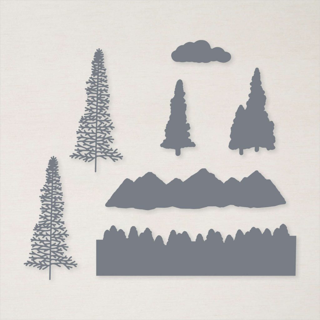
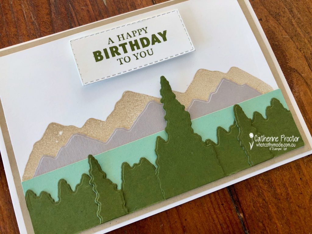
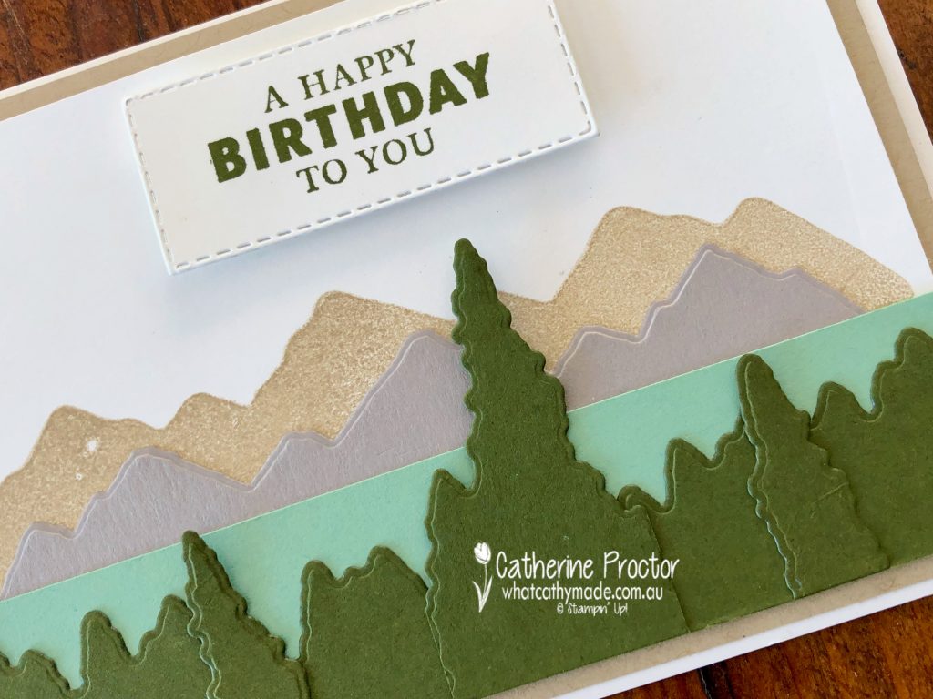
As soon as I saw this card I thought of the Mountain Air stamp set and its co-ordinating Majestic Mountain Dies.
I flipped the layout of the card from vertical to horizontal, but I CASEd the basic design and the colours: Mossy Meadow, Mint Macaron, Gray Granite, Crumb Cake and Sahara Sand.
The card I CASEd is a Father’s Day Card, however I didn’t need a Father’s Day card so I made a birthday card instead using the Handsomely Suited stamp set.
I have to confess the extra Mossy Meadow tree dies on the bottom of my card were added to hide a mistake – I accidentally got glue on the front of my card when I was assembling it! However, I actually like the dimension and height they add to my Mossy Meadow layer.
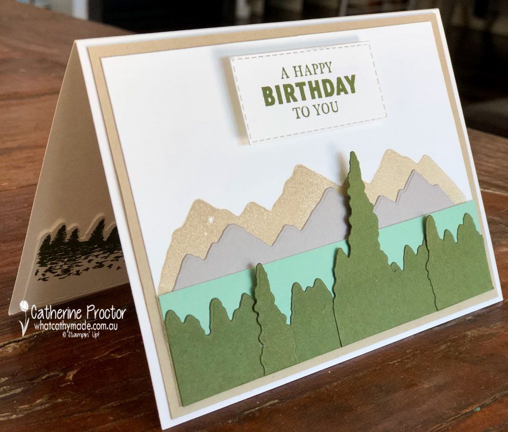
The inside of my card was finished off with a stamped a die cut row of Mossy Meadow trees.
Just a heads up – as a Stampin’ Up! demonstrator I get to order new products early and I have already received the kit for the card I CASED on page 9 of the Annual Catalogue – it is a fantastic kit for masculine cards and comes with EVERYTHING you need to make 10 cards with matching envelopes, including this versatile masculine stamp set.
I’ll share some cards I’ve made with this set very soon; however, I’ll be back this Wednesday with the AWH Colour Creations Showcase – we are creating projects with Soft Sea Foam this week.
To order any of the products I’ve used today, click on the links below.
When you shop online in my Stampin’ Up! Online Store don’t forget to use my monthly Host Code (if your order is between $50 – $250) and I will send you a thank you gift the following month. If your order is over $250 don’t use the host code because you will qualify for your own stamping rewards.
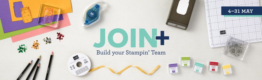
My May Host Code is 3VN7RDGE and it is valid until midnight May 31.
Would you like to get a 20% discount on everything you order?
The Stampin’ Up! Starter Kit is always the BEST deal for any order over $169, but during the month of May it’s giving you an even bigger bang for your buck!
Normally, with the purchase of a starter kit, you pay $169 and receive $235 worth of products – that is $66 of free products.
However, from May 4-31, spend $169 and you will receive $283 worth of products! That’s $114 worth of products FREE!!! You can order your start kit here.
You get to chose any products you like in your starter kit and there is absolutely no obligation to buy anything else and no pressure to sell or hold parties.
Right now you get There’s no pressure to sell anything or host parties or even to ever order anything again – you simply enjoy the discount as a hobby demonstrator.
Click here to join my team:
Thanks for visiting my blog today. I’ll be back this Wednesday with the AWH Colour Creations Showcase – we are creating projects with Soft Sea Foam this week.
In the meantime, wherever you are in the world, stay safe, stay calm…and keep on crafting xxx
Welcome to the Monthly Art With Heart Creative Showcase.
Tonight we’re sharing projects that use new products from the 2021-22 Stampin’ Up1 Annual Catalogue. If you haven’t seen the new catalogue yet, this 50 second video shows you some of the stunning products inside!
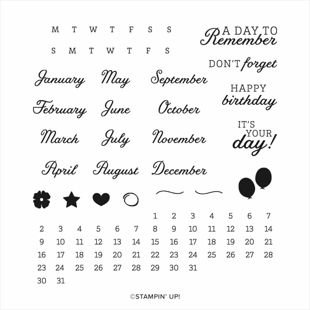
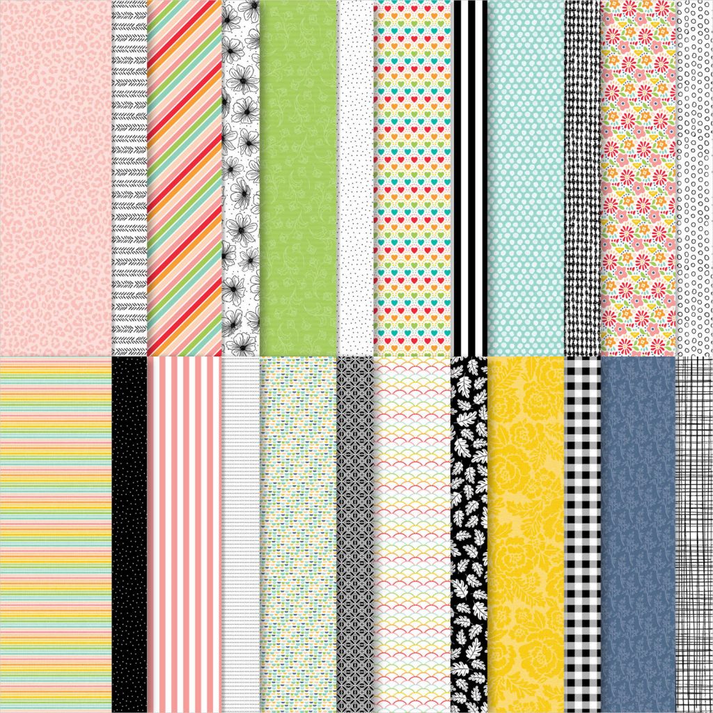
Two of my favourite products from the new 2021-22 Annual Catalogue are the Days to Remember stamp set and the Party Pattern DSP, which is one of the new host products.
The Days to Remember stamp set has everything you need to create calendars and it is also perfect for using on scrapbooking layouts or in a bullet journal.
I can’t tell you how much I love this Pattern Party DSP! It has bright graphic patterns on one side and really versatile black and white patterns on the other side. AND you get 48 sheets – 4 each of 12 double-sided designs!
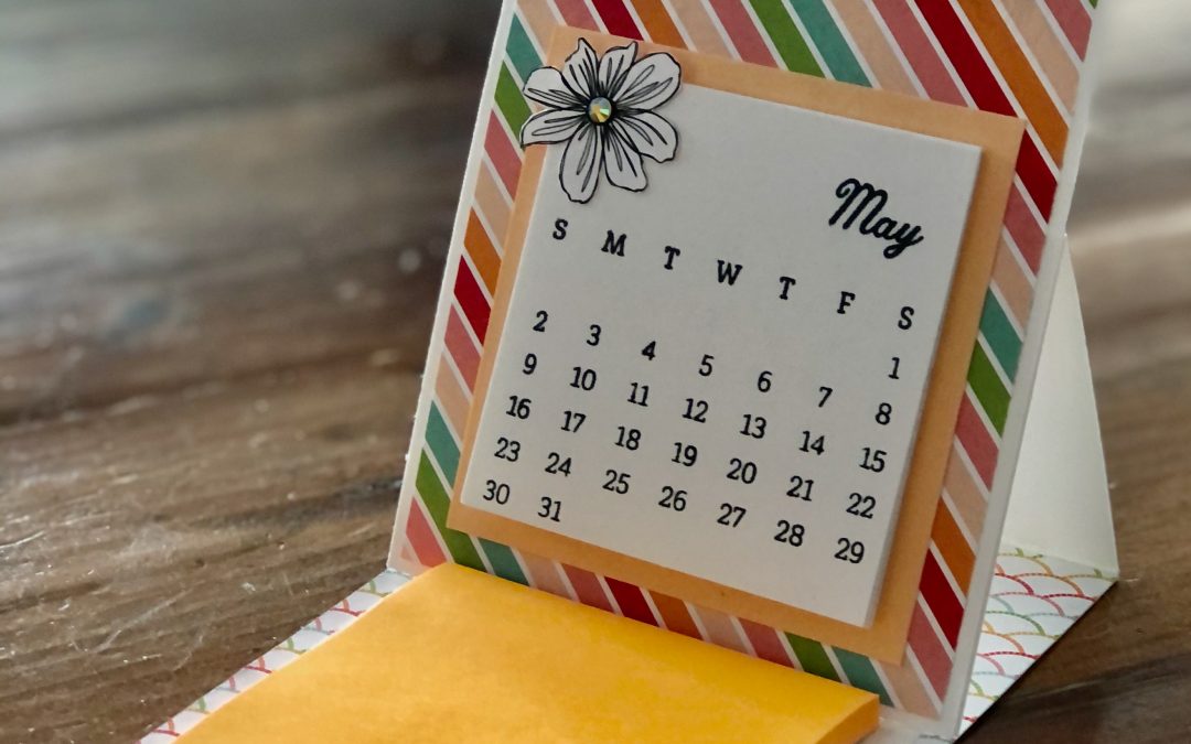
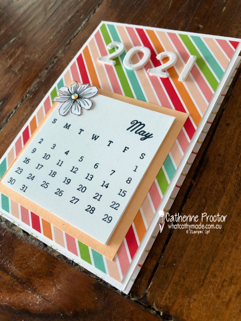
My easel card is a really practical desk accessory that uses two simple folds to create a combined calendar and Post It note holder. You can use any DSP for this project.
This card folds flat for postage but due to its weight and the thickness it will cost slightly more than a standard letter to post. It will fit into a C6 envelope.
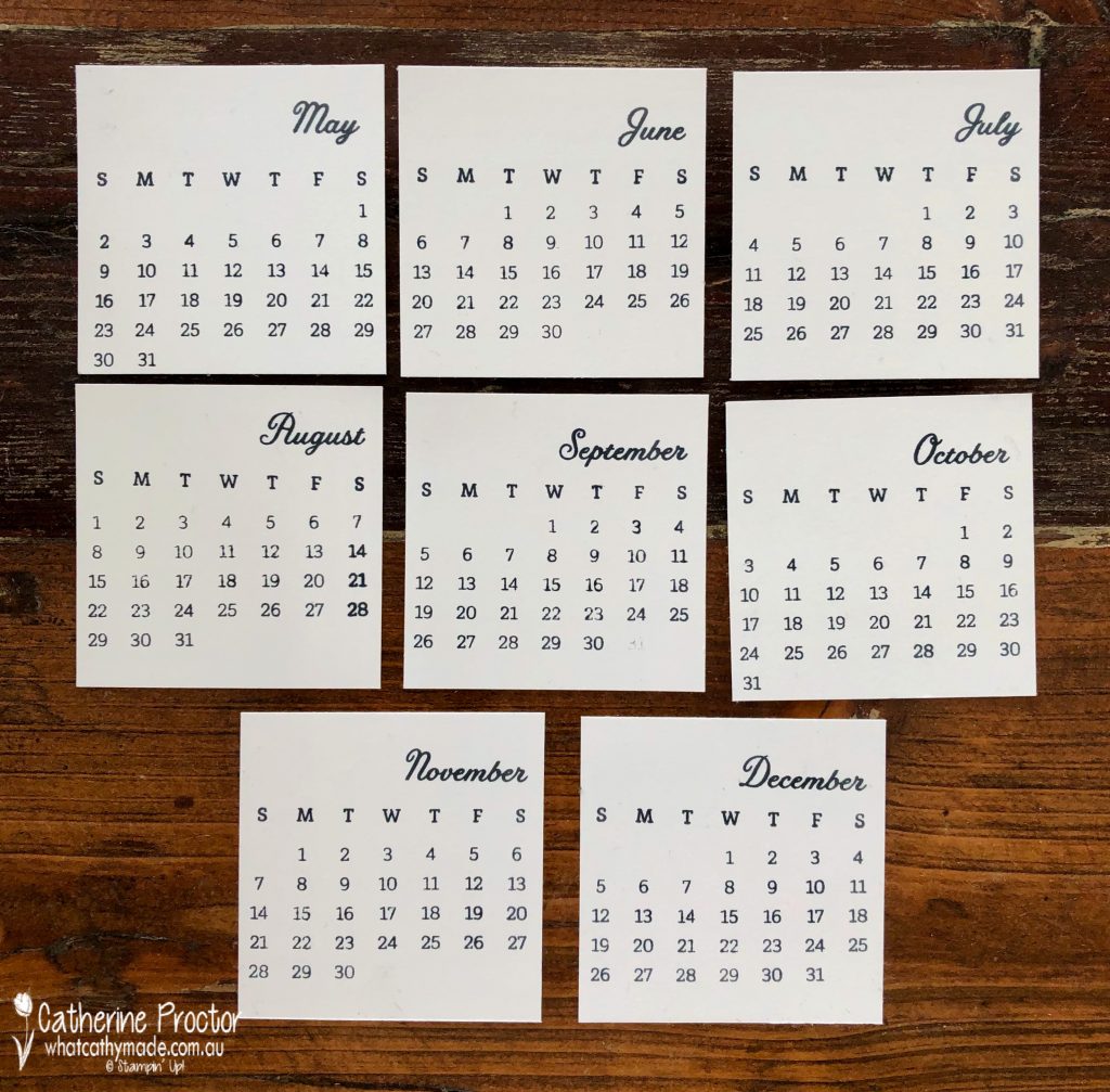
The days to Remember stamp is super easy to line up and stamp because it has been designed to fit the width of an inkpad. My Calendar pages measure 7x7cm – just don’t forget to remove the ink from the number 31 for the months that only have 30 days.
When all months are stamped use a few drops of multipurpose glue along the top of each calendar month to attach them together into a calendar.
For the rest of the card, cut and score as follows:
Cut base: Thick Basic White card stock at 29 x 10 cm
Cut card front: Thick Basic White card stock at 14.5 x 10 cm
Score base: Score and fold card base at 14.5 cm and 27.5 cm
Card front DSP layer: Cut Pattern Party DSP at 14 x 9.5 cm
Inside card DSP layer: Cut Pattern Party DSP at 14.5 x 10 cm
Card stock layer under Post It Note: Basic White card stock 9 x 9 cm
Card stock layer under calendar: Pale Papaya card stock 8 x 8 cm
I added the 2021 lettering (die cut AFTER mounting onto foam adhesive sheets) to the top of the calendar and finished my card with a flower fussy cut from the reverse side of the striped DSP and a Pale Papaya 2021-2023 In Colour Jewel.
To see the rest of the AWH team’s projects, go back to Rachel’s blog as she is hosting the monthly showcase.
To purchase any of the products used in my card tonight, click on the links below.
If you’d like me to post you your very own copy of the brand new 2021-22 Stampin Up! Annual Catalogue, the January – June 2020 mini catalogue, or to simply find out about more about Stampin’ Up! contact me.
In the meantime, wherever you are in the world, stay safe, stay calm…and keep on crafting xxx
Welcome back to our Colour Creations Showcase as we continue our showcase of over 50 beautiful Stampin’ Up! colours in alpha order.
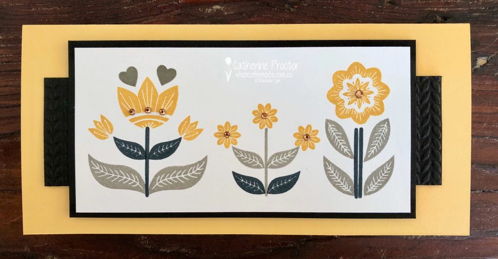
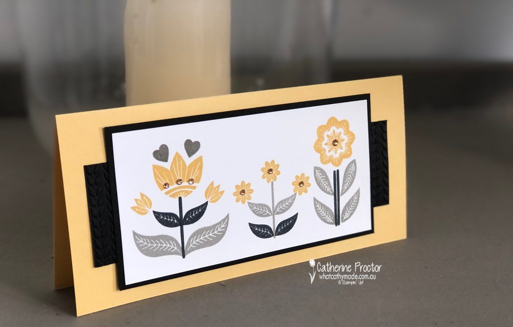
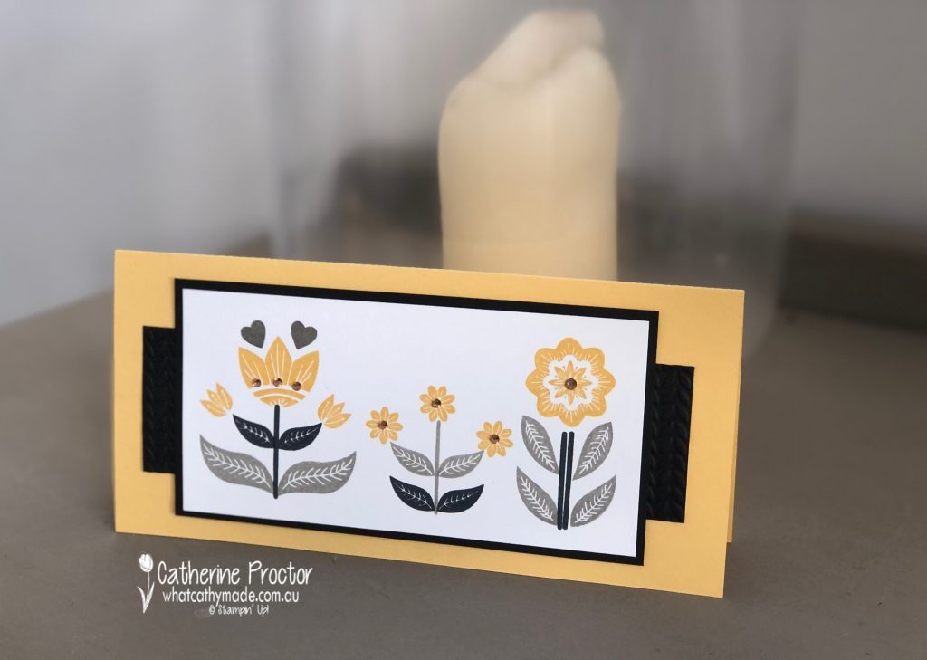
This week we are showcasing So Saffron, a creamy pale yellow from the subtles family.
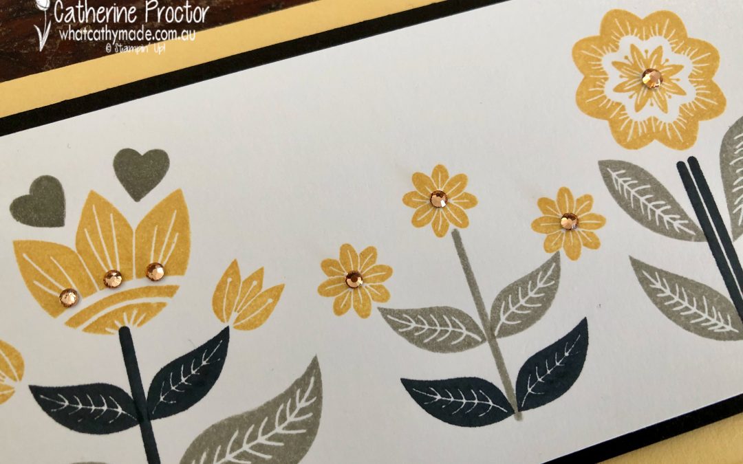
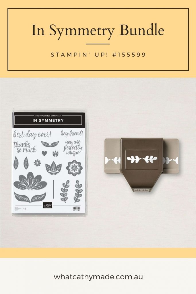
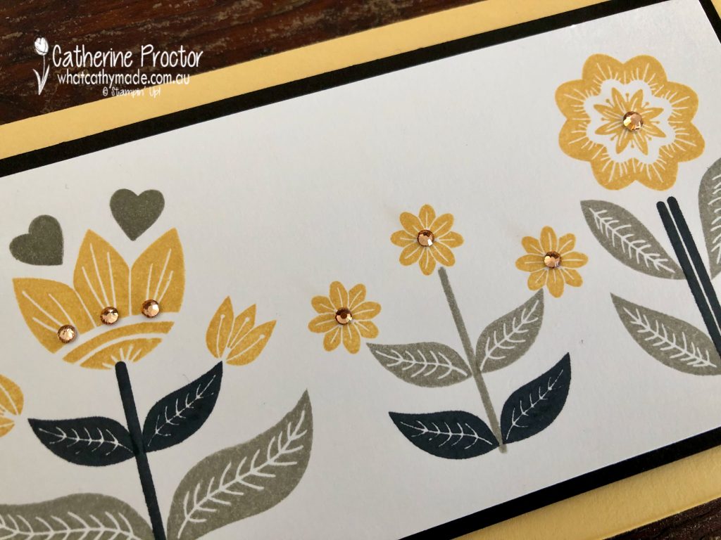
I’m excited to be sharing another new stamp set from the 2021-22 Annual catalogue: In Symmetry. You can save 10% and purchase the stamp set as a bundle with the Symmetry Stems Border punch, however I’ve only used the stamp set on my card today.
The In Symmetry stamp set has a lovely “Scandi” folk art feel which I’ve tried to replicate in my slimline card today.
This is such a versatile stamp set because it would work with any colour combination. After making this card I realised I’ve used the colours of my house exterior: black, different shades of gray and a pale yellow front door!
The In Symmetry photopolymer stamps are easy to use and easy to align – I simply made up my design as I went along. I think this stamp set has a lot of design possibilities and will be great for wreath and square cards too, as well as making your own DSP.
The Basic Black embossed strip behind the stamped panel has been embossed using one of the Greenery embossing folders – it’s hard to see in these photos but this embossing folder really matches the stamped leaves.
Champagne Rhinestone Basic Jewels add a co-ordinating touch of bling, picking up on the pale yellow of the So Saffron flowers.
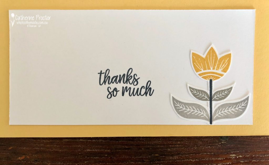
I stamped and fussy cut a spare flower to use on the inside of my card. The sentiment is from this stamp set, stamped in Tuxedo Memento.
I can’t wait to see what everyone else has created with So Saffron today!
If you’d like me to post you your very own copy of the brand new 2021-22 Stampin Up! Annual Catalogue, the January – June 2020 mini catalogue, or to simply find out about more about Stampin’ Up! contact me.
In the meantime, wherever you are in the world, stay safe, stay calm…and keep on crafting xxx
Yippee! The new 2021-22 Stampin’ Up! annual catalogue is live.
Have you placed an order and seen the exciting new items in it yet?
I’ve used some new products in my card today and I’m sure the other AWH team member will too as we showcase Smoky Slate, one of our neutral colours.
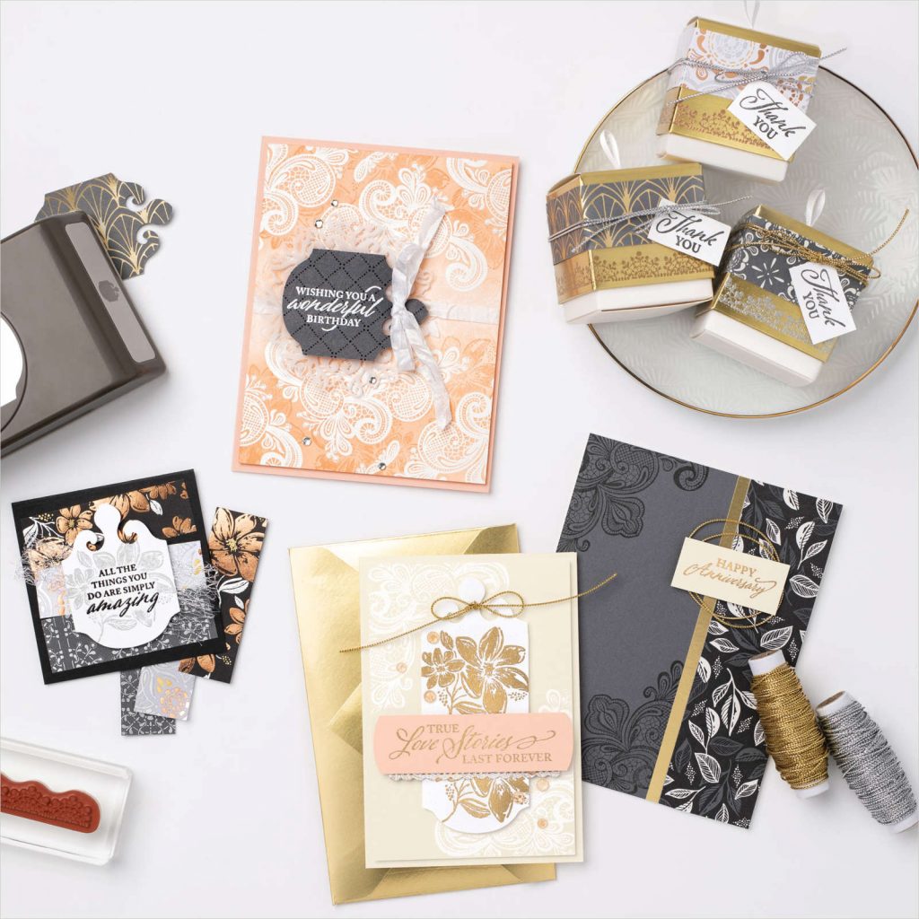
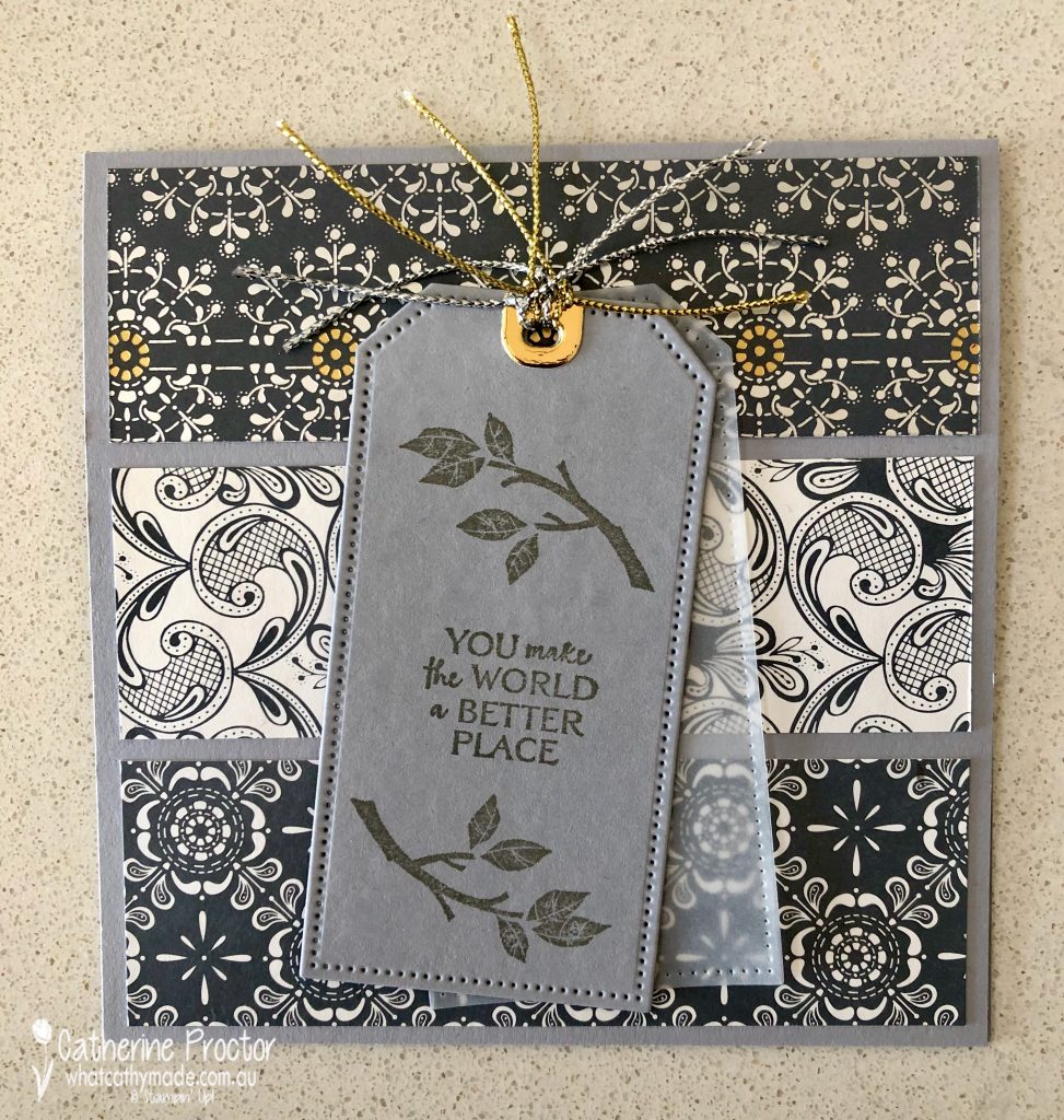
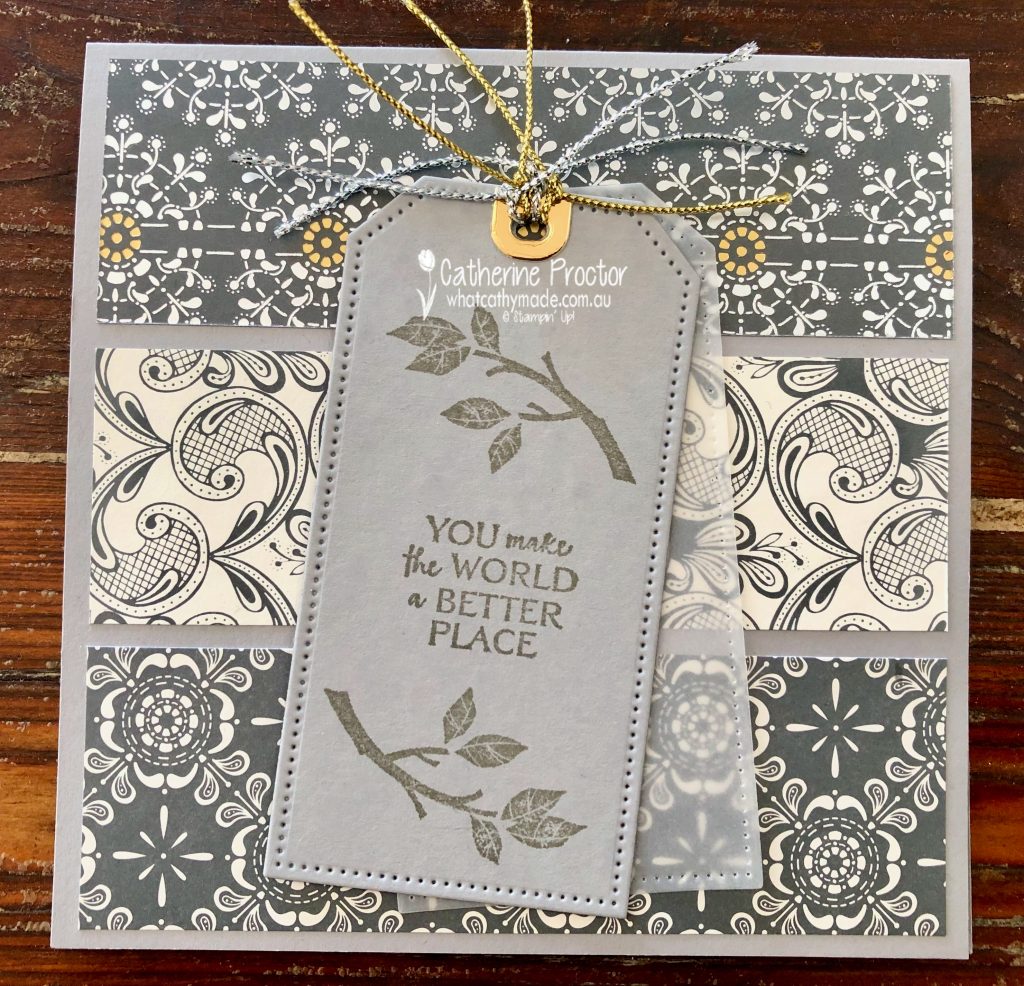
For my card this week I’ve decided to CASE a card from page 68 of the new catalogue. It’s the square card on the bottom left of the photo below of cards made using the new Simply Elegant Suite Collection.
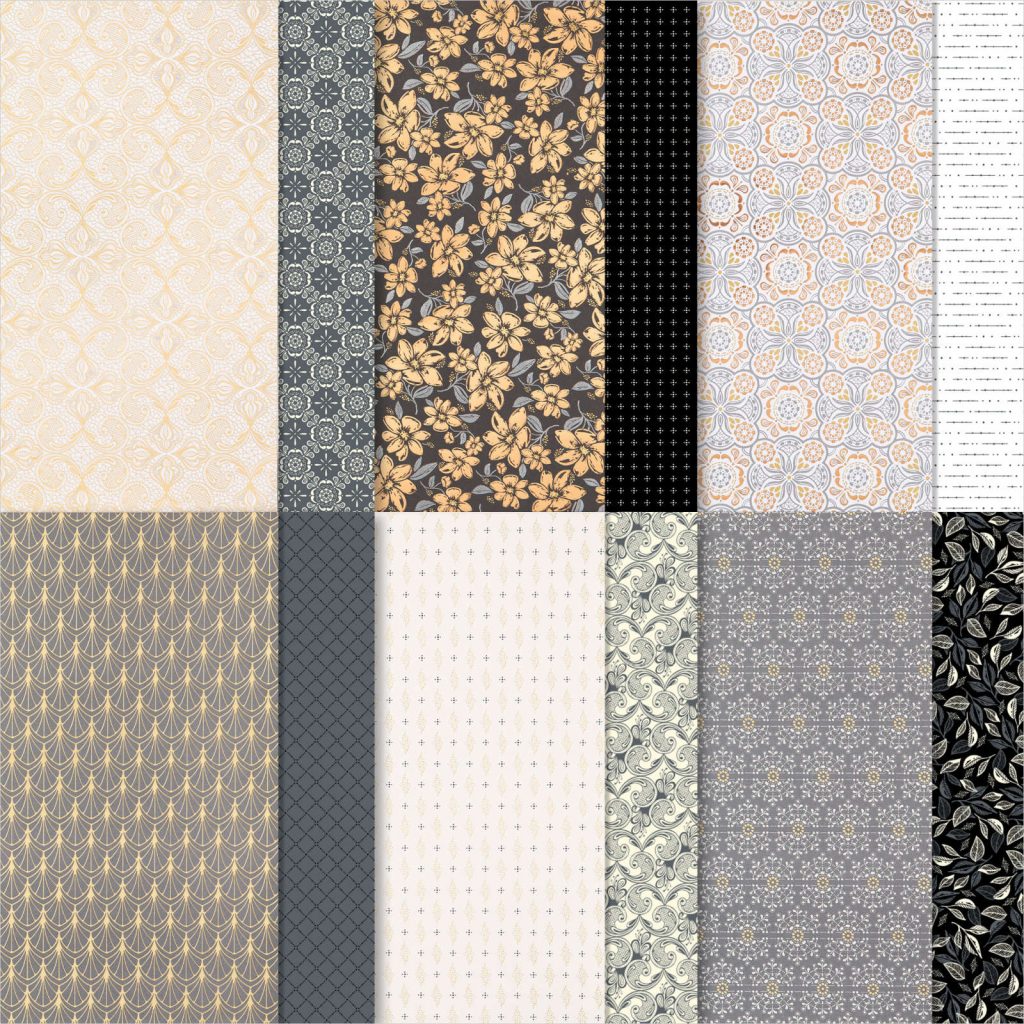
The Simply Elegant Suite Collection includes a stamp set, punch, trim and this stunning Simply Elegant Specialty Designer Series Paper that features sophisticated intricate designs in these colours: Basic Black, Basic Gray, copper, gold, silver, Very Vanilla and white.
Although Smoky Slate is not one of the colours in the Simply Elegant Specialty Designer Series Paper I thought it would work very well with this colour palette.
Do you agree?
I don’t (yet!!!) have the Elegantly Said Stamp Set or the Elegant Tag Punch so I’ve used some other exciting new products to make my card.
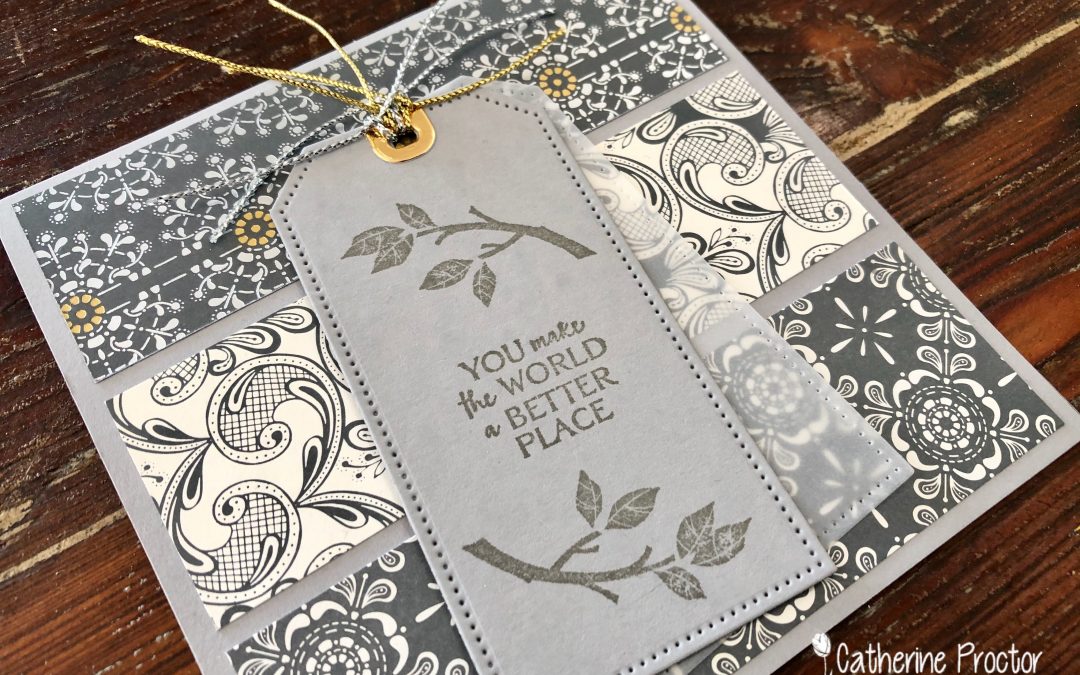
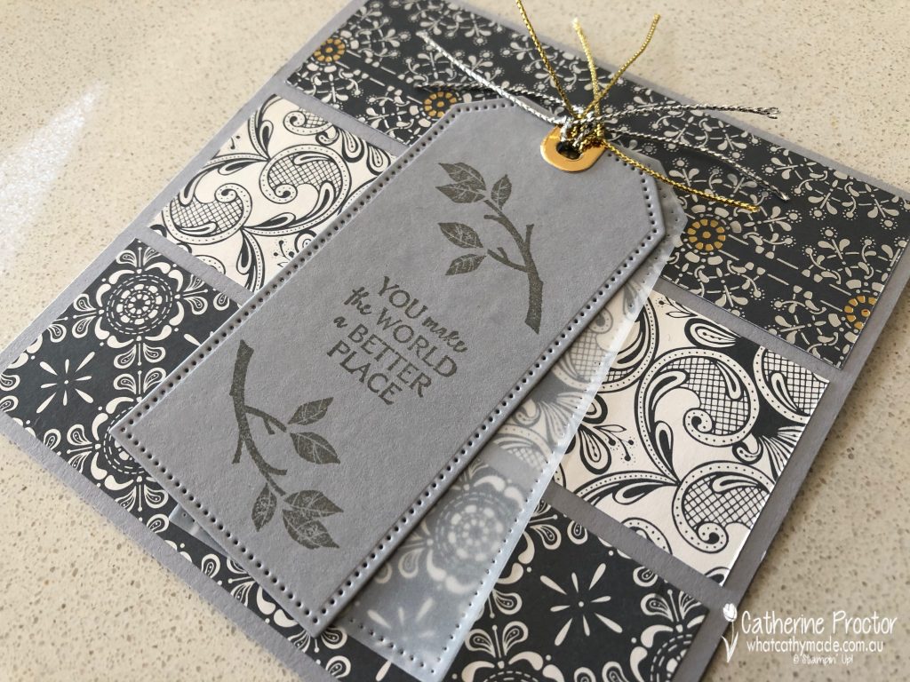
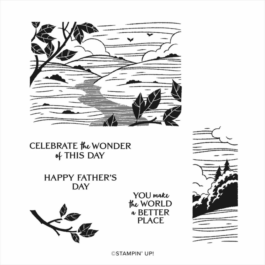
The Better Place Stamp set is one you might overlook because it is a host set – you’ll find it on page 171 of the catalogue. I’m always very attracted to stamp sets that look like illustrations from books I remember as a child!
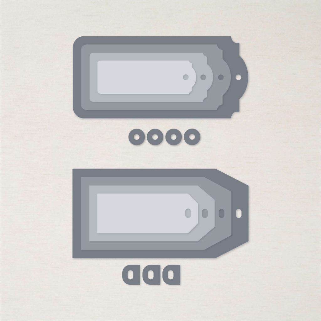
Instead of the Elegant Tag Punch I’ve used a new die set: Tailor Made Tags.
I bought with Christmas cards and tags in mind, but I can already see myself using these tags constantly for all types of cards.
I die cut the largest die in both vellum and Smoky Slate Card Stock before stamping in Smoky Slate ink onto the Smoky Slate card stock.
I then used a scrap of gold foil to die cut the little hole re-inforcers.
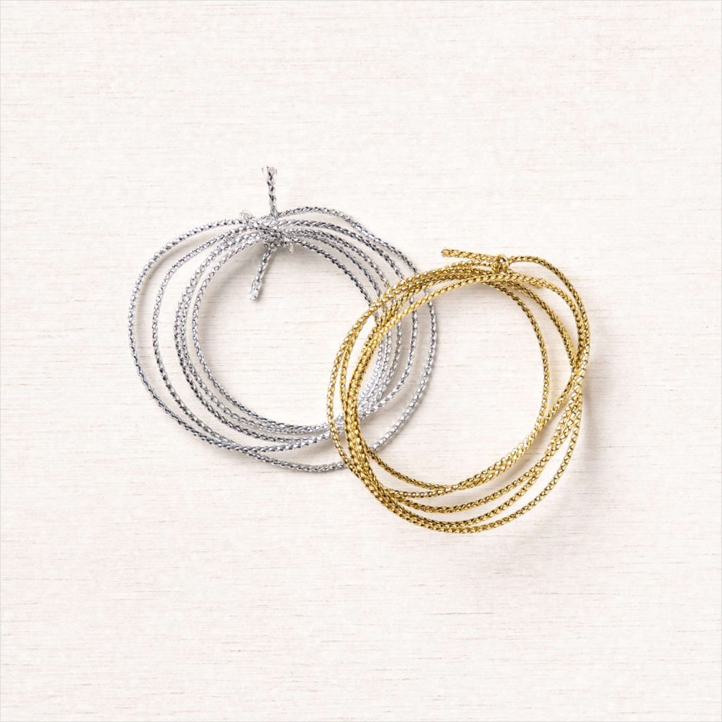
Did you notice the gold and silver trim tied through the top of the tag? It’s the Simply Elegant Trim from the Simply Elegant Suite Collection. Again, I bought this with Christmas Cards in mind but I doubt it will last that long at this rate!
I hope my card today inspires you to use your catalogue as inspiration to create your cards and projects even if you don’t have the exact same items that were used in the project you’re CASEing.
I can’t wait to see what everyone else has created with Smoky Slate today!
If you’d like me to post you your very own copy of the 2021-22 Stampin Up! Annual Catalogue, the January – June 2020 mini catalogue, or to simply find out about more about Stampin’ Up! contact me.
In the meantime, wherever you are in the world, stay safe, stay calm…and keep on crafting xxx
Welcome back to our Colour Creations Showcase as we continue our showcase of over 50 beautiful Stampin’ Up! colours in alpha order.
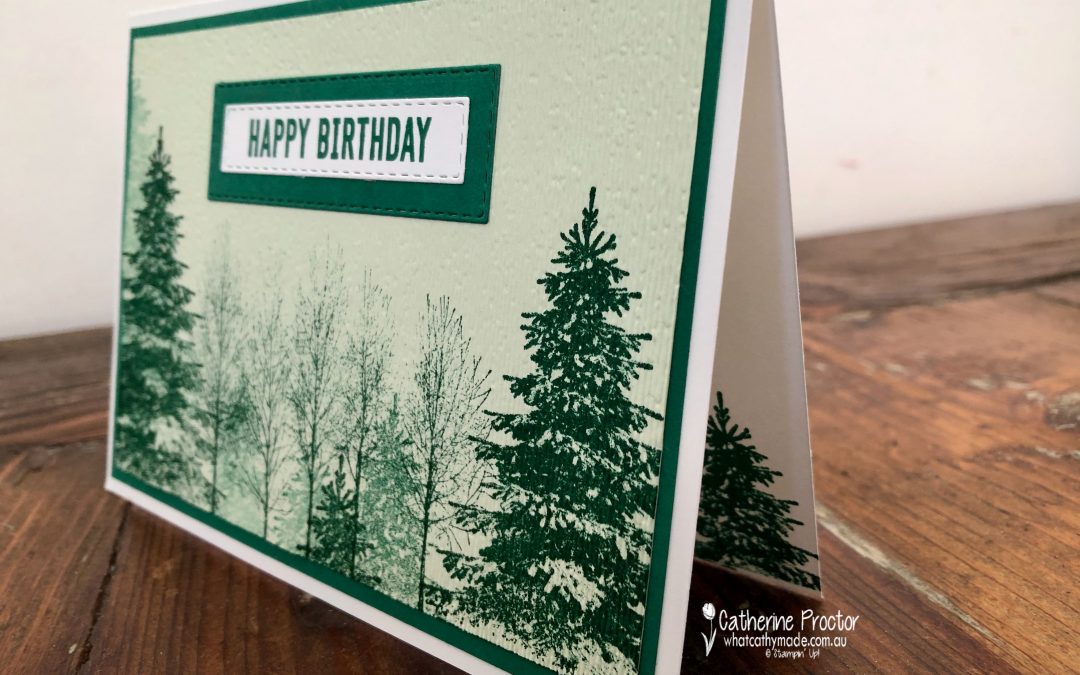
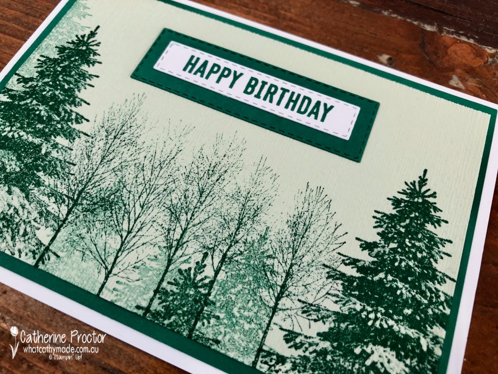
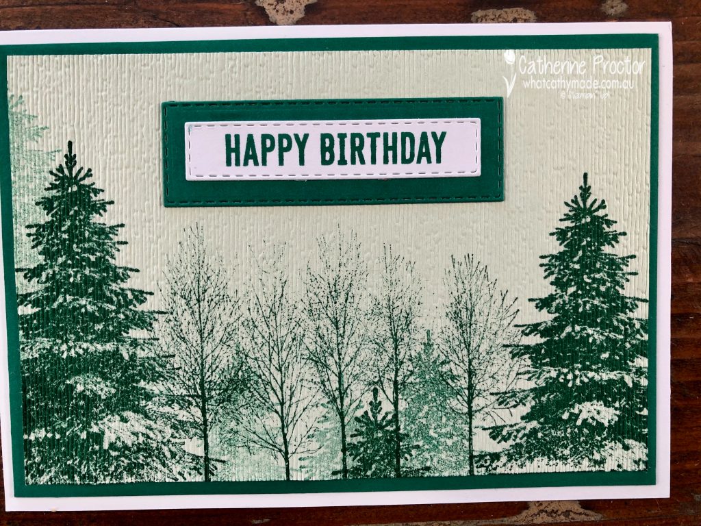
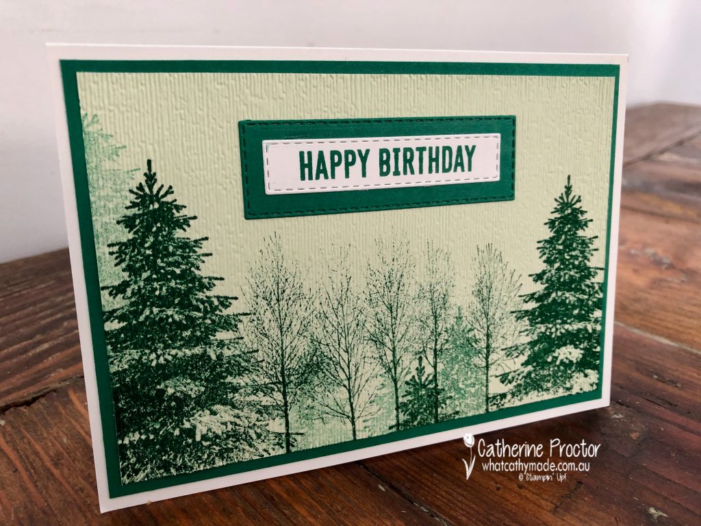
This week we are showcasing Shaded Spruce, a dark green colour from our Regals Family.
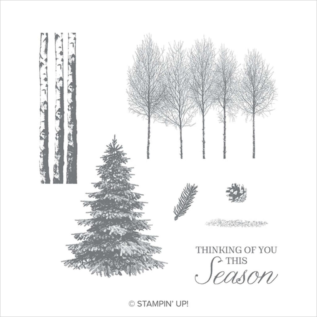
This is our last Colour Creations Showcase before the 2020-21 Annual Catalogue retires so I’m using some of my retiring favourites for this card: the Subtles Embossing folder, the Itty Bitty Birthdays stamp set and the Winter Woods stamp set.
I can’t take credit for the basic design of this card as I’ve CASED it from a beautiful Christmas card made by an overseas Stampin’ Up! demonstrator called Theresa McEntee. However, I felt April was was just a tad early to start making Christmas Cards so I’ve changed the sentiment and some elements of Theresa’s design to make a masculine birthday card instead.
If you don’t already have the Winter Woods stamp set it’s one I definitely recommend adding to your collection for simple stamping and for masculine cards. Although this stamp set only has a Christmas sentiment, I turned it into a birthday card by simply using a “happy birthday” sentiment from the Itty Bitty Birthdays stamp set.
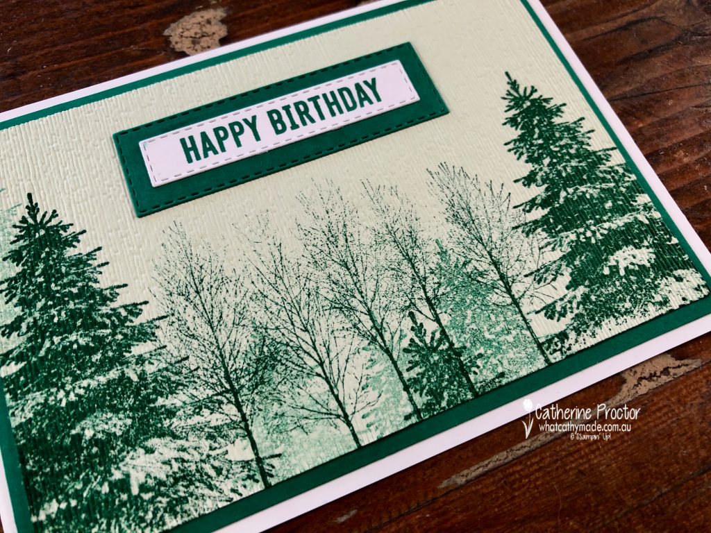
Can you see the lovely texture I’ve added to the stamped front panel using the subtle embossing folder? If you want to try this technique don’t forget to always stamp first and then emboss afterwards.
I love the colour combination of Shaded Spruce with Soft Sea Foam. Although they are the darkest and the lightest greens in the Stampin’ Up colour range they work really well together. All of the trees have been stamped in Shaded Spruce but I’ve “stamped off” some of the trees to create depth in my forest.
I can’t wait to see what everyone else has created with Shaded Spruce today!
If you’d like me to post you your very own copy of the forthcoming 2021-22 Stampin Up! Annual Catalogue, the January – June 2020 mini catalogue, or to simply find out about more about Stampin’ Up! contact me.
In the meantime, wherever you are in the world, stay safe, stay calm…and keep on crafting xxx
Welcome back to our Colour Creations Showcase as we continue our showcase of over 50 beautiful Stampin’ Up! colours in alpha order.
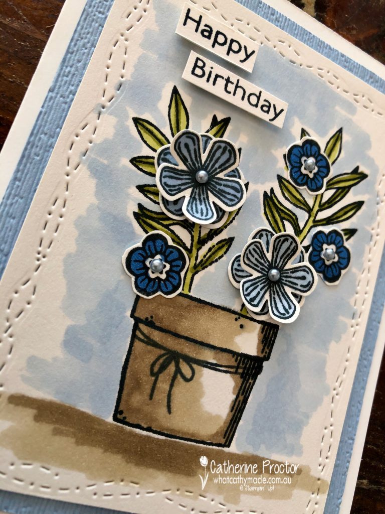
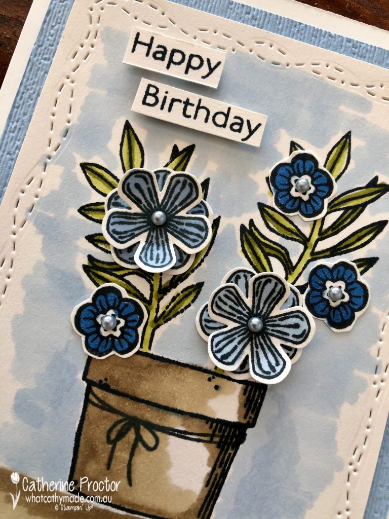
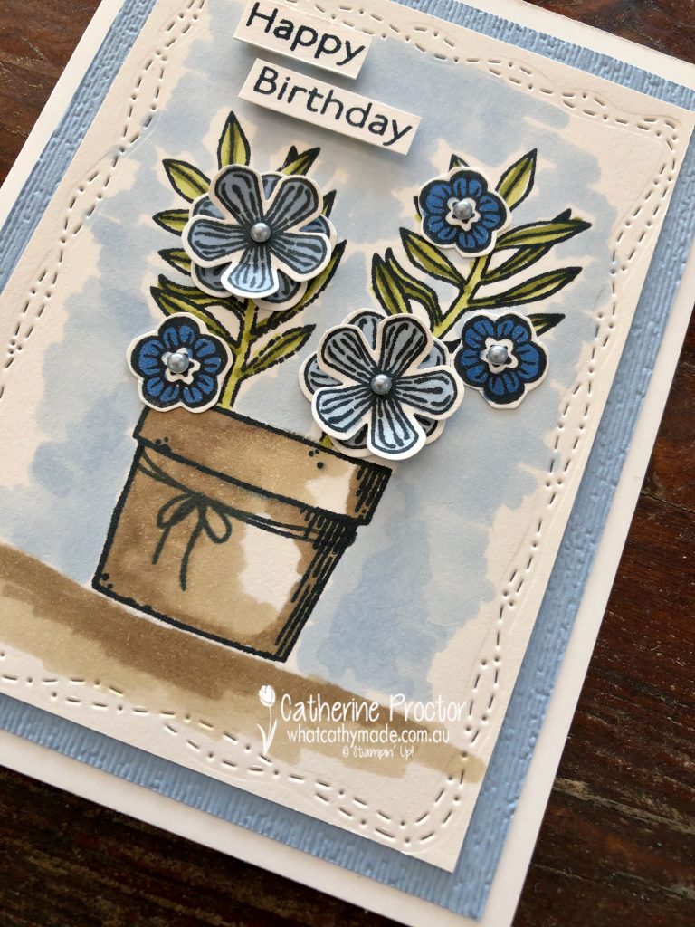
This week we are showcasing Seaside Spray, a soon to be retired 2019-21 In colour that I’m really going to miss!
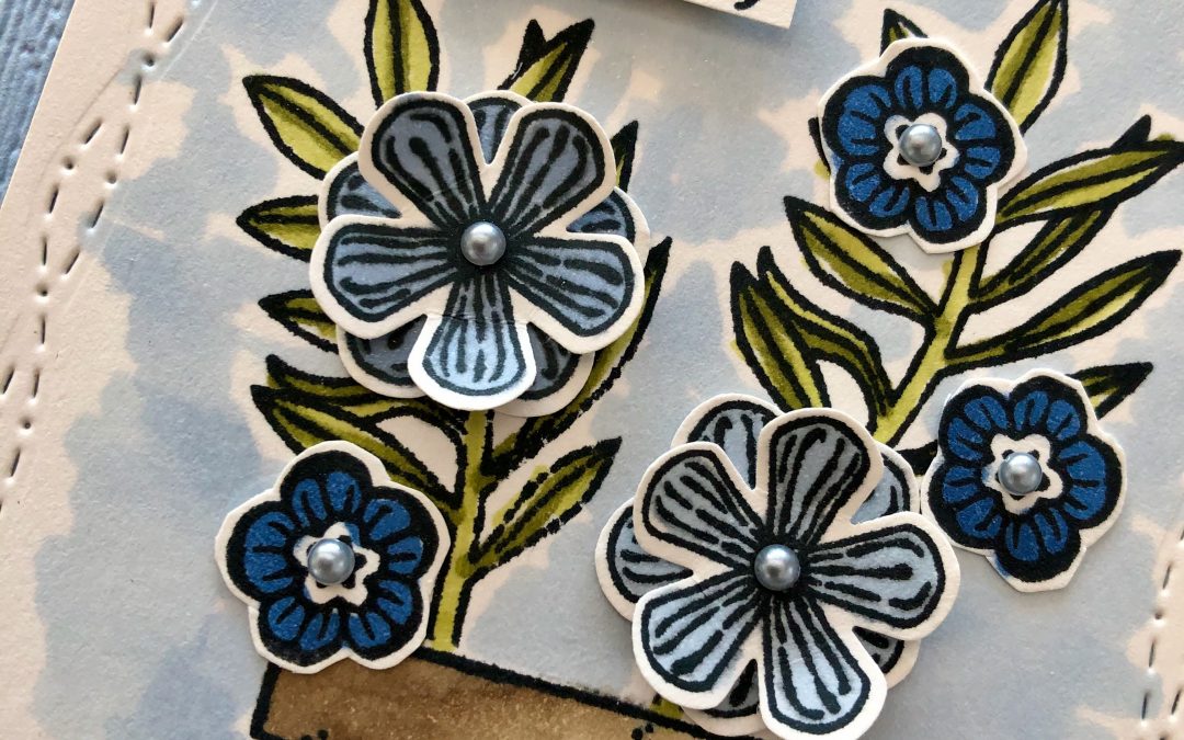
This week I’m also using a stamp set and co-ordinating punch that are retiring soon – the Basket of Blooms stamp set and the small bloom punch.
For quick and easy colouring I simply stamped my pot and leaves in Memento Ink onto Shimmery White card stock and coloured the pot in using Crumb Cake Stampin’ Blends and the leaves using Old Olive Stampin’ Blends.
The ground below the post and the area around the pot were also coloured using Seaside Spray Stampin’ Blends and Crumb Cake Stampin’ Blends . I love the stamp in this set that is a piece of twine wrapped around the pot.
The flowers were stamped onto a separate piece of paper and coloured in with Night of Navy and Seaside Spray Stampin’ Blends before being punched out with the small bloom punch or fussy cut. I’ve layered the largest flower and used silver metallic pearls for the centre of the flowers.
Don’t you just love the border created by the touch of whimsy dies? I’m so glad these are not retiring – the metallic pearls and the stitched with whimsy dies are both carrying over to the new catalogue, hooray!
The subtle embossing folder will also be sorely missed – I love the dimension this gives to card stock.
I can’t wait to see what everyone else has created with Seaside Spray today!
We will return next week on Wednesday April 28th when we’ll be showcasing Shaded Spruce.
If you’d like me to post you your very own copy of the forthcoming 2021-22 Stampin Up! Annual Catalogue, the January – June 2020 mini catalogue, or to simply find out about more about Stampin’ Up! contact me.
In the meantime, wherever you are in the world, stay safe, stay calm…and keep on crafting xxx
Welcome back to our Colour Creations Showcase as we continue our showcase of over 50 beautiful Stampin’ Up! colours in alpha order.
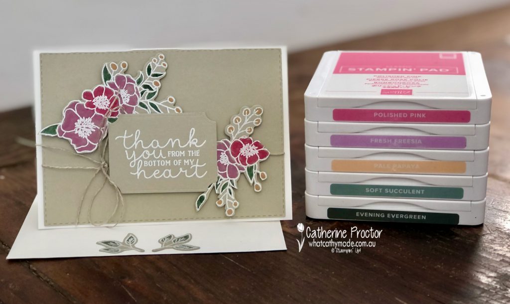
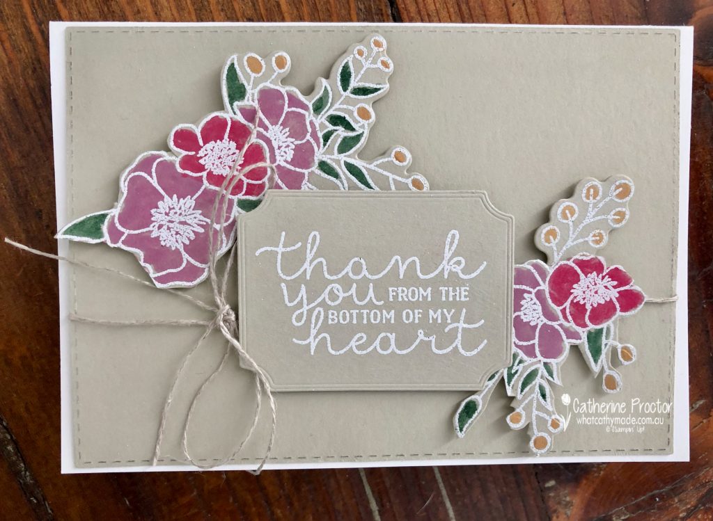
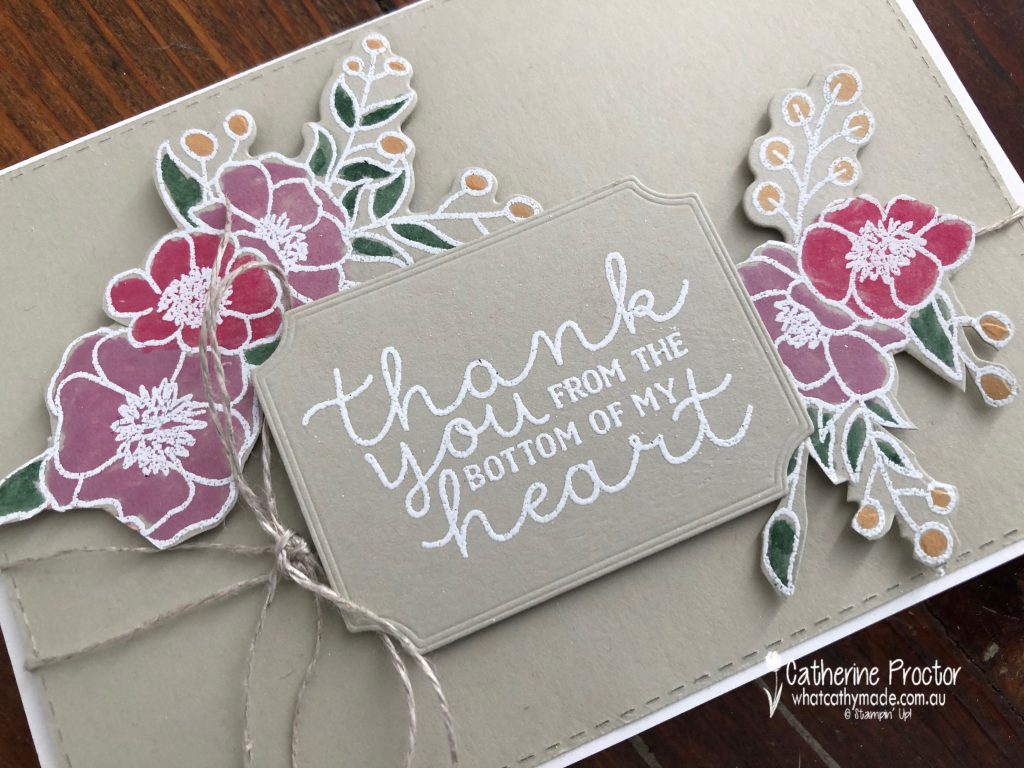
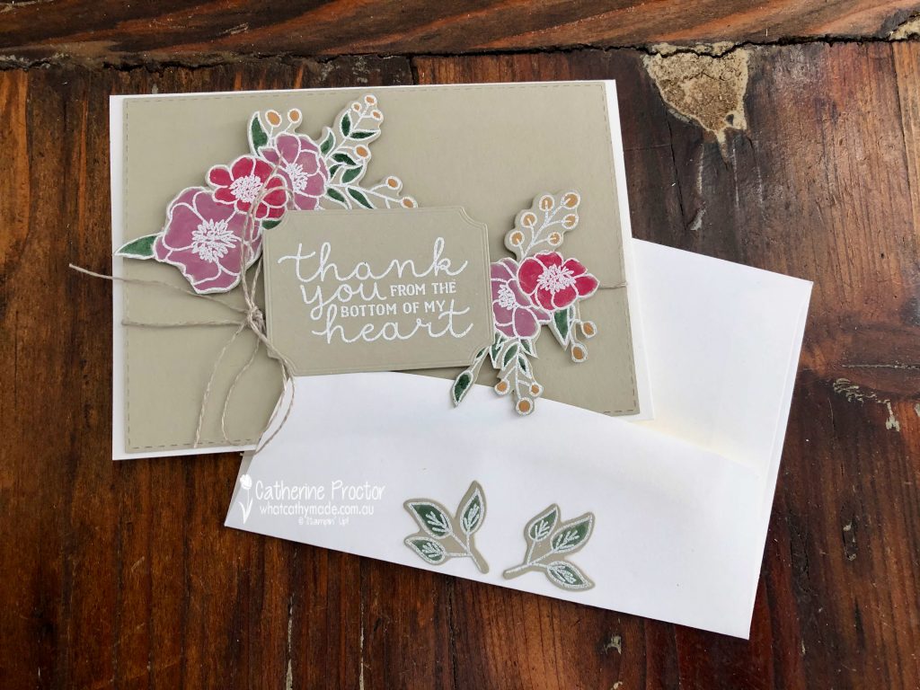
This week we are showcasing Sahara Sand, the lightest neutral in the Stampin’ Up! colour range.
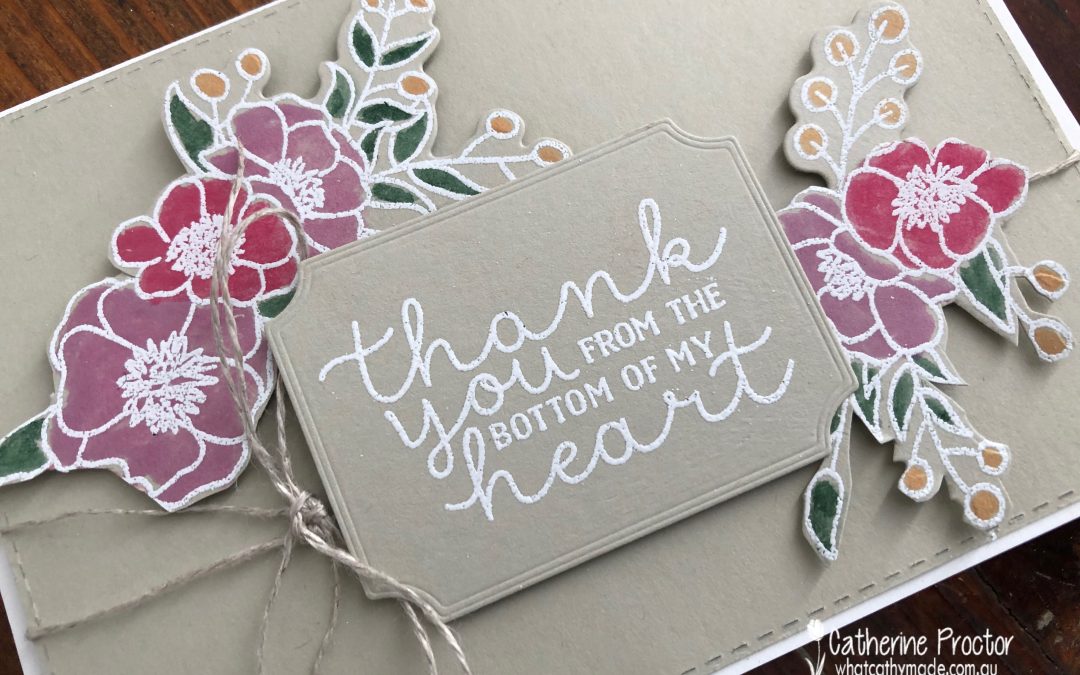
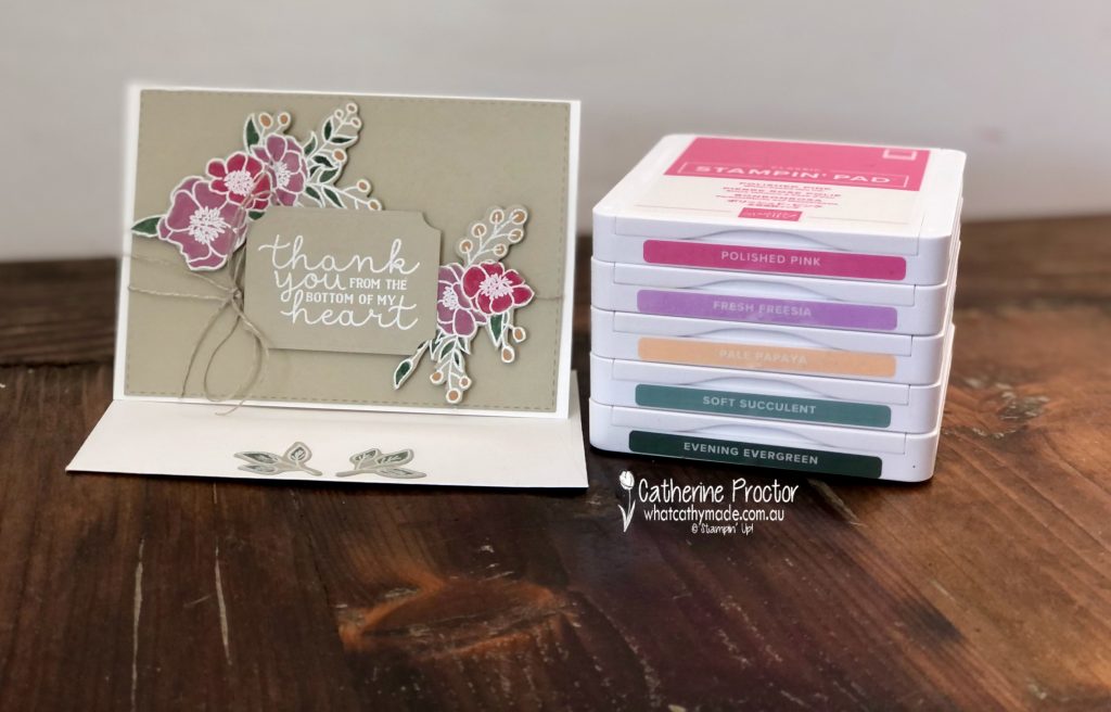
Recognise the colours on my card this week? You probably won’t because they are the brand new 2021-23 In Colours!
From top to bottom in my ink pad stack you can see Polished Pink, Fresh Freesia, Pale Papaya, Soft Succulent and Evening Evergreen.
My card is “something old, something new” this week, with the “new” being the InColours and the “old” being the lovely floral stamp set and dies that I’ve white heat embossed onto my Sahara Sand card base.
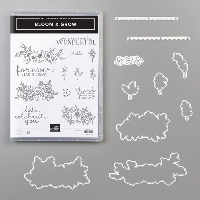
I’ve loved the Bloom & Grow stamp set and I’m going to miss it a lot when it retires in a few week’s time.
After heat embossing the larger floral stamp (top left on stamp case image), the “thank you” sentiment and some of the smaller sprigs I used my blender pen to lift ink directly off the stamp pads and colour in the images. I snipped the larger image into two pieces and arranged the flowers behind my sentiment.
Before adhering everything to the card with dimensionals, I wrapped linen thread around the Sahara Sand Layer and tied a bow.
The notecards with matching envelopes make card making so quick and easy – I used a few left over leaves to decorate the back of my envelope.
Sahara Sand is a great colour to colour directly onto, especially after you have heat embossed in white. Although I’ve used my ink pads and blender pen for this card, you could also use water colour pencils with the blender pen, Stampin’ Write markers or your Stampin’ Blends.
All of the new InColours are available as Stampin’ Blends as well as Stampin’ Write markers and you can purchase them from the 1st May.
I can’t wait to see what everyone else has created with Sahara Sand today!
We will return next week on Wednesday March 10th when we’ll be showcasing a lovely soft blue 2019-21 InColour that is about to retire: Seaside Spray.
If you’d like me to post you your very own copy of the forthcoming 2021-22 Stampin Up! Annual Catalogue, the January – June 2020 mini catalogue, or to simply find out about more about Stampin’ Up! contact me.
In the meantime, wherever you are in the world, stay safe, stay calm…and keep on crafting xxx
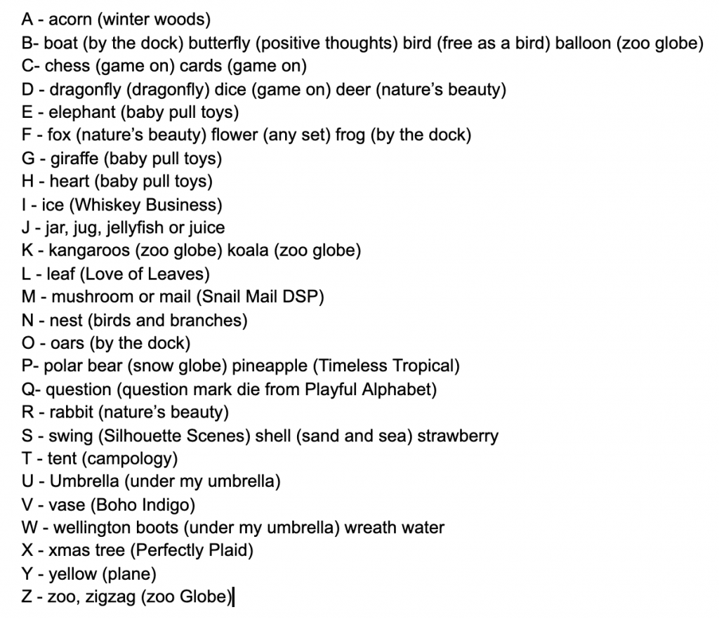
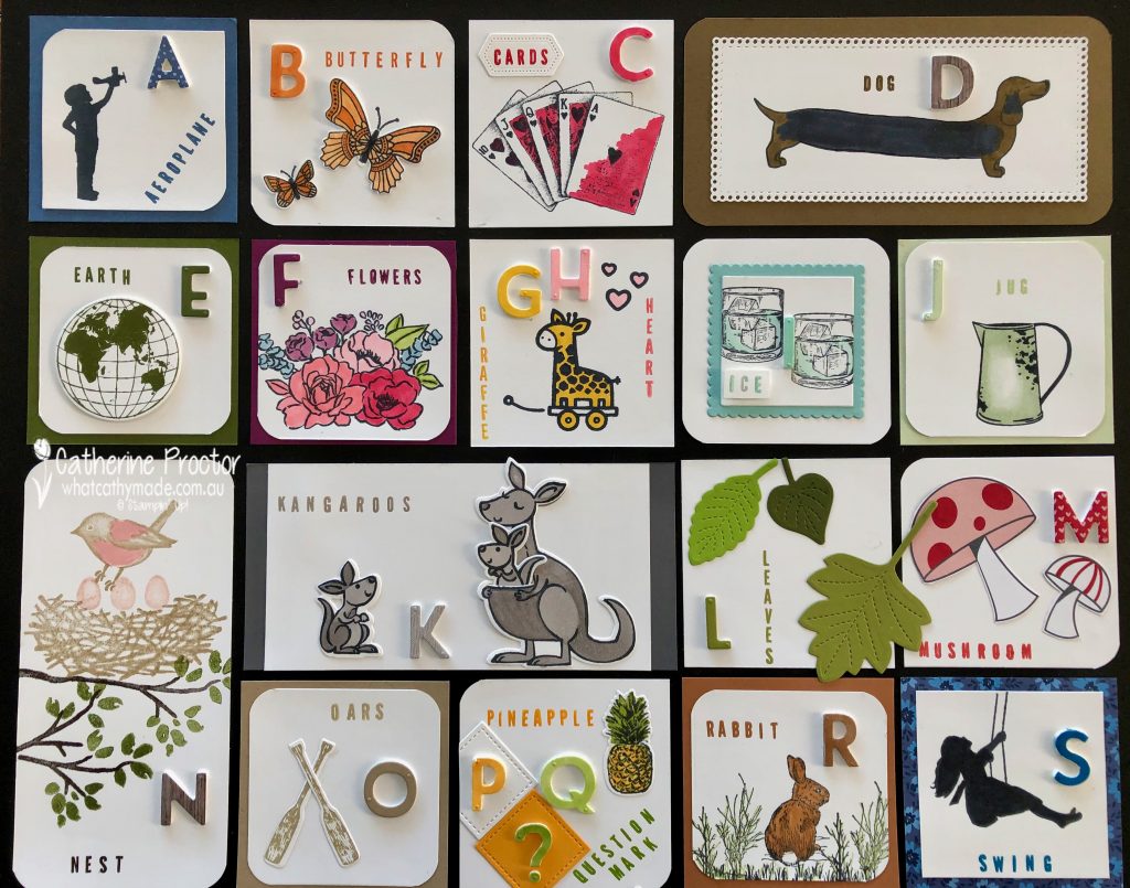
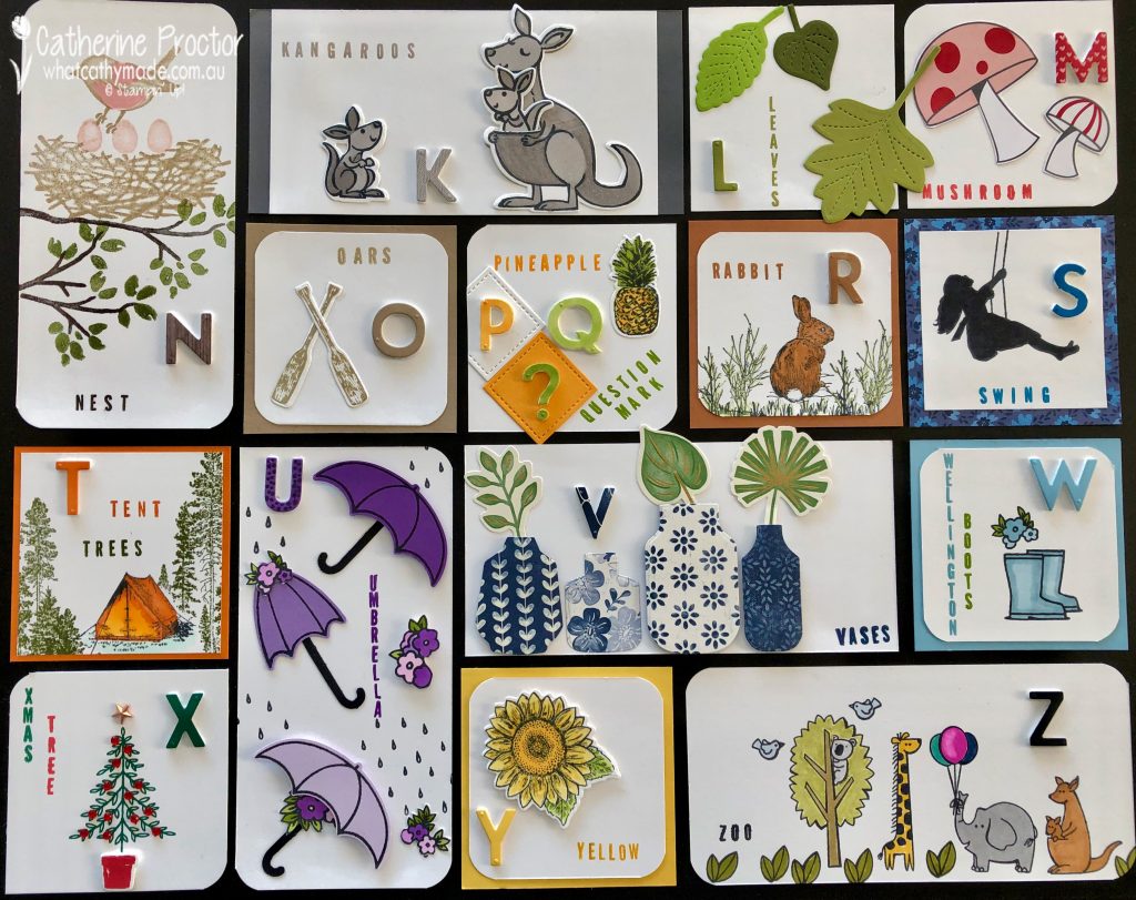
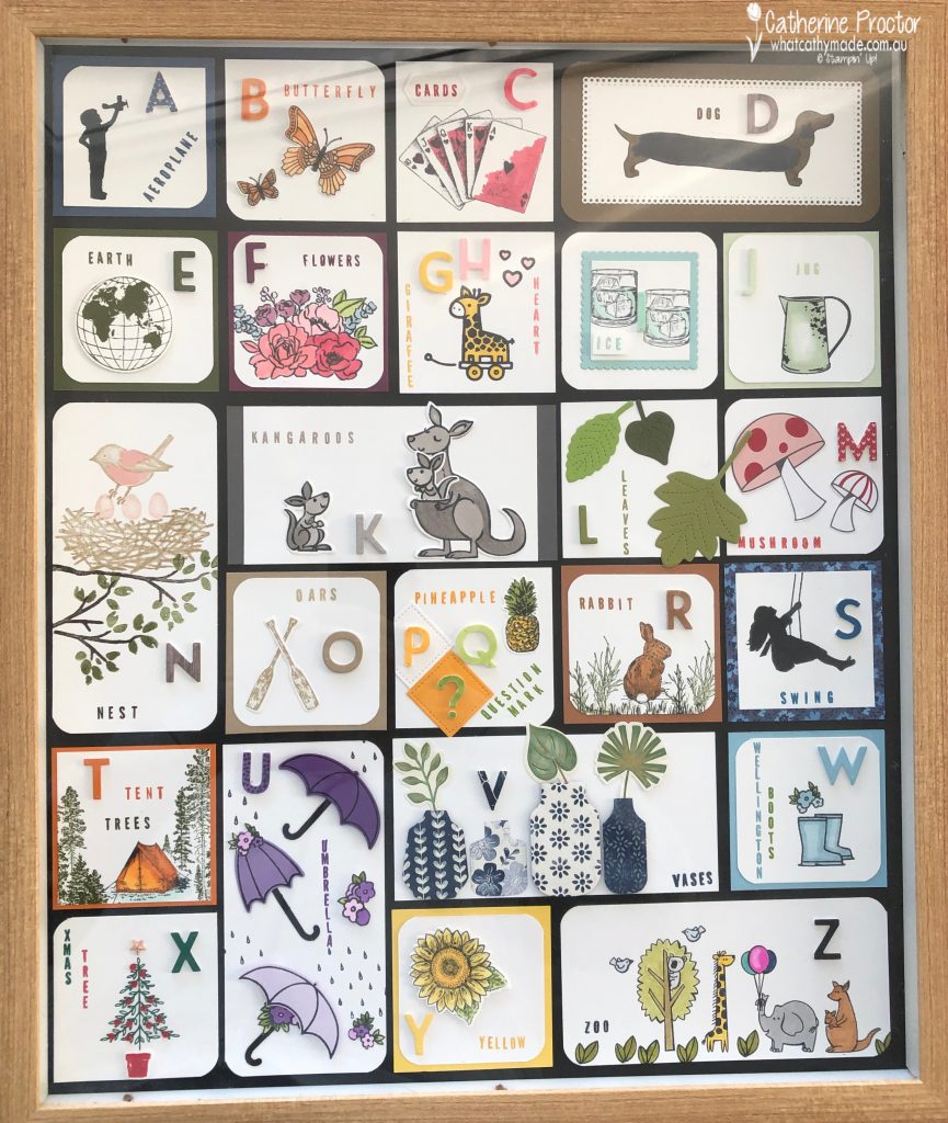
Today I’m sharing a very special project that was a real labour of love – a hand made alphabet sampler for my niece who is about to turn three.
This was such a fun project to make and yes it did involve a lot of my stamp sets. If you’d like to make one of your own, here’s how I created my alphabet sampler.
I began by looking at my stamp sets and making a list of words I could use for each letter.
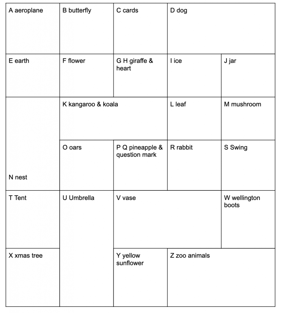
Once I worked out the word for each letter I then designed the layout to suit the images used.
The final step before I began to stamp was to calculate the size of each square or rectangle. I used a shadow box frame I found at a charity shop and each square worked out to be approximately 7cm (2 3/4 inches) square.
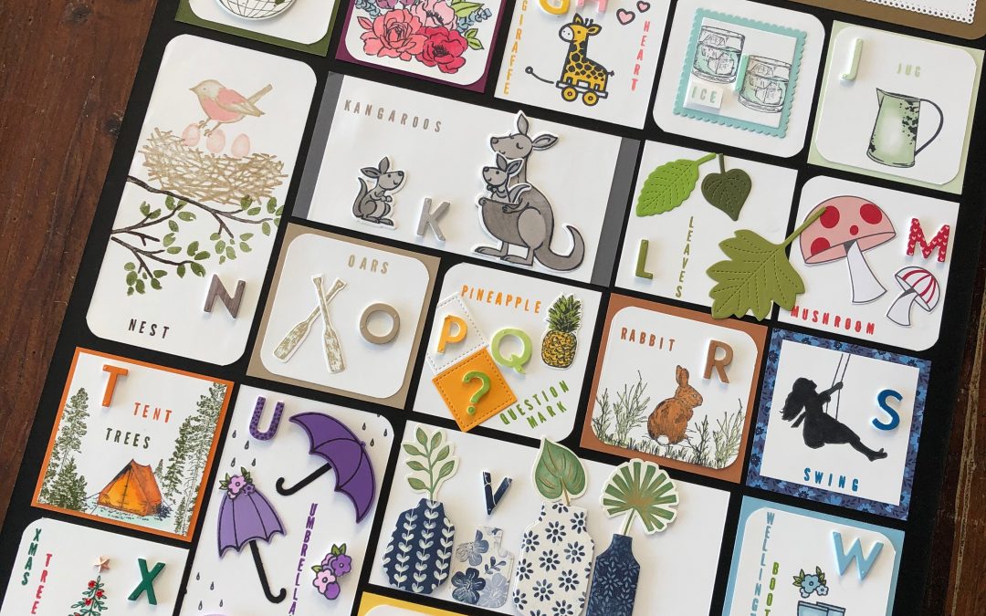
Here’s a close up of the top half of the sampler.
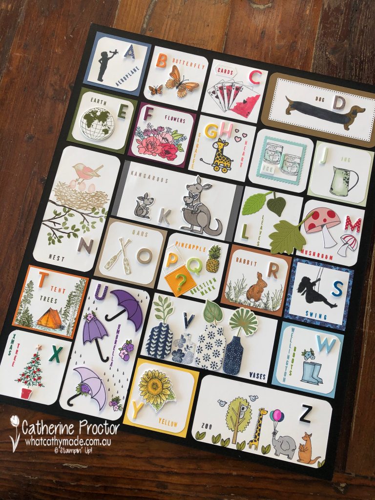
And here is the bottom half.
Letters throughout were created with the Playful Alphabet dies (die cut onto foam adhesive sheets) and the words were stamped using the Make a Difference stamp set.
The complete list of stamps used is as follows:
A – Silhouette Scenes
B – Butterfly Gala
C – Game On
D – Hot Dog
E – Beautiful World
F – Jar of Flowers
G & H -Baby Pull Toys
I – Whiskey Business
J- Country Home
K – Kangaroo & Company
L – Love of Leaves
M – Snail Mail DSP
N – Birds & Branches
O – By the Dock
P & Q – Timeless Tropical
R – Nature’s Beauty
S – Silhouette Scenes
T – Campology
U – Under My Umbrella
V – Boho Indigo
W – Under My Umbrella
X – Perfectly Plaid
Y – Celebrate Sunflowers
Z – Zoo Globe
Here’s what it looks like inside the frame.
If you’d like me to post you your very own copy of the forthcoming 2021-22 Stampin Up! Annual Catalogue, the January – June 2020 mini catalogue, or to simply find out about more about Stampin’ Up! contact me.
When you shop online in my Stampin’ Up! Online Store don’t forget to use my monthly Host Code (if your order is between $50 – $250) and I will send you a thank you gift the following month. If your order is over $250 don’t use the host code because you will qualify for your own stamping rewards.
My April Host Code is ESWKFC2Y and it is valid until midnight April 31.
Would you like to get a 20% discount on everything you order? Click here to join my team:
Thanks for visiting my blog today. I’ll be back this Wednesday with the AWH Colour Creations Showcase – we are creating projects with Sahara Sand this week.
In the meantime, wherever you are in the world, stay safe, stay calm…and keep on crafting xxx


 Designer Series Paper")


")
 Host Designer Series Paper")


")


 Specialty Designer Series Paper")