Welcome to week 45 of the Art With Heart Colour Creations Blog Hop!
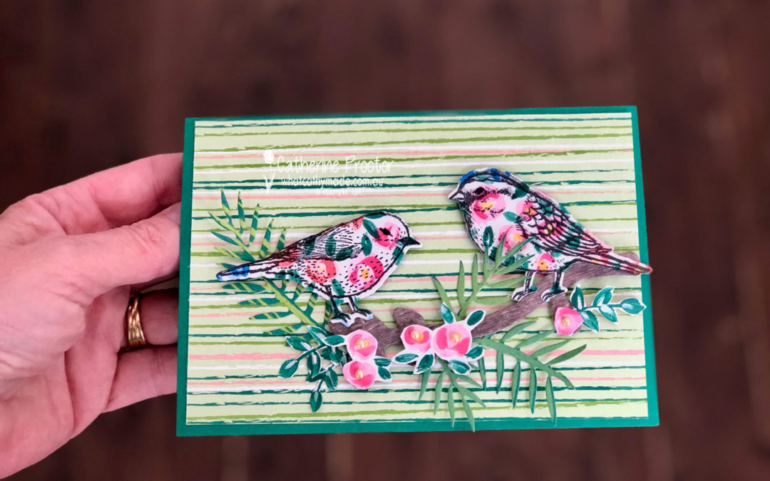
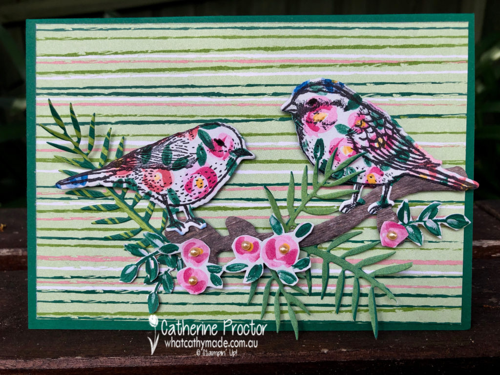
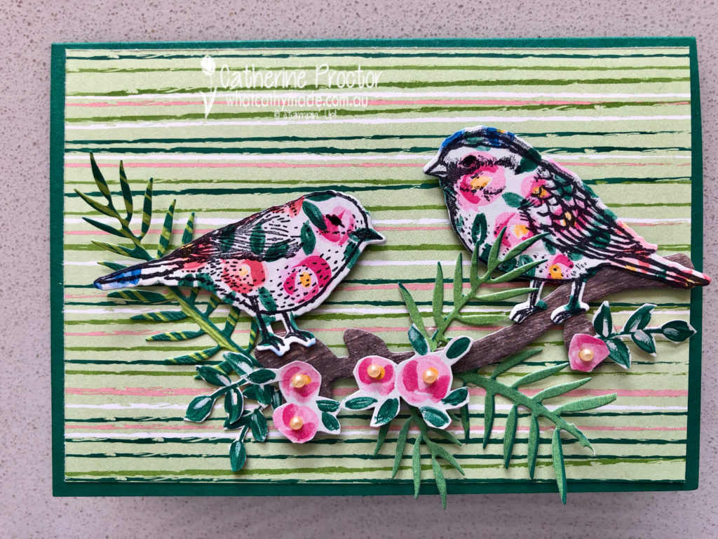
Our colour this week is a very dark regal colour: Shaded Spruce.
Stampin’ Up has some lovely Designer Series Papers that feature Shaded Spruce and I used two of these for my card today: Garden Impressions and Tropical Escape DSP.
My card uses a mix of die cutting and fussy cutting.
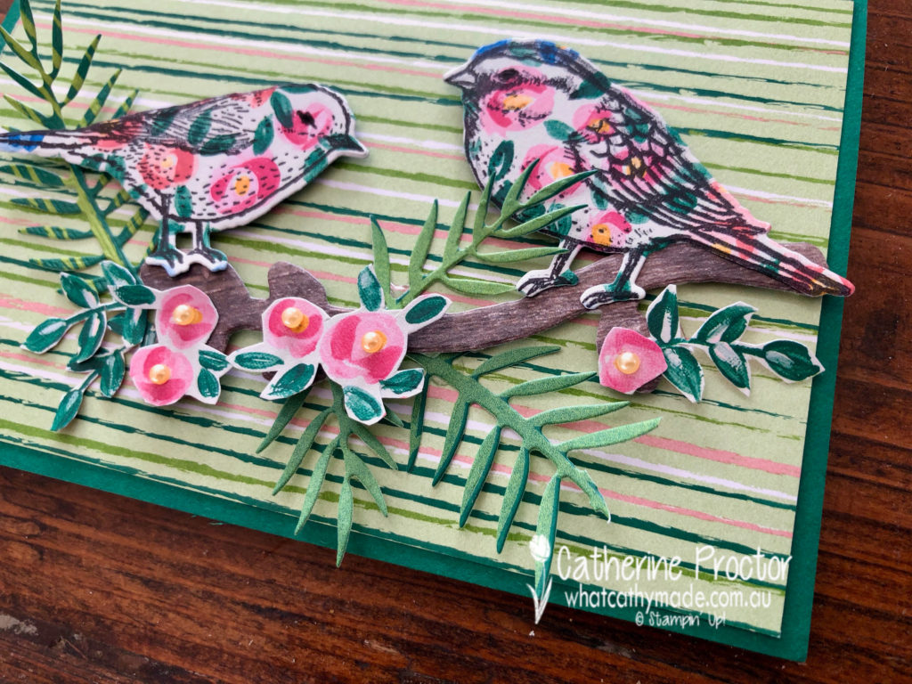
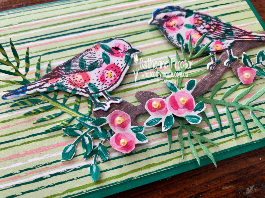
I stamped my birds in black ink onto the Garden Impressions DSP before die cutting them out. The branch they sit on has been die cut from the Wood Textures DSP.
The pink roses have been fussy cut from the Garden Impressions DSP, but the leaves have been die cut from the Tropical Escape DSP.
The card base is Shaded Spruce card stock topped with a rectangle of striped paper from the Tropical Escape DSP.
To see what the rest of the team have made click on the links below.
To purchase any of the products I used in this project you can shop with me here. Or if you’d like me to post you your very own copy of any of the Stampin Up! catalogues or find out about more about Stampin’ Up! contact me .
We will be back again next week showcasing a neutral colour: Smokey Slate! We hope you can along with us then.
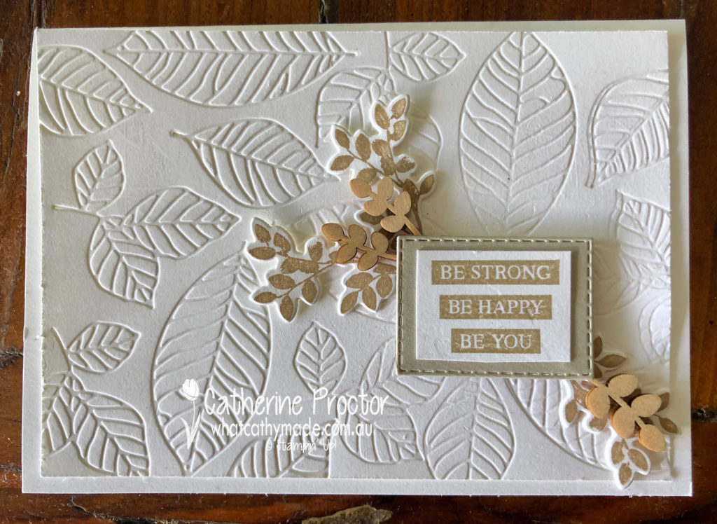
Welcome to week 44 of the Art With Heart Colour Creations Blog Hop!
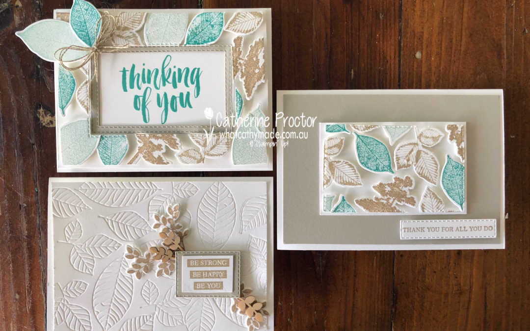
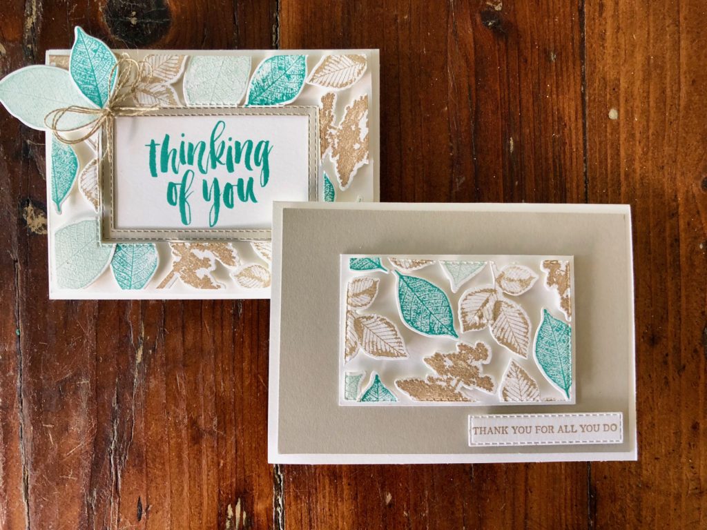
Our colour this week is one of the lightest neutral colours: Sahara Sand.
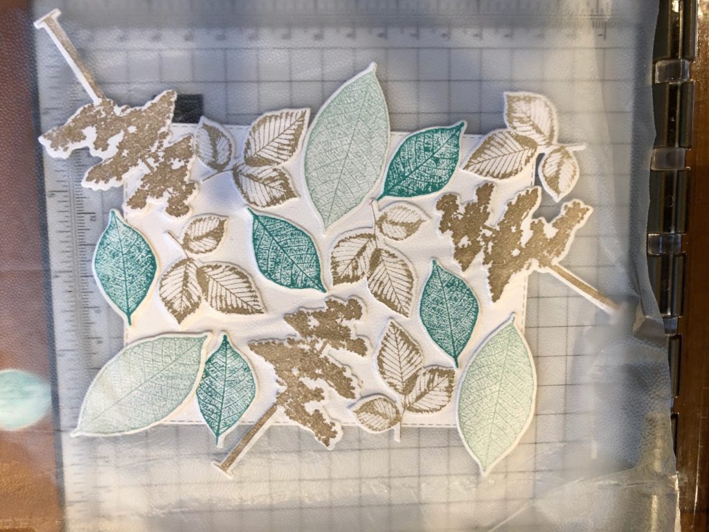
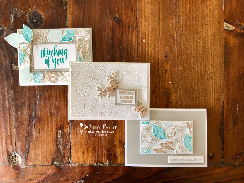
There’s a new technique around called the floating frame technique and I decided to try it out for my project this week, using the Rooted in Nature stamp set and the matching Nature’s Root Framelits.
The technique is quite similar to making your own DSP. I began by stamping the leaves and trees and die cutting them out before I arranged them onto a rectangle. Once I was happy with my layout I laid a sheet of Glad Press and Seal over the top of my die cut pieces, turned everything upside down and trimmed off the overlap.
My colour combination is Sahara Sand, Pool Party, Bermuda Bay and Crumb Cake.
Once I’d trimmed off the excess, I die cut a rectangle out of the middle before removing the Whisper White cardstock from behind the die cuts. The Glad Press and Seal keeps your die cut pieces in place while you do this.
The final step is to use a lot of dimensionals behind the die cut pieces to adhere them to your card base. When your frame is in place you gently peel off the Glad Press and Seal. If you look closely at my card you can see where I’ve stuck the Press and Seal down too hard and it’s lifted some of my ink off.
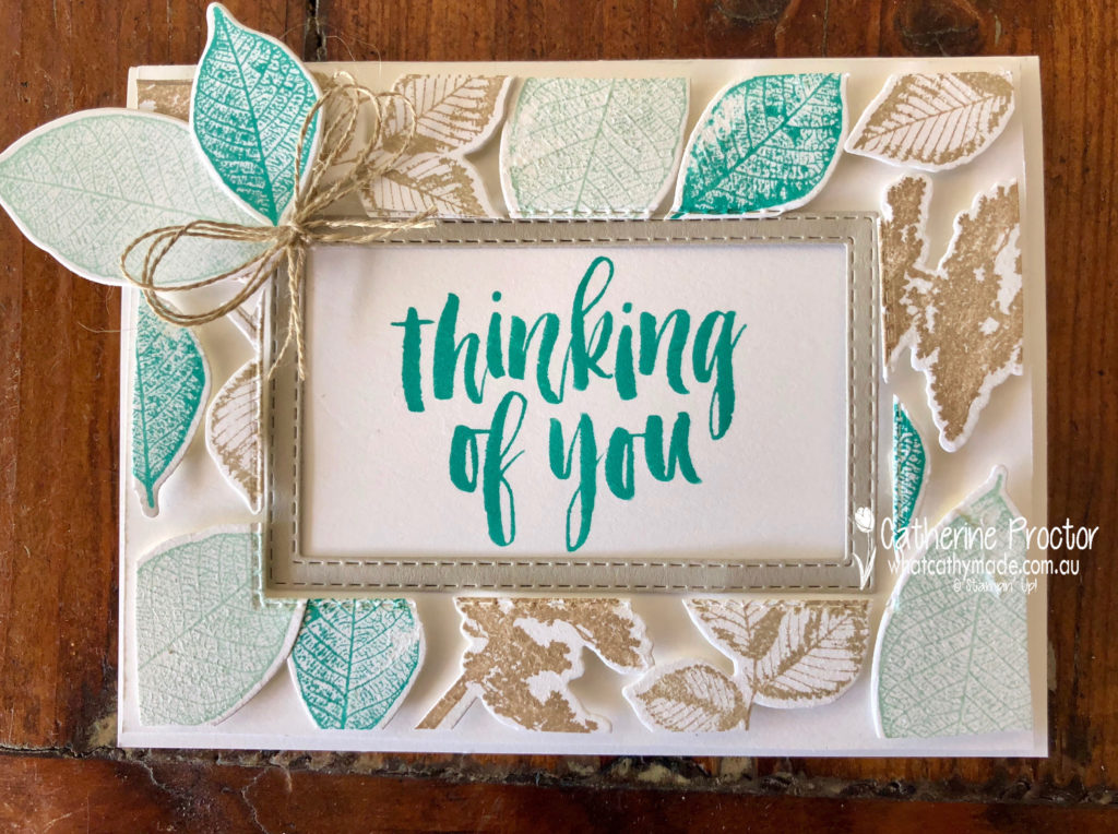
One of my favourite things about this technique is that you get 2 cards from it. Here’s the second card, made from the inside piece.
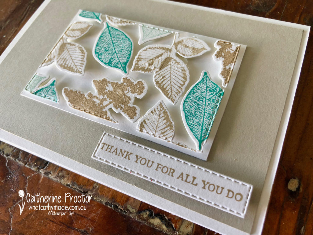
I decided to make a third card to showcase the lovely embossing dies in the Nature’s Root Framelits, as well as showing how elegant Sahara Sand looks on its own when paired with Whisper White.
To see what the rest of the team have made click on the links below.
To purchase any of the products I used in this project you can shop with me here. Or if you’d like me to post you your very own copy of any of the Stampin Up! catalogues or find out about more about Stampin’ Up! contact me .
We will be back again next week showcasing a regal colour: Shaded Spruce! We hope you can along with us then.
Welcome to week 43 of the Art With Heart Colour Creations Blog Hop!
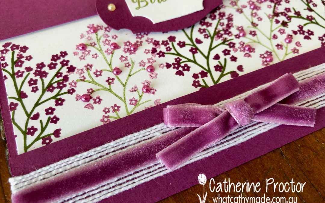
Our colour this week is a regal colour: Rich Razzleberry.
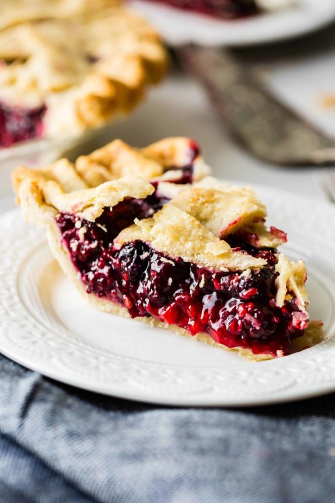
I’ve never seen a razzleberry in a fruit shop so I assumed it must be an American berry, but when I did a bit of Google research I discovered it is actually the name of a type of pie made with a mix of berries. Recipes differ but it is usually made with either raspberries and blackberries or raspberries, blueberries and blackberries.
Yum! I’m definitely going to make a razzleberry pie now that I’ve found the recipe!
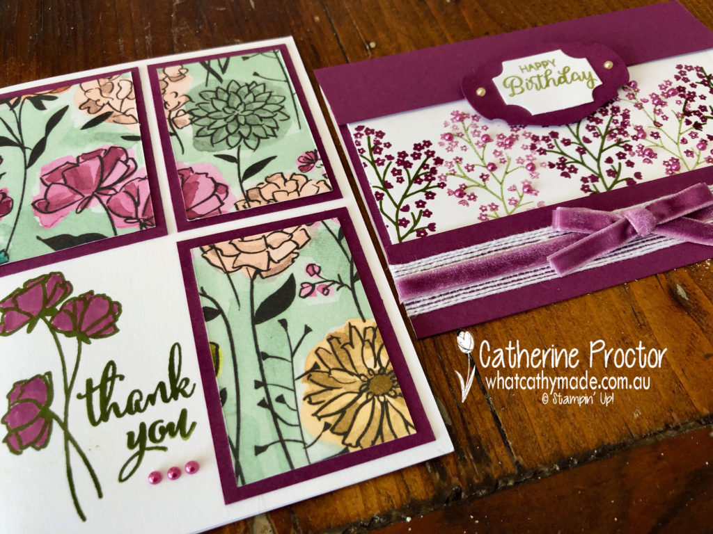
I love this colour so much I made two cards this week. I don’t think they’re my best cards ever but hopefully, they can showcase this lovely colour.
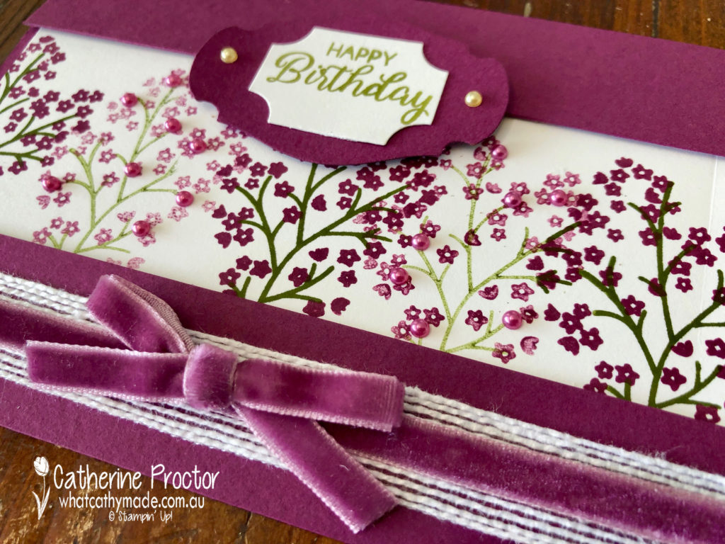
My first and favourite card uses the Beautiful Bouquet stamp set. I wanted to show how pretty Rich Razzleberry is stamped at both full strength and stamped off once. I also wanted to use the beautiful Rich Razzleberry velvet ribbon.
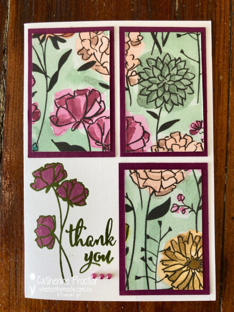
My second card is quite an old fashioned layout but it is a great way to use Designer Series Paper. You cut a rectangle into 4 even sections and mount 3 of these onto cardstock. The remaining square is stamped instead. A quick and easy card of any occasion.
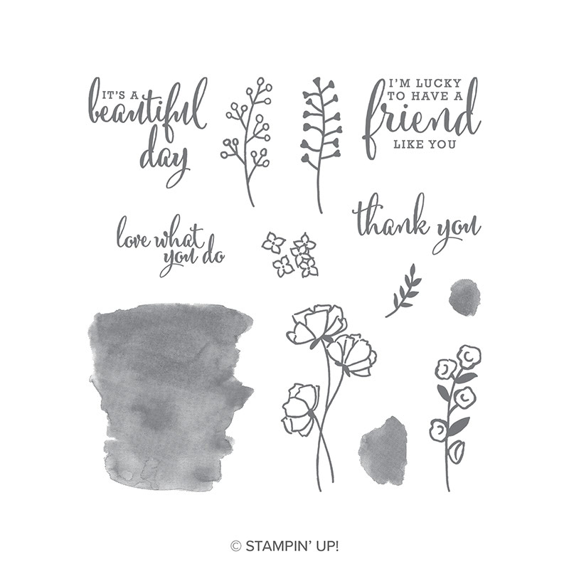
I’ve used the Share What You Love Specialty Designer Series Paper with the matching Love What You Do Photopolymer Stamp Set to stamp my sentiment and flower in Mossy Meadow before colouring in with Rich Razzleberry. I love this stamp set!
To see what the rest of the team have made click on the links below.
To purchase any of the products I used in this project you can shop with me here. Or if you’d like me to post you your very own copy of any of the Stampin Up! catalogues or find out about more about Stampin’ Up! contact me .
We will be back again next week showcasing the palest of neutrals: Sahara Sand! We hope you can along with us then.
Welcome to week 42 of the Art With Heart Colour Creations Blog Hop!
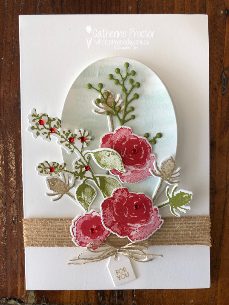
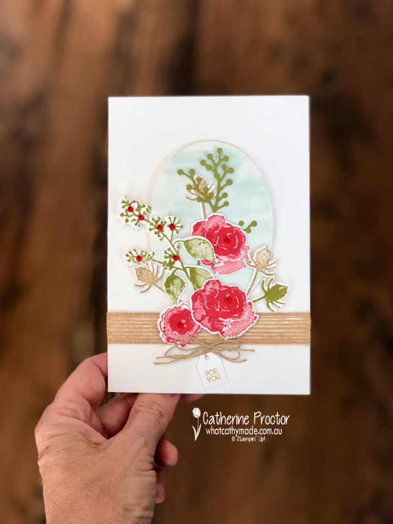
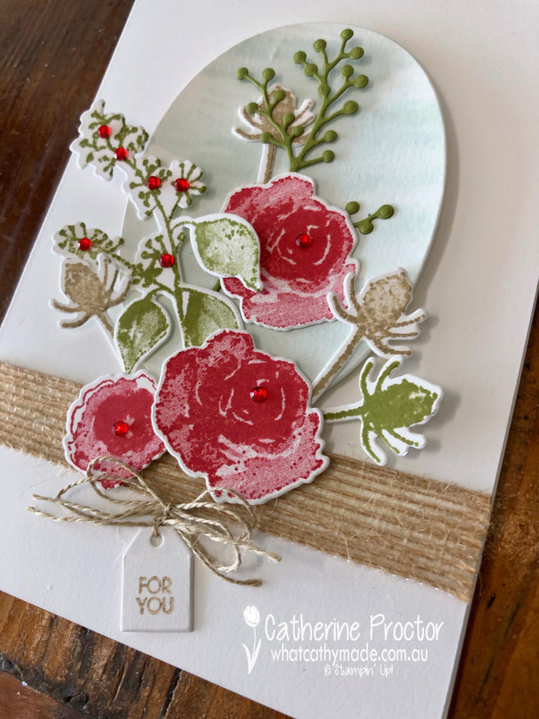
Our colour this week is a regal colour: Real Red.
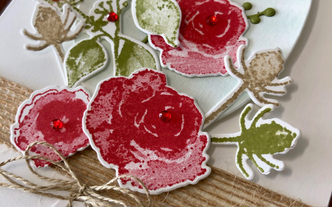
Real red is such a classic, stunning colour I wanted to pay homage to it with another classic: a bunch of red roses.
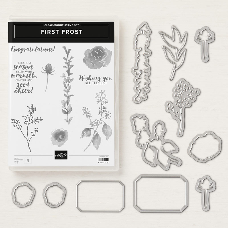
I’ve used one of my favourite stamp sets to create my beautiful rose bouquet: the first frost stamp set with its matching dies.
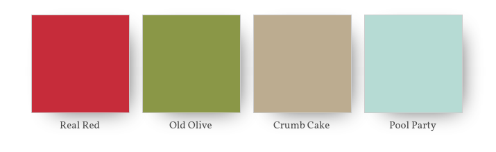
My colour combination is real red, crumb cake and old olive with a touch of pool party in the backgroud.
In my opinion, real red, just like old olive, really is one of those colours you can almost use as a neutral. It looks amazing with virtually any colour and really makes your card pop even if you only use a touch of it.
Last week I also used used real red in this colour combination.
In my project this week I’ve only used real red for my roses and for a touch of bling and dimension with the addition of the red rhinestones, but I still think it is the dominant colour of the card.
At the bottom of my card I used another all-time favourite of mine, the tiny little tag from the Bouquet Bunch Framelits Dies, stamped with the “for you” stamp from the Beautiful Bouquet Photopolymer Stamp Set.
To lift my bouquet off the front of the card I washed some pool party onto some card stock before cutting it out with my largest oval die. I love pool party with any shade of red.
To see what the rest of the team have made click on the links below.
To purchase any of the products I used in this project you can shop with me here. Or if you’d like me to post you your very own copy of any of the Stampin Up! catalogues or find out about more about Stampin’ Up! contact me .
We will be back again next week showcasing another one of the regal colours Rich Razzelberry! We hope you can along with us then.
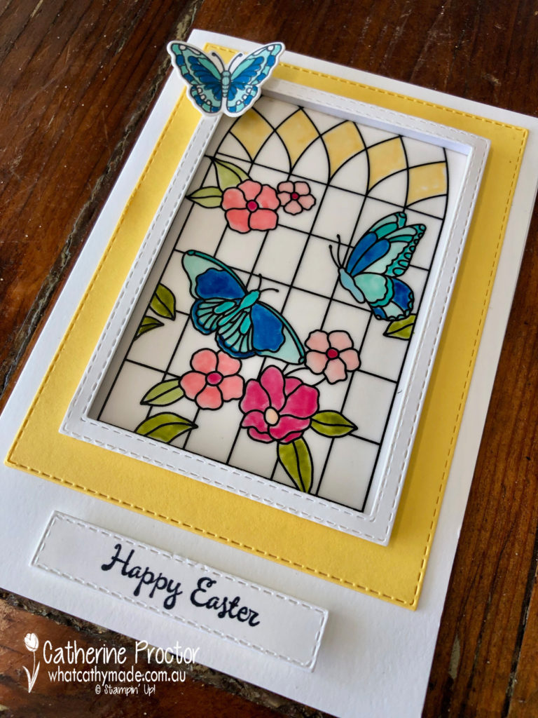
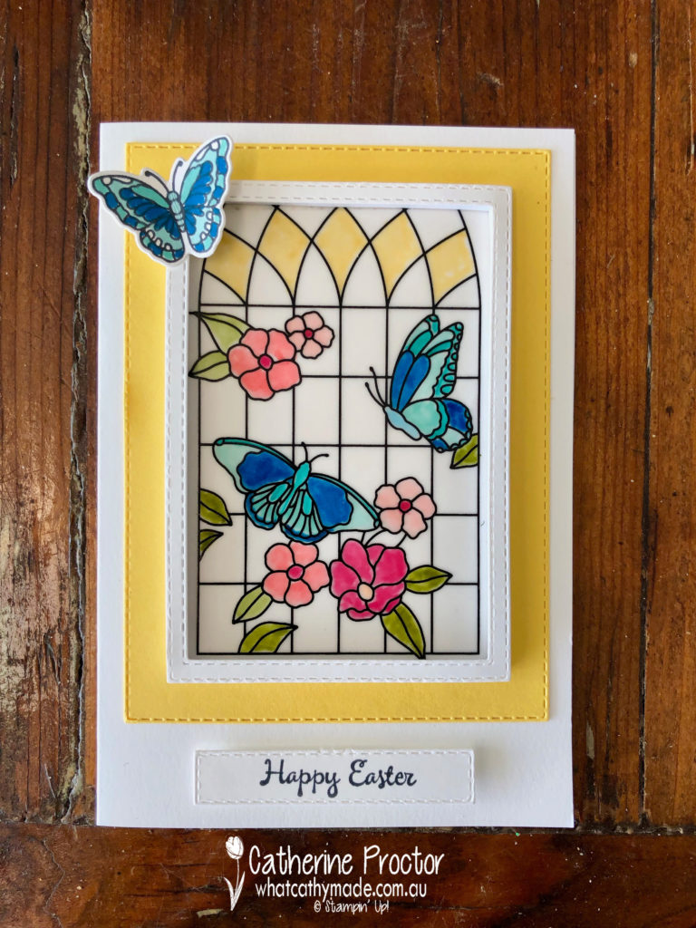
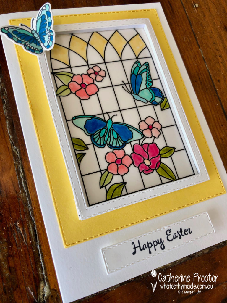
Tonight the Art with Heart team are sharing creative projects with an Easter theme.
Don’t forget, sale-a-bration ends on March 31st! There is still time to earn free product with purchase or even join our Stampin’ Up! team. Ask any of the girls on the hop for more details.
Easter means different things to different people. For some, it is all about bunnies, Easter eggs, hot cross buns and public holidays. For others, it is the most important day on the religious calendar. But although Easter is a celebration of the resurrection from the dead of Jesus Christ, did you know the Easter holiday is also based on an ancient Pagan ritual?
Easter dates change every year because it is also based on the Pagan ritual of the Spring Equinox, which is a celebration of new life and the change that comes with spring.
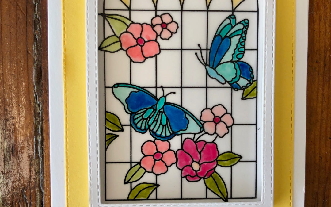
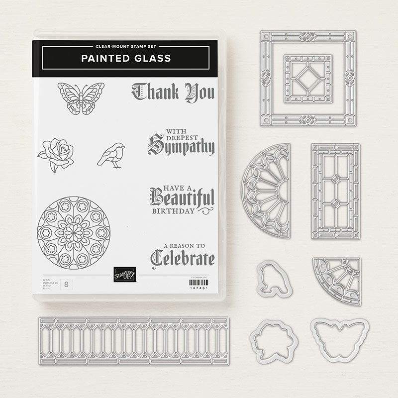
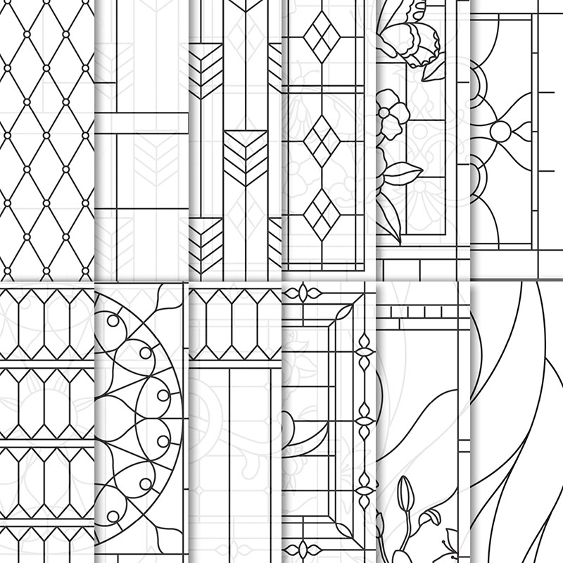
For my project tonight decided to celebrate both aspects of Easter – the Pagan and the religious celebration of Easter – by referencing the beautiful stained glass windows of the churches I would celebrate Easter morning in as a minister’s daughter. The Painted Glass Clear-Mount Bundle and Graceful Glass 6″ X 6″ Designer Vellum was just perfect for this.
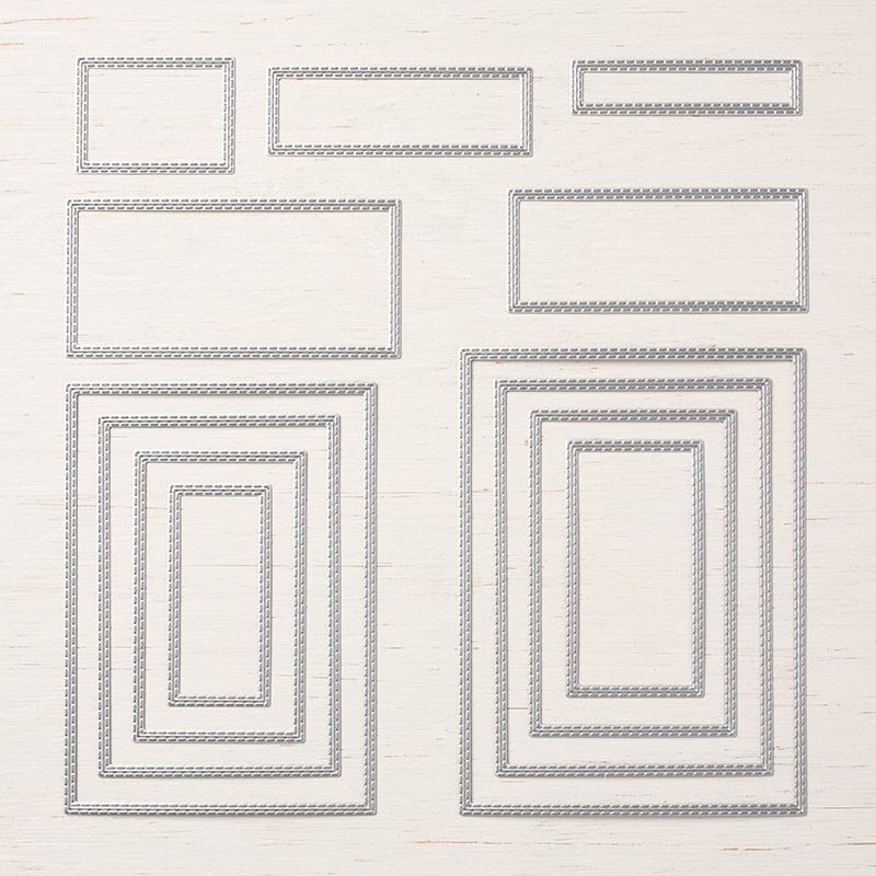
After colouring in my sheet with my Stampin blends, I used the Rectangle Stitched Framelits Dies to make a window frame for my stained glass window.
I then mounted my frame using the Foam Adhesive Strips and hey presto, I had created a beautiful stained glass window!
The Rectangle Stitched Framelits Dies were put to good use again for my Daffodil Delight layering mat and for my sentiment, which was stamped using the “You’re Inspiring” stamp set.
To celebrate new life and the change of season my final touch was a butterfly resting gently on my window…I think it makes my butterflies in my window come to life and look like they might fly away too!
Now it’s time to hop on over to our next participant, the very talented, Caroline Manwaring.
If you find a broken link or have come to this blog hop from a different entry point, you can view the participants below:
Welcome to week 41 of the Art With Heart Colour Creations Blog Hop!
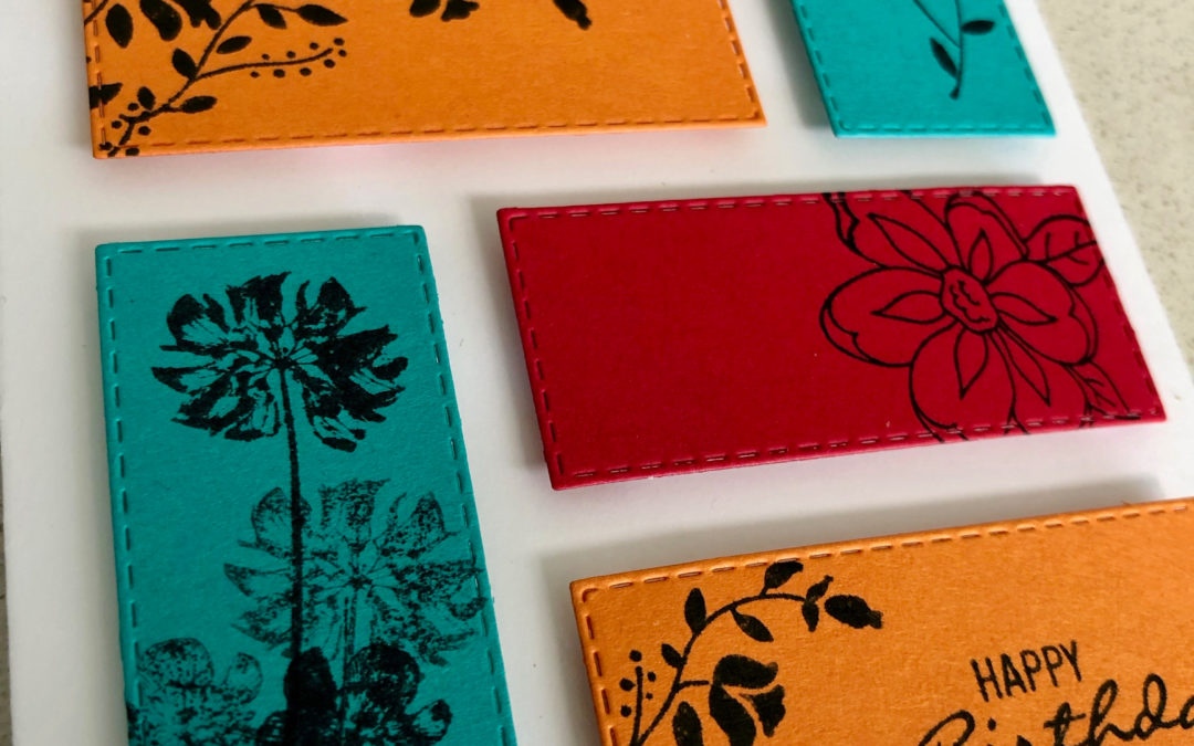
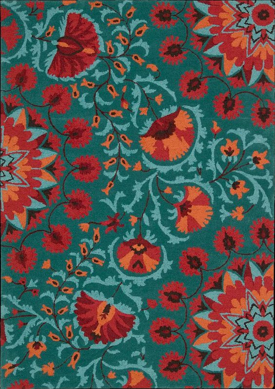
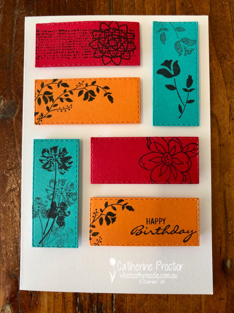
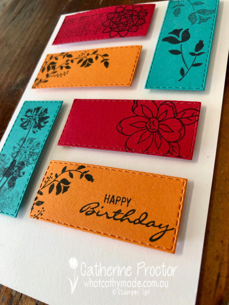
Our colour this week is a regal colour: Pumpkin Pie.
This is a colour I rarely use or wear – so it did prove a bit of a challenge until I saw this stunning rug!
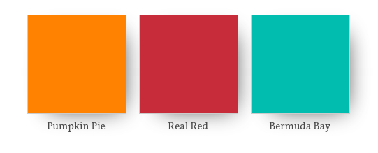
I looked at colour combinations within the regal family but decided I wanted a bluer green to go with the orange so I settled on the following colour combination: Pumpkin Pie, Real Real red (both regals) and Coastal Cabana (from the brights family).
Last week I created a background by stamping all over the powder pink cardstock with powder pink ink – such a simple and effective technique – so this week I did a similar technique, this time stamping in black a variety of floral images onto my three different coloured cardstocks.
I then die cut two rectangles in each of the three colours using my rectangle stitched framelits
I like how this technique lets the vibrant colours of the cardstock shine through, whilst also adding a subtle touch of floral elegance.
Because there are no embellishments on this card (and I was so very tempted to add a bow of linen thread!!!!!) I added dimension by mounting all of my rectangles to the card base using adhesive foam strips.
The stamp sets I used were the botanical bliss stamp set and the pressed flowers stamp set, both from the annual catalogue.
To see what the rest of the team have made click on the links below.
To purchase any of the products I used in this project you can shop with me here. Or if you’d like me to post you your very own copy of any of the Stampin Up! catalogues or find out about more about Stampin’ Up! contact me .
Welcome to week 40 of the Art With Heart Colour Creations Blog Hop!
Our colour this week is a 2017-19 in colour: Powder Pink, which retires at the end of May.
I was quite amazed when I looked at the Designer Series Paper to see which ones contained Powder Pink and I discovered nearly every single range used Petal Pink instead. So I decided instead to CASE a card from the Occasions catalogue that features the “All that you are.” I based my design on the card on the left in the picture below.
What I loved about this card was the background created by stamping all over the powder pink cardstock with powder pink ink. Its such a simple and effective technique and in both my card and the one I CASED the background is softened with a layer of vellum.
The lovely deep pink that co-ordinates with the powder pink is flirty flamingo and I die cut my leaves and foliage from old olive and crumb cake card stock using the co-ordinating frosted bouquet framelits.
The sentiment is also from the “All that you are” stamp set, stamped in crumb cake and then die cut using a die from the frosted bouquet framelits.
F
To see what the rest of the team have made click on the links below.
To purchase any of the products I used in this project you can shop with me here. Or if you’d like me to post you your very own copy of any of the Stampin Up! catalogues or find out about more about Stampin’ Up! contact me.
We will be back again next week showcasing one of the regal colours Pumpkin Pie! We hope you can along with us then.
Welcome to week 39 of the Art With Heart Colour Creations Blog Hop!
Our colour this week is a returning bright: Poppy Parade.
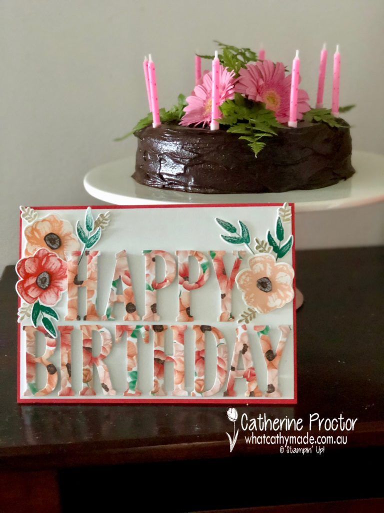
Last weekend I needed to make a very large card for a friend from my mother’s group. Our eldest children were born on the very same day and they turn 21 this year!!! My friend turns 50 today and we celebrated with a girl’s night out for 16 people. We all put in for a group present so there needed to be lots of room on the card for everyone to write a message.
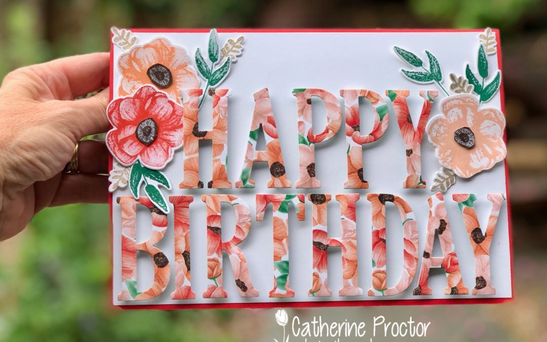
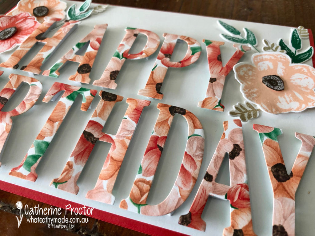
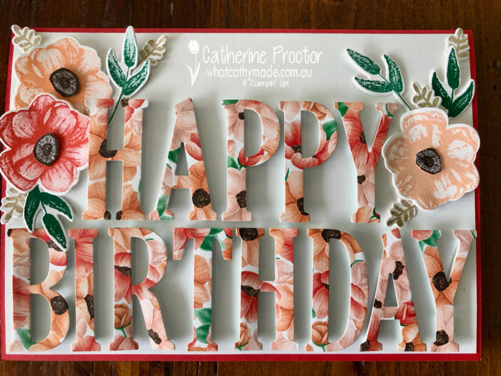
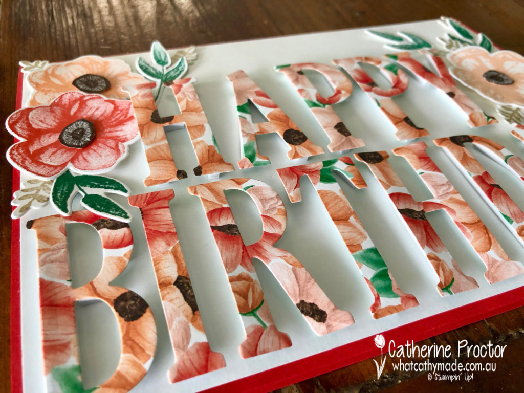
Red is her favourite colour so I made the base of my card by simply scoring a piece of A4 Poppy Parade cardstock in half. I added a layer of Whisper White and then used my large letter dies to cut out “happy birthday” from the stunning Painted Seasons floral DSP. I mounted my letters onto the front of my card with the foam adhesive strips…they really make the letters pop!
Then I stamped some flowers and leaves in the coordinating colours and die cut them out using the Painted Seasons stamp set and the matching Four Seasons framelits.
I also made the birthday cake for dessert for my friend because she is gluten-free. Every time I make this cake I get so many requests for the recipe I thought I might share it here too.
It is so simple to make, not too sweet and very moist. I think Claudia Roden created this recipe but I have also seen Stephanie Alexander and Nigella Lawson make it. My variation is to ice it with a dark chocolate ganache, which is the perfect counterpoint for the orange cake.
Flourless Orange Almond Cake
Ingredients
2 navel oranges
6 eggs
1 cup sugar
1 tsp gluten free baking powder
250gm almond meal
2 blocks of dark Lindt chocolate
2 tbsp cream
Method
Cover the oranges with water in a saucepan and boil for 1-2 hrs or until soft.
Remove from water and let cool.
Preheat oven to 180 C. Grease and line a springform pan.
Leaving the skin on, roughly chop oranges into chunks and blend in a food processor until smooth.
Add eggs, sugar, almond meal and baking powder to a food processor and blitz to combine. the mixture will be quite runny.
Pour into your lined springform tin and bake for about 1 hour or until a skewer comes out cleanly and cake starts to come away from the sides.
Let cool for a few minutes and then gently release cake from the tin.
Once the cake has totally cooled, melt chocolate and cream together and combine to make a glassy ganache. Spread over cake, decorate and enjoy!
To see what the rest of the team have made click on the links below.
To purchase any of the products I used in this project you can shop with me here. Or if you’d like me to post you your very own copy of any of the Stampin Up! catalogues or find out about more about Stampin’ Up! contact me.
We will be back again next week showcasing one of the 2018-20 in colours Powder Pink! We hope you can along with us then.
Welcome to week 38 of the Art With Heart Colour Creations Blog Hop!
Our colour this week is one one of my favourite subtles: Pool Party.
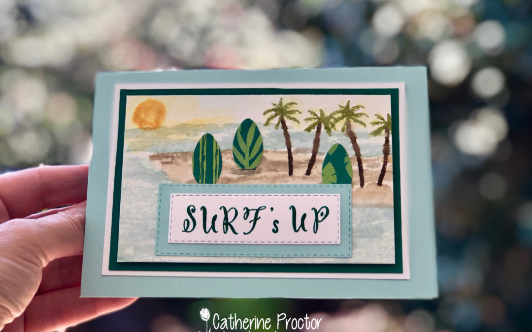
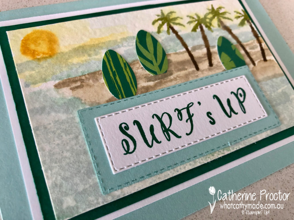
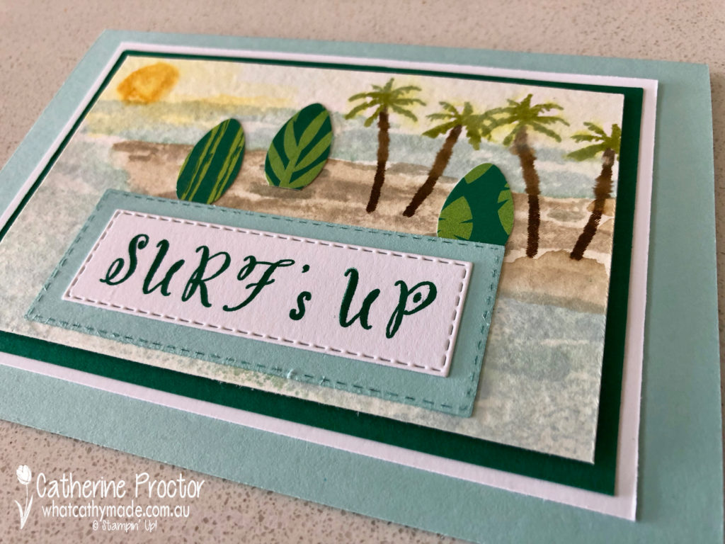
To be honest, the timing of this colour couldn’t be better as it was my husband’s birthday on the weekend and I need to make him a surf related birthday card. Well, it was either going to be a surf, single malt whiskey, craft beer or a yoga-themed card…but surf really is his greatest passion.
Which left me with 2 problems… One, we had family stay the whole weekend so I only had a 30 minute window to make the card, and two, I don’t own any current Stampin’ Up! supplies that are surf-related!
So before I show you my card, just remember that it was definitely a case of “the thought that counts this week”. The card is rushed and far from perfect … but my hubby did love his card and that’s the most important thing to me.
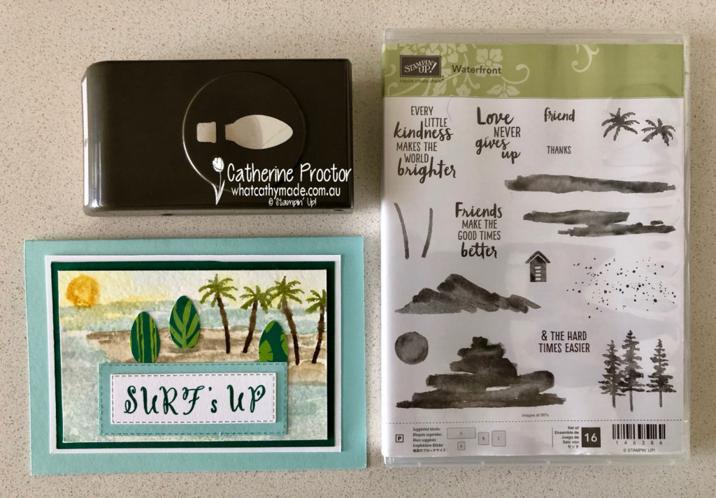
I had to get creative very quickly so I used three different products to achieve my surf theme. The wonderful “waterfront” stamp set is so versatile for any natural scene you want to create. I used it to evoke a sense of Fiji, which is where Pete and Sam (my eldest son) went on a boy’s surfing trip together last year.
For the sentiment on the front, I used the “make a difference” stamp set. I love alphabet stamp sets because they allow you to make any sentiment or message you need for a card.
Finally, can you guess what I used to make my surfboards?
Believe it or not, the Christmas Bulb Builder punch was just perfect for what I needed.
It’s not quite the shape of the surfboard Pete uses to surf his usual break at South Curl Curl, however, our birthday present to him this year was a shorter rounder soft board called a pocket softboard, which is designed for surfing a different kind of break in the corner of Shelly Beach.
When I trimmed off the bottom of the bulb punch I realised it was the perfect shape for his new board.
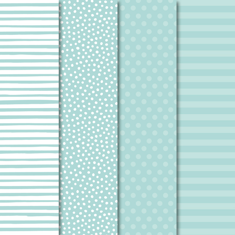
I felt the tropical escape DSP would look great as my mini surfboards, which inspired me to introduce a colour I wouldn’t normally pair with Pool Party…Shaded Spruce. But I really like the framing effect and contrast it gives to the softer, watery palette of my watercoloured surfing scene.
To see what the rest of the team have made click on the links below.
To purchase any of the products I used in this project you can shop with me here. Or if you’d like me to post you your very own copy of any of the Stampin Up! catalogues or find out about more about Stampin’ Up! contact me.
We will be back again next week showcasing a returning bright: Poppy Parade! We hope you can along with us then.
Tonight the Art with Heart team are sharing creative projects using products available for FREE when you make a minimum purchase during sale-a-bration. For every $90 (AUD) you spend before postage, you can choose FREE products from the brochure.
If you spend $90, you get one free level 1 product. If you spend $180, you get one free level 2 product, OR, you can choose two level 1 items. If you spend $270, you have the option to choose three level 1 items or one level 1 item and one level 2 items.
The sale-a-bration promotion is current now until March 31st. Be sure to request your copy of the brochure today if you don’t already have one. Sale-a-bration is also a great time to join our fabulous team – just ask any of the girls on the blog hop for more details!
There are so many lovely products in this sale-a-bration promotion it was hard to choose just one product.
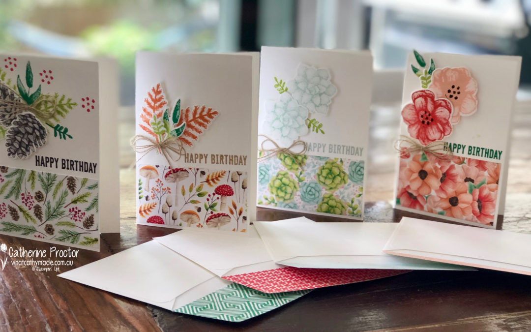
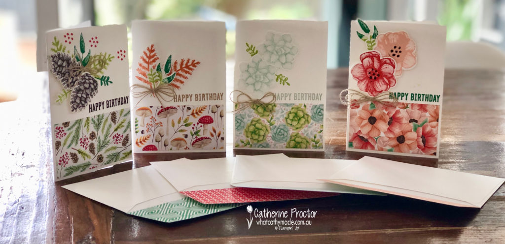
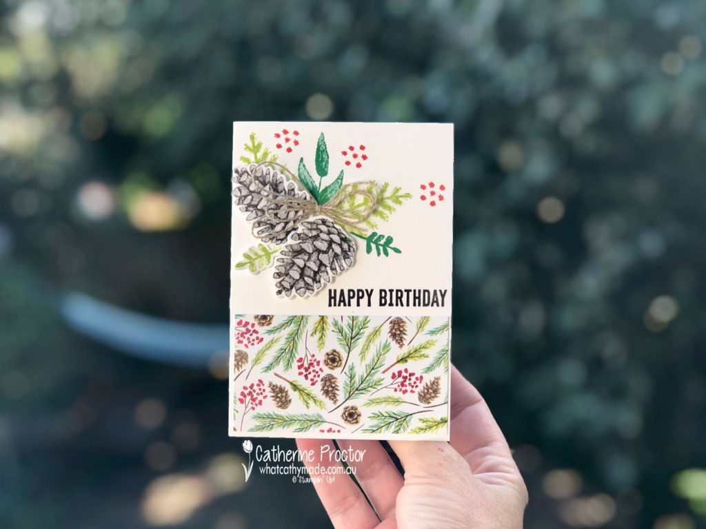
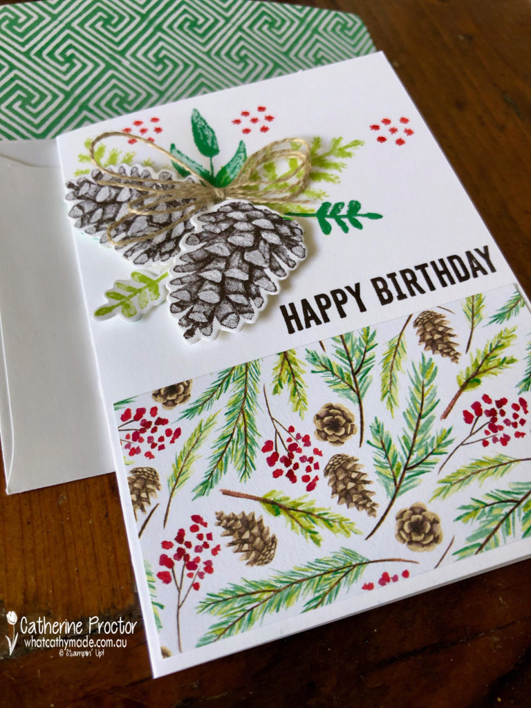
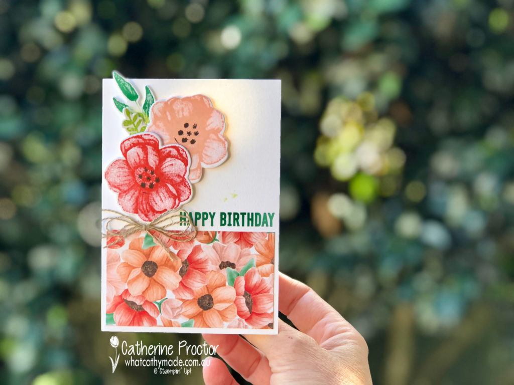
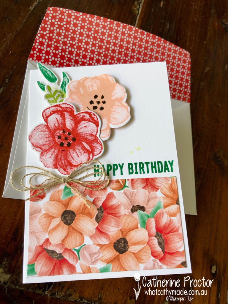
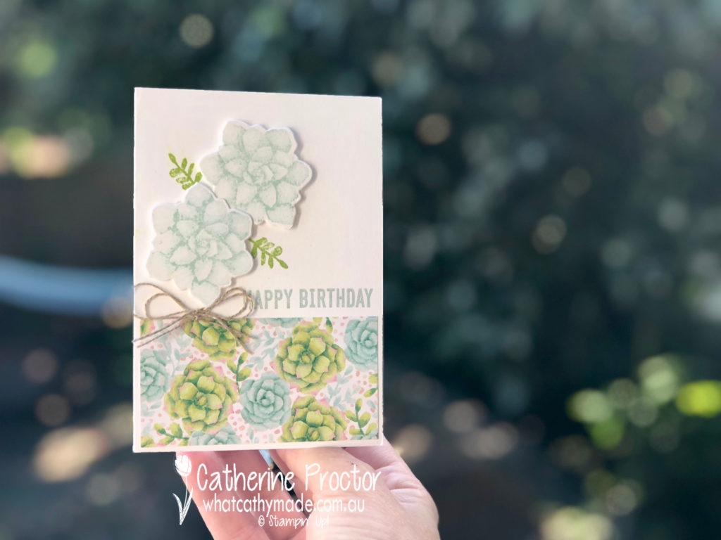
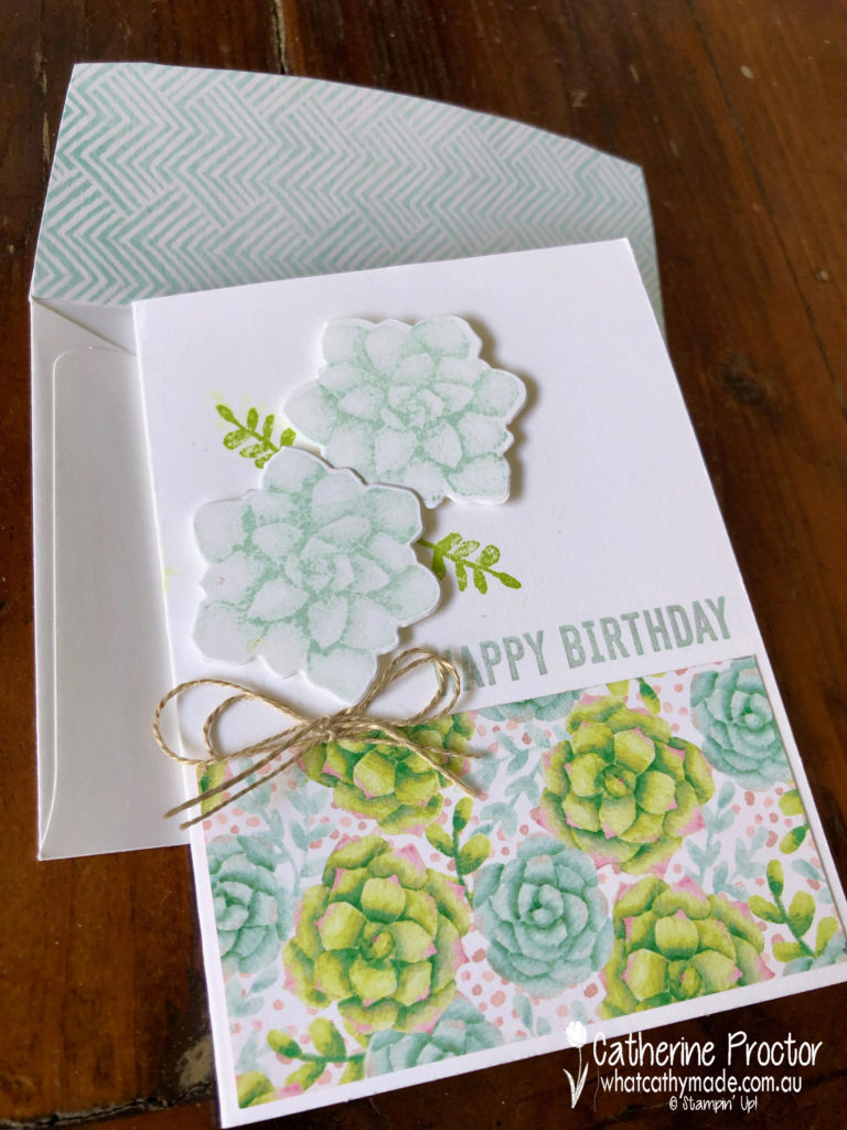
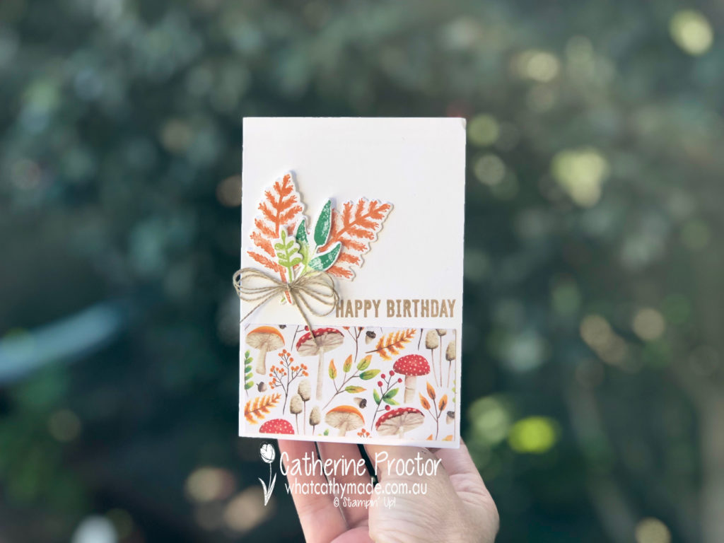
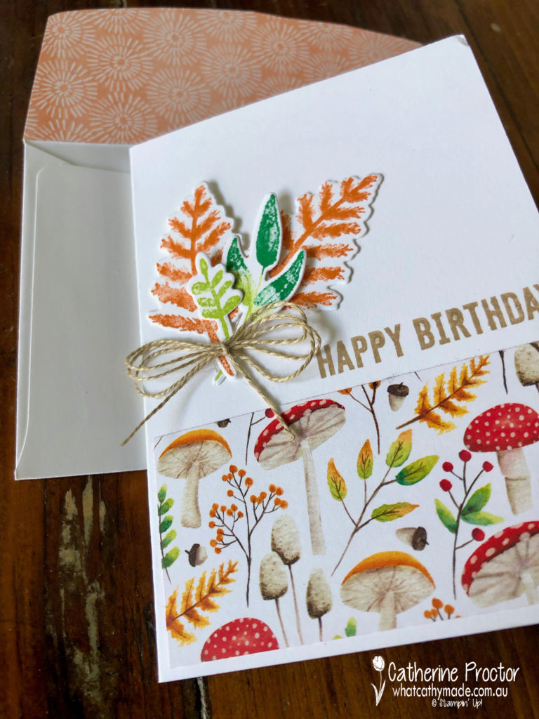
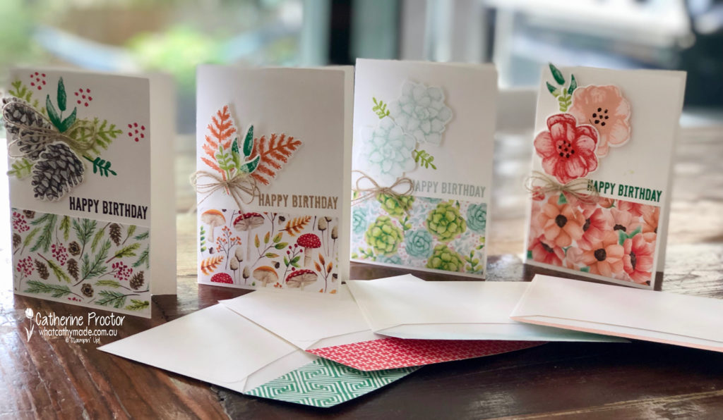
In the end I decided to use the Painted Seasons bundle to make four cards with matching lined envelopes.
I made four cards to show all the sheets of DSP and to use every dynamic stamp, as well as the all of the dies. Here they all are with their matching envelopes.
My favourite card is the winter card, featuring this stunning pinecone Dynamic stamp.
My next favourite card is the spring card, featuring the beautiful poppy stamp.
Next up are the stunning summer succulents…
…and finally, the autumnal card.
I used the notecards with matching envelopes to make this set of four cards, hand cutting the reverse of the DSP to line the envelope flaps.
The happy birthday sentiment is from the Itty Bitty Birthday stamp set in the ocassions catalogue and a bow of linen thread finishes off the four cards.
Now it’s time to hop on over to our next participant, the very talented Sue Madex.
If you find a broken link or have come to this blog hop from a different entry point, you can view the participants below: