Tonight the Art with Heart team are sharing creative projects CASED from the annual catalogue. If you CASE a project it means you Copy And Share Everything. If you would like a copy of the 2018 – 2019 annual catalogue, contact any of the girls on the blog hop and we will get in touch with you.
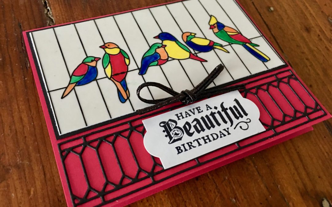
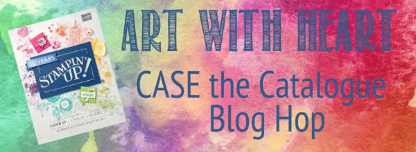
This is the card (back left in the photo below) that I decided to CASE from page 91 of the annual catalogue, changing the colours and some of the design elements to match a special project I’m making.
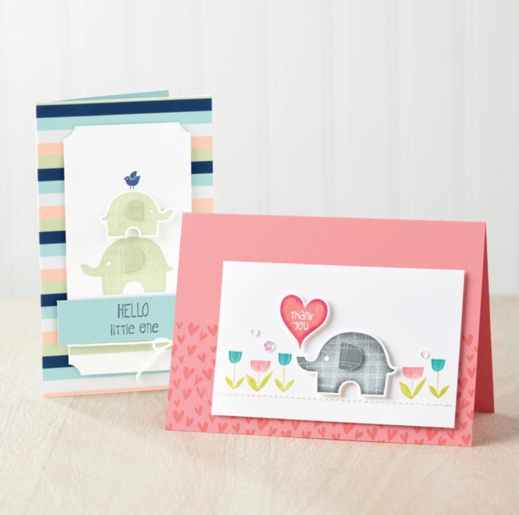
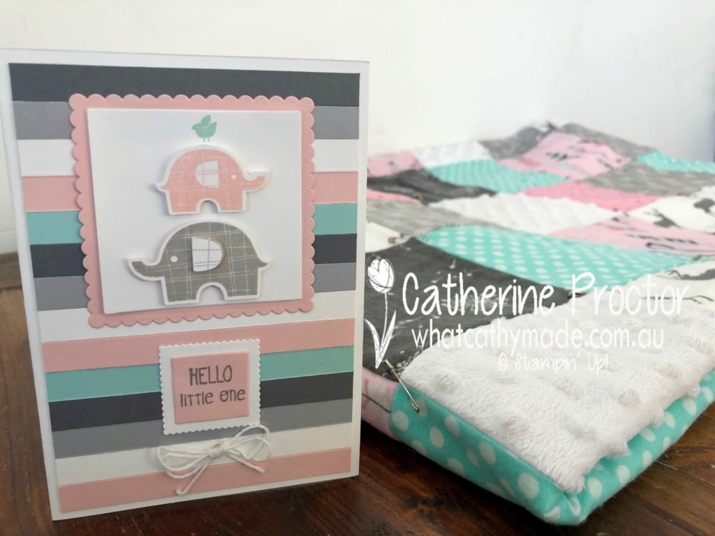
When I’m not paper crafting I also love to sew. And the birth of a new baby is the perfect excuse to make a new quilt.
My youngest sister-in-law is just about to give birth to her very first baby (it’s a little girl) and I can’t wait to meet her. I’m making a quick, easy and cosy flannelette quilt for her in soft grays, pinks, and whites, with just a touch of Pool Party aqua (one of my sister-in-law’s favourite colours).
Please excuse the pins and loose threads in the photo below…I’ve just assembled the quilt sandwich layers, ready to finally quilt it all together.
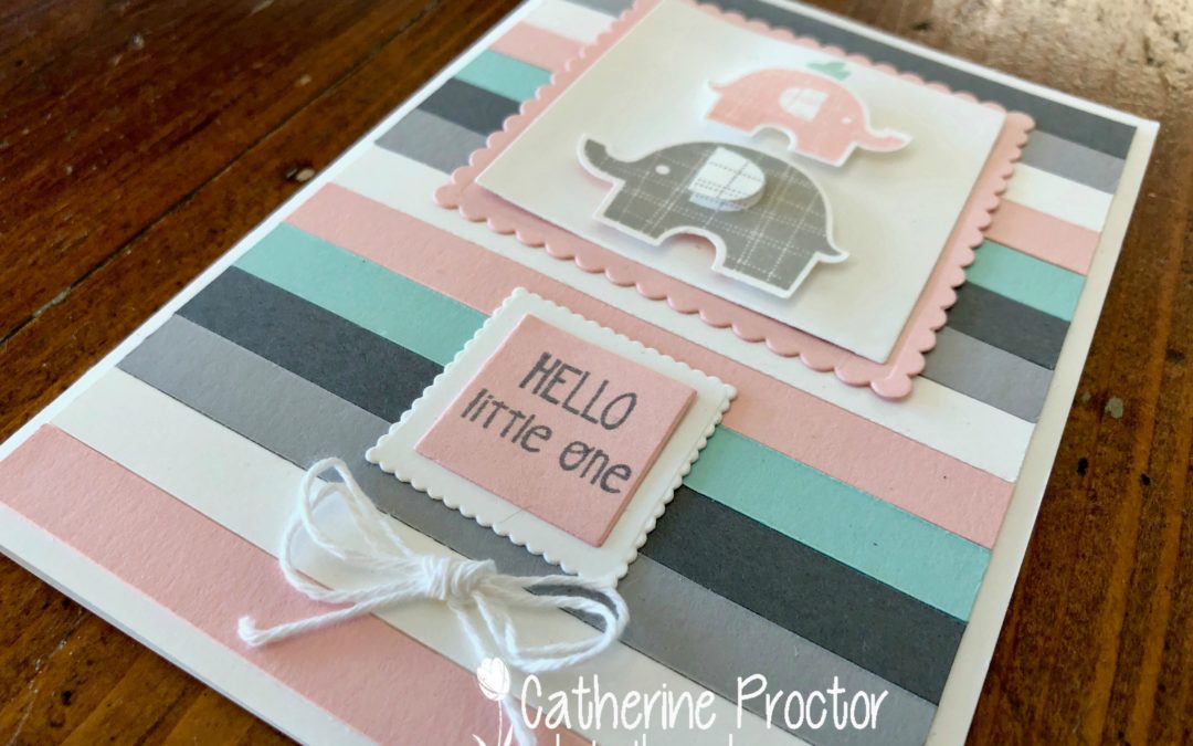
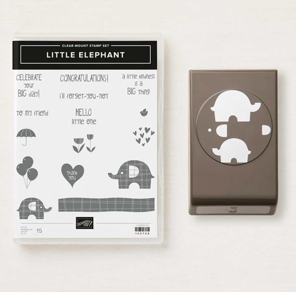
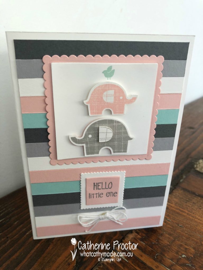
Once I finish quilting it (and I’d better get my skates on as she’s due in the next couple of weeks!) I’ll wrap it up and present it with my matching CASEd card, which I made using a fantastic new punch bundle called Little Elephant bundle.
Check out the teeny tiny details, such as the punch for the elephant’s ears and eyes, and the little bird stamp!
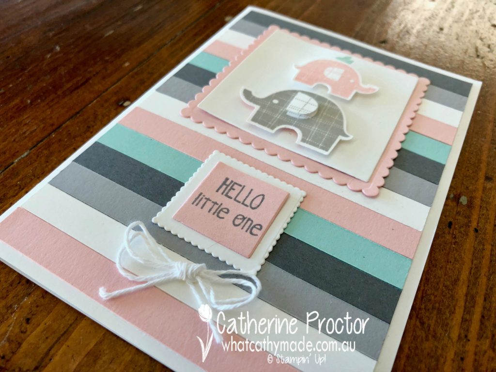
I really loved the striped DSP used on the card in the catty (it’s from the Twinkle Twinkle DSP pack) but the colours didn’t quite match my quilt. So I used my Stampin’ Up! trimmer to cut 1cm strips of Basic Gray, Smokey Slate, Whisper White, Powder Pink and Pool Party card stock and layered them horizontally over three vertical strips of tear and tape.
Ta da…my very own custom striped DSP!
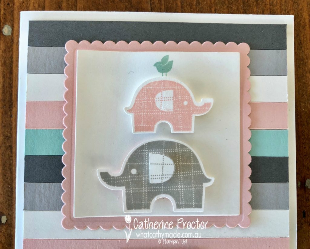
The little elephants were stamped and then punched out and layered on top of Powder Pink and Whisper White card stock that I had cut using the layering squares dies.
Did you spot the little Pool Party bird on top of the smallest elephant? And the layered elephant ear on the largest elephant? I just love these little details!
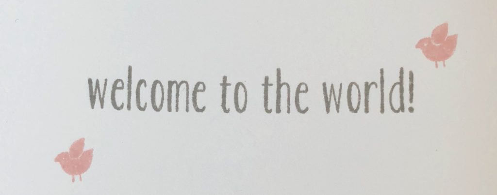
I used the same “Hello little one” sentiment stamp as the original card in the catty for the front of the card, but I’ve also added in the lovely “Welcome to the World” sentiment from the Baby Bear stamp set for the inside of the card.
And the final touch on the card is a little bow made from the Whisper White bakers twine.
Here is a photo of the card and the quilt together…I can’t wait to see my newborn niece all snuggly and warm, wrapped up in this quilt!
Now it’s time to hop on over to our next participant, the very talented, Kimberley Hern.
If you find a broken link or have come to this blog hop from a different entry point, you can view the participants below:
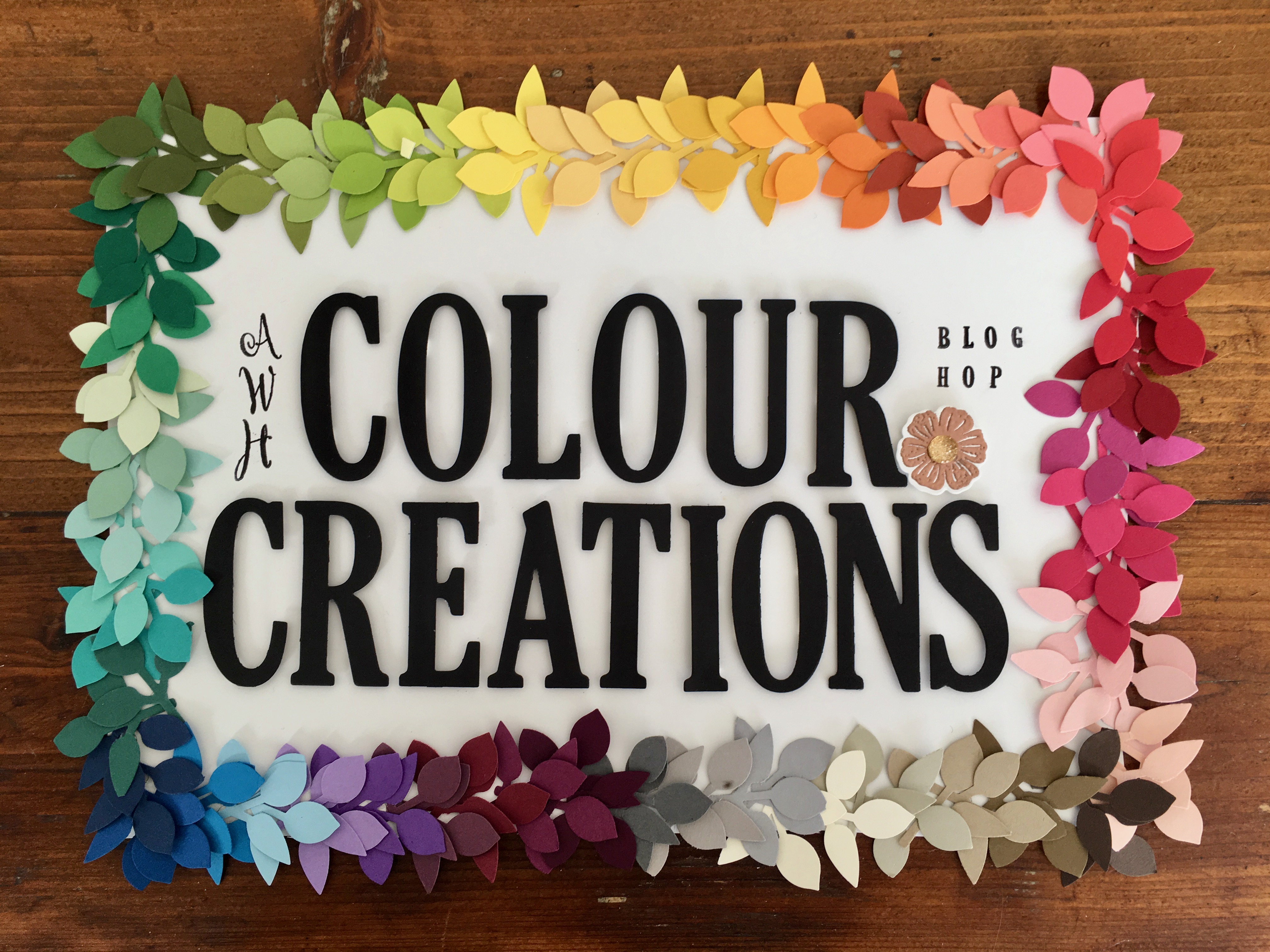
Welcome to week 4 of the Art With Heart Colour Creations Blog Hop!
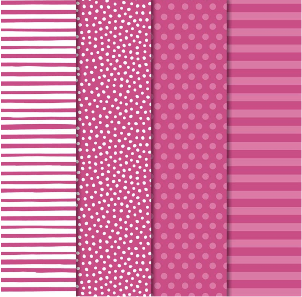
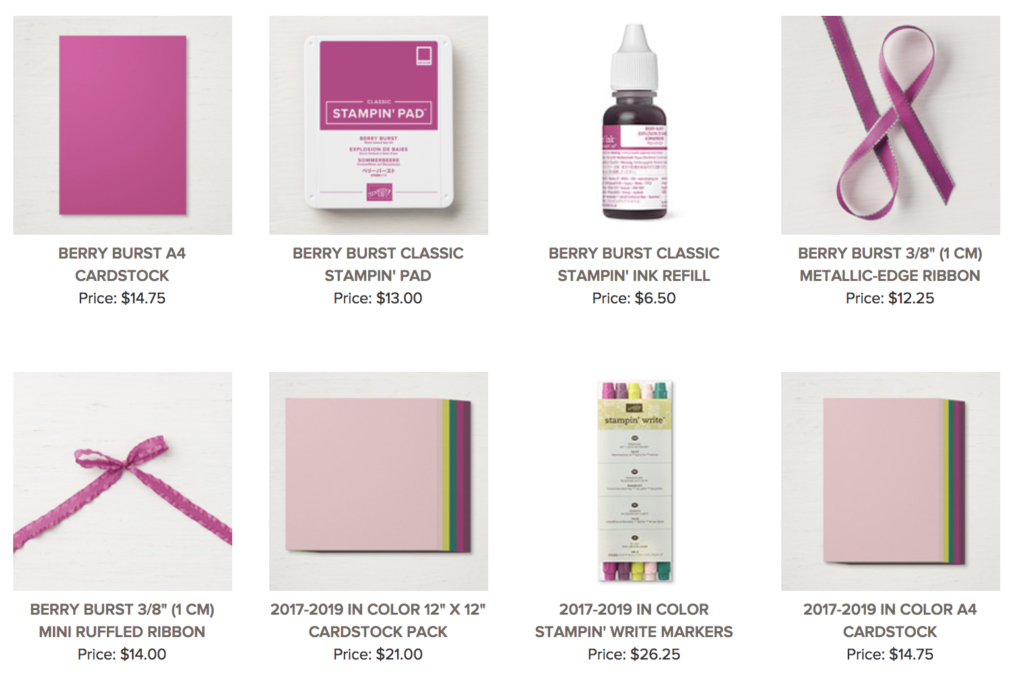
This week we are showcasing one of the 2017-2019 In Colours: Berry Burst.
For my projects today I’ve teamed Berry Burst with Old Olive and Basic Black…I just love the richness of these colours together!
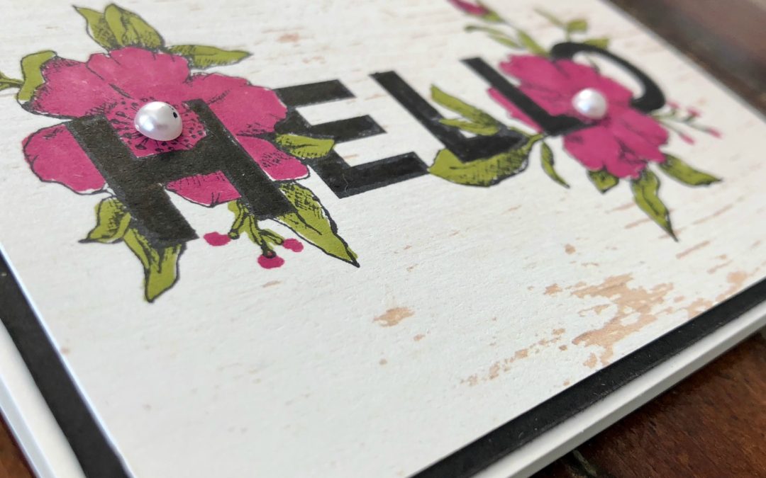
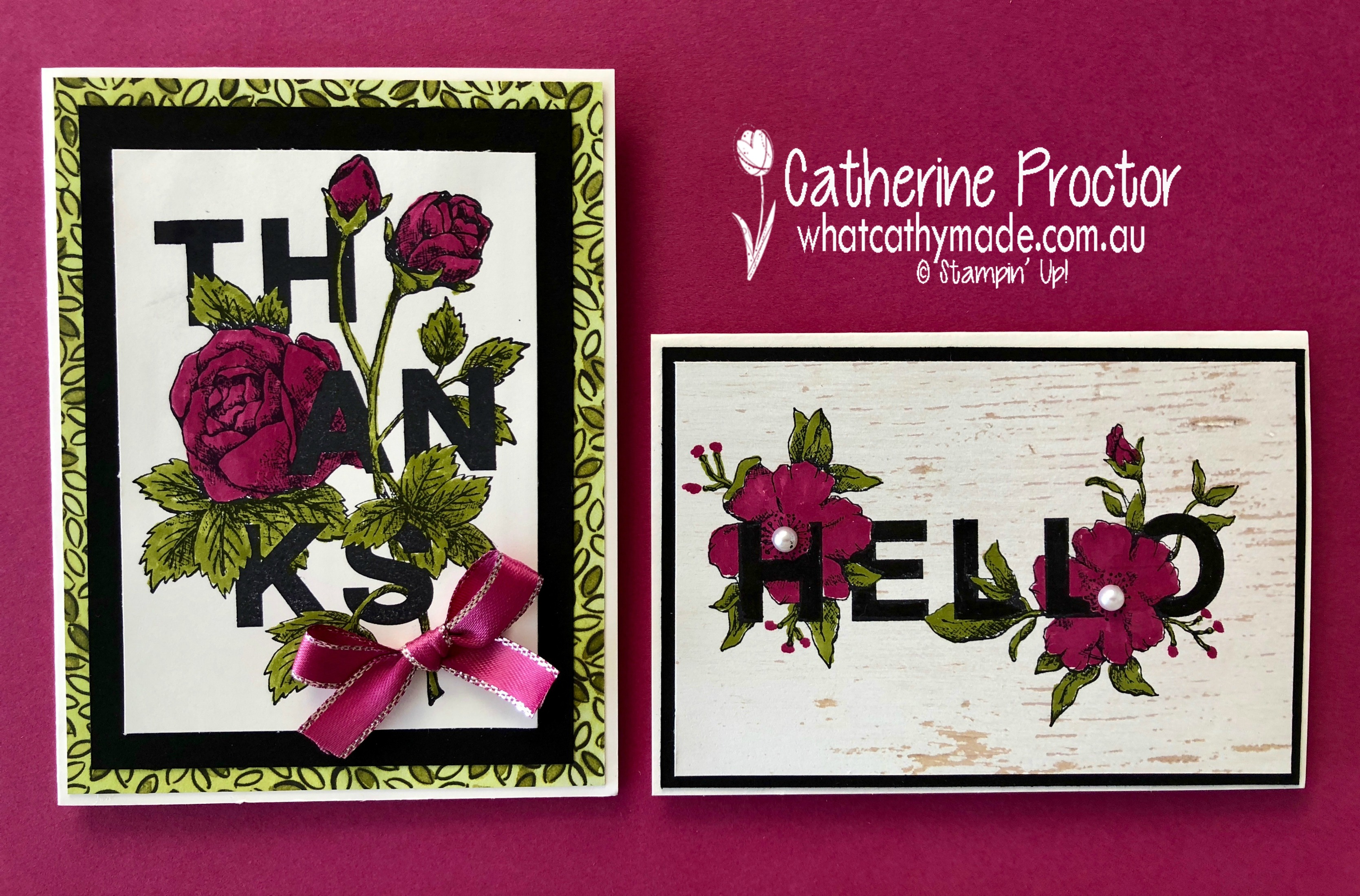
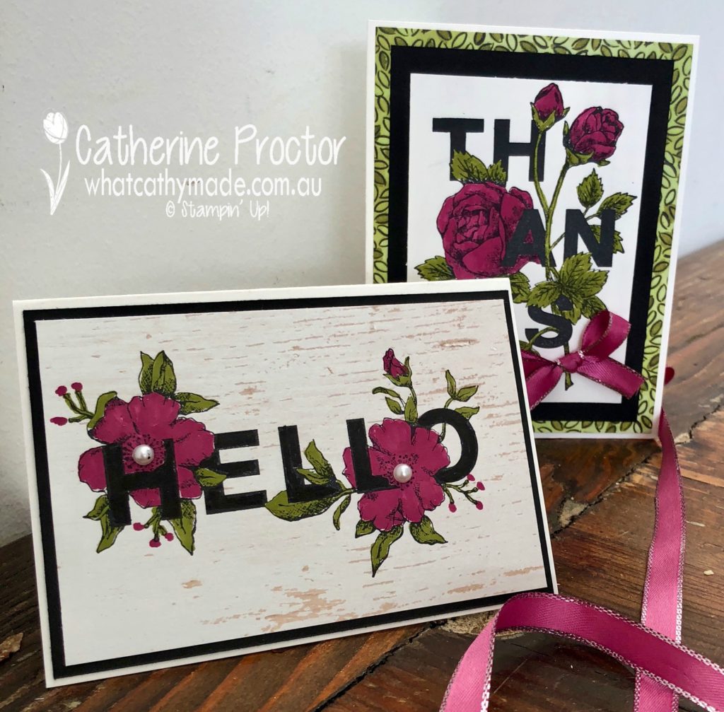
Both cards are made with the Floral Statements stamp set. This is such a great stamp set because it does all the hard work for you. There’s no juggling the position of the image and sentiment…both stamps artfully combine the two, so all you need to do is simply stamp and then colour. Too easy!
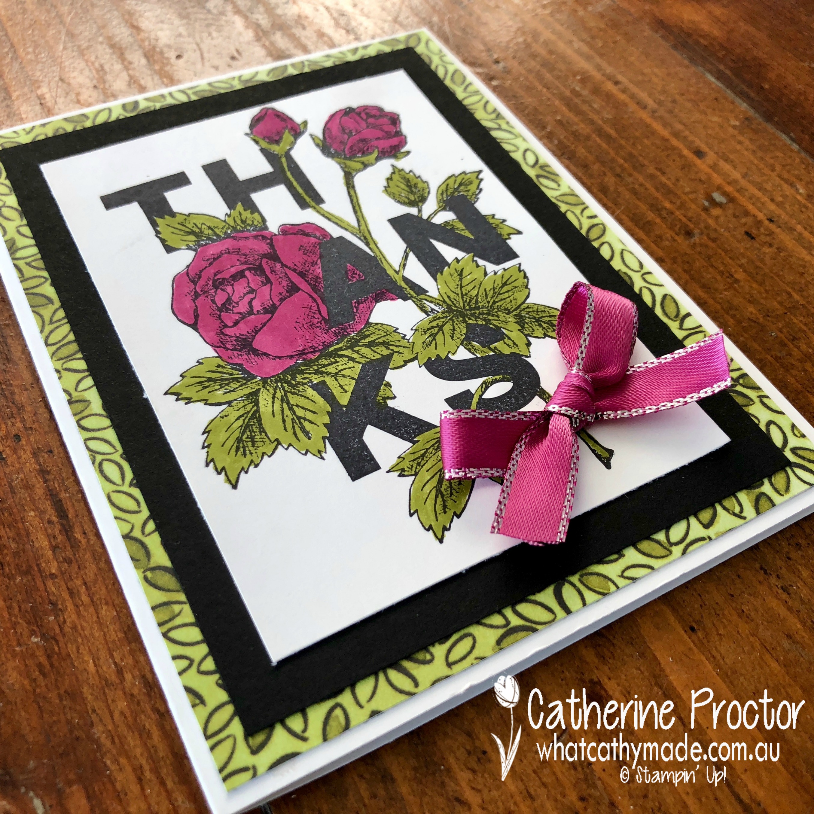
My first card couldn’t be simpler…I simply stamped the “Thanks” stamp in Basic Black onto Whisper White card stock and coloured the flowers with Berry Burst and Old Olive Stampin’ Write Markers.
I then mounted the coloured image onto Basic Black card stock and the stunning Share What You Love DSP, adhering it all to a Whisper White Card. The final touch is a bow made from the Berry Burst Metallic Edge Ribbon.
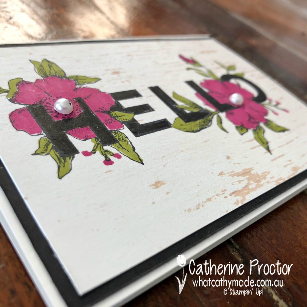
The second card was just as easy. This time I stamped the “Hello” stamp onto some of the incredibly versatile Wood Textures DSP, coloured with my Stampin’ Write Markers, then mounted the coloured image onto Basic Black card stock and a Whisper White Card.
The finishing touch for this card was some Basic Jewels Pearls. I’m really happy with the effect the Wood Textures DSP gives to the stamped image.
Both these cards couldn’t be simpler…I love how this stamp set makes me look like an artist!
Berry Burst is such a beautiful colour to use for flower stamps and I can’t wait to see what the rest of the Art With Heart team have come up with today.
Just click on the links below to see what they’ve all made.
Welcome to week 3 of the Art With Heart Colour Creations Blog Hop!
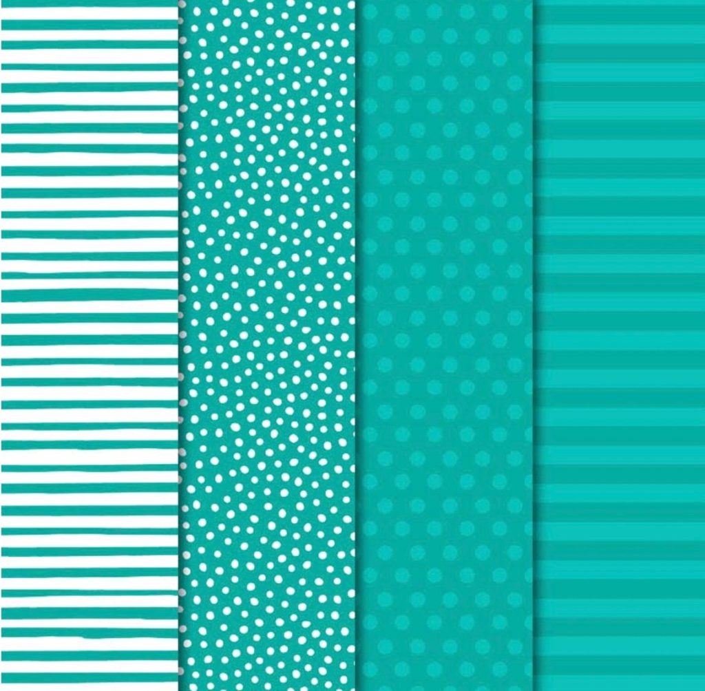
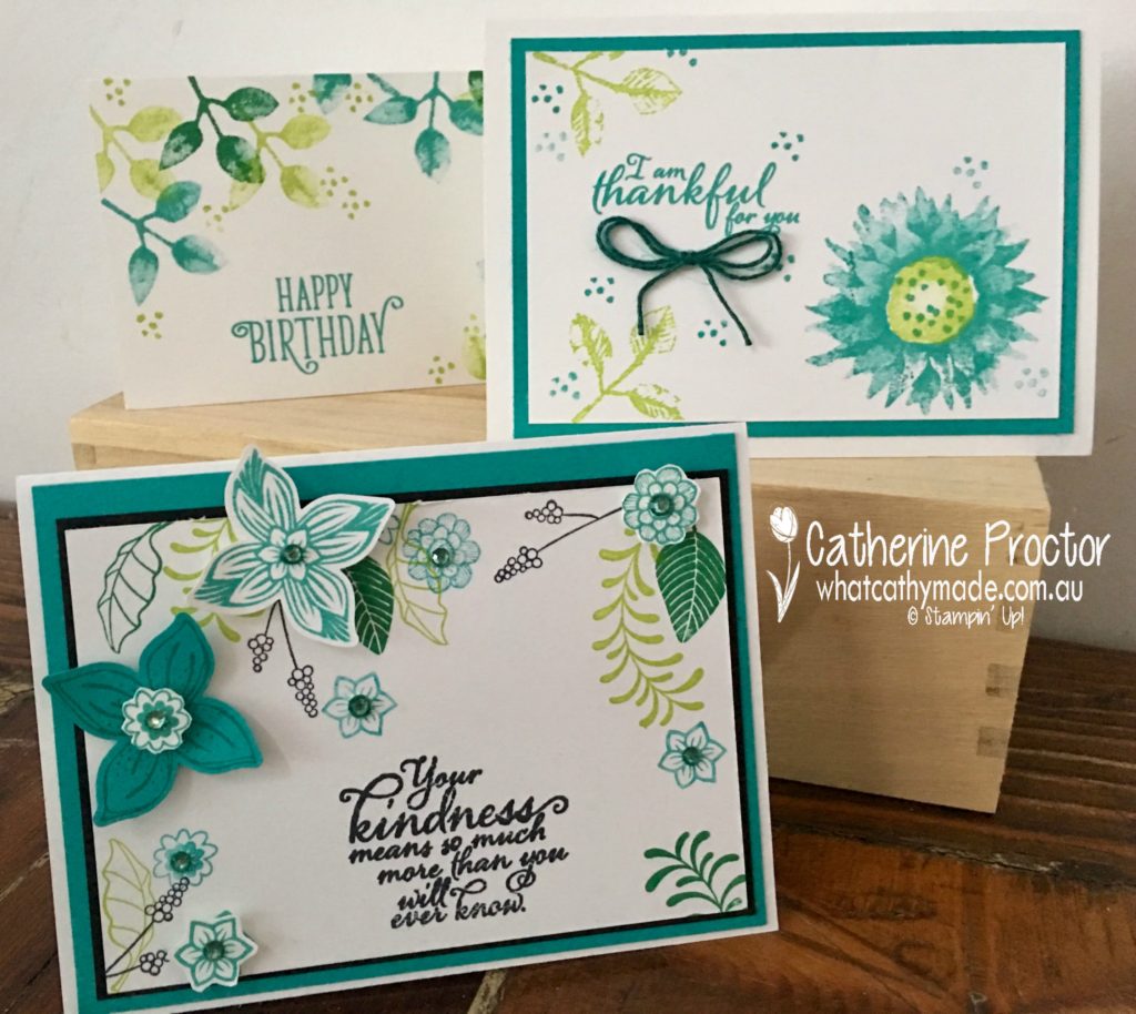
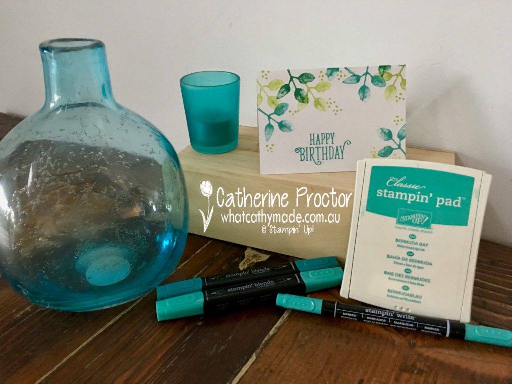
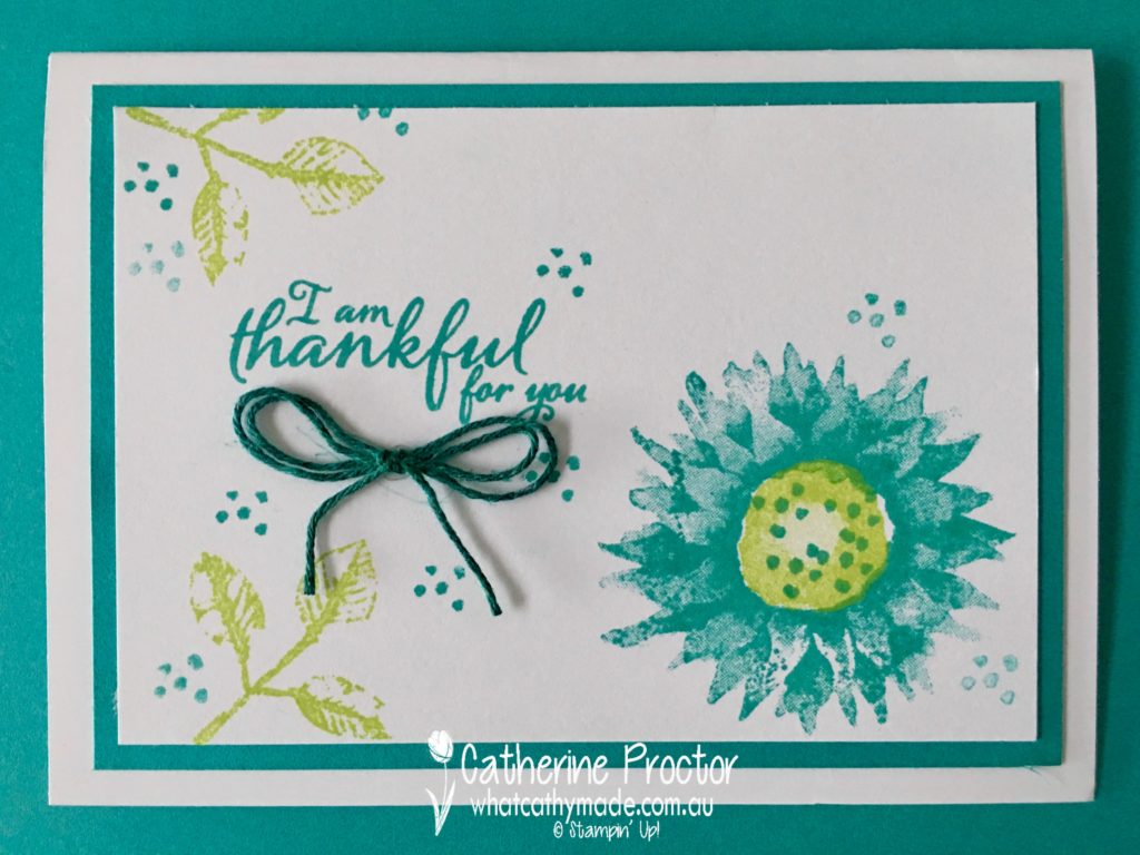
This week we are showcasing one of my favourite colours: Bermuda Bay.
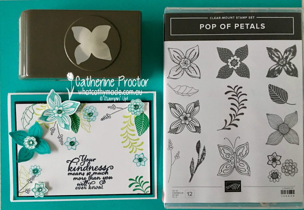
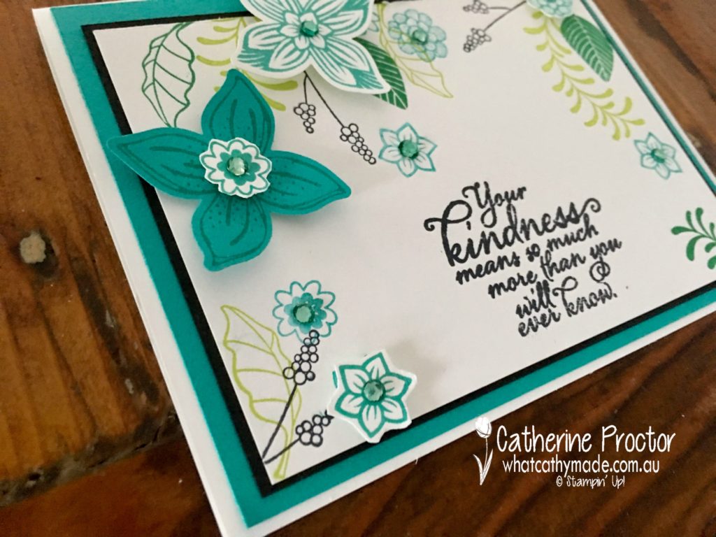
Bermuda Bay is often paired with Pool Party (and they look amazing together) but it also really looks great when used with Lemon Lime Twist. To showcase this colour combination I’ve used something old (the Painted Harvest stamp set) and something new (the Pop of Petals bundle) for my three Bermuda Bay cards.
For the first 2 cards, I used the Painted Harvest stamp set to CASE some cards I’d seen on Pinterest, changing up the colours and the sentiments. This first card is so simple but it really showcases how well Lemon Lime Twist and Bermuda Bay go together.
Can you spot the bakers twine in the next card? I used the dark Bermuda Bay Stampin’ Blend! to colour Whisper White bakers twine.
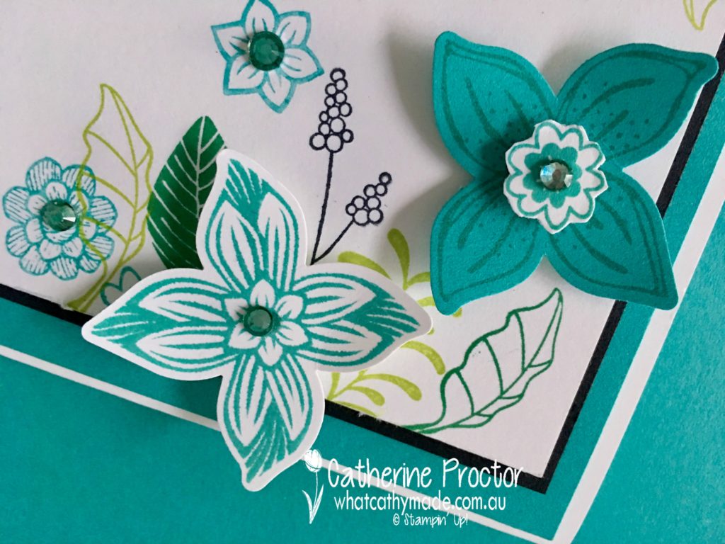
However, it’s the final card I’m most excited about…I used the new Pop of Petals bundle and I just love this stamp set and its matching punch!
If you look closely you’ll see another homemade embellishment that’s just so simple to make…I used the dark Bermuda Bay Stampin’ Blend! to colour a few rhinestone basic jewels. Here’s a close-up to show you my sparkly Bermuda Bay embellishments.
Look at all the lovely little stamps there are in this stamp set! I also used another great new colour, Call Me Clover, for this card.
Bermuda Bay works with so many different colour combinations and I can’t wait to see what the rest of the Art With Heart team have come up with today.
Just click on the links below to see what they’ve all made.
Welcome to week 2 of the Art With Heart Colour Creations Blog Hop!
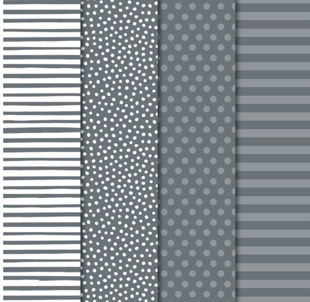
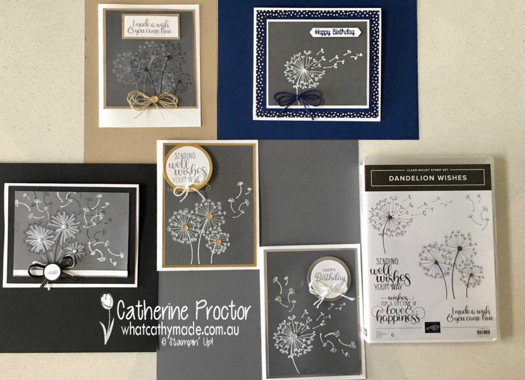
This week we are showcasing one of the most versatile neutrals: Basic Gray.
As a quilter, I know that gray is one of the best neutrals to use as a background colour because it really makes other colour pop, but I wanted to make the Basic Gray the focus for my projects today so I’ve deliberately paired it with other neutrals, even though it looks fantastic with any colour.
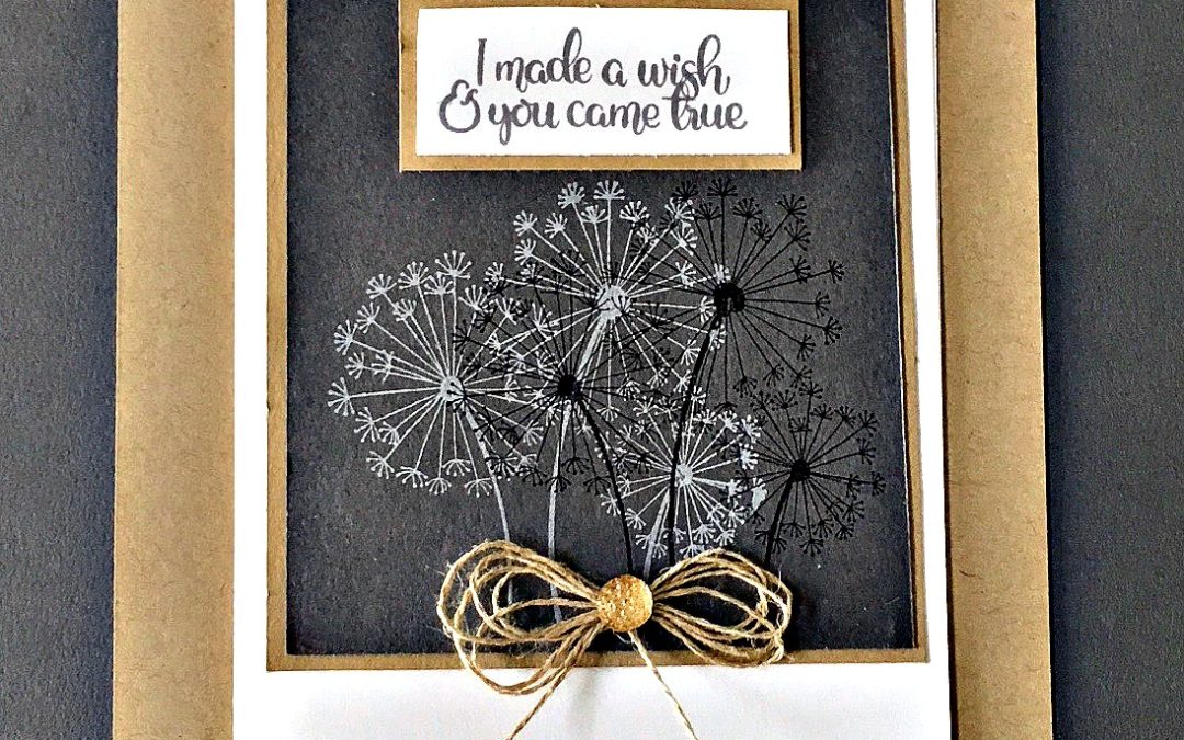
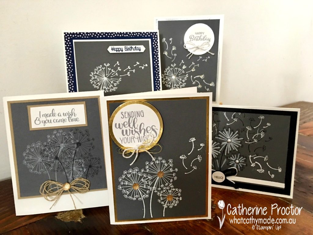
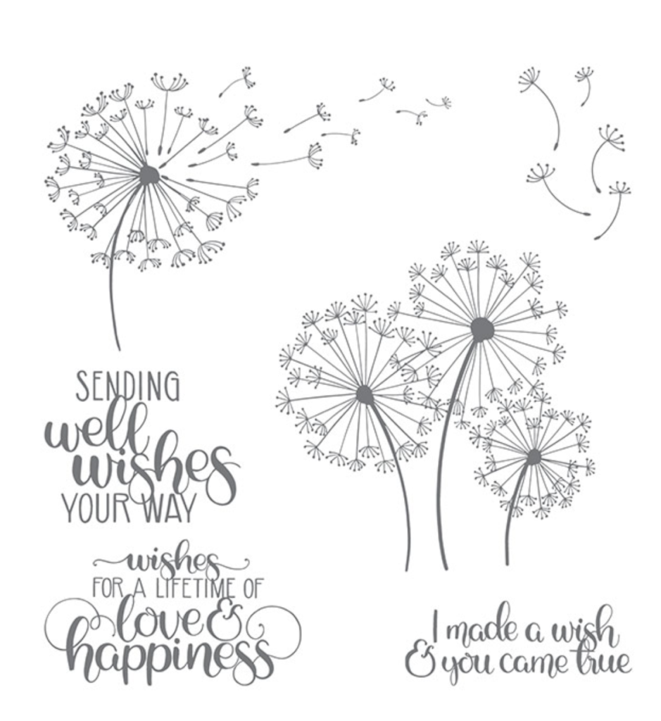
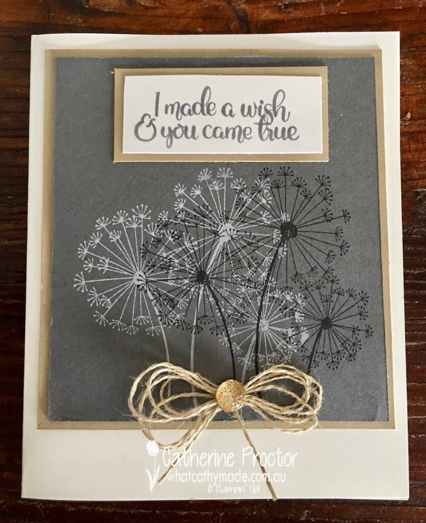
For all of these cards, I’ve used one of my favourite new stamp sets: Dandelion Wishes.
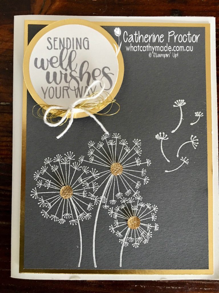
For the first 2 cards, I used silver and gold foil with the Basic Gray. I stamped onto the Basic Gray cardstock with Versamark ink and then heat embossed using white embossing powder. The gold facetted gems, and a bow made of gold metallic thread and Whisper White bakers twine finished off the gold foil card. You can see the silver card in the group shots of all the cards.
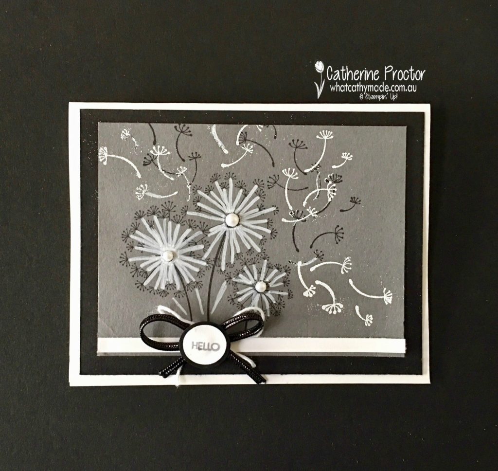
I then decided to contrast the Basic Gray with black and white, and even though there are a few heat embossing mistakes on this card, I still like the contrast in the colours. I used the white Stampin’ chalk marker to draw over the Dandelion stamp. The new black cord ribbon is stunning but slippery so I made the shape of a bow (without tying it) and used glue dots to make it stick to the card. The tiny hello sentiment is from the Beautiful Bouquet stamp set.
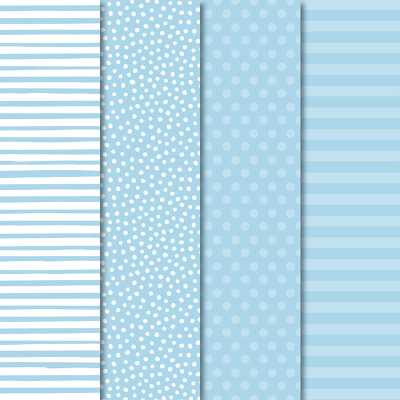
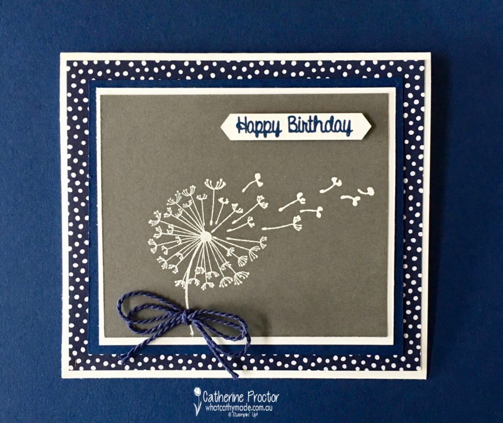
I also just couldn’t resist pairing Basic Gray with two of my all-time favourite colours: Night of Navy and Crumb Cake. For this Night of Navy card, I used some fantastic new DSP that comes in every single Stampin’ Up! colour (you can see the different patterns in the Basic Gray example I’ve included at the start of this blog). The happy birthday sentiment is from a new hostess stamp set: Hand Delivered.
But finally, I think this last card, pairing Basic Gray with Crumb Cake, is my absolute favourite!
It was really hard to get a shot of all the cards together, but I think laying them on the different contrasting cardstocks gives a good idea of how versatile this neutral really is.
I’m really looking forward to using Basic Gray with lots of different colour combinations and I can’t wait to see what the rest of the Art With Heart team have come up with today.
Just click on the links below to see what they’ve all made.
Isn’t it amazing where the inspiration for a card can come from?
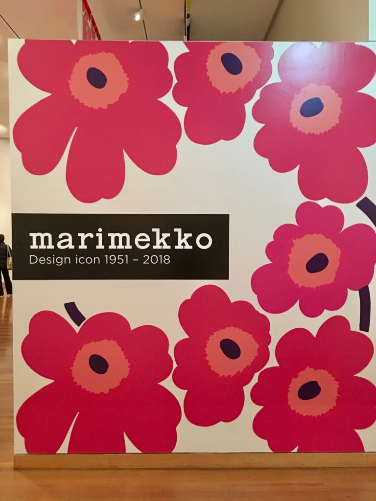
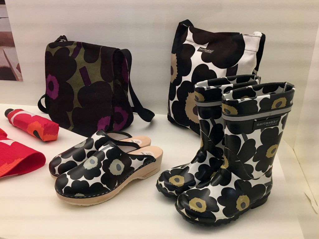
Two weeks ago I went to Bendigo for the very first time to see the Marimekko exhibition at Bendigo Art Gallery and I fell in love with the classic bold graphics of this design house all over again.
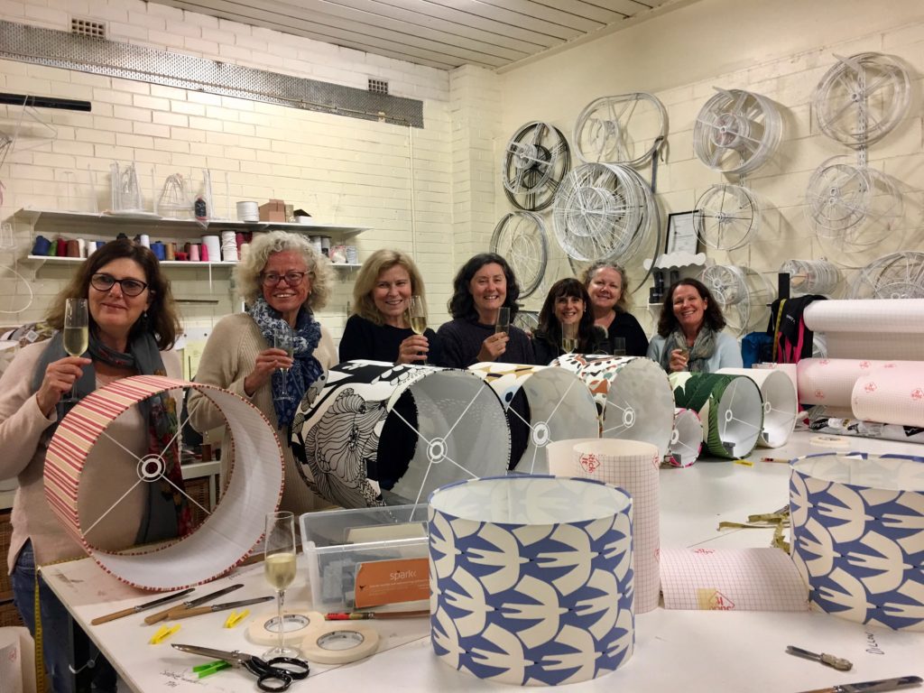
And then last week I went to a lampshade making evening with some of my girlfriends and made not one, but two lampshades.
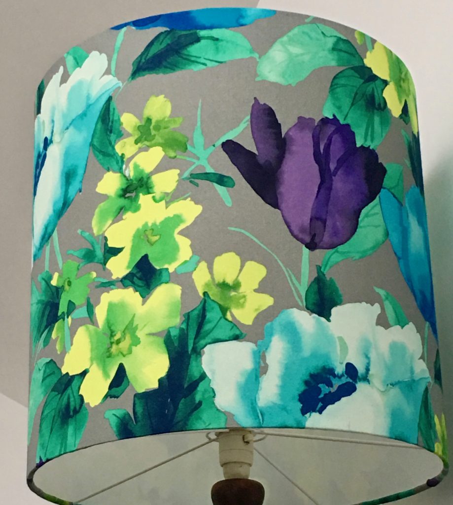
I love the watercolour look of the fabric on this lamp. I found this fabric in a remnant pile.
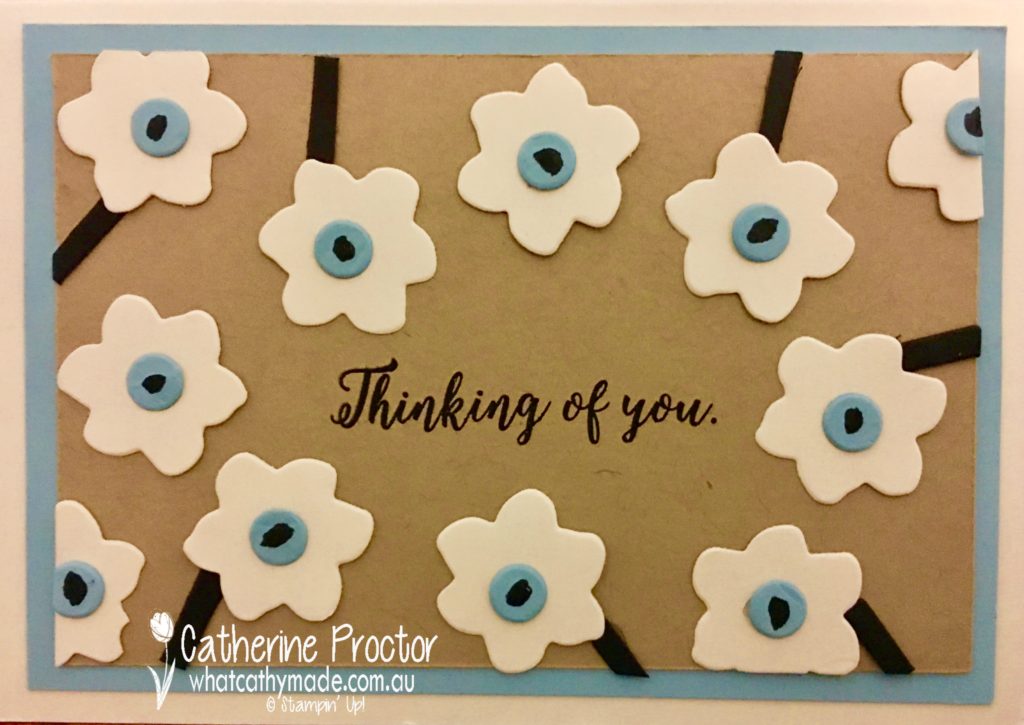
But it’s the fabric I used to make this next lampshade that inspired my project tonight. This lampshade is made from a new colourway of one of my favourite Marimekko designs: Unikko.
At the Marimekko exhibition, I learnt that this classic design was created in 1964, despite the Marimekko founder having publicly proclaimed a ban on flowers in Marimekko prints. One of the artists designed a collection of floral patterns that were so fresh and unique that Marimekko produced eight of them, including their now iconic Unikko pattern.
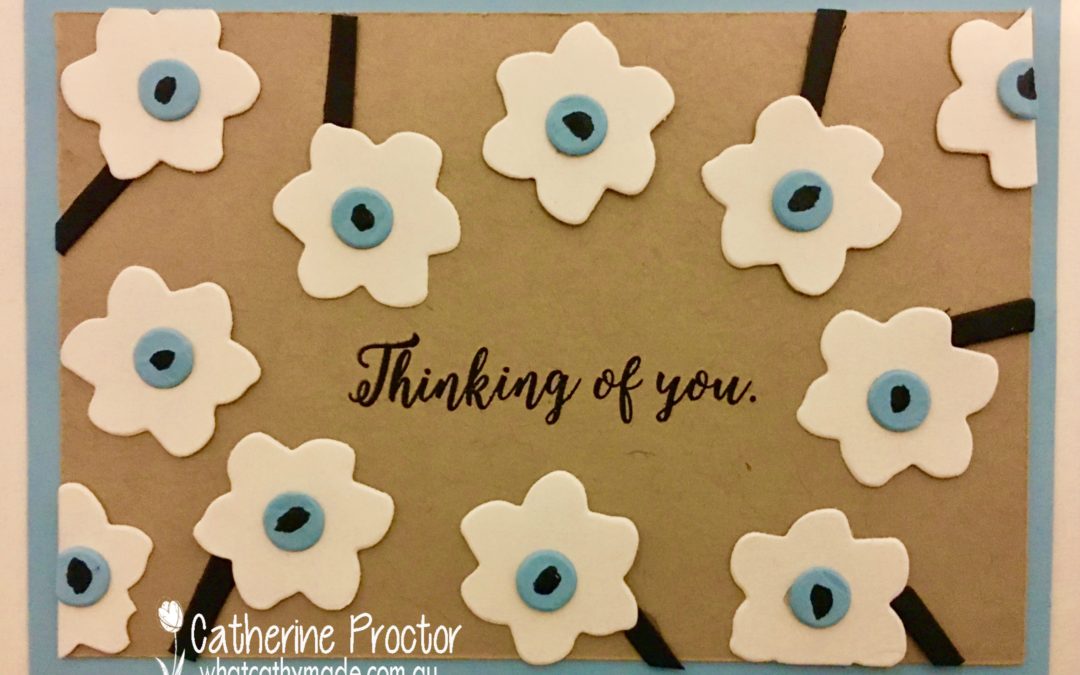
To replicate this beautiful Marimekko design on my card I used Crumbcake, Very Vanilla, Basic Black, and a new colour Stampin’ Up! colour, Balmy Blue, for the lovely light blue centre of the flowers. In hindsight, I could have also replicated this fabric using Crushed Curry as the background colour.
The flowers, their centres and their stems were cut from cardstock using the Seasonal Layers thinlit dies. The stems were made using the Adirondack chair die cut into smaller pieces, and the middle of the flower was coloured in with a black marker. The sentiment comes from the matching stamp set, Colorful Seasons.
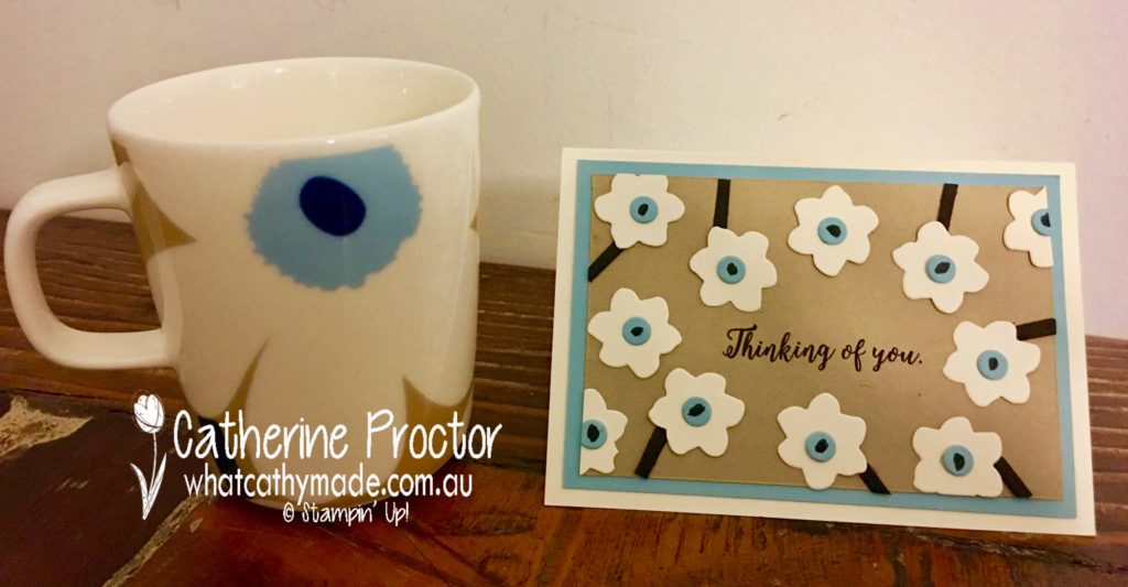
When I purchased the fabric I just couldn’t resist buying a matching cup for my morning cup of tea. I’ve actually had my morning cup of tea out of the Red Unikko mug for the past 10 years so it was high time to update my morning brew with a fresh new colour of that classic design I love so much.
This was a quick and easy card to make and I’m going to have a go now at replicating all of the beautiful Marimekko colourways of this gorgeous design using Stampin’ Up! colours. I’ll share them on my blog when they’re done.
In the meantime, To purchase any of the products featured in today’s post, simply click on the product links below.
If you’d like me to post you your very own copy of the 2018-2019 annual catalogue l catalogue or find out about more about Stampin’ Up! contact me.
Welcome to week 1 of the Art With Heart Colour Creations Blog Hop!
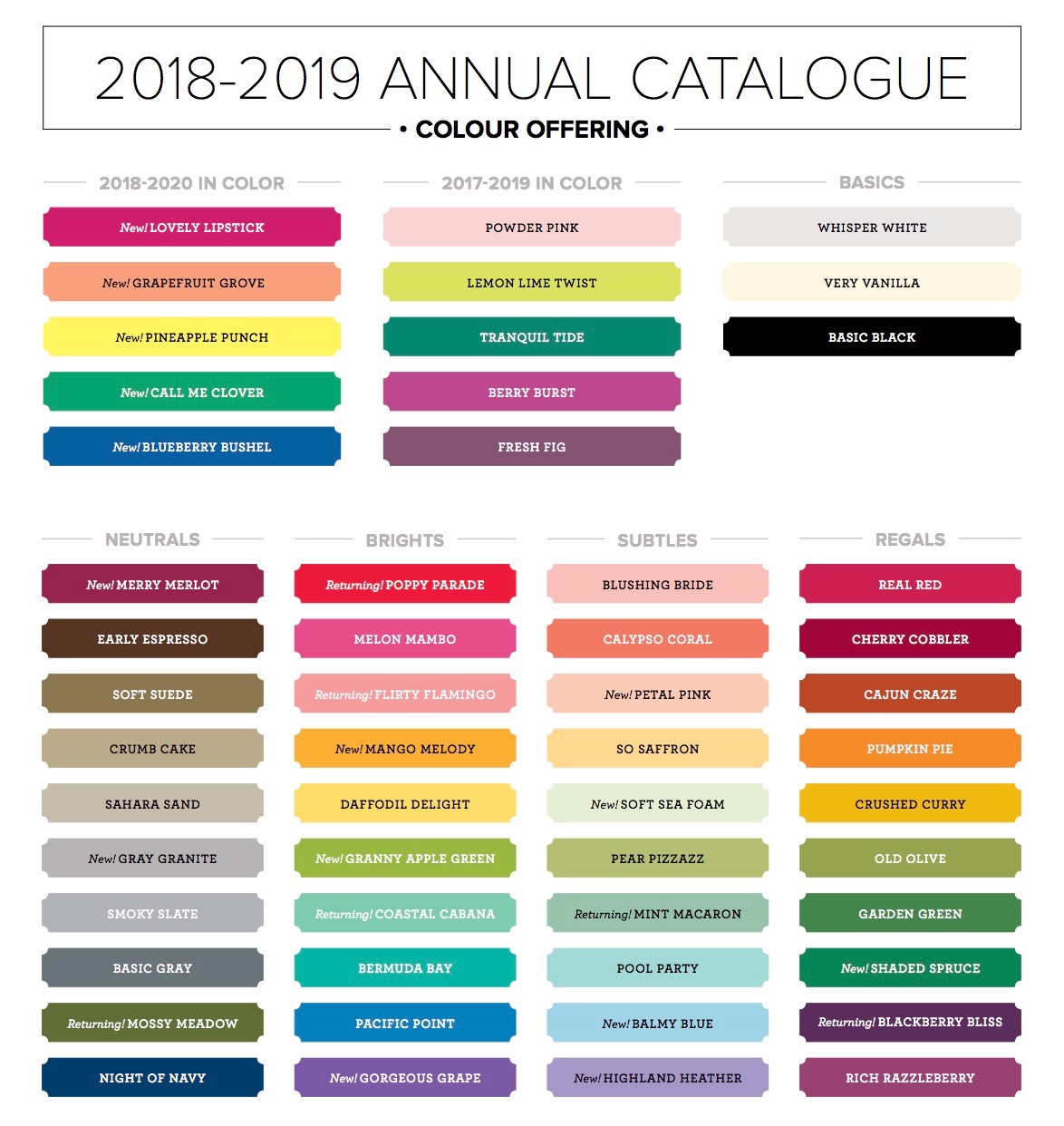
Because we have 52 stunning Stampin’ Up! colours (not including Whisper White) and 52 weeks of the year, it really made sense to decide to do a weekly blog hop to showcase each and every one of these beautiful colours.
Stampin’ Up! have had a colour refresh this year, introducing 10 new core colours, 6 returning favourites, and 5 new in colours. Here’s the entire list of Stampin’ Up! colours for 2018-2019.
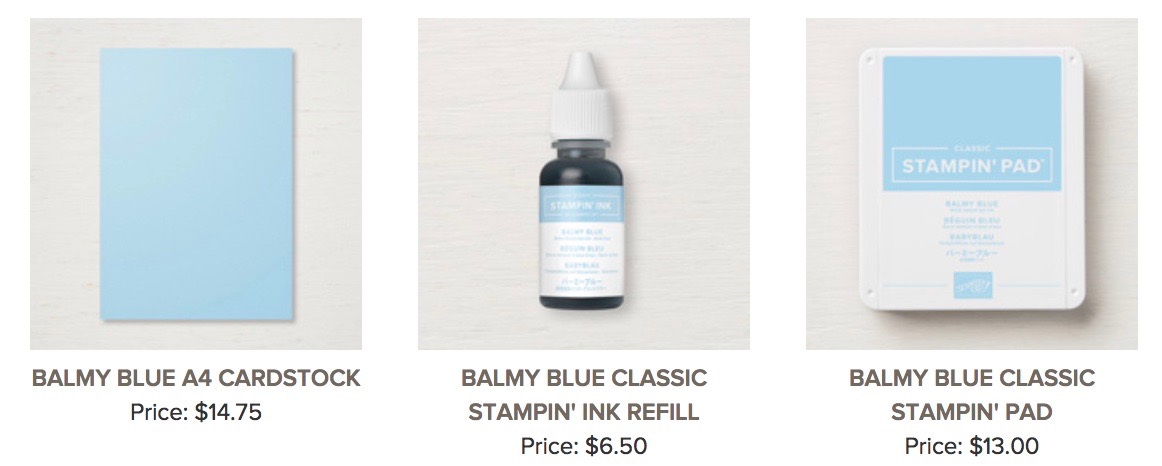
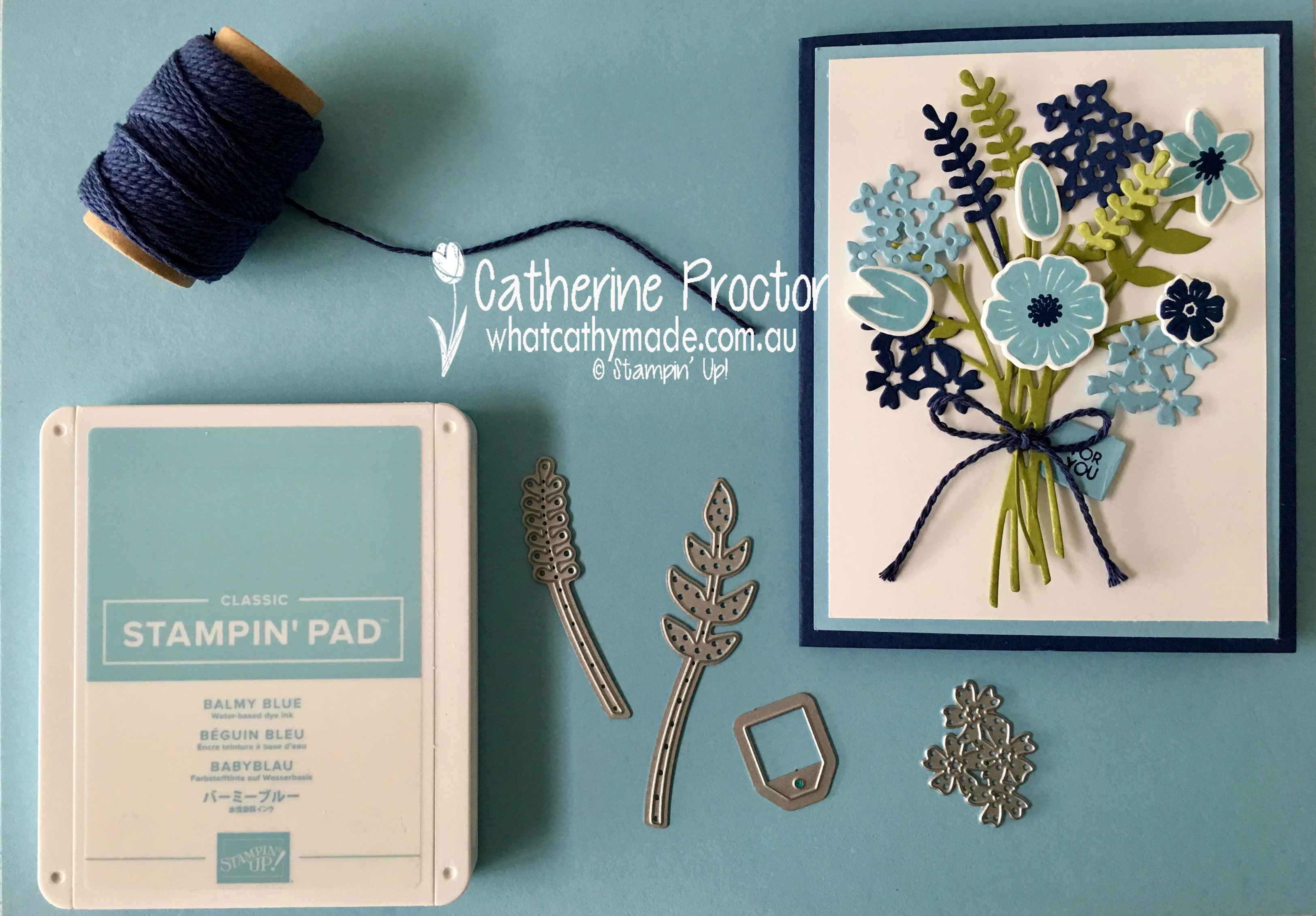
Working through the colours in alphabetical order, we begin our blog hop this week with a brand new colour: Balmy Blue. Balmy Blue is part of the subtles colour family and a great replacement for the now retired Marina Mist.
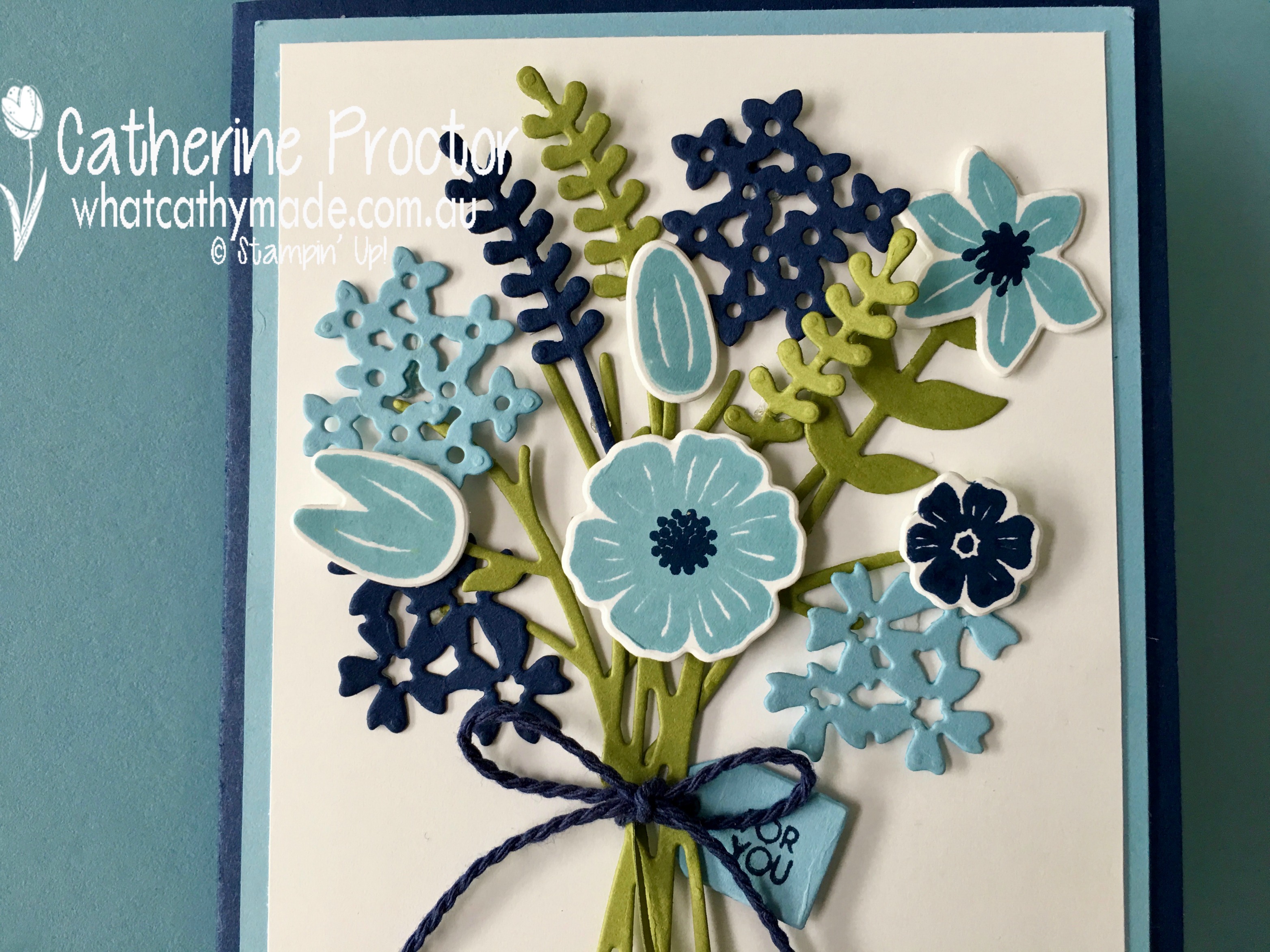
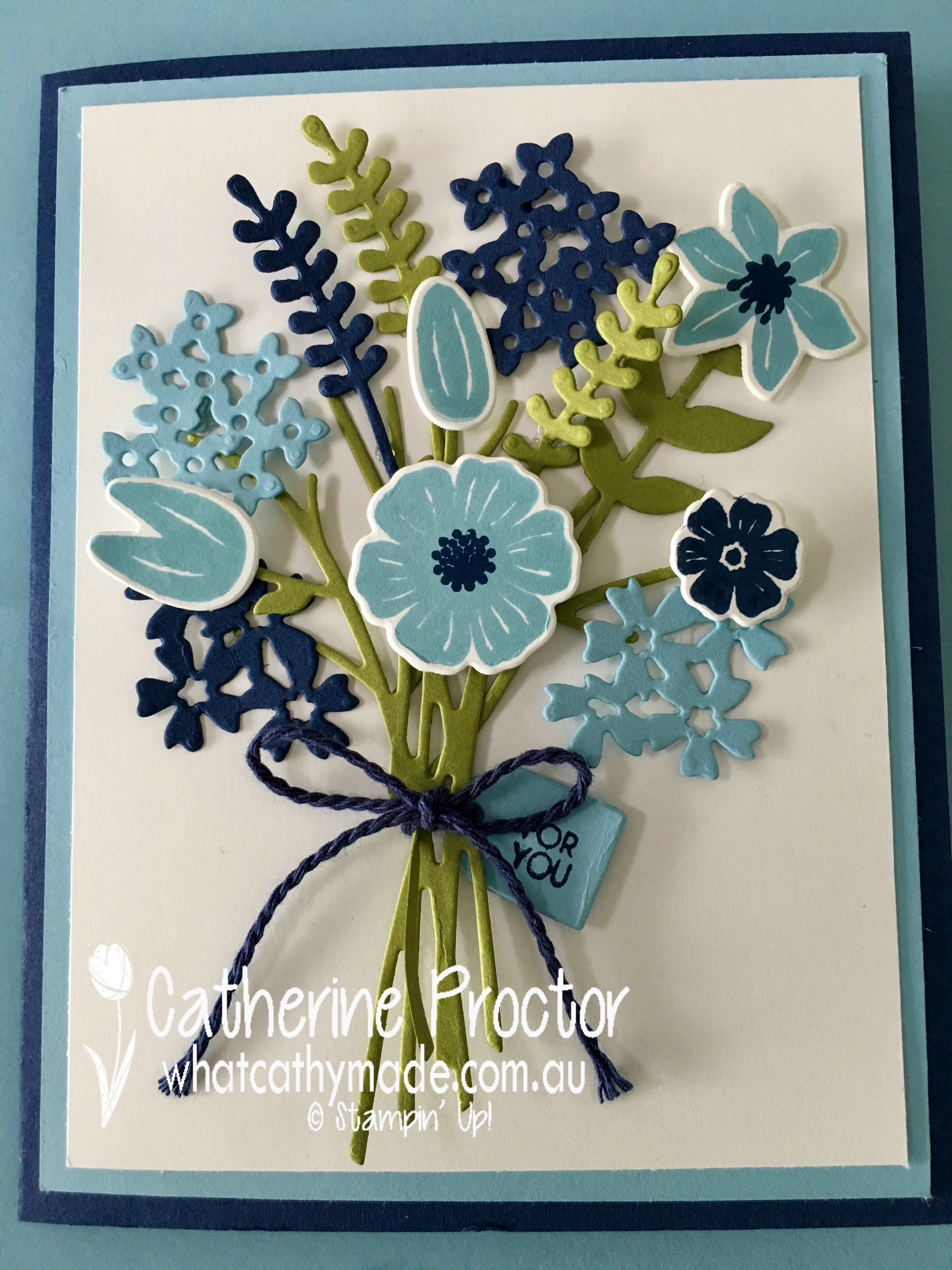
To showcase this colour I’ve paired it with a classic and elegant colour combination of neutrals: Night of Navy and Whisper White, with just a touch of Old Olive for the leaves in the bouquet. Something old and something new… Night of Navy and Balmy Blue.
This card uses one of my all-time favourite stamp sets, Beautiful Bouquet, with the matching Bouquet Bunch Framelits dies.
That little gift tag is just the sweetest…can you see it peeping out from behind the Night of Navy bakers twine?
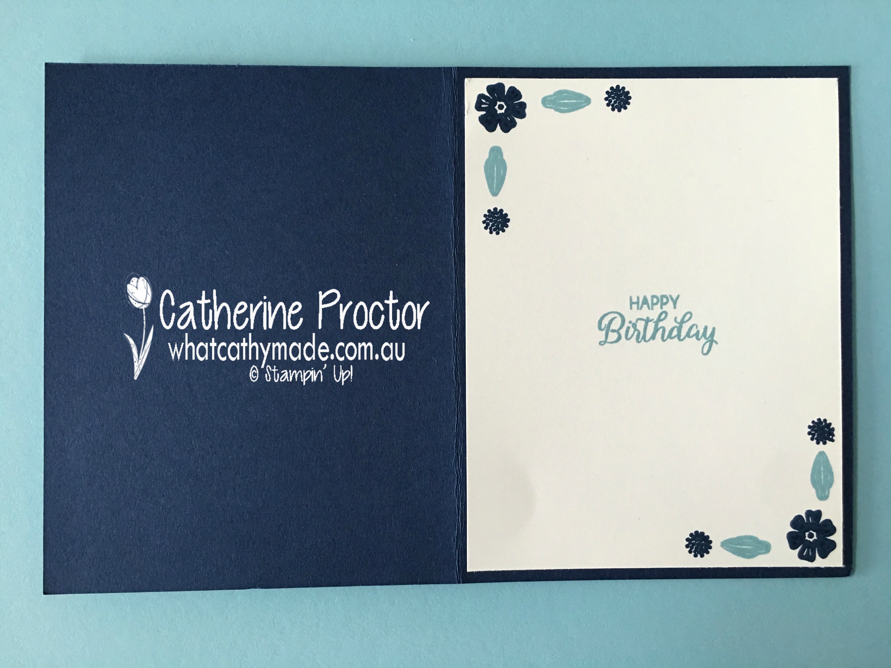
I’m hopeless at remembering to stamp the inside of my cards so I’ve set myself a personal challenge with this blog, to stamp the inside of every card!
I’m really looking forward to using Balmy Blue with lots of different colour combinations and I can’t wait to see what the rest of the Art With Heart team have come up with today. Just click on the links below to see what they’ve all made.
Just 2 more sleeps to go before the new Stampin’ Up! annual catty is released…and also before some lovely products retire.
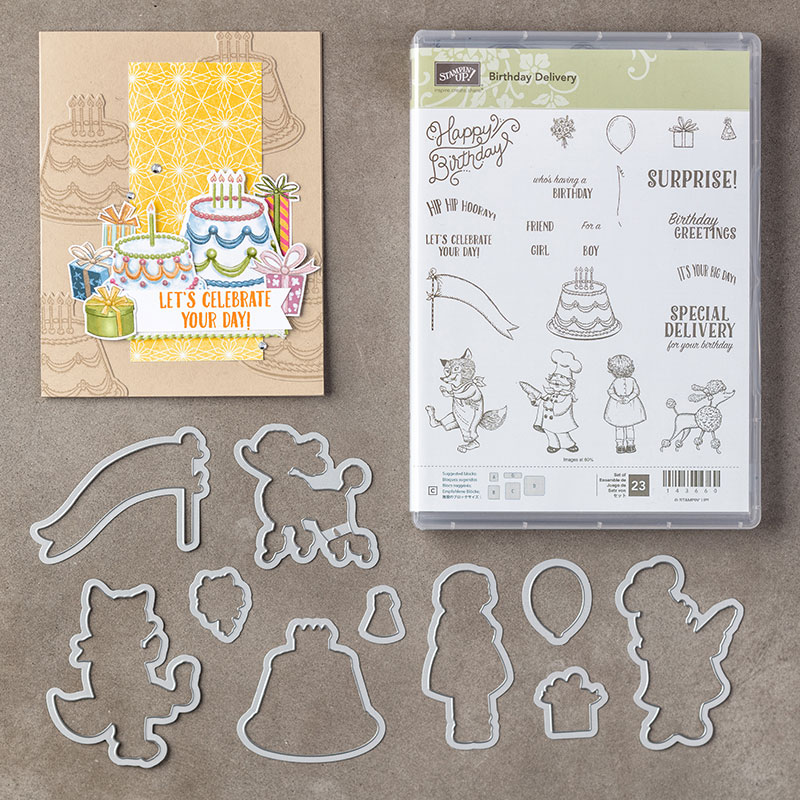
Today I’m sharing a project that uses one of these retiring products: the Birthday Delivery Photopolymer Bundle.
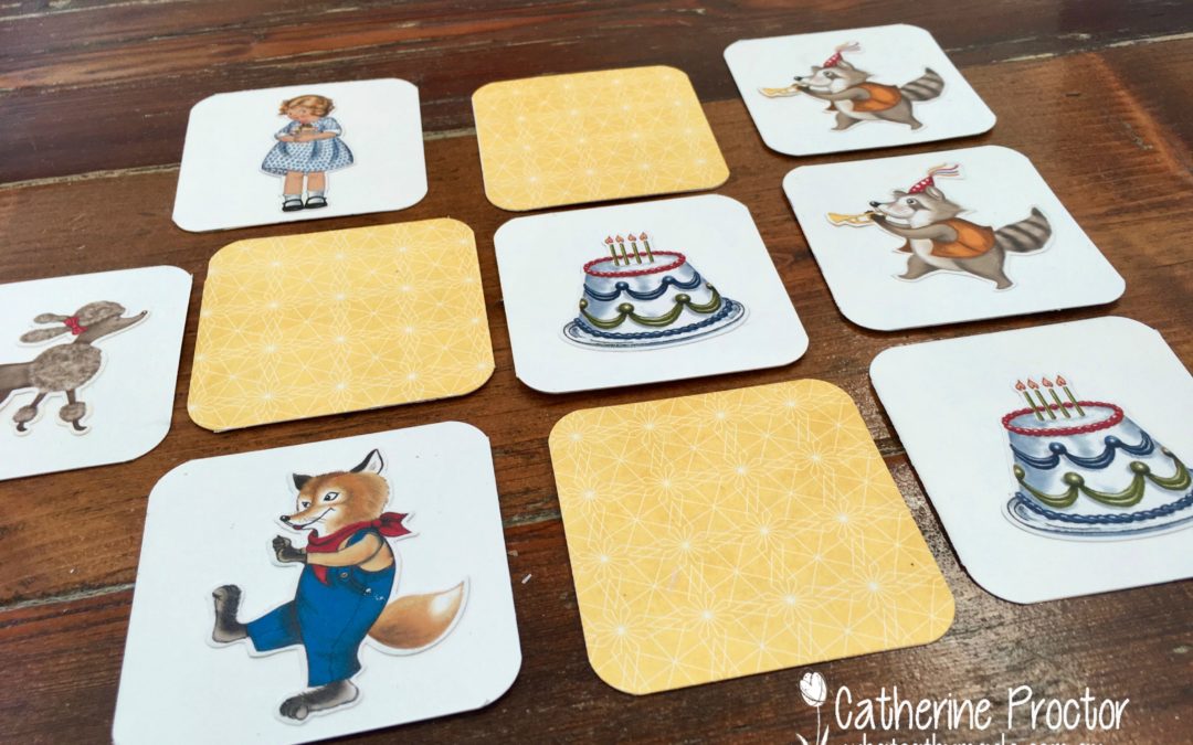
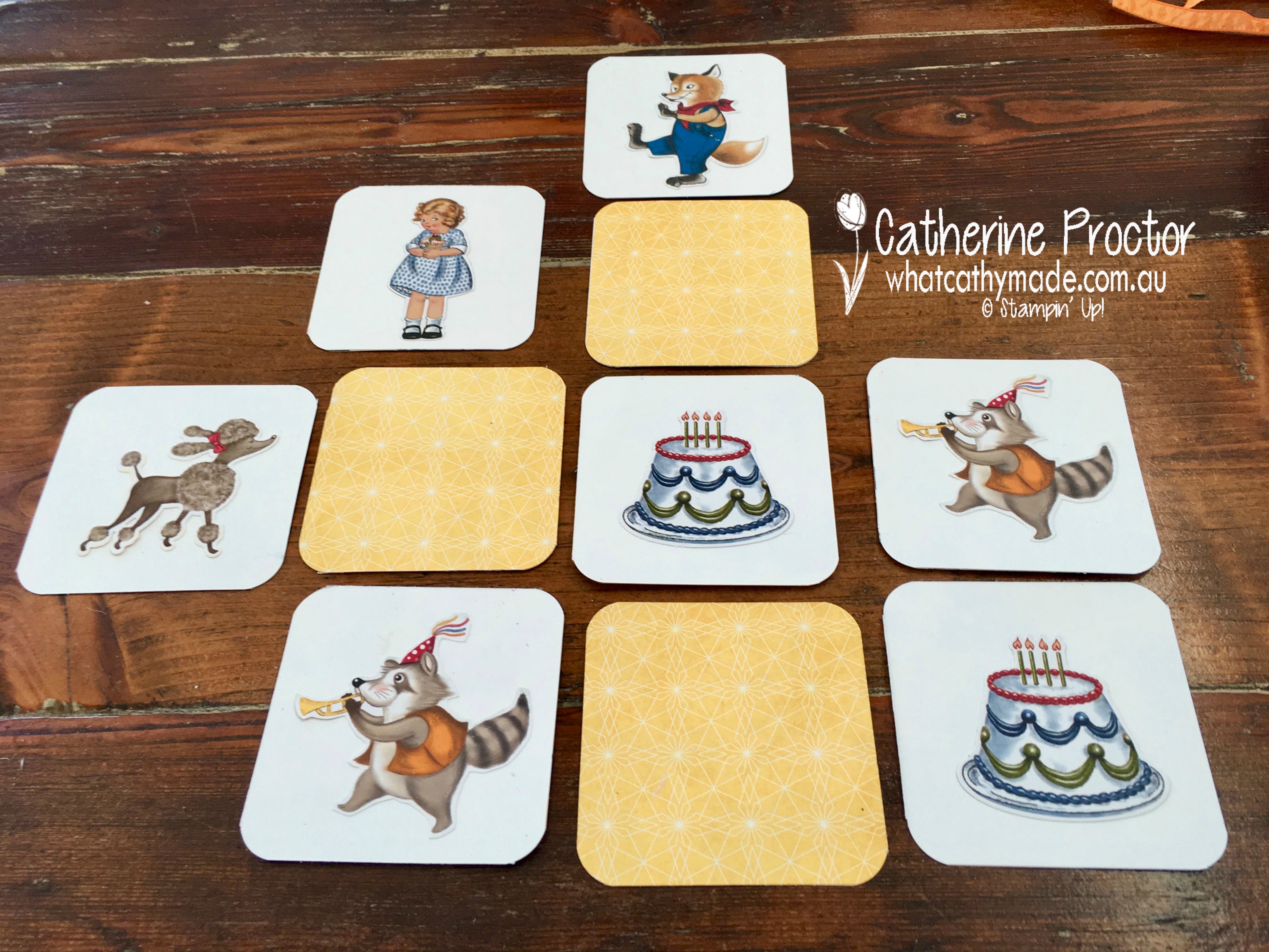
In two days time my beautiful niece, who is about to turn 2, flies to Amsterdam with my brother and sister-in-law so I decided to make her a little toy to help with the long flight, a memory game.
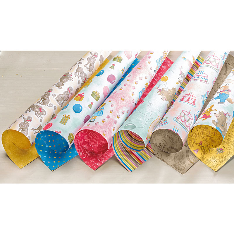
The Birthday Delivery Photopolymer Bundle, as well as the and the co-ordinating Birthday Memories Designer Series Paper are ideal for this project because the dies cut out images from the paper as well as the stamp set.
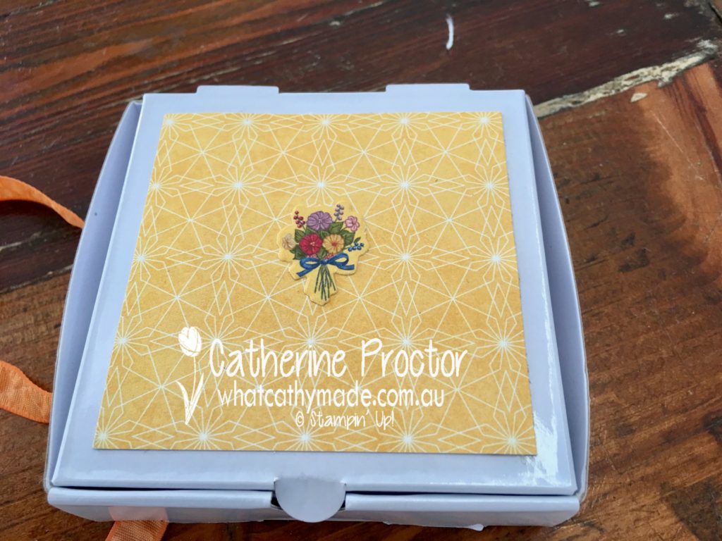
This memory game was so super easy to make. I cut 12 3×3″ squares of whisper white and stuck these squares to the co-ordinating DSP. I chose the yellow pattern as the back pattern for the memory cards because it is important for this game to choose a pattern that is the same for each card.
The pairs of images on the cards were cut from the designer series paper with the dies (so there was no stamping or colouring required) and simply glued to the whisper white cardstock. I used the corner rounder punch to round the corners of the cards.
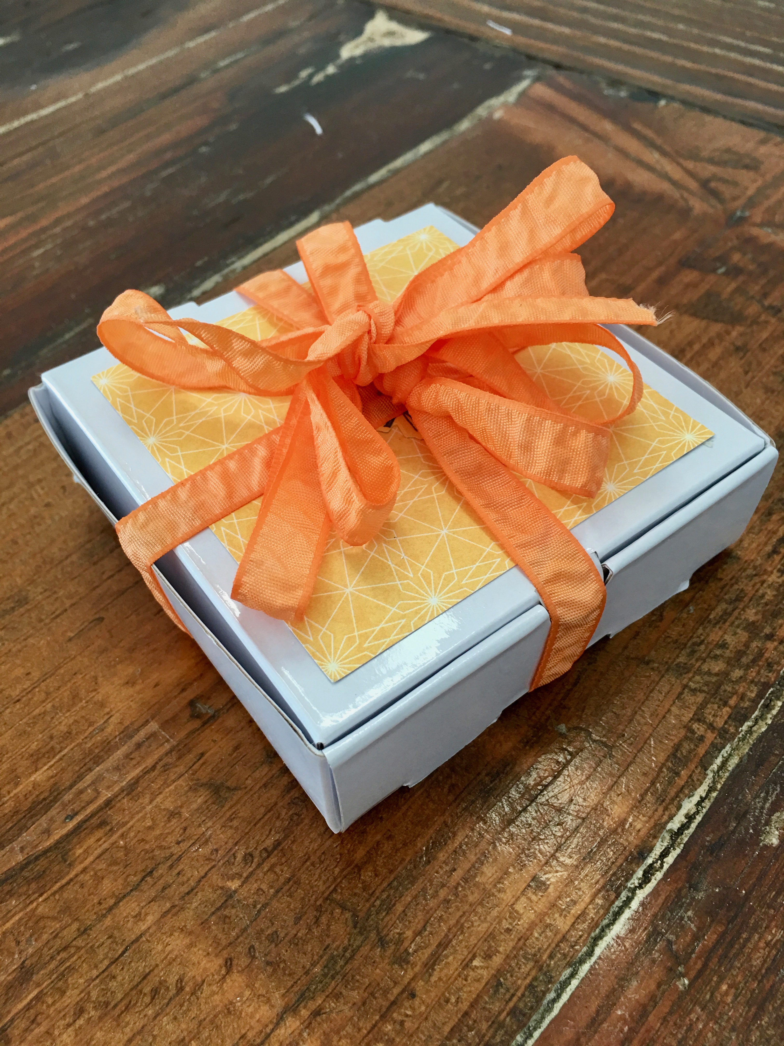
To finish off the project I popped all of the cards into a mini pizza box, topped it with some more of the yellow patterned DSP to match the memory card inside, as well as a die cut image from the DSP.
Finally, I tied it all up with some of the retiring crinkled seam binding ribbon in peekaboo peach.
You can purchase any of these products in my online store.
Or contact me if you’d like a copy of the new Stampin’ Up! 2018-2019 catalogue.
Tonight the Art with Heart team are sharing creative projects featuring “in colour” theme. Check out the new 2018 – 2020 in colours and let’s not forget the current 2017 – 2019 in colours. If you would like a copy of the 2018-2019 annual catalogue, contact any of the girls on the blog hop and we will get in touch with you.
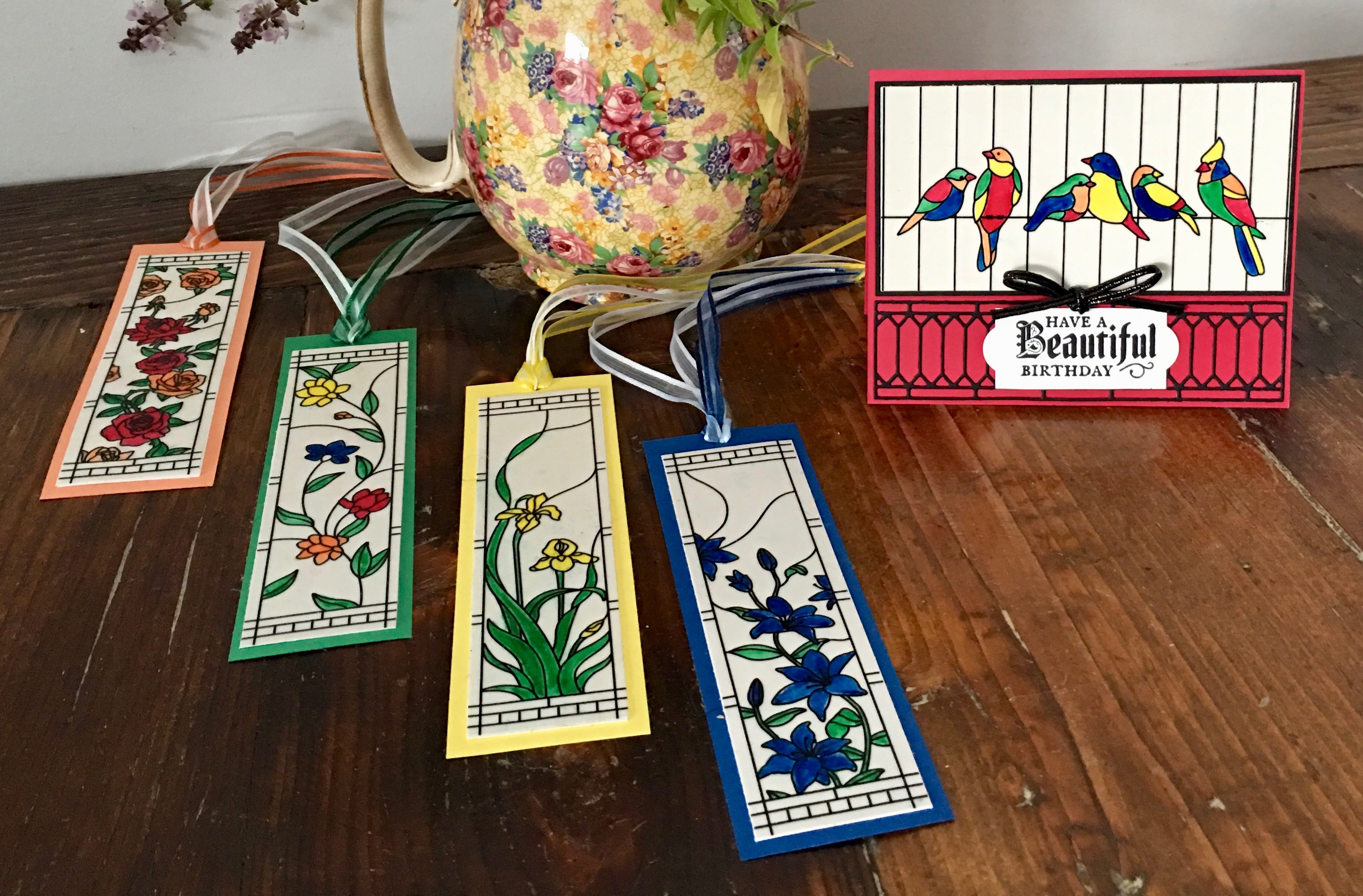
Because the 2018-2020 in colours are just so vibrant and beautiful I knew the Graceful Glass Suite would be the perfect suite to showcase these colours.
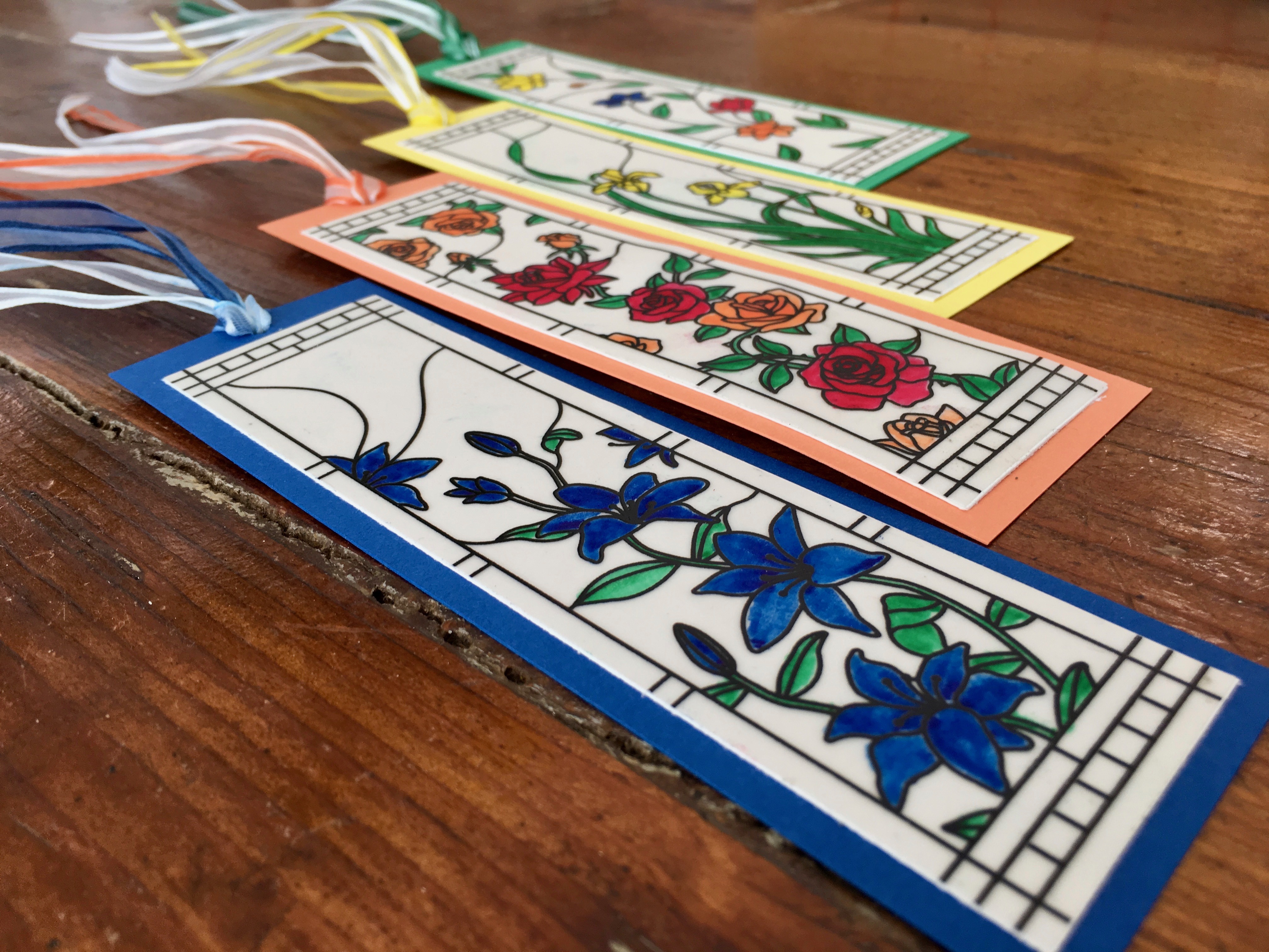
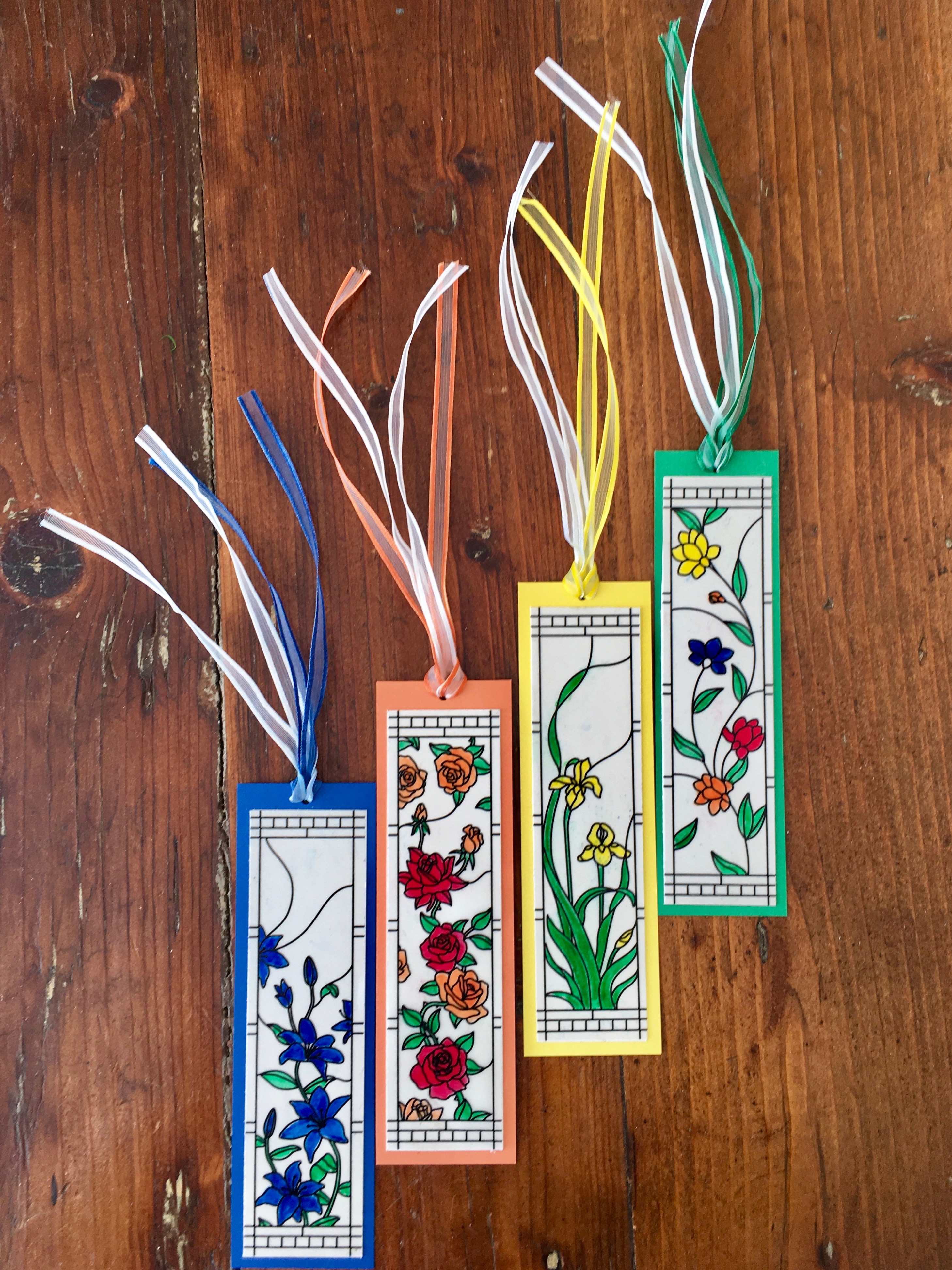
For this project, I used the gorgeous Graceful Glass designer vellum pack to make four bookmarks and a greeting card. Along the way, I learned a couple of tricks for adhering vellum without any adhesive showing and for making your own coloured ribbon.
These four bookmarks are from just one sheet of this vellum…this sheet can also be used as a single piece or cut in half to make smaller cards or cut into four to make four bookmarks like I have made here.
I love this vellum because you can colour it with markers, pencils or blends, and even add colour by simply laying it on the top of the coloured cardstock. This vellum is super easy to colour in and looks amazing with any colour combination…just be careful not to smudge inky fingers over the top of it like I did, LOL!
I used the new 2018-2020 in colour markers to colour the vellum and I tried to highlight a different in colour on each bookmark. Left to right in the photo below we have: Blueberry Bushel, Grapefruit Grove, Pineapple Punch, and Call Me clover. The lovely red colour is the fifth in colour: lovely lipstick.
Want to know the best ever way to adhere the vellum? All you need is some Tombow glue, a sponge, and a silicon mat. Squeeze a small amount of Tombow onto your silicon mat and use your sponge to lightly and evenly spread it across the reverse side of the vellum and then adhere the vellum to your cardstock. You clean up your sponge and mat by simply running under warm water. Too easy!
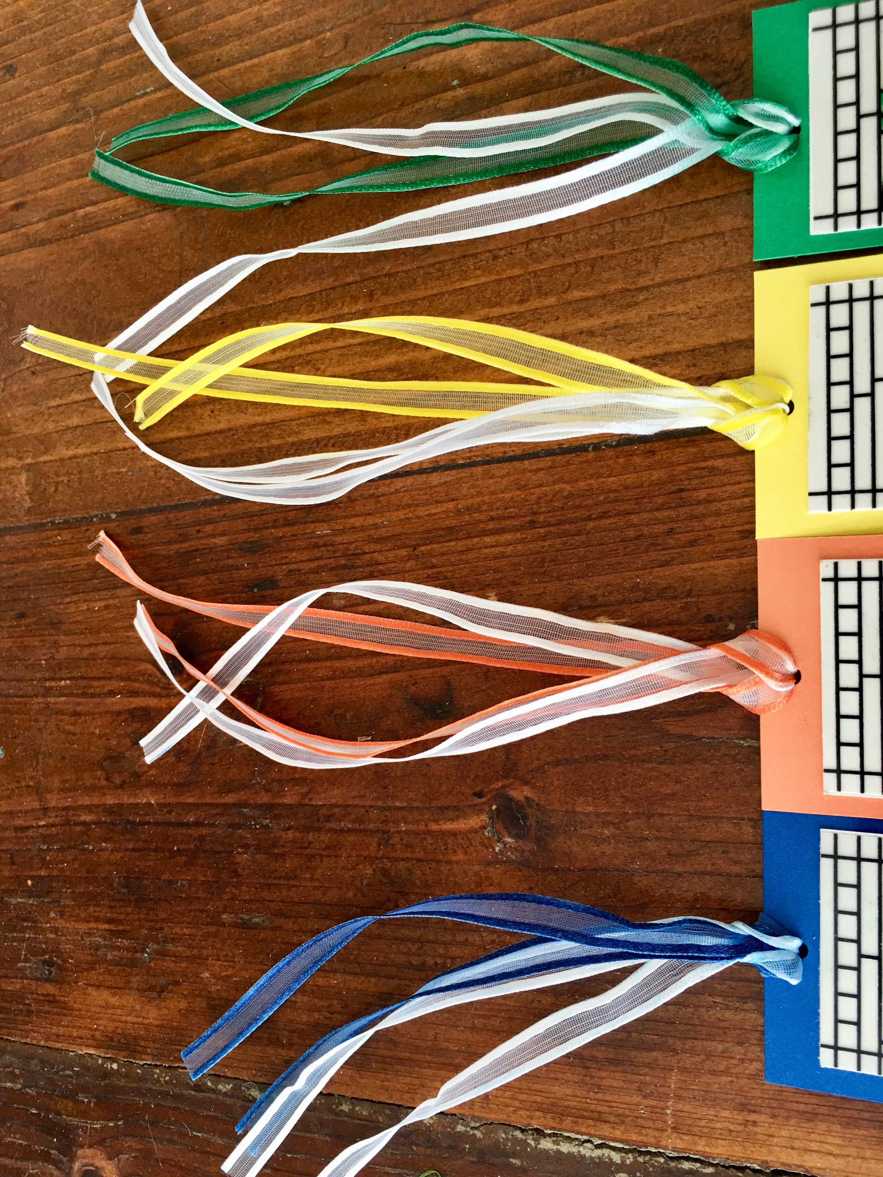
To further showcase these in colours I decided to colour the soft and versatile Whisper White 1/4″ (6.4 Mm) Organza Ribbon (this is a retiring item, only available until May 31, or sold out). Once again, this is so easy to do. Simply lay the ribbon on some scrap paper and colour on both sides with your marker or blender pens and then leave it to dry.
I adhered the coloured vellum to whisper white cardstock, and then to some in colour cardstock, punched a hole for the ribbon using the 1/8″ hole punch, and threaded through both a length of white organza ribbon and a length of the hand coloured ribbon.
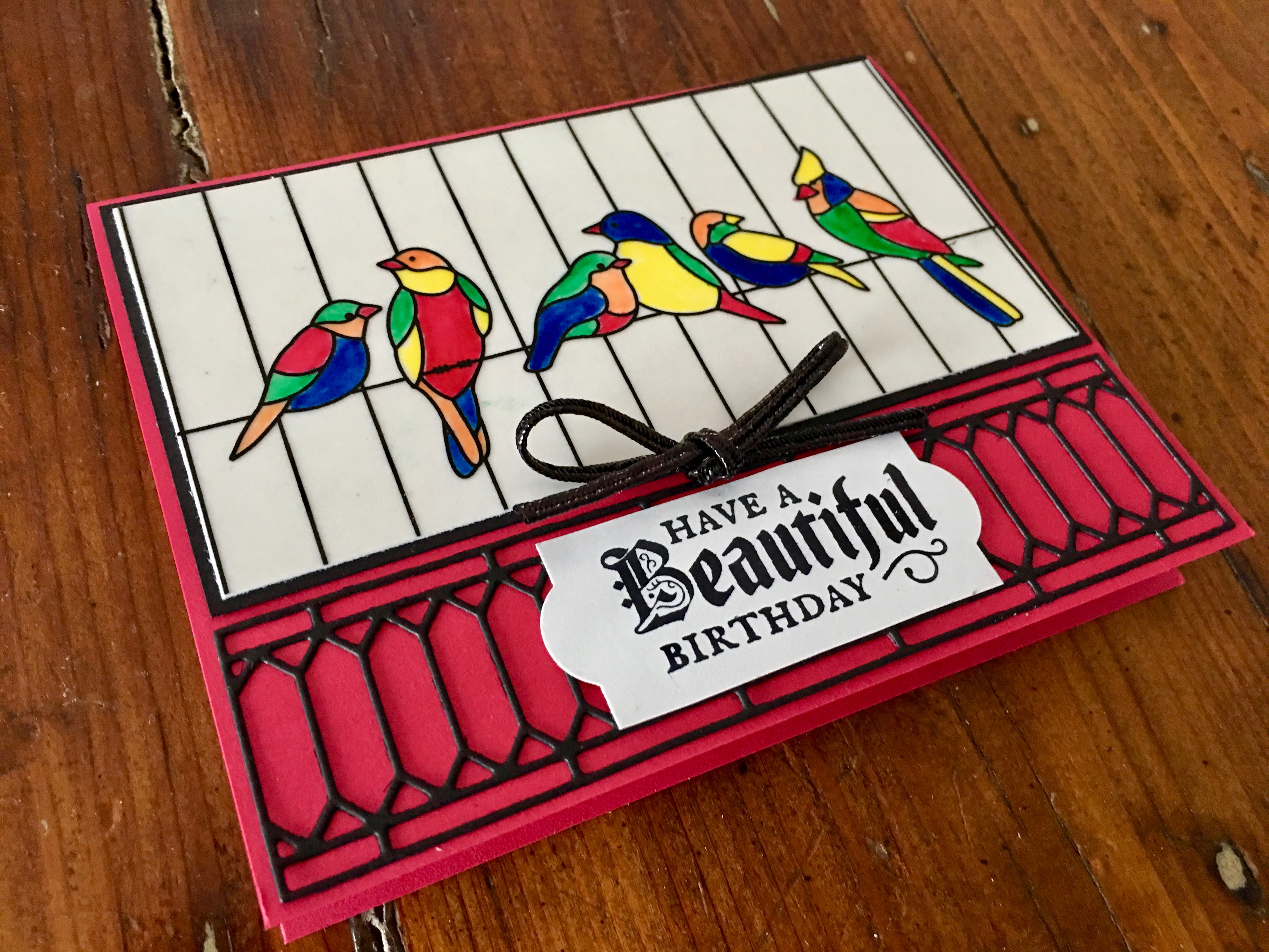
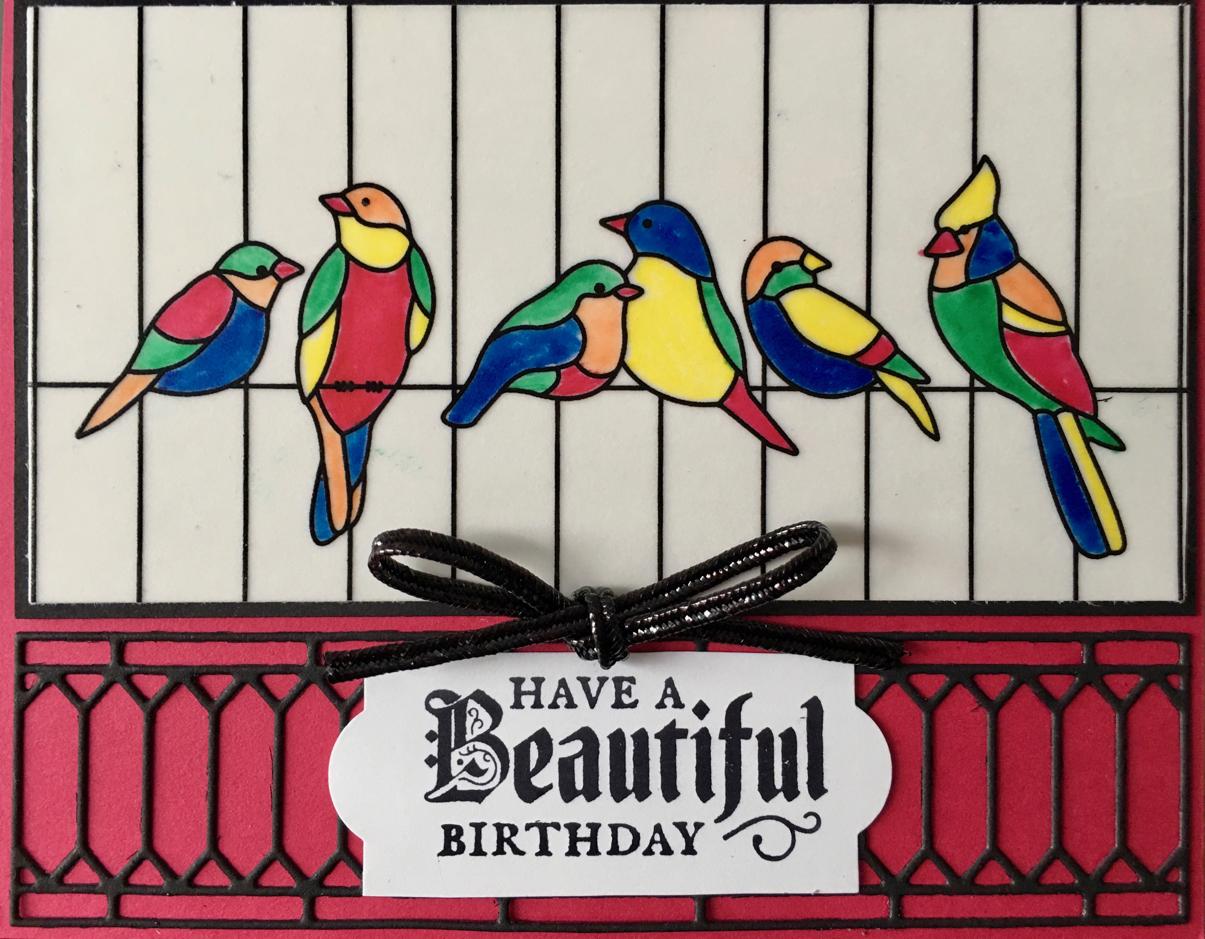
Finally, I just couldn’t resist making a matching card using another design from the Graceful Glass designer vellum pack because the in colours are the exact colours of Australia Rosellas and Parrots. This card features all of the new in colours but the main one is lovely lipstick, the red cardstock. The bird image on the vellum reminds me of an old Arnotts Biscuit tin my Nan used to have. Nan would keep an assortment of my favourite biscuits in the tin and bring it out for me to choose a biscuit (or two or three!) when I went to her place for a cuppa.
I hope you’ve enjoyed my projects today and feel inspired to create something yourself with these beautiful 2018-2020 in colours and the versatile Graceful Glass Suite…these products will be available June 1, 2018, just a week away from now!
Now it’s time to hop on over to our next participant, the very talented, Monika O’Neill. I can’t wait to see what Monika has made!
If you find a broken link or have come to this blog hop from a different entry point, you can view the participants below: Ros Davidson
Tonight the Art With Heart team are sharing creative projects featuring products from the last chance products list.
There are lots of products to choose from with retiring stamp sets, ink pads and ink refills guaranteed to be available until 7 May (and all other products while supplies last).
Contact anyone on the blog hop to place your last chance order today.
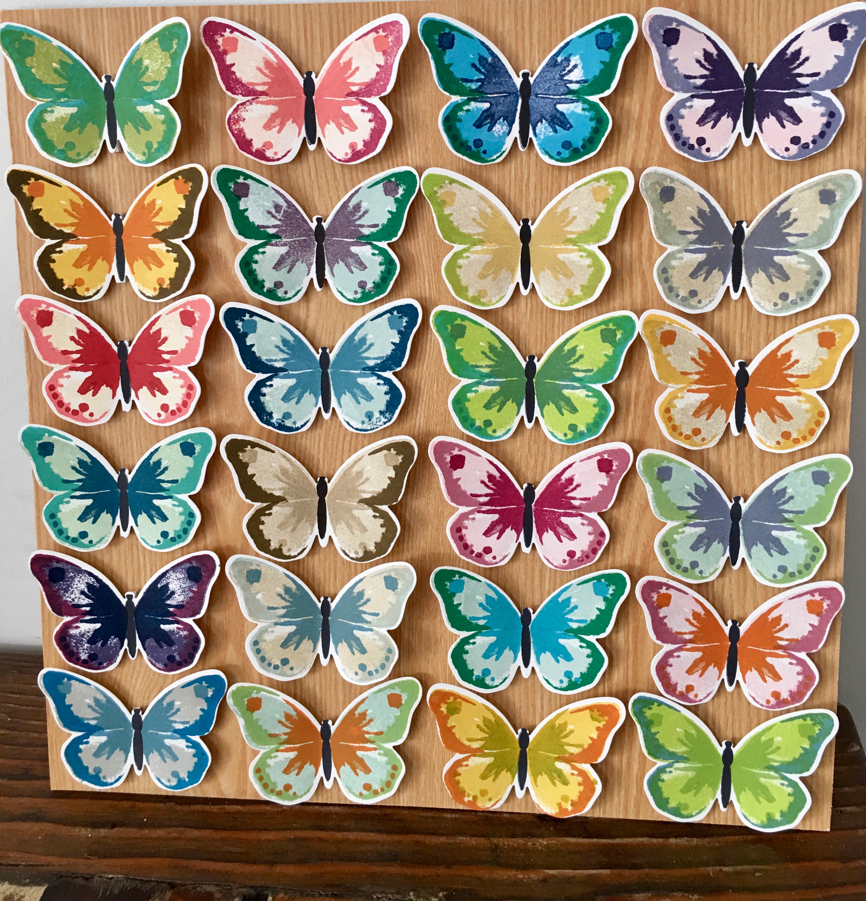
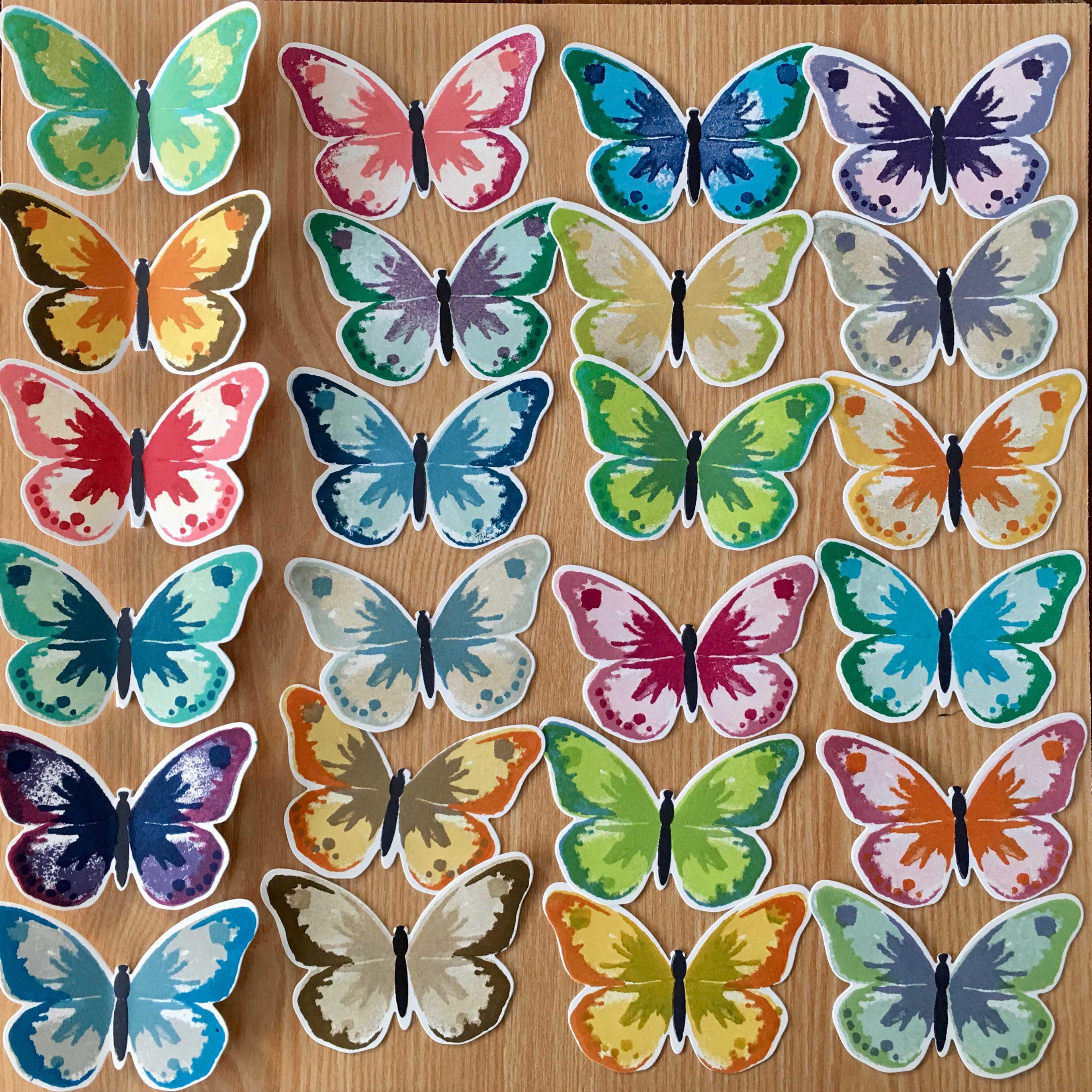
Watercolour Wings (and its matching die sets, Bold Butterfly Framelits Dies and Butterflies Thinlits Dies) is one of the stamp sets I’m really going to miss when it retires on May 31 this year. This beautiful set can be used with any combination of colours and the watercolour-look photopolymer 3 step stamps are incredibly forgiving of any mistakes.
To showcase this retiring bundle I decided to make a butterfly display box. I’ve been thinking about making this home decor piece for a while now, but it was a recent trip to America that really triggered this project.
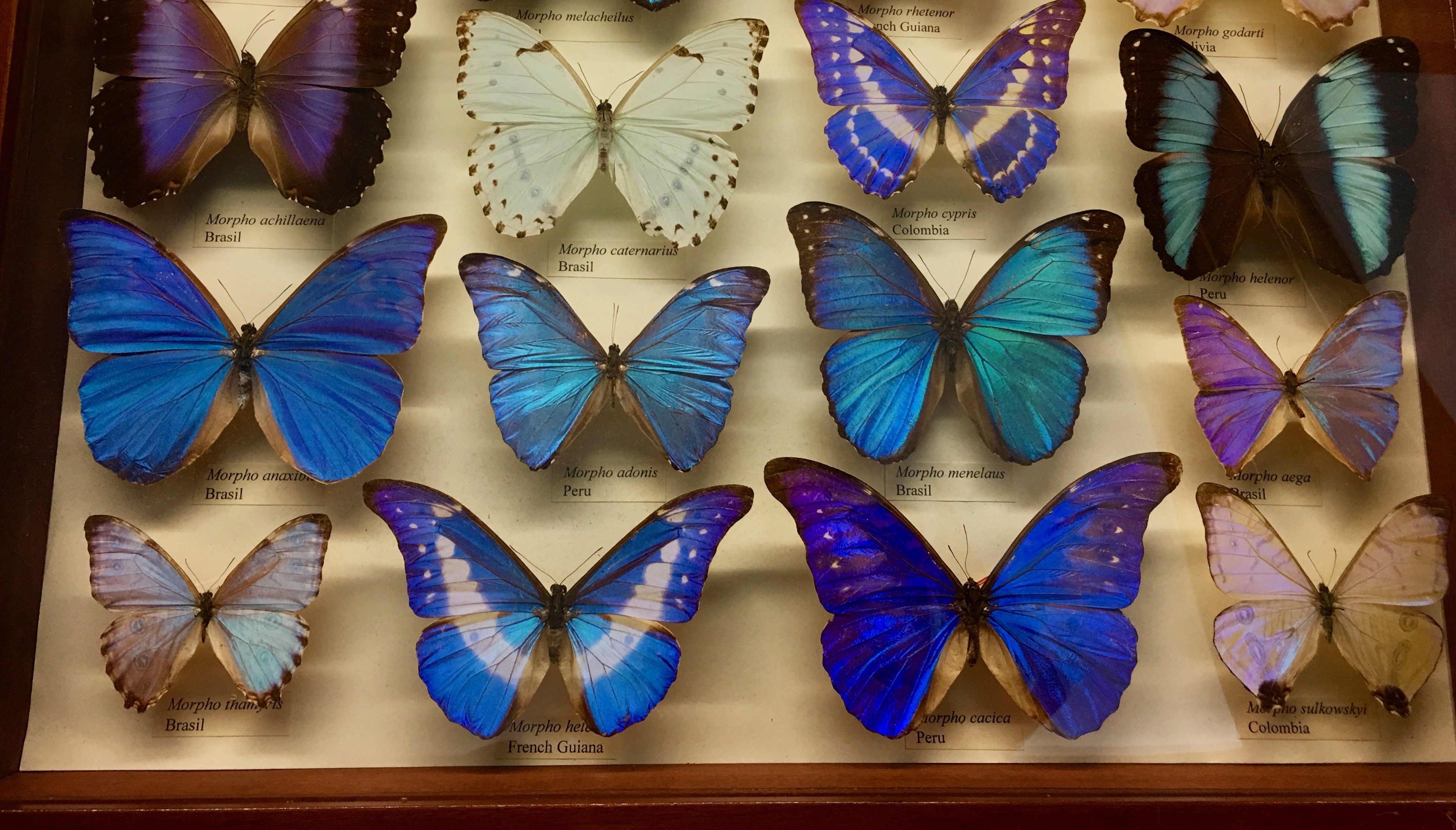
Earlier this year I was incredibly lucky to finally visit a city that I’ve always wanted to visit: New York, New York. We only had a week there but managed to cram so much in, including a visit to the Museum of Natural History, where we walked through an incredible exhibit of live butterflies in a rainforest.
We were surrounded by thousands of these gorgeous creatures as they landed on our heads and our hands, but they were quite tricky to photograph.
Much easier to photograph were the amazing butterfly display boxes in the main section of the museum, and this one below was my absolute favourite.
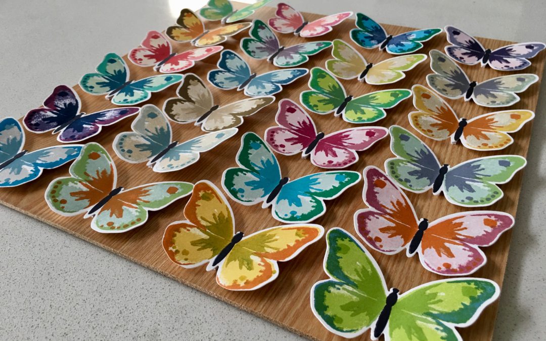
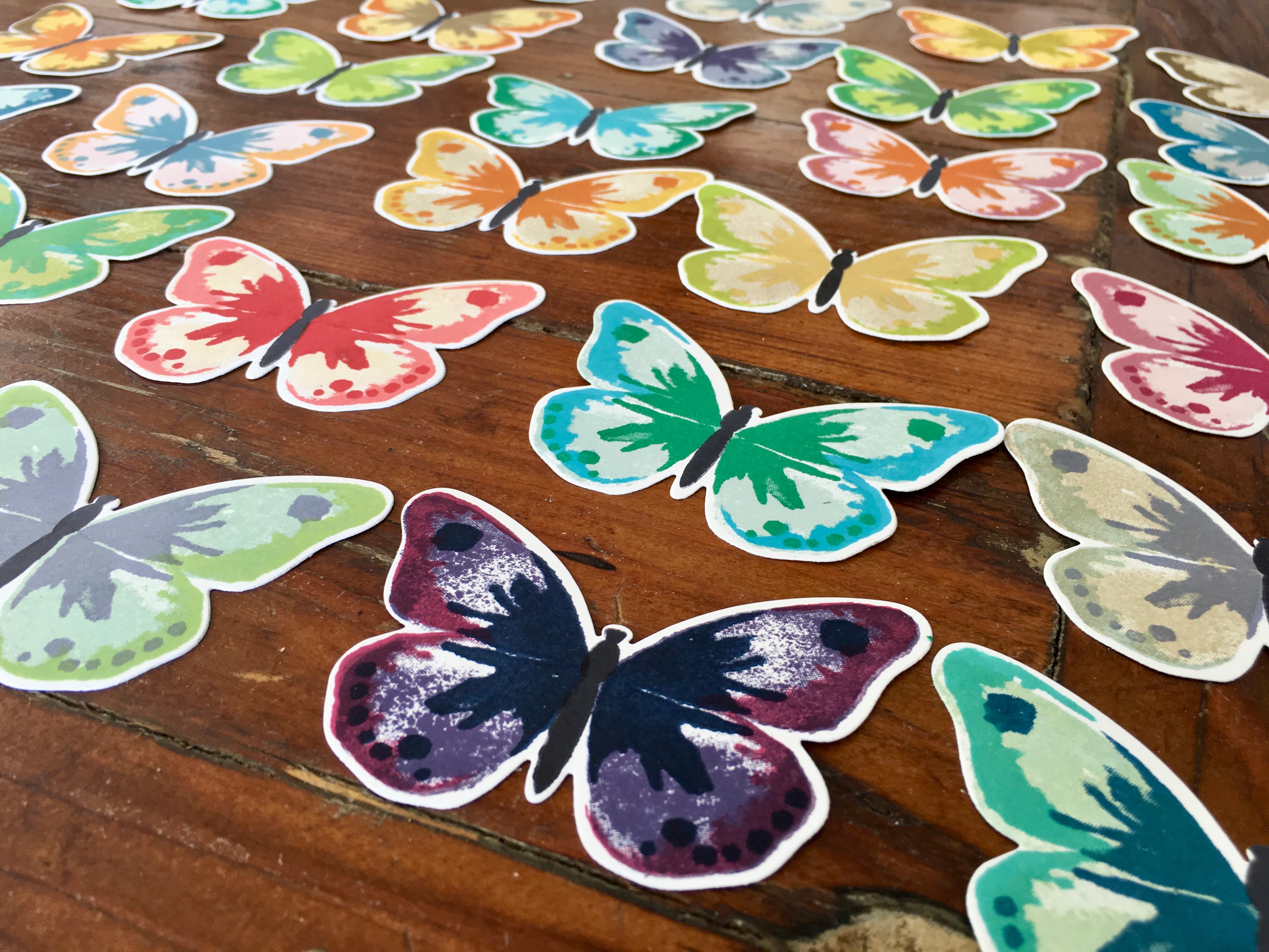
To make my own butterfly display box I simply stamped a variety of different coloured butterflies using the larger butterfly stamps and then stamped the body of the butterflies in black.
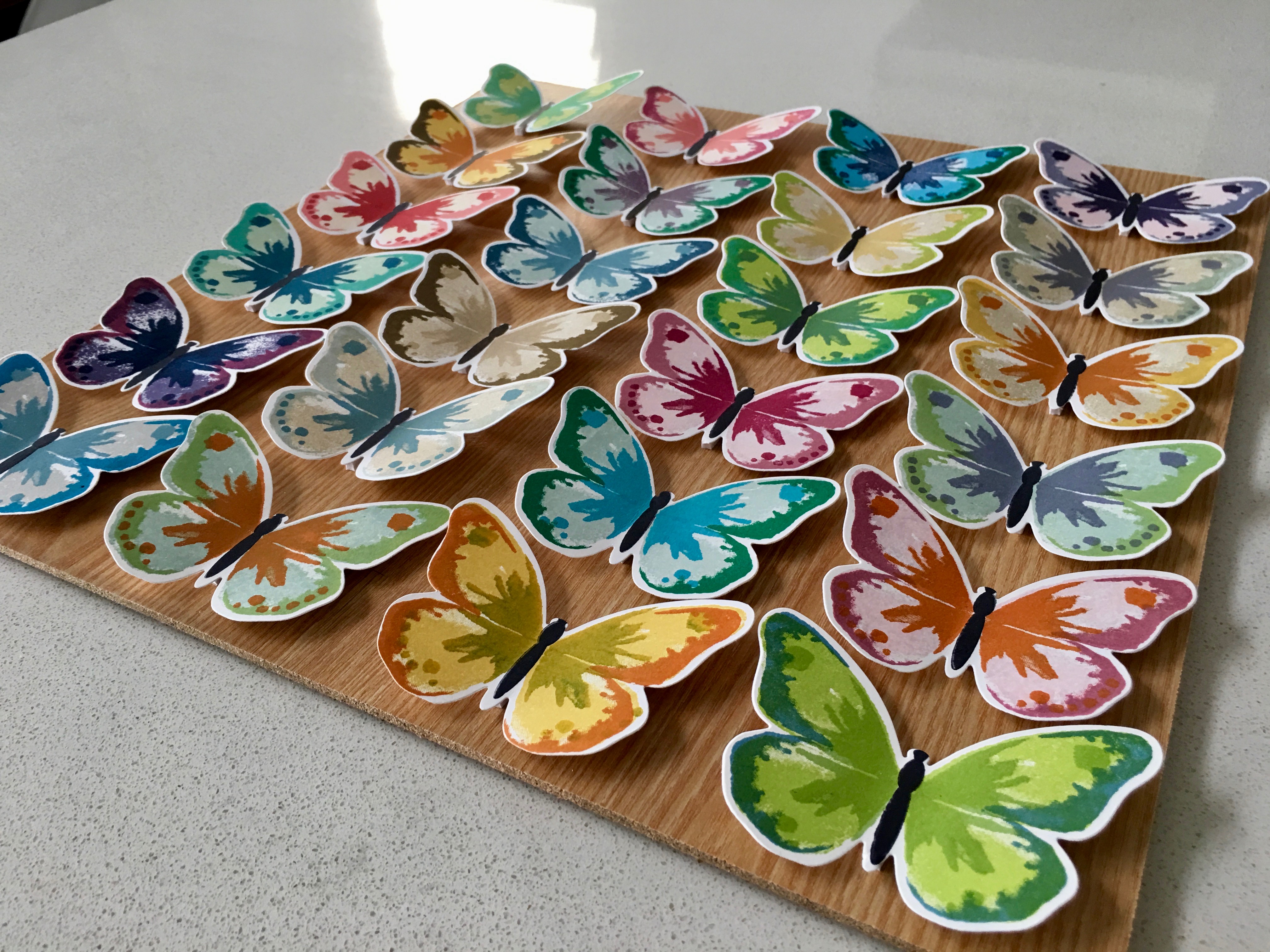
Generally, I found that a lighter colour works best as the background colour, allowing the darker and bolder colours to really pop out the details of the butterflies. Some of my favourite retiring colours – Tempting Turquoise, Perfect Plum, and Soft Sky – worked especially well for this project.
I die cut the butterflies out using the Bold Butterfly Framelit that matches the larger of the 2 butterfly stamps and then arranged them on the backboard of a shadow box. The butterflies were attached using Foam Adhesive Strips to really make them pop.
As I attached the butterflies to the board I bent their wings forward…you can see in the image below (where just the left column has been attached) how the butterflies really come to life once their wings are bent and they are mounted on a foam strip.
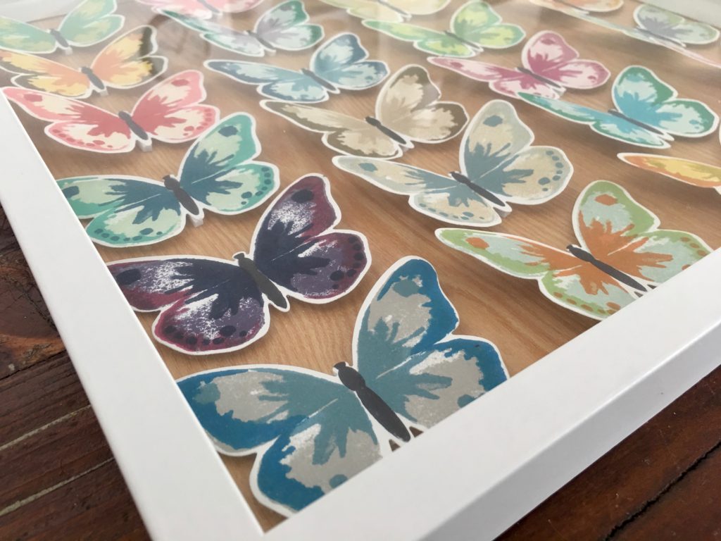
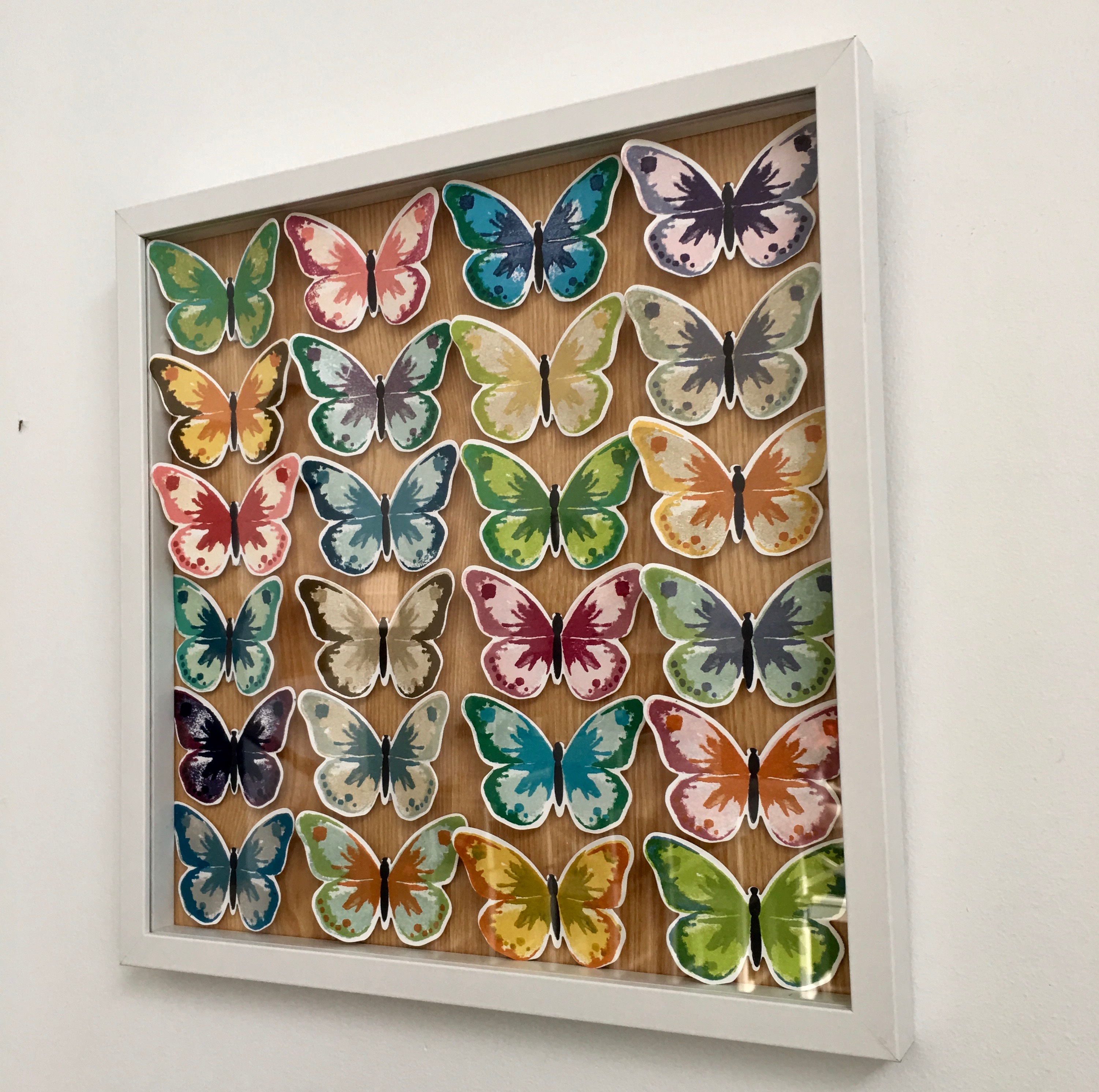
It’s really hard to photograph the butterflies inside the shadow box because of the reflection off the glass, so here is the finished product before I put it into the shadow box. Don’t they look like they might all just take flight at any moment?
And here’s the best photo I could get of the shadow box. It’s still a bit glary from the reflected light but it shows you just how pretty they all look lined up inside the shadow box.
Now it’s time to hop on over to our next participant, the very talented, Sharon Davern. I can’t wait to see what Sharon has made!
If you find a broken link or have come to this blog hop from a different entry point, you can view the participants below:
Tonight the Art With Heart team are sharing their Easter creations.
Don’t forget, Sale-a-bration has just over a week left to earn free product with purchase…and it is also a fabulous time to join Stampin’ Up!
Ask any of the girls on the hop for more details.
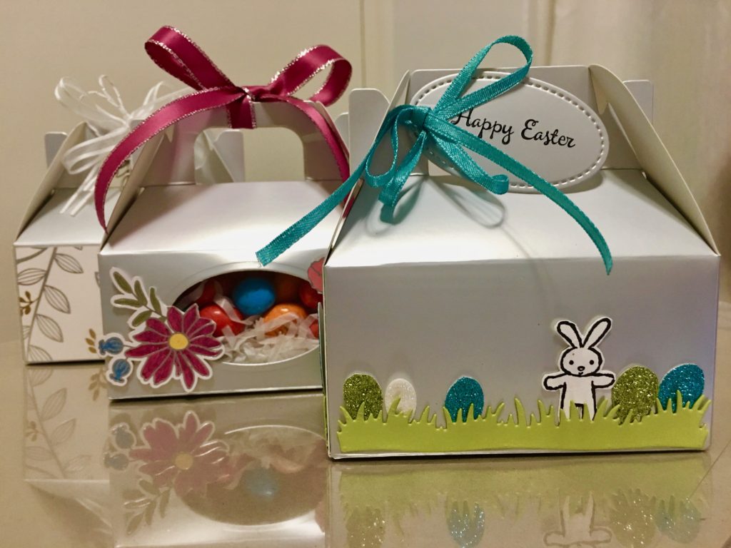
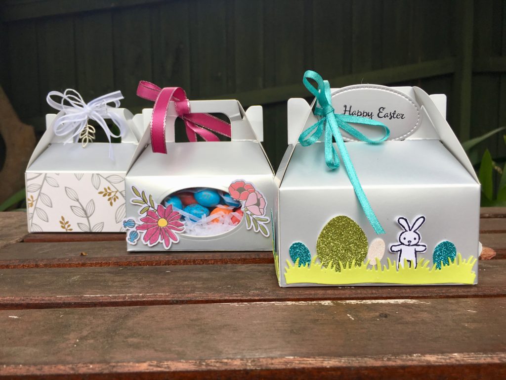
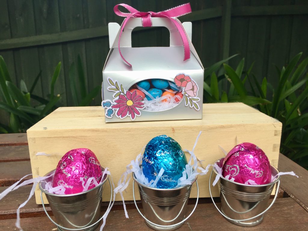
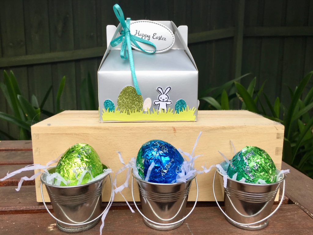
Easter Egg Silver Mini Gable Boxes
Don’t you just love these silver mini gable boxes?
They are so easy to decorate, look very professional, and their silver foil colour is a great neutral that works with any colour.
You can also open them up and turn them inside out if you’d like a plain white surface to work with and add colour to, but I decided to stick with the silver theme for my Easter Egg boxes.
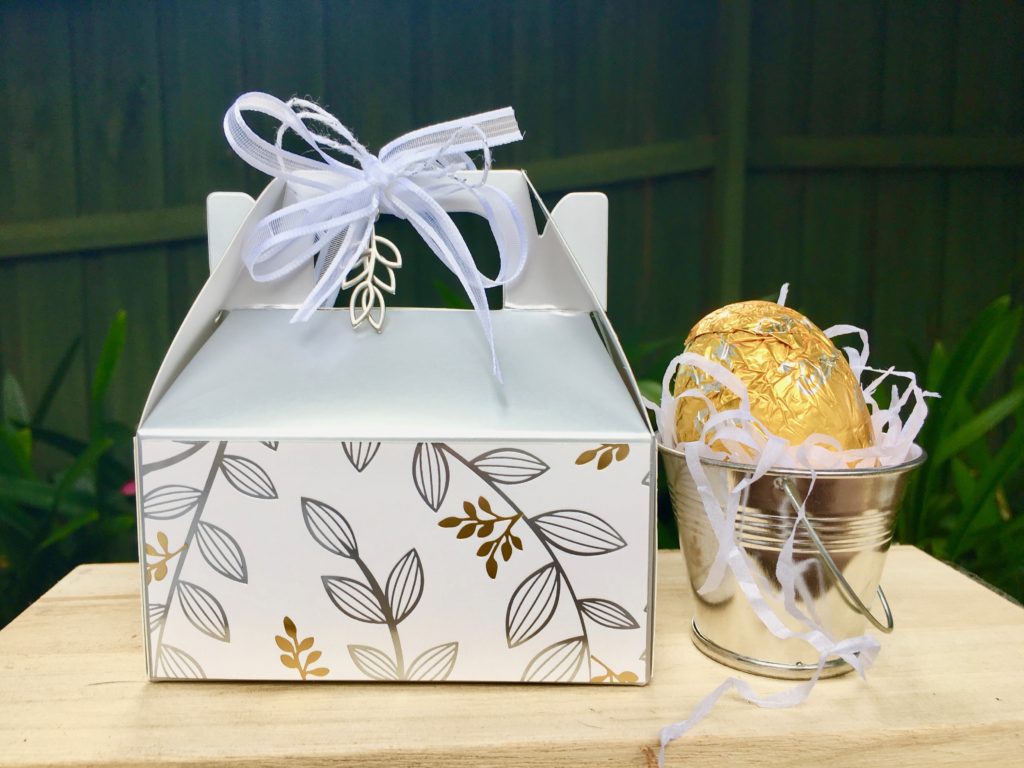
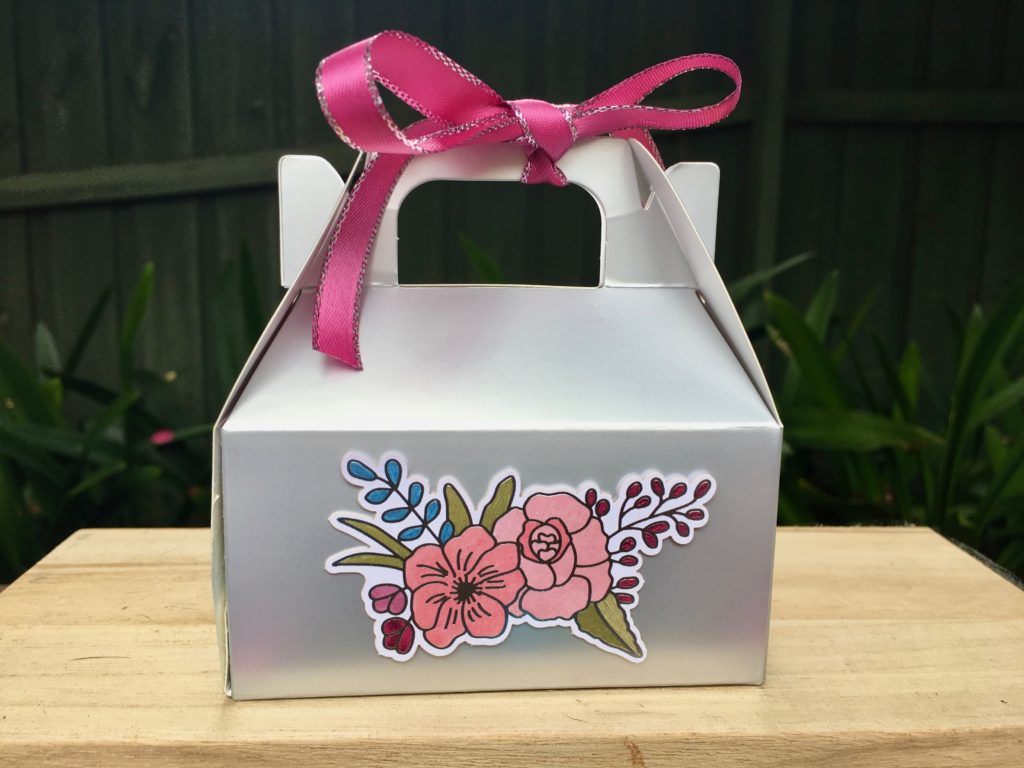
Box 1: Springtime Foils Easter Egg Box
For my first box I used products from the Occasions catalogue and the Sale-a-bration catalogue.
I simply cut some pieces of the gorgeous Springtime Foils specialty DSP and adhered them to four sides of the gable box using double sided tape and attached two matching silver Petal Passion embellishments using Silver Bakers Twine and Whisper White organza ribbon.
So quick and easy…but incredibly effective with that stunning foil DSP.
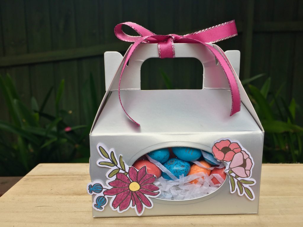
Box 2: Sweet Soiree Easter Egg Box
For my second box I inserted a window panel into the front of the box so you can see the eggs inside. This was super easy to do.
I carefully opened the side seam of the box then ran one side through my big shot and cut an oval window using one of the oval stitched shape framelit dies.
The clear window pane was created by using the next largest oval stitched shape framelit die to cut out a piece of window sheet, which attached with glue and double sided tape.
After resealing the box (using double sided tape) and filling the box with my speckled eggs I used some of the pieces from the Sweet Soiree Embellishment Kit to decorate my box and tied a bow to the top with Berry Burst metallic-edge ribbon.
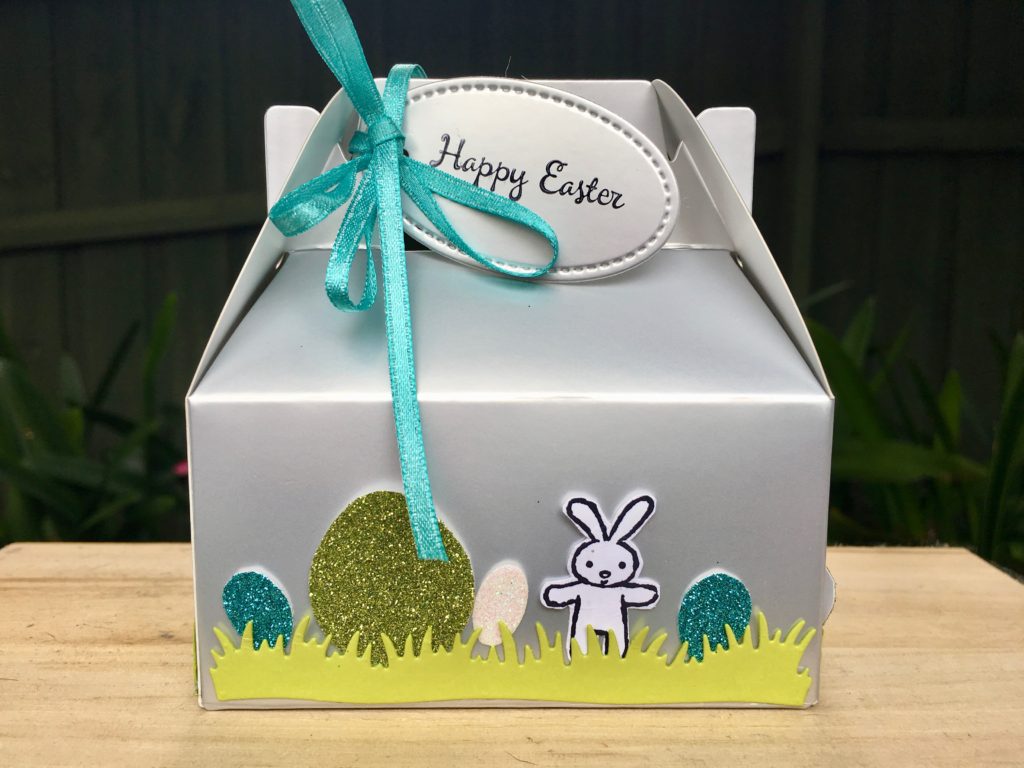
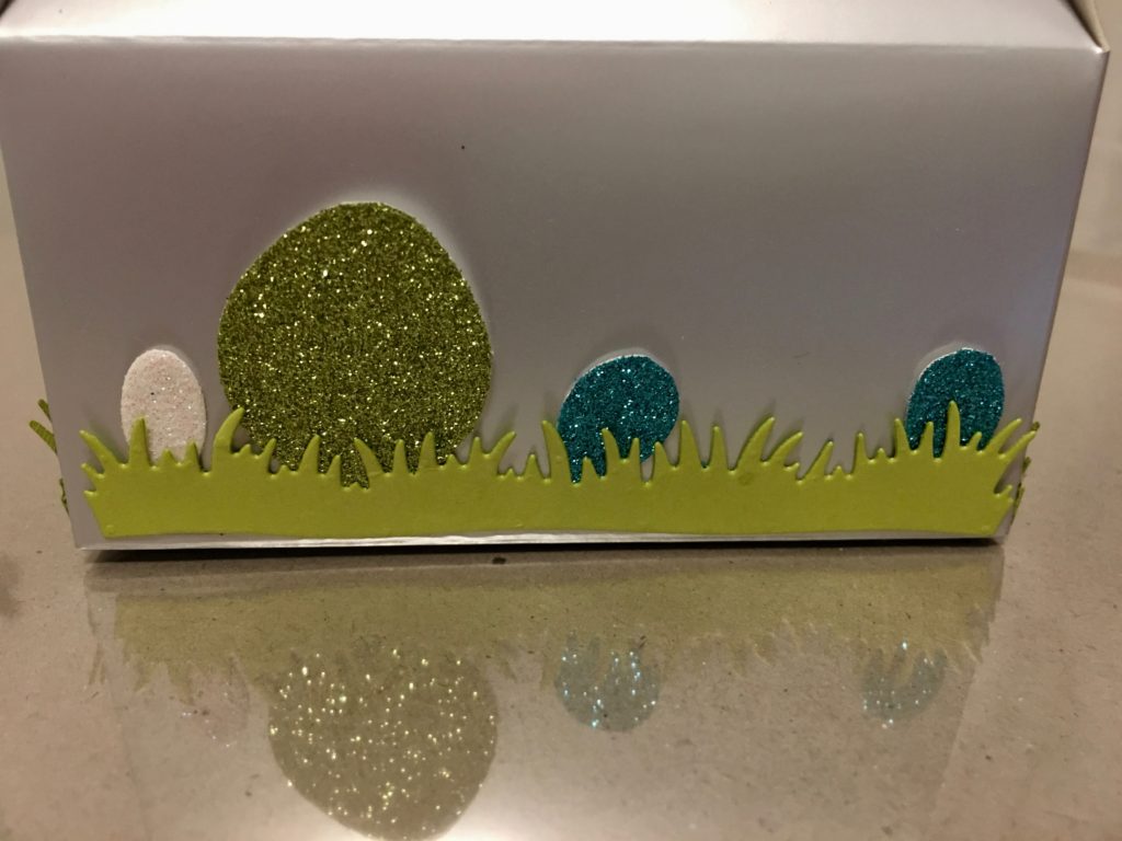
Box 3: Moon Baby Bunny Easter Egg Box
The third box is my favourite because it is just so much fun. I used the grass die from the Picnic Basket Builder framelits dies to cut Lemon Lime Twist card stock and attached this to the bottom of the box… it is the perfect length for the longer side of the box. For the two shorter ends I simply cut down one piece to size.
The darling little bunny is stamped using one of the Moon Baby stamps and then fussy cut…but can you guess what I used to make the various sized eggs?
The largest egg is punched using the ballon builder punch (use scissors to trim off the base of the balloon and you have an egg shape).
The medium egg is punched using the leaf punch (you trim the 3 ‘eggs’ from the leaf), and the smallest egg is cut from the top of the wooden spoon shape in the Apron Builder framelits.
I love the glittery effect the Myths and Magic Glimmer paper gives to my little eggs hiding in the grass!
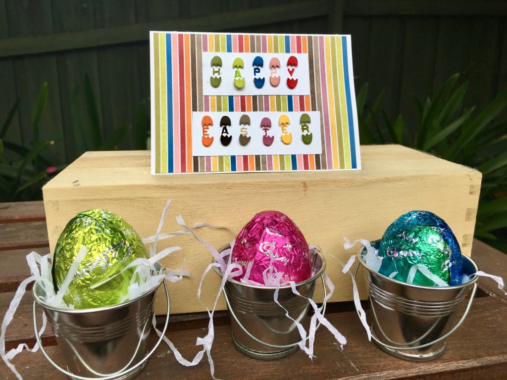
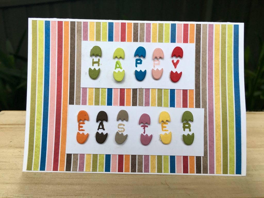
Apron Builder Easter Egg Card
And finally, I just couldn’t resist making this super easy card using another die from the Apron Builder Framelits…it’s a little cracked egg.
Although my stamping isn’t perfect on this one, this fun and easy card uses the Labeller Alphabet Stamp set to stamp the sentiment, with the colourful striped Birthday Memories DSP as the background piece.
Now it’s time to hop on over to our next participant, the very talented, Kathryn Mangelsdorf.
If you find a broken link or have come to this blog hop from a different entry point, you can view the participants below:

 Metallic-Edge Ribbon")


 Cord")


 Designer Series Paper")