Welcome to week twelve of our Art With Heart 2024-25 Colour Creations blog hop!
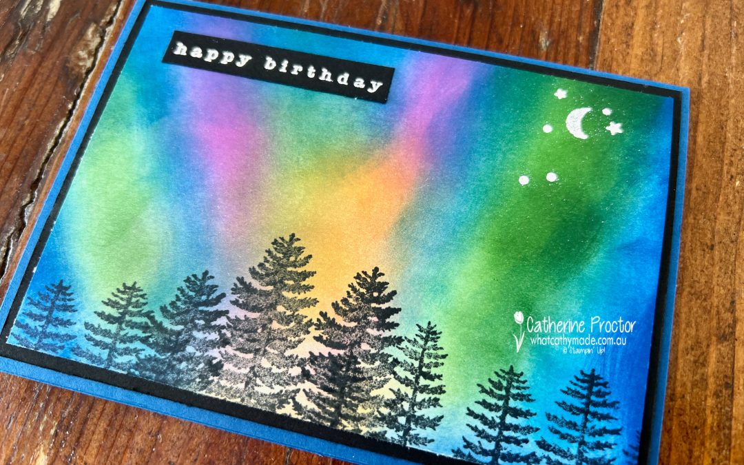
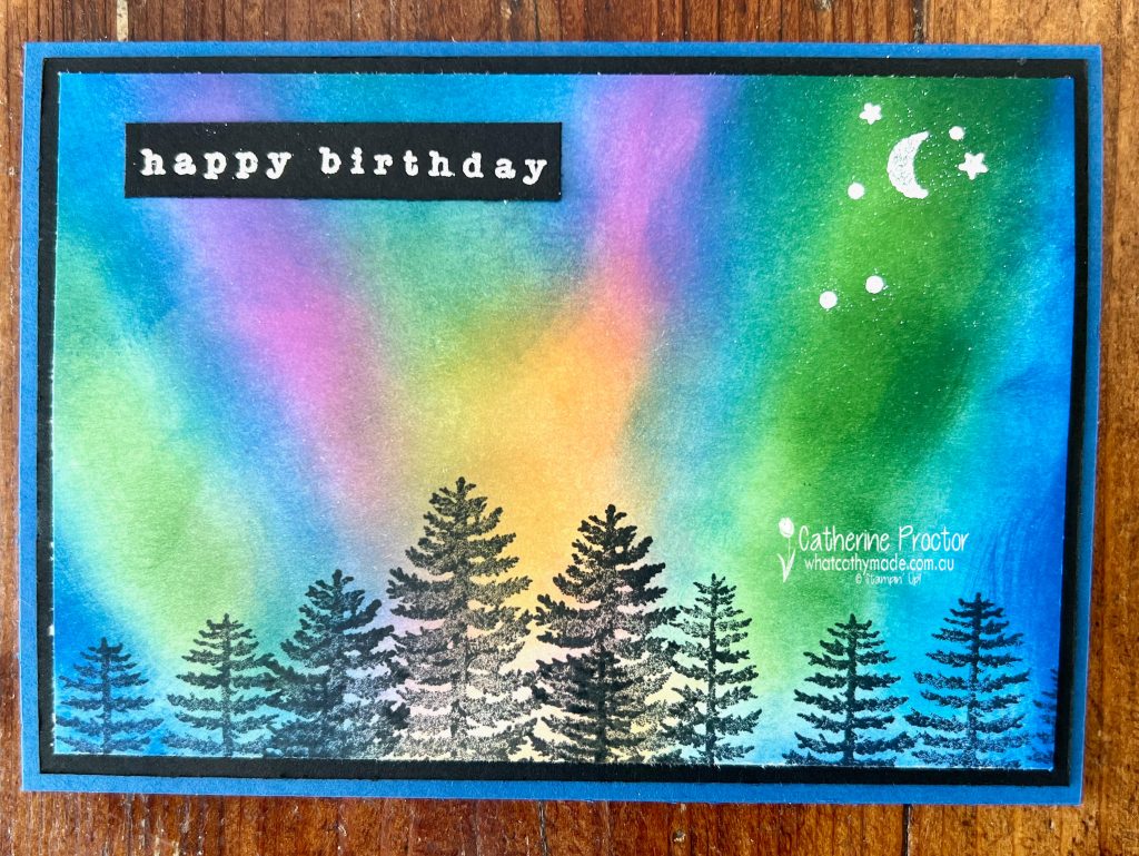
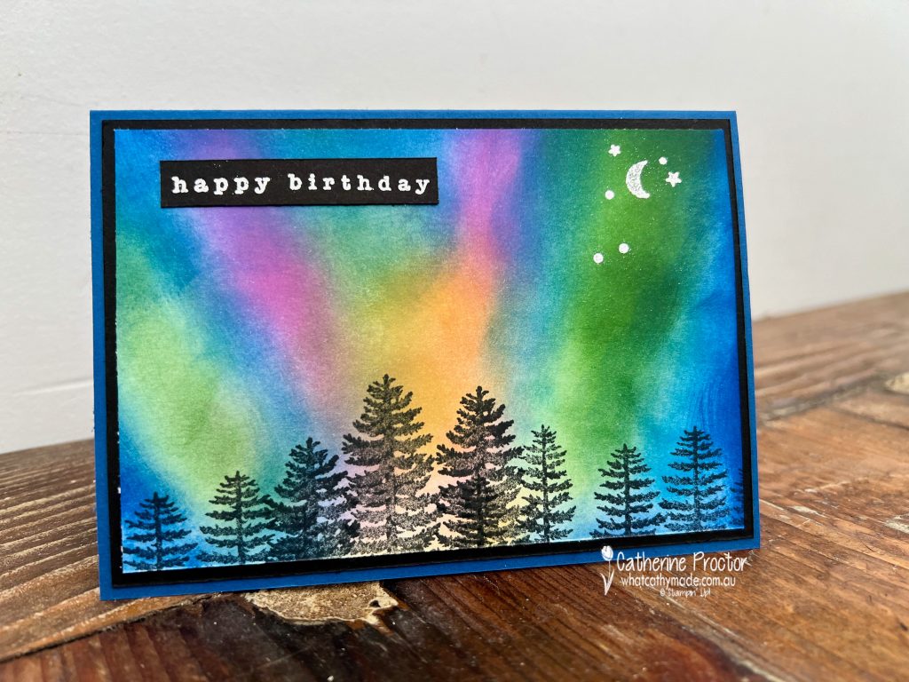
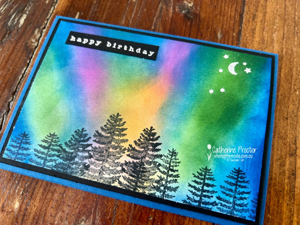
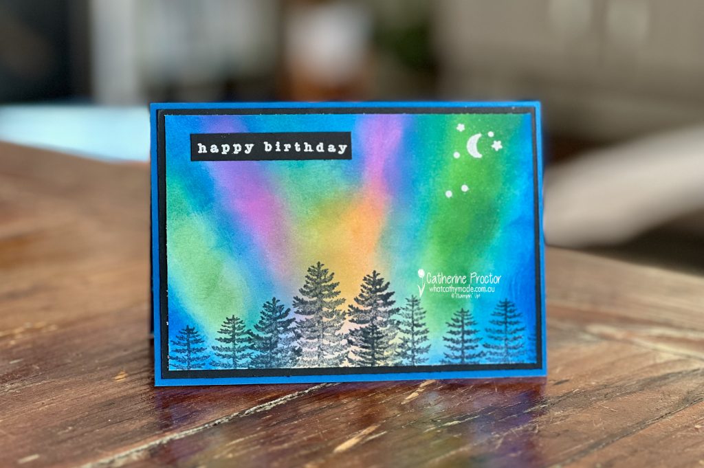
This week we’re featuring Blueberry Bushel, a rich and clear deep blue from the Regals family. And as it my dad’s birthday this weekend I’ve made him a Blueberry Bushel birthday card.
My dad loves all things astronomical so I decided to give the northern lights technique a go. This is the colour combination I chose, although if you look at photos of the northern lights you’ll see that you can really use any combination of colours.
The northern lights technique is fun and easy to do. All you need is blending brushes, ink and cardstock.
Start from the bottom of the card and apply the ink in upward strokes working in order from the lightest colour to the darkest colour. Then go back over each colour to add depth and blend. I added the Blueberry Bushel last.
I used two of the tree stamps from the Forever Forest Stamp set (stamped in Memento ink) to create the forest silhouette at the base of the card.
I stamped the moon and stars image from the same stamp set in Versamark ink and heat embossed it in white.
The “Happy Birthday” sentiment is from the Country Birdhouse Stamp Set, also stamped in Versamark ink and heat embossed in white. I chose this sentiment as it was long and narrow and I didn’t want to cover up any of the gorgeous northern lights.
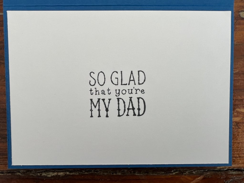
This sentiment from the Gone Fishing stamp set was the perfect sentiment to use on the inside of my dad’s birthday card!
Now it’s time to hop in over to our next participant, the lovely Rachel Woollard – I can’t wait to see what Rachel has made this week!
If at any time you find a broken link, you can find the complete list of all participants below.
Welcome to week eleven of our Art With Heart 2024-25 Colour Creations blog hop!
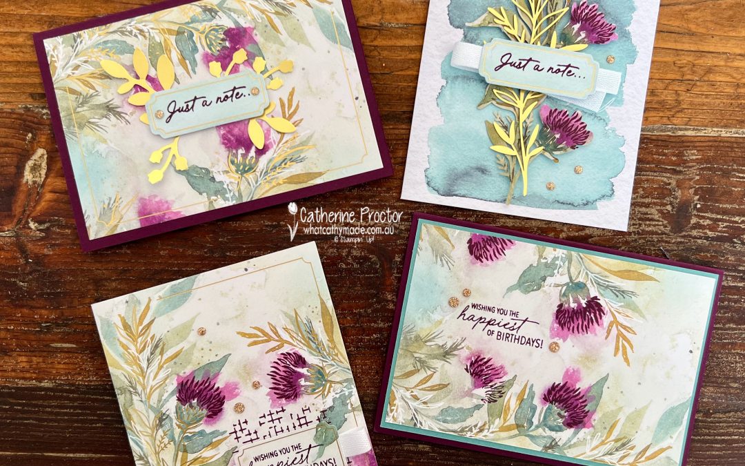
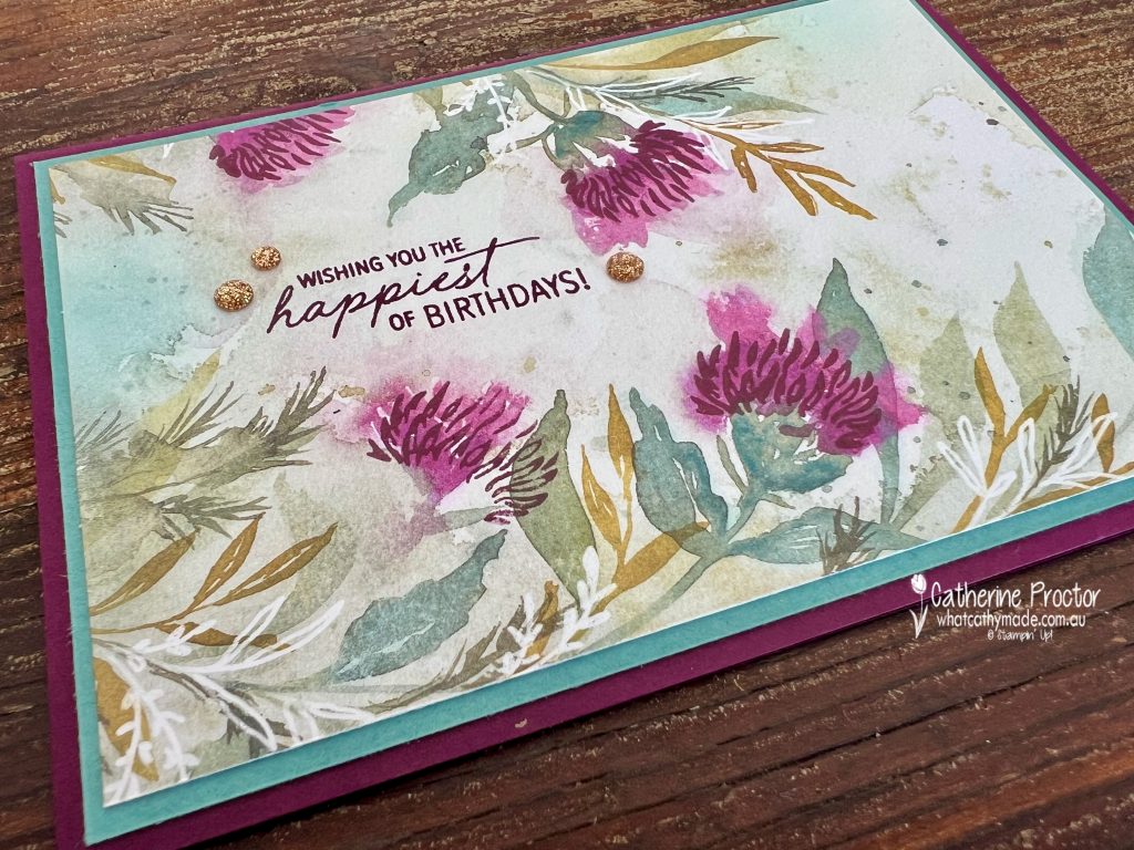
This week we’re featuring Blackberry Bliss, a very dark berry colour that has recently moved from the Regals family to the Neutrals.
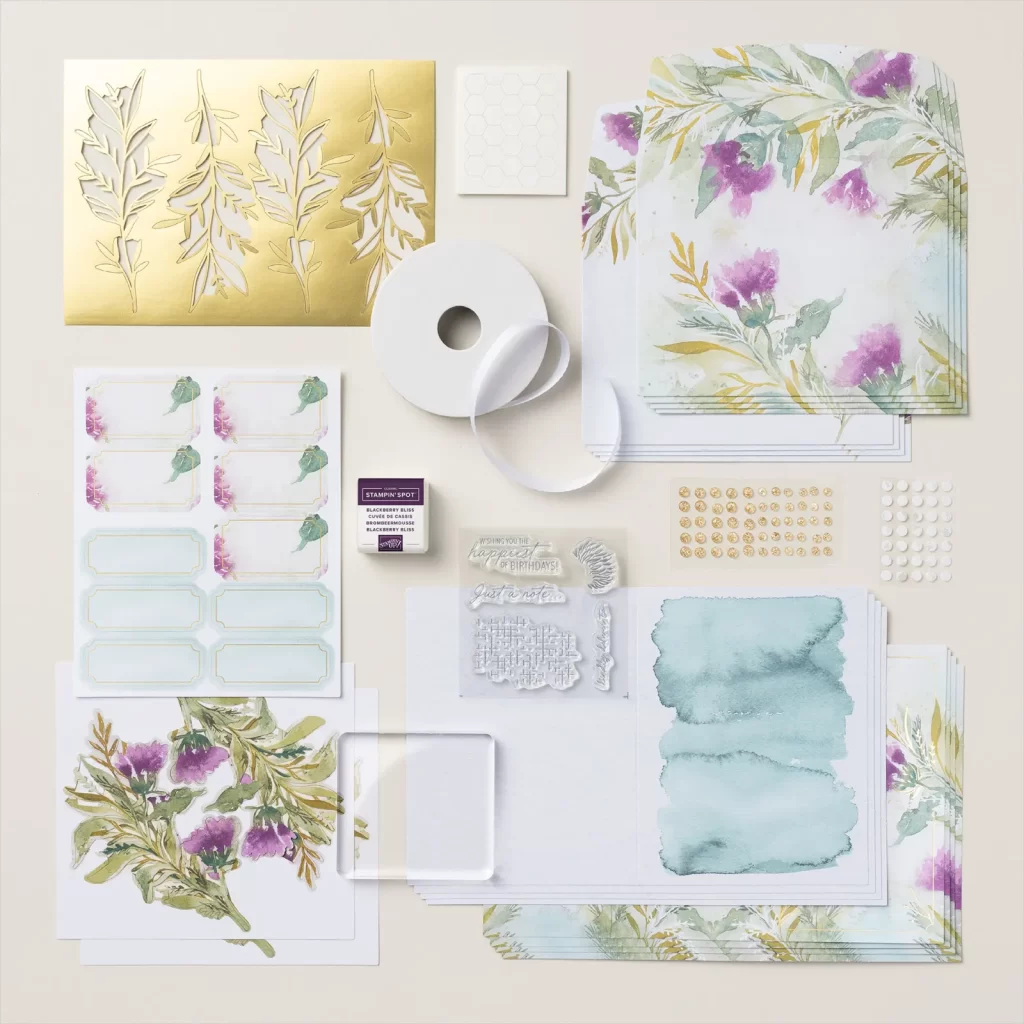
It was a great opportunity to crack open my new Expressions of Kindness Kit.
My colour scheme is the colours included in this kit: Blackberry Bliss, gold foil, Lost Lagoon, Mossy Meadow, Petunia Pop, Pretty Peacock, Wild Wheat.
The Expressions of Kindness Kit is such great value for money. It comes with a full set of instructions, an acrylic block as well as everything you need to make 8 cards, 4 each of 2 designs. * Expressions of Kindness Photopolymer Stamp Set * Blackberry Bliss Stampin’ Spot * Roll of white ribbon * 8 printed card bases * 8 printed envelopes * Folded card: 5-1/2″ x 4-1/4″ (14 x 10.8 cm) * Printed die-cut images and gold foil labels * Adhesive-backed gold sparkle gems * Adhesive dots and Stampin’ dimensionals
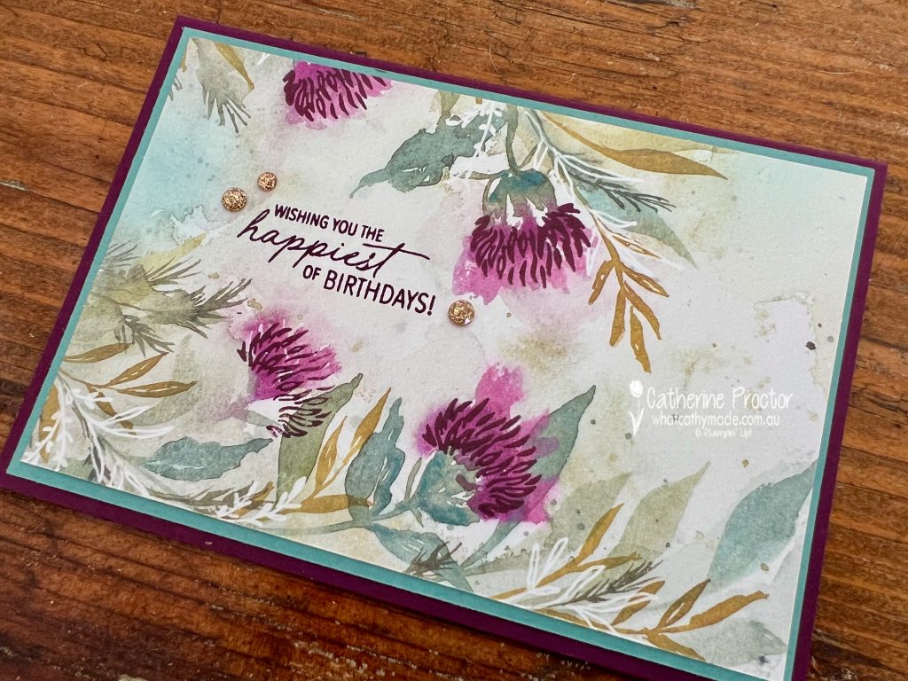
Here are the two card designs and envelopes made as per the kit instructions. The envelopes really are as stunning as the card bases!
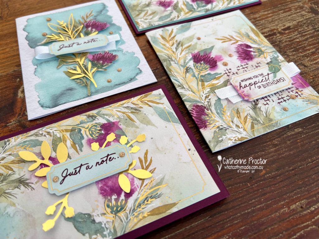
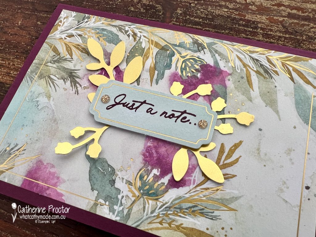
Then I went rogue and chopped up one of the gold foiled card bases to make two extra cards on Blackberry Bliss card bases. The design of these card bases extends to the back of the card as well as the front.
This is the “simple stamping” card I made using the back of the card base.
I stamped the sentiment directly only the patterned card and the thistle stamp onto the Blackberry Bliss flowers, adding a layer of Lost Lagoon card stock and some of the gold sparkly gems included in the kit.
My second card variation used the front of the card base and a spare sentiment label included in the kit. Can you guess how I made the gold sprigs?
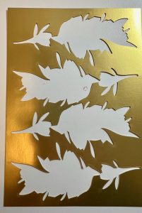
This is the leftover gold foil in the kit.
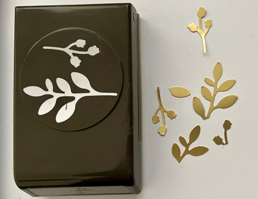
I used my Bough Punch to punch out sprig pieces from this gold foil.
I love this gorgeous kit and I know I’ll be using the stamp set on other projects as well as on the cards included in the kit.
Now it’s time to hop in over to our next participant, the lovely Kate Morgan – I can’t wait to see what Kate has made this week!
If at any time you find a broken link, you can find the complete list of all participants below.
Welcome to week ten of our Art With Heart 2024-25 Colour Creations blog hop!
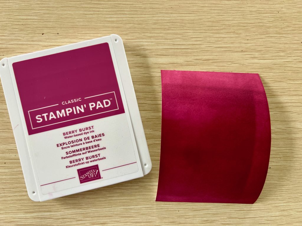
This week we’re featuring Berry Burst, a beautiful berry colour from the Brights family. I love this colour with Night of Navy and other shades of blue, however this is the colour combination I settled on for my card this week.
I’m away from home for a few days and was only able to take limited paper craft supplies with me to make my card. Let’s just say it was something to do with the number of wetsuits and surfboards in the card. And okay, maybe also a tiny bit related to the sewing machine and quilt supplies that also accompanied us on our trip!
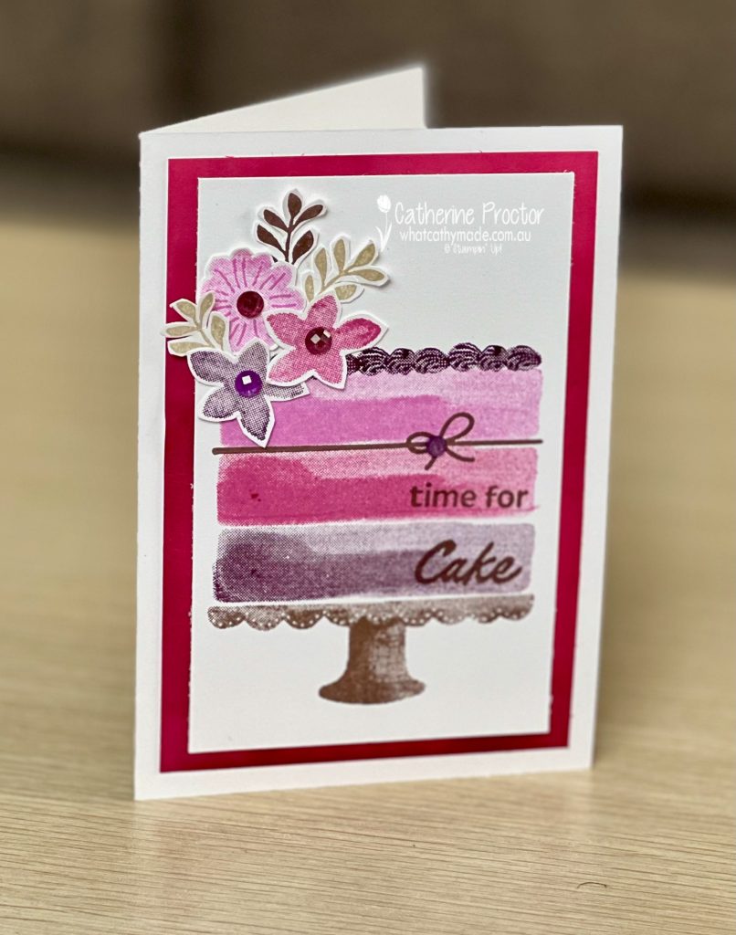
So whether we blame Pete or me, this week I have made a simple stamping card that only uses a stamp set, paper snips, ink pads, embellishments and a pack of note cards with envelopes. There is no die cutting, punches or embossing. And it was super fun to make!
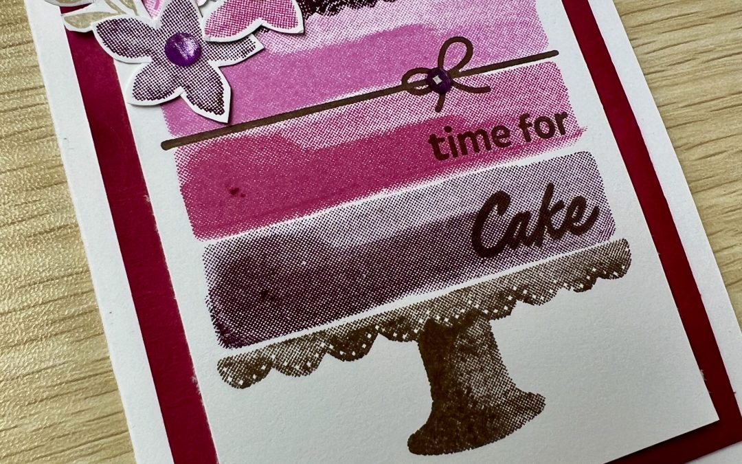
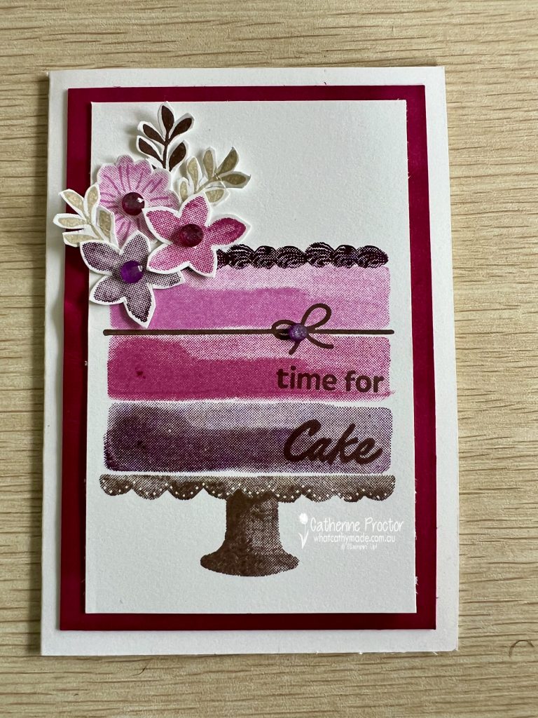
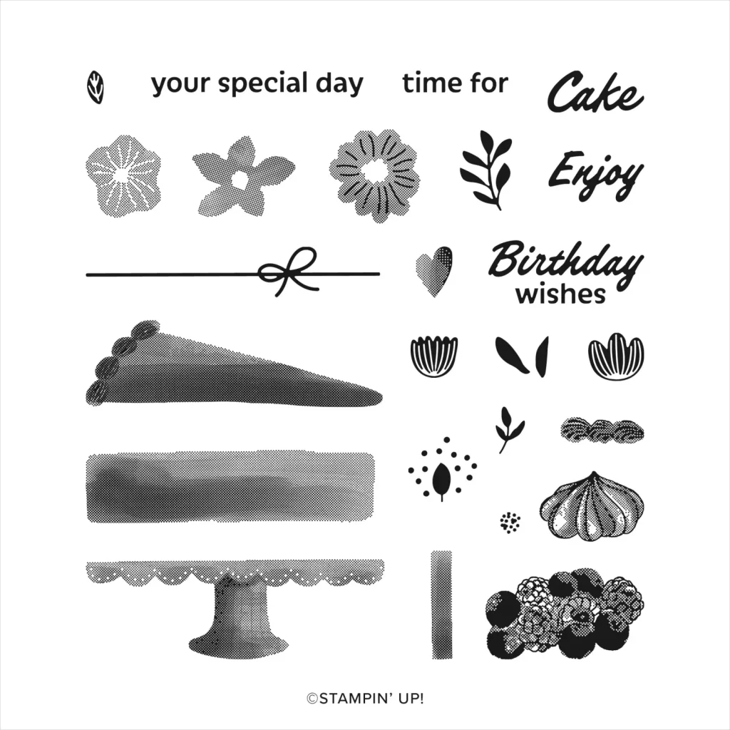
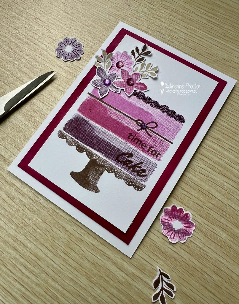
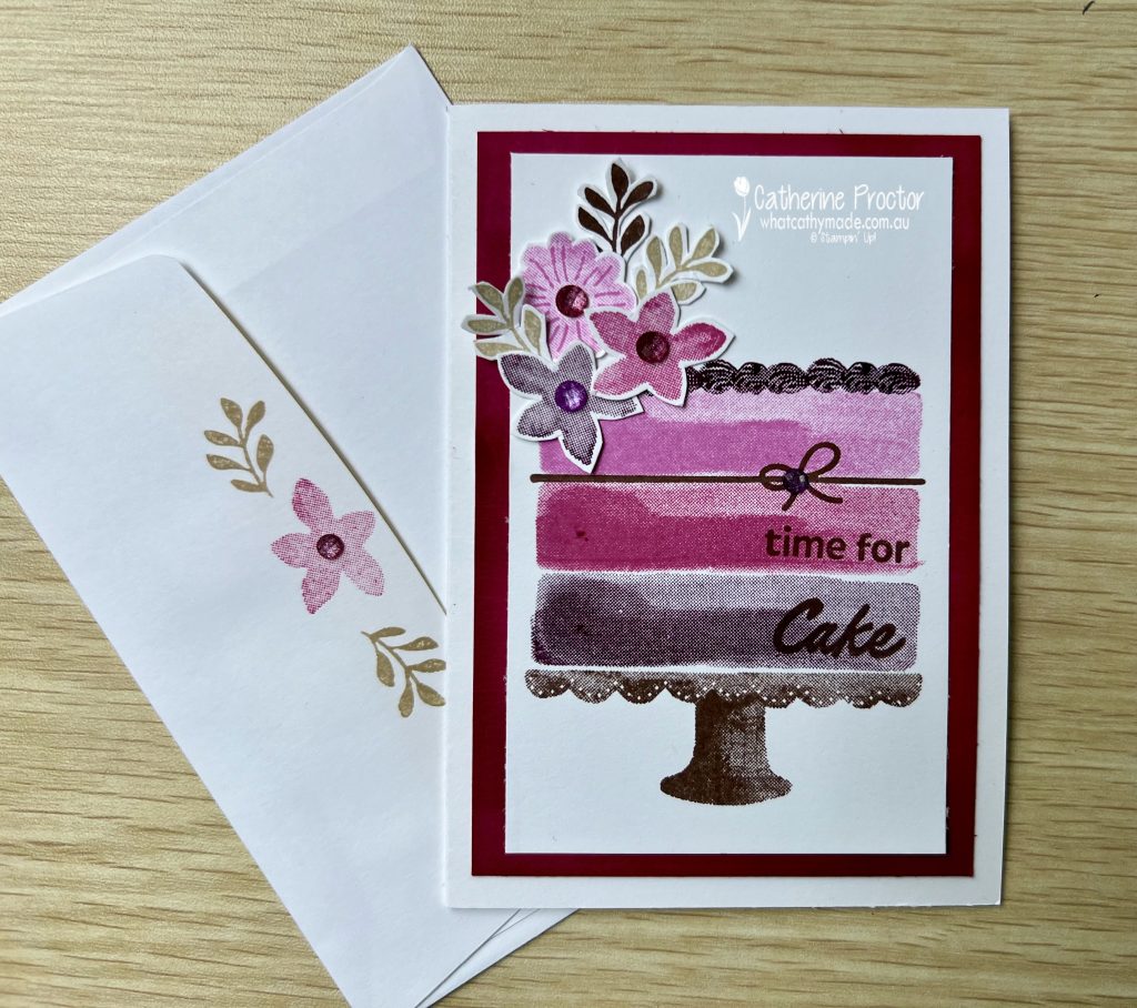
I love this new stamp set called the Cake Fancy Stamp Set. It has so many tiny little cake decorating elements to play with, just like decorating a cake.
I forgot to bring Berry Burst cardstock with me so I made my own by swiping my Berry Burst stamp pad over a piece of a notecard. The hairdryer in a our caravan park cabin was perfect for drying it – I’m sure it had never been used this way before!
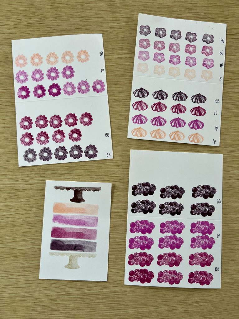
I stamped multiple stamps in the different ink colours to see how the ink colours I’d bought away with me looked together.
Poor old Petal Pink was rejected as I decided on a monochromatic colour combo instead, stamping an Early Espresso cake stand, ribbon and leaves; Crumb Cake leaves: Blackberry Bliss bottom cake layer, flower and piped icing; Berry Burst middle cake layer and flower: Petunia Pop top cake layer and flower.
It was super easy to fussy cut the flowers and leaves for the top of the cake – they add a wonderful dimension to the card.
The sentiments were stamped right onto the cake layers in Early Espresso. I love the effect this gives to the card!
Purple Fine Shimmer Gems add a touch of bling and I stamped a notecard envelope flap to match.
Now it’s time to hop in over to our next participant, the lovely Di Furniss – I can’t wait to see what Di has made this week!
If at any time you find a broken link, you can find the complete list of all participants below.
Welcome to week nine of our Art With Heart 2024-25 Colour Creations blog hop!
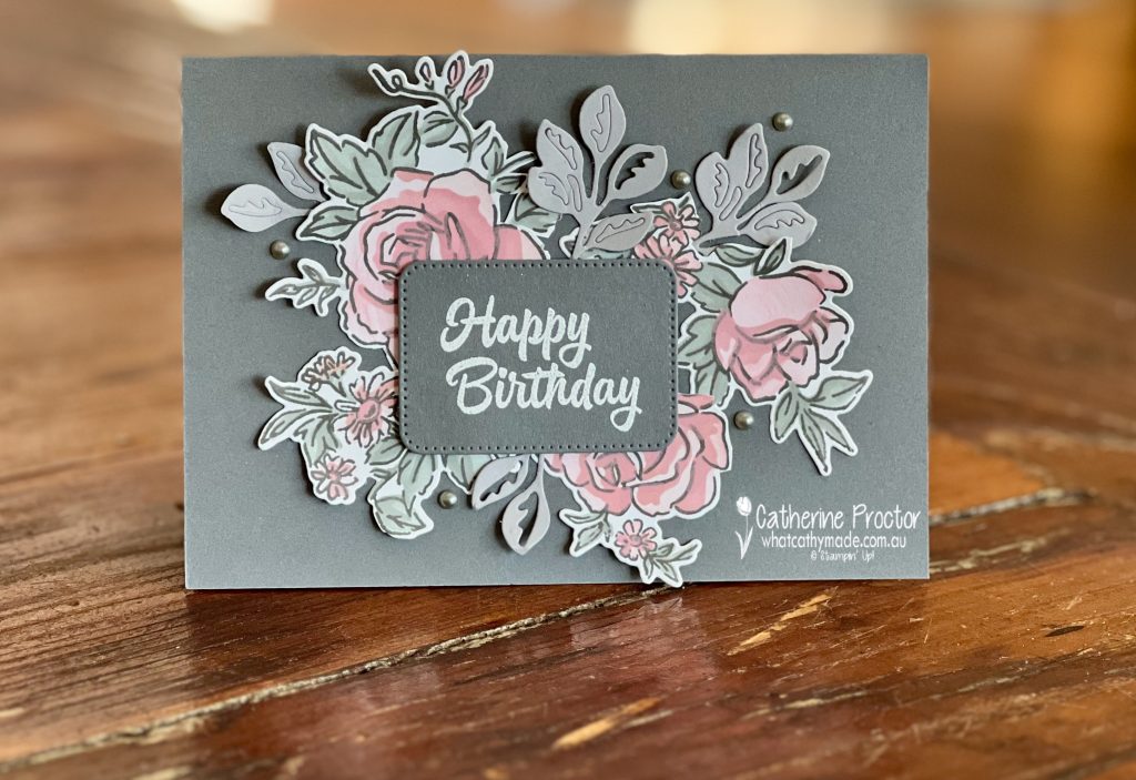
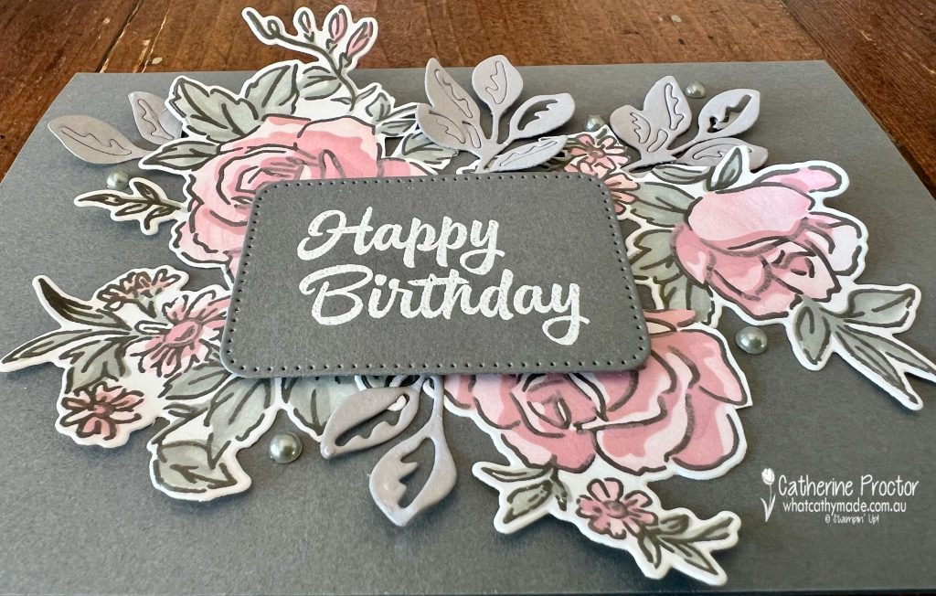
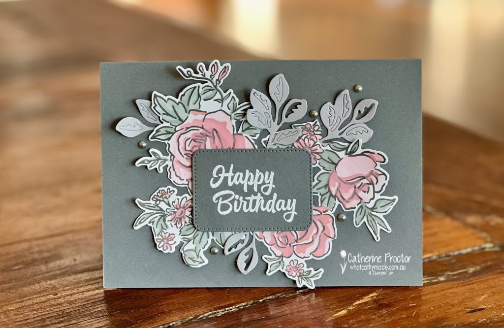
This week we’re featuring a dark gray neutral called Basic Gray. Although this is a great colour for landscape scenes and masculine cards, I decided to show how it can also work well for a feminine card.
This is the colour combination I’ve used for my card.
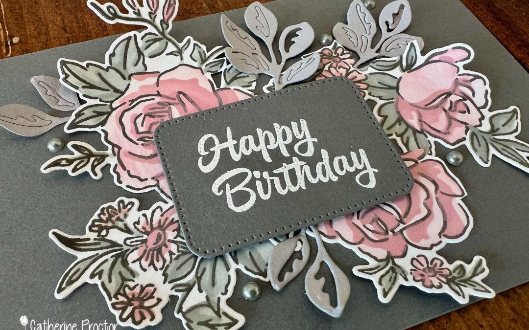
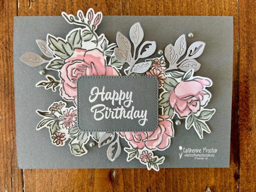
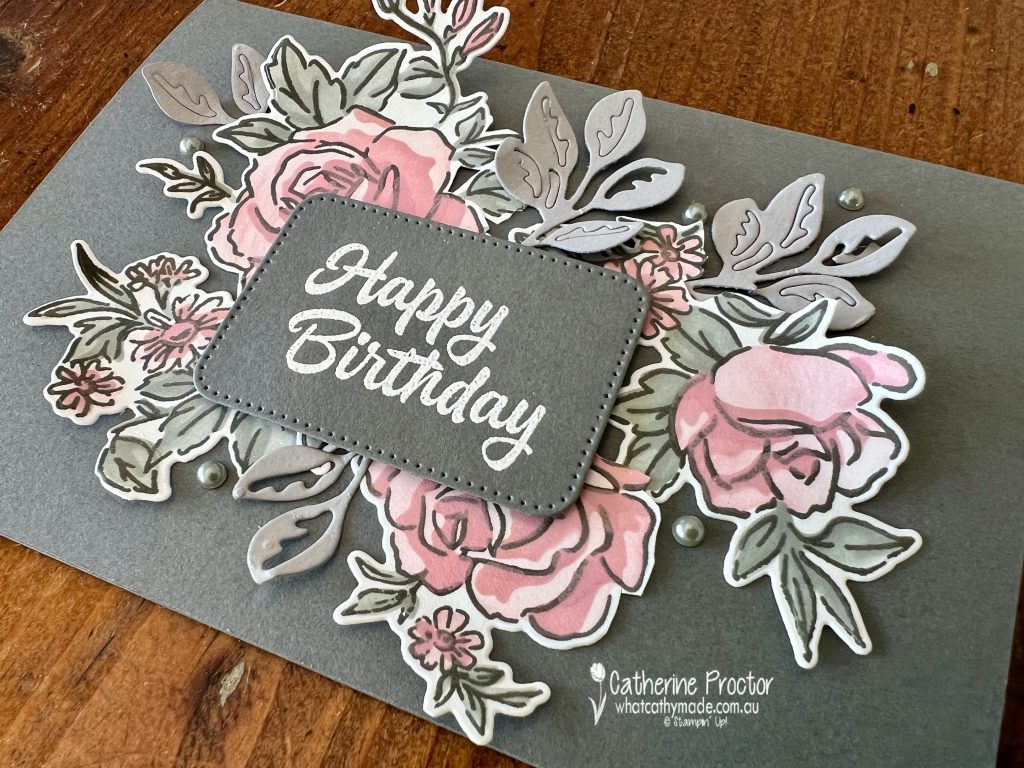
I can’t stop using this stunning Layers of Beauty bundle. For masks 1, 2 and 3 I’ve used Pretty in Pink. The colour gets darker every time I add another mask layer.
The leaves in the main stamped image are masked in Basic Gray.
After stamping and colouring the large floral image from the Layers of Beauty stamp set I cut it apart and arranged it on the card behind the white heat embossed “Happy Birthday” sentiment.
I’ve added some extra die cut Smoky Slate leaves using dies from the Layers of Beauty dies, finishing the card with Basic Gray Pearls.
Now it’s time to hop in over to our next participant, the lovely Ros Davidson – I can’t wait to see what Ros has made this week!
If at any time you find a broken link, you can find the complete list of all participants below.
Welcome to week eight of our Art With Heart 2024-25 Colour Creations blog hop!
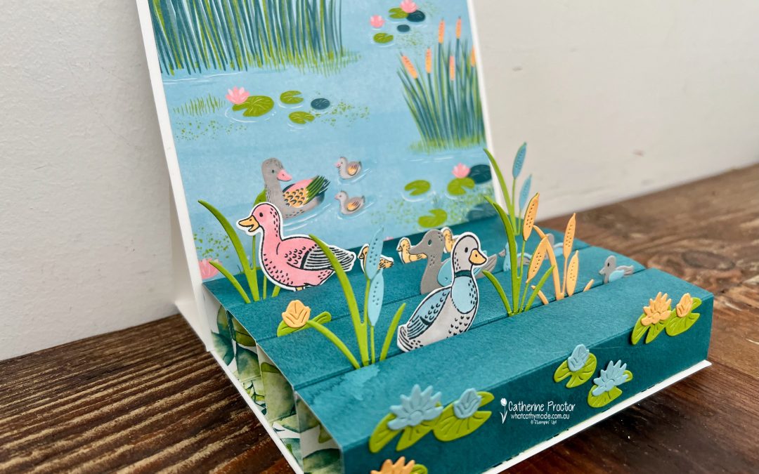
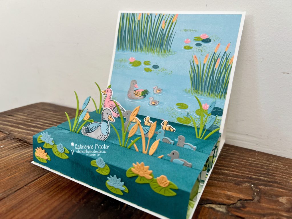
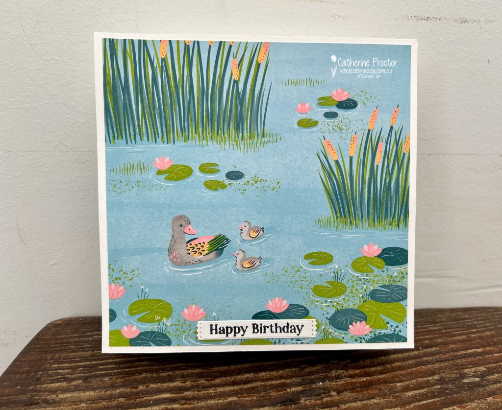
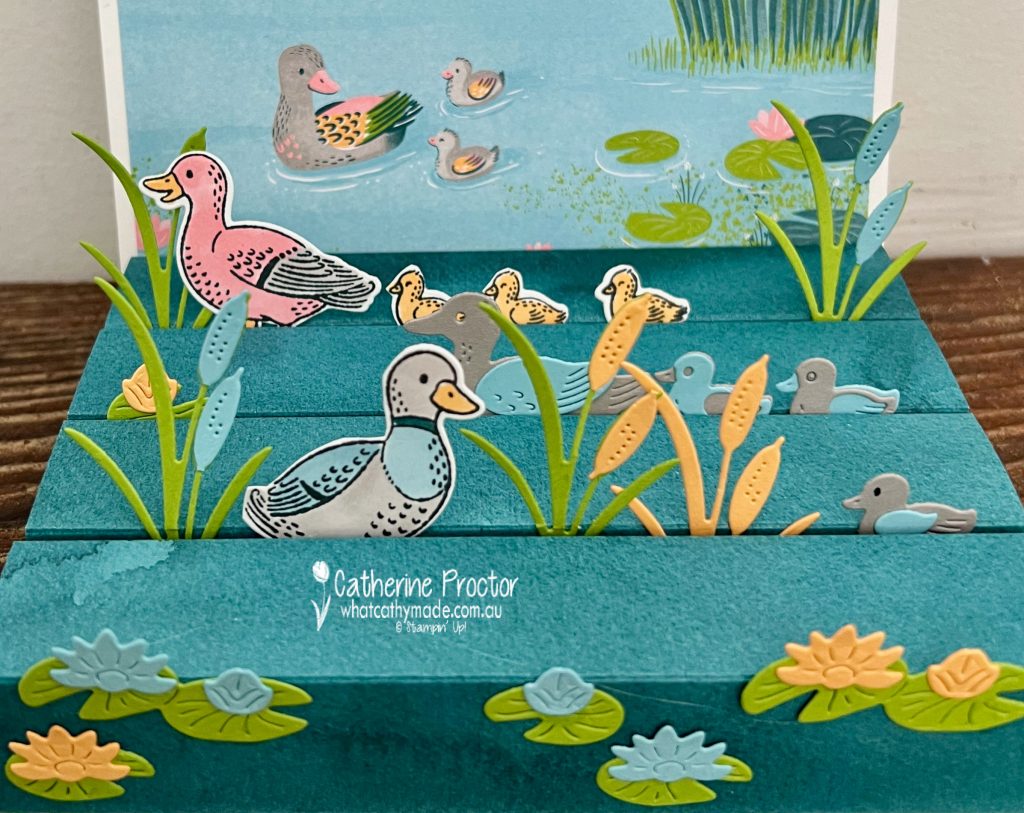
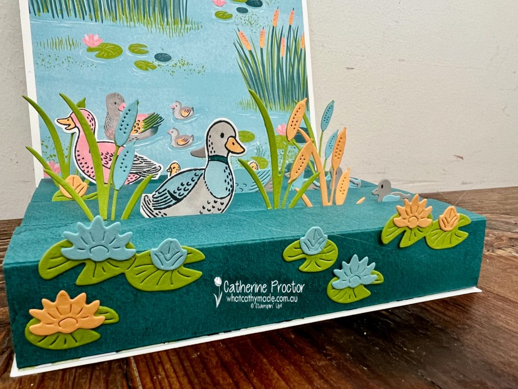
This week we’re featuring a lovely soft blue colour called Balmy Blue and I’ve created a duck pond scene card using the Lily Pond Lane suite.
The colours in my duck pond card are the colours from the Lily Pond Lane DSP: Balmy Blue, Granny Apple Green, Gray Granite, Peach Pie, Pretty In Pink, Pretty Peacock.
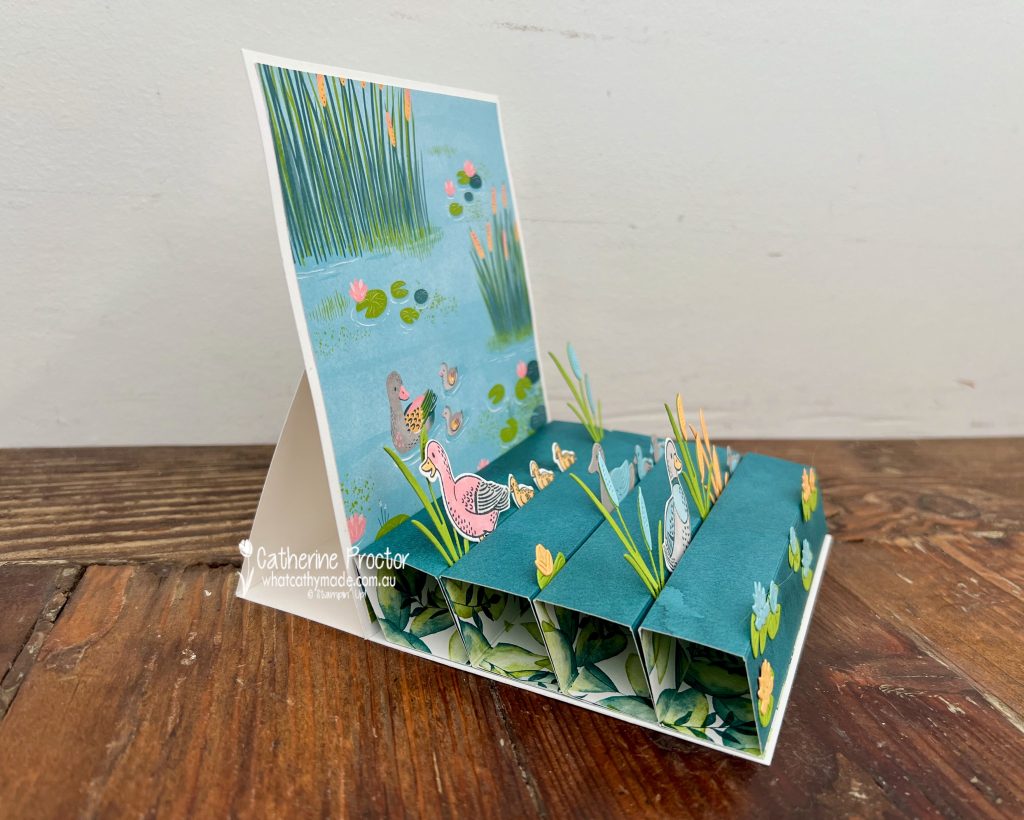
Call me Cathy or call me crazy (most people do!) for this week’s card I decided at the very last minute to make a fancy fold that I had no instructions for. This fancy fold is called an easel block card, a block easel card or a pop-up block easel card.
Here’s a video that show how this card opens up and looks from the side.
The easel card base is a 6 x 12 piece of Basic White cardstock, scored and folded at 6 inches and 3 inches.
A 6 x 6 piece of Basic White cardstock attached to the front 3 x 6 part of the easel card becomes the card front, decorated with a piece of Lily Pond Lane DSP ( 1/4 inch trimmed off the top and one side) and the Happy Birthday sentiment from the Lily Pond Lane stamp set .
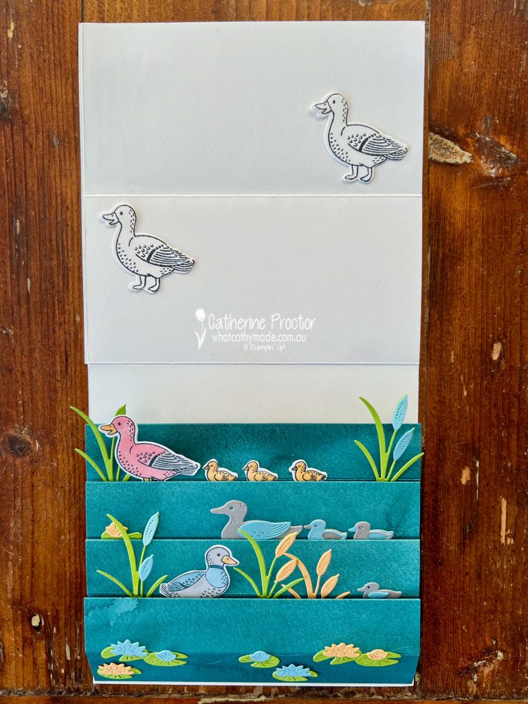
Here’s what it look like when opened up to reveal the inside. You can write your message on the top half of the inside of the easel fold. I’ve just laid a couple of extra ducks here for this photo.
This top view (with easel folded over) shows how the blocks in this fancy fold hold the different elements at different depths. This is why this is such a great fancy fold for creating scene cards – you simply slot them in and adhere them.
To make the blocks at the base I used a 12 x 12 sheet of the Delightful Florals DSP in Pretty Peacock. Each block measures 5 3/4 x 5 3/4 inches, scored and folded at 1, 2, 3 and 4 inches.
I folded each piece of DSP along the score lines to create a 1 inch square block adhered with Tear-n-tape and then laid them side by side inside the card base, adhered again with Tear-n-tape.
I used scraps of Balmy Blue, Granny Apple Green, Gray Granite, Peach Pie, Pretty In Pink and Pretty Peacock cardstock to die cut the ducks, ducklings and vegetation, as well as Stampin’ Blends for colouring in the stamped and die cut ducks and duckings.
The lily pads were adhered to the front of the card and these blocks all fold back to lie flat so the card can be placed into an envelope.
Now it’s time to hop in over to our next participant, the lovely Andrea Sargent – I can’t wait to see what Andrea has made this week!
If at any time you find a broken link, you can find the complete list of all participants below.