In my family a lot of our birthdays fall in both July and December. One of the July birthdays we have just celebrated is for my niece Mimi, who has just turned three.
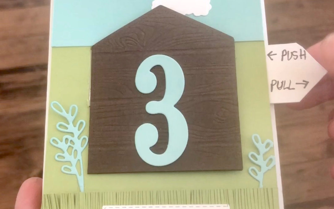
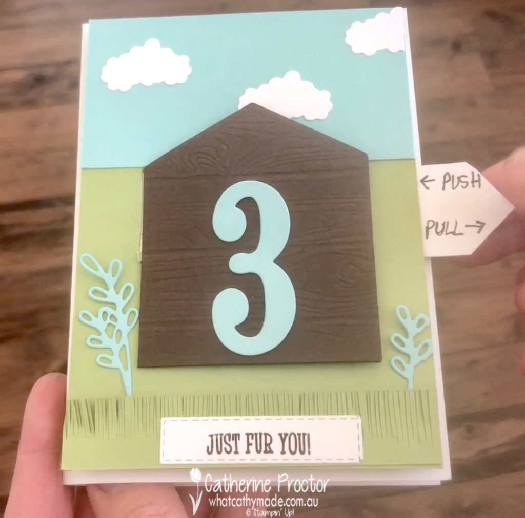
Because Mimi is obsessed with my dog, Superman, I decided to use the Happy Tails stamp set to create a special type of pop-up card for her birthday.
I used Kylie Bertucci’s video tutorial HERE to learn how to create the pop up tab mechanism, but altered the design of the card to suit the products I had available.
Here’s a short video of my card. I love cards that move!
The dog house is created by embossing Early Espresso card stock with the Pinewood Planks embossing folder and the grass is simply hand snipped from Pear Pizzaz card stock using my paper snips. The clouds are die cut using a die from the new Detailed Peacock dies.
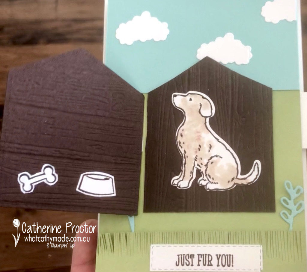
Inside my card I’ve used the Happy Tails stamp set and matching Dog Builder punch to create a surprise Superman for my niece.
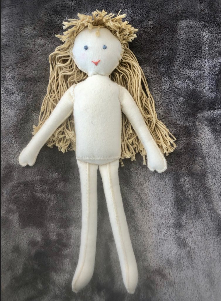
I also had a lot of fun making Mimi’s birthday present: a handmade felt doll.
I also made her a hand knitted and hand sewn wardrobe, including flannelette pjs and her very own felt Miffy Doll (Mimi’s favourite toy!).
And yes, you guessed it, her favourite colour is purple!
To purchase any of the products I used in this project you can shop with me here.
Or if you’d like me to post you your very own copy of any of the brand new 2019-20 Stampin Up! catalogue or find out about more about Stampin’ Up! contact me.
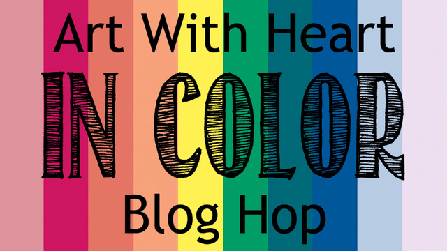
Tonight the Art With Heart Team are sharing creative projects featuring in colour theme. Check out the new 2019 – 2021 in colours and let’s not forget the current 2018 – 2020 in colours.
If you would like a copy of the 2019 – 2020 annual catalogue, contact any of the girls on the blog hop and we will get in touch with you.
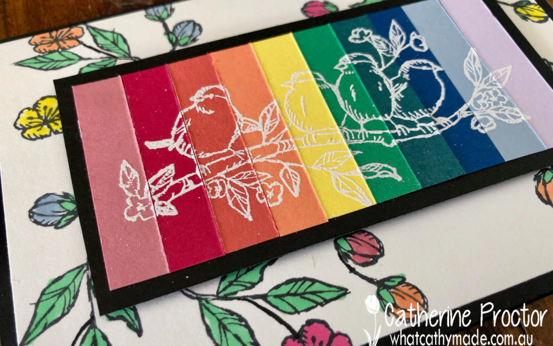
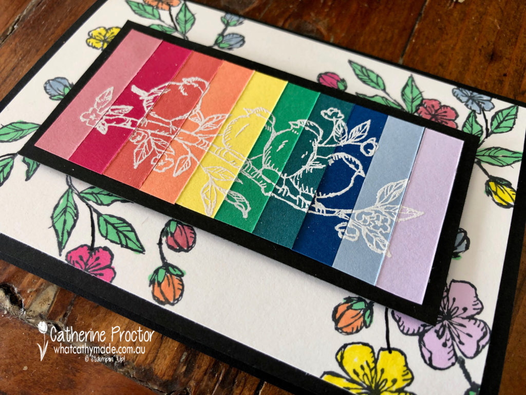
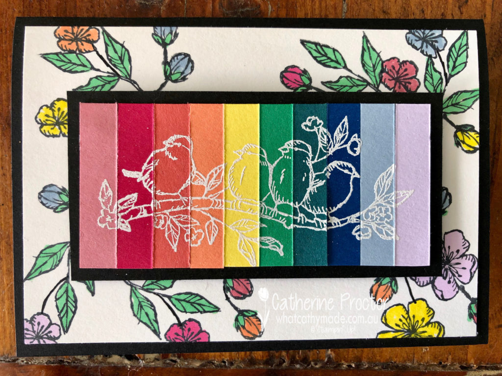
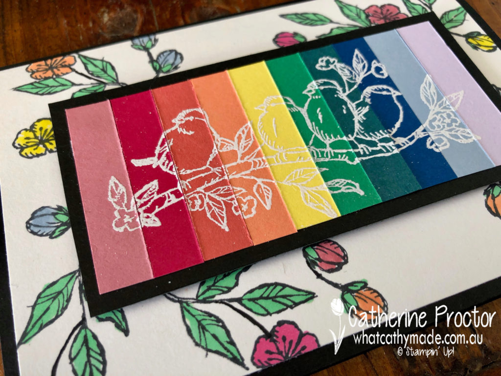
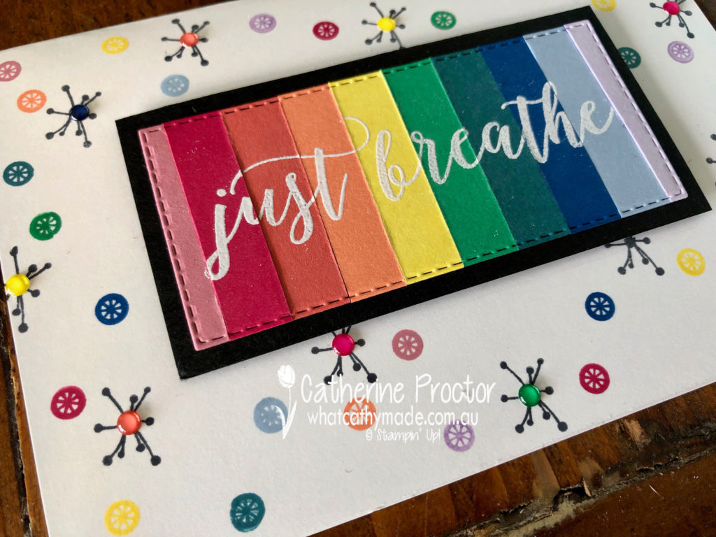
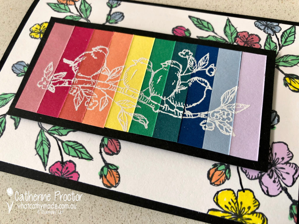
Why use just one In Colour when you can use all 10 together on your card. Lined up, side-by-side, they create such a stunning rainbow!
I’m excited to share not one but two cards with you this week.
The first card showcases all 10 In Colours, as well as the Free as a Bird stamp set.
The first step is to cut a 1cm strip of card stock from every In Colour. Line then up in rainbow order and adhere together with strips of tear and tape.
Next stamp your image or sentiment in Versamark, dust with white embossing power and heat emboss. Mount onto black card stock.
The background layer is a piece of Whisper White cardstock which has been stamped with black ink and coloured in with a variety of Blends and markers in the various In Colours. I love creating my own Designer Series Paper for my projects.
Mount the rainbow cardstock onto the middle of your DSP and adhere to a cardbase made from black cardstock.
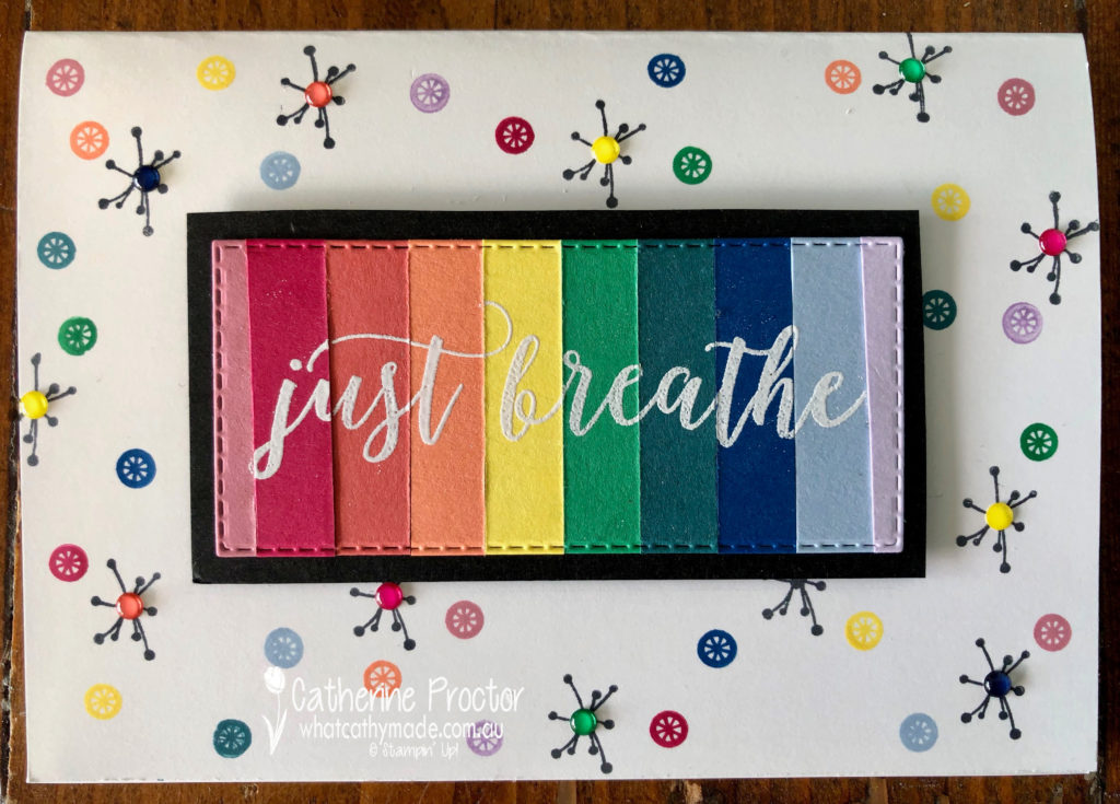
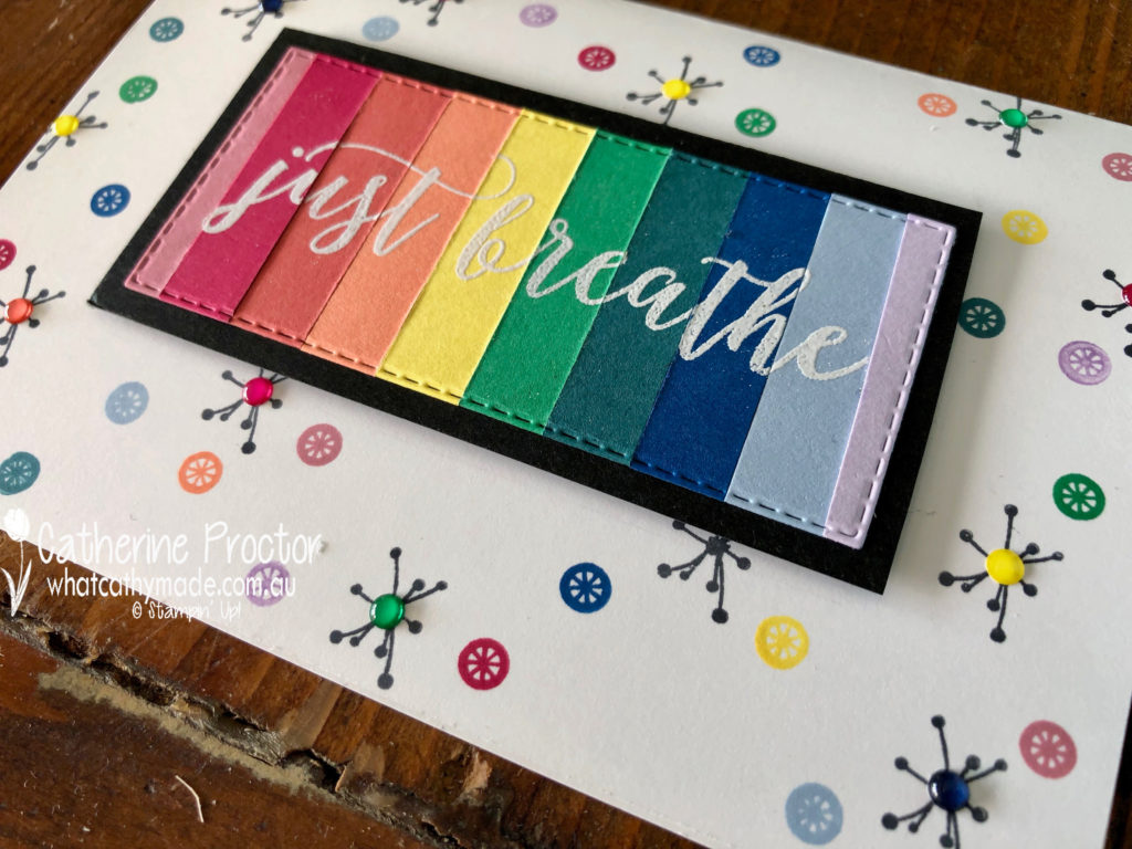
I wasn’t planning on making a second card but I had leftover rainbow strips so I decided to see what they looked like with a sentiment stamped on top.
This time I used the Colourful Seasons stampset for my sentiment and the home made DSP. I deliberately die cut the cardstock on an angle using a stitiched rectangle die to add visual interest.
The background was stamped with two of the smallest dies in black and In Colours. Happiness Blooms Enamel Dots add texture and interest.
These rainbow colours just make me feel very happy and I hope they also put a smile on the face of whoever I post them to.
Now it’s time to hop on over to our next participant, the very talented, Kathryn Mangelsdorf.
If you find a broken link or have come to this blog hop from a different entry point, you can view the participants below:
Tonight the Art with Heart team are sharing creative products using supplies from the upcoming 2019 – 2020 annual catalogue.
If you would like a copy of the brand new annual catalogue, contact any of the girls on the blog hop and we will get in touch with you.
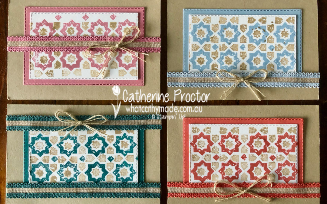
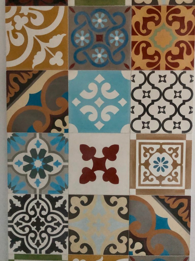
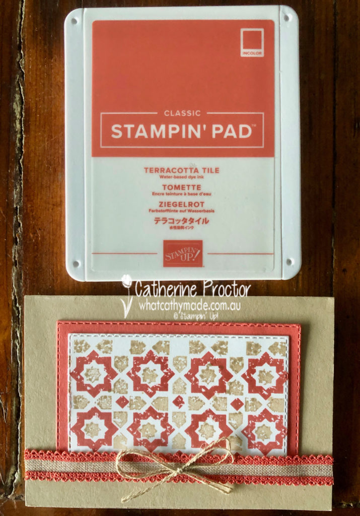
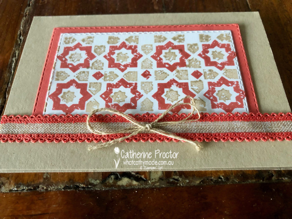
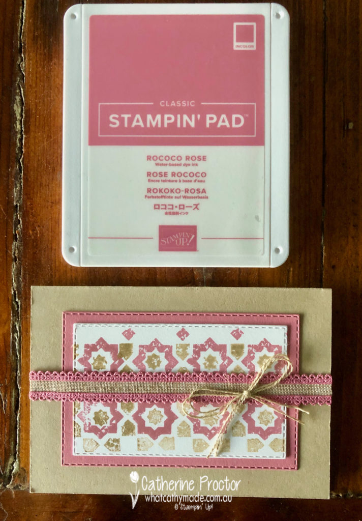
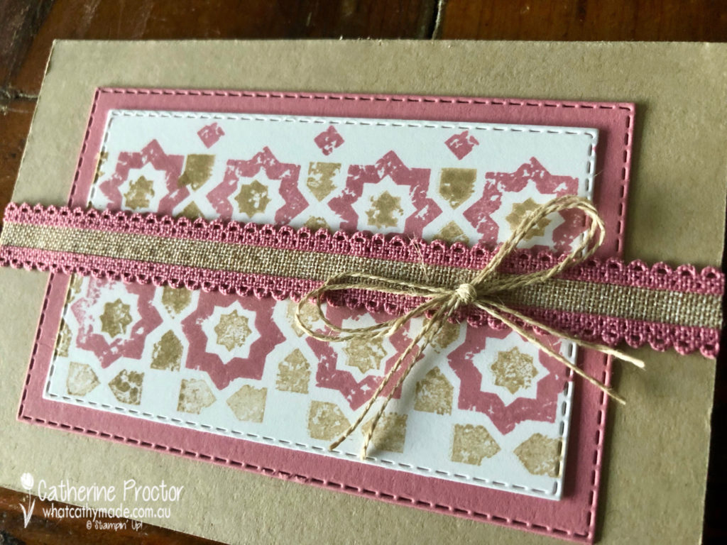
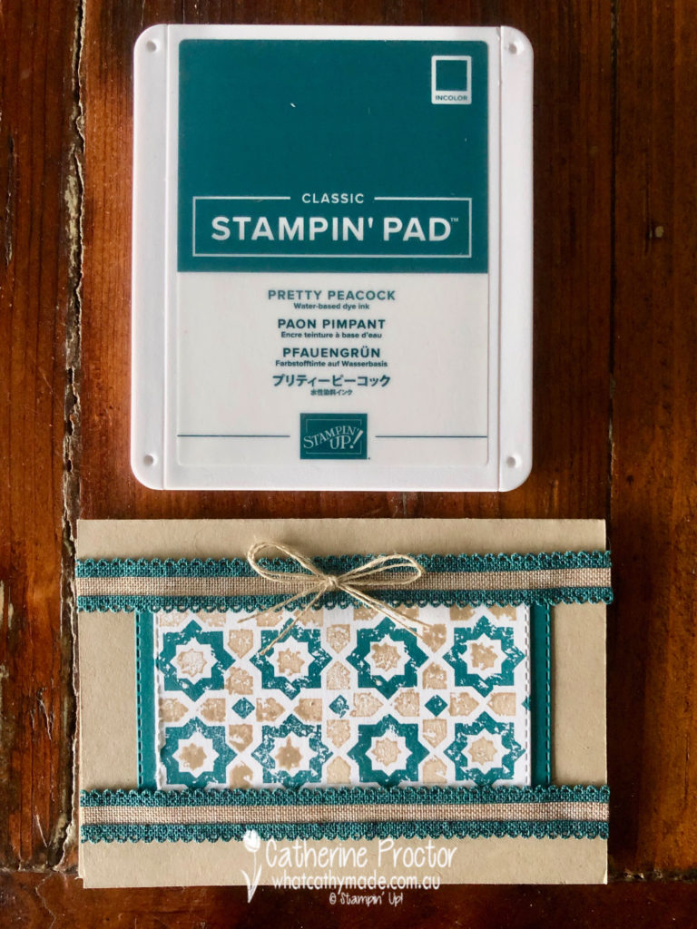
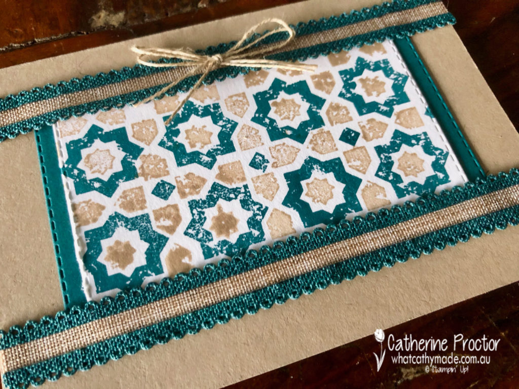
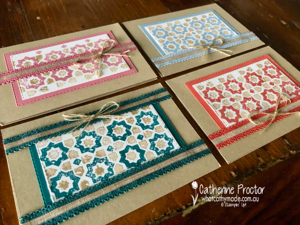
My cards tonight were inspired by the splashback in my powder room. It goes all the way from the basin to the ceiling but here’s just a snippet of these beautiful encaustic tiles.
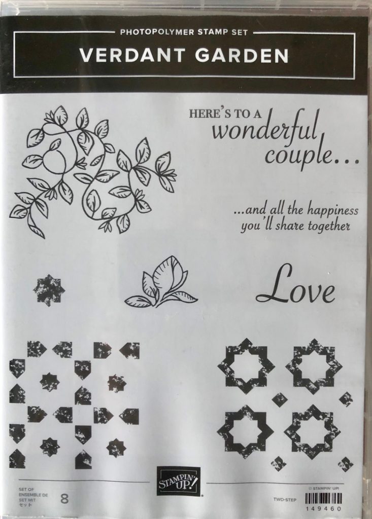
As soon as I saw the new Verdant Garden stamp set I knew I would use it to make a card inspired by the tiles in my splashback.
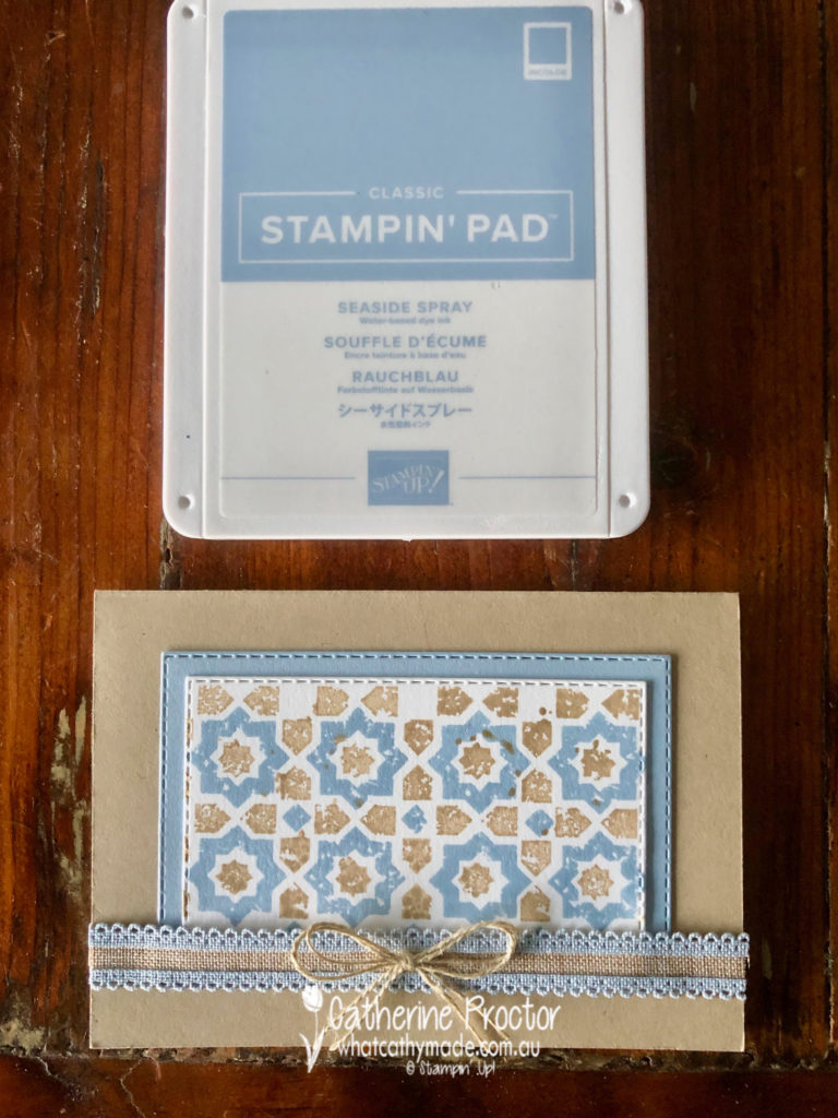
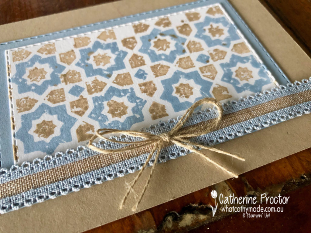
Combined with the colour scheme of the Scalloped Linen Ribbon (oh be still my beating heart!!!) it also proved to be an excellent opportunity to introduce you to the new 2019-20 in colours.
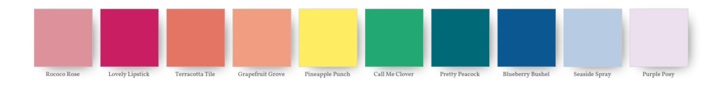
First cab off the rank? Seaside Spray.
Seaside Spray is definitely one of my new favourite colours. How good does it look with Crumb Cake? (And yes I have deliberately referenced ScoMo for his incredibly versatile “motherhood and apple pie” statement).
Next, I’d like to introduce you to Terracotta Tile. I think Terracotta tile is going to get on famously with its closest cousin, Cajun Craze.
Rococo Rose is another new favourite, such a soft and gentle pink I just know I’ll be using a lot.
Pretty Peacock is very dark and rich – I can’t wait to team it with Night of Navy!
There is one more lovely 2019-202 in colour called Purple Posy that I haven’t included this week because the ink pad is not orderable yet. If you’re wondering what it looks like it’s a very pale purple, sort of a love child of Highland Heather and Smokey Slate.
Here’s a closer look at the other 4 in colours.
Now it’s time to hop on over to our next participant, the very talented, Rachel Palmieri.
If you find a broken link or have come to this blog hop from a different entry point, you can view the participants below:
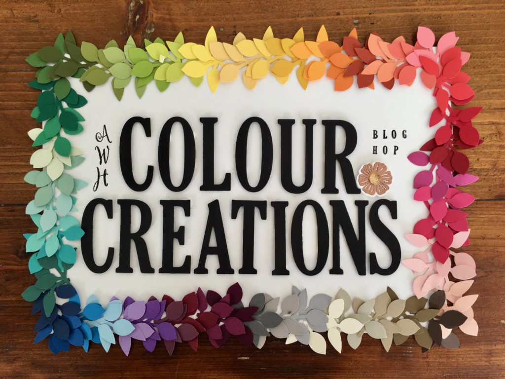
Welcome to week 46 of the Art With Heart Colour Creations Blog Hop!
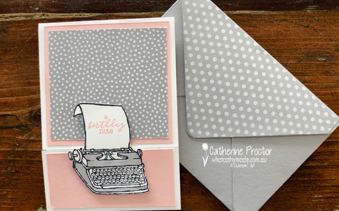
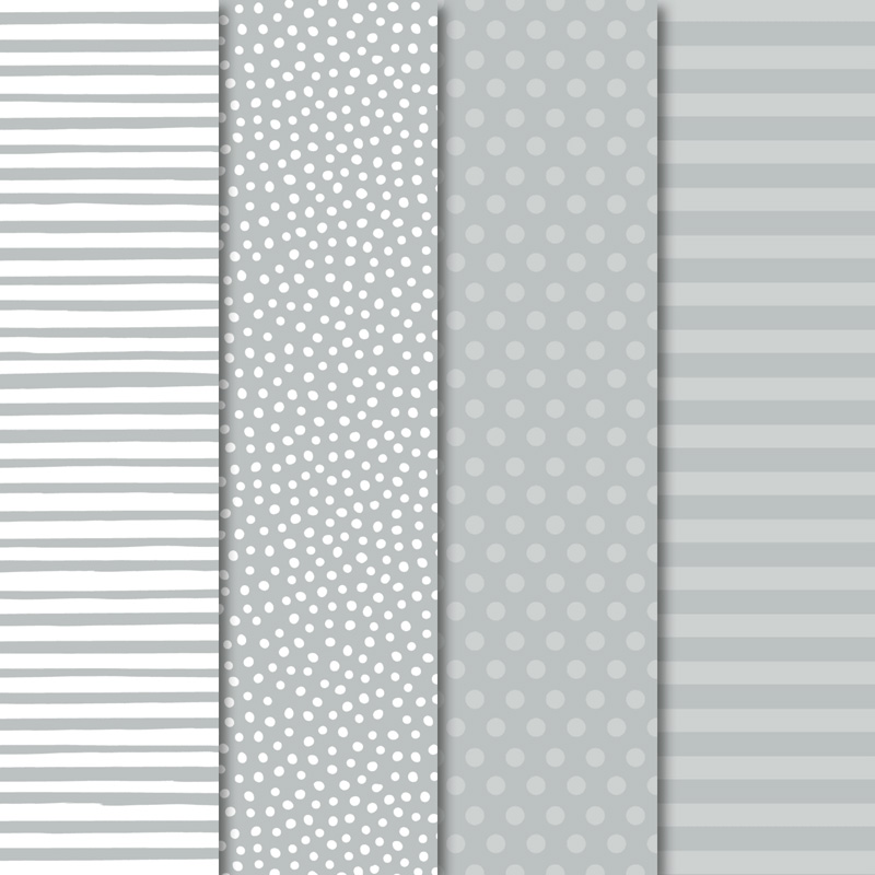
Our colour this week is a very light neutral colour: Smokey Slate.
Because these neutrals go with every colour I thought it would be a perfect colour to showcase our retiring In-Colours in a series of cards that use other retiring products too.
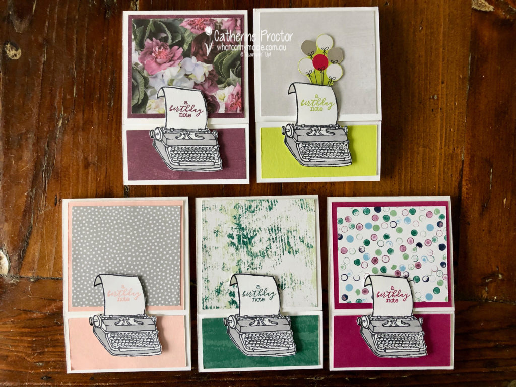
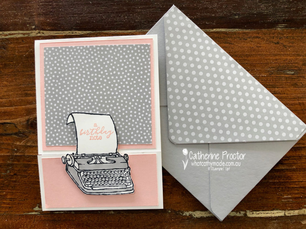
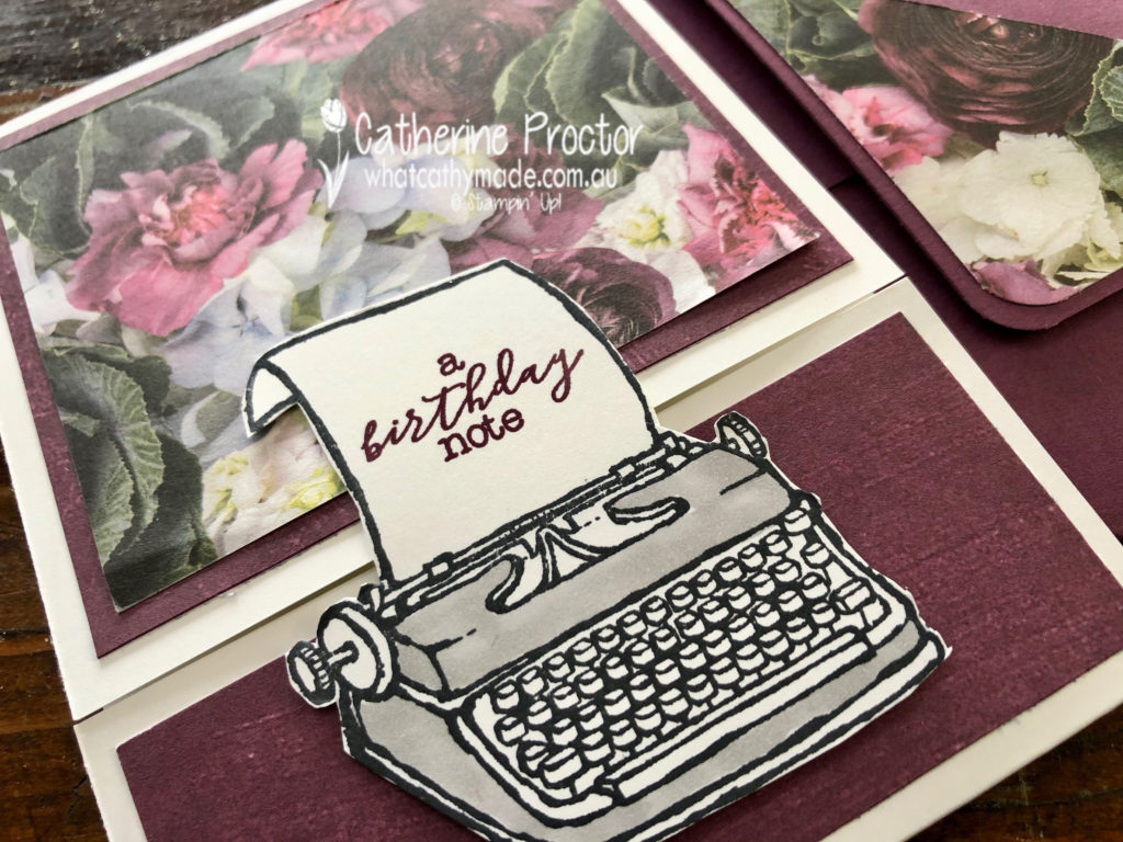
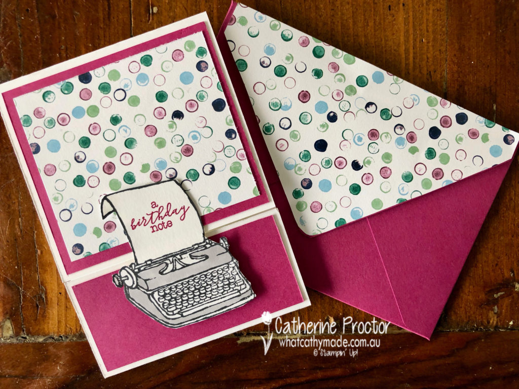
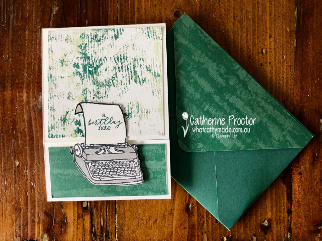
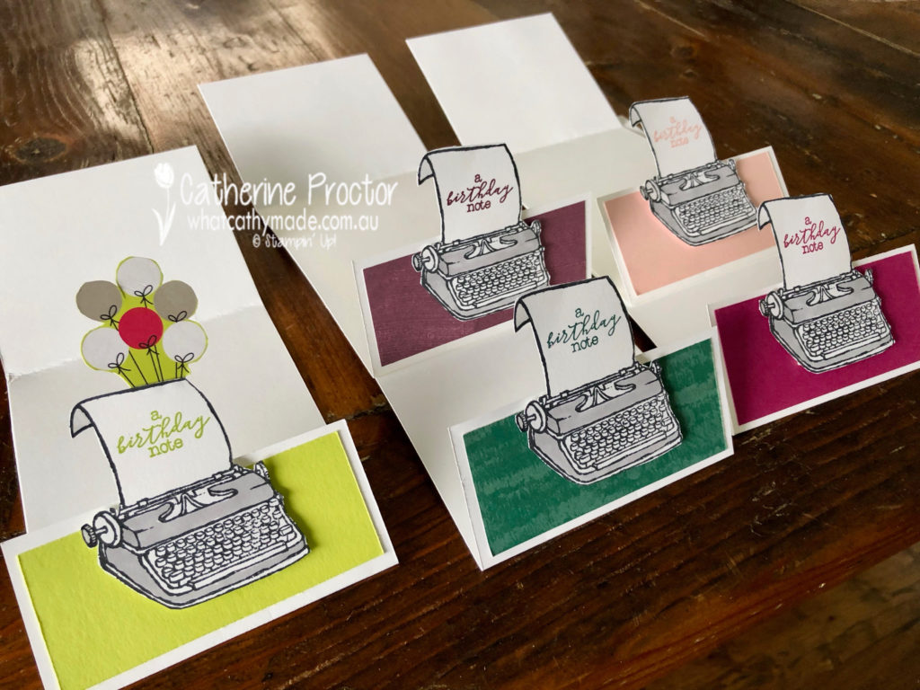
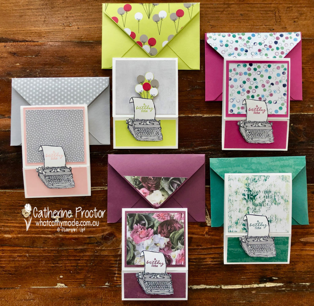
I like to call this set my typing pool!
I decided to use the delightful “P.S. You’re the Best stamp set” as it was just perfect for my friend Bruce. I’m going to his 50th birthday party this weekend and he is an author and currently writing his next book.
I think I’ll give Bruce the Lemon-lime twist card with the festive balloon paper from the Broadway Bound Designer Series Paper.
What I really like about this stamp set is that you can use it with any colour to make either male or female cards. The Powder Pink card is very feminine.
The Fresh Fig card is also very feminine, using the Petal Promenade DSP
The Berry Burst card and the Tranquil tide card could work for men or women and both use the Tranquil Textures DSP.
My favourite thing about my typing pool cards is the way they open…it is a type of fancy fold but I’m not sure what it’s called!
Another fantastic retiring product I used was the Envelope punch board to make a matching envelope for each card.
To see what the rest of the team have created, click on the links below.
To purchase any of the products I used in this project you can shop with me here. Or if you’d like me to post you your very own copy of any of the Stampin Up! catalogues or find out about more about Stampin’ Up! contact me .
We will be back again next week showcasing a subtle colour: So Saffron. We hope you can along with us then.
Welcome to week 45 of the Art With Heart Colour Creations Blog Hop!
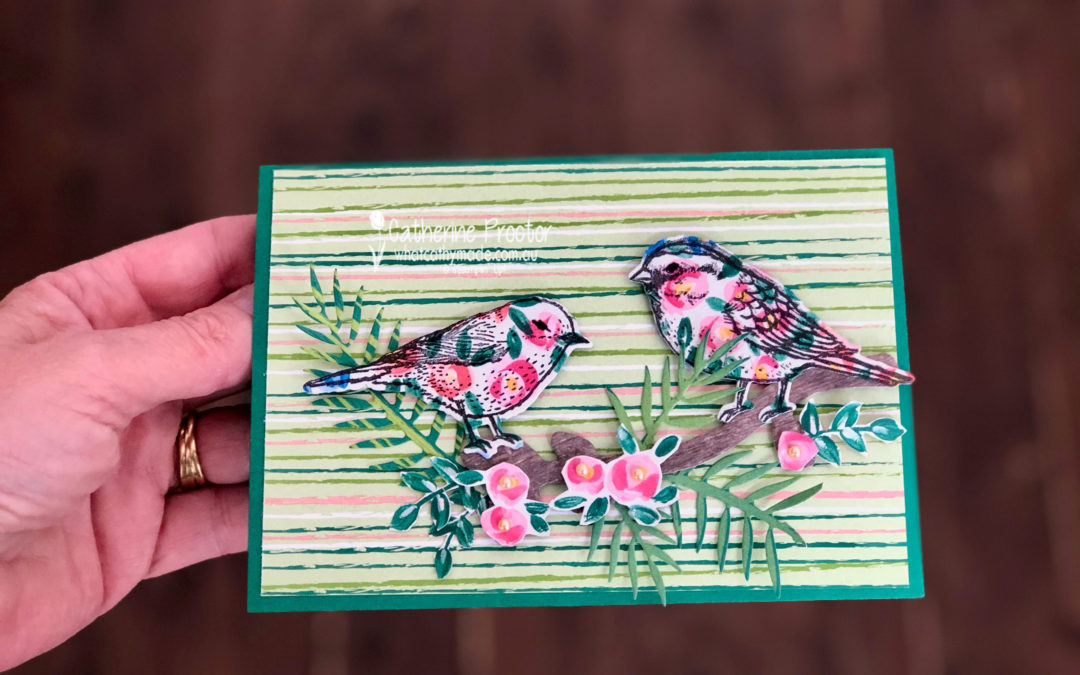
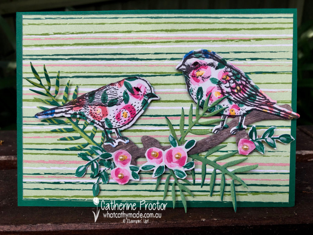
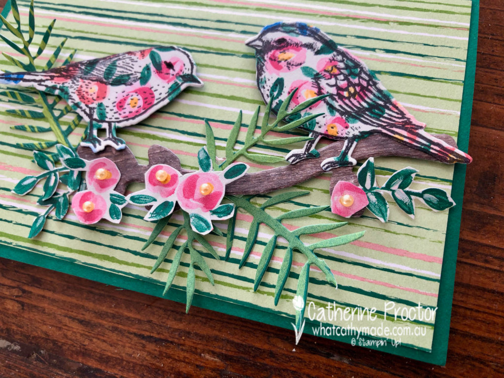
Our colour this week is a very dark regal colour: Shaded Spruce.
Stampin’ Up has some lovely Designer Series Papers that feature Shaded Spruce and I used two of these for my card today: Garden Impressions and Tropical Escape DSP.
My card uses a mix of die cutting and fussy cutting.
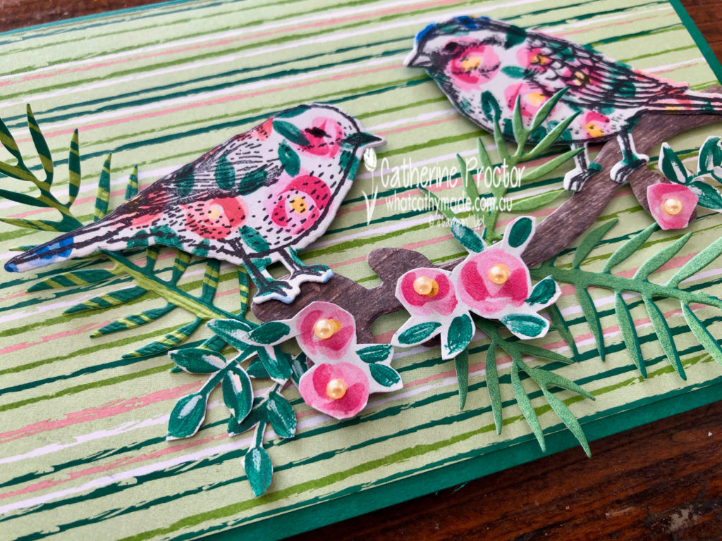
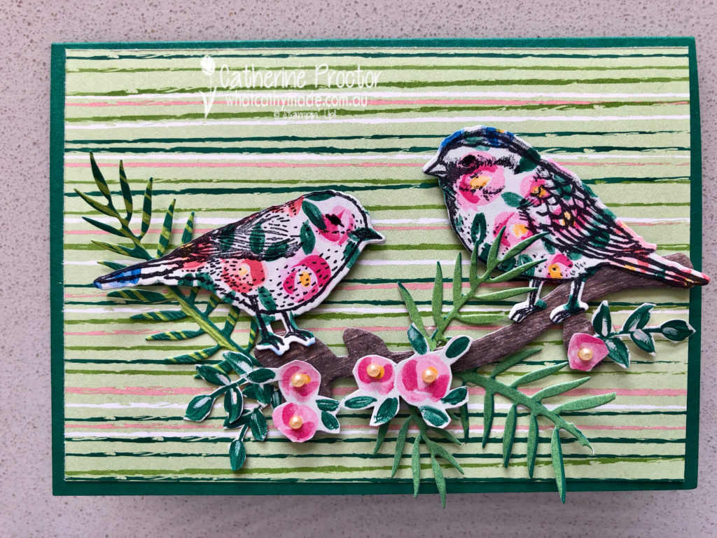
I stamped my birds in black ink onto the Garden Impressions DSP before die cutting them out. The branch they sit on has been die cut from the Wood Textures DSP.
The pink roses have been fussy cut from the Garden Impressions DSP, but the leaves have been die cut from the Tropical Escape DSP.
The card base is Shaded Spruce card stock topped with a rectangle of striped paper from the Tropical Escape DSP.
To see what the rest of the team have made click on the links below.
To purchase any of the products I used in this project you can shop with me here. Or if you’d like me to post you your very own copy of any of the Stampin Up! catalogues or find out about more about Stampin’ Up! contact me .
We will be back again next week showcasing a neutral colour: Smokey Slate! We hope you can along with us then.
Welcome to week 44 of the Art With Heart Colour Creations Blog Hop!
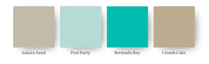
Our colour this week is one of the lightest neutral colours: Sahara Sand.
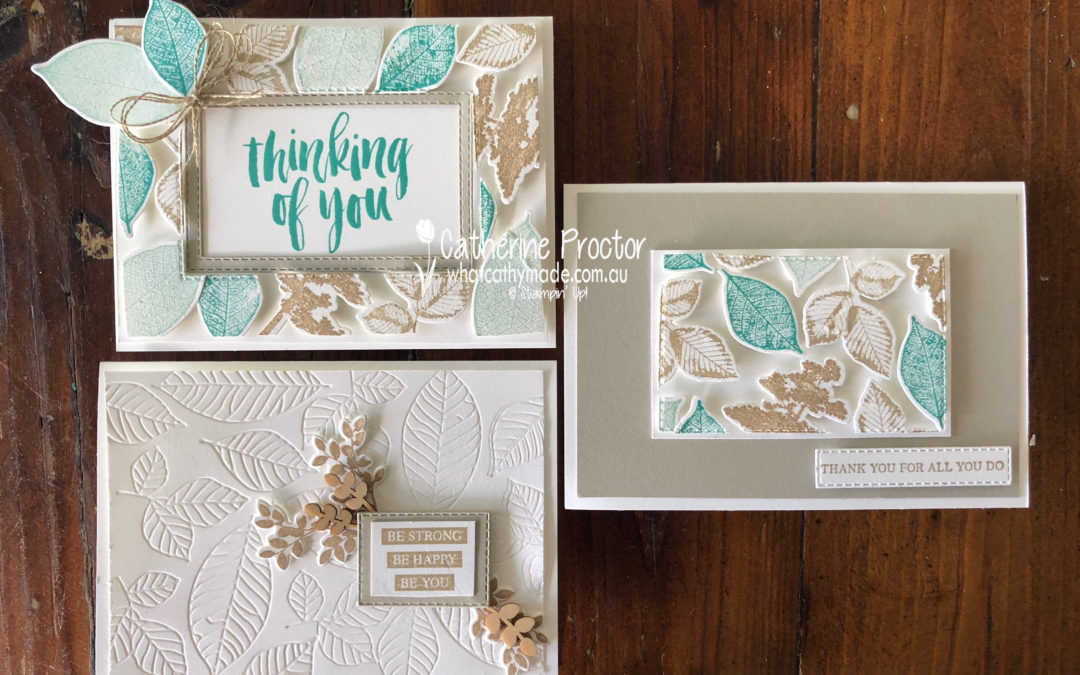
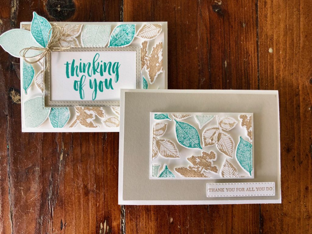
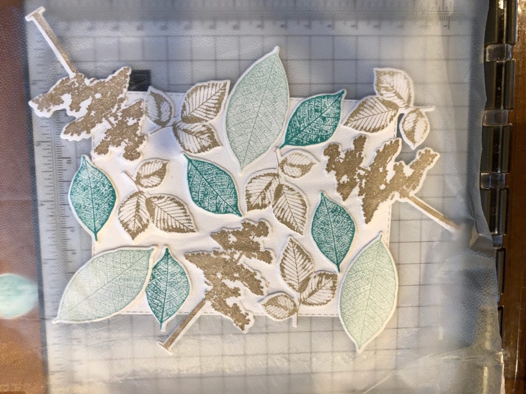
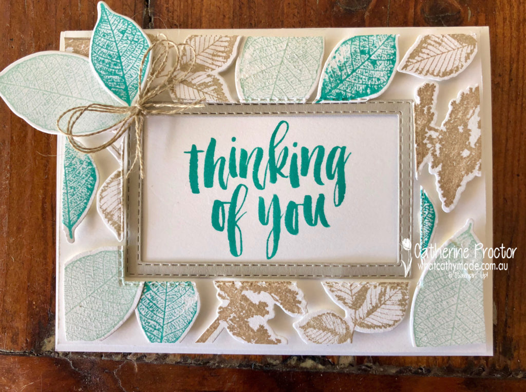
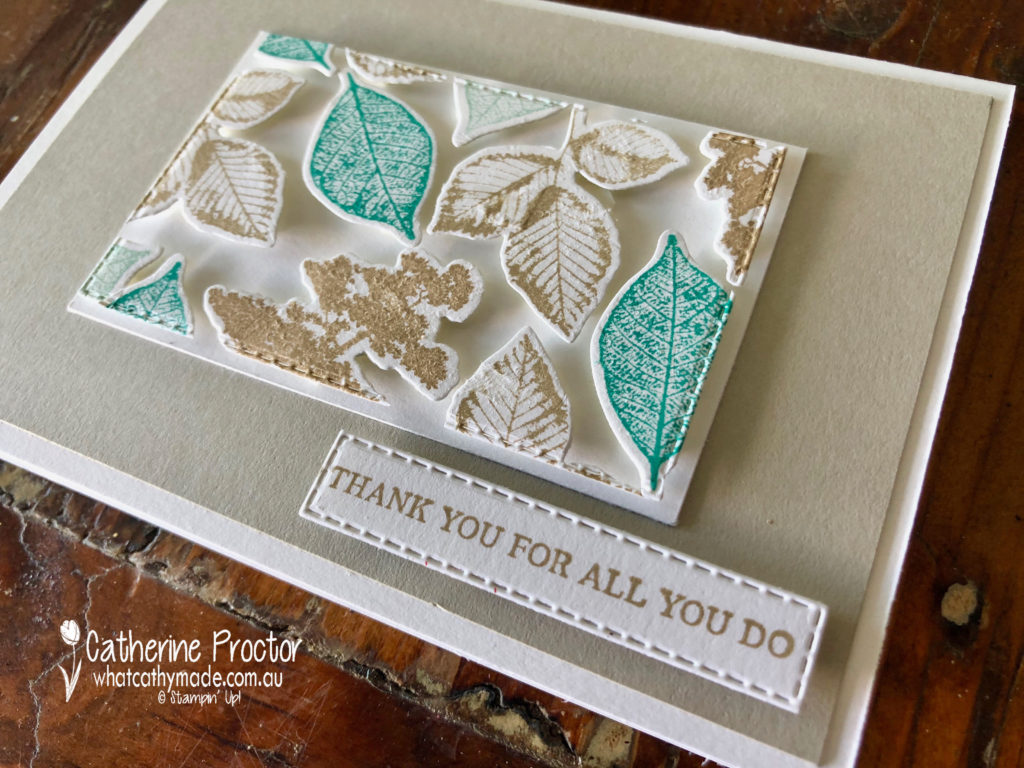
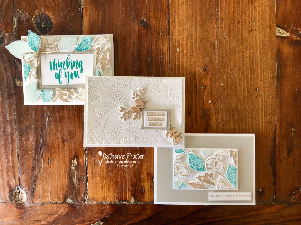
There’s a new technique around called the floating frame technique and I decided to try it out for my project this week, using the Rooted in Nature stamp set and the matching Nature’s Root Framelits.
The technique is quite similar to making your own DSP. I began by stamping the leaves and trees and die cutting them out before I arranged them onto a rectangle. Once I was happy with my layout I laid a sheet of Glad Press and Seal over the top of my die cut pieces, turned everything upside down and trimmed off the overlap.
My colour combination is Sahara Sand, Pool Party, Bermuda Bay and Crumb Cake.
Once I’d trimmed off the excess, I die cut a rectangle out of the middle before removing the Whisper White cardstock from behind the die cuts. The Glad Press and Seal keeps your die cut pieces in place while you do this.
The final step is to use a lot of dimensionals behind the die cut pieces to adhere them to your card base. When your frame is in place you gently peel off the Glad Press and Seal. If you look closely at my card you can see where I’ve stuck the Press and Seal down too hard and it’s lifted some of my ink off.
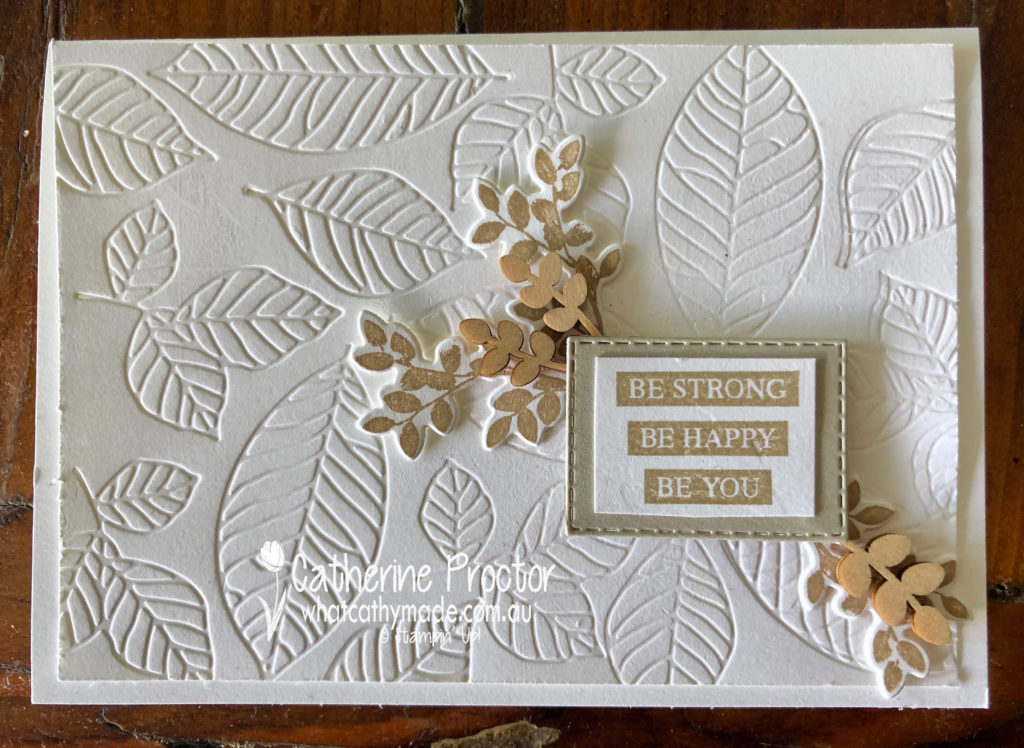
One of my favourite things about this technique is that you get 2 cards from it. Here’s the second card, made from the inside piece.
I decided to make a third card to showcase the lovely embossing dies in the Nature’s Root Framelits, as well as showing how elegant Sahara Sand looks on its own when paired with Whisper White.
To see what the rest of the team have made click on the links below.
To purchase any of the products I used in this project you can shop with me here. Or if you’d like me to post you your very own copy of any of the Stampin Up! catalogues or find out about more about Stampin’ Up! contact me .
We will be back again next week showcasing a regal colour: Shaded Spruce! We hope you can along with us then.
Welcome to week 43 of the Art With Heart Colour Creations Blog Hop!
Our colour this week is a regal colour: Rich Razzleberry.
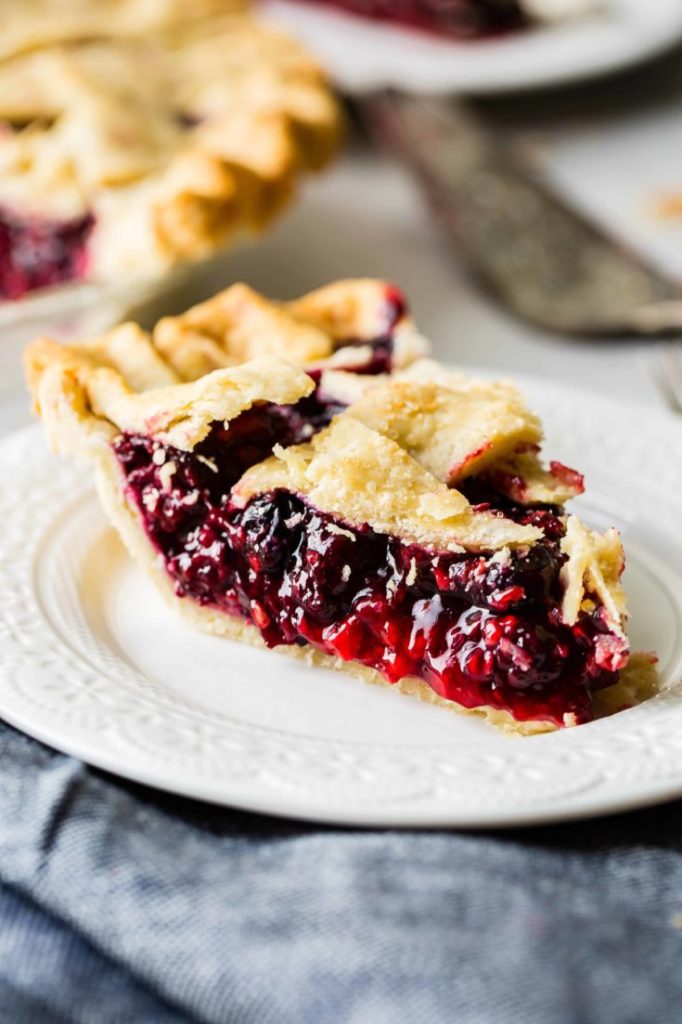
I’ve never seen a razzleberry in a fruit shop so I assumed it must be an American berry, but when I did a bit of Google research I discovered it is actually the name of a type of pie made with a mix of berries. Recipes differ but it is usually made with either raspberries and blackberries or raspberries, blueberries and blackberries.
Yum! I’m definitely going to make a razzleberry pie now that I’ve found the recipe!
I love this colour so much I made two cards this week. I don’t think they’re my best cards ever but hopefully, they can showcase this lovely colour.
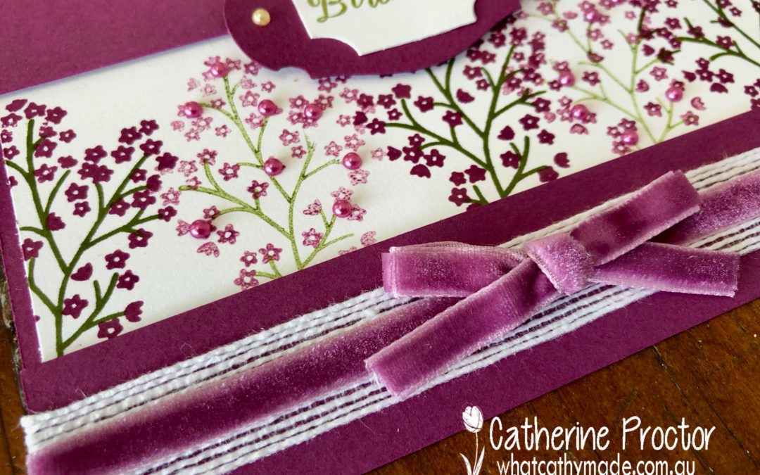
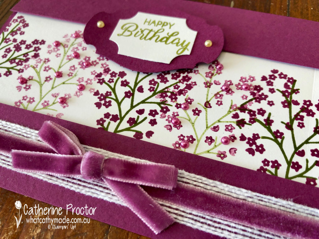
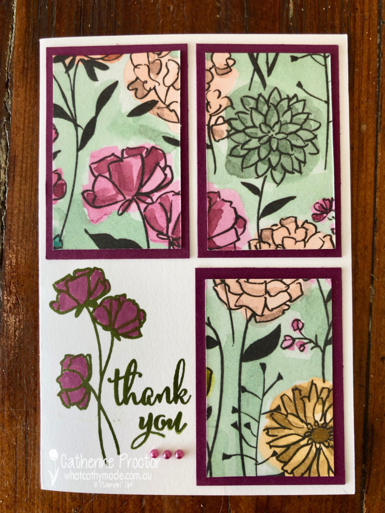
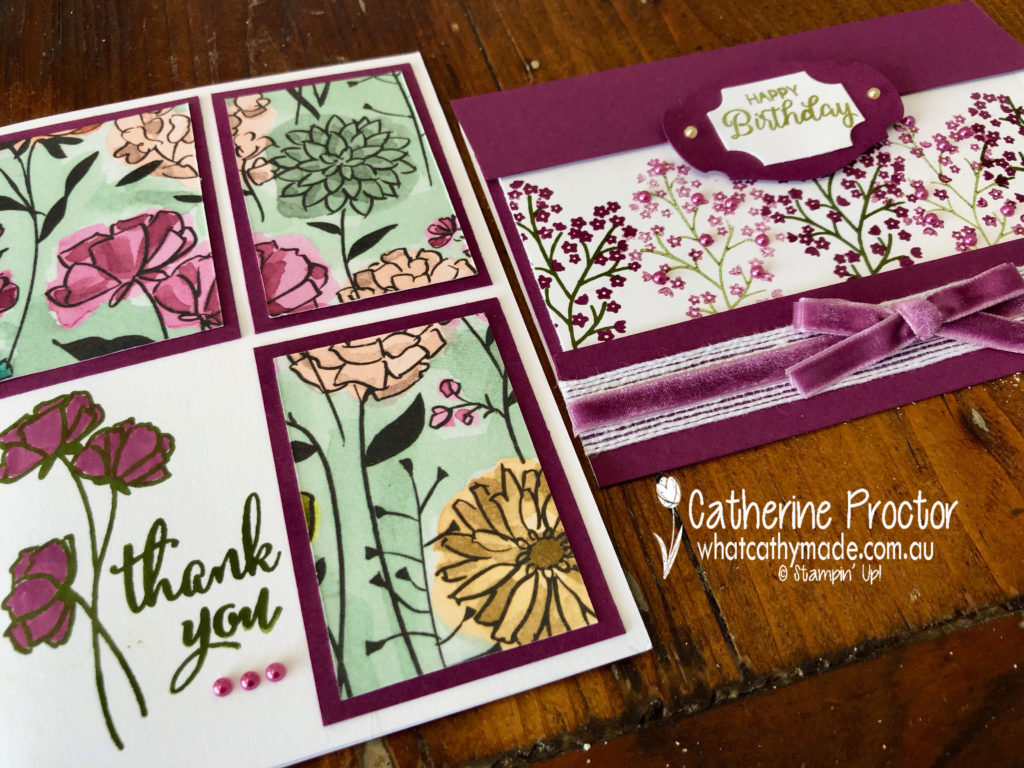
My first and favourite card uses the Beautiful Bouquet stamp set. I wanted to show how pretty Rich Razzleberry is stamped at both full strength and stamped off once. I also wanted to use the beautiful Rich Razzleberry velvet ribbon.
My second card is quite an old fashioned layout but it is a great way to use Designer Series Paper. You cut a rectangle into 4 even sections and mount 3 of these onto cardstock. The remaining square is stamped instead. A quick and easy card of any occasion.
I’ve used the Share What You Love Specialty Designer Series Paper with the matching Love What You Do Photopolymer Stamp Set to stamp my sentiment and flower in Mossy Meadow before colouring in with Rich Razzleberry. I love this stamp set!
To see what the rest of the team have made click on the links below.
To purchase any of the products I used in this project you can shop with me here. Or if you’d like me to post you your very own copy of any of the Stampin Up! catalogues or find out about more about Stampin’ Up! contact me .
We will be back again next week showcasing the palest of neutrals: Sahara Sand! We hope you can along with us then.
Welcome to week 42 of the Art With Heart Colour Creations Blog Hop!
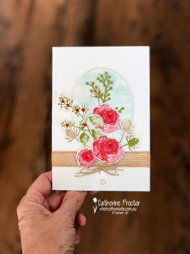
Our colour this week is a regal colour: Real Red.
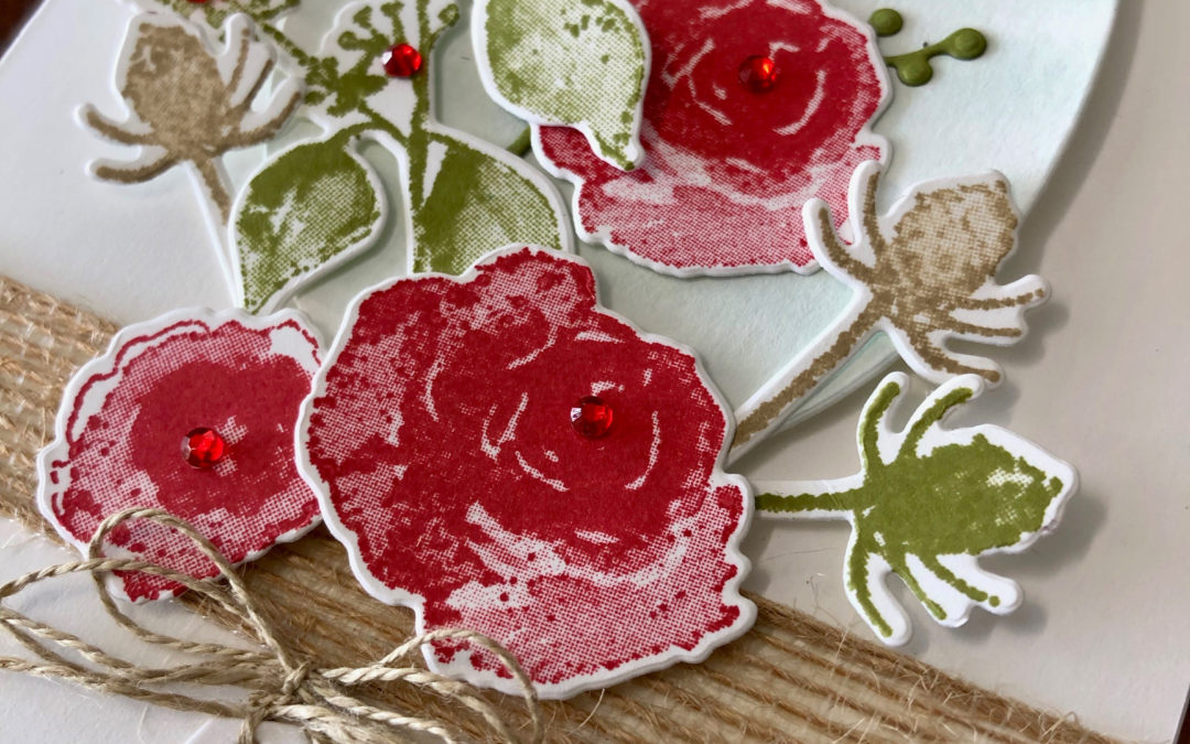
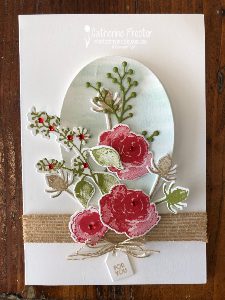
Real red is such a classic, stunning colour I wanted to pay homage to it with another classic: a bunch of red roses.
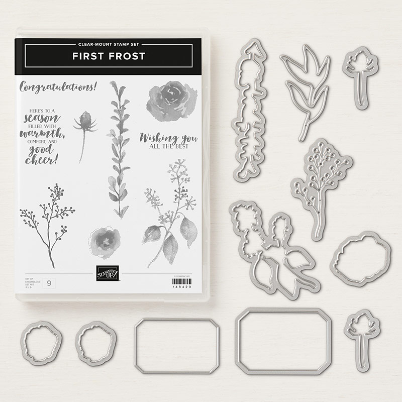
I’ve used one of my favourite stamp sets to create my beautiful rose bouquet: the first frost stamp set with its matching dies.
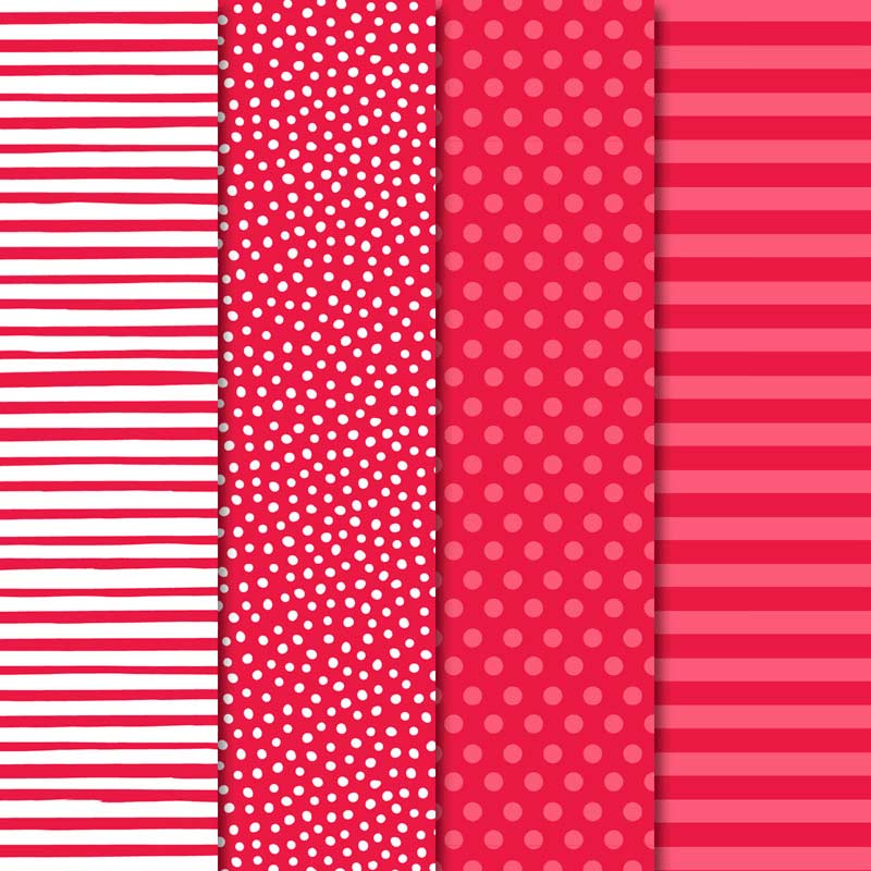
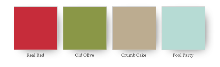
My colour combination is real red, crumb cake and old olive with a touch of pool party in the backgroud.
In my opinion, real red, just like old olive, really is one of those colours you can almost use as a neutral. It looks amazing with virtually any colour and really makes your card pop even if you only use a touch of it.
Last week I also used used real red in this colour combination.
In my project this week I’ve only used real red for my roses and for a touch of bling and dimension with the addition of the red rhinestones, but I still think it is the dominant colour of the card.
At the bottom of my card I used another all-time favourite of mine, the tiny little tag from the Bouquet Bunch Framelits Dies, stamped with the “for you” stamp from the Beautiful Bouquet Photopolymer Stamp Set.
To lift my bouquet off the front of the card I washed some pool party onto some card stock before cutting it out with my largest oval die. I love pool party with any shade of red.
To see what the rest of the team have made click on the links below.
To purchase any of the products I used in this project you can shop with me here. Or if you’d like me to post you your very own copy of any of the Stampin Up! catalogues or find out about more about Stampin’ Up! contact me .
We will be back again next week showcasing another one of the regal colours Rich Razzelberry! We hope you can along with us then.
Tonight the Art with Heart team are sharing creative projects with an Easter theme.
Don’t forget, sale-a-bration ends on March 31st! There is still time to earn free product with purchase or even join our Stampin’ Up! team. Ask any of the girls on the hop for more details.
Easter means different things to different people. For some, it is all about bunnies, Easter eggs, hot cross buns and public holidays. For others, it is the most important day on the religious calendar. But although Easter is a celebration of the resurrection from the dead of Jesus Christ, did you know the Easter holiday is also based on an ancient Pagan ritual?
Easter dates change every year because it is also based on the Pagan ritual of the Spring Equinox, which is a celebration of new life and the change that comes with spring.
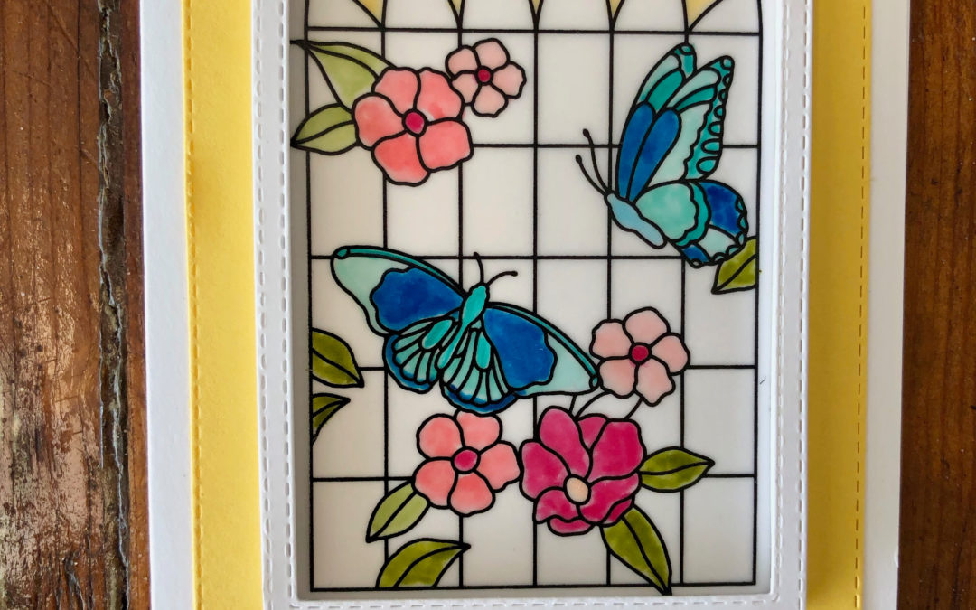
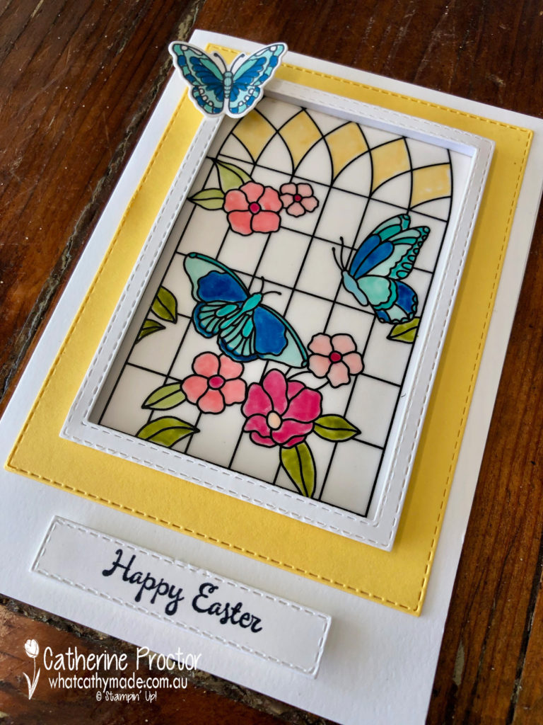
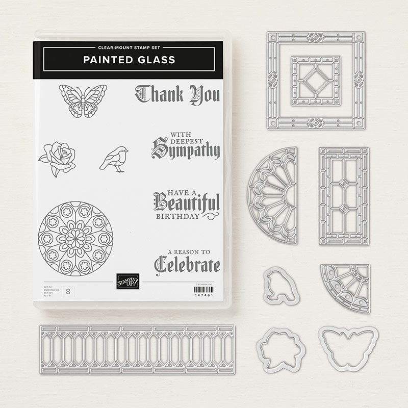
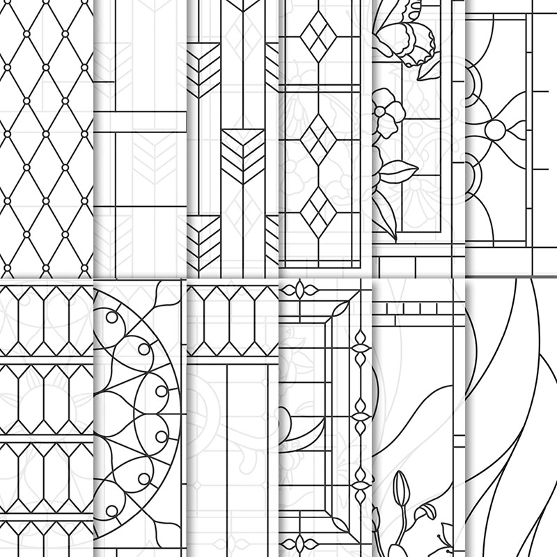
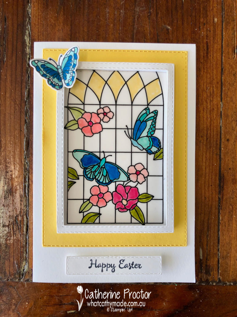
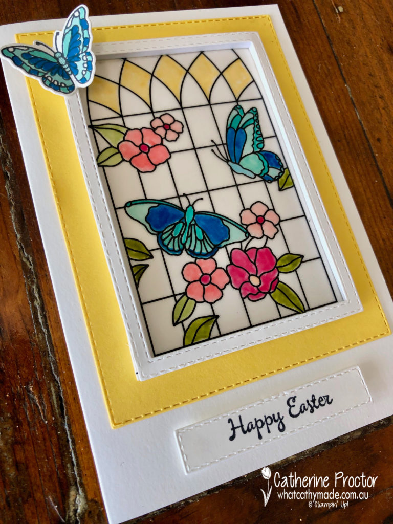
For my project tonight decided to celebrate both aspects of Easter – the Pagan and the religious celebration of Easter – by referencing the beautiful stained glass windows of the churches I would celebrate Easter morning in as a minister’s daughter. The Painted Glass Clear-Mount Bundle and Graceful Glass 6″ X 6″ Designer Vellum was just perfect for this.
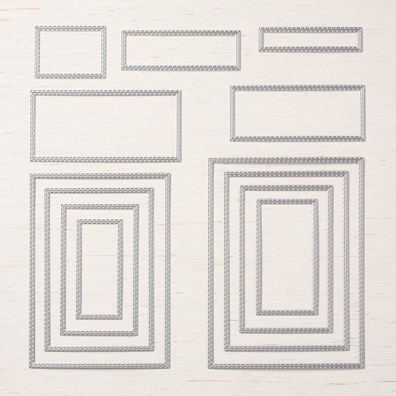
After colouring in my sheet with my Stampin blends, I used the Rectangle Stitched Framelits Dies to make a window frame for my stained glass window.
I then mounted my frame using the Foam Adhesive Strips and hey presto, I had created a beautiful stained glass window!
The Rectangle Stitched Framelits Dies were put to good use again for my Daffodil Delight layering mat and for my sentiment, which was stamped using the “You’re Inspiring” stamp set.
To celebrate new life and the change of season my final touch was a butterfly resting gently on my window…I think it makes my butterflies in my window come to life and look like they might fly away too!
Now it’s time to hop on over to our next participant, the very talented, Caroline Manwaring.
If you find a broken link or have come to this blog hop from a different entry point, you can view the participants below:
Welcome to week 41 of the Art With Heart Colour Creations Blog Hop!
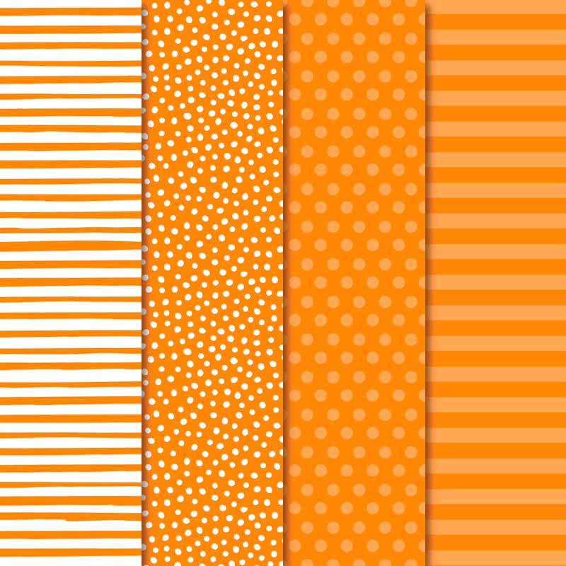
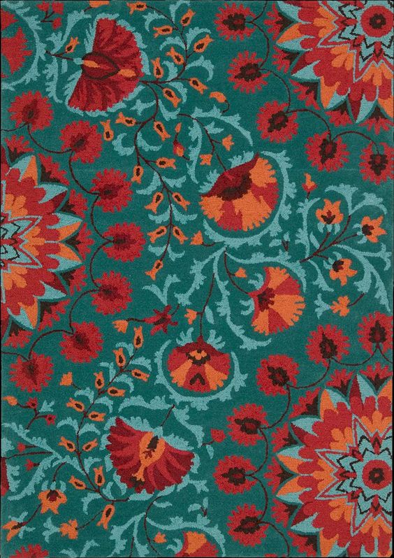
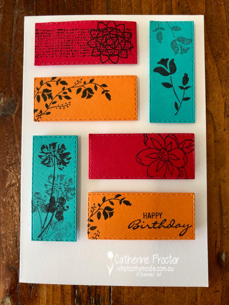
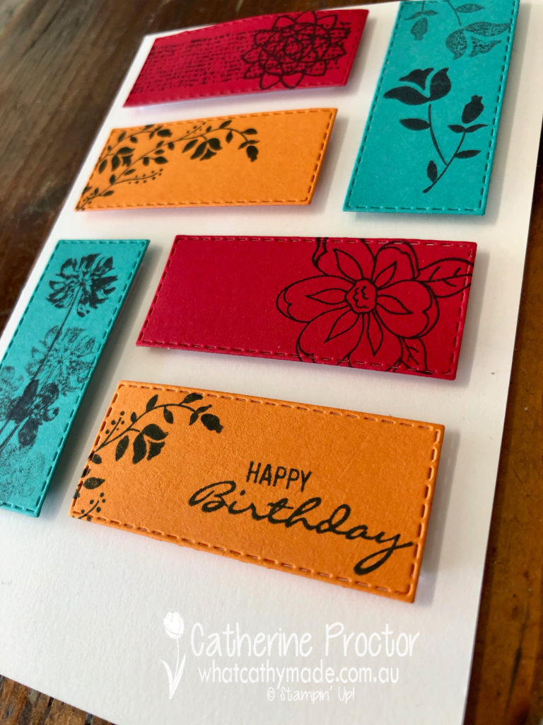
Our colour this week is a regal colour: Pumpkin Pie.
This is a colour I rarely use or wear – so it did prove a bit of a challenge until I saw this stunning rug!
I looked at colour combinations within the regal family but decided I wanted a bluer green to go with the orange so I settled on the following colour combination: Pumpkin Pie, Real Real red (both regals) and Coastal Cabana (from the brights family).
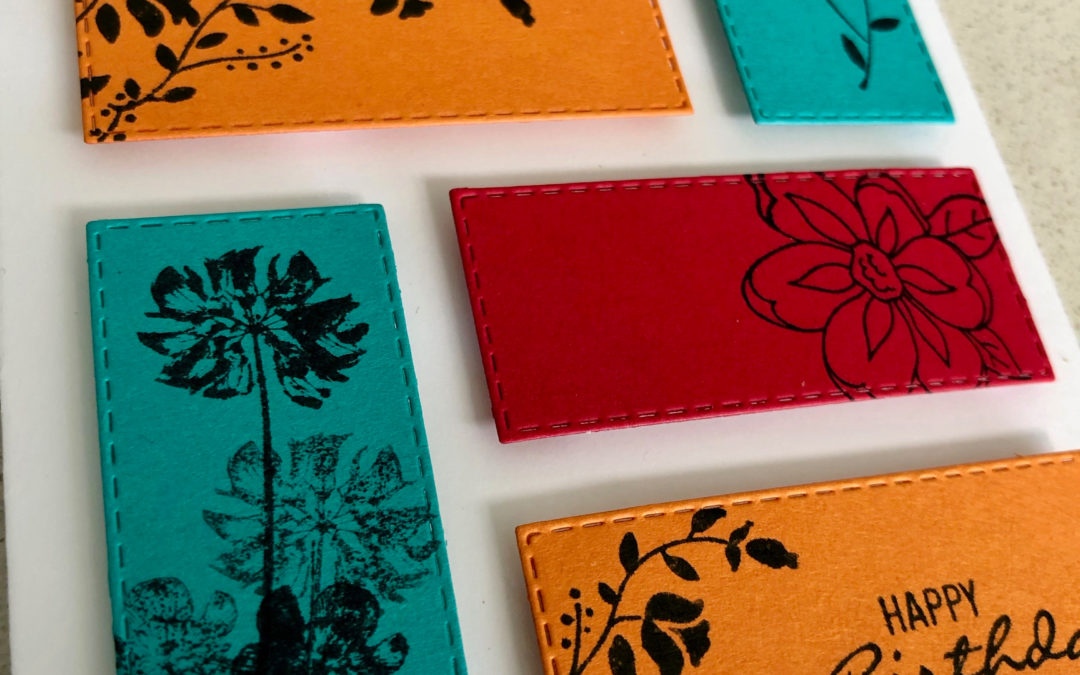
Last week I created a background by stamping all over the powder pink cardstock with powder pink ink – such a simple and effective technique – so this week I did a similar technique, this time stamping in black a variety of floral images onto my three different coloured cardstocks.
I then die cut two rectangles in each of the three colours using my rectangle stitched framelits
I like how this technique lets the vibrant colours of the cardstock shine through, whilst also adding a subtle touch of floral elegance.
Because there are no embellishments on this card (and I was so very tempted to add a bow of linen thread!!!!!) I added dimension by mounting all of my rectangles to the card base using adhesive foam strips.
The stamp sets I used were the botanical bliss stamp set and the pressed flowers stamp set, both from the annual catalogue.
To see what the rest of the team have made click on the links below.
To purchase any of the products I used in this project you can shop with me here. Or if you’d like me to post you your very own copy of any of the Stampin Up! catalogues or find out about more about Stampin’ Up! contact me .