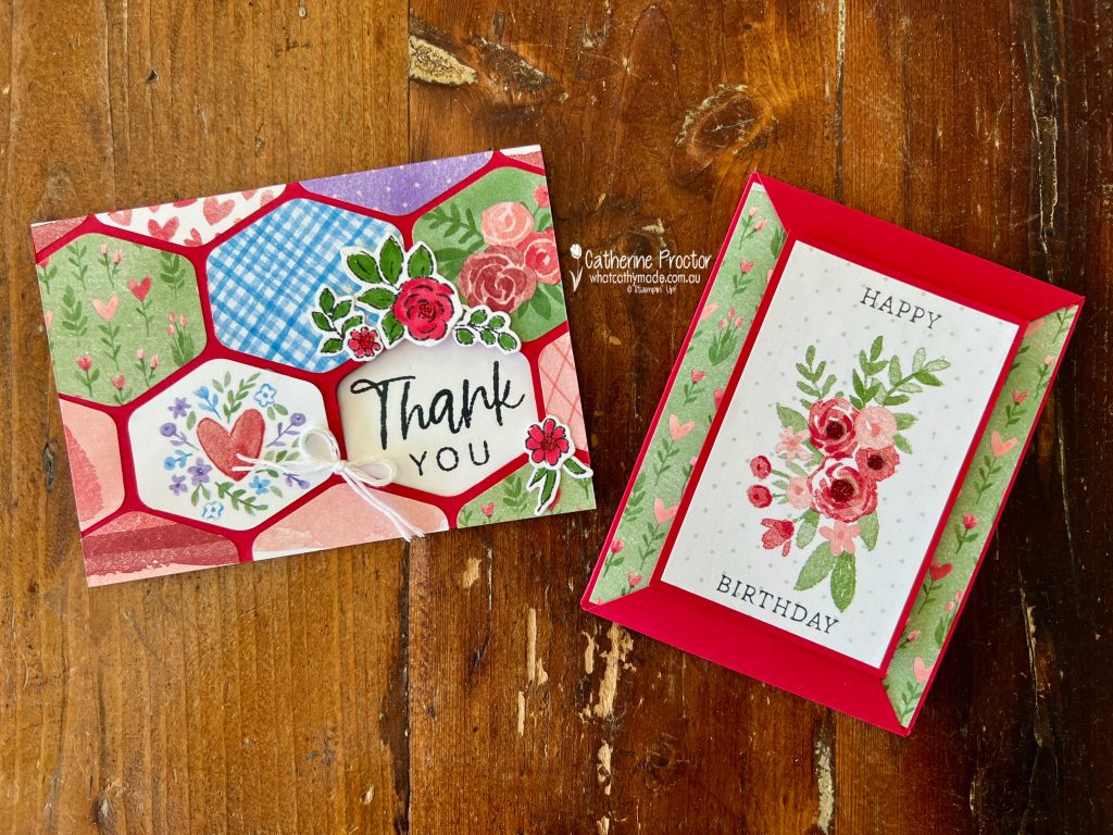
Two card designs ideal for using up your designer series paper (DSP), even the scraps!
This week for the Art With Heart Colour Creations we’re celebrating Real Red ❤️ and I’ve set myself a little challenge… use up some Designer Series Paper instead of saving it “for something special”!
I only had a small share of the Beautiful Love Notes DSP, so I wanted to create cards that:
used smaller pieces;
showcased multiple designs;
and made the most of every scrap.
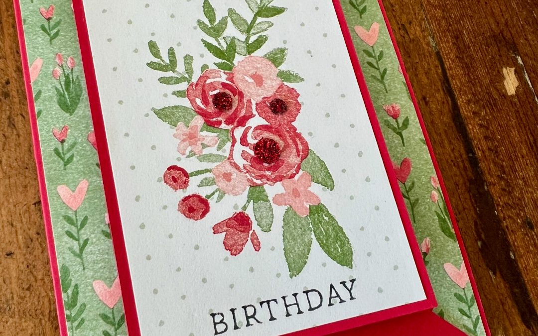
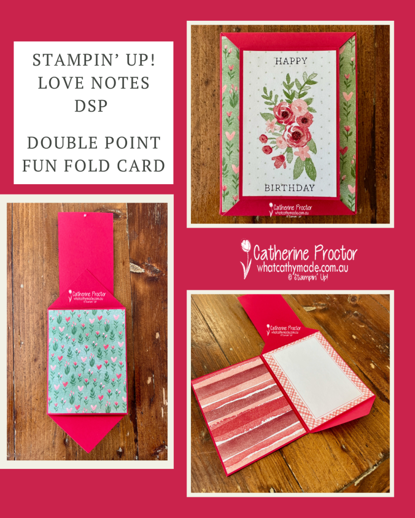
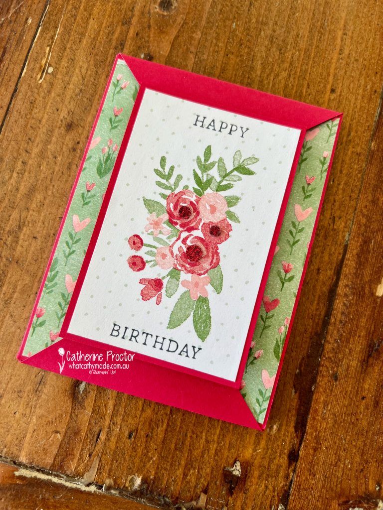
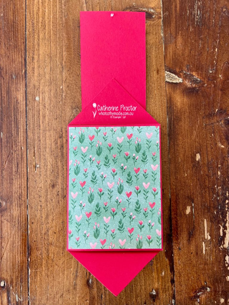
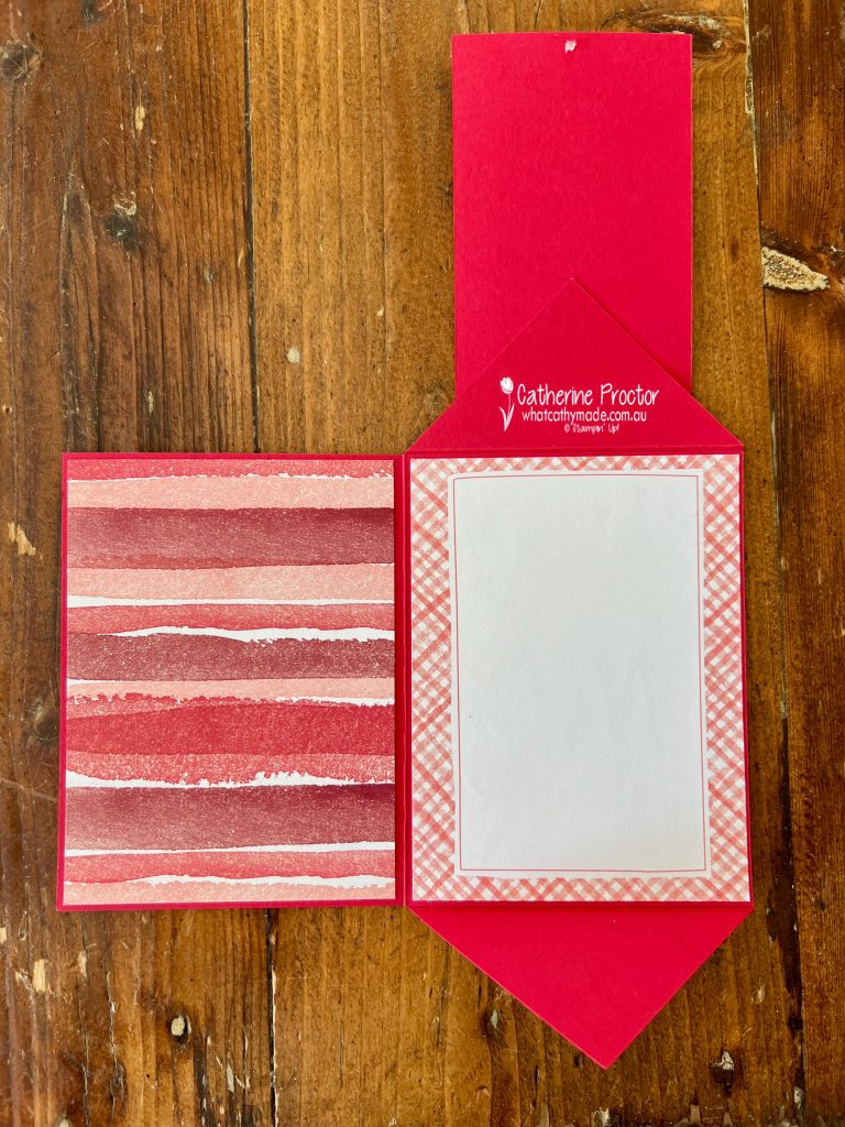
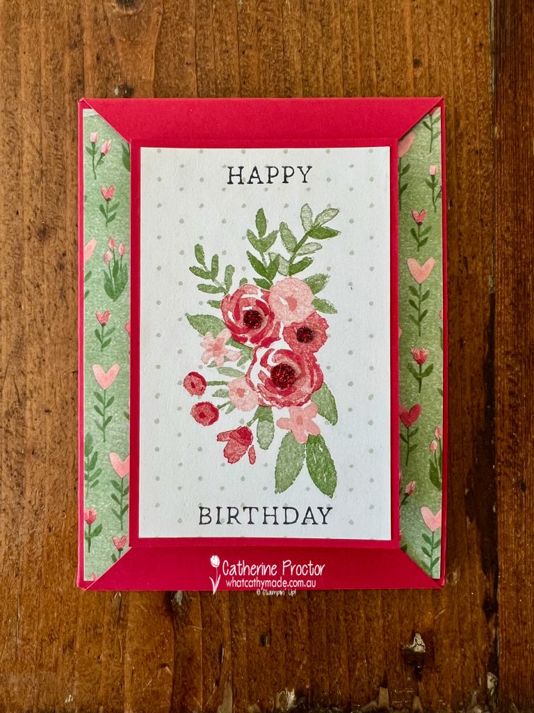
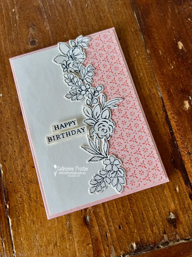
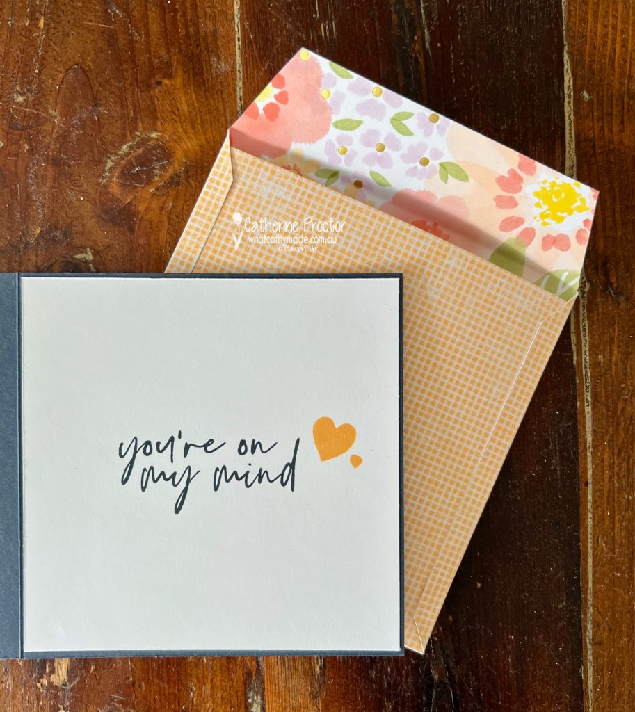
Double Point Fun Fold Card
I wanted to showcase my favourite DSP designs from of the Love Notes DSP and this fancy fold was just perfect with all its different layers.
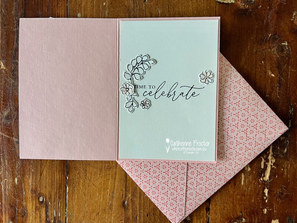
This graphic below shows the different layers that are revealed as you open up the card.
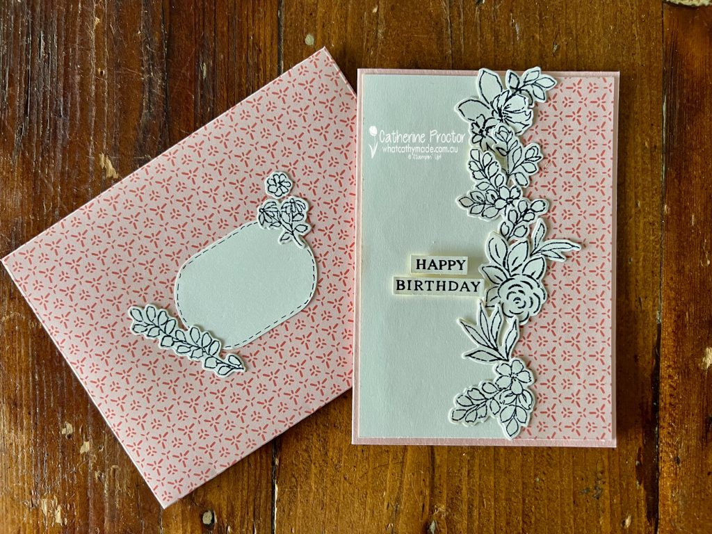
For the sentiment, I stamped the happy birthday stamp from the “Simply Said” stamp set onto the front layer of the card, stamping both above and below the central floral image.
This inside section is a “card within a card” and the card front features this gorgeous floral pattern from the Love Notes DSP.
The inside of the card features more of the designs from the Love Notes DSP, trimmed to fit the card base.
This is one of those fancy fold cards that looks impressive, but is incredibly easy to make.
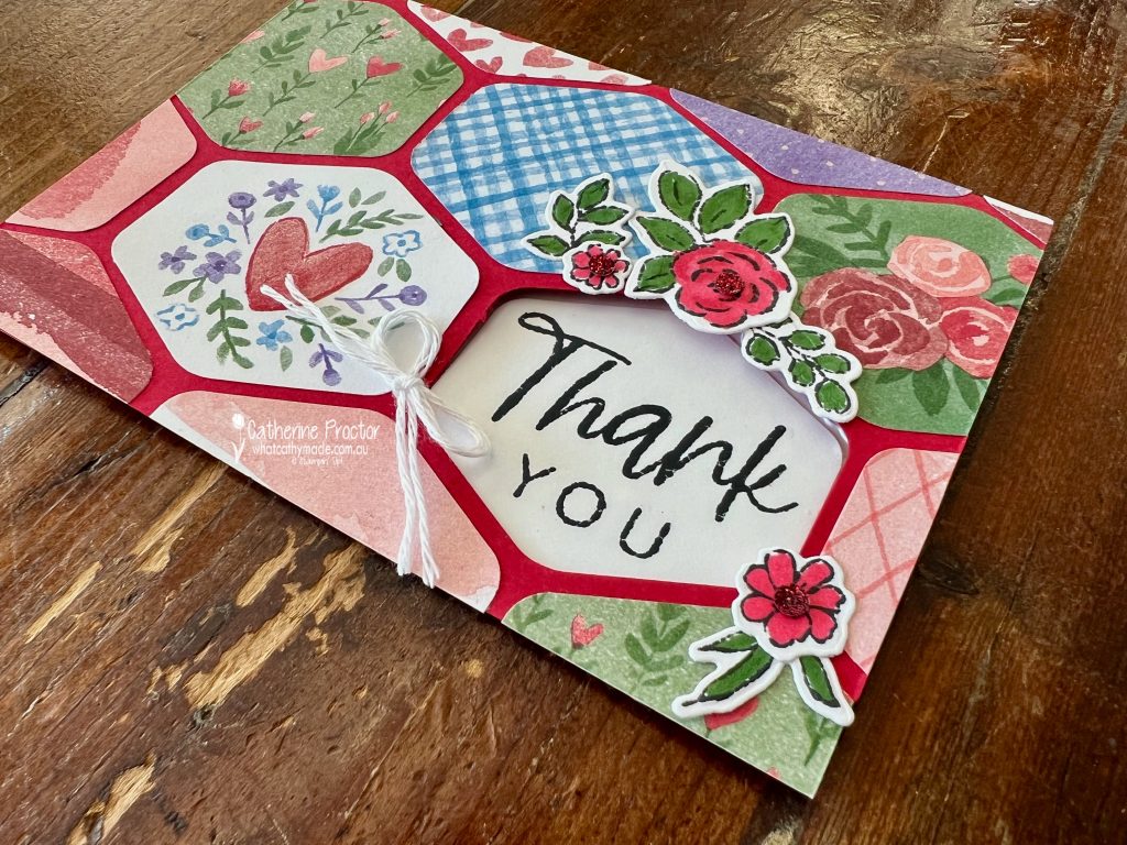
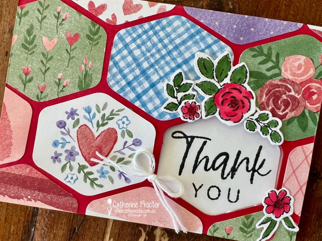
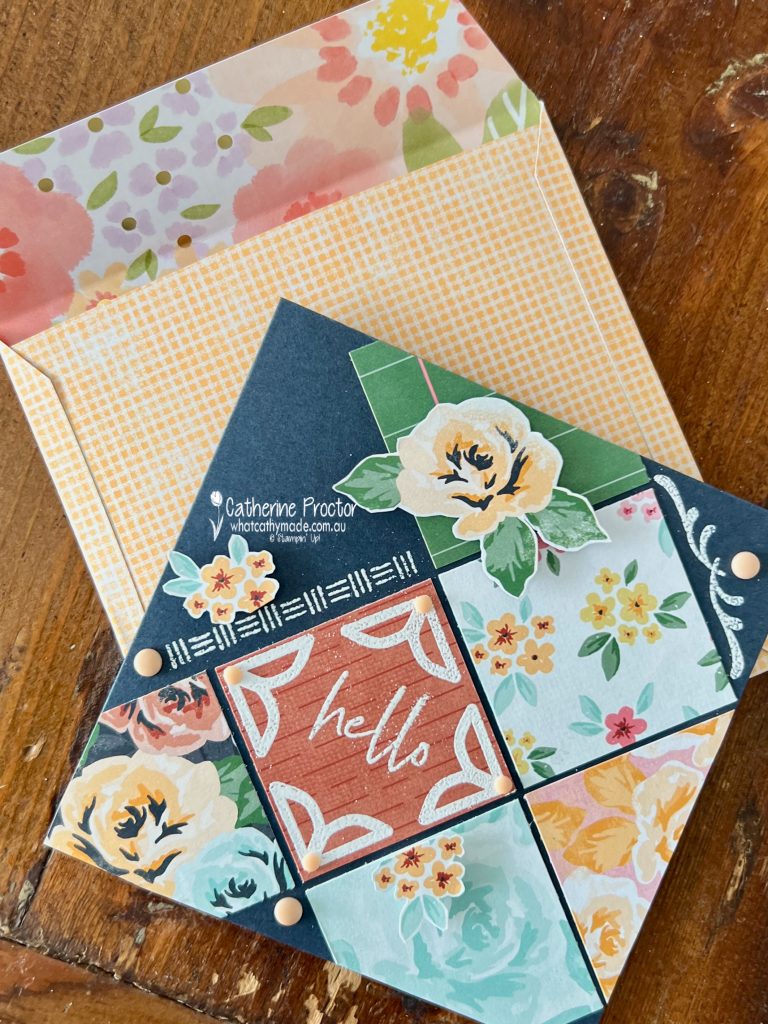
Heartfelt Hexagon Window Card
For my second project, I created a hexagon window card, using the Heartfelt Hexagon punch and his one is all about using up the smaller scraps.
After punching out a hexagon on the bottom right of the card front, I then punched lots of small pieces of DSP to create a patchwork-style front, featuring multiple patterns from the same pack.
I used the “Extraordinary Flora” bundle to created floral ephemera pieces that match the floral design and the main colours (Real Red and Garden Green) in the Love Notes DSP.
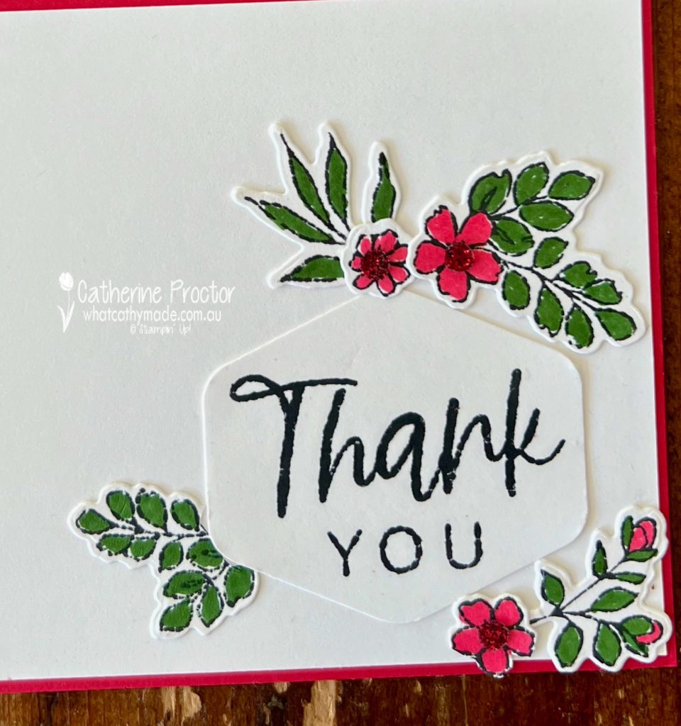
The hexagon window draws your eye straight to the sentiment, which is stamped on the inside of the card using the thank you stamp from the “With You in Mind” Stamp Set.
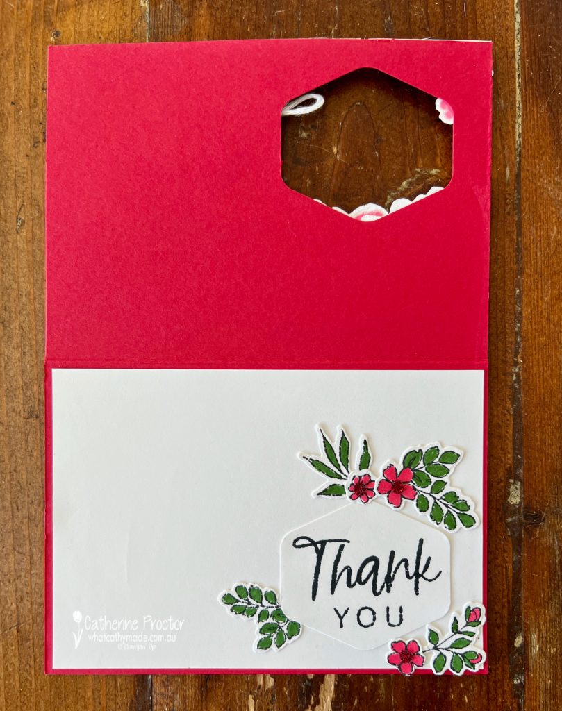
This is what the card looks like when opened up.
To decorate the inside of the card, I also added some extra Extraordinary Flora pieces around the sentiment.
Tips for Using Up Your Designer Series Paper
If your Designer Series Paper stash is growing (and growing 😅), here are a few easy ways to start using it:
Cut your paper into smaller panels instead of saving full sheets
Choose fun folds that naturally require multiple pieces
Stick to one colour family (like Real Red here) to keep everything cohesive
Try patchwork or mosaic layouts
Mix bold and subtle prints to create balance
These cards were such a good reminder that DSP is meant to be used, mixed, layered and enjoyed… not hidden away in a drawer!
Take a look at some more Real Red inspiration on our Insta Hop!
Our blog hop is now an Instagram hop but the good news is that you don’t need to have an Instagram account to view all of the other projects!
Simply copy any of the Insta handles below into a new search engine window to follow the Instagram hop at any point.
Next in our Hop is Kate @craftwithkate. Be sure to check out her gorgeous project/s.
The full list of this week’s InstaHop is listed below:
Kate @craftwithkate
Kirsty @crafty.littlemiss
Rosa @hum.and.stamp
Helen @apaperparadise
Cathy @whatcathymade – you are here!
Thank you for joining me for Week 45 of Colour Creations. We’ll be back next Wednesday when we are showcasing Shaded Spruce. I hope you can join us then.
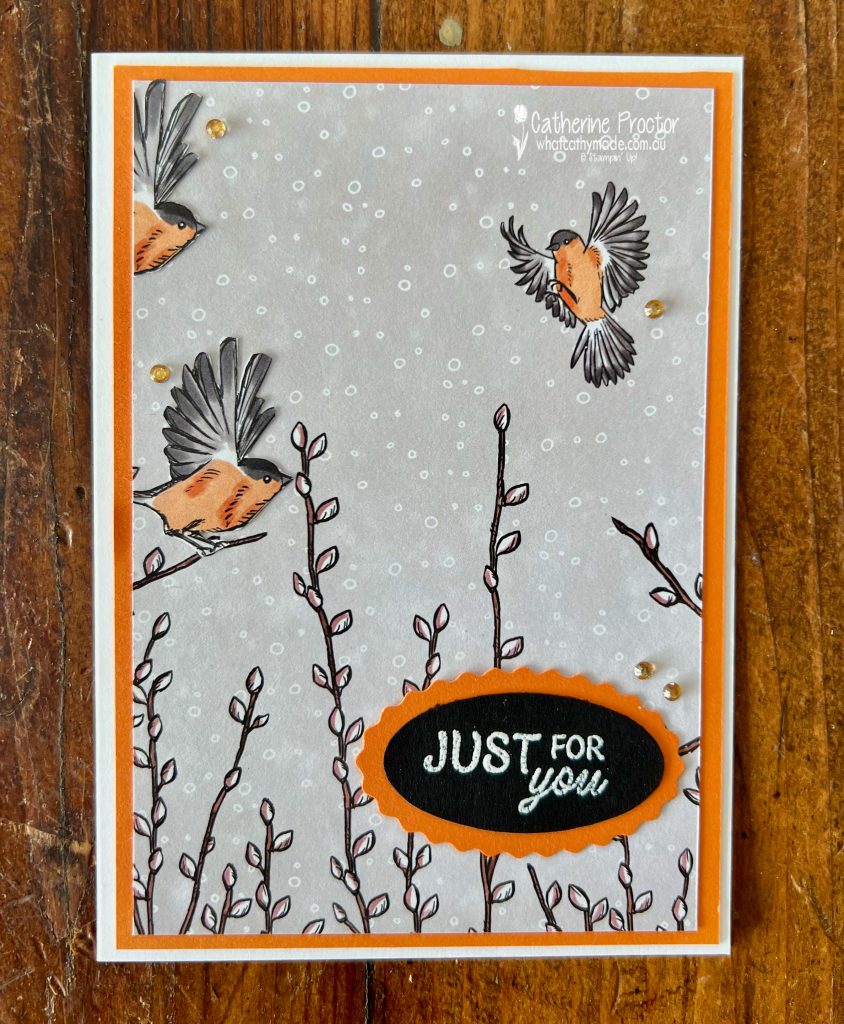
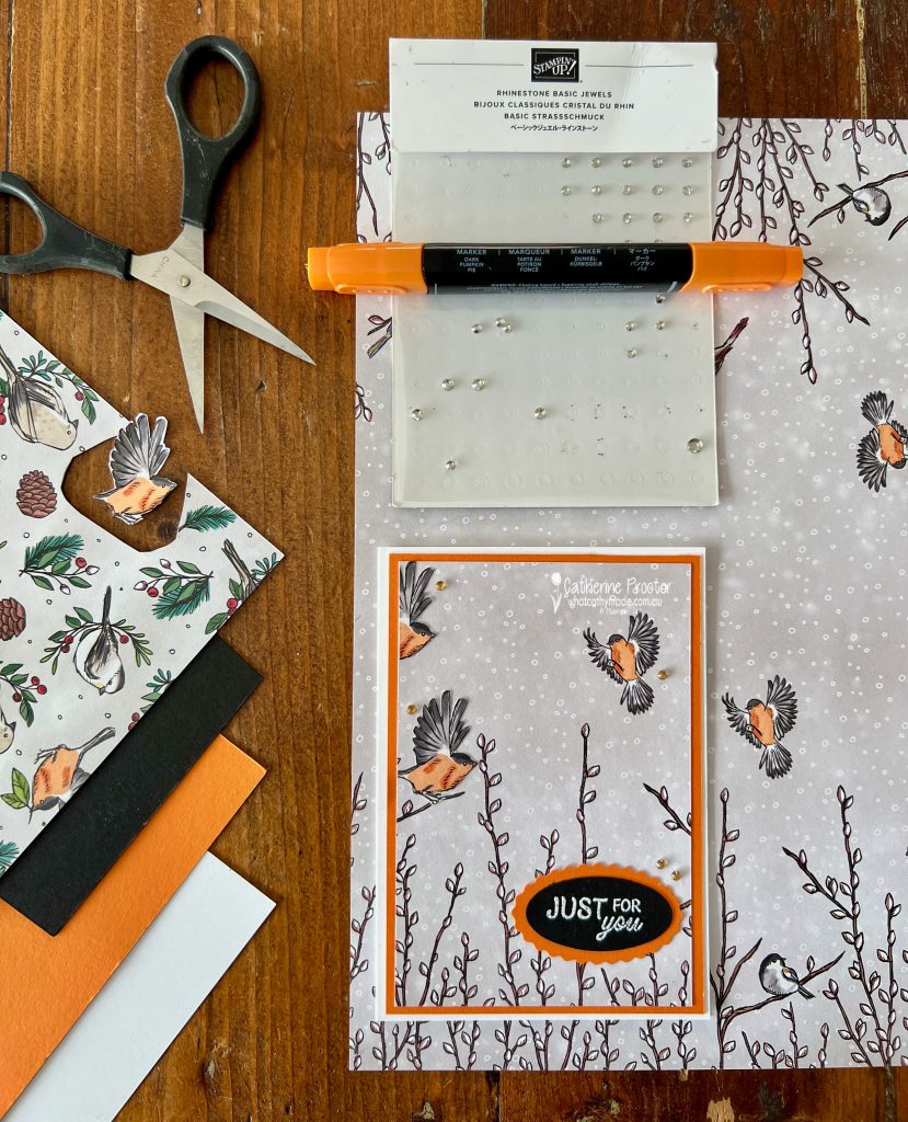
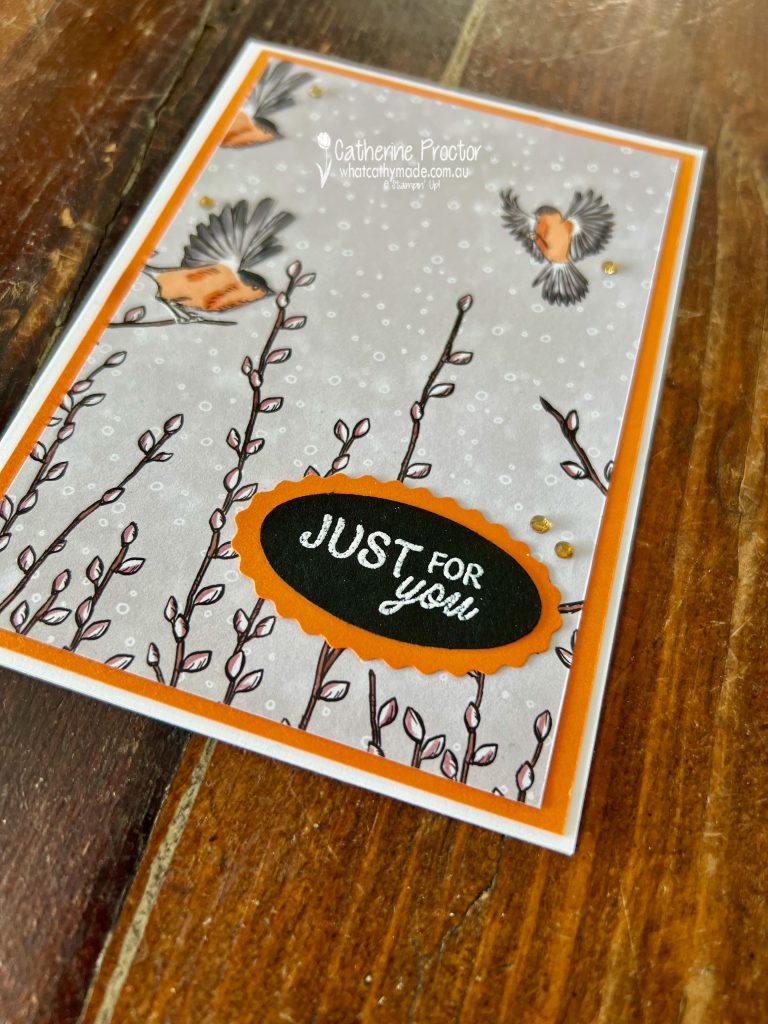
This week for the Art With Heart Colour Creations we’re celebrating Pumpkin Pie, a colour I rarely use but really love.
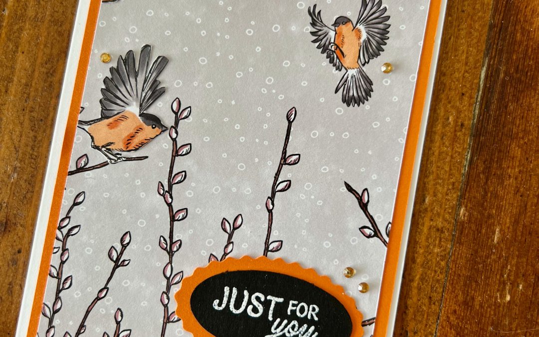
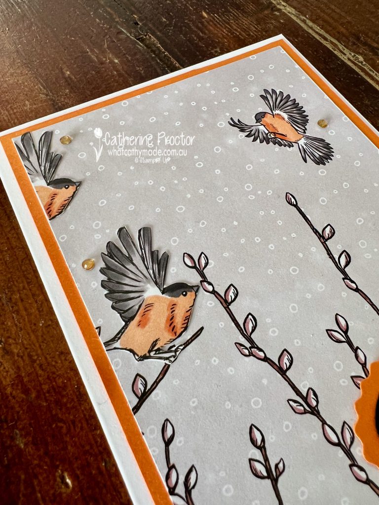
And as I was slightly time poor I’ve created a card that lets the beautiful Nests of Winter 12″ x 12″ Designer Series Paper do most of the work.
The Nests of Winter 12″ x 12″ Designer Series Paper really has to be one of the prettiest DSP’s, ever!
For my background layer of DSP I’ve used the sheet with mirroring sides and I simply added a couple of fussy cut sweet orange-breasted birds from another sheet of DSP in the pack.
I’ve layered them over the background to bring the design to life and add a lovely sense of movement, like they’re fluttering through the scene.
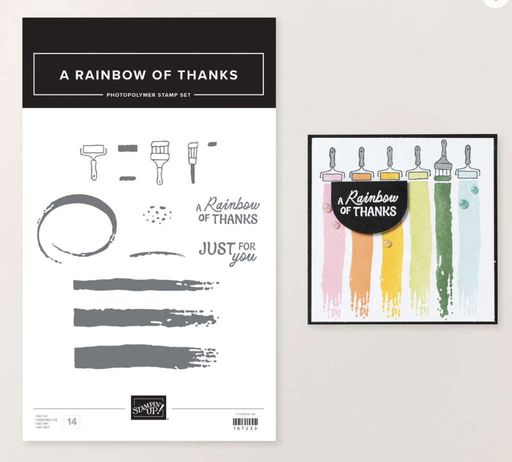
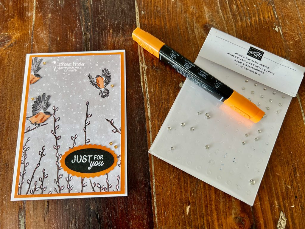
For the sentiment, I used one from the new March Online Exclusives “A Rainbow of Thanks” Stamp Set, heat embossed in white onto black card stock for a crisp, high-contrast finish.
I then punched it out using the retired Double Oval Punch and layered it onto a Pumpkin Pie scalloped oval for a bit of extra detail.
To finish the card, I added a few rhinestone basic jewels that I coloured with my Pumpkin Pie Blend to tie everything together perfectly and add a subtle pop of sparkle.
This is one of those cards that comes together quite easily thanks to the gorgeous DSP and a little bit of relaxing fussy cutting.
Take a look at some more Pumpkin Pie inspiration on our Insta Hop!
Our blog hop is now an Instagram hop but the good news is that you don’t need to have an Instagram account to view all of the other projects!
Simply copy any of the Insta handles below into a new search engine window to follow the Instagram hop at any point.
Next in our Hop is Kate @craftwithkate. Be sure to check out her gorgeous project/s.
The full list of this week’s InstaHop is listed below:
Kate @craftwithkate
Helen @apaperparadise
Kirsty @crafty.littlemiss
Cathy @whatcathymade – you are here!
Thank you for joining me for Week 44 of Colour Creations. We’ll be back next Wednesday when we are showcasing Real Red. I hope you can join us then.
This week I wanted to show two different ways you can use Stampin’ Up! kits. Firstly, by making them up exactly as intended as a relaxing and creative way to quickly build up your stash of cards. And secondly, by using elements from the kits as components in your own card designs.
A beach birthday card for my husband
Pretty Peacock is one of those colours that instantly makes me think of the ocean, which made it the perfect colour to use for my surfing husband.
For my main project this week I used elements from the Adventure Awaits Kit to create my husband’s birthday card on a Pretty Peacock slimline card base. His birthday was last Tuesday and he loved the card!
The Adventure Awaits Kit includes some fantastic travel and coastal themed die cuts. The surfboards in the back of the ute were perfect for creating a relaxed beach scene as his car is a ute!
To build the card, I layered two circular seaside scenes from the kit to create the horizon and boardwalk. Then I added the turquoise ute loaded with surfboards, a palm tree for that instant tropical feel, and a few balloons to give the card a celebratory touch.
The bold HAPPY birthday sentiment comes from the Happy Place Stamp Set, coloured in with my Pool Party and Granny Apple Green Stampin’ Blends.
The finished card feels like a little snapshot of the perfect day for Pete: ute packed, boards ready and ocean in view!
The Lots to Love Kit
I also wanted to share three cards I made using the Lots to Love Kit because the designs are so beautiful and are even prettier in real life than they appear in the online photos.
Sometimes it’s nice to just enjoy a kit exactly as it was designed (although I did cut one of the sentiments to make it shorter), and this one is a great reminder that quick cards can still feel really special.
The colour combinations in this kit are not ones I would normally use but they are really gorgeous too, with bright florals paired with soft backgrounds that make the flowers really pop.
Take a look at some more Pretty Peacock inspiration on our Insta Hop!
Our blog hop is now an Instagram hop but the good news is that you don’t need to have an Instagram account to view all of the other projects!
Simply copy any of the Insta handles below into a new search engine window to follow the Instagram hop at any point.
Next in our Hop is Kate @craftwithkate. Be sure to check out her gorgeous project/s.
The full list of this week’s InstaHop is listed below:
Kate @craftwithkate
Helen @apaperparadise
Rachel @rachelpalmieristampin
Kirsty @crafty.littlemiss
Cathy @whatcathymade – you are here!
Thank you for joining me for Week 43 of Colour Creations. We’ll be back next Wednesday when we are showcasing Pumpkin Pie. I hope you can join us then.
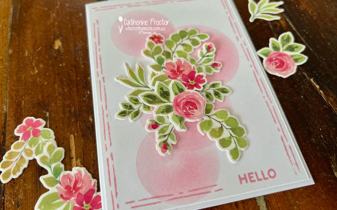
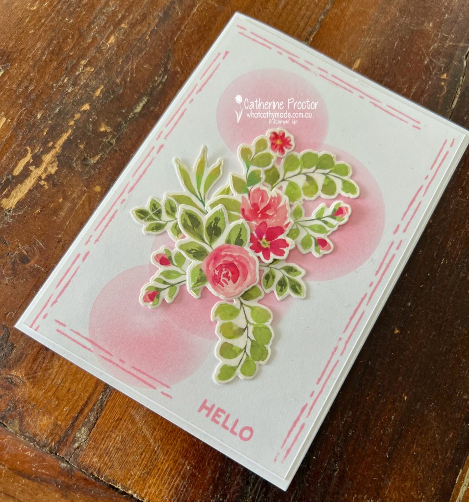
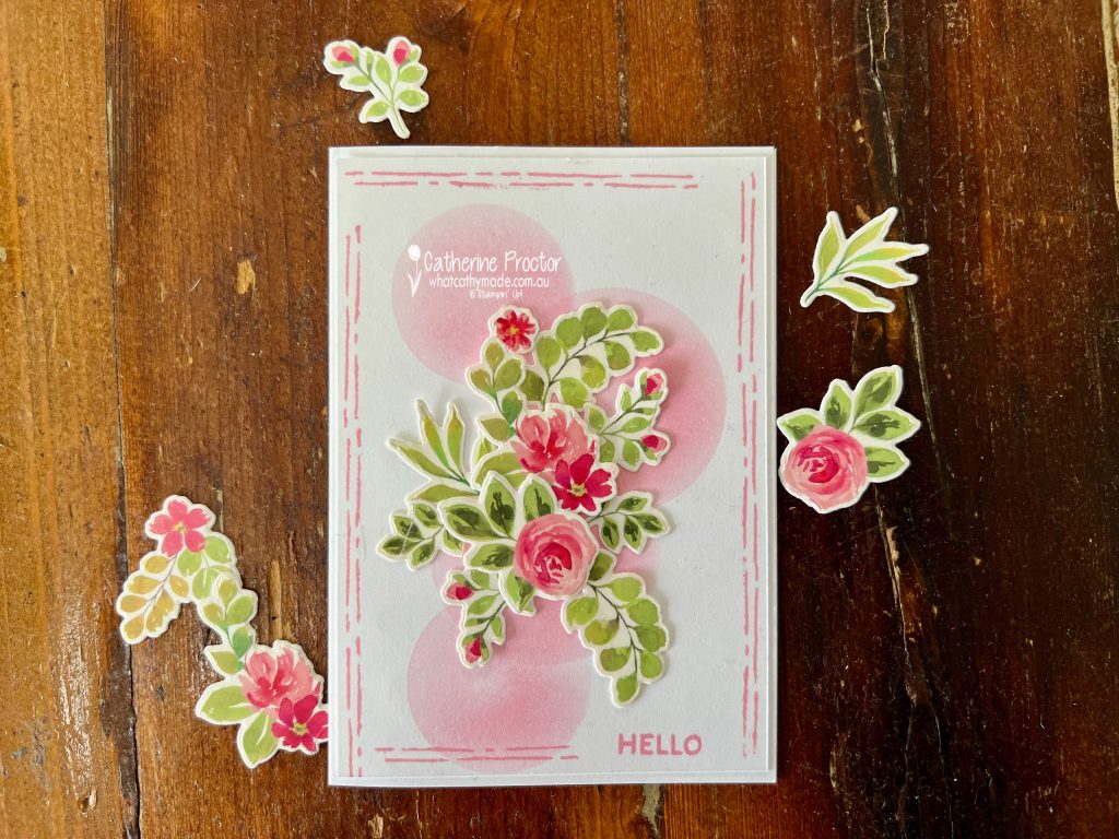
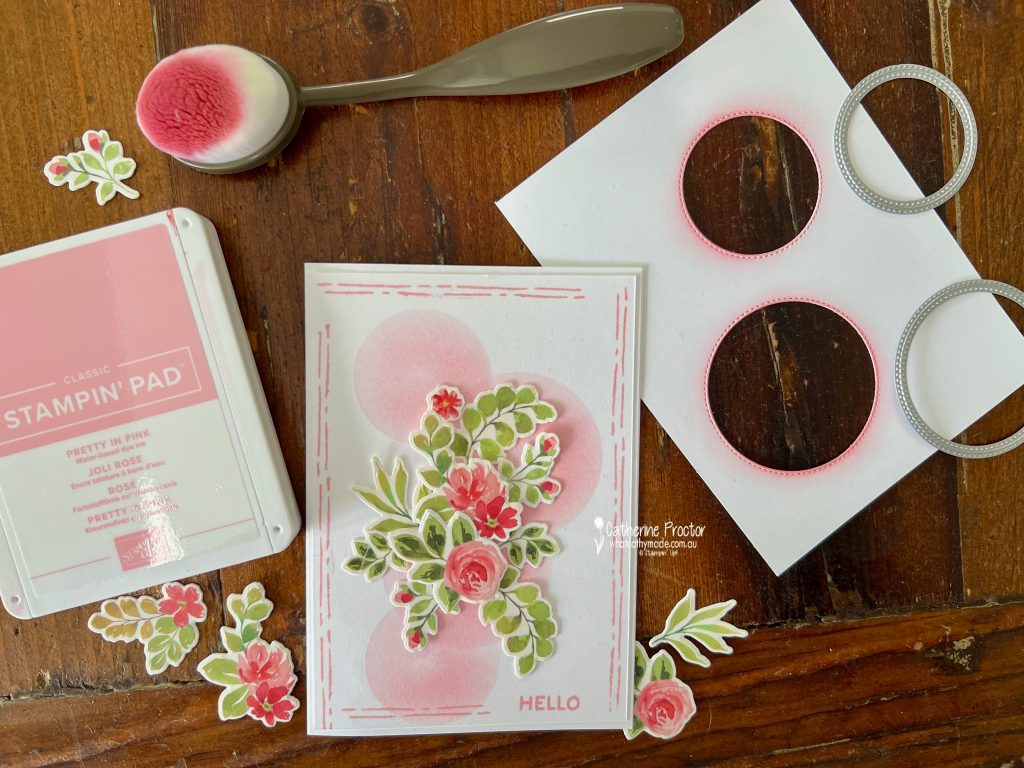
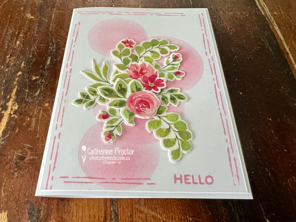
This week for Colour Creations we’re celebrating Pretty in Pink and I’ve created a soft floral hello card using hand made masks to create shading for the background layer.
This gorgeous pink 2024-26 InColour is retiring at the end of April so stock up now if you love Pretty In Pink.
The Extraordinary Flora Bundle and the coordinating Extraordinary Flora Washi Tape makes it incredibly easy to create beautifully detailed floral clusters without lots of individual stamping and colouring.
All you need to do is adhere the tape to cardstock, die cut the images using the coordinating dies, and you suddenly have a whole pile of ready-to-use flowers and foliage.
To create the soft background detail, I die cut a few circles from scrap paper using the Stylish Shapes Dies and used them as masks. With a blending brush and Pretty in Pink ink, I gently blended ink through the circular openings to create those soft, dreamy pink circles behind the floral arrangement.
The only stamping on my card is the simple “Hello” sentiment from the Help Me Grow stamp set, sitting in a hand stamped border that I created using the parallel lines stamp in the Extraordinary Flora stamp set.
Take a look at some more Pretty In Pink inspiration on our Insta Hop!
Our blog hop is now an Instagram hop but the good news is that you don’t need to have an Instagram account to view all of the other projects!
Simply copy any of the Insta handles below into a new search engine window to follow the Instagram hop at any point.
Next in our Hop is Helen @apaperparadise. Be sure to check out her gorgeous project/s.
The full list of this week’s InstaHop is listed below:
Helen @apaperparadise
Kirsty @crafty.littlemiss
Kate @craftwithkate
Cathy @whatcathymade – you are here!
Thank you for joining me for Week 42 of Colour Creations. We’ll be back next Wednesday when we are showcasing Pretty Peacock. I hope you can join us then.
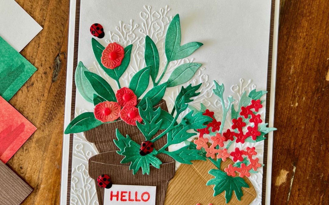
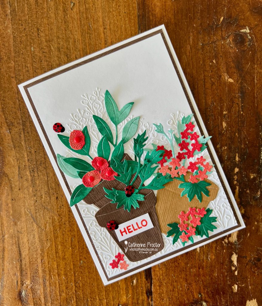
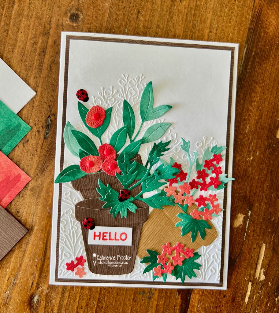
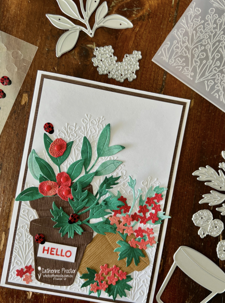
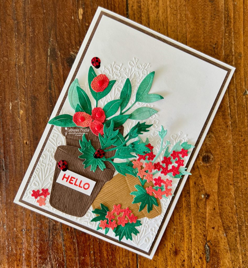
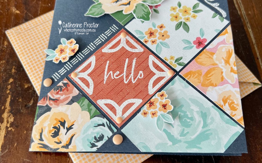
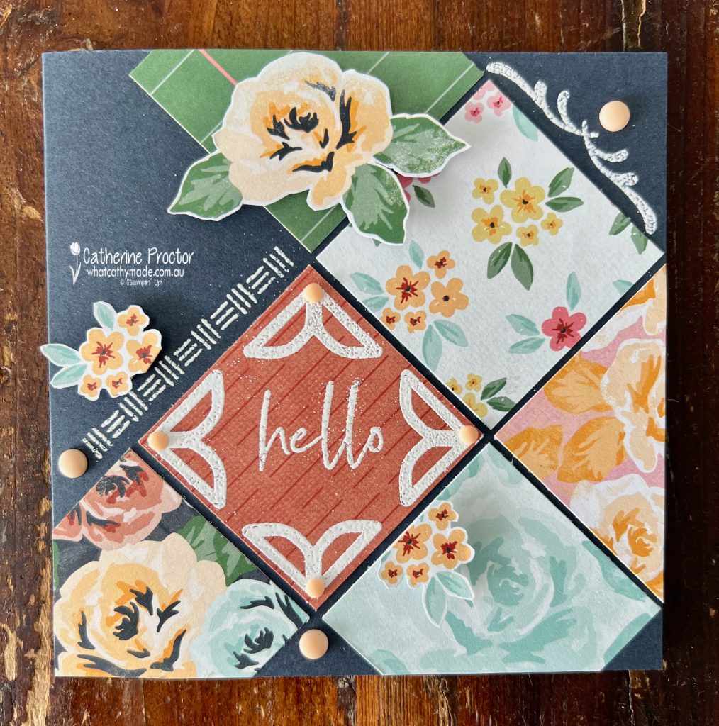
This week for Colour Creations we’re celebrating Poppy Parade, and I’ve created a layered garden scene using three brand new Online Exclusives that will be available to order from Tuesday 3 March:
Help Me Grow Bundle
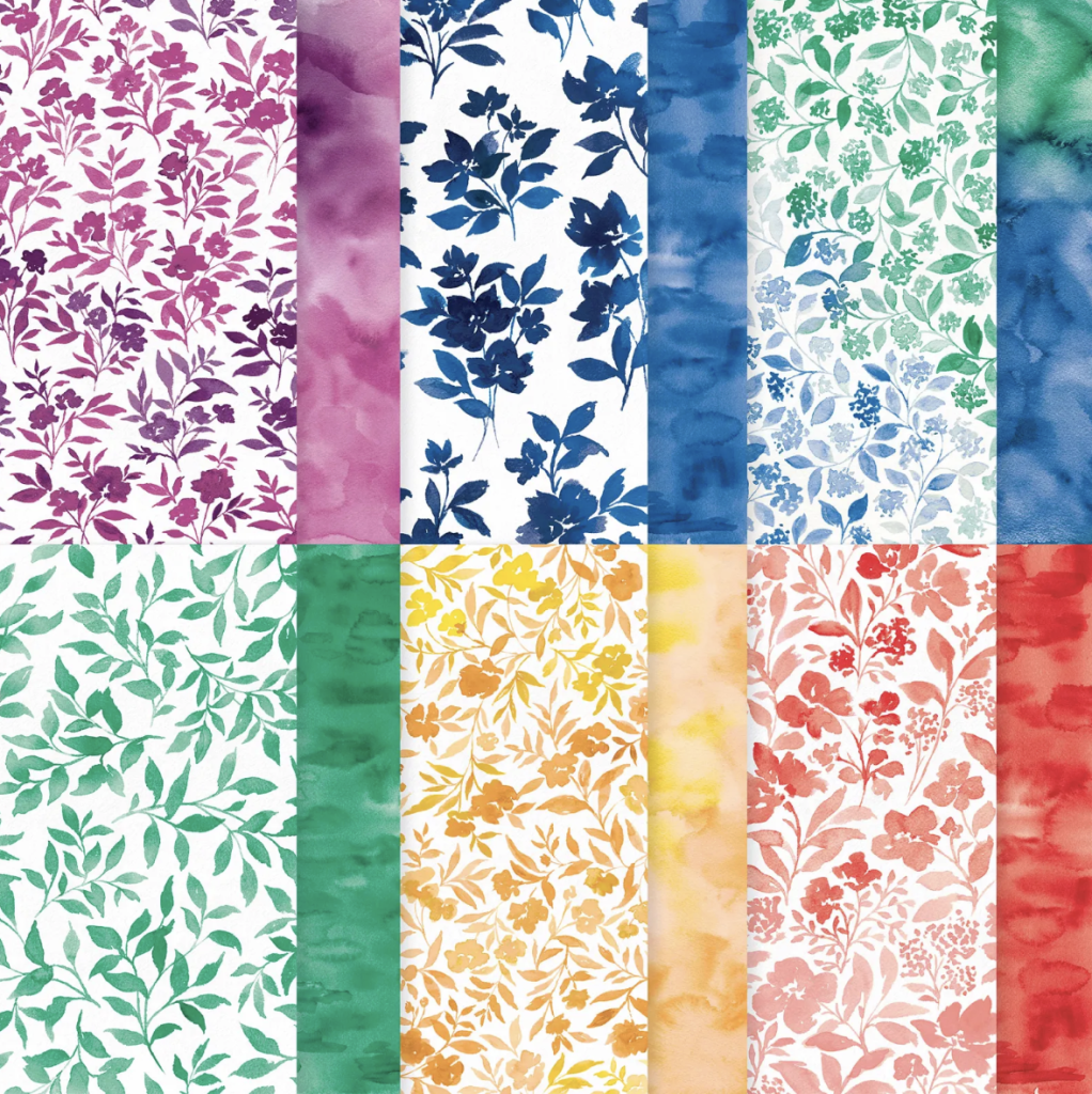
Garden Poetry 12″ x 12″ Designer Series Paper
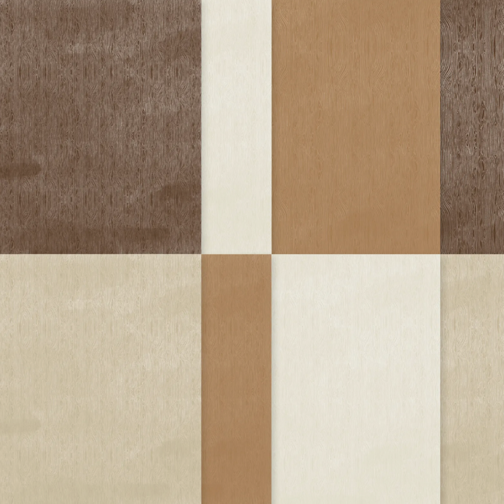
Wood Grain Wonders 12″ x 12″ Designer Series Paper
This all-purpose “hello” card was the perfect excuse to play with these exciting new goodies, as well as a fabulous embossing folder which is currently in the last chance section of the website.
My colour combination of Poppy Parade, Shaded Spruce, Basic White, Early Espresso and Pecan Pie was inspired by the colours in the two Designer Series Papers I used for the card.
The Garden Poetry 12″ x 12″ Designer Series Paper gives the plant flowers and leaves a soft watercolour effect, so it looks hand coloured without any actual colouring.
I simply used the Help Me Grow dies to die cut the leaves and flowers from the Poppy Parade and Shaded Spruce patterns in the DSP.
The three plant pots from the Help Me Grow dies are cut from the timber patterns in the Wood Grain Wonders DSP, giving them beautiful warmth and realism.
Behind the garden scene, I added a panel embossed with the Pressed Flowers Embossing Folder. It gives the softest, delicate background texture without competing with the focal point. And at $7.70 on the Last Chance list, it’s an absolute steal.
The only stamping on the card is the simple “Hello” sentiment from the Help Me Grow stamp set.
I embellished the garden scene with three Ladybirds from the Ladybug Garden Epoxy Shapes and a few Poppy Parade Dear Dots in the centre of the flowers.
Take a look at some more Poppy Parade inspiration on our Insta Hop!
Our blog hop is now an Instagram hop but the good news is that you don’t need to have an Instagram account to view all of the other projects!
Simply copy any of the Insta handles below into a new search engine window to follow the Instagram hop at any point.
Next in our Hop is Kate @craftwithkate. Be sure to check out her gorgeous project/s.
The full list of this week’s InstaHop is listed below:
Kate @craftwithkate
Helen @apaperparadise
Kirsty @crafty.littlemiss
Rachel @rachelpalmieristampin
Cathy @whatcathymade – you are here!
Thank you for joining me for Week 41 of Colour Creations. We’ll be back next Wednesday when we are showcasing Pretty In Pink. I hope you can join us then.
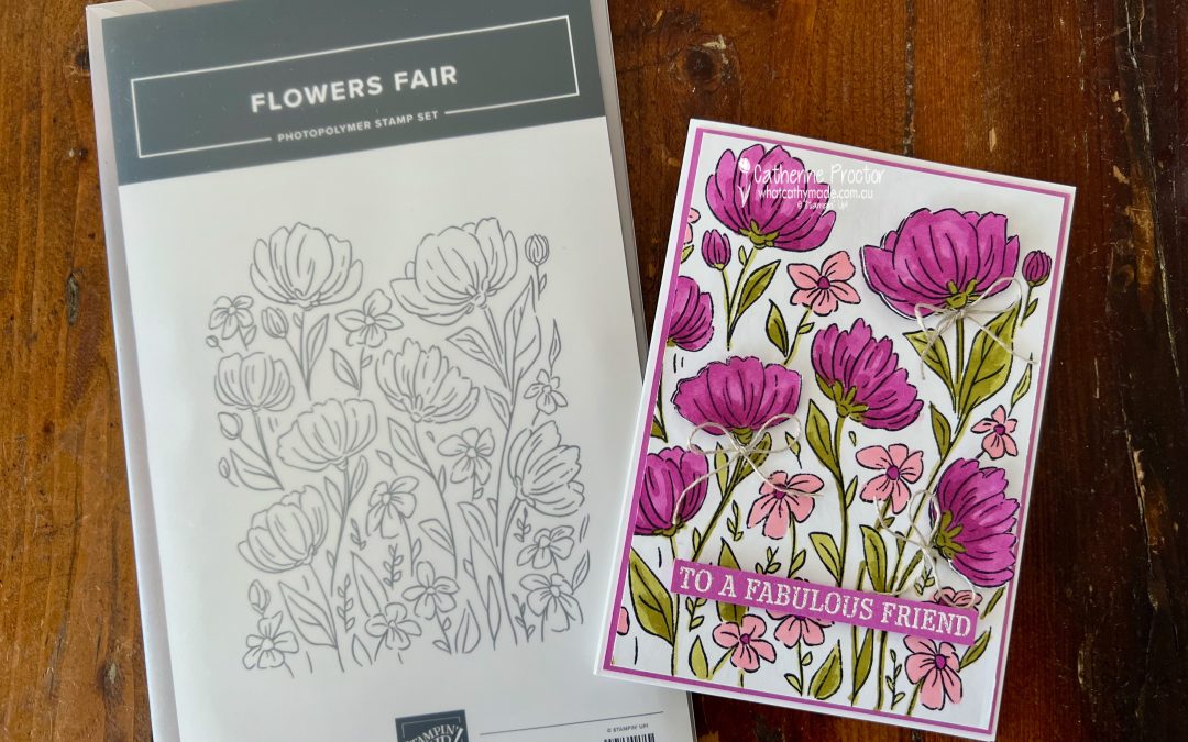
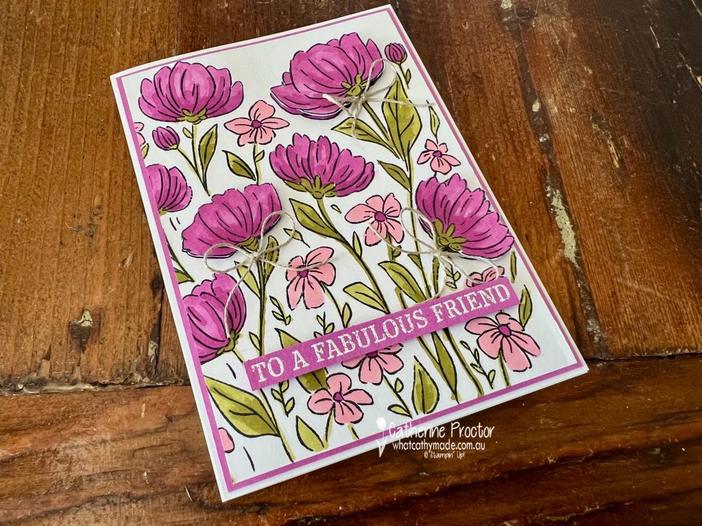
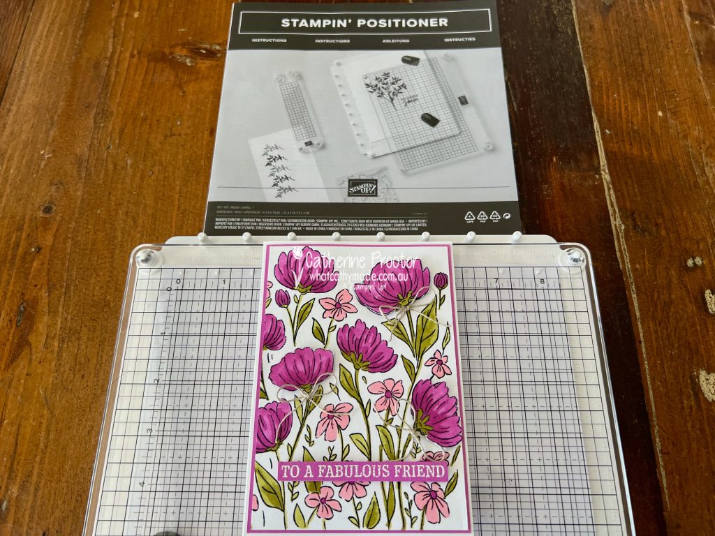
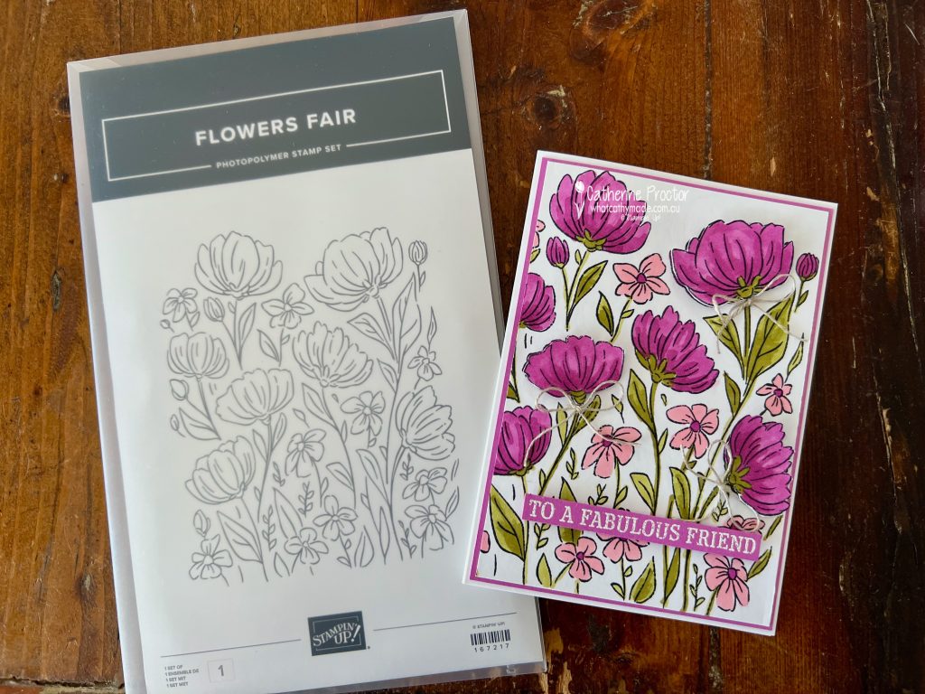
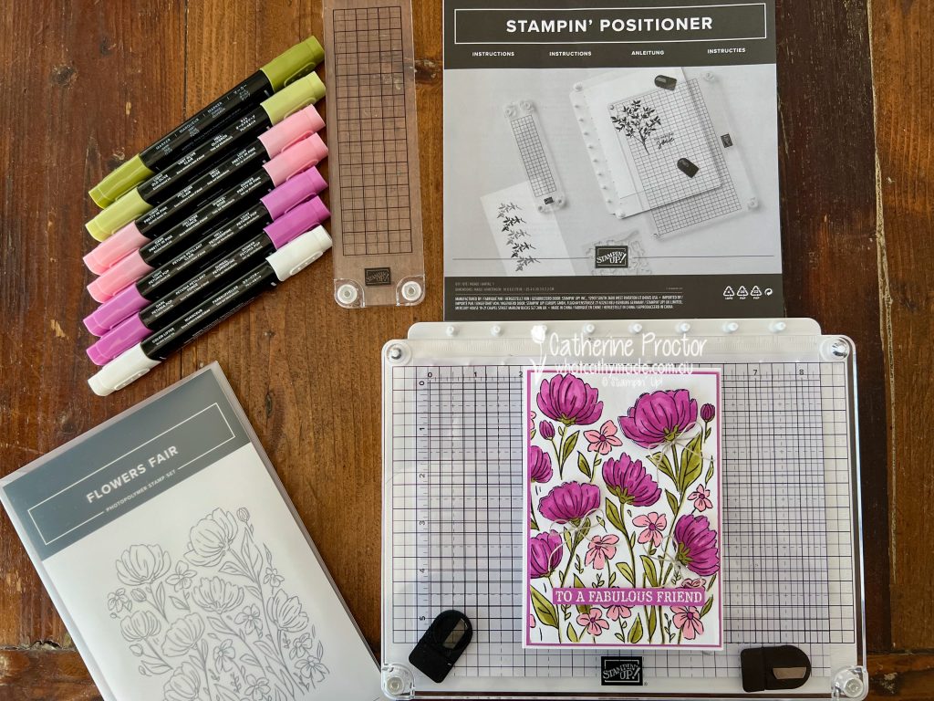
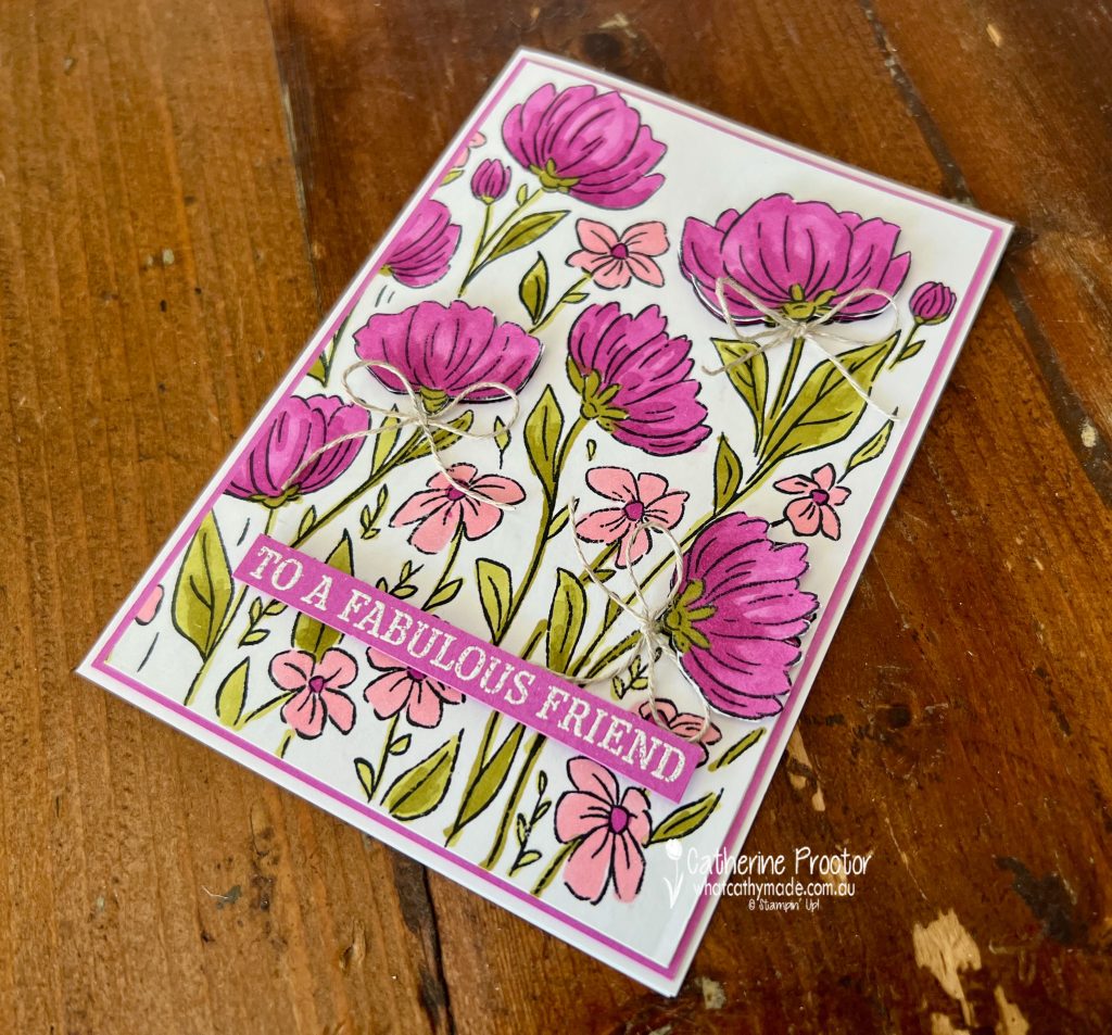
Week 39 of the Art With Heart Colour Creations InstaHop is all about Petunia Pop and I could not resist going bold and floral to celebrate this gorgeous colour.
This all-purpose card was the perfect excuse to play with two exciting new goodies.
I used the brand new Stampin’ Positioner, a stamping alignment tool designed to make stamping easier and more accurate. It’s free with the current joining offer.
There are so many cool things you can do with the Stampin’ Positioner. You can stamp perfectly aligned images, create repeating backgrounds, stamp Two-Step images with ease, and make multiples in minutes.
It is perfect for background stamps like this one, the Flowers Fair background stamp set, which will be available in the upcoming March Online Exclusives.
This is the first time Stampin’ Up! have released a background stamp in photopolymer, so the Stampin’ Positioner was absolutely the hero tool here for getting a crisp, perfectly placed impression. Top tip: I “seasoned” the stamp with an eraser before stamping to help the ink grip beautifully on the first impression.
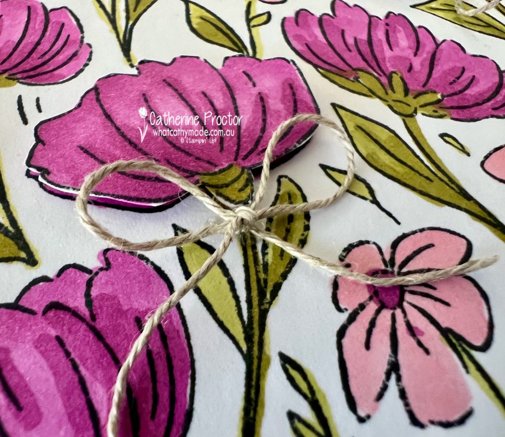
To add dimension, I stamped a second image, fussy cut three flowers and popped them up with Stampin’ Dimensionals. I tucked little bows of Linen Thread underneath each flower for a soft, textured finish.
I’ve coloured the stamp with Stampin’ Blends in Petunia Pop, Pretty in Pink and Old Olive. I love this colour combination!
The sentiment is from the January Product of the Month, the Fabulous Sayings stamp set. I deliberately kept the inside blank so this card can work for lots of different occasions.
Take a look at some more Petunia Pop inspiration on our Insta Hop!
Our blog hop is now an Instagram hop but the good news is that you don’t need to have an Instagram account to view all of the other projects!
Simply copy any of the Insta handles below into a new search engine window to follow the Instagram hop at any point.
Next in our Hop is Kate @craftwithkate. Be sure to check out her gorgeous project/s.
The full list of this week’s InstaHop is listed below:
Kate @craftwithkate
Kirsty @crafty.littlemiss
Helen @apaperparadise
Rachel @handstamped_by_rachel
Andrea @andreaksargent
Cathy @whatcathymade – you are here!
Thank you for joining me for Week 39 of Colour Creations. We’ll be back next Wednesday when we are showcasing the ever versatile, Pool Party. I hope you can join us then.
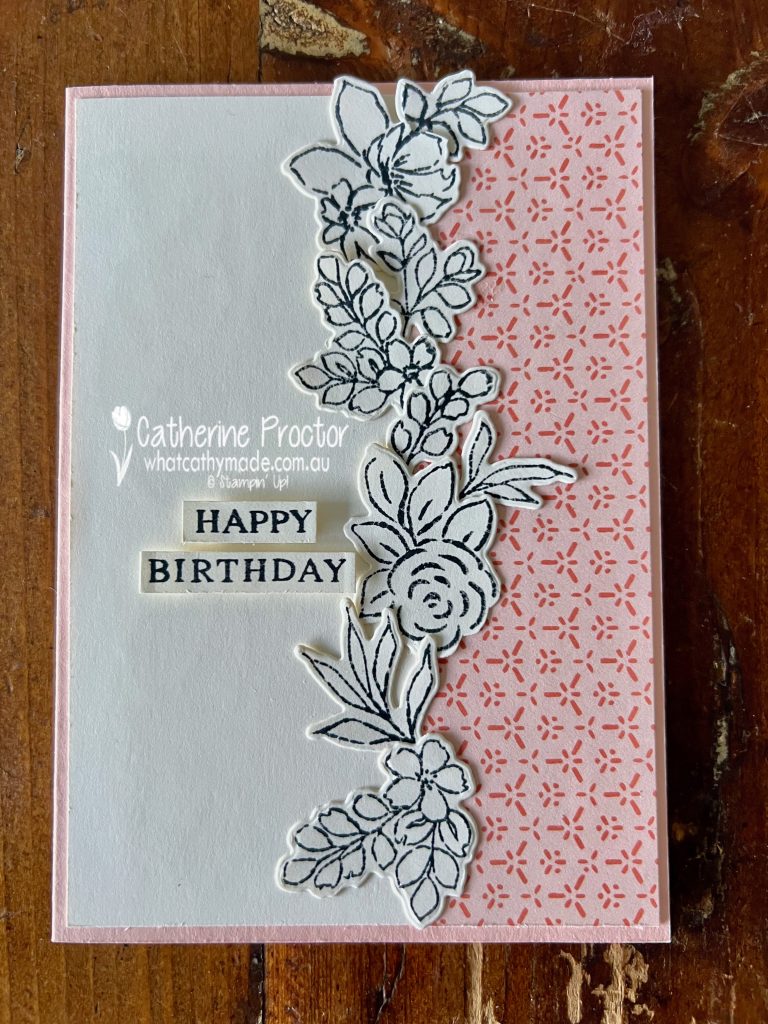
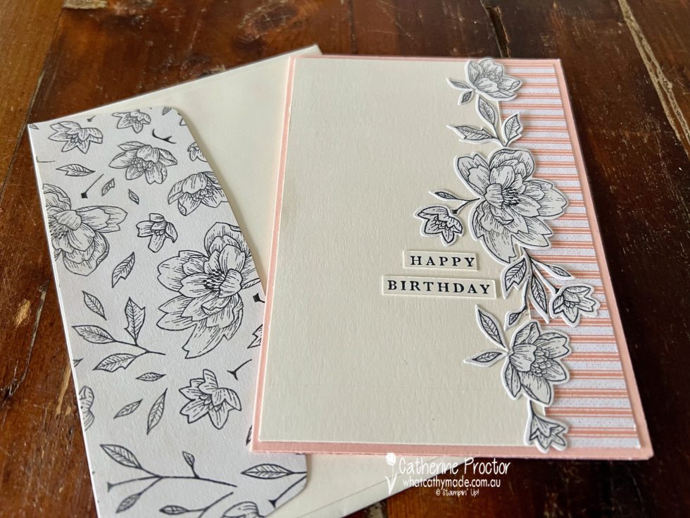
For Week 38 of Colour Creations, we are playing with the beautifully soft and versatile Petal Pink, and this week’s project is a birthday card that I’ve CASED from myself!
The layout is based on a card I made three years ago using the Abigail Rose DSP paired with the Cottage Flowers Dies. It is always interesting to revisit older designs with fresh products and see how they evolve. Same bones, completely new personality. Here’s the original card from three years ago:
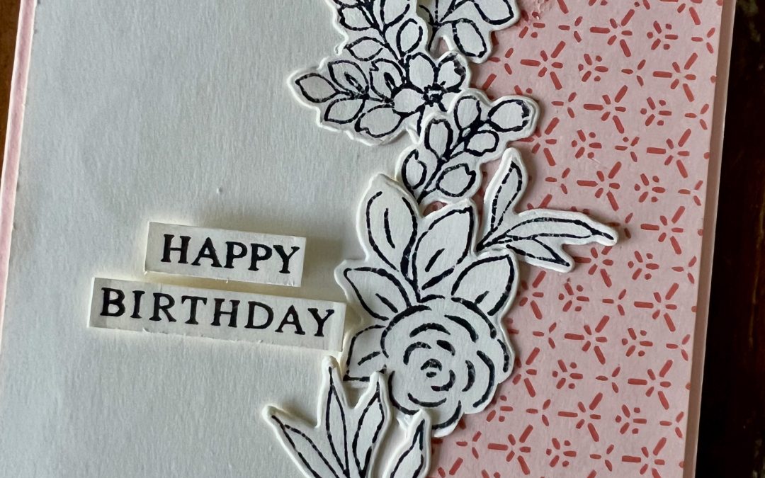
This year’s card was created using Very Vanilla card stock, stamped in Black Memento ink with the gorgeous Extraordinary Floral Bundle. I absolutely love how striking black ink looks on Very Vanilla. It feels classic and timeless, and it allows the detailed floral line work to really shine without the need for additional colouring.
To bring in our feature colour, I added Petal Pink Designer Series Paper from the Painterly Pears Designer Series Paper. The subtle Petal Pink pattern works perfectly as a soft backdrop and appears on the side panel of the card as well as on the handmade envelope.
The envelope is made using the same Petal Pink DSP for a coordinated look, and the address label on the front was created with the Modern Oval Punch. I added a hand drawn border and used some of the leftover floral offcuts.
The sentiments on both the front and the inside of the card are from the the Beautiful Butterflies Stamp Set which is a last chance stamp set. The rest of the leftover floral offcuts adorn the inside of the card.
Take a look at some more Petal Pink inspiration on our Insta Hop!
Our blog hop is now an Instagram hop but the good news is that you don’t need to have an Instagram account to view all of the other projects!
Simply copy any of the Insta handles below into a new search engine window to follow the Instagram hop at any point.
Next in our Hop is Kate @craftwithkate. Be sure to check out her gorgeous project/s.
The full list of this week’s InstaHop is listed below:
Kate @craftwithkate
Andrea @andreaksargent
Kirsty @crafty.littlemiss
Helen @apaperparadise
Vicki @vickiboucher
Cathy @whatcathymade – you are here!
Thank you for joining me for Week 38 of Colour Creations. We’ll be back next Wednesday when we are showcasing Petunia Pop. I hope you can join us then.
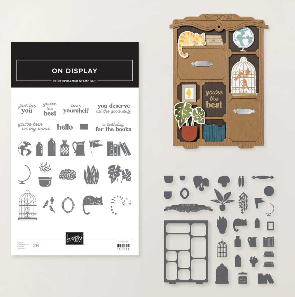
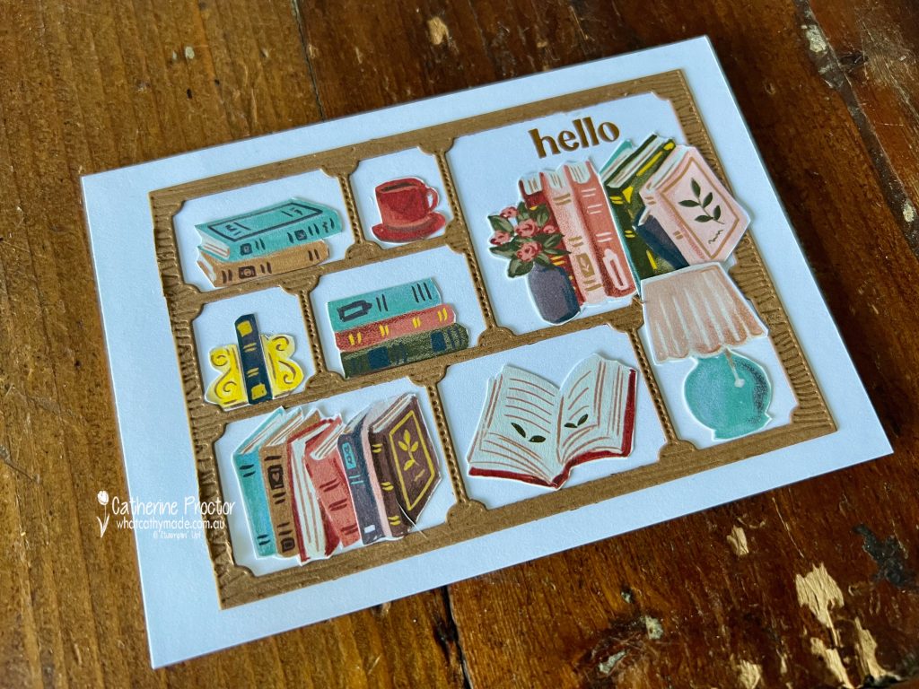
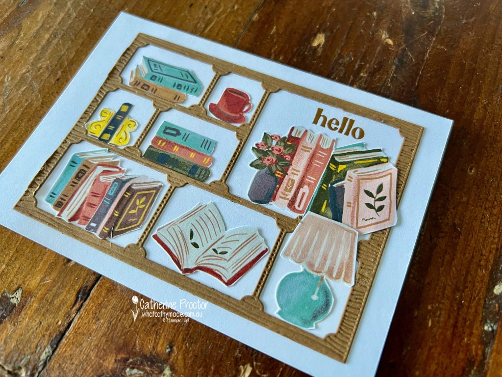
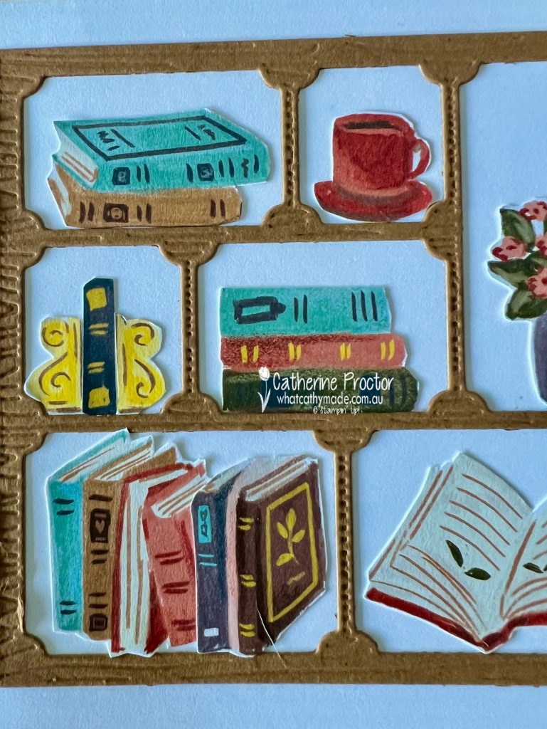
I have worked in publishing all my life, and whether books are found in libraries, bookshops or stacked at home, they bring me an enormous amount of comfort, inspiration and joy.
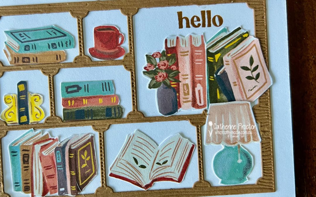
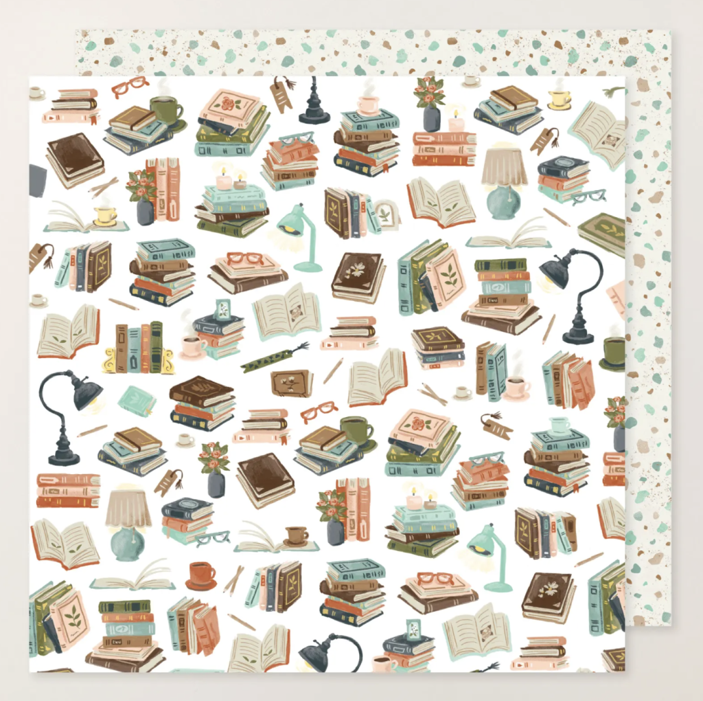
So for Week 37 of Colour Creations I knew I wanted to create something that celebrated that love of books using a combination of the On Display bundle and the book themed paper from the Hobby Haven DSP.
My bookcase was die cut from Pecan Pie card stock using the largest bookcase die in the bundle. Once the bookcase was adhered to the card base, I carefully fussy cut the shelves to open up each compartment. Yes, this happened after I had already glued it down. Oops!
I’ve filled the shelves with individually fussy cut images from the Hobby Haven DSP. Stacked books, an open book, a coffee cup, a little lamp and a vase of flowers all come together to create a cosy, collected look.
I deliberately arranged the books so they feel a little imperfect and well-loved, rather than styled and symmetrical, much like a real bookcase that has grown over time.
The sentiment, a simple “hello”, is stamped in Pecan Pie using the On Display Stamp Set, which is part of the same bundle. It sits neatly in the top right shelf, almost like the greeting is tucked in among the books themselves.
Take a look at some more Pecan Pie inspiration on our Insta Hop!
Our blog hop is now an Instagram hop but the good news is that you don’t need to have an Instagram account to view all of the other projects!
Simply copy any of the Insta handles below into a new search engine window to follow the Instagram hop at any point.
Next in our Hop is Kate @craftwithkate. Be sure to check out her gorgeous project/s.
The full list of this week’s InstaHop is listed below:
Kate @craftwithkate
Andrea @andreaksargent
Kirsty @crafty.littlemiss
Rosa @hum.and.stamp
Helen @apaperparadise
Vicki @vickiboucher
Cathy @whatcathymade – you are here!
Thank you for joining me for Week 37 of Colour Creations. We’ll be back next Wednesday when we are showcasing Petal Pink. I hope you can join us then.
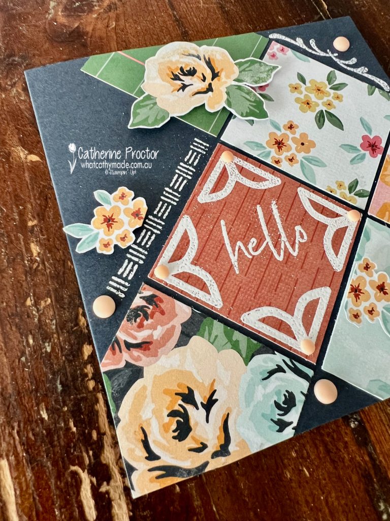
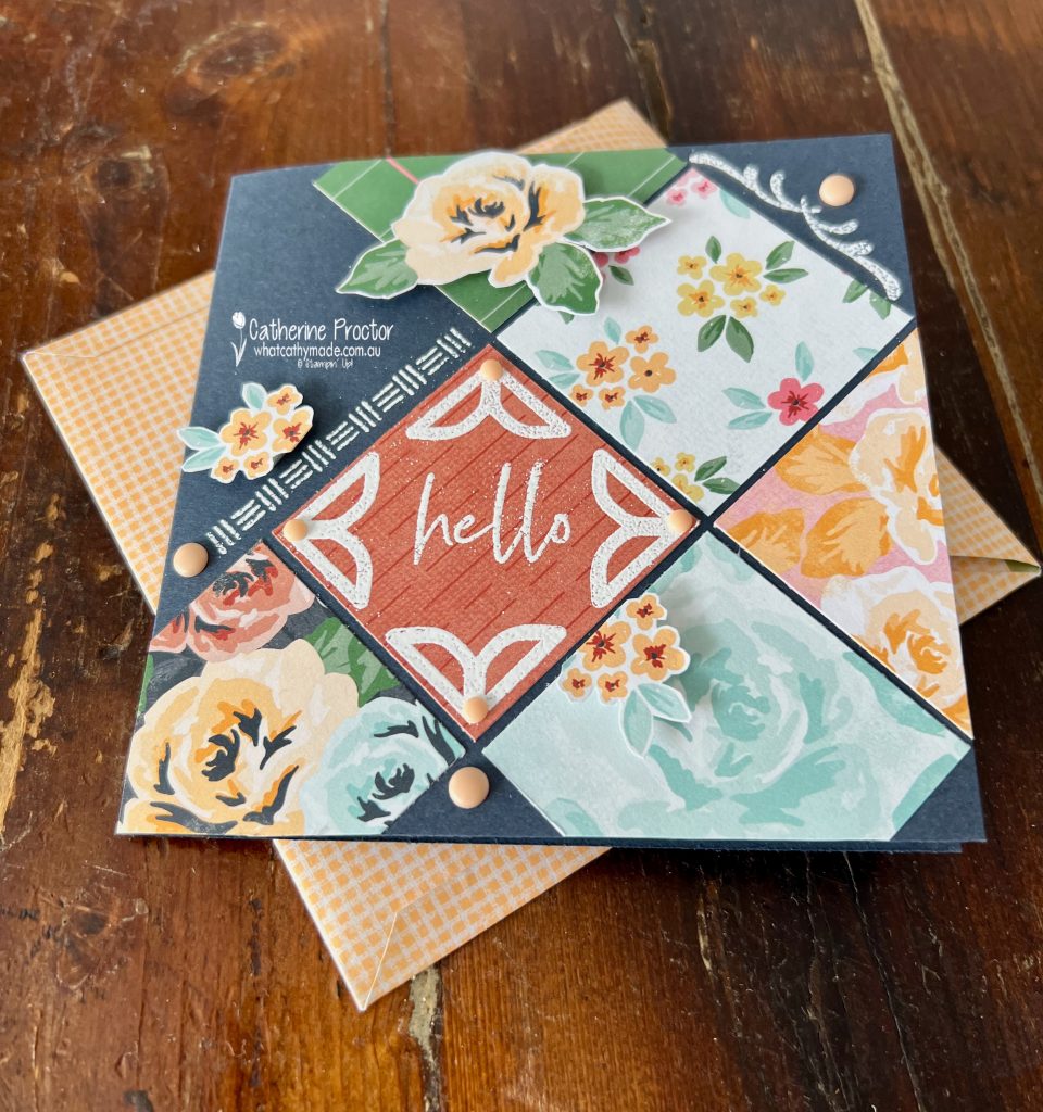
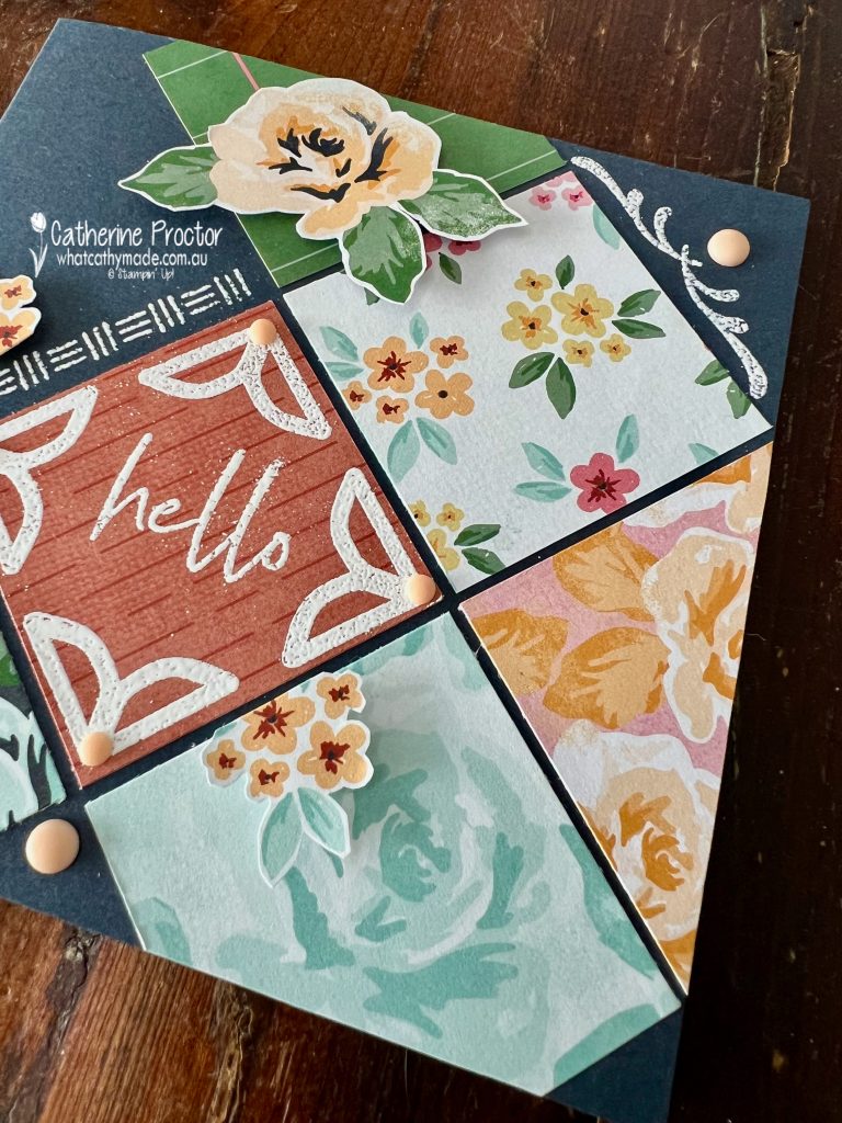
Welcome to Week 36 of Colour Creations, where we are playing with the soft warmth of Peach Pie.
For this project, I paired Peach Pie with a Secret Sea card base to create strong contrast and visual depth. These two colours work beautifully together. The Peach Pie really pops against the deep, moody background, while Secret Sea anchors the design and keeps it feeling polished rather than pastel-heavy.
The layout of my card was inspired by the scrapbook page on page 2, inside the front cover of the new January–April Mini Catalogue.
I loved how the squares were set on an angle in the 12 x 12 inch layout, so I scaled that idea down for a 5 x 5 inch square card. I’ve cut squares of the Square Snippets Designer Series Paper, which pairs perfectly with the Joyful Squares Bundle.
By cutting smaller squares and tilting them, I was able to recreate the look of the scrapbook page in a card-friendly format without losing the impact of the original design.
The simple “hello” sentiment is heat embossed in white on some of the Square Snippets Designer Series Paper. I then stamped the corner stamps from the Joyful Squares Bundle to frame the hello and white heat embossed those too as well as the further stamping on the card base.
The embellishments are from the Rainbow Adhesive-Backed Dots.
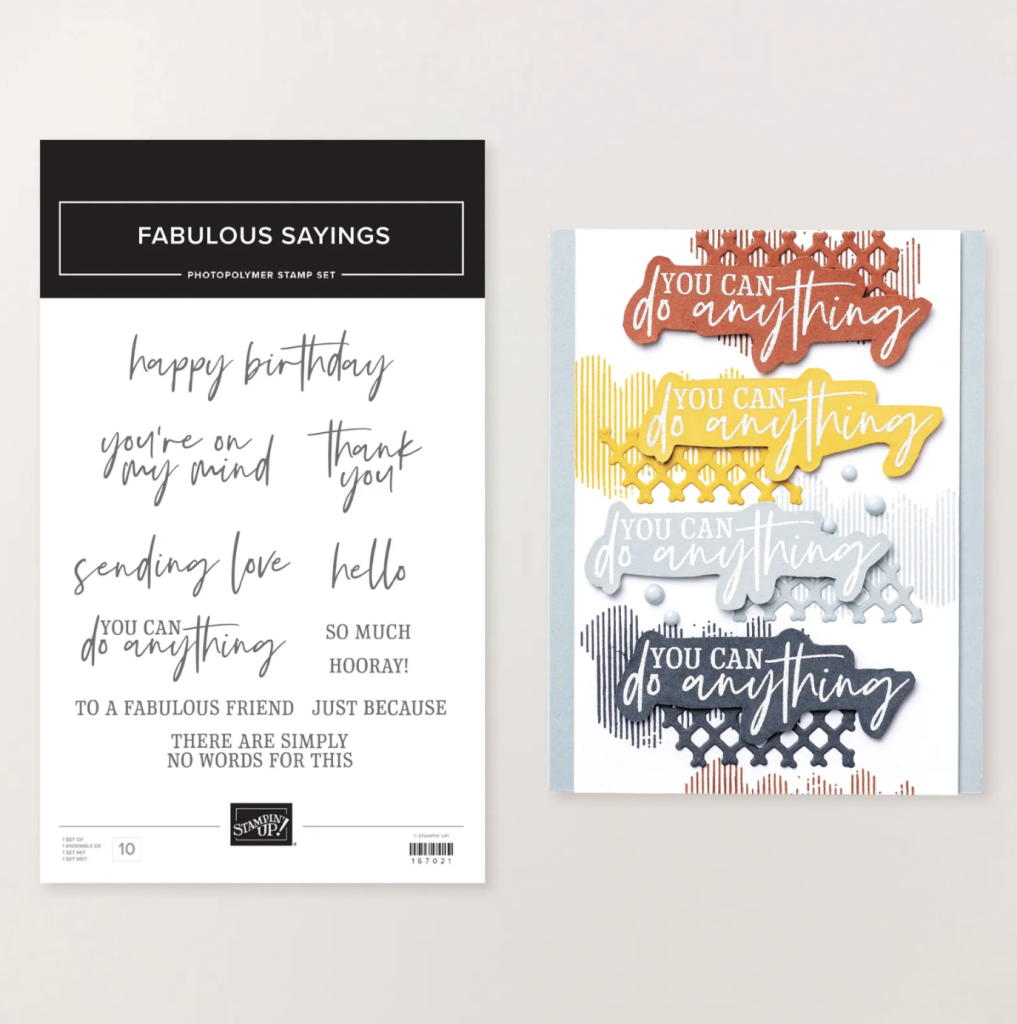
The “hello” sentiment comes from the January Product of the Month, the Fabulous Sayings Stamp Set. This set includes sentiments for just about every occasion, making it one of those go-to basics you will reach for again and again. At just $9, it is an easy addition to any craft stash.
Inside the card I’ve added a Basic White insert and stamped it using stamps from the Joyful Squares bundle. The handmade envolope is made from a 6×12 inch piece of the the Lovely & Beautiful 12″ x 12″ (30.5 x 30.5 cm) Specialty Designer Series Paper.
Peach Pie brings warmth and softness, while Secret Sea adds drama and contrast. Together, they create a balanced combination that feels modern, fresh and very versatile. If you are ever unsure how to make a lighter colour stand out, pairing it with a deep neutral like Secret Sea is a great place to start.
Take a look at some more Peach Pie inspiration on our Insta Hop!
Our blog hop is now an Instagram hop but the good news is that you don’t need to have an Instagram account to view all of the other projects!
Simply copy any of the Insta handles below into a new search engine window to follow the Instagram hop at any point.
Next in our Hop is Kirsty @crafty.littlemiss. Be sure to check out her gorgeous project/s.
The full list of this week’s InstaHop is listed below:
Kirsty @crafty.littlemiss
Andrea @andreaksargent
Kate @craftwithkate
Helen @apaperparadise
Rosa @hum.and.stamp
Cathy @whatcathymade – you are here!
Thank you for joining me for Week 36 of Colour Creations. We’ll be back next Wednesday when we are showcasing Pecan Pie. I hope you can join us then.
Welcome to Week 25 of Colour Creations, where we are working with the ever versatile Old Olive. Old Olive is my favourite green and it seems to be the most “natural” of all of the Stampin’ Up! greens, along with Mossy Meadow.
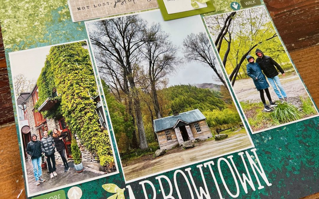
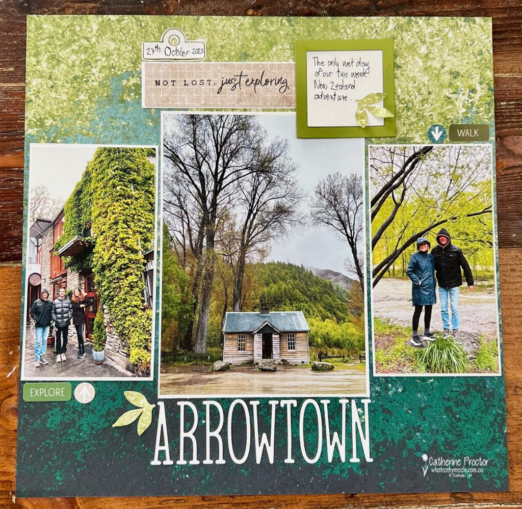
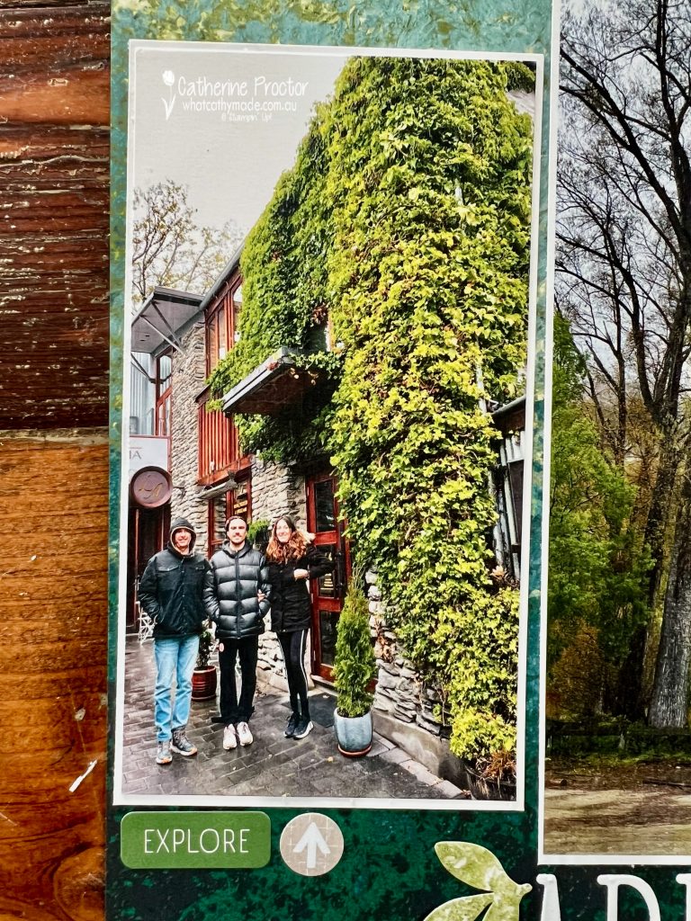
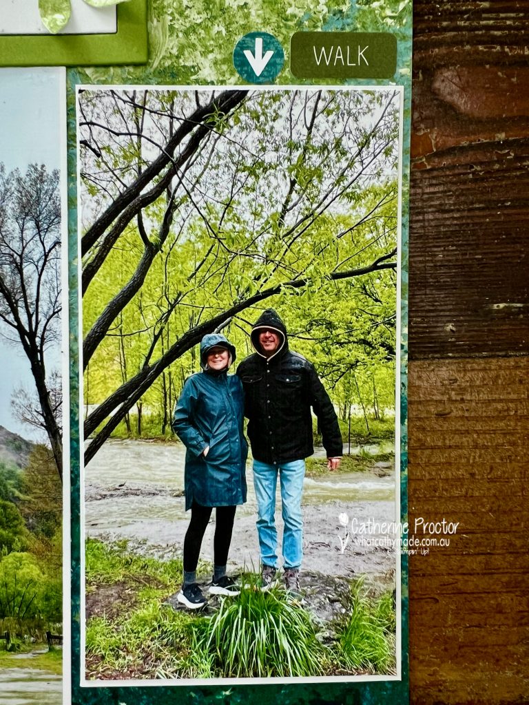
This week’s creation is a scrapbook page documenting part of our 2025 New Zealand trip, something I have not done in a very long time. Cardmaking has been my creative focus for years, but this trip was such a special moment in time that it felt important to record it in a different way.
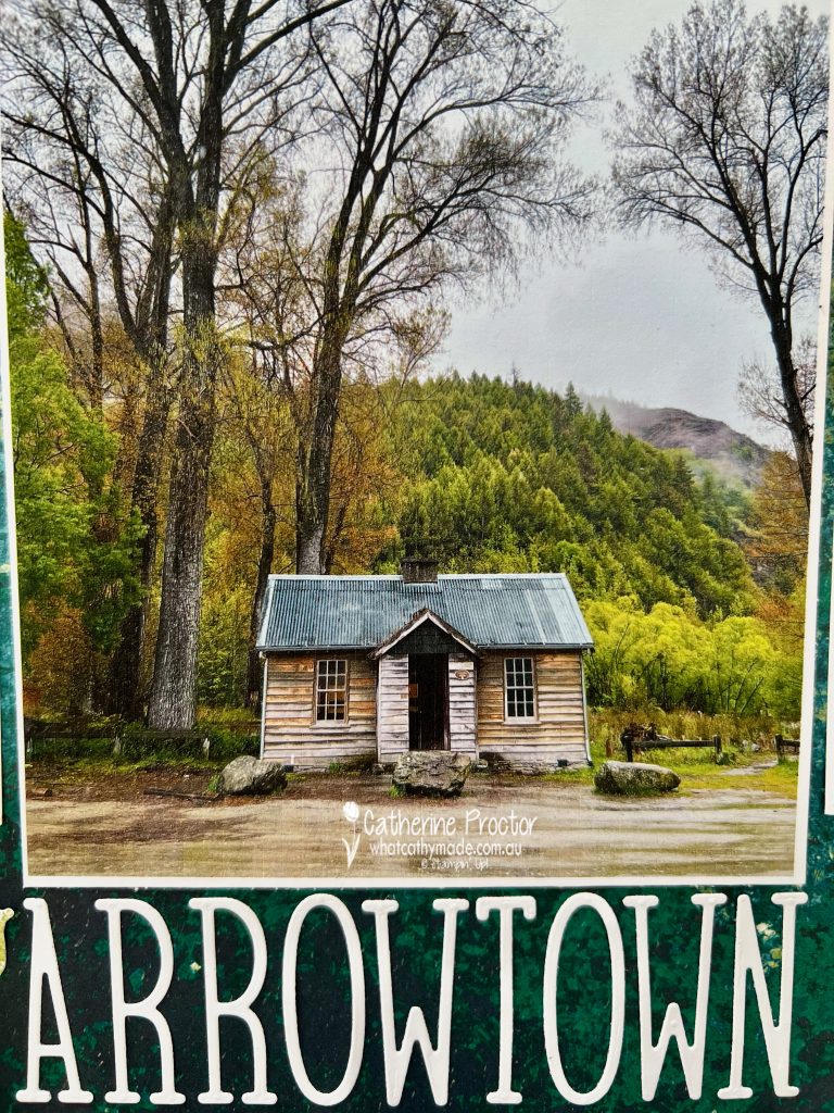
Slowing down, printing photos and telling the story on a full 12″ x 12″ page felt right. and the Nature’s Walk DSP was the perfect background for my photos of Arrowtown, New Zealand.
Our day trip to Arrowtown was the only wet day of our entire trip but even in the rain Arrowtown was spectacular with its mossy greens, historic weathered timber buildings, stone walls and flowing river.
The organic patterns and layered greens of the Nature’s Walk Designer Series Paper mirror the landscape beautifully and really anchor the photos without overwhelming them.
For the title, I used the Alphabet À La Mode Dies to spell out ARROWTOWN. I love how bold alphabet dies help ground a scrapbook page and instantly tell you where you are before you even take in the details.
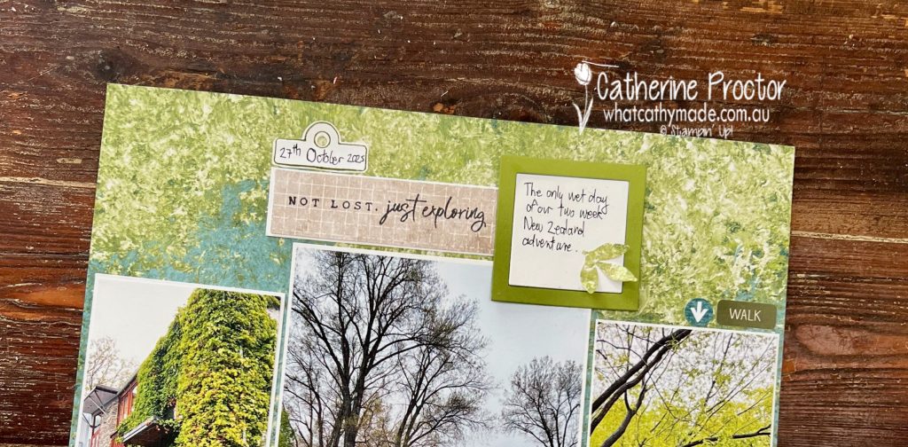
The Joyful Squares Bundle was perfect for adding small focal elements, recording the date and framing some of the journaling. I kept the embellishing minimal, letting the photos do the talking, but these little details help guide the eye around the page.
The sentiment pieces come from the Exploring Nature Stamp Set, which could not have been more appropriate. Phrases like “Not lost, just exploring” captured exactly how this trip felt.
And even though I hate my handwriting, one of my favourite details on the page is the small journaling note about the rain. Sometimes the imperfect moments are the ones you remember most.
Take a look at some more Old Olive inspiration on our Insta Hop!
Our blog hop is now an Instagram hop but the good news is that you don’t need to have an Instagram account to view all of the other projects!
Simply copy any of the Insta handles below into a new search engine window to follow the Instagram hop at any point.
Next in our Hop is Andrea @andreaksargent. Be sure to check out her gorgeous project/s.
The full list of this week’s InstaHop is listed below:
Andrea @andreaksargent
Kate @craftwithkate
Kirsty @crafty.littlemiss
Helen @apaperparadise
Cathy @whatcathymade – you are here!
Thank you for joining me for Week 25 of Colour Creations. I hope this page encourages you to revisit an old photo, a special trip or a memory that deserves to be told on paper.
We’ll be back next Wednesday when we are showcasing Peach Pie. I hope you can join us then.