Tonight the Art with Heart team are sharing creative projects CASED from the annual catalogue. If you CASE a project it means you Copy And Share Everything. If you would like a copy of the 2018 – 2019 annual catalogue, contact any of the girls on the blog hop and we will get in touch with you.
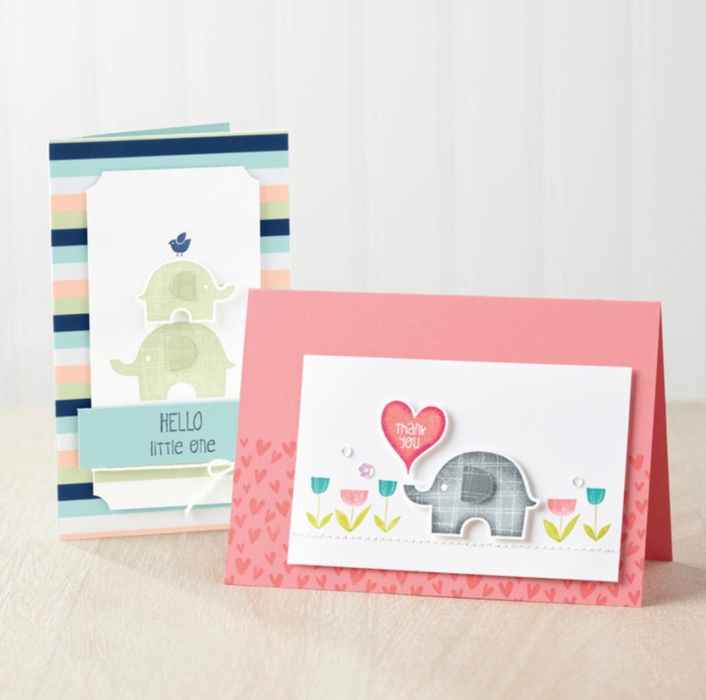
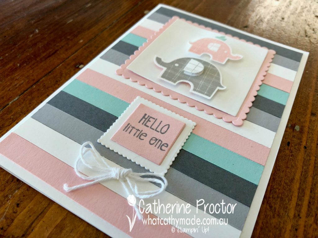
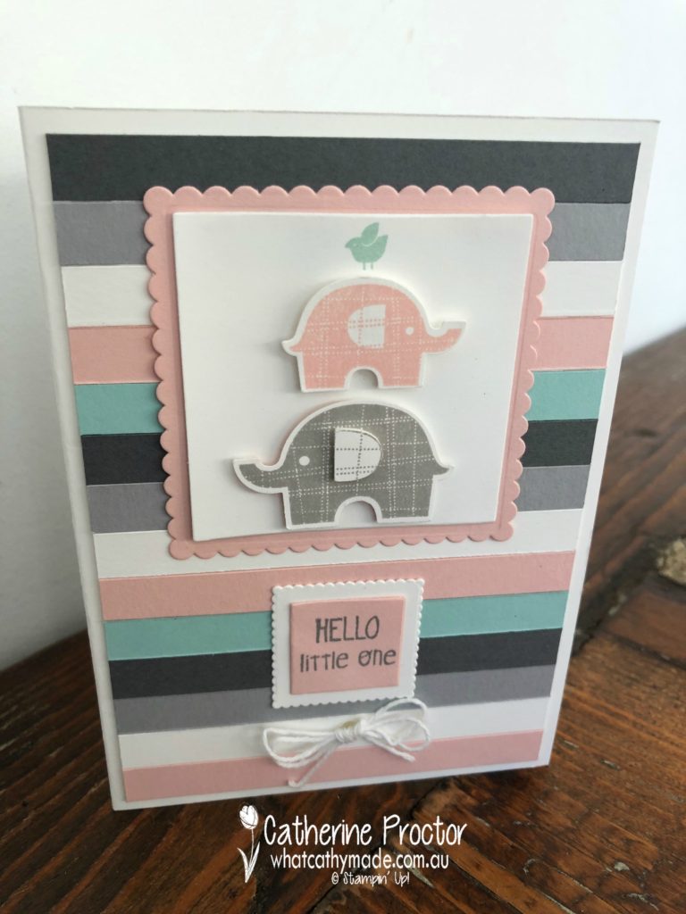
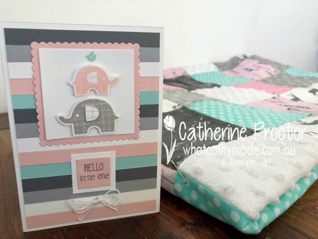
This is the card (back left in the photo below) that I decided to CASE from page 91 of the annual catalogue, changing the colours and some of the design elements to match a special project I’m making.
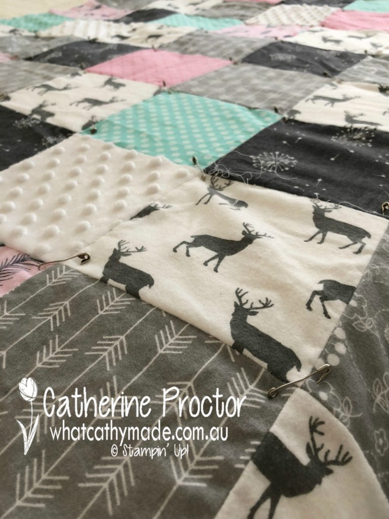
When I’m not paper crafting I also love to sew. And the birth of a new baby is the perfect excuse to make a new quilt.
My youngest sister-in-law is just about to give birth to her very first baby (it’s a little girl) and I can’t wait to meet her. I’m making a quick, easy and cosy flannelette quilt for her in soft grays, pinks, and whites, with just a touch of Pool Party aqua (one of my sister-in-law’s favourite colours).
Please excuse the pins and loose threads in the photo below…I’ve just assembled the quilt sandwich layers, ready to finally quilt it all together.
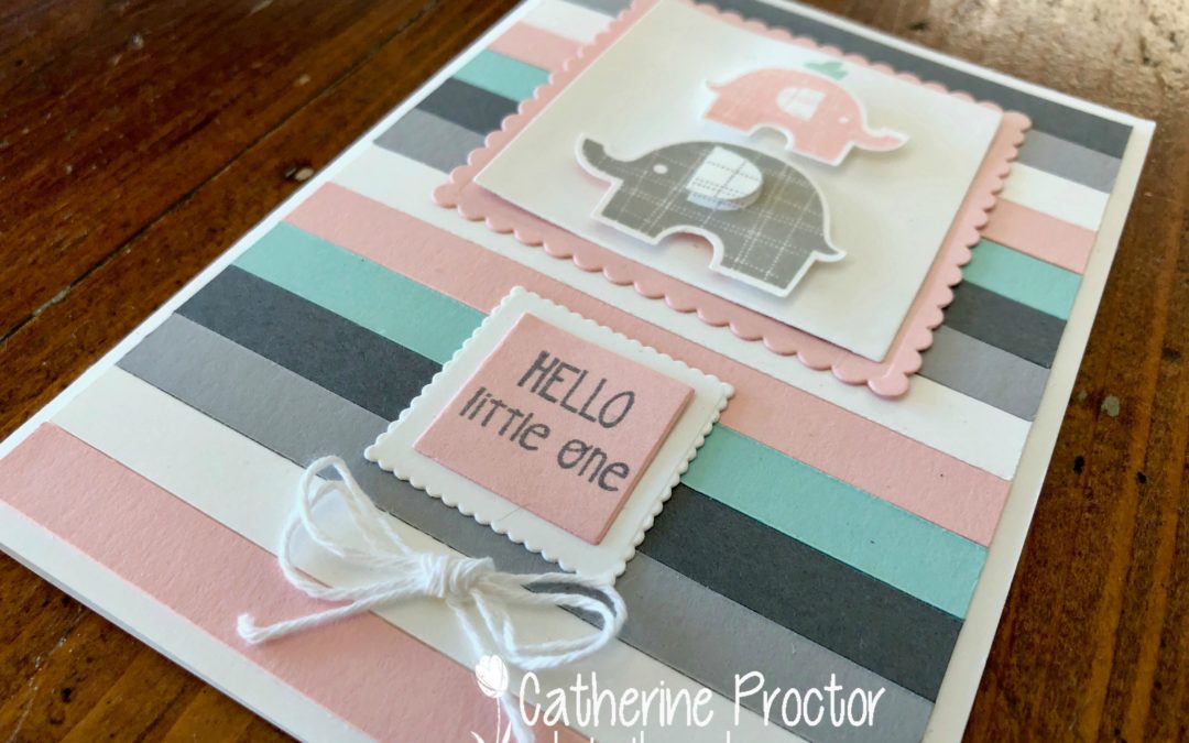
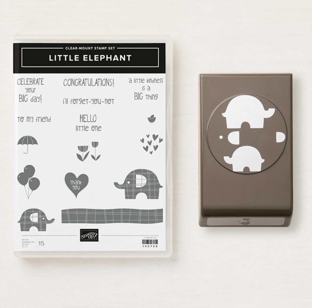
Once I finish quilting it (and I’d better get my skates on as she’s due in the next couple of weeks!) I’ll wrap it up and present it with my matching CASEd card, which I made using a fantastic new punch bundle called Little Elephant bundle.
Check out the teeny tiny details, such as the punch for the elephant’s ears and eyes, and the little bird stamp!
I really loved the striped DSP used on the card in the catty (it’s from the Twinkle Twinkle DSP pack) but the colours didn’t quite match my quilt. So I used my Stampin’ Up! trimmer to cut 1cm strips of Basic Gray, Smokey Slate, Whisper White, Powder Pink and Pool Party card stock and layered them horizontally over three vertical strips of tear and tape.
Ta da…my very own custom striped DSP!
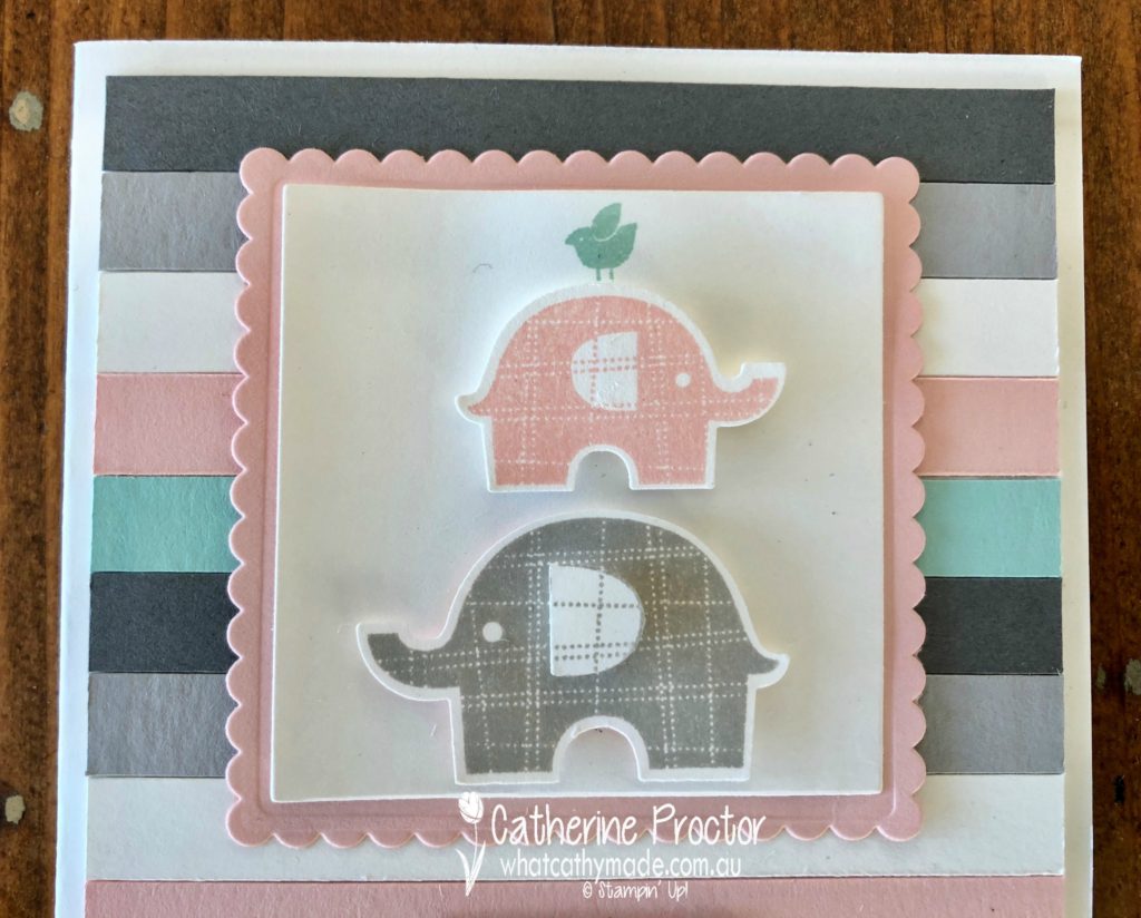
The little elephants were stamped and then punched out and layered on top of Powder Pink and Whisper White card stock that I had cut using the layering squares dies.
Did you spot the little Pool Party bird on top of the smallest elephant? And the layered elephant ear on the largest elephant? I just love these little details!
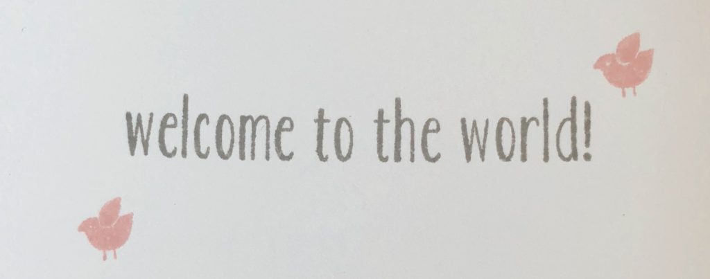
I used the same “Hello little one” sentiment stamp as the original card in the catty for the front of the card, but I’ve also added in the lovely “Welcome to the World” sentiment from the Baby Bear stamp set for the inside of the card.
And the final touch on the card is a little bow made from the Whisper White bakers twine.
Here is a photo of the card and the quilt together…I can’t wait to see my newborn niece all snuggly and warm, wrapped up in this quilt!
Now it’s time to hop on over to our next participant, the very talented, Kimberley Hern.
If you find a broken link or have come to this blog hop from a different entry point, you can view the participants below:
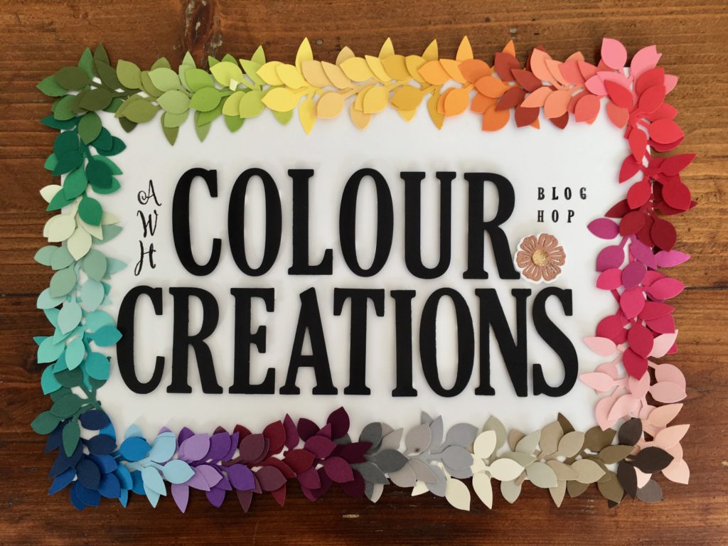
Welcome to week 4 of the Art With Heart Colour Creations Blog Hop!
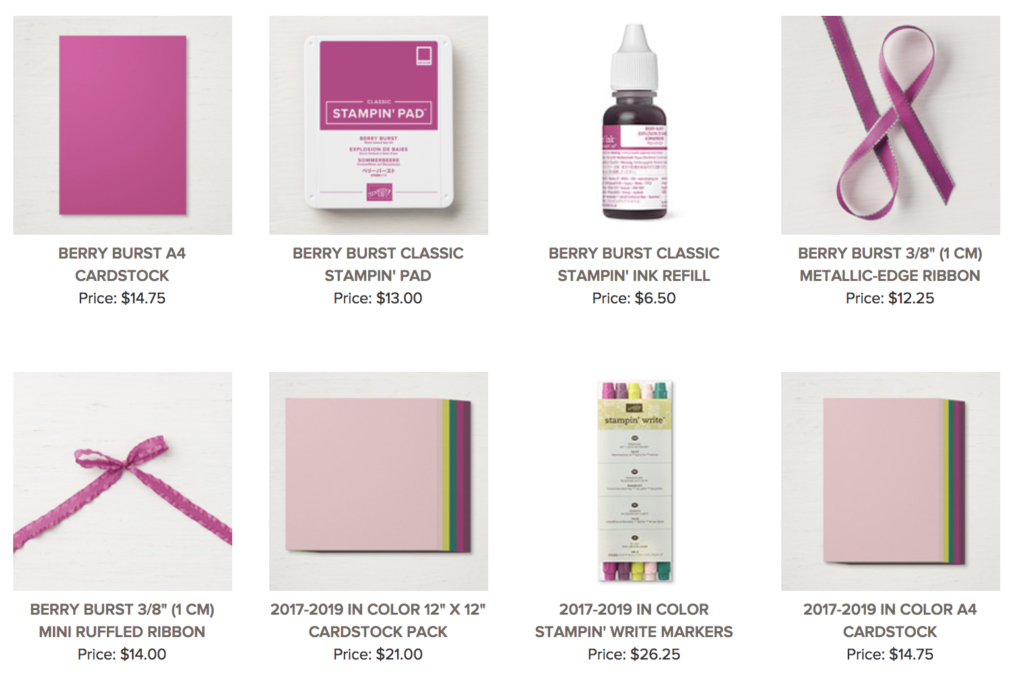
This week we are showcasing one of the 2017-2019 In Colours: Berry Burst.
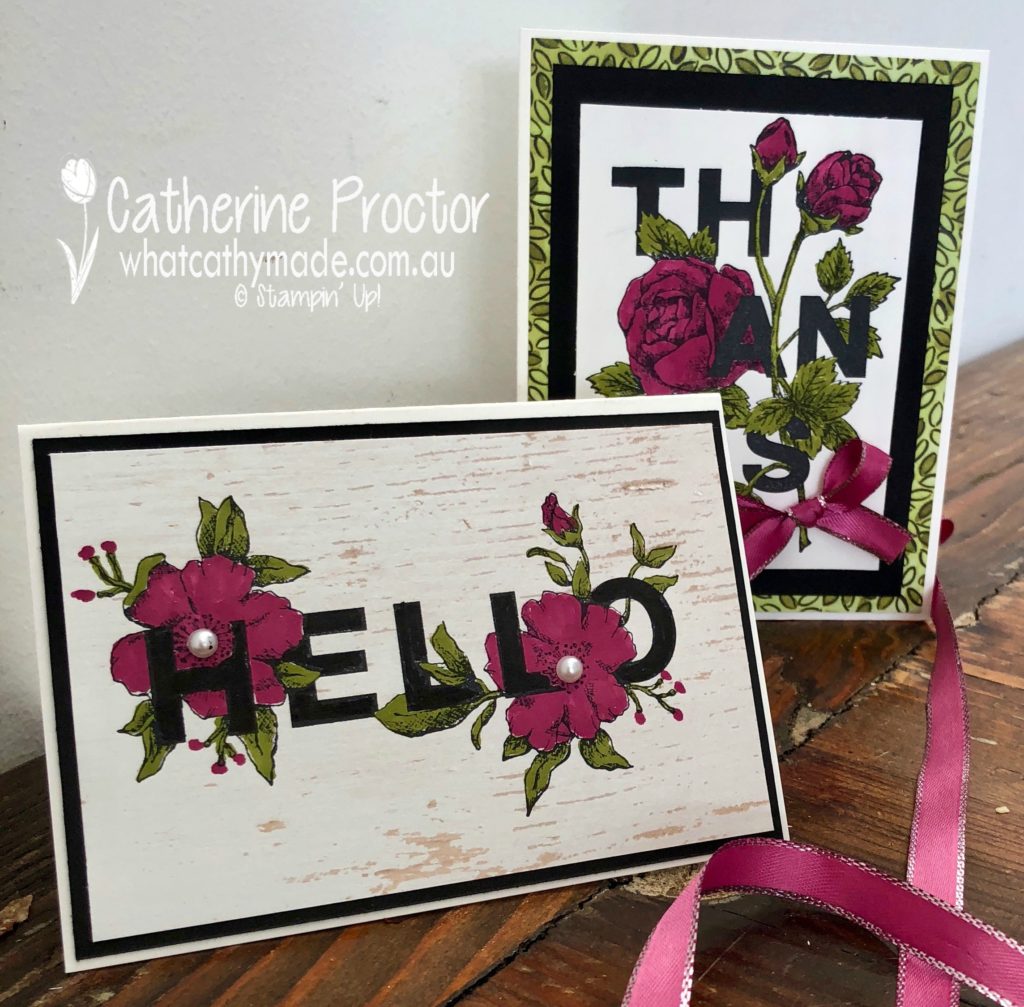
For my projects today I’ve teamed Berry Burst with Old Olive and Basic Black…I just love the richness of these colours together!
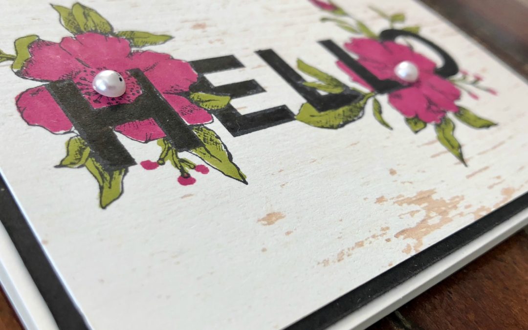
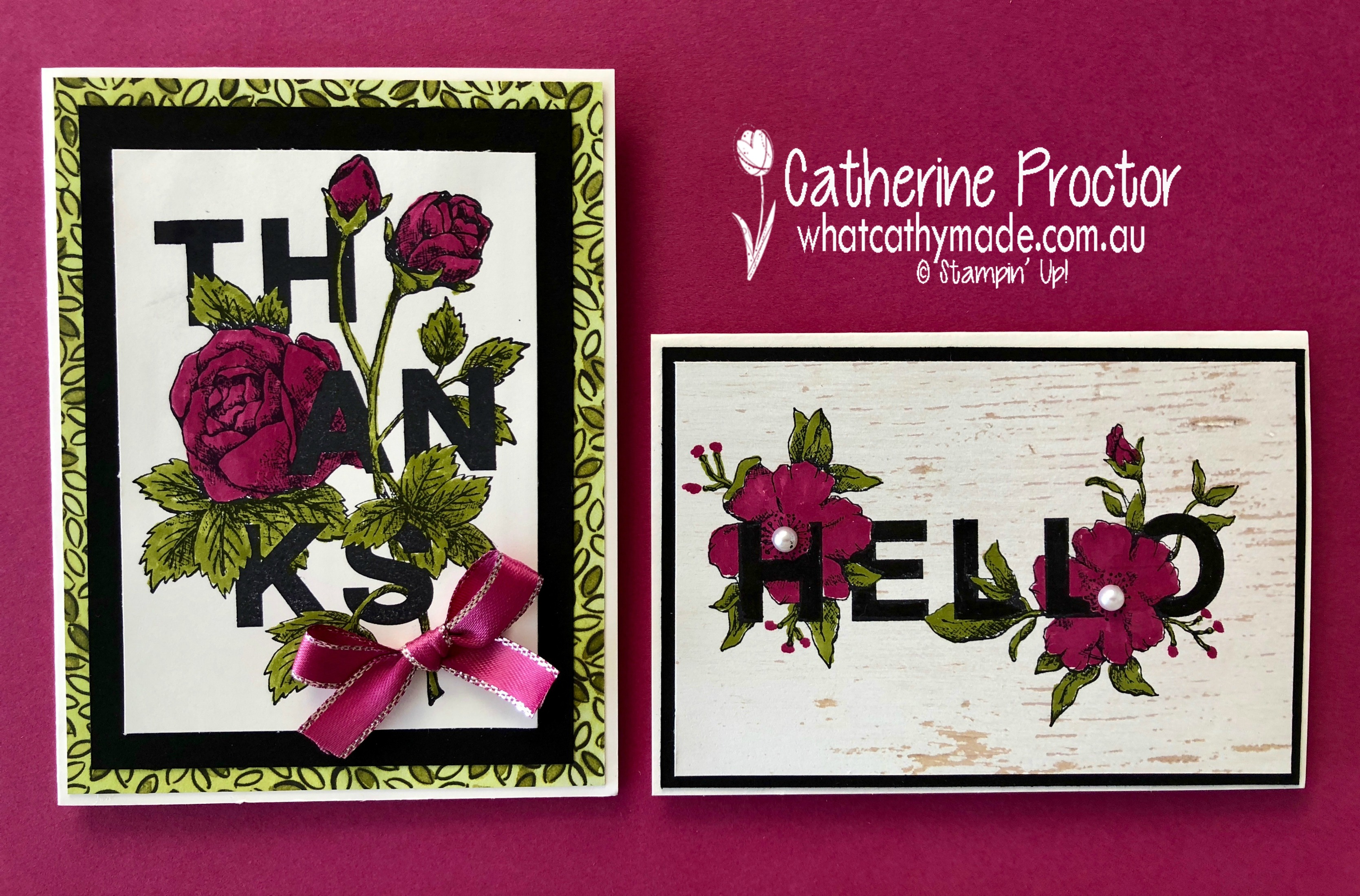
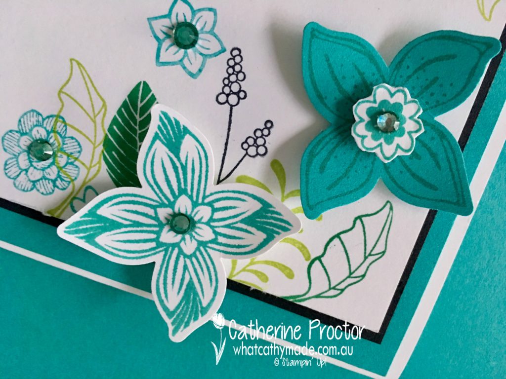
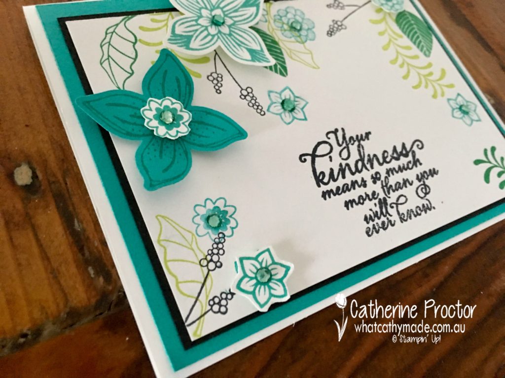
Both cards are made with the Floral Statements stamp set. This is such a great stamp set because it does all the hard work for you. There’s no juggling the position of the image and sentiment…both stamps artfully combine the two, so all you need to do is simply stamp and then colour. Too easy!
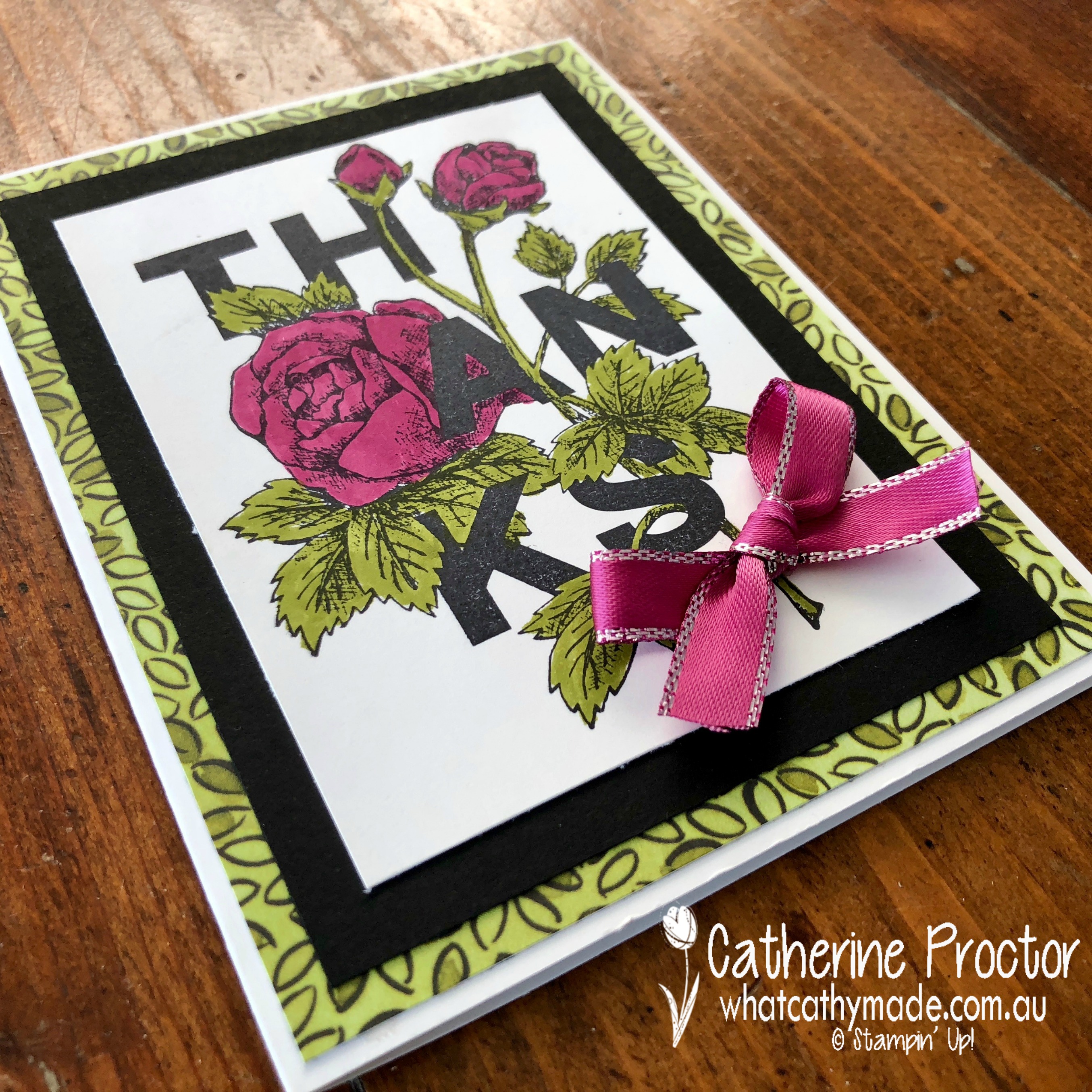
My first card couldn’t be simpler…I simply stamped the “Thanks” stamp in Basic Black onto Whisper White card stock and coloured the flowers with Berry Burst and Old Olive Stampin’ Write Markers.
I then mounted the coloured image onto Basic Black card stock and the stunning Share What You Love DSP, adhering it all to a Whisper White Card. The final touch is a bow made from the Berry Burst Metallic Edge Ribbon.
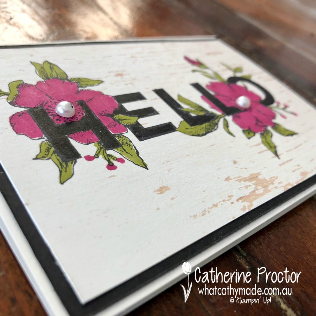
The second card was just as easy. This time I stamped the “Hello” stamp onto some of the incredibly versatile Wood Textures DSP, coloured with my Stampin’ Write Markers, then mounted the coloured image onto Basic Black card stock and a Whisper White Card.
The finishing touch for this card was some Basic Jewels Pearls. I’m really happy with the effect the Wood Textures DSP gives to the stamped image.
Both these cards couldn’t be simpler…I love how this stamp set makes me look like an artist!
Berry Burst is such a beautiful colour to use for flower stamps and I can’t wait to see what the rest of the Art With Heart team have come up with today.
Just click on the links below to see what they’ve all made.
Welcome to week 3 of the Art With Heart Colour Creations Blog Hop!
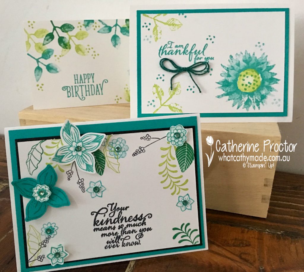
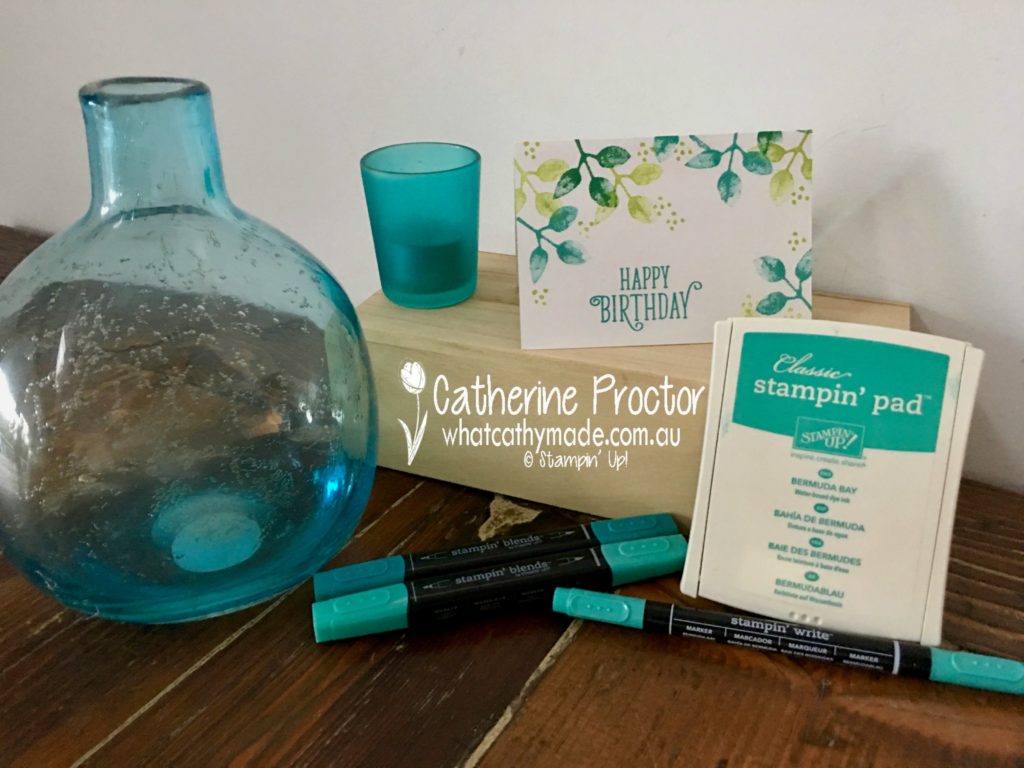
This week we are showcasing one of my favourite colours: Bermuda Bay.
Bermuda Bay is often paired with Pool Party (and they look amazing together) but it also really looks great when used with Lemon Lime Twist. To showcase this colour combination I’ve used something old (the Painted Harvest stamp set) and something new (the Pop of Petals bundle) for my three Bermuda Bay cards.
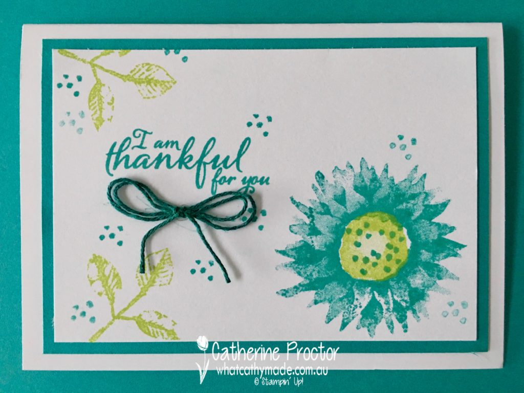
For the first 2 cards, I used the Painted Harvest stamp set to CASE some cards I’d seen on Pinterest, changing up the colours and the sentiments. This first card is so simple but it really showcases how well Lemon Lime Twist and Bermuda Bay go together.
Can you spot the bakers twine in the next card? I used the dark Bermuda Bay Stampin’ Blend! to colour Whisper White bakers twine.
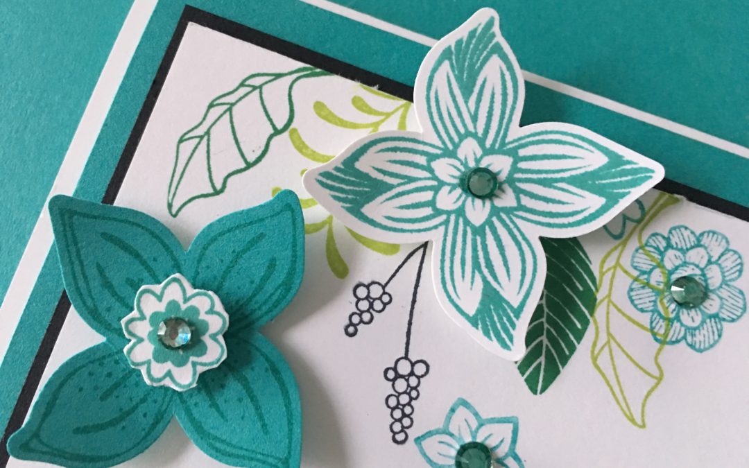
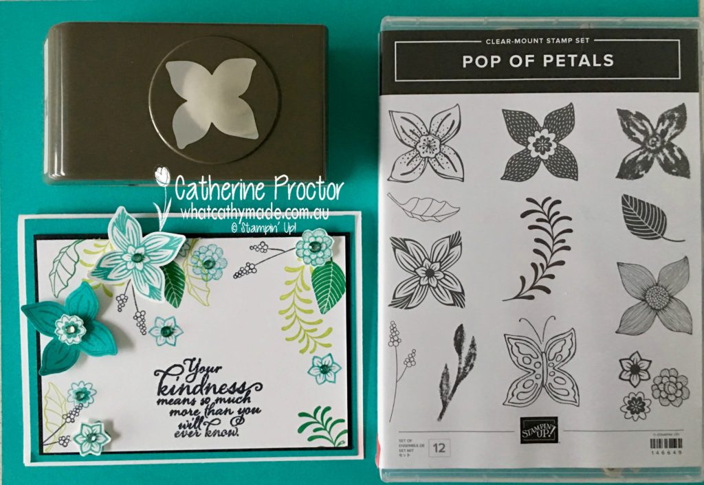
However, it’s the final card I’m most excited about…I used the new Pop of Petals bundle and I just love this stamp set and its matching punch!
If you look closely you’ll see another homemade embellishment that’s just so simple to make…I used the dark Bermuda Bay Stampin’ Blend! to colour a few rhinestone basic jewels. Here’s a close-up to show you my sparkly Bermuda Bay embellishments.
Look at all the lovely little stamps there are in this stamp set! I also used another great new colour, Call Me Clover, for this card.
Bermuda Bay works with so many different colour combinations and I can’t wait to see what the rest of the Art With Heart team have come up with today.
Just click on the links below to see what they’ve all made.
Welcome to week 2 of the Art With Heart Colour Creations Blog Hop!
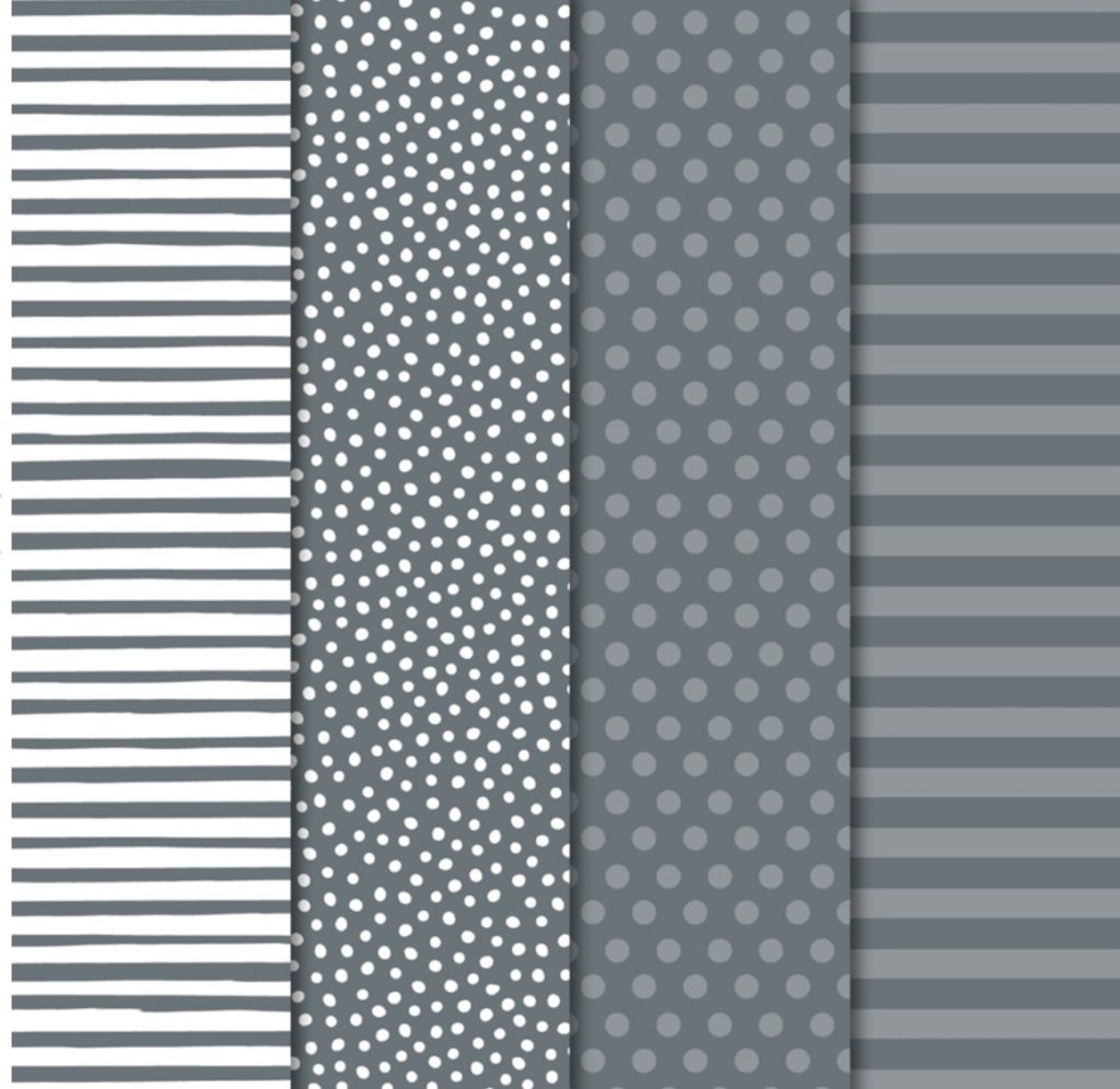
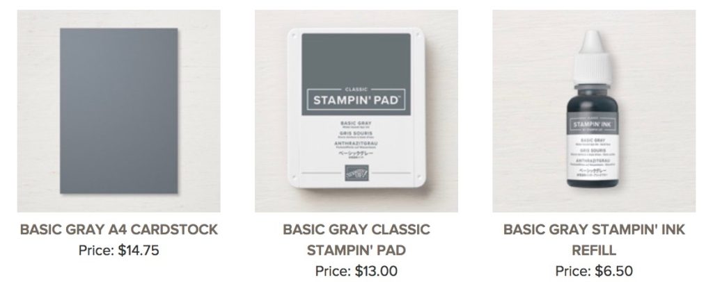
This week we are showcasing one of the most versatile neutrals: Basic Gray.
As a quilter, I know that gray is one of the best neutrals to use as a background colour because it really makes other colour pop, but I wanted to make the Basic Gray the focus for my projects today so I’ve deliberately paired it with other neutrals, even though it looks fantastic with any colour.
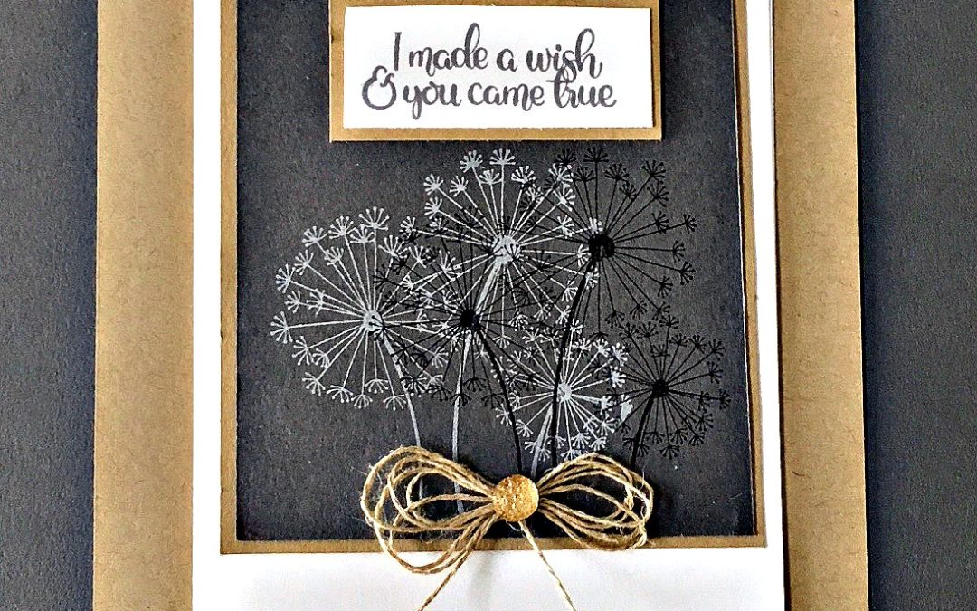
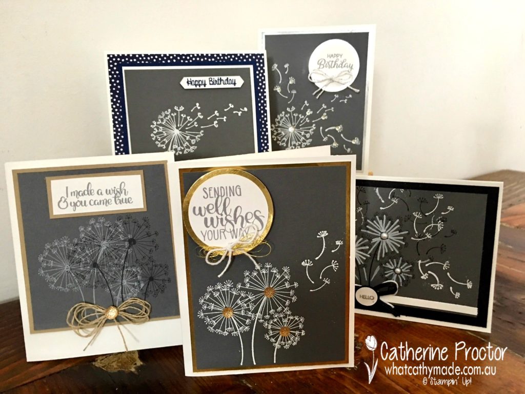
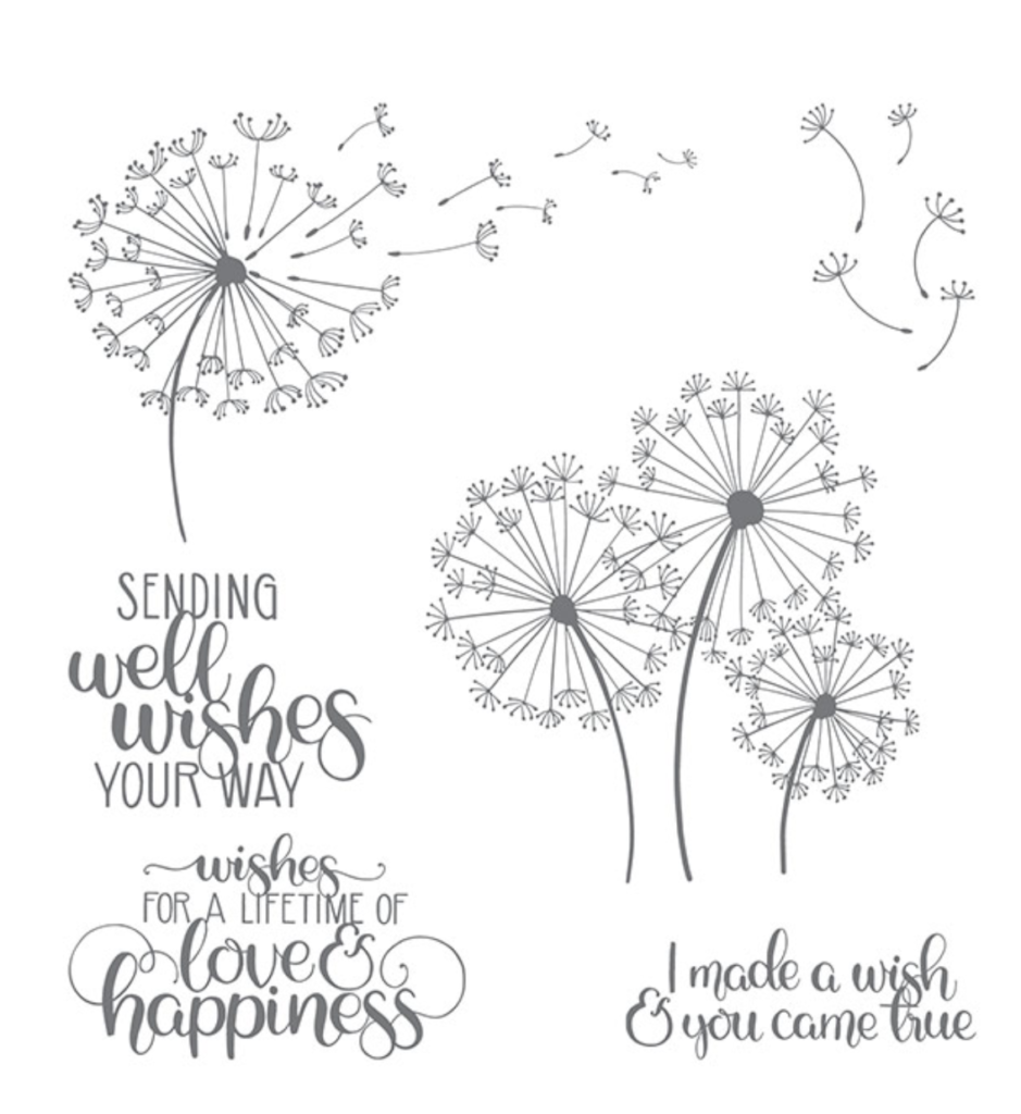
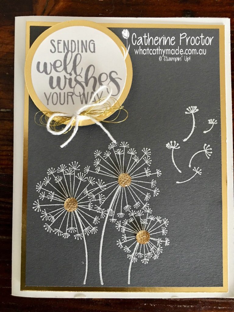
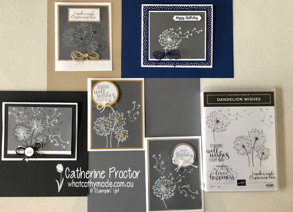
For all of these cards, I’ve used one of my favourite new stamp sets: Dandelion Wishes.
For the first 2 cards, I used silver and gold foil with the Basic Gray. I stamped onto the Basic Gray cardstock with Versamark ink and then heat embossed using white embossing powder. The gold facetted gems, and a bow made of gold metallic thread and Whisper White bakers twine finished off the gold foil card. You can see the silver card in the group shots of all the cards.
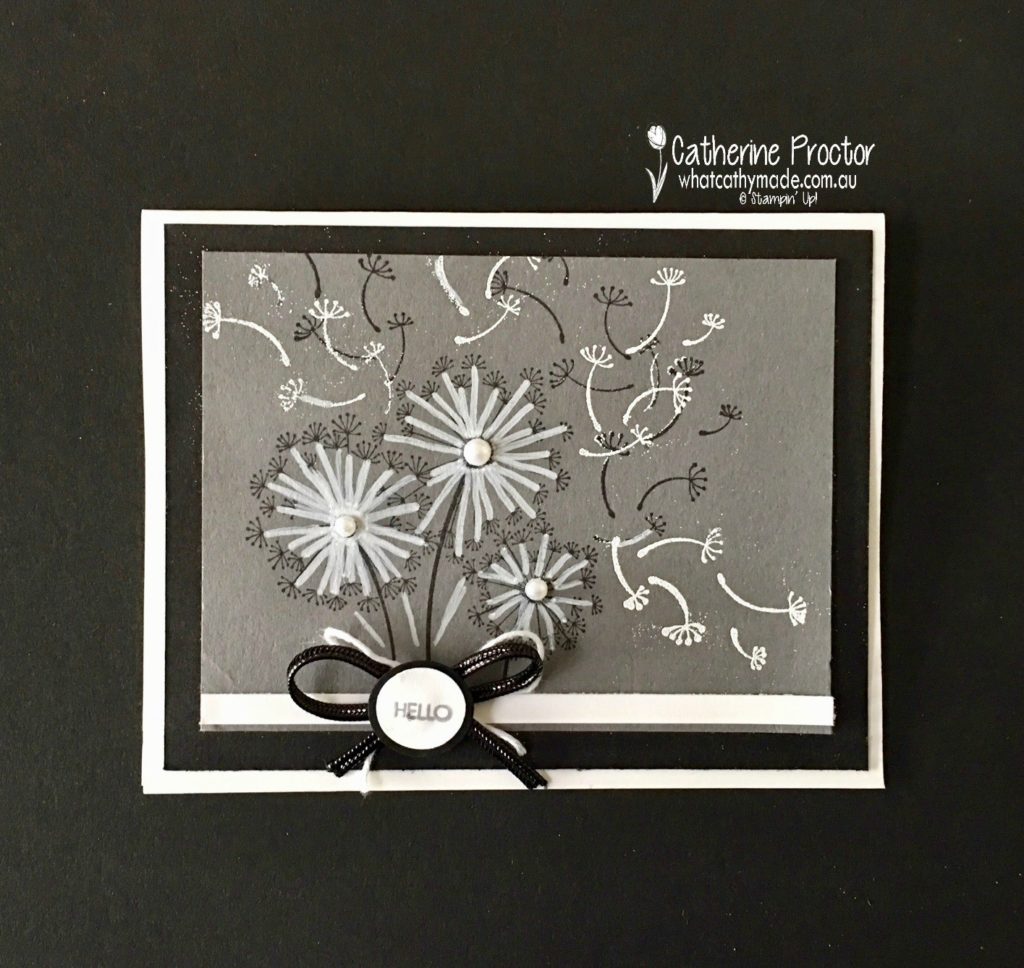
I then decided to contrast the Basic Gray with black and white, and even though there are a few heat embossing mistakes on this card, I still like the contrast in the colours. I used the white Stampin’ chalk marker to draw over the Dandelion stamp. The new black cord ribbon is stunning but slippery so I made the shape of a bow (without tying it) and used glue dots to make it stick to the card. The tiny hello sentiment is from the Beautiful Bouquet stamp set.
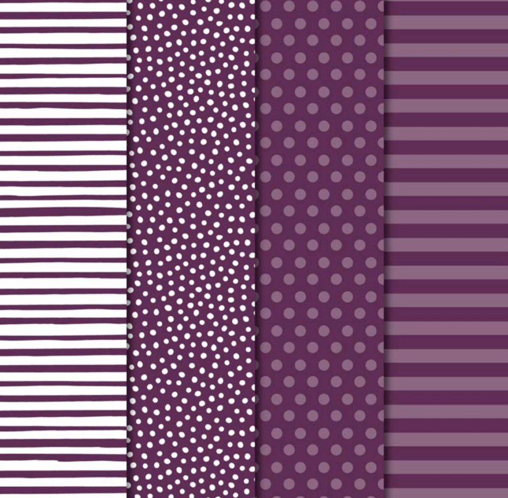
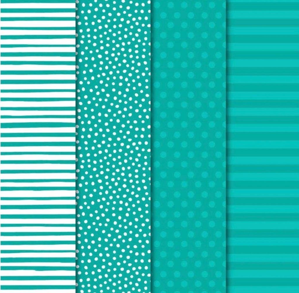
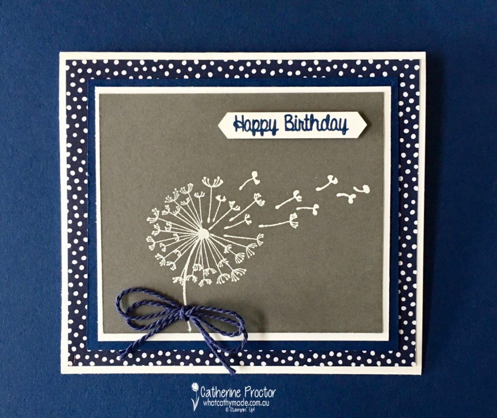
I also just couldn’t resist pairing Basic Gray with two of my all-time favourite colours: Night of Navy and Crumb Cake. For this Night of Navy card, I used some fantastic new DSP that comes in every single Stampin’ Up! colour (you can see the different patterns in the Basic Gray example I’ve included at the start of this blog). The happy birthday sentiment is from a new hostess stamp set: Hand Delivered.
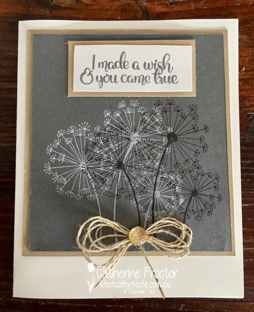
But finally, I think this last card, pairing Basic Gray with Crumb Cake, is my absolute favourite!
It was really hard to get a shot of all the cards together, but I think laying them on the different contrasting cardstocks gives a good idea of how versatile this neutral really is.
I’m really looking forward to using Basic Gray with lots of different colour combinations and I can’t wait to see what the rest of the Art With Heart team have come up with today.
Just click on the links below to see what they’ve all made.
Isn’t it amazing where the inspiration for a card can come from?
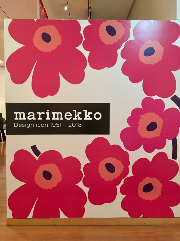
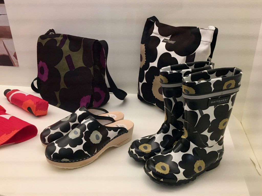
Two weeks ago I went to Bendigo for the very first time to see the Marimekko exhibition at Bendigo Art Gallery and I fell in love with the classic bold graphics of this design house all over again.
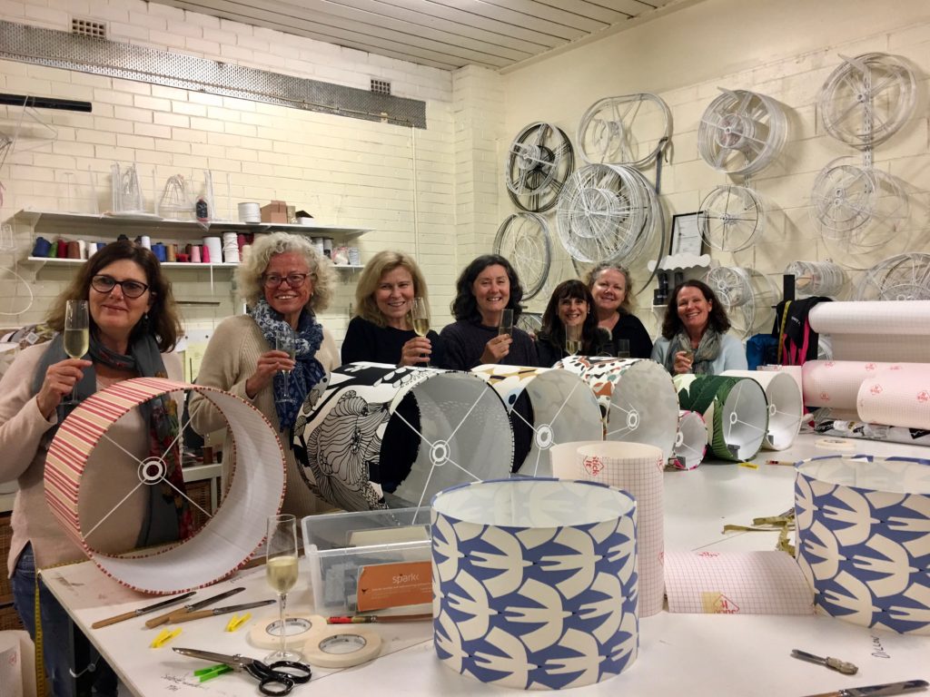
And then last week I went to a lampshade making evening with some of my girlfriends and made not one, but two lampshades.
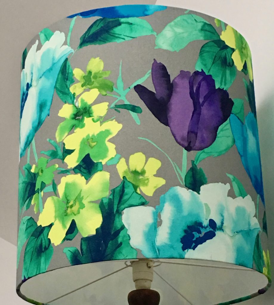
I love the watercolour look of the fabric on this lamp. I found this fabric in a remnant pile.
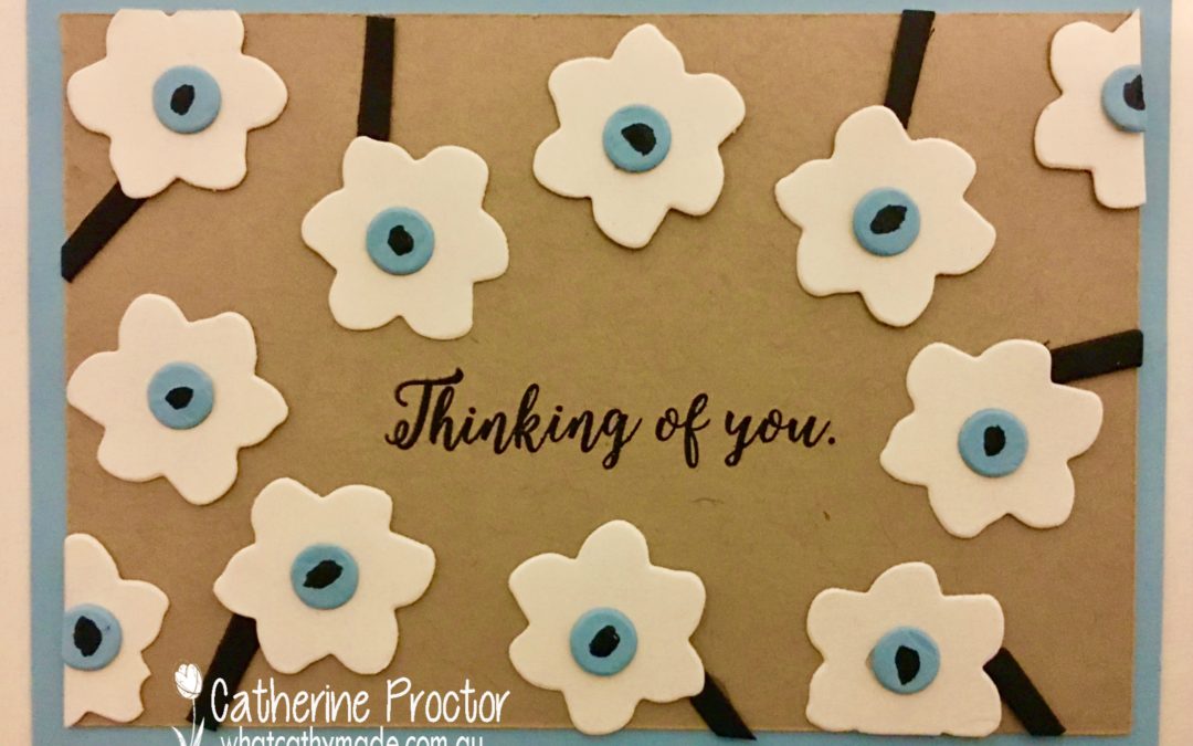
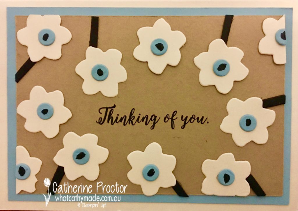
But it’s the fabric I used to make this next lampshade that inspired my project tonight. This lampshade is made from a new colourway of one of my favourite Marimekko designs: Unikko.
At the Marimekko exhibition, I learnt that this classic design was created in 1964, despite the Marimekko founder having publicly proclaimed a ban on flowers in Marimekko prints. One of the artists designed a collection of floral patterns that were so fresh and unique that Marimekko produced eight of them, including their now iconic Unikko pattern.
To replicate this beautiful Marimekko design on my card I used Crumbcake, Very Vanilla, Basic Black, and a new colour Stampin’ Up! colour, Balmy Blue, for the lovely light blue centre of the flowers. In hindsight, I could have also replicated this fabric using Crushed Curry as the background colour.
The flowers, their centres and their stems were cut from cardstock using the Seasonal Layers thinlit dies. The stems were made using the Adirondack chair die cut into smaller pieces, and the middle of the flower was coloured in with a black marker. The sentiment comes from the matching stamp set, Colorful Seasons.
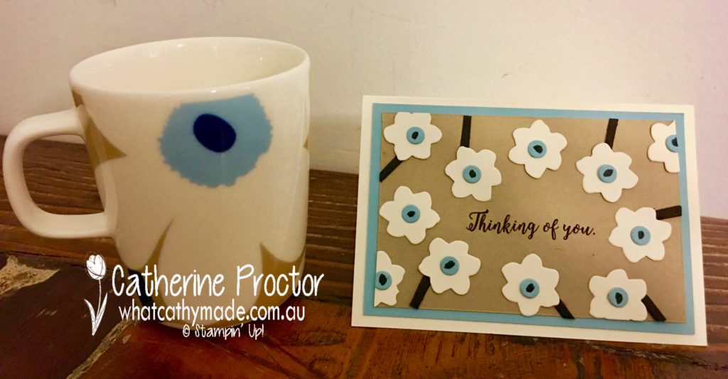
When I purchased the fabric I just couldn’t resist buying a matching cup for my morning cup of tea. I’ve actually had my morning cup of tea out of the Red Unikko mug for the past 10 years so it was high time to update my morning brew with a fresh new colour of that classic design I love so much.
This was a quick and easy card to make and I’m going to have a go now at replicating all of the beautiful Marimekko colourways of this gorgeous design using Stampin’ Up! colours. I’ll share them on my blog when they’re done.
In the meantime, To purchase any of the products featured in today’s post, simply click on the product links below.
If you’d like me to post you your very own copy of the 2018-2019 annual catalogue l catalogue or find out about more about Stampin’ Up! contact me.

 Metallic-Edge Ribbon")


 Cord")


 Designer Series Paper")