Welcome to week 5 of our 2020-21Colour Creations blog hop! We are showcasing Blackberry Bliss, a rich, deep colour from our regal family.
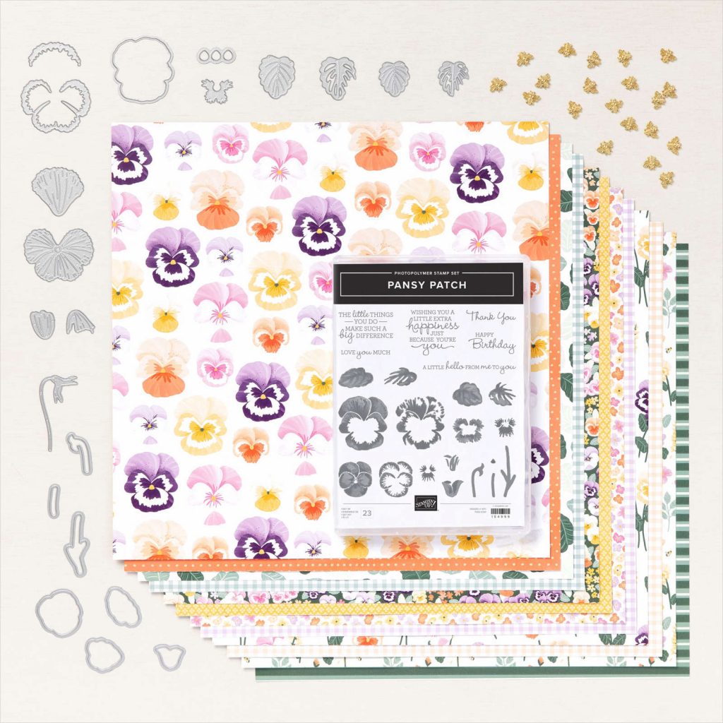
One of the most beautiful suites in the new Stampin’ Up! Annual catalogue is the Pansy Petals suite. I love this suite so much because it reminds me of my Nan and her stunning African Violets.
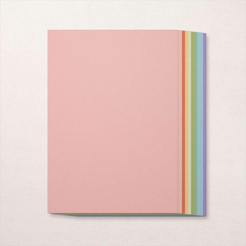
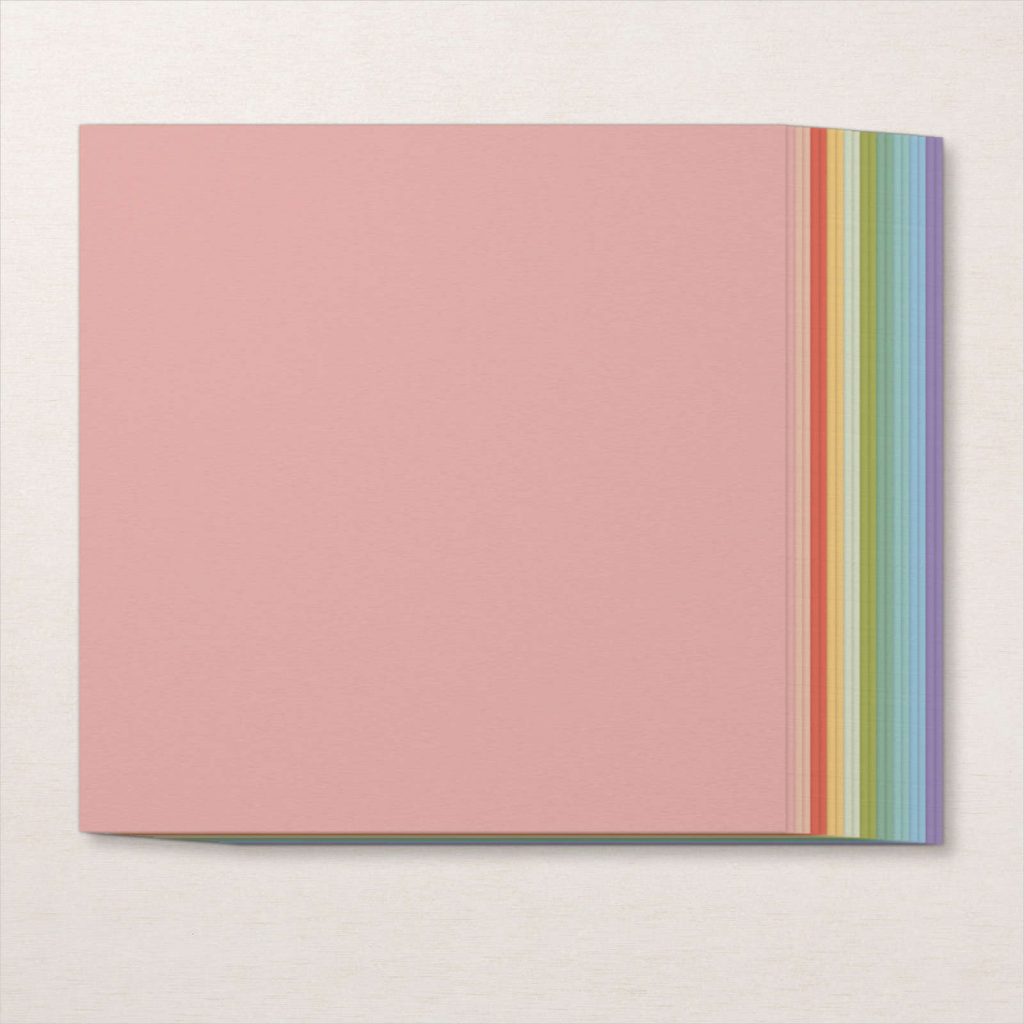
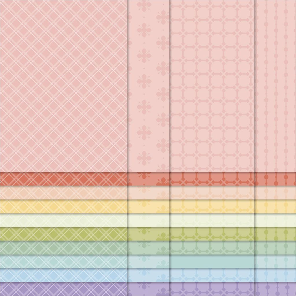
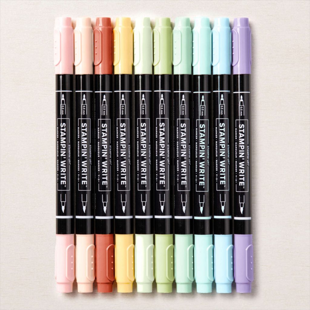
The Pansy Petals DSP in this suite has the following colour combination: Basic White, Blackberry Bliss, Bumblebee, Calypso Coral, Evening Evergreen, Fresh Freesia, Pale Papaya, Polished Pink, Soft Sea Foam and Soft Succulent. However, because pansies come in so many different colours so you really can use any colours with this suite.
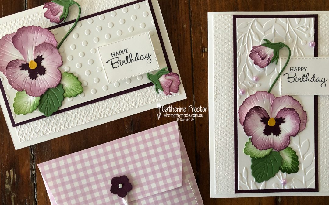
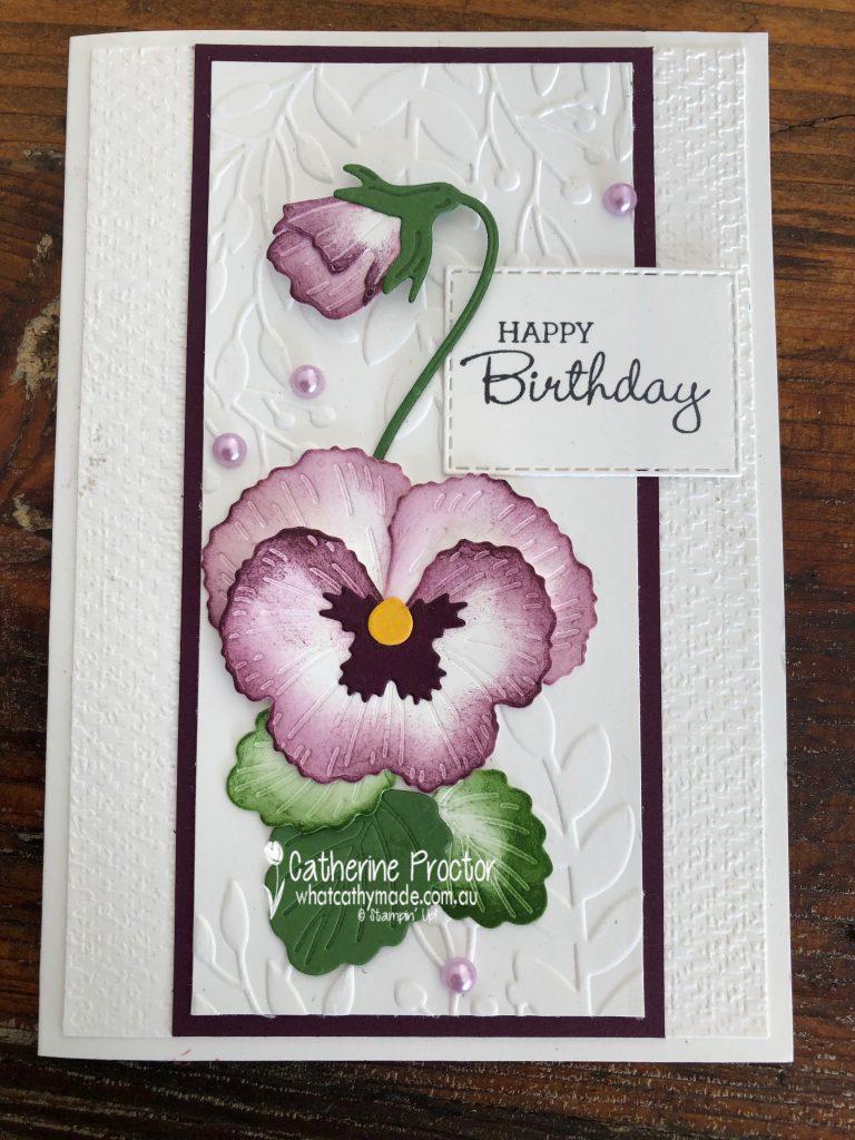
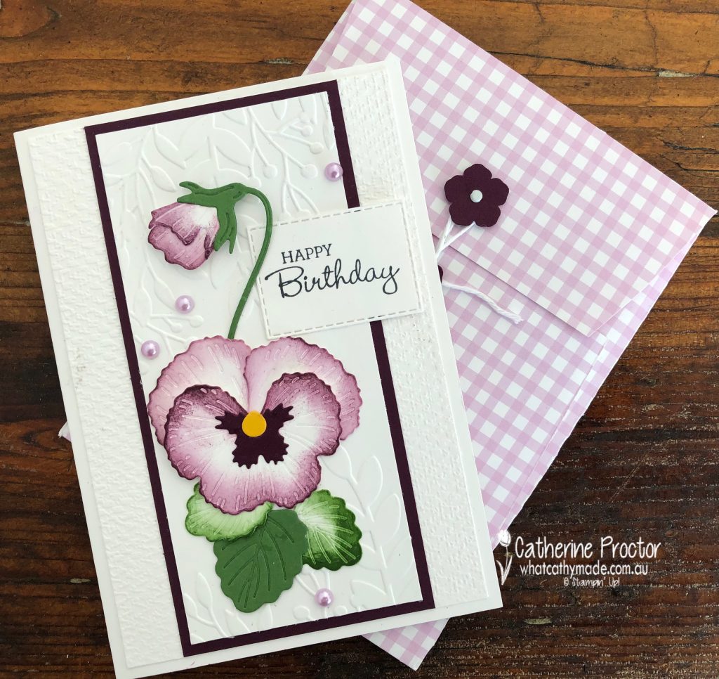
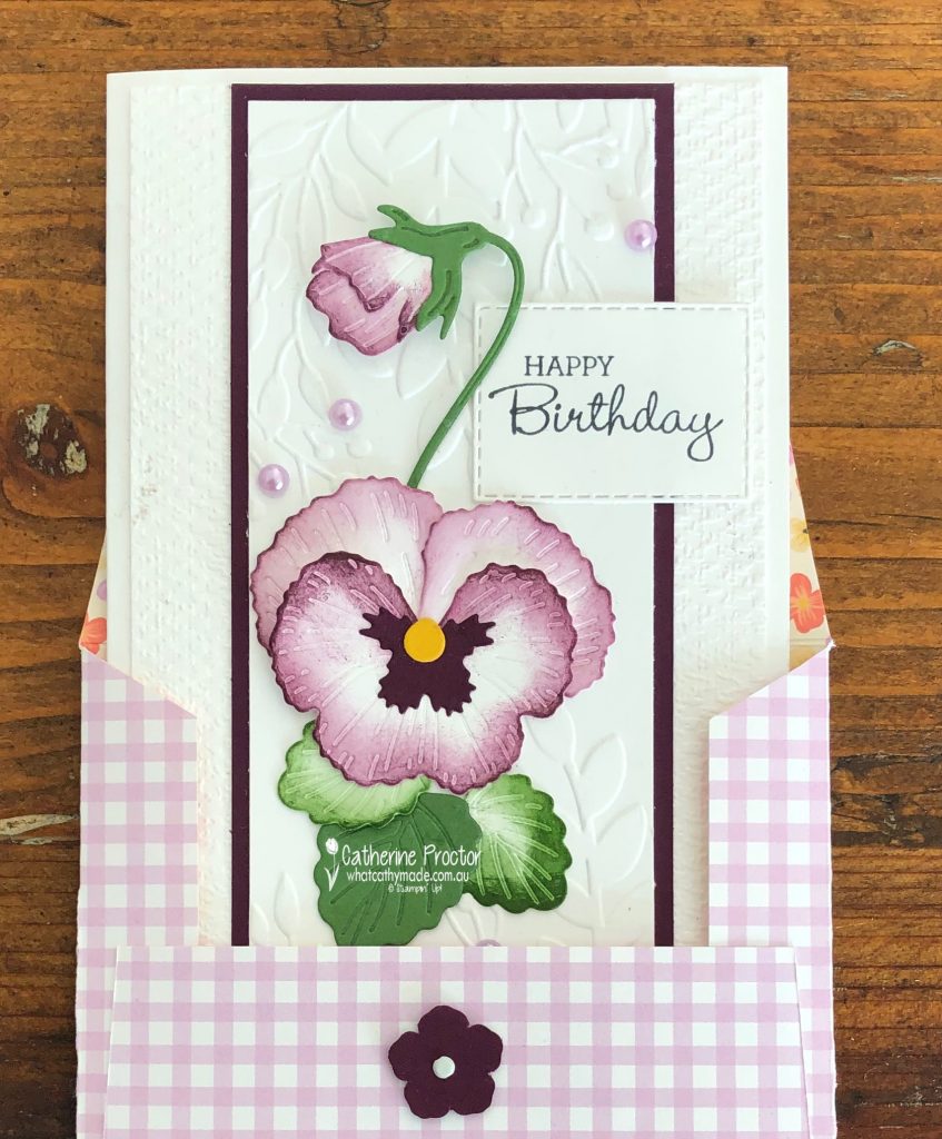
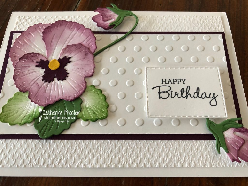
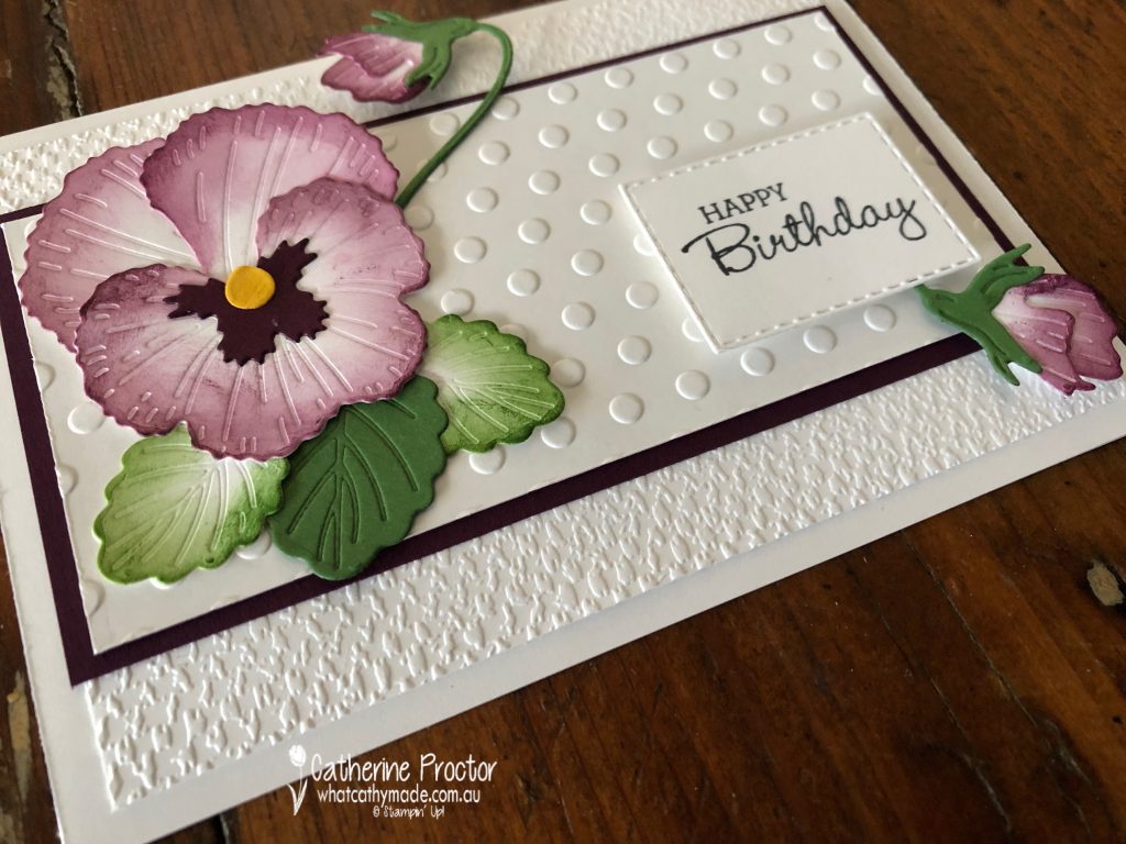
My first card was CASEd from a card I found on Pinterest made by an incredibly talented Stampin’ Up! demonstrator called Gail Ellis. I’ve CASEd her basic layout, the use of two different embossing folders and the shading of the flower petals and the leaves, however I’ve used different colours, a different background embossing folders, a different sentiment and different embellishments.
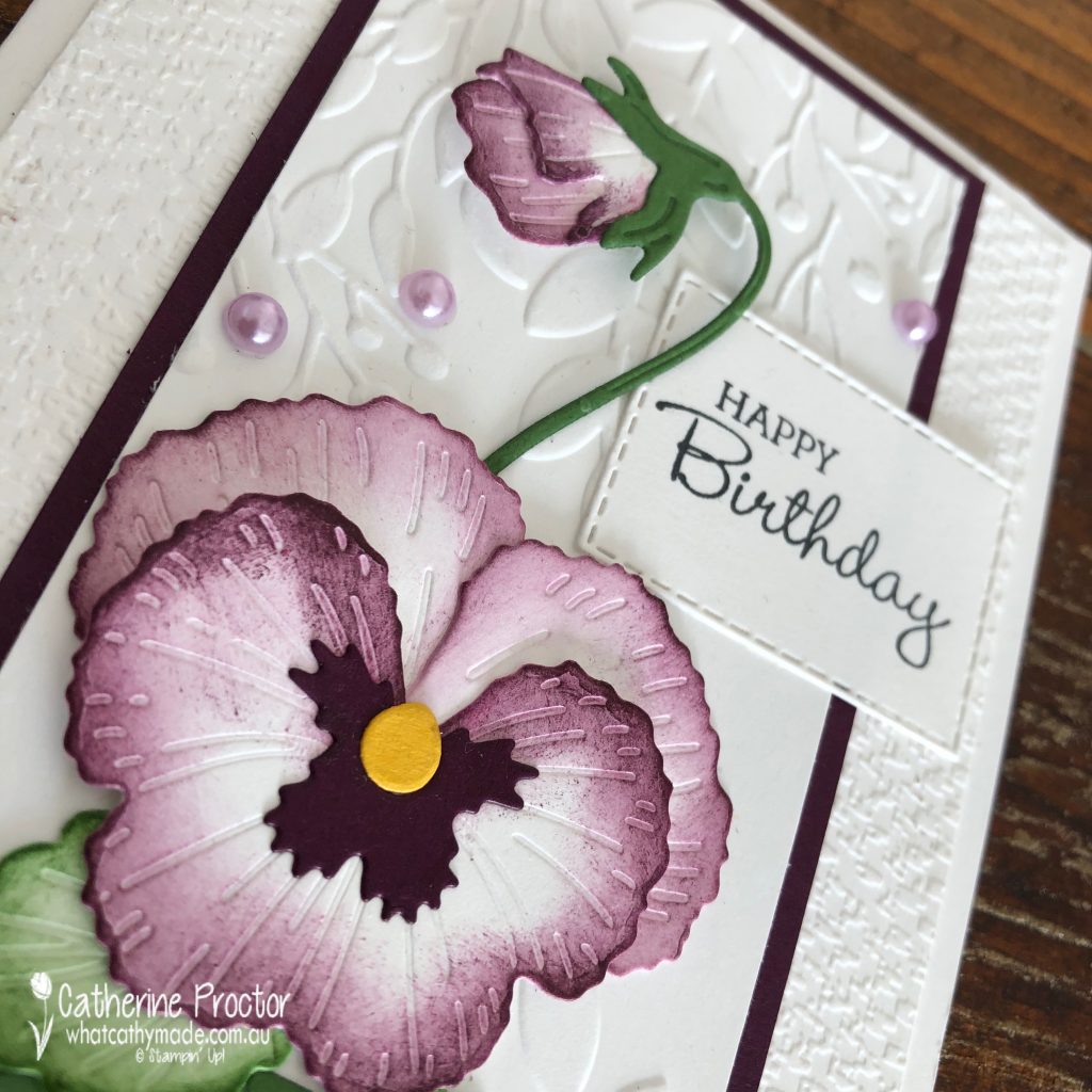
To achieve the colour shading on the edge of the flower, the flower bud and the leaves, I used sponge daubers, taking the ink directly off my ink pads. The flowers and buds are sponged with Blackberry Bliss and the leaves with Garden Green.
The yellow centre of the pansy flower is die cut from a scrap of Crushed Curry card stock, with the stem and large leaf die cut from Garden Green card stock.
These Pansy dies really are so realistic – they emboss at the same time that they die cut the flower petals, buds and the leaves.
Thank goodness the Pastel Pearls have carried over to the new catalogue – I’ve used the Highland Heather coloured pearls for a touch of bling.
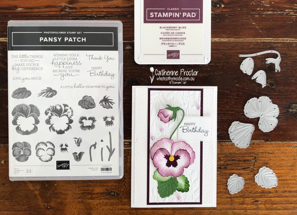
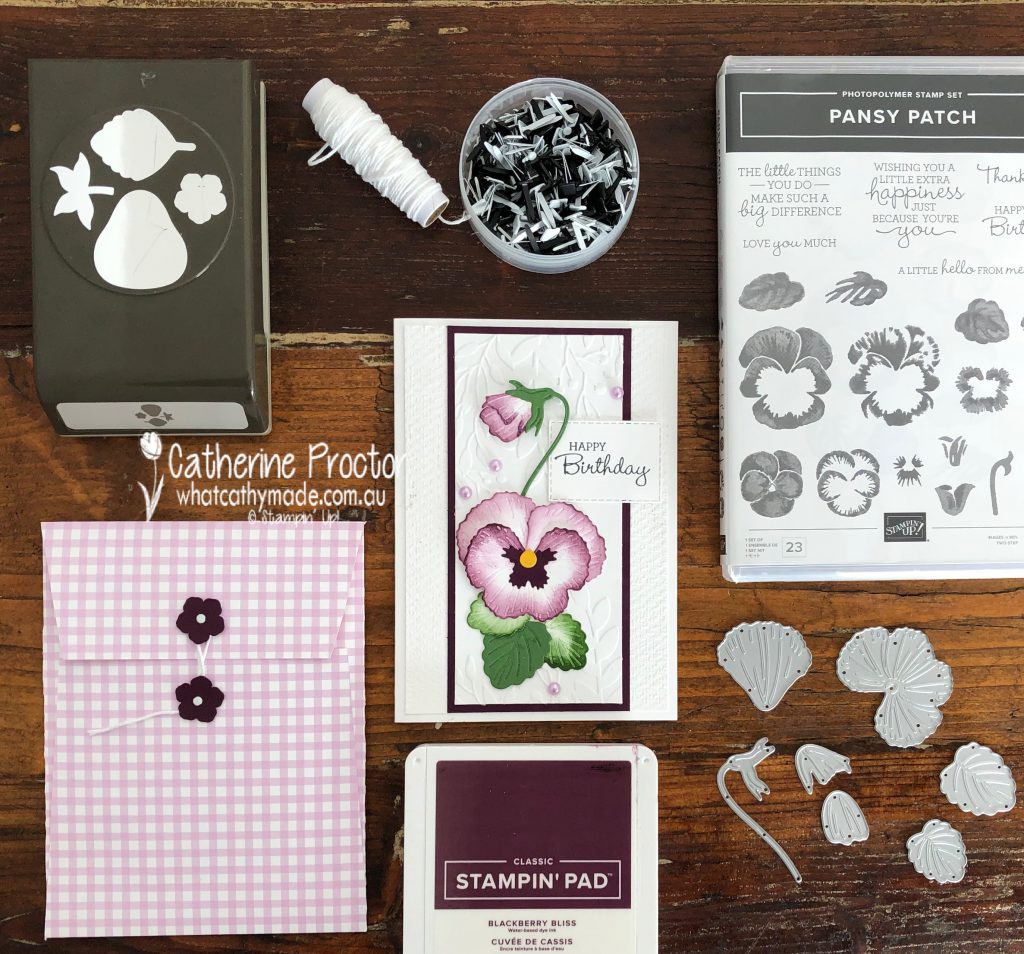
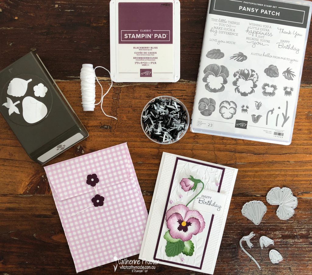
The Pansy Patch stamp set has a wonderful range of sentiments – I love how they mix both italic and Roman text together. I prefer to make most of my cards with either a happy birthday or a thank you sentiment as these are the types of cards I use the most and the Pansy Patch stamp set has both of these sentiments.
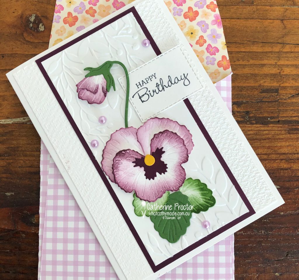
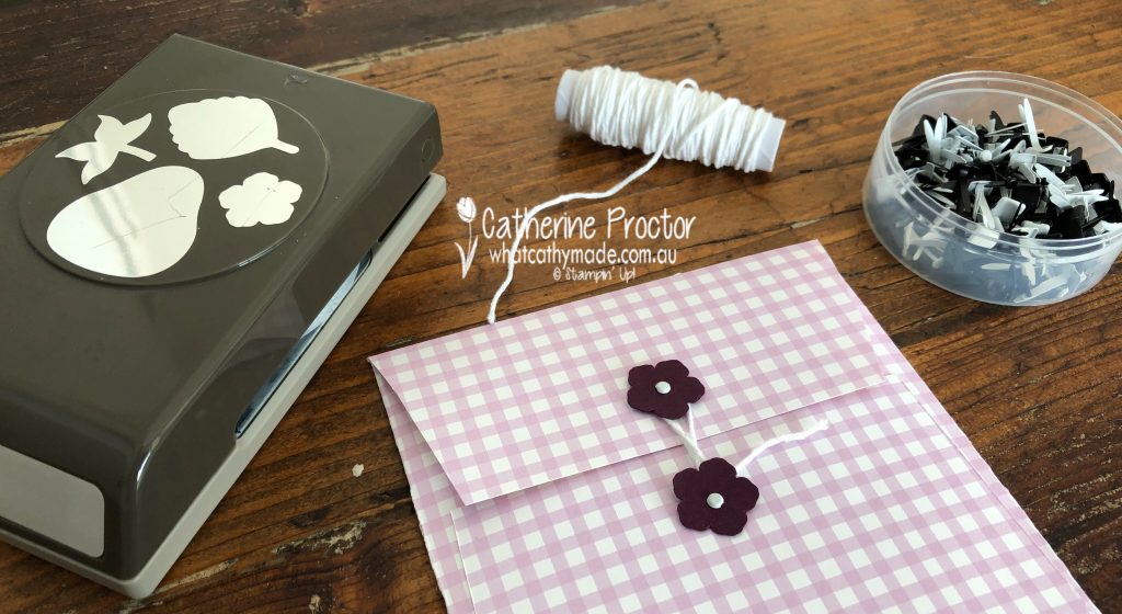
Did you notice the handmade envelope made from Pansy Petals DSP? On Stampin’ Up! Sara Douglass’s Facebook live this week she demonstrated how to make this envelope as well as two other sizes.
I slightly adapted the American measurements to fit our metric card size, assuming a card base made with half a A4 piece of cardstock. Tip – the envelope fits better if you trim just 5 mm off the height of the card base.
The back closure is super easy to make. Use the Strawberry Builder punch to punch two flowers out of Blackberry Bliss card stock and attach them to the top and bottom flap with two of the white round brads.
A length of white baker’s twine twisted under the flowers closes the envelope. You could also use any round or flower shaped die or punch if you don’t own the Strawberry Builder punch.
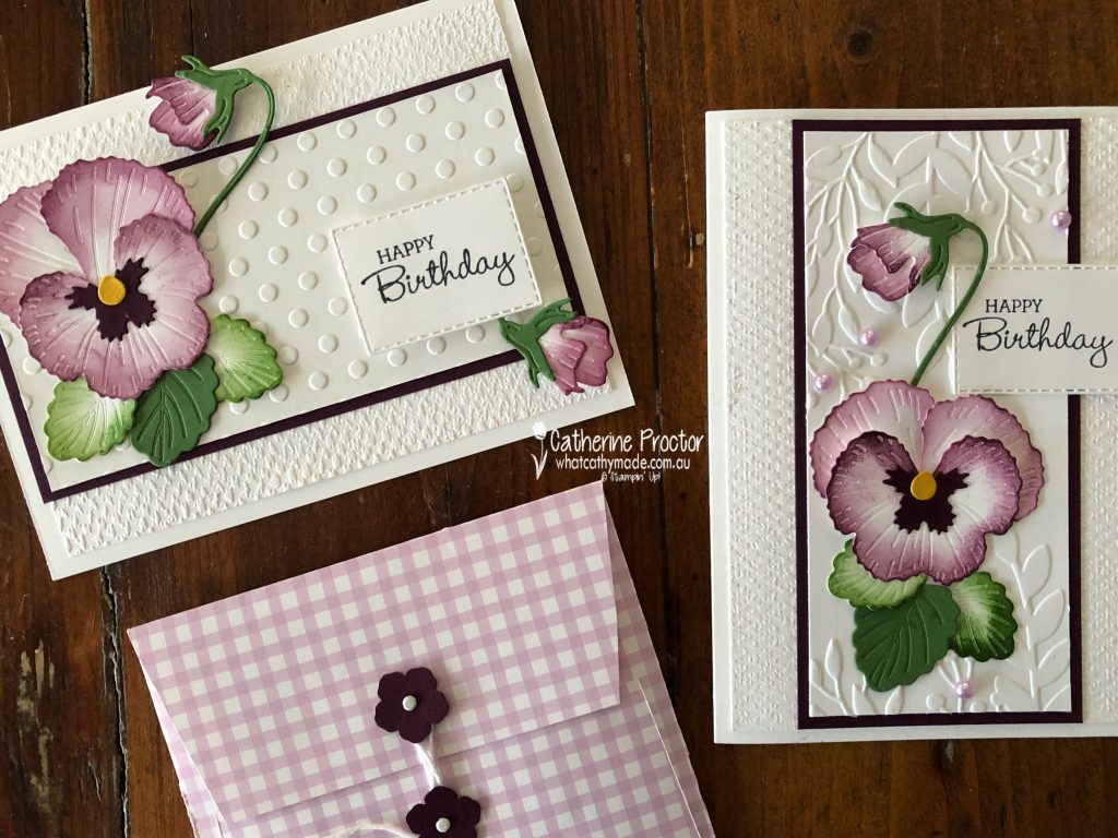
Card two is horizontal and uses the same colours, however it features the dots embossing folder (instead of the greenery embossing folder) for the top layer and it also has an additional flower bud placed under the “happy birthday” sentiment to balance the layout.
Both cards use the Tasteful Textiles embossing folder for the base layer – this embossing folder is my new “go to” replacement for the now retired *sob!* Subtles folder.
Horizontal or vertical? Do you have a favourite?
Now it’s time to hop on over to our next participant, the very talented Rachel Palmieri. I can’t wait to see what she’s made this week!
If you find a broken link or have come to this blog hop from a different entry point, you can view the participants below:
Welcome to the week 4 of our Colour Creations blog hop format for 2020-21. This week we’re showcasing the bright and beautiful Bermuda Bay.
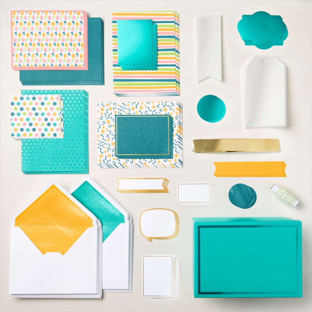
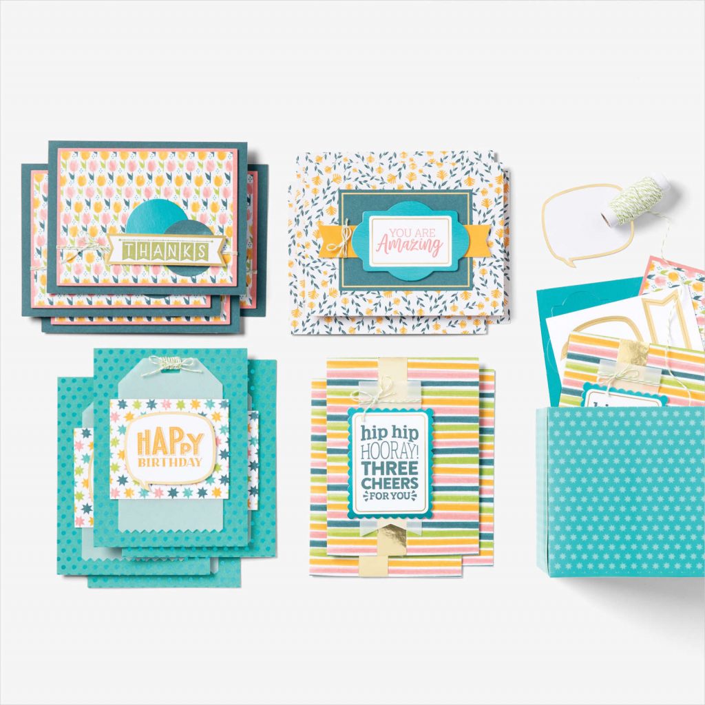
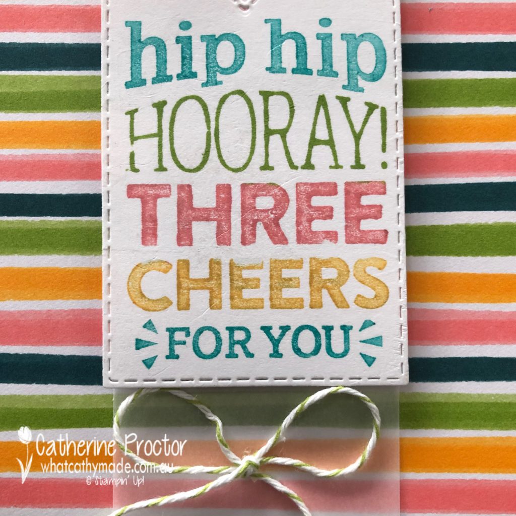
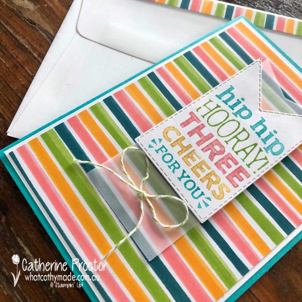
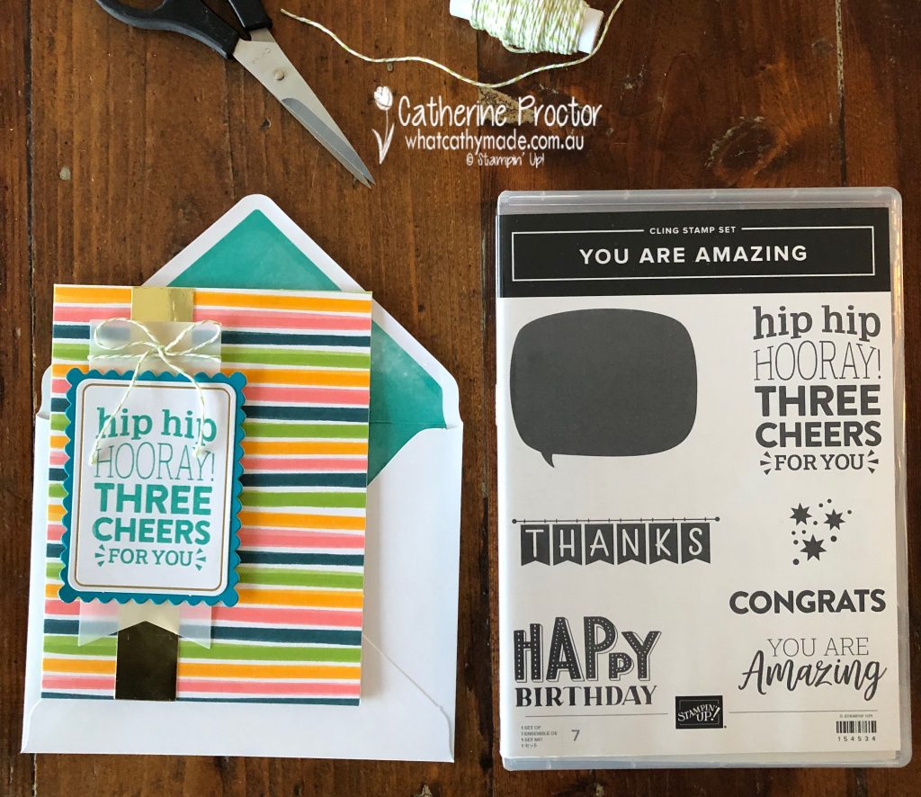
Because I’m away this week I needed a quick, easy and portable crafting solution and the You Are Amazing Stampin’ Up! kit came to my rescue. There are so many fun elements in this kit, however it retires very soon on June 30 – so don’t miss out!
Here’s how the cards look when made up according to the instructions.
The “You are Amazing” co-ordinating stamp set for this card kit also retires very soon on June 30. It has really great sentiments and typefaces.
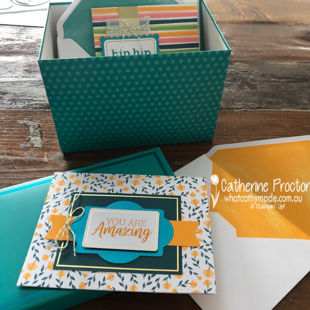
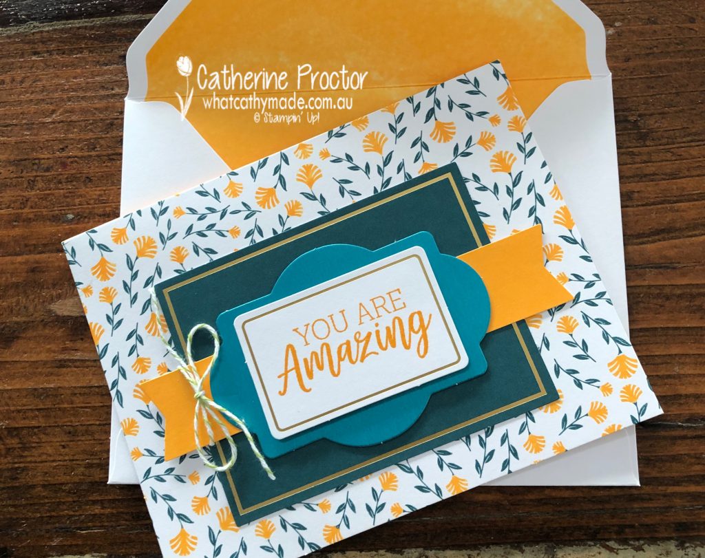
Two of my favourite aspects of this kit are the Bermuda Bay box that you can store your cards and envelopes in (it has foiled dots on the outside) and the Bermuda Bay Foil layering pieces. You can see the Bermuda Bay Foil layering piece behind the “You are Amazing” sentiment layer on this card below.
I made the “You are Amazing” card up pretty much as per the instructions, however I stamped the sentiment in Mango Melody instead of Flirty Flamingo.
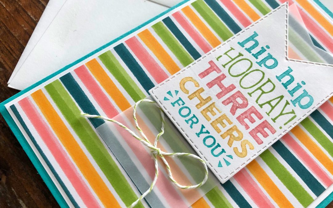
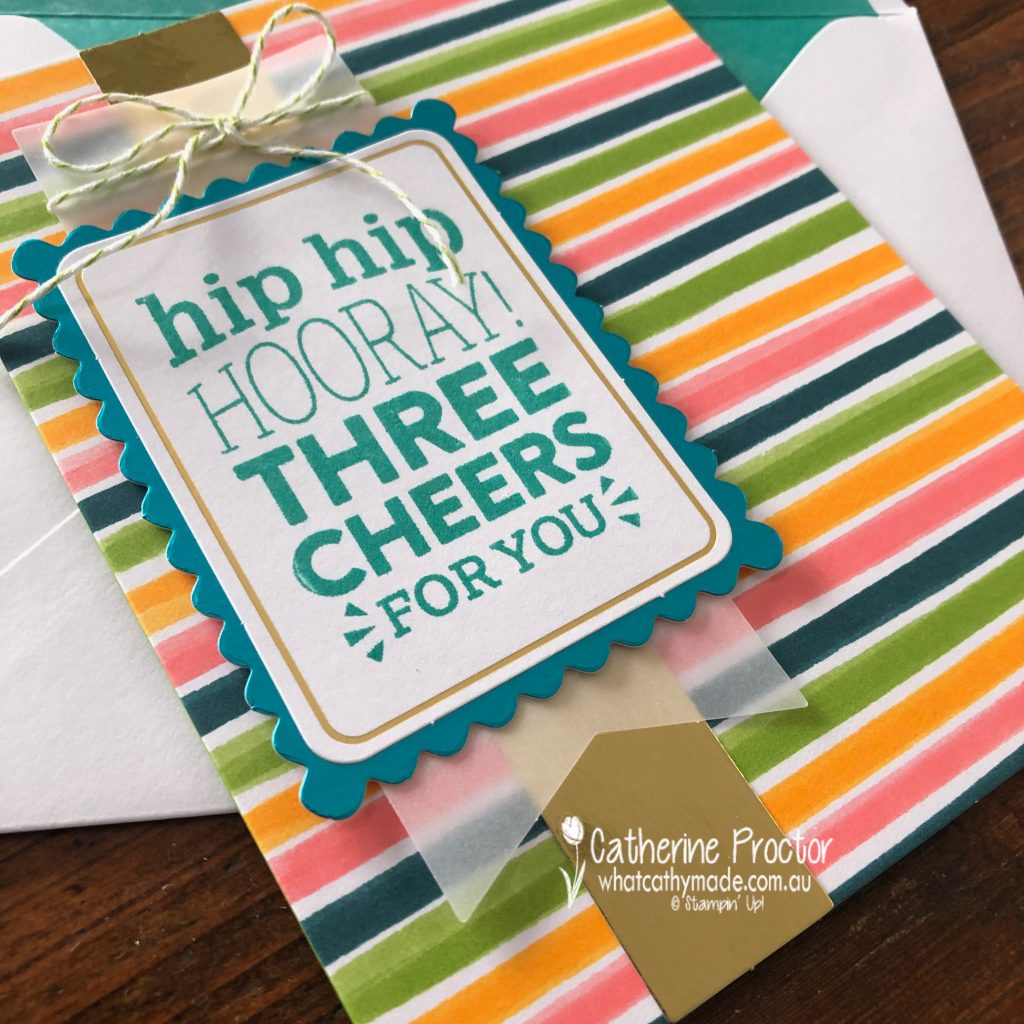
I love this striped DSP layer and the sentiment for card 2. It’s hard to see in the photo but the Bermuda Bay layer behind the sentiment is one of the Bermuda Bay Foil layering pieces.
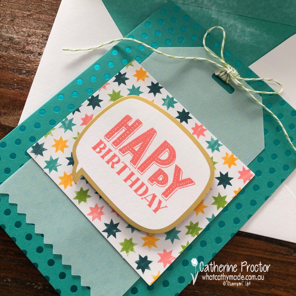
The card base on card 3 has a stunning spotted Bermuda Bay Foil front and a matching envelope lined with Bermuda Bay.
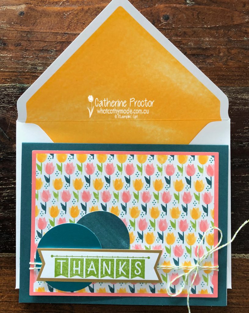
Card 4 has two of the layering Bermuda Bay Foil circles and a vibrant Mango melody lined envelope.
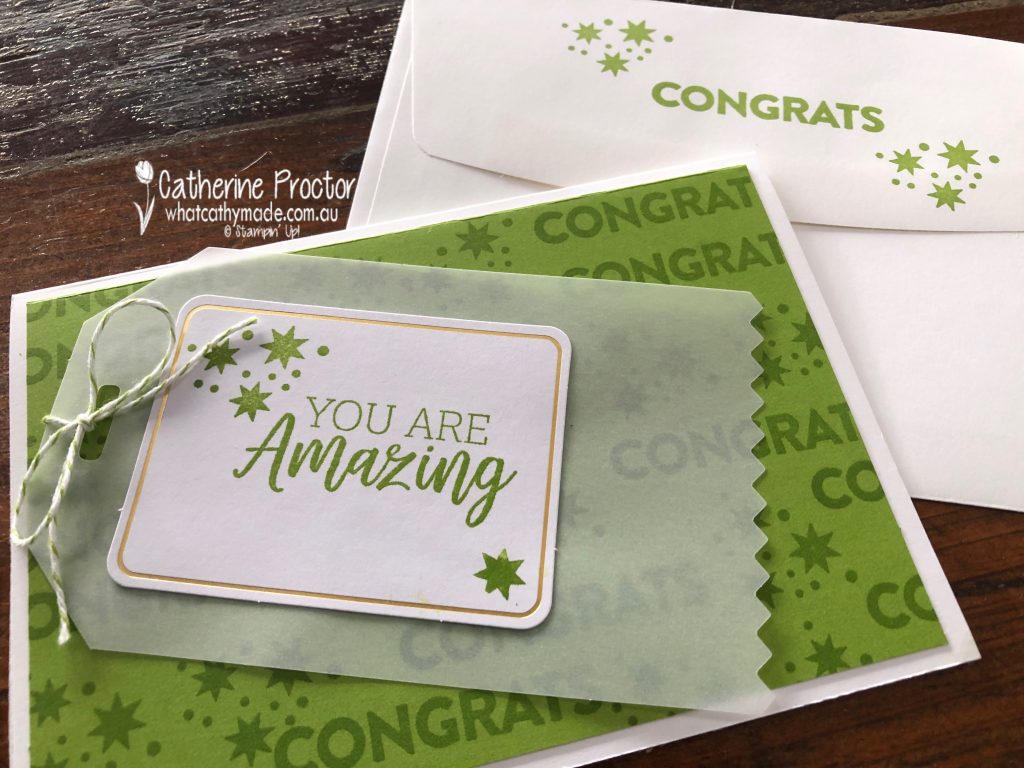
Once way I like to extend a card kit is to cut up one of the card bases and use both the front and the back of the card base as a DSP layer onto a card base made from card stock- immediately you have created 2 cards using the one card base from your kit!
The colours on the front of this striped card base inspired me to try the marker technique to make a multi-coloured sentiment – so much fun, don’t you think?
I made my card base using Bermuda Bay card stock, added a Basic White card stock layer and then trimmed the striped card base to make the top layer
For this card I used the back of this striped card base in Granny Apple Green. I was inspired by the colours in the bakers twine, so I stamped the “congrats” and star stamp in Granny Apple Green ink onto Granny Apple Green card stock. You could do this simple design in any colour!
I hope I’ve inspired you get more out of your card kits and to add this versatile and vibrant card kit with its coordinating stamp set to your collection before they retire next Wednesday, June 30.
Now it’s time to hop on over to our next participant, the very talented, Kristine D’Auria.
If you find a broken link or have come to this blog hop from a different entry point, you can view the participants below:
Welcome to week 3 of our Colour Creations blog hop format for 2020-21!
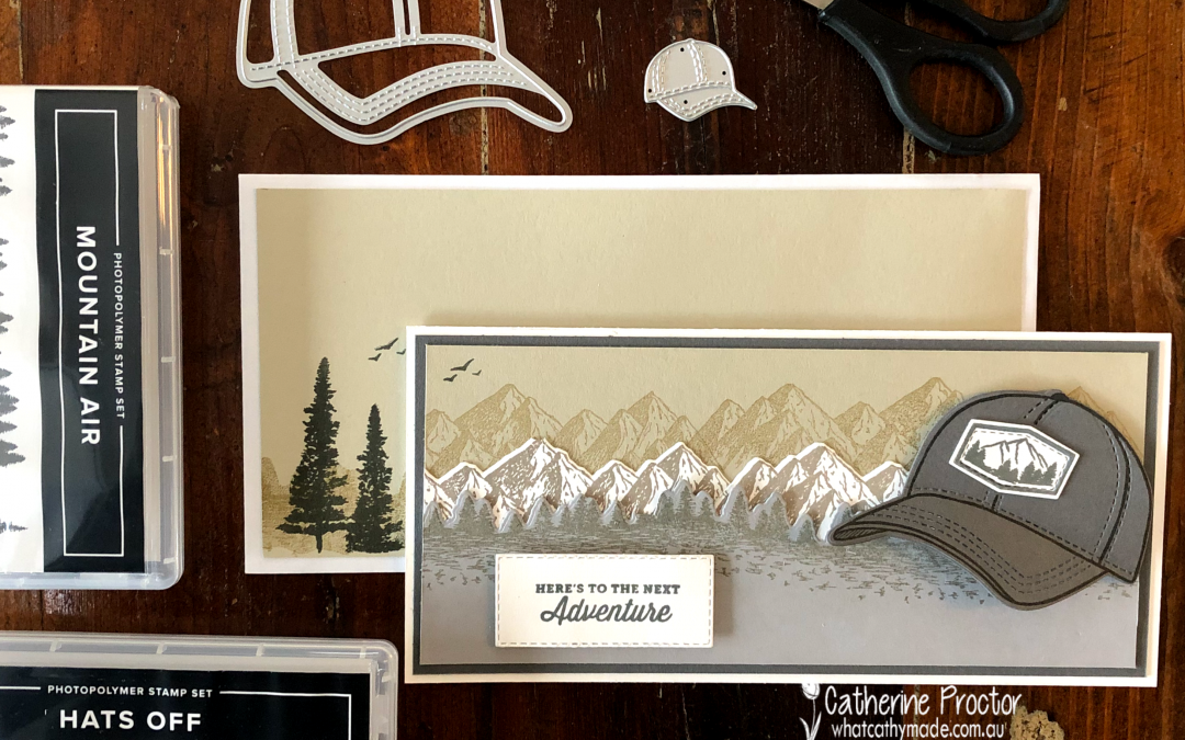
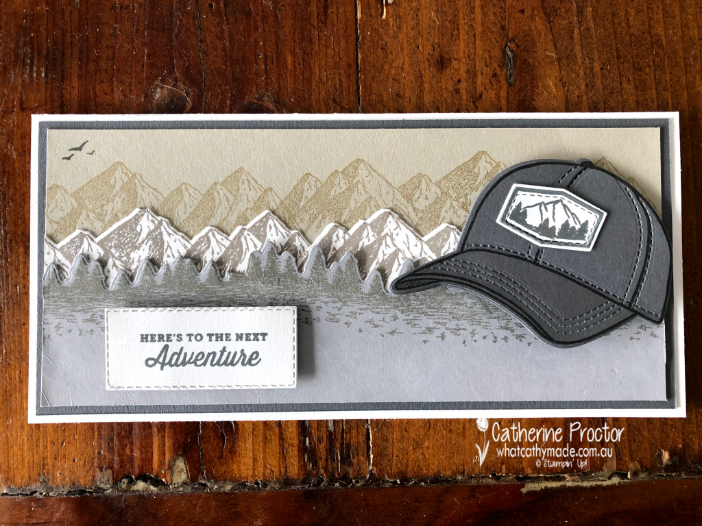
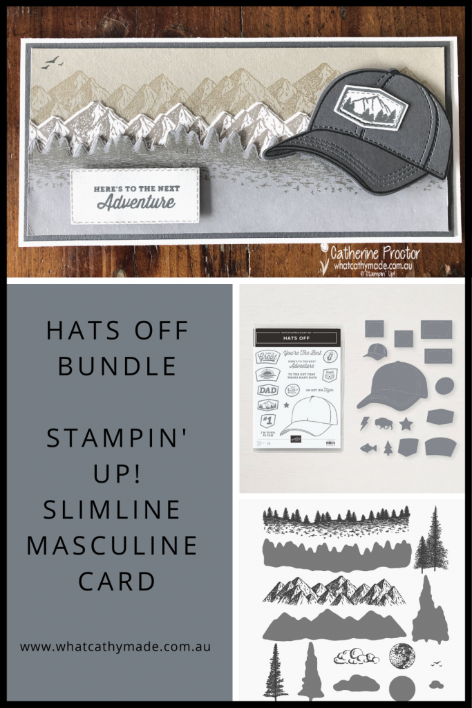
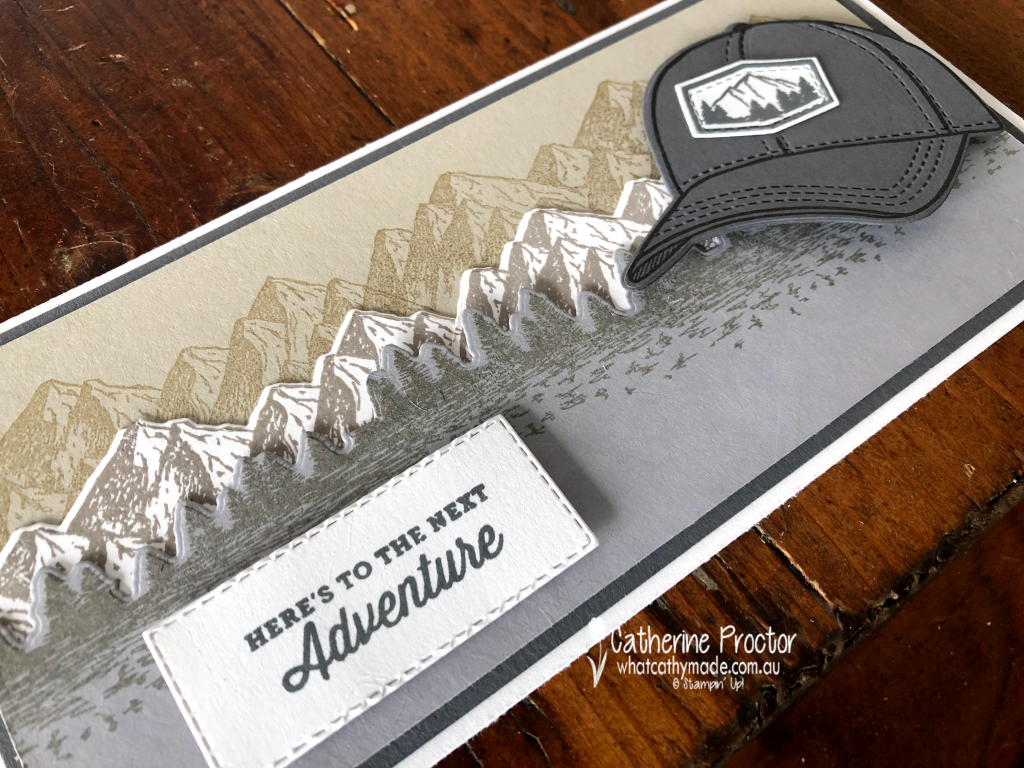
Today we are showcasing a very dark neutral – Basic Gray – and I’ve teamed it with other neutrals to make an all-purpose masculine slimline card. I’ve deliberately left the inside blank so I can use it for a variety of occasions.
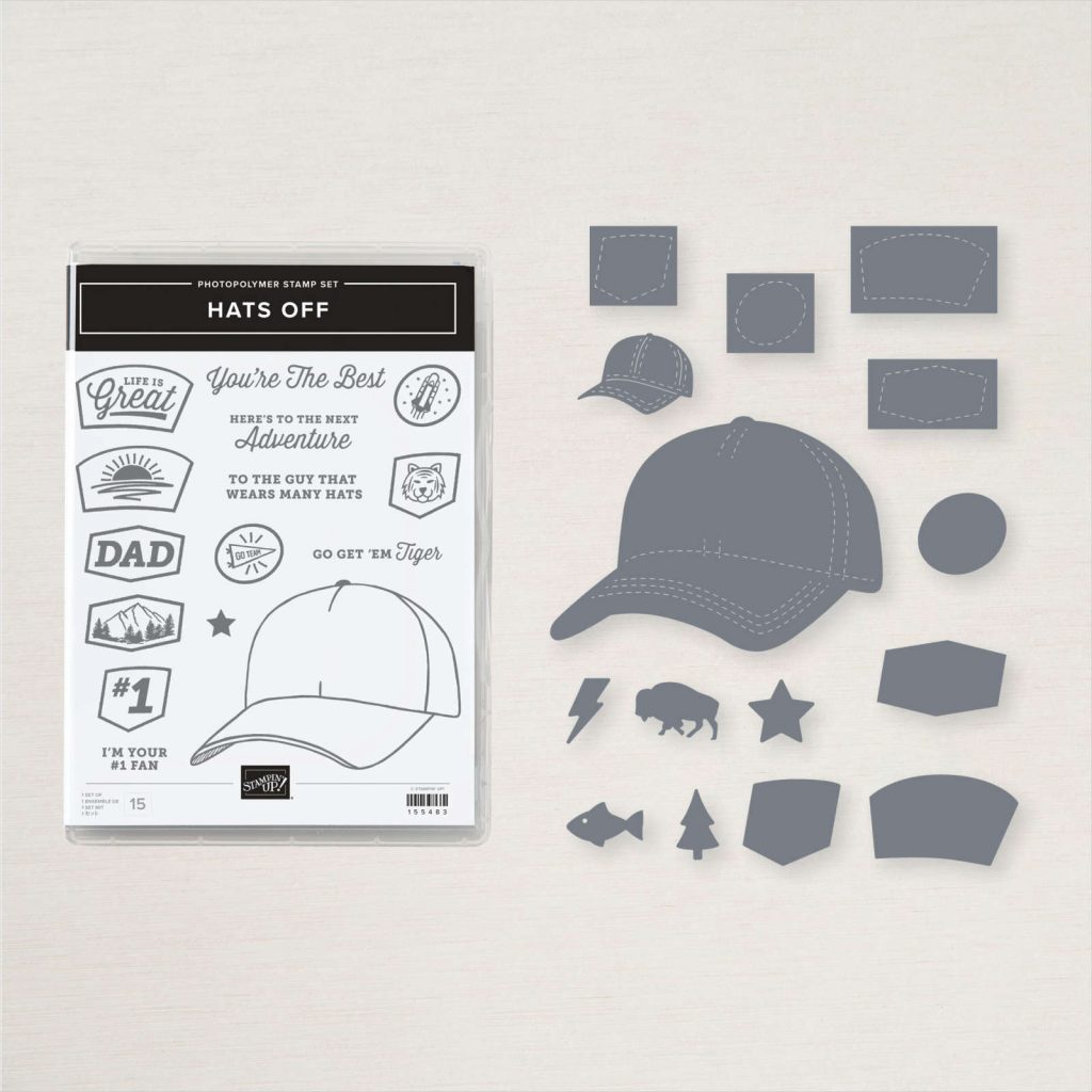
My friend Kate has been making the most fabulous cards with the new Hats Off bundle so I finally caved in and bought it too. I’m so glad I did – what a great bundle for masculine, teenager (and feminine) cards!
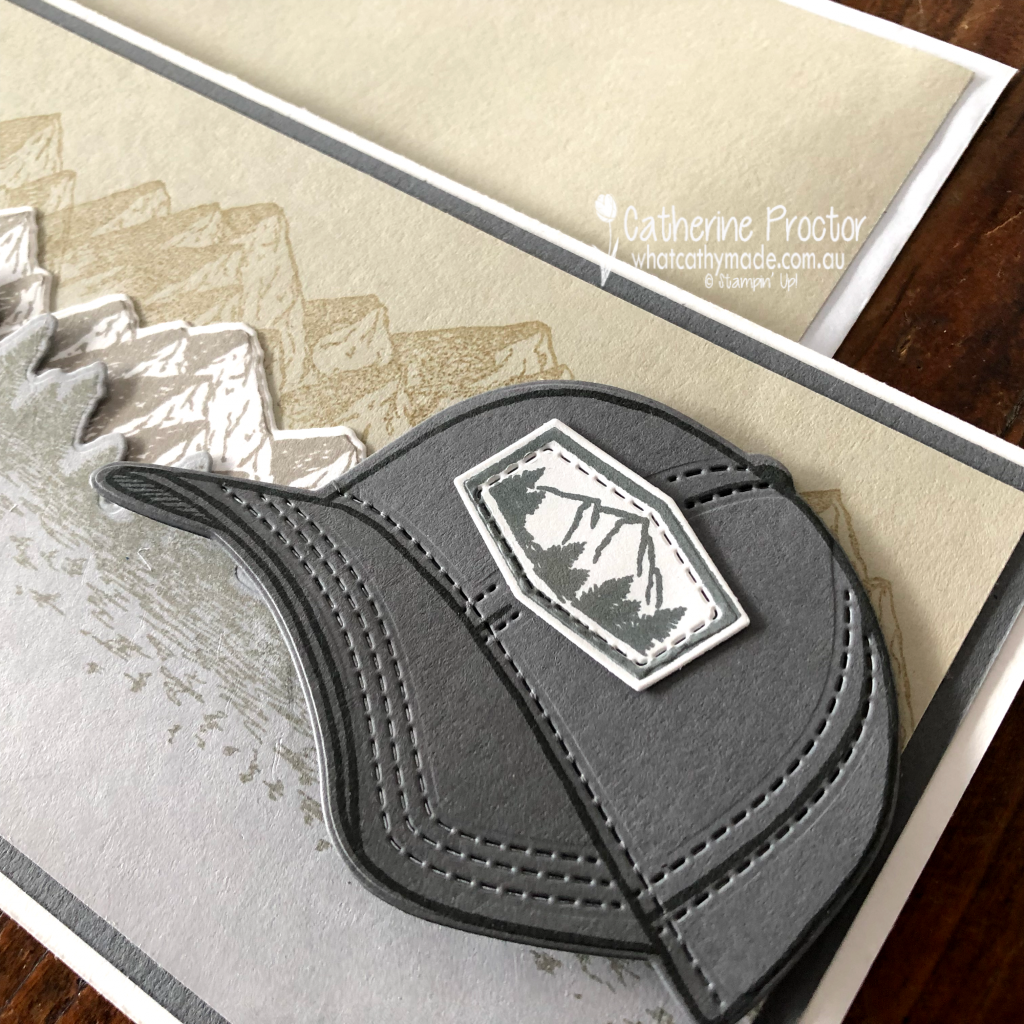
There are so many cute little elements in this bundle and options for decorating the emblem on the front of the cap and you can make this cap in any colour you like! I’ve got some great ideas for this bundle…watch this space!
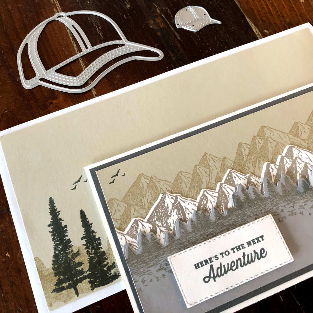
If you take a closer look at the emblem I chose for my cap I think you’ll understand why I decided to pair the Hats Off bundle with the Mountain Air Stamp set and Majestic Mountain dies.
They really were made to to be used together, don’t you think?
To make a quick and easy matching envelope for my slimline card I’ve simply decorated a standard business envelope by adhering a stamped panel of card Sahara Sand card stock to the front of the envelope. I deliberately trimmed the Sahara Sand card stock layer to be smaller than the envelope so there was a border of white that matched the design of the card itself.
The sentiment also perfectly matches the Mountain Air stamp set and was stamped in Basic Gray and die cut using a stitched rectangle die.
Now it’s time to hop on over to our next participant, the very talented, Rachel Palmieri.
If you find a broken link or have come to this blog hop from a different entry point, you can view the participants below:
This week we’re showcasing Balmy Blue for week two of our Art With Heart Colour Creations Blog Hop 2020-21.
Balmy Blue is a lovely soft and powdery blue and part of the subtles family. It is available in the following products.
Classic Stampin’ Pad
Blue Adhesive-backed Gems
Balmy Blue Stampin’ Blends
Balmy Blue Classic Stampin’ Ink Refill
Balmy Blue A4 Card stock
Subtles A4 Card stock
Subtles 12×12 Card stock
Subtles 6×6 DSP Assortment
Watercolour Pencils assortment 2
Subtles Stampin’ Write Markers assortment
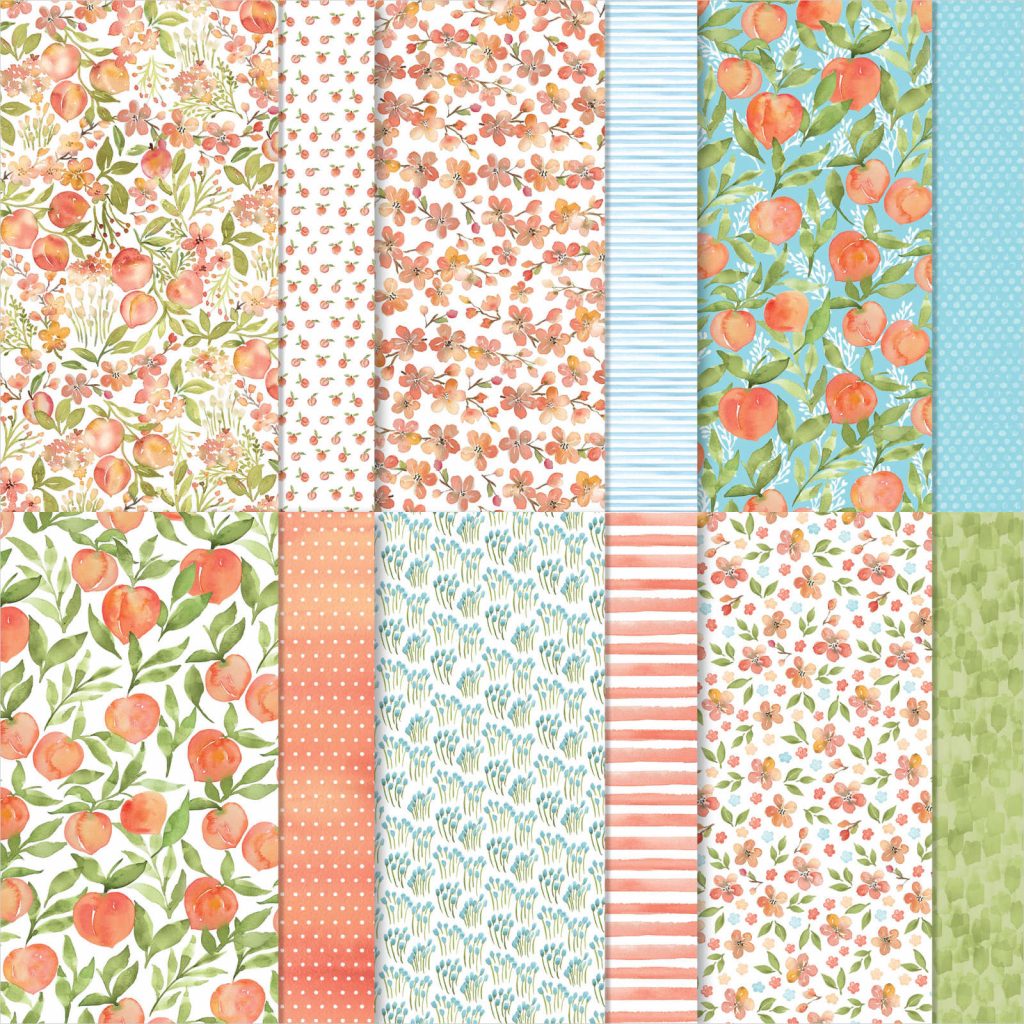
You’re a Peach 12×12 DSP
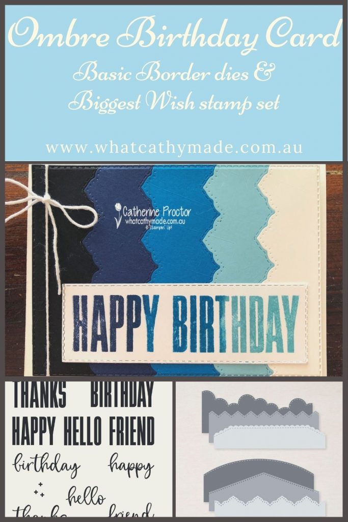
Today I’m sharing a card that uses two really versatile new products from the 2021-22 Annual catalogue: the Basic Border dies and the Biggest Wish stamp set.
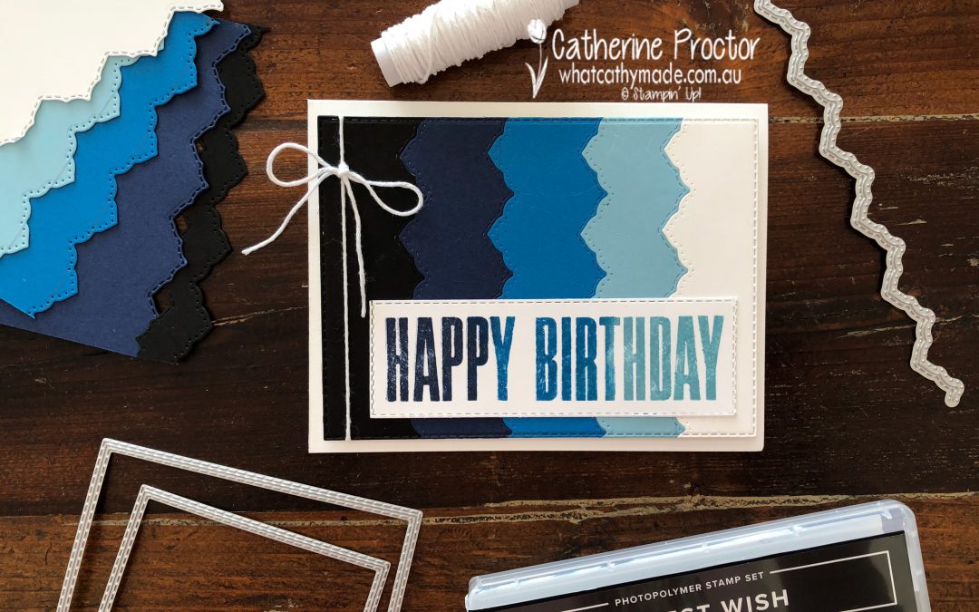
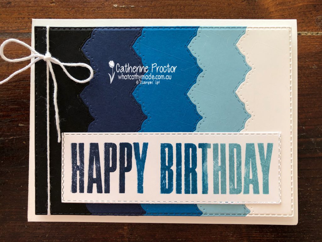
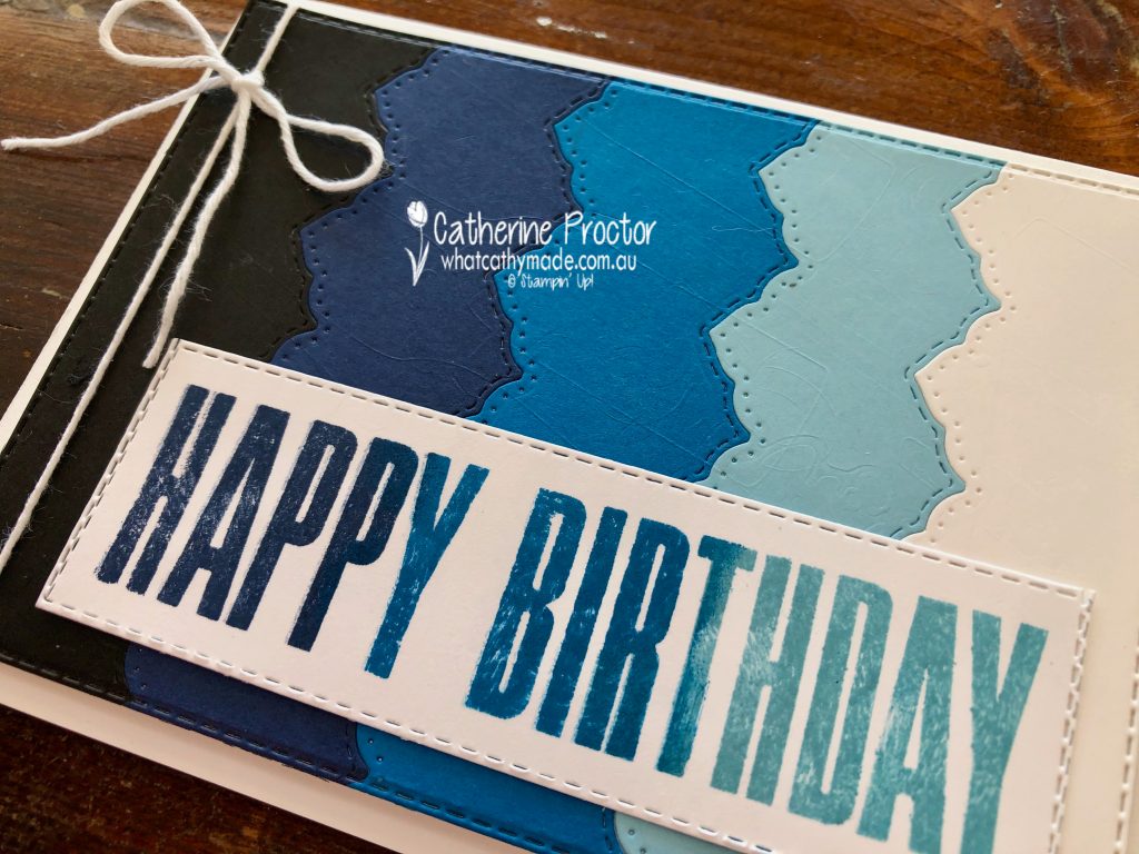
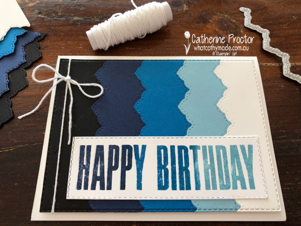
To make an ombre card you simply chose a colour and fade from dark to light. Balmy Blue is our colour this week so I’ve paired it with the other blues as well as black and white to get an ombre effect.
Each strip of card stock was die cut using one of the Basic Borders dies at approximately 3cm wide. Once all my card stock strips were die cut I carefully lined them up in ombre order, then adhered them to a piece of Basic White card stock. This ombre layer was then die cut using the largest stitched rectangle die. (Tip – if you place your rectangle die and card stock on a angle it is much easier to die cut.)
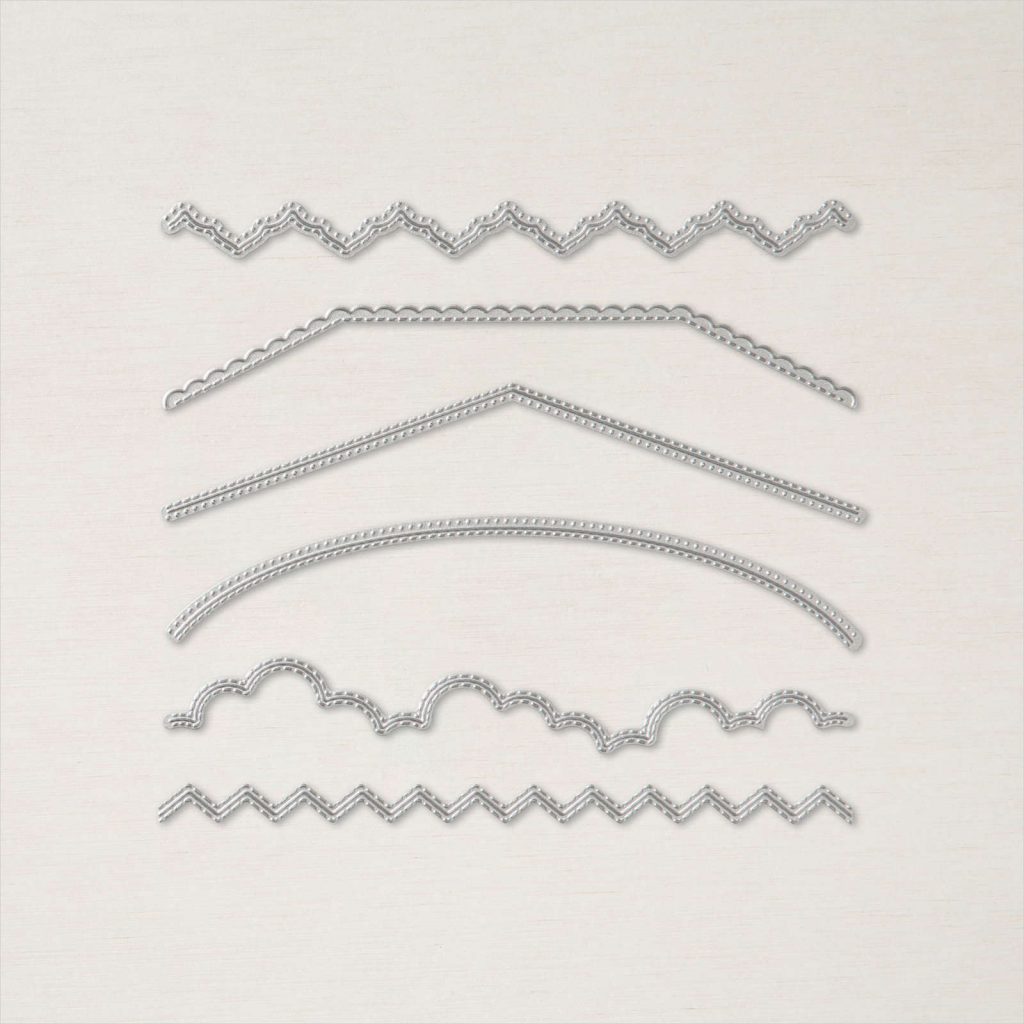
These Basic borders dies are incredible – there are six different shaped dies and the die I’ve used on my card leaves a stitched pattern on one side and a dotted pattern on the other side of the die cut.
My Stamparatus made creating an ombre sentiment quick and easy. I lined up the “happy” and the “birthday” stamps and then used sponge daubers and the Stamparatus to repeatedly stamp and gradually build up ombre colour. The ombre effect was created by stamping in Night of Navy, then Pacific Point and finally Balmy Blue.
A slightly smaller stitched rectangle die was used twice to die cut the sentiment and a single layer of Basic White twine from the Bakers Twine Essentials pack was wrapped around the side of the card.
Now it’s time to hop on over to our next participant, the very talented, Caroline Manwaring.
If you find a broken link or have come to this blog hop from a different entry point, you can view the participants below:
Welcome to the very first week of our new Colour Creations blog hop format for 2020-21!
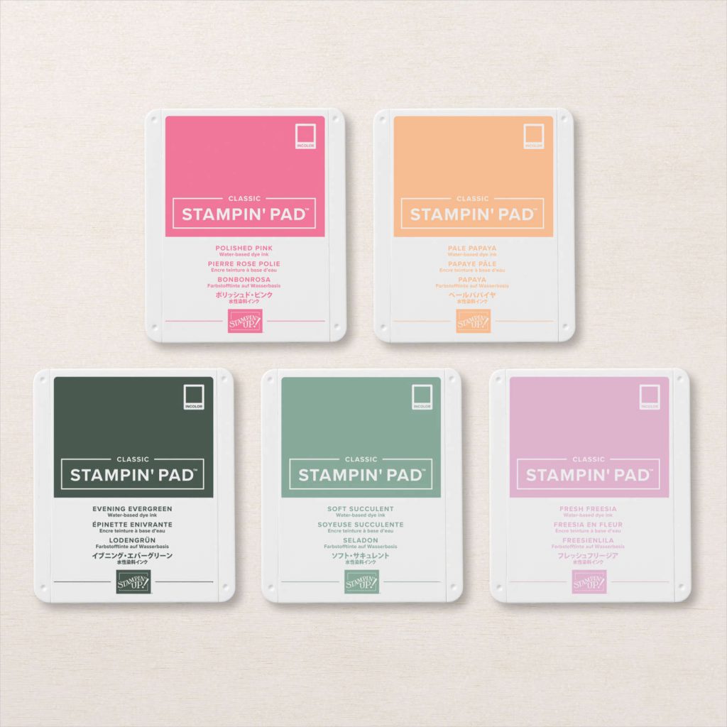
From today we are reverting to a traditional blog hop format, starting with a showcase of ALL FIVE 2021-23 InColours, followed by the rest of our beautiful Stampin’ Up! colours in individual alpha order at 8pm every Wednesday.
If you haven’t already seen them, here are the five new 2021-23 In Colours.
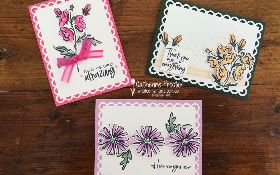
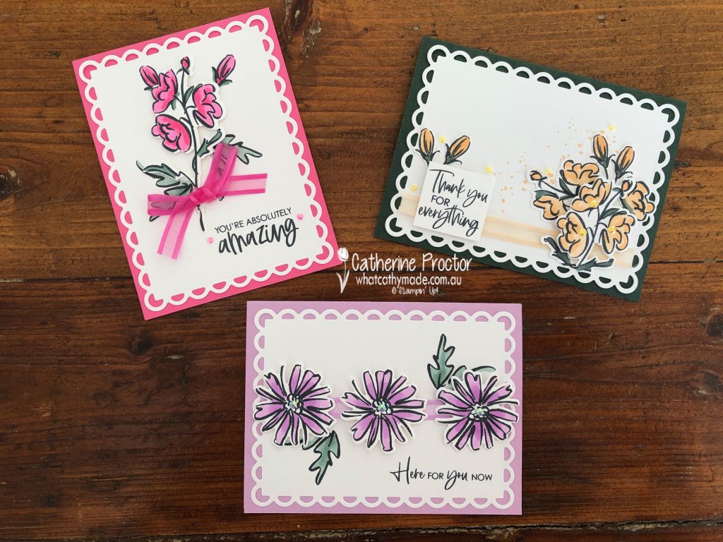
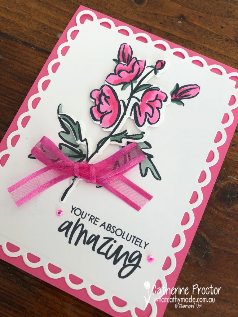
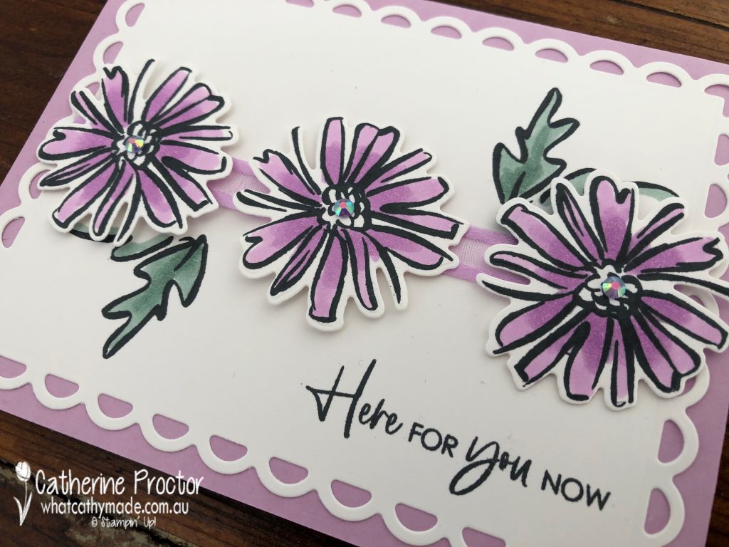
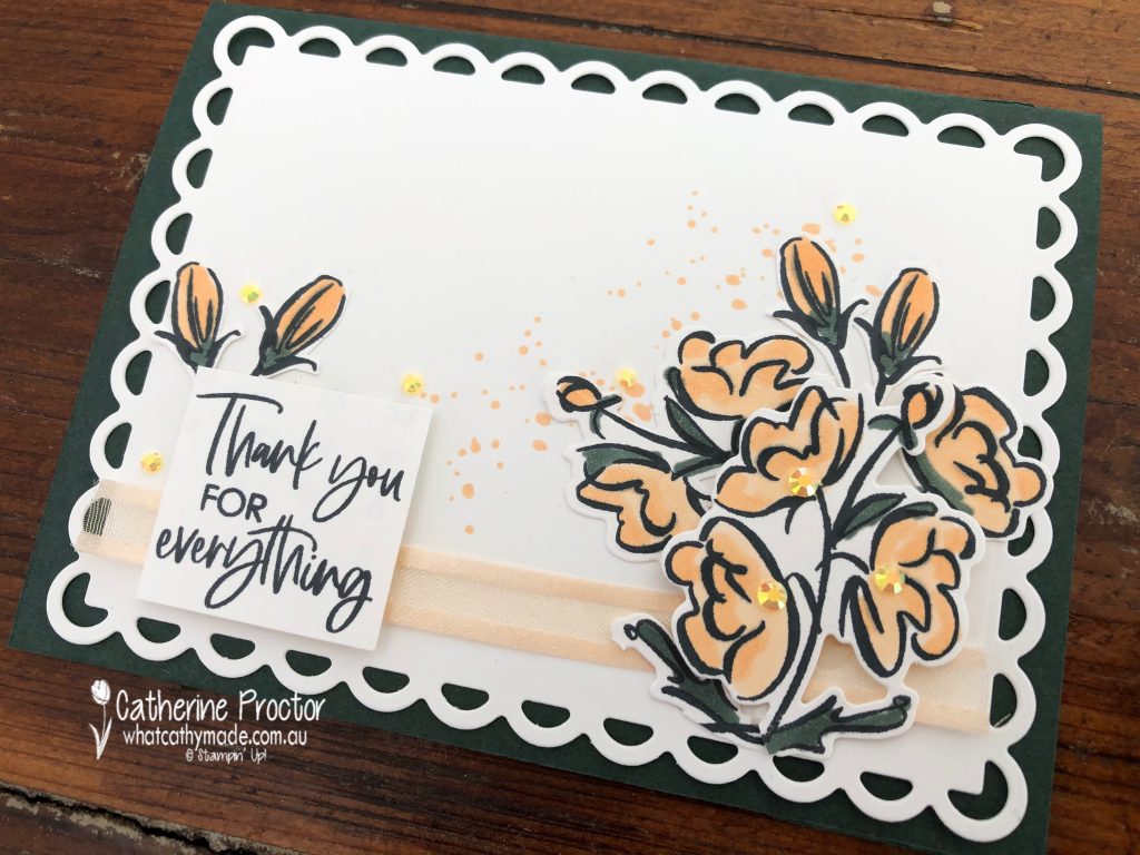
And here are the cards I’ve made to showcase these beautiful 2021-23 InColours using the Colour & Contour bundle. I love how the graphic quality of these floral images really make these colours pop.
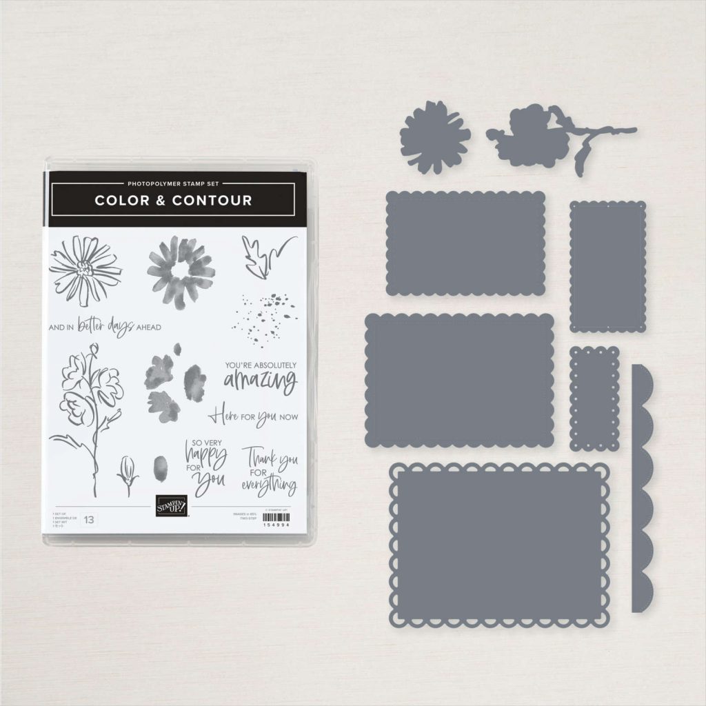
When I first saw the Color & Contour bundle I was immediately drawn to the scalloped layering dies but not so sure about the stamp set. After just one use I am totally sold on this stamp set! Although I’ve used the new InColour Stampin’ Blends to colour in the flowers and leaves the stamp set comes with stamps you can use to stamp the colour into the flowers and leaves if you prefer.
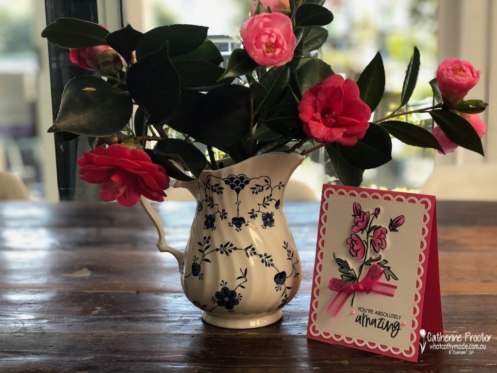
Polished Pink is the brightest of the new 2021-23 InColours – it’s a slightly “redder” pink than Magenta Madness. I couldn’t resist taking a photo of this card beside some camellias I’ve just picked from the trees in my back garden – how good do these pinks and reds look together?
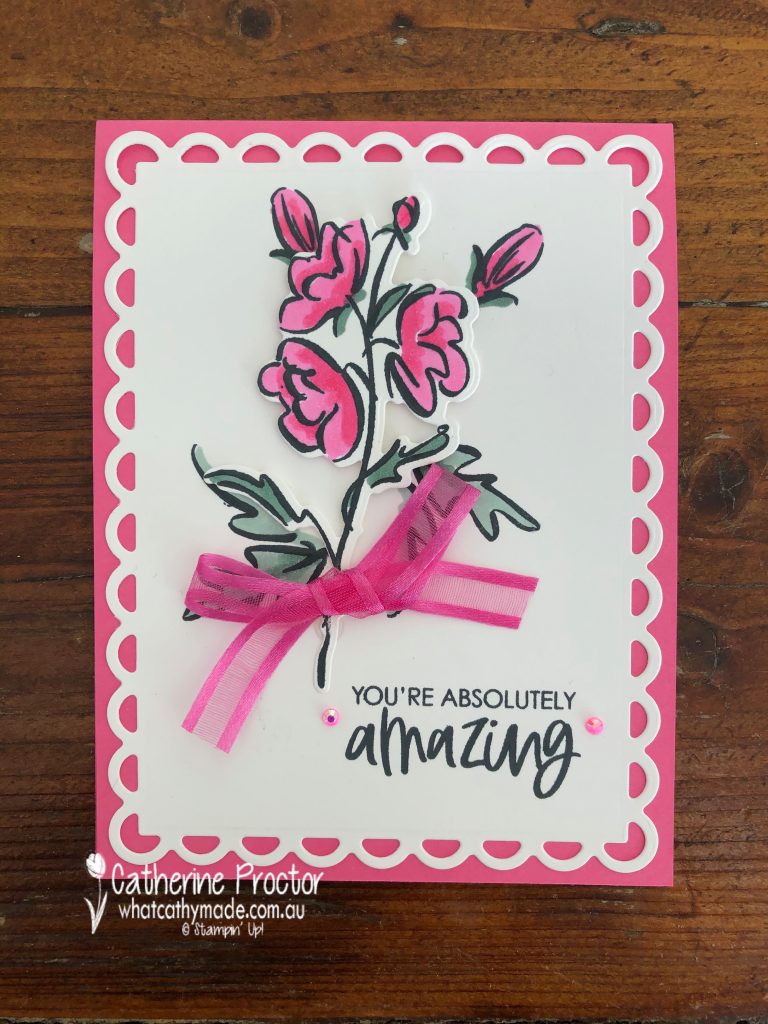
This close-up shows how stunning the largest scalloped contour die is and gives you a better look at the new 2021-23 InColour Jewels and 2021-23 InColour Polished Pink open weave ribbon. The leaves are coloured using another new 2021-23 InColour – Soft Succulent.
I’m so glad I didn’t have to fussy cut this flower – there’s a die for both of the flowers in this bundle. The buds and the smaller leaves are stamped directly onto the Basic White top layer and then the die cut flower is adhered using Stampin’ Dimensionals.
Fresh Freesia is my favourite 2021-23 InColour and this second card uses the other flower stamp, coloured using the Fresh Freesia InColour Stampin’ Blends and die cut with the matching die. The leaves are stamped onto the card front and coloured with the Soft Succulent InColour Stampin’ Blends.
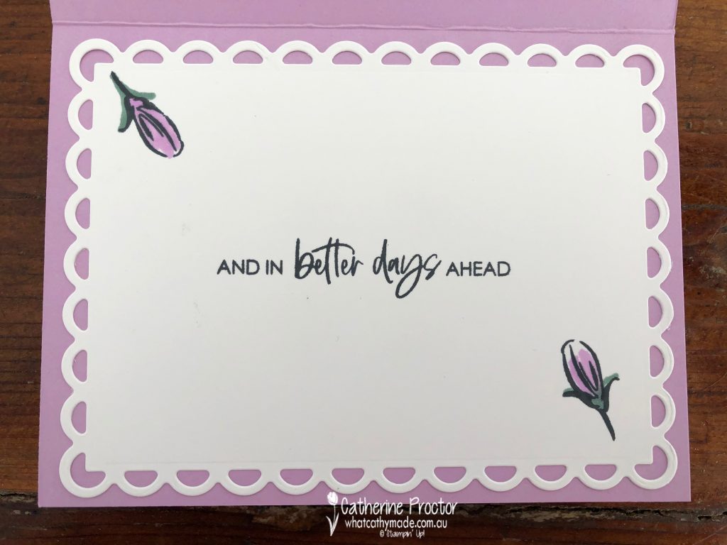
The sentiment stamp on the front of this card is card has a matching stamp that I’ve used on the inside of the card.
For my final card I’ve paired the lightest 2021-23 InColour (Pale Papaya) with the darkest (Evening Evergreen) but I think they really complement each other.
I’ve fussy cut 4 buds as well as the larger flower image (after I die cut it) to create a different floral shape for this card. Did you notice the splattering on the card – it’s another stamp in this really versatile stamp set.
Now it’s time to hop on over to our next participant, the very talented, Kate Morgan.
If you find a broken link or have come to this blog hop from a different entry point, you can view the participants below: