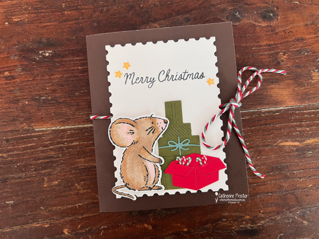
A cute Christmas mouse on the front, a whole festive scene inside! This week’s card has a little surprise waiting beneath its baker’s twine bow.
Welcome to Week 22 of the Art With Heart Team’s Colour Creations hop. We’re exploring the Stampin’ Up! colours in alphabetical order, and this week it’s Early Espresso.
This rich chocolate brown makes a beautiful base for my Christmas shadow box card, created using the A Little Christmas Suite Collection. Paired with crisp Basic White, festive reds and greens, and touches of soft blue, it gives the card a warm, cosy feel.
The shadow box frame is constructed from basic white card stock, sitting inside a card base made with Early Espresso Two-Tone Card stock.
A mouse with Christmas on its mind
How cute are these mice!
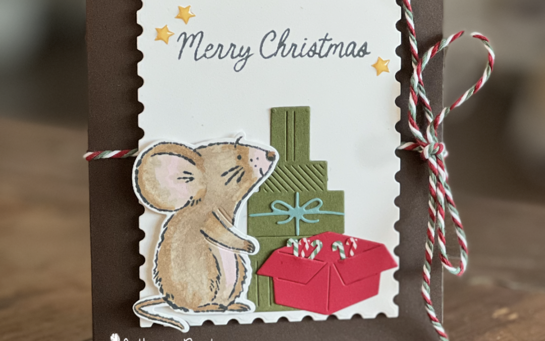
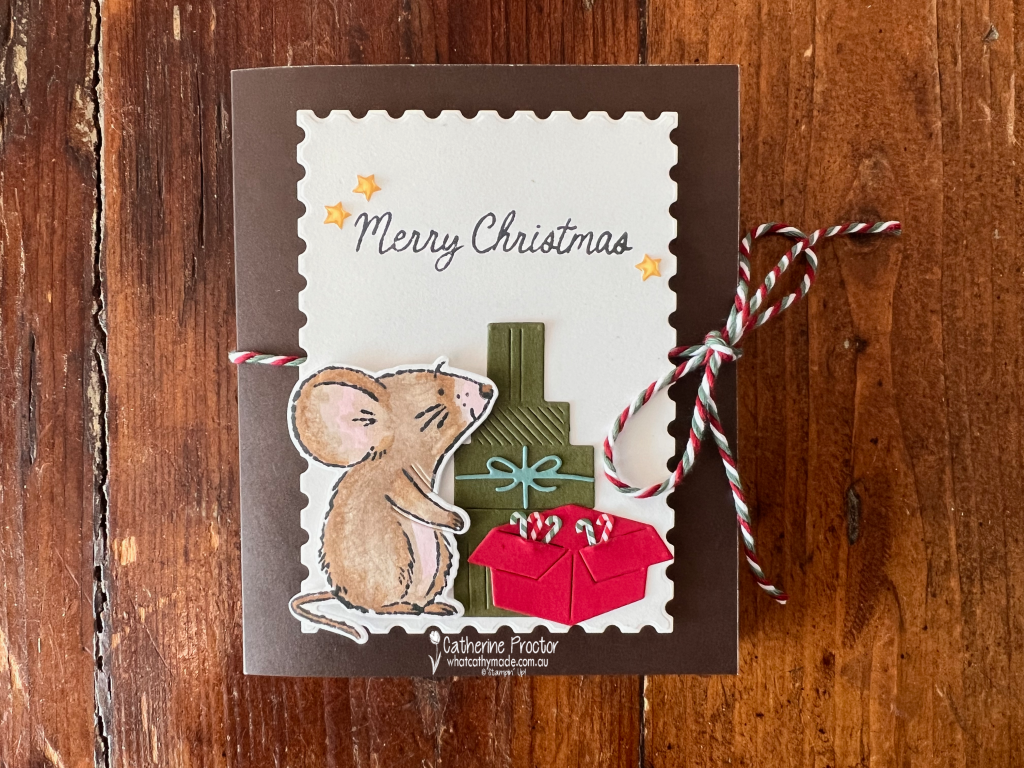
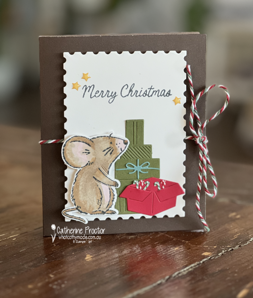
On the front, a little mouse looks up beside a stack of presents and an open red box filled with tiny candy canes. I love how the detailed die cuts bring these simple shapes to life, right down to the folds in the box and the ribbon on the gifts.
The Basic White panel, cut using the Perennial Postage Dies, provides a clean backdrop for the scene. A “Merry Christmas” sentiment and three Christmas Epoxy stars finish the panel, while the Multicolor Christmas Baker’s Twine ties the card closed like a little gift.
Untie the bow for a Christmas surprise
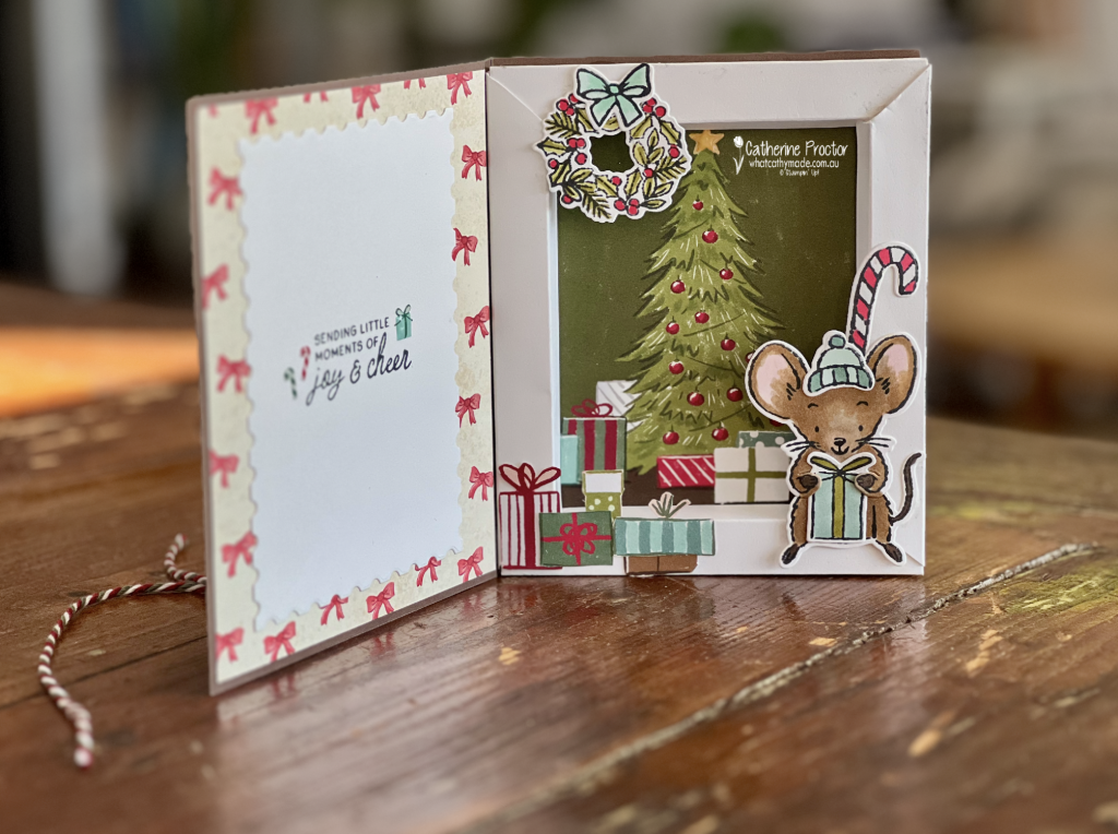
Open the card and there’s a miniature Christmas scene tucked inside a white shadow box frame.
The Christmas tree image is from the A Little Christmas Designer Series Paper and makes a lovely backdrop for the scene. I fussy cut presents from the same paper, arranging them around the tree and along the front of the frame to create extra depth.
Another little mouse, wearing a cosy hat and holding a gift, sits at the front, with a candy cane peeking up behind it. A wreath with a soft blue bow decorates the top corner.
I love the way the mouse, wreath and presents overlap the white frame. It makes the scene feel as though it’s spilling out of its little Christmas box!
On the inside cover, red bow-patterned Designer Series Paper surrounds another Basic White postage-edge panel. The sentiment, “Sending little moments of joy & cheer”, feels just right for this little Christmas world, with plenty of space left for a handwritten message.
Colouring the Christmas mice
I coloured the mice using light and dark Stampin’ Blends in Barely Blush, Old Olive, Crumb Cake and Pecan Pie, together with the Deep combo pack.
For the hats, candy canes, presents and other festive details, I took my colour inspiration from the A Little Christmas Designer Series Paper, using Lost Lagoon, Old Olive, Pool Party and Real Red.
Taking colour cues from patterned paper is one of my favourite ways to create a coordinated project. Here, the paper does double duty, providing both the Christmas tree backdrop and little presents to fussy cut and layer.
A suite full of little details
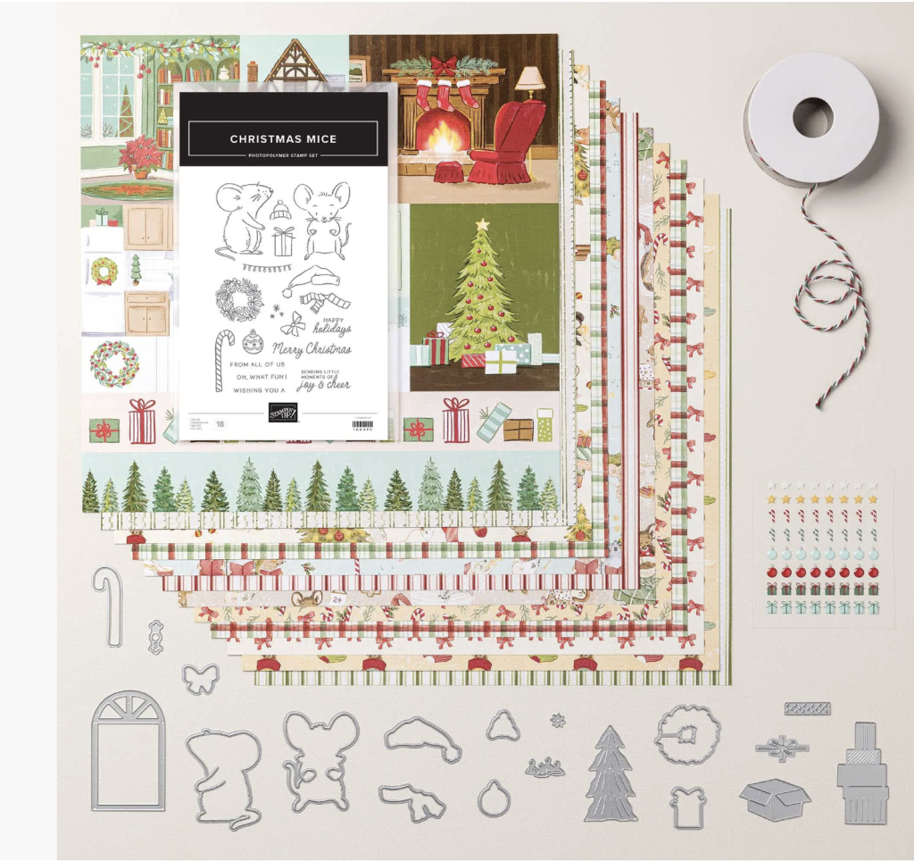
This project uses all five products from the A Little Christmas Suite Collection:
*Christmas Mice Photopolymer Stamp Set
*Christmas Mice Dies
*A Little Christmas Designer Series Paper
*Multicolor Christmas Baker’s Twine
*Christmas Epoxy Shapes
From the tiny candy canes to the cheerful mice, there are so many details to enjoy in this suite. And Early Espresso provides a lovely, warm foundation for them all.
Wouldn’t this be a fun little Christmas surprise to receive?
Take a look at some more Early Espresso inspiration on our Insta Hop!
Our blog hop is now an Instagram hop but the good news is that you don’t need to have an Instagram account to view all of the other projects!
Simply go to my Insta handle in a new search engine window to follow the Instagram hop: @whatcathymade.
Next week we are showcasing the dark brown neutral, Early Espresso.
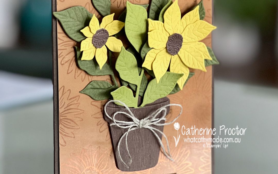
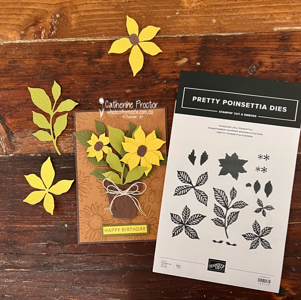
Who says a poinsettia die can’t be used to make a sunflower? Not me!
Welcome to Week 21 of the Art With Heart Colour Creations Blog Hop. This week we are showcasing Darling Duckling, a warm golden yellow that is perfect for creating cheerful sunflowers.
I’ve seen a few talented crafters use the Pretty Poinsettia Dies to create sunflowers, so I thought I would give it a go too.
My colour combination is:
Darling Duckling
Old Olive
Mossy Meadow
Early Espresso
Pecan Pie
Copper Foil
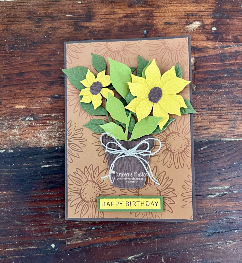
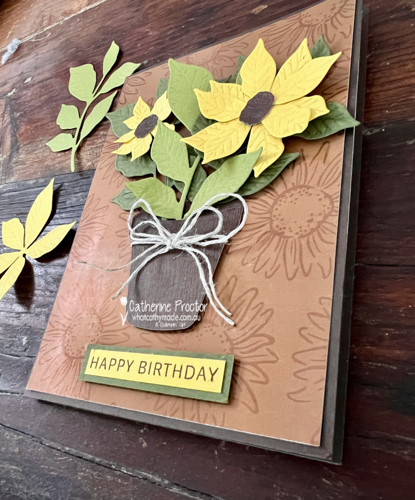
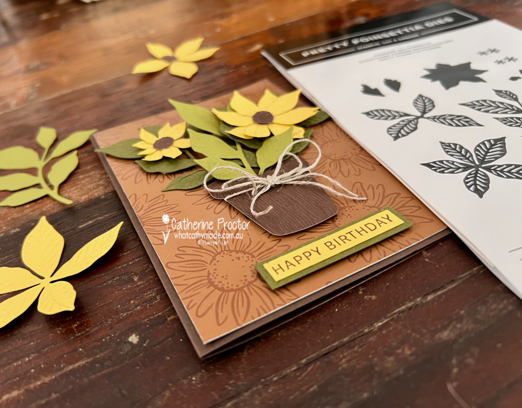
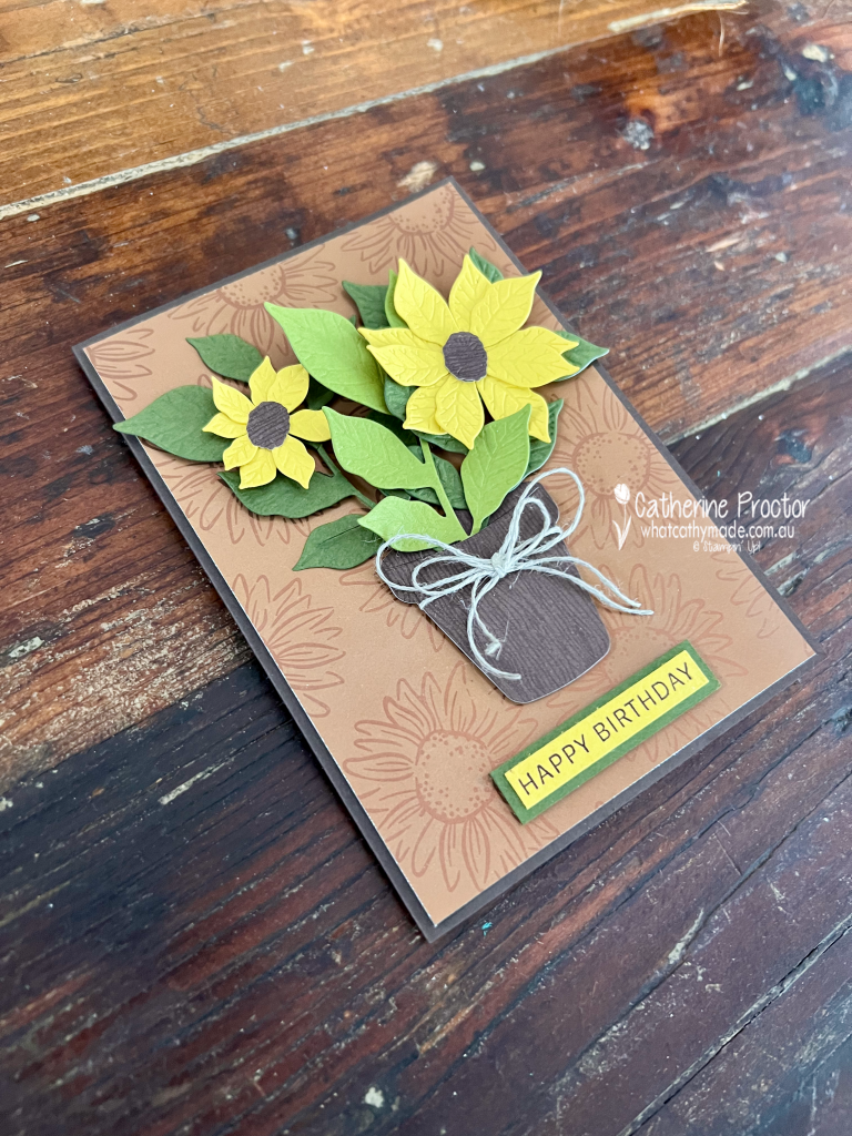
The Pretty Poinsettia Dies were used to create the two layered Darling Duckling sunflowers and much of the surrounding foliage. I used the Help Me Grow Dies for the flowerpot and the Early Espresso sunflower centres, cutting these pieces from the Wood Grain Wonders Designer Series Paper to give them plenty of natural texture.
For the background, I simply had to use the beautiful sunflower-patterned paper from the Radiant Foils Specialty Designer Series Paper. Its copper foil details add a lovely glow and complement the warm, earthy colours of the card perfectly.
The happy birthday sentiment is from the Lovely Arrangements Stamp Set. I stamped it in Early Espresso onto Darling Duckling cardstock, layered it onto Old Olive cardstock and added it to the card with Stampin’ Dimensionals.
A double Linen Thread bow tied around the flowerpot adds the finishing touch.
I love discovering unexpected ways to use my crafting supplies. The Pretty Poinsettia Dies might have been designed for Christmas projects, but with a change of colour and a little imagination, they can create the most cheerful sunflowers too.
Have you ever used a die to create something completely different from its original purpose?
Take a look at some more Darling Ducking inspiration on our Insta Hop!
Our blog hop is now an Instagram hop but the good news is that you don’t need to have an Instagram account to view all of the other projects!
Simply go to my Insta handle in a new search engine window to follow the Instagram hop: @whatcathymade.
Next week we are showcasing the dark brown neutral, Early Espresso.
A group of creative friends from the Art with Heart team are back with our Annual Heart of Christmas blog hop. Follow through the blogs each Monday night until the end of November for Christmas card inspiration.
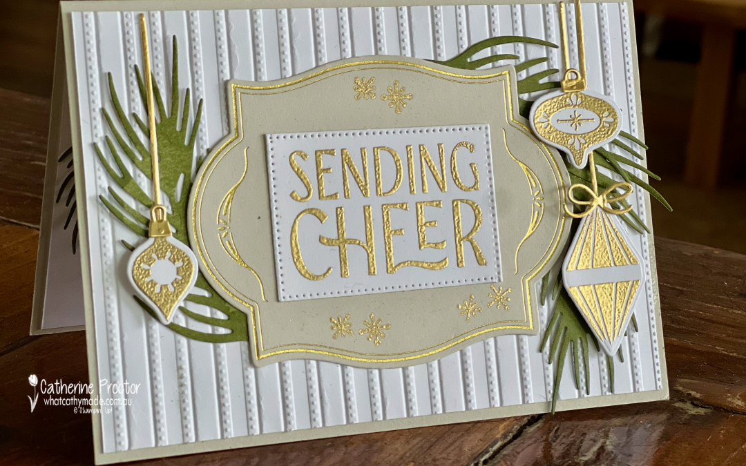
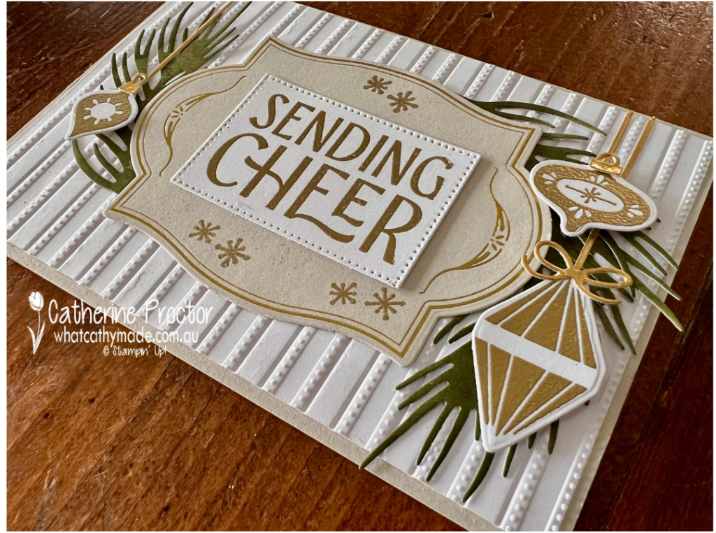
This week, I have created a collection of elegant Christmas cards featuring my current favourite combination of techniques and products: hot foiling, heat embossing and gold foil.
These techniques work beautifully together to add layers of shine and texture without overwhelming the design. The hot-foiled details provide a delicate metallic finish, while the gold heat embossing and Gold Foil add further depth and a touch of Christmas luxury.
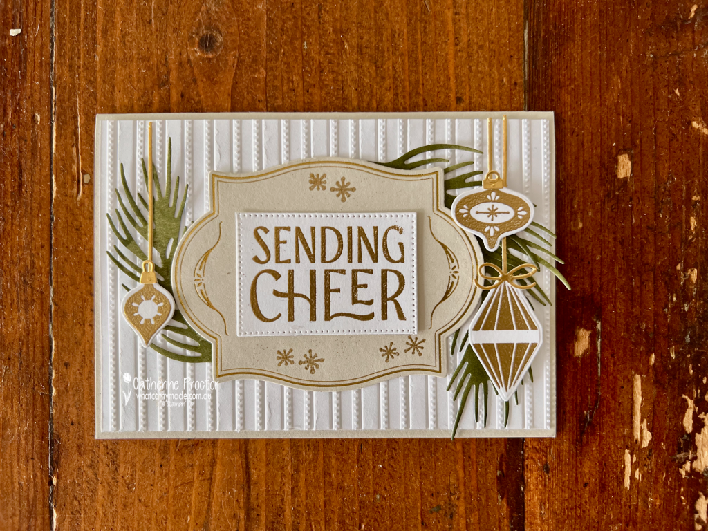
My colour combination is Basic White, Basic Beige, Old Olive and Gold Foil. I seem to be reaching for these elegant neutrals a lot lately. Basic White and Basic Beige create a soft foundation, while Old Olive and Gold Foil add traditional Christmas warmth, shine and sophistication.
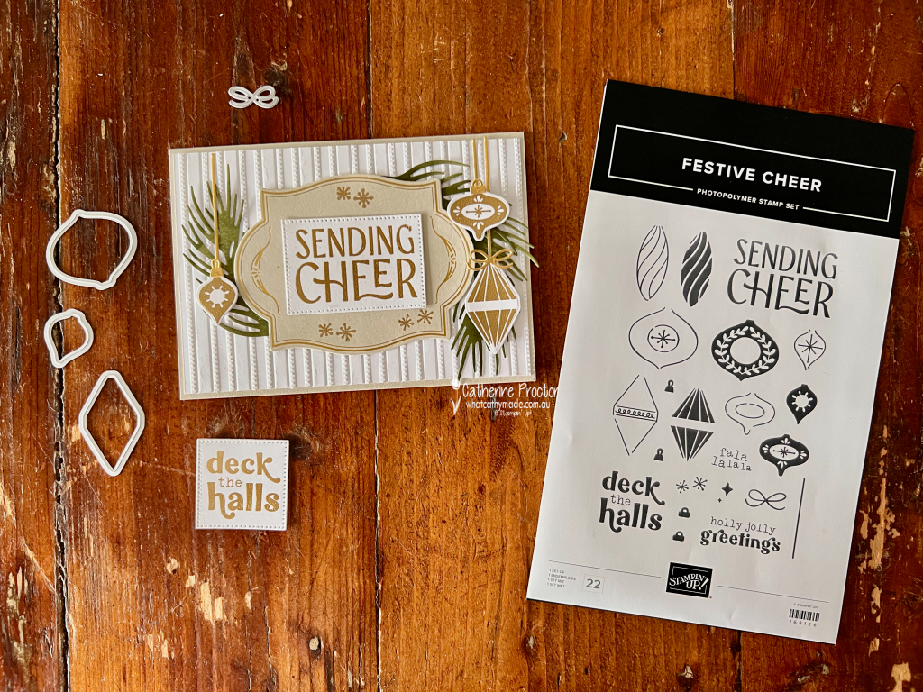
The Flourish & Frames Hot Foil Dies were used to create the beautiful foiled details. I paired these with the Festive Cheer Bundle and the Lovely Stripes Embossing Folder, which introduces subtle texture and helps bring the different elements of each card together.
The Delicate Dreams Specialty Designer Series Paper adds a subtle variegation to the Old Olive foliage. Gold Foil backed with an adhesive sheet was used for selected die-cut elements, while sentiments stamped in Versamark ink and heat embossed with Gold Metallics Embossing Powder complete the coordinated metallic look.
Although several techniques and finishes have been combined, limiting the designs to a restrained colour palette keeps the cards balanced and cohesive.
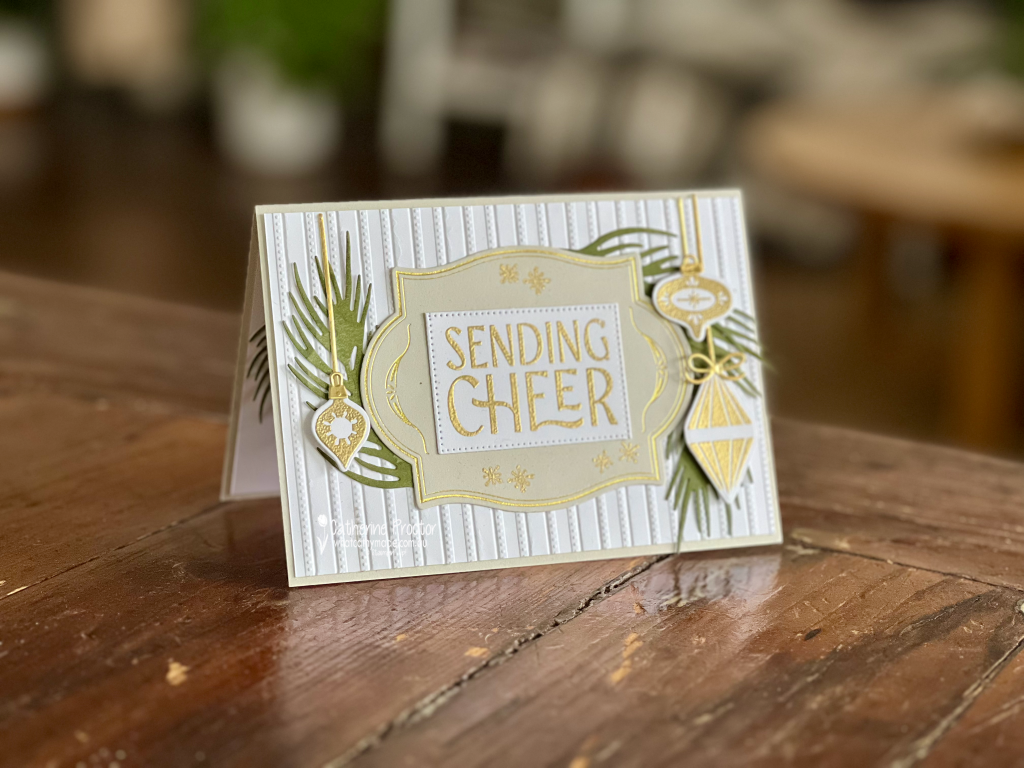
It’s hard to capture the gorgeous shine of all the gold touches, hopefully this portrait shot gives you a better idea of how it shines in real life.
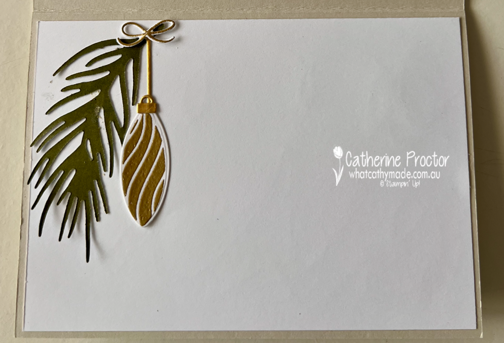
I used some leftover pieces to decorate the inside of my card.
Take a look at some more Heart of Christmas inspiration!
Now it is time to continue our Heart of Christmas Blog Hop and see what the next talented member of the Art With Heart Team has created.
Next in our blog hop is Judy May. Click on the link below to see her beautiful Christmas project.
If the next button link is not working or you’d like to see the entire list of participants, go to Sharon Davern‘s blog.
Welcome to Week 20 of the Art With Heart Colour Creations Blog Hop for 2026–27. This week, we are sharing projects featuring Daffodil Delight.
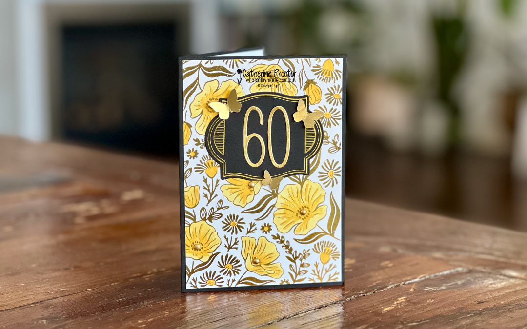
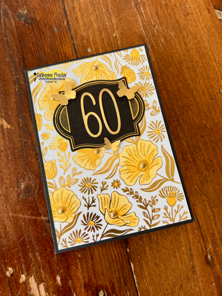
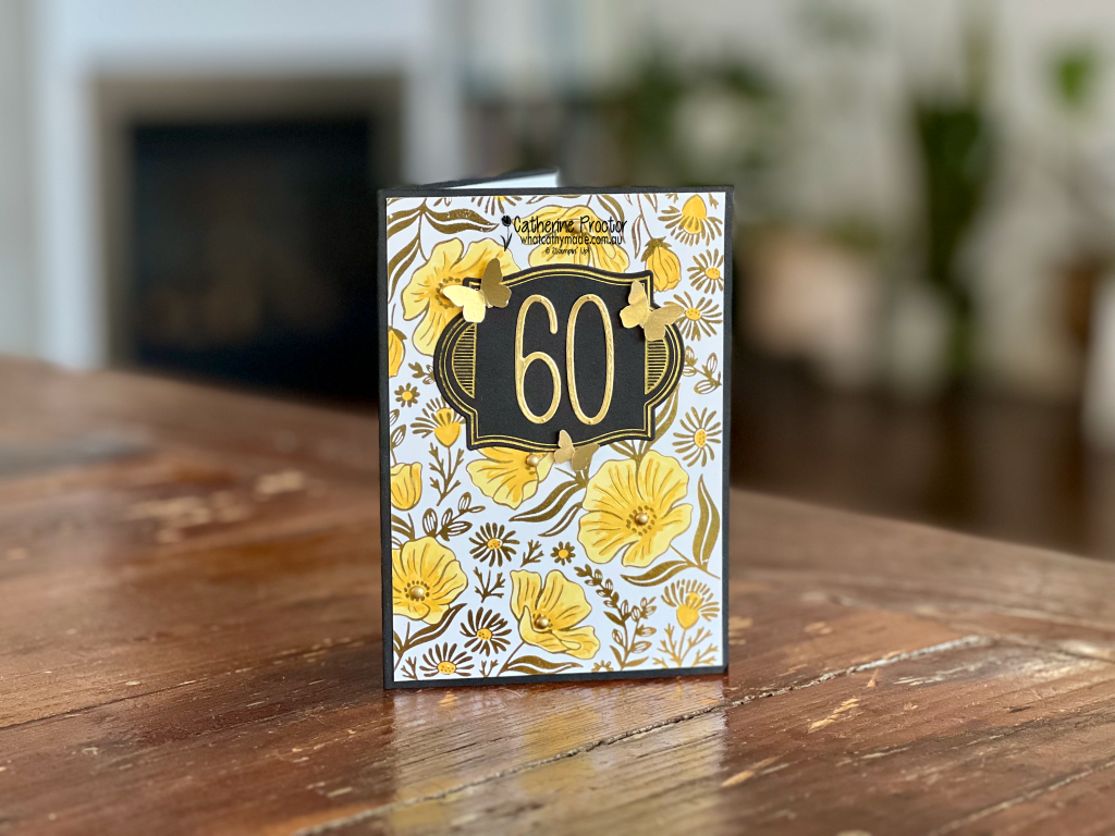
Daffodil Delight is such a bright and cheerful yellow, and tonight I’ve paired it with gleaming gold foil to create a special 60th birthday card.
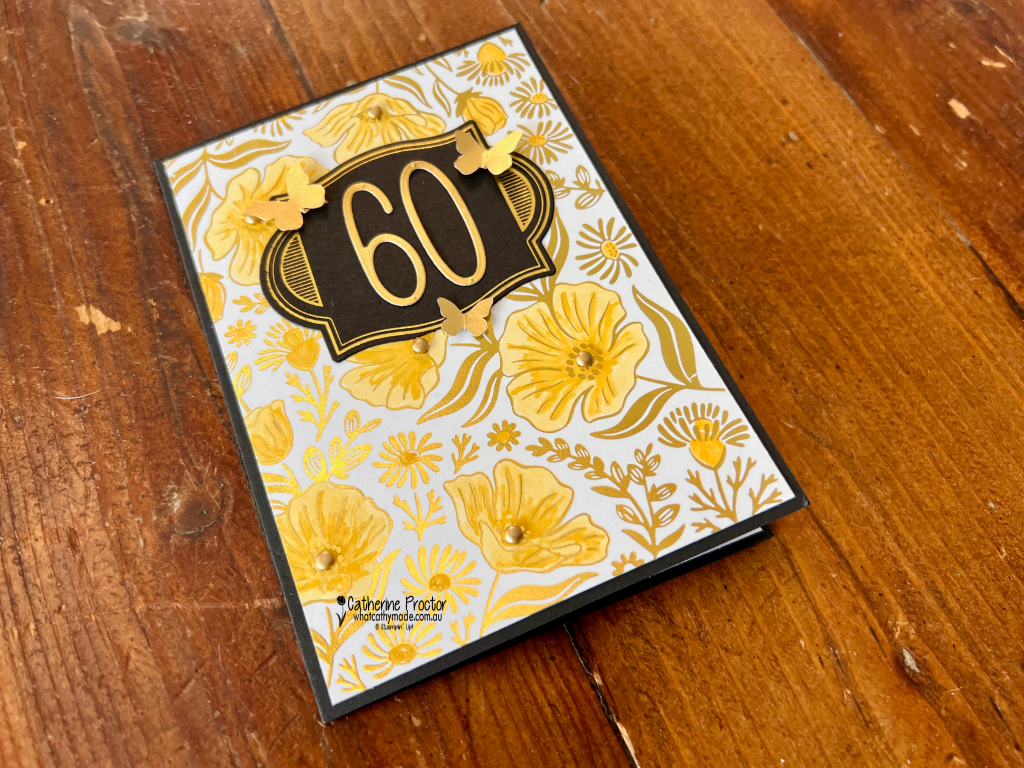
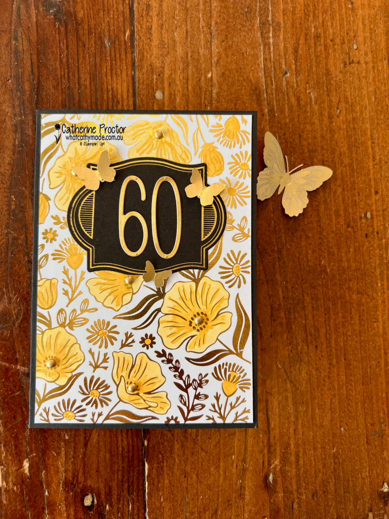
The floral focal point was created with the new Garden Silhouette Hot Foil Die. After foiling the image, I coloured the flowers using Light and Dark Daffodil Delight Stampin’ Blends. The two shades add depth and dimension while allowing the beautiful gold outlines to remain the star of the design.
I also used the Flourish & Frames Hot Foil Dies to add more elegant foiled details to the card with a hot foiled gold and Basic black label layer for the feature “60”. It is very hard to capture the amazing shine in photographs, but the gold foil looks spectacular as the card moves and catches the light. The best photo I have of the foil was taken upside down!
To embellish the card, I added Gold Adhesive-Backed Dots and some delicate Gilded Wings Accents. The Gilded Wings Accents are currently on the Last Chance list, so you may want to order them soon if they are on your wish list.
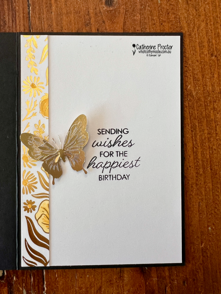
Inside the card, I stamped a sentiment from the Framed All Around Stamp Set, which is also on the Last Chance list. I decorated the inside with a leftover strip of foiled card stock and another butterfly from the Gilded Wings Accents. Using the leftover foil strip was an easy way to carry the design through to the inside while ensuring none of that beautiful foiled card stock went to waste.
I love the combination of Daffodil Delight, Gold Foil, black and white for a milestone birthday. It feels joyful, celebratory and just a little bit glamorous, which is perfect for a 60th birthday card.
Take a look at some more Daffodil Delight inspiration on our Insta Hop!
Our blog hop is now an Instagram hop but the good news is that you don’t need to have an Instagram account to view all of the other projects!
Simply go to my Insta handle in a new search engine window to follow the Instagram hop: @whatcathymade.
Next week we are showcasing another yellow, Darling Ducking.
A group of creative friends from the Art with Heart team are back with our Annual Heart of Christmas blog hop. Follow through the blogs each Monday night until the end of November for Christmas card inspiration.
This week’s card is a fancy fold I designed as my “Make and Take” project for when I caught up with some of our Art With Heart team members at an event in the Adelaide Hills a few weeks ago.
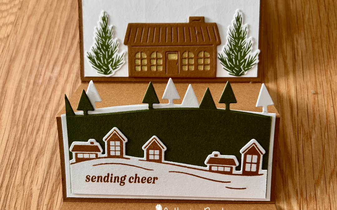
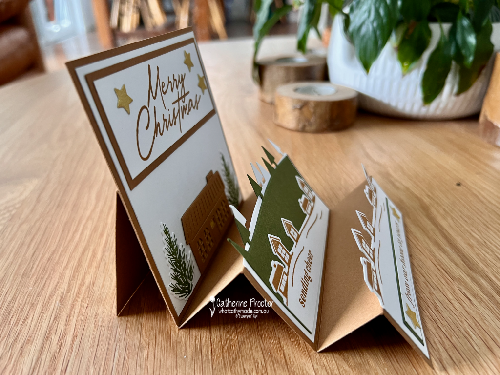
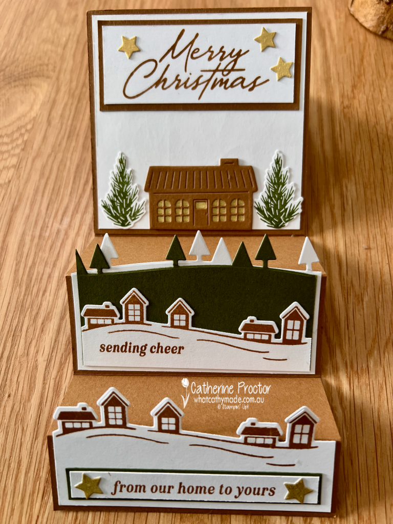
My Neutral Noel Single Step Card, features a dimensional Christmas village in a warm, earthy colour palette of Pecan Pie, Mossy Meadow, Basic White and gold.
I love a fancy-fold card that creates plenty of impact when it is displayed. This single step design provides several different levels for building a scene, so the houses and trees appear to stretch into the distance.
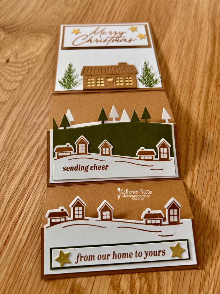
This is what it looks like when laid flat.
The Welcome Noel Bundle was perfect for creating my little Christmas village. I used the coordinating stamps and dies to build rows of houses and trees across the different sections of the card.
The detailed Pecan Pie house on the back panel has been layered over Gold Timeless Metallic Specialty Paper, giving the windows and door a lovely warm glow. More touches of gold appear in the die-cut stars surrounding the large Merry Christmas sentiment.
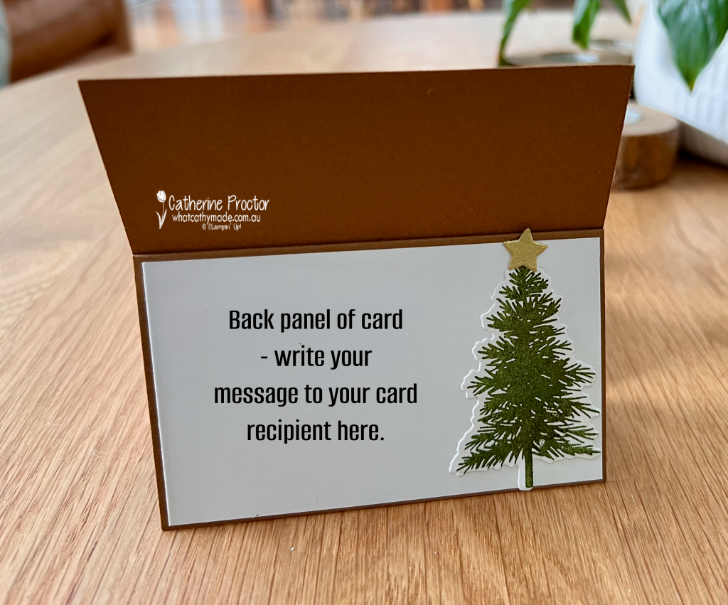
Although the card has plenty of dimension when standing, the design folds down for placing in an envelope. I also added a Basic White panel to the back of the card, providing plenty of room to write a personal Christmas message.
Free Single Step Card Tutorial
Because I created this project as a “Make and Take” I have a FREE PDF tutorial to share with you so you can make this card yourself.
Welcome to Week 19 of the Art With Heart Colour Creations Blog Hop. This week we are showcasing Crushed Curry, a rich golden yellow that brings warmth and energy to any project.
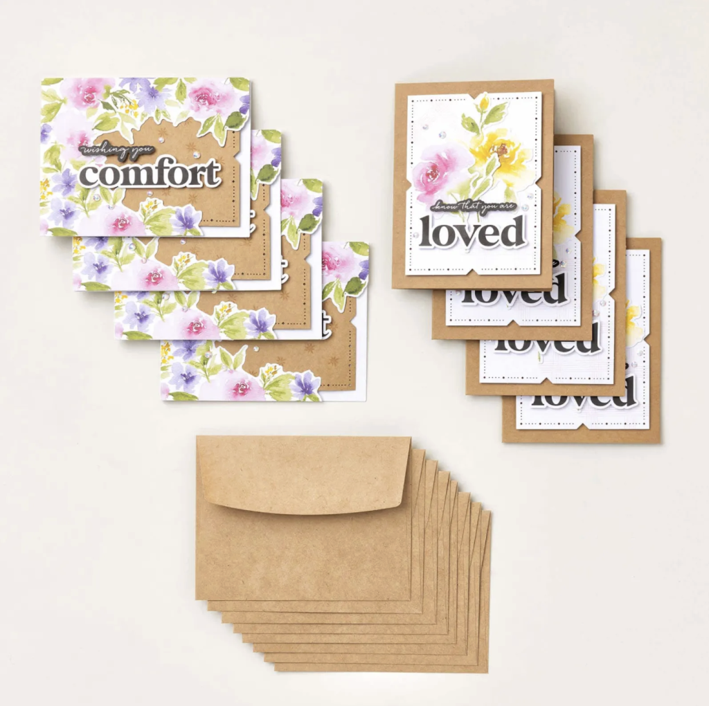
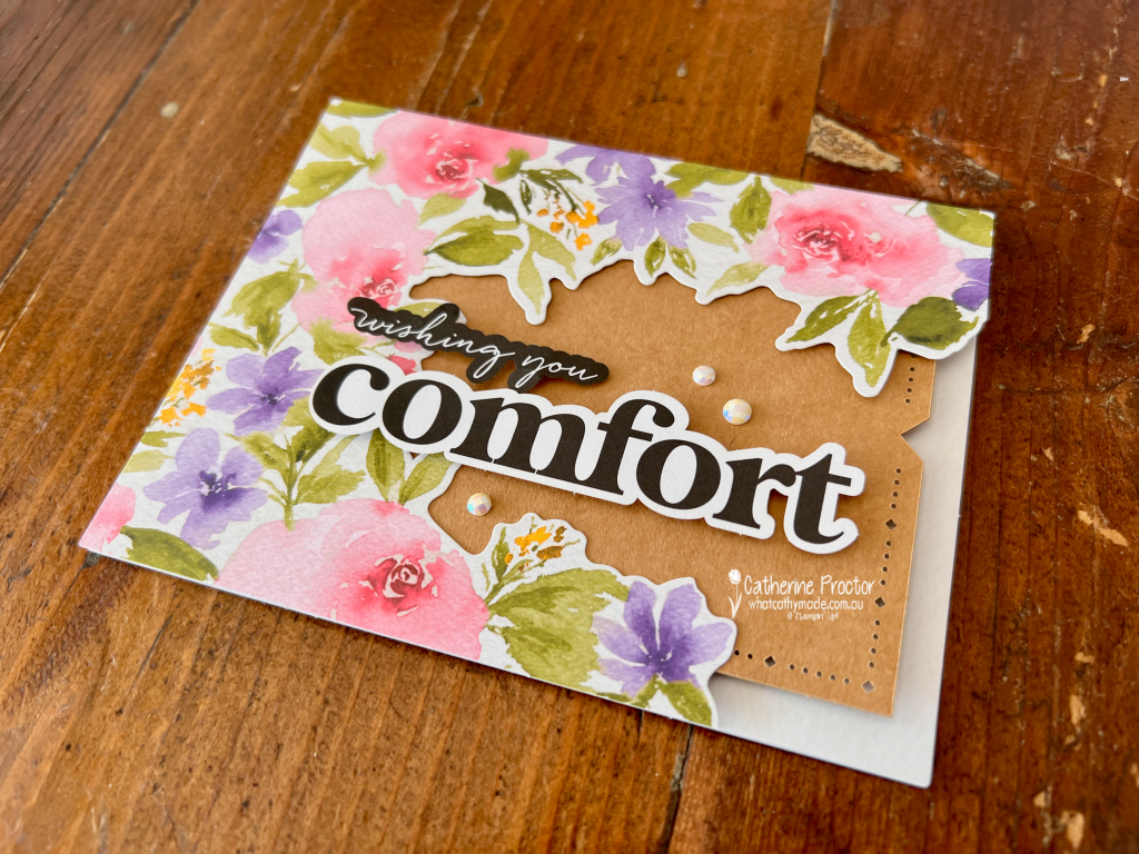
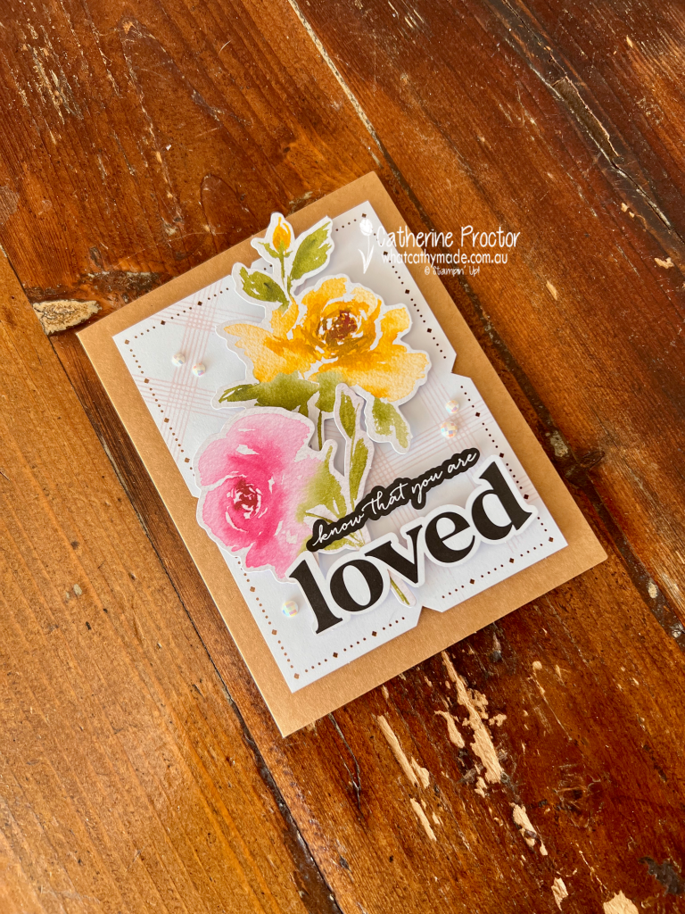
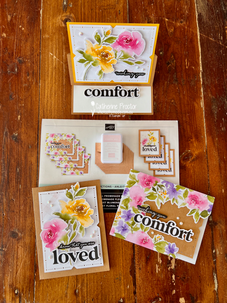
For tonight’s cards, I’ve used a brand new Stampin’ Up! kit: the Floral Promenade Kit.
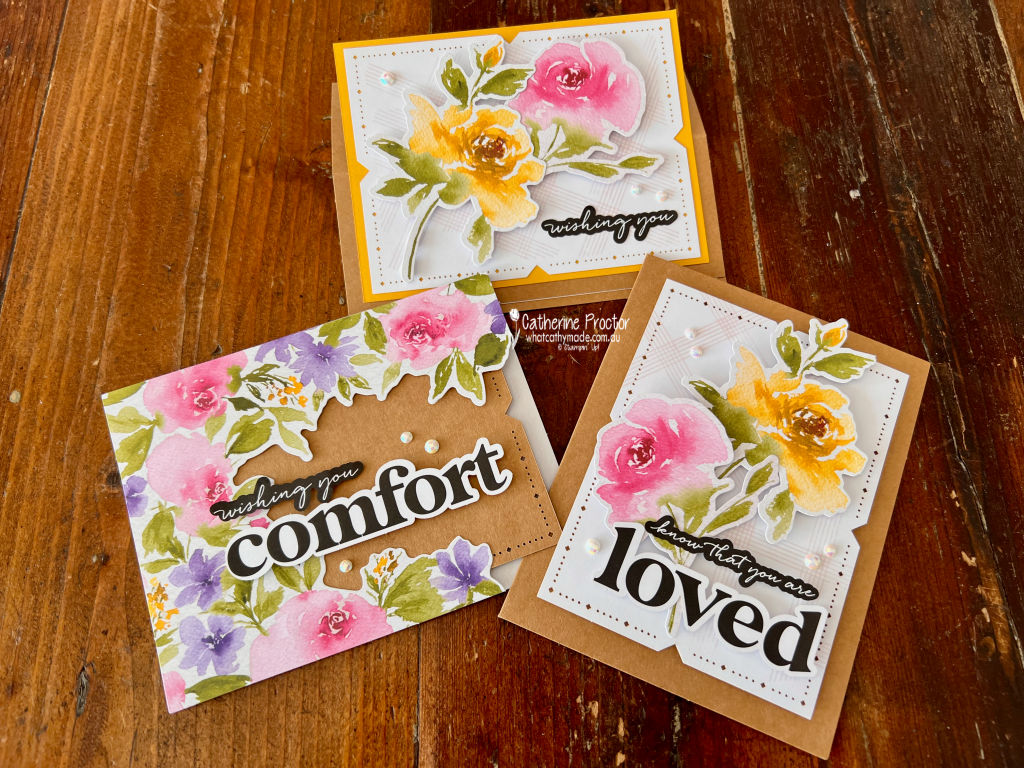
The Floral Promenade Kit features stunning watercoloured flowers in a bright, cheerful colour palette. The pink, purple and yellow blooms look particularly beautiful against the Kraft card bases and layers.
The kit pairs Crushed Curry with Basic Black, Gorgeous Grape, Melon Mambo and Old Olive, all set against Kraft and Basic White. How good does Crushed Curry looks with these colours!
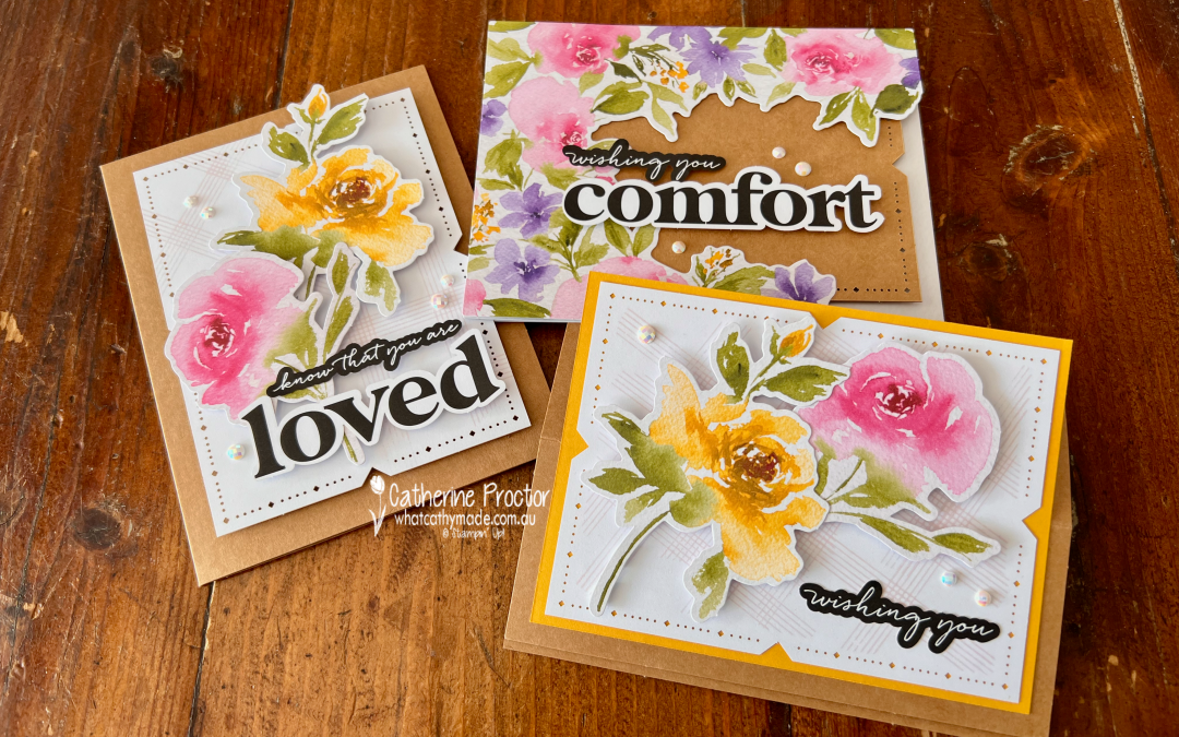
The kit contains two different card designs, and I thought both were so beautifully designed that I made them exactly as shown in the instructions.
The first design features a floral frame surrounding the large “comfort” sentiment. There’s only a few touches of Crushed Curry in this card, however I love the way the flowers contrast with the Kraft panel underneath.
The second design has a lot more Crushed Curry, layering the water coloured flowers over a white decorative panel on a Kraft card base. The oversized “loved” sentiment creates a strong focal point, while the smaller script sentiment completes the message.
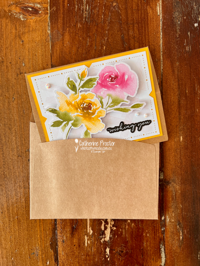
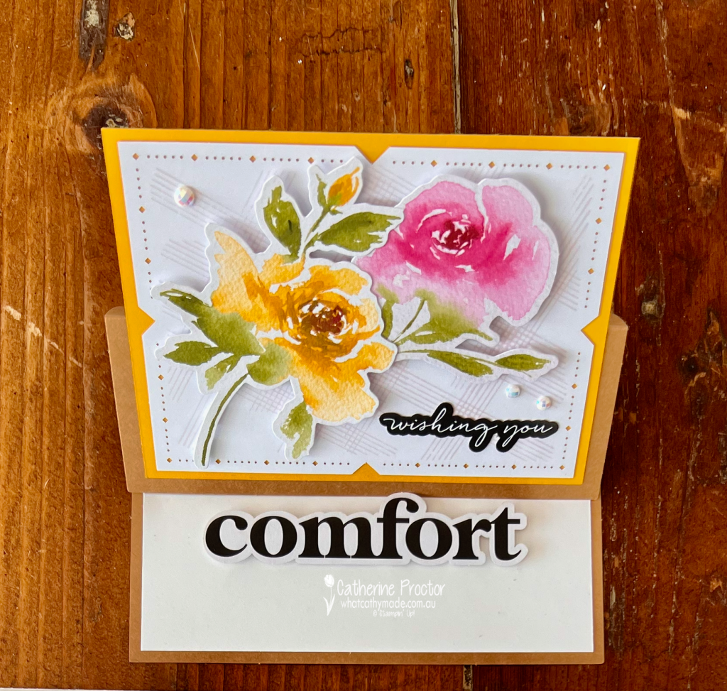
After completing the two original designs, I used more of the kit components to create a third card with a simple easel mechanism.
I added one extra score line to the front of the Kraft card base and folded it back on itself. The decorated floral panel was then attached to the folded section, allowing it to stand upright when the card is open.
I also added a layer of Crushed Curry cardstock behind the floral panel. This narrow golden border draws attention to the Crushed Curry flower and makes the watercoloured design stand out even more strongly against the Kraft base.
Inside the card, I raised the large pre-cut “comfort” sentiment on Stampin’ Dimensionals. This acts as the stopper that holds the easel upright when the card is displayed.
It is a very simple variation that requires only one additional fold and a piece of Crushed Curry card stock, but it gives the original kit design a completely different look.
Another exciting feature of the Floral Promenade Kit is the adorable new Premium Stampin’ Spot.
This is the first Stampin’ Up! kit to include the new-style ink spot. From now on, Premium Stampin’ Spots will replace the original Stampin’ Spots in kits.
The updated case feels like a miniature version of a full-sized Classic Stampin’ Pad and is such a lovely addition to the kit.
The Floral Promenade Kit is beautiful exactly as designed, but it also provides plenty of possibilities for alternative projects. My easel card is just one easy way to step up the supplied components without needing lots of additional products.
Take a look at some more Crushed Curry inspiration on our Insta Hop!
Our blog hop is now an Instagram hop but the good news is that you don’t need to have an Instagram account to view all of the other projects!
Simply go to my Insta handle in a new search engine window to follow the Instagram hop: @whatcathymade.
Next week we are showcasing another yellow, Daffodil Delight.
Welcome to Week 1 of the Heart of Christmas 2026 blog hop! It’s lovely to be creating Christmas cards again with the Art With Heart team, and I’m looking forward to sharing a new project each week as we head towards Christmas.
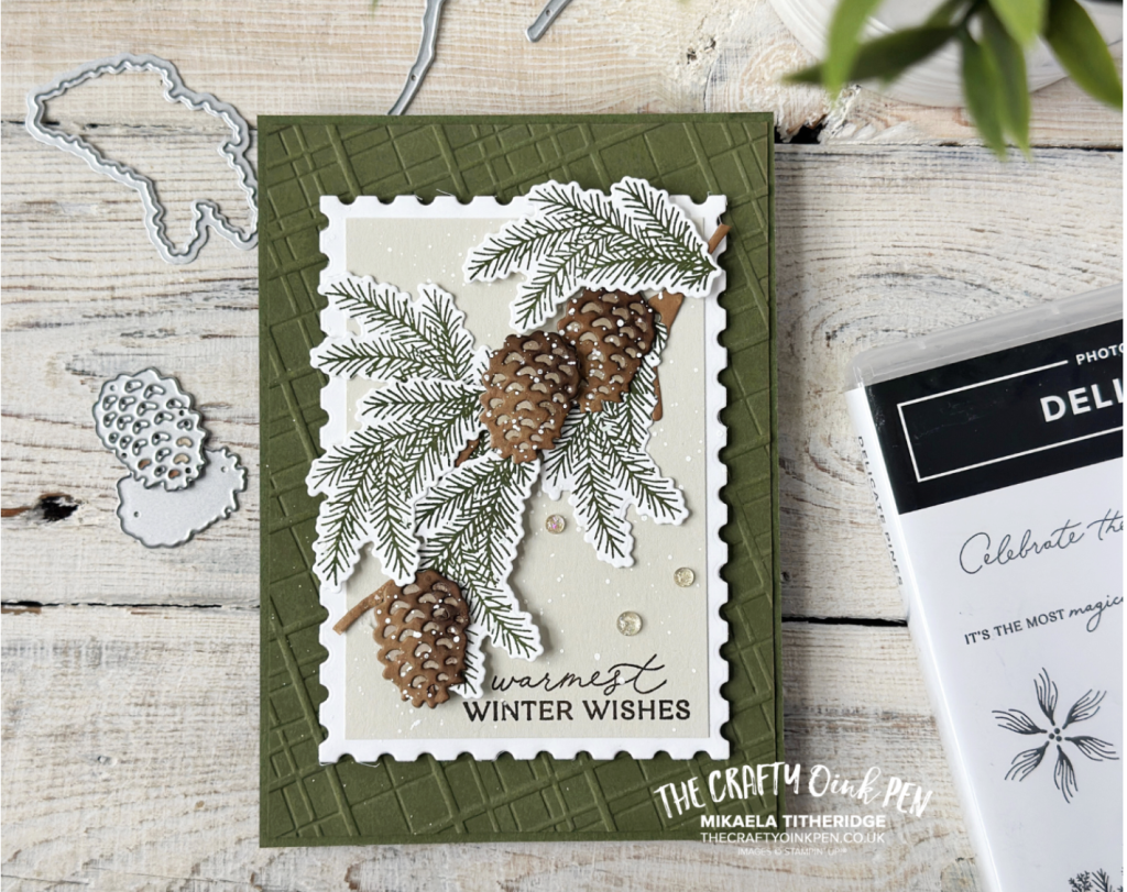
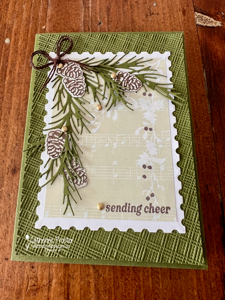
This week’s card is a CASE of a beautiful design created last year by Mikaela from The Crafty Oink Pen in 2025. CASE stands for Copy And Share Everything, and it’s a wonderful way to take inspiration from another card maker while adding your own creative touches.
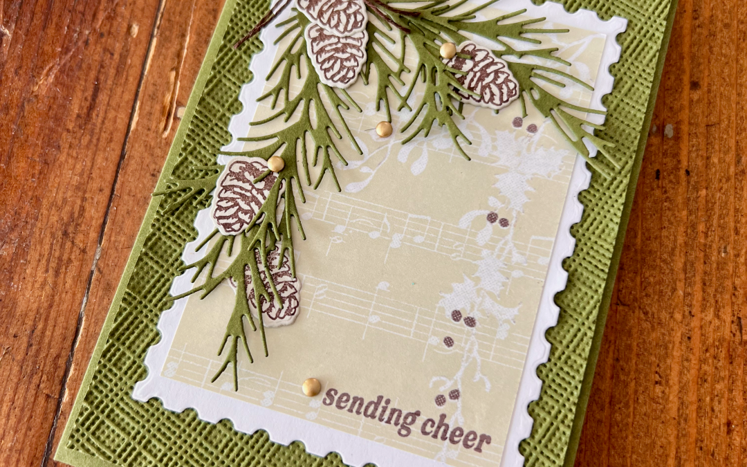
There were several elements of Mikaela’s original card that immediately caught my eye. I loved the way the embossing folder was positioned on an angle, rather than straight across the card. The neutral combination of dark green, cream and dark brown was also beautiful, as was the stamping directly onto Designer Series Paper.
The Perennial Postage Dies added another lovely detail, giving the layers a decorative edge without overwhelming the design. I wanted to retain these elements while creating a version in my own colour palette.
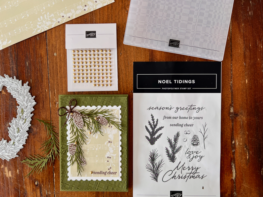
When you look at the two cards side-by-side so you can see how I’ve CASED Mikaela’s card and changed the elements of the design to make it my own.
Both cards have a Mossy Meadow card stock base with an embossed Mossy Meadow card stock or my card. Once again I’ve used the Softly Woven 3D Embossing Folder.
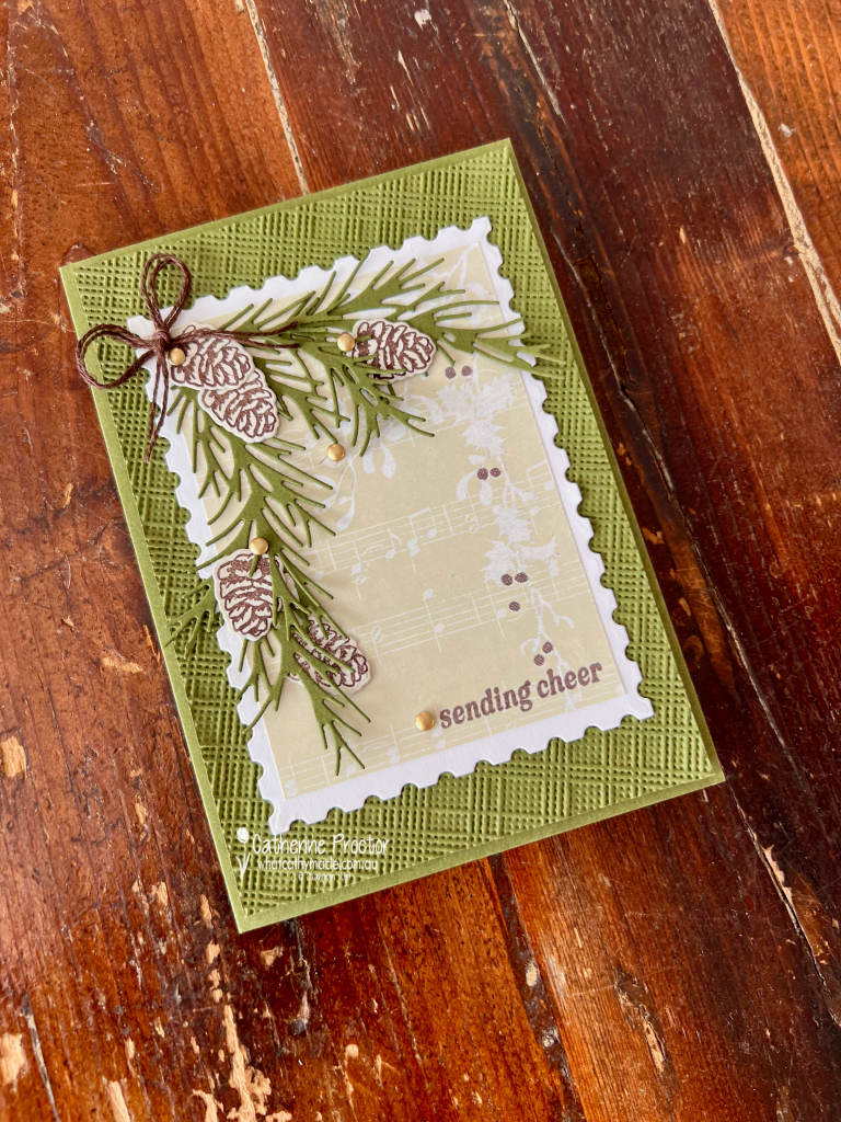
The beauty of a large embossing folder is the ability to angle the card stock layer in any direction you chose. I kept the angled embossing detail that I loved so much in Mikaela’s design. It adds movement and texture to the background and makes the card feel a little different from a traditional straight-layered layout.
However, I’ve used a slightly different colour scheme and moved my pinecones and foliage to the other side of the card to allow the elements on the DSP to be seen
I chose a limited colour scheme, combining Mossy Meadow, Basic Beige and Early Espresso (colours in the Yuletide Carols DSP), with touches of gold to finish.
The foliage was created using the large oval wreath die from the Noel Tidings Dies. Rather than using the wreath as a complete oval, I snipped the die-cut apart to create individual branches. The pine cones are stamped in Early Espresso onto Basic Beige card stock.
The “Sending Cheer” sentiment is from the Noel Tidings stamp set, stamped directly onto the Yuletide Carols Designer Series Paper. I love stamping onto patterned paper when the design is subtle enough to allow the sentiment to remain clear. It creates an extra layer of interest without needing another piece of cardstock.
I carried the design through to the inside with more stamped foliage and the sentiment: From our home to yours.
It’s a simple detail, but I always enjoy adding something to the inside of a handmade Christmas card. It makes the card feel finished and gives the recipient another little surprise when they open it.
Take a look at some more Heart of Christmas inspiration!
If the next button link is not working or you’d like to see the entire list of participants, go to Sharon Davern’s blog.
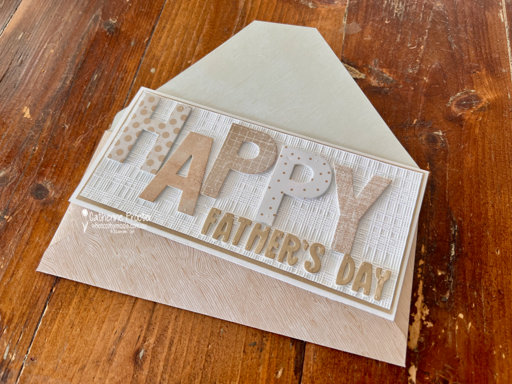
Welcome to Week 18 of the Art With Heart Colour Creations Blog Hop. This week we’re showcasing Crumb Cake, one of my favourite Stampin’ Up! colours and the perfect colour for a Father’s Day card.
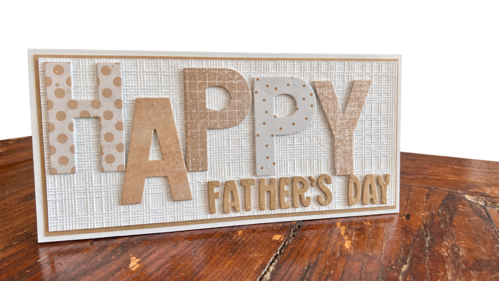
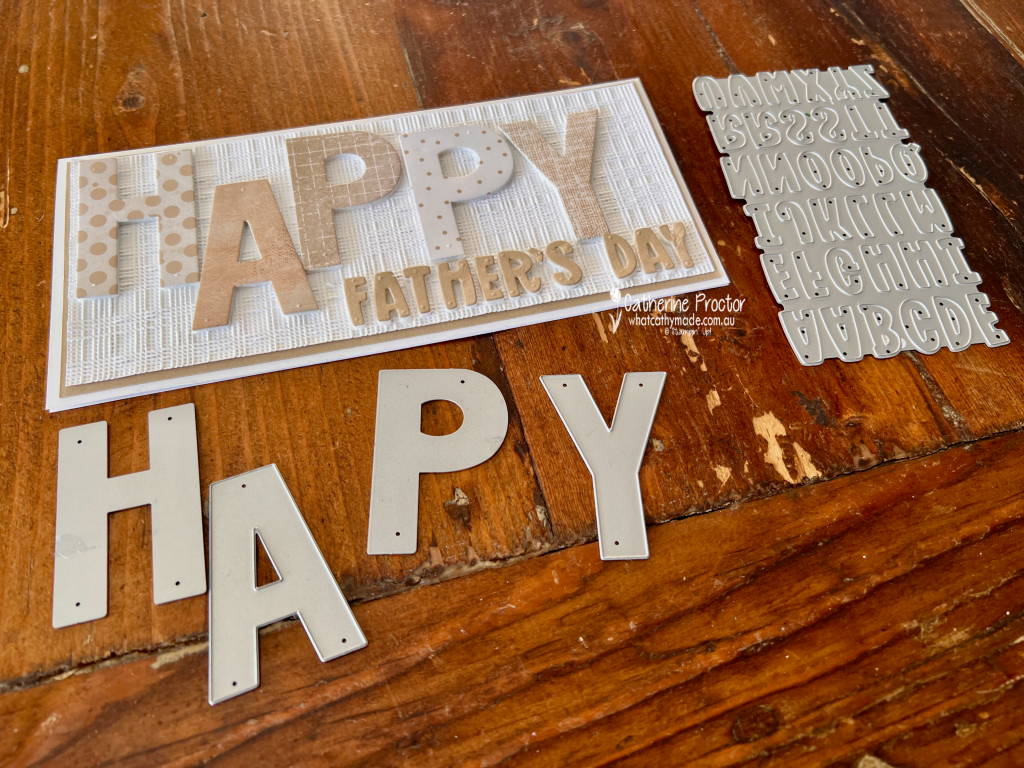
With Father’s Day this Sunday, I’ve created a Crumb Cake and white slimline card, combining lots of pattern, texture and dimension while keeping the colour palette elegantly simple and monochrome.
The starting point for my card was the oversized HAPPY sentiment. Rather than cutting all five letters from the same Designer Series Paper, I went through my DSP collection to find five different patterns featuring Crumb Cake. I love how different each one looks, yet they all work together because of the limited colour palette. From left to right, I used: H – Everyday Essentials Mix & Match 12″ x 12″ (30.5 x 30.5 cm) Designer Series Paper A – Beautiful Gallery 6″ x 6″ (15.2 x 15.2 cm) Designer Series Paper P – Nature Walk 12″ x 12″ (30.5 x 30.5 cm) Designer Series Paper P – Everyday Essentials Mix & Match 12″ x 12″ (30.5 x 30.5 cm) Designer Series Paper Y – Delicate Dreams 12″ x 12″ (30.5 x 30.5 cm) Specialty Designer Series Paper
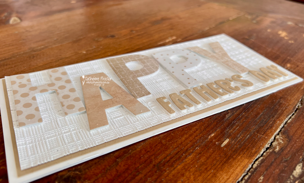
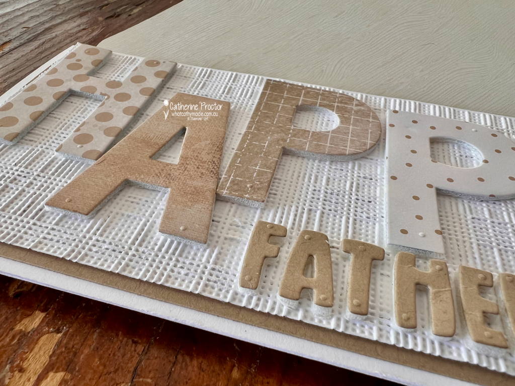
Before die cutting the letters, I adhered the DSP to Adhesive Foam Sheets. This was an easy way to give the large letters plenty of dimension and really lift them away from the embossed background. This photo shows the lovely dimension. the foam gives to the words.
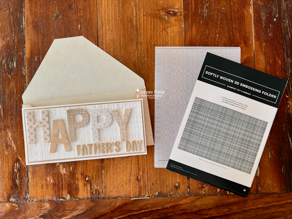
And that background adds even more texture! The Basic White layer has been embossed with the Softly Woven Embossing Folder. I especially love the contrast between its woven texture and all the different prints in the HAPPY letters.
The smaller FATHER’S DAY sentiment was die cut from Crumb Cake card stock using the Mini Alphabet Dies. I kept this part of the sentiment quite simple so it didn’t compete with those fabulous oversized letters from the Party Alphabet Dies.
I do love slimline cards. The extra length was perfect for the large letters in this design, however it also meant I needed to make an envelope to fit.
I used a sheet of Wood Grain Wonders 12″ x 12″ (30.5 x 30.5 cm) Designer Series Paper to create a coordinating envelope. The subtle Crumb Cake woodgrain couldn’t have been more perfect for this Father’s Day card.
I think this project is a great example of how a limited colour palette doesn’t have to mean a simple design. Mixing patterns, embossed texture and different levels of dimension gives a monochromatic project so much interest.
Take a look at some more Crumb Cake inspiration on our Insta Hop!
Our blog hop is now an Instagram hop but the good news is that you don’t need to have an Instagram account to view all of the other projects!
Simply go to my Insta handle in a new search engine window to follow the Instagram hop: @whatcathymade.
Welcome to Week 17 of the Art With Heart Colour Creations Blog Hop. This week we are creating with the gorgeous Coastal Cabana.
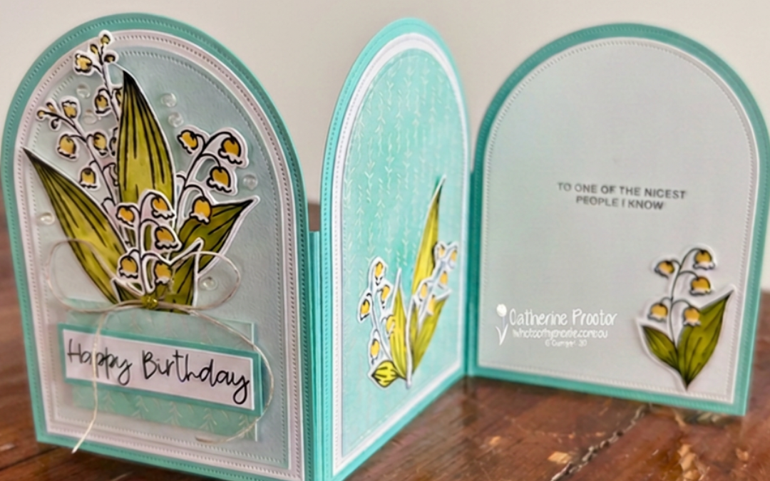
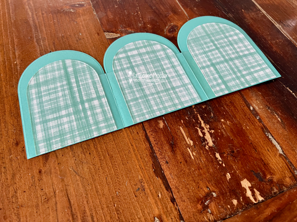
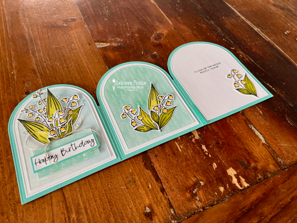
For my project this week, I’ve made a tri-fold arch card using the stunning Valley in Bloom Suite Collection. I love the way this card opens out to reveal three arched panels, and because it stands up so beautifully, it makes a wonderful display card too.
I used the three largest dies from the Everyday Arches Dies to create the layers and shape of my card.
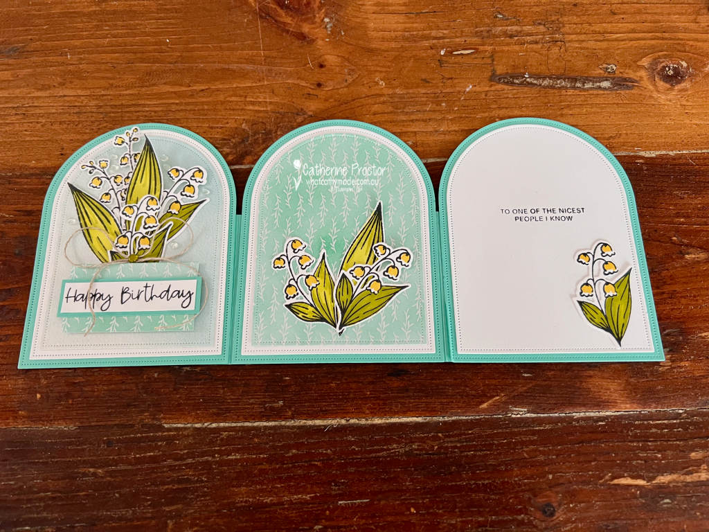
The Coastal Cabana card base consists of three arch-shaped panels joined together, with each panel decorated slightly differently. When completely opened, the three arches create a lovely continuous display, while the folds allow the card to stand on its own.
I also decorated the reverse of each panel with coordinating Designer Series Paper, so the card looks just as pretty from the back when it is standing on display.
My colour combination was taken directly from the Valley in Bloom 12″ x 12″ (30.5 x 30.5 cm) Designer Series Paper:
Coastal Cabana
Darling Duckling
Garden Green
Lemon Lime Twist
Basic White
I stamped the lily of the valley images before colouring them with Stampin’ Blends in Darling Duckling, Garden Green and Lemon Lime Twist. I love how those fresh greens and little pops of yellow look against Coastal Cabana.
One of my favourite details on this card is actually quite subtle.
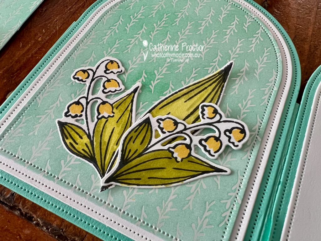
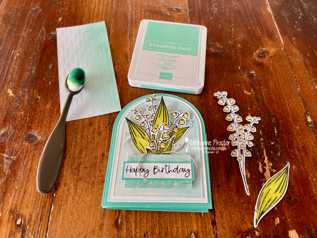
I used one of the beautiful patterns from the Luxe White 12″ x 12″ (30.5 x 30.5 cm) Specialty Designer Series Paper and added Coastal Cabana ink with a Blending Brush.
The soft ink blending allows the delicate white pattern of the paper to remain visible while completely changing its appearance. It was such an easy way to create a coordinating background without covering up the gorgeous detail in this specialty paper.
I used this piece on the front panel behind my largest arrangement of lily of the valley.
For the front panel, I created a fuller floral arrangement, layering several stamped, coloured and die-cut lily of the valley images over the softly blended Luxe White Specialty DSP.
I added a strip of the Valley in Bloom DSP behind the Happy Birthday sentiment, along with a simple linen thread bow and a few clear embellishments.
The centre panel features another pattern from the Valley in Bloom DSP, with a smaller arrangement of flowers positioned towards the bottom of the arch. I love how this panel lets that pretty Coastal Cabana pattern become part of the design rather than simply acting as a background.
The final panel is kept predominantly Basic White to leave plenty of room for a handwritten message. I stamped the sentiment “To one of the nicest people I know” and added one smaller lily of the valley image in the bottom corner to tie it back to the other two panels.
The combination of the repeating arch shapes, fresh colours and delicate flowers makes this card feel so light and spring-like.
And if you love the Valley in Bloom Designer Series Paper as much as I do, it’s an especially good time to stock up because it is on sale now.
I really enjoyed making this tri-fold design and I think the Everyday Arches Dies are perfect for this style of card. It looks quite impressive opened out, but I especially love that the recipient can stand it up and enjoy it long after their birthday.
Take a look at some more Coastal Cabana inspiration on our Insta Hop!
Our blog hop is now an Instagram hop but the good news is that you don’t need to have an Instagram account to view all of the other projects!
Simply go to my Insta handle in a new search engine window to follow the Instagram hop: @whatcathymade.
Welcome to Week 15 of the Art With Heart Colour Creations Blog Hop. This week we’re creating with Cloud Cover, a beautiful soft blue-grey that works wonderfully with Secret Sea.
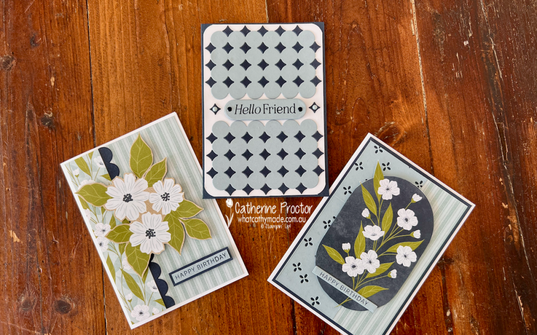
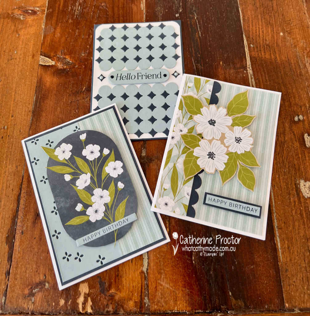
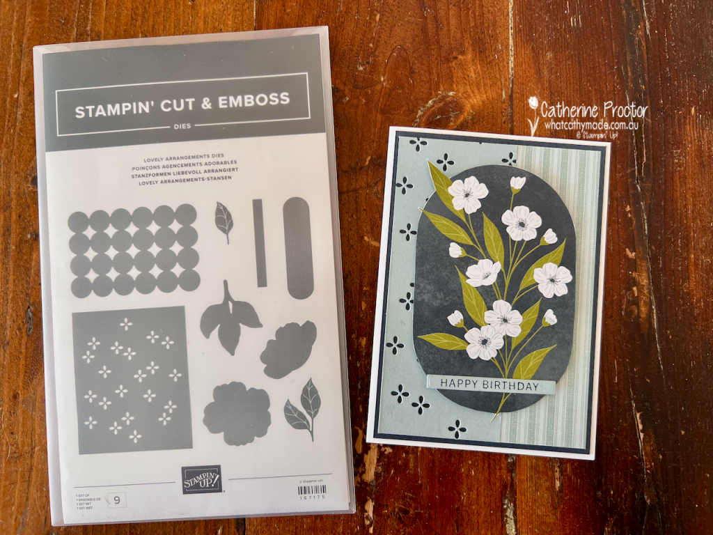
For my projects this week, I’ve paired Cloud Cover with Secret Sea, Old Olive and Basic White to create three very different cards using the Lovely Blossoms Designer Series Paper and the Lovely Arrangements Bundle.
And yes, this is another one of those DSP packs I’ve been hoarding because it’s just too lovely to cut into!
The good news is that Lovely Blossoms Designer Series Paper is currently included in the Stampin’ Up! paper sale, so it seemed like the perfect excuse to finally put some of mine to use.
The Lovely Arrangements Dies are also now in the Last Chance section of the Stampin’ Up! website, so if these versatile dies have been on your wish list, you might want to grab them before they disappear.
Card One – Fussy-cut florals
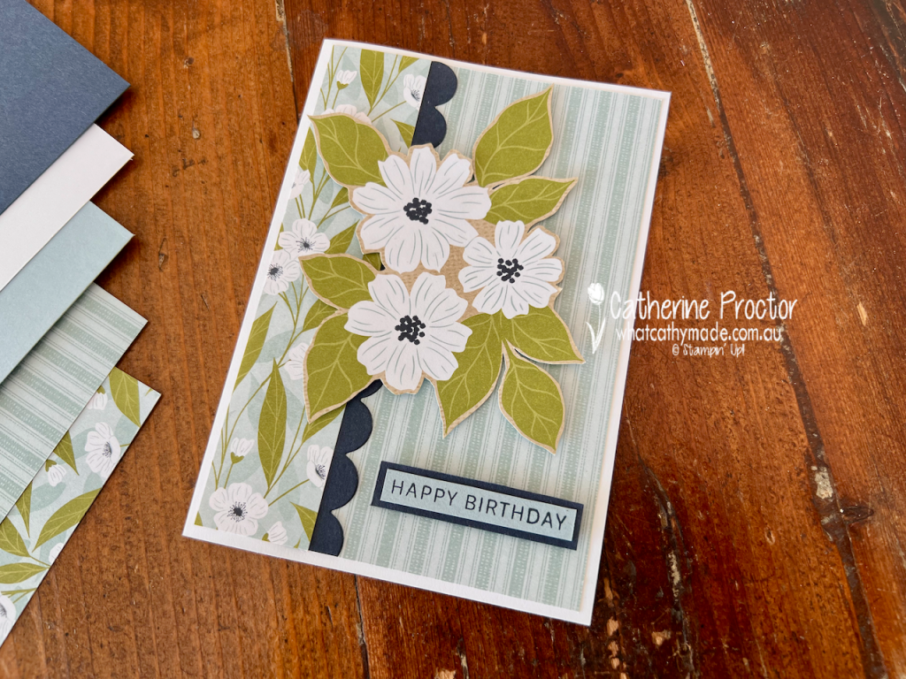
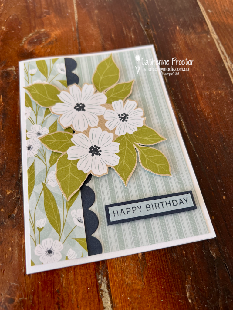
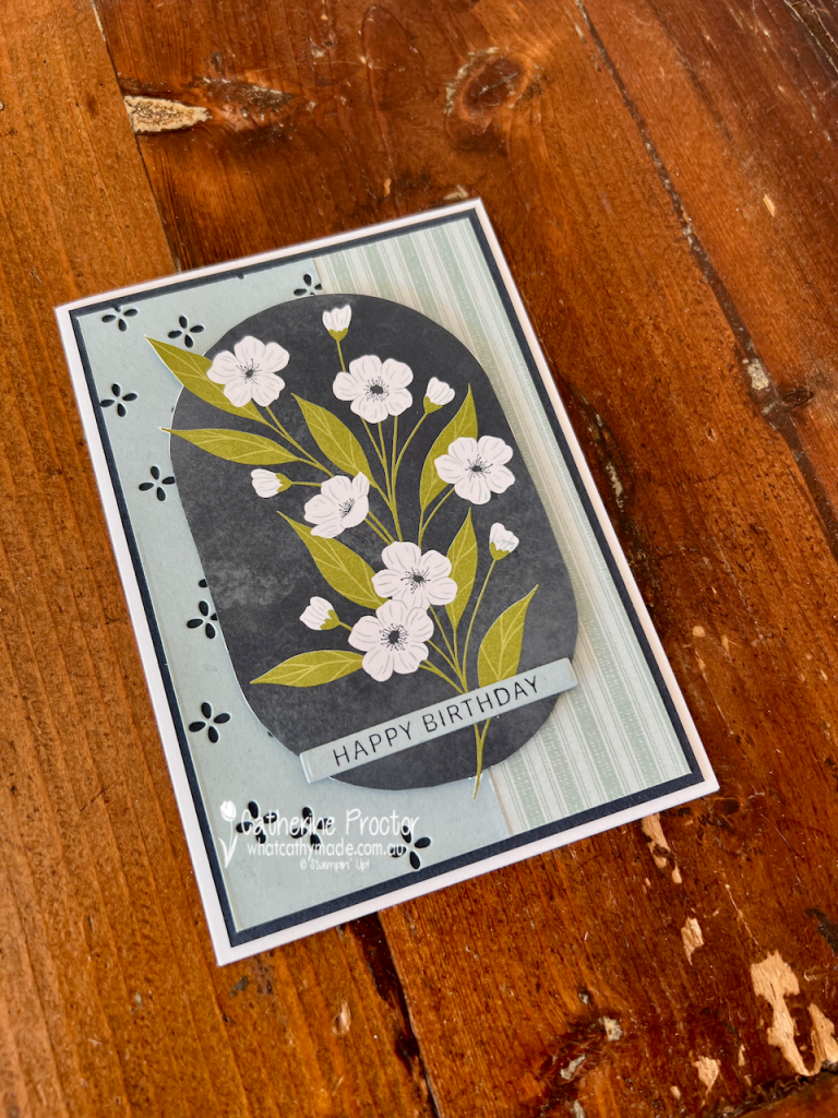
For my first birthday card, I let the gorgeous Lovely Blossoms DSP do most of the work.
I covered the card front with the subtle Cloud Cover striped pattern, then added a contrasting strip of the floral DSP down the left-hand side.
A narrow Secret Sea scalloped border was die cut using the Circle Lattice Die from the Lovely Arrangements Dies, creating definition between the two patterns.
The large floral arrangement was fussy cut directly from the DSP. I love doing this with papers that have beautiful large-scale imagery because you get all the detail of a stamped and coloured image without having to do any stamping at all.
I popped the arrangement up to give the card some dimension, then finished it with a simple Happy Birthday sentiment from the Lovely Arrangements stamp set, layered onto Secret Sea card stock.
Card 2 – Flower Frame
My second card uses another section of the Lovely Blossoms DSP, this time featuring the delicate white flowers and Old Olive foliage.
I once again fussy cut the floral arrangement from the DSP and layered over the Cloud Cover layer on the card front. I combined Cloud Cover card stock with another strip of the striped DSP.
I used the small floral detail die from the Lovely Arrangements Dies to cut tiny flowers into the Cloud Cover panel, allowing the Secret Sea layer underneath to show through.
A simple Happy Birthday sentiment across the bottom of the floral panel completes the card.
Card 3 – Lovely Arrangements Dies
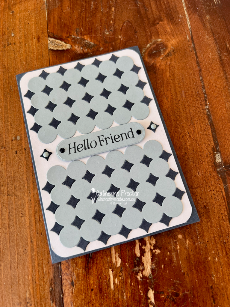
For my third card I wanted to show just how versatile the Lovely Arrangements Dies can be, even without using the floral DSP.
I used the Circle Lattice Die to cut two panels from Cloud Cover card stock. I also cut the die twice from Secret Sea card stock, this time keeping the small negative diamond-shaped pieces. I carefully adhered these into the openings in the Cloud Cover panels to create a striking geometric pattern.
I love the contrast between the soft Cloud Cover and deep Secret Sea, and how this simple technique gives the die a completely different look.
The panels are mounted onto a Basic White card stock layer and I rounded the corners to reflect the overall circular design.
Between the two panels I added a Hello Friend sentiment on a Cloud Cover label, with more Secret Sea card stock diamonds on either side and a few Secret Sea and Cloud Cover embellishments from the Moody Palette Glossy Dots to finish it off.
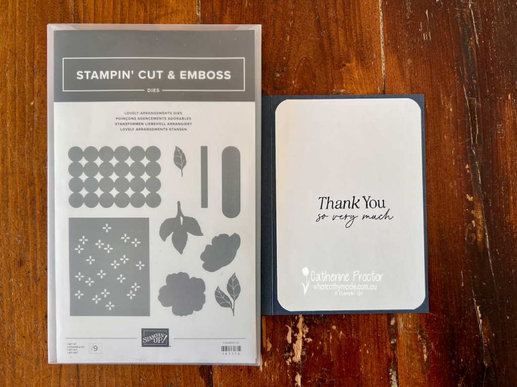
It has a completely different look from the first two cards, but uses exactly the same die set! Here’s the inside of the card.
Take a look at some more Cloud Cover inspiration on our Insta Hop!
Our blog hop is now an Instagram hop but the good news is that you don’t need to have an Instagram account to view all of the other projects!
Simply go to my Insta handle in a new search engine window to follow the Instagram hop: @whatcathymade.