A group of creative friends from the Art with Heart team are back with our Annual Heart of Christmas blog hop. Follow through the blogs each Monday night until the end of November for Christmas card inspiration.
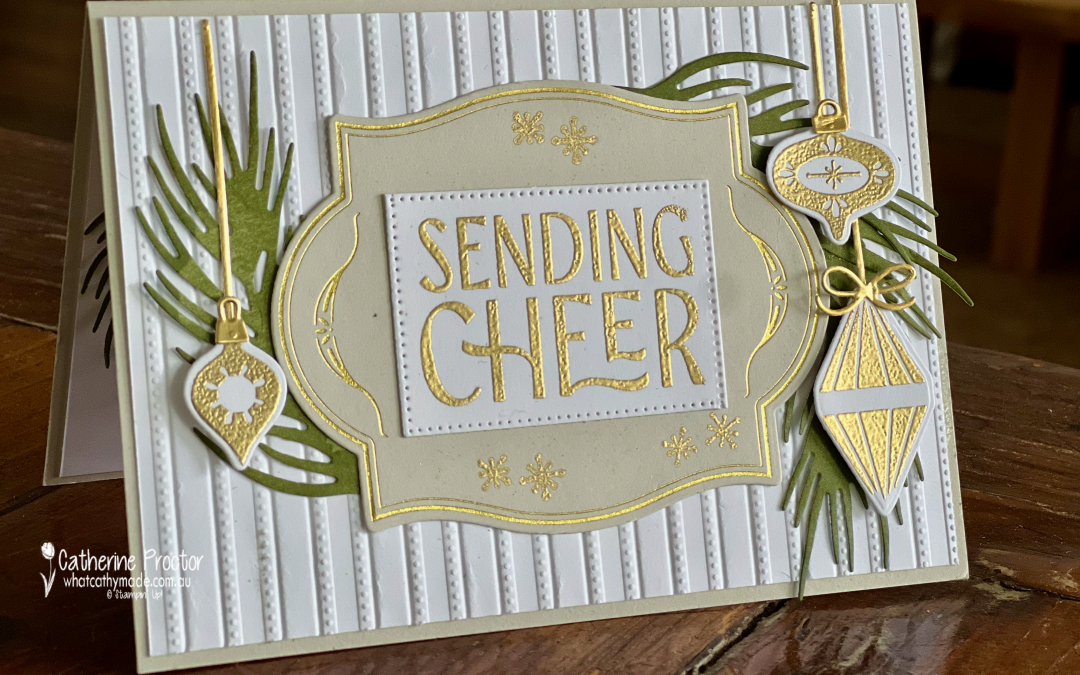
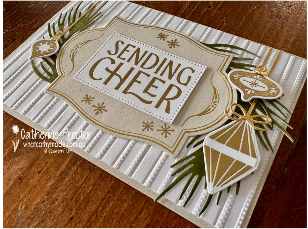
This week, I have created a collection of elegant Christmas cards featuring my current favourite combination of techniques and products: hot foiling, heat embossing and gold foil.
These techniques work beautifully together to add layers of shine and texture without overwhelming the design. The hot-foiled details provide a delicate metallic finish, while the gold heat embossing and Gold Foil add further depth and a touch of Christmas luxury.
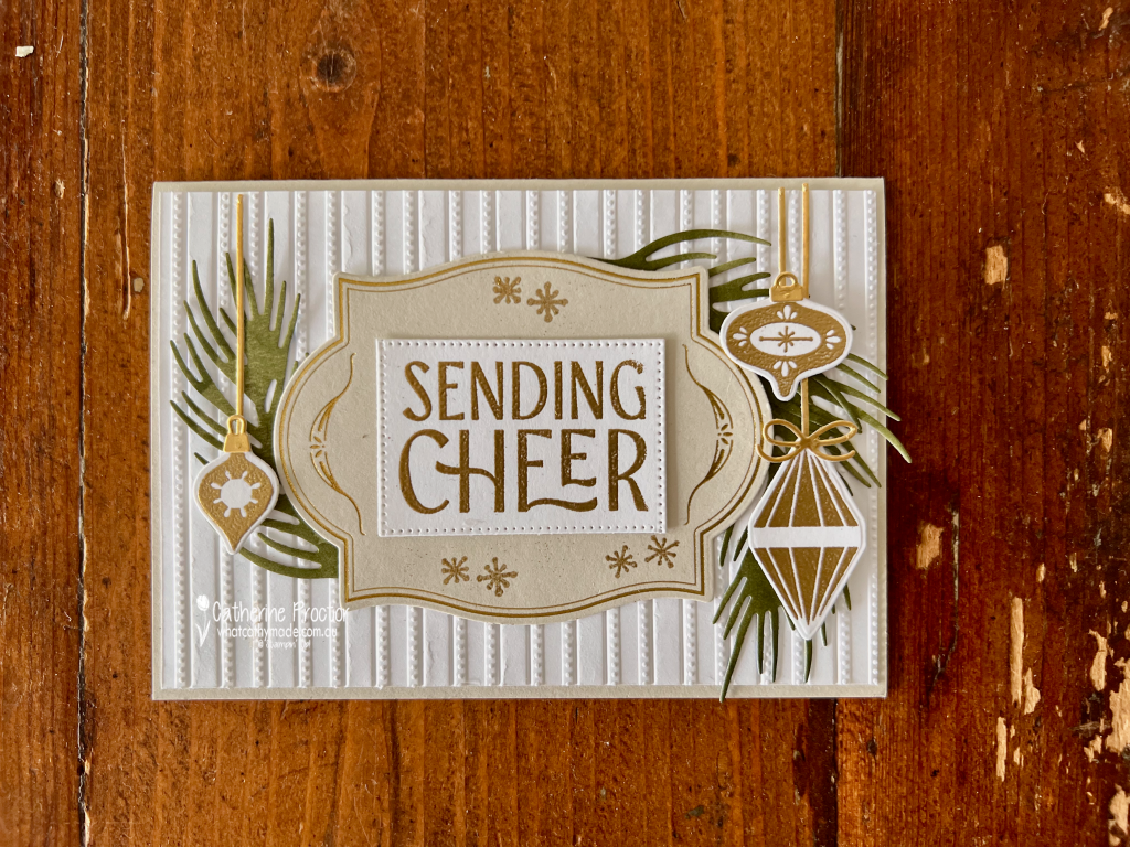
My colour combination is Basic White, Basic Beige, Old Olive and Gold Foil. I seem to be reaching for these elegant neutrals a lot lately. Basic White and Basic Beige create a soft foundation, while Old Olive and Gold Foil add traditional Christmas warmth, shine and sophistication.
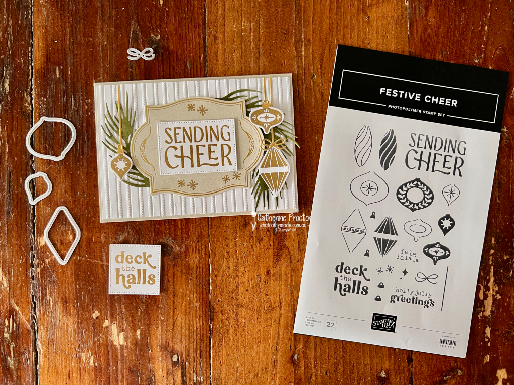
The Flourish & Frames Hot Foil Dies were used to create the beautiful foiled details. I paired these with the Festive Cheer Bundle and the Lovely Stripes Embossing Folder, which introduces subtle texture and helps bring the different elements of each card together.
The Delicate Dreams Specialty Designer Series Paper adds a subtle variegation to the Old Olive foliage. Gold Foil backed with an adhesive sheet was used for selected die-cut elements, while sentiments stamped in Versamark ink and heat embossed with Gold Metallics Embossing Powder complete the coordinated metallic look.
Although several techniques and finishes have been combined, limiting the designs to a restrained colour palette keeps the cards balanced and cohesive.
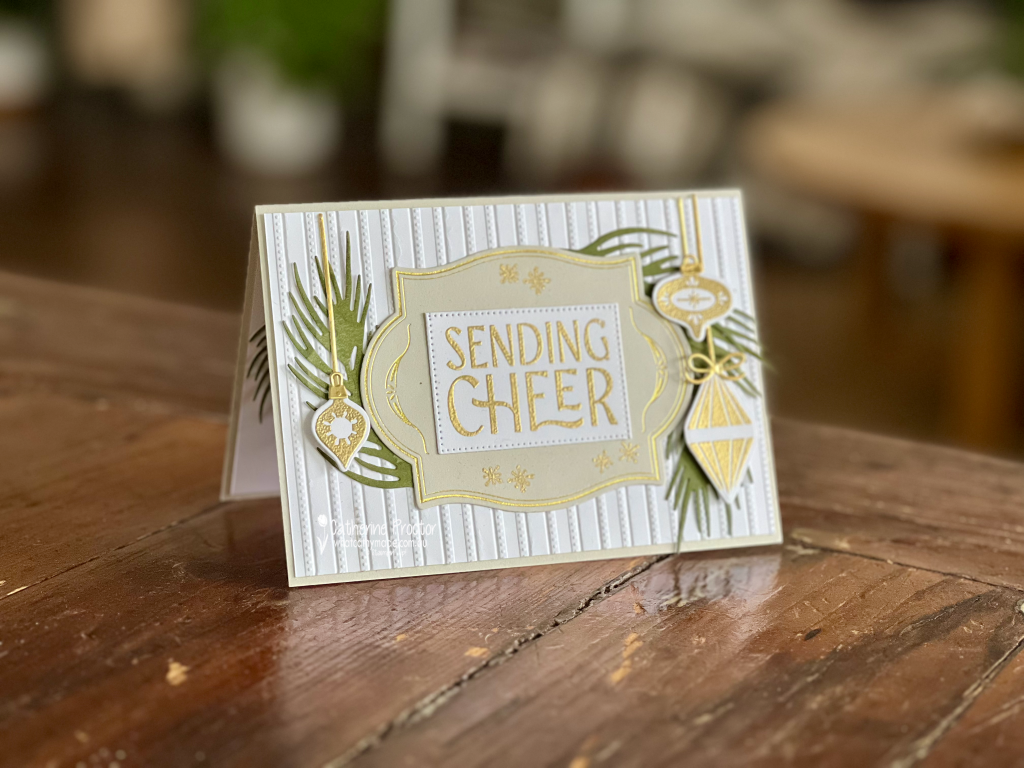
It’s hard to capture the gorgeous shine of all the gold touches, hopefully this portrait shot gives you a better idea of how it shines in real life.
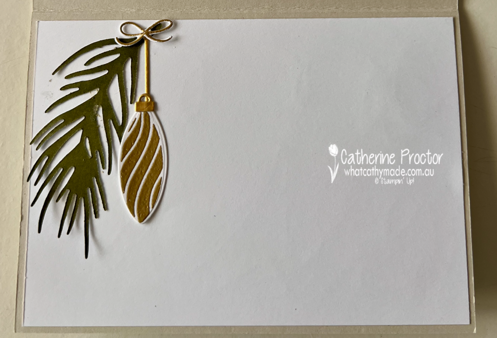
I used some leftover pieces to decorate the inside of my card.
Take a look at some more Heart of Christmas inspiration!
Now it is time to continue our Heart of Christmas Blog Hop and see what the next talented member of the Art With Heart Team has created.
Next in our blog hop is Judy May. Click on the link below to see her beautiful Christmas project.
If the next button link is not working or you’d like to see the entire list of participants, go to Sharon Davern‘s blog.
Welcome to Week 18 of the Art With Heart Colour Creations Blog Hop. This week we’re showcasing Crumb Cake, one of my favourite Stampin’ Up! colours and the perfect colour for a Father’s Day card.
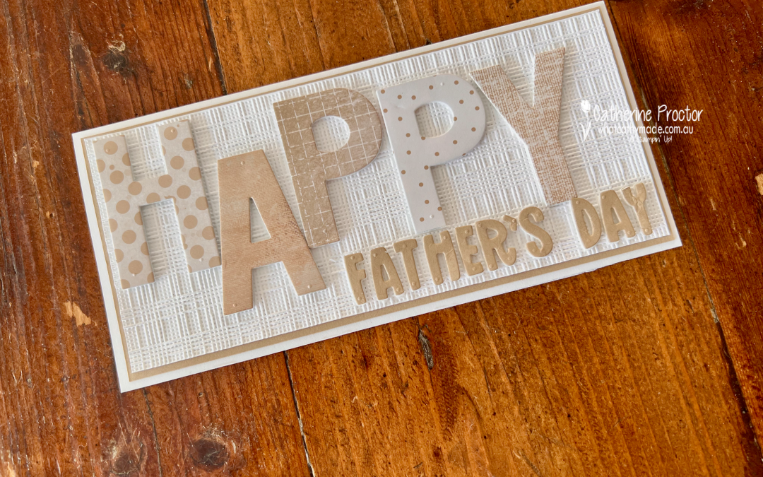
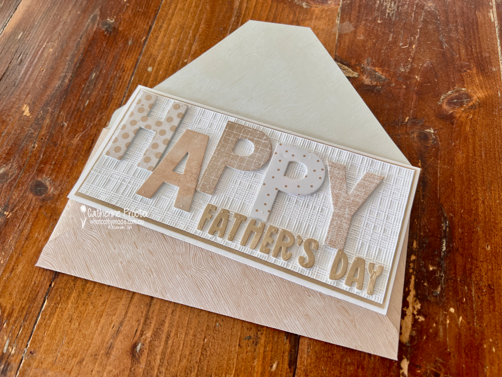
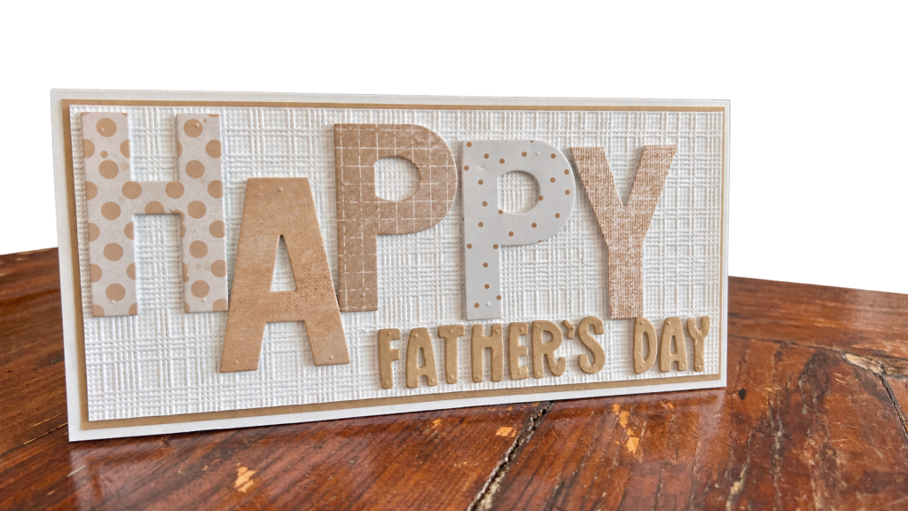
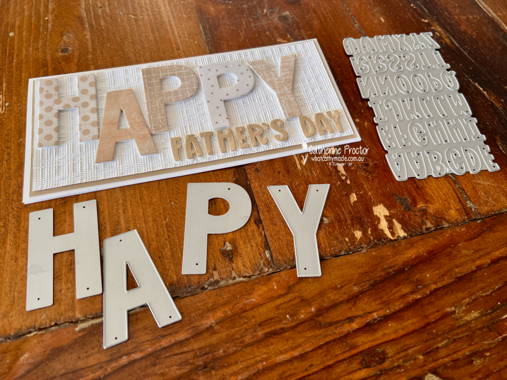
With Father’s Day this Sunday, I’ve created a Crumb Cake and white slimline card, combining lots of pattern, texture and dimension while keeping the colour palette elegantly simple and monochrome.
The starting point for my card was the oversized HAPPY sentiment. Rather than cutting all five letters from the same Designer Series Paper, I went through my DSP collection to find five different patterns featuring Crumb Cake. I love how different each one looks, yet they all work together because of the limited colour palette. From left to right, I used: H – Everyday Essentials Mix & Match 12″ x 12″ (30.5 x 30.5 cm) Designer Series Paper A – Beautiful Gallery 6″ x 6″ (15.2 x 15.2 cm) Designer Series Paper P – Nature Walk 12″ x 12″ (30.5 x 30.5 cm) Designer Series Paper P – Everyday Essentials Mix & Match 12″ x 12″ (30.5 x 30.5 cm) Designer Series Paper Y – Delicate Dreams 12″ x 12″ (30.5 x 30.5 cm) Specialty Designer Series Paper
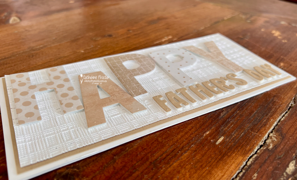
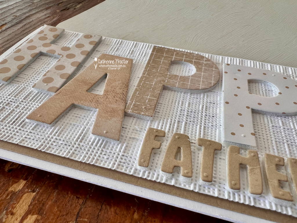
Before die cutting the letters, I adhered the DSP to Adhesive Foam Sheets. This was an easy way to give the large letters plenty of dimension and really lift them away from the embossed background. This photo shows the lovely dimension. the foam gives to the words.
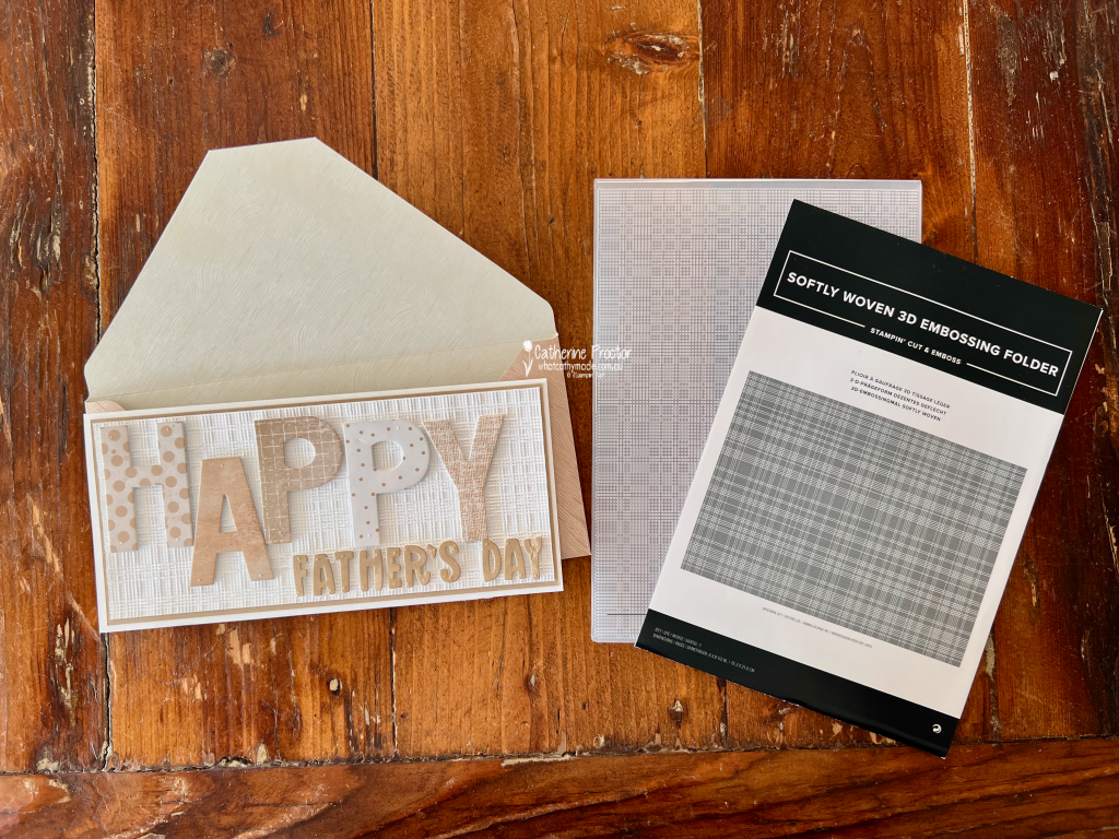
And that background adds even more texture! The Basic White layer has been embossed with the Softly Woven Embossing Folder. I especially love the contrast between its woven texture and all the different prints in the HAPPY letters.
The smaller FATHER’S DAY sentiment was die cut from Crumb Cake card stock using the Mini Alphabet Dies. I kept this part of the sentiment quite simple so it didn’t compete with those fabulous oversized letters from the Party Alphabet Dies.
I do love slimline cards. The extra length was perfect for the large letters in this design, however it also meant I needed to make an envelope to fit.
I used a sheet of Wood Grain Wonders 12″ x 12″ (30.5 x 30.5 cm) Designer Series Paper to create a coordinating envelope. The subtle Crumb Cake woodgrain couldn’t have been more perfect for this Father’s Day card.
I think this project is a great example of how a limited colour palette doesn’t have to mean a simple design. Mixing patterns, embossed texture and different levels of dimension gives a monochromatic project so much interest.
Take a look at some more Crumb Cake inspiration on our Insta Hop!
Our blog hop is now an Instagram hop but the good news is that you don’t need to have an Instagram account to view all of the other projects!
Simply go to my Insta handle in a new search engine window to follow the Instagram hop: @whatcathymade.