Welcome to week 49 of the Art With Heart Colour Creations Blog Hop – we have been hopping every week for nearly one year now!
Another week and another colour I really haven’t used much before.
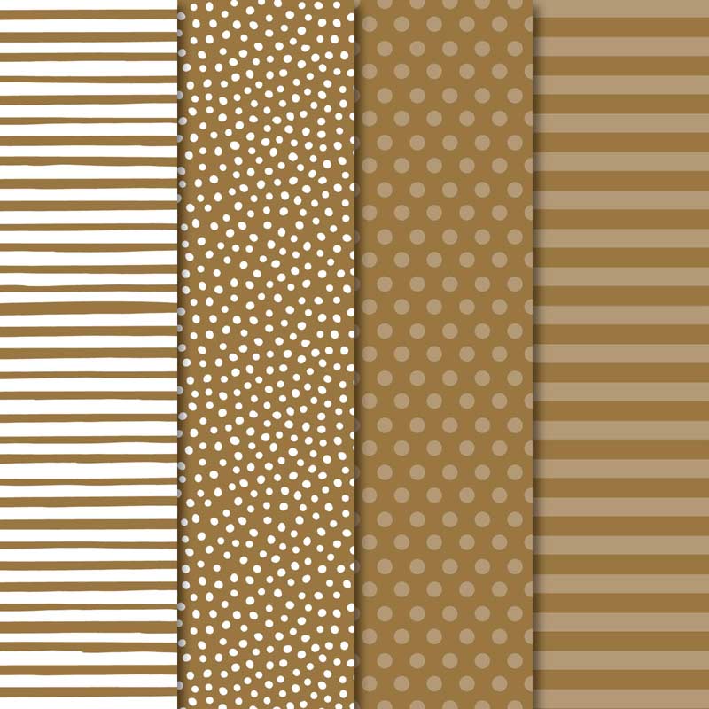
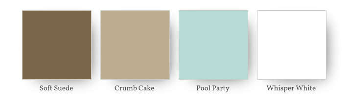
Soft Suede belongs in our neutral colour family but if I want to use a shade of brown I either reach for the Early Espresso (if I want a dark brown) or Crumb Cake, which is my absolute favourite neutral! So I have to admit this colour was quite a challenge for me!
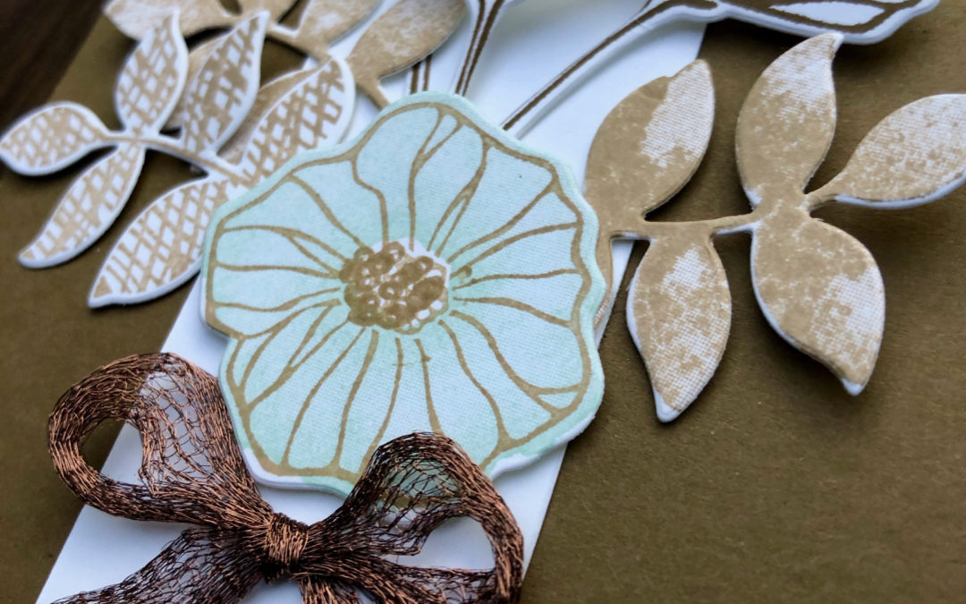
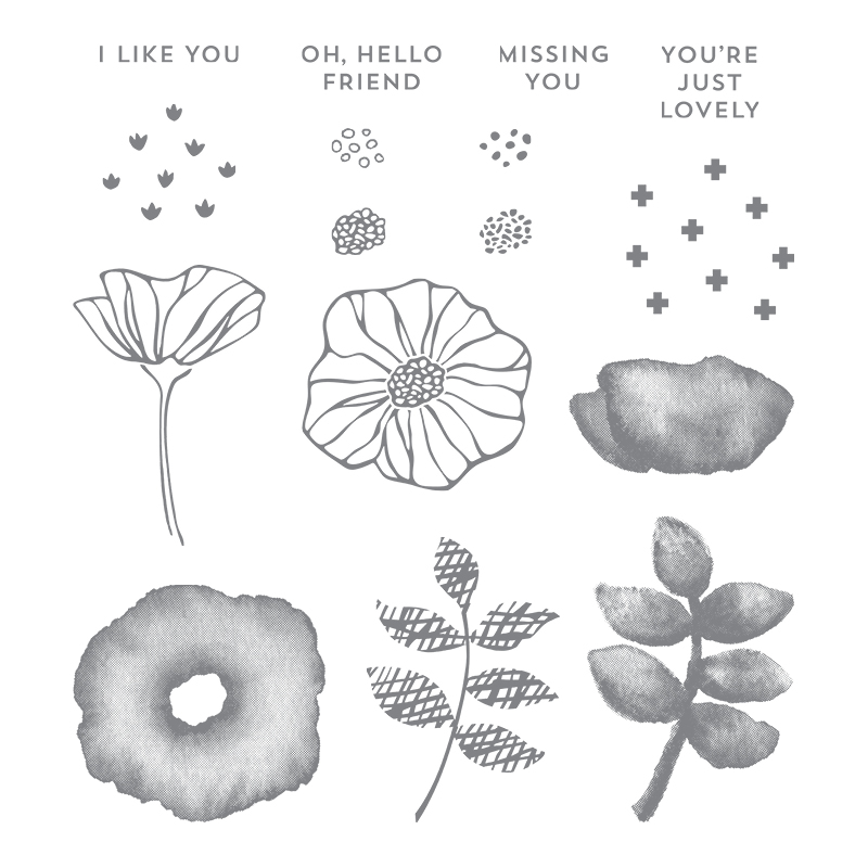
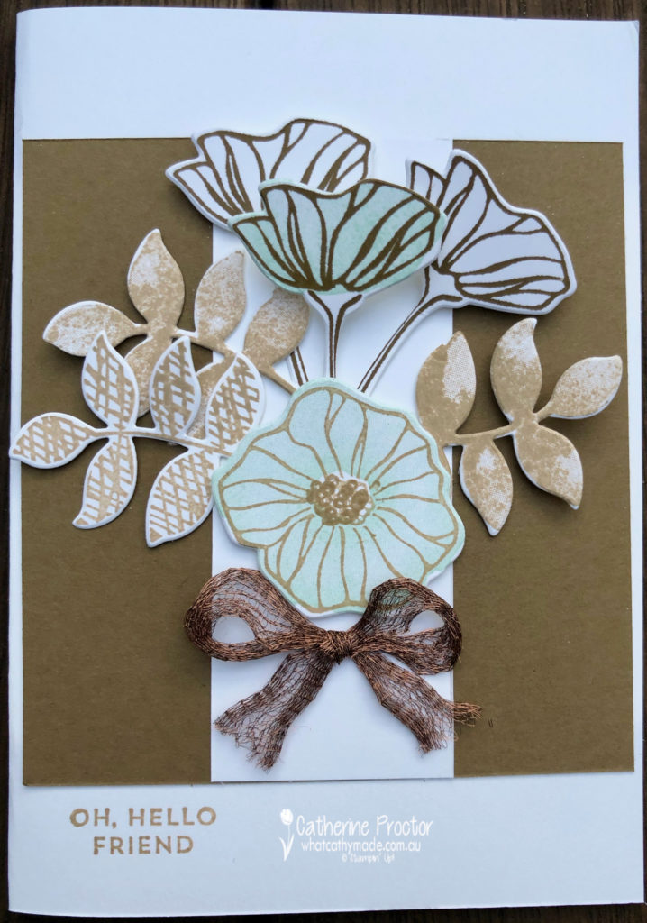
I decided to use a retiring favourite of mine: the Oh So Eclectic stamp set with the matching Eclectic Layering dies for my card this week.
My colour combination is a classic one: shades of brown with a touch of white and pale blue.
And here’s what I came up with.
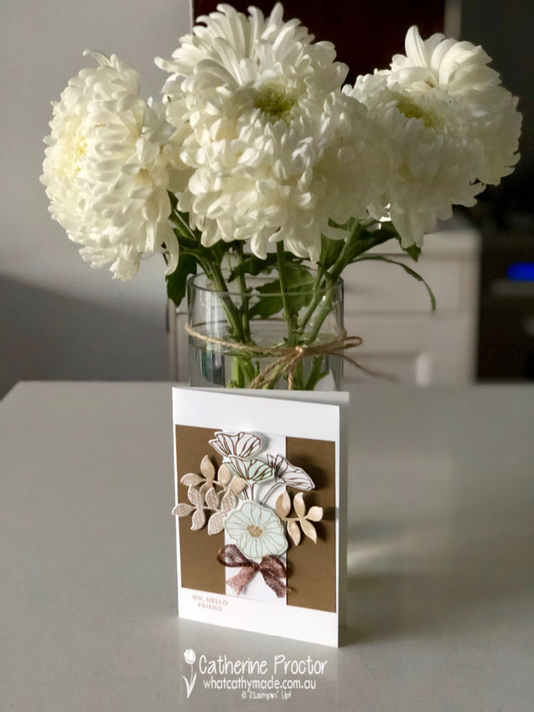
I photographed my card in front of the lovely Mother’s Day flowers my eldest son bought for me. It’s now over a week since Mother’s Day and they are still looking lovely, brightening up my kitchen and putting a smile on my face every time I walk into the room!
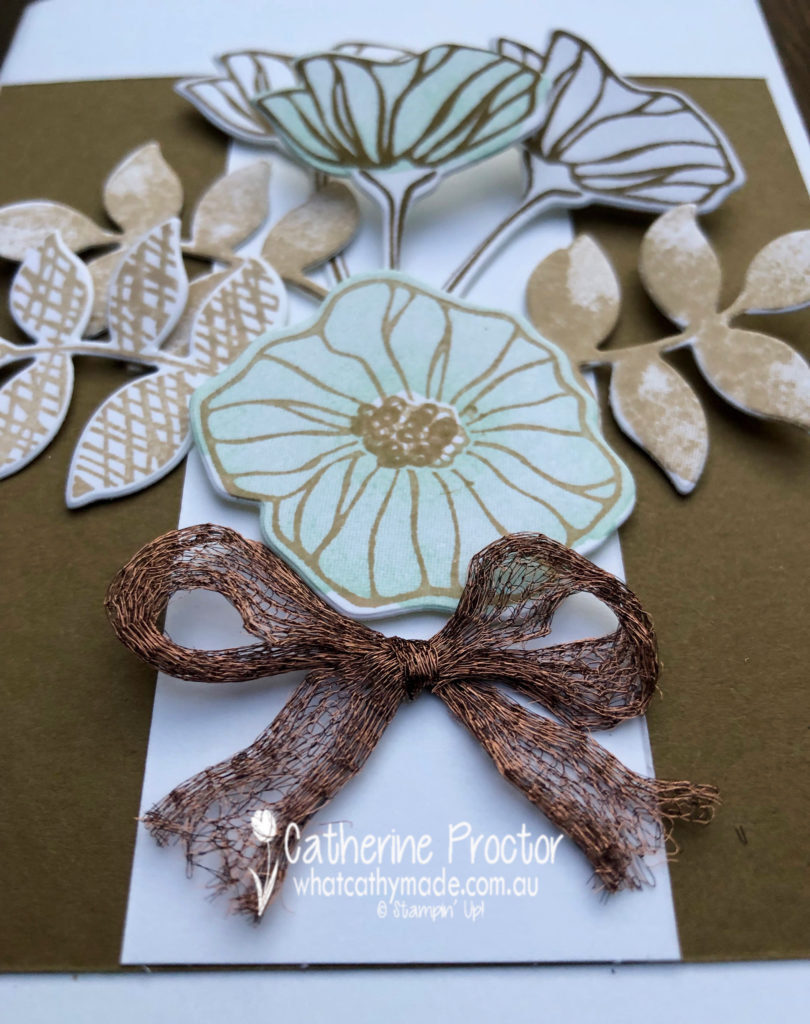
Take a closer look at the stunning copper trim…I love how you can pull this trim apart (as I have done here) or use it off the reel as a narrower trim.
To see what the rest of the team have created, click on the links below.
To purchase any of the products I used in this project you can shop with me here. Or if you’d like me to post you your very own copy of any of the Stampin Up! catalogues or find out about more about Stampin’ Up! contact me .
We will be back again next week showcasing our final colour for our 2108/2019 Colour Creations blog hop: Tranquil Tide. We hope you can hop along with us then.
Welcome to week 48 of the Art With Heart Colour Creations Blog Hop!
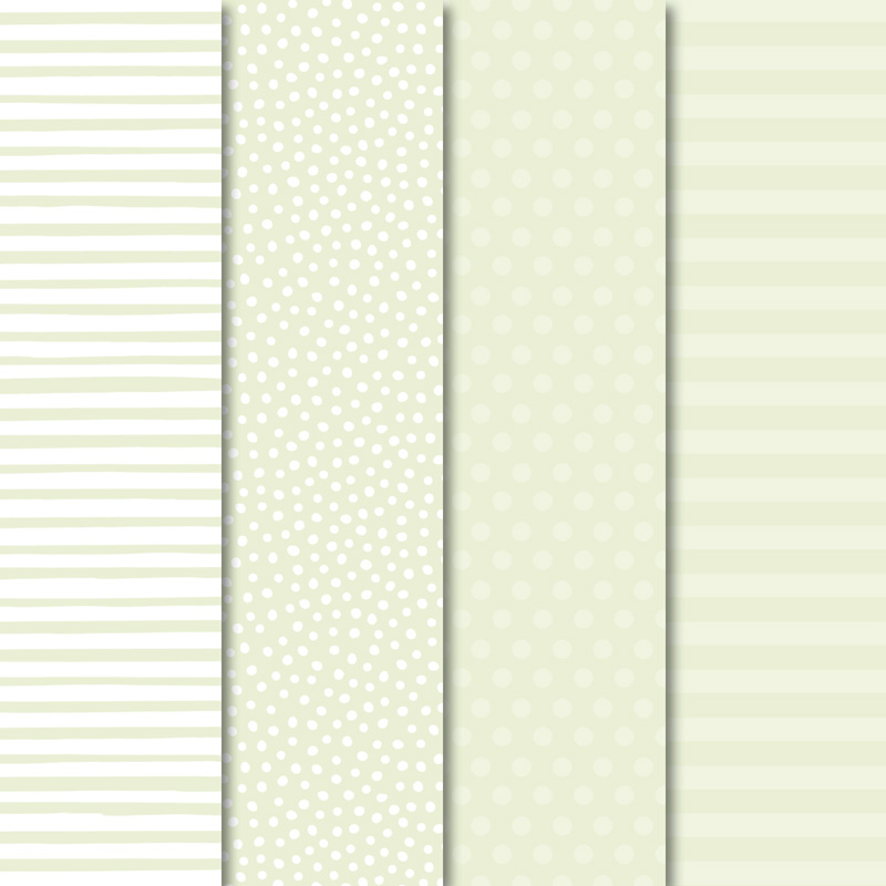
Our colour this week is a subtle colour: Soft Seafoam.
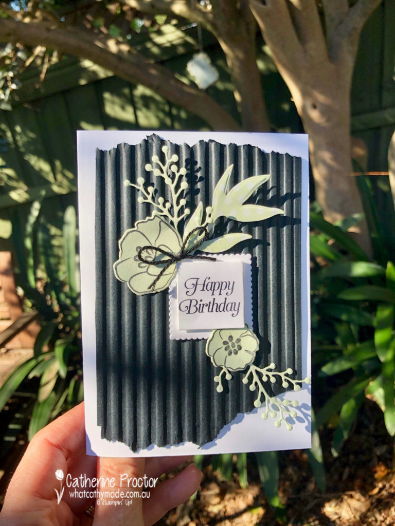
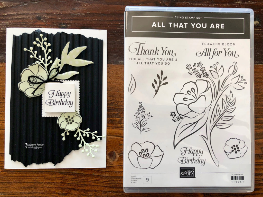
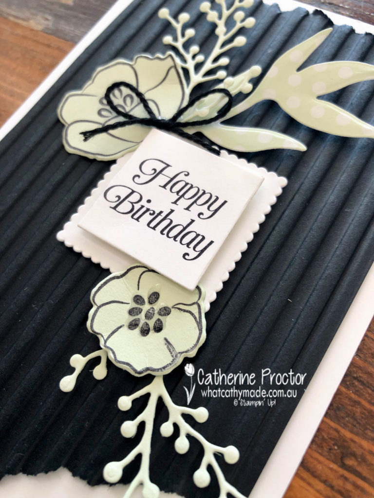
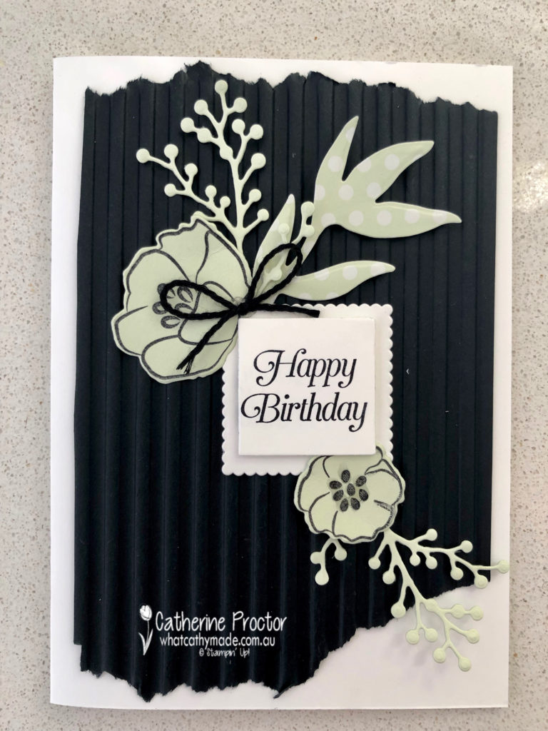
Because I always forget to use my embossing folders I made sure I used one for my card this week that I knew would really stand out: the Corrugated Dynamic Impressions Embossing Folder.
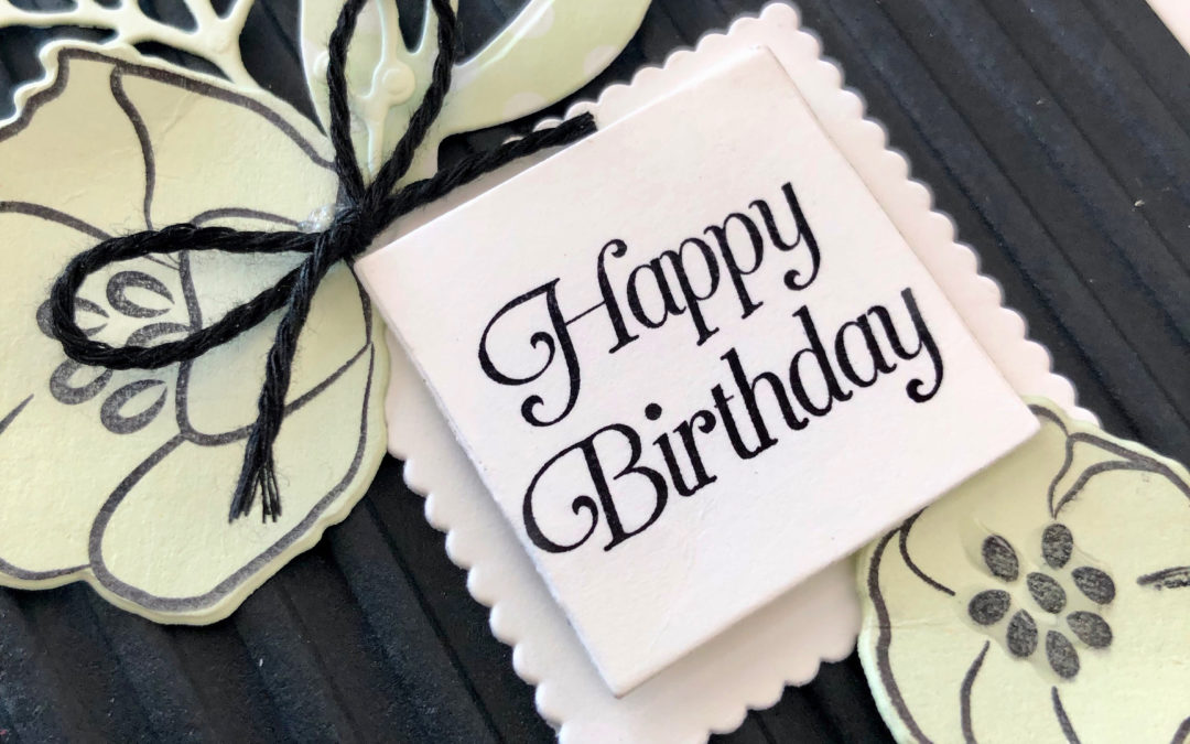
I love this soft green when it’s paired with black and white. And I also love this stamp set that’s about the retire: All That You Are. It co-ordinates with the Frosted Bouquet Dies and I’ve used both the stamp sets and dies for my birthday card today. It’s such a beautiful font.
If you take a close look at the flower on the bottom right you’ll see I’ve added a touch of dimension by applying some of the fine-tipped glue to the centre of the flower.
To see what the rest of the team have created, click on the links below.
To purchase any of the products I used in this project you can shop with me here. Or if you’d like me to post you your very own copy of any of the Stampin Up! catalogues or find out about more about Stampin’ Up! contact me .
We will be back again next week showcasing a neutral colour: Soft Suede. We hope you can along with us then.
Welcome to week 47 of the Art With Heart Colour Creations Blog Hop!
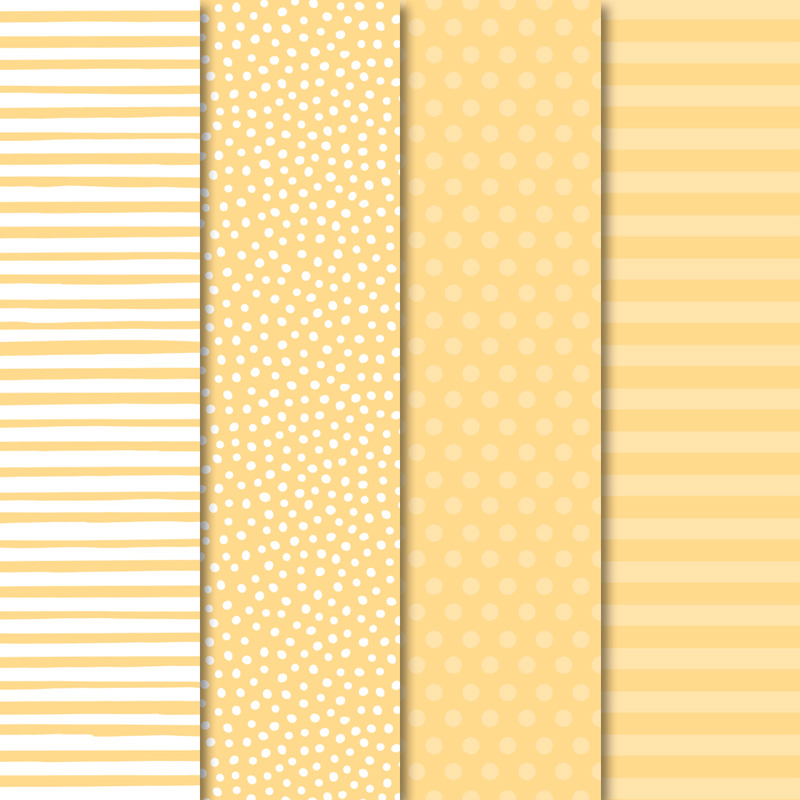
Our colour this week is a subtle colour: So Saffron.
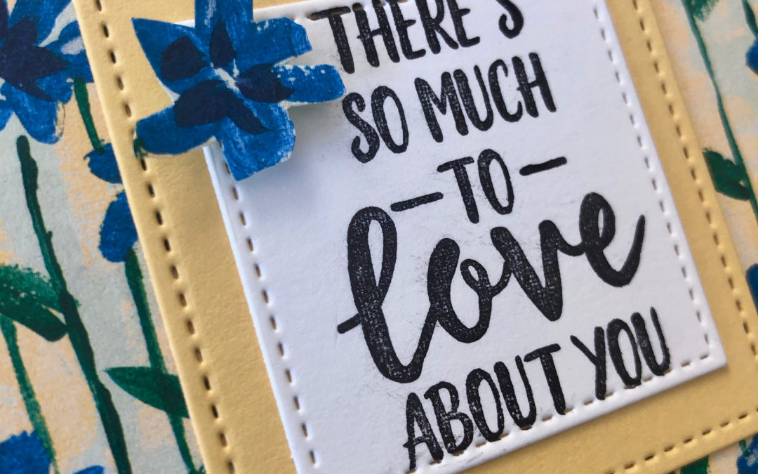
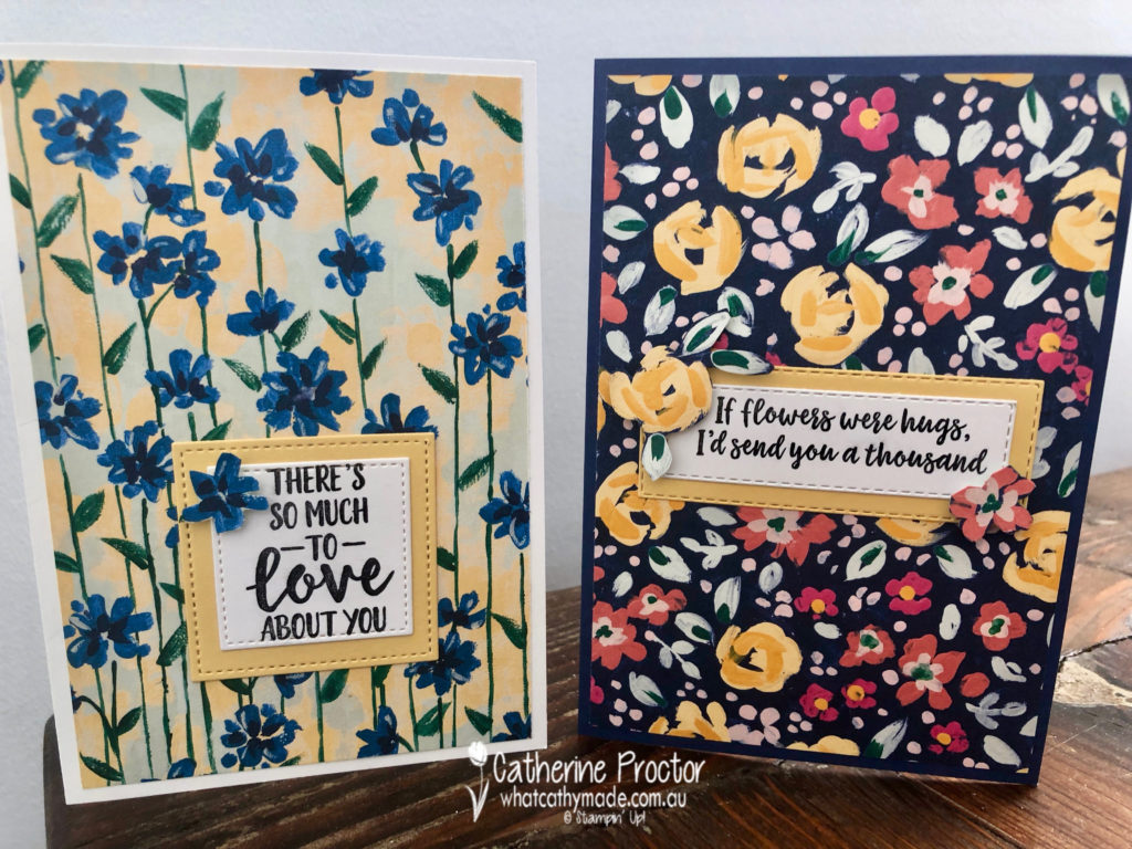
This soft yellow is used in one of my favourite Designer Series Papers: Garden Impressions. So I made a couple of cards to show off these lovely impressionist papers.
To see what the rest of the team have created, click on the links below.
To purchase any of the products I used in this project you can shop with me here. Or if you’d like me to post you your very own copy of any of the Stampin Up! catalogues or find out about more about Stampin’ Up! contact me .
We will be back again next week showcasing another subtle colour: Soft Sea Foam. We hope you can along with us then.
Welcome to week 46 of the Art With Heart Colour Creations Blog Hop!
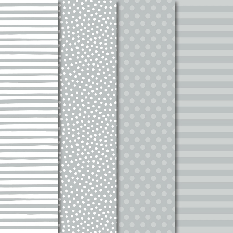
Our colour this week is a very light neutral colour: Smokey Slate.
Because these neutrals go with every colour I thought it would be a perfect colour to showcase our retiring In-Colours in a series of cards that use other retiring products too.
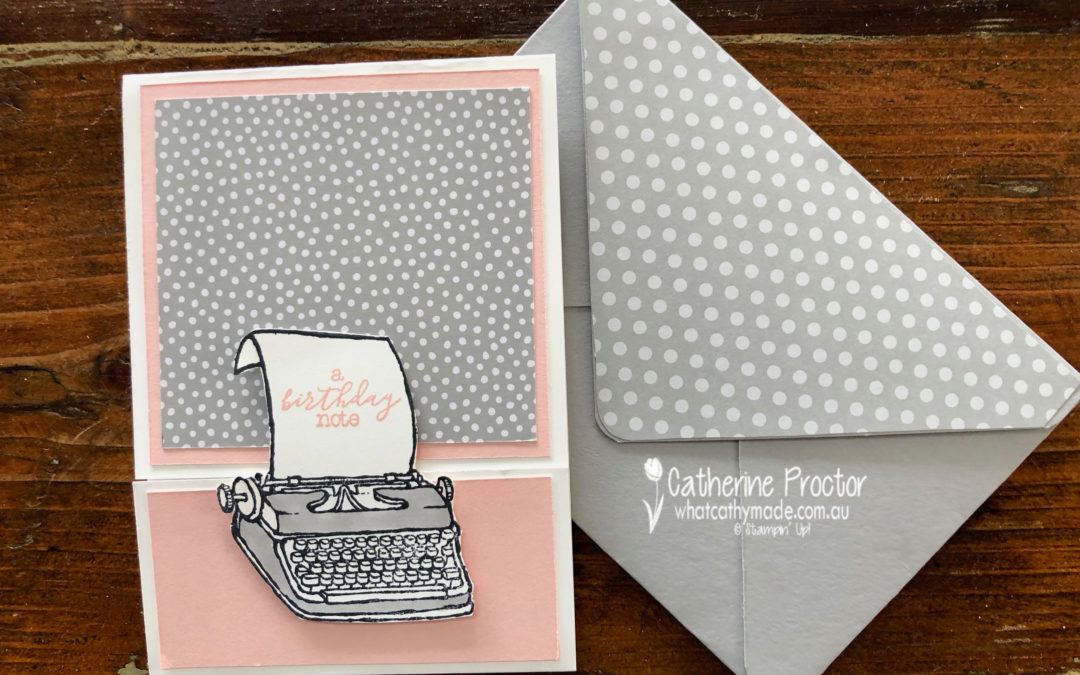
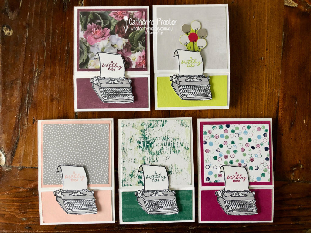
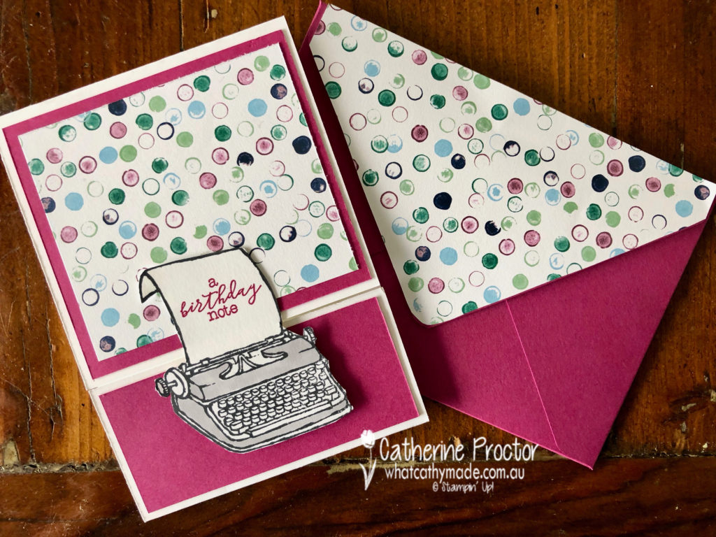
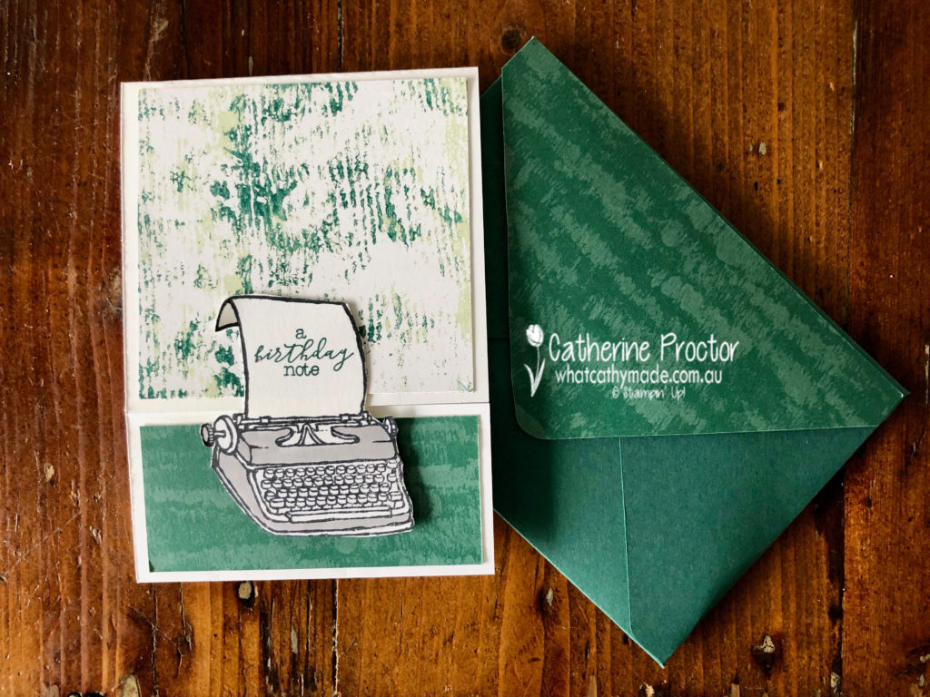
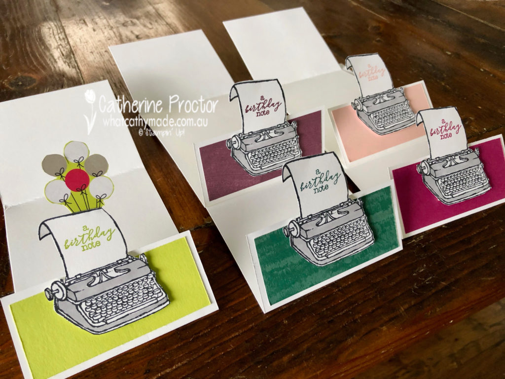
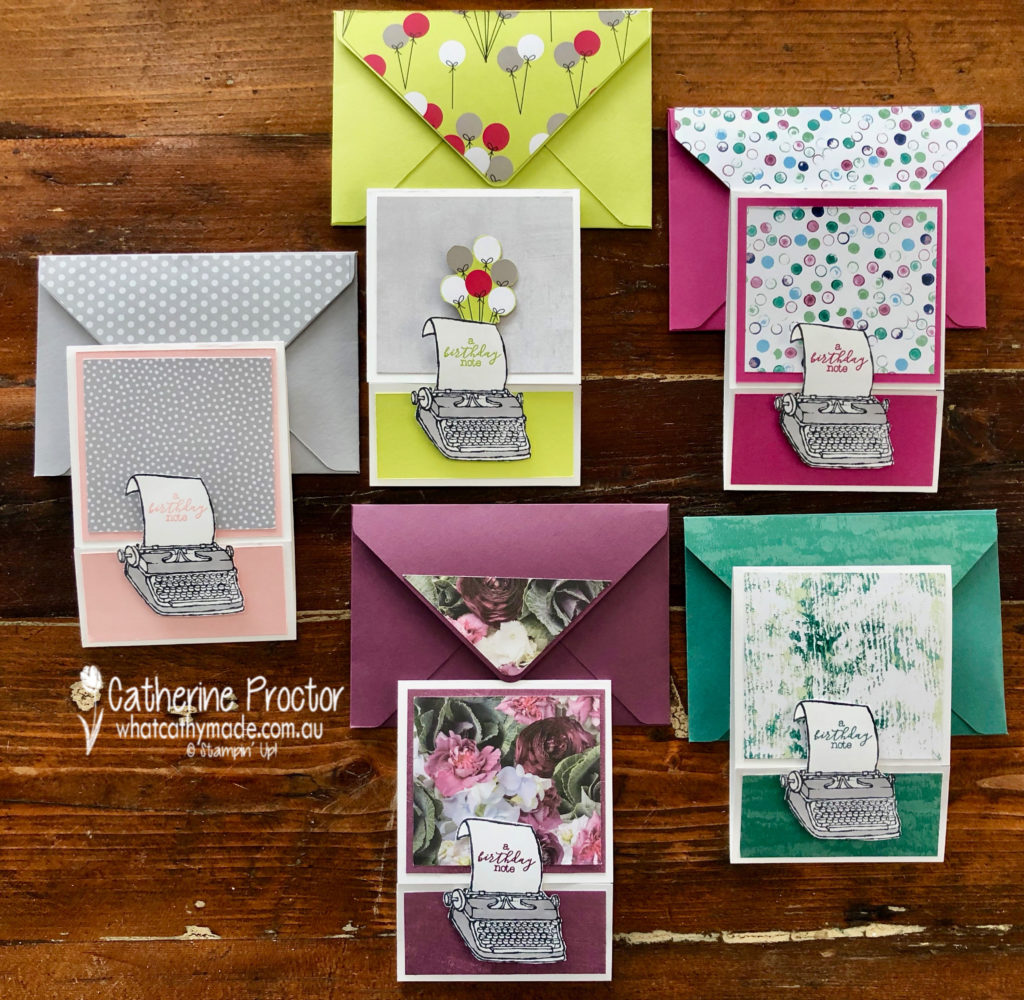
I like to call this set my typing pool!
I decided to use the delightful “P.S. You’re the Best stamp set” as it was just perfect for my friend Bruce. I’m going to his 50th birthday party this weekend and he is an author and currently writing his next book.
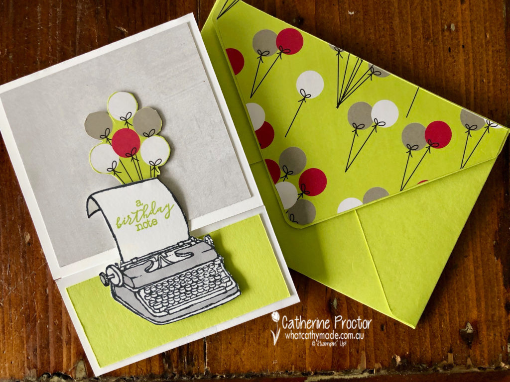
I think I’ll give Bruce the Lemon-lime twist card with the festive balloon paper from the Broadway Bound Designer Series Paper.
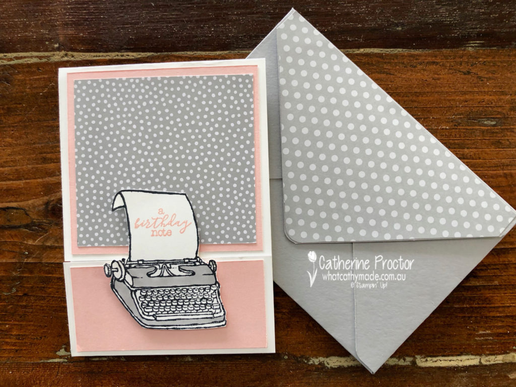
What I really like about this stamp set is that you can use it with any colour to make either male or female cards. The Powder Pink card is very feminine.
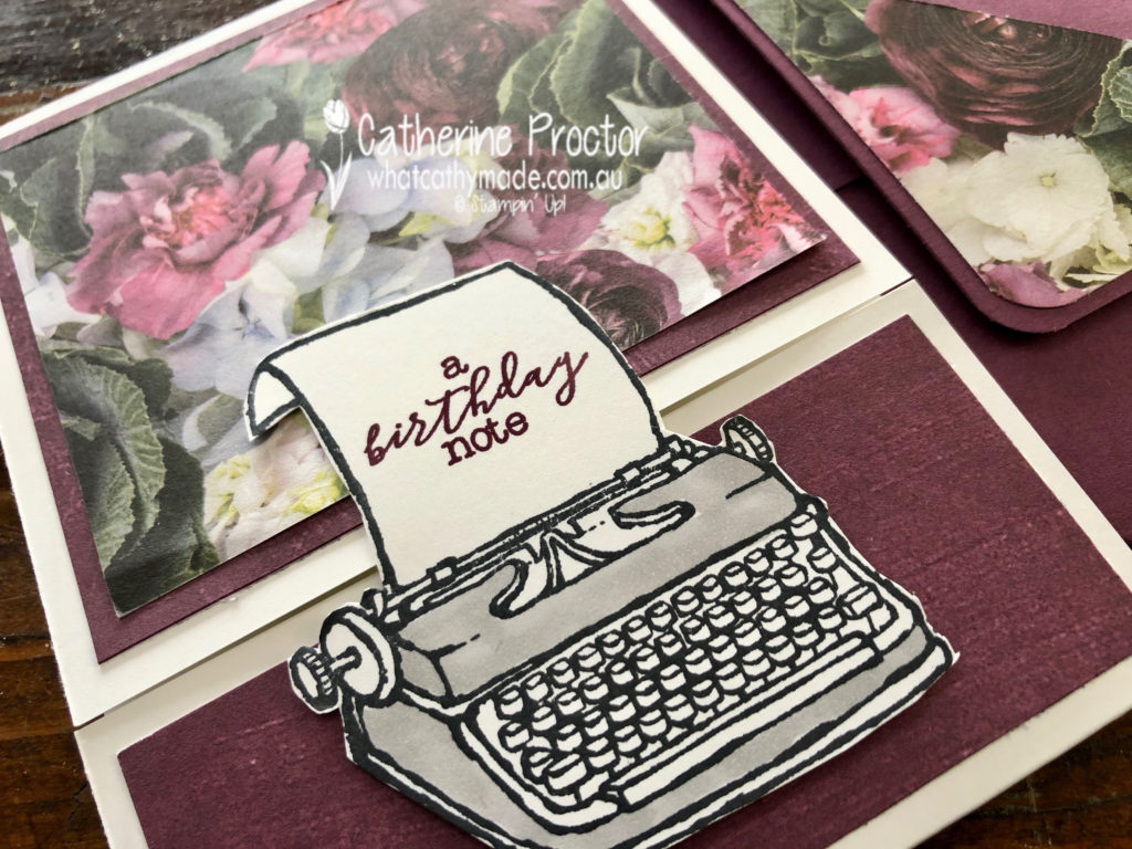
The Fresh Fig card is also very feminine, using the Petal Promenade DSP
The Berry Burst card and the Tranquil tide card could work for men or women and both use the Tranquil Textures DSP.
My favourite thing about my typing pool cards is the way they open…it is a type of fancy fold but I’m not sure what it’s called!
Another fantastic retiring product I used was the Envelope punch board to make a matching envelope for each card.
To see what the rest of the team have created, click on the links below.
To purchase any of the products I used in this project you can shop with me here. Or if you’d like me to post you your very own copy of any of the Stampin Up! catalogues or find out about more about Stampin’ Up! contact me .
We will be back again next week showcasing a subtle colour: So Saffron. We hope you can along with us then.
Welcome to week 45 of the Art With Heart Colour Creations Blog Hop!
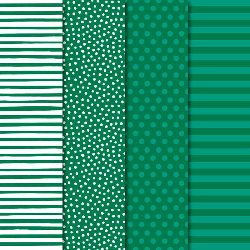
Our colour this week is a very dark regal colour: Shaded Spruce.
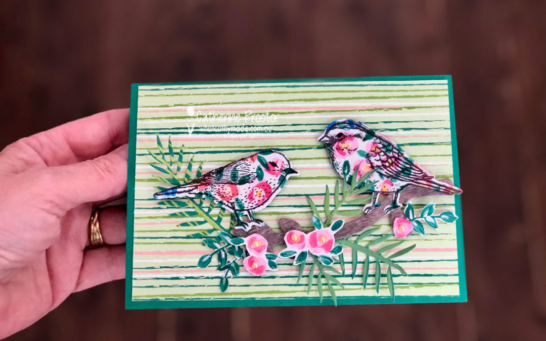
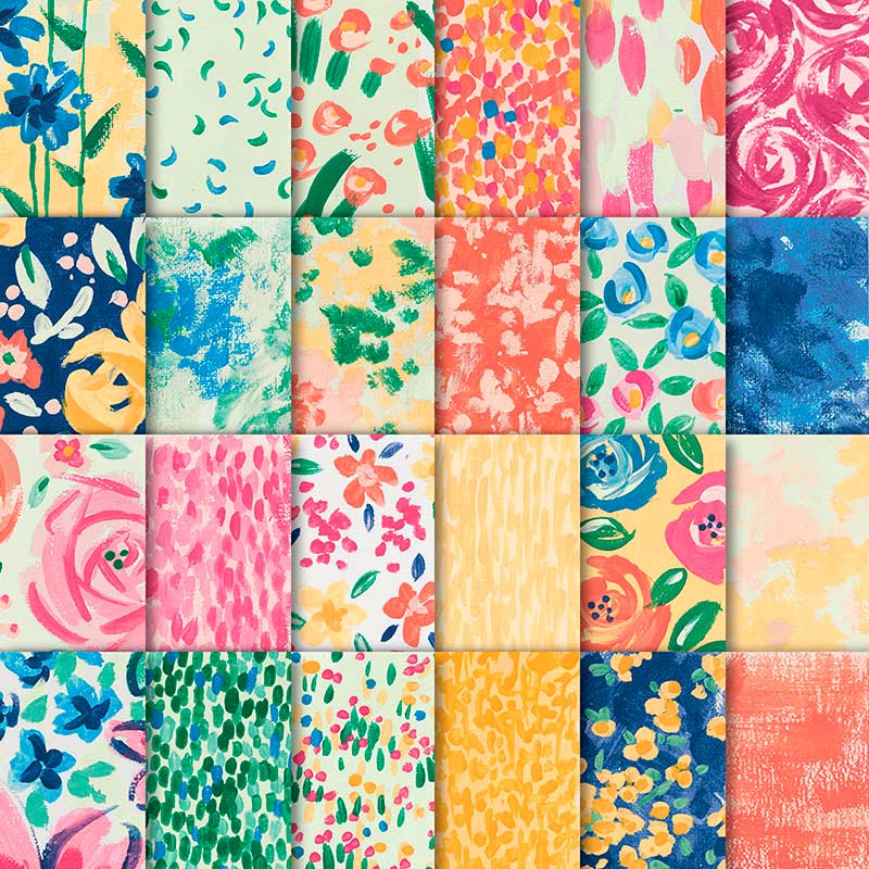
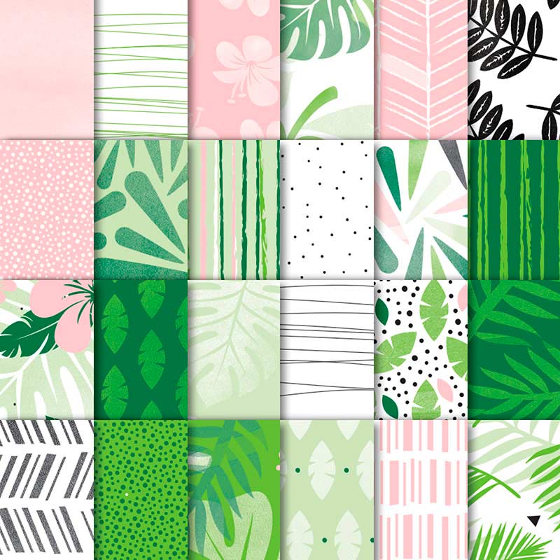
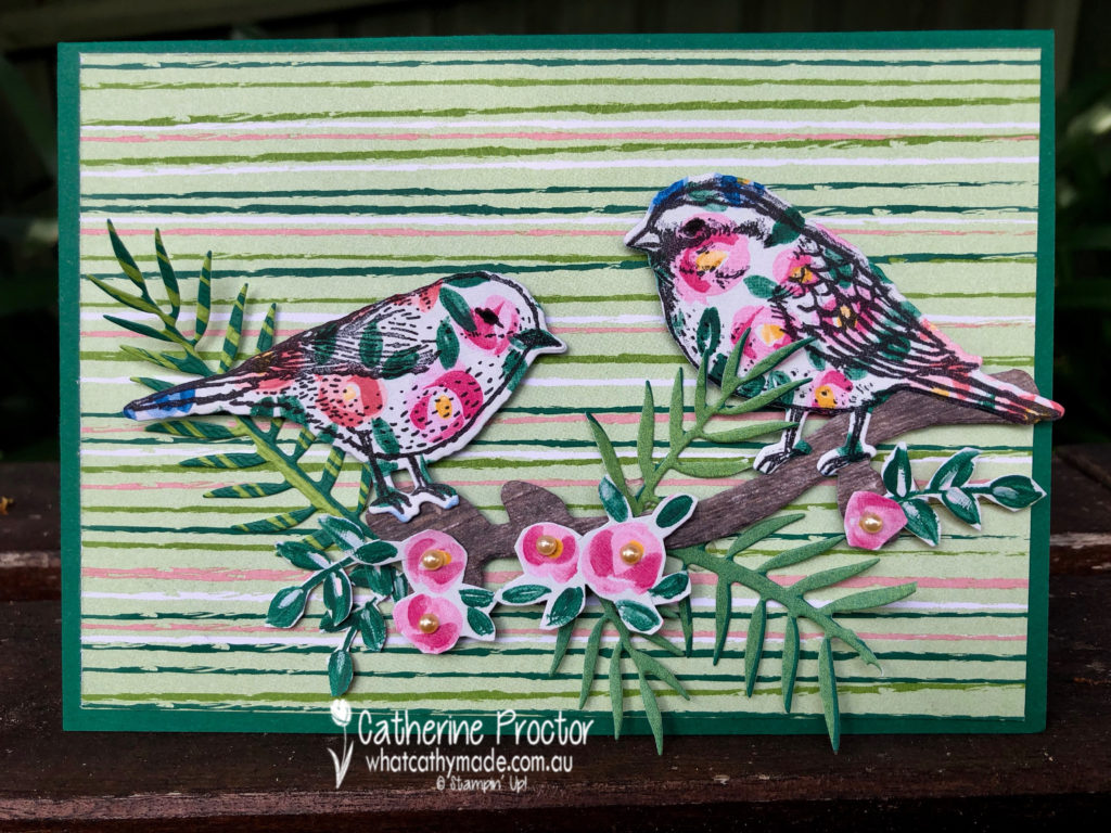
Stampin’ Up has some lovely Designer Series Papers that feature Shaded Spruce and I used two of these for my card today: Garden Impressions and Tropical Escape DSP.
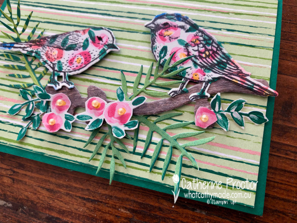
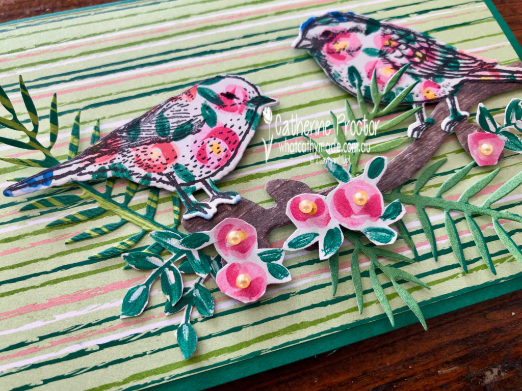
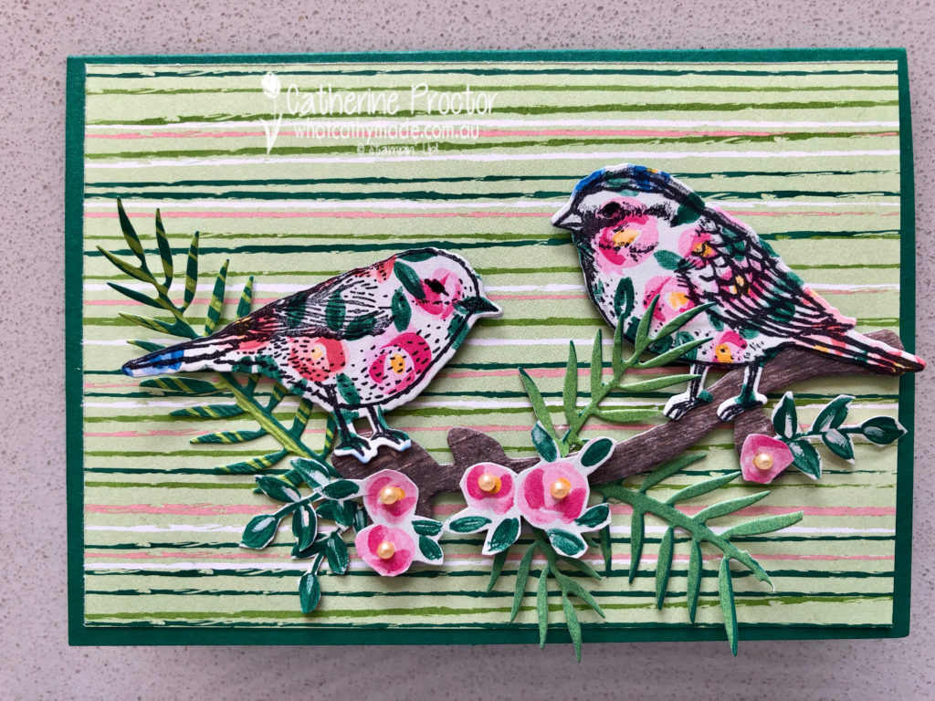
My card uses a mix of die cutting and fussy cutting.
I stamped my birds in black ink onto the Garden Impressions DSP before die cutting them out. The branch they sit on has been die cut from the Wood Textures DSP.
The pink roses have been fussy cut from the Garden Impressions DSP, but the leaves have been die cut from the Tropical Escape DSP.
The card base is Shaded Spruce card stock topped with a rectangle of striped paper from the Tropical Escape DSP.
To see what the rest of the team have made click on the links below.
To purchase any of the products I used in this project you can shop with me here. Or if you’d like me to post you your very own copy of any of the Stampin Up! catalogues or find out about more about Stampin’ Up! contact me .
We will be back again next week showcasing a neutral colour: Smokey Slate! We hope you can along with us then.