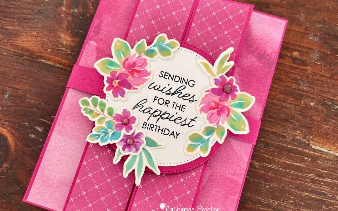
Welcome to Week 9 of our Art With Heart Team Colour Creations Blog Hop, where we’re working our way through the Stampin’ Up! colour collection in alphabetical order. This week we’re celebrating the rich, vibrant Berry Burst.
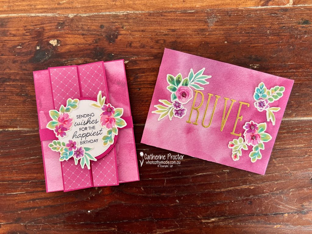
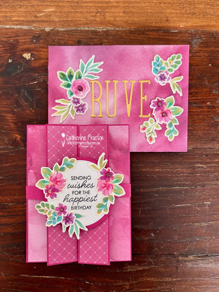
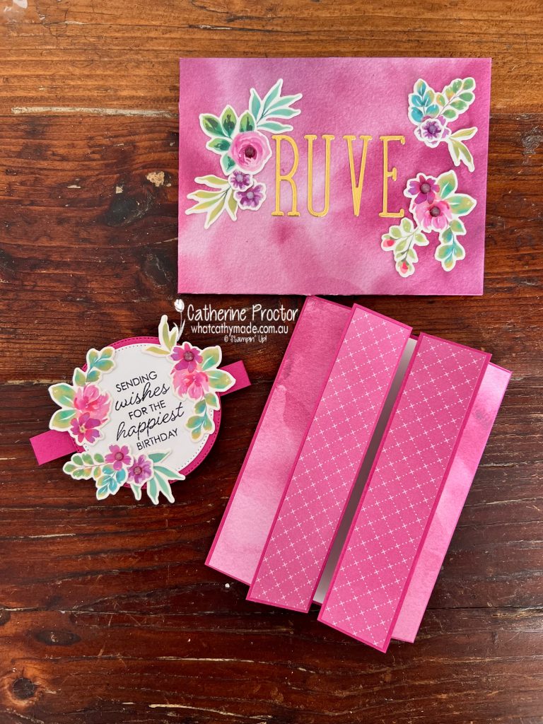
Berry Burst is one of those colours that always makes a statement. Bright, cheerful and full of personality, it pairs beautifully with florals, making it the perfect choice for this feminine birthday card and matching custom envelope.
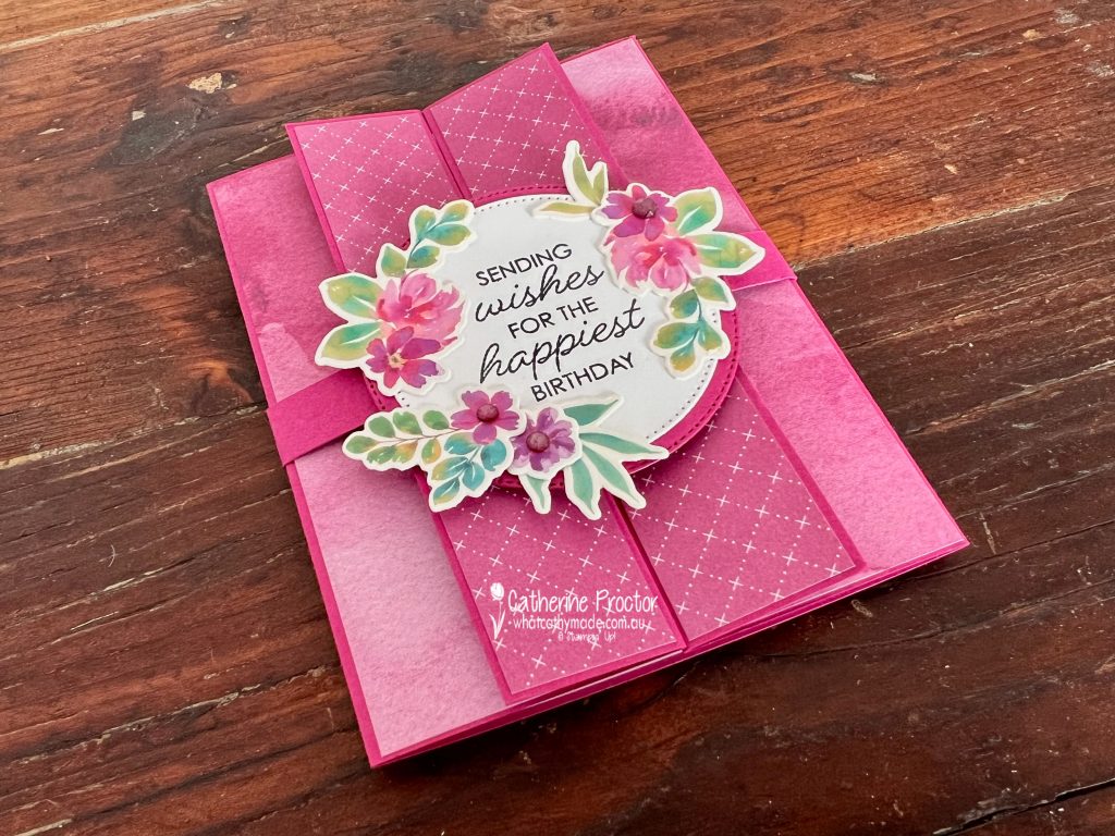
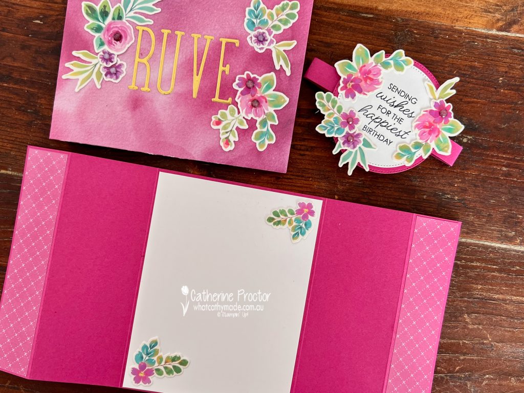
For this project, I created a Double Gatefold Card featuring the gorgeous Extraordinary Flora Washi Tape. If you haven’t tried this washi tape yet, it’s such a fun product to work with. Simply adhere it to Basic White card stock before die cutting with the coordinating Extraordinary Flora Dies, giving you beautifully detailed floral embellishments in minutes.
My card features:
Berry Burst card stock base
Moonlit Flora Designer Series Paper on the front gatefold panels
Garden Poetry Designer Series Paper for the inside panels and matching custom envelope
Extraordinary Flora Washi Tape adhered to Basic White card stock and die cut with the coordinating dies
Framed All Around Stamp Set sentiment
Layered Stylish Shapes Dies circles with a Berry Burst mat
Berry Burst embellishments to finish the floral clusters
Normally I make cards in metric measurements to make the most of our Australian A4 card stock bases, but because this design uses more than half a sheet of A4 card stock and because I wanted to make a perfectly fitting custom envelope, I followed a US tutorial using imperial measurements for this project.
Start with an 11″ x 5-1/2″ piece of Berry Burst card stock and score at:
1-1/4″
3-3/8″
7-5/8″
9-3/4″
Cut Designer Series Paper for the four front panels and adhere to the card stock base.
Front panels: 1-1/8″ x 5-3/8″ (Moonlit Flora DSP)
Inside flaps: 2″ x 5-3/8″ (Garden Poetry DSP)
For the inside panel cut a piece of Basic White card stock and adhere to the card base: 4″ x 5-1/4″.
I created a 1″ belly band to hold the card flat, covering the front join with layered stitched circles with a Berry Burst mat. The front sentiment is from the Framed All Around Stamp Set.
This video shows how the card opens up.
Take a look at some more Berry Burst inspiration on our Insta Hop!
Our blog hop is now an Instagram hop but the good news is that you don’t need to have an Instagram account to view all of the other projects!
Simply go to my Insta handle in a new search engine window to follow the Instagram hop: @whatcathymade.
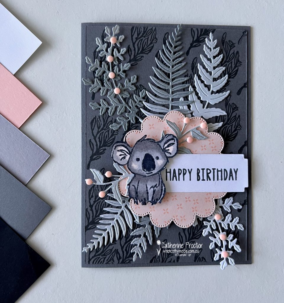
When you think of Basic Gray, you might immediately picture masculine cards, industrial themes or elegant monochrome designs. But this week’s Colour Creations project proves that Basic Gray can also be soft, sweet and perfect for birthdays.
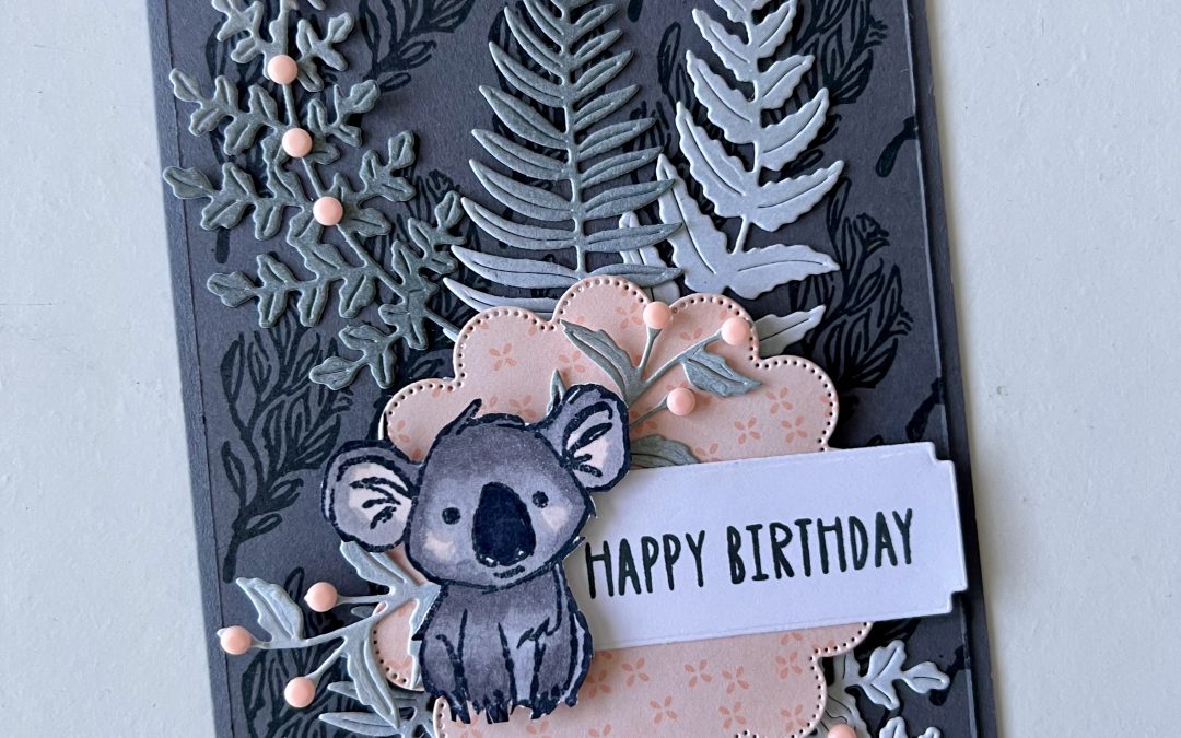
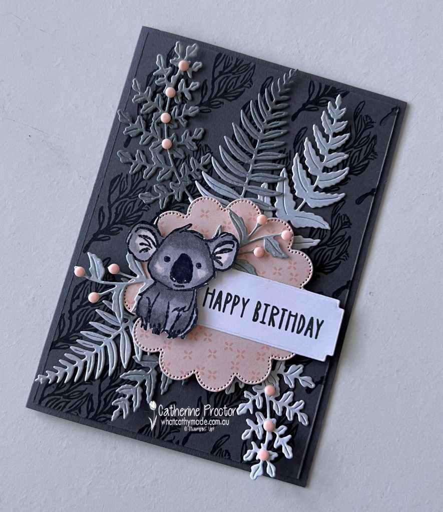
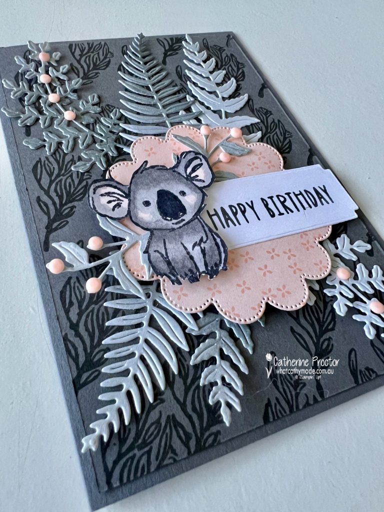
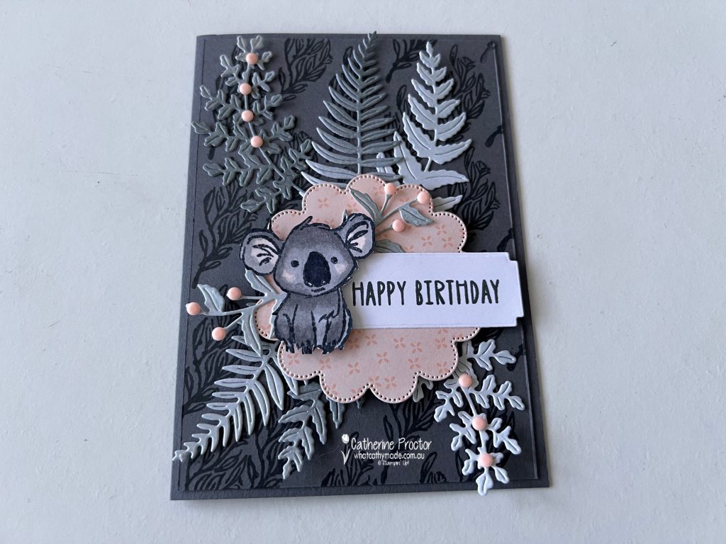
For my Week 8 Colour Creations card, I couldn’t resist using the adorable koala from the June Product of the Month, the Wild Bunch Stamp Set. Paired with Petal Pink and soft shades of grey, this little fellow creates a charming birthday card with a distinctly Australian feel.
This card has a special purpose too, as I’ve made it for my youngest niece, who turns eight at the end of June. This sweet little koala seemed like the perfect choice for her birthday card.
My colour combination is Basic Gray, Petal Pink, Basic White, Smoky Slate and Basic Black.
I used a Blending Brush to apply Basic Gray ink onto a scrap piece of Basic White card stock, creating a soft ombré effect. I then used the beautiful Fern & Flora Dies to cut the foliage shapes from the blended piece.
The scalloped circle was cut from a Petal Pink patterned paper from the Lovely Blossoms Designer Series Paper using the Scalloped Blooms Dies.
For the card base, I layered a slightly smaller piece of Basic Gray card stock onto a Basic Gray card base. Before adhering it, I stamped the branch image from the Wild Bunch Stamp Set across the background using Basic Gray ink for a tone-on-tone patterned effect.
The koala was stamped in Memento Tuxedo Black Ink onto Basic White card stock and coloured using Stampin’ Blends in Smoky Slate, Petal Pink and Basic Black. After colouring, I carefully cut around the stamped image and layered it over the die-cut foliage.
The “Happy Birthday” greeting is also from the Wild Bunch Stamp Set and was stamped in Basic Gray. I then used one of the label dies from the Fern & Flora Dies to cut out the sentiment.
To finish the card, I added a few Petal Pink Dear Dots. These gorgeous embellishments are currently available in the Last Chance section for just $7.50, making them a wonderful bargain if you’re looking to stock up before they retire.
I love how Basic Gray can be both elegant and playful. Combined with soft pink accents and an adorable koala, it creates a card that feels warm, modern and uniquely Australian.
Thanks for stopping by for Week 8 of the Colour Creations Blog Hop. I hope this project inspires you to give Basic Gray a fresh look in your own crafting.
Take a look at some more Basic Gray inspiration on our Insta Hop!
Our blog hop is now an Instagram hop but the good news is that you don’t need to have an Instagram account to view all of the other projects!
Simply go to my Insta handle in a new search engine window to follow the Instagram hop: @whatcathymade.
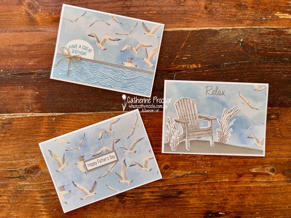
Welcome to Week 7 of the Art With Heart Team Colour Creations Blog Hop, featuring Balmy Blue, one of my favourite blues in the Stampin’ Up! colour range.
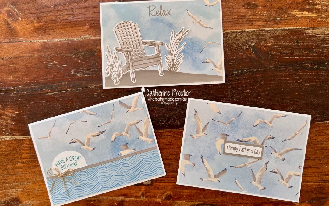
When I started planning this week’s project, I discovered I only had half a sheet of the seagull pattern from the Waterside Retreat Designer Series Paper.
Rather than putting it aside for a future project, I decided to challenge myself to use the entire piece and see how many cards I could create.
The answer was three!
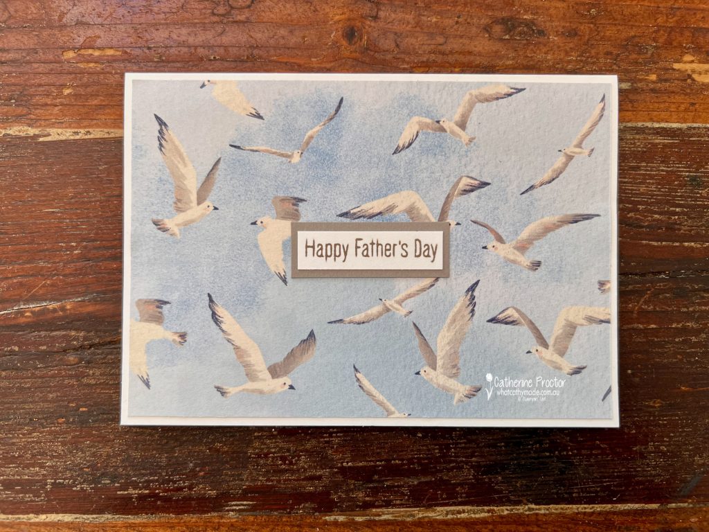
The first card is a simple Father’s Day design featuring the flock of seagulls as the star of the show. A layered sentiment keeps the design clean and masculine while allowing the beautiful artwork in the paper to shine.
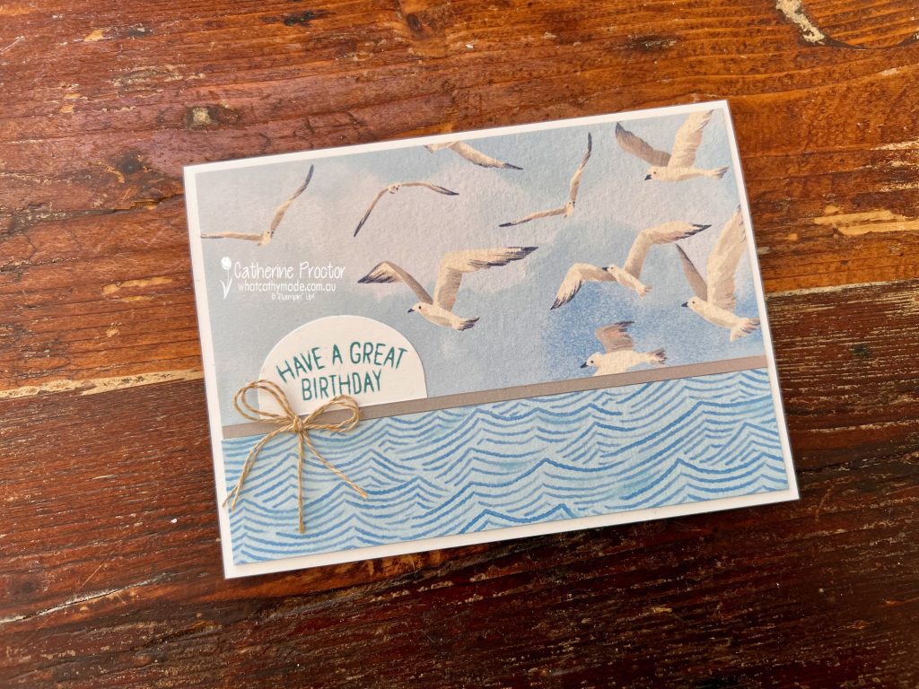
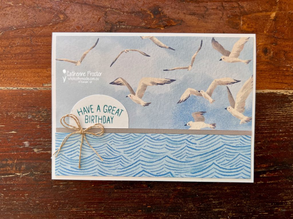
For the second card, I added a strip of coordinating patterned paper, a sentiment punched with the Modern Oval Punch and a bow tied from Linen Thread. This creates a casual seaside feel that works perfectly for a birthday card.
The “wave” pattern of the DSP on the lower half of the card is also from the Waterside Retreat Designer Series Paper.
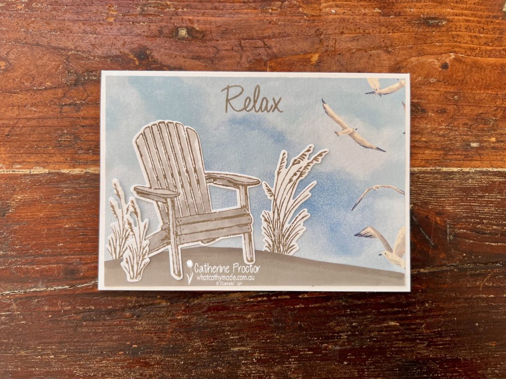
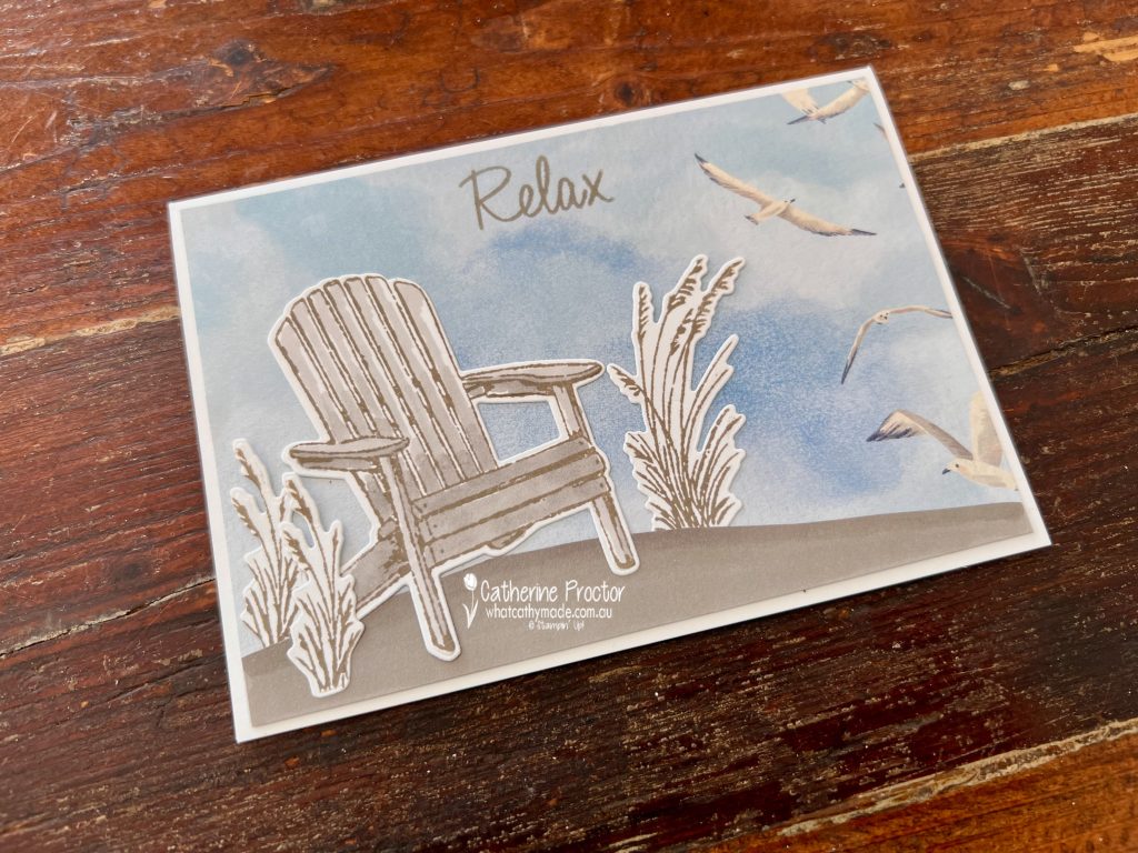
The third card uses elements from the Relaxing Waterside Bundle to create a peaceful coastal scene.
The Adirondack chair and foliage combine beautifully with the seagull background, while the “Relax” sentiment reinforces the tranquil atmosphere. I hand cut a scrap strip of Gray Granite cardstock to create the ground, using Stampin’ up! Blends to add shading.
My colour combination for all three cards was Balmy Blue, Azure Afternoon, Gray Granite and Misty Moonlight.
This project is a great reminder that designer paper doesn’t need to be hoarded. Even a leftover half sheet can become multiple cards when you let the paper do most of the work.
Take a look at some more Balmy Blue inspiration on our Insta Hop!
Our blog hop is now an Instagram hop but the good news is that you don’t need to have an Instagram account to view all of the other projects!
Simply go to my Insta handle in a new search engine window to follow the Instagram hop: @whatcathymade.
Welcome to Week 6 of the Art With Heart Team Colour Creations Blog Hop, featuring Azure Afternoon.
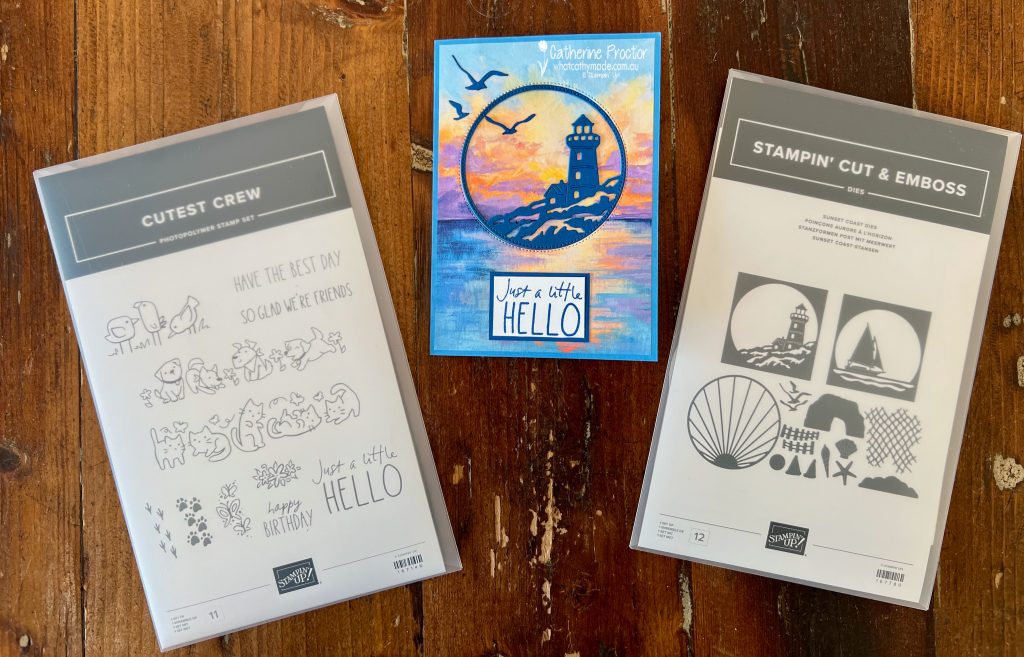
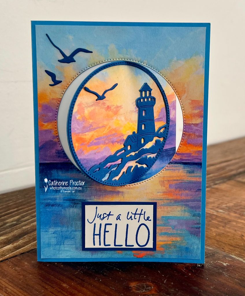
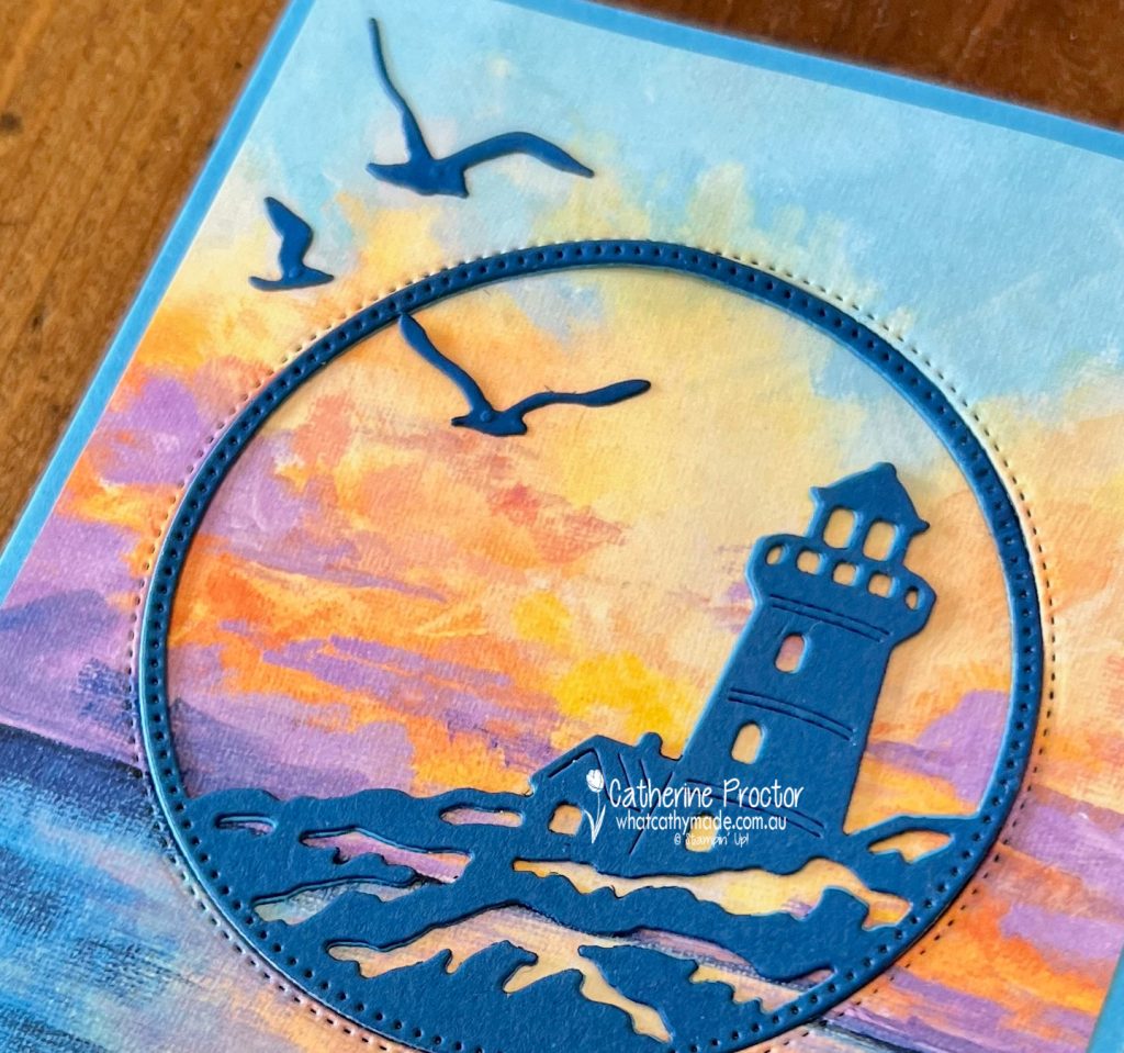
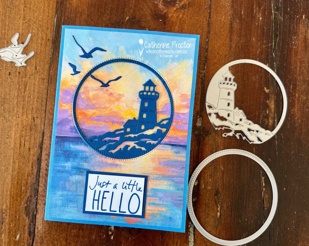
This bright, cheerful blue is one of the colours in the stunning Scenic Coast Designer Series Paper and I’ve also used the lighthouse die from the gorgeous Sunset Coast Dies. These two products are both part of the Scenic Coast Suite Collection.
As I don’t have the matching stamp set from this suite, I used the Cutest Crew Stamp Set for the sentiments, both on the card front and inside the card.
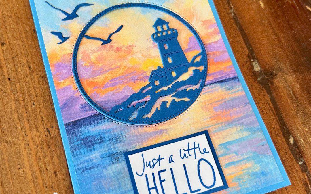
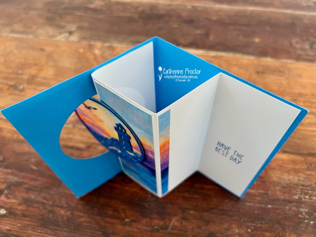
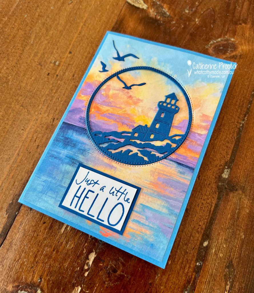
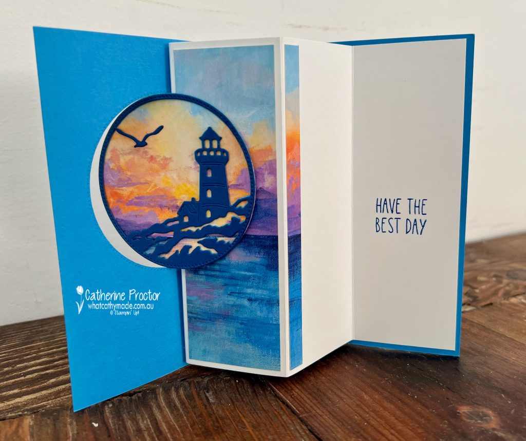
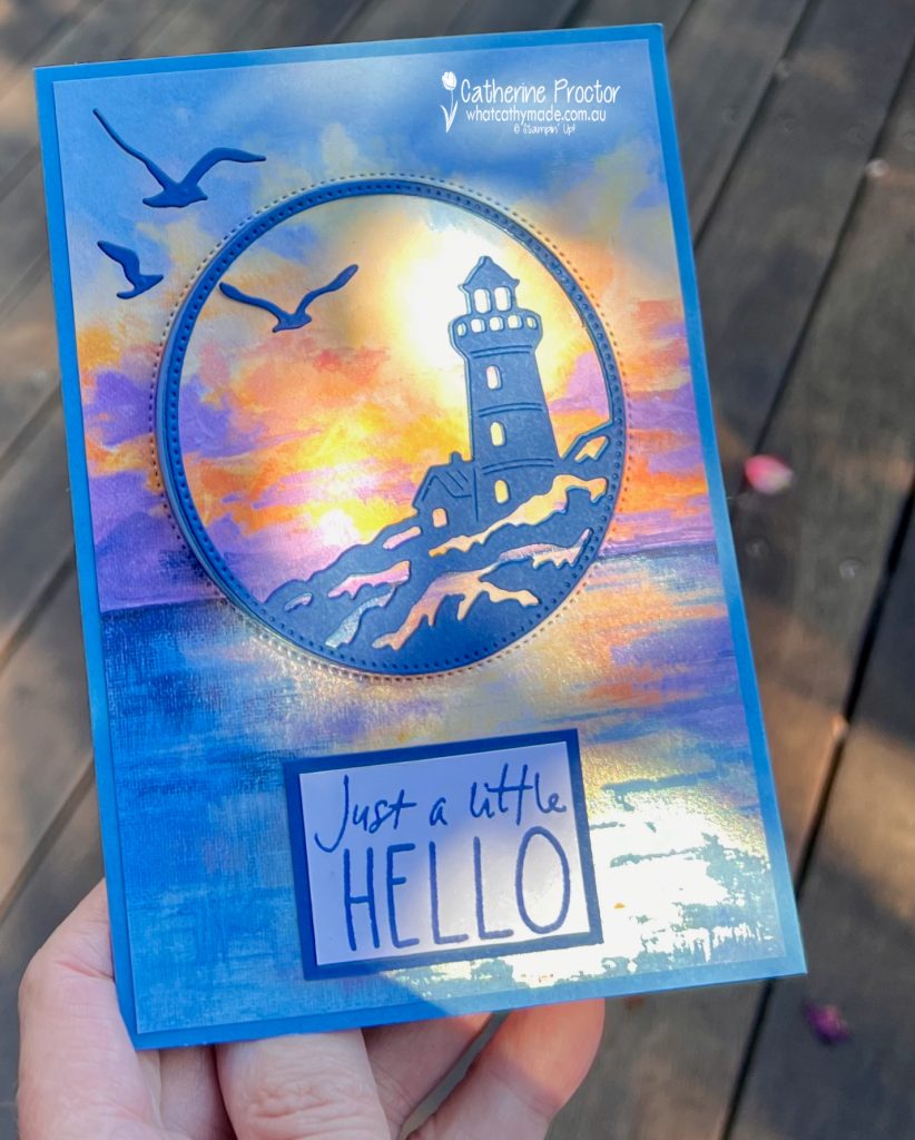
My card is a coastal-inspired Swing Fun Fold featuring a lighthouse framed within a circular aperture and set against the stunning pearlised Scenic Coast Designer Series Paper. The beautiful sunset tones in the paper create the perfect backdrop for this interactive design, while the fun fold mechanism adds an unexpected surprise when the card is opened.
This photo taken from above the card shows how the fun fold works.
The fun fold design is not mine. I was inspired by a wonderful tutorial by Cindy Lee from CindyLeeBeeDesigns. While I loved Cindy’s original concept and we used the same DSP pattern, I have adapted the project to suit the supplies I had on hand and to work with Australian A4 card stock. I changed the card stock colours, selected different stamp sets and sentiments, and converted all of the measurements from imperial to metric.
These are my measurements for the metric version of Cindy’s card.
The inside greeting is the “Have the Best Day” sentiment from the Cutest Crew Stamp Set. To better suit the space available, I stamped the sentiment over two lines by selectively inking only part of the stamp at a time, creating a custom layout that fits perfectly inside the card.
I had a tiny strip of the Designer Series Paper left over so I adhered it to one of the inside panels, opposite the sentiment.
The lighthouse was originally die cut in Azure Afternoon card stock, but it blended a little too much into the background. To create more contrast, I layered a second lighthouse die cut in Blueberry Bushel, which is the colour of the darker blue tones in the Designer Series Paper.
You can just see the original Azure Afternoon card stock under the Blueberry Bushel card stock in this close up below. I love the shadow effect it gives to the card.
One of my favourite tips from Cindy’s video was using the largest circle from the Stylish Shapes Dies to carefully cut around the lighthouse die cut. This creates the perfect circular frame and gives the card its distinctive focal point.
This stunning DSP has a beautiful pearlised effect that is hard to capture in a photo, but this outside photo of my card probably shows it the best.
Take a look at some more Azure Afternoon inspiration on our Insta Hop!
Our blog hop is now an Instagram hop but the good news is that you don’t need to have an Instagram account to view all of the other projects!
Simply go to my Insta handle in a new search engine window to follow the Instagram hop: @whatcathymade.
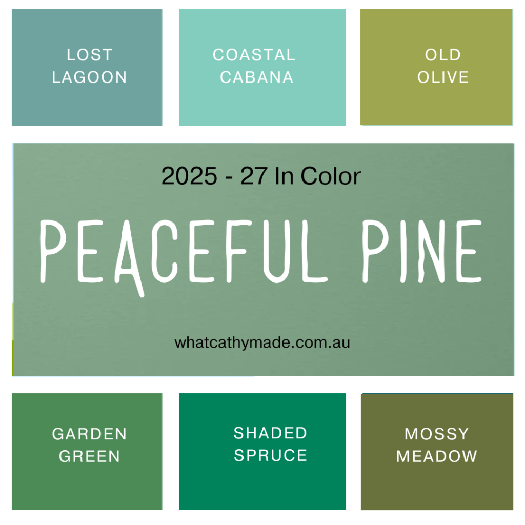
This week for the Art With Heart Team Colour Creations Insta Hop we’re featuring Peaceful Pine, one of the beautiful new 2026–2028 In Colours.
This slightly dusty, sage green colour sits somewhere between the bluer tones of Lost Lagoon and the purer green tones of Garden Green. It does not have any of the yellow tones of Old Olive or Mossy Meadow.
For this card I’ve combined something old and something new.
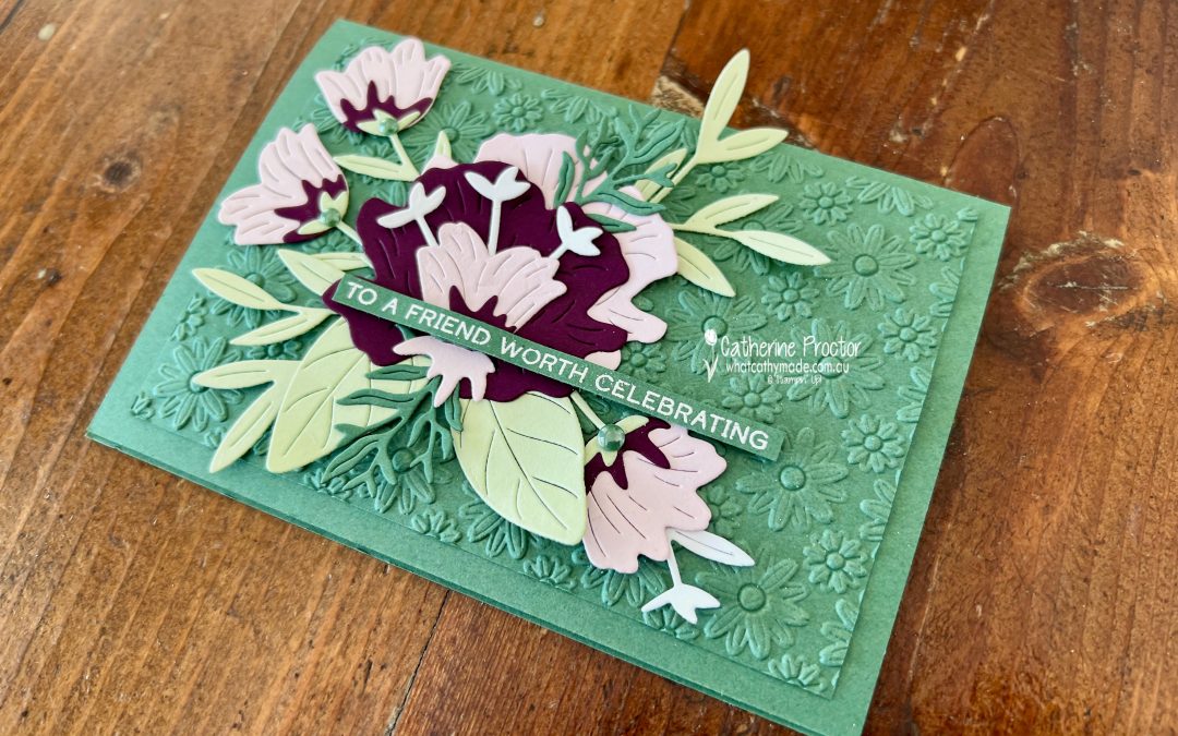
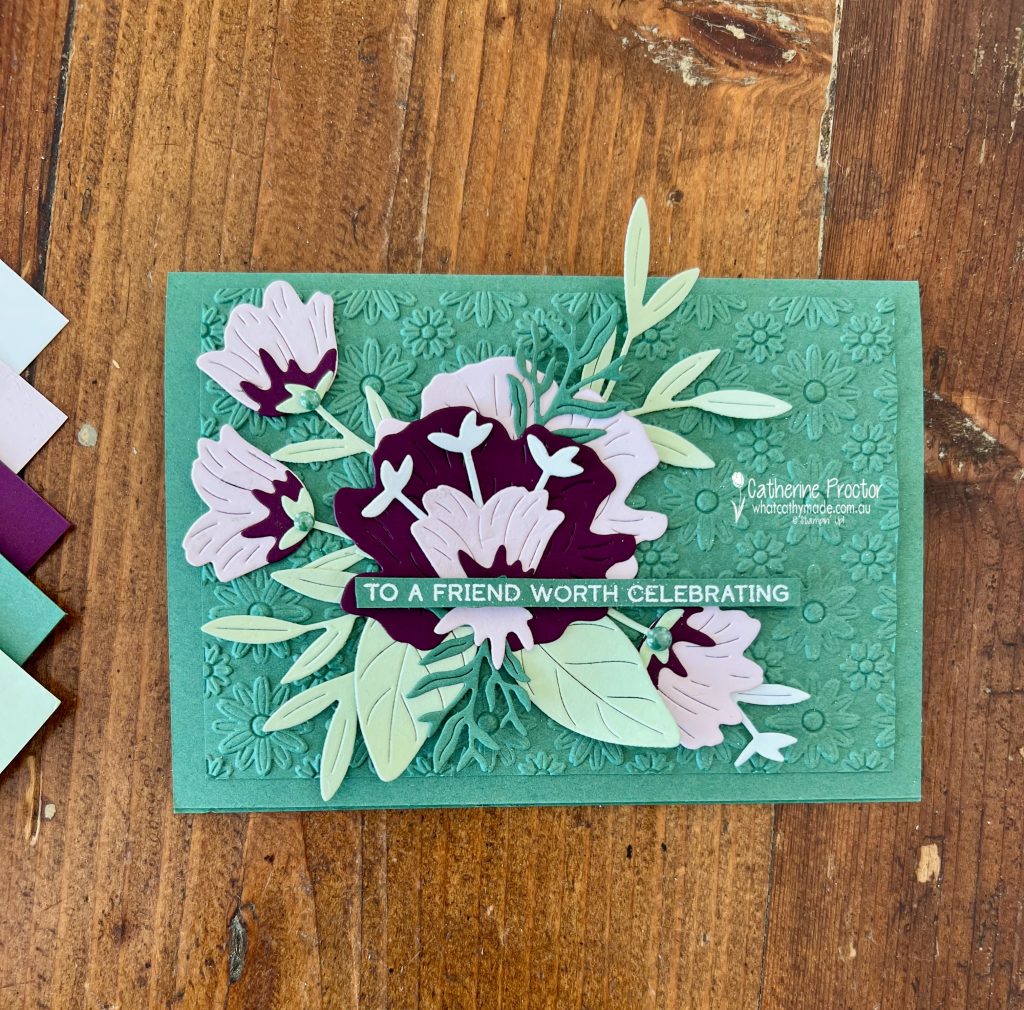
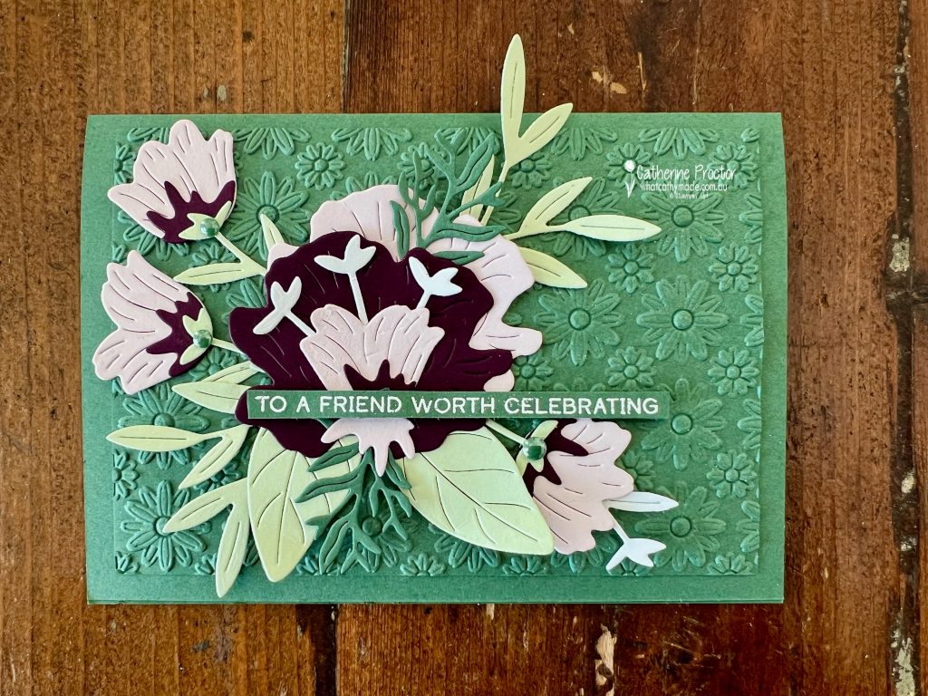
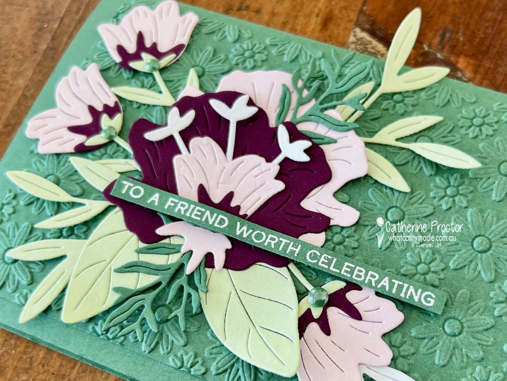
The “old” is the retiring Pretty Florals Dies, currently on the Last Chance list and reduced from $65.00 to $39.00. The “new” includes the Words & Wishes Stamp Set and the gorgeous Lazy Daisy Embossing Folder, which creates all the texture on the card front.
My colour palette combines Peaceful Pine, Soft Sea Foam, Blackberry Bliss and Barely Blush. I’ve found myself reaching for Soft Sea Foam again and again with the new In Colors because it complements them so beautifully.
The rich Blackberry Bliss flower creates a striking focal point against the softer greens and pinks, while Barely Blush adds a delicate contrast. Bubble Bath would also work beautifully in this colour combination.
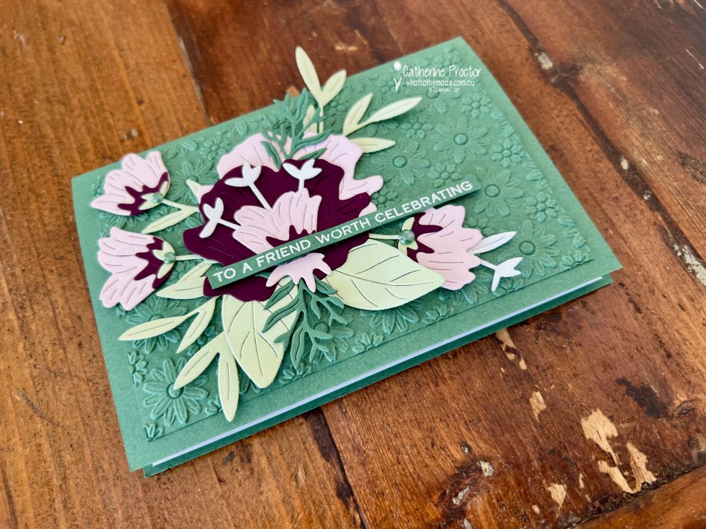
Apart from the white heat-embossed “TO A FRIEND WORTH CELEBRATING’ sentiment from the Words & Wishes Stamp Set, there is no stamping on the card front at all. The floral arrangement was created entirely from die cuts. I cut multiple elements using the Pretty Florals Dies and layered them over the embossed Peaceful Pine panel to create a lush bouquet effect.
The monochromatic embossed background adds plenty of texture while allowing the die-cut florals to remain the star of the show. I finished the design with a few Peaceful Pine 2026–2028 In Colour Dots, which pick up the colours of the card beautifully.
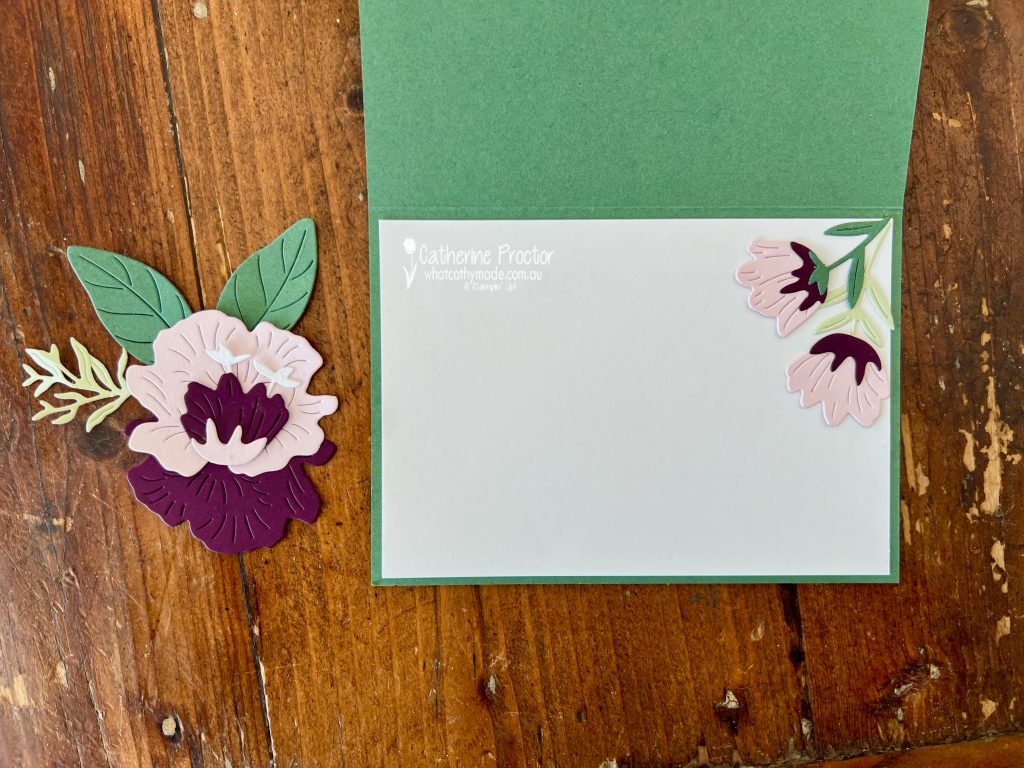
As always, I carried the design through to the inside of the card using leftover die-cut pieces. I love finding ways to use every scrap and create a coordinated finish inside and out.
Take a look at some more Peaceful Pine inspiration on our Insta Hop!
Our blog hop is now an Instagram hop but the good news is that you don’t need to have an Instagram account to view all of the other projects!
Simply go to my Insta handle in a new search engine window to follow the Instagram hop: @whatcathymade.
Next week we return to are showcasing the core Stampin’ up! colours in alphabetical order, starting with Azure Afternoon.