Welcome to week 51 of the Art With Heart Colour Creations Blog Hop. We have extended our one year Colour Creations Blog Hop for another 5 weeks to introduce the 2019-21 Stampin’ Up! in colours.
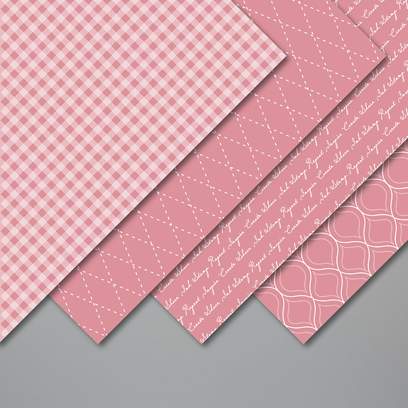
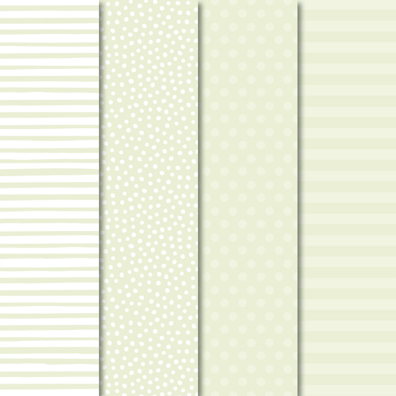
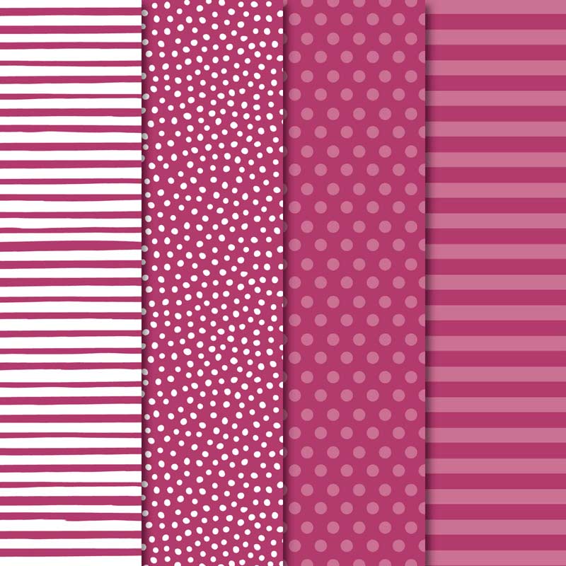
This week’s colour is a new shade of pink called Rococo Rose. This is the brand new designer series paper for the 2019-21 Stampin’ Up! in colours.
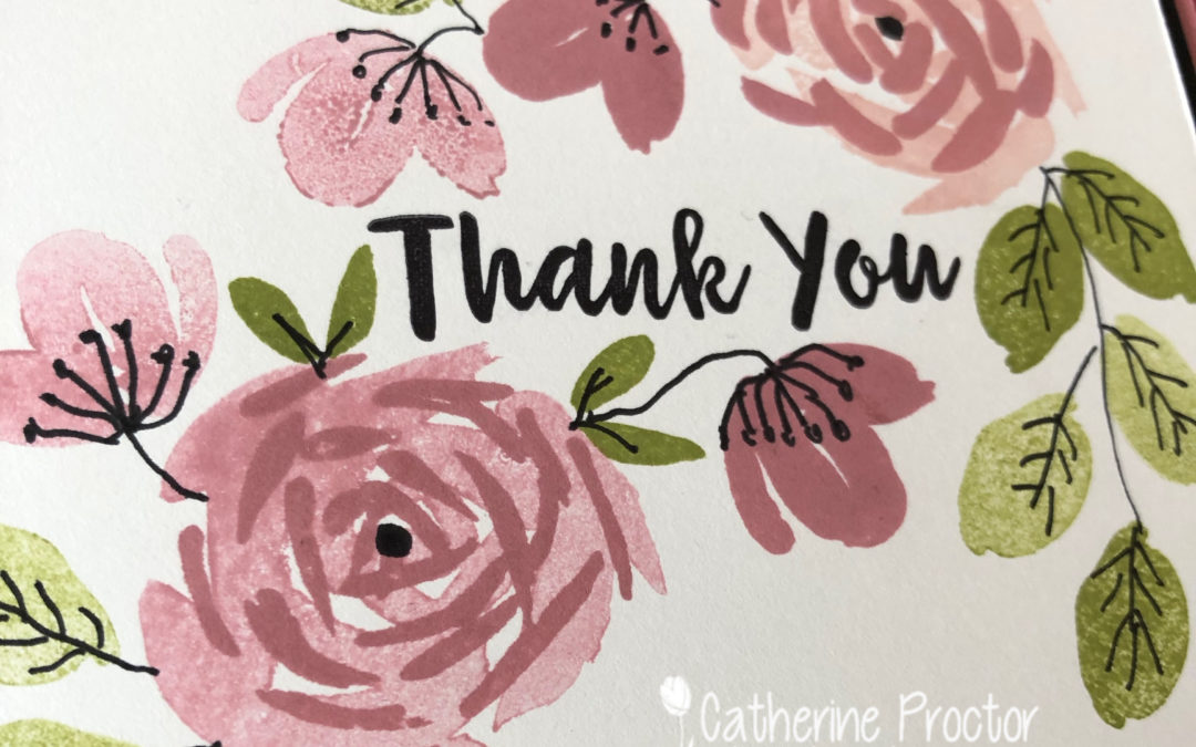
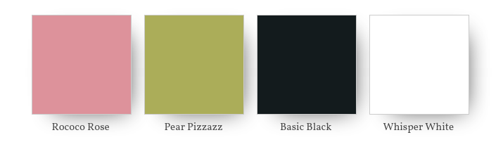
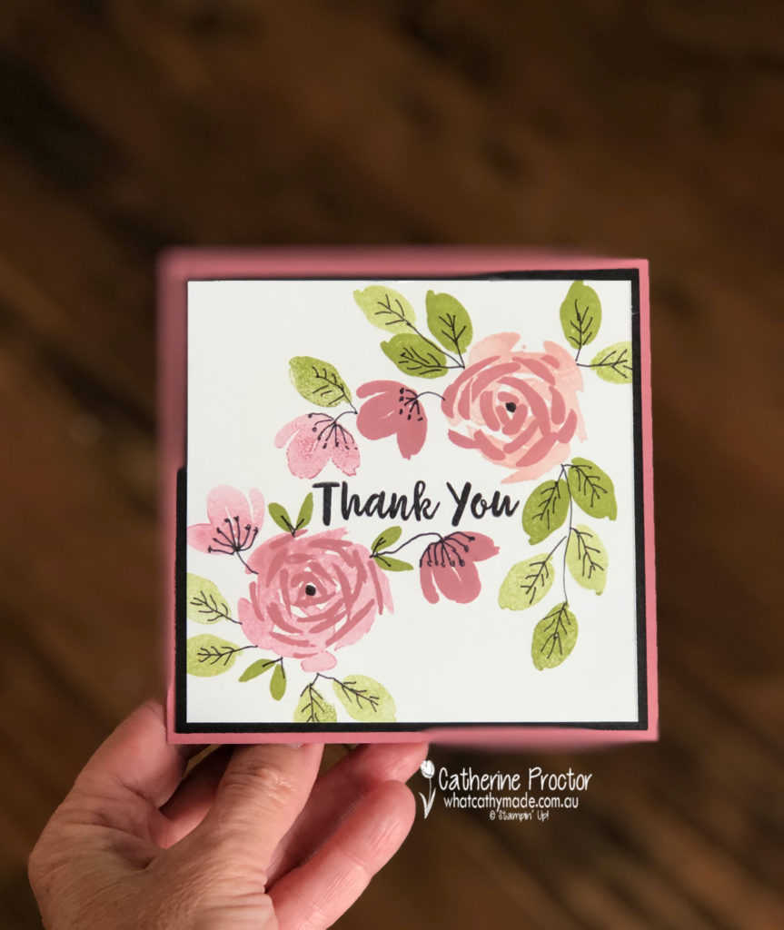
I’ve combined Rococo Rose with Pear Pizzazz, Basic Black and Whisper White.
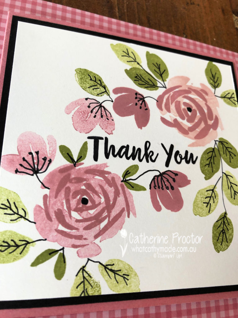
If you take a close look at my card it looks like I have also used a lighter pink and a lighter green but I have simply stamped off the Rococo Rose and the Pear Pizzazz.
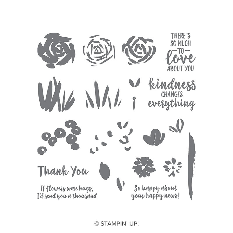
I’ve used the gorgeous Abstract Impressions stamp set – I’m so glad this set carried over to the new catalogue because it is one of those stamp sets that works well with any colour.
There are no punches or dies used on this card so it really is #simplestamping.
I’ve used my black marker pen to hand doodle over the top of my stamped images. This is such a simple technique and I really love the extra detail and dimension this gives to my card.
To finish my card off I mounted the stamped image onto Basic Black before adhering to the Rococo Rose card.
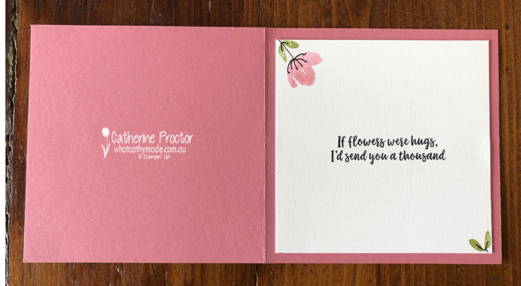
On the inside, a stamped square of Whisper White provides a space to write a message.
To see what the rest of the team have created, click on the links below.
To purchase any of the products I used in this project you can shop with me here.
Or if you’d like me to post you your very own copy of any of the brand new 2019-20 Stampin Up! catalogue or find out about more about Stampin’ Up! contact me.
Next week we will introduce you to another 2019-21 Stampin’ Up! in colour: Pretty Peacock. We hope you can hop along with us then.
Welcome to week 50 of the Art With Heart Colour Creations Blog Hop. We have been hopping every week for one year now (with a 2-week break for Christmas and New Year), which means we have now used all of the Stampin’ Up! colours.
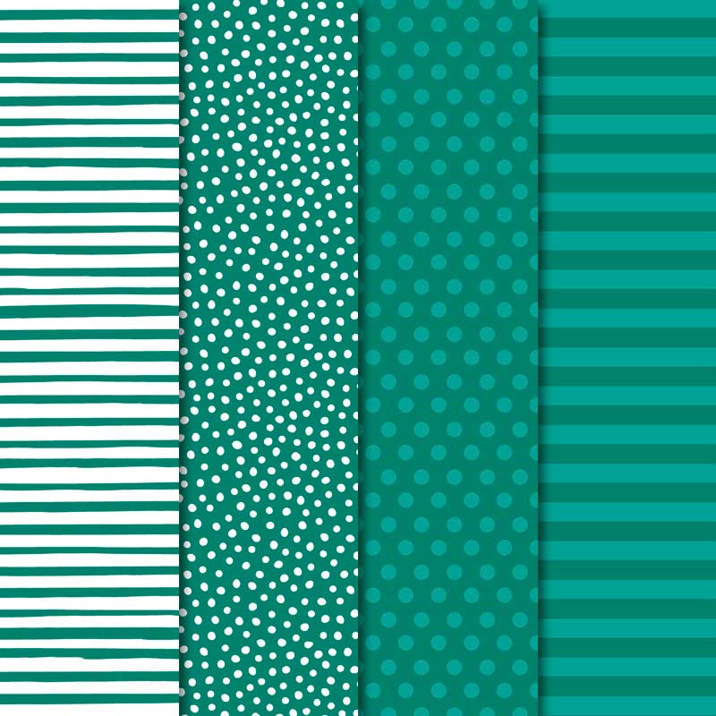
This week’s colour is a retiring in-colour called Tranquil Tide. I love this colour and will really miss it when it retires next week, but the great news is there is a similar in colour called Pretty Peacock that will be available to purchase next week.
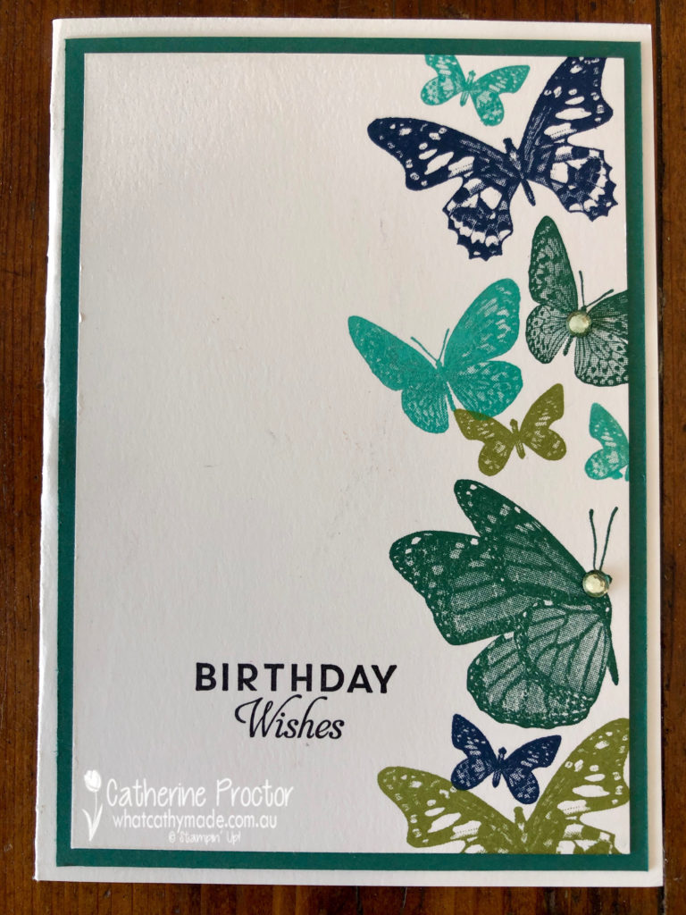
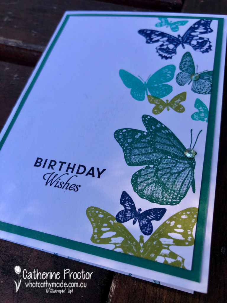
My card for our Tranquil Tide blog hop contains something old, something new, NOTHING borrowed but something blue.
Something old?
I’ve used Tranquil Tide with Night of Navy, Old Olive and Bermuda Bay.
Something new?
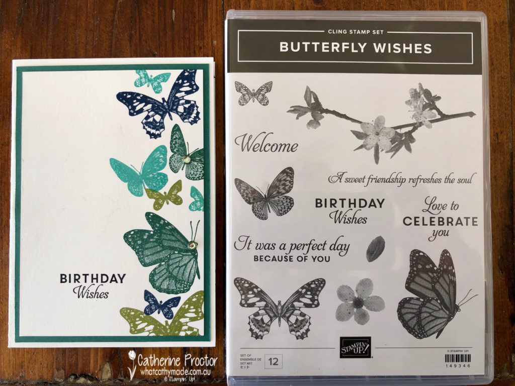
Check out this beautiful new stamp set called Butterfly Wishes.
Something blue?
Night of Navy pairs so well with Tranquil Tide.
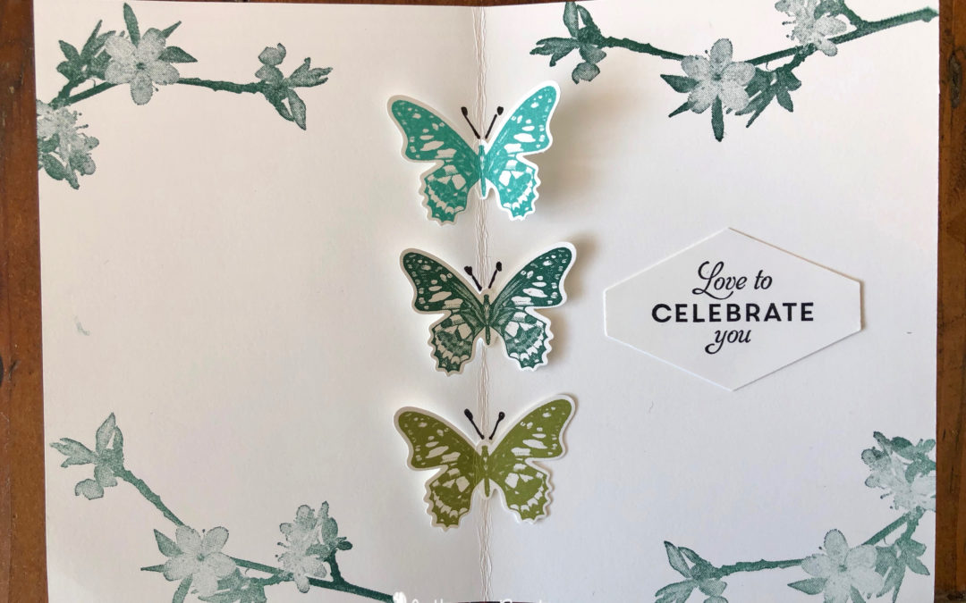
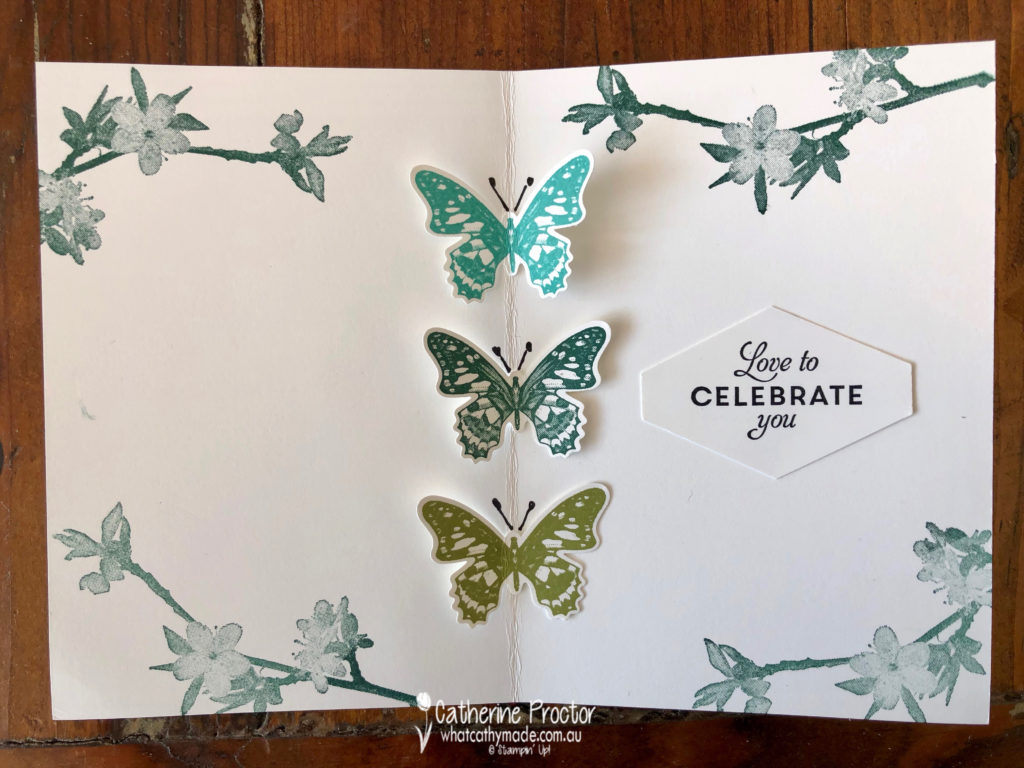
The Butterfly Wishes stamp set coordinates with the butterfly duet punch so on the inside of my card I added 3 beautiful butterflies that look as if they might just fly off the card.
To see what the rest of the team have created, click on the links below.
To purchase any of the products I used in this project you can shop with me here. Or if you’d like me to post you your very own copy of any of the Stampin Up! catalogues or find out about more about Stampin’ Up! contact me .
Next week the 2019-2020 catalogue goes live so we will continue our colour Creations blog hop for 5 more weeks to introduce you to the 5 new incolours. We hope you can hop along with us then.
Tonight the Art with Heart team are sharing creative products using supplies from the upcoming 2019 – 2020 annual catalogue.
If you would like a copy of the brand new annual catalogue, contact any of the girls on the blog hop and we will get in touch with you.
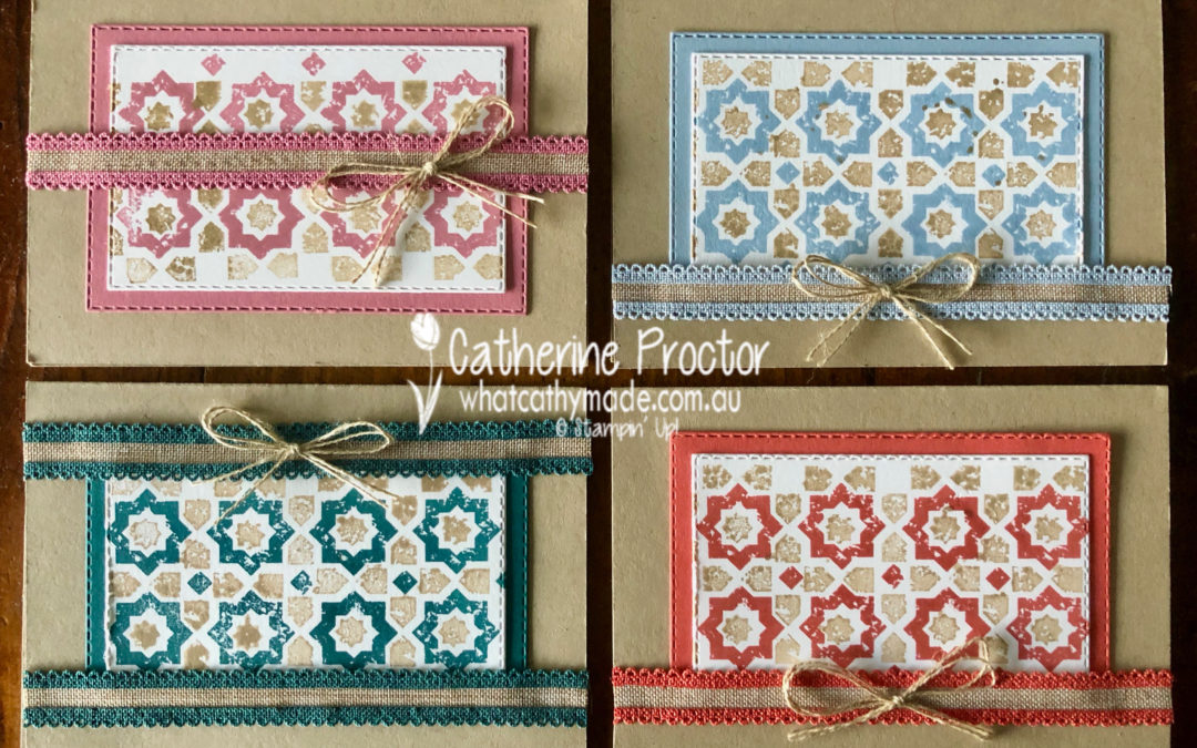
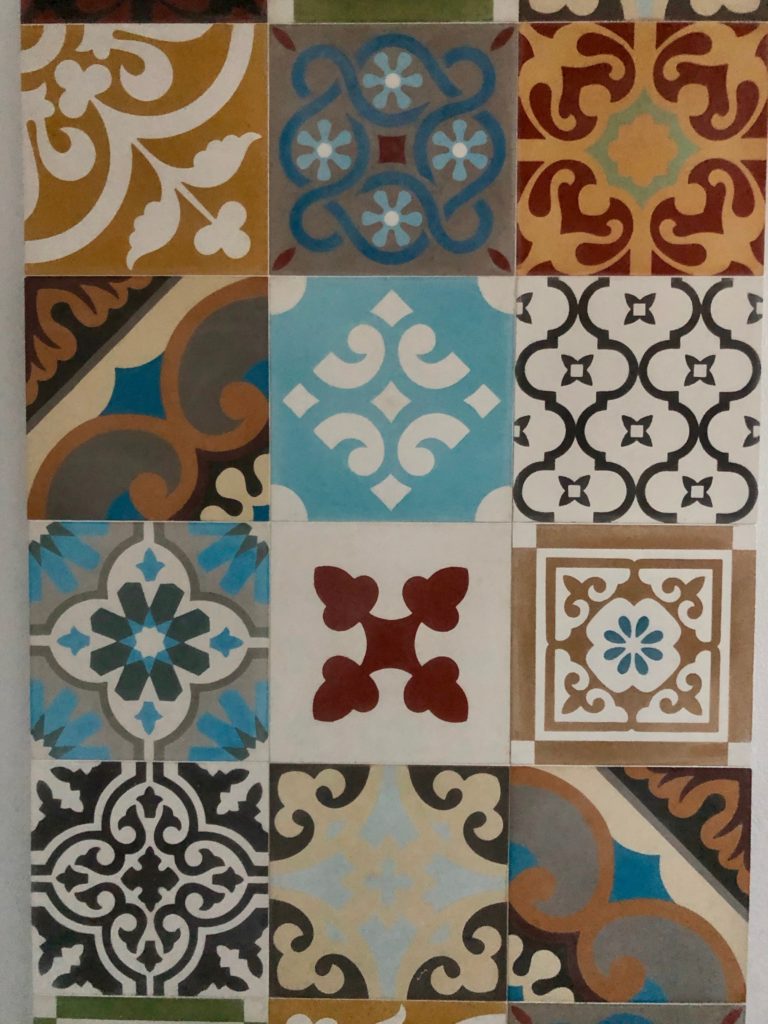
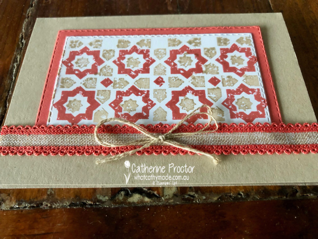
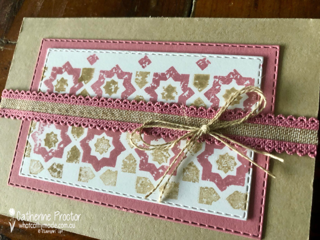
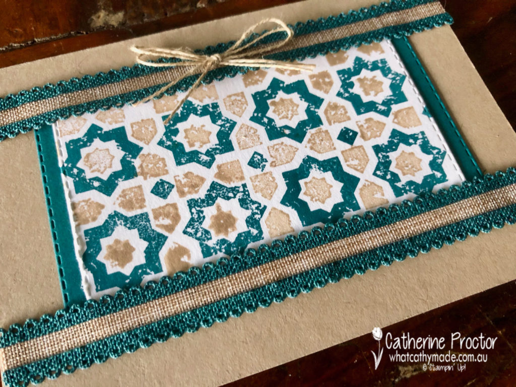
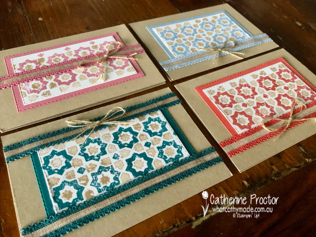
My cards tonight were inspired by the splashback in my powder room. It goes all the way from the basin to the ceiling but here’s just a snippet of these beautiful encaustic tiles.
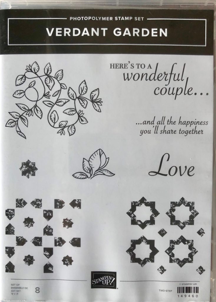
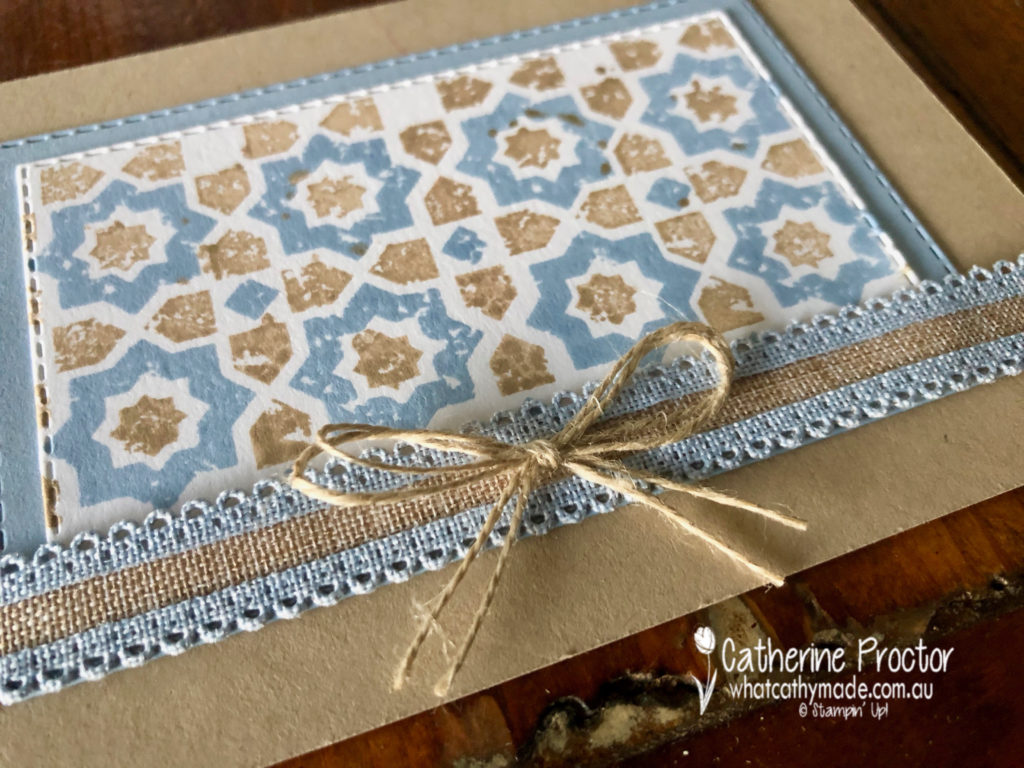
As soon as I saw the new Verdant Garden stamp set I knew I would use it to make a card inspired by the tiles in my splashback.
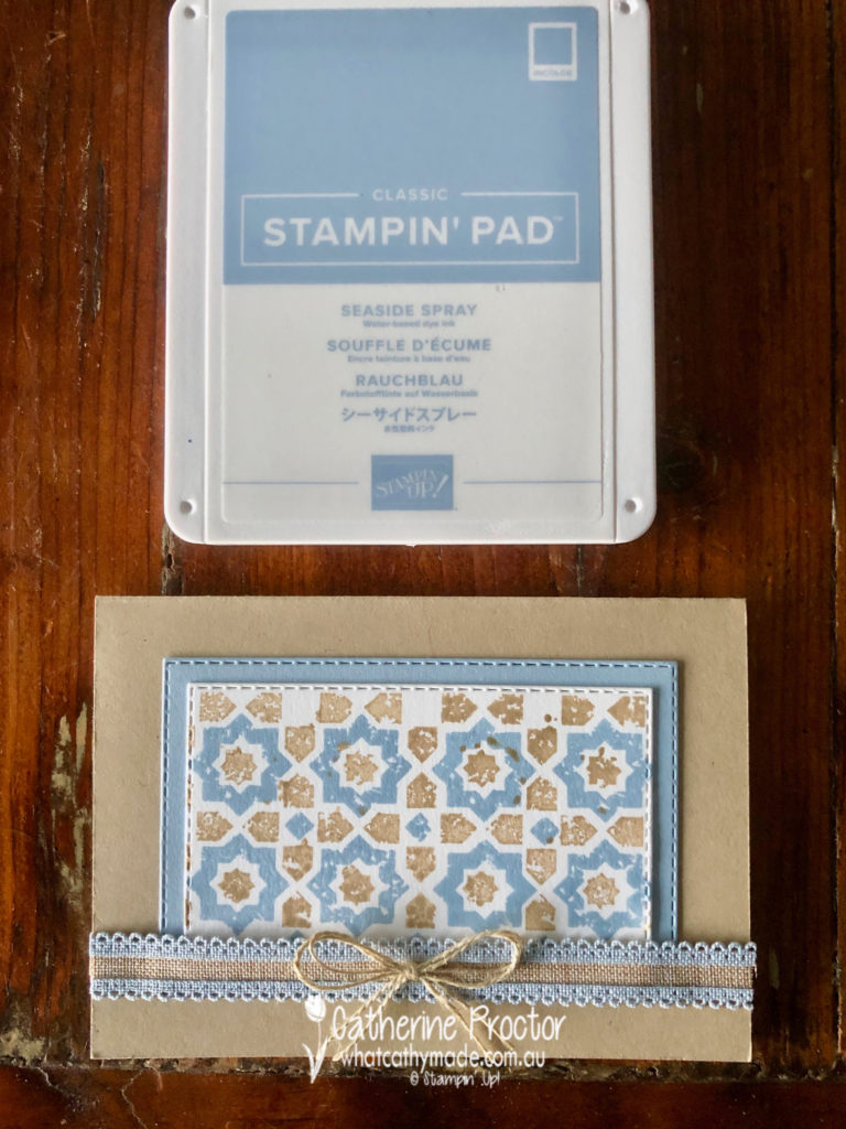
Combined with the colour scheme of the Scalloped Linen Ribbon (oh be still my beating heart!!!) it also proved to be an excellent opportunity to introduce you to the new 2019-20 in colours.
First cab off the rank? Seaside Spray.
Seaside Spray is definitely one of my new favourite colours. How good does it look with Crumb Cake? (And yes I have deliberately referenced ScoMo for his incredibly versatile “motherhood and apple pie” statement).
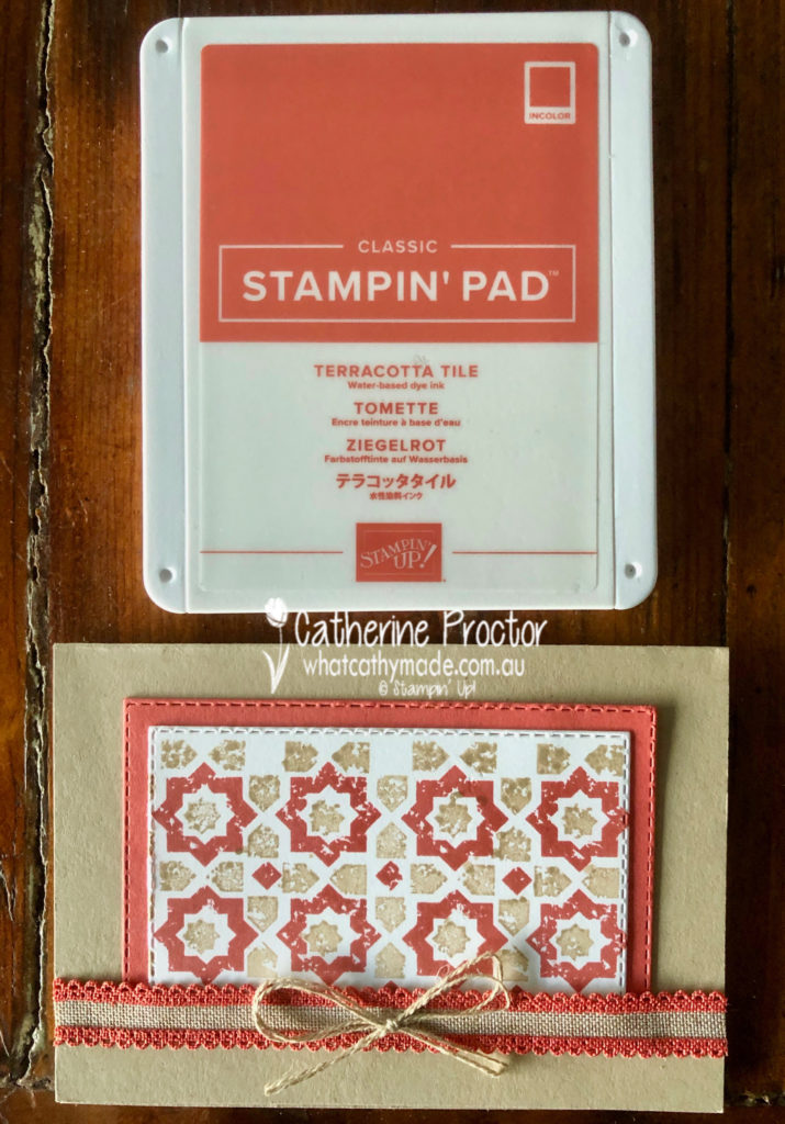
Next, I’d like to introduce you to Terracotta Tile. I think Terracotta tile is going to get on famously with its closest cousin, Cajun Craze.
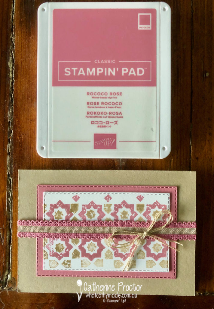
Rococo Rose is another new favourite, such a soft and gentle pink I just know I’ll be using a lot.
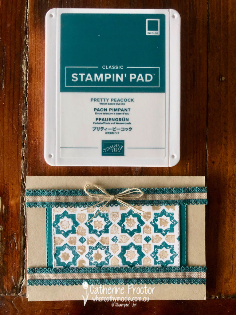
Pretty Peacock is very dark and rich – I can’t wait to team it with Night of Navy!
There is one more lovely 2019-202 in colour called Purple Posy that I haven’t included this week because the ink pad is not orderable yet. If you’re wondering what it looks like it’s a very pale purple, sort of a love child of Highland Heather and Smokey Slate.
Here’s a closer look at the other 4 in colours.
Now it’s time to hop on over to our next participant, the very talented, Rachel Palmieri.
If you find a broken link or have come to this blog hop from a different entry point, you can view the participants below:
Welcome to week 49 of the Art With Heart Colour Creations Blog Hop – we have been hopping every week for nearly one year now!
Another week and another colour I really haven’t used much before.
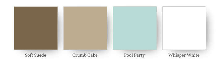
Soft Suede belongs in our neutral colour family but if I want to use a shade of brown I either reach for the Early Espresso (if I want a dark brown) or Crumb Cake, which is my absolute favourite neutral! So I have to admit this colour was quite a challenge for me!
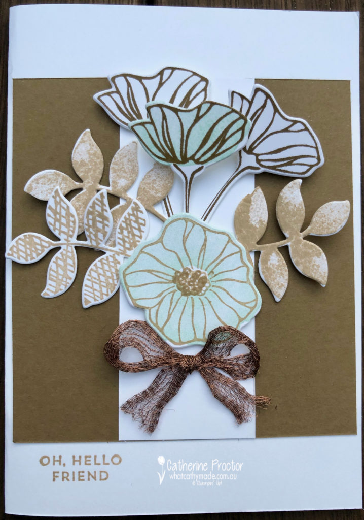
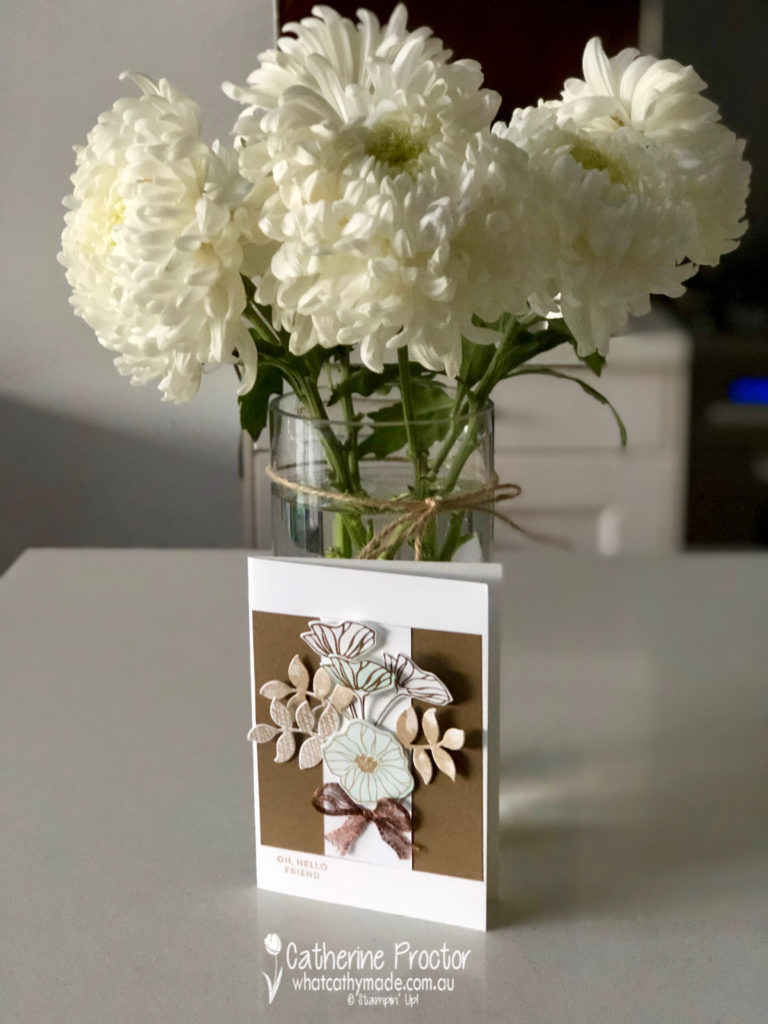
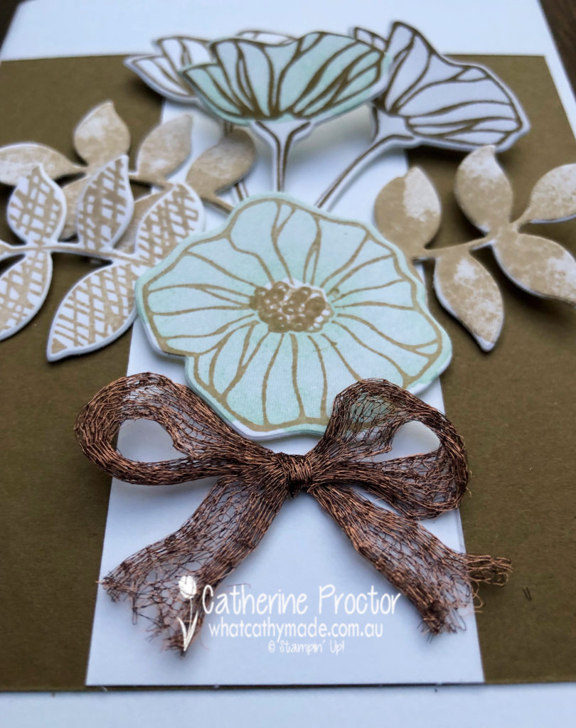
I decided to use a retiring favourite of mine: the Oh So Eclectic stamp set with the matching Eclectic Layering dies for my card this week.
My colour combination is a classic one: shades of brown with a touch of white and pale blue.
And here’s what I came up with.
I photographed my card in front of the lovely Mother’s Day flowers my eldest son bought for me. It’s now over a week since Mother’s Day and they are still looking lovely, brightening up my kitchen and putting a smile on my face every time I walk into the room!
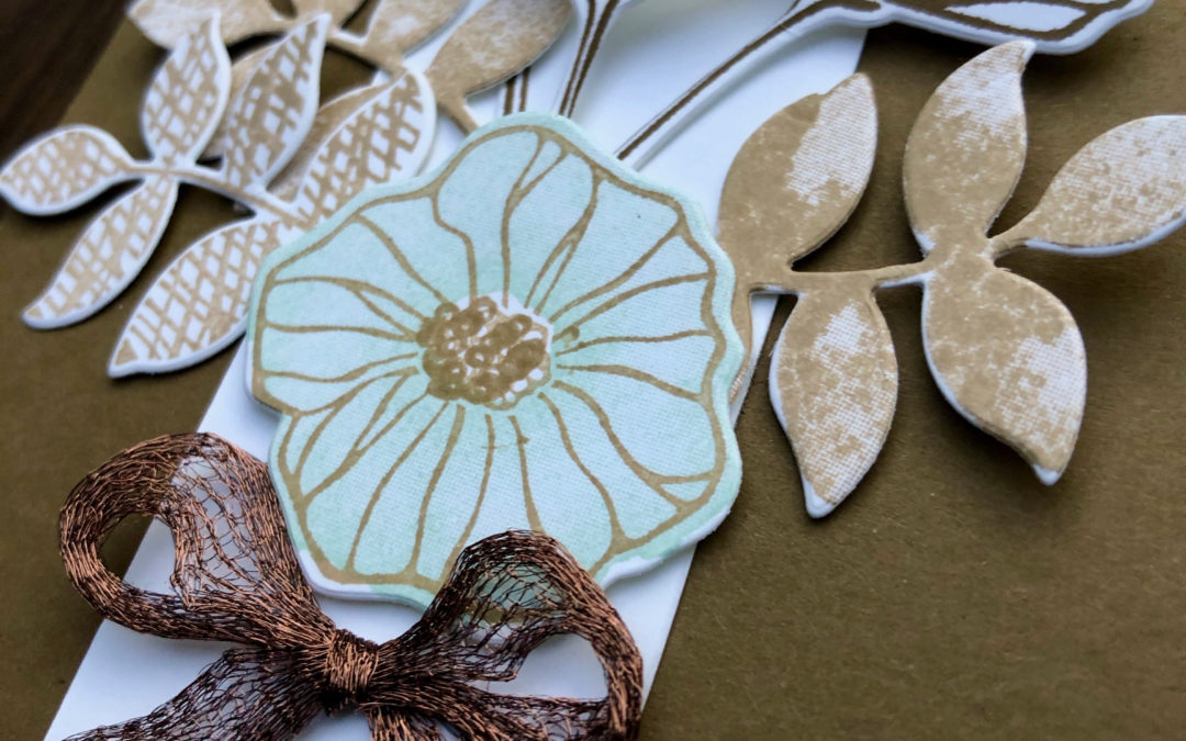
Take a closer look at the stunning copper trim…I love how you can pull this trim apart (as I have done here) or use it off the reel as a narrower trim.
To see what the rest of the team have created, click on the links below.
To purchase any of the products I used in this project you can shop with me here. Or if you’d like me to post you your very own copy of any of the Stampin Up! catalogues or find out about more about Stampin’ Up! contact me .
We will be back again next week showcasing our final colour for our 2108/2019 Colour Creations blog hop: Tranquil Tide. We hope you can hop along with us then.
Welcome to week 48 of the Art With Heart Colour Creations Blog Hop!
Our colour this week is a subtle colour: Soft Seafoam.
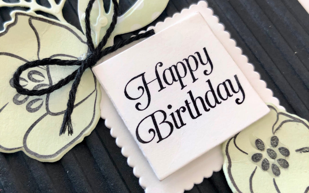
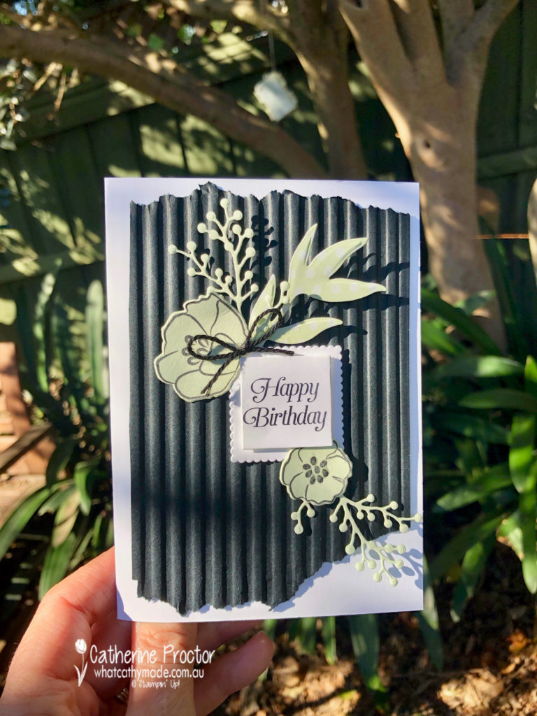
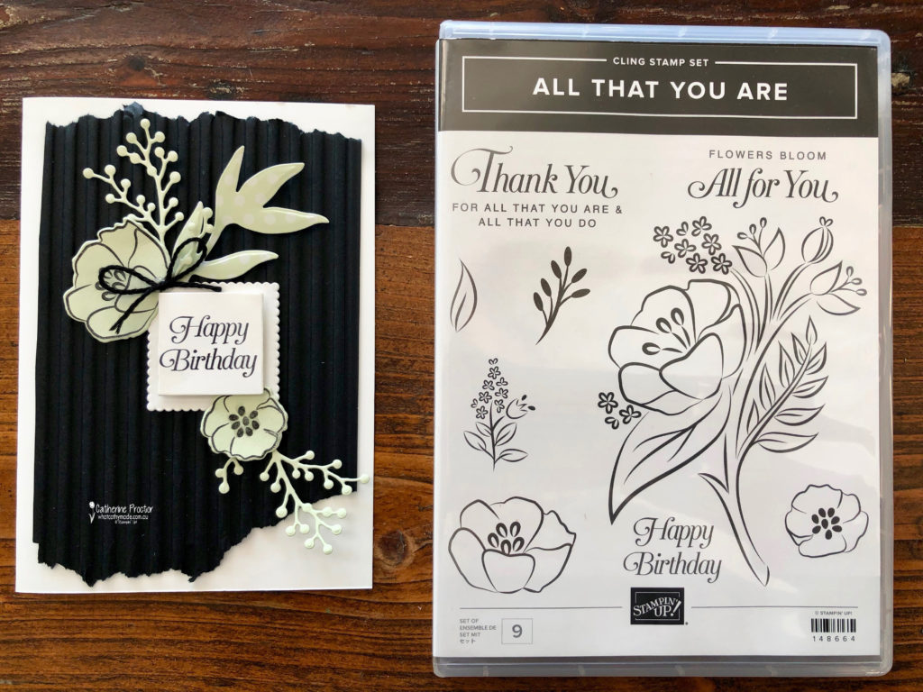
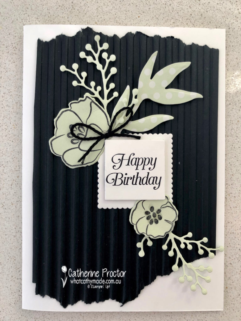
Because I always forget to use my embossing folders I made sure I used one for my card this week that I knew would really stand out: the Corrugated Dynamic Impressions Embossing Folder.
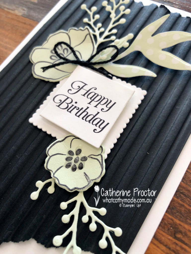
I love this soft green when it’s paired with black and white. And I also love this stamp set that’s about the retire: All That You Are. It co-ordinates with the Frosted Bouquet Dies and I’ve used both the stamp sets and dies for my birthday card today. It’s such a beautiful font.
If you take a close look at the flower on the bottom right you’ll see I’ve added a touch of dimension by applying some of the fine-tipped glue to the centre of the flower.
To see what the rest of the team have created, click on the links below.
To purchase any of the products I used in this project you can shop with me here. Or if you’d like me to post you your very own copy of any of the Stampin Up! catalogues or find out about more about Stampin’ Up! contact me .
We will be back again next week showcasing a neutral colour: Soft Suede. We hope you can along with us then.
Welcome to week 47 of the Art With Heart Colour Creations Blog Hop!
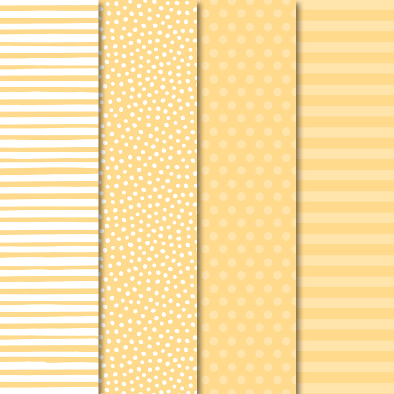
Our colour this week is a subtle colour: So Saffron.
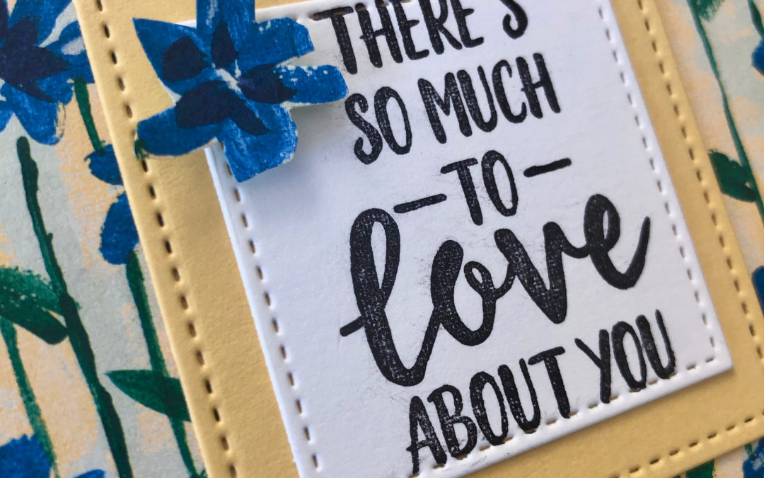
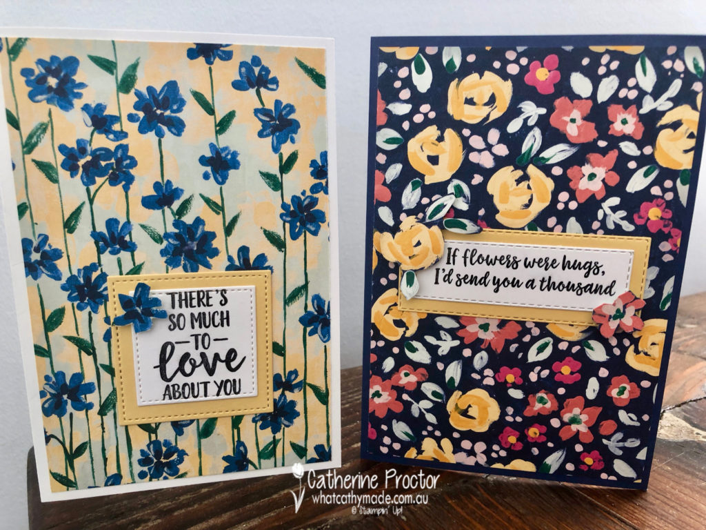
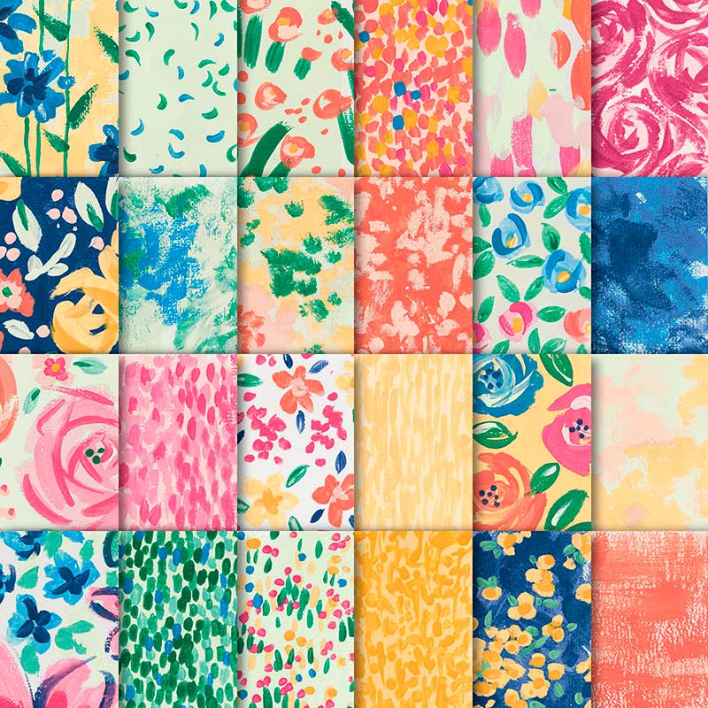
This soft yellow is used in one of my favourite Designer Series Papers: Garden Impressions. So I made a couple of cards to show off these lovely impressionist papers.
To see what the rest of the team have created, click on the links below.
To purchase any of the products I used in this project you can shop with me here. Or if you’d like me to post you your very own copy of any of the Stampin Up! catalogues or find out about more about Stampin’ Up! contact me .
We will be back again next week showcasing another subtle colour: Soft Sea Foam. We hope you can along with us then.
Welcome to week 46 of the Art With Heart Colour Creations Blog Hop!
Our colour this week is a very light neutral colour: Smokey Slate.
Because these neutrals go with every colour I thought it would be a perfect colour to showcase our retiring In-Colours in a series of cards that use other retiring products too.
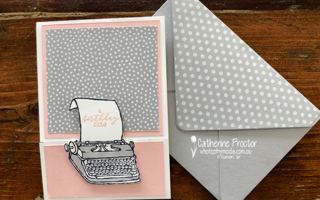
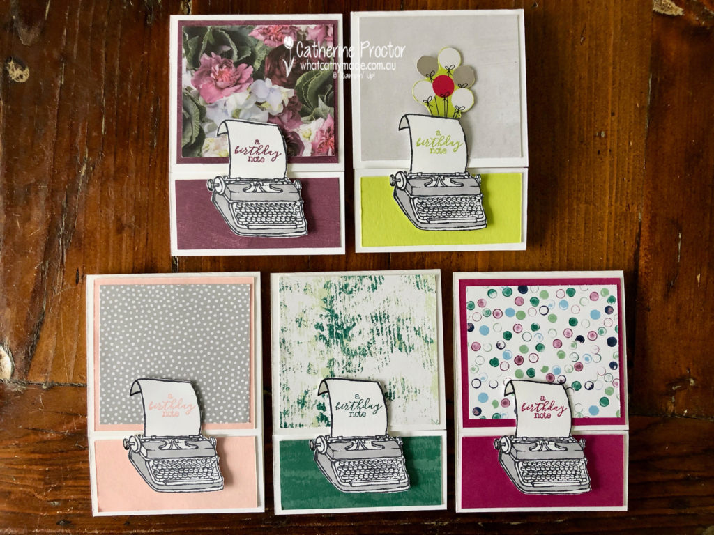
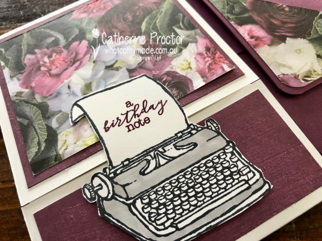
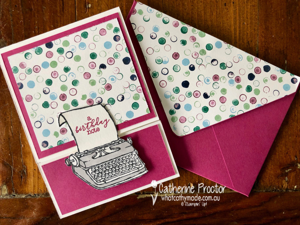
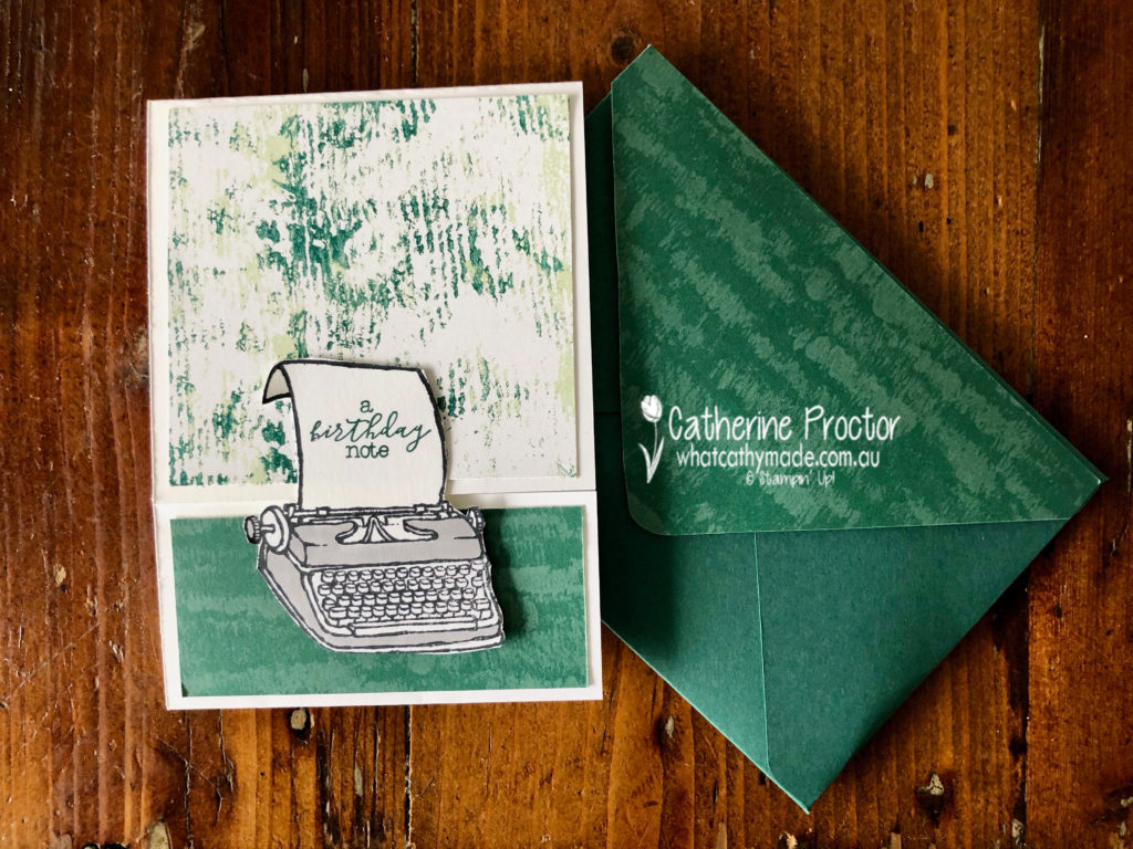
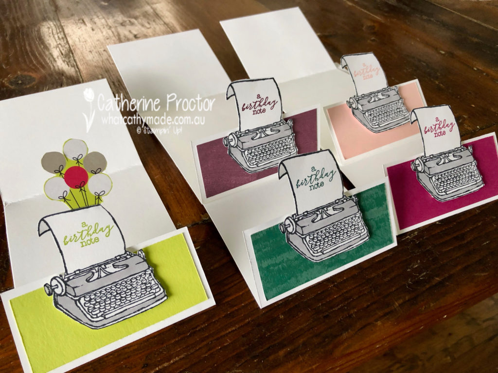
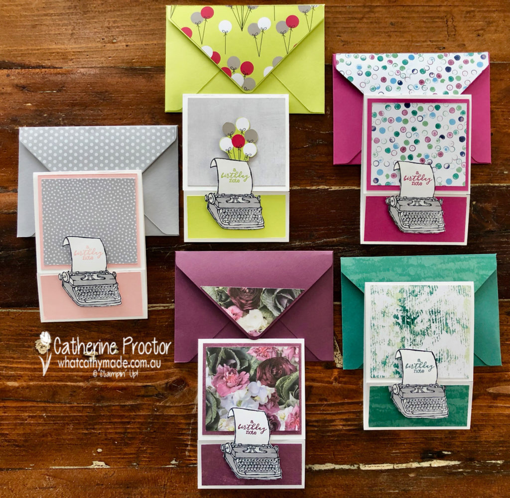
I like to call this set my typing pool!
I decided to use the delightful “P.S. You’re the Best stamp set” as it was just perfect for my friend Bruce. I’m going to his 50th birthday party this weekend and he is an author and currently writing his next book.
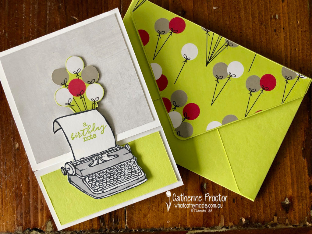
I think I’ll give Bruce the Lemon-lime twist card with the festive balloon paper from the Broadway Bound Designer Series Paper.
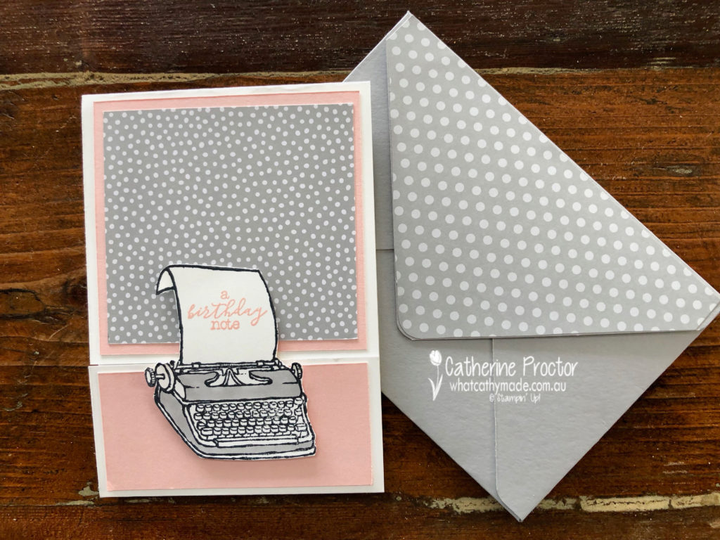
What I really like about this stamp set is that you can use it with any colour to make either male or female cards. The Powder Pink card is very feminine.
The Fresh Fig card is also very feminine, using the Petal Promenade DSP
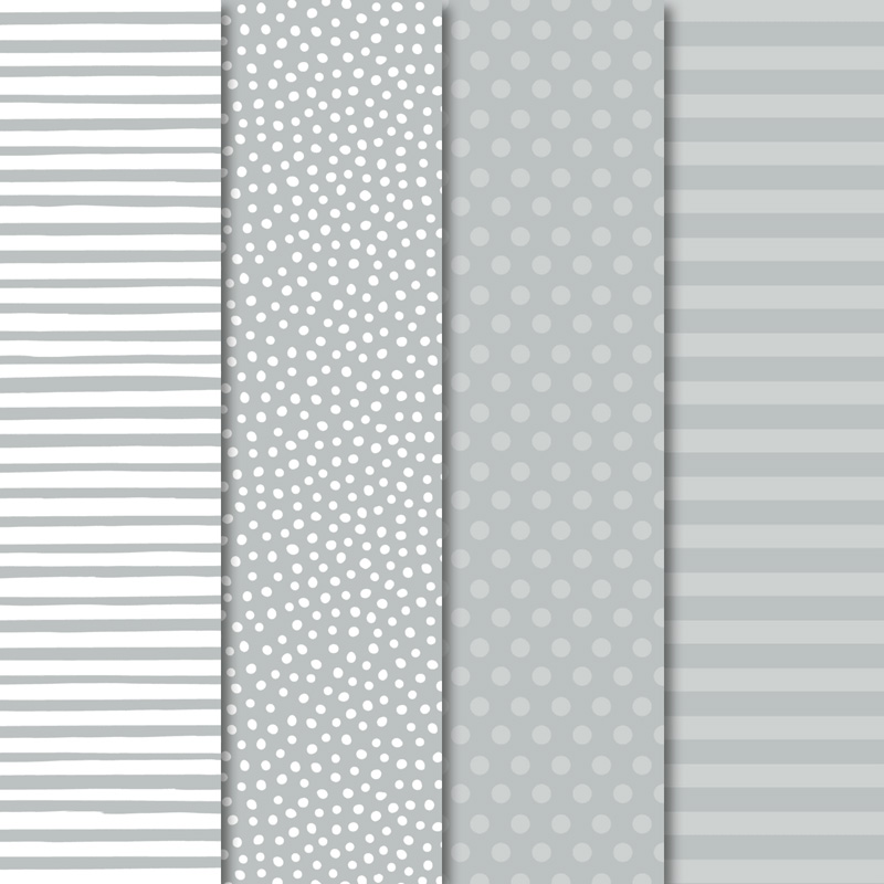
The Berry Burst card and the Tranquil tide card could work for men or women and both use the Tranquil Textures DSP.
My favourite thing about my typing pool cards is the way they open…it is a type of fancy fold but I’m not sure what it’s called!
Another fantastic retiring product I used was the Envelope punch board to make a matching envelope for each card.
To see what the rest of the team have created, click on the links below.
To purchase any of the products I used in this project you can shop with me here. Or if you’d like me to post you your very own copy of any of the Stampin Up! catalogues or find out about more about Stampin’ Up! contact me .
We will be back again next week showcasing a subtle colour: So Saffron. We hope you can along with us then.
Welcome to week 45 of the Art With Heart Colour Creations Blog Hop!
Our colour this week is a very dark regal colour: Shaded Spruce.
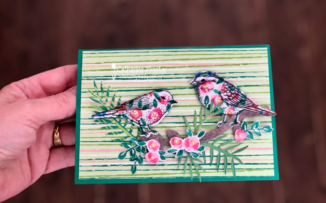
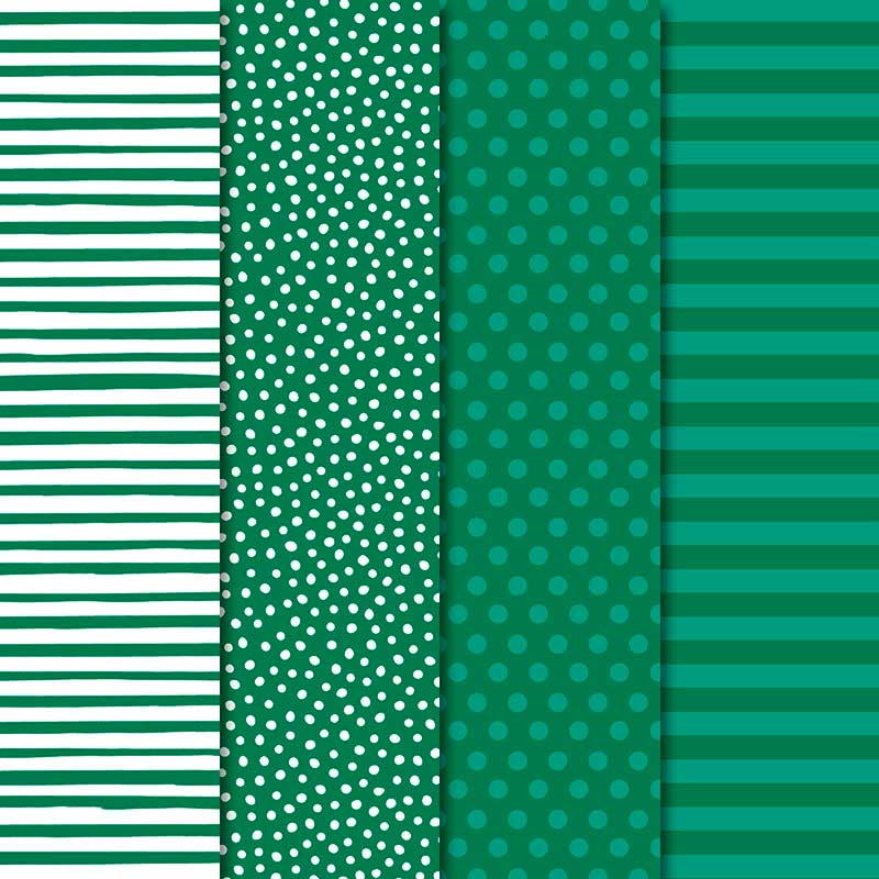
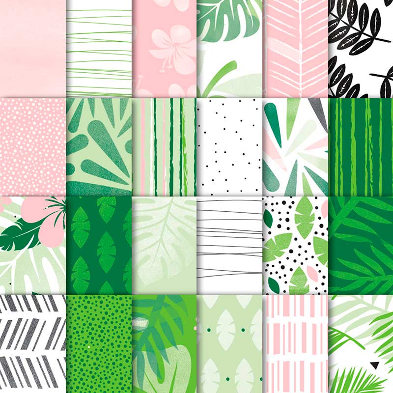
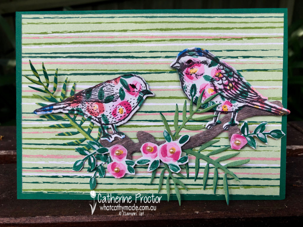
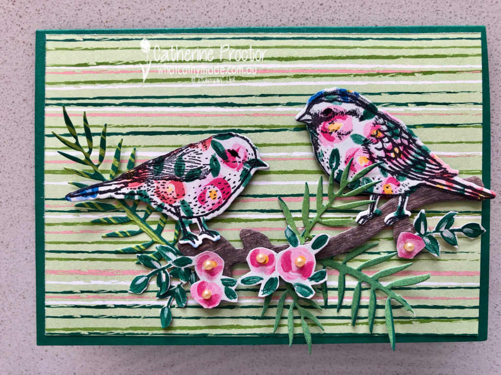
Stampin’ Up has some lovely Designer Series Papers that feature Shaded Spruce and I used two of these for my card today: Garden Impressions and Tropical Escape DSP.
My card uses a mix of die cutting and fussy cutting.
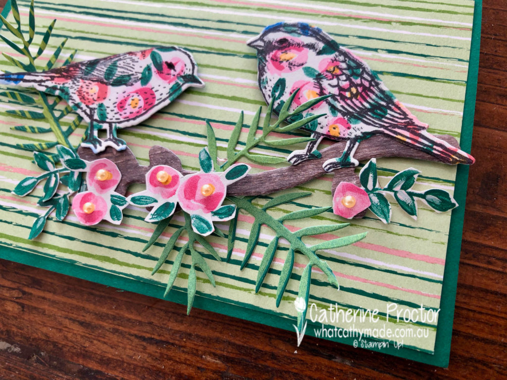
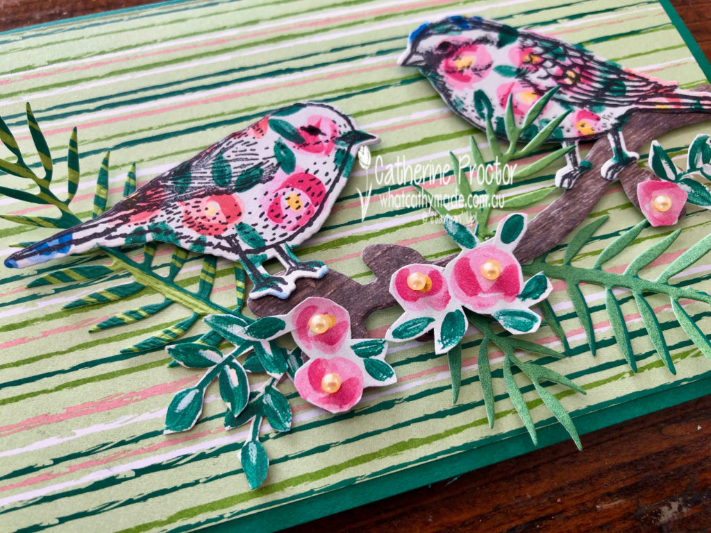
I stamped my birds in black ink onto the Garden Impressions DSP before die cutting them out. The branch they sit on has been die cut from the Wood Textures DSP.
The pink roses have been fussy cut from the Garden Impressions DSP, but the leaves have been die cut from the Tropical Escape DSP.
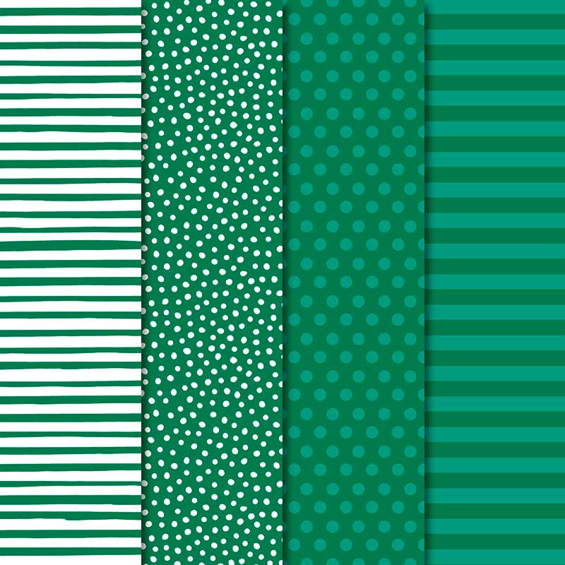
The card base is Shaded Spruce card stock topped with a rectangle of striped paper from the Tropical Escape DSP.
To see what the rest of the team have made click on the links below.
To purchase any of the products I used in this project you can shop with me here. Or if you’d like me to post you your very own copy of any of the Stampin Up! catalogues or find out about more about Stampin’ Up! contact me .
We will be back again next week showcasing a neutral colour: Smokey Slate! We hope you can along with us then.
Welcome to week 44 of the Art With Heart Colour Creations Blog Hop!
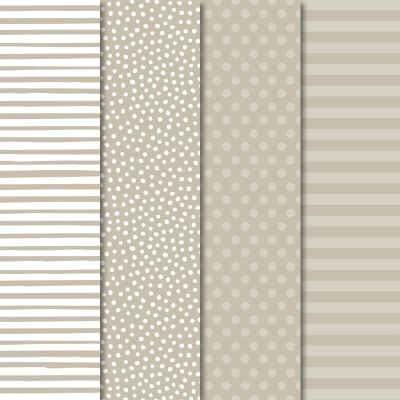
Our colour this week is one of the lightest neutral colours: Sahara Sand.
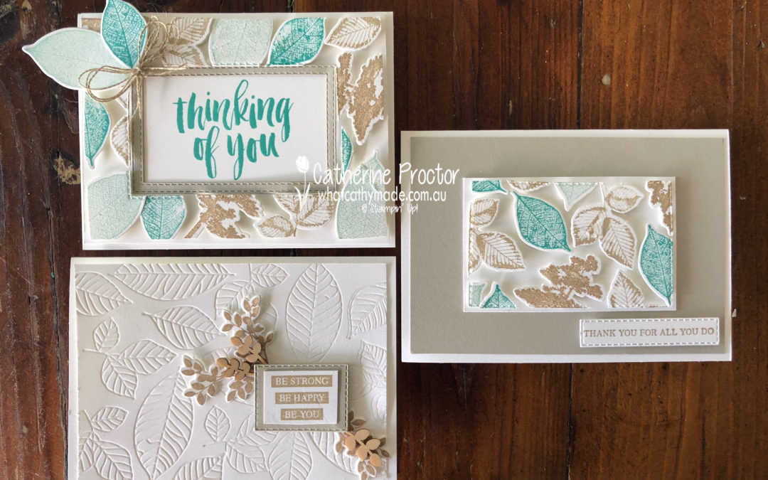
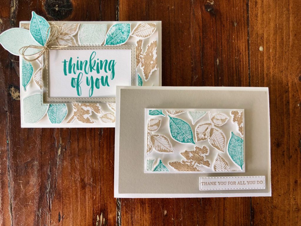
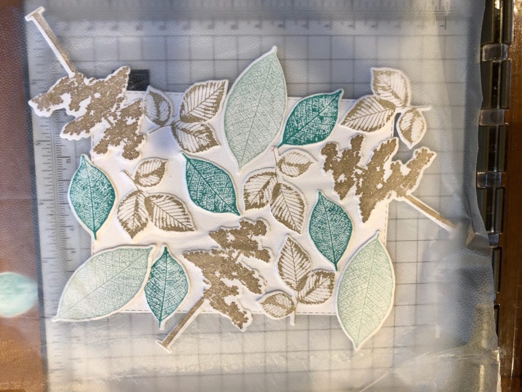
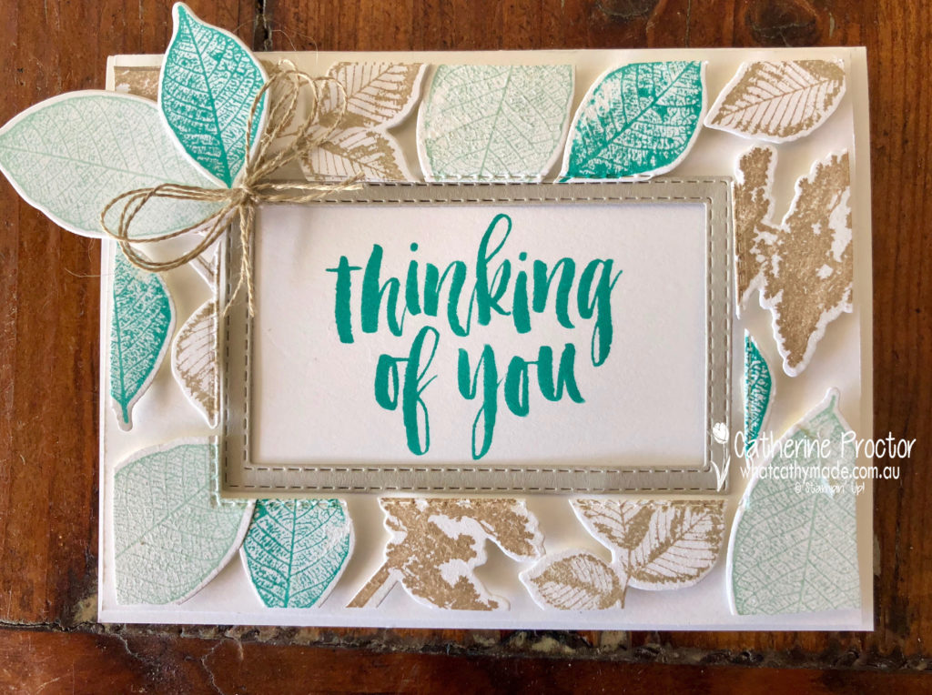
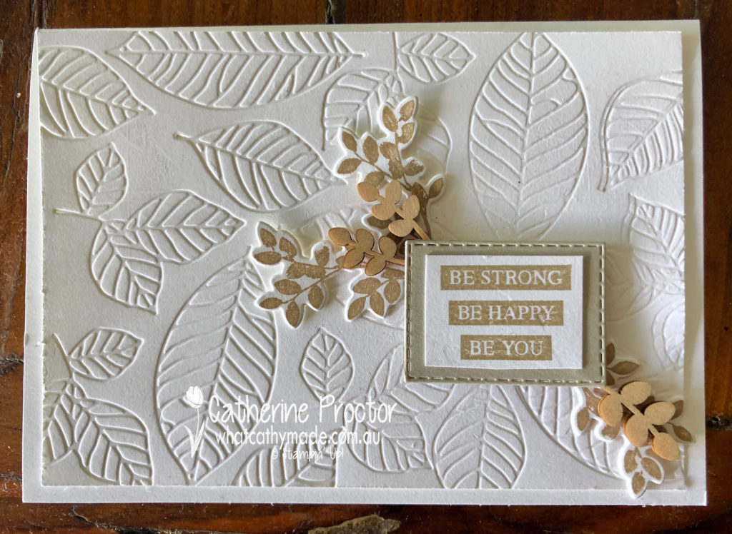
There’s a new technique around called the floating frame technique and I decided to try it out for my project this week, using the Rooted in Nature stamp set and the matching Nature’s Root Framelits.
The technique is quite similar to making your own DSP. I began by stamping the leaves and trees and die cutting them out before I arranged them onto a rectangle. Once I was happy with my layout I laid a sheet of Glad Press and Seal over the top of my die cut pieces, turned everything upside down and trimmed off the overlap.
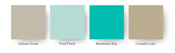
My colour combination is Sahara Sand, Pool Party, Bermuda Bay and Crumb Cake.
Once I’d trimmed off the excess, I die cut a rectangle out of the middle before removing the Whisper White cardstock from behind the die cuts. The Glad Press and Seal keeps your die cut pieces in place while you do this.
The final step is to use a lot of dimensionals behind the die cut pieces to adhere them to your card base. When your frame is in place you gently peel off the Glad Press and Seal. If you look closely at my card you can see where I’ve stuck the Press and Seal down too hard and it’s lifted some of my ink off.
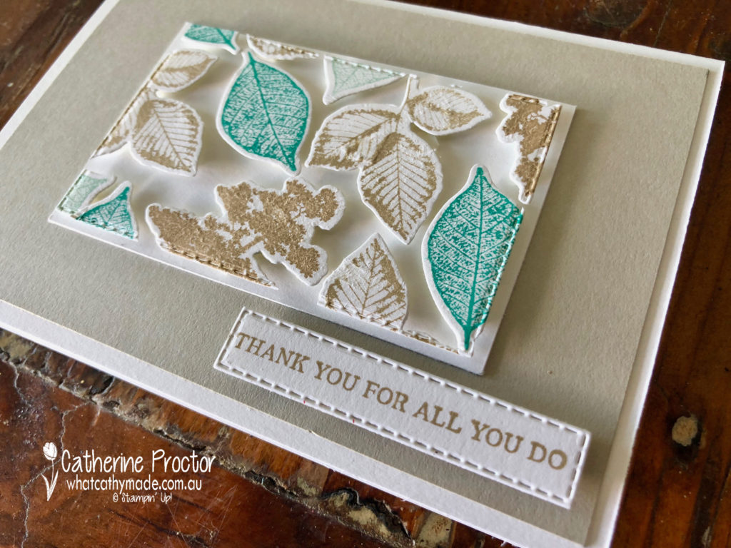
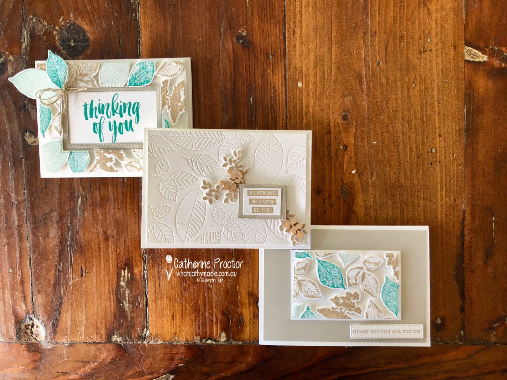
One of my favourite things about this technique is that you get 2 cards from it. Here’s the second card, made from the inside piece.
I decided to make a third card to showcase the lovely embossing dies in the Nature’s Root Framelits, as well as showing how elegant Sahara Sand looks on its own when paired with Whisper White.
To see what the rest of the team have made click on the links below.
To purchase any of the products I used in this project you can shop with me here. Or if you’d like me to post you your very own copy of any of the Stampin Up! catalogues or find out about more about Stampin’ Up! contact me .
We will be back again next week showcasing a regal colour: Shaded Spruce! We hope you can along with us then.
Welcome to week 43 of the Art With Heart Colour Creations Blog Hop!
Our colour this week is a regal colour: Rich Razzleberry.
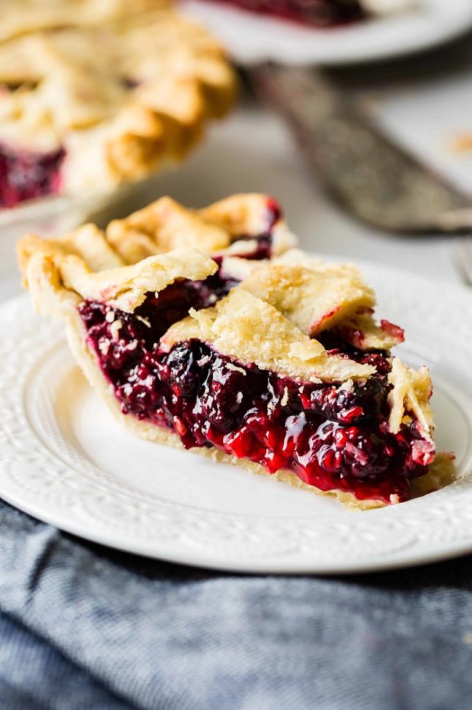
I’ve never seen a razzleberry in a fruit shop so I assumed it must be an American berry, but when I did a bit of Google research I discovered it is actually the name of a type of pie made with a mix of berries. Recipes differ but it is usually made with either raspberries and blackberries or raspberries, blueberries and blackberries.
Yum! I’m definitely going to make a razzleberry pie now that I’ve found the recipe!
I love this colour so much I made two cards this week. I don’t think they’re my best cards ever but hopefully, they can showcase this lovely colour.
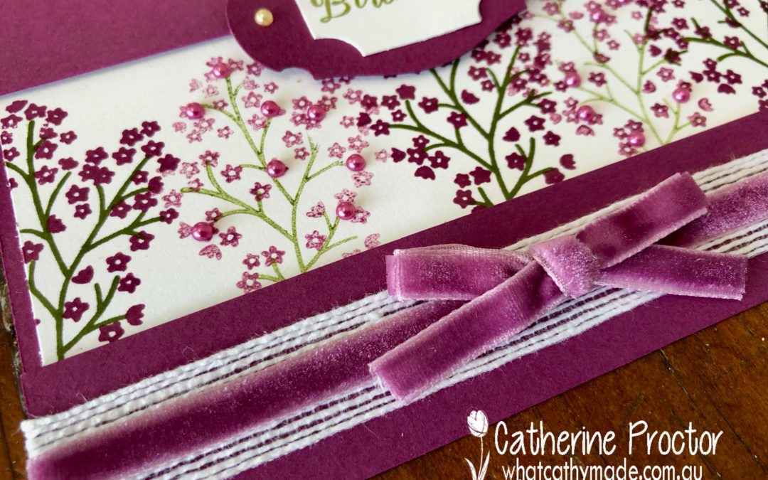
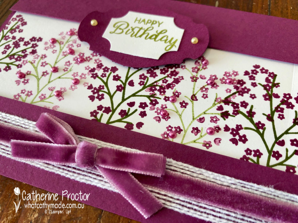
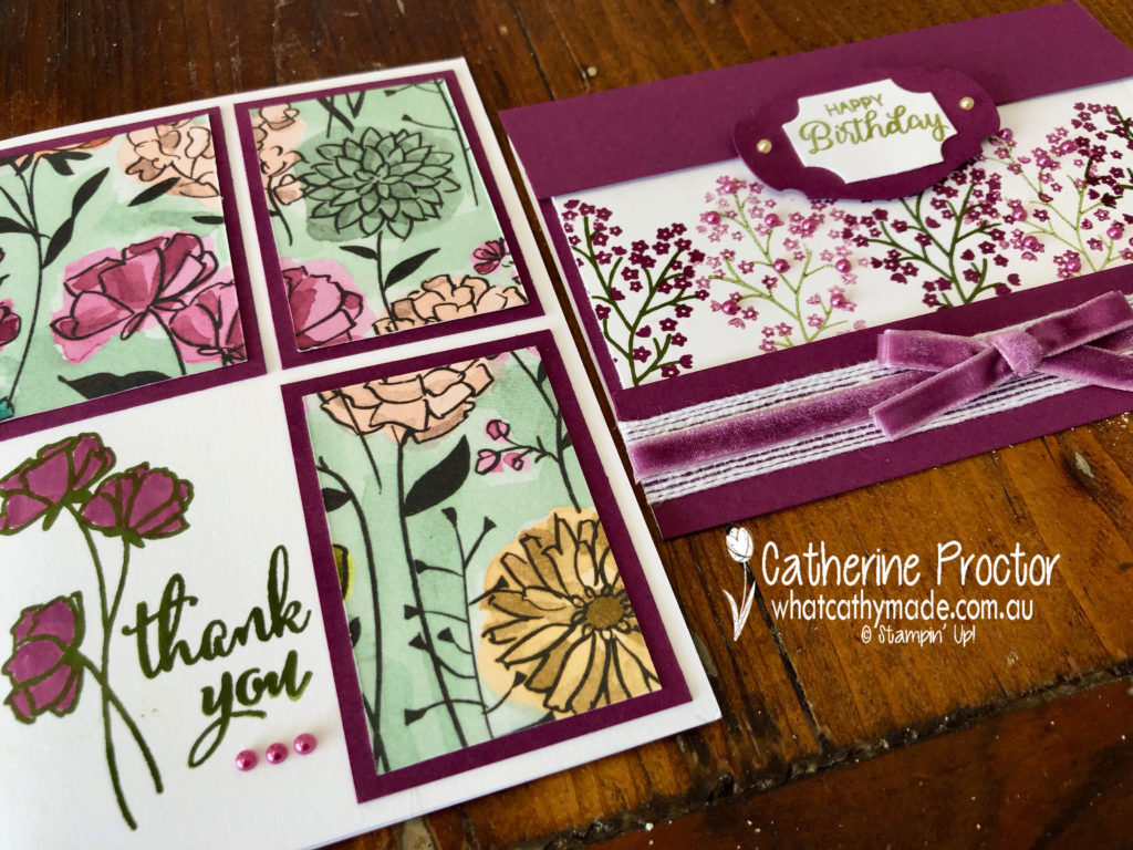
My first and favourite card uses the Beautiful Bouquet stamp set. I wanted to show how pretty Rich Razzleberry is stamped at both full strength and stamped off once. I also wanted to use the beautiful Rich Razzleberry velvet ribbon.
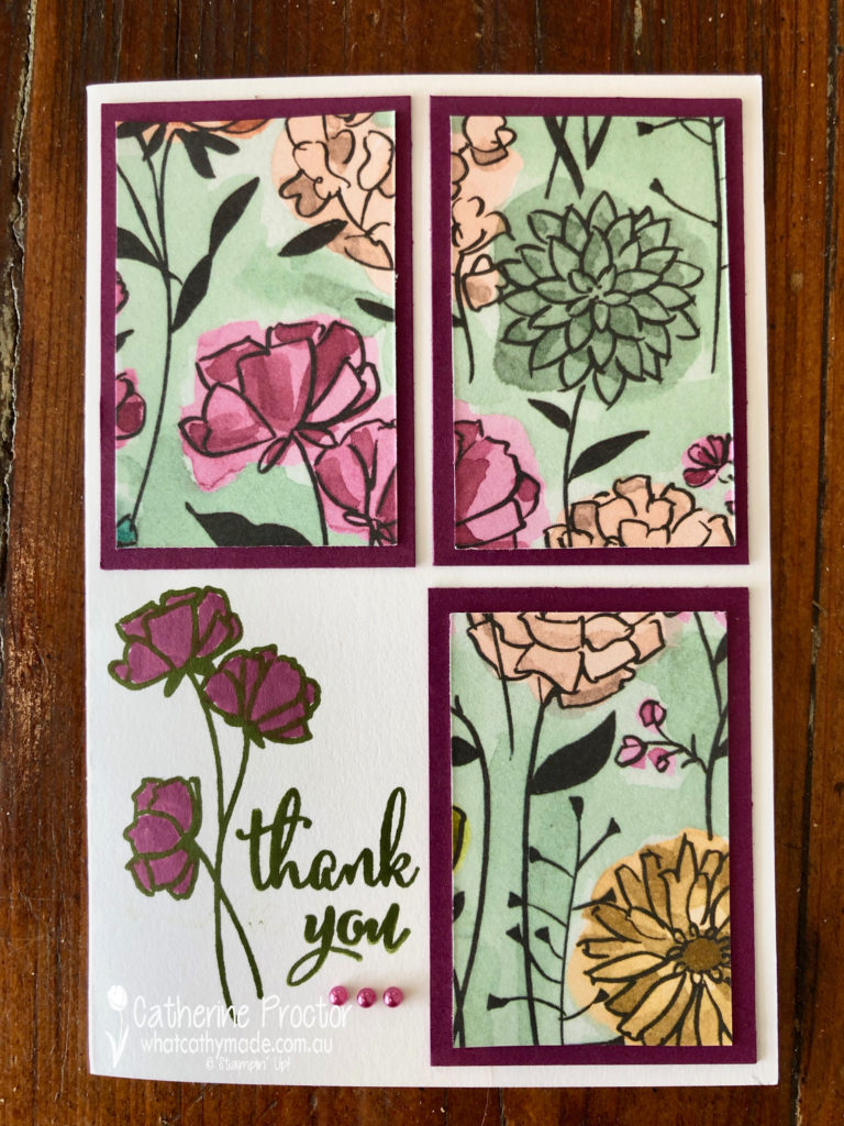
My second card is quite an old fashioned layout but it is a great way to use Designer Series Paper. You cut a rectangle into 4 even sections and mount 3 of these onto cardstock. The remaining square is stamped instead. A quick and easy card of any occasion.
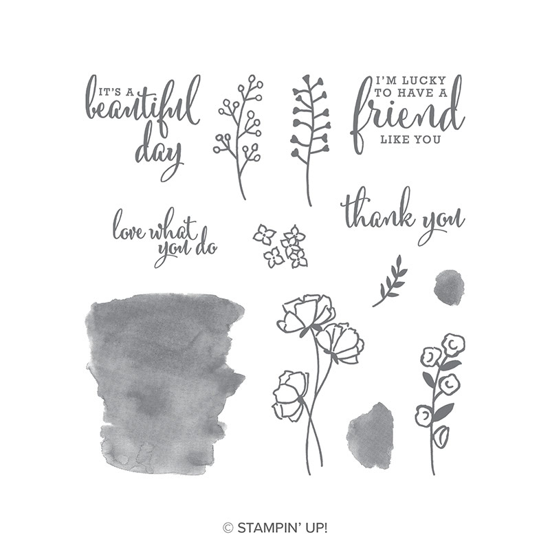
I’ve used the Share What You Love Specialty Designer Series Paper with the matching Love What You Do Photopolymer Stamp Set to stamp my sentiment and flower in Mossy Meadow before colouring in with Rich Razzleberry. I love this stamp set!
To see what the rest of the team have made click on the links below.
To purchase any of the products I used in this project you can shop with me here. Or if you’d like me to post you your very own copy of any of the Stampin Up! catalogues or find out about more about Stampin’ Up! contact me .
We will be back again next week showcasing the palest of neutrals: Sahara Sand! We hope you can along with us then.